Biennalen for Kunsthåndværk & Design 2019


The exhibition for the prestigious Danish award for the crafts - the Biennalen for Kunsthåndværk & Design - opened today at Nordatlantens Brygge / North Atlantic House in Copenhagen and continues until 5 May 2019.

Artists and designers selected to exhibit this year are:

Anett Biliczki
Helle Vibeke Jensen og Mette Saabye
Mariko Wada
Mia Lagerman
Signe Fensholt
Margrethe Odgaard
Ole Jensen
Kristine Mandsberg
Christina Christensen
Katrine Bidstrup
Kunstnergruppen RØRT: Ædelmetalformgiver og sygeplejerske Kristina Villadsen, Ædelmetalformgiver og arkitekt Maja Røhl, Ædelmetalformgiver og cand.comm. Maria Tsoskunoglu, Ædelmetalformgiver og grafiker Nanna Obel
Katrine Borup, Pernille Mouritzen og Bess Kristoffersen
Sarah Winther
Sarah Oakman og Maj-Britt Zelmer Olsen
Bitten Hegelund og Uffe Black
Bodil Manz og Jacob Manz
Charlotte Østergaard
Sisse Lee

Nordatlantens Brygge

Danske Kunsthåndværkere & Designere

Bauhaus #itsalldesign

Designmuseum Danmark, Bredgade 68, Copenhagen

A major exhibition has opened at Designmuseum Danmark on the history, the staff and their teaching and the work of the Bauhaus school of architecture and design.

This reassessment was conceived by Vitra Design Museum and Bundeskunsthalle, Bonn to mark 100 years since the opening of the Bauhaus.

review to follow

the exhibition continues until 1 December 2019
Designmuseum Danmark


Yellow at Officinet

An exhibition at Officinet - the gallery in Copenhagen of Danske Kunsthåndværkere & Designere - to show the works of the Danish artist Torgny Wilcke and the English artist Simon Callery.

Both artists have used the colour yellow for a common element and both use what are essentially functional every-day materials - for Callery heavy canvas and Torgny Wilcke timber and corrugated metal strip for roof covering.

Both work on a large scale with a strong presence in the space and both hint at potential practical uses for their works … the wall pieces by Simon Callery reference storage and the large floor pieces by Torgny Wilcke have been used for seating so they are challenging boundaries between art, craft and design.

Both use proportions to bring order and to assume control of the space in the gallery. 


the exhibition continues at Officinet until 24 March 2019
Bredgade 66, Copenhagen

Danske Kunsthåndværkere & Designere /
Danish Association of Craft and Design


Torgny Wilcke

Simon Callery


Margrethe Kaas at Design Werck


An exhibition has just opened at Design Werck in Copenhagen of paintings and sculptures by the Danish architect and artist Margrethe Kaas. The gallery space at Design Werck has beautiful light in space where furniture and decorative arts are also shown.

Margrethe Kaas was given her first set of paints at the age of four and painting has, for her, been a major vehicle for exploring colour. The large-scale colour studies show an architectural sense of planes and space and there are also topographic studies including here painting from visits to New York and London and a painting to reflect the colours and energy of Berlin.

the exhibition continues at Design Werck through to 31 March 2019

Margrethe Kaas
Design Werck

images from the Light Festival in Copenhagen

 
  • the tower of Christiansborg from Frederiksholms Kanal

  • the beam of light from the tower of Nikolaj Kirke across the statue of Bishop Absalon

  • Pyramid Construction by NEXT Cph on the square in front of BLOX

  • Go Boat on the Amager side of the harbour and Eternal Sundown by Mads Vegas at Bølgen, the Wave, at Kalvebod Brygge on the city side of the harbour

  • Chromatic Fields by Jakob Kvist at Louis Poulsen - Kuglegårdsvej

the Light Festival continues at venues around the city
through to 24 February 2019
the official site has a map and details of related events

Copenhagen Light Festival

it's all in the details


When there are surveys where people are asked if they are happy living in the city or town in which they live then Copenhagen comes high in the rankings.

There are obvious reasons why there are high level of approval from so many in Copenhagen for their city … it is relatively compact for a capital city so it has a human scale …  the climate does what it is supposed to do so it's not ridiculously cold in the winter and it's pleasantly warm in the summer … warm enough to swim in the sea from beaches nearby or the water is warm enough and clean enough to swim in the harbour … and swimming in the harbour is possible because there are no major industries that pollute the environment so clean air and clean water are further reasons for people to be happy here.

There is a good railway service to other parts of the country and to get to neighbouring countries and there is a good international airport with high passenger approval ratings and it's a short metro ride from the city centre. To say that people can get out of a city quickly and easily is perhaps not the most obvious reason for people feeling content but it's certainly better than living in a city where you feel trapped or it feels remote, far from anywhere you want to be.

Planners from around the world come to admire the architecture and the planning here and, in particular, come to see how and why the balance of private journeys are made by bike rather than by car … in themselves further reasons for being happy here or at least for being fitter.

There are also clear economic reasons for the success of the city … it has all the financial benefits and all the facilities that come from being a capital city … so the government, international delegations, national organisations and major companies are based here and the national theatre, the national library and so on are all here … but even so it is relatively small and it is a prosperous city but still a city with a strong if understated socialist ethos so extremes of wealth are not as obvious here as in many large cities.

All this is fine and has been assessed and analysed and written about in what seems like an endless number of articles but there is no simple Copenhagen ingredient … you can't take city X and add the Copenhagen factor and there you are … problems sorted.

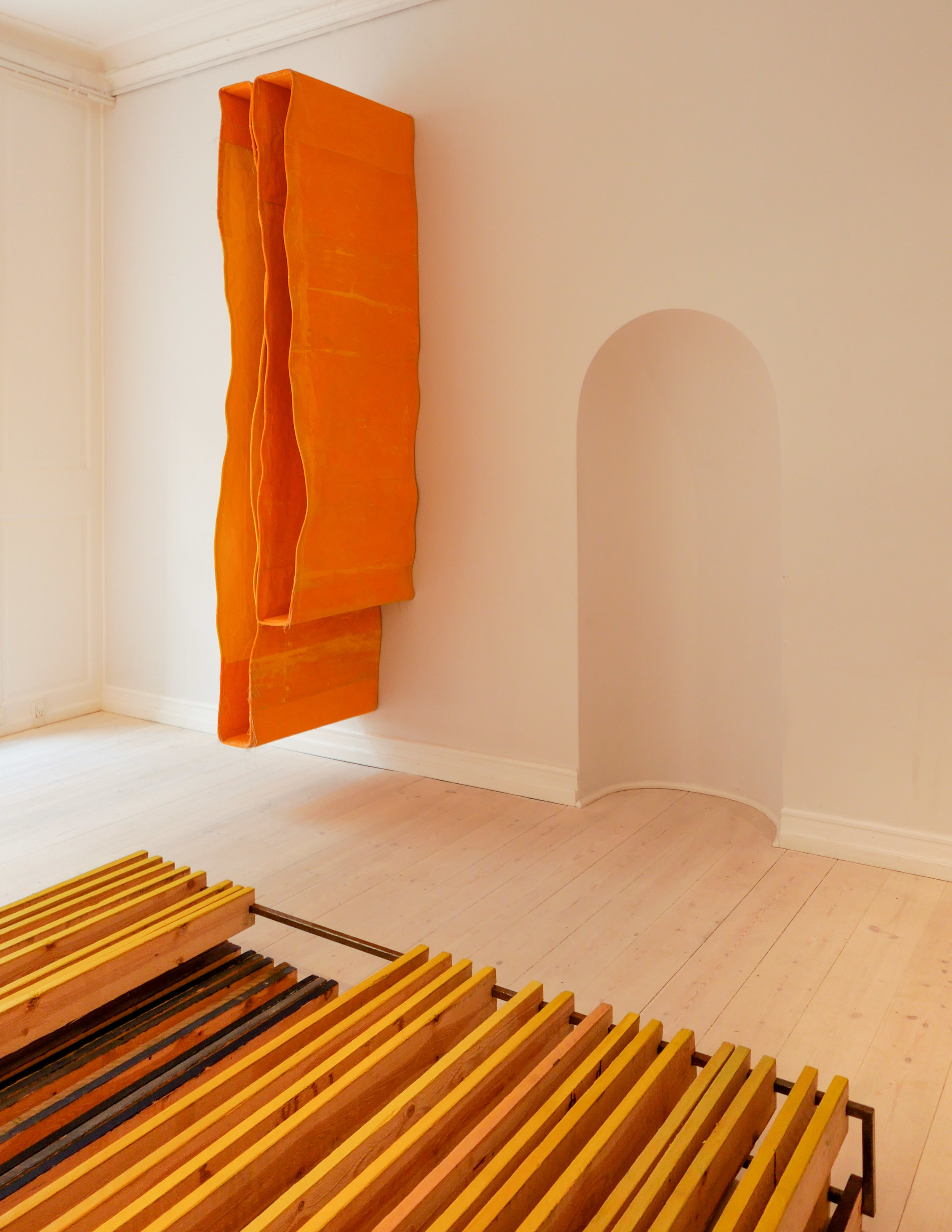
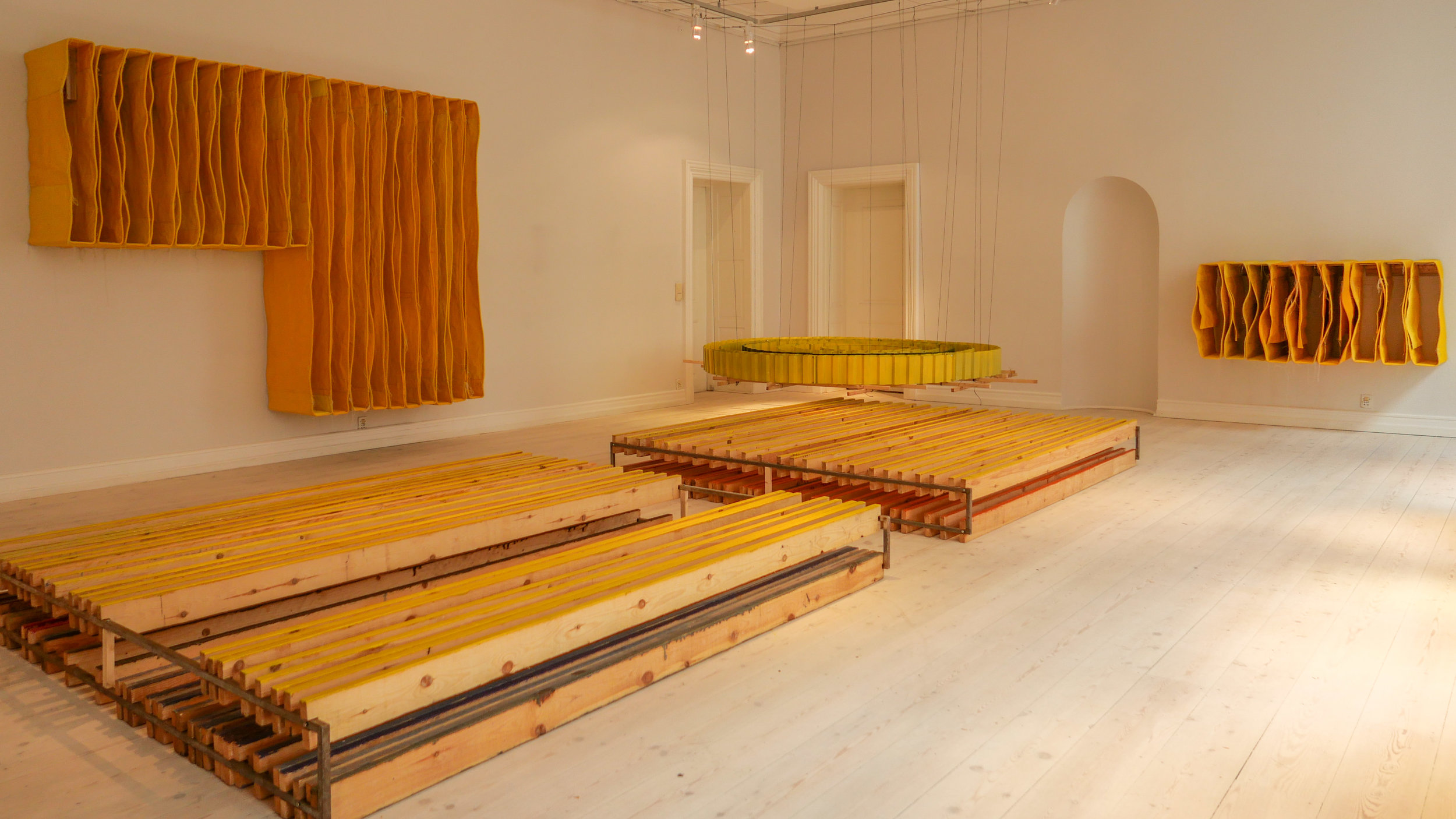
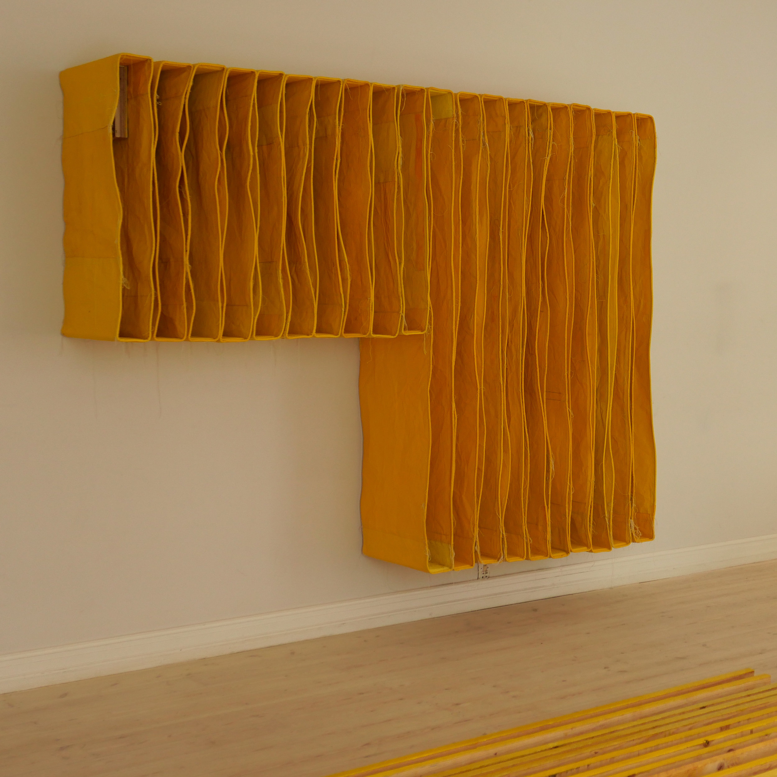
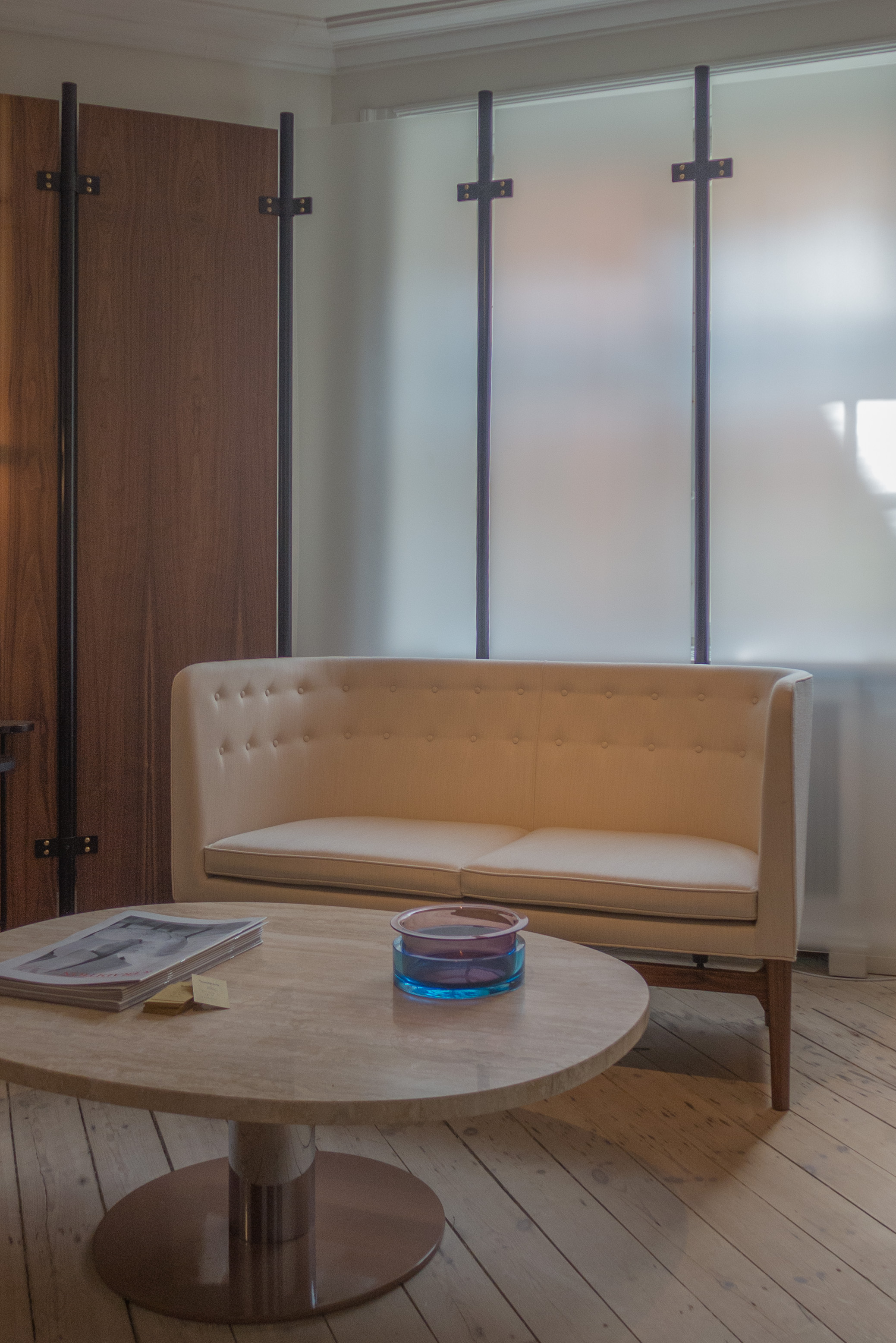
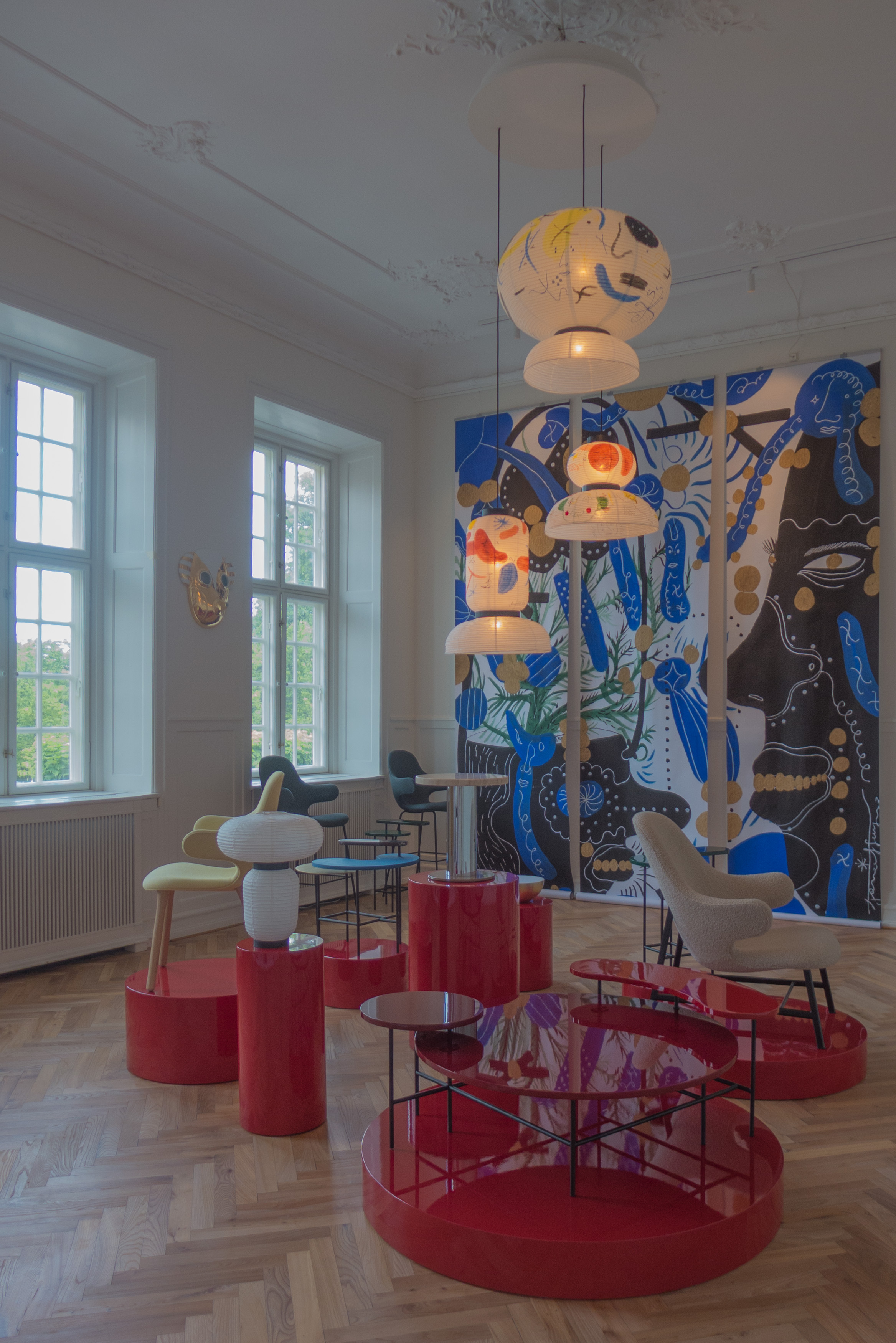
I've lived in Copenhagen for getting on for five years and I've known the city for much longer and, for me, one important factor that makes the city an amazing place to live is that it is so rich visually … or do I mean simply interesting and attractive?

It's not just about obvious places like, for instance, the royal palace of Amalienborg and the Marble Church- although the square and the buildings are one of the great public spaces in Europe - but it's the quality and the good design of smaller buildings in the city and it's about the courtyards and the corners and the odd spaces where people really do think carefully about what they are doing with their buildings and with the urban landscape of their city.

This photograph was taken a month ago, walking across from Nørrebro to get to Sankt Hans Torv - so outside the centre of the city but not far out.

Along the side of Guldbergsgade - a busy street of apartment buildings and shops - some land has been divided up for community use. There is, of course, play equipment here for children but also a small zoo where, right in the middle of the city, children can see hens grubbing around and rabbits and other small animals. There are also around two dozen garden plots together along the street edge that have been allocated to local residents for growing vegetables or flowers and all have neat fencing, borders and narrow paths and a shed although to call them sheds is hardly an adequate word to describe these small summerhouses that are potting sheds and stores for tools but also a place to brew coffee and sit and watch or sit and talk and clearly reflect the character and interests of each gardener.

I took a slight diversion along the narrow path between the two rows of garden plots, and paused to take the photo because for me this seems to sum up what are crucial aspects of life in Copenhagen that few academic authors seem to consider when they write about planning and the quality of life here.

First this is a city where there is a strong sense of respect … the respect of people with a quiet pride in the city they live in but also a respect for property - their property, other people's property and the general public property of the city streetscape. There is some mindless vandalism but remarkably little when over a million people live together. These gardens are not in a wealthy or distinctly middle-class enclave … in fact the reputation of Nørrebro is anything but that … but people moving out onto and claiming public space is a strong and an important part of life all over the city.

Second, and perhaps more important, is that ordinary people living in Copenhagen seem to have a strong visual sense …. here, ordinary used to mean people not working in design. People are visually aware and visually literate and that is clear here.

In books and magazines and guides Copenhagen is described as a design city but Milan, Paris, London and New York are design cities but could hardly be more different. In part it is because those are cities where style and fashion but also wanting to stand out or make a statement are driving factors.

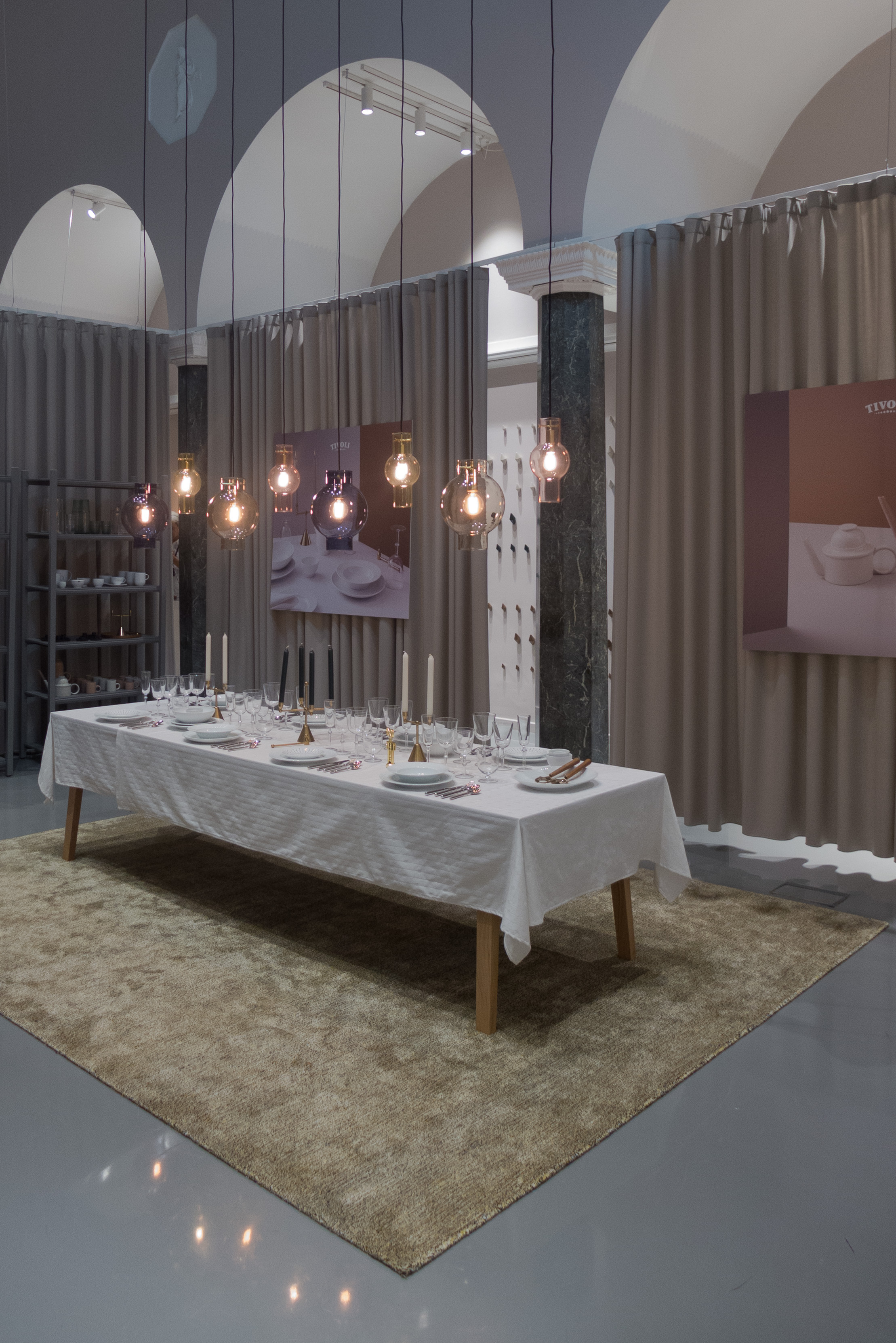
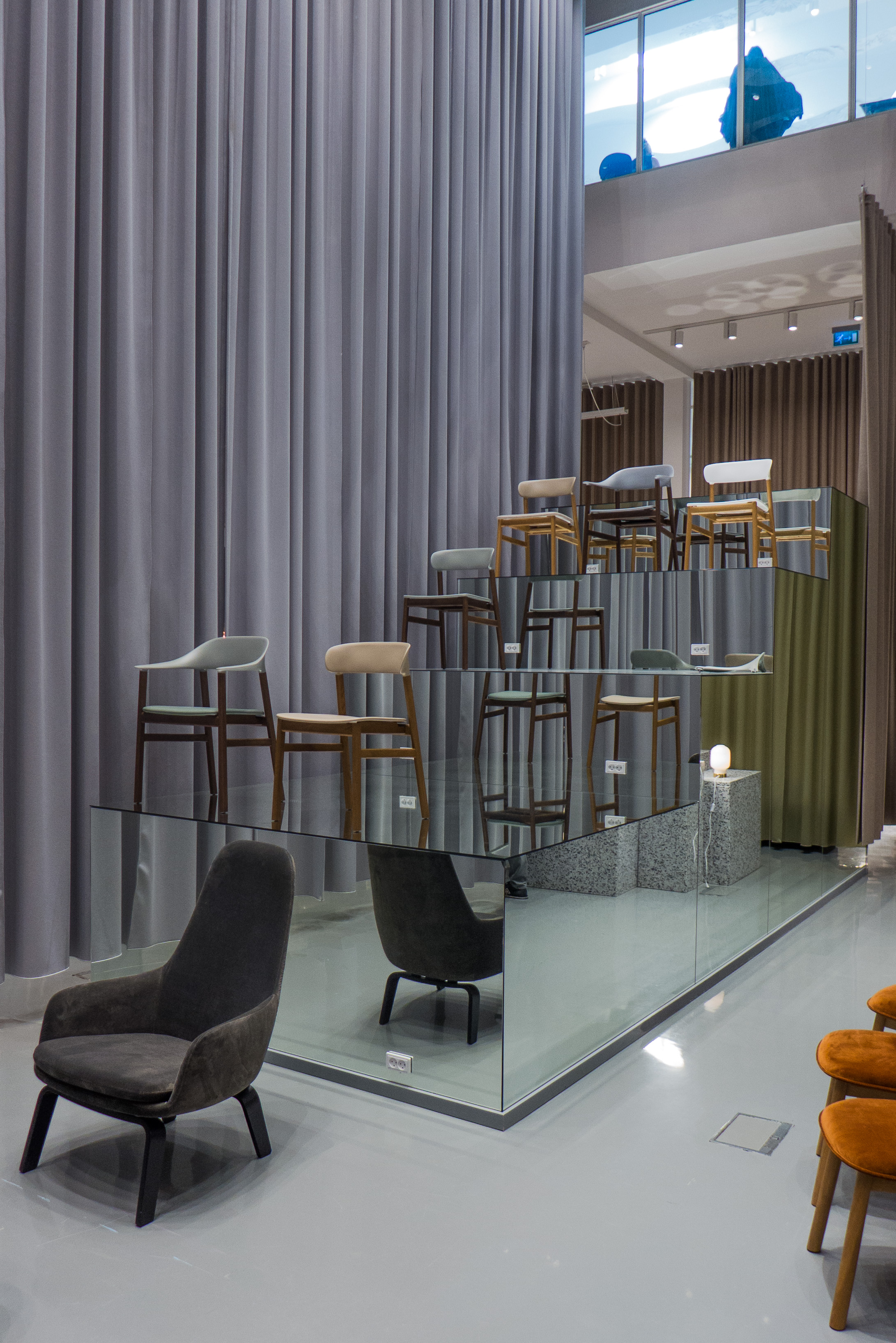
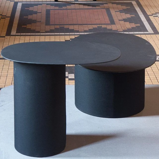
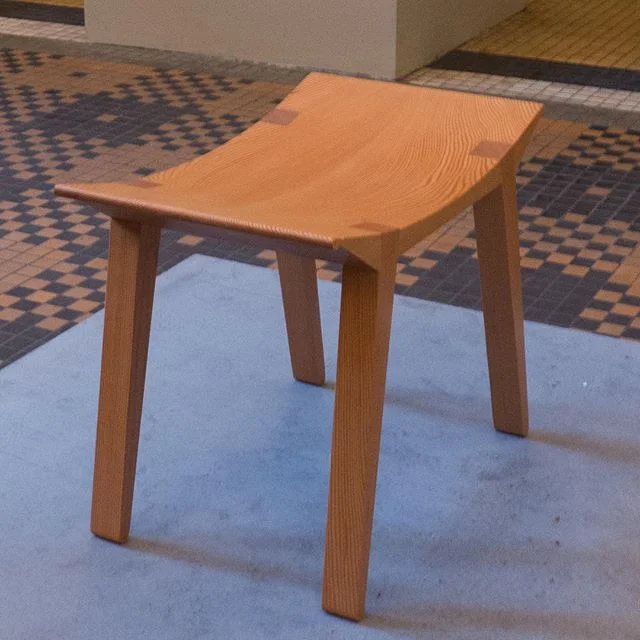
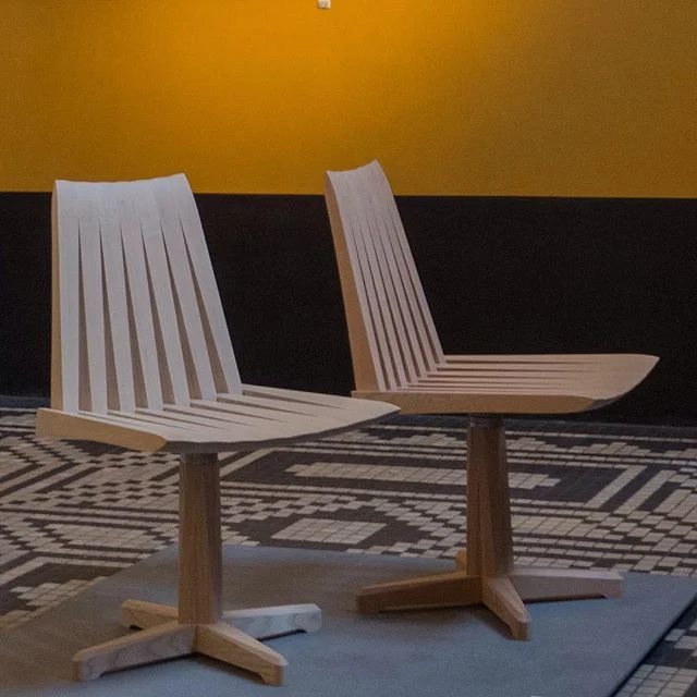
That's not, of course, to suggest that Copenhagen is unfashionable or unaware of fashion but visual sense here seems to be more firmly grounded: Copenhagen is a still a mercantile city where, for many many centuries, high-quality goods, made by craftsmen or by small independent companies, were and are respected; it is a city where the public face of a building or a business is important and it is a city where a good education in art and craft skills from a young age has been important in schools and through apprenticeships and technical training. So, in Copenhagen, design is not just about architects and designers and the design industries but good design permeates many aspects of daily life.


In the New Year a new occasional series of posts will look at some of these less-obvious aspects of architecture and urban planning in Copenhagen that together make it such a pleasant and attractive place to live.

Living Coral - Pantone colour of the year 2019

Pantone Color Institute has just announced their colour for 2019 and it is or, to be accurate, it will be Living Coral.

The Institute is a unit within Pantone that "highlights top seasonal runway colors, forecasts global color trends, and advises companies on color for product and brand visual identity."

This is where, I have to confess, I'm out of my depth. I understand fairly well the role of colour in architecture and furniture design and I admire and appreciate architects and designers who have an astute sense of colour and express that in their own work. I can see also that certain colours come into fashion and certain colours become associated with a designer or a period and some colours drop from wider favour.

But is that all too rational?

Can there really be a zeitgeist tone? Can there be a spontaneous decision by enough people to find a ubiquitous colour that works for most in most situations now but then next year doesn't?

Even Pantone suggest that they chose the colour of the year by looking at trends so maybe it's more about reaching peak Coral next year from a slow start but accelerating the build up of demand.

Or is choosing a colour of the year about giving fashion houses a nudge in one direction as they drown under colour swatches unable to decide exactly which of millions and millions of colours anyone and everyone will want to buy this Spring

To be cynical is it simply about trying to herd consumers towards a colour?

Or does a choice of colour still always come down to personal taste? … Though even using that word taste means stomping onto a minefield because it is loaded with the implication that if there is good taste then what is bad taste and who has bad taste and who is to arbitrate? Or is it better to talk about someone of limited or restricted taste?

And of course personal taste in colour or, rather, having singular and peculiar taste in colour is fine if you design and make and dye or paint for yourself but more difficult if you buy something when choice is limited to what is available.

Good taste or bad taste and how we react to colour is incredibly complex … our choices of colour for our clothes or for objects for our own homes can be because they remind us, in a good way, of events and people and things from our past while our reaction to colours we don't like are often because of their association with objects that have triggered an inexplicable prejudice. I really don't like lime green (except on a lime) and I'm not keen on scarlet but have no idea why.

It might be simply that I find it difficult to understand a colour chosen just for one year because I write about furniture makers and architects so about work with a longer time frame … few of us repaint and refurnish our homes completely every Spring … although, sometimes, I wish some architects would remember that people will be looking at their buildings for the next forty or fifty or more years because then they might not have chosen that colour.

Maybe it's just that I don't understand the fashion industry or at least the part that focuses on producing today what you will want tomorrow to replace what you wore yesterday.

Maybe I can't get my head around the idea of a colour of the year because although I like well-made clothes and although I do know that certain shapes of shirt collar or width of trouser leg show everyone I've had some clothes too long, I suspect it's more to do with me being more interested in materials and textures and for furniture and clothes, that means natural materials like wool and linen and in natural colours … or at least colours pretending to be natural colours.

Yup I'm staid and boring but I will keep an eye open for anything that appears over the coming months in Living Coral but don't be surprised if I'm still only wearing black and grey as we hit 2020 and the next Pantone colour of the year.


Pantone

Living Coral.jpeg

colour of the year 2019 Living Coral

 
Pantone Ultra Violet 2018.jpeg

2018 Ultra Violet

Pantone Greenery 2017.jpeg

2017 Greenery

Pantone Rose Quartz 2016.jpeg

2016 Rose Quartz

Pantone Serenity 2016.jpeg

2016 Serenity


Over the last few years I've made a note of each Pantone colour and filed away a swatch and thought about writing a post but then changed my mind worried that it was getting into dangerous territory including having to think about taste and fashion. To be honest I actually quite like Living Coral … sort of warm and keeping the right side of brash … not that I can see me wearing it or sitting on it or eating off it.


Snedkernes Efterårsudstilling / Cabinetmakers' Autumn Exhibition 2018


This week will be the last chance to see the exhibition of the furniture by cabinetmakers shown in the amazing interiors of Thorvaldsens Museum in Copenhagen

the exhibition continues until 9 December 2018

Thorvaldsens Museum,
Bertel Thorvaldsens Plads 2, 1213 Copenhagen

Y-Stolen I nye jubilæumsfarver / The Wishbone in new anniversary colours


Carl Hansen & Son was founded 110 years ago and to mark their anniversary the company has released the Wishbone Chair by Hans Wegner in a range of eight new colours with Navy Blue, Russet Red, Deep Olive, Rosy Blush, Deep Burgundy, Oyster Gray, Forest Green, Midnight Blue and all with a semi-matt sheen finish.

This is one obvious way to give this classic design ongoing appeal and relevance for another generation of customers but it also shows just how important not just the colour but the exact tone or depth of colour, and the finish is in making a design look fashionable and appropriate for a modern interior.

As one single factor, colour seems to be more important than the form and the details of the piece and even, curiously, more significant than any perception we may have of the date of the piece or any gut feeling we may have of the style of a piece of furniture.

How do design teams select a very specific range of colours like this? Is there really a zeitgeist - colours that somehow we recognise as 'of this moment' or, being by inclination sceptical, is this marketing and advertising driven?

Some time ago I saw a photograph of a Wishbone Chair in matt black with the paper-cord seat in black and set against a wall painted with matt blackboard paint with a floor of wide and very pale unvarnished boards and I thought how incredibly elegant and how sophisticated it looked. I see a Wishbone Chair in a high-gloss, bright blue paint and my first reaction is that it might be good in a large kitchen but I'm not sure I like it even though it is exactly the same chair. How can our reactions be so strong and so instant and, apparently, based on colours alone?

The Wishbone Chairs in these new anniversary colours are available until 31 December 2018.


Carl Hansen & Son

paint from File Under Pop


The paint range from File Under Pop was photographed in the Stilleben shop on Fredeiksborggade in Copenhagen - close to the Israels Plads food halls.

There are 64 colours in different finishes of gloss from a matt with 1% gloss for walls through to oil paint for wooden floors with 5% or 40% gloss and an 80% gloss for interior woodwork. The paints are produced with Jotun - the paint company founded in Norway in the 1920s. The selection and range of colours is interesting as is the way they are presented as large swatches pinned up as if they are a mood board.

File Under Pop have their studio in Frederiksgade in Copenhagen - close to the Marble Church - and they specialise in tiles and wallpapers in strong colours. The tiles are made in Valencia and the wallpaper produced in Copenhagen.

File Under Pop
Jotun

MONO - Snedkernes Efterårsudstilling / the Cabinetmakers’ Autumn Exhibition 2018

Piqué
designed by:
Hannes Stephensen
produced by: Snedkersind v/Kristian Frandsen

Sunrise
designed by:
Lise og Hans Isbrand
produced by: MoreWood Møbelsnedkeri ApS


The Cabinetmakers Autumn Exhibition for 2018 has just opened at Thorvaldsens Museum in Copenhagen.

SE - Snedkernes Efterårsudstilling - The Cabinetmakers’ Autumn Exhibition - is an association of 81 designers and manufacturers. Each year their board select a venue for their exhibition and set a theme along with any specific rules for a particular year - often to do with dimensions but this year also stipulating colour - so each work will be restricted to just one colour with the choice limited to either the natural colour of the material itself or to one of the strong and distinctive colours used in the original decorative schemes of rooms in Thorvaldsens Museum.

Each year, guest designers and guest manufacturers can apply to show their work. 

When setting the theme for this year, MONO was suggested to imply a range of associated ideas through monochrome, monolith, monopoly and monologue.

A subheading for the exhibition - furniture shaped by craftsmanship and insight - is important and significant: these pieces highlight the skills and the experience of the cabinetmakers who, in some pieces, take their chosen materials to new extremes and, in all the works, push their workshop techniques to the highest level of quality. So the exhibition is in part about the style and the form of each work but because, the cabinetmakers also represent a long and well-established craft tradition in Denmark, these pieces are about understanding the materials, to know what can be done and how, and to use incredible skills to shape, finish, join, refine or reduce the parts that make each work.

There are forty one works in the exhibition. Most were produced in a partnership between a designer and a cabinetmaker or furniture manufacturer - in many cases a  partnership that is now well-established over many years and over several projects shown at the Autumn Exhibition although several pieces were both designed and made by the same person.

The exhibition is also an opportunity to experiment or to produce designs that might otherwise not be commissioned … the aim is not only to challenge the skill of the maker but also to challenge the preconceptions of the visitor.


the Autumn Exhibition continues at Thorvaldsens Museum until 9 December 2018

Thorvaldsens Museum
SE - Snedkernes Efterårsudstilling

Cupola drejestol / Cupola swivel chair
designed by:
Niels Gammelgaard
produced by: Northern Layers

En stol / A chair
designed by:
Foersom & Hiort-Lorenzen
produced by: Kvist Industries A/S

Introvert position
designed by:
Andreas Lund
produced by: Toke Overgaard

Rum / Encircle
designed by:
Troels Grum-Schwensen
produced by: Malte Gormsen

2Gether
designed and made by:
Steen Dueholm Sehested

Bloom
designed by:
Hannes Stephensen
produced by: Egeværk

Beside
designed by:
Line Depping
produced by: Skagerak Denmark A/S

Guldlok / Goldilocks
designed by:
Monique Engelund
produced by: Sune Witt Skovhus


a special edition of The Egg

my thanks to staff of Fritz Hansen in Valkendorfsgade in Copenhagen for allowing me to photograph the chair and for the time we spent discussing the work of Jacobsen and the designs and colours of the Hallingdal range


The Egg in suede at the Copenhagen store but showing clearly the same strong and more sculptural look seen when the chair is covered with leather

To mark the anniversary of The Egg - Arne Jacobsen designed the chair for the SAS Royal Hotel in Copenhagen in 1958 - Fritz Hansen have released a special version covered in the Kvadrat fabric called Hallingdal that was designed by Nanna Ditzel in 1965 … a textile that is not as well known or as easily recognised outside Denmark but, like the chair itself, a design classic that has been in continuous production since it was launched. 

Although I can’t know the real figures, there is a very good chance that more people have sat on a chair covered with Hallingdal - without realising what they were sitting on - than have sat in an Egg chair … in the late 60s and through the 1970s for its well-deserved reputation for being hardwearing and for the range of colours it was the go-to fabric for upholstery for commercial seating for office chairs, chairs for schools, and seating for doctors’ and hospital waiting rooms.

It was a revelation seeing the chair covered in Hallingdal in the Copenhagen showroom of Fritz Hansen. 

Now we tend to know The Egg in the version covered in leather emphasising the bold sculptural quality of the design and often making the piece in a room a sort of statement of status. However, covered in a fabric, particularly in a soft natural colour, the chair immediately looks more subtle, more discrete, more inviting and comfortable and, curiously, smaller.

Initially, Jacobsen wanted these chairs in the hotel to be covered with leather but for fairly obvious economic reasons had to agree that chairs used in hotel rooms would be covered in fabric. He designed a relatively heavy fabric in a mix of the deep blue and green shades he often used but also gave it a stronger texture with distinct wavy lines through the weave.

The Hallingdal fabric is actually a bit of a chameleon for it takes on very different characteristics depending on the combination of colours … in natural greys or browns or creams used in combination then it looks like a Harris Tweed but with contrasting colours for warp and weft it gains a sharp pin or small check pattern that is quite sassy and in strong bold single colours - for instance a strong red - then an Egg can look just as powerful and assertive as when the chair is covered with leather.

This shows that even when a form is as bold and as distinctive as The Egg, colour and texture are incredibly important in reinforcing the character of the design or modifying it and toning it down.

note:
I understand this special edition is currently available only in Denmark

Kvadrat

Republic of Fritz Hansen


MONO - Snedkernes Efterårsudstilling / the Cabinetmakers’ Autumn Exhibition


This year the venue for Snedkernes Efterårsudstilling / the Cabinetmakers’ Autumn exhibition is the Thorvaldsens Museum in Copenhagen and the theme is Mono … each work will be restricted to just one colour with the choice of colour limited to either the natural colour of the material itself or to one of the strong and distinctive colours used in the original decorative schemes of rooms in the museum.

The works are also restricted in size to a maximum foot print 90cm by 90cm although the height is limited only by the height of spaces within the museum.

Below is publicity material published earlier in the year with the call for submissions to be considered by the exhibition selection committee. 

MONO - ’furniture with a maker’s touch’ opens on 2nd November 2018


MONO - a piece of furniture with a craftsman’s understanding
For Mono, this year's SE exhibition, furniture will be created that demonstrates an engagement and passion for shape, colour and material. Furniture that individually and together expresses quality but also a rhythmic, narrative and simple whole.

With MONO we want to create an exhibition consisting of single-coloured / MONOchrome furniture, furniture that emphasises the individual designer's personal message / MONOlog, and this in conjunction with Thorvaldsenś MONOlithic sculptures and Bindesbøll’s beautiful building

Background:
There are two strong personalities that emerge when you say Thorvaldsens Museum. Bertel Thorvaldsen, to whom the museum was built and whose works it contains and Michael Gottlieb Bindesbøll who is the architect of the building. Both of them, through their work, represent great craft knowledge and a pursuit of the perfect. In addition, Thorvaldsen and Bindesbøll were incredibly adept at using the past in a new and modern way, Thorvaldsen through his new interpretations of ancient history and Bindesbøll through his personal way of using inspiration from Pompeii and Herculaneum.

This year's theme invites:
That the craftsmanship is challenged, perhaps through a new interpretation of the Danish furniture tradition.

That the inner "furniture thread" comes into play, preferably by combining new and old technology. Like Thorvaldsen and Bindesbøll, we strive for the perfect.

That through the materials, the form and the colour, the aesthetic and ethical presence of the furniture is reconsidered.

The goal is for newly thought-out furniture that expresses craftsmanship but also creates a narrative and simple exhibition in interaction with the two great masters.

Requirements for dimensions, materials and colours:
The furniture must have a maximum of 90x90 cm in the floor. The height is free but the furniture must be able to stand everywhere in the museum.

The furniture must be monochrome (one colour) and this can be either the wood's own colour or one of the colours from Thorvaldsen’s museum:


farve form stof / colour form texture

detail of 1025 Farben by Gerhard Richter 1974
Parrhesia, sculpture in papier mâché by Franz West 2012
and, in the background Para 1 by Morris Louis 1959


Works in this exhibition are drawn from the collection and they mark major themes in art since the Second World War looking at the use of vibrant colour that has an immediate impact and at the exploration of texture and of forms for sculpture that step well beyond realism or, rather, look beyond the realistic depiction of colours and shapes and forms from the natural world.

The exhibition in the lower galleries looks at two other major themes from art from the middle of the 20th century onwards … men and masculinity and war and conflict.


the exhibition farve form stof continues until 21 October 2018
at Louisiana Museum of Modern Art
Gammel Strandvej 13, 3050 Humlebæk


Flammespor / Scorched traces - ceramics by Charlotte Nielsen


Ceramic works by Charlotte Nielsen that are fired using raku techniques that traditionally means rapid firing at a high temperature and rapid cooling so the fired clay takes on the colours and the sharp look of weathered and rusted iron. These incredible pieces are inspired by ironwork with ribs and spirals that make the pieces look like worn machine parts. 


Officinet
Danske Kunsthåndværkere & Deignere
Bredgade 66
14 July until 18 August 2018

multiple shadow house


A light installation by the Danish-Icelandic artist Olafur Eliasson for the opening of the new building and new exhibition spaces of the Danish Architecture Centre in Copenhagen. Multiple Shadow House was shown in New York in 2010 and at the Musée d'art contemporain in Montréal, in 2017.

At BLOX, it is in a smaller so what will be, presumably, a temporary exhibition and event space at the first level up from the entrance and book shop and before the main exhibition.

This area has been divided into three simple but linked spaces of different sizes to create what feels like a set of giant boxes.

At the back of each space, strong coloured lights are set low down at floor level to project a wash of colour up and forward across the front wall but when anyone enters the space they create a series of sharp overlapping silhouettes onto the front wall that, with people in the space, becomes a screen.

Each silhouette, created by one of the lights, seems to have a distinct colour and it is  the overlap of the silhouettes that is black. These multiple silhouettes are stronger in colour towards the centre and drop back becoming lighter or paler to left and right to create a sense of three dimensions in a light effect that should surely be and look flat.

The colours of the lights and the overlapping mixtures of colours are different in each space and all curiously quite subtle or at least not glaring and the pattern of overlapping silhouettes is intriguing … normally, with a single shadow, although the outline can be distorted by the angle of the light, limbs and movement, although they are elongated, can be quickly recognised and identified but here, although the shadows are 'larger than life' it is the multiplication of the image and the pattern of the overlap that is confusing so, with a group of people in the room, or even with someone on their own, the common response seems to be to exaggerate movements just to distinguish a hand or a foot from the limbs of someone else so light, instead of bringing clarity, seems to inspire the exaggeration or distortion of a stance or a movement.


Visitors become distracted - as they realise that the patterns of their multiple silhouettes respond to what they are doing or how they are standing - and, as they become absorbed, they seem less and less aware that they are illuminated by those same lights so there is an overlap of watchers watched as they become performers so it is interesting to stand quietly at the back to watch an impromptu performance.


continues until 10th October 2018

Dansk Arkitektur Center / Danish Architecture Centre
Bryghuspladsen 10
1473 Copenhagen K


the only selfie you will see posted to this site

the buildings out on Refshaleøen through a rose-tinted lens?

select any image to open the photos as a slide show


It's difficult. 

How do you preserve somewhere like this? Or at least keep some of the buildings and some of the features that make the place so interesting.

How can you keep the colours and textures of somewhere that only looks like this because it was abandoned and for twenty years has - for the most part - been left or had a series of people working out here without the money or the security of tenure to do much beyond patching and repairing. 

Of course there have been exceptions … a yacht yard has extensive workshops and the restaurant Amass is well established in a workshop building that was reconfigured by the architect Dorte Mandrup.

But even the land itself - the island - is hardly a long-term feature of the harbour with a long history. This land was all claimed from the sea in the late 19th century and until the mid 1990s this was the shipyard of Burmeister & Wain with a huge area of workshops and dry docks with buildings that had been added or adapted as necessary and as and when there was new work to be completed. The massive dry dock out the east - such a prominent feature of the works - was only constructed around 1960 so it only had a working life of around 30 years.

Maybe there is also something wrong about romanticising or fetishising the decay of industrial buildings when actually they are all that is left to mark the tough and dangerous working lives of thousands and thousands of men ..... it's sobering to read that the workshops where Amass have their restaurant and garden now was workshops where some of the men who were too old or had been injured at work could find less dangerous jobs in servicing and repairing machinery.

Small boat yards and engineering works colonised the space after the ship yard closed and that large hall has been used for events and for rock and pop concerts but Refshaleøen is now entering its next phase with the opening of new gallery space for Copenhagen Contemporary in workshops across the front of the music venue and in an area towards the harbour there is a new food market and there will be craft workshops and studios in some of the other buildings.

Even this next phase is short term - or relatively short term in the broader context of planning and future 'investment' in long-term development. This is valuable land just across the harbour from the city and much will depend on whether or not there is the motivation to build a new road tunnel to link Nordhavn and Refshaløen. 

If that happens then the whole character of the island will change.

Even now this is hardly what you would describe as marginal land but with or even without the tunnel this will not survive like this for much longer. The gallery has been told that they can stay for 10 years and some of the industrial buildings might survive to be given new uses but what merit will rusty steps and broken windows have then? What is the value of patina? What is the best rate of return on rust?


previous posts

Refshaleøen

Industrial buildings on Refshaleøen and Prøvestenen

Reffen / The Reef


&Tradition for 3daysofdesign


Until recently, &Tradition had their showrooms and studio on Paper Island, right in the centre of the city, but those former warehouses, where the newspaper industry had stored paper for printing - so hence the name - are being demolished to make way for a major redevelopment of apartments and a new inner-city swimming pool.

So &Tradition have moved across the city and are now established in a fine 18th-century town house that overlooks the King's Garden.


The change could hardly be more dramatic. Visiting the new showrooms and new studio and offices of the design company for the first time was one of the most interesting revelations of 3daysofdesign … or rather one of the most amazing and, to be honest, one of the most appropriate and clever transformations for a design company I have seen.

Don't get me wrong …. the old showroom, designed by the Copenhagen architects Norm, was dramatic with impressive space but the collection always looked slightly lost and, to be honest, it was difficult to make that step to imagining how that furniture might look in the sort of spaces we actually occupy.

the old studio on Paper Island

Furniture and lighting from &Tradition has been the usual mix of most Danish design companies ... so good classic designs - like the Mayor Sofa designed by Arne Jacobsen and Flemming Larsen in 1939 or the Flower Pot light by Verner Panton from 1969 - alongside new furniture commissioned from designers like Jaime Hayon.

With the move of location comes a new tag line … &Tradition Home of a Collector. It takes the furniture up a notch or three to break away from the crowded middle ground of Danish design companies and puts the furniture into a clearly domestic but very comfortable setting. This is Copenhagen interiors at their most stylish.


The house has a very grand entrance from the archway from the street but beyond is an incredibly pleasant courtyard and there is a new café.

If there were clear new trends from 3daysofdesign this year it was the use of named and well-known independent stylists - rather than in-house designers - and a growing number of design stores that have a café. This is furniture buying as a destination trip. And no ... that's not snide sarcasm … I only get round these events with in-flight refuelling of caffeine.

It is not all room settings here, for there are good displays of lighting and a couple of exhibition areas with a good small show about the background to the Little Petra Chair that was designed by Viggo Boesen in 1938 - after a trip to New York - and this chair is the latest addition to the &Tradition collection.

&Tradition, Kronprinsessegade 4, Copenhagen


Frama for 3daysofdesign


FRAMA studio and store in St. Pauls Apotek in Fredericiagade was open on the first evening of 3daysofdesign with people moving out onto the pavement to enjoy the warm weather.

This was an opportunity to show new additions to the collection - so a selection of cutlery in the ICHI range from Ole Palsby, now sold in the store, and a new tie in with home goods from the Japanese brand Ouur.

FRAMA


Normann for 3daysofdesign


Design stores throughout the city put on special events for 3daysofdesign but Normann can always be relied on to have dramatic displays in their store in Østerbro.

For this year, the sharp pinks of last year have gone and for now the huge space of the main part of the store has been subdivided by massive grey curtains that drop the full height and form spaces for room-like displays but with mirrors and large bold stacks of blocks to display chairs and the effect is certainly theatrical.


The company took this opportunity - the events of 3daysofdesign - to launch their new Tivoli Collection. The most obvious pieces are a new take on traditional Danish wooden toys in bold colours but, more significant, is a new co-ordinated range of home accessories all taking as a starting point the inspiration of the pleasure gardens of Tivoli in Copenhagen. The launch was during 3daysofdesign but the full range will be available from the Autumn so ready for the build up to Christmas.

This is certainly an interesting development. Most furniture and design companies produce ranges of objects from novelty tableware to candleholders to purely decorative ornaments that supplement the main range of furniture and the more practical but often unexciting ranges of basic and practical household items like plates or bowls or flatware and if you know your design world you can spot what are obviously company colours or typical shapes or even predictable materials but here, with the Tivoli Collection, there is a very deliberate rethink of over 300 pieces to create coherence … so much so that Normann themselves are talking about the Tivoli Brand.

From the start, Normann were noted for the colours they used, usually on bold deliberately simple and uncluttered shapes for their furniture, and they were one of the first companies to mark a clear rejection of the more conservative Danish colour palette of the late 20th century and the first decade of this century … so they replaced pale natural colours with strong and deep colours for fabrics.

Maybe, with the Tivoli Collection - with the use of much more decoration and the use of gold and so on - Normann are again heading a different move away from the stripped back and uncluttered rooms normally associated with Scandinavian homes to something that many will feel reflects more complicated and more individual lives. To me it seems a bit like a return to the days of Biba in London and the very first collections of Habitat … not the simple designs from Scandinavia and Germany that Conran introduced to British homes but the Moroccan rugs, the rope plant holders, candles and brass watering cans that filled his stores and pulled people in. Essentially, looking at that change as a social historian, it was all about a break away from post-war austerity … about individuality and about young adults wanting to buy things that were interesting and hinted at excitement and travel and a broader more open viewpoint …so  perhaps the more ornate accessories from Normann mark that point where cool and rational Scandinavian design seemed too much or, rather, too little for getting away from austerity economics.


Normann ... launch of the Tivoli Collection