Store Arne og Lille Arne / Big Arne and Little Arne 2019

These annual awards from Arkitektforeningen or the Danish Association of Architects began in 2007. Winners receive an acrylic statuette that is printed with the face of Arne Jacobsen and hence the name of the awards.

Winners for works from 2018 were announced in a ceremony at BLOX on 18 January 2019.

Store Arne / Big Arne

winner:

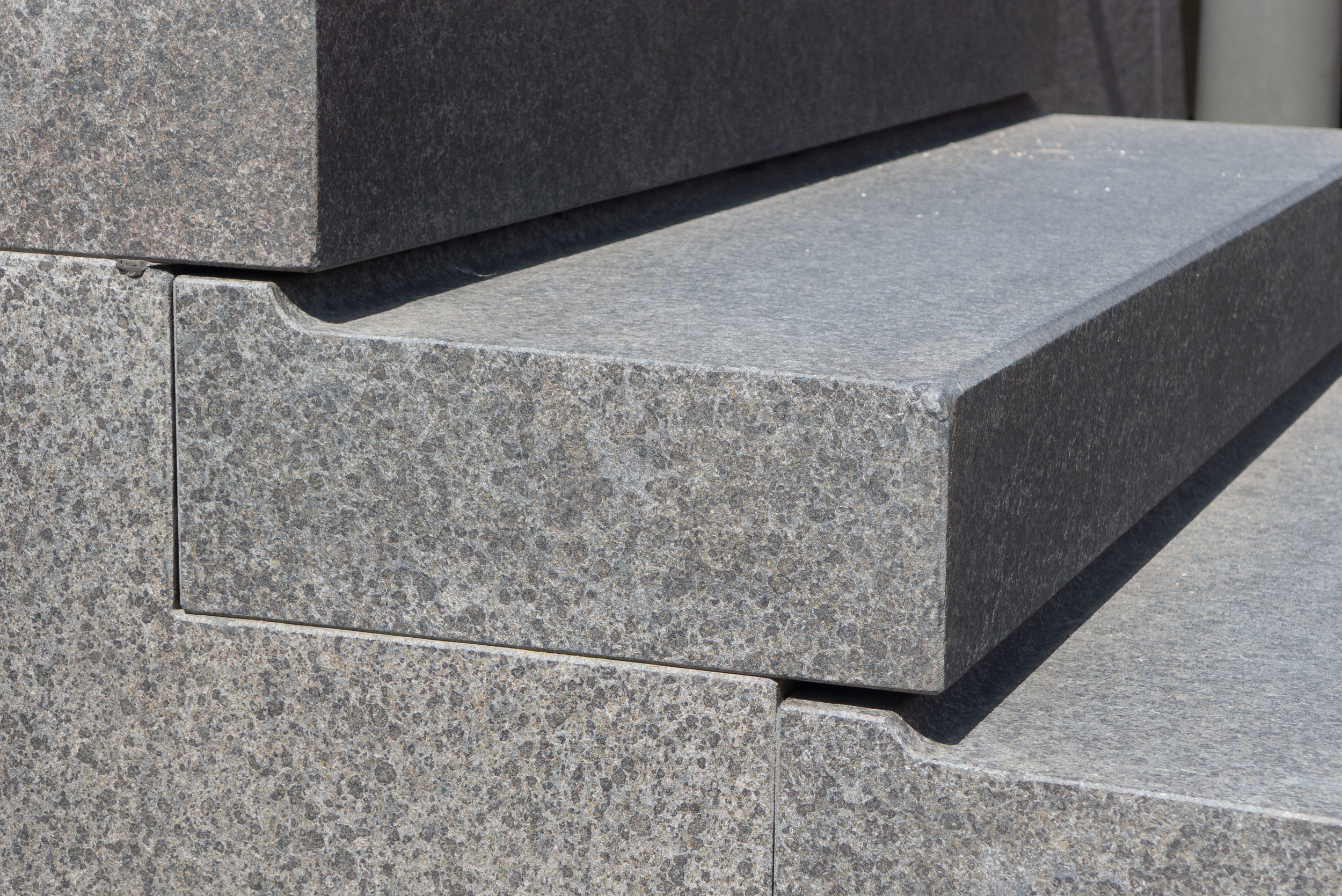
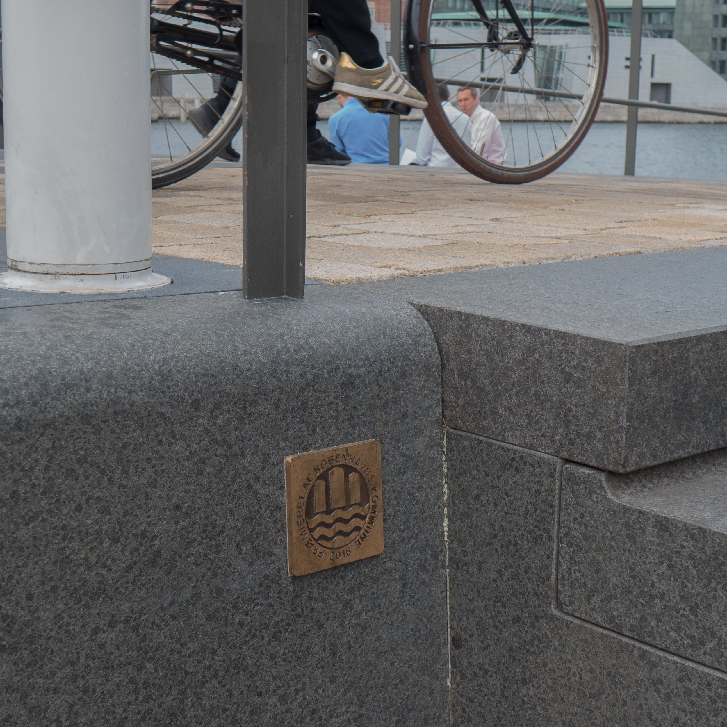
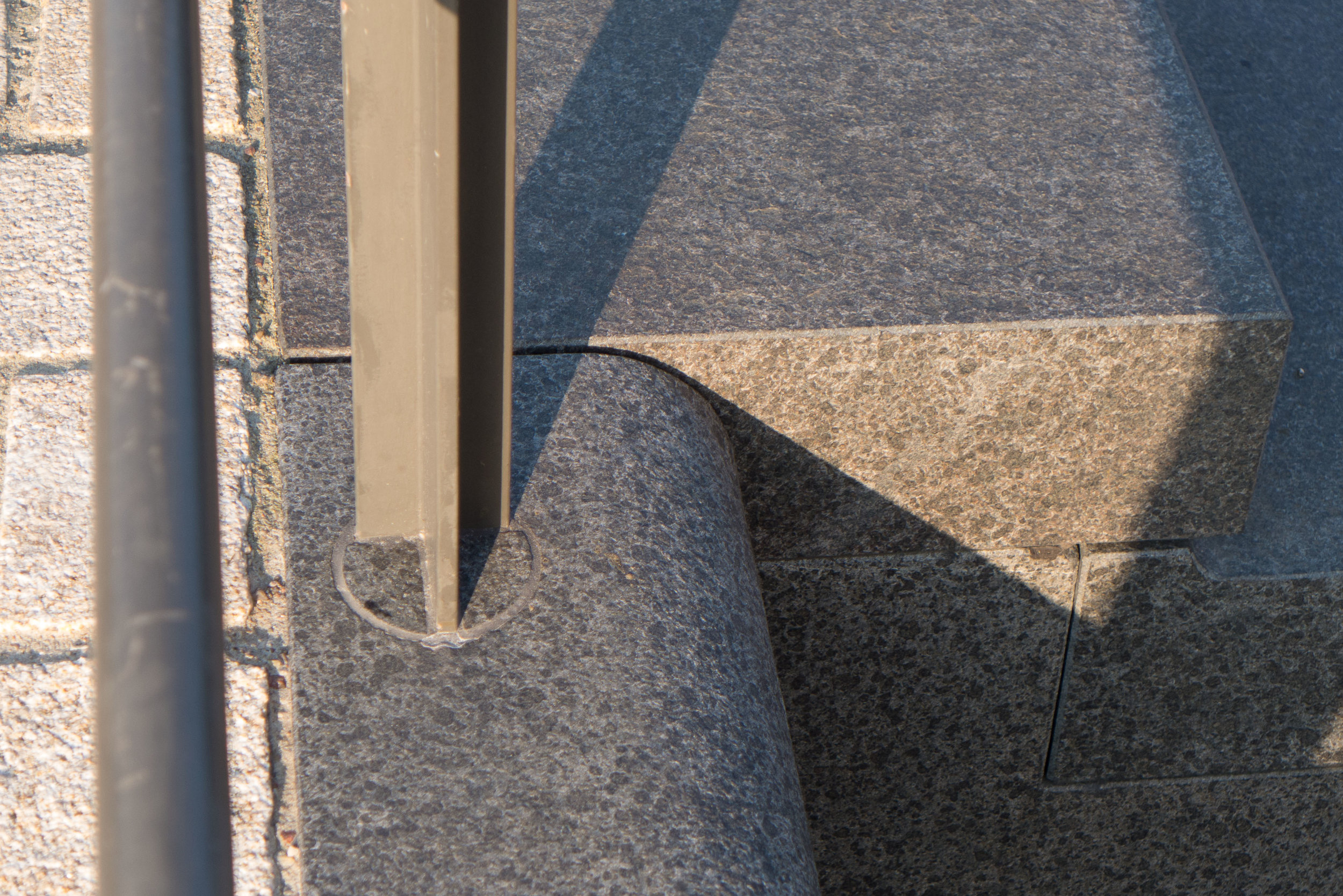
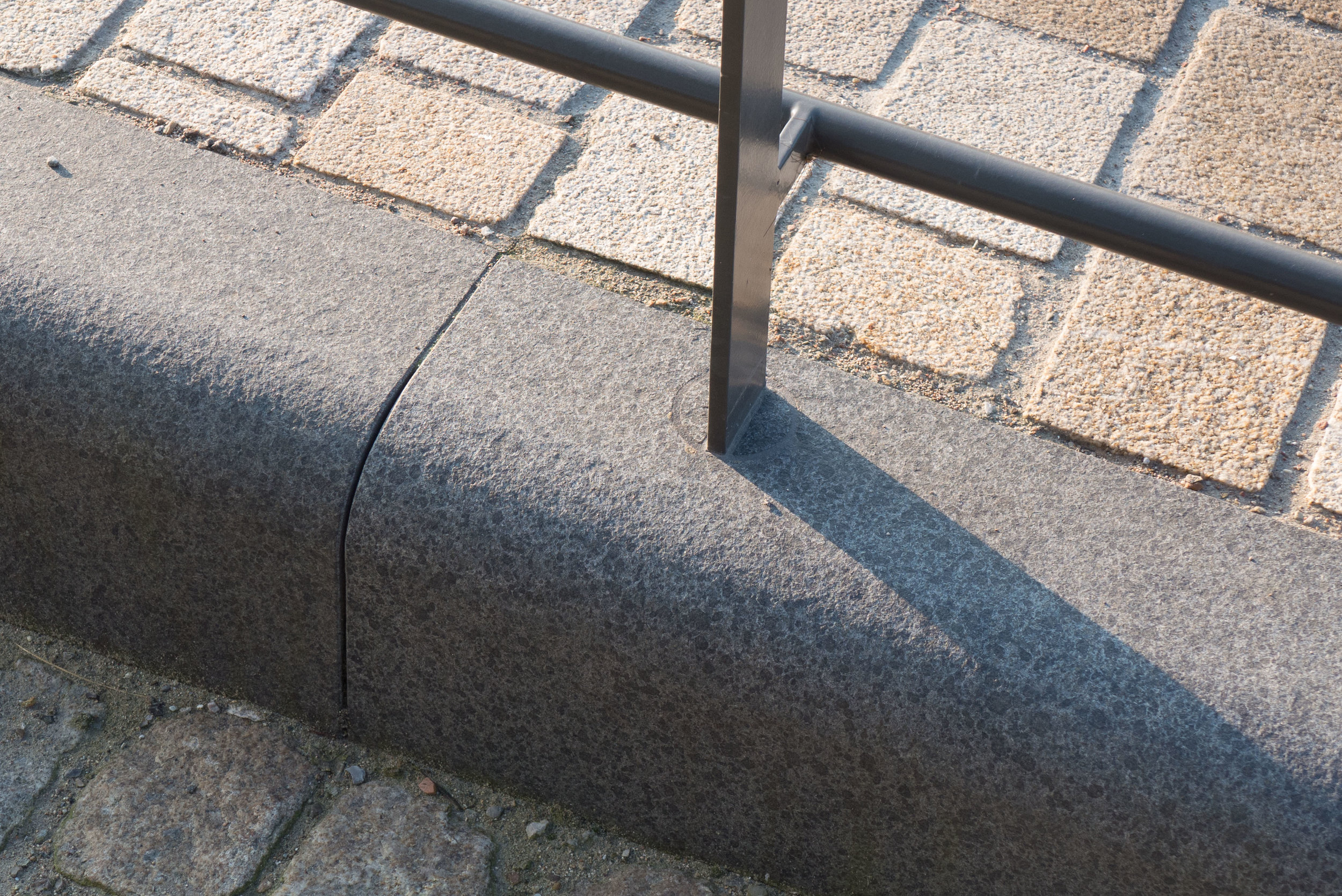
Elefanthuset / Elephant House
architects: LETH & GORI

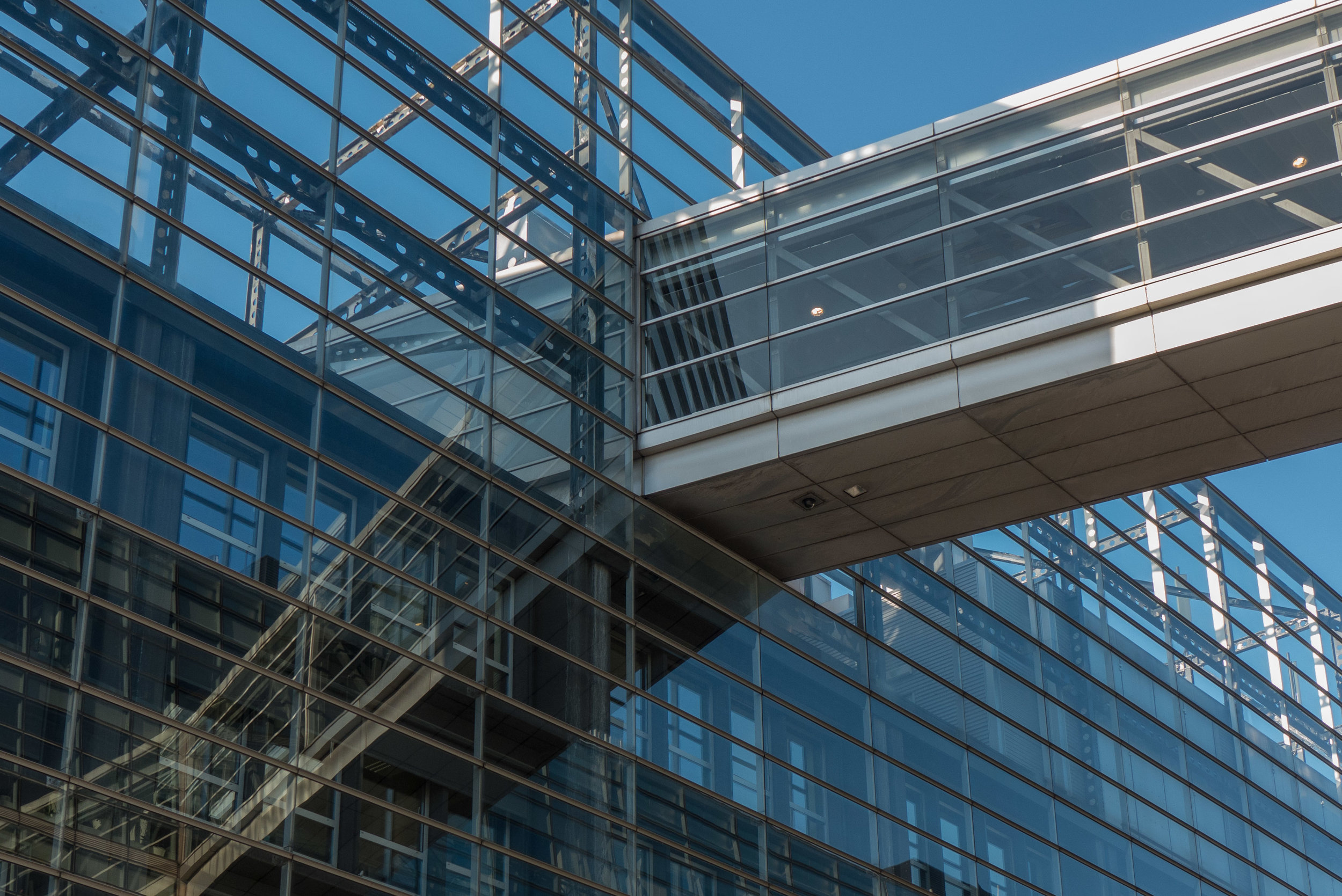
A brick chapel dating from the 1890s that has been restored and converted into an activity centre for patients with cancer. The building was part of the former hospital and old people's home of De Gamles By.

“The project shows an exemplary balance between humbleness and a personal and distinct architectural vision. Precise interventions all characterised by a refined materiality defines the project, that despite its small scale is able to bring new life to the building. By adding new functional layers the transformation opens up for a new era for the historic chapel building. The project is nominated for a vital transformation of a historic building that revitalises the house as an attentive and caring frame that embraces a vulnerable user group.”

Leth & Gori 

nominated for the award

Noma
architects: BIG + Studio David Thulstrup

Hotel Herman K
architects: Dansk Ejendoms Management A/S (inhouse)

Enfamiliehus på Kålagervej / Family house in Kålagervej
architects: Solveig Dara Draško Arkitektur

Tingbjerg Bibliotek og Kulturhus / Tingsbjerg Library and Culture Centre
architects: COBE


Lille Arne / Little Arne

winner:

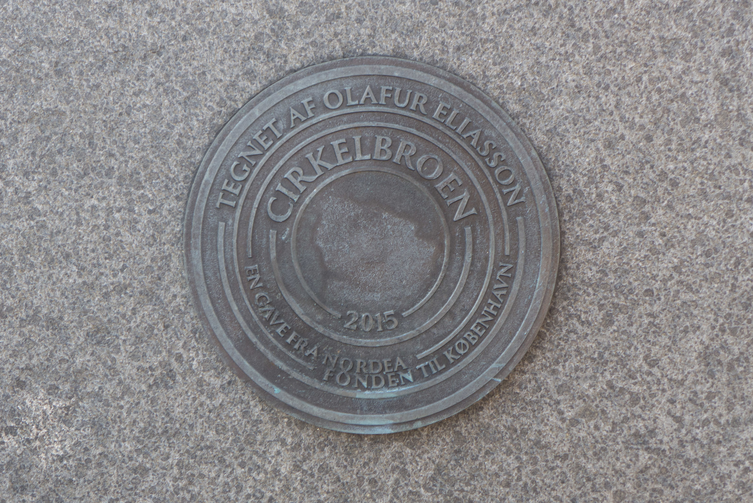
KADKs kritiske forskning om Københavns udvikling / KADK Critical research on the development of Copenhagen

Atlas of the Copenhagens and Boliger Bebyggelser By / Homes Ensembles City by Peder Dueland Mortensen

- Bolig og velfærd i København / Housing and welfare in Copenhagen

“We are incredibly proud that peers at their own prize, acknowledge research as a key contribution to the architectural profession. We work every day to create the world's best architectural education, and we do so on our unique three-legged knowledge base: the practice of the subject; artistic development and, not least research. Therefore, it really means a great deal to us that with this prize research is appreciated on an equal footing with the other architectural disciplines.”

Katrine Lotz - Head of the Department of Architecture, City and Landscape at KADK - the Royal Danish Academy of Fine Arts, Schools of Architecture, Design and Conservation.

KADK

nominated for the award:

Klimaflisen /Climate tiles
architects: Tredje Natur

Principper for cirkulært byggeri /Principles of circular construction
Fællestegnestuen GXN, Lendager and Vandkunsten

Resilient Aesthetics / Resilient Aesthetics
Forskningsindsats v. lektor Nicolai Bo Andersen, KADK


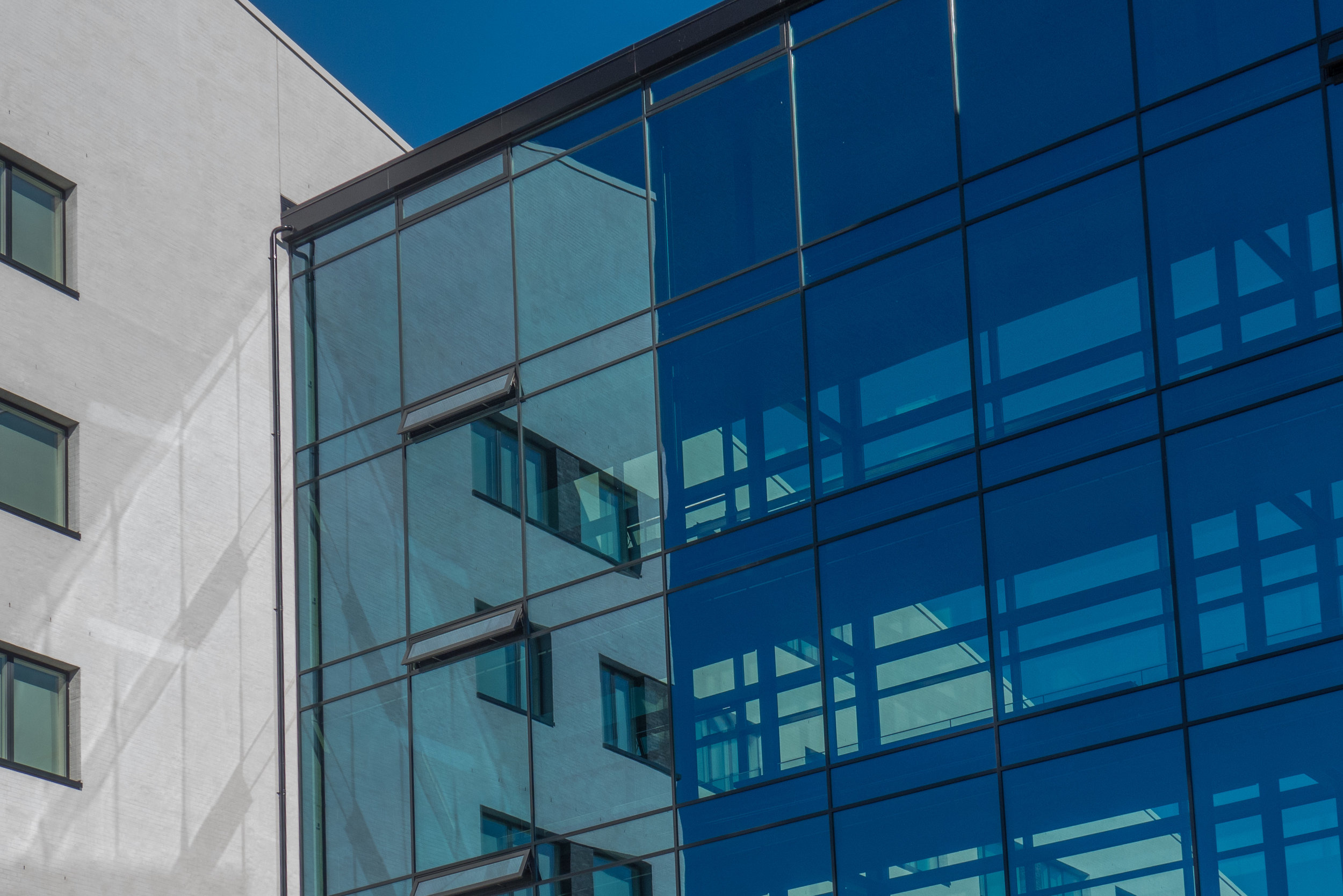
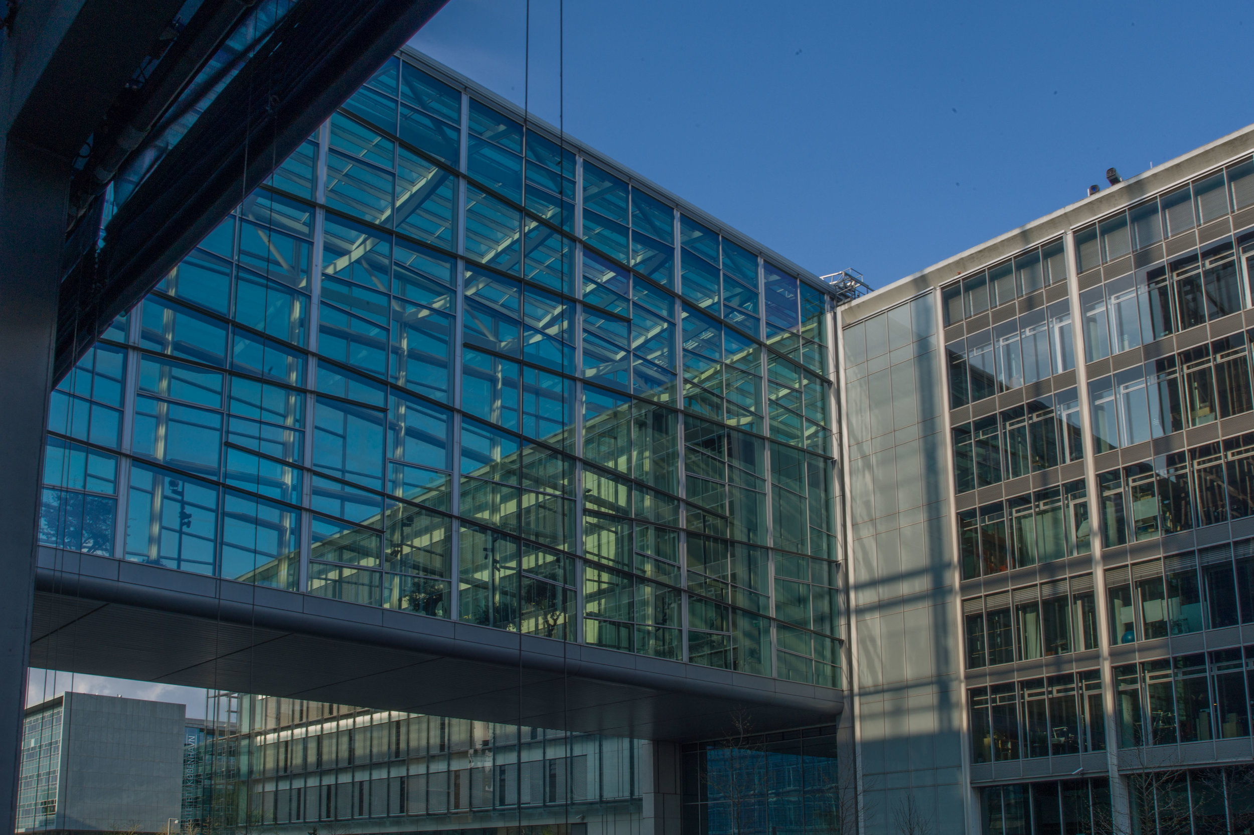
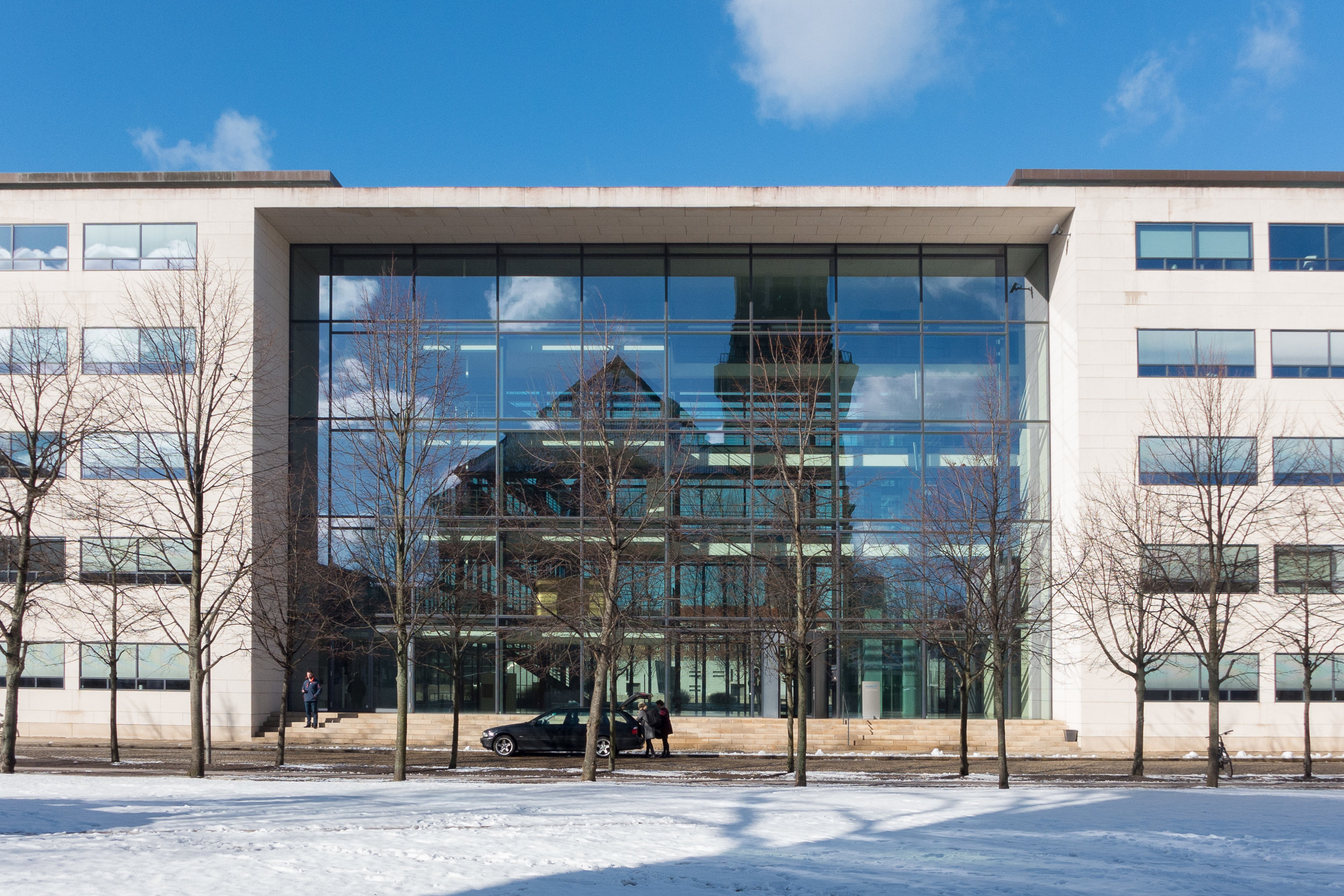
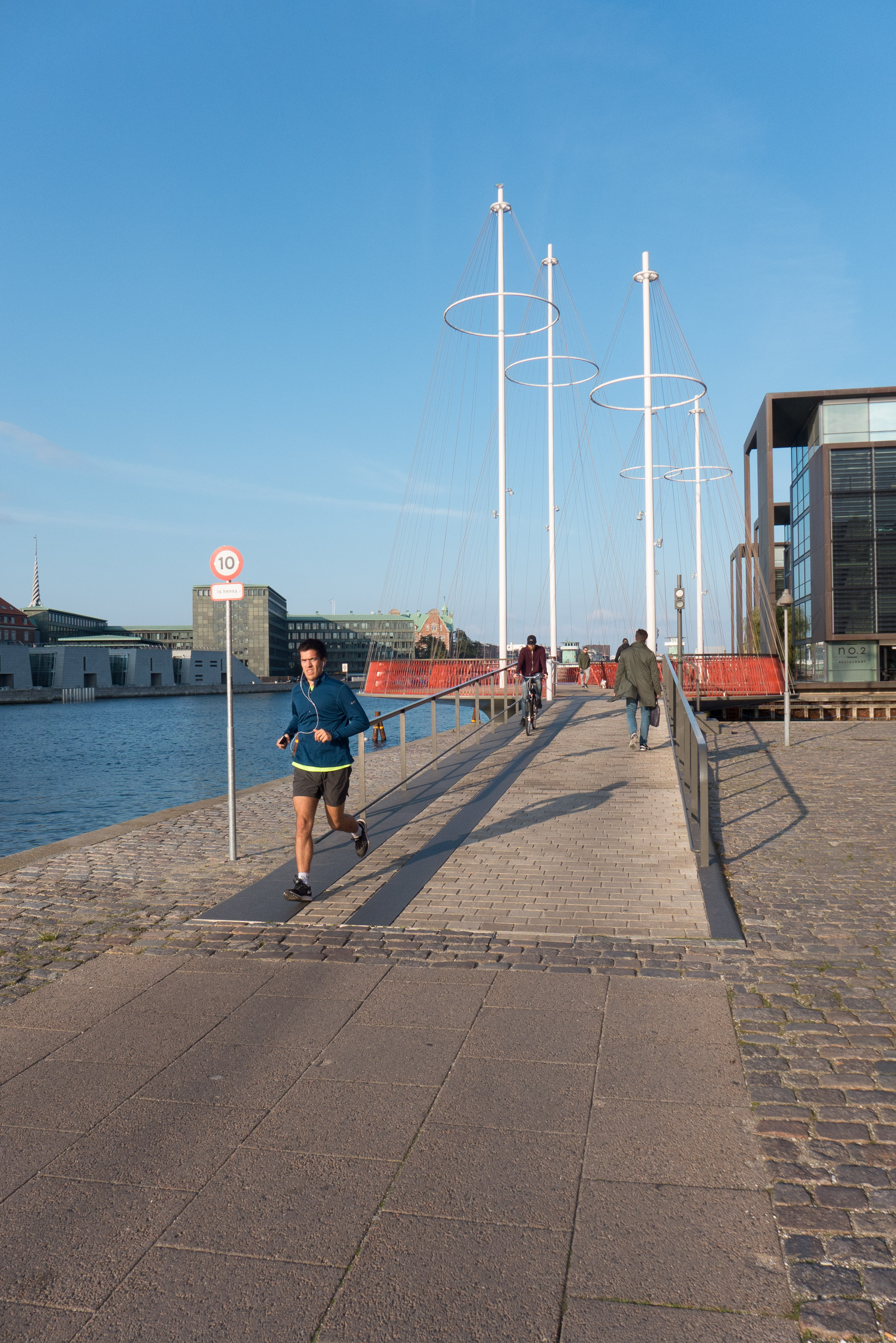
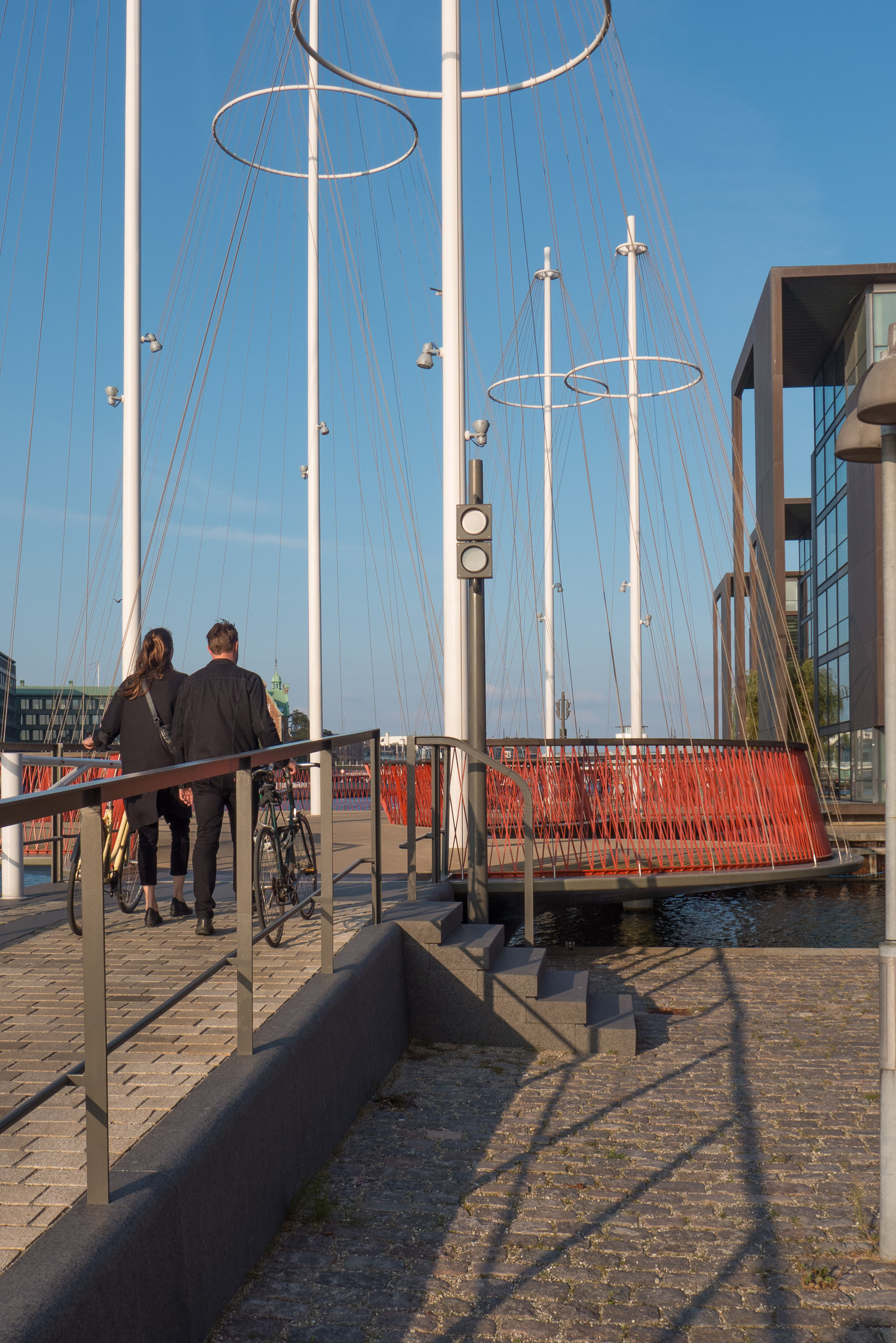
There are photographs and brief descriptions of the nominated buildings and work on the site of the Association of Architects.

Arkitektforeningen / the Danish Association of Architects


through a glass darkly


Over the last twenty or thirty years, much of the new architecture in the city has been designed with huge areas of glass across outside walls and this reflects back blue from the sky and the water but also, as you look through the building, you see colours or distorted colours of sky or water or an urban landscape beyond. 

The glass used varies in quality and does not reflect light in the same way from one building to another so some windows seem blank and flat, like holes in the façade, sucking in the light, while others are like tinted sun glasses, hiding everything inside but reflecting back everything outside. 

Some glass, particularly older and more irregular glass, can have really amazing qualities seeming, in comparison with modern plate glass, like comparing pewter and polished steel in metal … because the older glass has a warmth and softens and distorts images and reflections.

Certainly, the way the light is reflected by the glass means that the appearance of a building can change dramatically at different times of day, as the sun moves round, or can look very different if you approach from a different direction so you, rather then the sun, moves round.


Bien at Trianglen


This is one of the more extraordinary buildings in Copenhagen. 

It is at the east end of Trianglen in Østerbro, on the traffic island that was a tram car stop and it was a kiosk; a room for a traffic controller and public toilets and there were benches not only in the recessed spaces on the east and west sides but also around the outside where people could sit if they had to wait for trams at this busy interchange.

The architect was PV Jensen-Klint and it was commissioned in 1904 by the Østerbro Grundejerforening or Landowners Association to replace a wooden hut on the same site. A number of designs were presented before a final design was approved and the building was completed in 1907.

It has a sort of exuberance and delight in playing with variations of shape and form that is associated with Art Nouveau architecture but here the columns on each side with strong entasis - the bowing out in the middle - and the almost Baroque elements with curved shaped heads to windows and doors picked up in the line of glazing bars makes it more robust and strongly architectural than buildings you would find from the same period in Paris or Brussels.

The oval shape of the building and its copper roof meant that it was soon given the nickname of the Super Terrin or Terrinen - it looked like a large soup dish with a lid with the heraldic animals on the top like a knob or handle although they are actually flues for the stoves. The building is also known as Bien or The Bee from the name of the kiosk here at one stage.


brick cladding


Out near the beach on the east side of Amager there are large new apartment buildings that are going up and at an incredible speed because of the method of construction being used with large panels of preformed concrete lifted into place by huge cranes before then being fixed or linked together. 

Then, on the outer face, goes insulation and a veneer of brick in large sheets made in a factory …. and that is where I begin to have reservations.

There is nothing wrong with the building method - and the advantage is that very speed of building - but then my inner puritan kicks in. I notice the long straight joins between the panels and think that this really has little to do with real brickwork … basically because brickwork isn’t, curiously, just about bricks but also about the mortar and the courses and the patterns - created by how the bricks are laid - and how different colours of brick and how different colours of mortar effect the appearance.

Then there is the thing about honesty … that’s not honesty as in money and value but honesty in design so about using building materials in an appropriate way that reflects and uses the intrinsic qualities of those material. Here I can see that brick facing is used for these modern apartment buildings because people like it - it’s somehow more reassuring and warmer and more comforting than concrete or glass - and because it can be a good attractive colour and, at least, brick does provide an element of texture that can be missing from many cladding materials. 

Which is sort of part of the irony here … it is a factory made product - manufactured - but it appropriates the qualities of something made by hand. On Grundtvigs Kirke every brick was laid one at a time by hand … is that one of the reasons that makes it such an amazing building?

Obviously the apartment building is a very very different type of building so is that voice of my inner puritan wrong and misplaced? Is it perfectly OK to use current technology to achieve some of the benefits for none of the skill or effort?

But Copenhagen has a long and well-established tradition using brick in its buildings and it’s not simply a practical solution simply because these new apartments are very tall blocks so traditional brickwork would not be appropriate …. just look at the huge power stations in the city from the 1930s or some of the very large brick apartment buildings from the 1920s and 30s and you can see good traditional brickwork on very large buildings.

I guess in the end it comes down to thinking that the finished buildings look a bit mechanical because it’s all rather too flat and rather too regular. Presumably the developer would argue that the cost benefits outweigh any quibbles about trying to keep alive traditional building methods and they would probably tell you about 19th-century apartment buildings with thin walls a single brick thick where cold and condensation and noise were and are a serious problem. 

So do cost and comfort always trump aesthetics and rapidly-disappearing craft skills? 

select any image to open the photographs in a slide-show gallery ….

it really is interesting to look at how the concrete and insulation and brick panels are sandwiched together


is design all in the concept ....


For any design - a design for a building, a chair or a teapot - the starting point has to be the idea, the concept. It is that first attempt to imagine the what and then think about the how. 

If you are cynical or pedantic or just being realistic - in this tough world - you could argue that a commercial design actually starts with the commission and the contract but for me what is fascinating about looking at a great design is to try and understand that initial concept and to see how it was realised.

My apartment is about 200 metres from Cirkelbroen - The Circle Bridge - that was designed by Olafur Eliasson and completed in 2015. So whenever I walk into the city I either see the bridge at the end of the canal or I actually cross over the bridge to get to Islands Brygge or get to the west part of the city centre. 

When it first opened I thought it was stunning … and to be honest also rather useful as it made it possible for the first time to walk from Christianshavn on south along the harbour … but mainly I thought that it was stunning.  

Unique as well. Elegant and curiously delicate, almost ephemeral, when seen in sunlight but particularly if it is misty or the light is failing at the end of the day - but at night somehow stronger and much more dramatic. 


Sometimes a clever idea for a design looks exciting the first time you see it and then you begin to think well so what and then it becomes just part of your streetscape, maybe even a bit mundane or worse, because when the novelty wears off, you stop even seeing it. 

That is certainly not the case with the bridge and, living so close, I have the opportunity and sometimes find time to watch and see how people react to the design … so, for a start, it is obvious when people are seeing the bridge for the first time.

It is fascinating but not surprising that the city - because of the prominent location - wanted and commissioned something much more than a basic bridge that could be raised or swung open to let boats sail out from the canal into the harbour. 

And I guess it’s not that surprising that Nordea-fonden were sufficiently taken with the design to finance the work as a gift to the city but, at some point, someone, some how thought about commissioning Olafur Eliasson - the Danish Icelandic artist - to come up with the concept for the form and design the bridge. That is interesting.

His studio is in Berlin and his work challenges you but in a way that is subtle rather than hectoring or shocking. You seem to get drawn in and it is at that point, once you are involved, that you start to question your assumptions or question what everyone, including you, just accept without thinking.

For The River Runs Through It at Louisiana in 2015 the galleries were filled with rocks and gravel - scree from Iceland - with a stream running down the centre through the rooms. In the first space the rocks simply covered the floor but as people walked further in most seemed to slow down, look carefully at different rocks, touch the water, and slowly you could see people realising that in climbing up slowly through the series of galleries, they had just ducked to get under a doorway that they knew to be 4 metres or more high and then you began to see just how monumental the installation was and how radical and how it challenged your perception of what an art gallery could or should be and then question what we take for granted as being inside and what should or should not be outside.

Cirkelbroen if you let it slow you down on your walk - or on your bike - it makes you look in a different way at the harbour and it really doesn’t work like you expect a bridge to work.

The basic concept is that rather than a single arch over the canal, there are a series of five interlinked but offset circles set horizontally to form the deck. This is, in part, the way people are slowed down … so for cyclists it should be more than racing up the ramp, sprinting across the top and racing down the other side … although some do that … and in part it is so that people walking can stand to one side, on one of the great outward-curving bows, to look at the harbour or to look along the canal and watch the boat traffic there. 

Each of the circles has a tall mast at its centre and there are wires down from the top of the masts to the deck, held taut, like standing rigging on a sailing ship so, as you approach along the quay, you have the impression or perhaps, - even less tangible - an echo or a sort of ghost of the large masted boats and sailing barges that in the past docked along the harbour as they unloaded and loaded. Large sailing ships still come into the harbour so you can sometimes see what the harbour must have looked like when this really was a working commercial port. But because the masts on the bridge are off set then this never becomes a pastiche … never an attempt to look like a boat docked here … simply an evocative impression. 

The railings of the bridge are inside the wires and are set to slope inwards to respect the angle of the rigging so again, with the timber hand rail, there is an echo of the railings of a ship but, because of that angle inwards, more dramatic.

And when the bridge opens there really is a sort of magic. Bridges should clink and clunk and chains should pull. Most bridges that open do that. Cirkelbroen glides and, because of the circles and the masts, it seems to pivot and spin. That’s the brilliant part of the concept.

.... or all in the engineering ....

the bridge open for a boat to move out from the canal and into the harbour beyond


To be mundane, I suppose Cirkelbroen is simply a bridge over a canal, where there had been no bridge before, but it means that, for the first time, people on bicycles or walking can get along the waterfront of the harbour between Knippelsbro - the historic bridge at the centre of the harbour that links the historic centre and Christianshavn - and Langebro - the main traffic bridge between the city centre and Amager. All that was needed was a simple steel bridge that could either be raised or swung open to let boats from the canal sail out into the harbour.

Of course the bridge designed by Olafur Elliasson is so much more than it … but even so …  in the end … it all has to work and it has to be robust and it has to be relatively quick to move and and easy to operate. So that it is the engineering part of the design that allowed the concept to be realised.

Rambøll - the engineering company - were responsible for the construction of the bridge, and there are a number of interviews on line and a video on YouTube that shows the parts of the bridge deck arriving by barge and being lifted into place by a giant crane on another barge. There you can not only get a real sense of the size and weight of the parts but also get some sense, as it is lowered in to place, how it works. 

the bridge closing and, on the right, almost closed as cyclists wait to cross


You can see that although the bridge appears to pivot around the largest mast at the centre of the bridge, when it is opened, there is, in fact, a substantial substructure below the water that swings back and that carries the outer two circles at the Knippelsbro end of the deck in and away to create an opening for taller boats to pass.

The quay here is just 1.6 metres or so above the water and although a bridge deck at the level of the quay would have been simpler, and less intrusive visually, it would have given no head room for vessels to pass under the bridge without it being raised or swung open. By taking the deck up - just 1.1 metres above the quay - most tour boats and smaller pleasure boats and canoes can pass under the bridge with the deck in place. 

But the consequence is that there have to be long ramps up to the deck and because the ramps extend well beyond the quays on either side of the canal then there are also steps up onto the deck from the quay of the canal.

The length and the gradient of the ramp has to be a compromise: short but steep and the ramps would have been difficult for cyclists - particularly if they are riding family bikes, the famous Christiania bike, which can be heavily loaded or they are riding bikes with fixed gears - but too shallow a slope would make the ramp too long. In fact, the ramps seem just slightly too short and steep because cyclists seem to be pushing hard to get the top but then on reaching the deck it is not easy and certainly not an intuitive change to quickly reduce the effort on the pedals so bikes tend to come across the bridge just slightly too fast and, curiously, the curves on the route across either mean people cut the corners slightly - making their route less predictable for other users - or some faster cyclists even do that thing of leaning into the curves as they snake across and actually gain momentum … or at least appear to.

The other problem, of course, is that with tourists they are distracted - looking at the bridge or absorbed by watching what is happening on the harbour or they are looking at the back of a camera or holding up a phone for a selfie rather than watching out for the bikes coming through - so it is also a good place to pick up a smattering of Danish and foreign swear words. 

That’s not to suggest that the concept or the final design is wrong … just that, with any concept, the most difficult part is anticipating how human beings will behave.

Ramboll


.... or all in the detail?

L1051837.jpg
 

So at the start there is an idea - a brilliant concept - and then the engineering is the how that makes it all work. But I’m fascinated to find out who frets about the small stuff and when. Are the details of the design really just a part of the design process or part of the execution so the responsibility of the people who manufacture or construct or build the design? 

Arne Jacobsen had a reputation for designing every detail and he seems to have kept tight control of a small drawing office so presumably everything, even for a large project, went across his desk but at the other extreme there are architects and designers who present their ‘brilliant’ idea with a flourish, and while others worry about how or if it can be realised, they are off and away on the next exciting idea. Presumably, most major projects have to sit somewhere between those two extremes. And, of course, the details and the quality of the parts always depend on the size of the budget.

And the truth is that in the end, when it’s all finished, all that beautifully executed and expensive detail can be overlooked by people distracted by the excitement of experiencing that dramatic concept. 

The details are not quite the boring bit but more the ignored or under appreciated part of designing and making or constructing something because when you see people looking at Cirkelbroen not one is looking down at the surface they are walking on or looking at the amazing quality of the stonework of the ramps or looking at how the handrail and railings are made or how the curved and angled sections of the railings are spaced so that they slide apart as the bridge opens. Does anyone wonder who designed the beautiful stonework of the steps? One or two twang the wires but that seems to be the extent of their curiosity.

I’d like to see the drawings for this project … the concept drawings to see just how many ideas were discarded and how many stages it took to hone down the idea. And see how many engineering drawings were needed to make sure the bridge would actually open and shut and work and then see how many drawings there were to work through those details of how the precisely-rounded stone blocks for the edge of the ramp would be cut and spaced or the uprights of the railings would be set into the ramp or into the deck of the bridge? And that’s not even beginning to consider the design for lighting the bridge at night and all those diagrams for electric wiring and drawings for the planners and drawings for the press to ensure the public were on side.

Not to wonder about all those things is like being swept away by the power of a complicated piece of music but never once wondering how the composer could possibly have imagined the sound of all those instruments together in that way in their head let alone to be curious about who wrote out all those scores for each instrument in the orchestra.

For a great design you really can’t separate out the concept, the engineering, or the manufacturing methods, that are the how and the details of the what. The simple answer is that for a good or a great design you need an idea followed with the hard work going through the details and the design drawings that ensure it will work and the skills, when making or building or constructing, and materials that are appropriate and of a quality to do justice to the concept. Easy to say. Not easy to do.

So what I am saying, I suppose, is that a great design should be seen not only as a brilliant concept but also as the sum of its parts.


all in the detail


There have been several posts on this site about the stone cobbles or setts used for roads and pavements in the city. This is obviously far from being a cheap option but it is hard wearing and it is practical … unless you are wearing stiletto heels or you are trying to control a suitcase on wheels … and almost impossible if you are doing both. 

The first photograph is of the old meat market just to the west of the central station. There are no longer carts with metal hoops on their wheels clattering and bumping over these lanes and they no longer get covered with blood and gore - or at least not often - but the cobbles form a fantastic foil for the buildings.

Cobbles in the city range in colour through greys and dull purples and form an appropriate base for the buildings and create a texture that concrete paving or tarmac really cannot match.

The cobbles are laid with blocks of stone and together they form pathways that are used to direct the walker and cobbles can also be used on more prominent features to form embankments or gullies for drainage - as in front of the warehouses on Holmen. Cobbles are laid with considerable skill - part of the cost - for changes of level or to direct away water as in the example shown here which is at Højbro - the bridge over the canal from Christiansborg - where the curve of stone steps and the slope of the cobbles are necessary where the levels change dropping down from the bridge and round to the lower level of the quay at Ved Stranden.

At the top, two photographs show the corner of a street in Christianshavn … not an old surface - because until the 1990s this was the site of industrial buildings of a large engineering works - but cobbles have been used to respect the importance of this historic quarter of the city.

A trench was dug across part of the road fairly recently but with the cobbles back there is now no trace of the work so not just stylish but also practical … as long as you don’t insist on wearing those stiletto heels.


concrete and steel in the 1930s

L1180329.jpg

The Deutscher Werkbund - the German Association of Craftsmen - held an exhibition in Stuttgart in 1927 that included houses and apartment buildings - the Weissenhof Estate - designed by German architects but also by architects from Belgium, France and the Netherlands. New construction techniques for domestic buildings were shown … here an open steel frame infilled with concrete blocks for an apartment building designed by Mies van der Rohe


Arne Jacobsen at the SAS building during construction with Copenhagen City Hall in the background

Until the 20th century, the main materials for building construction in Europe were natural … so stone as a strong but usually expensive walling; timber for wall framing, roofs and architectural fittings including windows and doors. Natural materials were not of course always used in their found state but were modified or transformed by builders so sand for glass; plaster for covering internal and external surfaces; clay fired for bricks and roof tiles and, of course, lime for mortar and for cement. Perhaps the biggest change to the structural form and then, as a direct consequence, to the appearance of buildings in modern Denmark came with the more and more frequent use of concrete and steel … not just for industrial buildings but for housing and apartment buildings and for new large building types and particularly where high or wide and open enclosed spaces were wanted that were unencumbered by walls or internal supports.

The use of concrete and steel are now so common for building that we rarely stop to consider that both can be used in many different ways. Someone might say “… oh it’s a glass and steel block …” but that’s about as useful in helping to conjure up an impression or mental image of a building as saying that a meal was meat.

In the 1920s and 1930s steel was not always used for a complete frame of a building but could be used as simply a reinforcement for lintels and supports for wide openings but with traditional building materials for the wall itself and similarly concrete could be used for piers and frames to support large open floor spaces or it could be used poured into shuttering for panels for walls that could support considerable weight or concrete could be used cast in moulds for building blocks, used with mortar like stone or brick, or used for ornate features that could be reproduced easily and much more cheaply than when previously such features of a building were carved in stone. Above all, in terms of how the appearance of everyday buildings changed, reinforced concrete can be used with minimal support or can be cantilevered out from the facade for thin canopies or for balconies.

Arne Jacobsen’s own house in Ordrup should be seen as an important building at a pivotal stage in house design. Completed in 1929 it appears to be a modern and ground-breaking house with plain smooth white walls in the International Style that was then becoming fashionable but in fact, at that point, Copenhagen regulations did not allow concrete to be used in house building so the walls are actually built in brick and were then rendered and even the apartments at Bellavista completed in 1934 - perhaps the most iconic representation of the modern style of the 1930s in Denmark - are again brick rendered with plaster. 

Jacobsen did use concrete in the Mattsson riding building just north of the apartments - also completed in 1934 - to roof over a wide high space and concrete became more and more important in his work in housing but more frequently for the industrial and commercial buildings he designed.

There is an amazing photograph taken of Jacobsen with others at an upper floor of the SAS Hotel in Copenhagen looking out over the city before the tower was clad in glass. The impression of the building now, for most people, is of a light and thinly elegant block but the outside cladding and the internal fittings cover the underlying structure and this photograph and photographs of the tower under construction show clearly a massive and robust concrete structure. 

With potential problems with transport and access to the site, the concrete parts were not formed in a factory and brought to the city centre - a later and the more usual method - but the floors and cross walls were cast on site.

One obvious benefit from this substantial sub structure and the substantial internal supports is that there are no corners to the building … or rather the corners are formed by the windows and panels of the adjoining fronts being abutted to form a thin and almost invisible corner.


​when we get to the future


In 1927, the architects Arne Jacobsen and Flemming Lassen - exact contemporaries and old school friends - won a competition to design a House of the Future which two years later was constructed for the Housing and Building Exhibition at the Forum in Copenhagen. 

The exhibition hall itself was then a new building that had been completed in 1926 with the design by the architect Oscar Gundlach-Pedersen. He was sixteen or seventeen years older than Jacobsen and Lassen but, although he had trained at the time when national romantic architecture was fashionable and his first works were in that general style, he was interested in new materials and new building techniques and as early as 1922 published an article where he talked about buildings that use these new materials “that are not encumbered with tradition.”

Radiohuset - immediately opposite the Forum - is another key building of the period. Designed by Vilhelm Lauritzen, it was the radio studios of Danish Radio but there was also also a large concert hall. It is now the Royal Danish Music Conservatory. Building work there did not begin until 1936 and it was not finished until 1942.  

Lauritzen was eight years younger than Gundlach-Pedersen so eight years older than Jacobsen and Lassen. He had graduated in 1921 and in the following year started his own office. Of the four architects, he was the only one to visit Stuttgart in 1927 to see an important exhibition there of modern houses - the Weissenhoff Exhibition - that was organised through the Deutsche Werkbund but coordinated by the architect Mies van der Rohe with buildings from seventeen architects. Most were from Berlin, with two buildings designed by Walter Gropius, but there were also houses by Le Corbusier, Pierre Jeanneret and Josef Frank. This major exhibition really marked the crucial point of change for modern European architecture when the terms Futurism and Functionalism were broadly adopted for houses that were designed for what was seen as a very different society and a very different style of living. 

Many of the buildings had metal-framed windows in long horizontal strips, balconies with metal hand rails, simple plastered external walls - usually white but some painted in strong colour - and there were flat roofs used in housing rather than for industrial buildings. These were all features that were to be adopted by Danish architects through the 1930s and 1940s … in fact, all features that are accepted as normal in designs for housing today.

In 1929 Jacobsen was in his late 20s, having recently completed his studies at the Royal Danish Academy of Fine Arts and recently married. Both he and Lassen, as ambitious young architects, had a pretty clear and a confident idea of what should be possible in their work in the future and it is generally accepted that the House of the Future, one of the first buildings by what was to be called the Functionalist School of architects. was the building that launched Jacobsen’s career. 

The plan of the house was a ring of rooms around a central living room that were set out to take advantage of natural light as the sun moved round. There was a flat roof to the house where the owner could land in his helicopter and a garage for a car that appears in the drawings to be a swish sports car with a drop top. At the bottom of the building, that was set by the water, was a boat house for a stylish if not very streamlined speed boat. 

The vision of a bright future for all or just wishful thinking for the few? 

The garage door opened automatically as the car approached; there was a mat at the entrance where suction removed dirt from the visitor’s shoes; windows dropped down with the turn of a handle, like the windows in contemporary cars; there were built-in typewriters; a pneumatic mail system and curiously the kitchen was relatively simple as it was assumed that meals would arrive ready-prepared from a central kitchen.

Within ten years, most of Europe was caught up in a war that put the future on hold. Some of the houses at the Stuttgart site, unlike The House of the Future, designed and built to be permanent, were damaged or lost and in 1943 the Forum itself was destroyed by the Danish Resistance as an act of defiance against the German occupation and it was not rebuilt until 1947. By then the future was over or at least the Functionalist Movement in Architecture had moved on but these architects had left an important group of building around the city - including town halls, office buildings, department stores and large blocks of social housing and apartments that had been built through the 1930s and those buildings set the standard and established the style and used new building techniques that we would now accept as truly modern.


Hal C Arsenaløen - Christianshavn sports hall


from Værftbroen - looking along the canal towards the sports hall

On the opposite bank of the canal to Kids' City in Copenhagen - the school designed by COBE - is a local sports hall called Hal C that was designed by the architects Christensen & Co and completed 2013.

There is a large sports hall open to the roof at the east end that is lit by large tall windows on both sides - to the canal and towards the playing field to the north - arranged in pairs. All these opening have large plain shutters that open outwards and these and the deep red timber cladding are inspired by the 18th-century mast sheds nearby.

The west end of the sports hall is on two floors with an entrance lobby at the corner, glazed on two sides, and offices and changing rooms on the ground floor and a small hall or meeting room on the first floor.

In keeping with the beautifully simple exterior the interior has large area of plain panels much pierced and a very simple straight staircase with a plain solid side panel but the railings of the landings are rather more complicated open grill.

The building makes really good use of natural lighting inside. The sports hall has areas of top lighting. On both sides of the sports hall are wide wood step where spectators can sit and on the canal side there are steps along the length of the building where people sit and a series of landings down to the canal.


Christensen & Co

a new bridge across the canal from Kids' City

the windows and shutters of the main sports hall from the other side of the canal

entrance at the south-west corner

large windows to the sports hall on the side towards the canal with pairs of shutters

windows and shutters of the main sports hall from the playing field to the east

testing alternatives

At an early stage in a building project, a trial section of wall can be constructed on the site to get a clear sense of the colour of the main material in the actual location and it is also a chance to judge the effect of different colours or different textures of mortar which can have much more of an impact than many people would expect … dark mortar tends to act rather like the black leading in a stained glass window by making the colours of the main material, stone or brick, darker and will certainly emphasise any pattern in the bonding.

The appearance and the character of a facade will be modified by the light as it changes through the day and materials will certainly look very different from their appearance in the studio or even as seen on an another building. And colours and textures look different if they are in shadow, on a side away from the sun, or face towards the sun and are brightly lit and architectural details can look very different in bright light reflected up off water… bright light can make even strongly-projecting features look thin or flat or bleached out.

ATP Pakhus by Lundgaard and Tranberg on the Langelinie Quay in Copenhagen has just been completed but trial sections of wall were built at the construction site on the quay. Clearly two very different colours of brick were considered. Perhaps the deep orange brick was chosen rather than the very dark brown because a heavier tone, for such a large building, could have looked oppressive. It is interesting to compare the brickwork on the finished building with the appearance of the historic brick warehouses along the inner harbour and in Christianshavn.

ATP Pakhus, Langaliniekaj (2016)

Nordatlantens Brygge, Strandgade (1767)

texture and tone and growing old gracefully


warehouses in Christianshavn in Copenhagen - there is a mixture of materials and colours in the building materials but a uniform colour of paint for woodwork helps link the buildings together and the use of stone paving and simple areas of gravel provide a neutral landscape

Generally, until the 19th century, the visual character of towns and cities was determined by the use of relatively local materials unless a building was particularly important and then the cost of importing materials over some distance might be justified.

But today materials can be transported easily and relatively cheaply so one obvious problem now is that new buildings in many cities have lost any specific sense of place.

When choosing materials, rather than understanding the local topography and specific geology, the architect has to consider cost and factors like the sustainability of materials or their insulation properties so, with many new buildings - particularly commercial buildings - there is a feeling that economics or engineering have determined what the building looks like as much as specific aesthetic considerations.

And with some buildings, the design appears to be more influenced by ego … either that of the architect or the client … or at least there appears to be a clear determination to be different or novel rather than having any strong empathy for the location and for neighbouring buildings.

And often there appears to be little consideration for the texture and the tone of materials or for how materials will wear and weather over time.

on the main warehouse the bricks, the stone used for the plinth and the setts used for the road surface all have a mauve or purple/grey tone. The black and white photograph shows that the darkest tones are actually the doors which helps suggest depth to the arcade and, rather surprising, the trees and the water of the harbour basin. Although the clay tiles of the left-hand warehouse looks very different in colour the black and white photograph suggests that actually the depth of colour of the roof is appropriate for the wall of the building below.

copper and Copenhagen buildings


Copper and the copper alloys of bronze and brass are amazing metals with a long history of use in Denmark for a wide range of uses including making domestic vessels; for coins; for making weapons, particularly ornate weapons for ceremonial use or to display status, and copper and bronze, because they are relatively easy to work, have been used in jewellery and in the decorative arts, particularly for cast sculpture. From the late medieval period onwards copper and bronze have also been used on a much larger scale in architecture, for covering and protecting the roofs of important buildings and, again, because the metals are durable but relatively easy to work and because they can be used as thin sheets that can be shaped and joined together, copper is particularly good for covering domes and spires where the metal layer can be supported by a strong formwork or framework.

read more

early modern ... Vesterport, Vesterbrogade, Copenhagen

Vesterport - a large copper-clad office building on Vesterbrogade and close to the central railway station in Copenhagen - was designed by Ole Falkentorp and Povl Baumann and was completed in 1931.

It fills a complete city block with the building running back from Vesterbrogade to Gammel Kongevej with a side elevation towards Meldahlsgade that is over 110 metres (365 ft) - and there are three service courtyards.

This was the first steel-framed building in Copenhagen with reinforced concrete floors and is the first truly modern building in the city but if anyone notices it today then it is probably for the striking colour of the cladding which, with patina, has turned a sharp but pale acid tone of green. When new, before the copper changed colour, the building was known as the penny.

At street level there were shops so, again in a modern way, this was very much a commercial building and it was in what was then an important commercial area of the city.

The principle tenant was an English insurance company but the open-floor construction meant that it could be subdivided with non-structural partition walls depending on the requirements of any tenants.

But it is not just the method of construction but it is the scale of the block with its flat roof line and the grid-like division of the facades with continuous lines of windows above panels of cladding that is distinctly modern.


Signs for the road names as part of the canopy survive as an example of good typography from the period and brass doors at the entrances with heavy brass handles have been retained.

The building has a significant place in design history for another reason because Den Permanente, an influential design gallery and furniture shop, opened here in 1931 with display space over two floors. It was at the south-west corner of the building with large windows to Vesterbrogade and to Trommeshalen but closed in the 1980s.

note:

The photograph of the ironwork of the building at an early stage of the construction is from the city archive - Historie & Kunst, Københavns Kommune, Stormgade 20


copper after Vesterport

government buildings between Christiansborg and the harbour in Copenhagen by Thomas Havning 1962-1967


In terms of style, Vesterport can hardly be said to have set a fashion as few buildings copied the use of copper cladding although through the 1930s and well into the 1950s many did have brass window and door frames and brass architectural fittings including handrails for staircases.

Superficially the government buildings in Copenhagen at Slotholmgade and Christians Brygge designed by Sven Eske Kristensen and Thomas Havning and built in the 1960s are reminiscent of Veserport. The blocks have the strong colour tone dominated by green and of course with the continuous lines of windows and very regular lines of panels divided by ribs forming a regular grid but only the roofs and certain fittings are copper or brass … the panels below the windows and vertical divisions between the panels are in a dark green polished stone or slate.

However, more recently, the offices and tower at Pakhusvej near Amerika Plads by Arkitema has facades in copper. It was completed in 2004 and although now darkening in colour there is no sign yet of a surface patina of verdigris which shows how slow the transition can be even though this building, opposite the terminal for ferries from Oslo, is subject to winds off the sea.


the main tower and a detail of the copper cladding at Amerika Plads by Arkitema 2004


Most recently the Axel Towers in the centre of Copenhagen, close to Tivoli, by Lundgaard and Tranberg and nearing completion have been faced in tombac- a copper zinc alloy -and again it will be interesting to watch as this prominent, building - close to the City Hall and very close to the SAS Hotel by Jacobsen and two blocks from Vesterport, changes the visual dynamics of the area as its colour changes.


Axel Towers, Copenhagen by Lundgaard and Tranberg ... work nearing complettion

shouldn’t we talk about architecture more?


What a building looks like is important but in the end a building has to be judged by how it works - judged to see if it is doing what it was meant to do - not judged just by how it looks in a presentation drawing or in a beautiful photograph taken in exactly the right light. We judge a building by how it relates to either the crowded busy street in which it stands or to it’s landscape setting.

To understand a building you need to walk up to it, walk around it and walk through it, and, if possible, see it at different times of day and in different seasons.

And it helps if you can look at a number of buildings by the same architect to put the work in some sort of context … it’s that old ‘compare and contrast’ exercises we had to do in English lessons when I was at school though I’m not sure if that sort of thing is still on the curriculum.

Leaving aside the obvious problem of access to a building, it can also be difficult to get an overview of the work of a major architect because, for many, their stomping ground is global … in the past a successful architectural practice might open a regional office 200 miles away, if a long-term project justified the expense, or a second office sorted out some of the headaches of logistics, but now most of the big-name architects, at the very least, have offices in New York and somewhere in China and possibly in the Middle East as well. Architectural practices are truly trans Continental. Star architects can work … and tragically some die … anywhere in the World.

That makes the compare and contrast exercise for major works by major architects almost impossible for any writer or historian or photographer. Of course there are retrospective exhibitions with their catalogues and published monographs but many of those have to use stock images and they inevitably cut out the noise of the traffic, the hot dog stand in the wrong place and often cut out those inconvenient things called people so it becomes really very difficult to judge how a building works day to day or looks in the rain or functions at the end of a busy and hectic day as people try to get away in a hurry. Very few reviews of major buildings look at how many toilets there are or how easy it is to find your way around but surely that is exactly the sort of thing a good architect has to resolve … all that stuff that is important after the wow factor has begun to wear a bit thin.

Of course I admit that I try to take photographs on a good day … not least because I don’t function well in the cold and wet and cold and wet are not much good for the camera either … and I try to adjust the angle of view slightly if it avoids the overflowing waste bin in the foreground and I will wait for the delivery lorry to sort itself out and move on.

One new way of looking at buildings - and certainly a good way to judge a wider setting in a town or city - is to use Google Maps with their satellite and street views although obviously it is better for buildings that are on or close to a road rather than set back in private gardens or in an inaccessible landscape. 

Some major public buildings even have internal coverage by Google so you can explore and pan around the main rooms but that is still relatively rare. Some architects produce very swish, carefully rendered and highly realistic CGIs that are often included in major exhibitions or are published on their web sites but for obvious reasons these are not warts and all. At the very least architects have to admit that those presentations have been sanitised.

Does a detailed assessment for a building matter? In part it’s a done deal, once the building is there and signed off, with all snagging done.   

But isn’t it a bit odd that there are endless reviews of new cars in newspapers and magazines; new restaurants have to face criticism of everything from the size of their plates to the manners and appearance of the waiters and half the internet servers in the World must be straining under the load of hotel reviews good, bad and indifferent, but people buy their next home armed only with an A4 sheet from the estate agent or, worse still, buy ‘off plan’.


Exhibitions in museums and galleries that profile the work of an architect or of a studio are popular and certainly a print run of exhibition catalogues can far exceed what might sell as a monograph through a book shop … the current exhibition at the Danish Architecture Centre - Our Urban Living Room about the Copenhagen architects COBE - have sold out of their first stock of catalogues just half way through the exhibition which proves how much interest there can be in contemporary architecture.

The Infinite Happiness, by Ila Bêka and Louise Lemoine, is a fascinating film profile of the 8House  - the large block of apartments in Copenhagen designed by Bjarke Ingels.  It is in their Living Architecture series and looks at the building by talking to people who live and work there … so the best people to understand and appreciate or criticise the design. The film was screened recently by Arch Daily and the series has been acquired by the Museum of Modern Art in New York.


when was modern?


There is a problem … what do I call modern architecture?

Perhaps the obvious answer is to just call modern architecture modern but then design historians talk about Post-Modern architecture from the 1980s and early 1990s so surely anything more recent has to be post post modern? Or is that just trying to be too rational?

For me I couldn't possibly be old fashioned so one way of looking at this is to say that anything that was designed since I was 15 is modern. But then my modern can't be your modern unless you were 15 when I was 15 which is possible but a bit of a coincidence.

Why 15? Well that's roughly the age when adolescents seem to have developed both a more realistic sense of time and history and an interest in fashion and a sense of a personal style … before that it tends to be just wanting exactly the same things as everyone else in their class at school.

Calling something contemporary is not much better than calling it modern. How long can you go on calling something contemporary before you get a bit of a traffic jam and things have to start dropping off the back of the list? Anyway, it only puts off the problem because, as time passes, once a building is clearly not contemporary architecture, what does it then become?

Having everyone agree to a name for a period of architecture or for a clear phase in design history is useful because then, when you are telling someone about something, you can drop in the period and it conjures up an image and you both know that you are talking about the same thing without having to go into more detail … so if I say something looks a bit Rococo I'm hoping that you have an image of something fairly ornate and possibly in a lot of pastel colours.

It's generally agreed that these labels vary a bit from country to country although the English tend to name everything after their kings and queens on the assumption that everyone everywhere knows the English monarchs. Anything from the late 19th century onwards is a bit easier as most countries in Europe with a monarch has at least one married to an offspring of Queen Victoria but Georgian is a bit more difficult … how many people outside England can be expected to know there were four of them in the first batch but architectural historian make it even more difficult because they only talk about Early Georgian, Mid Georgian and Late Georgian which doesn't help. And in the early 20th century, when the Georges start up again, at least the first one, or strictly the fifth one, gets lumped into a period generally called Edwardian. The first Queen Anne architecture is in the first decade or so of the 18th century but there was another batch of buildings in a vaguely similar style two hundred years later but, as there wasn't a Queen Anne around then, it's called Queen Anne Revival. Still with me?

This rumination started while thinking about what we should really consider to be the first clearly 'modern' architecture in Denmark and was looking at Danish Functionalism. That's a good name because it was a period when architectural design became deliberately more rational and most decoration was removed - or at least made rather more simple - and some of the plan arrangements and some of the details for fittings like doors or balconies or staircases that were developed in that period - through the late 1920s and 1930s and into the early 40s - appear in new buildings now - either as a direct and proudly acknowledged copy or as a feature that is clearly of the 21st century but you can trace back a sequence of stages in the way the design evolved. Solid staircases with metal handrails and some arrangements of balconies in apartment buildings could be 1935 or 2015.

The only thing that confuses this use of Functionalism as the definition of a period is that few other European countries used the term quite so consistently and tend to call building with similar features that were designed in that period International Modern.

It's generally accepted that Post Modern architecture was a trend in building design that covered a period from the mid 1970s through to the mid 90s although obviously not all buildings designed in that period are Post Modern in style and one or two more recent buildings have, unfortunately, revived the look of quirky and basically illiterate fun.

In the twenty years since 1995, everything has got more frantic - so looking through various books you can see in quick succession Neomodern, something called Critical Regionalism, that I had not come across before, and then Deconstructivism, High-Tech and Green.

That leaves out Brutalism that was really before Post Modern and one of the architectural styles that seems to have caused the Post-Modern backlash but seems to refuse to die and makes an occasional and brutal reappearance.

No mention in the books of Post Post-Modern. Maybe we just have to stick with Modern or Contemporary until the next generation comes along and stakes a claim to them for their own works and looks back at what we are doing and realises that there really is a good name for the period … I just hope that the English don't go for Elizabethan Part 2.


just how difficult can it be to design a staircase?

the recently remodelled staircases in the Illum store in Copenhagen


Well, actually, quite difficult.

A staircase is not just a major feature in any building but it can also be a particularly difficult part of the design to modify if other parts of the scheme are changed as the plan develops. It becomes a difficult game of consequences - change one part and another no longer works.

It might sound like stating the obvious but a staircase really does have to function well. A doorway can be slightly too narrow or a window sill too high and people grumble. If a staircase is too steep or too dark or the steps are irregular or too small then it is difficult to use easily and it might even be dangerous. 

A design for a staircase normally has to start with the dimensions for the height and depth of a step - the tread and the riser - fixed by the average foot size and the average stride pattern so a tread of at least 300mm and a step up or riser of between 150 and 200mm. These can vary slightly from one staircase to another but not by much and they have to be consistent and ideally consistent through the full height of that staircase. Just watch how many people stumble at the top and bottom of an escalator if it has stopped moving so after a number of abnormally high steps you get into a rhythm for the stride and then hit two or three very shallow steps at the end. It is interesting that even though people clearly understand the escalator has stopped many still stumble.

The number of steps in a flight or often flights, if there are intermediate landings, is determined by the height between a floor and the levels of the floors immediately above and below. Curiously, of course, the thickness of any floor or ceiling structure is irrelevant … you climb not from the floor to the ceiling but from the floor to the level of the floor above. 

Then there are general ideas about the acceptable width of each flight that have to be taken into account - narrow is fine on a back staircase but looks and feels inadequate or mean for a main staircase in a public building - and the need for handrails or not will influence a design and in many countries handrails are required to comply with planning laws. 


the spiral staircase to one end of the atrium at the centre of the Copenhagen Business School - CBS Kilen by Lundgaard & Tranberg 2005. Elegant and complicated with wedge-shaped landings bridging across from the stair to the galleries. Note the leather covered handrail and the zig-zag of wire rather than rails or balusters as a clear appreciation of forms and style from the mid 20th century  


The form of construction of a staircase has a major impact … so if the staircase has single straight flights, or has intermediate landings, or has an open stairwell or is built around a solid core these features of the plan and the implications for the way each type of staircase is constructed and will influence how the staircase looks and how it is used. 

All that may sound very obvious but then the whole business becomes much more complicated when the position of the bottom and top steps of a staircase are determined by the position of doorways or there might be certain major alignments through a sequence of rooms in moving from the entrance to the main space within the building so, for instance, it is generally better to look up the first flight of the staircase as you approach from an entrance rather than going under the staircase and then doubling back although that can be more dramatic. 

Finally, in terms of the staircase in the plan of a building overall, the staircase might be a circulation space, might be on an important route through the building and may be important simply because it has a role as a symbol of status. There are town houses and palaces with grand staircases that go up to humble and badly-designed rooms never to be seen by the public but a guest walking across the foot of the staircase and looking up is not to know that the primary function of the staircase is to impress them with what they think might be up stairs rather what is actually there. The architecture of deception is a whole subject in itself. 


At the centre of the addition to the Royal Library by Schmidt Hammer & Lassen from 1999 is a dramatic double flight of moving pavements to get from the street level to the main first floor but from there up through the levels of the reading rooms are superbly designed 'secondary' staircases ... engineering design at its best. Note the precise cutting back of the glass at the end of the handrail because you might want or have to hold the end of the rail as you turn onto or come off the steps


Inevitably, any later modifications to the plan of a building will have an effect on the function of the staircase - many buildings have a long life and can be altered significantly as change of use or fashions mean that changes to staircases are necessary - so increasing the height of rooms on one floor will mean extra steps in the staircase that might mean a different position for the top or bottom step or both and having to move a doorway could mean it now lines up with the middle of a flight rather than a landing. So if the change to a room or sequence of rooms is more important than keeping the existing staircase then it is the stair that has to be altered or rebuilt. 

To return briefly to the business of handrails, one way of judging the design of a staircase, as you walk up or down, just move your arm and hand out to the handrail. If you have to bend your elbow to move your hand upwards to reach the handrail or, worse, have to stoop down then there is something wrong with the design or, in some very interesting but relatively rare examples, you have proof that the steps were altered but no one got around to adjusting the position of the handrail. Judge an architect by how they deal with the handrail at landings or with the handrail when there are winders. 

As the staircase is often the most expensive single fitting then replacing a staircase is rarely undertaken casually although having said that, staircases do follow changes of fashion and certainly reflect advancements in building technology so often updating a staircase and simply redecorating the rooms off a staircase in a more up-to-date style can transform a building even when the basic structure and layout remains much as built.

And one other problem, one that few people, other than architects and carpenters and builders, will appreciate, until it is pointed out, is that it is rash to see a staircase simply in terms of its plan … it has to be designed in three dimensions because there has to be adequate head room above anyone at all levels as they walk up and down.

Designing a staircase is always a complicated 3D puzzle. 


Town Hall Lyngby by Ib Martin Jensen and Hans Erling Langkilde 1938-1941.


The staircase can also be the most difficult part of construction work as omitting or removing floor beams for the open space of the stair hall means weakening structural integrity and flights of steps and landings have to be properly supported. That is particularly important in a public building, where a large number of people can be on a staircase at the same time and curiously insist on walking on the outer edge of a flight to look up and down the stairwell rather than perhaps more sensibly walking close against the wall where any load can be best supported. 

Theatres and opera houses usually have complicated staircases - not least because nearly everybody in the building is arriving and leaving at the same time and the main space is usually not a level floor but is sloping or raked. Do you come in at the bottom and walk up aisles to your seat or enter at the top row and walk down to your seat or are there entrance points at several levels? 

A grand theatre will have grand staircases to take grand people up to private boxes or to a circle at first-floor level while lesser mortals will have to get up steep, narrow and often strictly functional staircases to upper levels and very often those staircases are accessed from a side street and not from the posh entrance foyer and of course there have to be staircases for performers to get up or down to the stage from dressing rooms or rehearsal spaces. Cinemas have similar problems but are usually more egalitarian although multi-screen cinemas create some interesting problems with controlling access to staircases. 

One of the most interesting historic buildings I surveyed was a very early cinema in the north of England. It was interesting mainly for being one of those I-had-never-thought-about-that moments. The main public staircases were much as you would expect. It was the projection room that was interesting. The film was projected out through a narrow slot just above the heads of the top or back row of the balcony. The projection room was like a concrete box … well not like a concrete box … it was a concrete box … and the flight of steps up into the space was narrow with bare concrete steps and walls and being there felt like being in some sort of war-time bunke. And then I remembered that of course early film was nitrate celluloid that was highly flammable and serious accidents did happen if a projector - basically a large hot bulb - overheated. People did die in cinema fires. At least that is one problem that architects do not have to take into account now when designing the staircases in a new cinema.


Ny Carlsberg Glyptotek in Copenhagen was built between 1892 and 1906. The museum and gallery was extended in the 1990s when Henning Larsens built new galleries for the French collection almost as a free-standing building within a courtyard. The staircase to the galleries was constructed in the space between the new building and the external walls of the courtyard retaining arches and other features. The space is top lit so has a sense of ambiguity half interior half the feeling of being outside and the steps are shallow controlling the speed you walk up and down. Visitors slow down and tend to talk quite quietly so the design of the staircase sets a tone ...


Finally natural light on staircases can be difficult … if a stair window is behind you as you walk up a flight then it will throw a potentially dangerous shadow across the steps and if it is in front of you, shining down the flight, then people on the staircase can be momentarily confused if walking towards a bright light … and of course … in a building … any windows also have to fit with any wider and important design principle for the facade for the pattern or arrangement of the fenestration.

But get the design and the lighting right on a staircase and the experience of walking up and down the flights can lift not just the feet but the spirit as well.

So no … staircases are not easy to design.


note:

For a particularly good example of how you design staircases to get people up and down as quickly and as safely as possible … see an earlier post on the design of metro stations in Copenhagen.

Lundgaard and Tranberg


CBS Kilen, Kilevej 14, Frederiksberg 2005


For a city of its size, Copenhagen seems to have a disproportionate number of top architects. Some, like Bjarke Ingels, with his rise to international prominence, may now work as often on buildings in New York or London or Dubai or Shanghai as in Denmark but actually, over the last 20 years, there has been so much building work in the city - so much new and high-quality architecture commissioned and completed - that one aspect of the city that might not be more widely appreciated, is that here you can see not just several but many buildings by each single practice or design studio and you can trace, within a tight and accessible geographic area, how their careers and how their ideas have evolved. 

That means for the student, or for anyone interested in architecture and buildings, because the city is still relatively compact, you can get to see these buildings quite easily. And you begin to see that within that broad group of contemporary Copenhagen architects you can discern very different interests, even obsessions, or, more politely, to see how each architect can have a different focus that becomes not so much a specialisation but in effect a signature. 

Walking around Amager to look at the works from the first ten years or so of the designs by Bjarke Ingels, I think I see a man who loves the city - so he often uses well-established themes or planning forms - but he hates the fact it is so flat. He wants to be a downhill skier - actually literally at the Amager incinerator - in a place that does not even have that much chance for cross country. So he twists and tilts … if you can't build on a mountain you build a mountain under the building.

Buildings by 3XN in the city seem to focus on an open core for the circulation through a building that comes back to an atrium and often a phenomenally complicated staircase - so these are inward looking, cerebral building - while the architects at Cobe appear to work in absolutely the opposite direction to bring the outside in so barriers or boundaries become blurred but they also give the outside space fittings and functions of the interior but just without a ceiling.

With the buildings in the city by Lundgaard and Tranberg, some of those same features appear - obviously - so the Kilen building at the Copenhagen Business School has an amazing atrium and staircase as the main internal circulation area - the point everyone comes back to - but they have also opened up the entrances on both sides to welcome people to walk straight through so that the atrium becomes a public square on the way from one place to another. 

But if there is one clear and essential quality with all their buildings in the city, it seems to be a focus on the colour and the surfaces of the exterior in a very thoughtful, very careful and very sophisticated way. They play with and control texture and colour and tone and reflection in very different ways in each building. It's a subtle approach and not something tangible - a form or plan or feature - in common between the design and appearance of different buildings. It’s not even a style, as such, but an astute awareness of the quality of the natural light in the city that is the constant.

Lundgaard & Tranberg Arkitekter


CBS Kilen, Kilevej 14, Frederiksberg 2005. The building appears to be raised above street level on a grass mound. Approaching from the south the entrance is at the centre and gives access to the central atrium with doors out of this public area on the opposite side. The atrium is at street level but on either side there are steps and blocks up that can be used for seating where people sit and have coffee or sit and talk and the main rooms at either end of the building are at what is, in effect, a raised ground floor level. The internal steps of the atrium are continued on the outside on either side of the entrance to form seating areas that are presumably used in the summer.


CBS Kilen, showing the entrance from the south and showing clearly the columns of the floor structure set well back from the windows and panels of the exterior. The atrium with its dramatic staircase is not only a central space for circulation within the building but the central area on each long side seems to drop down through the line of the embankment that forms the base of the building to make the opposed doors a cross route through the building. 


Tietgenkollegiet, Rued Langgårdsvej 10-18, Copenhagen student housing from 2006. Student accommodation around a circular courtyard. Student rooms are on the outside and look out over the campus while common rooms and balconies look inwards to the courtyard to reinforce a sense of community.


Skuespilhuset - The Royal Danish Playhouse - Sankt Annæ Plads 36, Copenhagen 2007. The large tower is the fly tower above the stage. Long thin, dark grey bricks used for the main facades were developed specifically for this building. The east wall of the theatre looks out over a broad board walk or jetty and the harbour beyond ... this area is the restaurants and the foyer to the theatre itself, which is at the centre of the building. The band of glass above that is jettied or cantilevered out is actually dressing rooms and offices with lower levels and seating immediately on front of the glass so actors and staff retain a strong sense of the outside world. The glass is tinted but also picks up the strong colours and reflected light that comes up off the water


Charlottehaven, Strandboulevarden 76-88, Copenhagen 2002. The design here is more conventional ... certainly more regular with clear references to the style and form of Copenhagen apartment buildings from the past ... from the 1930s and 1940s and 50s. The courtyard is large - long from north to south and enclosed on the east side by a series of detached blocks although buildings at ground level are continuous and maintain the sense of enclosure and privacy. Here the colour palette is soft greys and mauves. The planting of sedges and grasses and pines is particularly good but there are still the bike sheds and play equipment you would expect but carefully integrated onto the arrangement of paths and open areas  


SEB Bank and Pension, Bernstorffsgade 44, Copenhagen 2010. Between the two blocks is a steep slope of paths that zig-zag up and the area is densely planted with conifers and larches to form an urban woodland. The cladding of the building has a vertical accent with the panels and windows being of various widths but with the width consistent for the full height. Colours are the deep blues and turquoise greens that go back to the period of Arne Jacobsen and earlier in the city 


Pakhuset På Langelinie, Langelinie Allé, Copenhagen 2015. Here the use of red brick was determined by an over riding scheme for the quay where the new buildings are very deep, substantial blocks, that pick up the scale and the simple form of the massive brick-built historic warehouses of the inner harbour. The trial section of the roof that was built on the quay adjoining the construction site offices is a fairly common requirement for planning where the architects and the builders show what the building really will look like and it can be used as a clear guide to what was agreed in case finishes or designs are modified as work actually proceeds. 


Axel Towers, Axeltorv 2, Copenhagen ... nearing completion. The cladding is copper. This group of circular towers is close to the north side of the Tivoli Gardens but not far from the large copper-clad building on Vesterbrogade by Povl Baumann and Ole Falkentorp from 1932 so the new building will pick up a well-established material and colour tone for buildings in this part of the city