when was modern?


There is a problem … what do I call modern architecture?

Perhaps the obvious answer is to just call modern architecture modern but then design historians talk about Post-Modern architecture from the 1980s and early 1990s so surely anything more recent has to be post post modern? Or is that just trying to be too rational?

For me I couldn't possibly be old fashioned so one way of looking at this is to say that anything that was designed since I was 15 is modern. But then my modern can't be your modern unless you were 15 when I was 15 which is possible but a bit of a coincidence.

Why 15? Well that's roughly the age when adolescents seem to have developed both a more realistic sense of time and history and an interest in fashion and a sense of a personal style … before that it tends to be just wanting exactly the same things as everyone else in their class at school.

Calling something contemporary is not much better than calling it modern. How long can you go on calling something contemporary before you get a bit of a traffic jam and things have to start dropping off the back of the list? Anyway, it only puts off the problem because, as time passes, once a building is clearly not contemporary architecture, what does it then become?

Having everyone agree to a name for a period of architecture or for a clear phase in design history is useful because then, when you are telling someone about something, you can drop in the period and it conjures up an image and you both know that you are talking about the same thing without having to go into more detail … so if I say something looks a bit Rococo I'm hoping that you have an image of something fairly ornate and possibly in a lot of pastel colours.

It's generally agreed that these labels vary a bit from country to country although the English tend to name everything after their kings and queens on the assumption that everyone everywhere knows the English monarchs. Anything from the late 19th century onwards is a bit easier as most countries in Europe with a monarch has at least one married to an offspring of Queen Victoria but Georgian is a bit more difficult … how many people outside England can be expected to know there were four of them in the first batch but architectural historian make it even more difficult because they only talk about Early Georgian, Mid Georgian and Late Georgian which doesn't help. And in the early 20th century, when the Georges start up again, at least the first one, or strictly the fifth one, gets lumped into a period generally called Edwardian. The first Queen Anne architecture is in the first decade or so of the 18th century but there was another batch of buildings in a vaguely similar style two hundred years later but, as there wasn't a Queen Anne around then, it's called Queen Anne Revival. Still with me?

This rumination started while thinking about what we should really consider to be the first clearly 'modern' architecture in Denmark and was looking at Danish Functionalism. That's a good name because it was a period when architectural design became deliberately more rational and most decoration was removed - or at least made rather more simple - and some of the plan arrangements and some of the details for fittings like doors or balconies or staircases that were developed in that period - through the late 1920s and 1930s and into the early 40s - appear in new buildings now - either as a direct and proudly acknowledged copy or as a feature that is clearly of the 21st century but you can trace back a sequence of stages in the way the design evolved. Solid staircases with metal handrails and some arrangements of balconies in apartment buildings could be 1935 or 2015.

The only thing that confuses this use of Functionalism as the definition of a period is that few other European countries used the term quite so consistently and tend to call building with similar features that were designed in that period International Modern.

It's generally accepted that Post Modern architecture was a trend in building design that covered a period from the mid 1970s through to the mid 90s although obviously not all buildings designed in that period are Post Modern in style and one or two more recent buildings have, unfortunately, revived the look of quirky and basically illiterate fun.

In the twenty years since 1995, everything has got more frantic - so looking through various books you can see in quick succession Neomodern, something called Critical Regionalism, that I had not come across before, and then Deconstructivism, High-Tech and Green.

That leaves out Brutalism that was really before Post Modern and one of the architectural styles that seems to have caused the Post-Modern backlash but seems to refuse to die and makes an occasional and brutal reappearance.

No mention in the books of Post Post-Modern. Maybe we just have to stick with Modern or Contemporary until the next generation comes along and stakes a claim to them for their own works and looks back at what we are doing and realises that there really is a good name for the period … I just hope that the English don't go for Elizabethan Part 2.

 

just how difficult can it be to design a staircase?

the recently remodelled staircases in the Illum store in Copenhagen


Well, actually, quite difficult.

A staircase is not just a major feature in any building but it can also be a particularly difficult part of the design to modify if other parts of the scheme are changed as the plan develops. It becomes a difficult game of consequences - change one part and another no longer works.

It might sound like stating the obvious but a staircase really does have to function well. A doorway can be slightly too narrow or a window sill too high and people grumble. If a staircase is too steep or too dark or the steps are irregular or too small then it is difficult to use easily and it might even be dangerous. 

A design for a staircase normally has to start with the dimensions for the height and depth of a step - the tread and the riser - fixed by the average foot size and the average stride pattern so a tread of at least 300mm and a step up or riser of between 150 and 200mm. These can vary slightly from one staircase to another but not by much and they have to be consistent and ideally consistent through the full height of that staircase. Just watch how many people stumble at the top and bottom of an escalator if it has stopped moving so after a number of abnormally high steps you get into a rhythm for the stride and then hit two or three very shallow steps at the end. It is interesting that even though people clearly understand the escalator has stopped many still stumble.

The number of steps in a flight or often flights, if there are intermediate landings, is determined by the height between a floor and the levels of the floors immediately above and below. Curiously, of course, the thickness of any floor or ceiling structure is irrelevant … you climb not from the floor to the ceiling but from the floor to the level of the floor above. 

Then there are general ideas about the acceptable width of each flight that have to be taken into account - narrow is fine on a back staircase but looks and feels inadequate or mean for a main staircase in a public building - and the need for handrails or not will influence a design and in many countries handrails are required to comply with planning laws. 


the spiral staircase to one end of the atrium at the centre of the Copenhagen Business School - CBS Kilen by Lundgaard & Tranberg 2005. Elegant and complicated with wedge-shaped landings bridging across from the stair to the galleries. Note the leather covered handrail and the zig-zag of wire rather than rails or balusters as a clear appreciation of forms and style from the mid 20th century  


The form of construction of a staircase has a major impact … so if the staircase has single straight flights, or has intermediate landings, or has an open stairwell or is built around a solid core these features of the plan and the implications for the way each type of staircase is constructed and will influence how the staircase looks and how it is used. 

All that may sound very obvious but then the whole business becomes much more complicated when the position of the bottom and top steps of a staircase are determined by the position of doorways or there might be certain major alignments through a sequence of rooms in moving from the entrance to the main space within the building so, for instance, it is generally better to look up the first flight of the staircase as you approach from an entrance rather than going under the staircase and then doubling back although that can be more dramatic. 

Finally, in terms of the staircase in the plan of a building overall, the staircase might be a circulation space, might be on an important route through the building and may be important simply because it has a role as a symbol of status. There are town houses and palaces with grand staircases that go up to humble and badly-designed rooms never to be seen by the public but a guest walking across the foot of the staircase and looking up is not to know that the primary function of the staircase is to impress them with what they think might be up stairs rather what is actually there. The architecture of deception is a whole subject in itself. 


At the centre of the addition to the Royal Library by Schmidt Hammer & Lassen from 1999 is a dramatic double flight of moving pavements to get from the street level to the main first floor but from there up through the levels of the reading rooms are superbly designed 'secondary' staircases ... engineering design at its best. Note the precise cutting back of the glass at the end of the handrail because you might want or have to hold the end of the rail as you turn onto or come off the steps


Inevitably, any later modifications to the plan of a building will have an effect on the function of the staircase - many buildings have a long life and can be altered significantly as change of use or fashions mean that changes to staircases are necessary - so increasing the height of rooms on one floor will mean extra steps in the staircase that might mean a different position for the top or bottom step or both and having to move a doorway could mean it now lines up with the middle of a flight rather than a landing. So if the change to a room or sequence of rooms is more important than keeping the existing staircase then it is the stair that has to be altered or rebuilt. 

To return briefly to the business of handrails, one way of judging the design of a staircase, as you walk up or down, just move your arm and hand out to the handrail. If you have to bend your elbow to move your hand upwards to reach the handrail or, worse, have to stoop down then there is something wrong with the design or, in some very interesting but relatively rare examples, you have proof that the steps were altered but no one got around to adjusting the position of the handrail. Judge an architect by how they deal with the handrail at landings or with the handrail when there are winders. 

As the staircase is often the most expensive single fitting then replacing a staircase is rarely undertaken casually although having said that, staircases do follow changes of fashion and certainly reflect advancements in building technology so often updating a staircase and simply redecorating the rooms off a staircase in a more up-to-date style can transform a building even when the basic structure and layout remains much as built.

And one other problem, one that few people, other than architects and carpenters and builders, will appreciate, until it is pointed out, is that it is rash to see a staircase simply in terms of its plan … it has to be designed in three dimensions because there has to be adequate head room above anyone at all levels as they walk up and down.

Designing a staircase is always a complicated 3D puzzle. 


Town Hall Lyngby by Ib Martin Jensen and Hans Erling Langkilde 1938-1941.


The staircase can also be the most difficult part of construction work as omitting or removing floor beams for the open space of the stair hall means weakening structural integrity and flights of steps and landings have to be properly supported. That is particularly important in a public building, where a large number of people can be on a staircase at the same time and curiously insist on walking on the outer edge of a flight to look up and down the stairwell rather than perhaps more sensibly walking close against the wall where any load can be best supported. 

Theatres and opera houses usually have complicated staircases - not least because nearly everybody in the building is arriving and leaving at the same time and the main space is usually not a level floor but is sloping or raked. Do you come in at the bottom and walk up aisles to your seat or enter at the top row and walk down to your seat or are there entrance points at several levels? 

A grand theatre will have grand staircases to take grand people up to private boxes or to a circle at first-floor level while lesser mortals will have to get up steep, narrow and often strictly functional staircases to upper levels and very often those staircases are accessed from a side street and not from the posh entrance foyer and of course there have to be staircases for performers to get up or down to the stage from dressing rooms or rehearsal spaces. Cinemas have similar problems but are usually more egalitarian although multi-screen cinemas create some interesting problems with controlling access to staircases. 

One of the most interesting historic buildings I surveyed was a very early cinema in the north of England. It was interesting mainly for being one of those I-had-never-thought-about-that moments. The main public staircases were much as you would expect. It was the projection room that was interesting. The film was projected out through a narrow slot just above the heads of the top or back row of the balcony. The projection room was like a concrete box … well not like a concrete box … it was a concrete box … and the flight of steps up into the space was narrow with bare concrete steps and walls and being there felt like being in some sort of war-time bunke. And then I remembered that of course early film was nitrate celluloid that was highly flammable and serious accidents did happen if a projector - basically a large hot bulb - overheated. People did die in cinema fires. At least that is one problem that architects do not have to take into account now when designing the staircases in a new cinema.


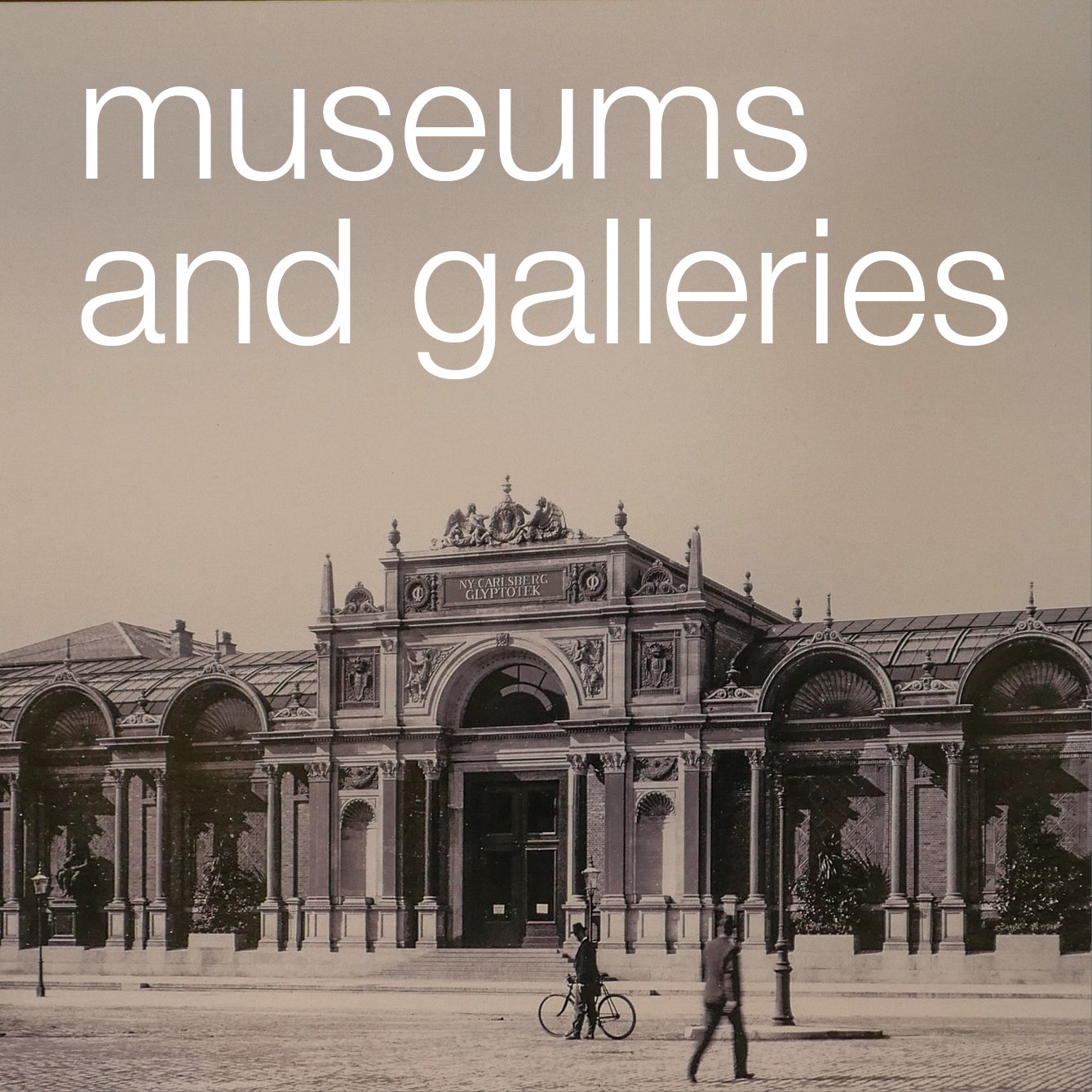
Ny Carlsberg Glyptotek in Copenhagen was built between 1892 and 1906. The museum and gallery was extended in the 1990s when Henning Larsens built new galleries for the French collection almost as a free-standing building within a courtyard. The staircase to the galleries was constructed in the space between the new building and the external walls of the courtyard retaining arches and other features. The space is top lit so has a sense of ambiguity half interior half the feeling of being outside and the steps are shallow controlling the speed you walk up and down. Visitors slow down and tend to talk quite quietly so the design of the staircase sets a tone ...


Finally natural light on staircases can be difficult … if a stair window is behind you as you walk up a flight then it will throw a potentially dangerous shadow across the steps and if it is in front of you, shining down the flight, then people on the staircase can be momentarily confused if walking towards a bright light … and of course … in a building … any windows also have to fit with any wider and important design principle for the facade for the pattern or arrangement of the fenestration.

But get the design and the lighting right on a staircase and the experience of walking up and down the flights can lift not just the feet but the spirit as well.

So no … staircases are not easy to design.


note:

For a particularly good example of how you design staircases to get people up and down as quickly and as safely as possible … see an earlier post on the design of metro stations in Copenhagen.

why don’t we talk about architecture more?


extension to the museum at Ordrupgaard by Zaha Hadid


Relaxing with friends - maybe when sitting around a dining table at home or sitting in a pub or in a restaurant - people discuss music or talk about food or fashion at length. If the conversation becomes animated it can reveal high levels of interest, often a fair bit of enthusiasm and frequently strong opinions expressed with partisan conviction that suggests a reasonable level of knowledge. At the very least, most people can distinguish rock from pop, classical from jazz; most will have an opinion on the latest restaurant to have opened or talk about the different beers brewed in their city and - even if men say they don’t know anything at all about fashion - they have clear preferences for one make of jeans over another and can explain precisely why. 

But rarely does there seems to be an equivalent interest or general knowledge when it comes to architecture and yet we all live in buildings and all, or nearly all of us, work in buildings. We visit large, expensive, modern buildings, that might be well-designed or badly-designed, when we shop or to go to a concert. Most of us walk along streets every day and architecture impinges on almost everything we do.

If pressed, nearly everyone will go as far as to say that they like or don’t like a particular new building and will talk about an amazing building they visited on a holiday trip but it’s usually a brief or passing reference … so rarely many detail or much analysis. 

Sometimes a modern building gains a curious notoriety … a new Guggenheim or if there is controversy over a design from the star architect currently being featured in the magazines … and then people might express an opinion.

Presumably, but only in part, this is because architecture and the built environment is rarely taught in school. Major historic buildings might have been mentioned in a history class if a castle was besieged or if there was a major fire but that is about it.

Is it that architecture seems to sit on the other side of a dividing line? Furniture, design, interiors and graphics on one side are accessible, straightforward, everyday - and architecture along with painting and sculpture on the other side of the line - are the territory of the experts?

Yet curiously, at a fundamental level, we all understand and read buildings well even if we don’t realise that that is what we are doing. Architects actually make use of that to direct and control how we use buildings and control how we respond to them … we are all predictable enough that most users or visitors to a building can be directed and manipulated by the architecture. 

Some types of buildings are so distinct - such as cinemas or railway stations or swimming pools - that even on a first visit we can find our way around, without needing too many signs or instructions, simply because we know how buildings like that should be laid out and and how they should function. Good examples are department stores and large hotels … often very large and very complicated buildings but generally we know how to use them without asking anyone for help. 


Grundtvigs Church by Peder Vilhelm Jensen-Klint ... nave, font and pulpit

Churches are another particularly good and fairly straightforward example of this. Fewer and fewer people attend churches regularly but on entering a church most people understand the arrangement, as long as it is relatively conventional, with an axial approach from the entrance door to the furthest point - the business end around the altar - and the arrangement of seating and any divisions between congregation and clergy vary but show clearly the way worship is conducted. Most visitors can see how light, or shadow, and impressive height and a high-quality architecture are all used to inspire or manipulate emotions. Different parts of a church are arranged in specific ways to allow for different functions so there are often areas and fittings with clearly defined uses … fonts are given space because people stand in a group for that part of the service for a Christening and seating varies so there are usually seats that are obviously for general visitors with a different form and arrangement of seating for a choir and often special seating for anyone with clear status - so a bishop or a monarch - so most people understand where they should or should not sit. 

So looking at the design of churches is a good starting point for looking at how architecture reflects and respects function and tradition and conventions and status but actually the same form of dissection and analysis can be used to assess a football stadium or an office block. It’s often simply a matter of looking at how it works or, even better, looking at how and why it doesn’t work.

When talking or writing about buildings there is a relatively straightforward check list of obvious things to cover so usually up at the top are the name of the architect and the date of the building and of course its function. Then materials are important because, in a curious way, people have preconceptions that can help create a picture of the building even when there is no photograph … so to say that a building is a steel and glass office block is clearly very different to talking about a brick house with a tiled roof and so, without having to point it out, the reader or listener probably adds to their image picture a flat roof to the office building and by convention a house has a pitched roof, or at least in northern Europe it does, and the mention of tiles confirms that so curiously, in talking about architecture it is the differences or exceptions that should come higher up the list … so even 10 years ago it might have been important to point out that a new railway station did not have a ticket office whereas now it might be more usual to express surprise that a new railway station has a traditional ticket office.

Describing the general appearance of a building and talking about its function is relatively straightforward but it’s quite difficult to take that next step … architecture has a complex vocabulary of terms that can form a barrier between the curious but interested outsider on one side and the professional … an architect, an engineer or a planner …  on the other. But then understanding the difference between an open cantilevered stair and one with a closed string is nowhere near as difficult as deciding if a double monk-strap boot can be worn with a formal suit or if milk or lemon or neither is best for Earl Grey tea.


good proportions and a sense of scale


the dome of the Marble Church in Copenhagen

Understanding how architects use proportions and scale … or rather looking at how good proportions, used properly in a design, and the construction of buildings with an appropriate scale … is essential in trying to appreciate architecture. 

Appropriate proportion and scale are not just just significant in the design of an individual building - having a strong impact on how good or how bad, how attractive or potentially how ugly, the facades are in isolation but proportion and scale are important in the relationship of the building to its setting … and not just for building in an urban streetscape but also for the way a building relates to its setting in a garden or in a natural landscape.

 In part, this is because we seem to respond instinctively to the scale of a building and can decide quickly if it looks wrong or looks right. Often this comes down to judging a building against our own human scale and normally that means deciding if it is right or wrong depending on if we feel comfortable or uncomfortable with the size of the building. 

It’s a difficult balance to get right. We can easily feel overwhelmed by a large building but we can also feel that a building is mean and too small if it’s not an appropriate scale for its function, particularly if its a civic building or a building of wider national significance. 

And what is right or wrong, in terms of the scale of a building, depends on its actual location - so a multi-storey car park, however useful, is wrong when it looms over a shopping street of historic buildings but usually quite acceptable in among office blocks.

We also have expectations for the size of buildings so many like the idea of a small cosy holiday home but we expect rich or important people to live in big houses and we are surprised or curious if they don’t. Consciously or subconsciously we make a calculation that balances scale against status. 

If scale is something we judge intuitively then an appreciation of proportion might seem rather more esoteric or at least rather more intangible. 

At its simplest, proportion is about both height and width and their relationship and also of course depth and therefore the proportions of volume or space, feeling right and appropriate whatever the size of the building and again our judgment of a building or of urban spaces is often judged against human proportions. 

But scale and proportions also have to be appropriate to the function of the building … so, for instance, in a busy airport a corridor might well be wide enough to take all the people passing through but if the ceiling is too low, little more than the height of a normal room, then it can feel crowded and noisy and unpleasant - simply because the proportions are wrong. The opposite can be true where, for instance, a high atrium at the entrance to a building can make visitors feel lost and insignificant and, of course, banks or government departments can use that effect quite deliberately in their buildings to keep people in their place. Buildings that are overbearing are often like that for very clear and specific reasons.

But proportions have a more important role when it comes to aesthetics … when trying to decide why a building is beautiful or ugly. Again it is something that we seem to respond to instinctively, even if we can’t explain exactly why it is that something doesn’t look quite right if the proportions are wrong, meaning something is too narrow for its height or the parts of a facade or the features in an interior appear to be badly related to each other in terms of their shape and their size. 

Look carefully to see why a beautiful 18th-century facade looks beautiful and it is often possible to discover an underlying geometry that determines the shape of windows and doors - the height related to the width in each - but also often a carefully set out relationship between the openings and the amount of solid wall along with the grading of features … so less important floors are lower in height but the windows, although smaller, can still relate to a grid of invisible construction lines across the whole facade.

Where it becomes more complicated is where scale and proportions that work for a building seen straight on and approached on the main axis will almost certainly not work for a similar building set in a street, only seen at a sharp angle from the side, and as well as the angle of the view, proportions have to take into account the overall height of a building … so features that appear to be quite reasonable in their proportions at ground level, if repeated higher up a facade can look squat because of the sharp angle of view.

A really good example of how these problems have to be resolved by an architect is when a building has a dome. The profile of a dome that works well inside - often something approaching a half sphere - would look too low on the outside - as if it is sinking into the roof - while a dome that looks elegant and well-related to its drum and the building below, when seen from the outside, will appear to be too narrow and much too high - almost pointed - from the inside. Normally, the solution is to build two domes - one inside, to be seen from below, and an outer dome, related in scale and proportions to the facade, with often a considerable gap between the two. It’s always interesting to find out if people looking up and admiring a dome above them realise that actually it is not strictly the dome they looked up at as they approached the building.

Of course deciding on an appropriate scale and designing something with good, basically pleasing, proportions is equally important in the deign of furniture, interiors, ceramics and glassware.

And for the clever designer, subverting what is generally seen as right for scale and shape can be made part of an intellectual game by designing buildings that challenge convention or shock the user into seeing the work in a different way. 

There are no hard-and-fast or easy rules about scale or proportion. The examples here - buildings and spaces in Copenhagen - were in part chosen because they seem to defy or at least play with ideas of scale and proportion and they also show just how easily the eye is deceived when we try to judge scale. That’s maybe the irony. Scale appears to be simple … just how big or how small something is … but curiously our eyes are often deceived whereas proportion seems all a bit theoretical and and a matter of taste but actually our eyes quickly work out if a shape is oddly squashed or elongated or just not quite square when it is meant to be and people respond instinctively to a beautifully-proportioned classical portico or the soaring spaces of a medieval cathedral where the masons used geometry to set out their work and to ensure the stability of its structure even if that geometry is not obvious when you are standing in the building. 


the Armoury ... the naval store built for Christian IV in the early 17th century close to the castle in Copenhagen. This is one of the most amazing spaces in the city. From outside the brick building looks large but not exceptional among other large buildings along the harbour but inside this space on the first floor is amazing ... simple in architectural terms but well built, in part because of the loads the floors had to carry with supplies for the navy, but an absolutely incredible size ... the black speck against the wall at the far end of this aisle is actually an adult and this photograph was taken from about a third of the way from the north end. Scale can be difficult to judge.


Grundtvigs Church in Copenhagen by Peder Vilhelm Jensen-Klint completed in 1940. Again an absolutely amazing space where again the scale is so impressive but here, unlike the Armoury, the proportions are vertical ... virtually all horizontal lines that might divert the eye are removed so there are no bases or capitals to the piers ... nothing to distract from the height, the light and the important diagonal views through the space as you walk down the nave or, here, down the aisle of the church. It is only the people that give a real sense of the height of the building


another image chosen to show how the eye can be deceived when judging scale ... this is a building on the new university campus in Copenhagen south of Christianshavn on Amager. It is difficult to judge the size of the stone blocks ... they could be bricks ... until you realise that the figure at the bottom is a student ... a student of average height ... sitting in the sun with his back to the wall to read  


Israels Plads in Copenhagen ... stone steps at the south-west corner of the recently remodelled square. The blocks read initially as a staircase until you see the figures in the distance. The risers of a staircase are normally around 15 centimetres high whereas these blocks are 36 centimetres high