Hal C Arsenaløen - Christianshavn sports hall


from Værftbroen - looking along the canal towards the sports hall

On the opposite bank of the canal to Kids' City in Copenhagen - the school designed by COBE - is a local sports hall called Hal C that was designed by the architects Christensen & Co and completed 2013.

There is a large sports hall open to the roof at the east end that is lit by large tall windows on both sides - to the canal and towards the playing field to the north - arranged in pairs. All these opening have large plain shutters that open outwards and these and the deep red timber cladding are inspired by the 18th-century mast sheds nearby.

The west end of the sports hall is on two floors with an entrance lobby at the corner, glazed on two sides, and offices and changing rooms on the ground floor and a small hall or meeting room on the first floor.

In keeping with the beautifully simple exterior the interior has large area of plain panels much pierced and a very simple straight staircase with a plain solid side panel but the railings of the landings are rather more complicated open grill.

The building makes really good use of natural lighting inside. The sports hall has areas of top lighting. On both sides of the sports hall are wide wood step where spectators can sit and on the canal side there are steps along the length of the building where people sit and a series of landings down to the canal.


Christensen & Co

a new bridge across the canal from Kids' City

the windows and shutters of the main sports hall from the other side of the canal

entrance at the south-west corner

large windows to the sports hall on the side towards the canal with pairs of shutters

windows and shutters of the main sports hall from the playing field to the east

texture and tone and growing old gracefully


warehouses in Christianshavn in Copenhagen - there is a mixture of materials and colours in the building materials but a uniform colour of paint for woodwork helps link the buildings together and the use of stone paving and simple areas of gravel provide a neutral landscape

Generally, until the 19th century, the visual character of towns and cities was determined by the use of relatively local materials unless a building was particularly important and then the cost of importing materials over some distance might be justified.

But today materials can be transported easily and relatively cheaply so one obvious problem now is that new buildings in many cities have lost any specific sense of place.

When choosing materials, rather than understanding the local topography and specific geology, the architect has to consider cost and factors like the sustainability of materials or their insulation properties so, with many new buildings - particularly commercial buildings - there is a feeling that economics or engineering have determined what the building looks like as much as specific aesthetic considerations.

And with some buildings, the design appears to be more influenced by ego … either that of the architect or the client … or at least there appears to be a clear determination to be different or novel rather than having any strong empathy for the location and for neighbouring buildings.

And often there appears to be little consideration for the texture and the tone of materials or for how materials will wear and weather over time.

on the main warehouse the bricks, the stone used for the plinth and the setts used for the road surface all have a mauve or purple/grey tone. The black and white photograph shows that the darkest tones are actually the doors which helps suggest depth to the arcade and, rather surprising, the trees and the water of the harbour basin. Although the clay tiles of the left-hand warehouse looks very different in colour the black and white photograph suggests that actually the depth of colour of the roof is appropriate for the wall of the building below.

copper and Copenhagen buildings


Copper and the copper alloys of bronze and brass are amazing metals with a long history of use in Denmark for a wide range of uses including making domestic vessels; for coins; for making weapons, particularly ornate weapons for ceremonial use or to display status, and copper and bronze, because they are relatively easy to work, have been used in jewellery and in the decorative arts, particularly for cast sculpture. From the late medieval period onwards copper and bronze have also been used on a much larger scale in architecture, for covering and protecting the roofs of important buildings and, again, because the metals are durable but relatively easy to work and because they can be used as thin sheets that can be shaped and joined together, copper is particularly good for covering domes and spires where the metal layer can be supported by a strong formwork or framework.

read more

early modern ... Vesterport, Vesterbrogade, Copenhagen

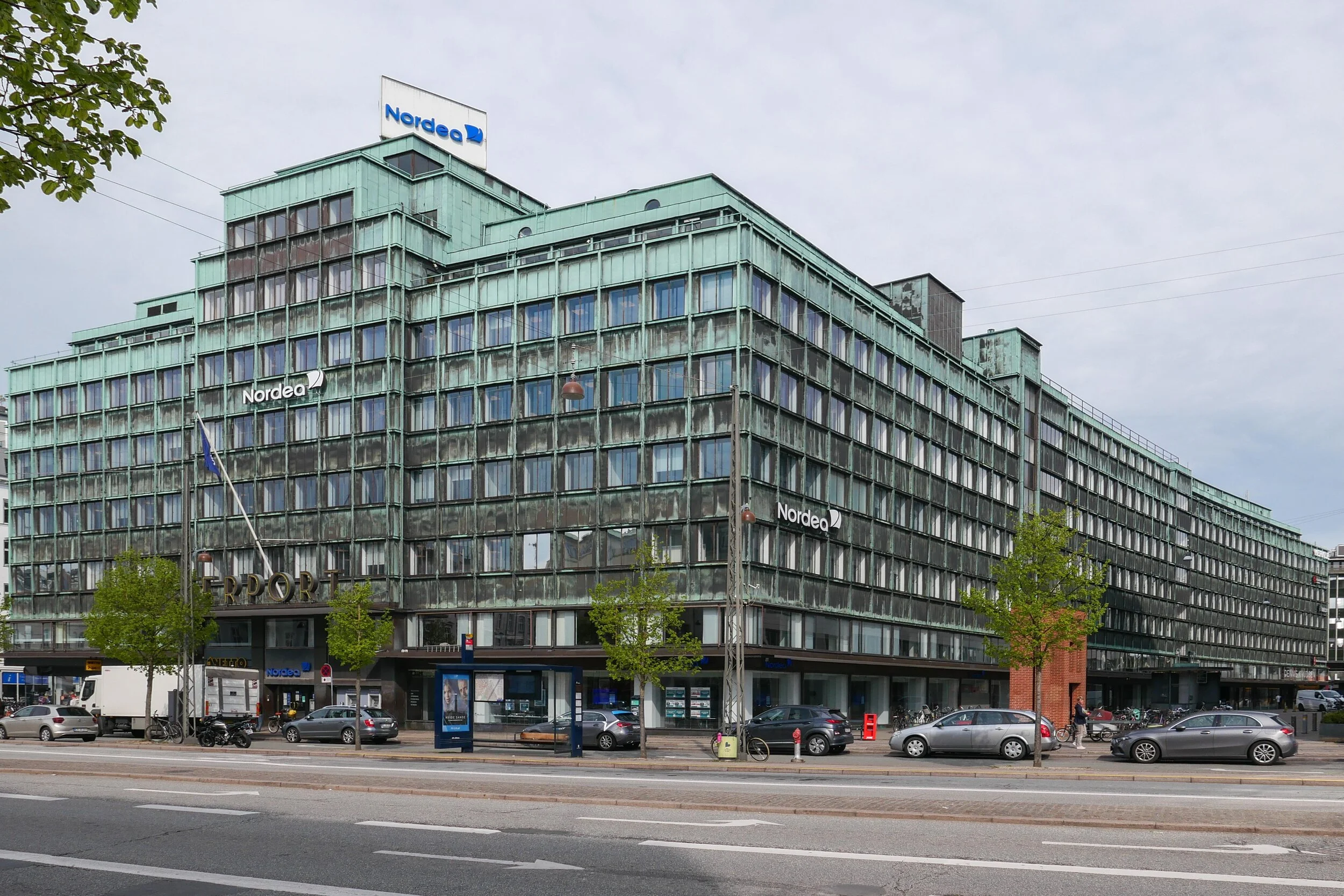
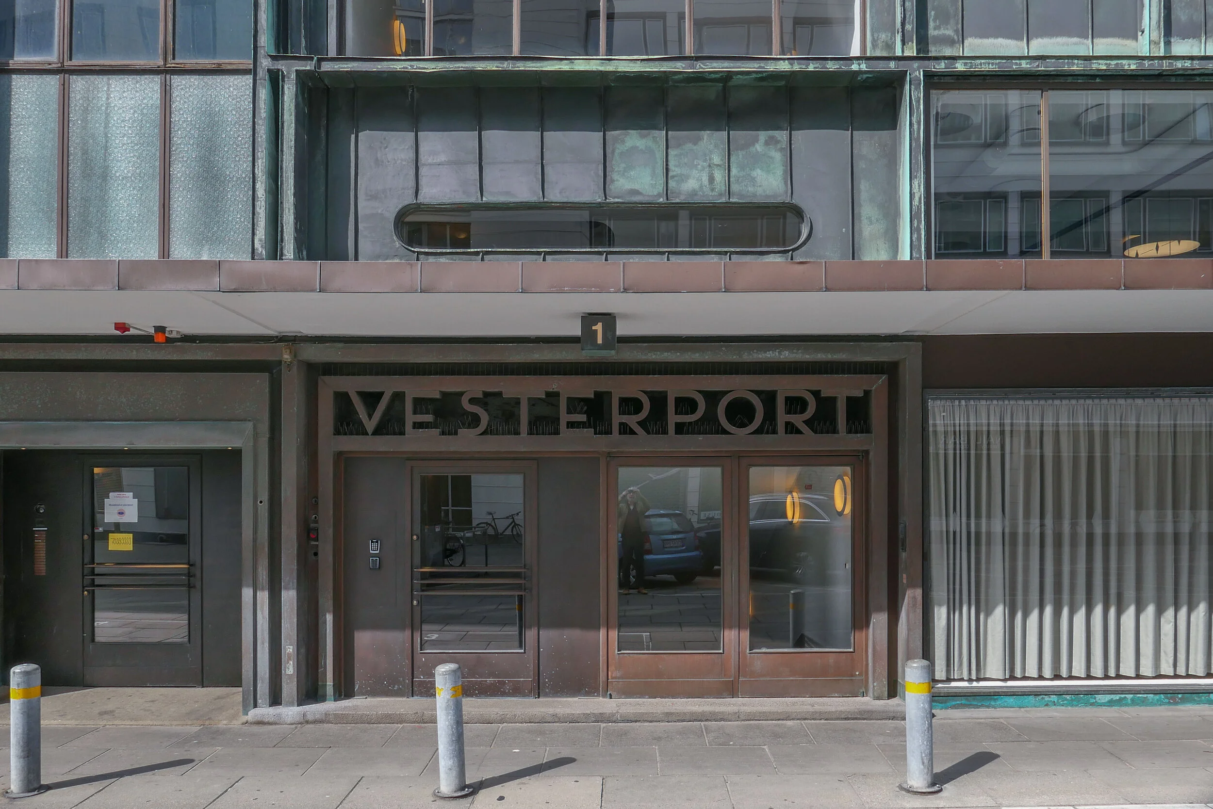
Vesterport - a large copper-clad office building on Vesterbrogade and close to the central railway station in Copenhagen - was designed by Ole Falkentorp and Povl Baumann and was completed in 1931.

It fills a complete city block with the building running back from Vesterbrogade to Gammel Kongevej with a side elevation towards Meldahlsgade that is over 110 metres (365 ft) - and there are three service courtyards.

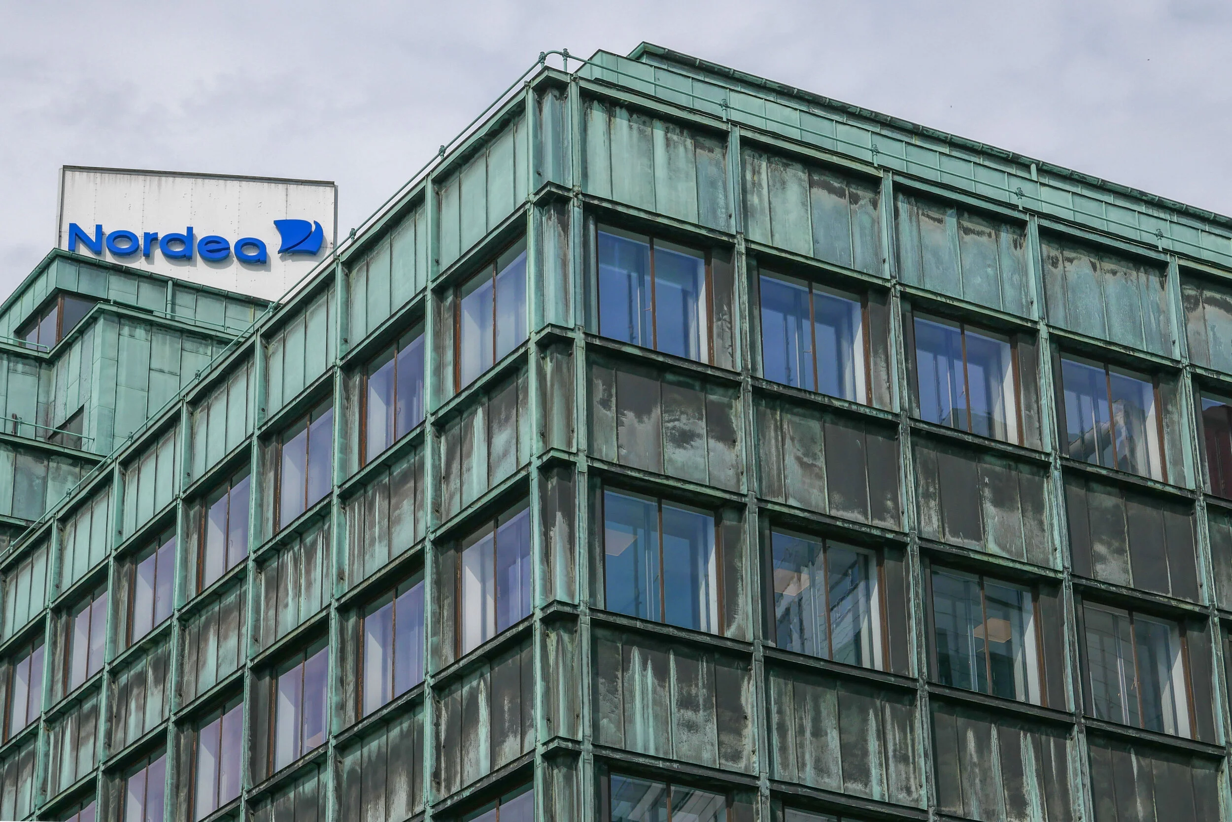
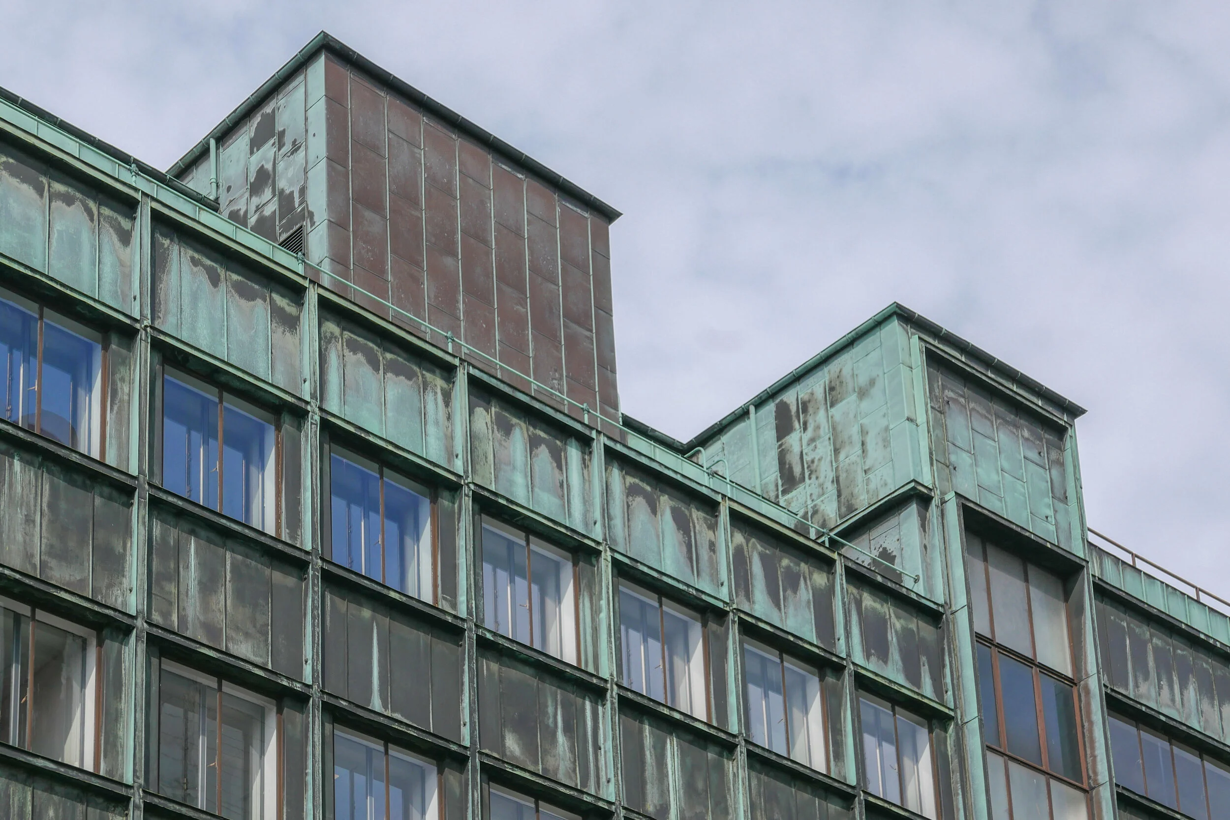
This was the first steel-framed building in Copenhagen with reinforced concrete floors and is the first truly modern building in the city but if anyone notices it today then it is probably for the striking colour of the cladding which, with patina, has turned a sharp but pale acid tone of green. When new, before the copper changed colour, the building was known as the penny.

At street level there were shops so, again in a modern way, this was very much a commercial building and it was in what was then an important commercial area of the city.

The principle tenant was an English insurance company but the open-floor construction meant that it could be subdivided with non-structural partition walls depending on the requirements of any tenants.

But it is not just the method of construction but it is the scale of the block with its flat roof line and the grid-like division of the facades with continuous lines of windows above panels of cladding that is distinctly modern.


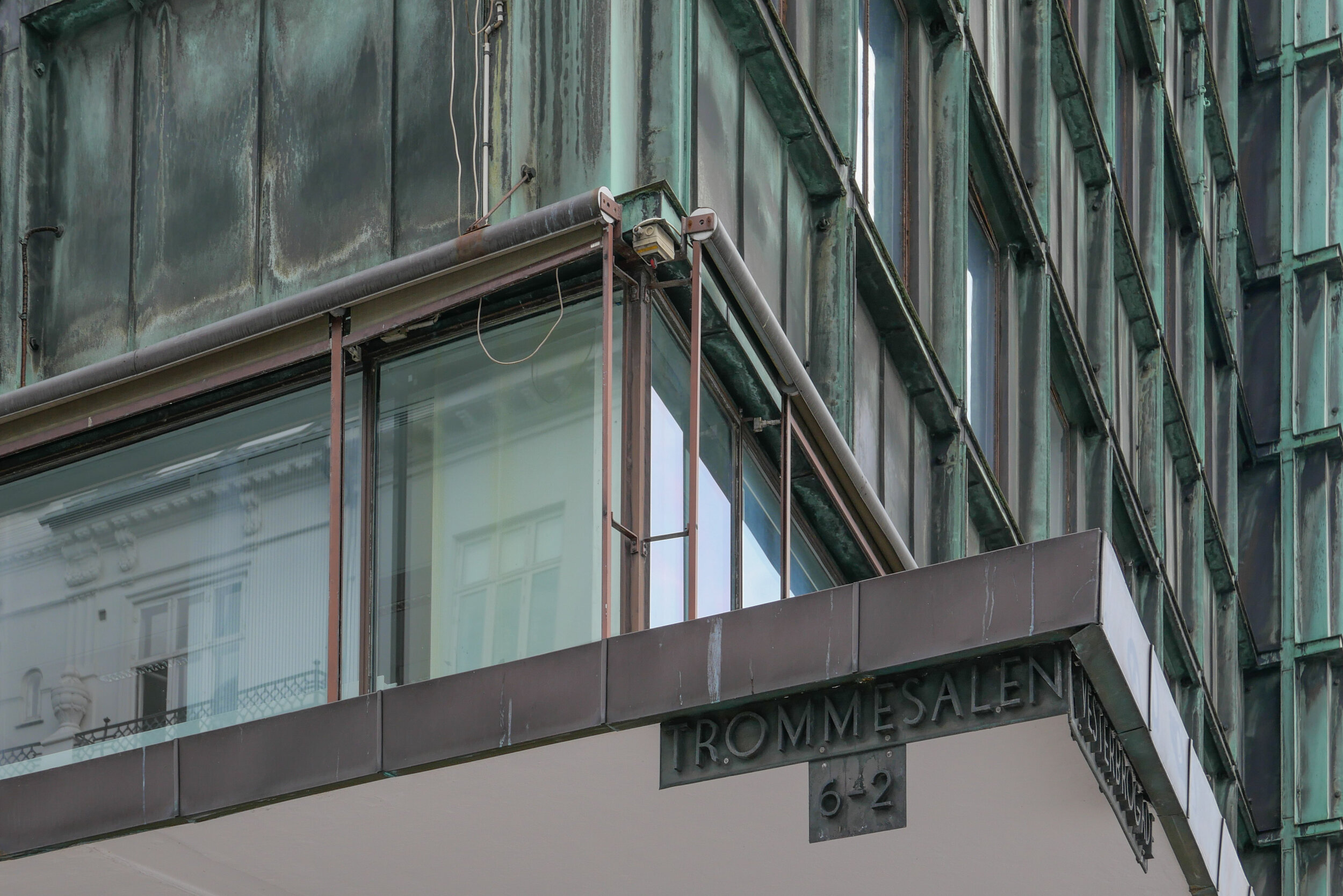
Signs for the road names as part of the canopy survive as an example of good typography from the period and brass doors at the entrances with heavy brass handles have been retained.

The building has a significant place in design history for another reason because Den Permanente, an influential design gallery and furniture shop, opened here in 1931 with display space over two floors. It was at the south-west corner of the building with large windows to Vesterbrogade and to Trommeshalen but closed in the 1980s.

note:

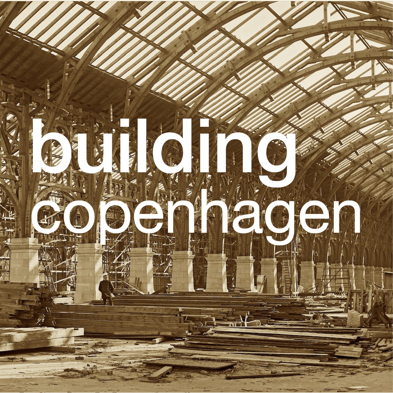
The photograph of the ironwork of the building at an early stage of the construction is from the city archive - Historie & Kunst, Københavns Kommune, Stormgade 20


copper after Vesterport

government buildings between Christiansborg and the harbour in Copenhagen by Thomas Havning 1962-1967


In terms of style, Vesterport can hardly be said to have set a fashion as few buildings copied the use of copper cladding although through the 1930s and well into the 1950s many did have brass window and door frames and brass architectural fittings including handrails for staircases.

Superficially the government buildings in Copenhagen at Slotholmgade and Christians Brygge designed by Sven Eske Kristensen and Thomas Havning and built in the 1960s are reminiscent of Veserport. The blocks have the strong colour tone dominated by green and of course with the continuous lines of windows and very regular lines of panels divided by ribs forming a regular grid but only the roofs and certain fittings are copper or brass … the panels below the windows and vertical divisions between the panels are in a dark green polished stone or slate.

However, more recently, the offices and tower at Pakhusvej near Amerika Plads by Arkitema has facades in copper. It was completed in 2004 and although now darkening in colour there is no sign yet of a surface patina of verdigris which shows how slow the transition can be even though this building, opposite the terminal for ferries from Oslo, is subject to winds off the sea.


the main tower and a detail of the copper cladding at Amerika Plads by Arkitema 2004


Most recently the Axel Towers in the centre of Copenhagen, close to Tivoli, by Lundgaard and Tranberg and nearing completion have been faced in tombac- a copper zinc alloy -and again it will be interesting to watch as this prominent, building - close to the City Hall and very close to the SAS Hotel by Jacobsen and two blocks from Vesterport, changes the visual dynamics of the area as its colour changes.


Axel Towers, Copenhagen by Lundgaard and Tranberg ... work nearing complettion

all in the detail … geometry and proportion in buildings by Arne Jacobsen

Towards the end of his life, in an interview that was published in Politiken in 1971, Arne Jacobsen explained that “the main thing is proportioning. Proportioning is what makes the beauty of old Greek temples classical. Like great blocks from which the air is literally carved out between the columns. And whether we look at a building from the Baroque, from the Renaissance, or from our own time the ones we wish to look at, the ones we admire - they are all well-proportioned: this is what is decisive.”  1

It is a comment that reveals much about an underlying aesthetic principle that was at the core not only of his architecture but also his designs for furniture and interiors … an aesthetic that can be seen in major works of this late period of his career such as St Catherine’s College in Oxford or his last major commission for the National Bank in Copenhagen. Not just buildings designed with elegant proportions but buildings that are calm and monumental in a way that is closely reminiscent of the best classical buildings.


That vivid and evocative description of “air carved out between the columns” provides one key to understanding buildings like Søllerød town hall but, equally, carefully resolved proportions are elemental to the design of small houses, in Jacobsen’s designs for gardens and as a key characteristic of his furniture.

He clearly saw the design of an elevation - the arrangement of doors and windows, their relative size and their spacing with an appropriate balance between the openings and solid wall - as an opportunity to use a rational grid as the underlying framework and he used geometry and mathematically determined proportions, not just for the overall outline of a facade but also for the features or the constituent parts of a design.

To some extent, the use of standard and repeated units for the elevations of large modern buildings and regular and equal floor heights repeated up the building would have created a grid pattern in any case but Jacobsen applied a system of proportions to the facades in buildings through the 1930s and then on into his post-war works, trying different arrangements for each design but becoming more complicated with each project.


Nyropsgade 18, Copenhagen  building for A Jespersen & Son,    completed in 1955


The City Hall, Rødovre Rødovre Parkvej 150 1956


SAS Royal Hotel, Hammerichsgade 1-5, Copenhagen 1960


A careful use of geometry and proportion is less obvious in smaller brick houses simply because, when compared with the front of an office building like the Jespersen block, the use of a design grid is clearly less pronounced but in the design for his own house at Gotfred Rodes Vej, the plan of the main room on the ground floor has the proportions of a golden rectangle and although ceiling heights are not given on the plan used for writing this post, a height of 2.5 metres, which is quite reasonable for a house of this size, would mean that it is possible that heights and therefore the volume or space within the house were also determined by golden proportions. The side block of that house, including the staircase, kitchen and dining room on the ground floor, is certainly a golden rectangle externally, and interlocking with that space, the staircase, the entrance hall and the small room to the right of the entrance in their overall dimensions define another golden rectangle so, at the very least, the starting point for the plan of his own house in 1929 was a geometric framework based on the golden section which was then developed into the final design even if every room and every feature did not fit precisely into a proportional straight jacket.

Jacobsen’s later home at the east end of the row at Strandvejen is even less obvious as a design based on geometry because there rather than the simple blocks and flat roofs of the first house, obvious geometric blocks, his post-war house is in a terrace or row and has a long narrow footprint and sloping roofs but even there the starting point appears to be a grid based on golden rectangles. The main part of those houses is a long block running north south and, starting with the width of that block, then it’s length is two golden rectangles set end to end and the main room on the top floor has the proportions of a golden rectangle. In Jacobsen’s own house in the terrace, because it is at the end of the row, it has space for an additional block on the east side that contains rooms on all three levels and that is based on a square with the dimension that is the starting point of the two golden rectangles of the main block.

For larger buildings such as the SAS Hotel in Copenhagen, Jacobsen was clearly aware that with the industrialisation of building construction, where you use a large number of components that were made in a factory and assembled on site, including all the windows, then to get the proportions of a single unit wrong would mean that that potentially ugly or disproportionate elements would be multiplied along the length of the facade or throughout the building to compound a poor design: it was essential that each part had to be not only well made but also well proportioned.

In fact, for the SAS Hotel in Copenhagen, not only was the design of the elevation based on geometric proportions but the basic window width of 60 centimetres, or multiples of that dimension, was used by Jacobsen for standard furniture and fittings for the rooms, including bedside tables and bed headboards so that furniture and fittings could be used in different positions and different combinations but still relate to the basic proportions of the space.  

Jacobsen trained at a time when both classicism and functionalism were dominant in Danish architecture and surviving drawings show that he studied classical buildings on trips to Italy …that included visits to Paestum. 

Nor is Jacobsen alone in using not just proportion but specifically the golden rectangle or golden proportion at this time.

In Norway the academic Frederick Macody Lund (1863-1943) was involved in a long-running dispute about the restoration of Nidaros Cathedral in Trondheim where he contended that the design of the medieval building had been based on the Golden Section and argued that geometry should be the principle control for any new work. The controversy this created was published in 1915.

In 1920, just before Jacobsen began his training at the Academy, Ivar Bentsen (1876-1943) produced designs for a new Philharmonic Building in Copenhagen where the fenestration was based on the Golden Section so the upper windows were square 5 by 5, the windows below that 8 by 5, then below that level windows13 by 5 and the lower row of openings was 21 high by 5 wide … in fact a ground floor and mezzanine. The dimensions of the windows are a progression based on golden proportions but presumably that was not immediately obvious even to someone interested in geometry.

That is part of the problem with using geometry: it is a useful tool as a starting point but if applied slavishly can produce a design that at best is mechanical and at worst is seen as something esoteric or downright obsessional when the geometry is pointed out to most people … even to many architects.

That is not to suggest it has no value. For thousands of years, artists and architects and designers have realised that certain shapes and certain lines are seen as more attractive or even as more beautiful than others and actually most people can appreciate that difference. As soon as you say that something looks a bit thin or something looks rather squat then you are making a judgement about the proportions.

Steen Eiler Rasmussen discussed this in his general work on architecture, Om at opleve arkitektur, published in 1957 and published in English as Experiencing Architecture in 1959.

In a chapter on Scale and Proportion, he talks about mathematical relationships and compares music and architecture … talking about composition and harmony.

“The truth” he explained, “is that all comparison of architectural proportions with musical consonance can only be regarded as metaphor … that scale and proportion play a very important role in architecture is unquestionable. But there are no visual proportions which have the same spontaneous effect on us as those which we ordinarily call harmonies and disharmonies in music.” 2

In that book Rasmussen also gives a very clear explanation of how the Golden Section is constructed and discusses how it was used by Le Corbusier in the 1920s as part of his system of subdividing or creating a series of related parts described as “Le Modular.” 

A return to simple facades with no or with much less decorative detail and a general return to symmetry and the rejection of designs that copied or adapted decorative details from earlier periods but applied them to distinctly new building types was a reaction against Romanticism. Young architects questioned why it was appropriate to use features taken from mediaeval architecture for a railway station. In 1954 the architect Kay Fisker explained bluntly that “… through a deliberate work with proportions and metrics, it was possible to reintroduce the concept of order after the individualistic chaos of the Nyrop era” … Nyrop being the architect most famously of the City Hall in Copenhagen that was completed in 1905.

Of course classical architecture, looking back to ancient Athens or Rome, for inspiration was equally used as a source of features from historic buildings whose original function had little to do with 20th-century buildings but, at least, stripped back to elements of construction then it is possible to argue that a system of vertical supports and horizontal beams - columns and lintels - the basic elements of classical buildings - created more appropriate and more practical spaces than arches and vaults and buttresses.

For Arne Jacobsen symmetry rather than asymmetry and clear honest construction used to create clean well proportioned spaces - rather than a building having a veneer of pattern that was more to do with nostalgia and romanticism than it was to to do with the real structure underneath - appealed to his own taste for clarity and for rational architecture that was essentially linear and graphic rather than sculptural and decorative.


Notes:

1 Quoted by Carsten Thau and Kjeld Vindum in their definitive work Arne Jacobsen (2002) page 16 

2 Steen Eiler Rassmussen, Experiencing Architecture (1959) page 105


all in the detail … Bispebjerg Bakke


Plan from Arkitekturbilleder, Det Kongelige Danske Kunstakademis Skoler for Arkitektur, Design og Konservering


It would be difficult to find two more different buildings in Copenhagen than the Jepersen office block by Arne Jacobsen and the apartment buildings at Bispebjerg Bakke from the partnership of the Danish artist Bjørn Nørgaard with the architectural practice Boldsen & Holm but what they have in common is that both designs depend absolutely on their focus on every detail of the design … not simply plan and elevations but the profile of window frames, the careful choice of the right finish and exactly the right colour for materials on the facades, the details of unique, custom-made staircases and so on.

Although the apartment buildings were completed in 2007, the initial idea for Bispebjerg Bakke went back many years before that to a conversation between Nørgaard and the chairman of the Association of Craftsmen so, from the start, an important aspect of the scheme was to have a strong link between an artistic concept and its execution with a very high level of craftsmanship.

Nørgaard made an initial model in clay so the design was organic rather than a building, like the Jespersen block, that was primarily about, what was for its date, very advanced engineering. Bispebjerg Bakke is about fluid lines and the potential for architecture to take sculptural form while the Jespersen building is about bringing to reality the beauty of a mathematically precise design. How you view the two buildings; how you experience the two buildings and how you move around and through the two buildings could hardly be more different and yet both depend on understanding completely the building methods that they exploited and both, with huge confidence, play games with forms and with styles that can only be achieved with the support of a client, willing to go with designs that were far from conventional by the standards of contemporary buildings.

Curiously, what the buildings also have in common is that the starting point for both designs was determined by their site. This might not be as obvious for the Jacobsen building, which appears to be suitable for any urban site, but the plan had to take as an unusual starting point, set by the planners, a stipulation that contact with the ground had to be reduced to the minimum as the space had to flow through from the street to the courtyard behind.

Bispebjerg Bakke could not be more different. It is absolutely and completely grounded on its landscape and follows a complex sloping site. To the west is the public road, Bispebjerg Bakke, that runs down the hill with the grounds of a large hospital opposite, and to the east of the narrow plot is a suburban railway line in a relatively deep cutting. The land drops down from the narrow north end but the road curves away to the west and the railway line curves sharply away to the east so the plot widens out as it slopes down to the south and east.

The landscape includes mature trees but it also means that the changing light as the sun moves round and views across the site and through the buildings are crucial as all the apartments have been given a dual aspect but few can benefit from direct sun from the south.

There are 135 apartments in the complex with a main building that has a sinuous line following the road, well over 400 metres long, and with a smaller second building, just under 90 metres long, to the east where the plot begins to widen out as the railway curves away. The arrangement of the apartments is in some ways quite conventional in that there are separate doorways giving access to a main staircase with just two apartments at each level, a single apartment to each side of the staircase, and the apartments run through from front to back of the block … to provide that dual aspect.

Each “block” or section is self contained with footpaths or roads between, linking the public street and path with an internal service road, with two entrance doors in each section but the roof is continuous down the length of the long building running across each pathway or road that cuts through the building. Each break is the full height from the pavement to the underside of the roof which adds considerably to the drama as the sections vary in height from three to eight storeys, the tallest section is at the north or uphill end, and the upper apartments in each section have mezzanines so have windows rising up through two tall or even two very tall floors.

The main staircases, two in each section, rise around an oval stair well and the apartments have curved walls and curved balconies so again the design appears to be organic although there is actually a strong and logical conceit in the use of materials on the different sides of the buildings that gives an interesting rationality to the design. In traditional apartment buildings from the early and mid 20th century in Copenhagen, in districts like Nørrebro, the blocks were built with what was then more expensive and more fashionable red brick on the street side and yellow brick towards the courtyard. In the city, an apartment building might be part of a longer row, forming just part of a city block, or might be around a complete block so often the junction between red and yellow brick is not visible or not particularly obvious. At Bispebjerg Bakke it is made into a distinct feature. Red and yellow brick meet at a vertical join half way through each archway and the join is emphasised with bricks projecting at a slight angle and interlocking to look almost like overstitching used on blankets or leather work.


There is a further game with the colour of brick used on each side of the buildings: vertical runs of window and balconies have brick columns or piers between them so, on the red-brick facades, the piers are in yellow brick and tiles, used for the sills and for the parapets of the balconies, are pale yellow but on the sides using yellow brick for the main walls, those piers are in red brick and the tiles - for the sills and balconies and for the surrounds or frames of the main entrance doorways - are red … a deep ox blood red.

Initially, on first seeing them, the doorways and balconies appear to be sculptural - rather free and organic - more Barcelona and more Gaudi than anything normally seen in Copenhagen - but then the effect depends on the very Danish precision and skill of the bricklayers and other craftsmen. Details like rain hoppers, the precision of the construction of the copper roof, the regularity of joints in the roof and the precisely shaped and coursed brickwork are all very carefully executed.

Windows are framed in jacoba wood and given a sinuous profile and inside the rails of staircases are bowed out. 


It seems odd to describe the roof as flat or even as mono pitch when in reality it swoops and twists across the building but it is certainly not pitched in the conventional sense because it does not have a ridge with inner and outer slopes. In terms of challenges, the main roof must be the most impressive part of the construction as the placing of joins in the copper sheeting must have required very careful design because there are surprisingly shallow and unobtrusive baffles and lipping to direct rain water, which can be torrential in Copenhagen, to run down the slopes to hoppers and down-pipes rather than simply cascading over the edge.


The curved lines of the balconies are interesting. Balconies are on the party wall and there is a central dividing pier on the line of the partition between one flat and its neighbour. The front line of each balcony curves back to the main wall line, forming a bowed, almost semi-circular front to each pair of balconies and the windows curve in from the front line of the wall to the partition to create what is, in effect, triangular balconies but with curved rather than straight lines to the front and window. Note window frames are curved but double glazing units are flat simply for practical reasons, primarily economic.  

On their web site Boldsen & Holm describe Bispebjerg Bakke as a building “where art, architecture, workmanship and technology melt into each other, in an equal and even interaction. The organic shape originates from the character of the area …”