Public Structures - Kunsthal Charlottenborg Biennale


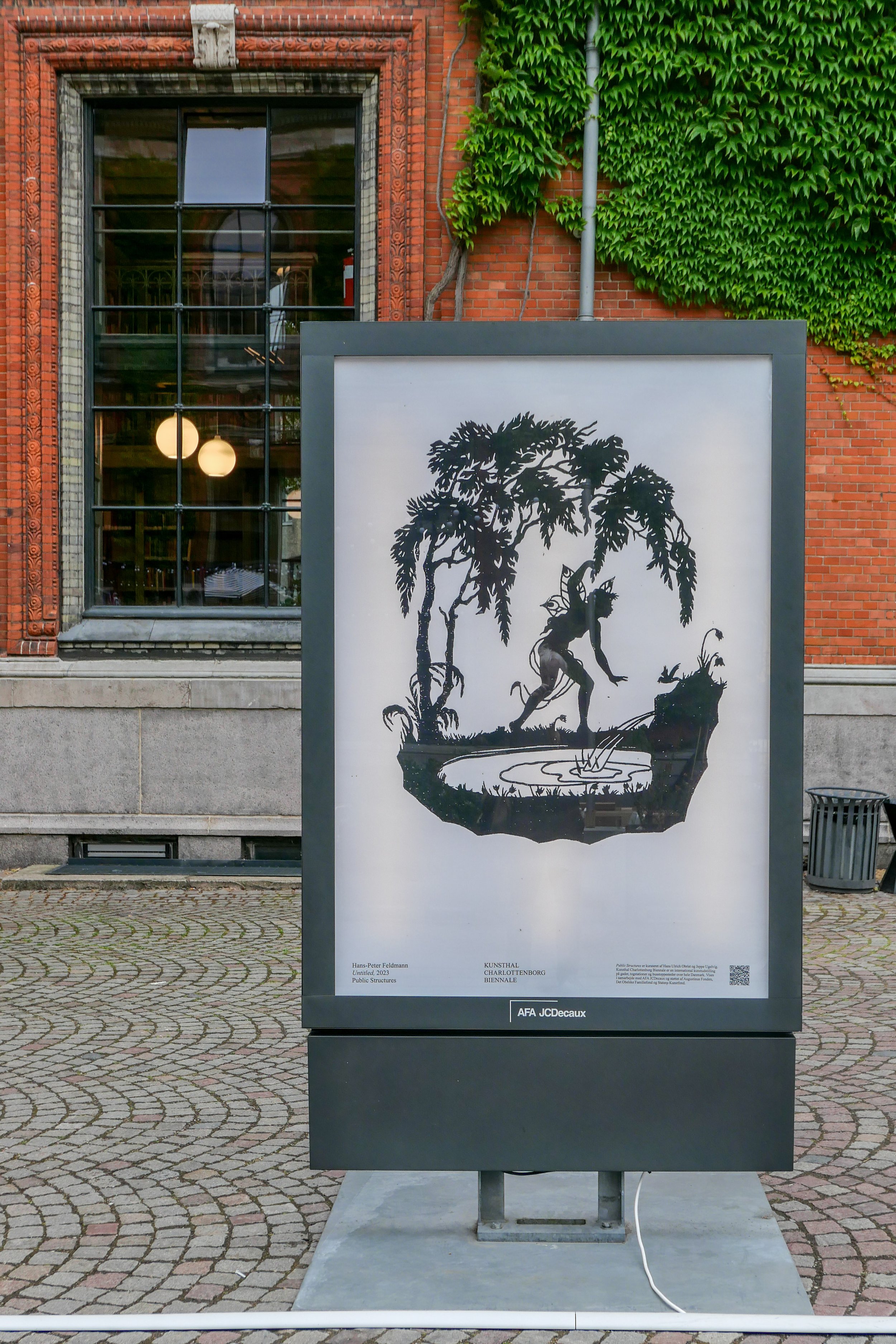
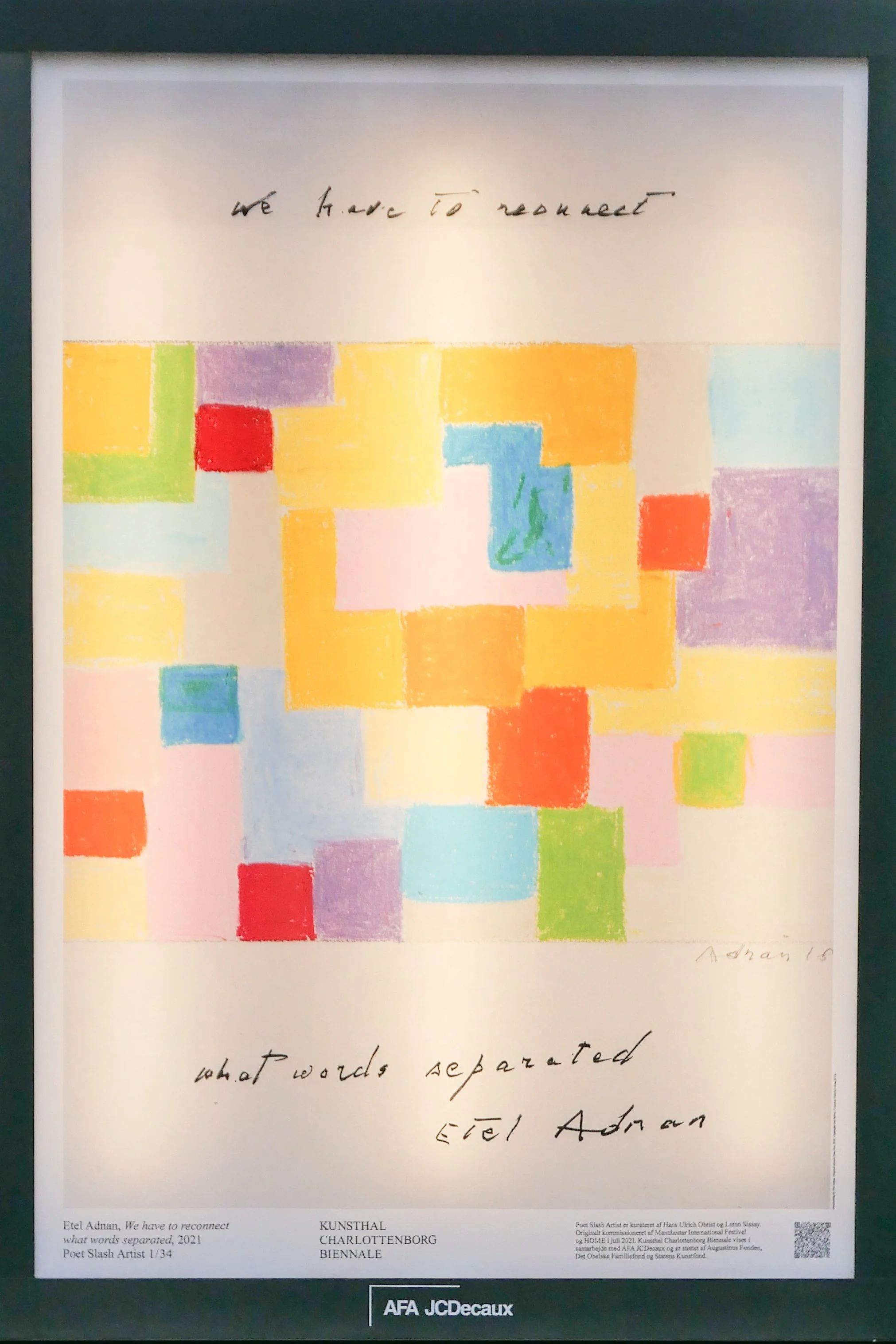
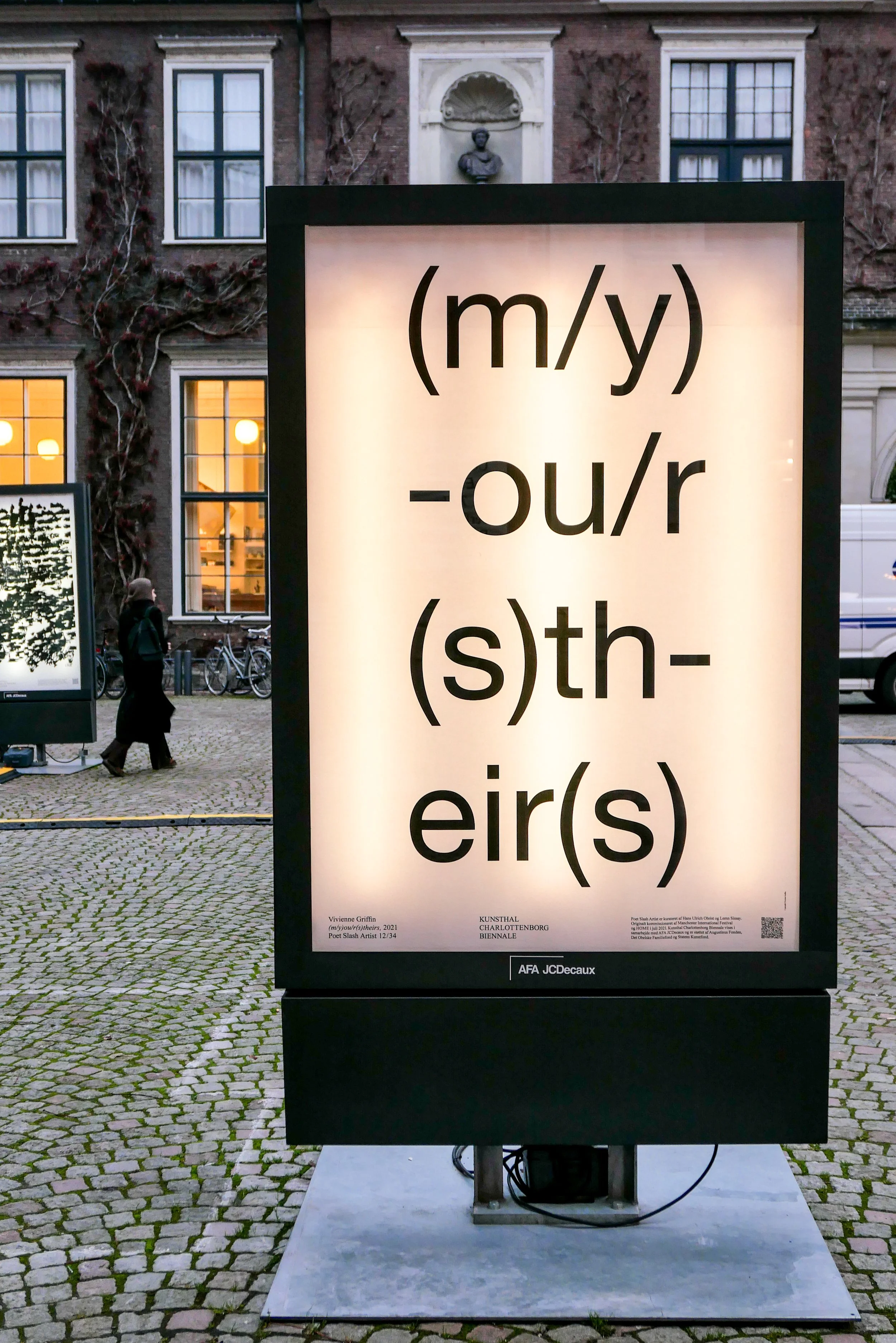
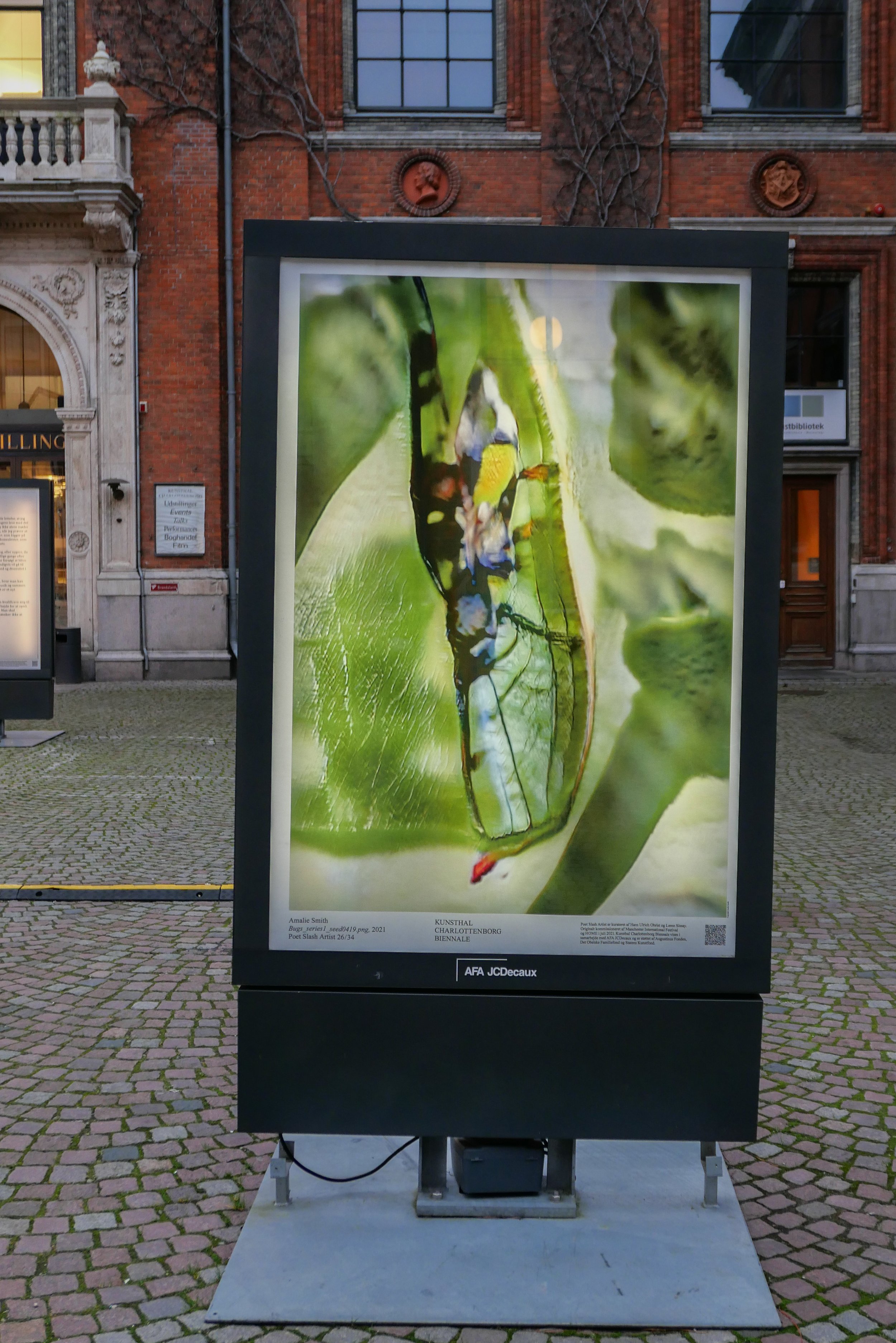
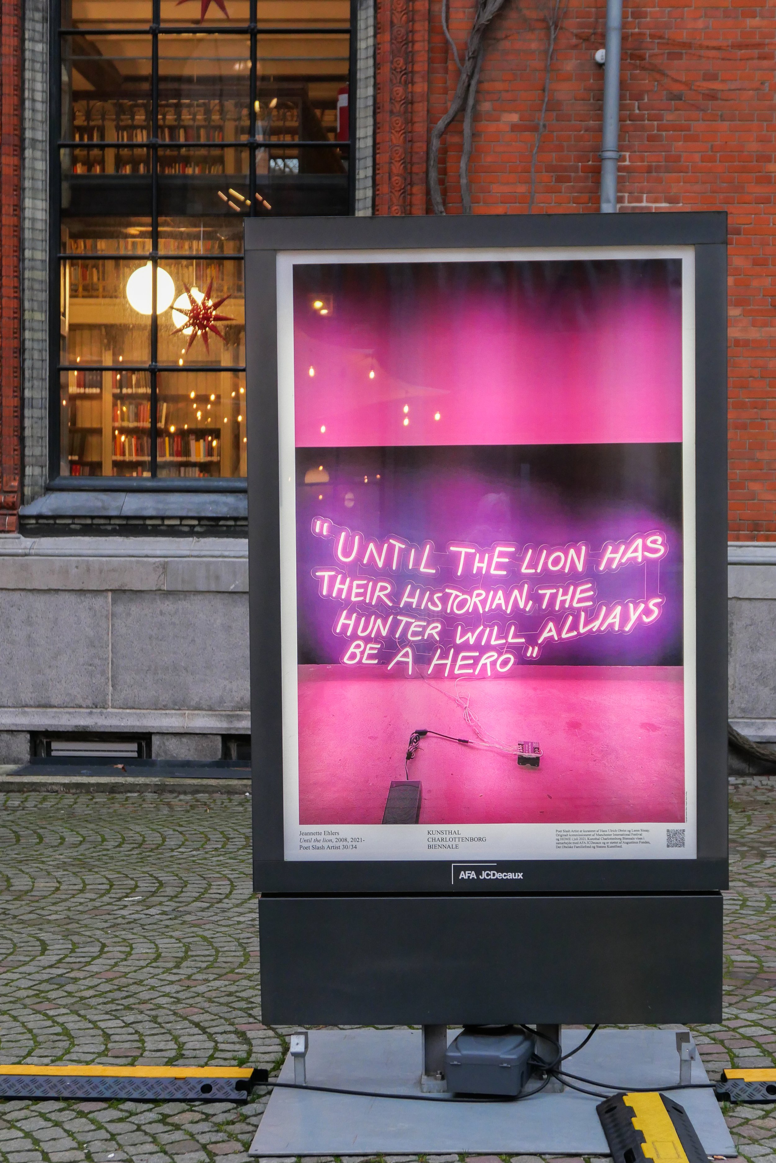
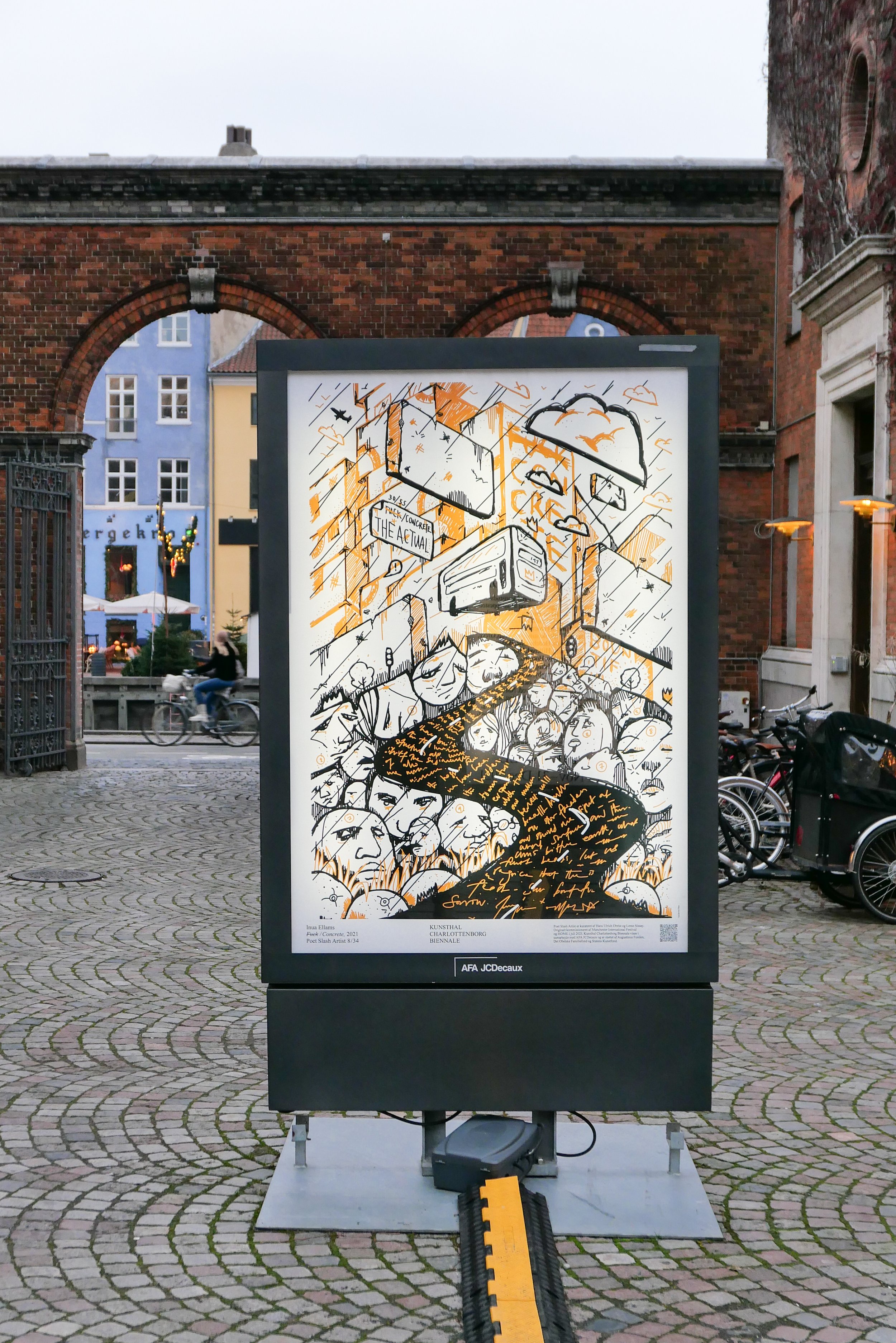
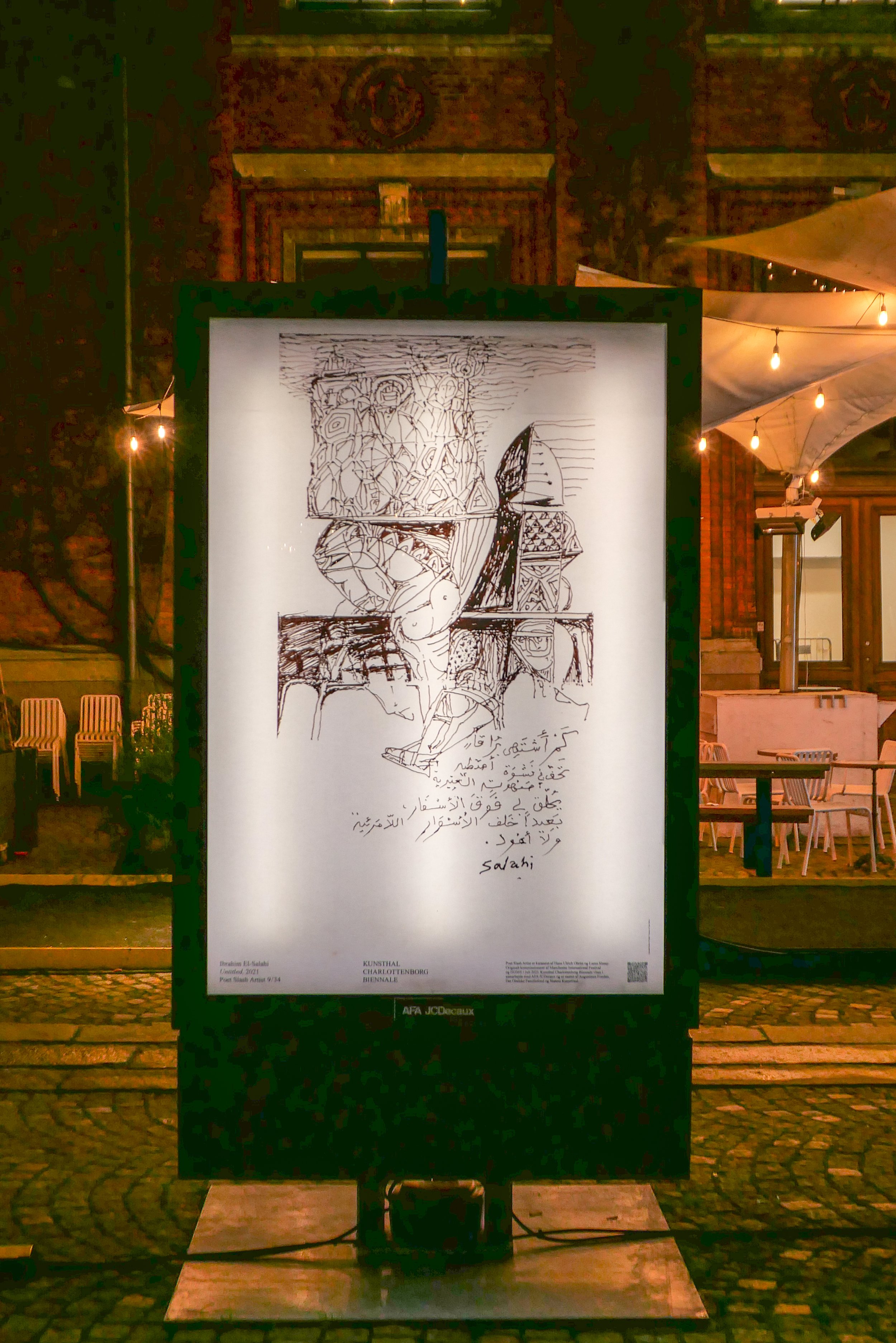
Public Structures explores the potential of advertising for artists to comment on how "value is constantly constructed and circulated."

The Biennale was curated by Hans Ulrich Obrist - director the Serpentine Galleries in London and Jeppe Ugelvig.

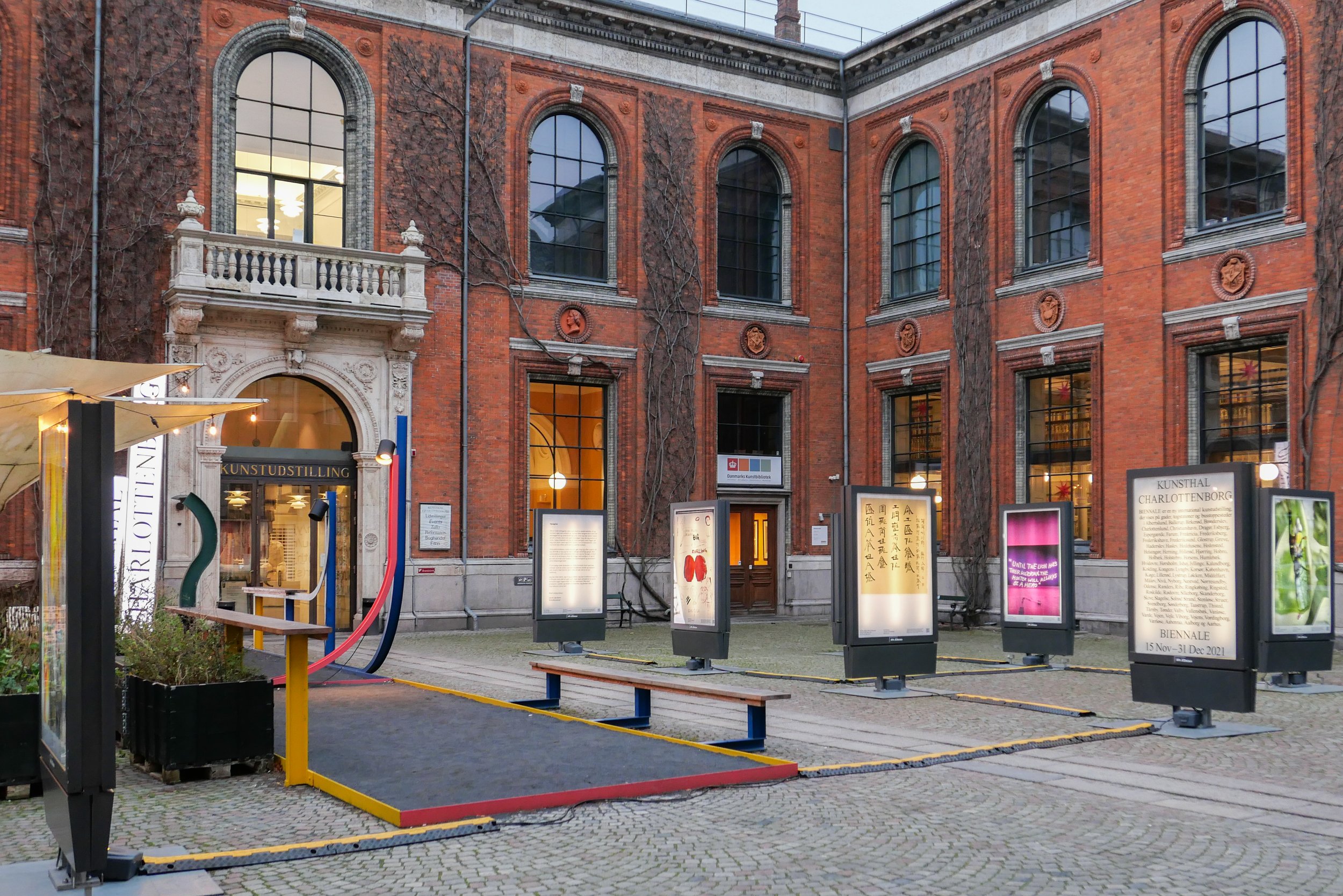
Works are shown in advertising panels and the exhibition opened on the 19 June in the main hall of the central station. From 3 July to 16 July the panels will be shown at numerous venues around Denmark.

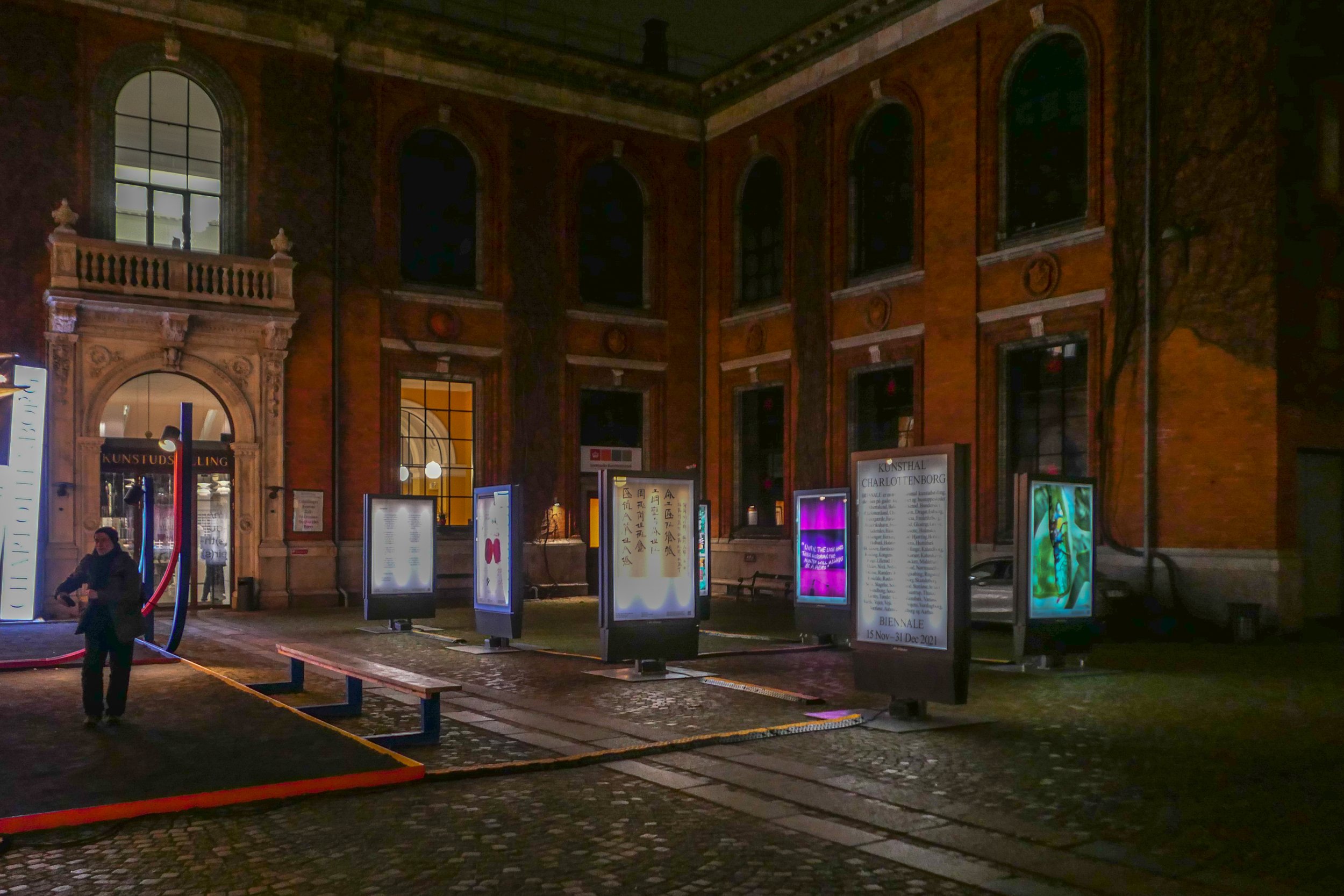
Public Structures
Kunsthal Charlottenborg courtyard
26 June 2023 - 23 July 2023

artists:
Akeem Smith, Bless (Desiree Heiss & Ines Kaag), CATPC (Congolese Plantation Workers), Eric Andersen, AA Bronson + General Idea, Hans-Peter Feldmann, KAWS, Koo Jeong A, Luki von der Gracht, Maja Malou Lyse & Esben Weile Kjær, Martine Syms, Minerva Cuevas, Michael Rakowitz, Pippa Garner, Rasheed Araeen, Rosemarie Trockel, Serapis Maritime, Shuang Li, Sungsil Ryu, SUPERFLEX, Tromarama, Yinka Shonibare CBE, Yugoexport/Irena Haiduk


Urban Heartbeats - celebrating 100 Years of public design by Knud V Engelhardt


This exhibition - in the outdoor display cases on the entrance courtyard of the design museum - marks the anniversary of the design from 1923 of the typeface and a signpost system for the municipality of Gentofte by Knud Valdemar Engelhardt.

His font is distinctive and, once seen, can be identified easily on road signs throughout Gentofte.

Individual letters are rounded and generously spaced with low ascenders and short descenders …. letters such as o or m determine the general height of the lettering and here, in Engelhardt’s font, letters like k or h with ascenders and j or g with descenders are restricted so the overall height of the word is tightly controlled within the background of the sign itself.

In Engelhardt’s font the g and j are particularly distinct as the g has a simple straight descender -that does not curl under the round body of the letter - and the lower-case j, rather than having a full stop or dot above the stem of the letter, has a small red heart …. a ‘signature’ detail that is a play by Engelhardt’s on his own surname.

We now take for granted san serif lettering - lettering without the sharp triangular cuts at the top and bottom of verticals that came to printing from hand-drawn lettering and from lettering cut with chisels on wood or masonry, such as funeral monuments.

Engelhardt was born in 1881 when posters and commercial printing frequently revelled in mixing styles and sizes of font for impact. He trained at the academy and graduated in 1915 and clearly his design recognises work of the Art’s and Craft period with design by Thorvald Bindesbøll and Anton Rosen. This certainly does not detract from his design or suggest that it is derivative …. rather that it explains why the lettering sits comfortably within Danish design history and marks a crucial point when mass production and industrial production came of age and when quality and context became a significant consideration.

The most popular or, at least, the most obvious design by Engelhardt seen by citizens was a new tram for the city that he designed in 1910.

Engelhardt died in 1931, at the relatively young age of 49 but, although his career was short, he is a key figure in the history of Danish industrial design.

Urban Heartbeats
18 June 2023 to 2 October 2023

Designmuseum Danmark
Bredgade 68
1260 Købemhavn K


one of the display cabinets on the forecourt has this model of the plakatsøjle (poster column) designed by Engelhardt.

several versions of these advertising displays were produced for the municipality through the 20th century and some survive on streets and squares in the city

POET SLASH ARTIST at Kunsthal Charlottenborg

Commisssioned initially for the Manchester International Festival and curated by Hans Ulrich Obrist and Lemn Sissay, the exhibition has been reconfigured for Denmark and includes the works of 35 Danish and international artists and poets. 

Work from Poet Slash Artist will also shown in streets, and at train stations and bus stops at several hundred locations across Denmark.

This is the first exhibition of what is to be a biennale event.

Poet Slash Artist
20 November to 31 December 2021
Kunsthal Charlottenborg, Nyhavn 2, Copenhagen


3daysofdesign - COME AGAIN 2.0

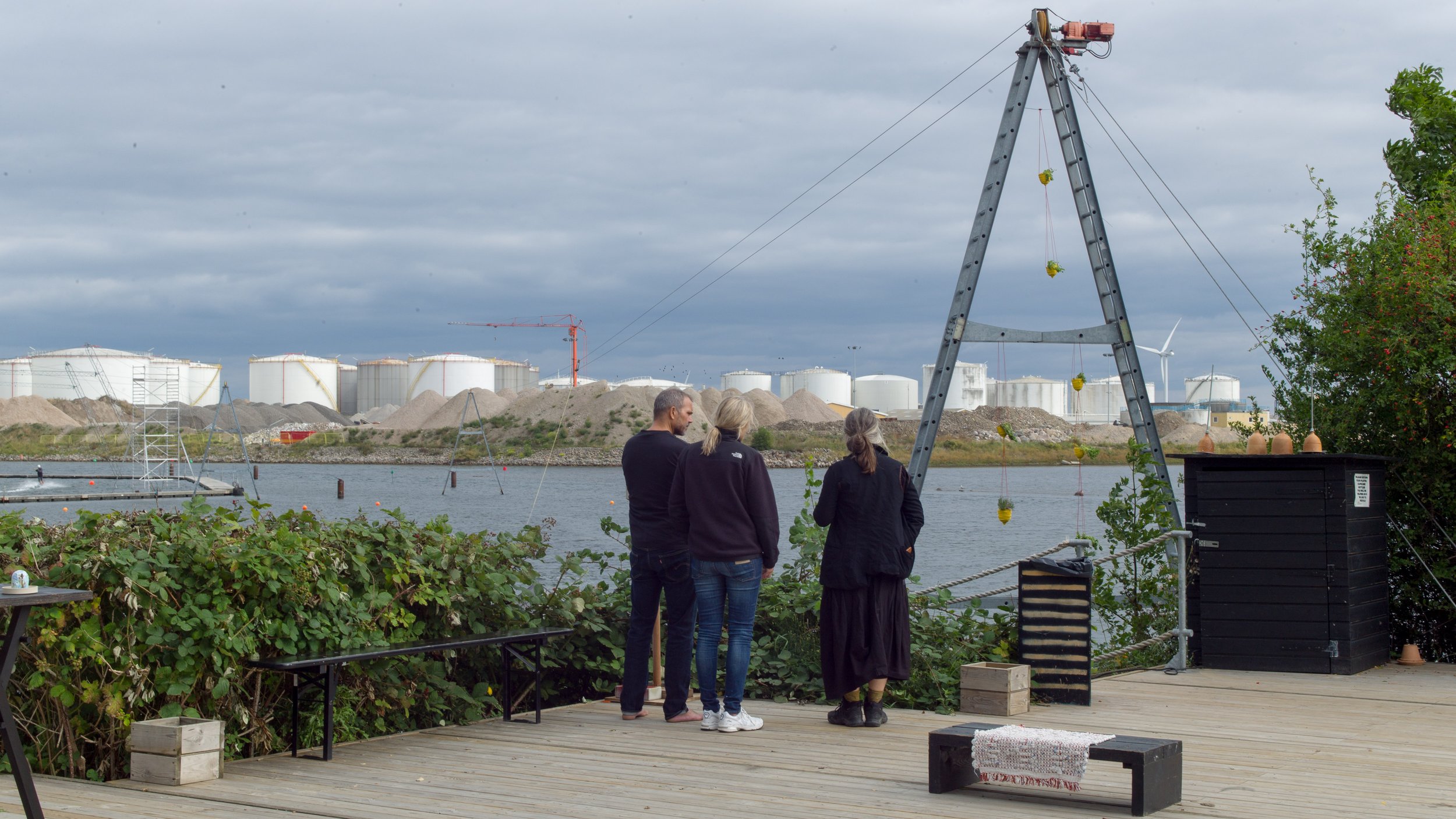
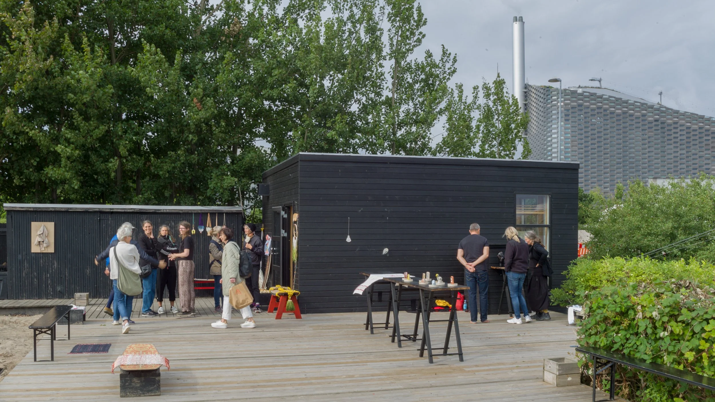
I didn’t get out to Cable Park until the very end of the third day of 3daysofdesign. That was not deliberate apart from the fact that I was trying to take a logical route from place to place to avoid doubling back or making long jumps across the city but there could not have been a better way of ending what was, by then, beginning to feel like a marathon run.

By a very long way, this was the most relaxed show of them all and - out on the edge of the sound - the light coming off the water was amazing.

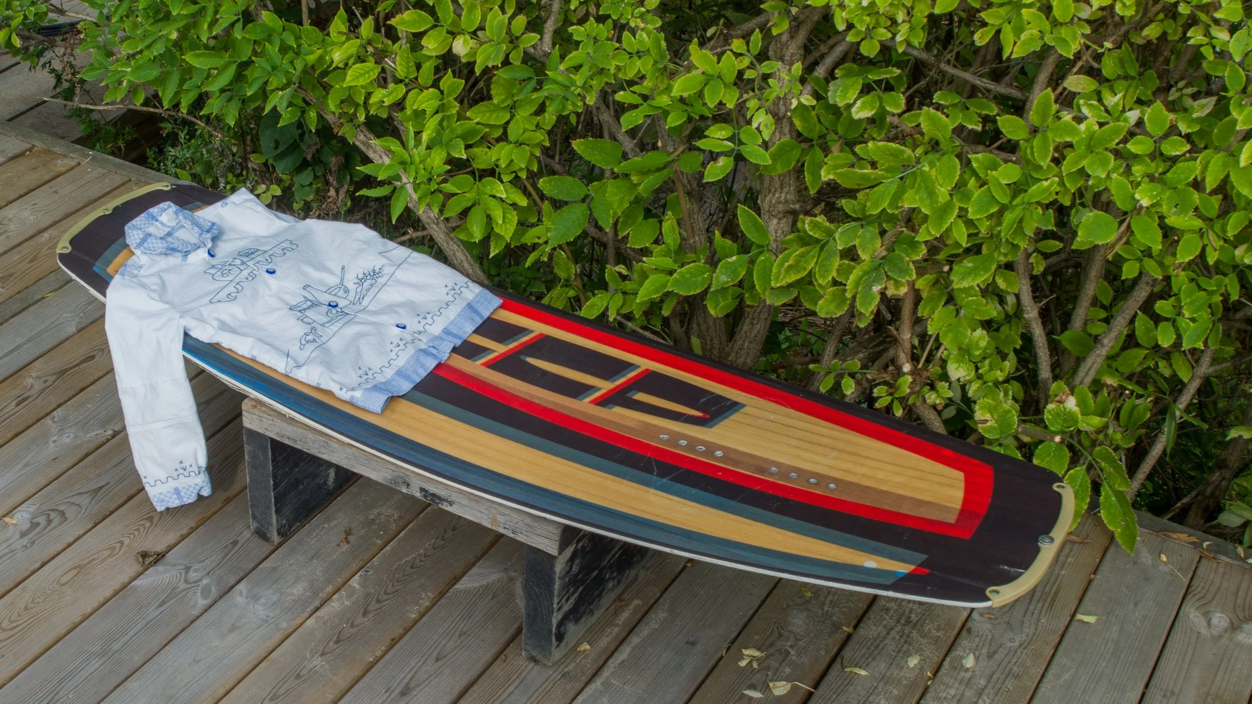
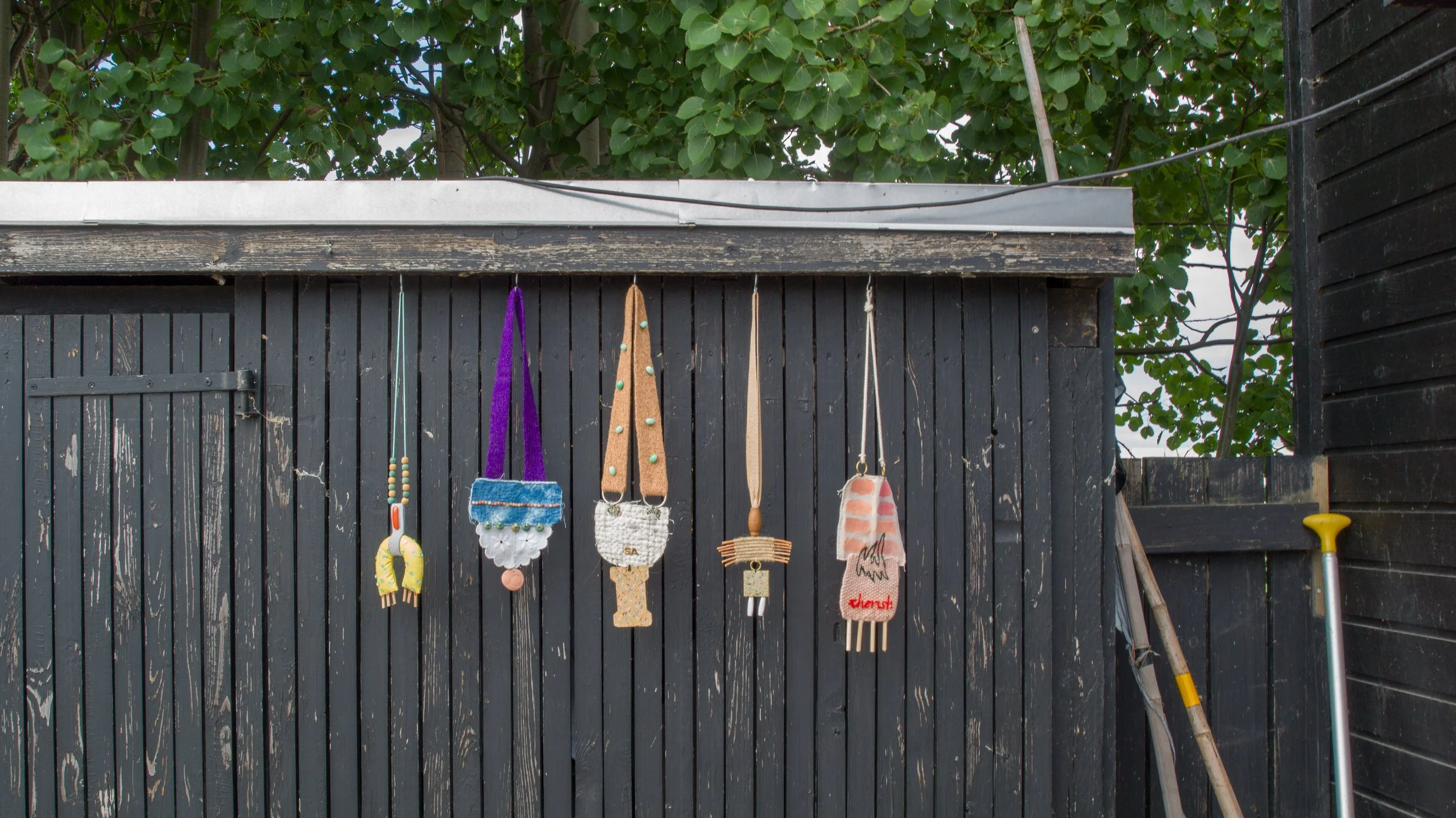
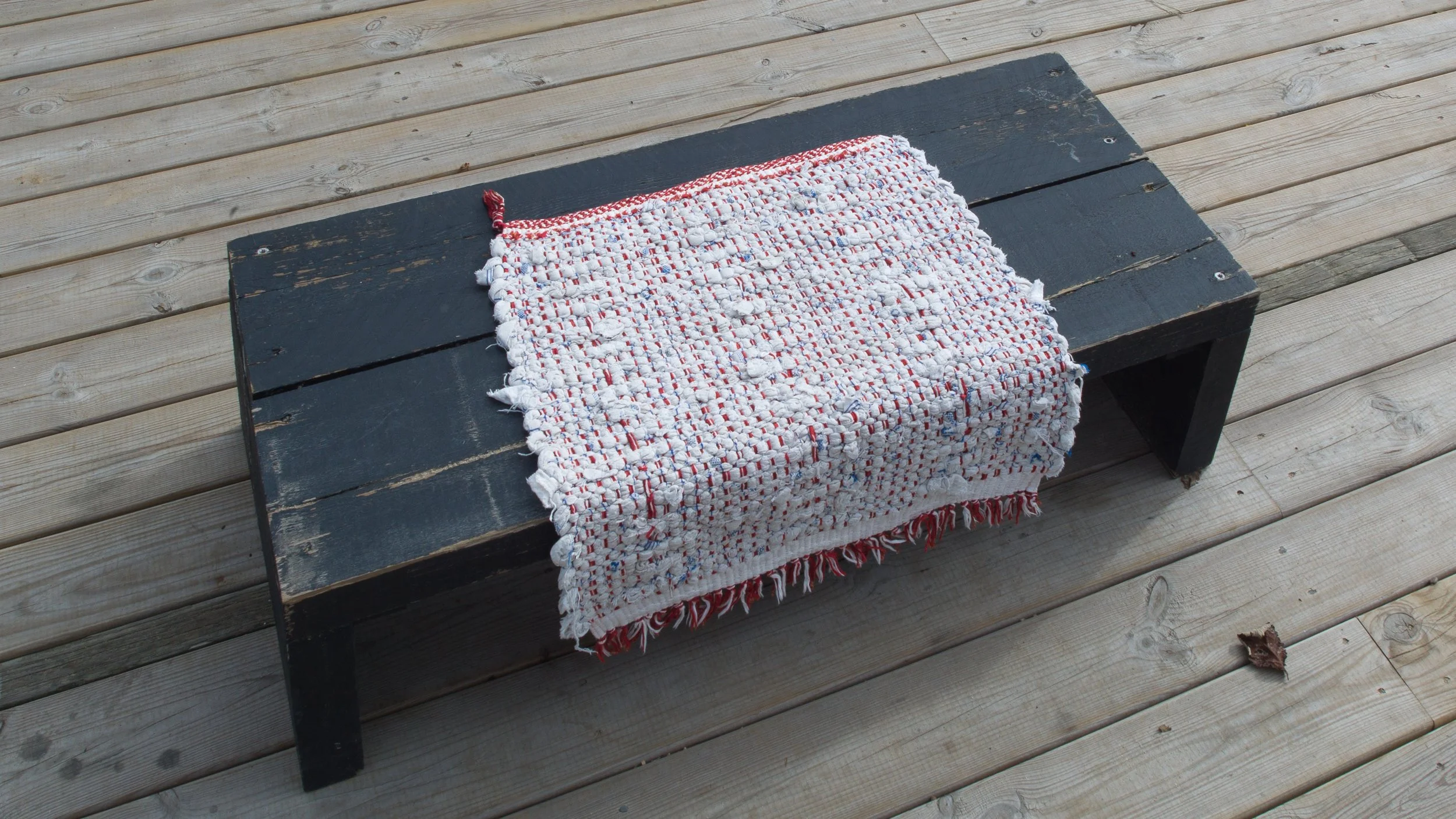
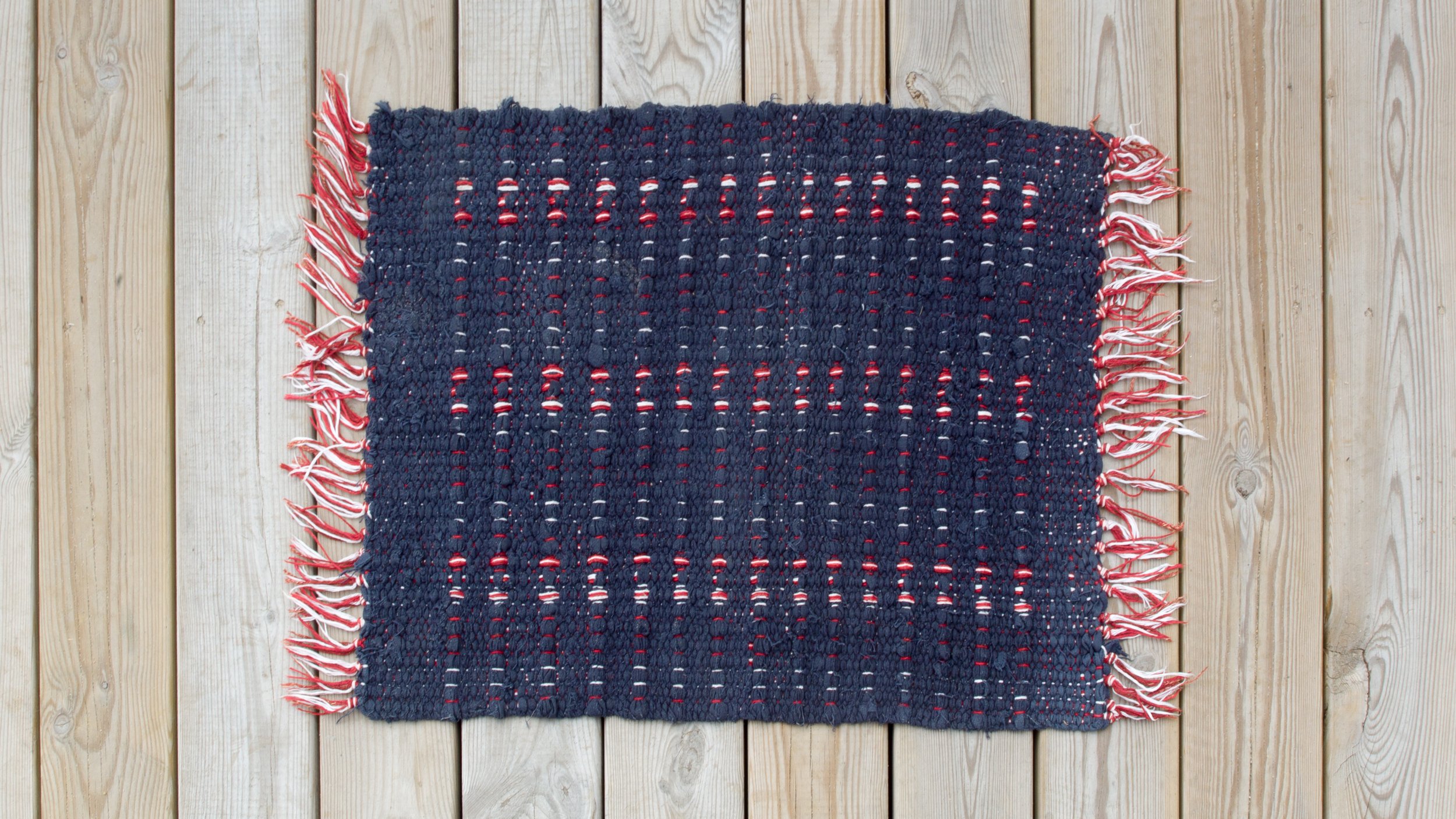
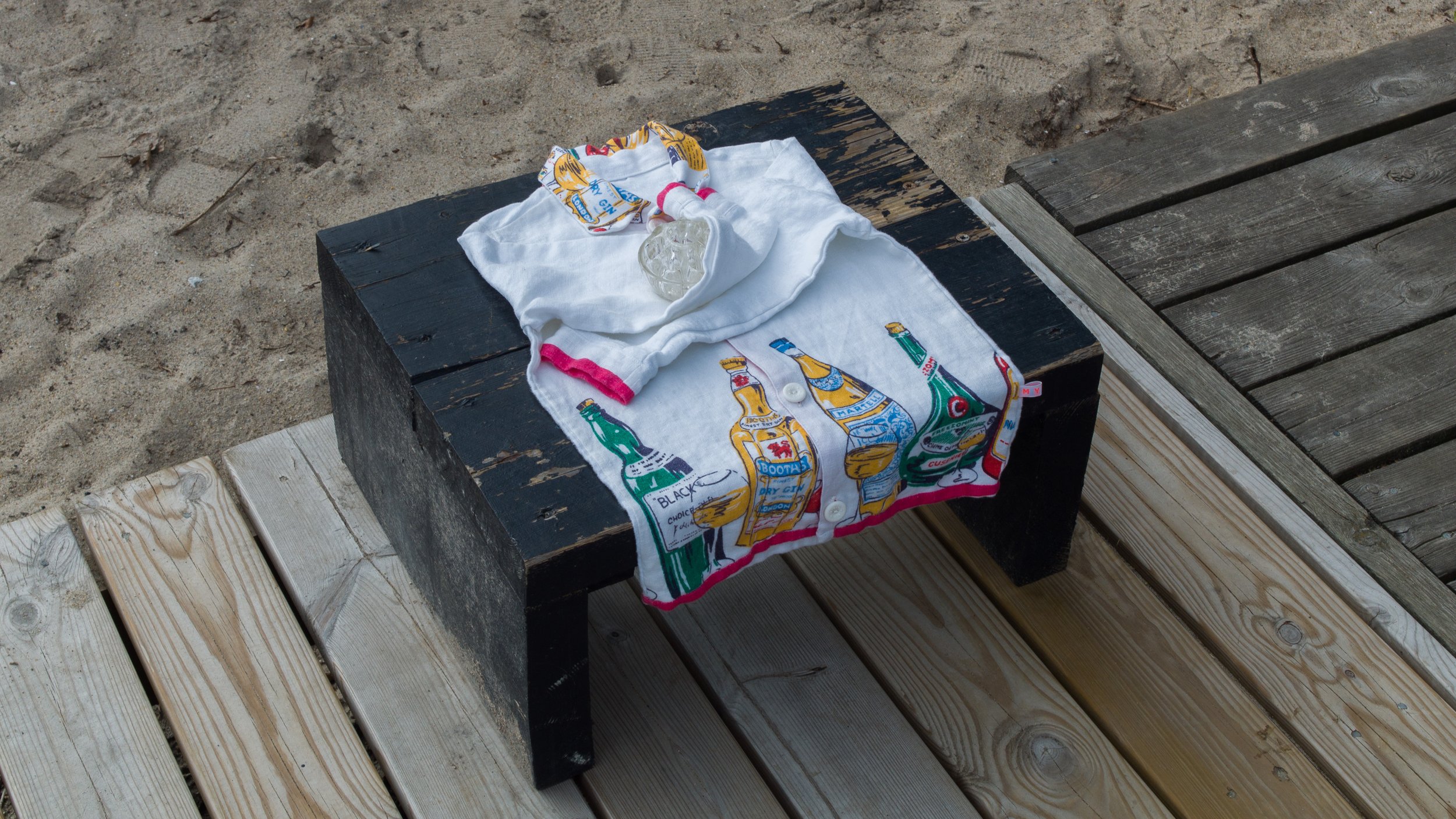
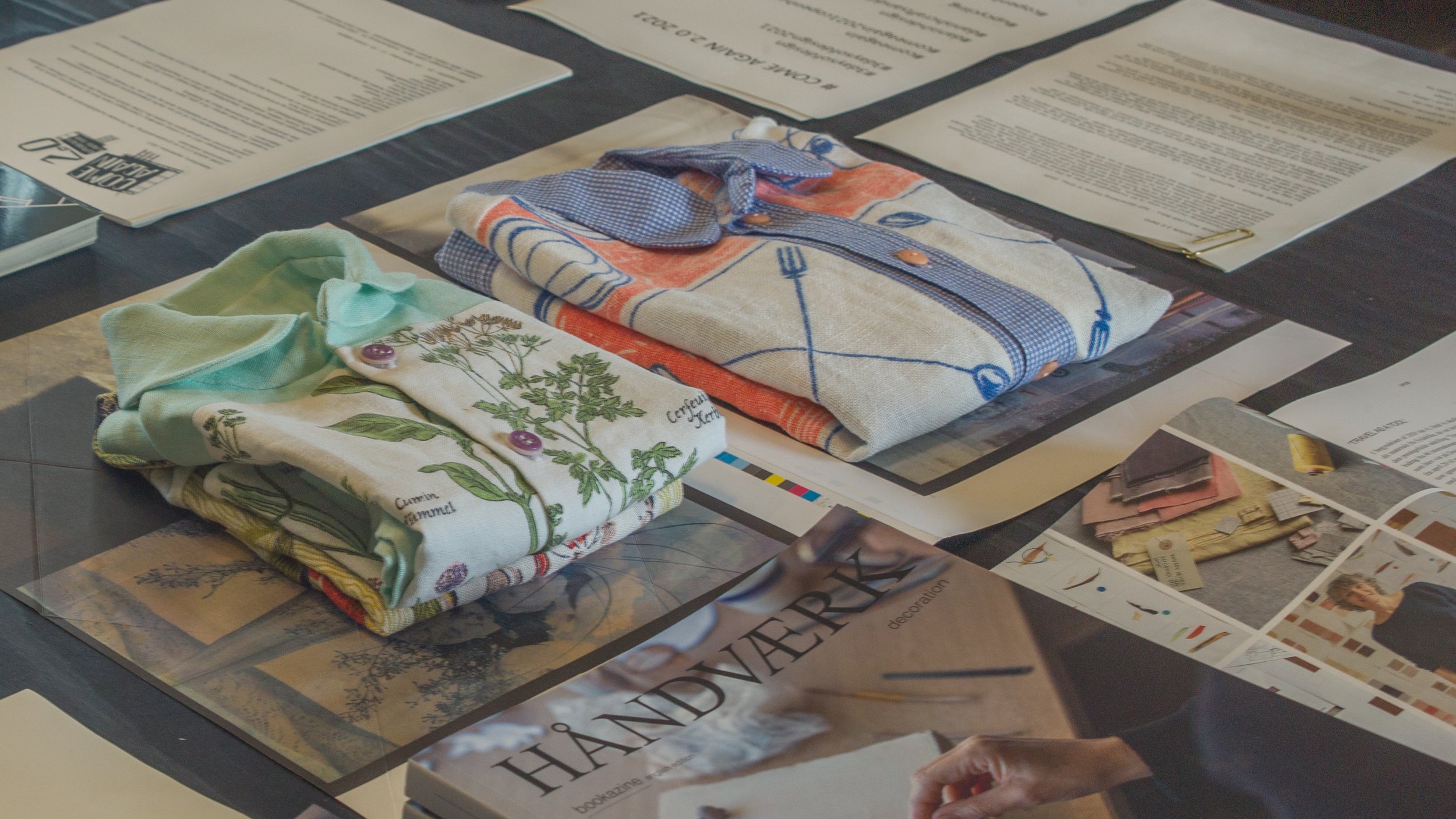
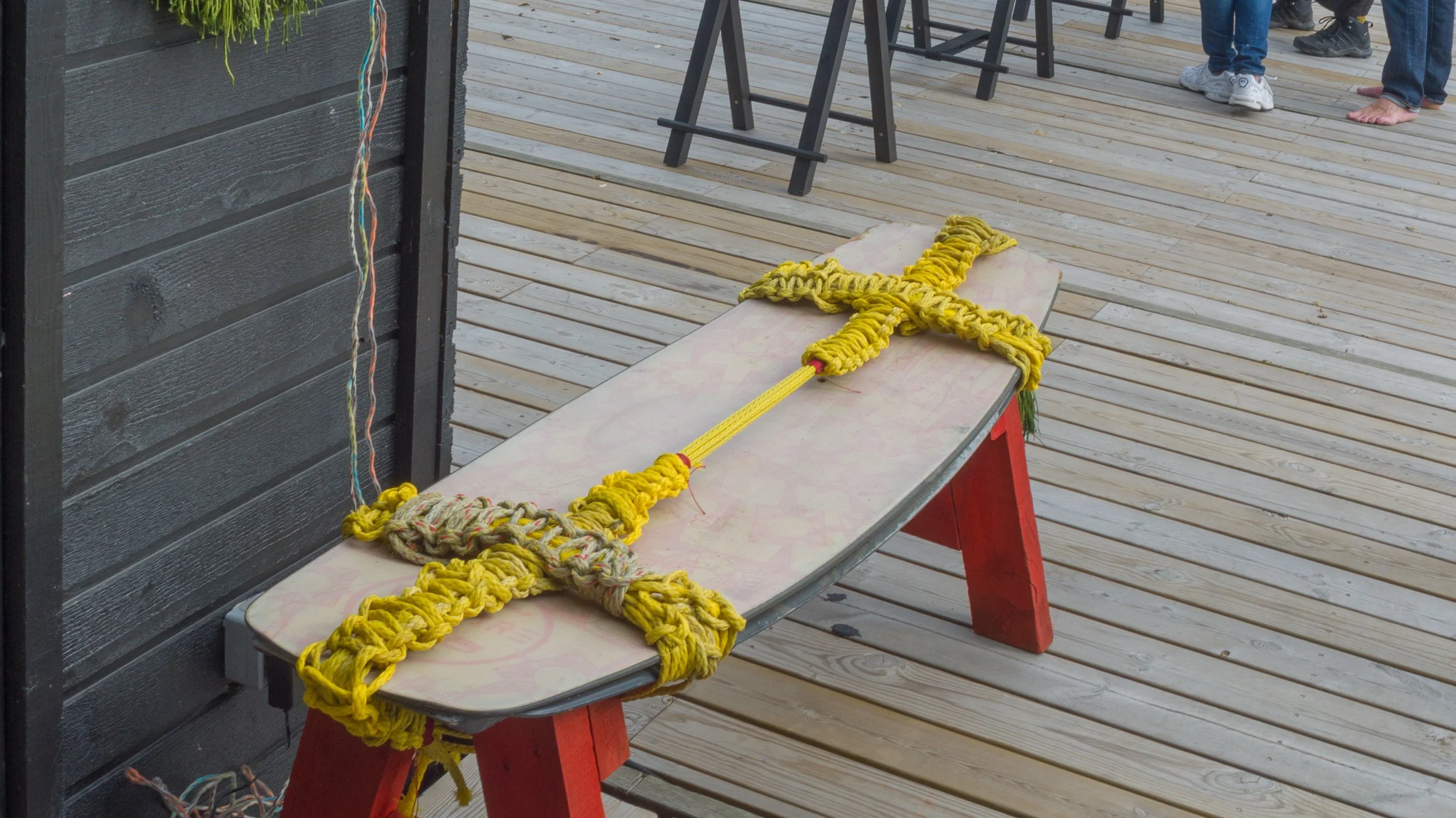
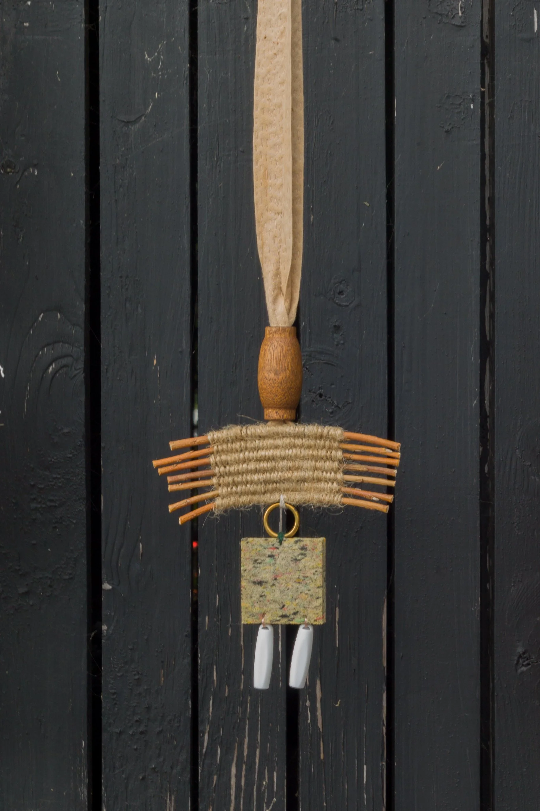
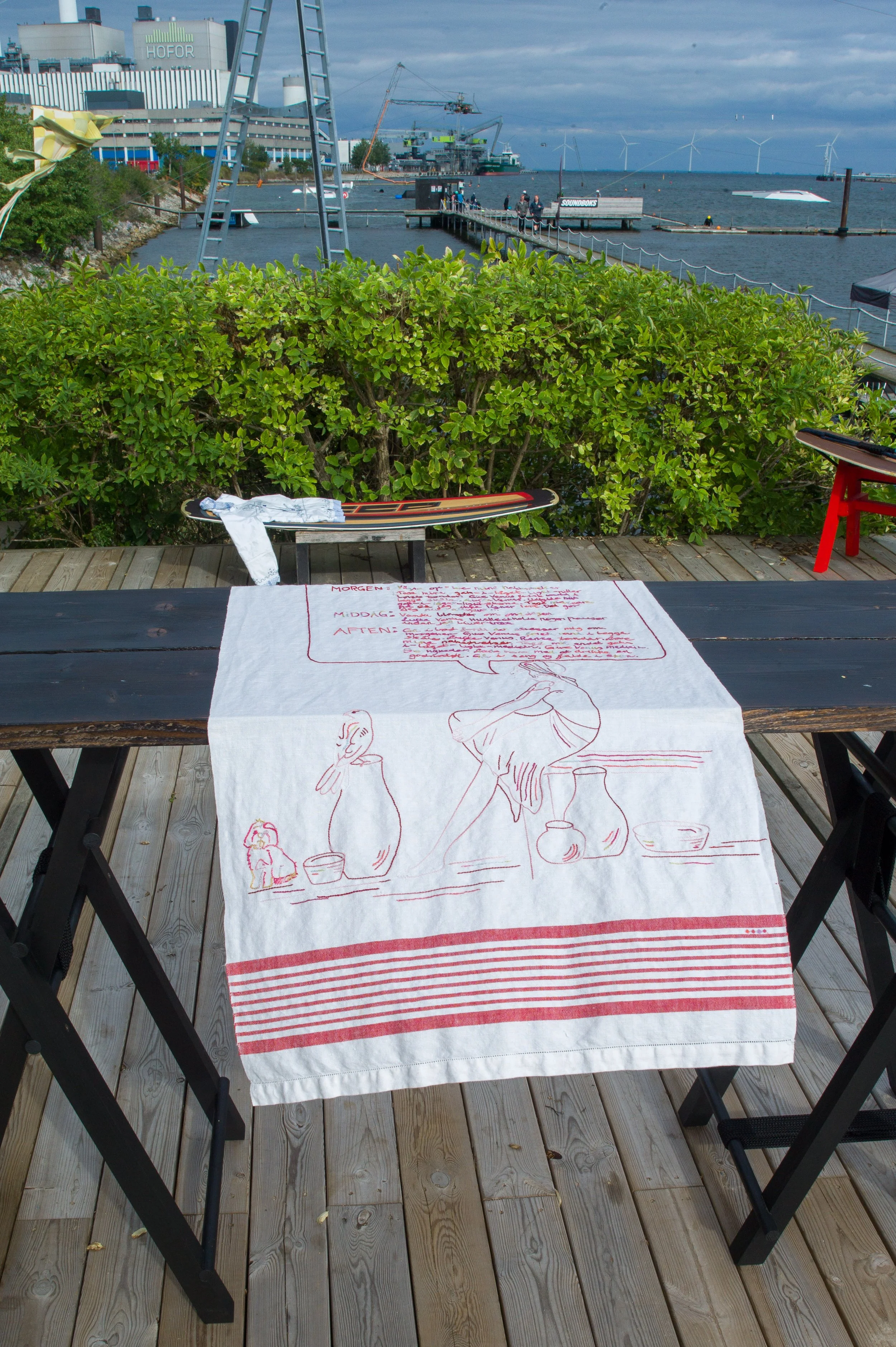
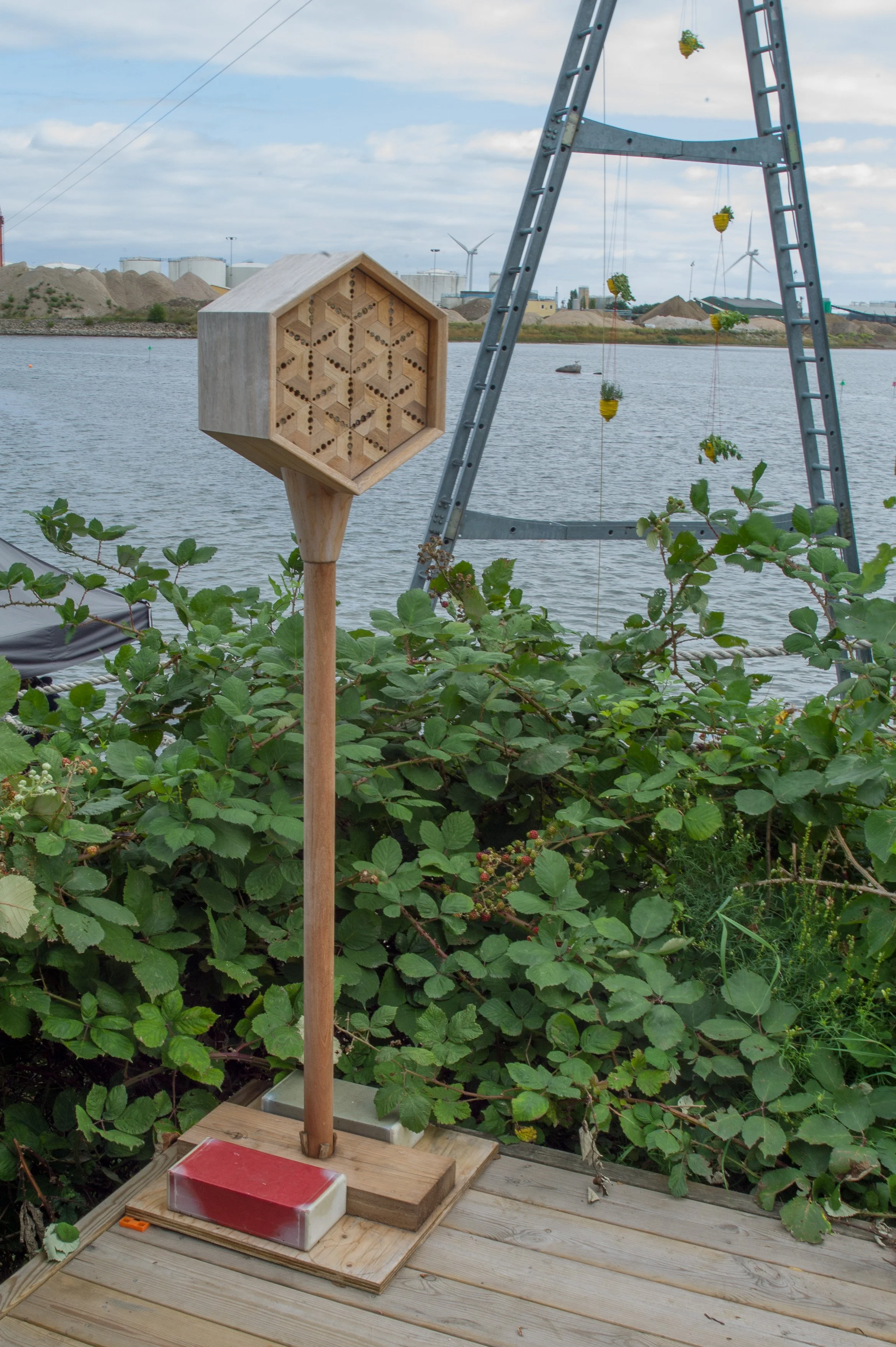
The venue was the studio of the designer, illustrator and ‘paper poet’ Helle Vibeke Jensen and the works, by craftsmen and designers, were shown on the board walks and the hung on the walls of the wooden sheds and outbuildings of the water sports centre and were even shown wrapped around or draped over wakeboards.

Kids in wet suits were not phased and this showed an important aspect of Danish design …. here good design and an interest in art can be just a part of everyday life.

This is the second outing of COME AGAIN, and as with the exhibition at the Offcinet - the gallery of Danske Kunsthåndværker & Designere in Bredgade - this was curated by the jeweller Helen Clara Hemsley and Helle Vibeke Jensen.

Helle Vibeke Jensen
Helen Clara Hemsley

Copenhagen Cable Park
Kraftværksvej 24, 2300 København S


Exhibitors:
Helen Clara Hemsley, Janne K. Hansen and Mette Saabye with George William Bell, Katrine Borup, Rasmus Fenhann, Line Frank, Helle Vibeke Jensen, Lise Bjerre Schmidt, Lotte Myrthue, Martine Myrup, Anne Fabricius Møller, Annelie Grimwade Olofsson, Camilla Prasch and Tina Ratzer.

Tina Ratzer
Reeds

Helen Clara Helmsley
Looking back, to look forward 2

Lotte Myrthue
Strøtanker 3

Rasmus Fenhann
Air Bee n’ Bee


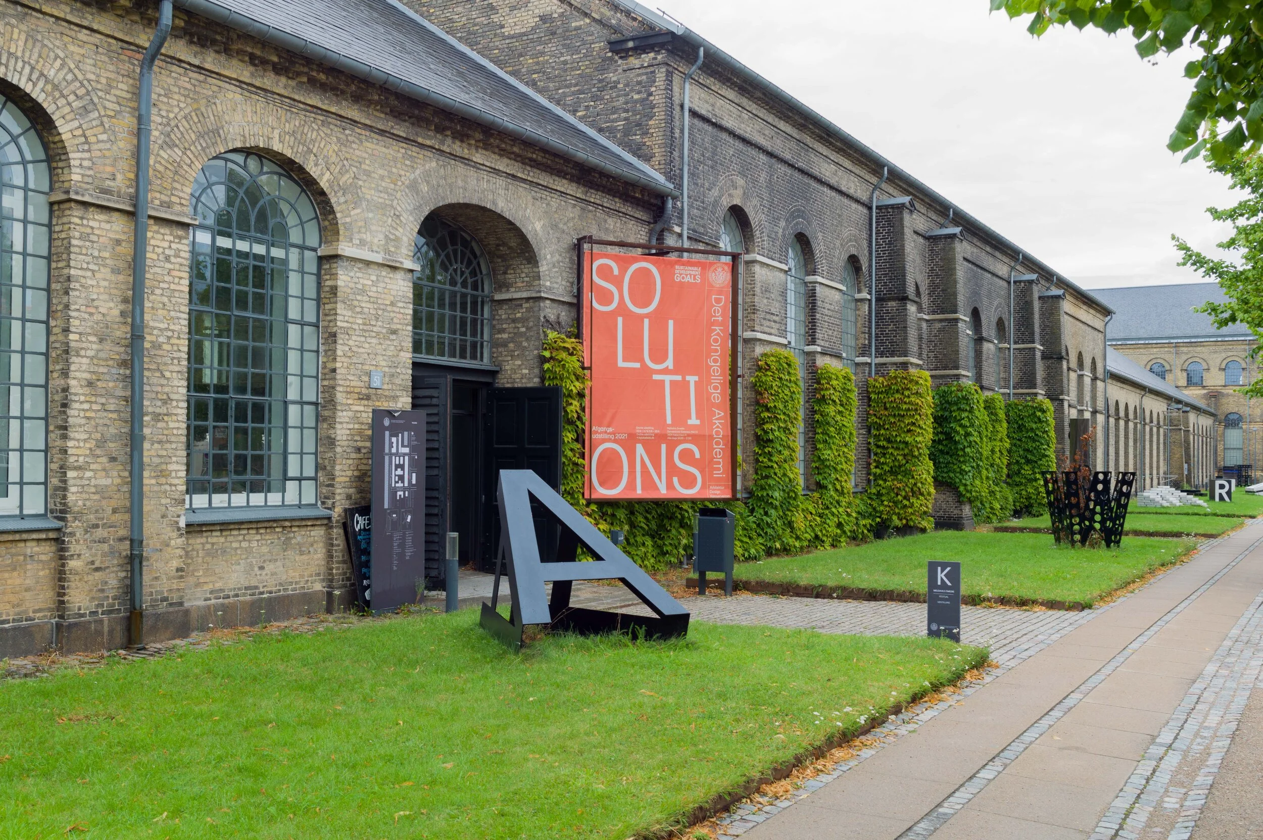
Solutions at Royal Danish Academy

Architecture Design Conservation: graduate projects 2021

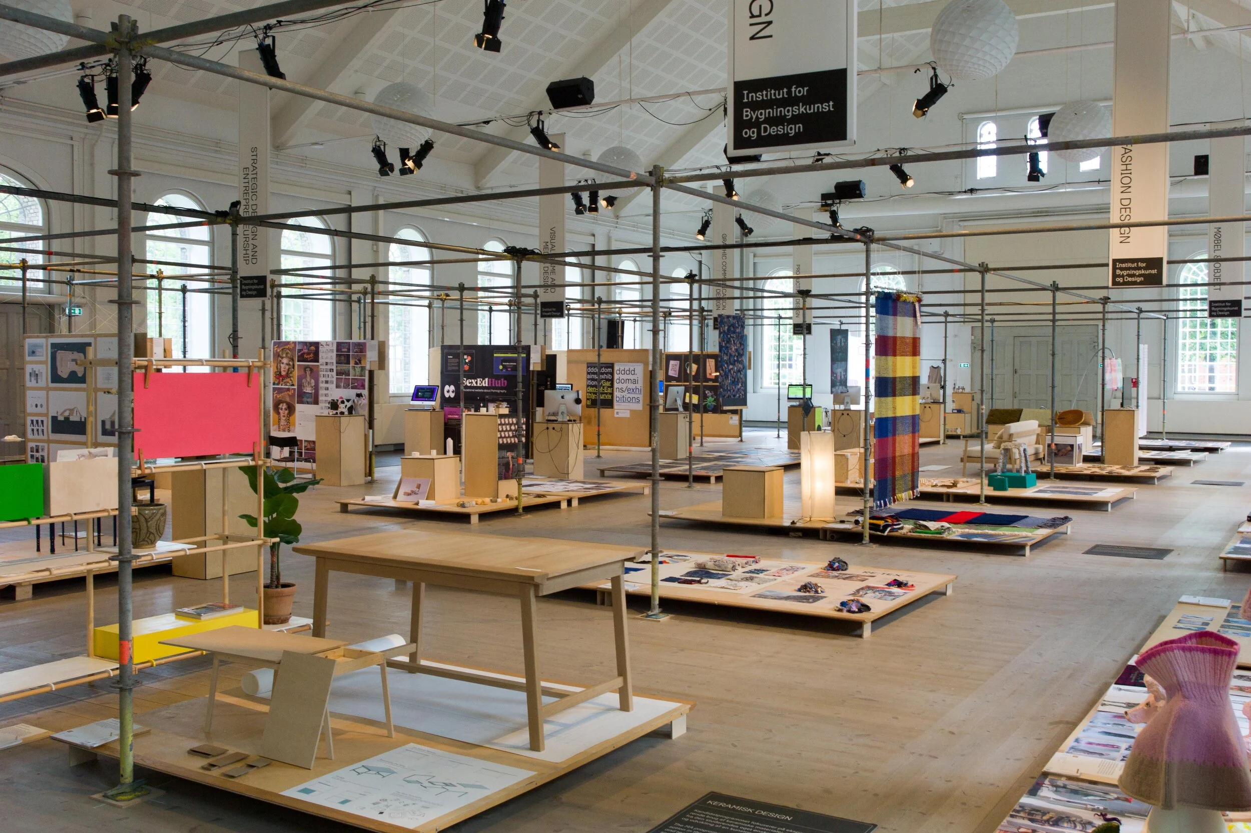
Shown here are 220 projects from the students in the schools of architecture, design and conservation who have graduated from the Royal Danish Academy in 2021.

This is an opportunity to see the work of the Academy schools, with their focus on the UN Sustainability goals, and these projects show clearly the ways in which teaching has taken onboard the challenge of climate change and the need to reassess our approach to materials for new developments and our approach to the increasing need to conserve or adapt existing buildings.

Here are the young architects and designers of the next generation whose designs for buildings and for furniture, industrial products, fashion and graphics will have to provide solutions to the new challenges.

As last year, the graduate projects can also be seen on line.

note:
after an initial opening in late June, the exhibition closed through July but then reopened on 2 August and can be seen daily from 10.00 to 17.00 through to 20 August 2021

Royal Danish Academy Architecture Design Conservation
Philip de Langes Allé 10
1435 Copenhagen K

Graduation 2021: SOLUTIONS
the exhibition on line

 
Solutions Grid.jpeg
 

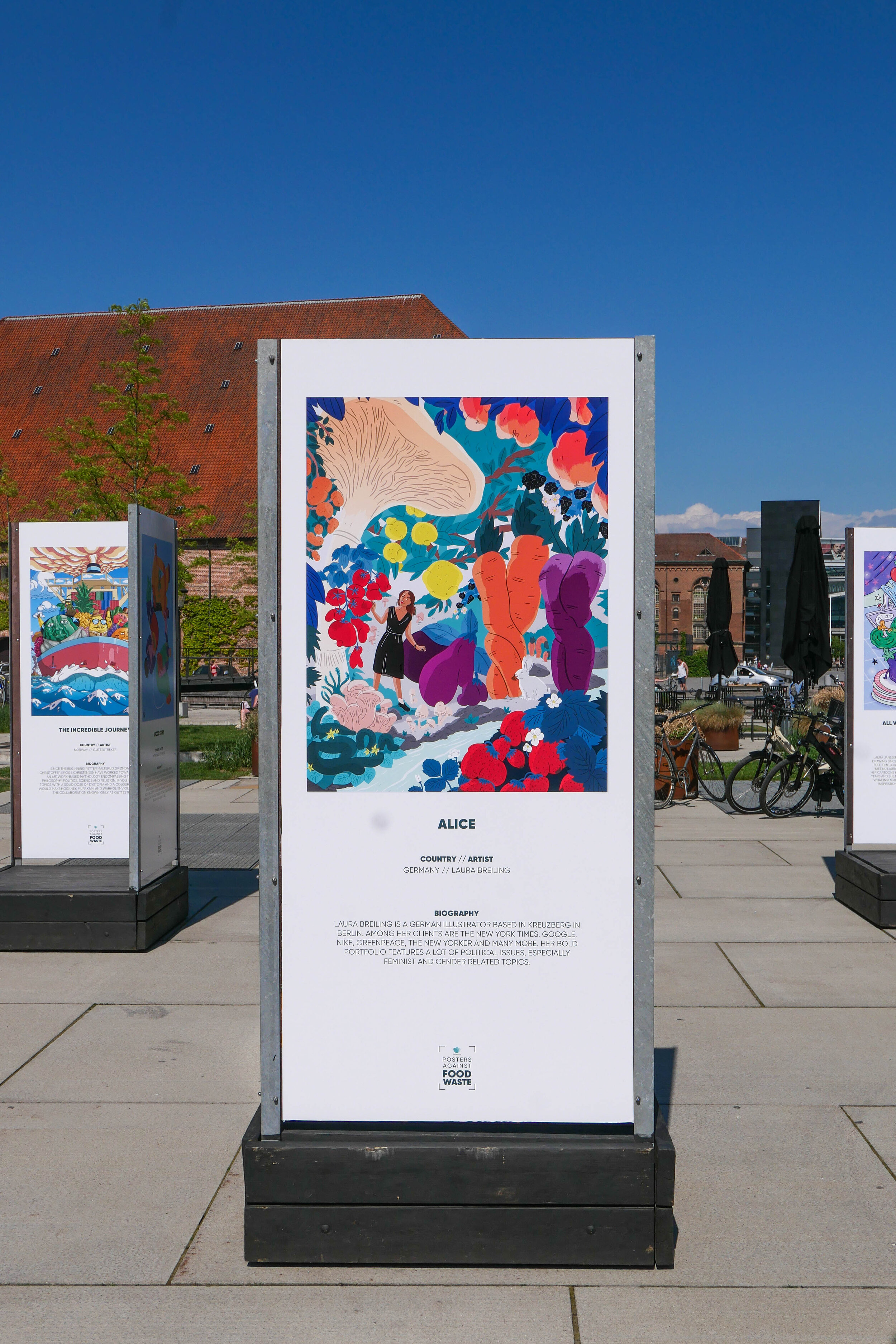
Too Good To Go - posters against food waste

A third of food produced in the World is wasted and, to compound the problem, that waste is responsible for 8% of greenhouse gas emissions.

These posters were launched on World Environment Day to make people more aware of the problem and are from a group of European illustrators and designers .

They have been printed in limited editions and can be purchased on line. The price covers printing, handling, packaging and delivery with the remainder going to the UN World Food Programme.

the exhibition continues on Bryghuspladsen until 27 June 2021


www.posters.toogoodtogo.com

Frama Permanent Collection

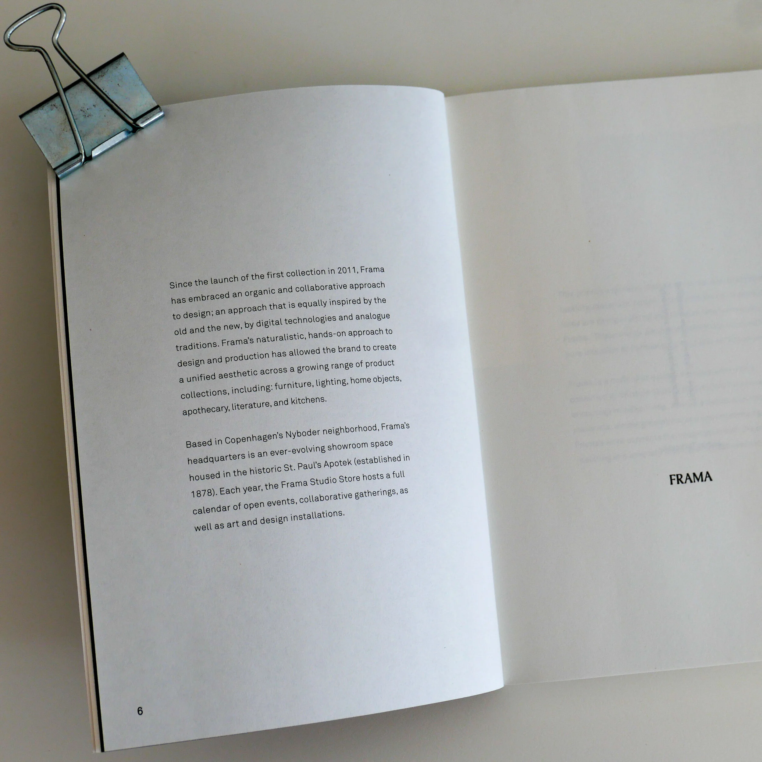
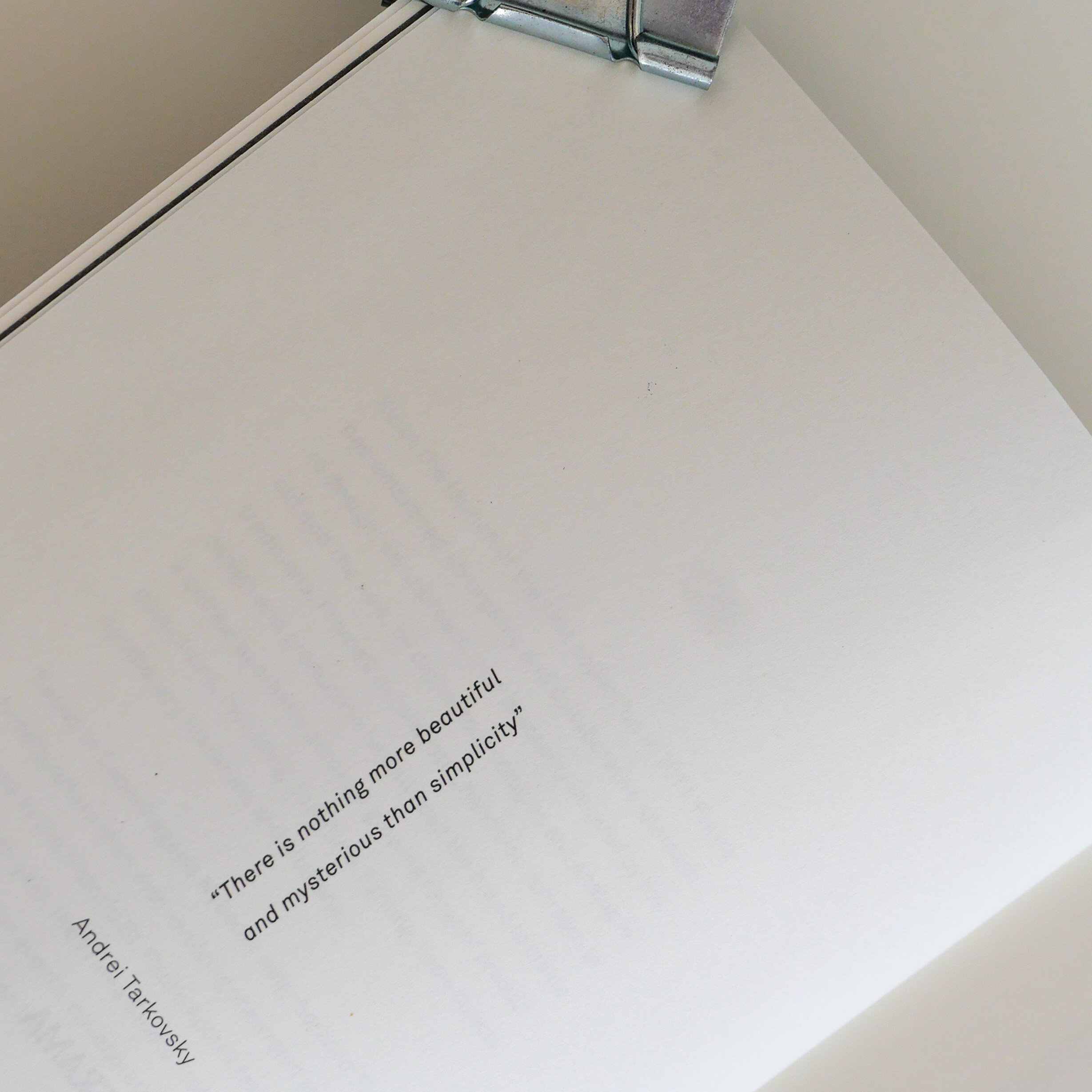
The catalogue for Frama Permanent Collection includes interesting quotations and some short comments or statements that hint at the ethos of the studio and stress the use of natural materials and the ‘simple geometries’ of the designs ‘resulting in a uniquely warm and honest aesthetic’.

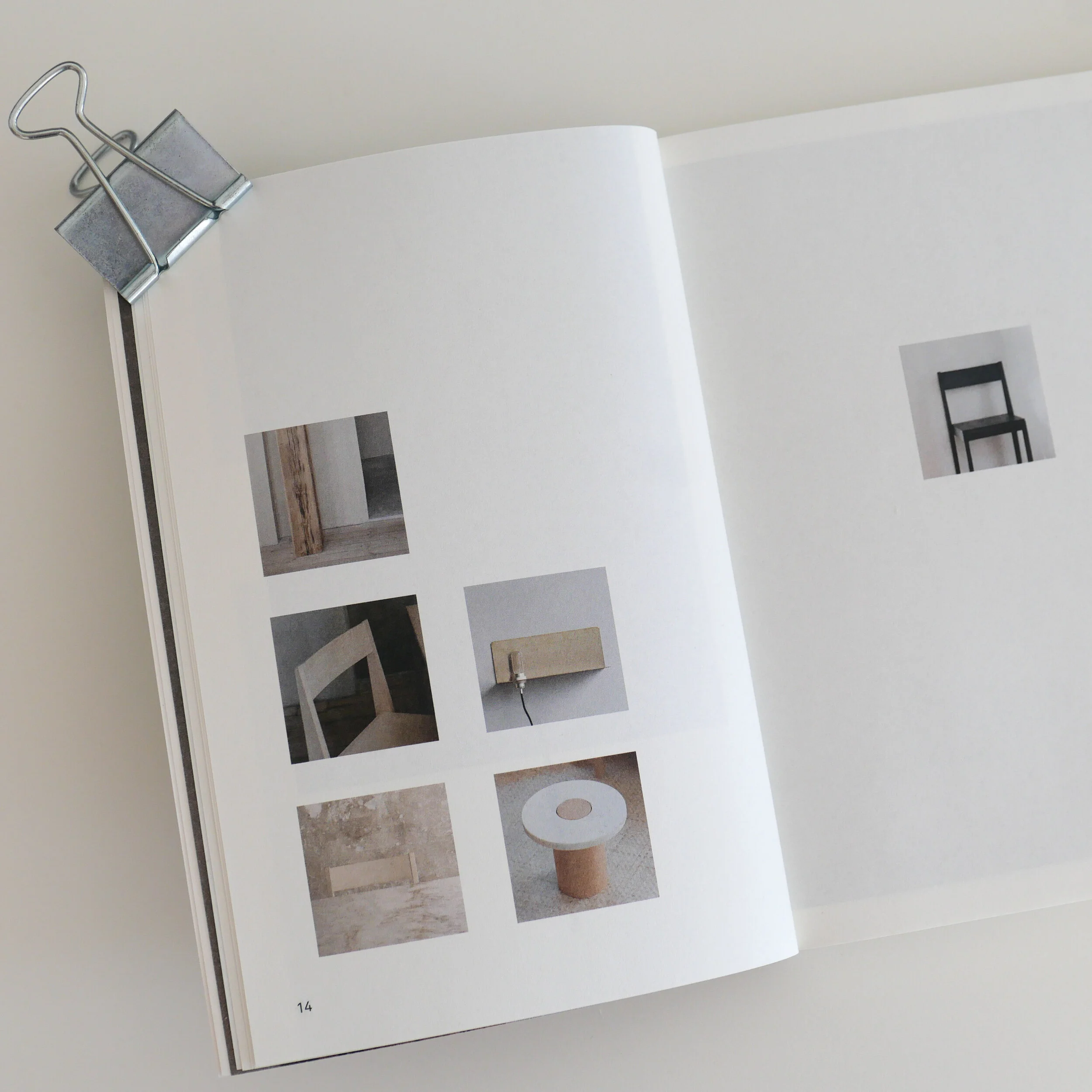
Photographs show the furniture in stark and simple interiors so in a strongly defined space but not in an obvious room to blur any sense of a specific place.

The full catalogue has simple, neat, useful, outline drawings and basic information about designers and materials and dimensions but not, significantly, the date of the design. Presumably, it is called the Permanent Collection because the intention is to remove any sense of a specific time.

My impression is that, having brought together a substantial body of work, Frama will now add to or edit this collection with well-measured discernment.

There are four sections in the catalogue with:

ESSENTIALS
described as "utilitarian pieces" that includes the hall-mark, metal-framed, stools by Toke Lauridsen; the low aml stool in wood by Andreas Martin-Löf; benches; Chair 01 by Frama; a daybed; Shelf Library by Kim Richardt; box units in aluminium by Jonas Trampedach and the round and the rectangular trestle tables by Frama Studio. These are the key pieces.

SIGNATURE
pieces are marked out for their ‘extra sophisticated appearance’ and for more challenging and demanding knowledge for manufacture including the Skeleton 021 Chair designed by Elding Oscarsen Architects and the Triangolo Chair by Per Holland Bastrup

HOME GOODS
are ceramics - robust glazed stoneware by Frama Studio - and glassware for the table from 0405 Glass with some kitchen to table pieces such as cutting boards

LIGHTING
is distinct and a very interesting range of pendant lights, free standing spots and a take on the strip light and all with simple, but clever and elegant, geometric shapes in brass or copper, polished steel or aluminium and powder-coated steel or powder-coated aluminium

The Apothecary Collection and the free-standing units of Frama Studio Kitchen are dealt with separately but can all be seen on the Frama site

FRAMA - the apartment

FRAMA Permanent Collection


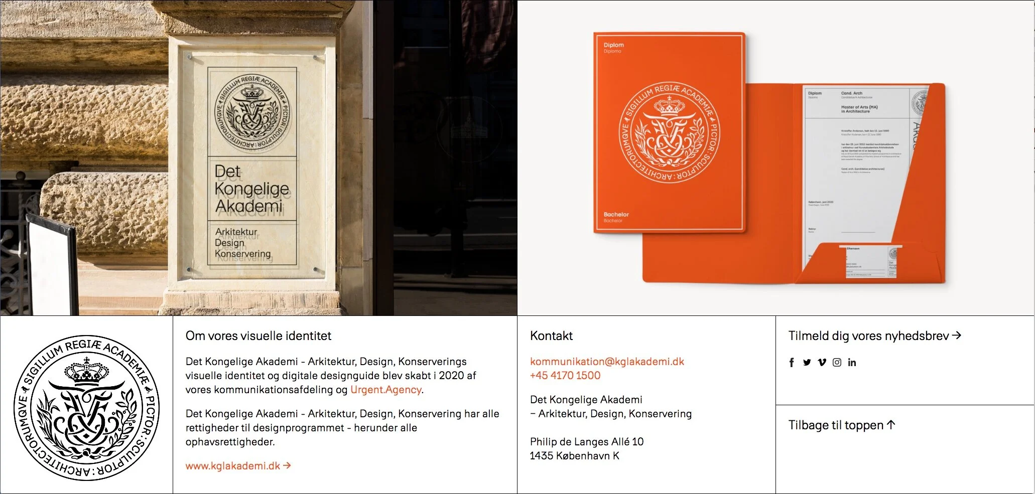
Det Kongelige Akademi - the new visual identity by Urgent Agency


On the 6 October the Royal Danish Academy of Fine Arts Schools of Architecture, Design and Conservation (KADK) launched a new visual identity created by the academy communications department and Urgent Agency. This is not just about graphics but appears to be a major rethink of how the Royal Academy presents itself, its students and their work to a wider public.

The name of the Academy and its design schools has been shortened to Det Kongelige Akademi - Arkitektur, Design, Konservering / The Royal Academy - Architecture, Design, Conservation and there is a new royal seal.

Without doubt, the old branding - with very heavy use of black borders and black blocks - was looking tired and dated and the online site was far from easy to navigate. The complete redesign of the online site cannot have been easy because it is the initial access point to a vast amount of information for students and staff; for potential students; for companies and potential employers and for a broader general public who are looking for information about the libraries, public exhibitions and so on.

Overall, the new visual identity is light and elegant and simple with just four colours - white, a strong and distinct orange, black and a light sand colour.

For all printed material and for the online site there is a new font called Akademi that has low ascenders and short descenders so it forms compact text blocks that are clean, neat and straightforward.

Even if, generally, you are not particularly interested in graphics or typefaces or layout it is worth looking at the online page for the new visual identity because it is itself a model of clarity. There are nice touches like an animation to show the new seal and information about the modular grid to be used for online pages and for all printed work. This is a crucial part of the design … a good grid has done it's job when it brings order and creates a consistent character but you don't register that it is there. Without a good grid, layouts quickly become muddled or crowded but without it being clear to the user exactly why.

Det Kongelige Akademi / Royal Danish Academy
Det Kongelige Akademi - visuelle identitet
Urgent Agency

telling you where to put it

Graphics for waste.jpeg

The amount of rubbish and the types of rubbish we recycle has changed over the years.

And not just what and how much is recycled has changed: the colour of bin you put the waste in and the sort of label or symbol on the bin has changed at different times in different places so now varies from city to city. Even within Copenhagen, the what and the where is different from one part of the city to the next. Some people would claim that you get a better sort of rubbish in Frederiksberg or Hellerup to the rubbish people throw away in Christianshavn but I'm not convinced.
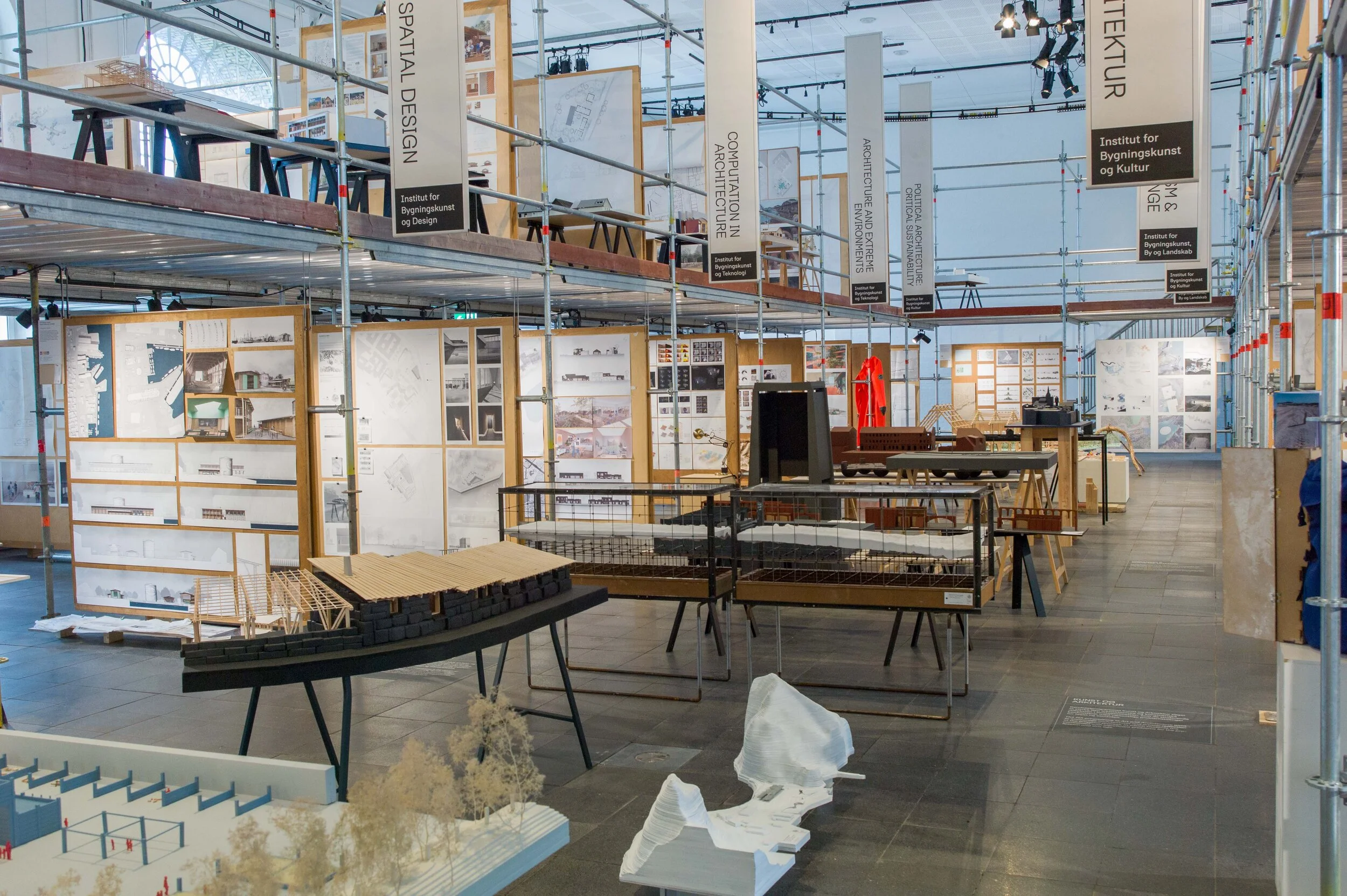
But now, throughout Denmark, all this is to be rationalised and with standard graphics so, hopefully, you will no longer have to stand in front of a line of bins trying to work out what the symbol really means.

Now there will be ten different bins for ten types of waste.

…. but even here they seem to have forgotten batteries and is anyone completely sure when paper is too thick to be paper and becomes cardboard or at what point a pamphlet becomes a book?

All we do know for certain is that gone are the days when everything simply went into one bin and ended up at the district heating incinerator.


shop signs - commerce over conservation

This is the sign for a restaurant on Grønnegade on a building in a prominent position that closes the view up Ny Aldelgade from Kongens Nytorv.

On the whole, commercial signs in the city are good but I have definite reservations about this sign.

At first, it seems to have been designed with relative care, with the neon lettering on a clear background, and that must have been a condition for planning permission but this was an important shop for paint and pigments and the beautiful typography of the original sign, cut into stone, has survived on what is a good, high-quality, historic facade.

Look carefully and you see that the fixings for the new sign are drilled straight into the original stonework and when removed the drilled holes will have caused damage that will have to be repaired ….. and this seems to be completely unnecessary as the sign is not the main sign with the restaurant name - that is actually in the window below - but for a rather feeble joke.

Signs for shops - particularly when they are signs with symbols for a trade - developed when many people in a city were illiterate. For the same reason - to attract customers and to advertise what they were selling - street traders and vendors at markets and fairs, shouted out what they were selling. Some shops don't seem to have realised that most of us are not illiterate and not short sighted - distracted maybe but illiterate and short sighted no.

The banner style of sign, sticking out from the shop front so they can be seen as you walk along the street, are fine and in Copenhagen there are plenty of examples that are clever and funny and well designed.

It's the over-big and badly-designed signs I don't like and particularly when they are the one-style-for-everywhere signs of corporate branding. It's the visual equivalent of having shopkeepers shout at me as I walk along the street.

Curiously, most of us are not wandering the streets with no idea why we are there or where we are going until a large, badly designed sign, reminds us we are hungry and desperately need a cheap burger.

And with phone apps shouldn't large and bad signs be redundant? Most people, thanks to an app, know what they want and where to go to get it.

I'd be quite happy if Google came up with software that gave users a mildly severe shock every time they got near a burger place and shouted into their earbud

"oi - you feel hungry - you need chips"

…. a sort of revenge for me having to walk around and avoid all those people staring down at their phone rather than watching where they are walking.

end of grumpy rant

Night Fever

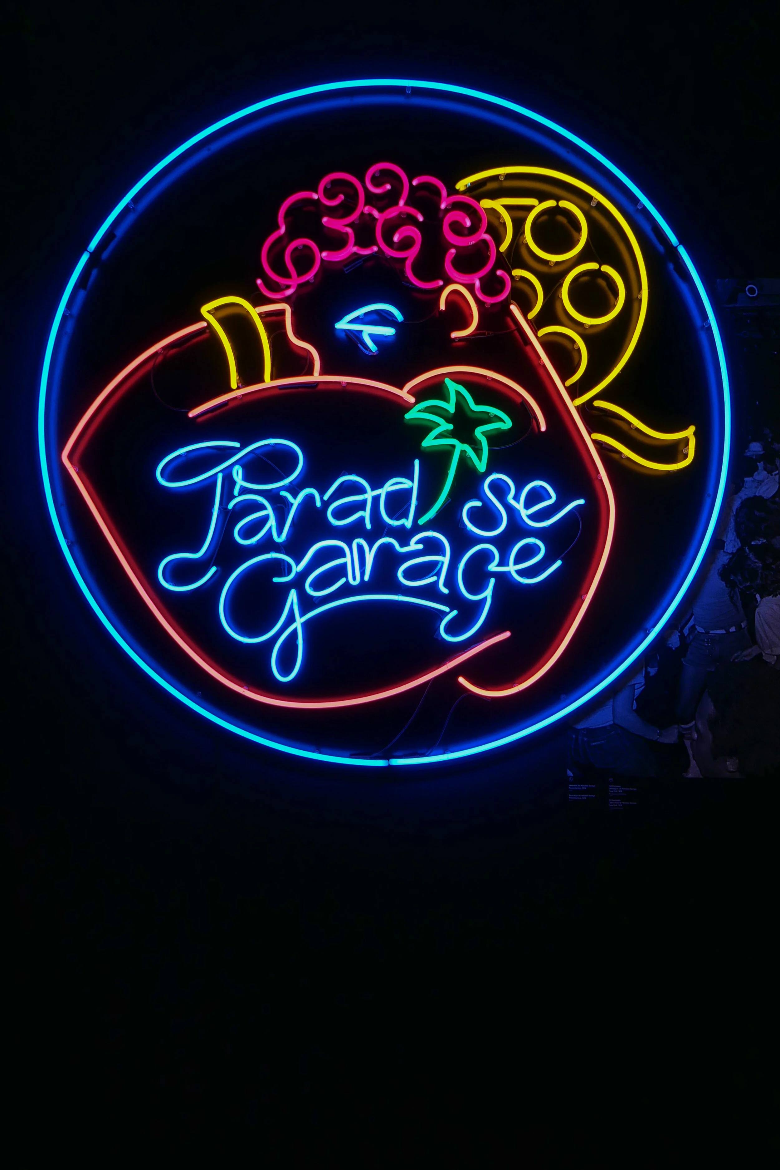
A major new exhibition has opened at Designmuseum Danmark in Copenhagen to explore the design of nightclubs and discotheques described as "hotbeds of contemporary culture."

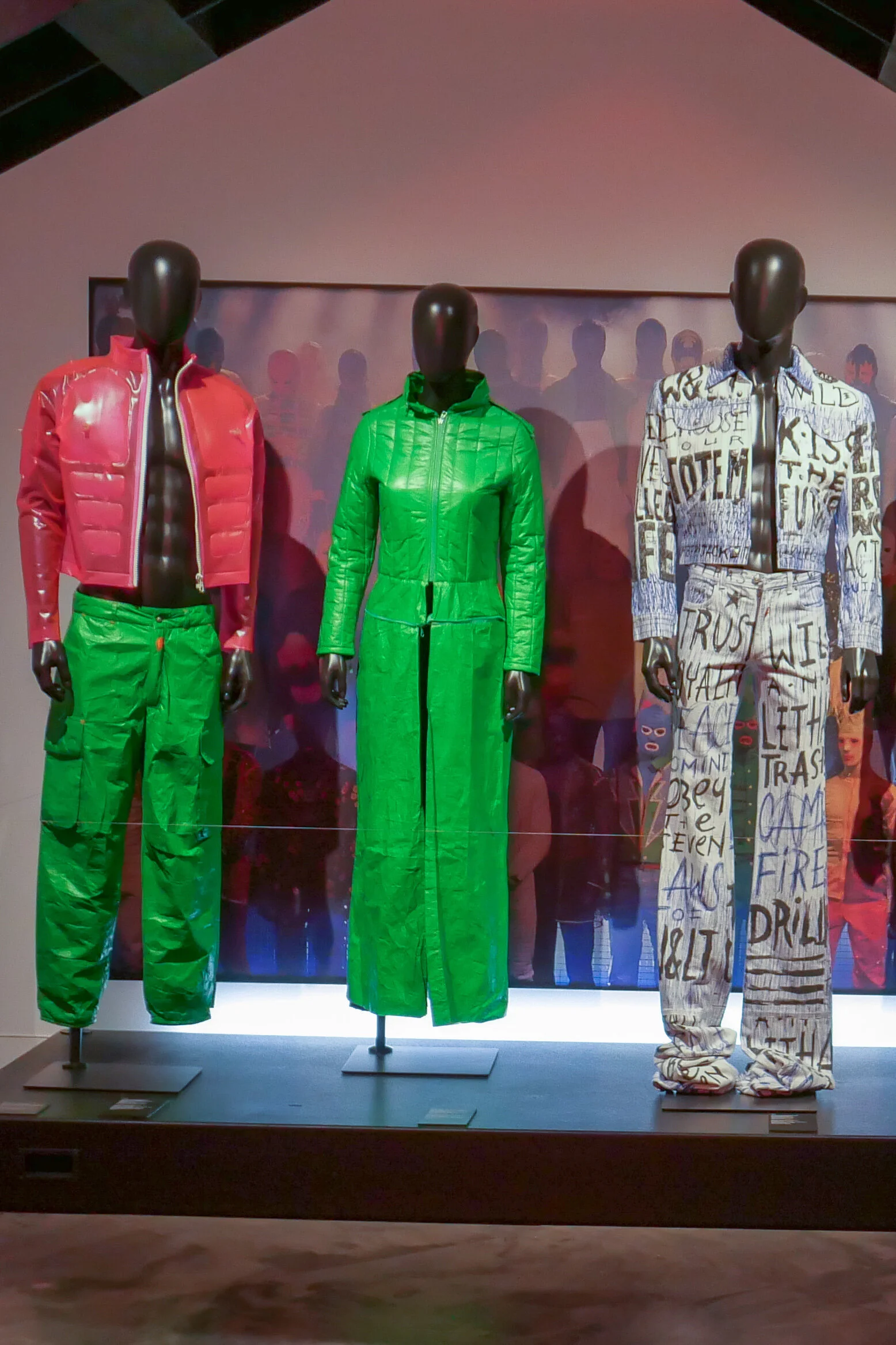
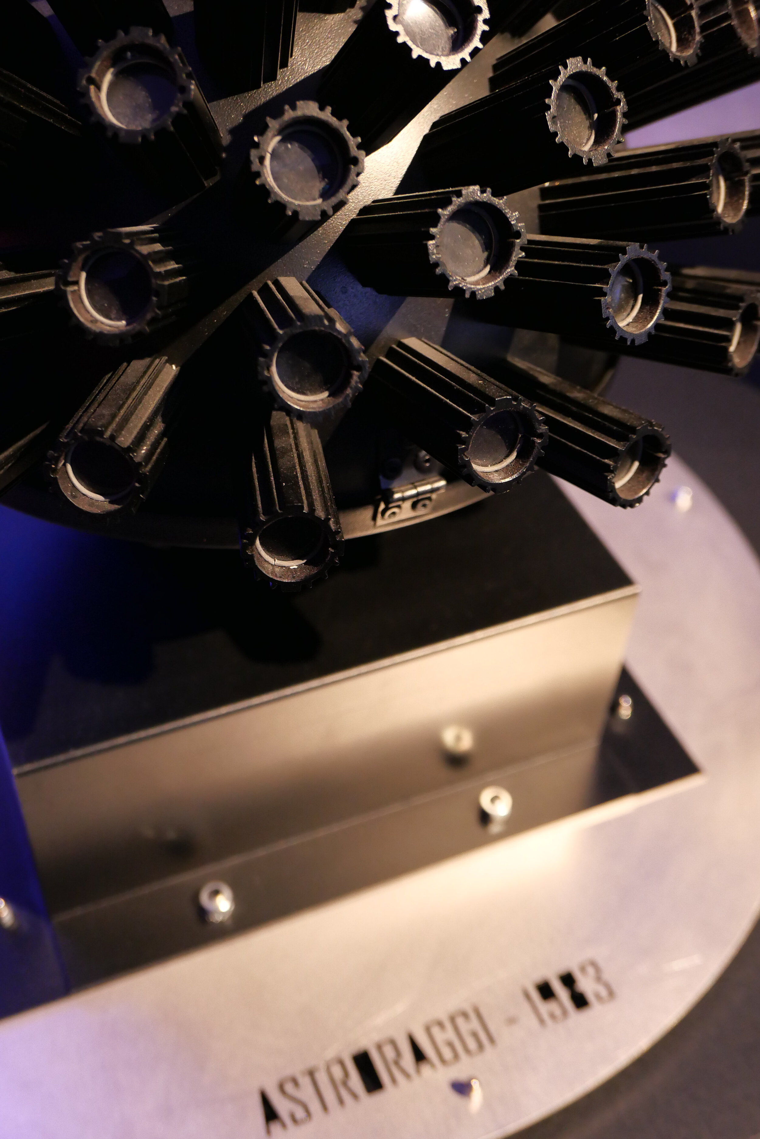
This is about interiors and furniture; about graphics, for posters and record covers; about the development of all the technology needed for sound systems and lighting in these venues and, of course, fashion with contemporary photographs and some outfits and with separate sections on key places through the decades since the early 1960s including Studio 54 in New York; the Hacienda in Manchester and Ministry of Sound in London along with clubs and discotheques in Italy and Berlin.

There are videos - including a long clip from Saturday Night Fever with John Travolta that was released in 1977 - and even a dance floor with music (through headphones) with play lists from early pop disco through house to techno.

The exhibition has been designed and curated by Vitra Design Museum and ADAM - Brussels Design Museum.

NIGHT FEVER. Designing Club Culture 1960-today
continues at Designmuseum Danmark until 27 September 2020


2030 NOW at BLOX

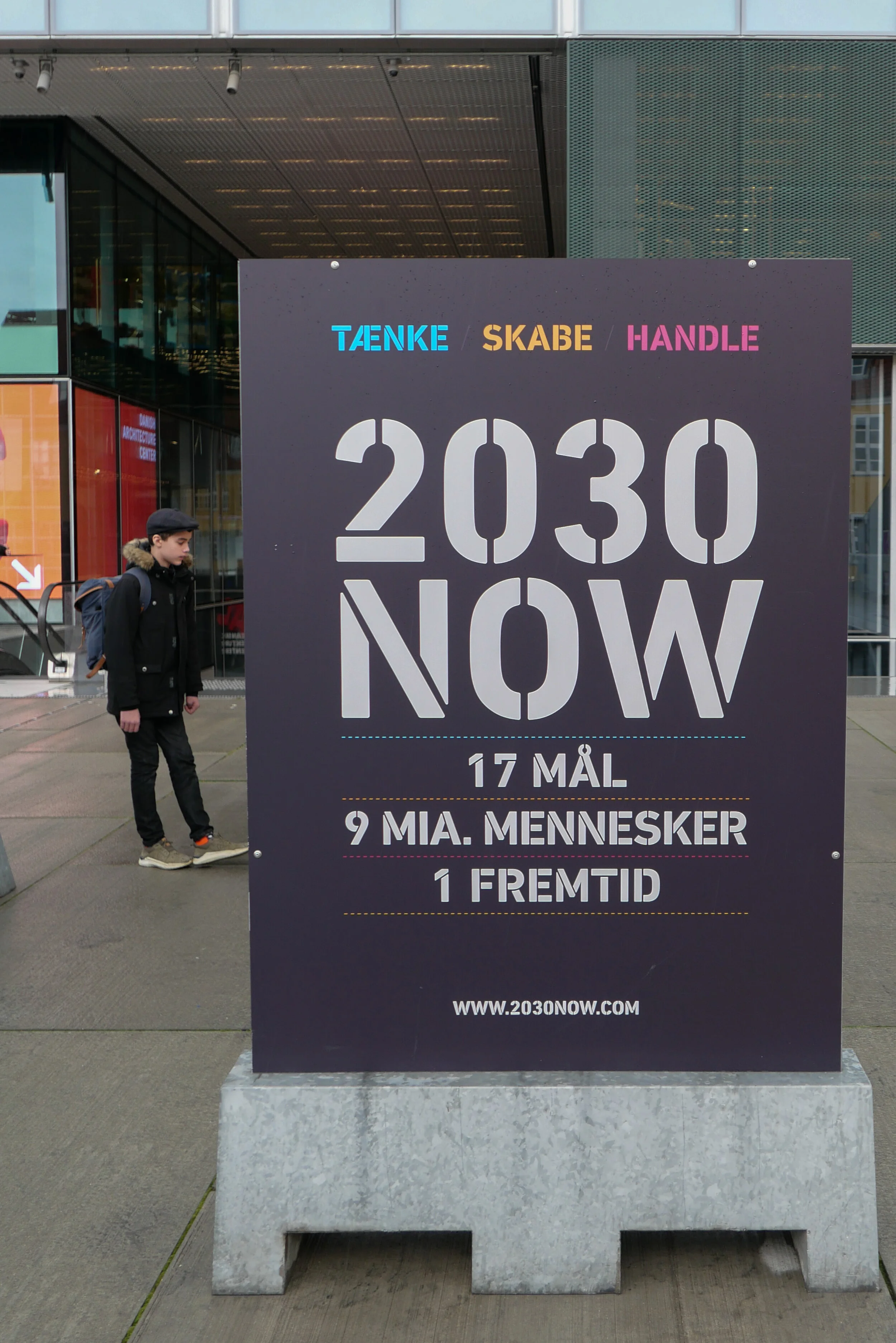
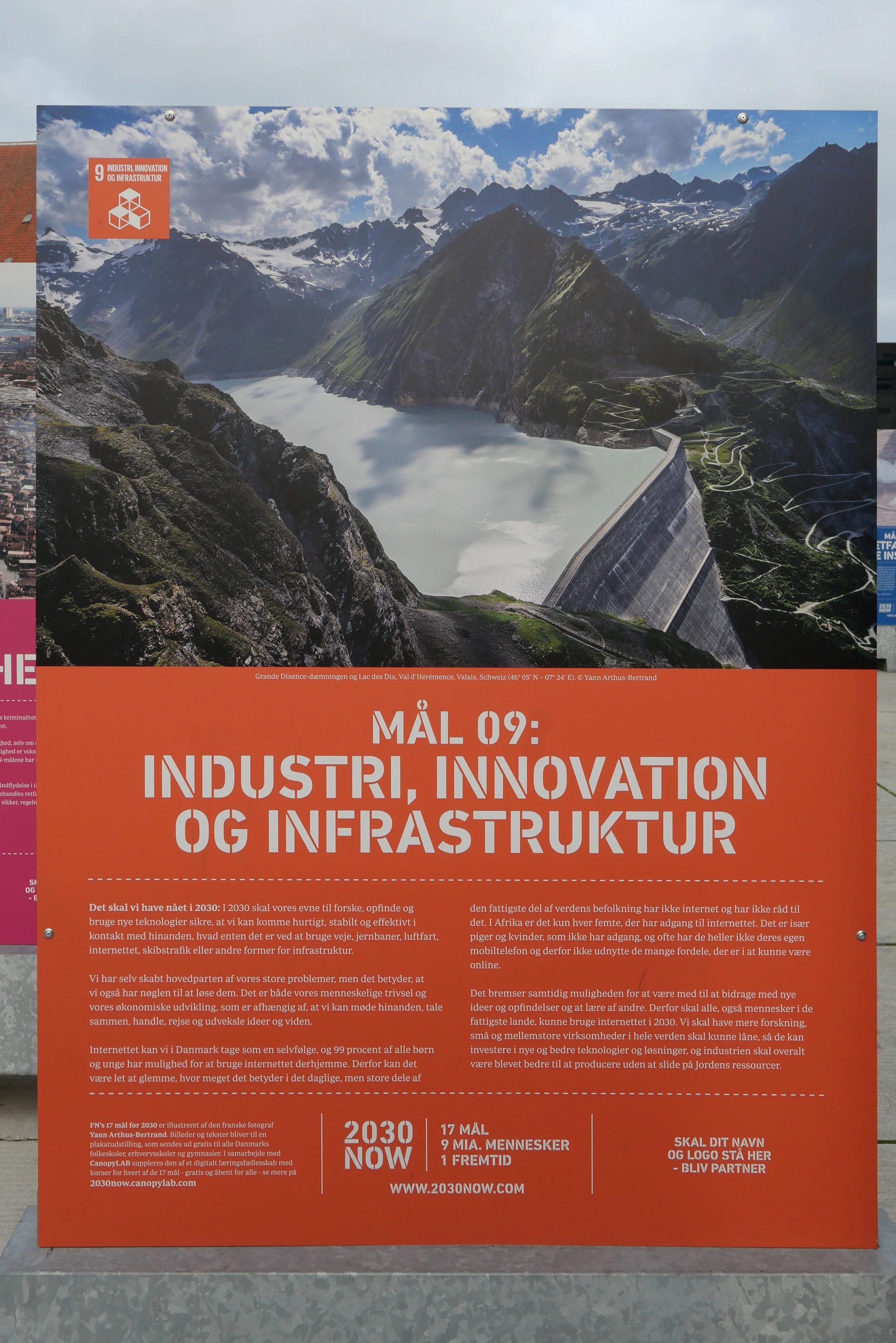
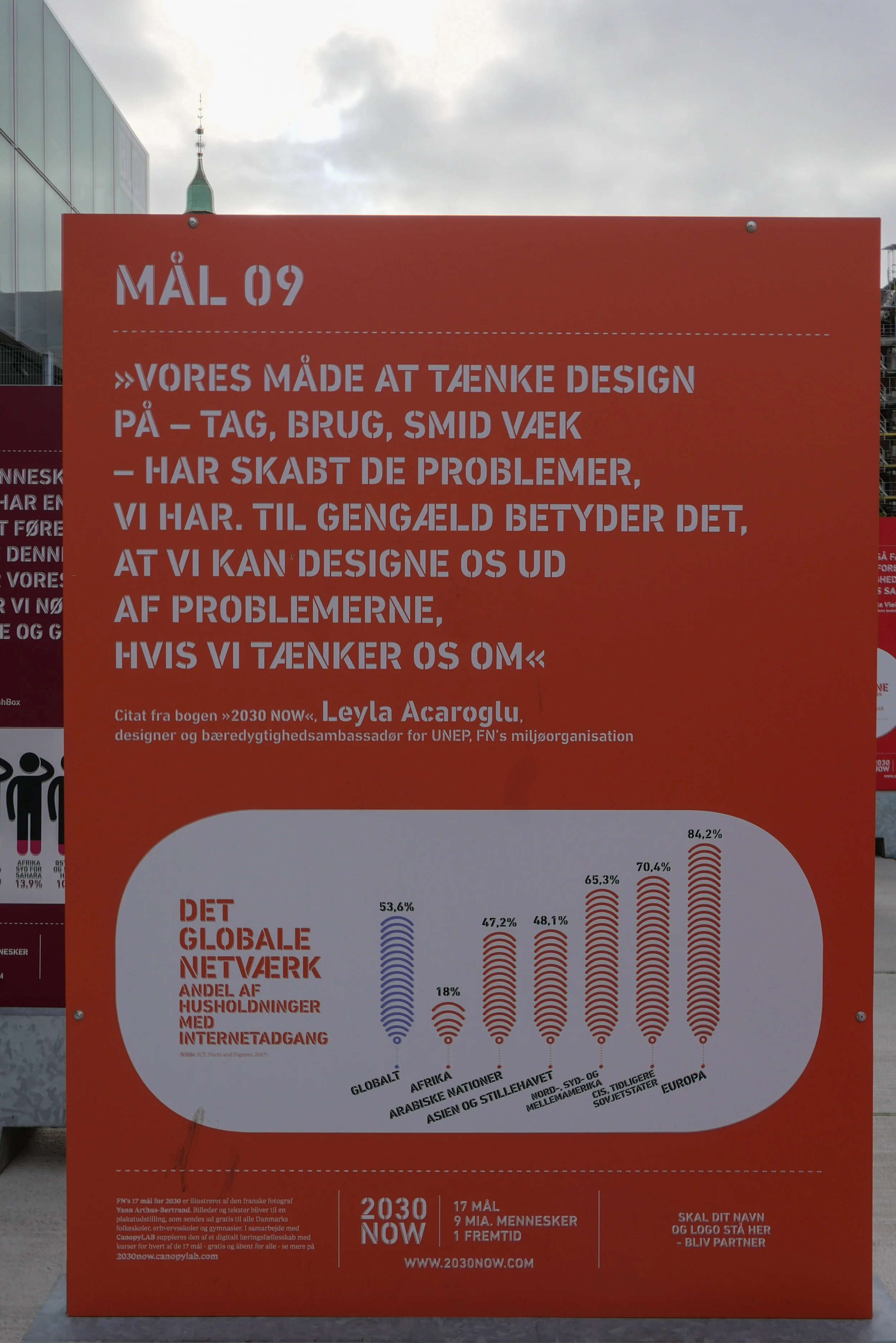
Through the period of the C40 Summit of World Mayors in Copenhagen in October 2019, Life Exhibitions have shown photographs and graphics from their book 2030 NOW in an outdoor exhibition on Bryghuspladsen - the square at the front of BLOX - the Danish Design Center and the Danish Architecture Center.

What is clear in this large space is the power of the images by the photographer Yann Arthus- Bertand and the importance of the strong graphics with the use of distinct colours for each of the UN goals for sustainability.
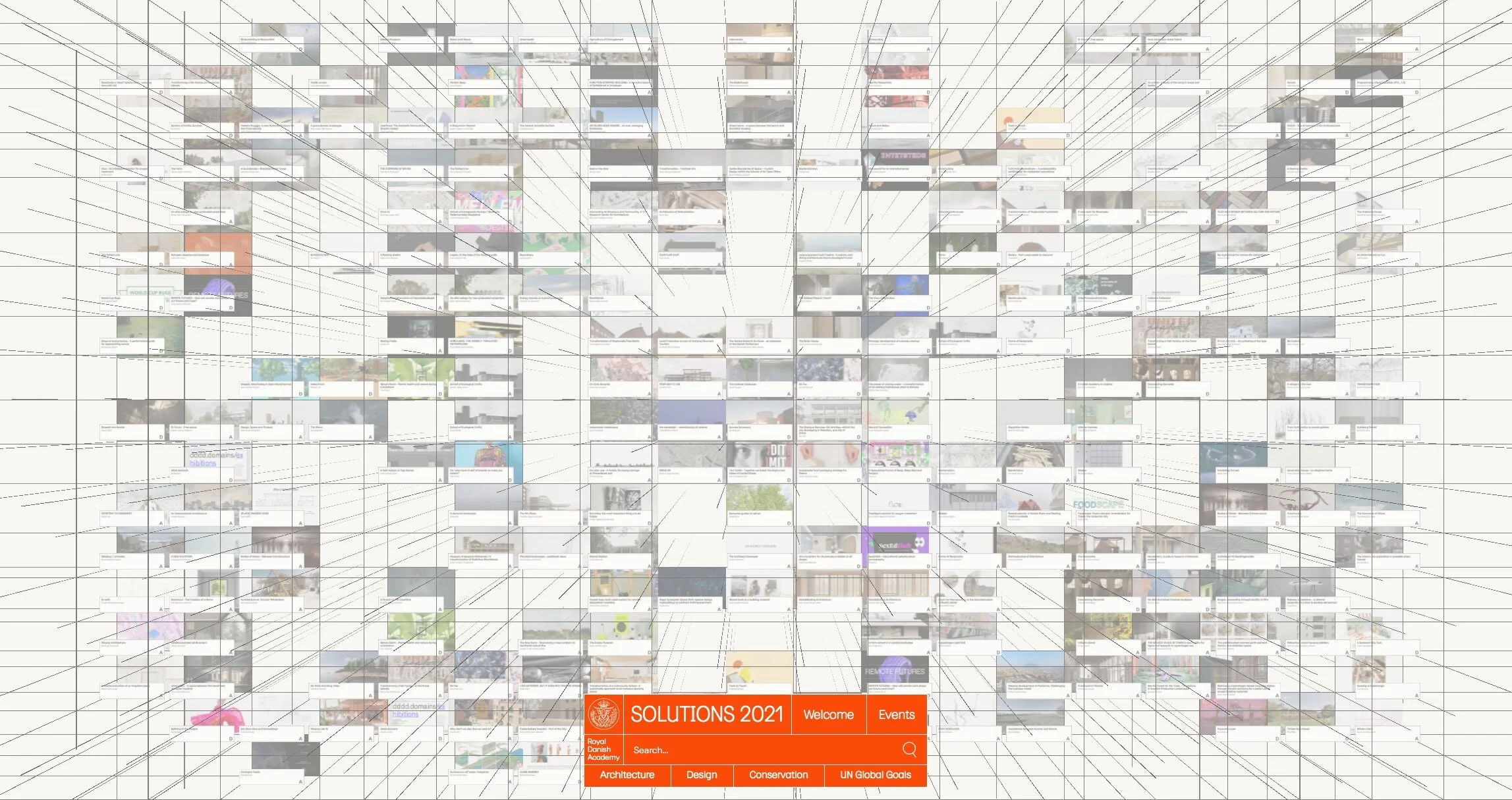
C40 Cities World Mayors Copenhagen 2019
LIFE EXHIBITIONS
2030 NOW


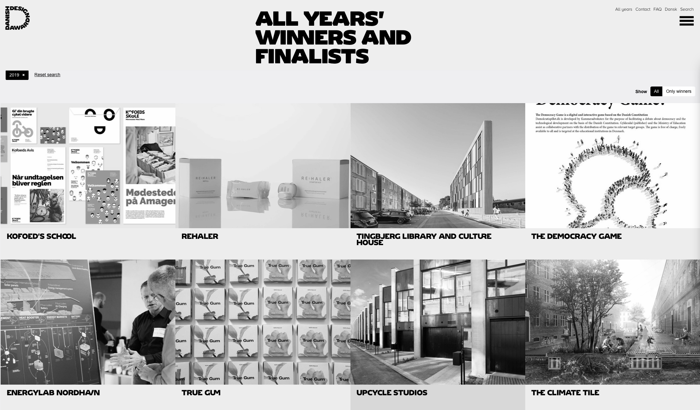
Danish Design Awards 2019


This design prize is awarded by Design Denmark and the Danish Design Centre in Copenhagen.

The awards go back to 1965 but in this form date from 2000 when the Industrial Design Prize and the Industrial Graphic Design Prize were merged.

Finalists were selected by a jury of 15 at the end of February and the Award Show will be at Dansk Industri / Danish Industry or DI at Industriens Hus on HC Andersens Boulevard - close to the city hall - on 13 May 2019.


Categories:

  •  Better Work

  • Better Learning

  • Feel Good

  • Game Changer

  • Healthy Life

  • Liveable City

  • Message Understood

  • Outstanding Service

  • Save Resources

 an interesting post about the judging from Danish Design Awards

all 45 finalists selected for this year


Bauhaus #itsalldesign

Designmuseum Danmark, Bredgade 68, Copenhagen

A major exhibition has opened at Designmuseum Danmark on the history, the staff and their teaching and the work of the Bauhaus school of architecture and design.

This reassessment was conceived by Vitra Design Museum and Bundeskunsthalle, Bonn to mark 100 years since the opening of the Bauhaus.

review to follow

the exhibition continues until 1 December 2019
Designmuseum Danmark


Lille Bakery


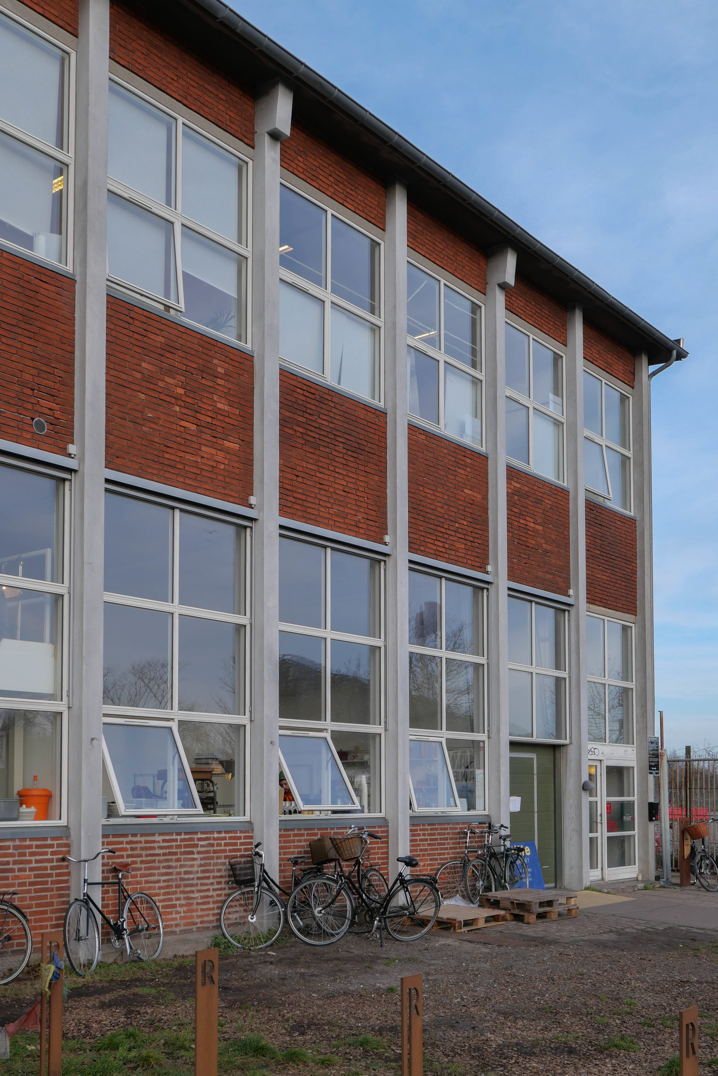
Lille Bakery at Refshalevej 213A is in what I've been told were the drawing offices for the apprentices at the ship yards.

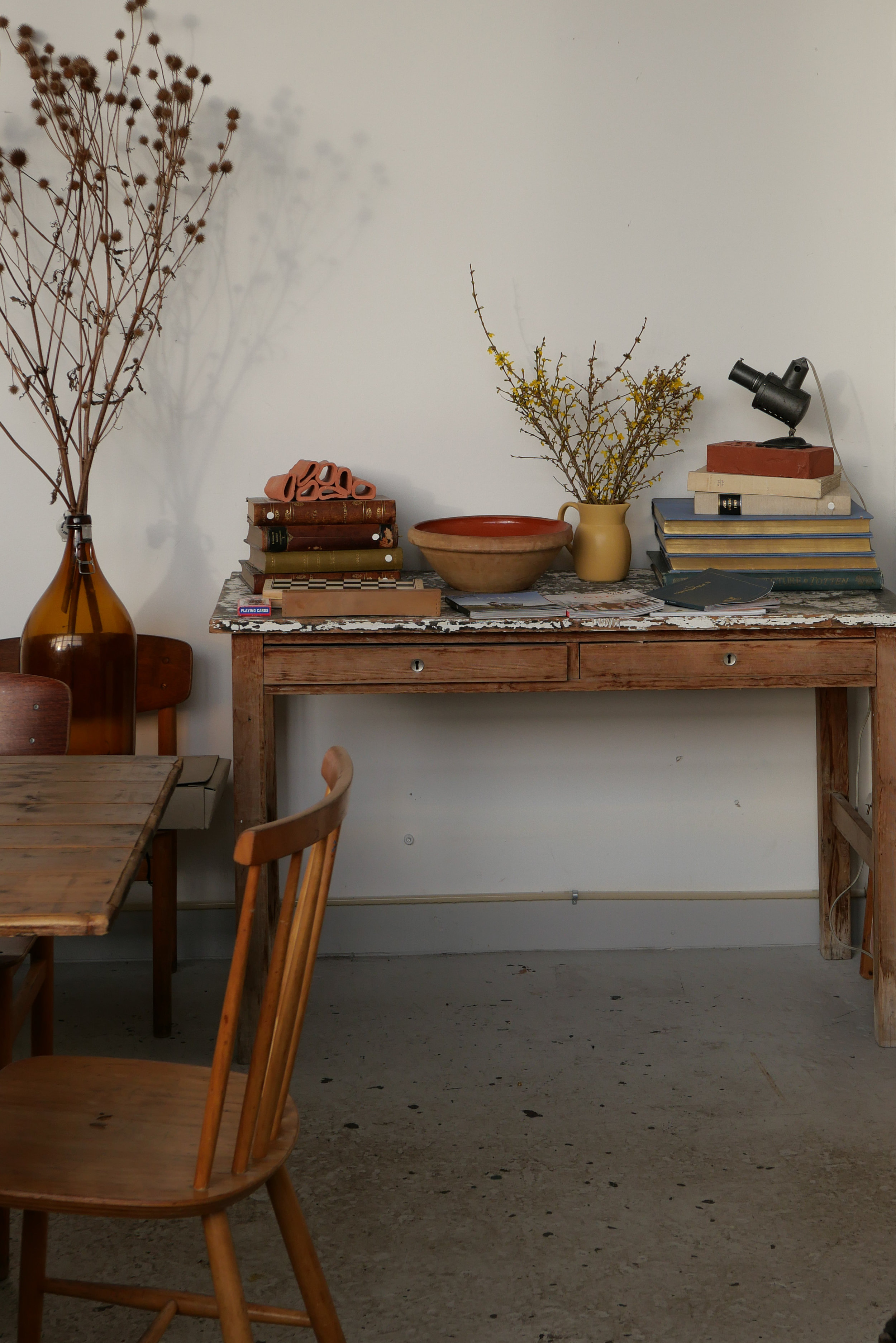
The bakery was launched on the savings of a group of friends and with crowd funding so there is a very strong community feel to the project. The space has communal tables with a comfortable mix of furniture and is open to the kitchens and bakery.
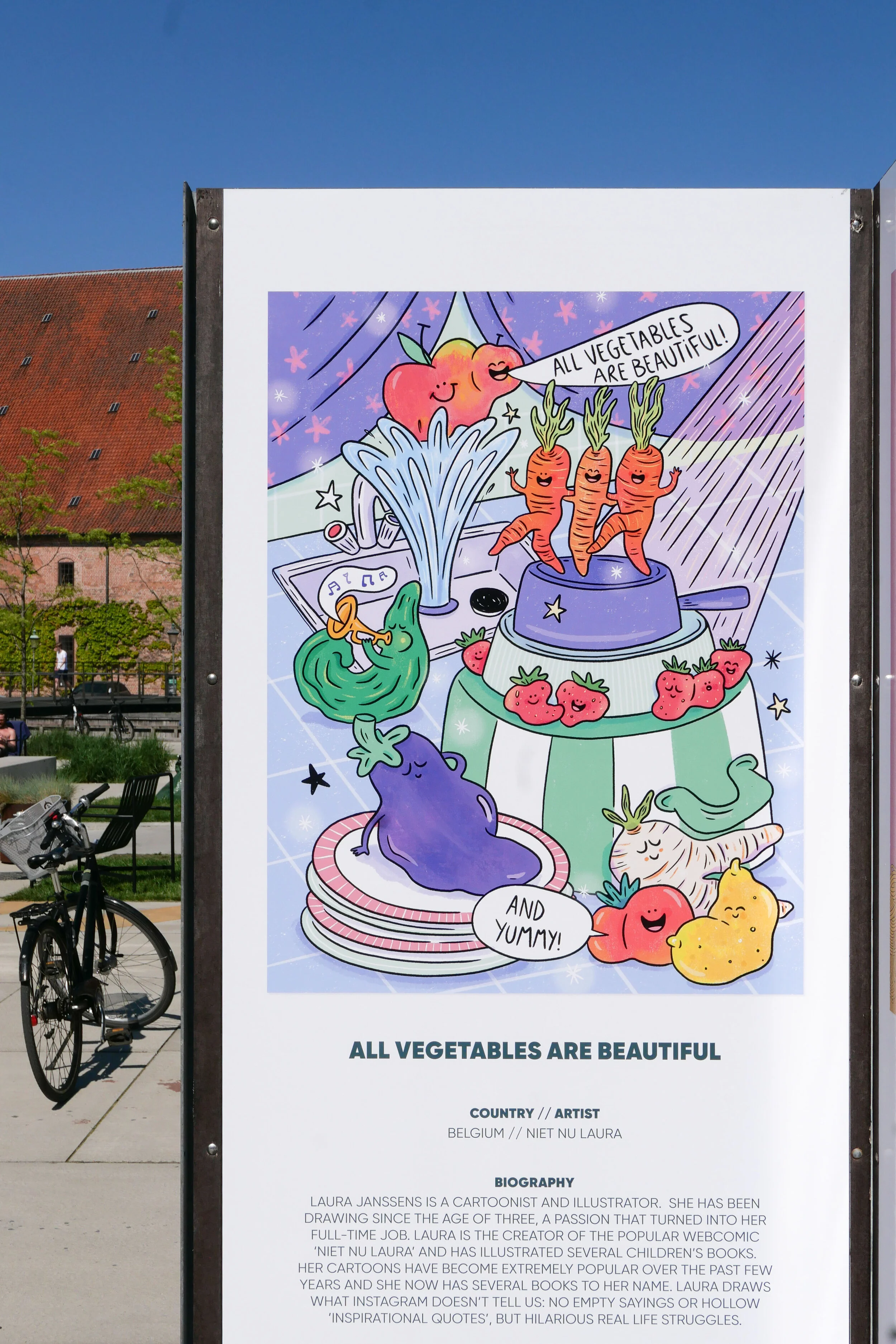
Sourcing of ingredients is ethical and, where possible, local and the bread is fantstic … the large sour dough loaf I tried had a strong and incredibly tasty crust and it is certainly worth my bus trip or 30 minute walk preferably walking both ways to justify trying all the different cakes.

Check out their web site - it could hardly be better and includes information about booking the space for events and for their "bread subscription" to order loaves by the month.

Lille Bakery


books on the Bauhaus at Designmuseum Danmark

This year, the major exhibition at Designmuseum Danmark is about the history and work of the Bauhaus - the German design school that opened in 1919.

The exhibition opens on the 14th March and will continue through to December but as a foretaste there is a small exhibition in the area to the left of the museum entrance with a display of books and journals from the Bauhaus and some of the many publications about the school that are in the library of the design museum.

Bauhaus #itsalldesign

new information panels on the Metro


Metro stations in Copenhagen are to have new flat-screen information panels on the platforms and these are part of a new information system.

The first of these new signs were installed at Vestamager and Ørestad at the end of 2018 but all the old-style signs will be replaced in all the stations over the next few months.

This is part of the preparations for July this year when Cityringen - a new inner city line - is to open.

It will be interesting to see not just how platforms and linking staircases are laid out at the new main interchanges - Kongens Nytorv will be an exceptionally busy station where the exiting lines and the new line cross - but also interesting to see where signs are placed and how signs and graphics will be used to control and direct the movement of people.

Commuters tend to move fast on auto pilot but at Kongens Nytorv, but also at Nørreport and at the new station at the City Hall, commuters will come up hard and fast against huge numbers of tourists who are new to the city and its transport systems and that's where that interface between design and human behaviour is crucial.

Can anyone explain why people stop in their tracks at the most inconvenient places - like immediately at the top of an escalator or the bottom of a flight of steps - to look at a map or gaze up to the ceiling? Are they looking for divine intervention?

There should be a new code of conduct … if you are lost step to the side.

And actually the same should apply when your mobile phone rings. Watch. It's amazing just how many people either stop walking wherever they are or at best slow down noticeably when their phone rings. I'm not sure that signs with even the cleverest graphics could deal with that problem.

Wulff & Konstali on Sankt Hans Torv


In the summer Wulff & Konstali opened their new food and coffee shop on the corner of Sankt Hans Torv in Copenhagen with design work by Studio David Thulstrup.

Although there are roads on three sides, the square itself is pedestrianised and has good landscaping with a large sculpture and water feature and is a very popular place for families and students to meet … particularly at weekends. There are several cafes and restaurants across the back of the square, the fourth side that does not have a road across in front of the buildings, and these have seats and tables outside on the pavement.

These buildings date from around 1900 and were and are stylish apartment buildings of that period … the square was quite an important intersection with a road running around parallel to the lakes - Blegdamsvej - and roads running out to parks and what were new suburbs that were laid out in the late 19th century. The area has seen a marked revival in the last couple of years with small galleries, a cultural centre - just beyond the café - and design companies moving to newly revamped buildings nearby.
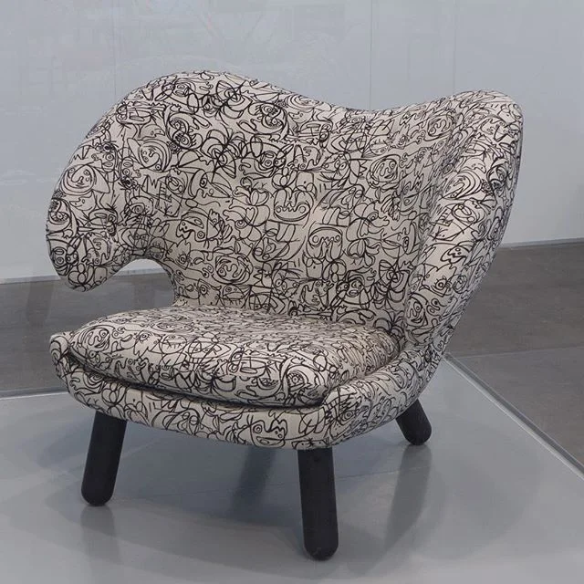
The new food shop for Wulff & Konstali is at the right-hand corner of this back line of good 19th-century buildings, on the corner of the square and Nørre Alle, with the entrance on the corner itself under a distinctive turret of French style.

The interior is L-shaped and compact running left and right from the entrance with new pale blue tiles on the walls - but a strong blue rather than a pretty pretty baby blue - and with very pale wood for bent-wood chairs and for high stools as seating at the windows. This looks under stated and clean - crisp and stylish without looking stark or clinical.

Food displays at the counters are again as simple in form as possible - glass boxes without frames that drop down below the counter top - but again simple but well made with the tiling carefully set out to fit precisely as complete tiles at joins and angles and with steel beading at the edges that again is clean and sharp and stylish. This is a good example of good Danish design that is thought through in considerable detail but hides that effort so it looks just neat and simple. There are tiled niches for displaying bread and for coffee machines and so on.

There are also good details for the graphics used throughout with matt steel cut-out lettering for the main menu that shows the types of coffee sold and the blue colouring of the tiles is taken through labels and price information so all in all a clever branding exercise as much as the design of an interior.

A deep mauve tile for the floor is taken up one course to form a kickboard for the counters and the same colour is used for the wood work of the entrance door and architrave. Lighting is also distinctive with thin loops of neon tube regularly spaced across the seating area - rather than down the length that would emphasise the relative narrowness - but also there are recessed lights.

This is, without doubt, top end design … David Thulstrup worked for Jean Nouvel in Paris and then in America before setting up his own studio in Copenhagen in 2009. The studio works on residential design and product design but seem to specialise in retail and hospitality … so recent projects include interiors for the new NOMA restaurant.

Wulff & Konstali
Studio David Thulstrup

note:

Wulff and Konstali food shops all have a similar menu of their own really good cakes and distinctive bread and savoury food so there is a consistent menu of a high quality in all their shops but then, in a  clever way, each coffee shop is thought through to be appropriate to it's neighbourhood. My regular stop is W&K on the corner of Gunløgsgade and Isafjordsgade in Islands Brygge, that is small and comfortable and relaxed in a way appropriate for this area that is primarily residential whereas the food shop and kitchen on Lergravsvej in East Amager, south of the city centre, has their main kitchen so that it can be seen through windows from the seating area but this is a fast-developing area of very new apartment buildings close to the beach and among factories that are being converted so that café has a rather more industrial look and a lively buzz that seems appropriate. Clever. There is also a W&K shop in an up-market shopping centre in Hellerup, the area along the coast immediately to the north of the city.