MONO - exhibition catalogue


The catalogue for the Cabinetmakers’ Autumn Exhibition in 2018 at Thorvaldsens Museum in Copenhagen has a general introduction to the exhibition by the selection board and then for each work there is a double-page layout with a full page black and white photograph for each of the works.

These monochrome images are dramatic and chime with the theme of the exhibition but also give a strong emphasis to the form of each work.

Some pieces have a descriptive or evocative name - so Calm or Look don’t touch and a cabinet for the display of special possessions has the title Ego - while other titles are more straightforward, with works described as Chair or Table and Chair.

Of course the catalogue sets out the name of the designer and the name of the cabinetmaker or the company who realised the work and each entry includes the materials and the dimensions of the piece.

There is also a short paragraph on each work to set out any thoughts that inspired the design or to talk about technical details - many of the pieces use material in an innovative way or the construction is much more complicated than is immediately apparent - and there is a translation in English.

Graphic design is by Studio Claus Due and the black and white photographs were taken by Torben Petersen.

Snedkernes Efterårsudstilling / The Cabinetmakers’ Autumn Exhibition 2018

Thorvaldsens Museum

Studio Claus Due


new metro hoardings


Around the city, the final stages of work on the new metro line means that the high hoardings around the engineering works for new stations have come down and work on new paving and hard landscaping has started but the extension of the metro out to the south harbour is not due to open until 2024. 

New hoardings have gone up around the site of the new station at Enghave Brygge and the paintings, in 12 sections on the theme of Evolution, are pretty amazing extending for nearly 500 metres … said to be the longest continuous graffiti in Europe.

The artists are Ulrik Schiødt, Peter Skensved, Michael Wisniewski og Caligr Oner står bag rekordmaleriet med deltagelse fra graffitikunstnerne Balstrøm, Welin, Sabe, Crema, Tonek, Toms, Name, Debs, Code, More, Then, Dae og Even.


Flexibility

A small exhibition - described as a pop-up exhibition - has just opened at Designmuseum Danmark.

With the subtitle The Missing Link in Danish Typography History, it spotlights the new font called Flexibility that was introduced last year as part of an updating of the typography and graphics used for the museum and is to be used across all aspects of their graphic design from posters to signage and display graphics, as the font for the museum's website and for in-house leaflets for publicity. This work was undertaken by the Copenhagen studio Urgent. Agency.

As part of the commission they searched through the archives of the museum and found initial sketches for this font that dated from the beginning of the 1960s and were by Naur Klint - the architect and designer who was the son of Kaare Klint. The designs were digitized and this was the starting point to produce a font appropriate for the museum.

With the exhibition there is a handout newspaper that sets out a good brief history of the design museum and also sets out the iterations of the typeface with various weights and an italic and an outline version.

The exhibition continues from 5 October through to 6 January 2019

Designmuseum Danmark
Urgent.Agency

Bagsider / Flip Sides


For the Golden Days Festival this year the theme was The B-sides of History so, for this exhibition, the curators at Statens Museum for Kunst took that literally and present the backs of paintings and drawings in their collection.

And it is fascinating.

read more

the exhibition continues at Statens Museum for Kunst until 10 March 2019


an exhibition to mark 100 years of political cartoons in Denmark

Bring up the subject of design and politics in a conversation and most people would assume that you are going to launch into a complaint about cuts in funding for teaching design or to talk about the depressing reality of how little art is commissioned by so many governments set against how much dubious art is commissioned by too many despots.

But design has always had a part to play in political life - even if it is only that each party ends up being identified by a specific colour and tries to use an appropriate and easily identified style in their graphics. I'm amazed by just how many posters appear on bridge parapets, trees and lamp posts here during an election and you quickly spot which belongs to which party.

At the moment - in front of the parliament building in Copenhagen - there is an outdoor exhibition to mark 100 years of political cartoons in Denmark and it demonstrates a surprising willingness by politicians to show, on their front step, how the popular papers saw and depicted their predecessors and how cartoonists saw and interpreted major events.


Posters from Paris in May 1968


In May 1968 there were demonstrations, street protests and the occupation of buildings by students along with major strikes by workers' against capitalism, against consumerism and against American imperialism. It built up to a general strike by over 9 million workers on 23 May 1968 and, as a consequence, President de Gaulle dissolved parliament and called a general election.

The Academy of Art, at the École Nationale Supérieure des Beaux-Arts, was occupied by students and the studios there became the Atelier Populaire or 'people's workshop' for the collective production of politically critical posters.

Most of the posters were printed in a single colour and many screen printed, with a quick turnaround as the situation changed or because students had to replace posters that had been torn down. Some newspapers that had been closed down even donated stocks of their paper but, where necessary, a new poster could be printed on the back of an earlier poster.

In 1971, Designmuseum Danmark, with a grant from the New Carlsberg Foundation, purchased 250 of the posters that had been produced by the Atelier in the short period before it was shut down by the police.

A small exhibition at Designmuseum Danmark shows a selection of these posters to mark the 50th anniversary of those events in France.

Designmuseum Danmark


CC online / graphics

Copenhagen Contemporary has an online site with exemplary graphics with a minimalist layout that uses open space in the best possible way.

The CC logo is dynamic so responds to the screen size and to scrolling.

Typography and the deep orange colour are taken through publications and signage at the gallery.

Copenhagen Contemporary online


SONG 1 by Doug Aitken

A sound and video installation at Copenhagen Contemporary with six curved screens forming an almost enclosed circle so the 35 minute programme can be viewed from the inside or from the outside.

This uses the classic pop song "I only have eyes for you" interpreted by very different singers and musicians but what runs through the sequence is a persistent but very beautiful feeling of melancholy.

In some sections of the sequence, images are separate to each screen or in others they are repeated on alternate screens; some images are mirrored in pairs or they wash around the full circuit as a single scene like an amazing modern version of a fairground round-a-bout.

The original version of the song is a jazz standard from 1934 but listening to so many versions, recorded over so many decades, it seems truly timeless. Cultural references abound in the images and above all it seems to be a love song - not actually to a lover but to what is truly great about the United States and it's architecture and its graphics with universally recognised symbols from the 20th century about being American in modern America so there are scenes in diners and on free ways driving inter state or in all-night bus stations.

So this is not about the natural landscape of the States but about man-made settings - the built invironment imposed on the natural - generally larger but also smaller urban and anonymous man-made spaces. It's a view of metropolis that seems indescribably lonely and sad but here mesmerising and hauntingly beautiful.

at Copenhagen Contemporary, Refshalevej 173A through until 30 December 2018

Copenhagen Contemporary / Song 1


Løsninger / Solutions 2018

29 June 2018

This evening was the official opening of the exhibition of the work of the graduates from the schools of architecture and design at Det Kongelige Danske Kunstakademis Skoler for Arkitektur, Design og Konservering - KADK or the Danish Royal Academy of Architecture, Design and Conservation


The exhibition is open every day through to the 19 August 2018

KADK
Udstillingen og Festsalen
Danneskiold-Samsøes Allé 51-53
1435 København K


Swiss Design Zurich Made … Designmuseum Danmark for 3daysofdesign


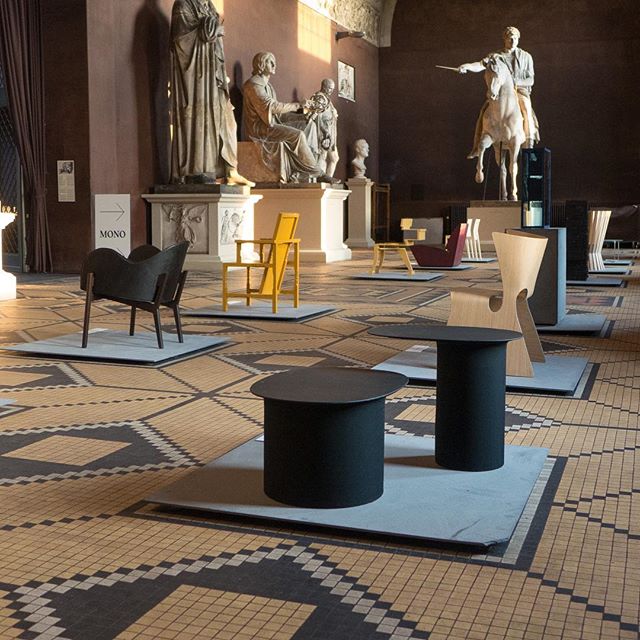
This was an event to show the work of the Department of Design from Zurich University of the Arts with an exhibition in the Festhallen of the museum - the big assembly room over the entrance of the museum - and there was a packed series of talks and discussions through the Friday and Saturday.

It was very much about new and emerging talent - the next generation of designers - and covered well-established disciplines such as typography but had a strong focus on design for the computer - virtual models, virtual reality, computer games and apps using GPS to explore a city and its culture - along with political or social aspects of design - so work on how gender is expressed either consciously or unconsciously in the design of products.

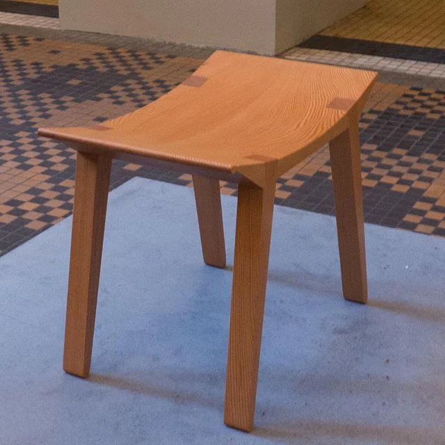
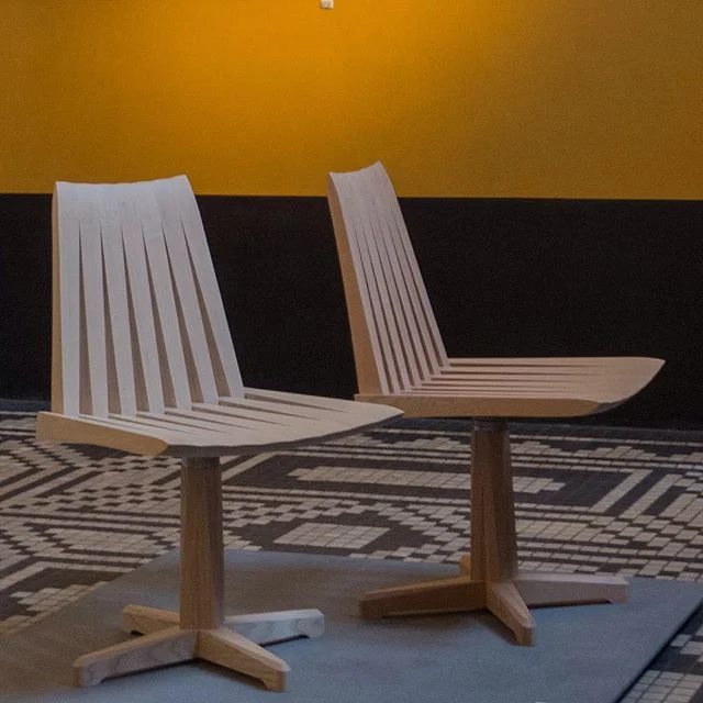
Established Swiss design was represented here by the Ulm Stool by Max Bill from 1954; the Stella Chair and the messenger bag from Freitag that reuse truck tarpaulin. With the bags, Freitag had worked with students to explore new concepts and new forms for the bag and for the event, down in the courtyard, there was a stall where you could design your own bag by moving a Perspex template over a tarpaulin to form the design you liked best.

Action! Teaching and Learning for Sustainability has online sites for their symposiums in 2016, 2017 and 2018. These show how design as a training and as a profession has now spread out to involve a much much broader social, environmental and political area.

Forty or fifty years ago to call a store a design shop somehow implied that it was special and, by implication, ordinary furniture was somehow not designed and to have 'designer' anything - from jeans to a vase by a named designer - somehow implied, in terms of marketing at least, that this was special - to justify the price tag - but again, insidiously, as if it marked the buyer out for their taste and discernment. Equally typography was the work of a graphic artist or typographer rather than someone calling themselves generally a designer and people declared themselves to be interior designers before they realised that dropping the word interior gave them more freedom to work over a broader range of products.

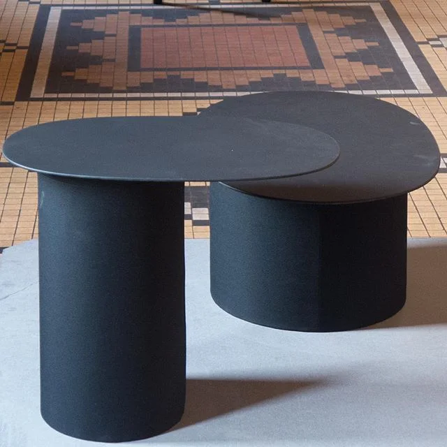
Now the word design seems to be too broad. I'm not suggesting that it has been claimed by too many for too many products … just that it has become too vague. Everything, even badly thought out and badly made furniture or household accessories are actually designed … bad products are not organic or spontaneous and don't appear as if by magic in a container at a port. But the Swiss exhibition here shows that really good design, for all aspects of life, can be enhancing and invigorating and crucial to everyone's by making appropriate and sustainable design for the coming decades.

Swiss design Zurich made

Freitag


BlackStar 1-180


Vibeke Rohland, the Copenhagen textile artist and designer, has just published a major book on her print series BlackStar 1-180 with studies exploring the theme of her signature design of the plus sign over-layed.

BlackStar 1-180 is available for purchase on line and from the bookshop at Designmuseum Danmark in Copenhagen, Cinnabar in Copenhagen and the design store Stilleben


Vibeke Rohland

a new on-line site for DAC

New DAC page.jpeg


The Danish Architecture Centre in Copenhagen has redesigned their web site.

In part this is in anticipation of the move, early next year, from their current building - an historic brick warehouse on the Amager side of the harbour - to BLOX a new building designed by Rem Koolhaas that is close to the National Library and close to completion.

The new web site is clean and minimal. The horizontal bands of images that scrolled through and were a hall mark of the older site have gone. The redesign site is very much in progress as with the move, presumably, more and more features will be added with new programmes for exhibitions and new services provided by the centre.

There seems to be a stronger emphasis on the study tours and outreach teaching programmes for schools from the centre and a focus on commercial aspects for the book shop and with on-line booking for the restaurant that I don’t remember being on the old site. The gallery of buildings - a quick reference tool on the old site that could be searched by architect, name of building or street name - has been removed for now but I have been told that this will return as work on the site moves forward.

Interesting that the font is Helvetica throughout … a clean typeface that obviously has well-established credibility for a design site but can look slightly compressed and therefore not as easy to read at smaller sizes or with a lot of information that might need bold or italic to suggest a hierarchy of information.

The site reconfigures well for the narrower proportions of a mobile or iPad screen. Wide, cinemascope images also make the scroll process quicker but may be limiting for some subjects.

Danish Architecture Centre


M/S Bibiana


A coaster that has been refitted as an exhibition and teaching space with workshops for children centred around fairy stories and tales of the sea.

Funded by Nordea Fonden, the ship has had a full programme through the summer visiting ports and coastal towns around Denmark.


M/S Bibiana will be moored at the quay at Kroyers Plads until 14 October

update on Knippelsbro graffiti


In an earlier post with the heading - I just don’t understand - I wrote about the graffiti daubed on the copper tower of Knippelsbro - the main bridge at the centre of the harbour in Copenhagen.

This evening I saw it had been cleaned but that has left a scar because, inevitably, along with the paint, the patina on the surface of the copper has been removed.

As I said before, I understand that some people feel powerless or feel that no one is listening to why they feel excluded or ignored. But surely this sort of graffiti is simply thoughtless and selfish. It is imposing what is painted on everyone … whether or not they like it or want to see it. Am I wrong in seeing it as a sort of hectoring or bullying? 

The bridge is not a symbol of authority or symbol of oppression. In fact it is just the opposite. It was built in the late 1930s … a time of huge economic and political uncertainty … but was a clear symbol of confidence and pride in the city … built for the city … and built with a sense of hope for the future - that is why it is unashamedly modern - and it must have been seen as an investment in the future because it was primarily practical and well built … a wide new bridge crossing high above the water for trams and for bikes for workers and for ordinary people going in and out of the city but also a bridge that could be opened quickly and efficiently to let taller vessels pass from one part of the harbour to another.

the tower of Knippelsbro earlier in the week


…. there is fantastic street art in Copenhagen


These photographs were taken back in July but I had not got around to posting them. 

The hoardings are around engineering works for what will be the new metro station at Trianglen. Extending for 66 metres, the drawings show the buildings of the local district of Østerbro. 

The artist is Benjamin Noir and he has a web site where there is a link to a video that shows him working on the drawing and talking to local people who stopped to admire the work in progress. Brilliant.

Benjamin Noir

I don’t often use emojis but …..


Came across these today and they certainly cheered up a grey damp morning in Copenhagen. 

Finland is now the “first country in the World to publish its own set of country themed emojis.”  There are 56 in all and they show a wry sense of humour in explaining some very specific scenarios so it’s fantastic that, for instance, Finland has a word, KALSARIKÄNNIT, to describe getting drunk alone at home in your underwear … and now there is an emoji for it. 

Knitted socks as a symbol for the “feeling of granny-made warmth” is brilliant and the emoji with a well-spaced out line of people at a bus stop to explain a general feeling of being uncomfortable about standing too close to strangers, if you don’t have to, shows a nice sense of self awareness.

Brilliant and useful ....... with grateful thanks to this is FINLAND

all 56 emojis can be downloaded from the this is FINLAND site


KALSARIKÄNNIT

The feeling when you are going to get drunk home alone in your underwear – with no intention of going out.

A drink. At home. In your underwear. And there is a word for it. Kalsarikännit.


OUT OF OFFICE

Back to the basics

In Finland we have this saying ‘to put your brain in the cloakroom’. And that’s what we do in the summertime every Friday after work and in July, when the whole of Finland is out of office. If you try to reach a Finnish person in July, prepare for a voice mail message saying”the person you are calling, has gone fishing”. Almost every tenth Finn has their own summer cottage as there are over 500 000 summer cottages in Finland.


STUCK

The feeling when you realize winter is here.

Even a Finnish child knows you shouldn’t lick anything made out of metal when it’s freezing outside. But you do it anyway. And then you’re stuck*!
*Ask a Finn how to get your tongue unstuck. Beware. It can get nasty.


BUS STOP

Finns respect the privacy and personal space of others, and expect the same in return.

We tend not to sit down next to anyone if another seat is available. When talking to a Finn, don’t stand too close – unless you want to see a Finn slowly edging backwards.


Donkey bikes


I guess I spend too much time looking up at buildings as I walk around Copenhagen and don’t give enough attention to things on the pavement because I have only just noticed these bright orange hire bikes from Donkey Republic that have appeared around the city. Actually, I only noticed these ones because a clutch of three were left near the front of the apartment. Is there a collective term for bikes? Presumably not a fleet ... like for cars when they are for hire.

The design of their web page is pretty good with clear instructions for how to set up a hire and unlock the bikes, some advice about rules for riding a bike in the city and some good recommendations for places to visit but I was a bit curious about the text on the bike carriers. Several Danish friends have told me that they don’t understand English puns … or rather their grasp of the meaning of the words is spot on … it's just that they can’t understand why the English find puns quite so funny. But then I suspect that these are aimed at tourists and visitors and not so much the locals. 

Looking at the map on the Donkey app this evening one bike seems to have got as far as the airport and another to Ballerup so if I’m bored I might keep tracking that one to see if it is heading for the west coast.

Donkey Republic

TÅRN - a Knippelsbro guide


For the reopening of the bridge tower, the team behind the restoration work have produced a combined guide and magazine. Narrower pages attached to the cover have a good selection of historic drawings, old photographs and information about the building of the bridge and its operation.

Inside is like a good art magazine with a selection of newspaper cuttings about the bridge and some interesting photographs of odd objects found as work on the restoration progressed but there is also a review of the art installation Between the Towers by Randi Jørgensen and Katrine Malinivsky at Arken; what appears to be a declaration of love for the Eiffel Tower; an essay about the symbolism of towers through time and much more.

you can now cycle ... or run ... around the harbour in Copenhagen

the information panel at Nyhavn


on the far side of Inderhavnsbroen looking across to Paper Island


With the opening of Belvederebroen at the south end of the harbour at the end of last year … along with Cirkelbroen or Circle Bridge designed by Olafur Eliasson that opened in August 2015 to cross the canal on the Amager side of the harbour and the Inderhavnsbroen that opened in July 2016 to link across the harbour between Nyhavn and Holmen … it is now possible to bike, run or walk around the harbour in Copenhagen. 

The complete circuit is 13 kilometres although shorter loops around smaller chunks using the older bridges at Knippelsbro or Langebro or by crossing over Bryggebroen - the bridge at Fisketorvet - there are shorter circuits of two or four or seven kilometres.

At intervals there are distinct signs in dark blue … appropriately close to the paint colour called Copenhagen Blue. Each post is at a key point on the route and they give, in Danish and in English, a short description of the immediate area and its history. If I was running the circuit I’d probably be using the sign for support as a tried to regain my breath … well beyond taking in the information but trying to pretend I was doing a few stretches before lurching off on the next section. My guess would be that most Danes running and certainly all Danes on bikes are going much too fast to read anything as they dash by.

These signs also have a map that shows the route and the stops of the harbour ferry - the Havnebus - if you feel like seeing the harbour from the water. But what is interesting, and more important, is that the maps mark the dedicated cycle routes into and across the city. This tells you something significant about the planning policy in Copenhagen … there is a historic core where transport has to be co-ordinated and there is the well-known and well-established and coherent policy to encourage cycling rather than car use but, more than that, the cycle routes and the harbour circuit are about linking the city together, to make places accessible to everyone so this circuit is about much more than the regeneration of the docks.

A map of the harbour can be downloaded if you want to plan your route but why not live dangerously and just go for it ... follow the signs ... you could end up back where you started ... or somewhere you hadn't planned to end up ... so much more interesting.

down by Belvederebroen

5C - design project


Back at the beginning of May there was a post on the site about the new buses that have been put onto the 5C route through the city. But the buses are simply the most obvious part of a complicated and carefully co-ordinated design project.

New bus stops have been built along the route and the longer buses meant that bus bays had to be extended at some stops so the work was co-ordinated with the city roads planners. 

There is a clear colour scheme for the buses with a strong blue and rich yellow and this continues across textiles and graphics but this was not simply a matter of creating a new “house style” because it had to be seen as a step on from existing designs … not too close so it was boring or barely worth the obvious investment but not too much of a difference to require a steep learning curve. Staggering back from work or carrying loads of shopping and pushing a kids buggy you don’t need to be confronted by something so unfamiliar that you are not sure where to go or what to do.

There are far more doors to get on and off the buses so whereas before the entrance was generally at the front past the driver, the new buses can be entered at any of the five doors so there had to be new graphics to explain this and now the doors do not open automatically but with the press of a button … both on the inside but also on the outside. The machines for clocking in and out, some with options for adding extra passengers to your ticket, that have until now been found only on railway and metro platforms are now used actually in the buses.

There are novel features that reflect the much larger number of people on each bus so vertical poles at some points actually split into three - so more people can hold on - and at the articulated join of the two parts of the bus there are barriers to stop you falling against the concertina of the link but this bar is padded so you can use it as a bum rest if you are standing on the join between the two sections.

There are also much-improved graphics for passenger information at a high level - to be seen over people standing - and as the bus follows a long route with a lot of stops that cross other bus routes and rail stations the graphics on a long panel at the centre mark the progress of the bus and the options to change to other routes at each stop.

It would be interesting to know just how many designers were involved on the full project and what the timetable was to interact with quite so many different contractors. This is an extremely good example of just how important good design is even if, for many, it exists very much in the background of their lives.