Normann for 3daysofdesign
/
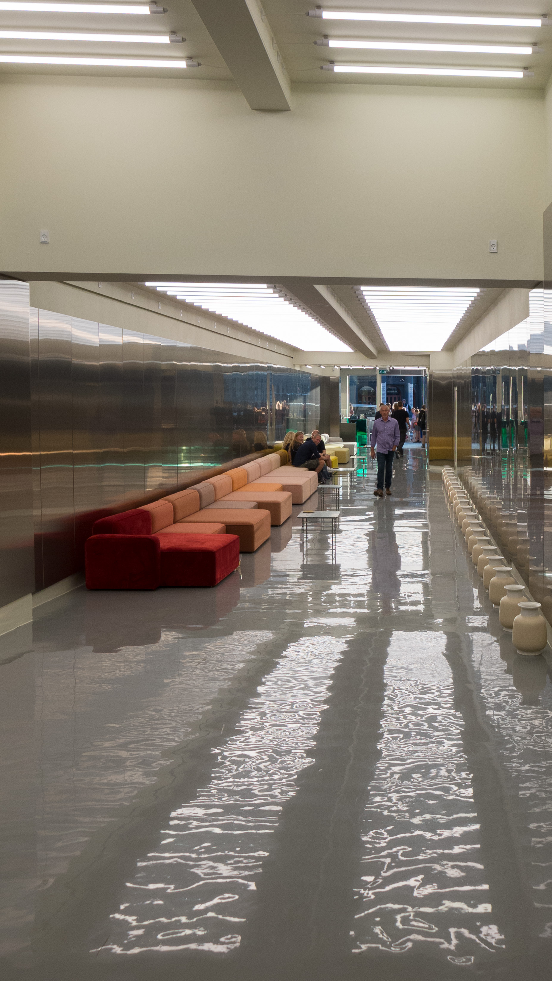
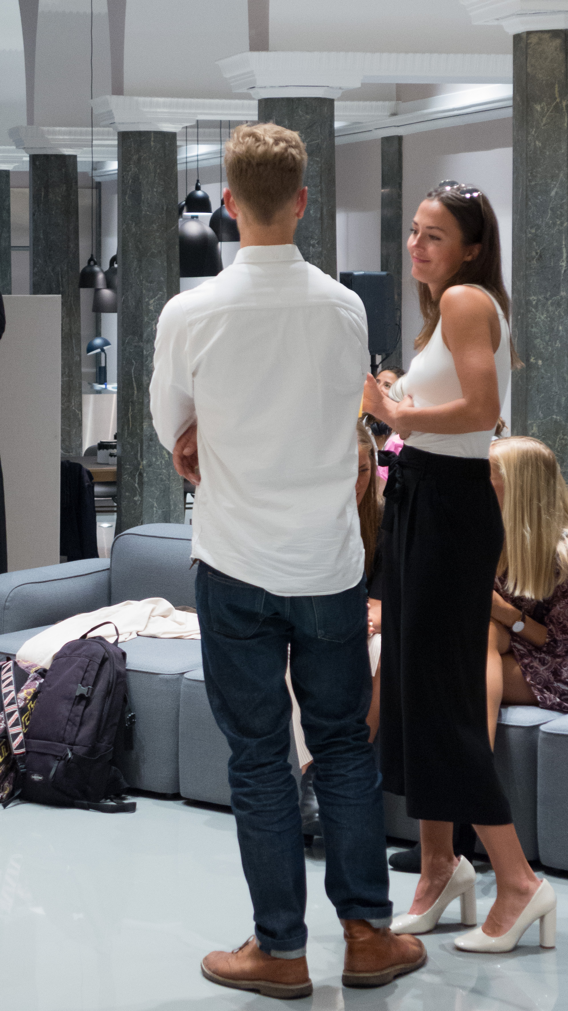
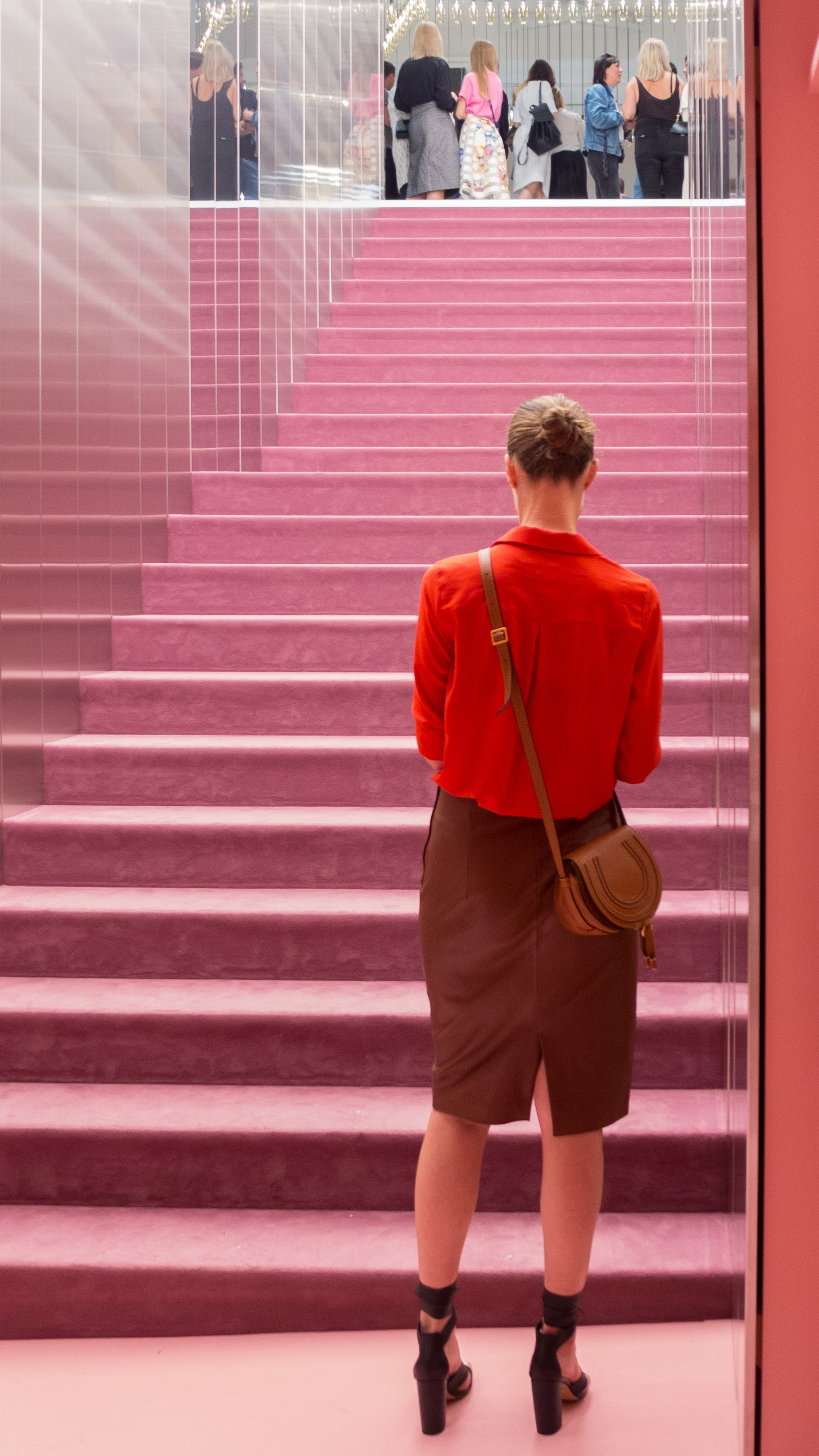
Design stores throughout the city put on special events for 3daysofdesign but Normann can always be relied on to have dramatic displays in their store in Østerbro.
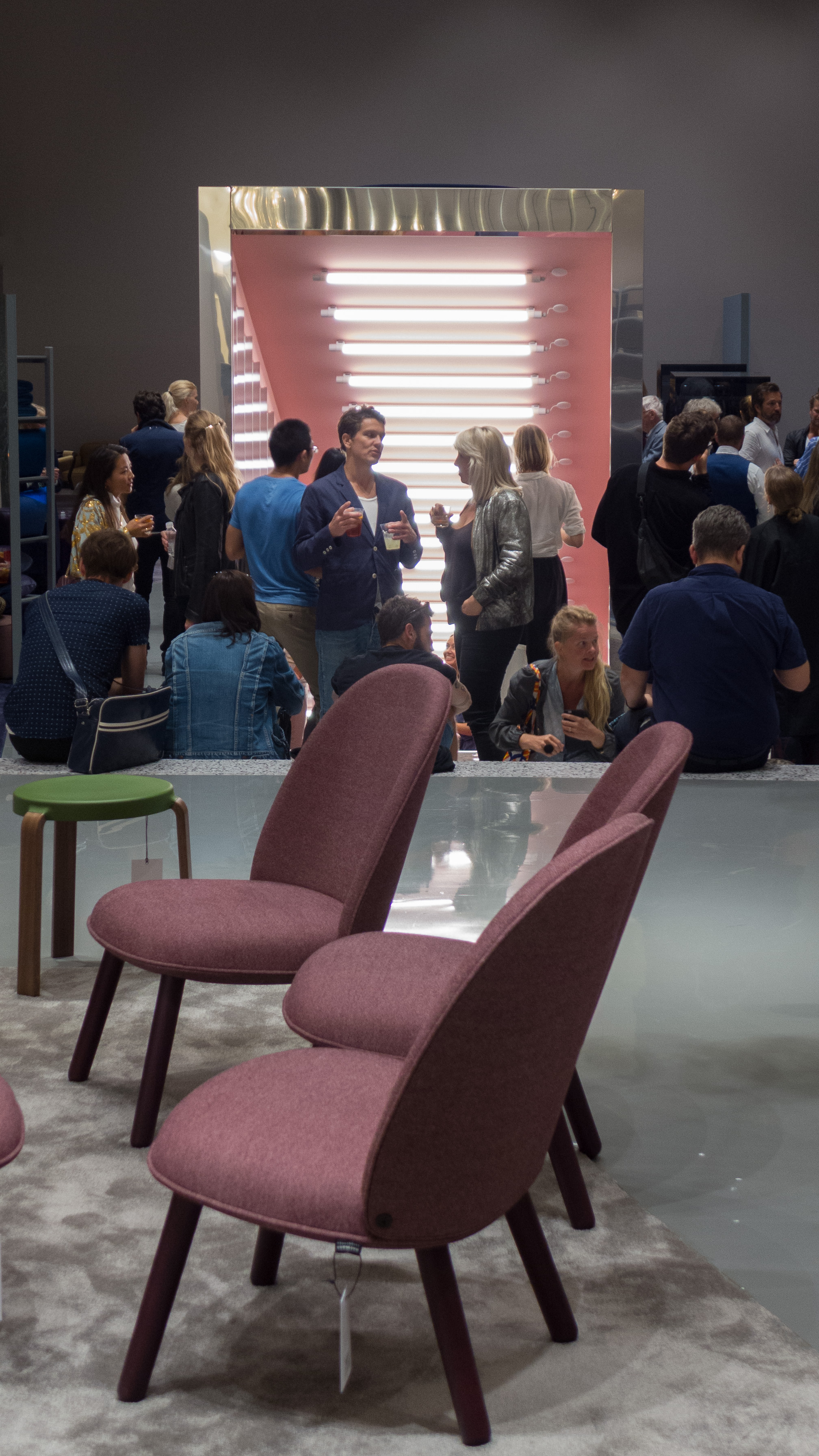
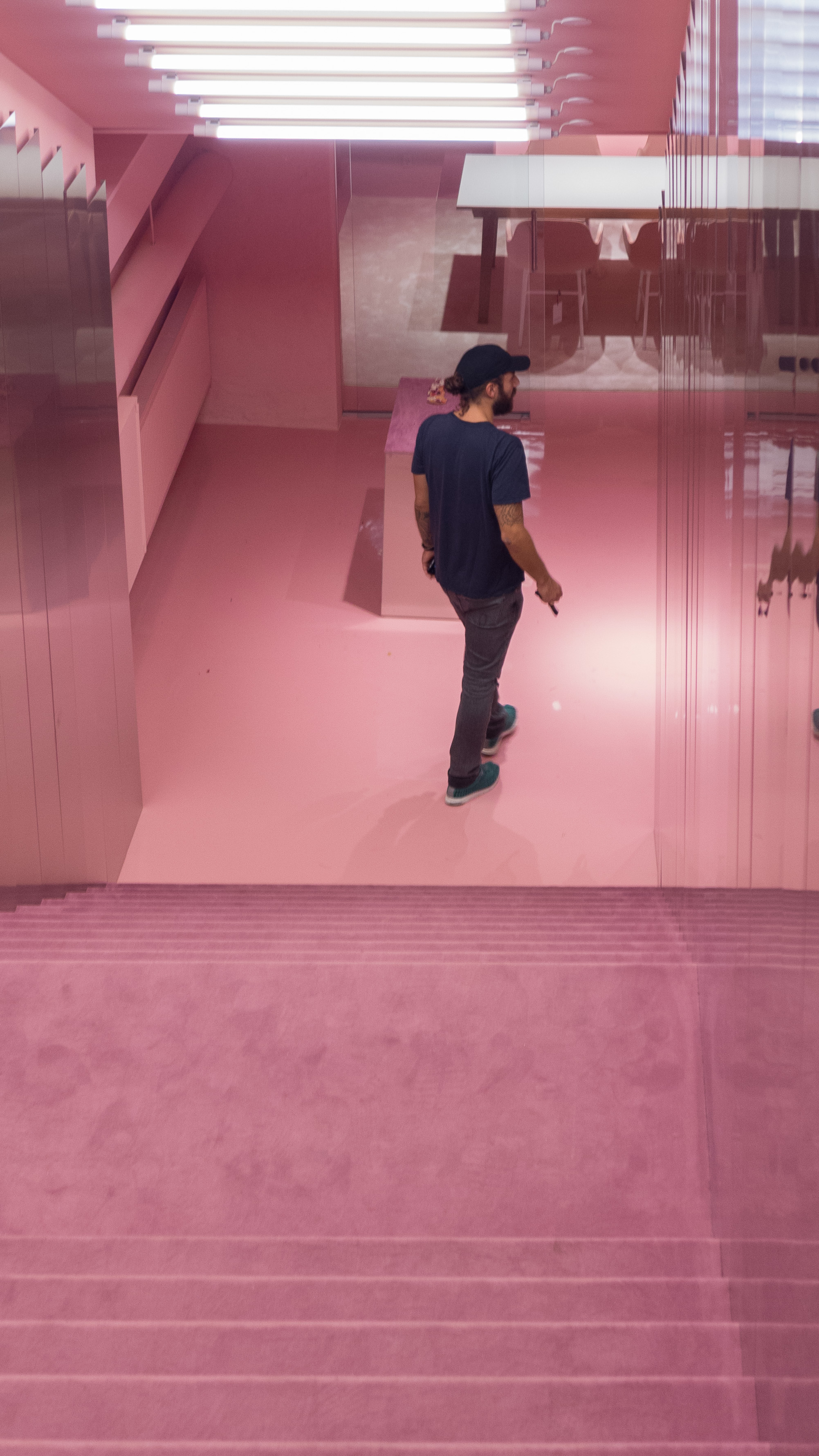
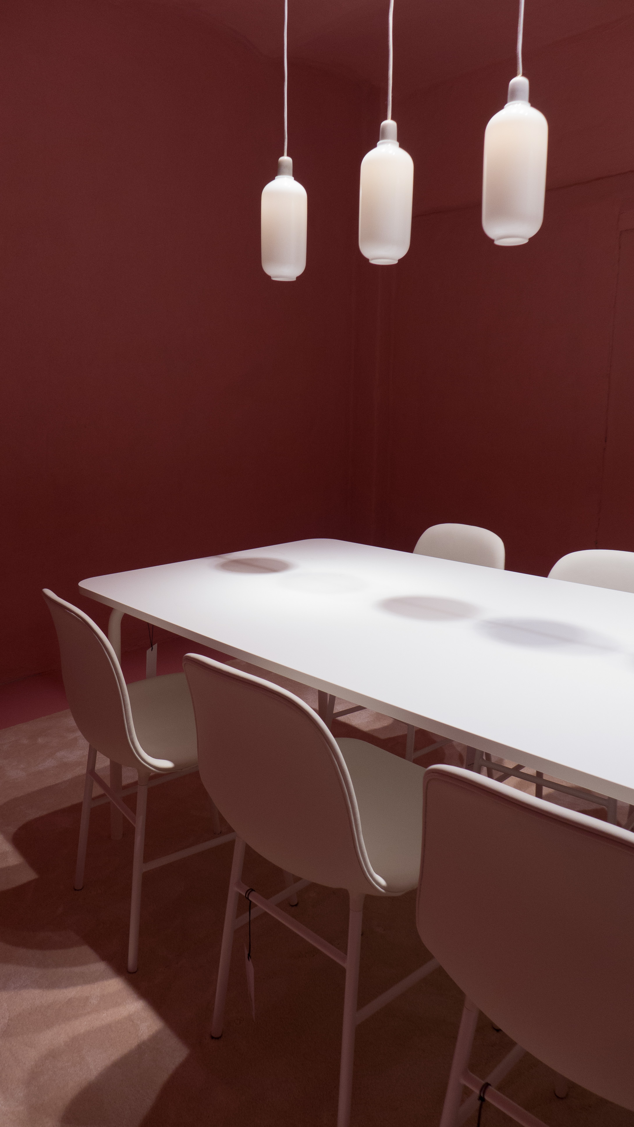
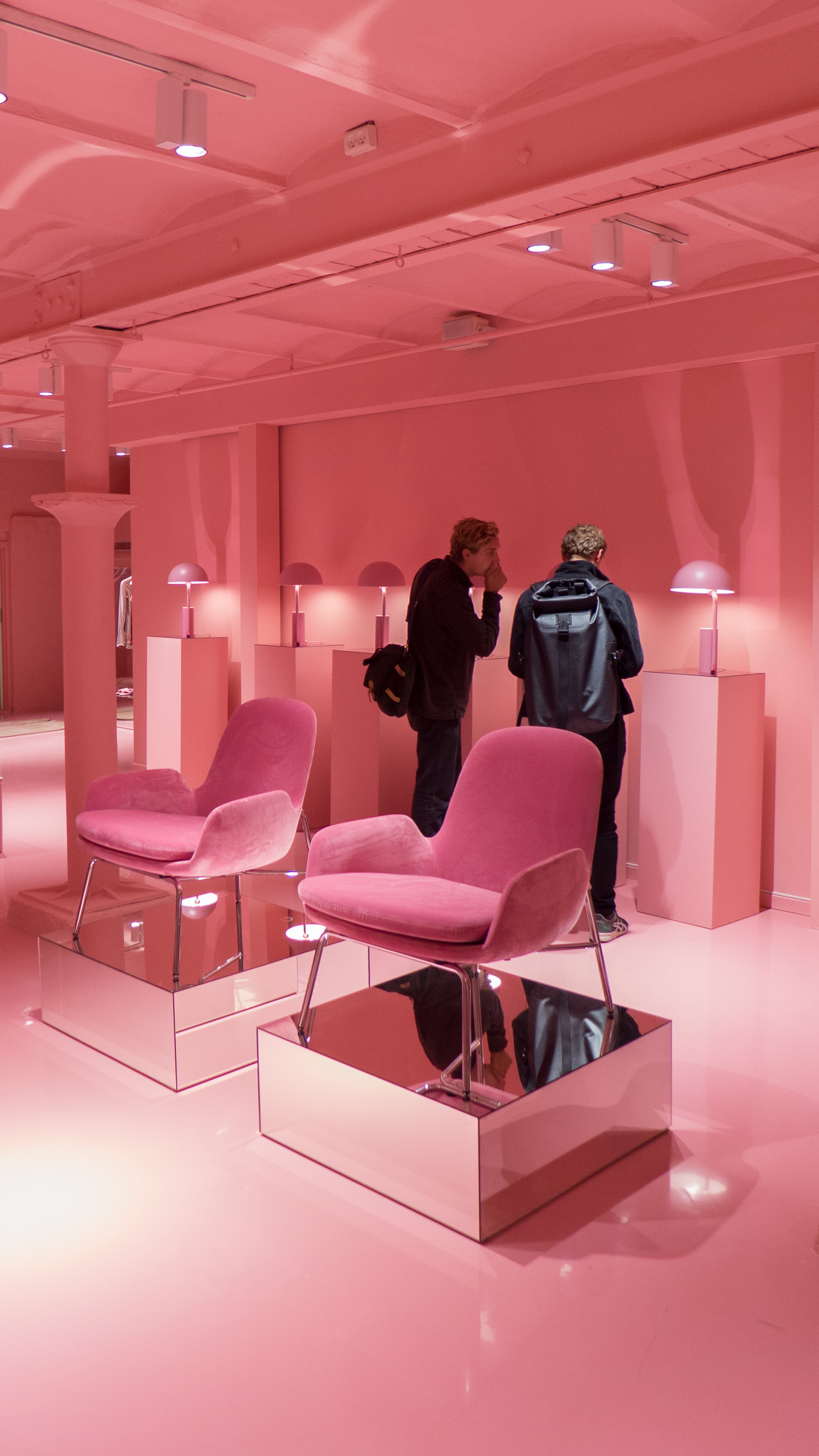
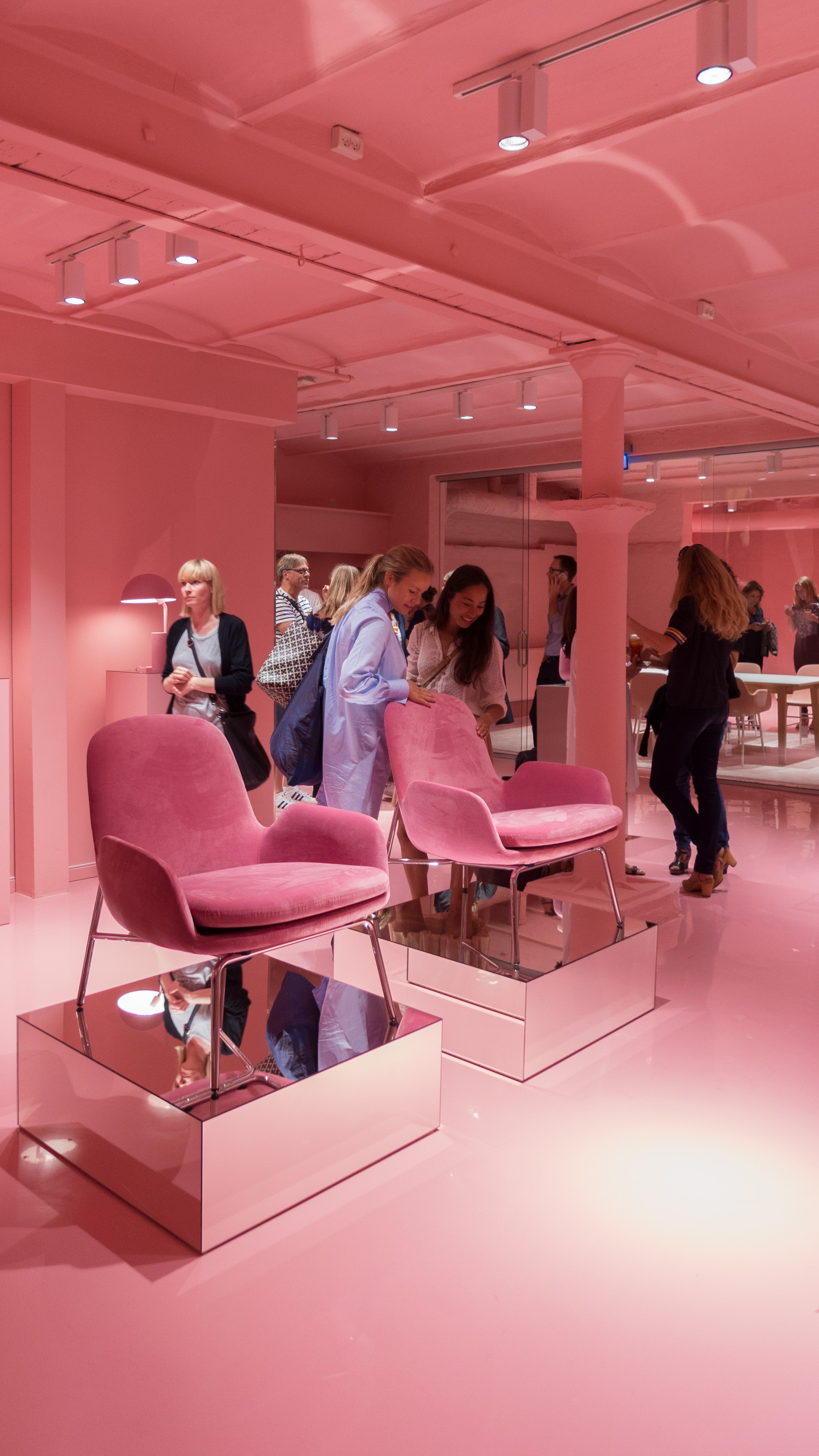
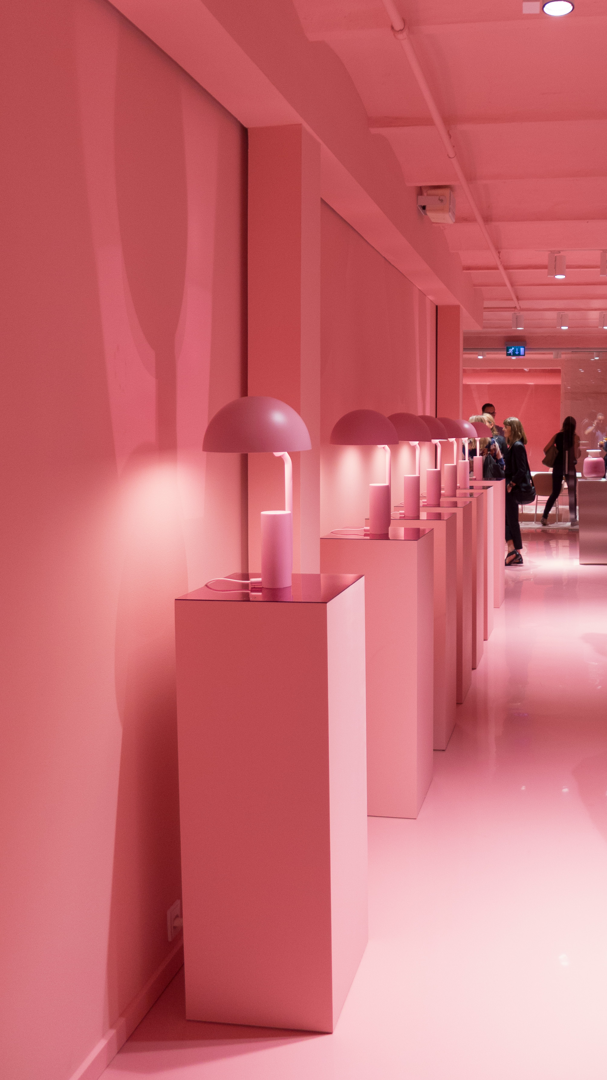
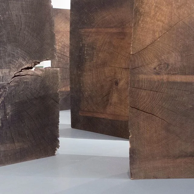
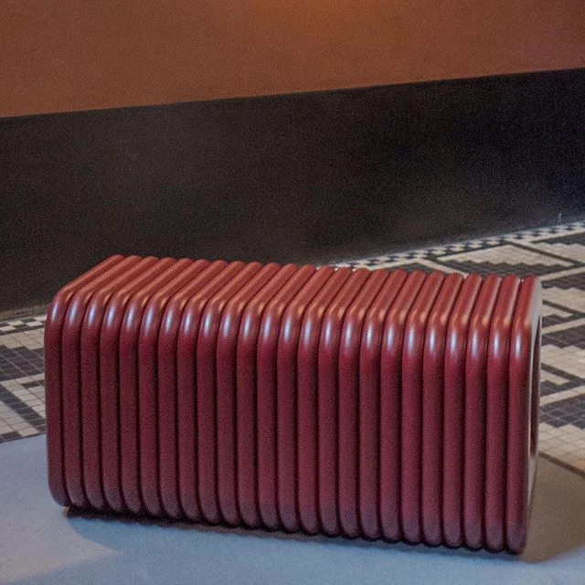
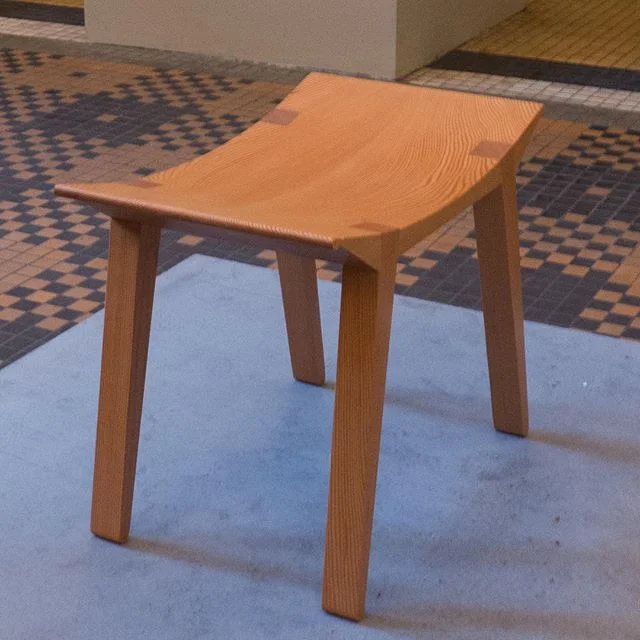
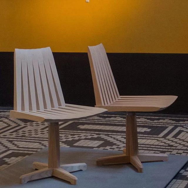
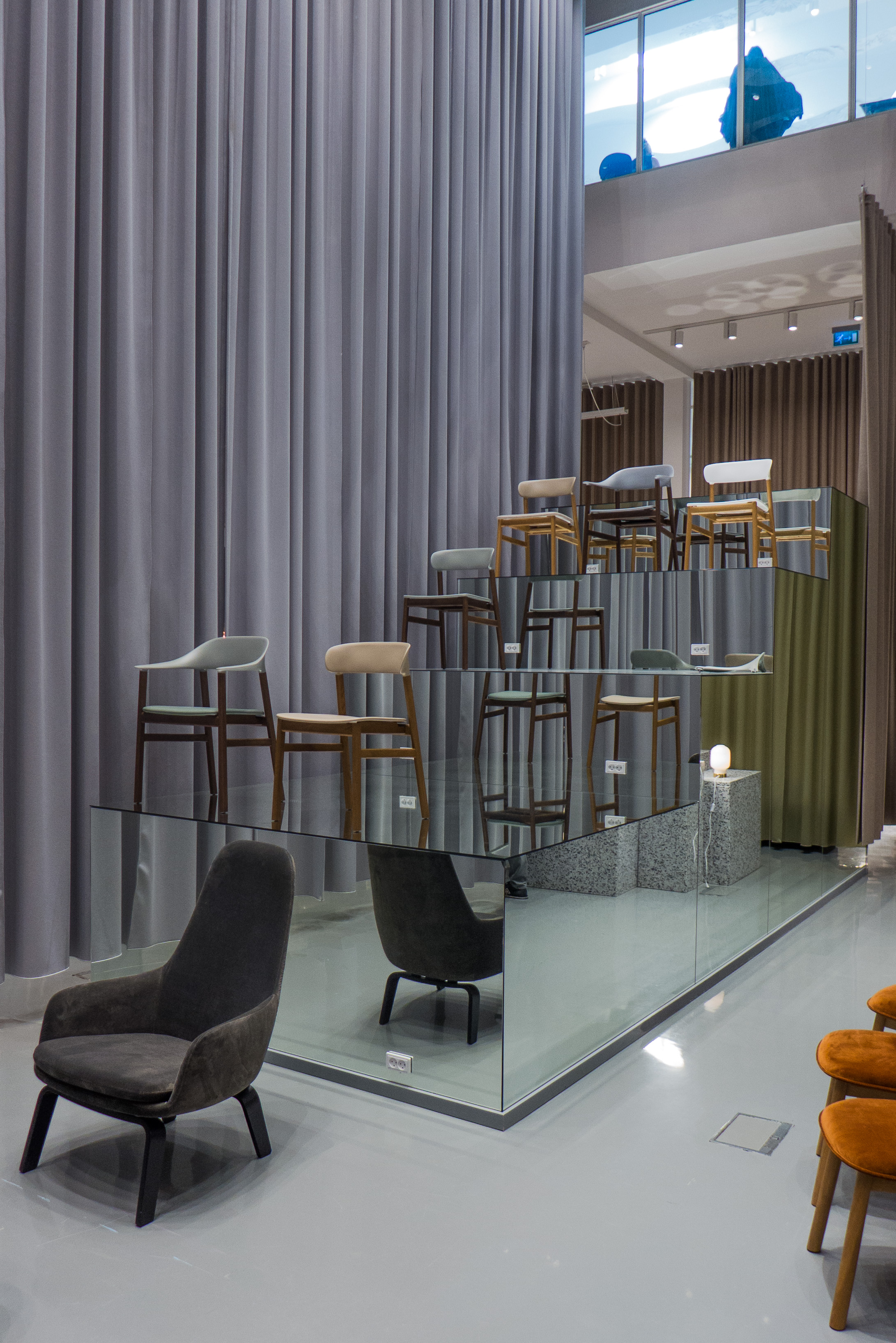
For this year, the sharp pinks of last year have gone and for now the huge space of the main part of the store has been subdivided by massive grey curtains that drop the full height and form spaces for room-like displays but with mirrors and large bold stacks of blocks to display chairs and the effect is certainly theatrical.
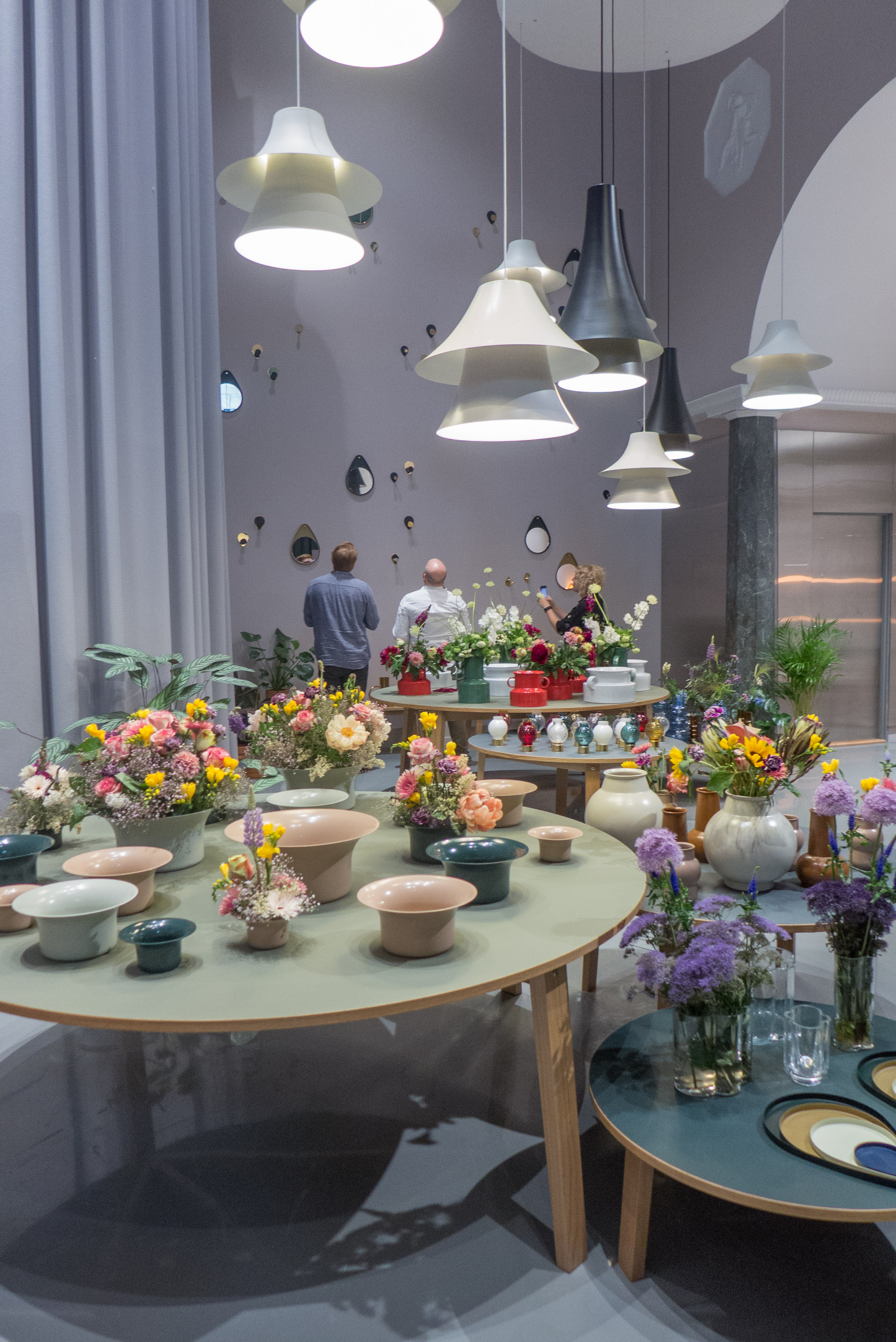
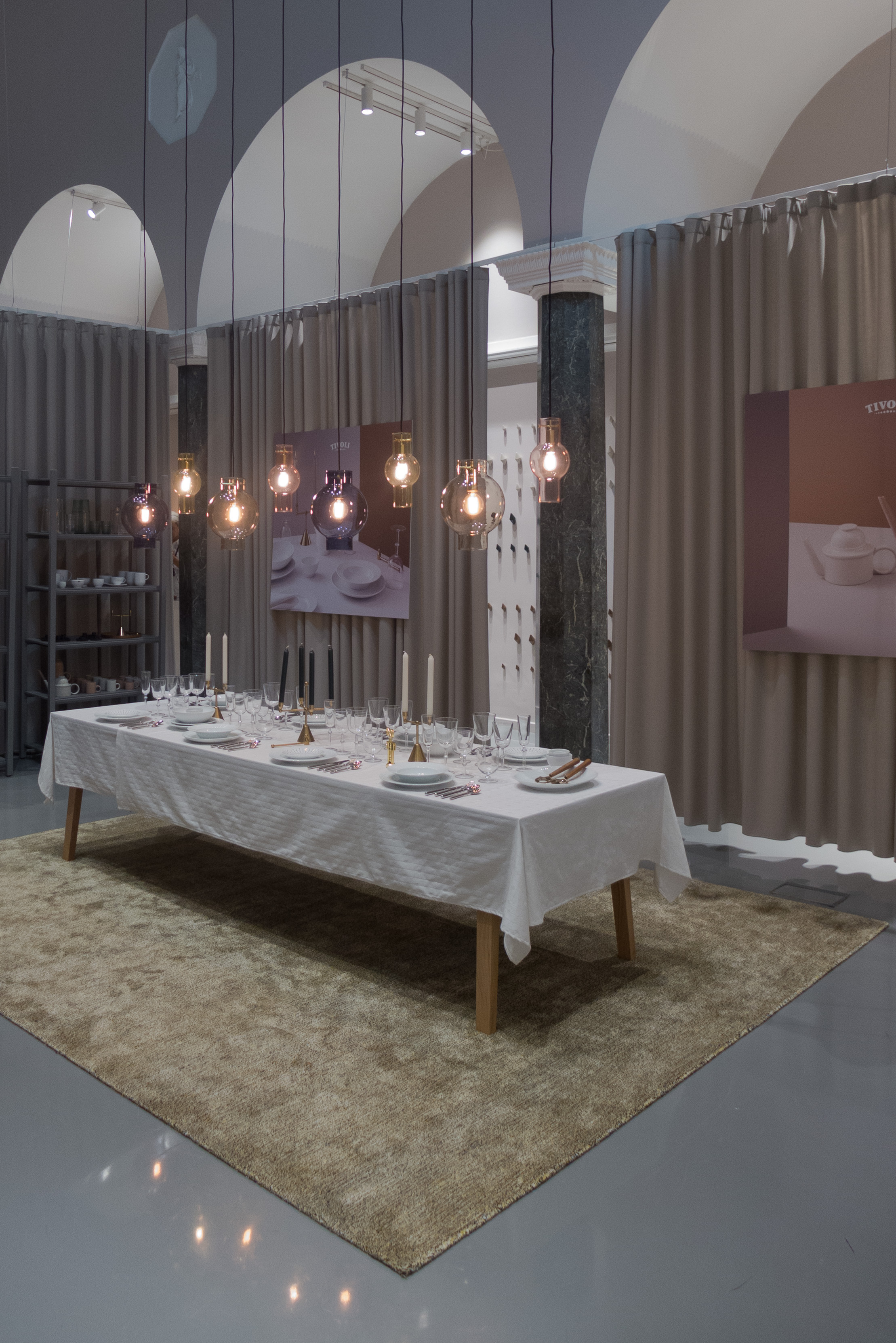
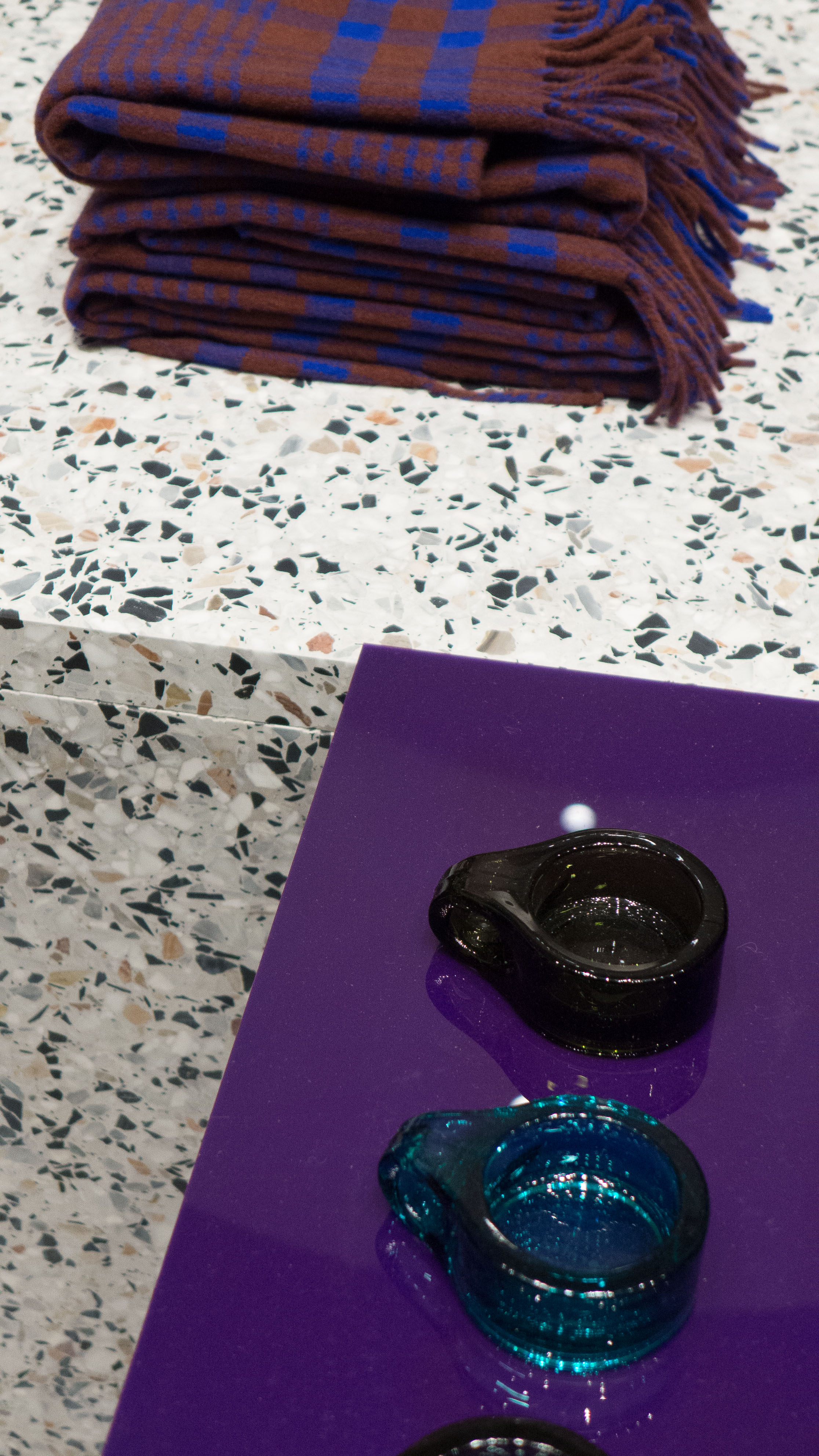
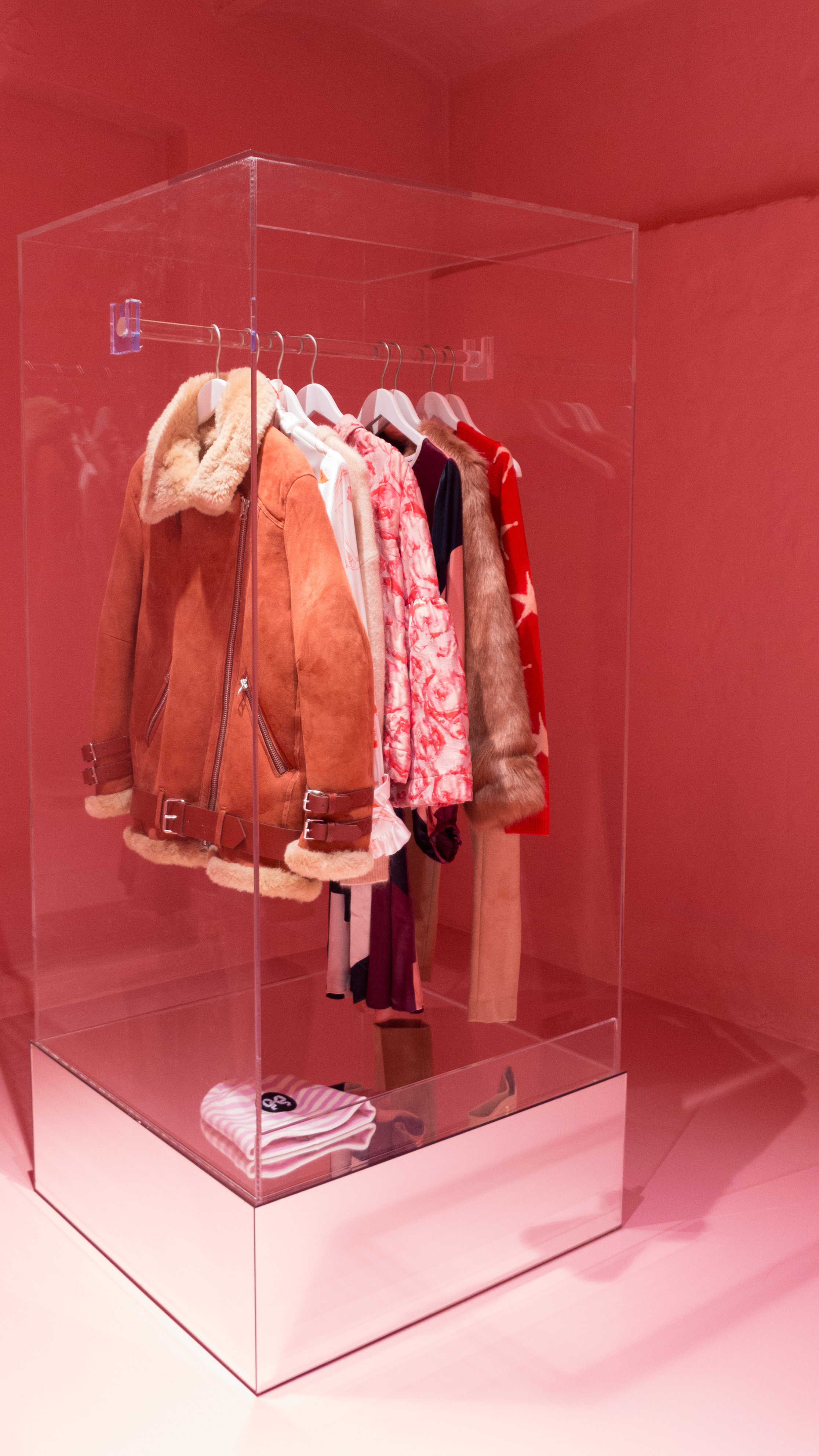
The company took this opportunity - the events of 3daysofdesign - to launch their new Tivoli Collection. The most obvious pieces are a new take on traditional Danish wooden toys in bold colours but, more significant, is a new co-ordinated range of home accessories all taking as a starting point the inspiration of the pleasure gardens of Tivoli in Copenhagen. The launch was during 3daysofdesign but the full range will be available from the Autumn so ready for the build up to Christmas.
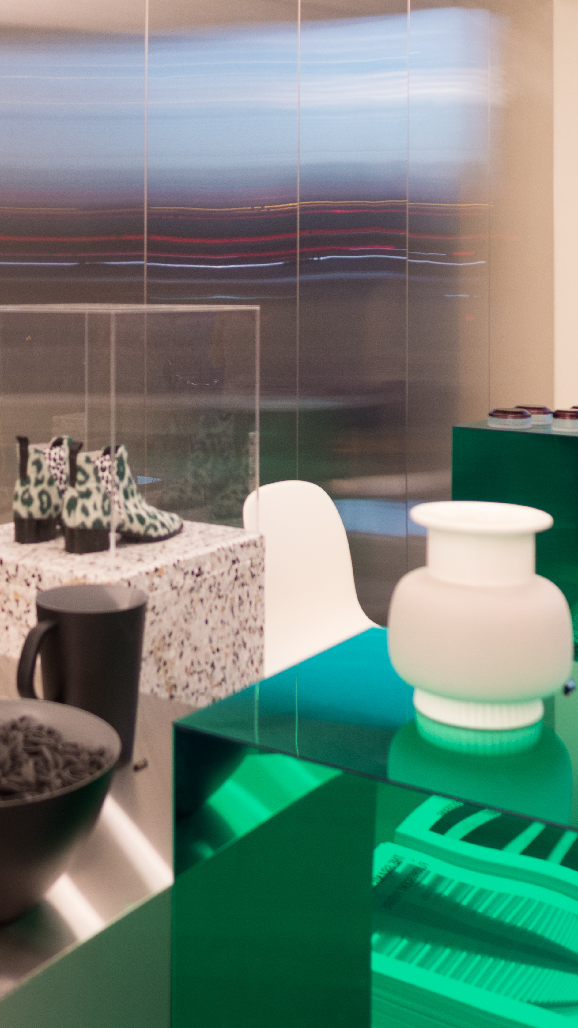
This is certainly an interesting development. Most furniture and design companies produce ranges of objects from novelty tableware to candleholders to purely decorative ornaments that supplement the main range of furniture and the more practical but often unexciting ranges of basic and practical household items like plates or bowls or flatware and if you know your design world you can spot what are obviously company colours or typical shapes or even predictable materials but here, with the Tivoli Collection, there is a very deliberate rethink of over 300 pieces to create coherence … so much so that Normann themselves are talking about the Tivoli Brand.
From the start, Normann were noted for the colours they used, usually on bold deliberately simple and uncluttered shapes for their furniture, and they were one of the first companies to mark a clear rejection of the more conservative Danish colour palette of the late 20th century and the first decade of this century … so they replaced pale natural colours with strong and deep colours for fabrics.
Maybe, with the Tivoli Collection - with the use of much more decoration and the use of gold and so on - Normann are again heading a different move away from the stripped back and uncluttered rooms normally associated with Scandinavian homes to something that many will feel reflects more complicated and more individual lives. To me it seems a bit like a return to the days of Biba in London and the very first collections of Habitat … not the simple designs from Scandinavia and Germany that Conran introduced to British homes but the Moroccan rugs, the rope plant holders, candles and brass watering cans that filled his stores and pulled people in. Essentially, looking at that change as a social historian, it was all about a break away from post-war austerity … about individuality and about young adults wanting to buy things that were interesting and hinted at excitement and travel and a broader more open viewpoint …so perhaps the more ornate accessories from Normann mark that point where cool and rational Scandinavian design seemed too much or, rather, too little for getting away from austerity economics.