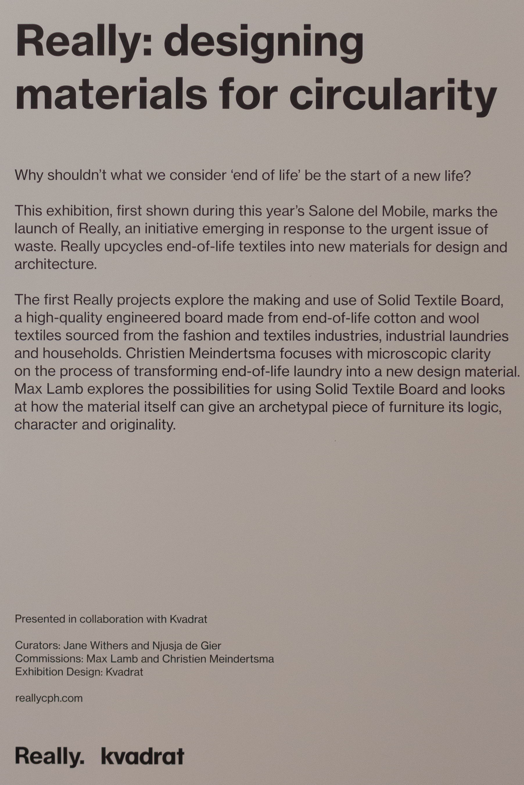
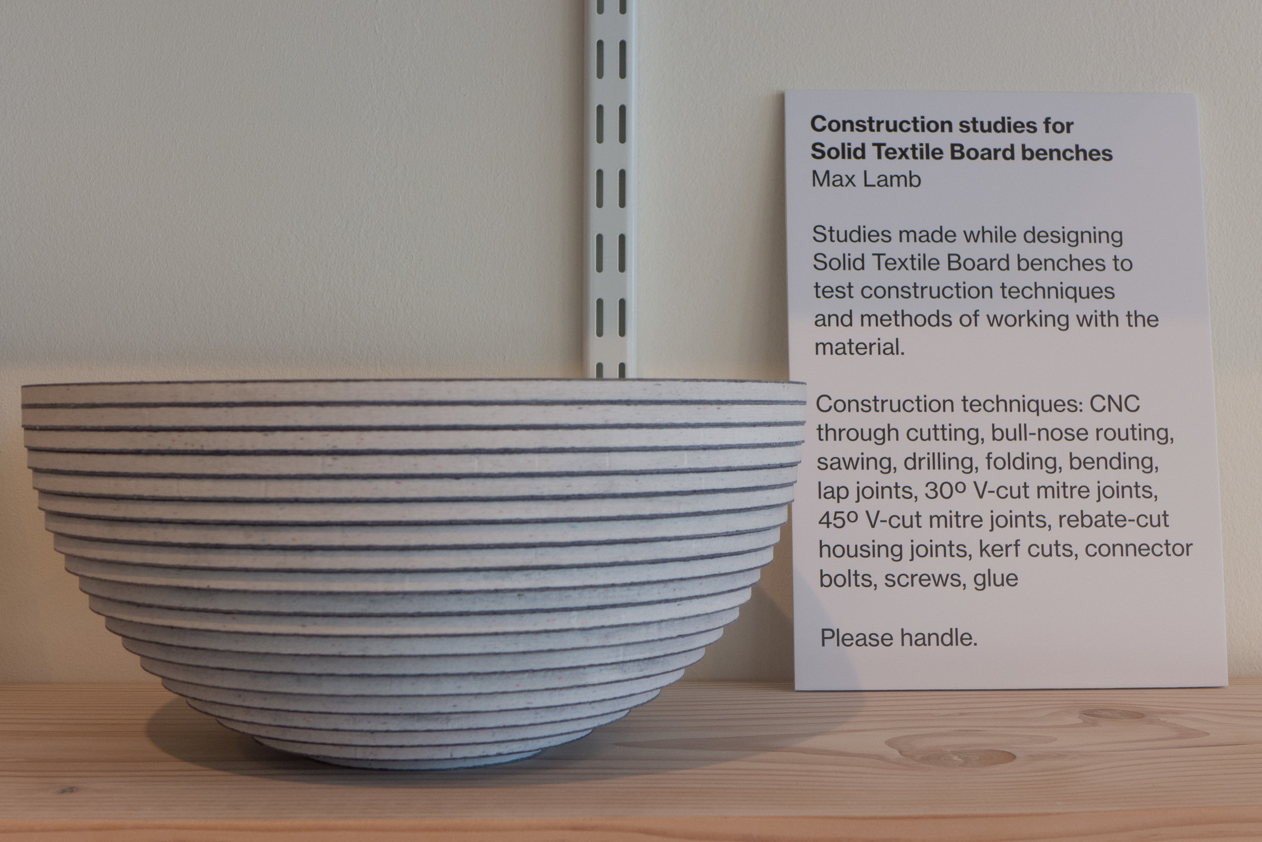
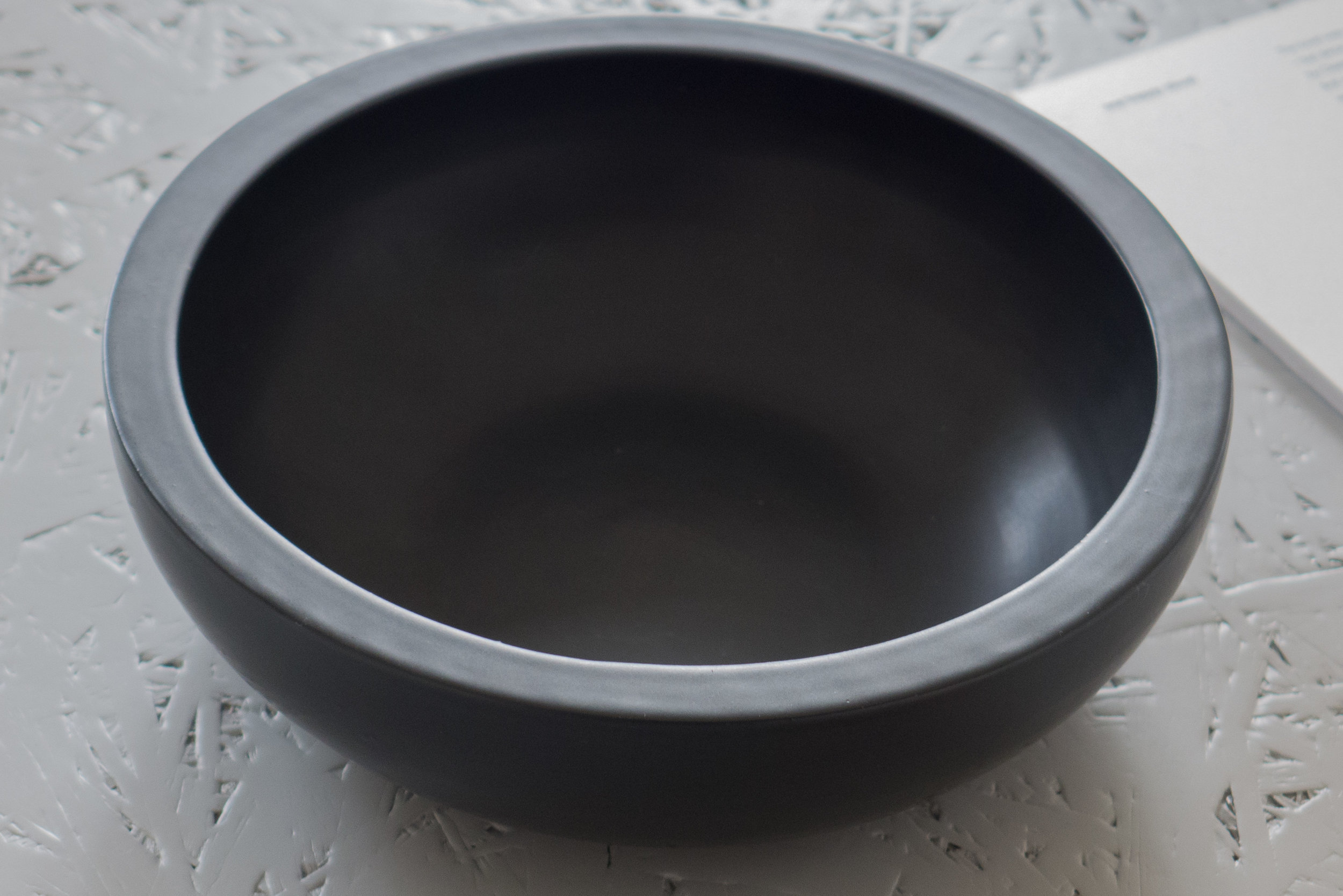
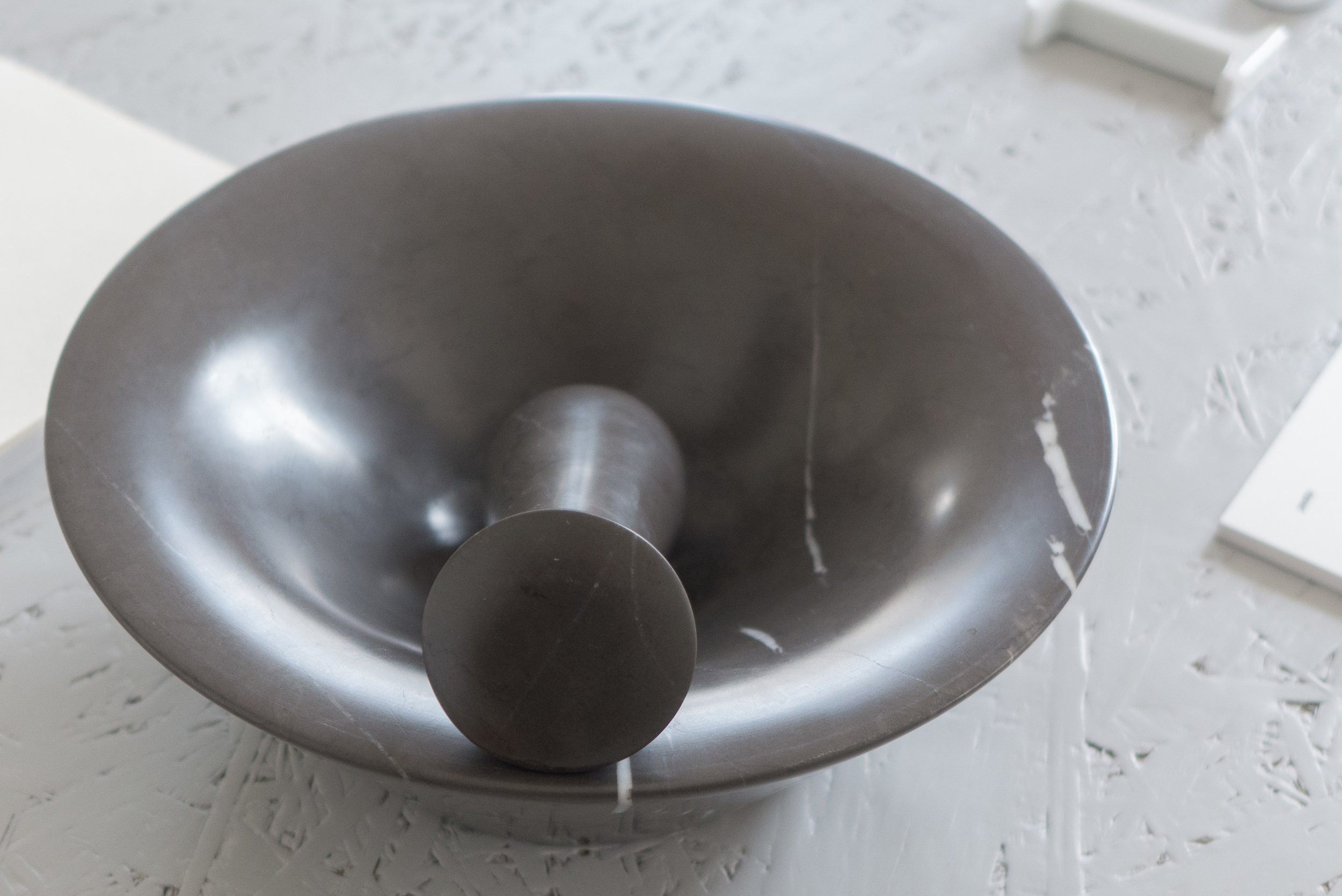
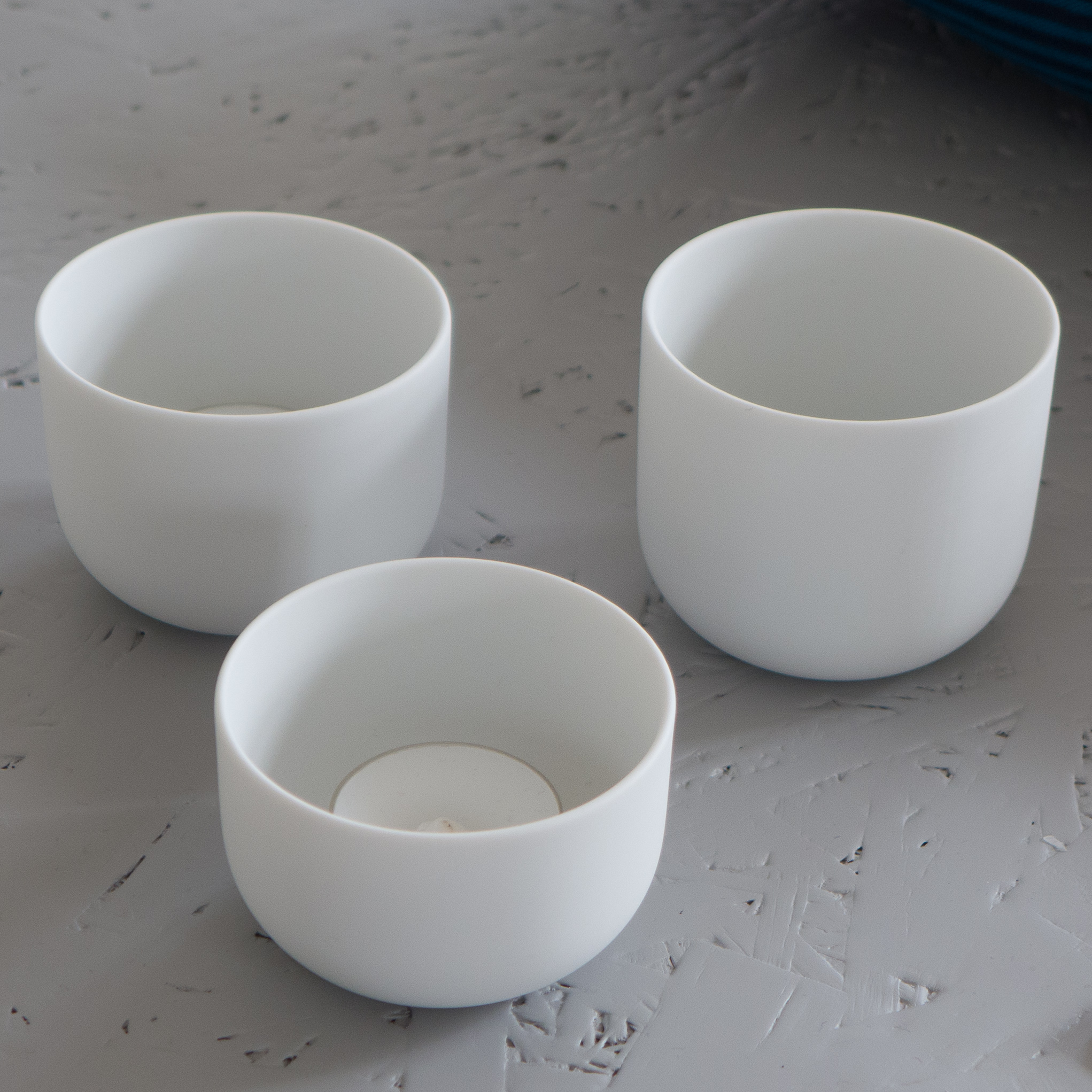
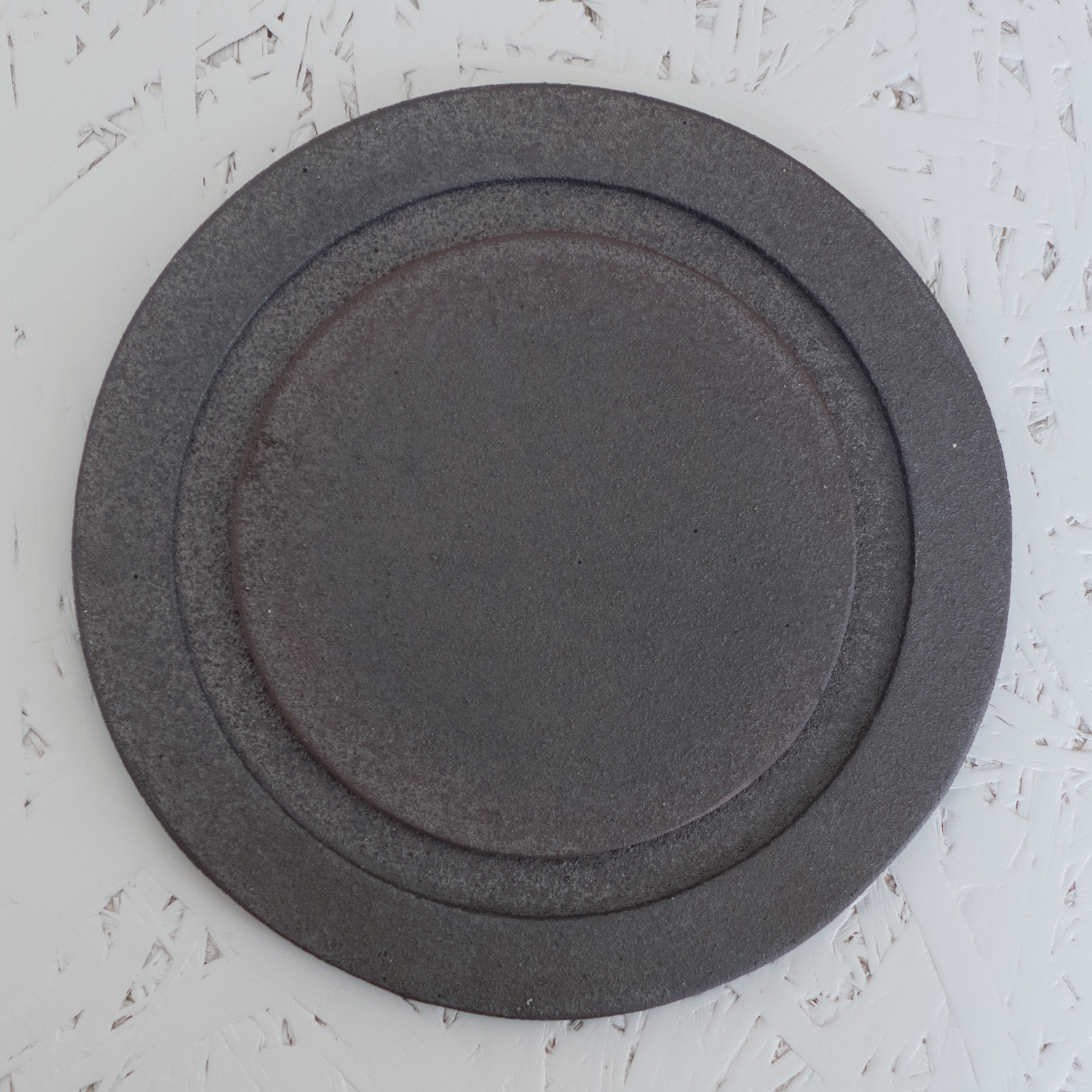
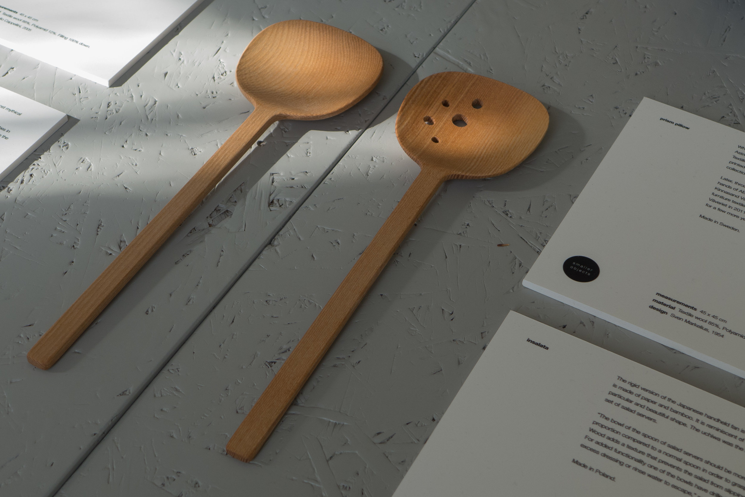
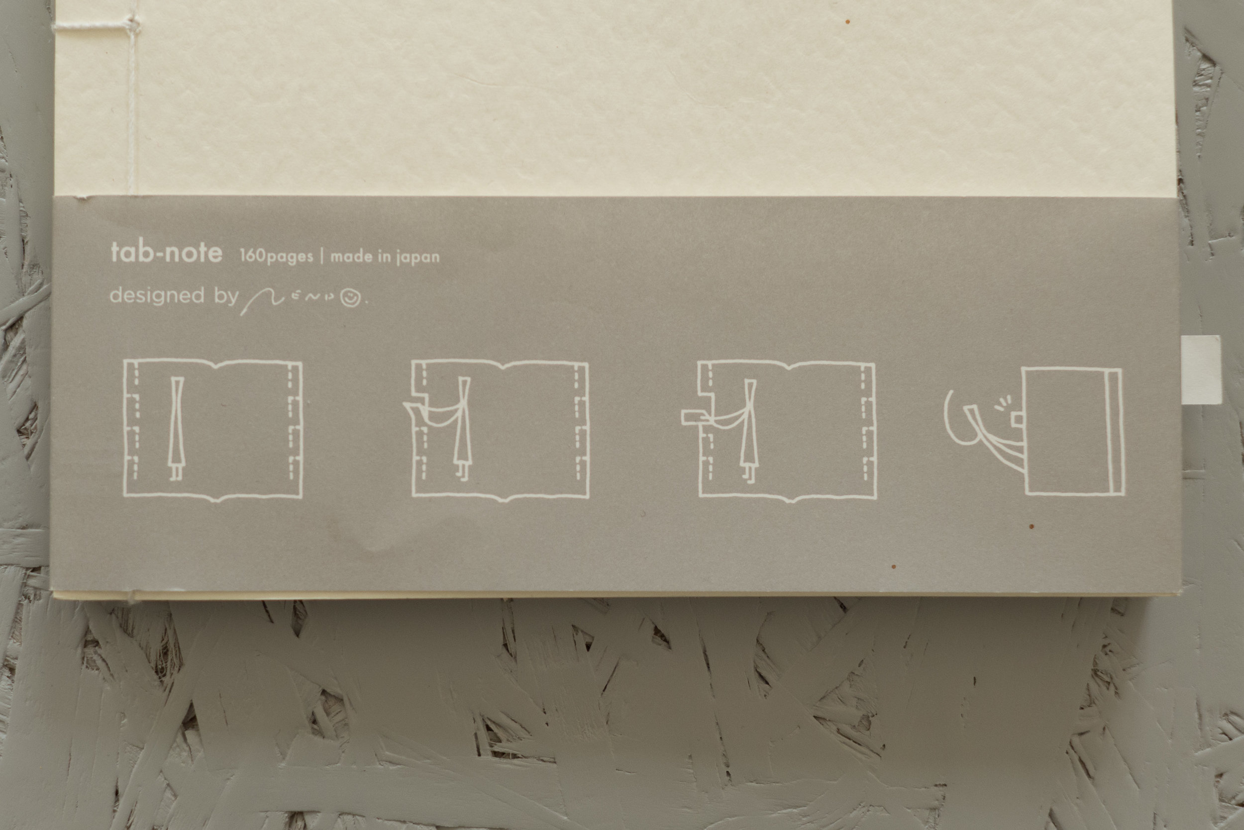
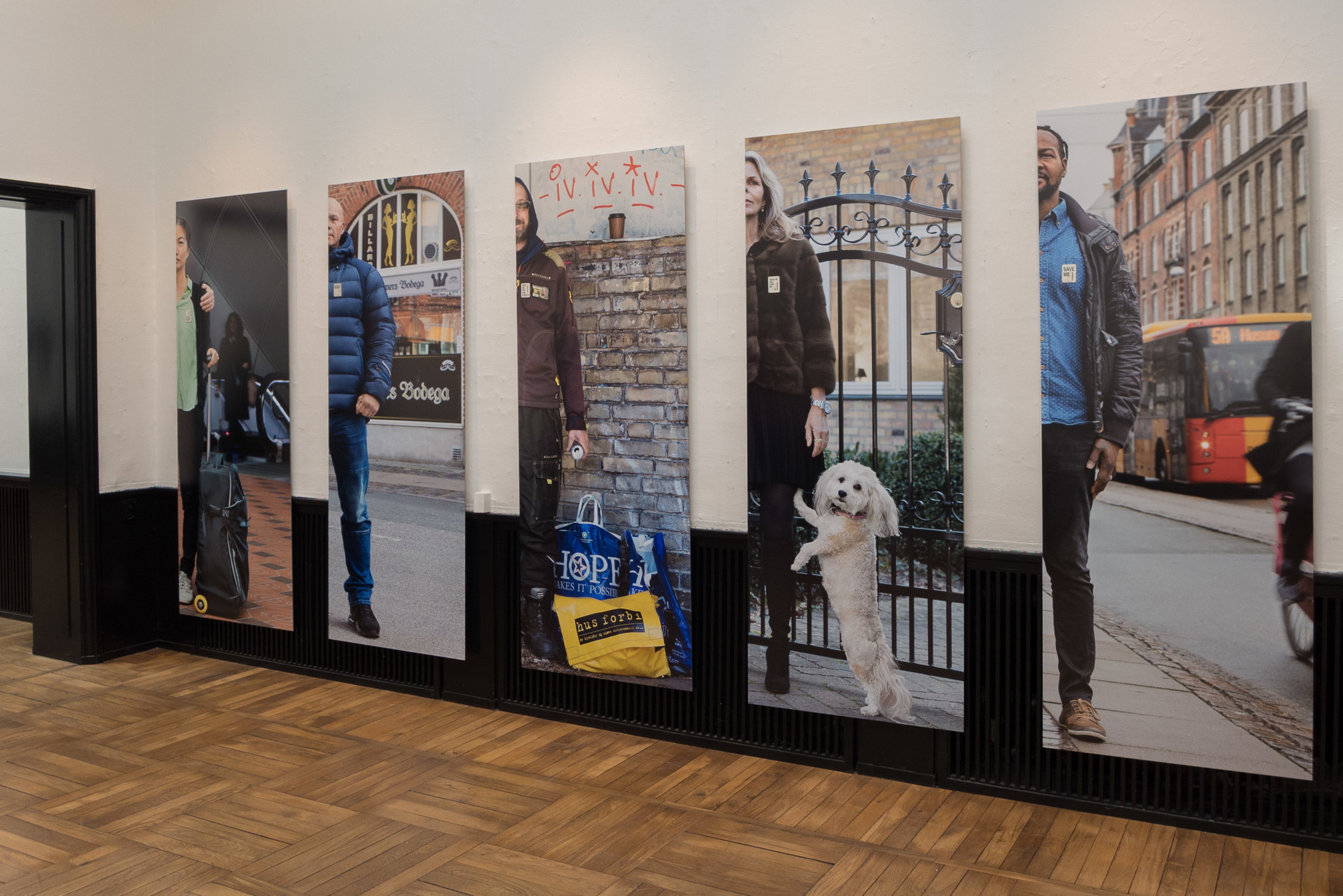
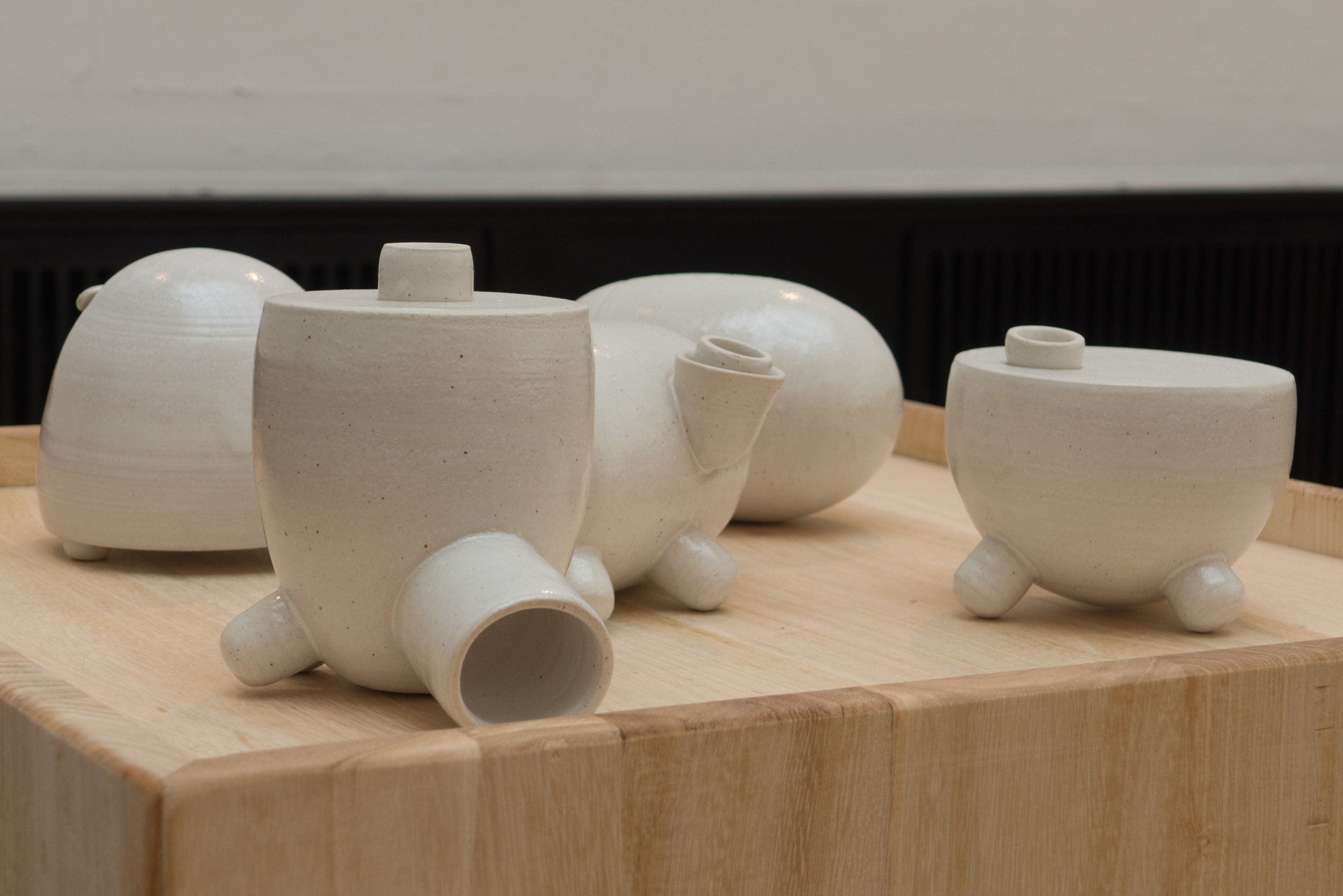
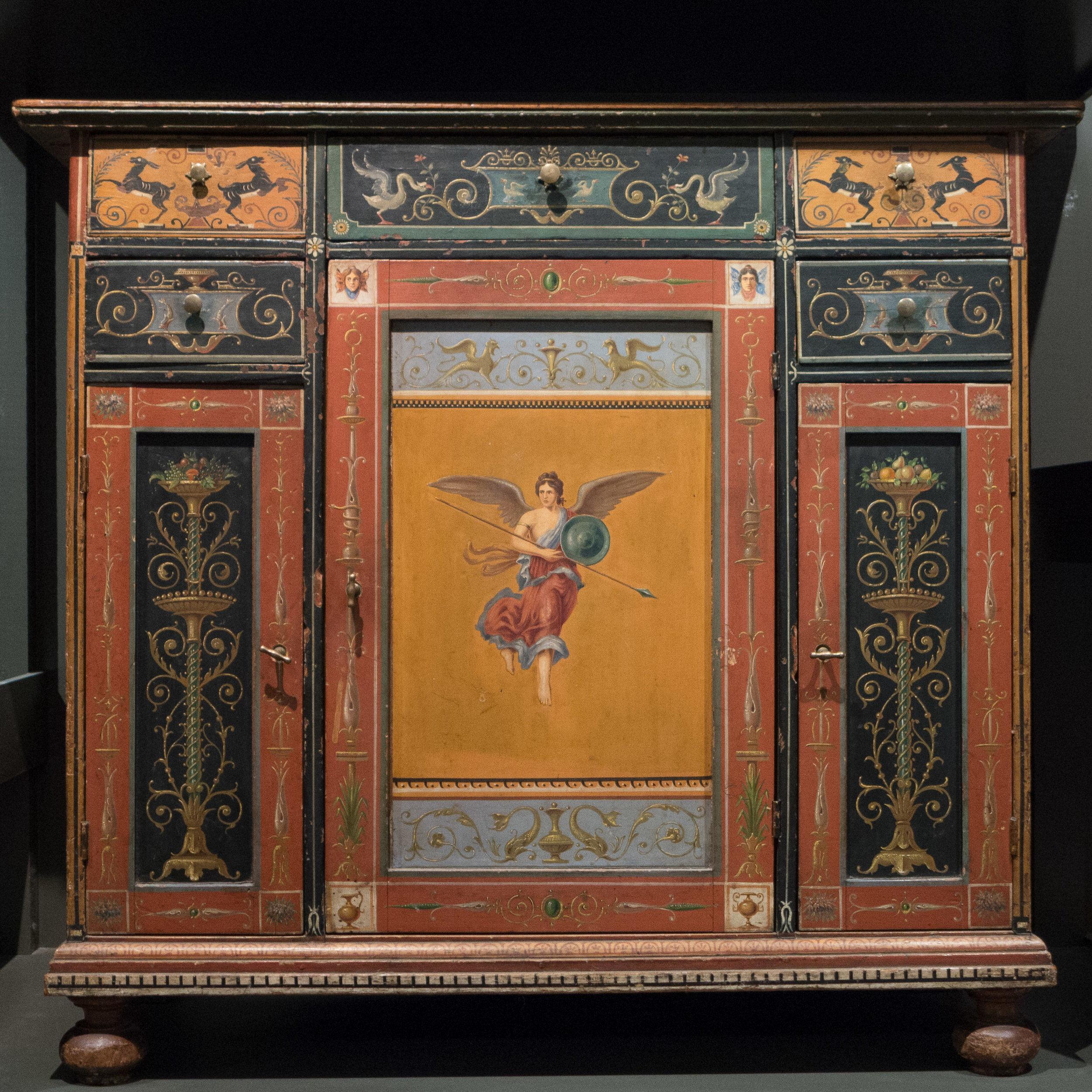
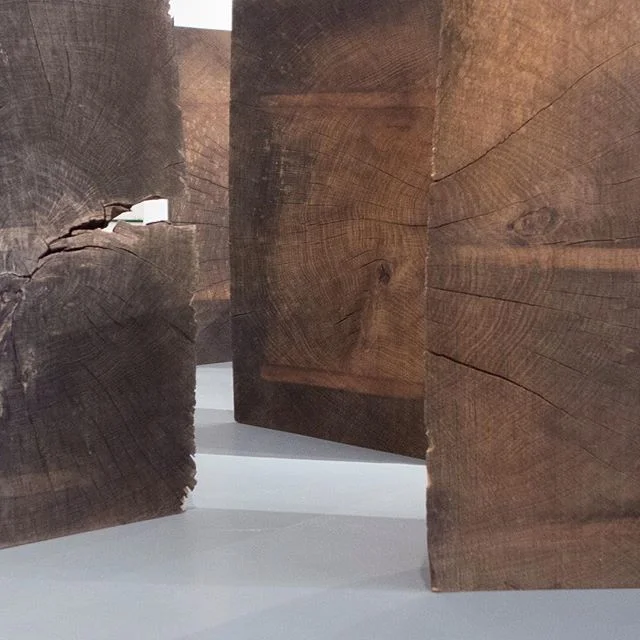
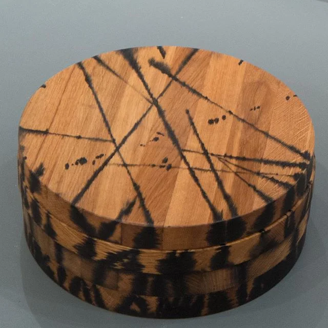
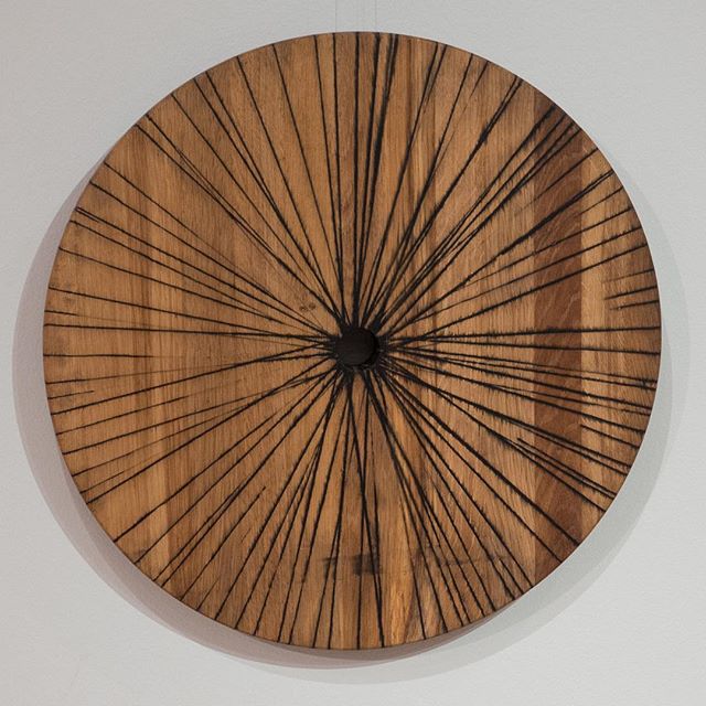
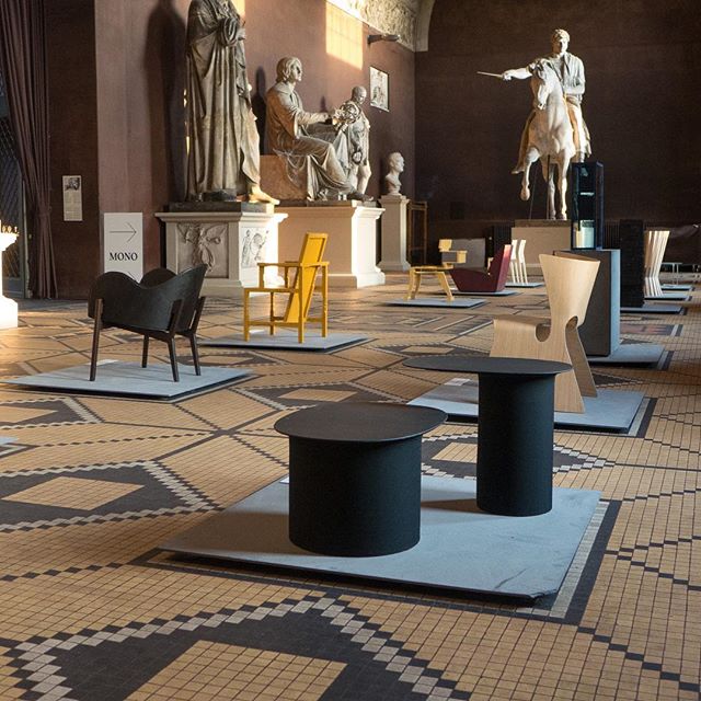
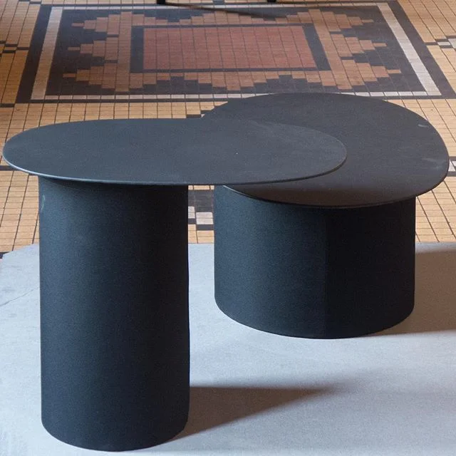
This is the last two days of the Biennalen ... an exhibition of some of the very best of Danish craft work.
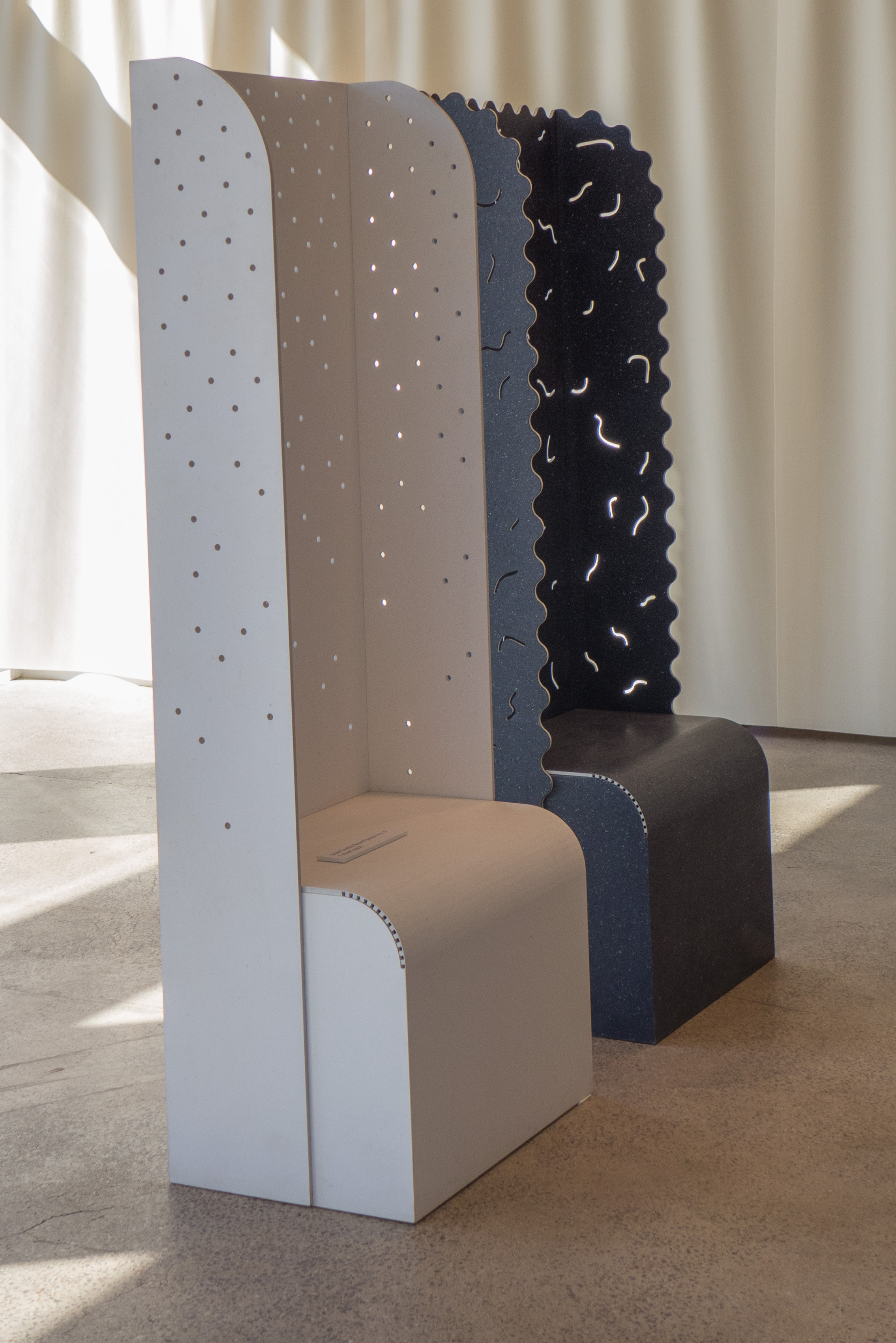
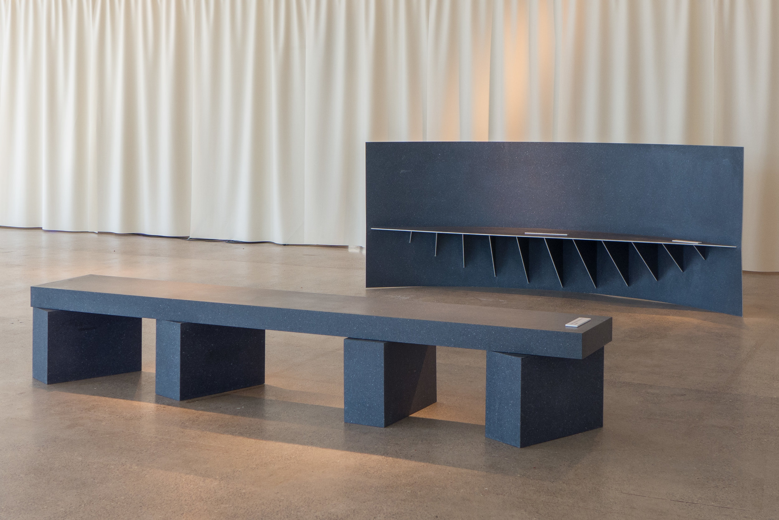
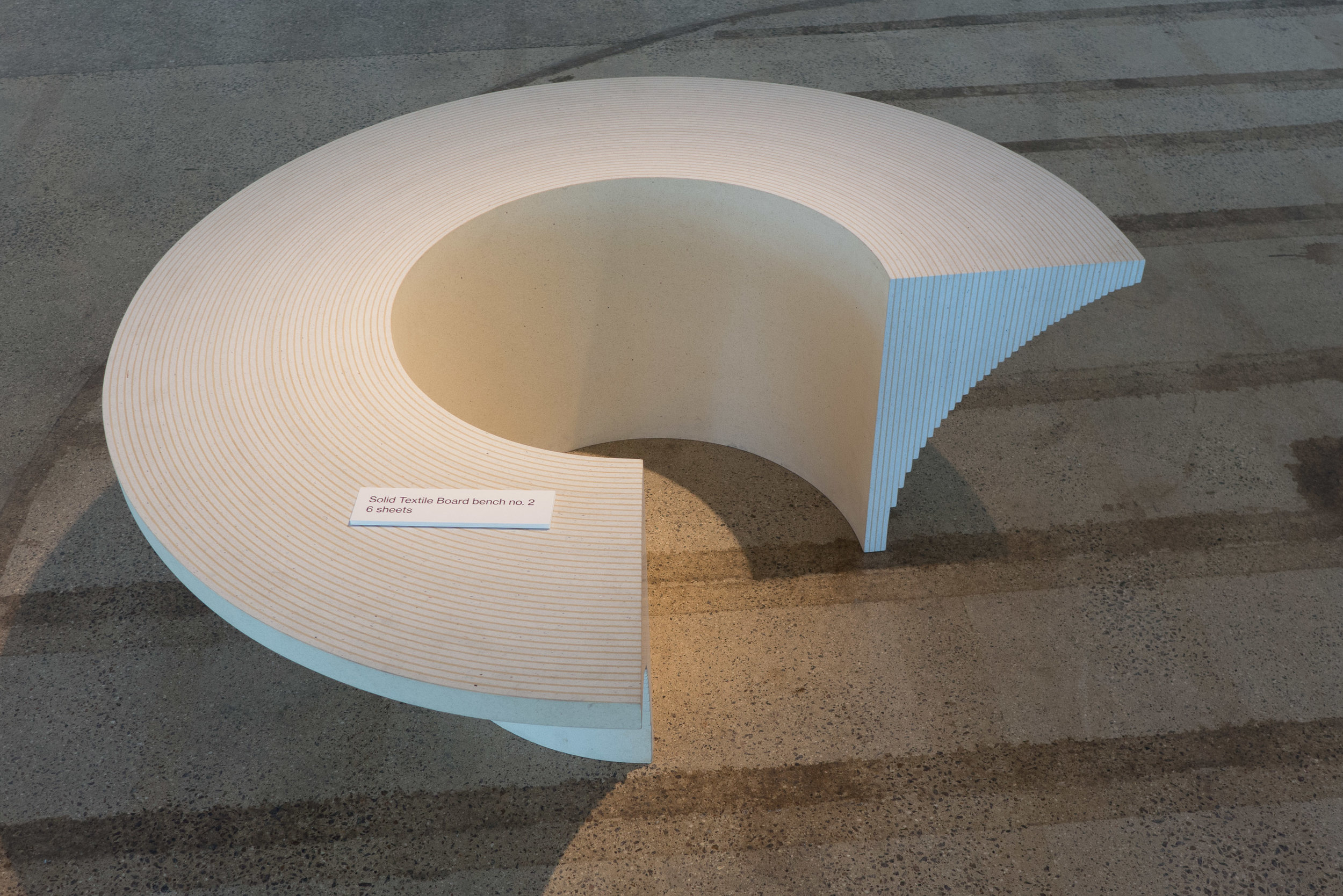
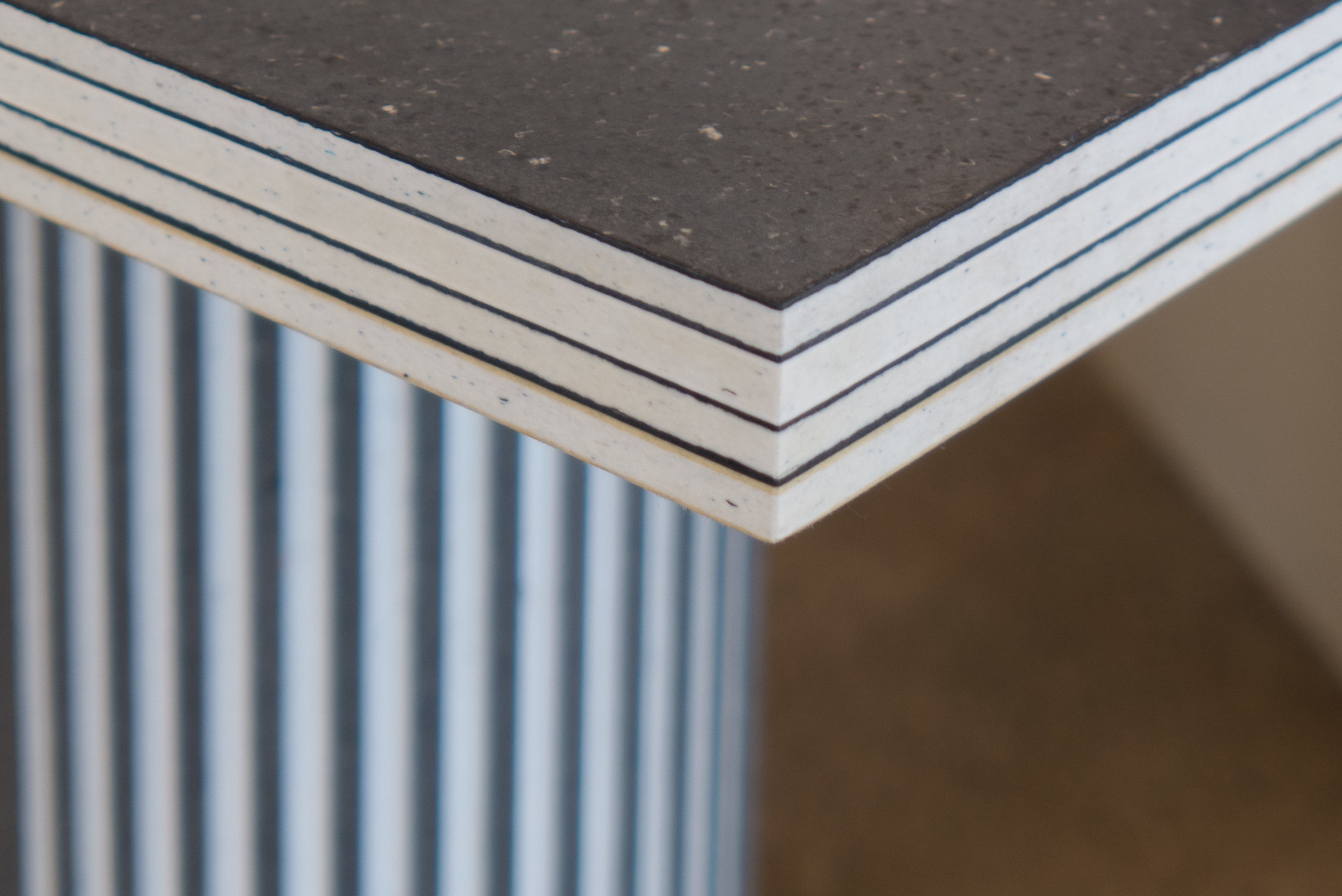
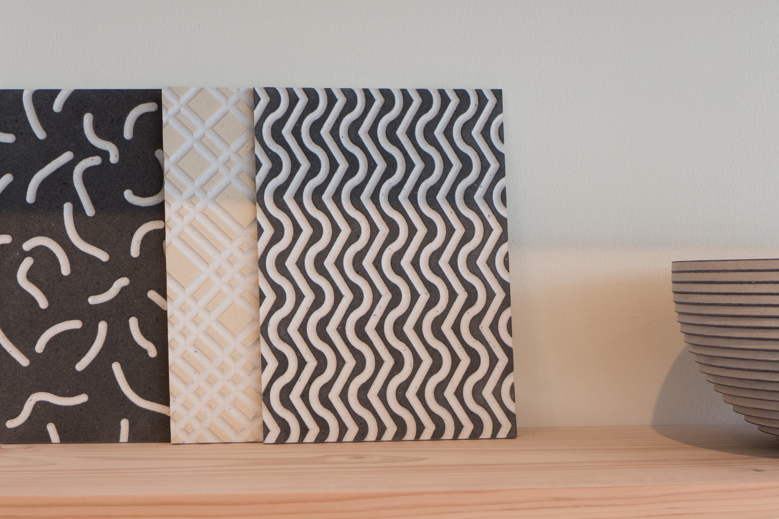
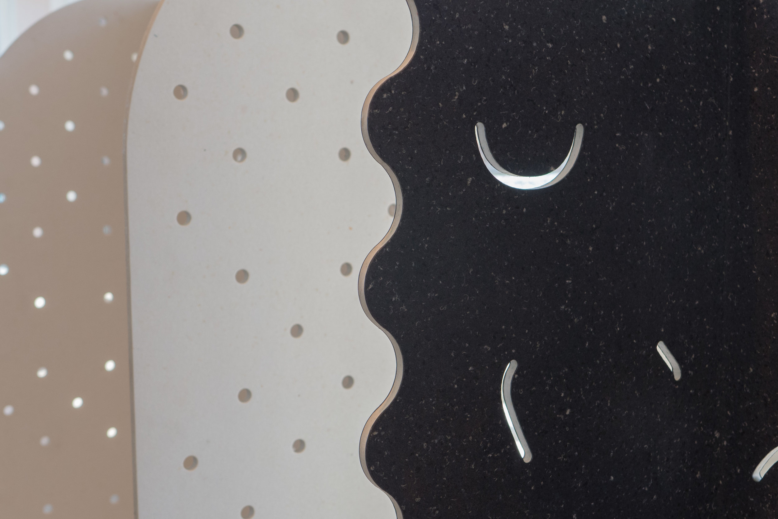
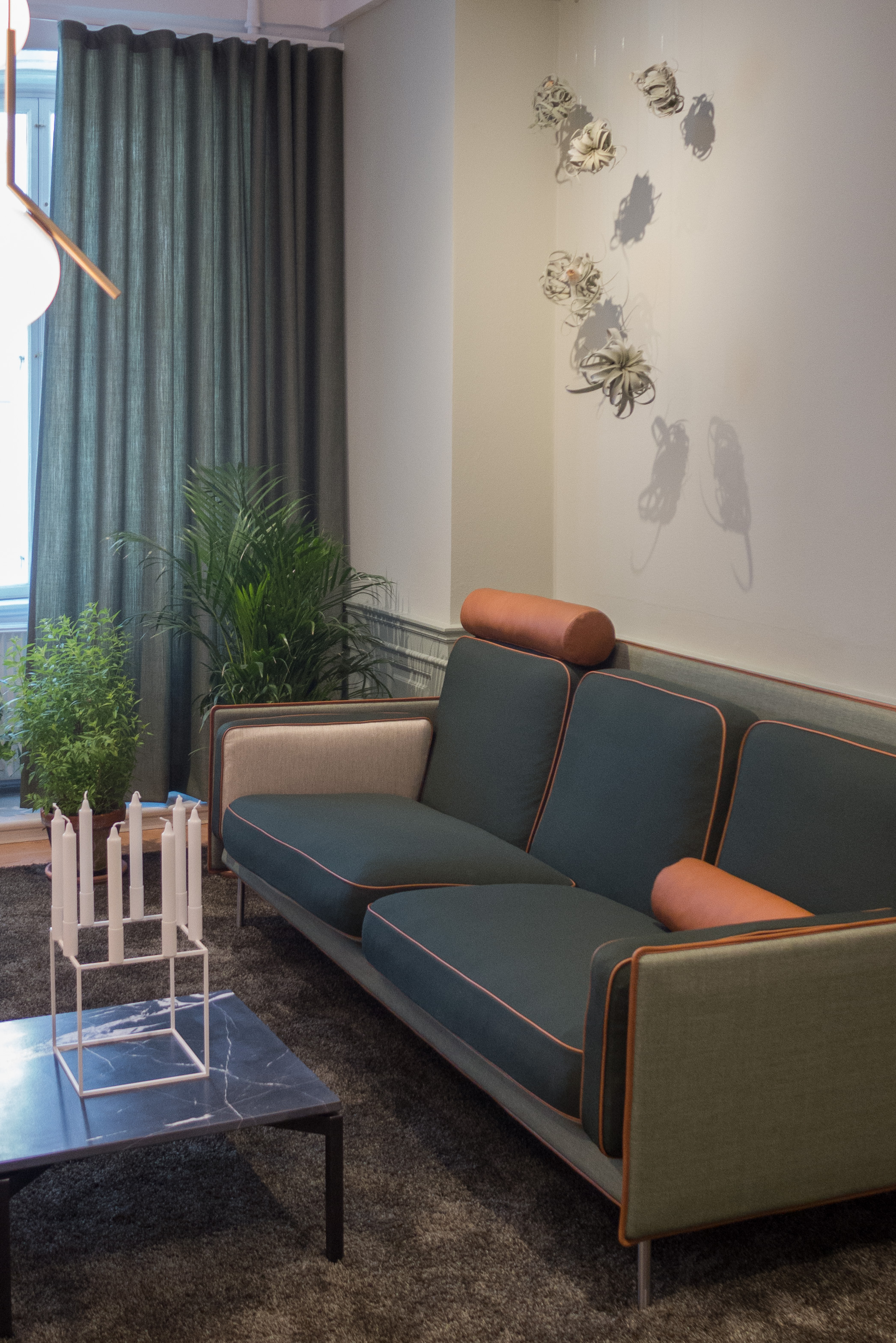
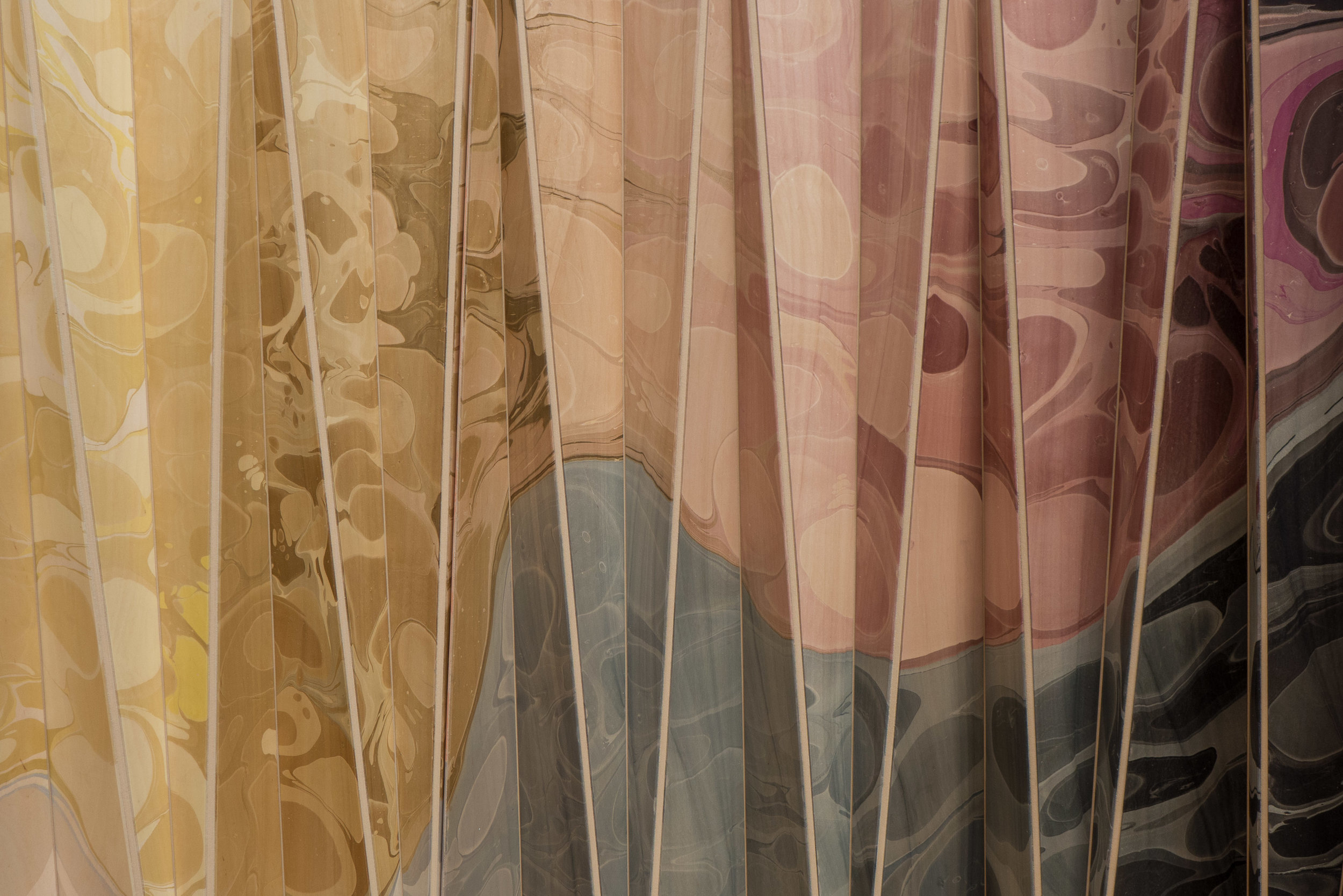
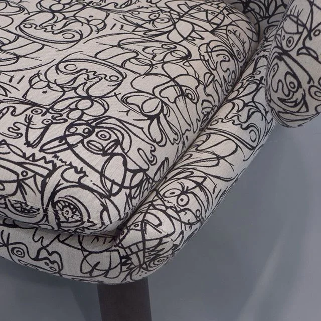
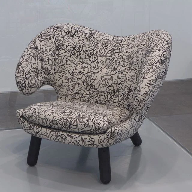
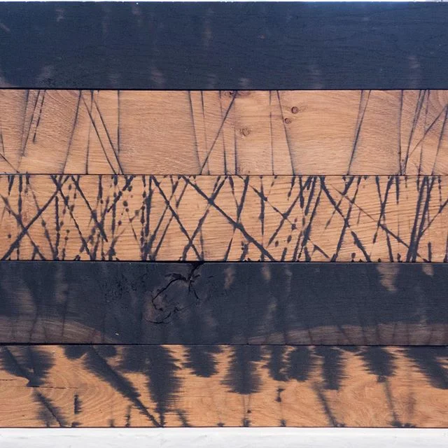
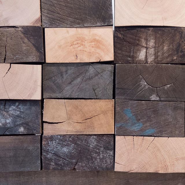
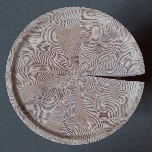
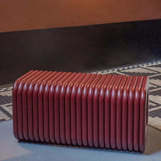
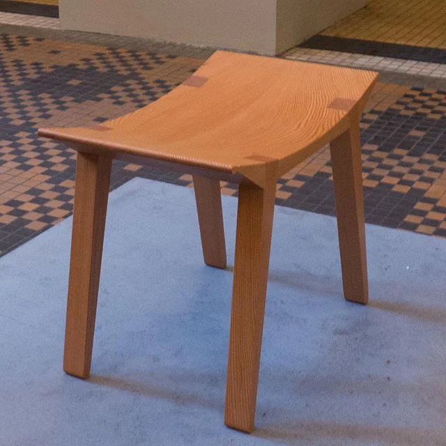
What is astounding here are those very qualities that are not normally associated with Danish design … or at least not with common preconceptions about Danish design from the late 20th century. So here there is strong, bold use of colour and texture and the exploration of ideas that challenge perceptions and preconceptions.
The theme Liquid Life - about how precarious modern life can feel - is from a text by Zygmunt Baumann and taken from his book Liquid Life that was published in 2005.
“Liquid life is the kind of life commonly lived in our contemporary, liquid-modern society ... The most acute and stubborn worries that haunt this liquid life are the fears of being caught napping, of failing to catch up with fast moving events, of overlooking the ‘use by’ dates and being saddled with worthless possessions, of missing the moment calling for a change of tack and being left behind.”
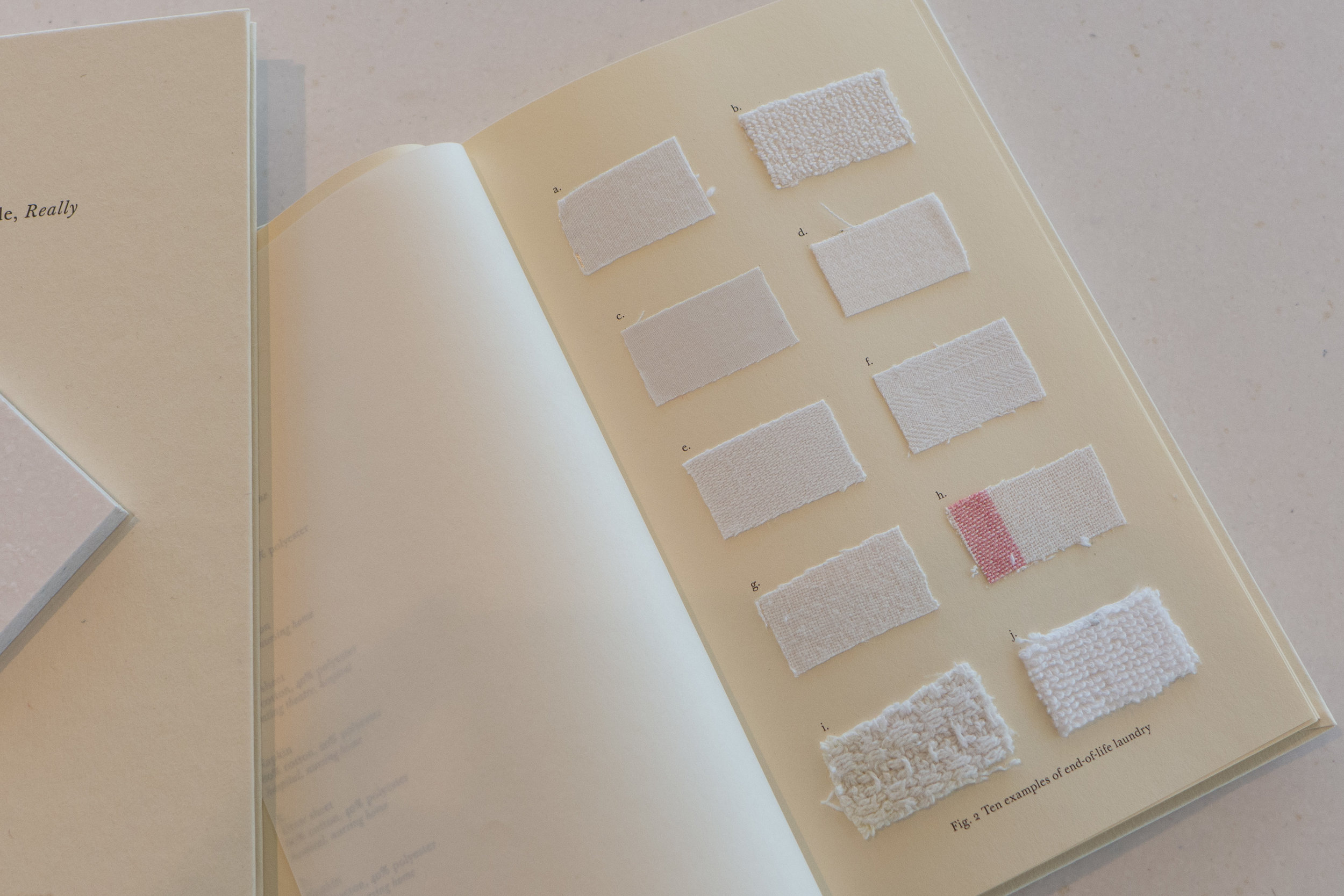
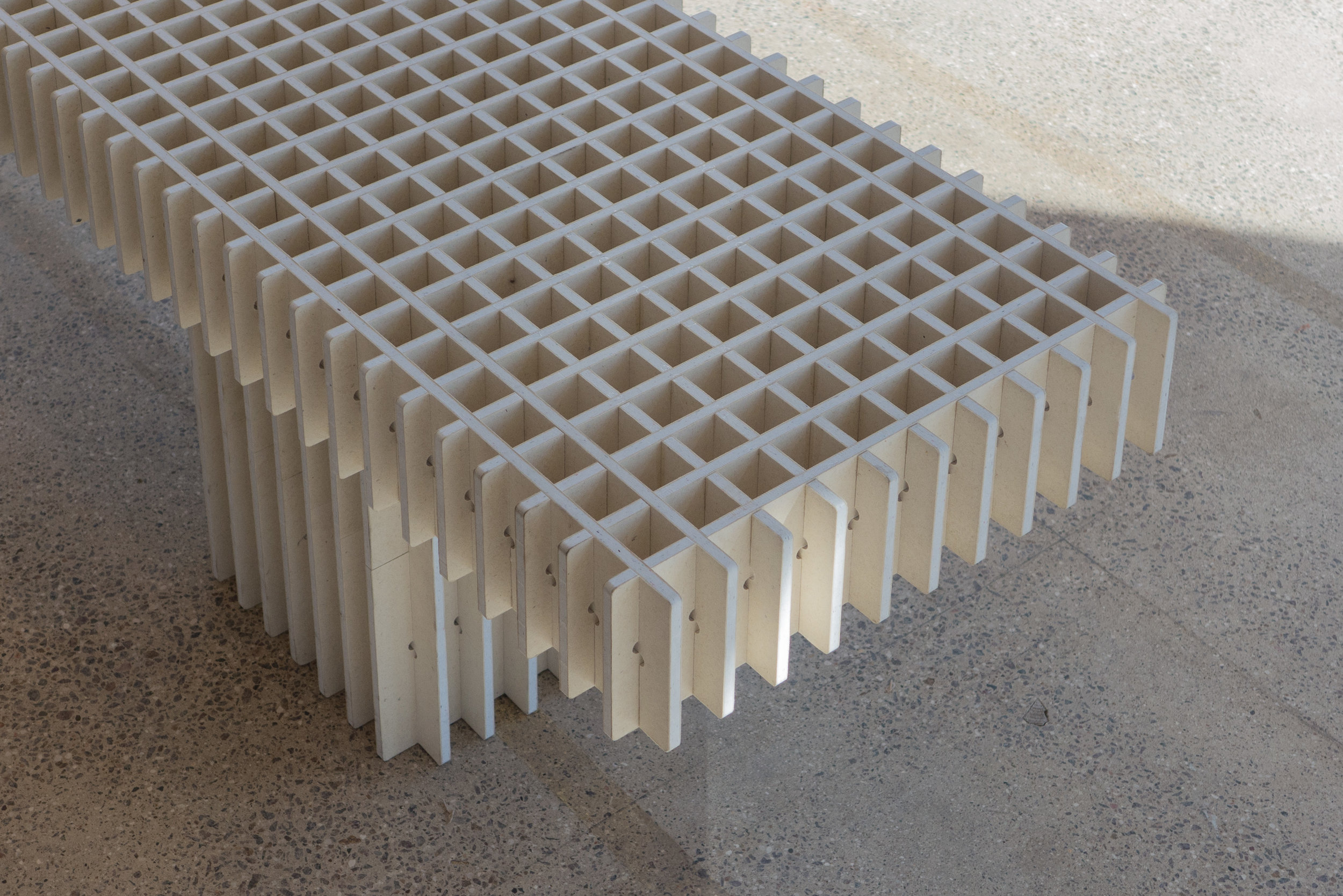
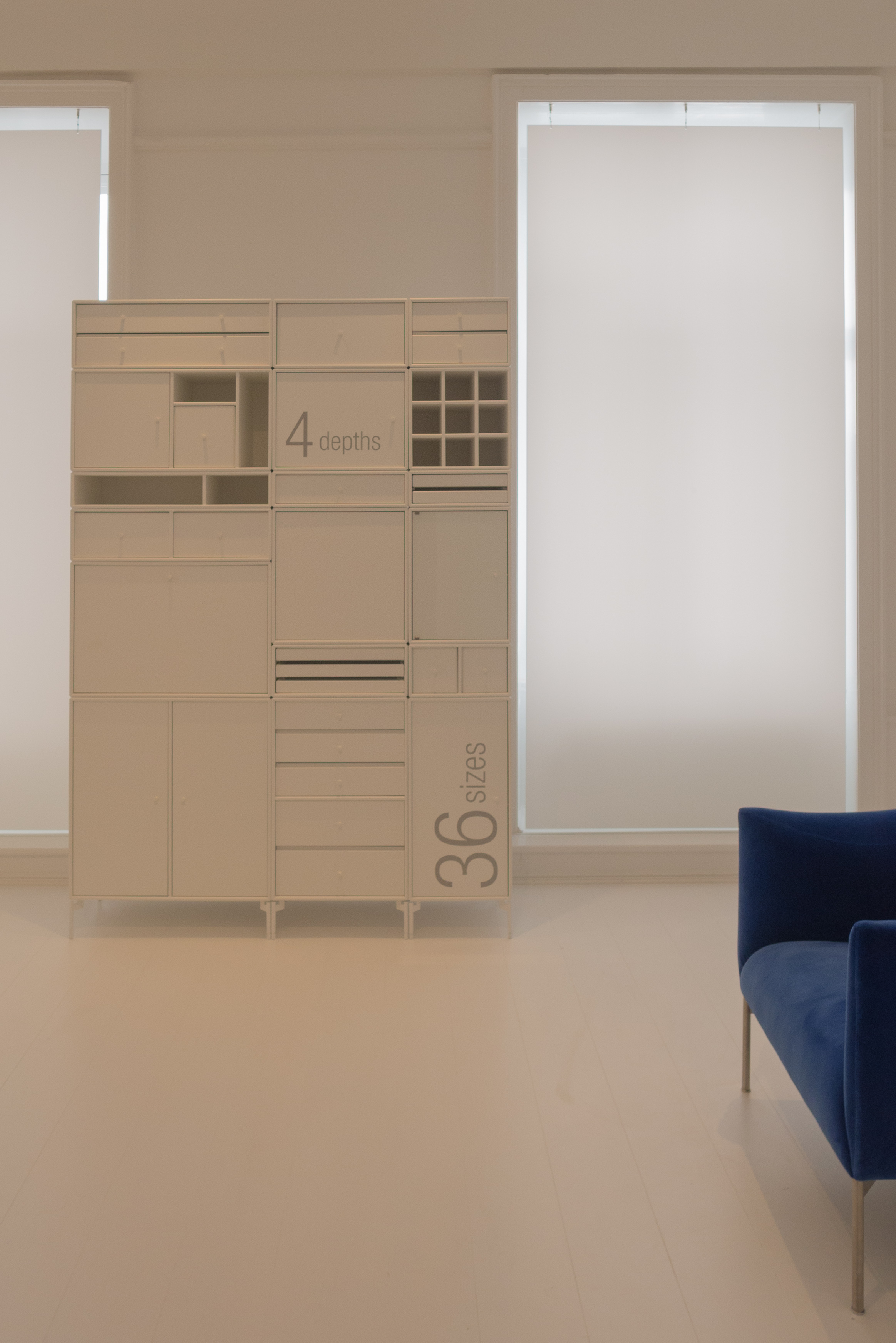
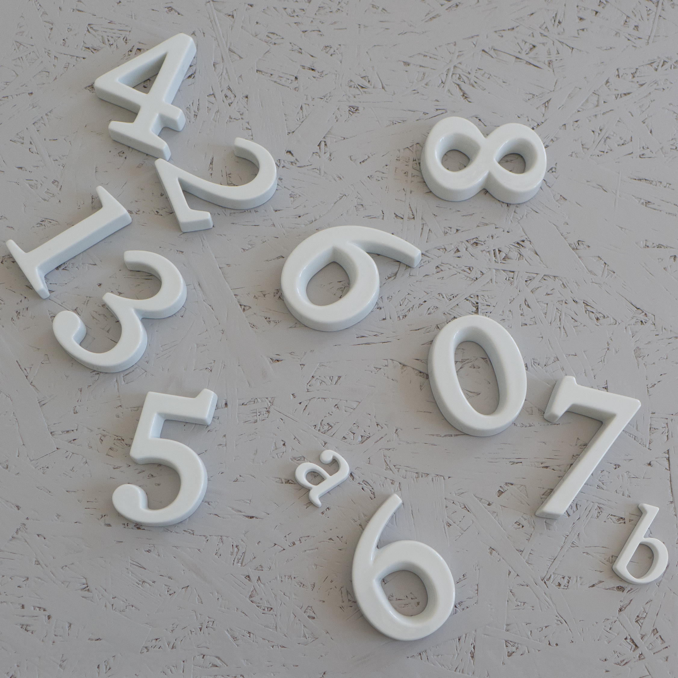
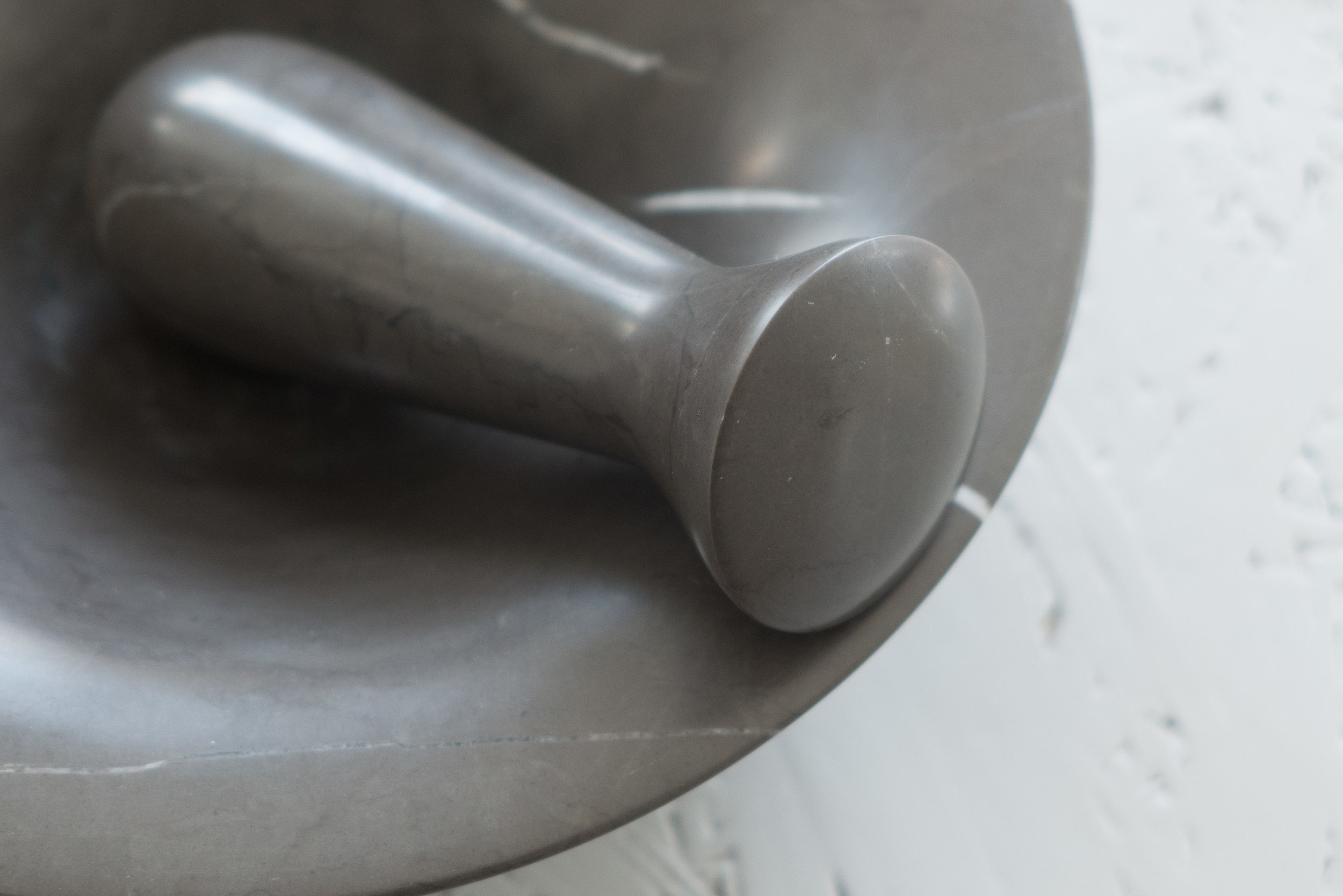
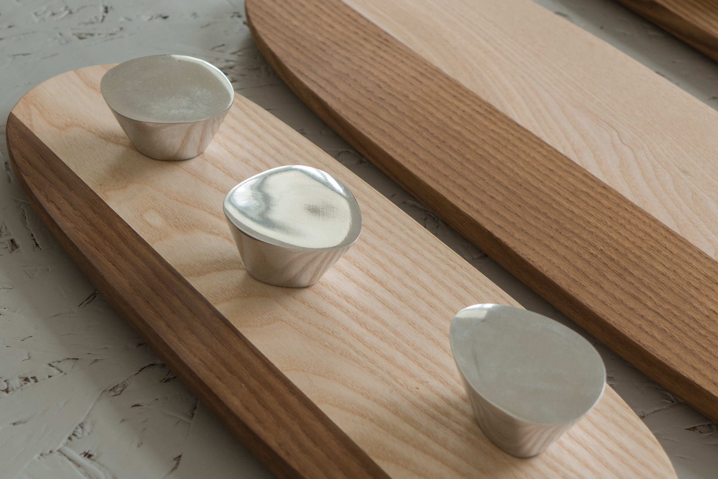
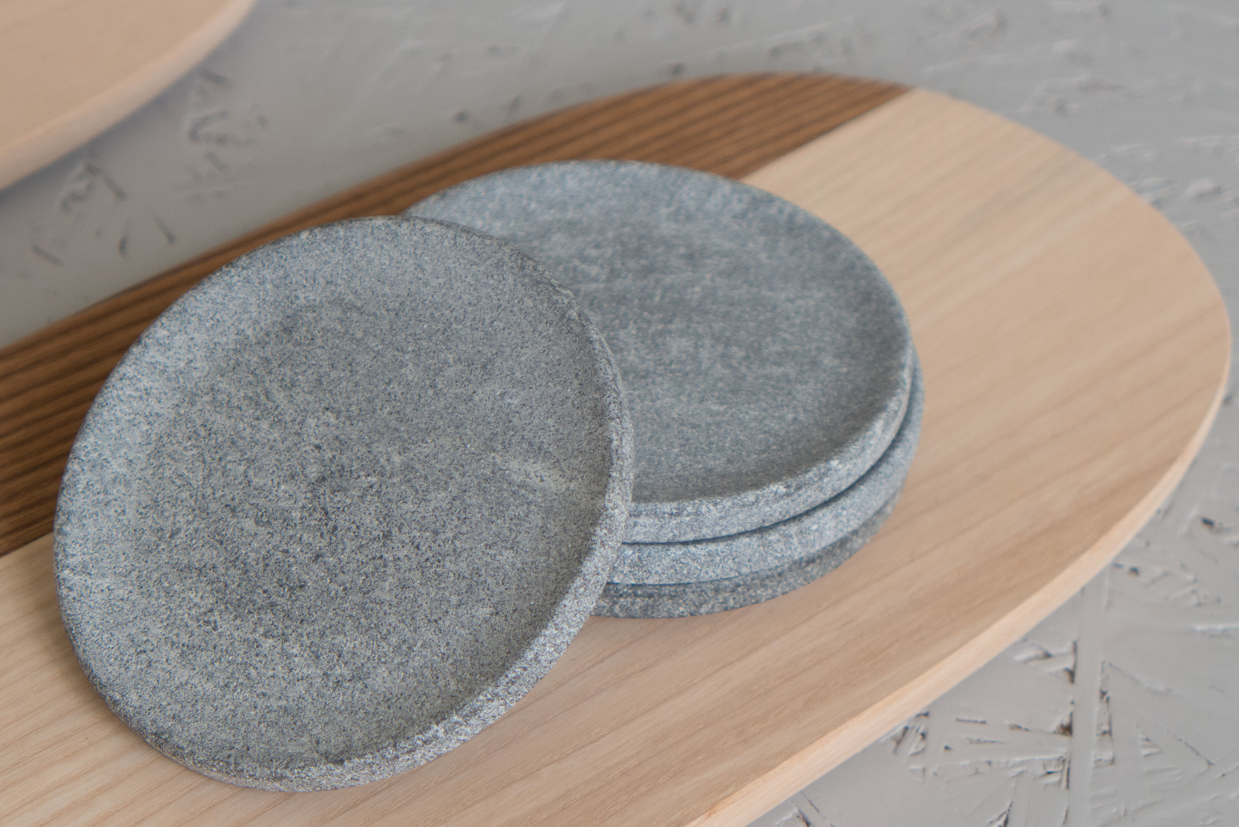
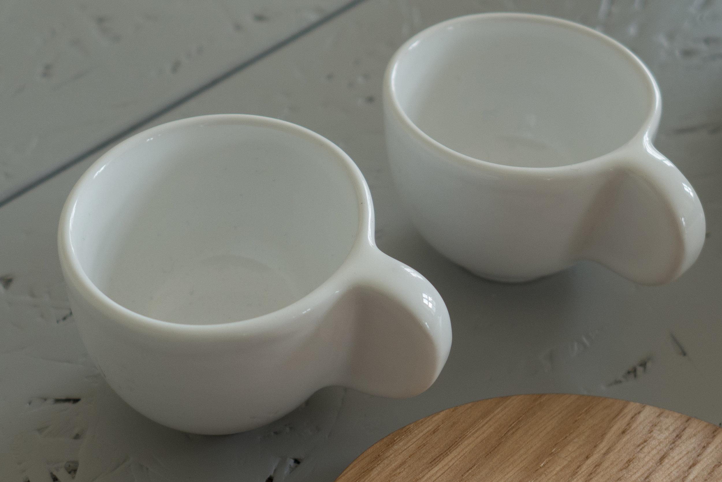
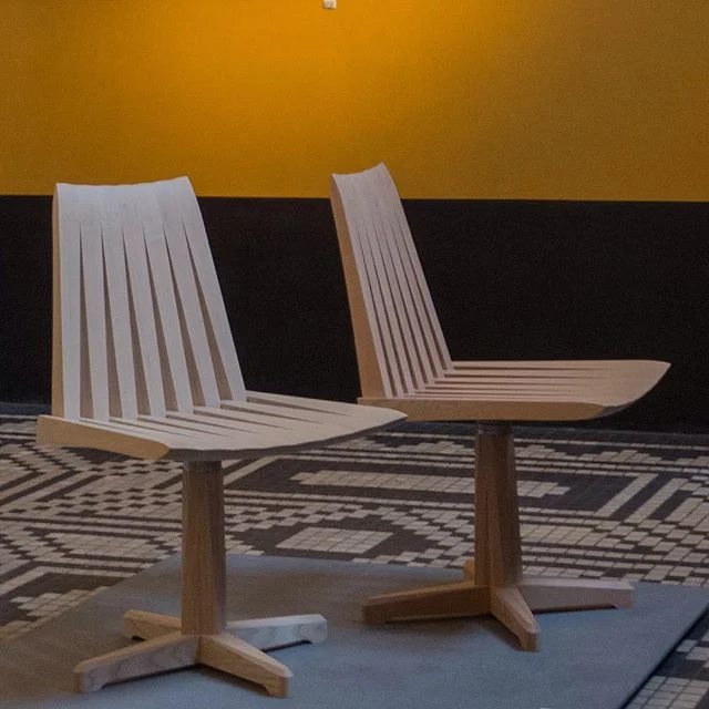
With an amazing diversity of both materials and techniques - with works in ceramic and glass, with textiles, jewellery, furniture, book binding, fashion and photography - and with many of the artists combining several materials and in some works several specialist skills - these works are the response that these observations by Zygmunt Bauman inspired in thirty seven artists, designers and makers ........... a response and an antidote.
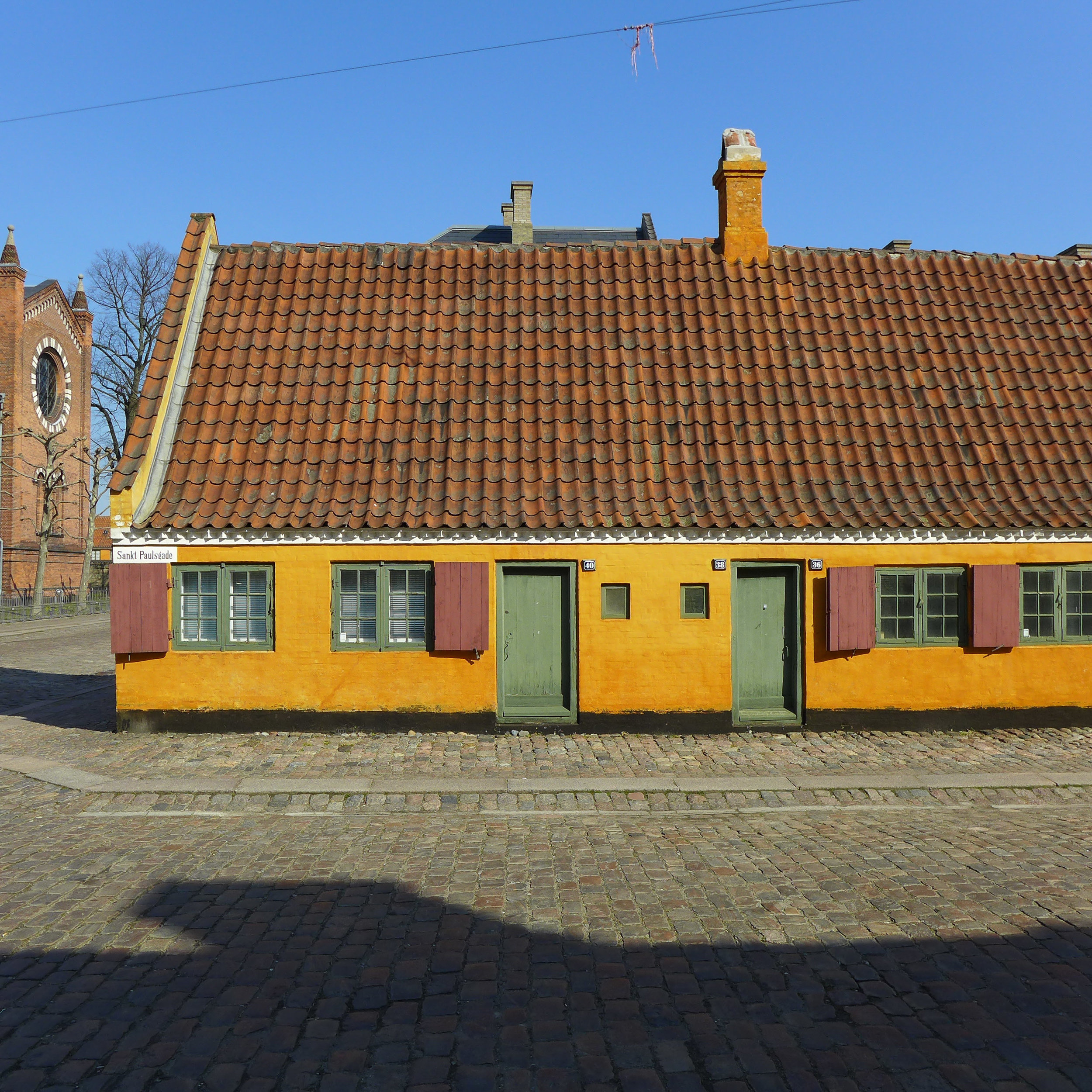
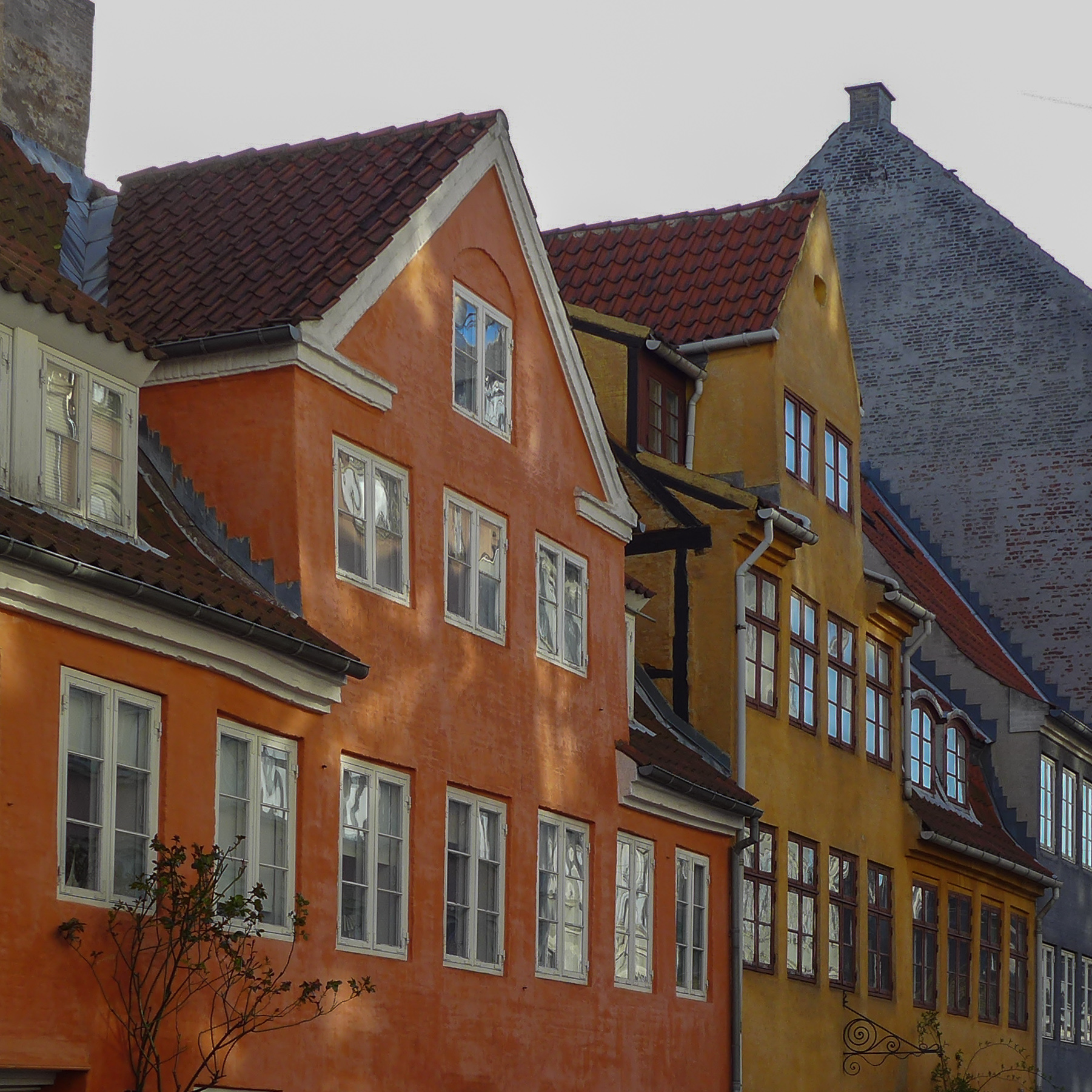
Liquid Life - Biennalen for Kunsthåndværk & Design 2017
Museumsbygningen, Kastelsvej 18, Copenhagen until 27 May 2017