A Visual Inventory by John Pawson


This is not so much a review as a simple signpost to an important book.

A Visual Inventory is a collection of annotated images with the photographs taken by the British architect John Pawson when travelling. The book is about colour and about light - so how colours change with different qualities of natural light - but the images are also about the photographer being aware of and sensitive to shape and form and texture and pattern and of age or how buildings and landscapes and materials change over time … those basic elements of all architecture and all design. Above all, the photographs invoke a strong awareness of place as different latitudes and different climates can be associated with what are often distinct colour ranges or tones and with specific patters and forms of building.

Above all the book is an insight into how an architect and designer sees his world and what draws his attention and what, specifically, he looks at and records for inspiration in his work.

Single images are printed on each page with short notes but are set in pairs across each double-page spread and linked by shapes or subjects or location. None of the photographs have been cropped or altered so the process of taking the photographs is clearly considered with care so they reflect, in a straightforward and honest way, the reaction to the subject by the photographer at a specific moment.  

John Pawson also has an Instagram site that should be bookmarked by anyone trying to appreciate and understand our landscapes and our buildings in terms of colour and tone and texture.


A Visual Inventory, John Pawson, Phaidon (2012) 

John Pawson on Instagram

design classic: PH 5 lamp by Poul Henningsen 1958


With his designs for lamps and light fittings, Poul Henningsen sought to control electric light to produce even and glare-free illumination. His drawings show detailed studies of how light was reflected back off surfaces and it is said that he had a study or work room at his home in Hellerup where the walls were painted black so that he could trace the way light spreads out or, for pendant lamps, he could see how different curves on metal or glass shades could be used to direct some light down and some of the light up to reflect back off the ceiling.

He established his own independent studio in 1919 and with the Danish lighting company Louis Poulsen his first lamps were shown in Paris in 1925. Through the next 40 years he produced a series of lights that used a combination of shallow, curved shades, in either metal or in glass, that focus the light down or out at an angle across a wider area and these were combined with coloured baffles to change the colour tone of the light or he used a series of flaps or petals, again of glass or metal, to hide the light source and control the direction and angle of the beams of light.

These different lamps might appear to be about appearance - about style and fashion - or, with the very large lights, about drama but in fact they allowed for such a precise control of artificial light that they were used in work spaces and in museums and galleries - used in the first trade exhibition on the opening of Forum in 1926 and in the exhibition spaces and staircases of the Design Museum in Copenhagen - and even, on long stems set at an angle, installed in ranks to floodlight indoor tennis courts.

The PH 5 was first produced by Louis Poulsen in 1958 and is a large lamp with five metal shades 267mm high and with an overall diameter of 500mm but it has been so popular in Denmark that it has been claimed that every Danish family has at least one PH 5 light.


Poul Henningsen was also a writer and critic and when the PH 5 was released he wrote with self-mocking humour: 

“For a generation I have believed that consideration for the consumer and common sense would prevail, but now I have become a fatalist. I have accepted fate, and with Louis Poulsen´s permission I have designed a PH fixture which can be used with any kind of light source, Christmas lights and 100 W metal-filament bulbs. Although a fluorescent tube would be too much to ask in the existing form!” 


Louis Poulsen

note:

The PH 5 lamp in the photographs has slightly warped shades and some small dents in the edge because it has been used in at least four different apartments - at least four as I bought it at an antique market attracted by its unusual deep grey colour. Over the years it has had two trips across the North Sea and has been dropped at least once by removal men. Needless to say, new lights from Louis Poulsen are perfect - you have to add your own marks to make it yours.


the origin of a modern Danish aesthetic?

In the Spring and through into the early summer, there was an important exhibition of the works of the Danish artist Vilhelm Hammershøi at the museum and gallery at Ordrupgaard which is just to the north of Copenhagen. With the title At Home with Hammershøi, the exhibition focused on an amazing series of paintings of interiors that he produced when he and his wife were living in an apartment that they rented in Strandgade in Christianshavn from 1898 through to 1910. 

The rooms have plain walls that were painted in soft greys or creams with all the woodwork simple colours - rather than picked out with any gilding - and furniture is relatively simple, set back against the walls, although they had a piano, at least one bookcase and with a few small paintings and simple pottery. This is in marked contrast to photographs and paintings that survive of what must have been more typical middle-class homes in the city with carpets, heavy curtains, upholstered furniture and banks of paintings on the walls.

Was Hammershøi reacting to the clutter of rooms in middle-class homes of the late-19th century? Was it simply that furniture was carefully rearranged for the painting? Was it a consequence of poverty or, at least, the relative poverty of an artist although he came from a middle-class family and while they lived in Strandgade, Hammershøi spent time in London and in Rome. These paintings are certainly not about ostentatious affluence. Whatever the reasons for their restrained good taste, they do seem to reflect a clear and recognisable Danish design aesthetic and these are interiors that we can appreciate as distinctly modern.

read more


Interior in Strandgade, Sunlight on the Floor painted in 1901 by Vilhelm Hammershøi (1864-1916) in the collection of Statens Museum for Kunst in Copenhagen


when the lights come on ........

A generalisation I know, but historic buildings in traditional materials are usually best seen during the day because that is when you can appreciate ornate decoration or amazing stone work or complicated brickwork or a beautiful landscape setting of trees and planting. At night those same buildings become much simpler solids and details are flattened and, particularly if they are large buildings, they can be dark and ominous. Walk past a fantastic medieval church or an 18th-century house at night and what might impress is the glow of light and the sense of an internal life from the bright windows but the design of the building, its massing and the design of it's facades and the quality of the external architecture become softened or lost completely in shadow.

read more

Roon & Rahn


Nicki van Roon and René Hansen are based in Aarhus and their designs were produced to solve a specific problem … they couldn’t find what they really wanted for their own apartment.

In fact, that seems to have become a key feature of their work … it’s problem led or do I mean solution driven? That’s a good starting point for any design … identify a problem - don’t just accept that something is and should be like that because it has always been like that and try to come at a problem from a different direction, a different viewpoint, to find a different solution.

Roon & Rahn also have a strong interest in graphics and they exploit engineering for the precision they want in manufacturing their designs.


Pieces in production include a bench and a round stool with three legs in wood; a rack for storing shoes; lighting and a wall hanging system called Moodboard and in development there is a very clever spice rack.

That might not sound like an extensive catalogue but Roon & Rahn are a young company and they are sensibly taking their time to add the right new designs. Moodboard took a year to develop, to come up with exactly what they wanted - the right design - and that is obvious in the quality of the finished product and in the clever way their system works. In fact, I liked the design so much that later in the Autumn, after seeing their work first at Northmodern, I tracked them down at Designer Space in Copenhagen to buy a Moodboard for my new apartment and then ended up buying a couple of their lights as well.


The pendant lights are interesting. They are simple with a large globe bulb hanging from a cable that runs through a brass stem but turned wood that drops over the bulb holder was made from timber salvaged from old recycled furniture. They use twisted flex in a natural linen colour that was chosen to give the lights a less clinical, less hard and less technical quality, as, over time, the brass will gain a patina.

R&R have a keen interest in the materials they use - the brass stems for the lights are made by them and we talked for quite a long time about sourcing good timber and about fuming or smoking oak. Again this is not about just designing at a drawing board but about working with materials and trying out ideas in the workshop to discover what a material can do or might do. The clear perspex used for the Moodboard is another good example because they had to experiment and had to work out how they could use laser cutting to get the precision and finish that they wanted. 

From talking to Nicki and René, it was clear that in Aarhus there are local craftsmen, workshops and designers who together provide a mutual support group … so if they don’t know exactly how to do something then they know someone who does. 

Packaging for their products is good. They use simple unbleached cardboard but again that disguises just how carefully thought out and stylish it all is … pictograms they designed for instructions for mounting the Moodboard on the wall are particularly good. These graphics are actually a step up from a pictogram but are still simple illustrations and are used instead of detailed written instructions … important when aiming for an international market. That same preference for good clear but sophisticated graphics can be seen in the design of their printed catalogue as well as the layout for their web site. 


In the catalogue they use white lettering on a warm grey background … all simple but stylish and all very carefully thought through, as you would expect. A non-standard ampersand and their logo with interlocked Rs is interesting, one R inverted, so together they look like a bolt or screw head. 

Roon & Rahn show yet again just why Danish design is so strong and why so many young designers and new companies are so successful … it’s not just about drive and ambition … they certainly have that … but about imaginative new solutions to old problems, with a clear sense of style, high standards for manufacturing with good, high-quality materials and the understanding that every detail really does matter.


ROON & RAHN

Haeng at northmodern

A great strength in the design sector in Denmark is the phenomenal number of small and independent companies - designers, workshops, craft studios and design consultancies - in the country and the number is growing all the time. 

I first met Jakob Forum with his company Haeng at Finderskeepers last year. Finderskeepers is a lively market place for design, crafts, fashion and food that was held over a weekend at TAP1 on the Carlsberg site in Copenhagen and is also held regularly in Aarhus. It attracts a really lively and mixed group of customers but with a strong element of young people and young families so it’s a great place to pitch ideas and new products.

Jakob has a background as a carpenter but has combined that with his idea for lighting that is very sculptural. The lights are put together from simple geometric elements that are beautifully turned in wood or made from natural materials like cork and wool. Each part has a strong sense of form and silhouette, but there are also strong colours. The starting point is a bulb holder and its light flex and all the other elements are threaded on to that so of course the flex itself can be a strong colour and can set the character of the final arrangement of the light.

Several ideas here are important: the individual pieces are beautifully made and presented and the final boxing and packaging is deceptively simple but well thought out and what is important is the participation of the buyer - not just choosing the individual elements, which is great fun, but also deciding, back at home, just how those pieces are to be strung together - and of course in the future, or in a different room or a different home, the pieces can be moved around to create a different effect.

a suggestion for the starting point ... a light on the display at northmodern

the light in my apartment that I bought last year at Finderskeepers in Copenhagen 

Haeng has just opened a store and showroom in Copenhagen and their stand at northmodern looked really good … this is all a very confident move forward for a new company and they really do deserve to succeed.


Haeng, Vesterbrogade 204, 1800 Frederiksberg

Opening - Wednesday to Friday 10 - 17 and the second Saturday of each month 10 - 15

furniture at northmodern

northmodern shows clearly how strong and how diverse the furniture industry is in Denmark. Scale, approach, style of product and even preferred materials vary enormously from furniture company to furniture company but also what differs is the business model … particularly the difference between, at one extreme, companies that select design from a number of well-established manufacturers, almost like a curator might, and, at the other, companies that actually commission unique designs from independent furniture designers and work with a number of manufacturers to produce a collection that reflects what aims to be the unique style and the focus of the company.


Hornbak & Co

Hornbak have showrooms in Nordhavn in Copenhagen at Pakhus 48 and represent the Italian company Arper; the German designers and manufacturers Zeitraum; Offecct from Tibro in Sweden and Kasthall who are also Swedish. My assumption here is that they import primarily for the office and commercial market.

Hornbak & Co


FK 6720 and FK91 by Preben Fabricius and Jørgen Kastholm from Lange Production Copenhagen

Lange

Based in Hellerup on the northern edge of Copenhagen, Lange Production were established in 2006. They have a carefully curated catalogue of Danish furniture where they have acquired the licence to reintroduce and put into production mid-century classics from the design partnership of Preben Fabricus and Jorgen Kastholm and furniture by Greta Jalk.

Chair by Greta Jalk from Lange

        Chair and tables by Greta Jalk - Designmuseum Danmark, Bredegade, Copenhagen

Lange Production


Menu

Menu has been described in editorials as a design brand. Several companies like Menu have been established in Denmark over the last 30 or 40 years including Gubi, Normann, Muuto and Hay and there are similar companies in nearby countries including Design House Stockholm and most recently Hem in Germany. The companies vary in organisation so Menu does not have it’s own stores but markets only through selected retailers while Normann has a major store in Copenhagen as does Hay but both retail their products through a large number of furniture and interiors shops. What they all have in common is that they use a number of designers and independent manufacturers to create a distinct catalogue that tries to create a relatively clear brand style. 

All the companies produce a number of lights and decorative pieces so it is possible to furnish a Menu room or buy many of the major items of furniture needed to set up a new home. Menu is increasing the number of major pieces of furniture in its catalogue and at northmodern showed the Afternoon Chair by Hung-Ming Chen and Chen-Yen Wei inspired by bentwood chairs from Thonet from the early 20th century but using powder-coated tubular steel. 

The Menu web site lists 47 different designers or design studios that have worked with Menu on their products but there is a clear and deliberate Menu style so pieces work well together and in various combinations. One strong characteristic is the use of metal for furniture to create a spare and slightly industrial feel … a new range of three different sizes of table by the Stockholm-based designers Afteroom are said to have been inspired by Bauhaus furniture.

Bottle Grinder by Norm Architects

Corner Shelf and Corner Divider by Kyuhyung Cho

New starkly-simple seating called Godot with an arm chair and two sizes of sofa was designed by Iskos-Berlin and has just been launched and there is an elegant day bed by Anita Johansen, a young Danish designer who graduated in 2012.

Perhaps the strongest partnership for the company is with the Danish architectural practice Norm and new pieces by them shown at northmodern included new versions of the Bottle Grinder in polished or matt steel rather then the soft grey and stone colours of the original plastic versions.

Menu


Woud

Woud are the new company to add to the group and at northmodern they launched a new catalogue for 2016 with two new chairs. As with Menu they work with a number of designers - the catalogue lists 25 designers and studios - and again, as with the other ‘brand’ companies, they achieve a coherent style through their range of furniture, lighting and accessories.


Woud

1 | Virka Sideboard by Mark Wedel Pedersen & Rasmus Røpke

2| S A C Dining Chair by Naoya Matsuo

3| Bank by Nur

4| Lean Lounge Chair by Nur

design classic: Flowerpot Pendant by Verner Panton


Designed by Verner Panton in 1967, initially the Flowerpot pendant lamp was made by Louis Poulsen but is now produced by &Tradition

Verner Panton (1926-1998) trained as an architect at the Royal Danish Academy of Art in Copenhagen. After graduating in 1951 he worked first in the office of Arne Jacobsen before starting out on his own. His furniture designs are renowned for his use of strong vibrant colours and in 1960 he produced the first single-form, injection-moulded plastic chair.

The design of the Flowerpot Pendant is deceptively simple with a half globe over the light and, inverted, a small half globe of half the diameter that covers the light bulb.

A display in Designmuseum Danmark shows a number of the strong colours produced through the 1970s.

&Tradition package the lamp in a clever and well-designed box … a good example of packaging not just protecting the lamp, but providing background information for the purchaser and of course making storing and stock management for the retailer easier. Presumably a lot of people just dump the box, barely giving it a second thought, but packaging really is an important part of the design, production and sale sequence.


Haeng at Finderskeepers

Perhaps the ultimate in customer engagement that was shown at Finderskeepers was the Haeng light system designed by Jakob Forum. In fact I was so engaged I ended up buying one of the lamps.

The starting point is a large “mega Edison” bulb in a standard lamp holder on a long coloured or flecked cable with a large wood sphere that is hollowed out with a hole in the top so it drops down over the lamp holder. You start by choosing the colour of flex and one of a number of timbers used for the main bottom sphere. 

Then the top of the counter of the stand at Finderskeepers was divided up into compartments. In the different sections, protected by straw … well actually shredded paper that looks like straw … were smaller wood spheres in oak, beech, walnut, wenge and other beautiful timbers along with cones, cylinders and drop shapes either in smooth, sanded wood or painted in colours including light and dark grey or cream or dark green and there were large spheres wound in coloured thread and spheres cut from cork. All have a hole through them and they are strung like beads, onto the electric cable dropping down to rest on the bulb holder.


All the shapes are carefully finished to bring out the grain of the wood and the painted elements are perfectly finished and compliment the colours and tones of the timbers.

A rectangle of leather was laid across the counter and slowly you put together the arrangement you want. The final lamp you design is packed in a strong box in unbleached card with more straw/shredded paper. And that’s it. Hooked. Or do I mean well and truly strung.

Of course the level of engagement in selecting the combination of pieces is important and everyone will remember where and when they bought the lamp and who they were with and what influenced their choice and of course if you move the lamp to a different room or want to change the design you simply pull out the flex and re string the elements into a different arrangement. Now there’s customer engagement with a design.

Haeng

FINDERSKEEPERS at TAP1


FINDERSKEEPERS has been promoted as “an indoor market where innovative design meets luxury secondhand clothing.” 

The clothes are a mixture of retro/antique or good second-hand (neither term derogatory) along with hand-made clothing or clothes from a small-run by an independent producer. That was mostly in the back half of the huge hall and across the front half were crafts and design of all types and between the two a lively and really good food area. What’s not to like for a Saturday afternoon.

The venue itself, TAP1, is a large industrial building on the Carlsberg site - where the brewery was, to the west of the centre in Copenhagen, before it was moved out of the city in 2008. 

It was all pretty amazing and pretty inspiring. It’s a sort of alternative Northmodern and I hope that is taken in the way it was meant - as being very very positive about both.

Design included leatherwork, textiles, ceramics, some surprisingly substantial items of furniture (including armchairs and tables) along with lighting and all from small and young independent companies and craftsmen.

Ceramics from Tina Marie Copenhagen Handmade

Here again I come up against this slight problem I have with the term craftsmen. Maybe it’s an English sensibility because I've seen too many poor-quality craft “fairs” in the UK. The word I keep coming back to is makers but I really don’t know if that translates into Danish.

Here, at FINDERSKEEPERS, the maker or, to use the Danish term, kunsthåndværker … art handworker is the clumsy literal translation into English … is also an entrepreneur and again that is used in the most positive way. Talking to people and looking at the stalls, it made me realise that everyone, with usually a very small team of people, has to design and make packaging, design and maintain a web site, deal with the finance and business side, cope with marketing and spend their whole weekend at an event like this, working hard, and that's all on top of designing and making their work.

Looking at the internet site for the venue, this event was organised through TALL GROUP and their “vision is to create sustainable companies that thrive on a global market, achieving this by encouraging pioneer thinking, guts and a clear path away from mainstream alternatives.”

Really the main point to make is that although most of the work here was 'hand made' rather than being from a large-scale factory manufacturer there was an all-pervading sense of professionalism, real commitment and self belief with a clear sense that each designer is working towards a carefully-considered and distinct style that carries across all their products, and there was, overall, great presentation, packaging, labelling and graphics. Having lived in Copenhagen for over a year now, none of this comes as a surprise to me … I am simply spelling it out for anyone who is not fortunate enough to get to the event.

What is also important is the crowd that was queuing at the door to get in. These were mostly couples and groups of friends in their 20s and early 30s. The event was packed and people were buying so obviously there is a very serious demand for high-quality design that is slightly different, more unusual than what can be seen in a store. Of course, many of the companies here sell through conventional outlets as well as their own on-line sites but people coming to the event certainly seemed to be looking for something that says a lot about the person who made it and probably, they hope, quite a bit about the taste and interests of the person buying. 


BLINKENBIKE ApS


Finderskeepers opened on 26th September 2015 and continues on the 27th

TAP1

FINDERSKEEPERS has photographs and links to the internet sites of the designers. Note that Finderskeepers hold comparable events in Aarhus and Odense so see their internet site for dates.

Louis Poulsen - Gammel Strand in Copenhagen remodelled

 A new desk and work light - the NJP Table designed by Oki Sato from nendo - shown in the entrance lobby to Louis Poulsen on Gammel Strand in Copenhagen 


Louis Poulsen established their headquarters on Gammel Strand in Copenhagen in 2006, the year after they moved production from Copenhagen to a new factory and research and development centre in Vejen in Jylland (Jutland) .... all development and production for lighting from Louis Poulsen has been kept in Denmark.

Those Gammel Strand offices focused on commercial business. Although general visitors were welcomed - I went there many times over the years on every visit to Copenhagen - the display of lighting was straightforward, comprehensive and tended to concentrate on technical aspects and practical things like dimensions. Absolutely fine for a trade buyer or an architect or for someone like me who wanted to compare different lights or see the latest design. It was the catalogues and then the in-house magazine Louis Home that tried to show a potential buyer how the lighting can be used in homes and commercial buildings.

However, with the recent and extensive remodelling, of the space at Gammel Strand, the large ground-floor desk and reception area has gone, the area of display open to visitors has been extended up onto the first floor in addition to the old area immediately across the front of the building at street level. Furniture and other design items have been brought in to give the light fittings a clearer sense of context and the general consumer an amazing amount to look at and be inspired by.

Lights from Louis Poulsen are not simply lights … or rather not simple lights. They have to be seen in several ways. The company dates back to the late 19th century but the character of their light fittings and the importance of their designs really date from their collaboration with the architect and designer Poul Henningsen in the 1920s. He worked on a technical analysis of electric light as a source of artificial light (in those early days of electricity when oil, gas or candle were still used for many homes) and that technical approach has influenced or even, to put it more strongly, dominated the products from the company since. It is the quality of the light, the control of glare with complex curved shades that baffle or redirect the light; the use of metal shades or opaque glass to create different forms and different effects and the control of levels of light, from illuminating a work area to creating an appropriate atmosphere in an area where you are relaxing or resting, that have exercised the designers ever since.

In addition to all that, lights from Louis Poulsen have a role in a room or, externally, on a building even in bright natural light during the day. Many of the lights are deceptively simple but have bold and beautiful curved silhouettes or sculptural profiles and are used by designers to give spaces and facades definition, or balance, or a sense of order. That might seem to be an exaggerated claim for a light fitting but just check out how often lighting from Louis Poulsen is used by major architects on major projects.

Both the technical aspects of the lights and their importance for interior and exterior design is difficult to appreciate from a catalogue if you are not a professional … not an architect or designer. Hence the importance of the changes to the showroom. Sorry for an awful bit of prose but ... here in the new showroom the lights are put under a spotlight and can be sen in a new light. Sorry that is so bad it should be edited out.

A new kitchen area in the showroom with an AJ Royal light designed by Arne Jacobsen over the work area and the classic PH Snowball designed by Poul Henningsen over the table


The new upper display area with free-standing desk and table lamps and with wall lighting or down lights beyond with historic photographs and drawings providing background information and context


louis home

The official opening of the new showroom area at Gammel Strand on the 23rd September was also an opportunity to launch the 2015/2016 edition of Louis Home.

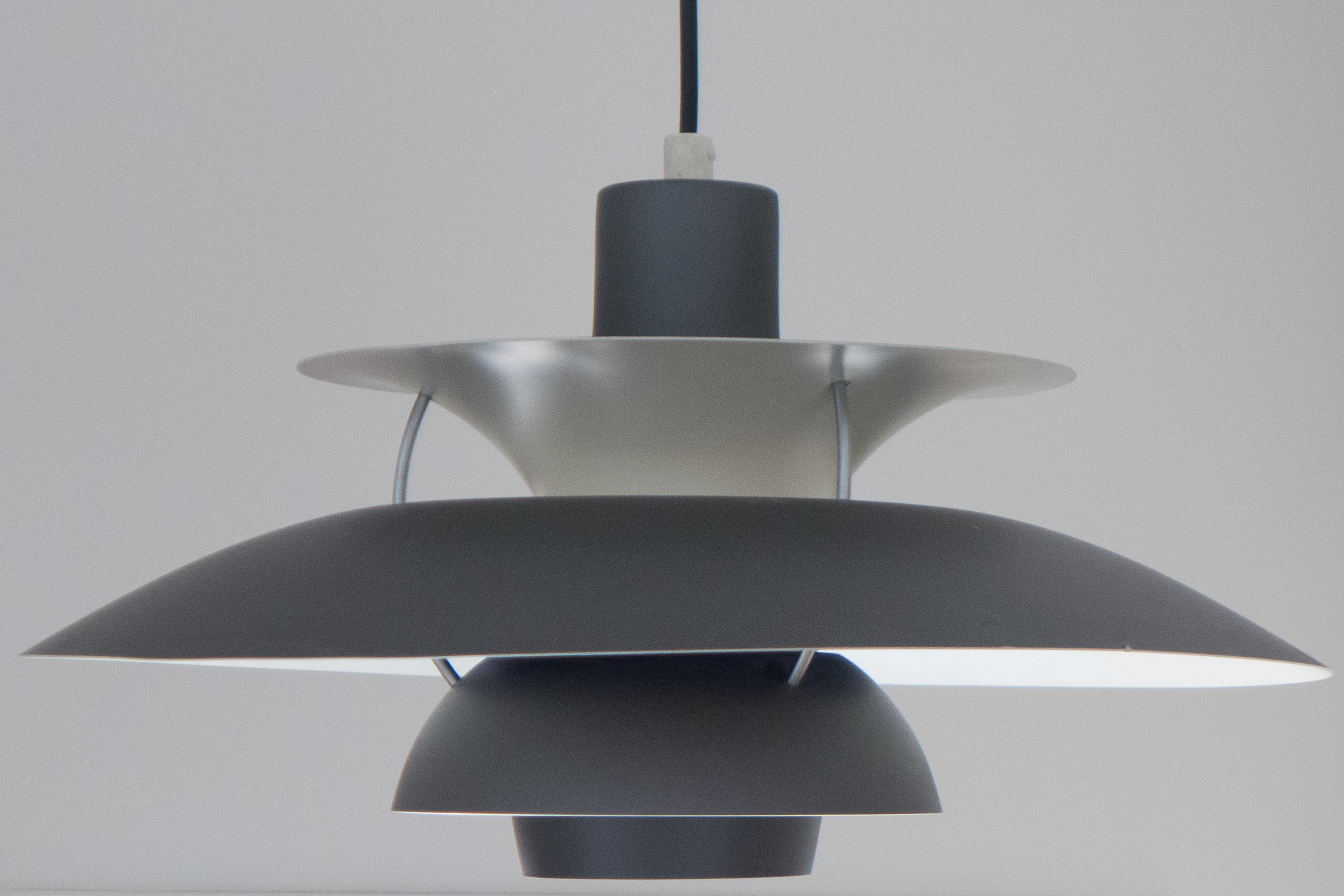
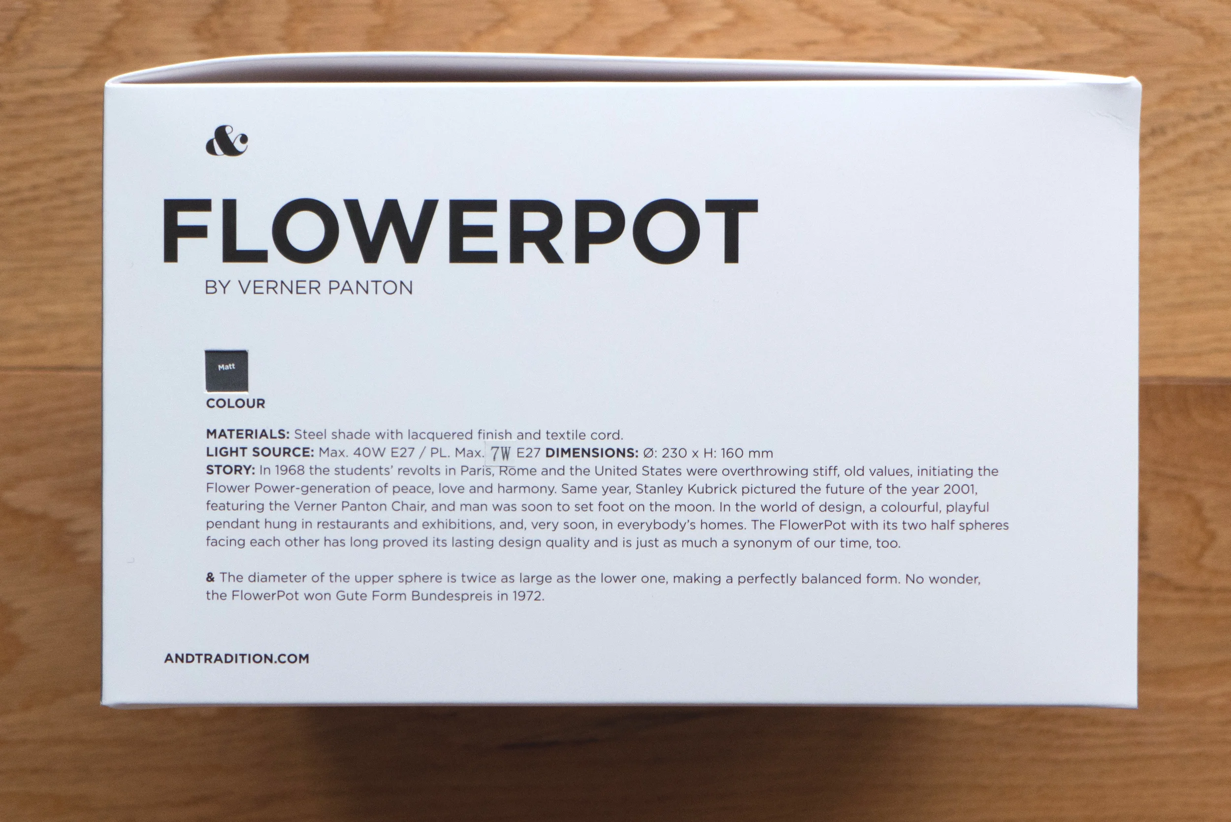
Short articles introduce two important new lamps that have been added to the collection this year. There is a new desk lamp - the NJP Table by the Japanese designer Oki Sato from nendo Studio and an interview with Øivind Slaato and an assessment of his Patera pendant … a deceptively simple design, a large beautiful globe, with considerable visual impact and an incredibly sophisticated and complex structure based on the Fibonacci pattern. This is not clever for the sake of being clever but controls and directs the light through diverse angles.

A separate section of photographs, The World of Heidi Zilmer, shows the collaboration with the master painter and wallpaper designer in the remodelling of the Copenhagen showroom.

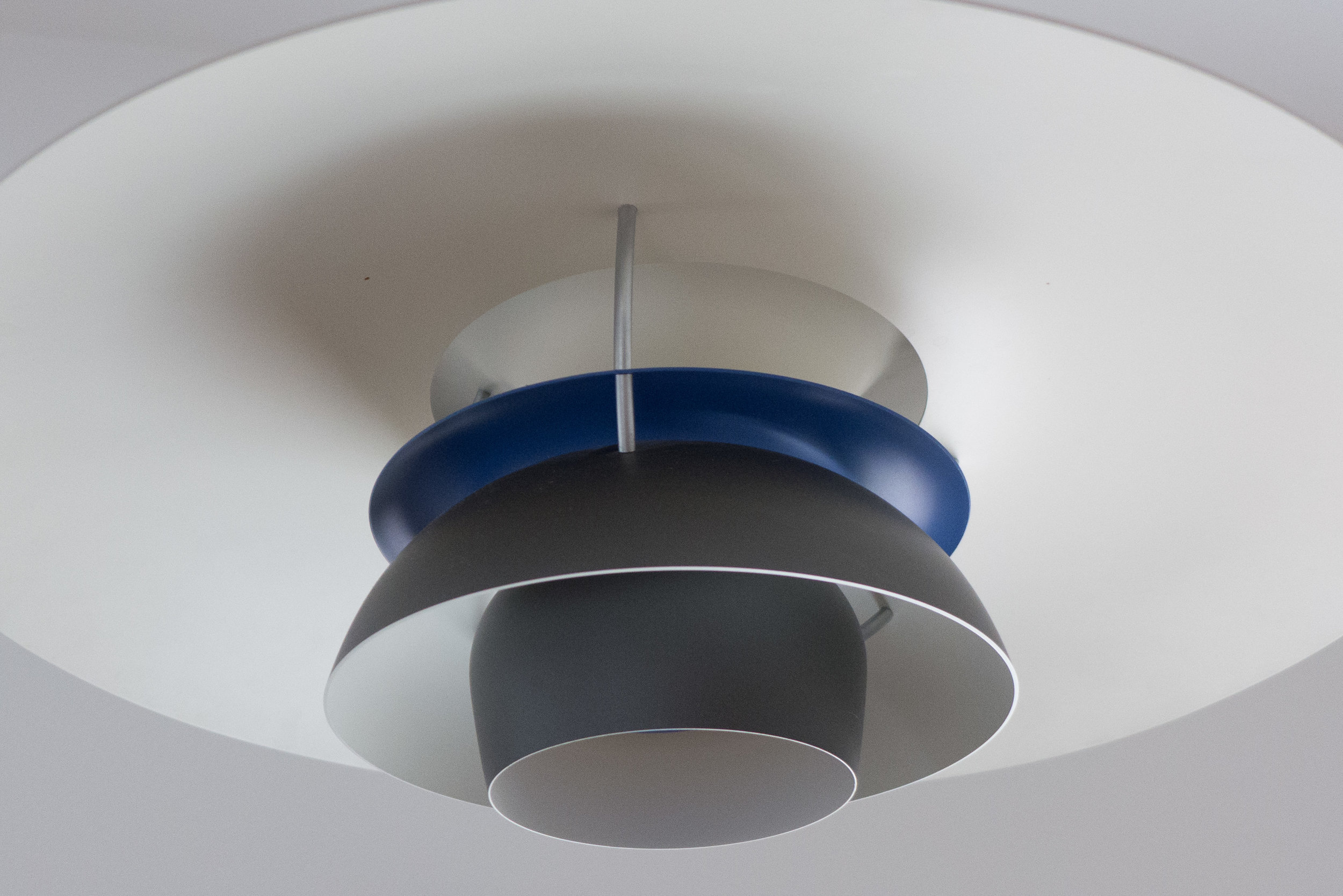
Examples of lights from Louis Poulsen are shown in different rooms and different spaces to show the complex inter-relationships between a light and its architectural settings but also to show the way that Danish homes mix period and style with such confidence. Louis Poulsen continues to produce classic designs that date from the 1920s but there are also classic designs that have been given new colours to give them contemporary relevance; they produce light fittings that have gone through a number of different colours through the years but have been re-introduced in the original colours and there are recent and strongly-contemporary designs. 

And the permutations possible for use in the home are equally variable from modern lights in historic settings through to historic fittings in starkly modern interiors.

An apartment in Amager, the south part of Copenhagen, is featured with a Danish mix of old and new furniture and fittings, mainly in tones of grey with black, and shows how lighting plays a strong role in the room, even during the day, rather like using sculpture with pure shapes and it certainly shows the value of white light fittings to give clear points of interest in the interior.

A very modern home just outside Stavanger is profiled, that has the largest and most dramatic pendants, the Enigma and the PH Artichoke, and that contrasts with a short article on lighting in a very traditional summer house that is now a family home using the AJ series of wall and free-standing lamps as a sort of theme running through the rooms but also has the Toldbod and appears to use a Doo-Wop light suspended low beside a bed instead of a table lamp.

Another section of Louis Home has photographs of major pieces of furniture from the Danish company Fredericia to demonstrate how lighting and furniture work together to create a style or particular character in a room.

Of course, good lighting should not just be kept to the dining room or entrance hall. In Louis Home there are articles on lights in different areas of the house so, in this edition, lighting in a large green house or conservatory “… mobile illumination that you can change to suit the shifting functions of the room as the day progresses.”

Under the night sky shows how external lighting emphasises architecture to reinforce the rhythm of a pattern of fenestration or emphasise an architectural feature and shows just how important it is to vary the height of the lights and use more than one so, for instance, setting lights high to flank a front door or set low along pathways. 

Finally, photographs of Coffee Lab in Copenhagen show how, in an extensive and quite complicated commercial space, lighting can be used to define areas, create atmosphere or control and influence how people use a space and that is equally applicable in a purely domestic setting.

Louis Home can be viewed on line ....  louis home 2015/2016

louis poulsen


Heidi Zilmer at Louis Poulsen


Louis Poulsen invited Malermester (master painter) Heidi Zilmer to provide wallpapers and art pieces for the new room settings in a major remodelling of their lighting showroom on Gammel Strand in Copenhagen.

A number of hand-painted papers are shown in the entrance area, including a new dragonfly design, floral designs, geometric patterns and designs with silhouettes of bowler hats and one design has silhouettes of classic pieces from Danish design history.

Wallpapers by Heidi Zilmer from her Nordic range, based on historic knitting patterns, have been used with Nordic Antique in a kitchen area and New Nordic for a bathroom setting. In one  setting - for the new Patera pendant from Louis Poulsen, designed by Øivind Slaatto - there is a panel of the bowler hat design in white on silver along with a Jacobsen two-seat Swan Sofa in white leather. Very elegant, very subtle and very sophisticated.

There are smaller works by Heidi, many gilded, including silhouettes of famous lamps from Louis Poulsen and several larger panels with geometric designs have been used as decoration, hung in with a large group of paintings along with a mirror, across one wall of a bedroom setting.


Nordic Antique wallpaper in the kitchen with an AJ Royal pendant above the work top and the Louis Poulsen PH Snowball over the table


New Nordic from Heidi Zilmer in the bathroom setting of the recently remodelled show room

Decorative panel above the desk and a silhouette of a classic PH pendant from Louis Poulsen by Heidi with a PH 4/3 Table in the bedroom setting in the show room

Den Nya Kartan - Form Design Center Malmö


An initial report by Jenny Nordberg, begun in 2013 and completed through 2014, looked at how small-scale production of furniture, ‘gadgets’ and other design objects could be part of a sustainable community within Skåne, a clearly defined and relatively small region. The report considered ethical values in consumption and looked generally at production and at manufacturing skills surviving in southern Sweden. In part it seems to have followed a growing desire that more food should be produced locally. 

One aim of the consequent project is to reduce transport costs for both materials and for finished goods but also it was hoped that focusing design and production locally would also mean that there would be fewer intermediaries in the commercial chain. 

Early in 2015 twenty-four designers were selected along with twenty-four manufacturers to collaborate in the project. They were chosen in part for their curiosity about the project but also for their openness to trying new business partnerships.

Many of the designers had worked both locally and internationally and the manufacturers ranged in scale from craftsmen, who are generally geared up to small production runs, to companies organised for larger-scale production. Each partnership was given freedom to determine what they would produce and how and much came down to developing personal as well as working relationships.

This project has also been about testing the form of collaboration, between designer and manufacturer, and aimed to establish a more equitable financial arrangement that moved away from the normal pattern of royalties for rights to reproduce a design to agreements where the designers and manufacturers share the expenses incurred in development and initial production but then also share the revenue.

Items or objects produced through the project cover a wide range of materials and manufacturing techniques including blown glass, ceramics, metal work, leather work and textiles and a wide range of items from stacking boxes to storage jars to lighting to jewellery and a champagne table.

That last item emphasises one curious aspect of the works presented. It would appear from the introduction to the exhibition that the designers and manufacturers were given freedom to choose what they would produce. Jenny Nordberg, who also curated the exhibition, commented on this:

“As a curator, I imagined that most people would design and produce saleable inexpensive items to show that it actually does not need to be particularly expensive by local production. There, I thought wrong. It has instead been mostly projects where both designers and manufacturers wanted to challenge themselves and show the breadth of their skills. Many of the projects … are unique, conceptual, luxurious, on the verge of unfeasible and overall, just amazing.”


Biophillia - Stoft & Zol Art

Unisex-kimono-kofta - Liv Andersson & Biommiga Gredelina

Vaporware Fluid

Andréson & Leibel och Humi-Glas (samt JFKemi)

SpegelrörPetra Lilja & Wallåkra Stenkårlsfabrik

Spegelrör

Petra Lilja & Wallåkra Stenkårlsfabrik

Transformer

Milan Kosovic & Thomas Alexandrsson

Stilleben

Sophia Lithell & Herman Andersson Plåt

1L=

Patrik Bengtsson & Genarps Lådfabrik


It is not clear if this shows that designers or manufacturers were concerned primarily to showcase their skills but that seems unlikely given the well-established careers and reputations of most. Possibly they wanted to use the opportunity to produce things they would not normally be able to work on. It could be more of a problem, in terms of ongoing viability and the possibility of extending the project, if they all felt that reasonable financial returns would only be possible through producing more expensive items or if they thought that their potential market would not be interested in buying just basic items. Perhaps it is simply that, at this initial stage in this project, more basic designs - so everyday household items such as tableware - actually need a much larger production run to return a profit.


All the designs are available through the web site.

The exhibition continues at Form Design Center in Malmö until the 15th November and then transfers first to the National Museum in Stockholm and then in 2016 to Vandalorum in Värnamo.

Den Nya Kartan - The New Map

Hjemlighed .... homeliness


Ten designers, architects and craftsmen have come together to exhibit their work in a private apartment in Lavendelstræde - a street in a tightly built up area of historic buildings just to the east of the city hall in the centre of Copenhagen.

It is an amazing apartment spread over two upper floors and the attic space of the tall, narrow 18th-century house with a striking mixture of original parts, including the roof structure, but with modern features such as an open metal staircase, a long wall of modern kitchen units and an area of glass floor between the attic bedroom and the kitchen and dining room on the level below.

The kitchen area opens onto a large roof terrace with views over the Copenhagen skyline looking towards the tower of Vor Frue Kirke. 


This is not just a chance to see a very striking apartment but, of course, to see the works displayed in a home, in the rooms of the apartment, along with books and furniture and kitchenware of a very real domestic setting.

Perhaps we have created false divisions between craftwork, such as tableware, that we can use in our homes, and the works of artists working in the crafts that we see as gallery pieces. These works, in this exhibition, were not, specifically, designed and made to be contained in an art gallery or museum - although many of these artists have their works in museum collections - but they can and should be seen and appreciated in a home. These pieces stimulate comment, attract admiration, stimulate discussion, stir people to decide if they love, like or even dislike the pieces. Owning and enjoying original art and craft pieces is not exclusively the prerogative of the public gallery or the private wealthy collector but original works of art or of craftsmanship really do have a place enhancing our lives in our homes.

Works shown here range from ceramic multiples through printed cotton squares displayed on a clothes drier on the roof terrace, to a bench in smoked oak supported on upturned stoneware vessels and there are monumental architectural urns in stoneware. Porcelain lights over the main table are a homage to the iconic Danish PH lights and striking jewellery in braided or plaited white plastic beads, forming deep ruffs for the wrist or ankle but set in a framework of a house, reflect the title of the exhibition. The one odd work, and only odd because it was large and set diagonally it fills and dominates the space of the bathroom it is displayed in, is a long narrow glass case with an arrangement of single socks with no pair.

This piece, Finds by Morten Sørensen, illustrates really well one very important role of art which is to point out or isolate something that either we have not thought about or points out an absurdity or a universal experience that we rarely even think about. Other works show how artists experiment with materials and forms pushing boundaries that really should not be there and multiple works are a really good way of emphasising subtle differences or step changes or variations.

toPHøj in porcelain by Anne Tophøj

Indretning in stoneware by Marianne Nielsen and Kristine Tillge Lund

I tid og utid by Anne Tophøj and Theis Lorentzen

Base in oak, aluminium and stoneware by Anne Dorthe Vester and Maria Bruun


Architects, designers and artists taking part include:

Anne Fabricius MøllerAnne Tophøj, Anne Dorthe VesterMaria BruunJohan Carlsson

Katrine BorupKristine Tillge LundMarianne NielsenMartin SørensenTheis Lorentzen


Hjemlighed ... an exhibition at Lavendelstræde 8, 1462 København K continues until 15th September.

new talent at northmodern


A number of young designers exhibited at northmodern. 

In part, because they are not long out of university or art school, it was tempting to see their work as closer, in terms of professional development, to pure design theory not yet  compromised by the pressures of commercial reality or cynicism. That is not another way of saying these designs were naive … far from it. Just follow the links to the online sites of these designers and you can see just how professional and how focused they are. It is just a way of saying that their view point and ideas were sharp and fresh … as you would expect.

It was also interesting that several were not Danish so, coming from different European design traditions, they introduced a slightly different perspective on design.


Tatous

Valentin van Ravestyn is an industrial designer from Namur in Belgium who trained in Brussels at La Cambre - the renowned school of architecture and the visual and decorative arts that was founded by Henry van de Velde in 1926.

In this project, that he has called Tatous, Valentin has taken thin sheets of plywood and by drilling a regular pattern with pairs of holes that are then linked by a fine, curved cut, he is able to flex and fold and twist the wood so that it takes on the character of a heavy textile and can be used as a covering for furniture, almost like a canvas. In these pieces the wood has been ‘sewn’ or lashed to the tubular-metal frame of the chair or bench with a thick black cord. The result is fascinating, giving the wooden surface a fish-scale like quality or the appearance of a giant pine cone that catches shadow and light in a dramatic way with decorative potential as well as possibilities for completely new uses.

What this work illustrates so clearly is that although man has been cutting and forming wood for thousands of years that does not mean that we have understood and exploited all its characteristics and possibilities. 

One role of a designer is to take a familiar material and familiar techniques of working - here simple drilling and cutting - and, with skill and precision but also lateral thinking and imagination, has seen if a different approach, that no one has considered, could produce something new.

Valentin Van Ravestyn


Belvedere

Pierre- Emmanuel Vandeputte is also an industrial designer and also studied at La Cambre. His design work includes a bold ceramic cup with the handle formed by an inward curve and a facet back to the main outline that creates a simple indent or ridge for the fingers rather than a loop for a conventional cup handle or there is his starkly simple but beautifully proportioned wine carafe in glass with a straight cylinder, like a laboratory vessel, but with a V-shaped snip in the lip to form a spout.

At northmodern he exhibited Belvedere and his Cork Helmet. Both showed that actually a designer has to take a step away and look at problems from a different viewpoint. Looking at old problems in the same way normally just comes up with the same solution.

When I first saw Vandeputte he was sitting 3 metres up looking very calm and relaxed above the phrenetic whorl of activity on the first day of the fair. He explained that he created the design because he likes to step away, or in this case step up, to somewhere calmer.

He showed me a series of photographs of him forming the cork helmet from a series of rings, cut from thick cork sheet, that were glued together and then sanded to shape. It is suspended from the ceiling by a cord and counterweight and is rather like the jousting helmet of a medieval knight. There are circular cuts out of the rim so that it lowers completely over the head and rests on your shoulders. The noise around drops to a gentle murmur - rather like putting your head under water in a swimming pool. I have to confess I felt slightly disturbed by trying the helmet ... slightly claustrophobic, in the gloom, and certainly rather vulnerable as suddenly I had no idea what was going on immediately around me.

Pierre-Emmanuel Vandeputte


snak, gren and gren light

Even if his name may sound Danish, Gunnar Søren Petersen was born in Bonn and trained and is now based in Berlin although he did also study at KADK in Copenhagen.

snak is a light dining table that can be carried around slung from the shoulder by a thin cord. The top is plastic that folds out with flaps then turned back under that make the surface rigid in use when it is supported on upturned wood tripods that clip into place.

The tripod shape is used again in gren, a modular system with plastic joints linking wood dowels that are used to form coat racks or screens that look organic - like a tree or a chemist’s diagram of a compound substance. 

gren light has the same form as gren but the tripod junction is in porcelain with the electric flex of the pendant light running into a wooden stop on one arm and three light units set into the three down-ward and outward pointing branches of the porcelain unit. As with gren, the porcelain units can be linked together to make large complex forms.

copyright Gunnar Søren Petersen

This is more-clearly commercial industrial design than the works by Valentin or Pierre-Emmanuel  but something more interesting emerged as I talked to Gunnar. We discussed Danish design aesthetics … I was curious on his take because he comes from the more clinically rational background of the German design school system, the heirs of the Bauhaus, but he had studied here in Copenhagen and I would say that that showed clearly in the softer more organic look of the light - particularly in the use of wood rather than, say, steel or plastic.

What we actually ended up talking about was how he had turned, shaped, and refined by handwork the precise form of each of the elements of the gren designs. What he said was that he knew every mm and every curve of the shapes and the moulds as he made sure that everything fitted together properly and looked absolutely right in the stages before it could go into production. There were, obviously, sketches and drawings for the system but, what appears to be the ultimate in industrial design, was, at least initially, hand crafted. 

Gunnar Søren Petersen


Some designs can and do go straight from the drawing table (or CAD screen) to the machine shop but, of course, I really like it when there is a hands-on approach to the design process and there is an important role for the maker or craftsman between conception and production. This is exactly what a designer like Hans Wegner did … making sure that something worked in terms of what he could do with the materials and resolving the aesthetics of the end product in a hand-crafted 3D stage ... the stage before expensive machine tools were set up in a factory or workshop. Yup 3D computer modelling and rendering on a screen has a place but still does not beat having something in my hands that I can twist and turn to see from all angles but also feel and touch.