northmodern ... WOUD

Last Thursday, after the first day at northmodern, I posted a piece that was my first impression of the design fair, having just got back home that evening. 

There, I said that WOUD stood out immediately because of the huge step change since they exhibited earlier this year at northmodern in January. The company are based in Horsens in Jylland - Jutland - in Denmark and was established, I think, only about 6 months before that by Torben and Mia Koed. It was not that the January show was bad - far from it with some really interesting pieces in their first catalogue for Spring 2015 - but it is now clear that, to use an English phrase, they hit the ground running.

Looking at the WOUD web site you can see that they have chosen to work with a number of young and independent Nordic designers but they are also looking further afield - to Germany and to Canada for instance - for designers and new designs that still fit within a broader, more general, Scandinavian aesthetic.

They seem to be pitching their pieces at the middle of the price range for Danish furniture and, like Muuto, Gubi and Normann, they have selected pieces that work well together and are introducing a wider range of products - so they have already taken that logical Danish step into lighting but have also now started to market rugs and smaller items like wall hooks. Are they chasing that mythical customer who walks into a store and says I want you to furnish my whole apartment? Well what that means, in reality, is that most pieces work together in terms of scale, materials, colours and style details … so for instance the wood legs on several tables, armchairs and sofas angle out slightly rather than being vertical or a number of pieces have thin legs in black that hint at a 1960s style source. In houses or apartments where there is a single large living space for relaxing, entertaining, dining, cooking and even, often now, sitting at a desk working, colours and styles that work together become much more important. Light colours, timber generally in paler tones, and plain-coloured upholstery give the WOUD furniture a light and clean look.


The Peppy sofa and chair were designed by Nikolaj Duve and Kasper Meldgaard of the furniture design studio Says Who in Aarhus. Fabric-covered buttons on the back and using a paler colour for the cushion than for the fully upholstered back gives the pieces a distinctly 60s feel. With a generous width, the chair is very comfortable without becoming too bulky or too dominant for a smaller room.

The drum-like side tables are called Skirt and are by the Finnish designer Mikko Laakkonen whose studio is in Helsinki. He has designed pieces for Marimekko.

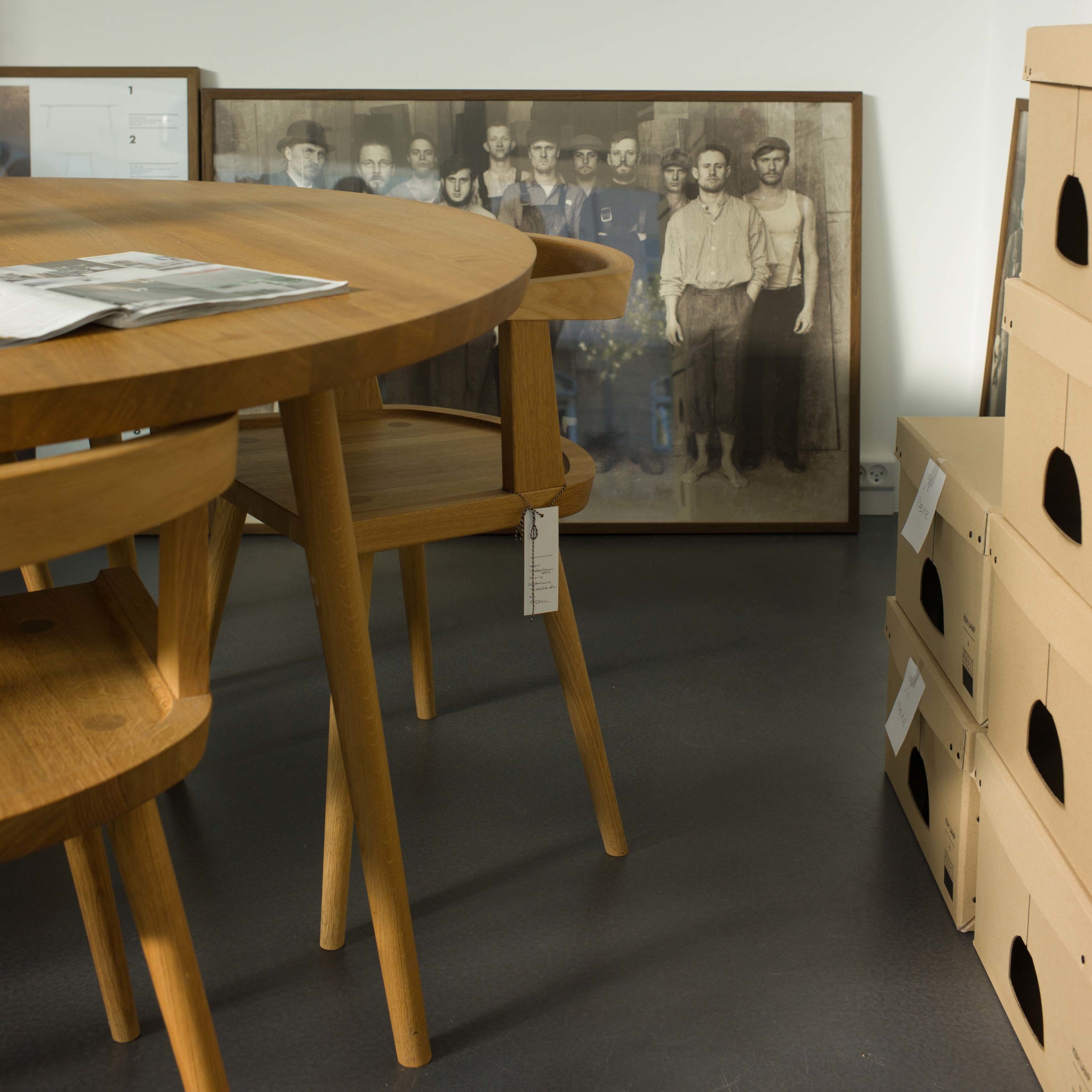
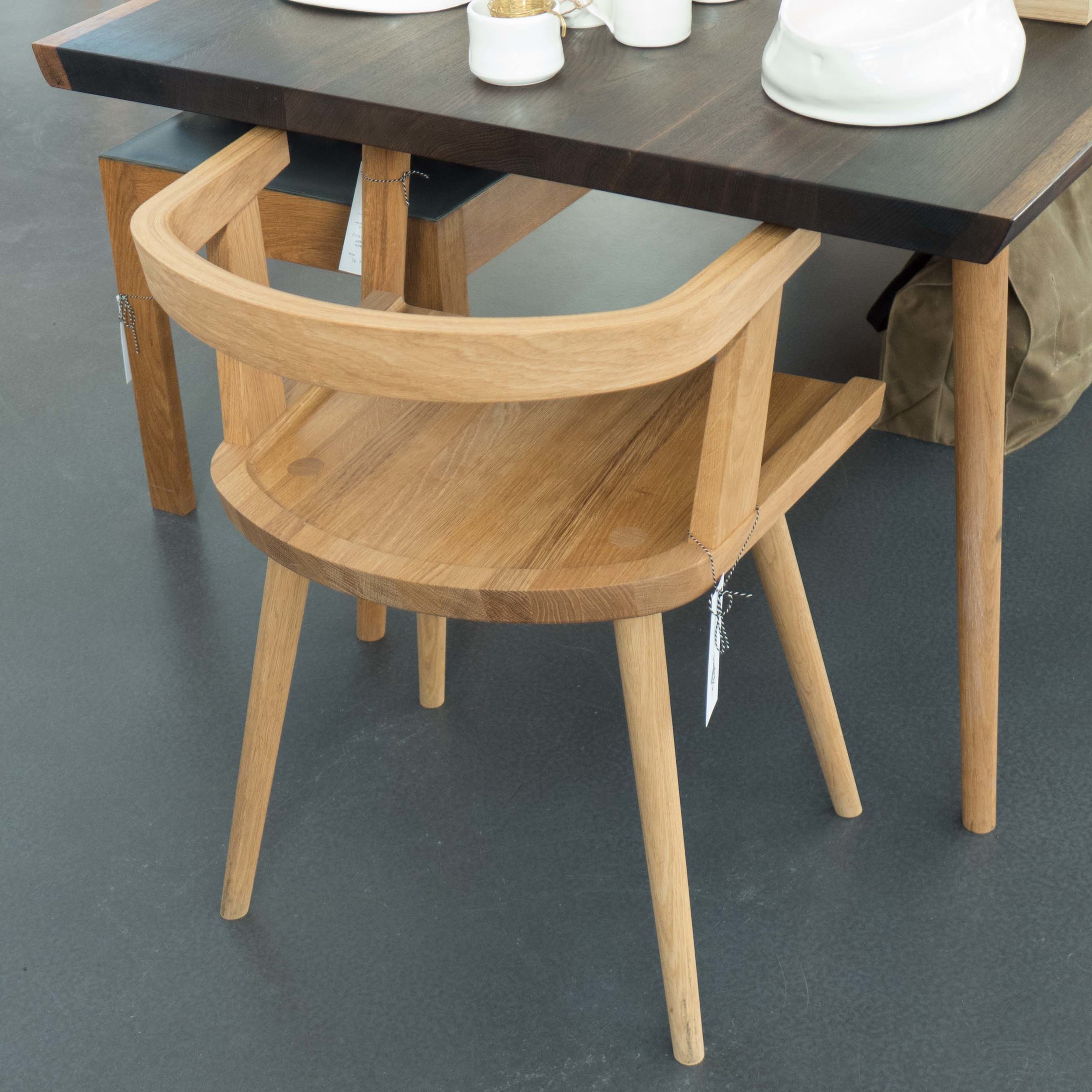
The Tripod table by Come Here is from the Danish designer Steffen Juul who has his studio here in Copenhagen. With three legs, this is obviously stable, but it was a simple and clever detail to extend one of the legs up through the top to give it a distinct look and to imply that the piece can be moved easily to where it is needed even if you don’t use the upper part as a carrying handle. It is a bit like a giant cake stand.


Pause dining chairs and table are by the Finnish designer Kasper Nyman. The tables are in oak with linoleum top and the Pause chairs come in black, oak, light blue and green.

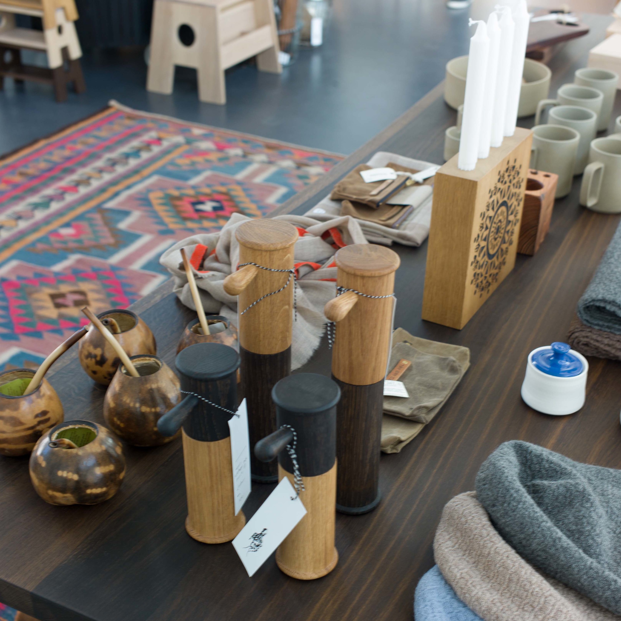
In the photographs I have tried to show the quality of the details … how elements are finished off or how they are set at an angle or finished with a chamfer.


Nakki comes in a one-seat or a two-seat version and is by the Finnish designer Mika Tolvanen who graduated from the Royal College of Art in 2001. Upholstery is dropped over plywood arm, rather like a saddle bag, and give the profile a sort of plump and comfortable look. 


For me, there were two pieces on the WOUD display that are outstanding. 

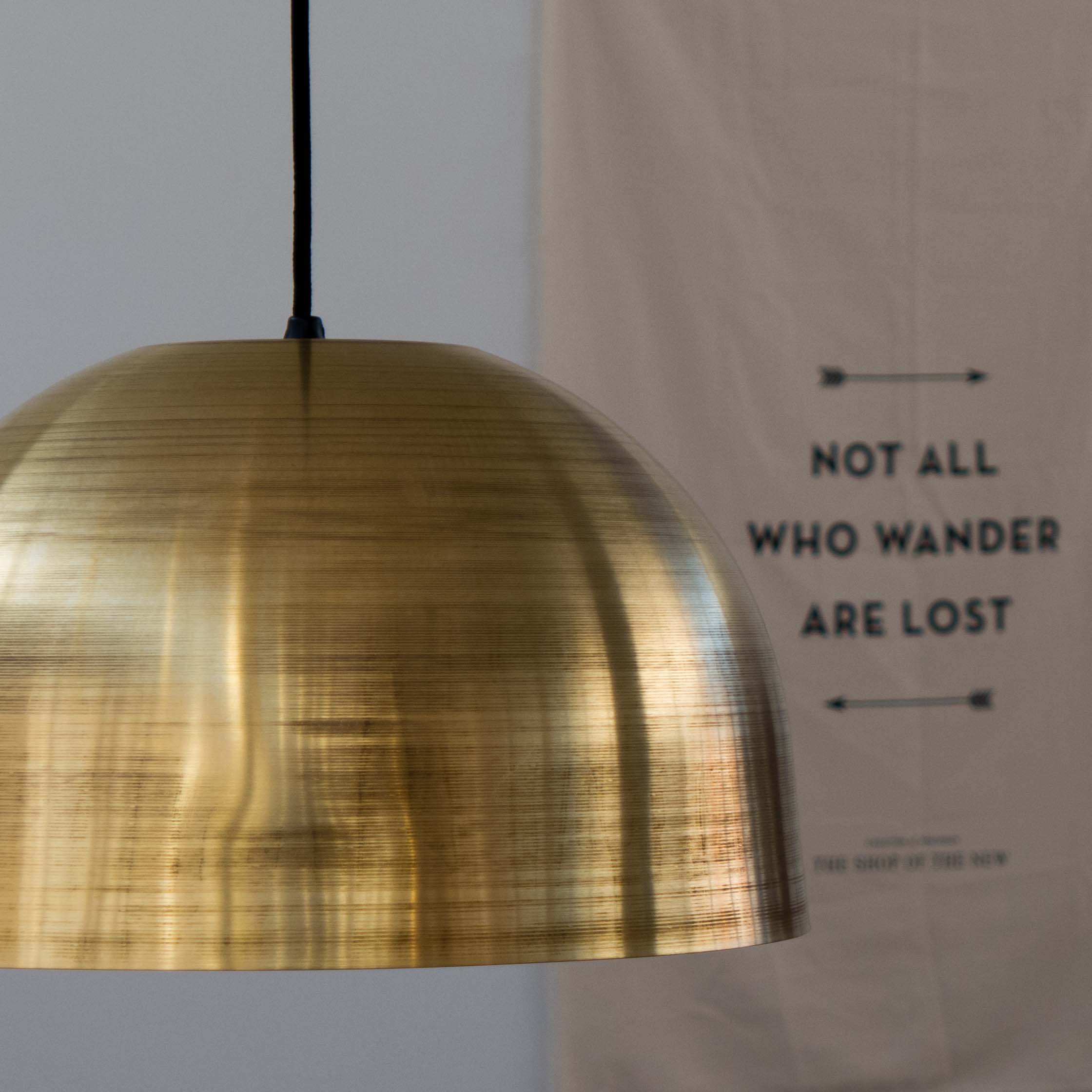
The first is a cone-shaped light called Annular by Jessica Nakanishi and Jonathan Sabine of M-S-D-S Studio in Toronto who also designed the Ladder Light sold through WOUD. Annular has a simple shade in spun aluminium with the shape and proportions reminiscent of the pendant light by Arne Jacobsen from the 50s from Louis Poulsen called, I think, the Billiard Lamp. 

With the Annular pendant, however, there is actually a second, inner, aluminium cone and the LED light is in a ring around the rim in the space between the two cones. Very clever. And it produces a very different light over the table to the normal single bulb found in most pendant lamps. 


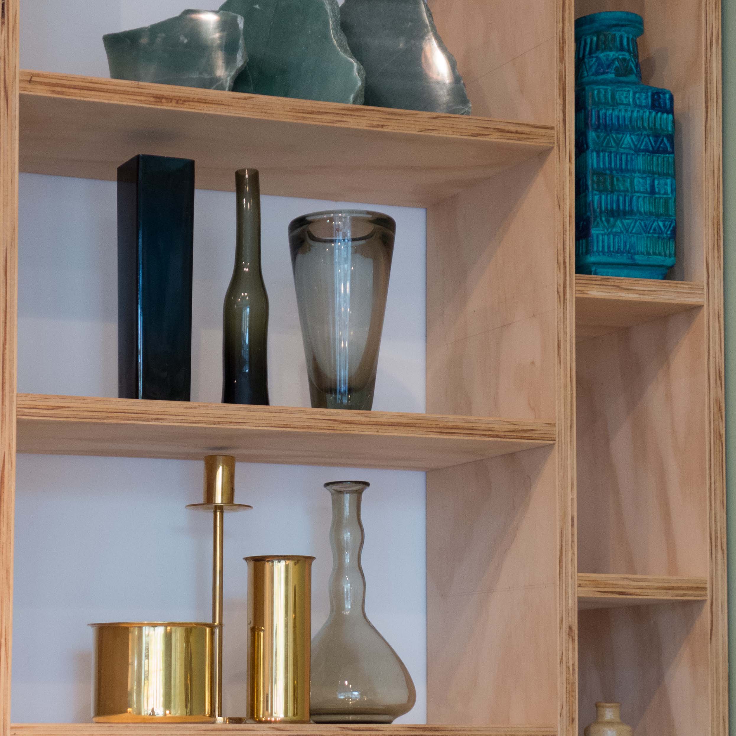
These thin shelves are called the Stedge Shelf but in German “stab im brett” or rod in the wall and are by the German designer Leonard Aldenhoff who trained as a product designer at the Kunsthochschule in Kassel.

They come with either two or three wood shelves that are 800 mm wide by 220 mm deep but are chamfered down to 4mm on the exposed edges to give an incredibly elegant profile. Each shelf is supported along the wall edge by double ended screws - one end into a smooth pin that goes into a precisely-cut hole in the thick edge of the shelf and the other end a wood screw that goes into a rawlplug in the wall. There is also, on each shelf unit, a single, fine steel wire that runs through metal eyes close to the outer left corner and acts as a stabiliser and spacer. 

This is crisp, precise, engineering design and beautifully made. If it was badly made it would not work … the sharp elegant look would be compromised and if a wood screw had been driven into the shelf, rather than the pin in a well-cut hole, then the grain would be forced apart and the wood might split when the shelf was loaded with any weight. 

Look at the web site by Leonard Aldenhoff to see in well-laid out graphics how the shelf was designed and made.

Northmodern was packed with amazing design but if I had to choose just one piece then, for me, this would be the best new design for furniture of this show.


WOUD now sends out a pack with its furniture when it is delivered that includes care instructions and background information about the company and the designer. 

This is a good idea because, generally now, as more and more people purchase furniture on line, it can mean that customers miss important information that before was provided by well-trained in-store staff. Information, sent out with the delivery, should head off some potential problems … so for instance complaints about wear or whatever when actually the customer was using the product in a wrong way … and, hopefully, for a new company like WOUD, it also helps build brand loyalty through a sense of connection.


WOUD

northmodern dramatic


Lighting is incredibly important in Denmark and, alongside specialist lighting companies like Louis Poulsen, many of the large furniture companies produce extensive ranges of lights.

Although the lights here are not Scandinavian, I could not resist posting these photographs of the Assolo ring lights and the scroll-shaped FormuLa light from CINI&NILS from Milan and the double wave pendant boomer light designed  by Jos Muller from the Netherlands but produced by tossB from Zeebrugge in Belgium.


CINI&NILS

tossB


Also, of course, furniture can be presented in a theatrical way. This is Classic ARTEK furniture from Paustian shown in a large area just to the left of the entrance to northmodern - these photographs show just part of the large, stark and very dramatic display


Next Door


The full name of this shop in Østerbro is NEXT DOOR Recycle your rooms. Christine Løschenkohl Holm and Christine Heiberg sell furniture, ceramics, glassware and rugs and textiles mainly dating from the mid 20th century. The shop opened last summer but is already well established.

They have agents scouting for good pieces and they use an Instagram site and Squarepics and Iconosquare well as a very appropriate ways to show customers what has just arrived in the shop. The turn round of stock is rapid … I walk past here a couple of times a week to get to my local coffee shop or to look into Goods … and it is always beautifully arranged.

One really strong characteristic of Danish homes is the way that good design is mixed with skill to match Classic mid-century design with current pieces or to have starkly modern pieces of furniture in old rooms with panelling and ornate plasterwork or to use antique pieces in starkly modern glass and steel apartments.

What is unusual at Next Door is the striking and confident use of strong colour and strong pattern that has not been a part of typical Danish design for many years. Probably the style is closer to that found in Sweden in shops like Svenskt Tenn in Stockholm. The team at Next Door told me that one aim for the shop is to encourage people to use colour and pattern with more confidence. To help they also offer a design and advice service.


Next Door Dag Hammardkjölds Alle 33, 2100 Copenhagen Ø

Anne Black

This shop is different again and certainly different in its business model. Anne Black is primarily a ceramic company supplying selected shops throughout the world. The pieces are designed in Denmark but produced by hand in their factory in Vietnam.

Obviously, the Copenhagen store on Gammel Kongevej stocks a good range of the ceramics, but they do not dominate the store … in fact far from it. Again, as with the other independent shops in the city, there is a very strong sense of a personal taste behind the selection of pieces that includes women’s clothing (there is now a separate shop for men’s clothing a few doors down) but also French furniture, unusual glass light fittings, textiles, magazines and a very good selection of glassware for the table.


Anne Black, Gammel Kongevej 103, 1850 Frederiksberg, Denmark

The Shop Of The New

Slightly out of Copenhagen along the coast to the north, at the north end of the main street in Hellerup, is The Shop of the New. This opened at the end of last summer and is in fact the store for the Copenhagen furniture makers Københavns Møbelsnedkeri who have their workshops in Islands Brygge - the area on the east side of the inner harbour in Copenhagen and immediately beyond Christianshavn.

Again the style is probably not what is immediately recognised as Classic Danish although what is clear in the design of the furniture is the Danish love of and deep respect for wood and craftsmanship. I hope to talk to some of the craftsmen at the workshop at some stage but until then what I can see is that there is a deliberate stepping back from current Danish design. Not stepping away but stepping back in time and returning to earlier principles and earlier methods of design and production. The photograph in the shop and on their web site, with the craftsmen from the company dressed and posed to look as if it was taken a century ago, is clearly tongue in cheek - funny and ironic - but actually a very clear statement about returning to earlier principles. This is not nostalgia. This is saying that if you feel concerned or feel that something is wrong with where you are then, rather than blundering on, hoping to find your way, it is often better to go back to an earlier fork in the road and try a different route. So this is a return to the techniques and the view point of craftsmen c.1900 and not a return to their designs.

In the work of the cabinet workers from companies such as Rud Rasmussen, working with designers like Hans Wegner in the 1940s and 1950s, you can see and appreciate that between designer and maker there was a mutual respect and a common understanding of workshop techniques and together they explored what was possible and together tried new forms and developed new techniques.

It is significant that on the wall in the shop in Hellerup is displayed a definition of the role and status of the artisan. With its political and moral overtones, this view has been rather sidelined for fifty or sixty years but this must be the right time to reassess those values to see if they could and should have relevance now. That’s the idea of apprenticeships; the reassessment of the values we put on certain skills and the idea of respecting and carrying forward knowledge and experience. 

What you can also see here, I suspect, is inspiration from what is called vernacular or craft furniture. Go to the open air museum in Aarhus or look through the houses at Frilandsmuseet, the open air museum north of Copenhagen, and you will see robust, honest furniture made by joiners and carpenters from villages and country towns, made locally; made to be functional; made to last but far from crudely made. Look at the way that furniture was made to improve the life of the owner and make lives more comfortable and more enjoyable … that is one basic but important definition of what makes a design good. 

The Shop Of The New also sells their own lamps in turned brass, children’s furniture from Collect Furniture, skate boards from One Village, chopping boards, grinders and yard brooms from the Philadelphia company Lostine and T-shirts and shorts from the Pacific Island company of M.Nii.

Again, as with the other shops, look at the distinctive packaging, the use of good graphics, the careful presentation in the shop to reinforce the style, type and form of furniture that they are making and selling.

There’s also a really good coffee shop in the store and the bus from the centre of Copenhagen stops outside … just in case you are worried about venturing that far out of the city.


The Shop Of The New, Strandvejen 213, 2900 Hellerup, Denmark

Bella Center Flea Market

just one of three main spaces

Today and tomorrow for the first big Flea Market of the Spring at the Bella Center in Copenhagen. It’s almost too big. After strolling up and down a dozen aisles my eyes glaze over and I begin to forget what I saw where so there is no back tracking if I decide, on reflection, I should have bought something. 

Having said that, this is the place to get your eye in … particularly if you are looking for lighting or kitchenware and glassware from the mid 20th century. And it’s a good place to get to know dealers  … many trading here also have shops in the city where they hold more stock. 

There are some stalls with furniture although for larger pieces a better starting point might be the auction houses in the city. Every week through the summer there will also be smaller flea markets at Israels Plads on Thursdays and Fridays and on the square in front of the Thorvaldsen Museum on Friday and Saturday. Glass and ceramics and cutlery and lighting from the 1950s, 60s and 70s are very collectible or, even better, why not use these things every day. That's what they were designed for.

Bella Center, Copenhagen


technical excellence

In very general terms, the designer understanding the materials they are working with and understanding the strengths and the limitations of the production methods and using and exploiting that knowledge to realise their design can be seen as the technical part of the design process.

Unfortunately, technology is often, but not always, seen as the opposite of crafting by hand. 

In reality, of course, ceramics, with the use of glazes and kilns for firing, and the making of glass and of course looms for weaving, lathes for turning wood, machines for cutting veneer and so on are all examples where the technology that enables mass production has been established for centuries and also exist at both a craft level and on an industrial scale. This forms obvious and important links between the making of one-off pieces and multiple commercial production.

So the design and commercial manufacture of items may involve aspects of these older and well-established technologies along with the latest technologies including of course CAD but also the development of new materials, new developments such as LED lighting and new techniques of production such as the potential use of 3D printing.

What I am trying to say, in a slightly awkward and stilted way, is that craftsmen, producing one-off, high-quality pieces can and do use and exploit rapidly changing technologies on their own terms and designers, producing designs on a commercial scale, can and should take from the best craftsmen, their understanding of craft skills and, from the very best craftsmen, their quality control.

For me, there were three exhibitors at northmodern whose work showed exceptional understanding and exceptional use of technology and in slightly different ways. I would go as far as to say that these products are technically brilliant … and that is meant in both ways that the word brilliant is used in English: brilliant in the sense of highly intelligent but also as a superlative.


Ole Palsby Design

Mikkel and Caroline Palsby established Ole Palsby Design to continue to produce work designed by their father who died in 2010.

Just released, the first products are a range of cutlery with two finishes, ICHE Matte, a plain steel cutlery with a matte finish and ICHE Titanium with a coating to the steel that gives the cutlery an amazing dark grey lustre. For each finish there are three sizes of knife, four sizes of fork, including a pastry fork, and eight sizes and shapes of spoon including spoons for dinner, lunch, and for soup, a child’s or dessert spoon, a long spoon, pastry spoon, teaspoon and espresso spoon.


The design was finished by Ole Palsby shortly before his death and the first prototype was made by the Japanese craftsman Kazonosuke Ohizumi.

The reasons for this collaboration are clear. Japan has a well established craft and industrial tradition for making steel blades for kitchen knives and weapons that goes back over a thousand years and modern Japanese craftsmen have almost unmatched expertise in forging steel and resolving technical issues with the flexibility of the piece, the finish and the cutting edge. So Ole Palsby Designs are using well-established experience and and highly developed specialist skills in the design and manufacturing process to produce cutlery of the highest quality.

As with his designs for the Eva Trio range of saucepans, here with the cutlery, Ole Palsby did not choose shapes or forms with the simple intention of being novel for novelties sake but he analyses the way cooking pans and, in this case, cutlery are made and how the items are used … whereas some designers want to develop and take forward current forms my feeling is that Palsby himself was more curious to backtrack down a route of development and think about what might have evolved as the accepted and normal if slightly different decisions had been made at each point of the evolution of a shape or form or method of construction or manufacture.

Here, with the cutlery, you can see that the balance of the pieces has been changed and the modifications are particularly clear in the angle of the bowl of the spoons which is different and the forks are shorter than in many designs and have a bowl shape rather than having long thin closely-spaced tines … so they can be used for holding food in place on the plate while it is cut or used for scooping up food but not for impaling food.

Ole Palsby Design


OSOOS

Oscar Peet and Sophie Mensen of the studio OSOOS in Eindhoven are graduates of the Design Academy in Eindhoven. Their Mono light uses thin elegant LED tube lights with a sleeve that can be twisted round to shield or direct the light. Light tubes are linked by section of soft grey tube - soft in colour but also soft in feel and flexibility so that they bend to form a relatively tight arc. The light tubes are of three different lengths and a line of light tubes is fixed to the power source at one end but can be set at different angles and moved from a horizontal to a vertical alignment and anchored at the free end by using either simple round brackets fixed to the wall or the end of the tube can be dropped into a heavy marble ring that is set down on the floor and acts as an anchor. The lighting can be swung into a new configuration if it is wanted in a different part of the room or moved to change the level and mood of the lighting in the space.

Eindhoven, an industrial city in the south of the Netherlands, is the headquarters of Philips and therefore has attracted a number of specialists - experts and independent technology companies - focusing on the development of glass including companies such as FEI who are specialists in optics.

Design is also very important in the city - it hosts the Dutch Design Week and according to Wikipedia, in 2003 Time Magazine called the Design Academy Eindhoven “The School of Cool” although I can't decide if the students from the academy should see that as a great accolade or now rather ... well ... uncool. The important point is, however, that the city has a major international manufacturer and a major school of design and has attracted technical expertise and designers to their mutual benefit. 

OSOOS


Overgaard & Dyrman

A longer review/assessment of the wire and leather chair from Jasper Overgaard and Christian Dyrman will be published on this site in the next week or so but here what I want to emphasise is that the design combines a very very high quality of finish with a very clear command of the technical aspects of production. 


The upholstery in leather combines saddle leather on the outer side - to maintain the shape - and traditional upholstery leather for comfort on the side of the cushions that you sit on or lean against. That sounds simple but involves considerable skill in production … and meant understanding and mastering difficult traditional craft skills of the saddle maker. The chair would not be anywhere near as good if this quality of work was compromised. We tend to associate the words technical and technology with the here, now and current but that is doing a grave dis-service to the amazing technical skills we have inherited such as leather processing, saddle making or metal working and of course technical knowledge in such industries as weaving, glass making and ceramics.

The complex overall 3D shape of this chair is created with wires bent in 2D so not only the shape but the overall quality of the finished piece depends on how precisely these are made working from computer generated templates as each piece is different. And, of course, what is crucial is how accurately these pieces are joined together to form the basket shape. Again any compromise in technical quality would not only be obvious but would undermine the credibility and the integrity of the product. At this level of design and production Overgaard and Dryman are selling un-compromised quality combined with technical excellence.

Overgaard & Dyrman

lovewood

A huge strength of the northmodern furniture and design fair is that it gives the visitor a really good chance to compare the very different approaches taken by the different designers. Many of the companies exhibiting are small and many are recent start ups and many are producing similar things … chairs, tables, decorative objects in wood. That is not a criticism but in fact just the opposite because what you see is a phenomenal range of styles and different approaches to marketing, packaging and so on which shows clearly the strength and the depth and breadth of the Danish design and production industries.

There is a lively and varied approach to design in Denmark from the novel and experimental through to those companies that want deliberately to build on the traditions of good design and high levels of Danish craftsmanship in their own products.


Inside the boxes for The Donut from Lovewood it says that they have been “produced and designed in Denmark” … by “talented and dedicated furniture artisans with great respect for the Danish design tradition.”

From Hammershøj, about 50 kilometres drive north of Aarhus, Lovewood was launched in 2014. There were three initial products:

  • The Donut - a tea light or candle cup - in wood 
  • cushions that are covered in traditional horse blanket and
  • wall clocks with the face in wool fabric or leather and hung from a leather strap.


The Donut is a beautiful, simple piece but very very carefully designed. It fits neatly into the palm of the hand so is tactile - when was the last time you couldn’t resist picking up and cupping in your hands a candlestick? - and by just pushing one finger up through the hole in the centre you can push the tea light up to remove and replace it. There is a clever inner ridge that keeps the tea light centred and clear of the inner sides - a neat subtle touch to the design. Its soft shape shows the grain of the wood well but it also comes in a number of very carefully chosen and mixed colours … at DESIGNTRADE last August Martin Skov explained to me just how much time had been spent on getting the colours right. Similarly with the cushions it is clear that there is not only a love of a traditional Danish cloth but it is combined with real care taken over stitching and finishing.


A major new addition for the northmodern show was a stool with three legs and cross rails in oak and a leather-covered seat in tan or black. As with their other products the stool has a remarkable level of care in both design and production … the seat is gently hollowed and well upholstered and the underside of the seat is also covered with leather … that makes it very pleasant to pick it up and move it … with many stools you look at the underside and you see and feel roughly finished mdf or ply. The mark of a good product is when even the parts that are not immediately obvious are as well finished as the rest of the piece. The legs are interlaced with leather cord … clearly not structural but here a nostalgic reference back to a piece of furniture fondly remembered from childhood where, as you move around the stool, you see an interlocking star that changes with your viewpoint. Many of these types of bar stool can feel too high and unstable and when in plastic very unforgiving on the backside … the stool from Lovewood could not be more comfortable and the tree legs make it inherently more stable if the floor is uneven and the T-shaped cross-bars form a foot rest at the front that is at exactly the right level.


design classic: JH604 by Hans Wegner

Although known primarily for his furniture, Hans Wegner did design a number of lights that were produced commercially, including the JH604. 

A small knurled knob on the stem of the pendant means that the position of the bulb can be adjusted in relation to the bottom edge of the metal shade … the shade can be raised to expose the lower part of the lightbulb (as in the photograph) for a general and wider area of light, for instance if it is used over a side table, or it can be lowered so that the bulb is covered when it is hung above a dining table in part to form a tighter pool of light but also so the bulb is tucked up above the lower edge of the shade and does not dazzle people sitting around the table. 

In the original design, a rise and fall unit in a metal globe just above the shade meant that the whole light could be raised up out of the way when there were candles on the table.

This version of the light is produced by Pandul and the rise and fall unit is in plastic in the ceiling fitting which is, apparently, more reliable, but for me it reduces part of the distinct character of the light that made it look so much 'of its period' … although I guess some would argue that the modification makes the present version simpler and therefore rather more timeless.

For writing this post, I tried to work out why I like this light so much - the photograph shows the light I fitted over my dining table a few weeks ago. Some of the reasons are fairly obvious … I like the simple but beautiful profile of the light, its quality and its size … it is surprisingly large with an overall diameter of 510mm. I also realise that part of its appeal is its place in design history. As a design historian I am fascinated by that period in the 1920s and 1930s when design aesthetics changed in Europe with the wider take-up of industrial materials and industrial methods of production for domestic furniture and fittings. The interest in tubular steel, chrome and so on can be found most obviously in the works of the Bauhaus in Germany but there were contemporary products from Austria, France, Belgium, Holland that explored both the new materials and the style that emerged. Of course the JH604 is later, it was designed about 1960, but illustrates clearly that Denmark took its own course through this period … chrome, steel and glass were all used through the 1930s, 40s and 50s but for me the style always remains Danish. This really could not be a Bauhaus lamp. Why? I’ll have to think about that a little more before I write a post on that theme.

For a photograph of the light with a metal rise-and-fall unit see page 72 of the recently published book on Wegner, Wegner just one good chair by Christian Holmsted Olesen (Design Museum Danemark and Hatje Cantz 2014). There is also the reproduction of a working drawing on the same page and on page 77 a photograph of the light over the dining table in Wegner’s own house in Gentofte.

Pandul

commemorative light

Today, to mark the 120th anniversary of the birth of the designer Poul Henningsen on the 9th September 1894, Louis Poulsen have launched a new light for their current collection, the PH 3½-3 pendant, based on original designs by Henningsen from the late 20s and early 30s. The proportions and profile of the triple shades can be seen in the 4/3 lamp in glass of 1928 and the slimmer upper part in copper but with metal shades with a rolled edge in the 6/5 lamp of about 1929. Looking at an illustration from a catalogue of 1936, this version appears to combine the size (a diameter of 33 cm) of the 3½/3 but with the extended and more elegant upper part of the larger 4/3 and 4/4 lamps.

Photographs of these original versions along with reproductions of Henningsen’s working drawings and the fascinating analytical drawings that show how the light is dispersed by the multiple shades of the lamps can be found in Tænd! PH Lampens Historie, edited by Tina Jørstian and Poul Erik Munk Nielsen for Louis Poulsen and published by Gyldendal in 2007.

For the new 3½-3 the metal shades are produced in green, red, yellow or white and the stem is a semi-glossy brown and made of copper.

Photographs taken from publicity material from Louis Poulsen for the launch.

lights from Louis Poulsen

Louis Poulsen, the Danish company who manufacture lighting, was founded in 1874. They produce a huge range of lights and are noted not just for the exceptional quality of their light fittings but for their technical understanding of illumination for lighting to be used both inside and outside buildings. They are well known for their collaboration with the designer Poul Henningsen who trained as an architect but never practiced and saw himself as primarily an inventor. Henningsen died in 1967 but Poulsen still produce many of his pieces.

Two light fittings that are currently being promoted by Poulsen illustrate the range and character of their products.

The PH 3½-3 was designed by Henningsen in 1929 and was one of the first designs in the PH series using three shades to control the light. Over the intervening years a number of changes and modifications were made to the design but this light returns to the original form. It is in copper as a limited edition to mark the 120th anniversary of Henningsen’s birth and will only be available to order from 1st March to the 31st May 2014. 

When you look at the working drawings for the light, you can see exactly how carefully and precisely the measurements, proportions, curves and lines were determined. The lamps in the PH series, with their multiple shades, control light in an almost magical way. I have a PH 5 over my dining table and I am still trying to analyse exactly how it works. The layers of shades create a pool of light over the table but also throw out a soft light over the space around and yet people around the table cannot see the light bulb and are not dazzled by it as they look across the table.

With a price tag of £995 in England the PH 3½-3 will almost-certainly be seen as a collectors or specialists piece for architects and design fanatics.

The Toldbod 120, in contrast, is a simple pendant light that is a relatively recent addition to the Poulsen range. The shape is deceptively simple but it has sophisticated and very carefully designed lines … the bulb holder is not straight-sided but a subtle truncated cone and the shade curves out gently without verticals. The bulb itself is housed well into the shade so, again, there is no glare. The lights are relatively small, 120mm high and 120mm diameter (hence the 120 in the name) and made in spun aluminium. They come in a number of colours including white with a pale green interior, dark grey with a deep turquoise interior, “cloudy” white with deep orange inside and apple green with a speckled orange inside. Some finishes have a matt and slightly textured surface.

The lights look great as a loosely-formed group with different colours together and flexes at different lengths or as a line with a number of fittings equally spaced with one colour - for instance along a work surface - to give a structured lighting that would fit with a minimalist interior and be a good alternative to ceiling spots.

pendant lights from Secto

The Finnish lighting company Secto Design Oy are based in the town of Espoo some 20 kilometres west of Helsinki. Their birch lampshades, designed by the architect Seppo Koho, are made with thin strips of wood set around formers in aircraft plywood. The birch is left with a natural finish or it can have either a laminate face (in black or white) or a walnut veneer. 

The lampshades come in a number of shapes - Octo has the silhouette of a garlic bulb, Victo is dome-shaped and Puncto and Secto 4200 (shown here) are simple and very elegant cone shapes. The strips of birch form a gentle shutter that gives a soft glow to lamp when seen in profile but with a soft pool of light directed down.


Kivi

As an alternative to candles and candlesticks, there are the Kivi glass night lights from Iittala that were designed by Heikki Orvola in 1988. They come in a wide range of colours to reflect any scheme or any mood and new colours are introduced to the collection every year. Shown here are the lights in apple green, votive red and frosted clear glass.

Candles

This year I was in Helsinki in June - in late June around the time of the longest day - and I really appreciated being able to wander around the city in the late evening when it was still warm and the sky had that never-actually-dark glow. Of course the price they pay for that comes in the Winter. Very long, very cold and very dark nights.

I know it’s nowhere near as bad in England but then this afternoon it was dark and raining here at 3.30.

One easy way to counter the gloom is by lighting candles and there is a huge range to go for ... from the tall thin candles for the Nordic Lights to the scented candles by Scintilla from Iceland … smellies called things like Westwinds and Silent Sands.

Put on your Killing Jumper, light a few candles, make some gløgg, put on something from E.S.T. - turned down low - and snuggle up with the most recent offering from Jo Nesbo.

Nordic Lights

Design House Stockholm produces a wide range of candlesticks from the Nordic Light, by Jonas Grundell, that opens out with four candles on the smaller candlestick or with seven branches on the larger Nordic Light, or there is the Nordic Shine, by the same designer in the same form but in a glossy lacquer finish and with four candles. Design House Stockholm also produce the beautifully simple Night Light by Pia Törnell … the one to light your way up the stairs to bed when the power goes out.

Night Light by Pia Törnell