Is This Colour? … an exhibition by Kontempo at The Round Tower


Kontempo, an association of textile designers in the Nordic region, was founded in 2015. With a board of eight textile and furniture designers who meet once a month, they are "working to raise awareness about contemporary textile work and practices."  

Is This ….? …. is a series of exhibitions by Kontempo with Is This Colour? being the third following Is This Textile? in 2016 and Is This Knit? in 2017.

Here, twenty four works are shown that, using many different materials and styles, explore aspects of colour. The Gallery is in the Trinitas Church, the parish church for students, in an upper level that housed the university library, and access is via the brick spiral ramp in the tower. With windows on both sides - with views over the city - there is amazing natural light through the space and that is exploited in the exhibition so that what is clear, immediately, is that surface, texture and shadow all have a crucial role in how we perceive colours.

KONTEMPO
the exhibitions continues at Rundetaarn / The Round Tower until 23 June 2019

the framework
ide Blichfeld

NCS S 1080 Y20R
Kitt Dusnia

compleat
Charlotte Østergaard

colour lab
Louise Sass

duotone
Eva Fly

translucent faces
Henning Larsen

There I Belong at Statens Museum for Kunst


There I Belong is the first in a new series of exhibitions under the title SMK Plus where contemporary artists will explore the collections of the National Gallery.

For this exhibiion - Inspired by the works of the Danish painter Vilhelm Hammershøi who lived and worked in Copenhagen around 1900 - the artists Michael Elmgreen and Ingar Dragset have collaborated with Marianne Torp and Tone Bonnén, the museum's curators of contemporary art.

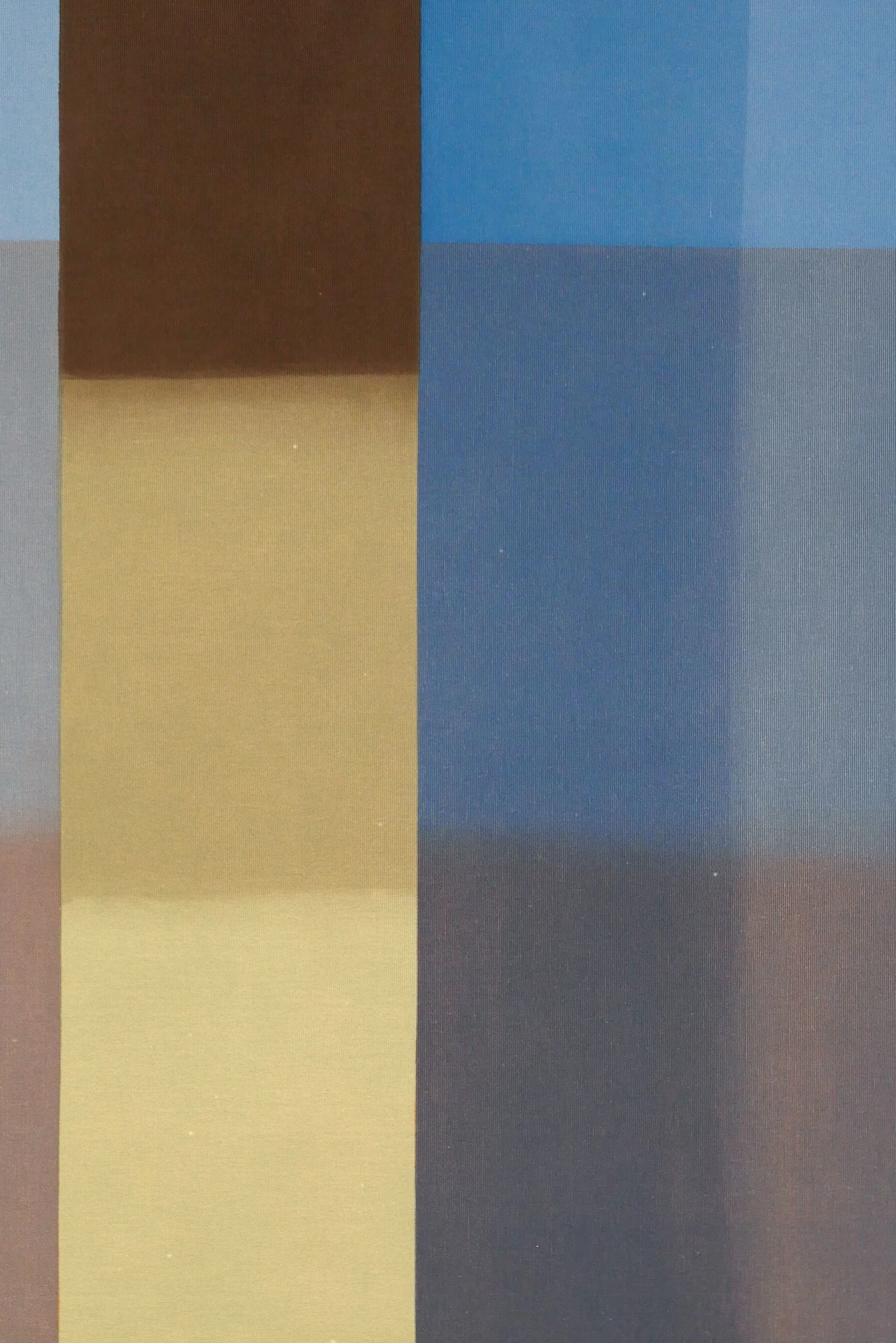
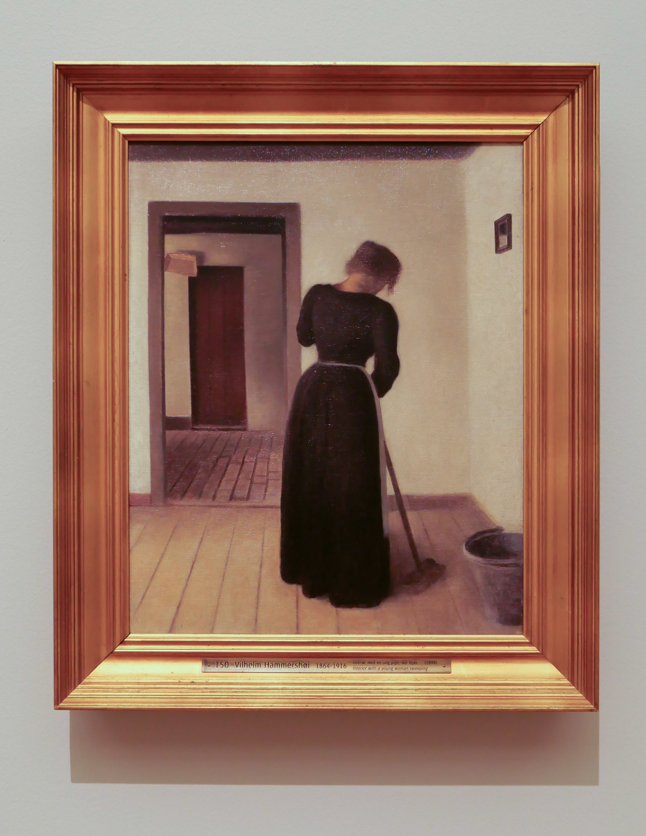
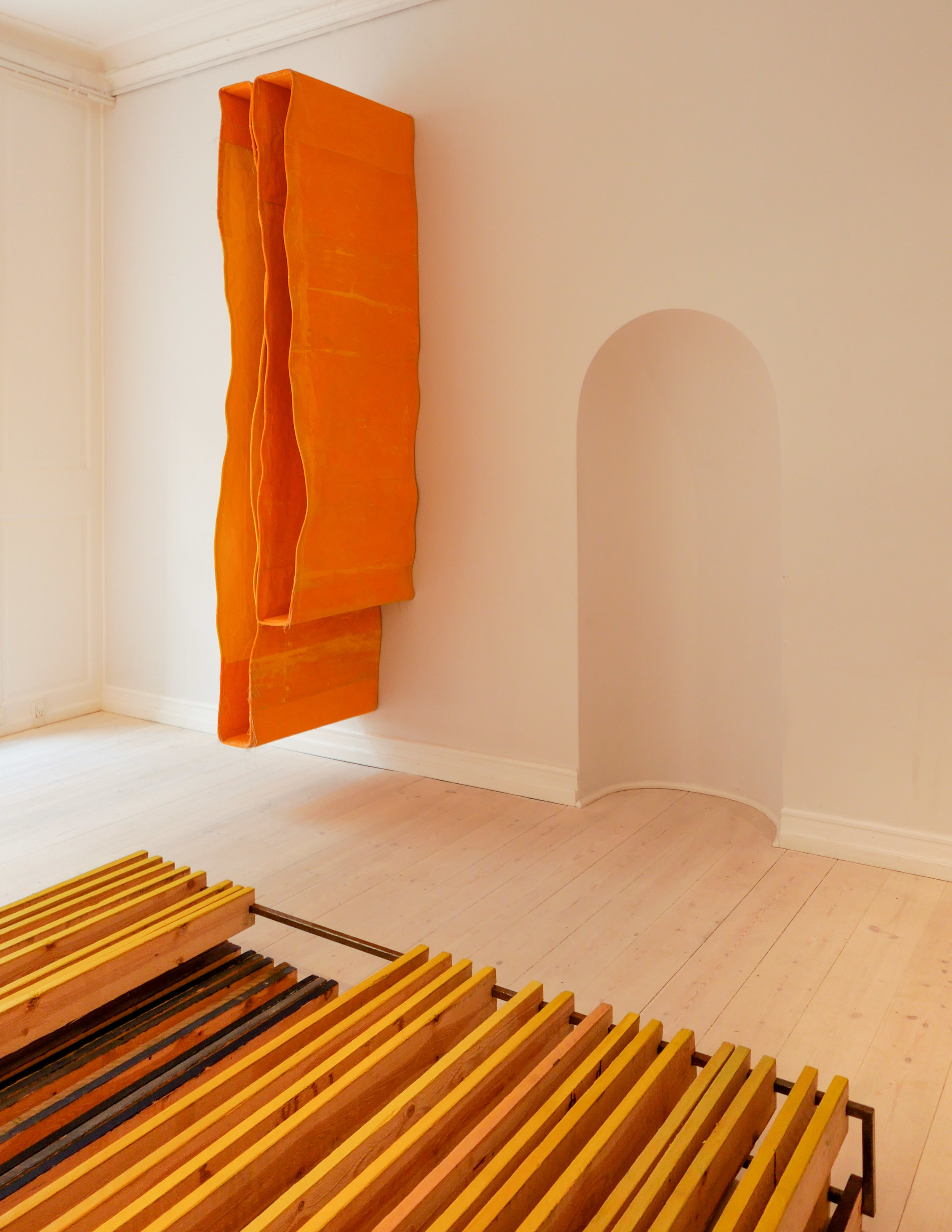
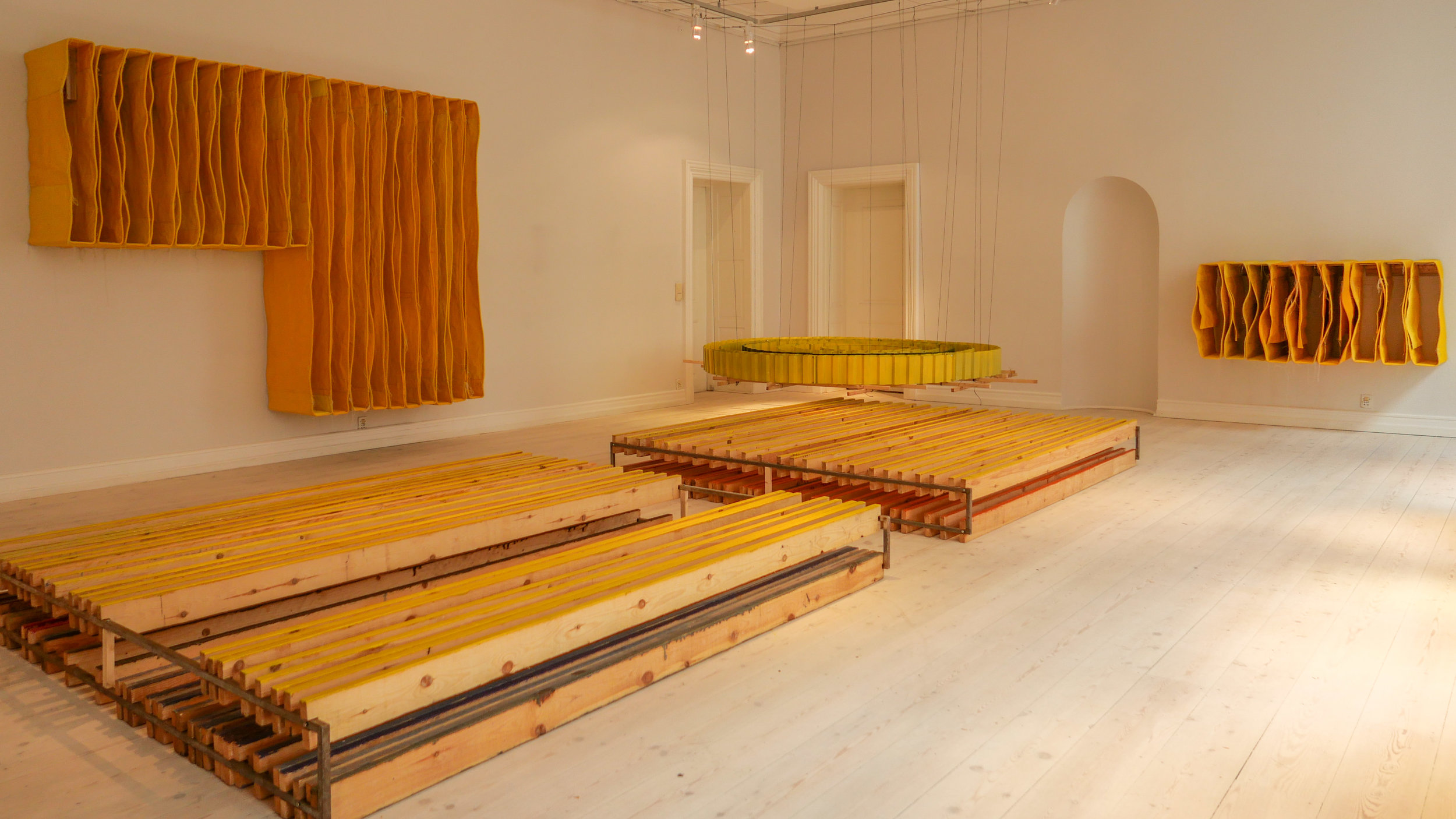
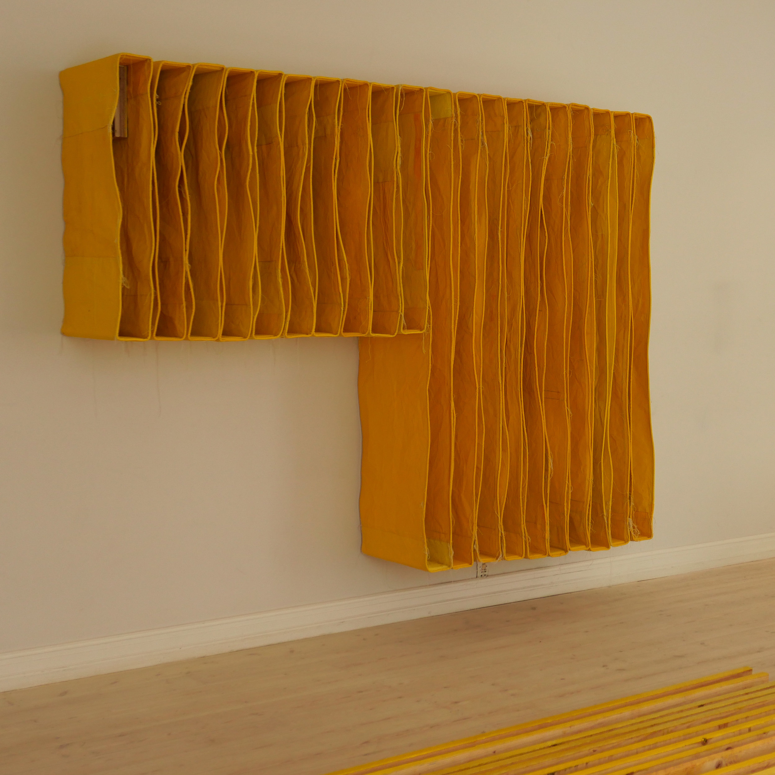
Spartan interiors by Hammershøi are restrained and calm but they are enigmatic - paintings that tread a fine line between being self contained or depictions of a life of painful isolation. The paintings resonate with a contemporary audience, reflecting aspects of modern taste and restrained Scandinavian interiors.

There may be windows in these rooms but the view out to a world beyond is usually obscured by thin, translucent curtains … the natural light entering the room is crucial but a sense of place not so because these are studies in light but never put people, objects or place under a harsh spot light. Figures in the paintings are detached, generally absorbed in what they are doing, inward looking, often with their back to the viewer and in many of the paintings we do not even know if they are reading or writing or simply sitting with head bowed in quiet contemplation. Open doors indicate that there are rooms beyond but barely hint at a lived life.

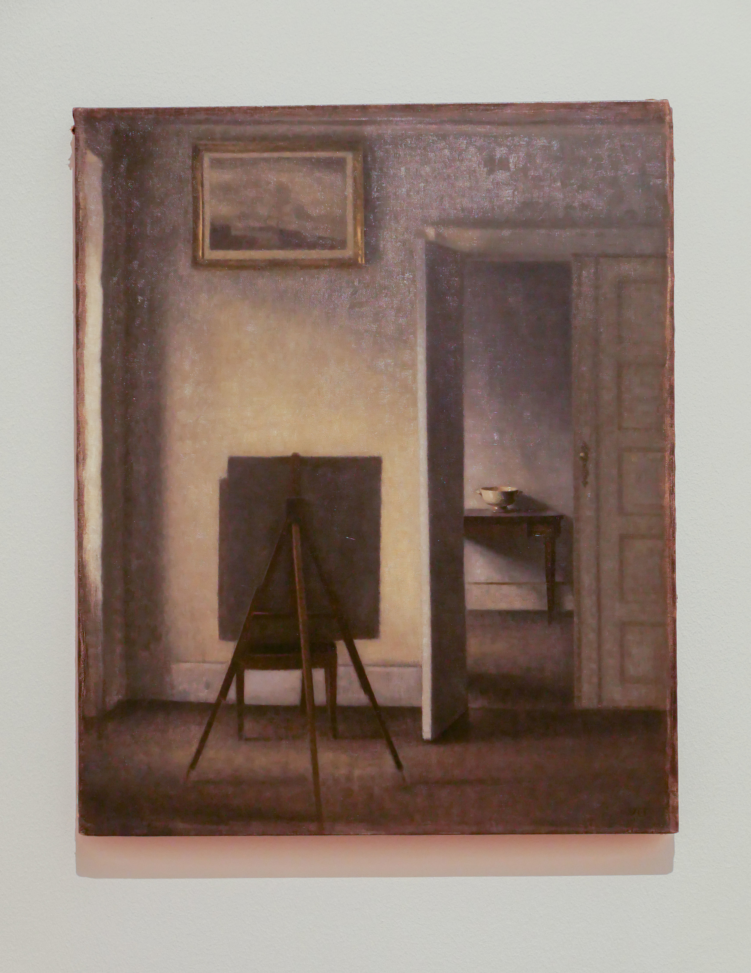
Interior with the Artist's Easel, takes this to an extreme because, when painting the picture, the artist himself should be at the easel. The only conclusion has to be that there is a second easel at the point where the viewer is standing so are we the artist? Perhaps we have been co-opted into this quiet and private world but this is the ultimate antidote to that modern scourge - the selfie - where the photographer shows themselves at the centre of the scene, always the subject of the view, inevitably relegating an event or scene beyond to a secondary role.

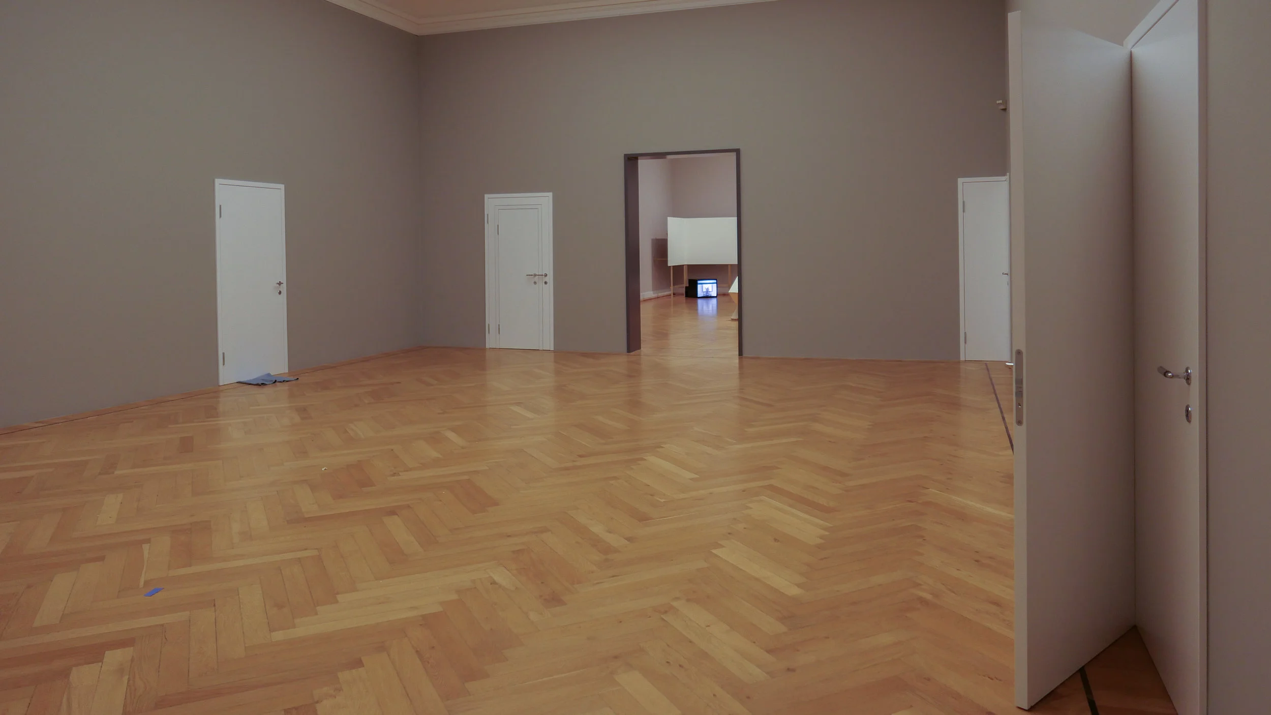
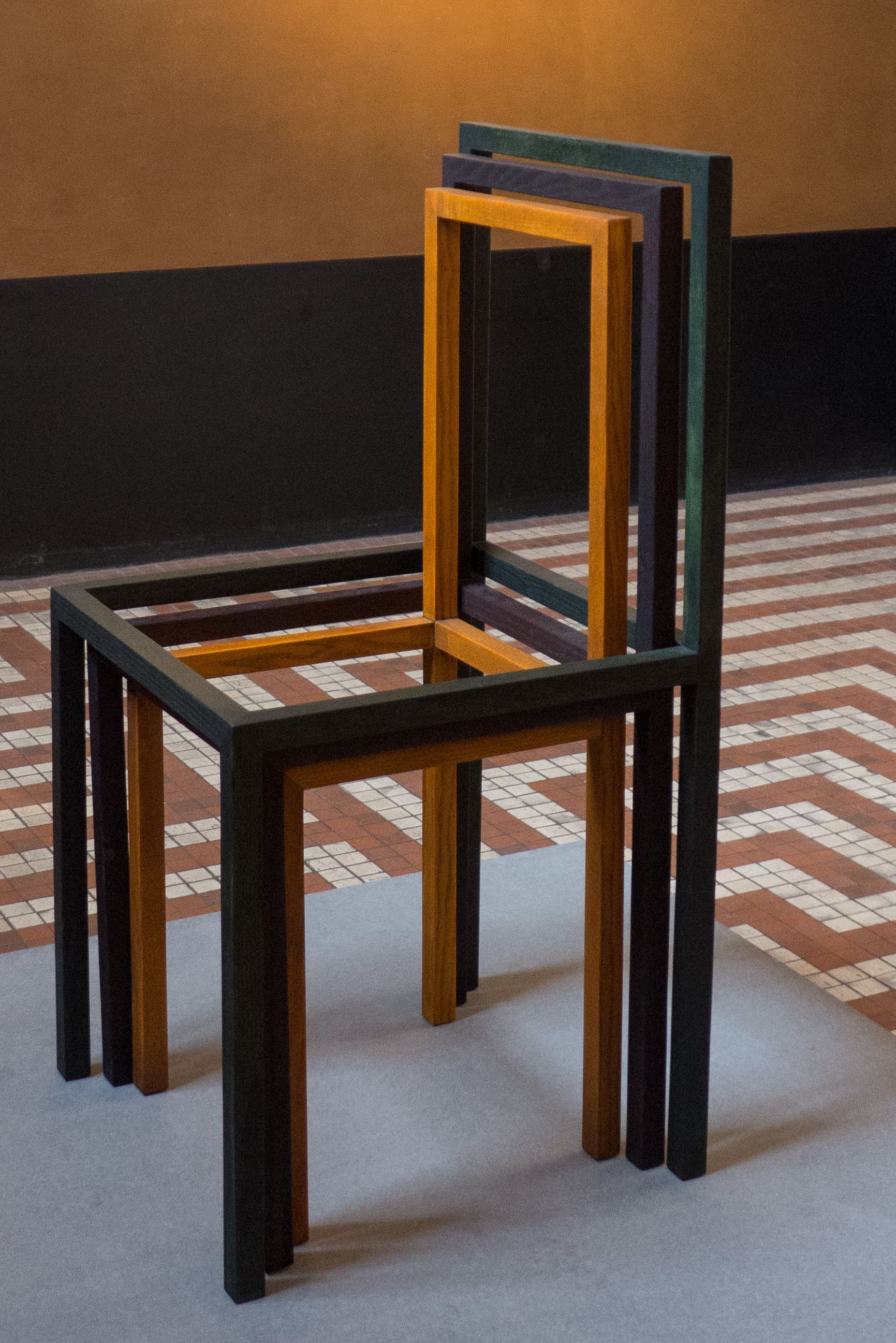
The second gallery - a large space - shows the work Powerless Structures (8 doors) by Elmgreen & Dragset from 2000-2002. These are the most simple, basic, standard white doors imaginable, with plain white door frames but each is a variation in a theme of a detachment from the real or the functional … one door has handles and hinges on both the left and the right side so it would be impossible to open - another has a handle that is not on the door but on the wall alongside so it might or might not open - one door is slightly open to reveal a locked door immediately behind - one door is folded and wrapped around the corner of the gallery - a pair of doors on adjoining walls at another corner are separate but linked by a security chain as if someone might be able to squeeze through from a room on one side to another room without being able to get into the gallery.

This work, or a version of this work, was shown at Statens Museum for Kunst in 2015 in Biography - an ambitious set of major installations by Elmgreen & Dragset. Then, the doors were part of a corridor and a series of rooms that were in what appeared to be a government or public office building. If not obviously dystopian then the corridor was completely anonymous and designed to smother any sense of self. On entering you had a choice to go one way or the other but with no signs or notices to say where you were or why you were there although you could get a ticket from a machine to wait for your number to be called but it never would be, of course, and if you proceeded past these doors you could only return to where you started.

By now placing these doors on the four walls of a large gallery, the work takes yet another step back and pays homage to Hammershøi but expands his space until it is monumental in scale.

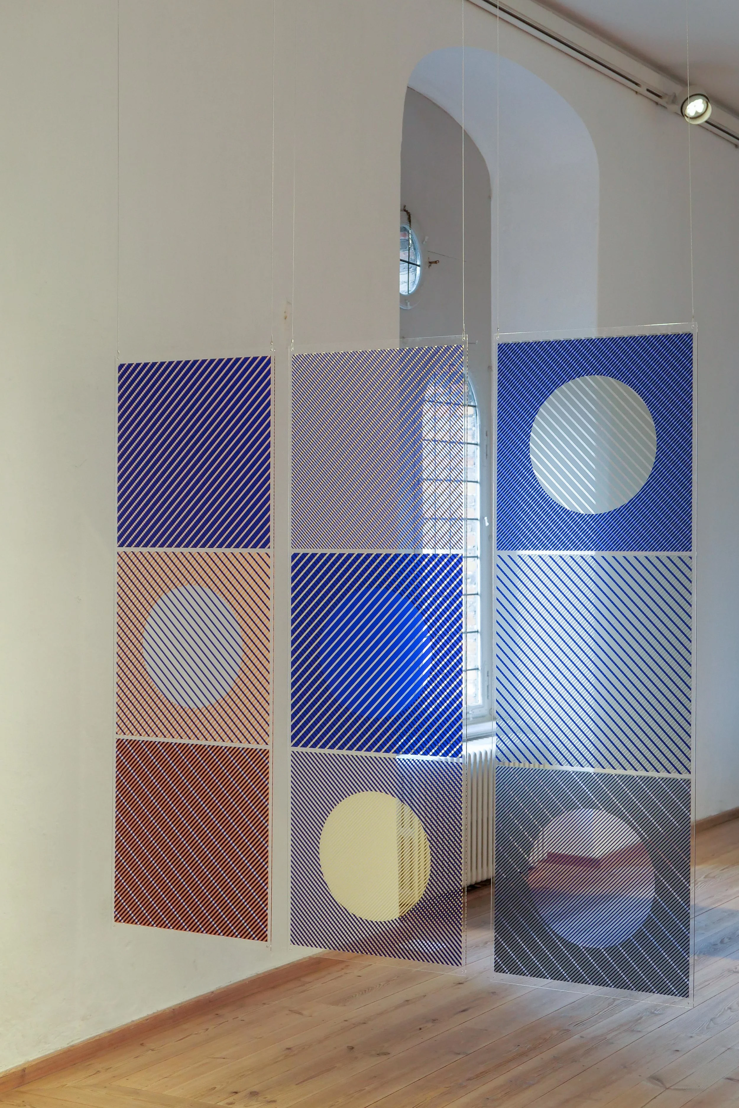
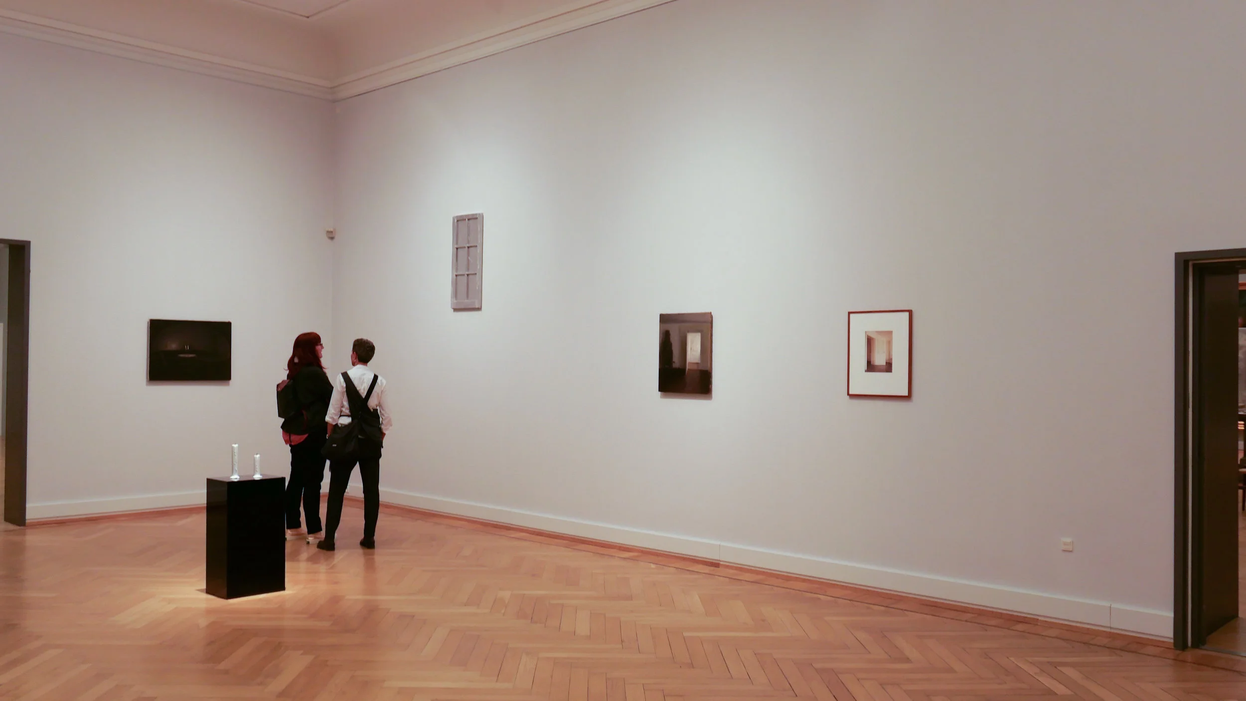
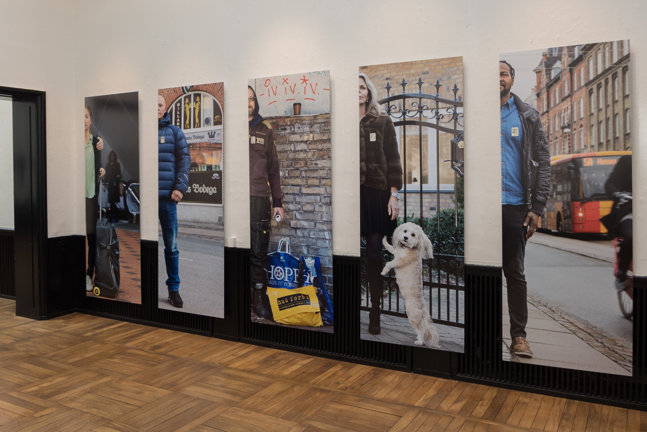
The exhibition includes photographs, paintings, sculptures and video by other artists - all taking the theme of doorways and spartan anonymity - with works by Njideka Akunyili Crosby, Lilianna Maresca, Francesca Woodman, Robert Gober, Annika von Hausswolff, Ugo Rondinone and Thomas Ruff. Only the work by von Hausswolff is from the museum collection with the other works either courtesy of the artist or on loan from galleries and private owners.


the exhibition at Statens Museum for Kunst / The National Gallery in Copenhagen
continues until 1 September 2019

Interior with a young woman sweeping, 1899

Interior, No 30 Strandgade, 1906-1908

Interior with the Artist’s Easel, 1910

Fællesskab anno 2019 / Community anno 2019

Catalogue for Biennalen for Kunsthåndværk & Design / The Biennale for Craft & Design 2019

The forward for the catalogue has been written by  Hans Christian Asmussen - designer and lecturer in design and on the board of Danske Kunsthåndværkere & Designere / the Danish Association of Craft and Design.

He discusses the growing importance of our sense of community and the eighteen projects chosen for the Biennale consider, in one way or another, our "notion of community - some with a critical voice, some in a playful tone, some tenderly, but all striving to explore the value that community offers."

This is about how artists, through their work, explore complex ideas, express what they feel and give the viewer reasons to think and reconsider by emphasising or challenging a view point or simply by shining a light on aspects of our lives that possibly we need to reconsider.

There is a longer essay on Community by the design historian and design theorist Pernille Stockmarr. She makes the crucial observation that with the frequent use of terms such as 'sharing economy', 'co-creation', ‘co-design', 'crowdsourcing', and 'crowdfunding', the concepts of community and cooperation have a strong and important relevance.

Historically, the concept of community is strong in Denmark with a well-established welfare state; a strong sense of family and friendship; a strong and ongoing role for the co-operative movement in retailing for food and household design and a strong volunteer movement through various sports and hobby associations.

In part, political change outside Denmark and the growing pressure to resolve threats to our environment has lead many to question what motivates us and those uncertainties make us reconsider our priorities and help us decide how we can move forward as local or wider communities.

read more


the Biennale - Popsicle Index Workshop


A fascinating project by the textile and colour designer Margrethe Odgaard to explore links between our senses … so how taste or flavour, and presumably also smell, can form associations with certain colours.

In blind tastings of different foods in four different groups - Apricot, pomegranate and date in one trial and masala and marshmallows in another - people picked a colour from 520 different colour samples on the ice-lolly sticks and then put them into the slot in a wooden box to record which colours they associated with which flavours.

Colours selected for each specific group of flavours are shown in frames.

Obviously the mental and emotional process - linking a colour with a flavour or smell - is complex and surely has to be subjective. Some flavours will seem hot or cool or strong or subtle - we use many of the same words when we try to describe flavours and colours - and presumably that makes the choice of specific colours relatively straightforward but also people will also associate a specific smell or flavour with a particular memory of a specific event so that could well be the colour of the room they were in when they first tried a food or there might be a strong link between a person they knew and their favourite food and their favourite colour.

This experiment also, of course, throws a light on how designers, particularly product designers, have to consider options for colours that have to reflect fashion while allowing not only for personal taste but also conventions within a community or society for which colours are associated with a function … so designers have to consider colours that a wider community might associate with freshness or grief or passion or, that most curious of human concerns, about which colours reflect or might signal that you have good or bad taste. 

Biennalen for Kunsthåndværk & Design

margretheodgaard.com

the Biennale - to play and learn together


This work by Kristine Mandsberg has prominent labels that read "please touch".

Play and, through play, early learning is one of the first stages where a child not only begins to explore and understand the physical world but also begins to build bonds with parents, siblings and a growing circle of friends.

Copenhagen has remarkable playgrounds with a huge range of equipment to test agility, to stimulate the imagination of children and to encourage play and the production of toys and furniture for children has been important in the works of many designers.

Kristine Mandsberg trained as a textile designer in Kolding and once you know that then the structural form of Three of a Kind, with warp and weft, becomes intriguing.

She also describes herself as an illustrator and the bold simple shapes here and her use of strong, bold colours has to come from a graphic sensibility.

But it was not just children who spent time twisting and turning and resetting these pieces. It was interesting to watch adults set and re set the pieces … perhaps not to find the inner child but seemed to reflect, at least, the way humans are curious about complex and adaptable structures.

These works have an element of mechanics about them … reminiscent of old wood football rattles that are never seen at matches now.

Biennalen for Kunsthåndværk & Design

kristinemandsberg.com


Yellow at Officinet

An exhibition at Officinet - the gallery in Copenhagen of Danske Kunsthåndværkere & Designere - to show the works of the Danish artist Torgny Wilcke and the English artist Simon Callery.

Both artists have used the colour yellow for a common element and both use what are essentially functional every-day materials - for Callery heavy canvas and Torgny Wilcke timber and corrugated metal strip for roof covering.

Both work on a large scale with a strong presence in the space and both hint at potential practical uses for their works … the wall pieces by Simon Callery reference storage and the large floor pieces by Torgny Wilcke have been used for seating so they are challenging boundaries between art, craft and design.

Both use proportions to bring order and to assume control of the space in the gallery. 


the exhibition continues at Officinet until 24 March 2019
Bredgade 66, Copenhagen

Danske Kunsthåndværkere & Designere /
Danish Association of Craft and Design


Torgny Wilcke

Simon Callery


Chair by Anne Fabricius Møller at MONO - the Cabinetmakers' Autumn Exhibition


Stol / Chair: Spøjs / Speys - MONO catalogue 3

What you notice first about this chair is the striking colour. It's not paint, because you an see the grain clearly but it's not stain … the chair is made in hardwood from a tree of the genus Peltogyne that is native to South and Central America and is known, for fairly obvious reasons, as Purpleheart because the heartwood turns a deep purple after the timber is cut.

But it's not just the colour that is unusual. The chair has an unusual form that was inspired by a work of the German artist Joseph Beuys that is now in the Neue Staatsgalerie in Stuttgart. It has a solid and relatively thick seat in wood with four turned or round legs that are slightly tapered - so thinner at the floor - and set just in from each corner but with a pronounced splay outwards at an emphatic angle to make the chair stable. These legs are fixed with a round tenon that goes through the seat and is held in place by a wedge driven down into the tenon from above.

So … so far fairly conventional.

But the chair is rectangular - much deeper than it is wide - with a back rest fixed across the narrow end … well a back rest if you sit astride the chair with your back against the rest or it is a single arm rest if you sit on the chair as if it is a bench.

This backrest / armrest is shaped rather like a staple or perhaps more like a squared-off and simplified version of the Greek letter Pi [ π ] with two uprights in turned wood and a straight but tapered cross bar linking the two at the top. This is dropped down into deeply-curved vertical grooves or channels on each long side of the seat - just in from the corners of the narrow end - and down and slightly inwards to cross over the legs - again running through rounded vertical channels but here cut in the legs - and stop short of the floor.


Spøjs / Speys
MONO Catalogue number 3
designed by
: Anne Fabricius Møller
produced by: Toke Overgaard

Amaranttræ / also known as amaranth and purpleheart
height: 69 
width: 48
depth: 63 cm

MONO - Snedkernes Efterårsudstilling / the Cabinetmakers’ Autumn Exhibition 2018

Piqué
designed by:
Hannes Stephensen
produced by: Snedkersind v/Kristian Frandsen

Sunrise
designed by:
Lise og Hans Isbrand
produced by: MoreWood Møbelsnedkeri ApS


The Cabinetmakers Autumn Exhibition for 2018 has just opened at Thorvaldsens Museum in Copenhagen.

SE - Snedkernes Efterårsudstilling - The Cabinetmakers’ Autumn Exhibition - is an association of 81 designers and manufacturers. Each year their board select a venue for their exhibition and set a theme along with any specific rules for a particular year - often to do with dimensions but this year also stipulating colour - so each work will be restricted to just one colour with the choice limited to either the natural colour of the material itself or to one of the strong and distinctive colours used in the original decorative schemes of rooms in Thorvaldsens Museum.

Each year, guest designers and guest manufacturers can apply to show their work. 

When setting the theme for this year, MONO was suggested to imply a range of associated ideas through monochrome, monolith, monopoly and monologue.

A subheading for the exhibition - furniture shaped by craftsmanship and insight - is important and significant: these pieces highlight the skills and the experience of the cabinetmakers who, in some pieces, take their chosen materials to new extremes and, in all the works, push their workshop techniques to the highest level of quality. So the exhibition is in part about the style and the form of each work but because, the cabinetmakers also represent a long and well-established craft tradition in Denmark, these pieces are about understanding the materials, to know what can be done and how, and to use incredible skills to shape, finish, join, refine or reduce the parts that make each work.

There are forty one works in the exhibition. Most were produced in a partnership between a designer and a cabinetmaker or furniture manufacturer - in many cases a  partnership that is now well-established over many years and over several projects shown at the Autumn Exhibition although several pieces were both designed and made by the same person.

The exhibition is also an opportunity to experiment or to produce designs that might otherwise not be commissioned … the aim is not only to challenge the skill of the maker but also to challenge the preconceptions of the visitor.


the Autumn Exhibition continues at Thorvaldsens Museum until 9 December 2018

Thorvaldsens Museum
SE - Snedkernes Efterårsudstilling

Cupola drejestol / Cupola swivel chair
designed by:
Niels Gammelgaard
produced by: Northern Layers

En stol / A chair
designed by:
Foersom & Hiort-Lorenzen
produced by: Kvist Industries A/S

Introvert position
designed by:
Andreas Lund
produced by: Toke Overgaard

Rum / Encircle
designed by:
Troels Grum-Schwensen
produced by: Malte Gormsen

2Gether
designed and made by:
Steen Dueholm Sehested

Bloom
designed by:
Hannes Stephensen
produced by: Egeværk

Beside
designed by:
Line Depping
produced by: Skagerak Denmark A/S

Guldlok / Goldilocks
designed by:
Monique Engelund
produced by: Sune Witt Skovhus


Maud Jarnoux at Statens Værksteder for Kunst

the first stages of the project - assessing and recording the historic urban colour palette in the city
select any image to open all the photographs in sequence as slides


the colours on woven panels of thin ash veneer

Recently  I had the opportunity to meet the French designer and teacher Maud Jarnoux who was at Statens Værksteder for Kunst / the Danish Art Workshops on Strandgade where she has been working on a project inspired by the light and the colours of Copenhagen.

Walking around the city, she has sketched buildings and details of the architecture with annotations of the colours and matched those colours on site using pastels.

Back in the studio, those colours were matched in acrylic paint that was applied to sheets of thin card and again checked against small flakes of paint collected or checked against the notes and back out at the buildings.

Maud feels that the colours have not only changed over time - as fashions and paints change - but that colours also change from area to area and with the types of buildings and also with the light in different parts of the city that are reflected in subtle differences.

The next step, to me, seemed to be the amazing and incredibly creative and imaginative stage of the project.

Maud describes herself as a colour designer but she is also a textile designer. She cut the sheets of painted card into regular strips and these were then woven together in various combinations that were inspired by and reflect many of the colour combinations seen around the city on its buildings.

I have always been fascinated by the light in the city and in the colours of the plaster and the woodwork of the buildings and have got as far as appreciating that colour varies with the quality of the plaster or wood or stone. Uneven surfaces absorb or reflect light across a wall to cause distinct and often subtle changes in the density and quality of colours and - although Danes may take the work of Danish house painters for granted - the woodwork of doors and windows in the city, usually using linseed oil paints so with a matt finish, have a depth and a consistency and a quality of colour rarely matched in other cities …. but what this project by Maud Jarnoux did was open my eyes to strong and distinct combinations of colours in a single building: a deep warm pink on a wall combined with a gun-metal grey on woodwork or the range of deep green colours used for woodwork or stonework that is not actually a single consistent colour but a colour created by a range of often very different colours in distinct flecks or grain.

In a final stage, back in the workshop, colours were matched in linseed oil paint that was applied to split lengths of ash and these thin strips of coloured wood were woven together into large panels, using different weaving patterns and different combinations of colour, for what are, in essence, the weft and warp.

With woven fabrics it is the weave and the combination of different thicknesses of yarn and different colours that together create a texture and pattern and that controls how we perceive the overall colour and character of the textile. Here, that has been achieved with wood.

There is a link with the weaving of baskets and, in some cultures, the weaving of panels for walls and fences in willow or reed or split laths and other materials, with or without the bark stripped but this seems to me to be a truly remarkable and extremely imaginative project that makes us look again and reassess and appreciate anew the colours in the buildings around us.

 
_MG_4959.jpg
 

note:

I am extremely grateful to Maud for the time she spent to show me her work on this project, and to discuss what was done and why, particularly as it was at the very end of her stay in Copenhagen and she was having to pack away the work to return to Paris.

Above all I’m incredibly grateful that then she generously sent me her own photographs and allowed me to reproduce them here.

This is the only post in this blog that has used the photographs of another photographer throughout the piece but here the essence of the work is colour matching so it was important to use photographs that Maud herself feels reflect the work she has done. This is a remarkable and imaginative project to identify the colours that give a city and its light its distinct character.

These photographs should not be reproduced without permission.

This is another amazing example of the important role of the workshops for research and for facilitating creative projects in design and crafts in the city.

Statens Værksteder for Kunst

‘the art of mixing grey’


The book by Bente Lange on The Colours of Copenhagen has a section on the pigments used to make grey paint. On historic buildings in the city, the range of greys used is amazing from soft stone colours through dark steel grey to warm greys tending almost to dull green. Of course the pigments used are never simply black added to a white base but might have touches of Prussian blue or ultramarine or even Italian red.

Bente Lange describes the ‘grey of the Baroque’ as ‘a cold heavy colour made by mixing carbon black into white’ and she refers to a painters’ handbook from 1799 that ‘contains recipes for mixing … silver grey, linen grey and ordinary grey’ and there are evocative gems just dropped in to the short account of grey pigments that ground black was made ‘by charring young shoots from grapevines’, linen grey was with white lead, varnish and Berlin blue ‘ground separately before mixing’ and stone colours might include ‘shavings’ from cut stone in lime putty with ‘brown ochre as needed.’

Bente Lange, The Colours of Copenhagen, published by The Royal Academy of Fine Arts School of Architecture Publishers in 1997

Copenhagen blue II

Torvegade and Christians Kirke from Overgaden Over Vandet


Having said that for me blue is the colour in the urban landscape of Copenhagen that seems to be strong and reflect how I see the city, there are very few buildings that are actually painted blue. 

There are several reasons for this and not least it’s that early blue pigments derived from lapis lazuli for ultramarine were incredibly expensive and the cheaper Prussian blues that were available from the early 18th century onwards were fugitive so they not only faded but could decompose in the air. Although Cobalt blue, an industrially produced blue pigment, was stable and lime proof, even that paint was considered to be too expensive for use across a facade.

Also, I have read somewhere that Danish architects and painters considered blue to be a very strong and dominant colour … ‘stronger’ than red … so to be used carefully.

Some historic buildings in the city are now painted blue in shades that vary from cornflower blue to blues that are much closer to purple and they certainly lift and brighten a line of buildings but there really should be a rule that one blue house in a street is fantastic but two is too much so once one owner has gone for blue that should be it.


Det Blå Hjørne / The Blue Corner

The infill building in Christianshavn by the architectural studio Vandkunsten known as Det Blå Hjørne or The Blue Corner (bottom right) dates from 1989.

This is - as the name implies - a corner plot which can be difficult for both the plan of a building and for the design of the facades but here the corner is not even a right angle as Dronningsgade and the side road of Store Søndervoldstræde meet at an angle of about 120 degrees.

In addition, making the commission for a new apartment building here more difficult, this is a part of Christianshavn where relatively modest historic houses have survived so it gives an important impression of what domestic areas of the inner city must have been like in the 17th and 18th centuries before ordinary houses were replaced with grander or more commercial buildings. The building is at the quiet end of a beautiful and complex courtyard that retains more old courtyard buildings than in many blocks. 

But Vandkunsten were bold, dividing the new apartments between two buildings to leave a narrow view into the courtyard at the corner and played with all the rules so the roofs are mono-pitch - the older buildings have pitched roofs with a ridge - and the choice for wall finish is metal sheet so it almost feels like a final parry with convention, that the cladding is deep blue. The total effect works well as it gives the building a semi-industrial feel and if there is any single aspect of the historic centre of the city that has been lost or changed with too little appreciation of the consequences it is that Copenhagen has lost far too many of the workshops and early industrial buildings that once filled many of the back streets and courtyards.


A Visual Inventory by John Pawson


This is not so much a review as a simple signpost to an important book.

A Visual Inventory is a collection of annotated images with the photographs taken by the British architect John Pawson when travelling. The book is about colour and about light - so how colours change with different qualities of natural light - but the images are also about the photographer being aware of and sensitive to shape and form and texture and pattern and of age or how buildings and landscapes and materials change over time … those basic elements of all architecture and all design. Above all, the photographs invoke a strong awareness of place as different latitudes and different climates can be associated with what are often distinct colour ranges or tones and with specific patters and forms of building.

Above all the book is an insight into how an architect and designer sees his world and what draws his attention and what, specifically, he looks at and records for inspiration in his work.

Single images are printed on each page with short notes but are set in pairs across each double-page spread and linked by shapes or subjects or location. None of the photographs have been cropped or altered so the process of taking the photographs is clearly considered with care so they reflect, in a straightforward and honest way, the reaction to the subject by the photographer at a specific moment.  

John Pawson also has an Instagram site that should be bookmarked by anyone trying to appreciate and understand our landscapes and our buildings in terms of colour and tone and texture.


A Visual Inventory, John Pawson, Phaidon (2012) 

John Pawson on Instagram

Anatomy of Colour


The Anatomy of Colour begins with types of paint - from distemper to lime wash to milk paint and more - and then Patrick Baty sets out the sources of pigment for those paints so through white paint, black paint and then on to each colour through the blues, the browns, greens, reds and yellows - so, generally, for each colour, he traces the development from natural pigments, from plants and minerals, to the by-products of emerging industries and then on to the first pigments by industrial chemists. 

Historic practices and techniques for house painters are discussed; there are fascinating reproductions of historic catalogues for the paint brushes and the tools of professional painters and the author looks at the early organisation of guilds and paint companies. However, for designers, the important contribution of the book comes from the extensive number of historic colour charts reproduced along with summaries of early colour theories and detailed discussions for each major period or each major style and fashion, that helps set historic design within the context of colour. He combines longer sections of text with carefully designed double-page spreads and uses longer captions effectively so you can sit and read the book cover to cover or you can use the book and its images as a reference encyclopaedia seeing where cross references take you.

We tend to describe styles and the relatively distinct periods of interior design in terms of the forms and types of furniture that were popular in a certain period and we also recognise distinct patterns that appear on furniture or are reproduced on textiles but certainly styles or periods can have distinct preferences for colours or, and more interesting, for the juxtaposition of certain colours. Even the choice of materials can be determined by what are fashionable or unfashionable colours so distinctly orange Oregon Pine was popular for a relatively short period and Formica was as much about having a wide selection of deep strong colours as it was about having a smooth clean surface for food preparation.

Reproductions from historic paint charts and books or articles about colour theories by contemporary artists and designers show how the presentation of colours and any general discussion about colour can influence our choice of colours for our homes. We may not even realise we are being influenced because, of course, although we feel now that there is almost infinite choice, what we see clearly here is that what designers select and what companies produce and make available and what they advertise all influence that choice.

It is absolutely right to describe this book as an anatomy of colour because, in a careful and scholarly way, the technical development of household paints and the theories of colour and the preference for certain colours in certain periods is dissected. It feels, in a good way, like sitting in an old-fashioned lecture theatre with high banks of seats to watch someone with skill take something apart, with care, to say now look at this … isn’t it fascinating … and this is how and why it works.


The Anatomy of Colour, The Story of Heritage Paints and Pigments, Patrick Baty, Thames & Hudson (2017)

Liquid Life - Biennalen for Kunsthåndværk & Design 2017

This is the last two days of the Biennalen ... an exhibition of some of the very best of Danish craft work.

What is astounding here are those very qualities that are not normally associated with Danish design … or at least not with common preconceptions about Danish design from the late 20th century. So here there is strong, bold use of colour and texture and the exploration of ideas that challenge perceptions and preconceptions. 

The theme Liquid Life - about how precarious modern life can feel - is from a text by Zygmunt Baumann and taken from his book Liquid Life that was published in 2005.

“Liquid life is the kind of life commonly lived in our contemporary, liquid-modern society ... The most acute and stubborn worries that haunt this liquid life are the fears of being caught napping, of failing to catch up with fast moving events, of overlooking the ‘use by’ dates and being saddled with worthless possessions, of missing the moment calling for a change of tack and being left behind.”

With an amazing diversity of both materials and techniques - with works in ceramic and glass, with textiles, jewellery, furniture, book binding, fashion and photography - and with many of the artists combining several materials and in some works several specialist skills - these works are the response that these observations by Zygmunt Bauman inspired in thirty seven artists, designers and makers ........... a response and an antidote.


Liquid Life - Biennalen for Kunsthåndværk & Design 2017

Museumsbygningen, Kastelsvej 18, Copenhagen until 27 May 2017


note: select an image by clicking on it and that will take you into the gallery where the title of the work and the name(s) of the artist(s) can be found

more photographs

cladding in Copenhagen … ….


the south end of the harbour in Copenhagen looking across to the Gemini  building by MVRDV and JJW Architects converted from silos to form 84 apartments in 2005


There are so many large new buildings in Copenhagen that the city could claim to have the International Reference Collection of Cladding

At the very least, if architectural students want to look at what is possible with different types of external wall for new concrete or steel-framed buildings then the city would be a good starting point.

I'm not saying that many of these examples are bad … no value judgements were intended … as they say … to avoid litigation. But some are curious in a bad way and many are curious in a good way … quirky or challenging or very revealing about what the architect or the planner or the client was trying to achieve.

Some are actually amazing and outstanding and tell us much about how and why architecture developed so rapidly in terms of both engineering and building technology through the 20th century and most might be worth looking at because they are interesting to think about … if it's not raining and you are not in a hurry.

images and comments