new Normann

Tea Strainer by Böttcher Henssler Kayser, Nutcracker by Ding3000 and Peeler by Holmbäck-Nordentoft


With such a large number of people at the party last month for the relaunch of the Normann store in Copenhagen, it was a bit difficult to judge exactly how much had been changed. You could see the main alterations to the space but obviously it was difficult to see how and where furniture and so on would be displayed and impossible to get any sense if it would really feel like a different shop once the partygoers had left and it was all arranged for a more normal day.

So a trip back over to the store on a weekday was fascinating.


It has always been an unusual store because at one stage in its past the building was a cinema and that had been built immediately behind earlier shops on the street frontage. There is a relatively narrow and simple frontage from the street … simple in the sense that several shops along the street retain original or at least early fronts with heavy wood-framed windows and traditional display areas but Normann has large sheets of glass with minimal frames and a discrete name above. Inside there is a long and relatively narrow corridor running straight back into the building to get you to the main shop area in the old cinema. Until recently this corridor had a fair amount of display, in part to draw you into the store, but it is now much more dramatic with a solid and stark block of terrazzo forming a sale counter or reception just inside the doorway and some carefully-chosen items on display and then the corridor itself has been given a grey but glossy floor and the ceiling has ranks of neon strip lighting with the walls covered in large sheets of reflective metal. Along one side is a long long line of upholstered seating, rather like the Swell range from the company but squared off, less rounded, and, at the moment, along the side facing the seating is a long line of vases, the Nyhavn Vase, standing on the floor and all the same colour, so the effect is dramatic and sort of glamorous but glamour carefully restrained.


Just Chair from Iskos of Berlin with Slice Table by Hans Hornemann and the Onkel Sofa by Simon Legald

Ace Sofa by Hans Hornemann and Sumo Pouf by Simon Legald with Solid Table by  Lars Beller Fjetland


The large main shop space opens out at the end of the corridor and previously had a first part with a low ceiling, under an upper gallery that is an office and studio space, with steps and slopes down with parapet walls enclosing the area before the lower main display area and then at the far end there was a large raised area that was used in part for display and in part for meetings and exhibitions. The steps down are now the full width and in a dark terrazzo, so much more architectural, and the stage area has been removed completely to open up the space. Historic architectural features, including fairly grand and ornate arcading along each side, have been kept but given a sophisticated colour scheme in grey and white.

What was an open staircase in the centre to get down to a basement area has been in part covered over, again with the reflective metal sheet, and the stairs carpeted in pink. Clothes for men and women that were originally shown in that lower basement level have been moved up to the main floor and to glass wardrobe-like display/storage - that in part makes the items seem rather more special and even more carefully selected and in part these cabinets and other display features, taller and more solid than any previous display, divide up the area and enclose parts that suggest something much more like room settings for the furniture than was possible before.

Below, in the basement area, there is still some display but vaulted areas towards the back have been glazed in to create well-fitted meeting rooms and it is this that appears to be a key to the remodelling. It is just from observation rather than from talking to the team at the store but this all seems like a very careful move to take the whole brand up a level. For both the customer and the commercial buyers.


Nyhavn Vase designed by Simon Legald

Cap table lamp by the German design studio Kasch Kasch


The shop was always more a design store anyway rather than simply a main shop … most Normann furniture and design is sold through independent shops and department stores. So this means the Østerbrogade store is now the place to come for inspiration and not really the place to come to buy one more chair like the ones you bought last year although I’m sure they would be happy to sell it to you. 

Over the last five or ten years the main furniture and design companies in Denmark have ended up too much alike, too bunched together in the middle of the price band, trying to match each other in price and ending up matching each other in style too … the simple consequence of the consumer driven pressure for ‘value’. With the recent opening of a Fritz Hansen store in Copenhagen and the proposed merging of Hay with &Tradition and with Gubi still going very much it’s own way there seems to be a really healthy and new sense of divergence. 

At Normann, rather as with Muuto, what has always been interesting is that they have distinguished their designs by choosing very distinct ranges of colours. There really is a Normann style and although they would say, quite rightly, that their furniture appeals to a wide range of customers, this change to the store and the very character of the launch party itself would suggest that, at least here in Copenhagen, they are aiming for the 30 plus urban professional who has a real interest in fashion and design and this really does mark a move away from the pale wood and grey or muted colour palette normally associated with Scandinavian design and a move towards something still very sophisticated but maybe, as said, a bit more glamorous and a bit less clam. Minimal meets Art Deco revival … or is that me trying to be too clever?

normann Copenhagen, Østerbrogade 70, 2100 Copenhagen
colours for this blog and its logos


With recent changes to this site there was a reason to look again at the typography and the layout of its pages and a chance to use some different colours. That meant thinking about which colours for me stand out in Copenhagen with a clearer appreciation of the city now I live here year round through all seasons.
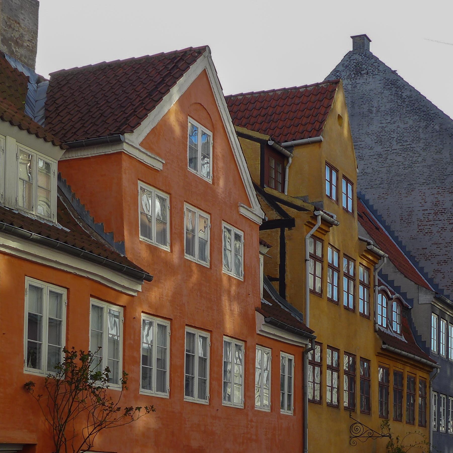
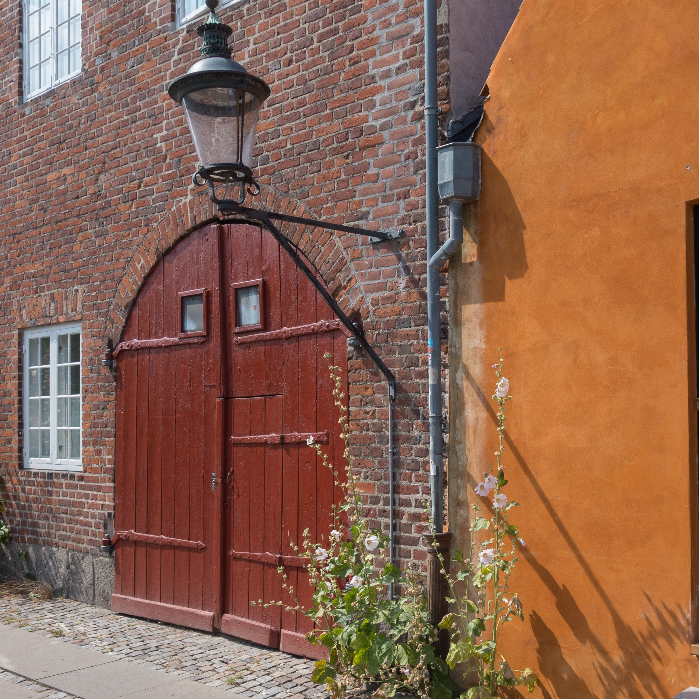
Water around the city - the seascapes of the sound - and water in and through the city - the water of the harbour, the lakes and the fountains of Copenhagen - along with the strong clear light, means that clean, deep blues are a strong influence on design and architecture here along with the softer distinct slate green colours found in the work of Arne Jacobsen and in many of the more recent buildings in the city with opaque panels of blue or green or with acres of glass picking up the tones reflected up off the water. Cream and sand colours, of many of the historic buildings, are important and, of course, greys tending to purple of the cobbles and setts contribute a lot to the colour and tone of the townscape but in the end, to my surprise, I realised that it is the dark yellow and deeper colours, from ochre through to the deep oranges and darker reds of iron oxides, used for so many of the painted buildings, that has made a real impact.
Of course, these strong earth colours are not unique to Copenhagen but are found throughout Denmark and in Oslo and Bergen and from Malmö to Stockholm and beyond, so they are truly Scandinavian colours and part of a strong colour palette that designers and architects see around them every day.


Fredericia at northmodern


With such a large number of designers and manufacturers showing their work at northmodern it is a place where you actually have to revise a few of those myths about Danish design. For a start Danish design is not all about white walls or, when colour is used, all safe, soft and muted.

Fredericia took the opportunity at northmodern to show their work with Uffe Buchard from Darling Creative Studio to create the ‘Double F Hotel’.

Shown in May in their city-centre store as part of 3daysofdesign, the spaces created represent a bar, a hotel lounge and a dining room. Publicity material from Fredericia talks about the ‘bright colours, unexpected textiles and … homey atmosphere, which today’s traveller demands … A home away from home.’

All the furniture is from the current Fredericia range but here shown against very strong colours and with dramatic use of lighting and plants and some furniture is shown with new textiles.

The concept is inspirational. 

Design hotels all over the world are a target market for any major design or furniture company, not just for the contract itself, but of course many travellers now seek inspiration from where they stay on holiday or business trips … a stay in a hotel is a chance to actually try out a new design or discover a new idea for fittings or decoration or use different and sometimes outrageous bathrooms … and then try to reproduce the look or track down the furniture for their own homes. 

Colours chosen by Uffe Buchard and the very confident juxtaposition of certain classic designs could certainly be copied in larger apartments in Copenhagen or Oslo or Sweden and particularly in older buildings with higher ceilings and large sash windows but would be equally theatrical in the new harbour-side apartments with their dramatic light reflected back up off the water. A large apartment only because in a small or cluttered space the use of such strong dark colours can be claustrophobic but maybe I'm still too cautious about using colour in this way ... maybe all that’s needed is inspiration … and maybe a little courage … or conviction.

Fredericia

ceramics at the Frue Plads market

Ane-Katrine von Bülow, Møntergade 6, Copenhagen


The annual craft market on Frue Plads in Copenhagen provides an amazing opportunity to see a huge range of styles, forms and colours of ceramics of the highest quality. 
To start with the mundane … pottery is simply carefully selected earth that has been formed into a shape that is dried; possibly decorated - with incised, applied or painted decoration - and usually, but not always, covered with a glaze and then fired in a kiln at a greater or lesser temperature, depending on the nature and qualities of the clay and the effect planned, for the finished work to form a resilient and long-lasting piece. 

But then the reality, or at least the reality here is that the ceramics produced are personal and dynamic. For a start, the ceramics reflect the quality of the clay chosen - fine and regular and able to form a thin and precise shape and fired at a high temperature - or heavier or even with an inherent colour ranging from pale grey through to deep brown depending on minerals present in the clay. And texture varies from almost impossibly smooth to almost gritty clay used for robust and organic work and the forms that are possible range from almost impossibly delicate to strong and sculptural and the finish from precise regularity through to an almost-free irregularity. Colour for a glaze or for painted decoration applied to the surface can be anything from a thin wash, reminiscent of a water-colour painting, to a depth of colour that is almost so thick and so deep that it is almost tangible and designs can be anything from fine graphic lines to the boldest and strongest shapes and patterns.

Perhaps it is this almost infinite number of permutations for form, colour and texture that make ceramics so attractive not least because each piece reflects the taste and the interests of the individual ceramicist and works are often the product of a long period of experimentation with the careful development of a technique to create the form or pattern envisioned.


Anne Rolsted, Kagerupvej 22, Regstrup

Charlotte Nielsen, Reerslevvej 20a, Ruds Vedby

Karin Patricia Jensen, Anna Queens Stræde 5, Helsingør

Bente Brosböl Hansen, 1685 Klåverröd, Sweden

Finn Dam Rasmussen, Haredalen 4, Tisvildeleje

Jytte Strøm, Torupvejen 109, Hundested

Helle Vestergaard, Kigkuren 8d, Copenhagen
Nelly Gaskin, Gammeltotv 2a, Skælskør

Birgitte and Hans Börjeson, FulbyGl Skole, Dansbrovej 2, Sorø

Note there were over 130 stalls at the market so the selection here is simply of images that give an impression of the huge range of styles and forms of work shown at the market. Also the event was packed with visitors and there is an amazing crowd dynamic where, as soon as you find some space and an open view of a work, at least six people, thinking you must have spotted something good, step in front of the camera to get a closer view themselves of what must be really interesting … because someone is photographing. And of course it is not the most appropriate time to talk to a maker/designer when they have to focus on those people actually buying … but several names were noted down for visits to studios later in the year.

Names highlighted here in bold green type should give a direct link to the artists own site and details but the web site of Danske Kunsthåndværkere & Designere has an excellent gazetteer with links and images.

all in the detail … Bispebjerg Bakke


It would be difficult to find two more different buildings in Copenhagen than the Jepersen office block by Arne Jacobsen and the apartment buildings at Bispebjerg Bakke from the partnership of the Danish artist Bjørn Nørgaard with the architectural practice Boldsen & Holm but what they have in common is that both designs depend absolutely on their focus on every detail of the design … not simply plan and elevations but the profile of window frames, the careful choice of the right finish and exactly the right colour for materials on the facades, the details of unique, custom-made staircases and so on.

Although the apartment buildings were completed in 2007, the initial idea went back many years before that to a conversation between Nørgaard and the chairman of the Association of Craftsmen so, from the start, an important aspect of the scheme was to have a strong link between an artistic concept and its execution with a very high level of craftsmanship.

Nørgaard made an initial model in clay so the design was organic rather than a building, like the Jespersen block, that was primarily about, what was for its date, very advanced engineering. Bispebjerg Bakke is about fluid lines and the potential for architecture to take sculptural form while the Jespersen building is about bringing to reality the beauty of a mathematically precise design. How you view the two buildings; how you experience the two buildings and how you move around and through the two buildings could hardly be more different and yet both depend on understanding completely the building methods that they exploited and both, with huge confidence, play games with forms and with styles that can only be achieved with the support of a client, willing to go with designs that were far from conventional by the standards of contemporary buildings.

Copenhagen in the snow

Houses in Kronprinsessegade from the King's Garden
 

This photograph of houses on Kronprinsessegade in Copenhagen was taken from the King’s Garden walking across to the National Gallery - to Statens Museum for Kunst - to see their major exhibition on the work of the Danish artist Christoffer Wilhelm Eckersberg on the last weekend before it closed.

Eckersberg was born in 1783 in Schleswig - then part of Denmark - and moved to Copenhagen in 1803 to study at the Royal Danish Academy of Fine Arts. He would certainly have known the King’s Garden and these houses. This large area of avenues and formal planting had been the private garden of the King’s house of Rosenborg, built in the early 17th century and just outside the city walls, but was opened to the public in the late 18th century and the iron railings and pavilions, between the gardens and the street, designed by Peter Meyn, date from about 1800 … so just before Eckersberg arrived in the city. 


the pavilions and railings between the garden and the street


Historiske Huse, a catalogue of historic houses in the city, that was published by the National Museum in 1972, indicates that these fine town houses date from the first decade of the 19th century and were part of the expansion of the city to the north in the late 18th century and early 19th century.

The National Gallery did not move to its present building until the 1890s and, through the 19th century, the royal collection of paintings, the core of the National Gallery collection, was housed in the Christiansborg Palace on the opposite side of the city but the Royal Academy, where Eckersberg studied, was in the Charlottenborg Palace on Kongens Nytorv just a few blocks from the gardens. The Academy had been established in the Palace in 1753 and is still in that building.

After a period at the Academy as a student, Eckersberg travelled first to Paris in 1812 to study under the artist Jacques-Louis David and then on to Rome where he remained until 1816. Back in Copenhagen he returned to the Academy and was appointed to a professorship in 1818.

As a product of the Royal Academy and as a teacher Eckersberg did produce grand paintings of historic and classical scenes but he is better known now for his portraits of wealthy middle-class families of Copenhagen society and for marine landscapes and for studies of his city and of his family. He lived in an age noted for rational investigation and he knew and associated with contemporary scientists - men like the physicist Hans Christian Ørested whose portrait he painted in 1822. Linked to scientific observation, an interesting areas of the exhibition at the National Gallery were the cloud studies by Eckersberg and his drawings and studies of perspective including a modern version of the viewing screen with gridded glass that he used for drawing in the landscape and a copy of notes and instructions on perspective for his students produced at the academy.

perspective study by Christoffer Eckersberg from the collection of Statens Museum for Kunst in Copenhagen

By comparing preparatory sketches and the paintings completed in the studio you could see that in the finished works he rationalised the view to create distinct planes, rather like theatre sets, so that more distant features could be pulled forward and given more emphasis. This might sound as if the works were therefore not strictly naturalistic but in fact he simulated well what the human eye does so well naturally … how often have people taken a landscape photograph and realised that a distant feature, quite clear to the human eye, looks more distant and much smaller in the photograph but then if a zoom lens is used, the distant feature looks more like what the eye can focus on but the width of view suddenly looks much narrower.

Eckersberg used the same rationalisation and the same sharp observation in his portraits and his drawings of interiors. In these works, you see some of the well-established and prosperous families of Copenhagen but remarkably little ostentation or show. Clearly, in part, that is because of the style in clothes at this period, with little expensive lace or ornate embroidery, but as with the uncluttered interiors you can see the expression of wealth in high-quality materials and well made clothing and furniture. 

detail of the painting of the Nathanson family from the collection of Statens Museum for Kunst in Copenhagen

The interiors themselves seem surprisingly but deliberately simple with shutters, rather than draped curtains, or at most blinds at the windows and stripped plain floors and unified and straight-forward colour schemes with all the panelling one flat and quite dark colour or at most one colour below the dado and a second colour for all the panelling and the cornice above the dado rail. There seem to be relatively few pieces of furniture in each room but that furniture is relatively restrained but clearly of good quality.

Similarly with the houses of this period, typical examples being those looking down into the King’s Garden, which are sober and elegant with carefully spaced windows and features such as doorways with columns that are based on classical precedents. Solid and respectable.

view of Sankt Annæ Plads, close to the Academy at Charlottenborg Palace


Does this sound familiar? I would not go so far as to suggest that what is called the classic period of Danish design from the 1950s and 1960s - the work of Arne Jacobsen, Hans Wegner or Finn Juhl - looked back to the first half of the 19th century in terms of style but at least you can see through the works of Christoffer Eckersberg an important stage in the development of middle-class Danish taste that can be seen echoing still in the best modern furniture and interiors in Denmark.


the daughters of the artist as they look out of a window in the Academy. Drawn by Eckersberg shortly before his death in 1853. From the collection of Statens Museum for Kunst and available through the Google Art Project

skills at northmodern


Within the large area at northmodern made over to Handmade, there were a number of traditional skills on display that are flourishing as their crafts are revived or revitalised and given a new focus to make them relevant in modern production. Traditional crafts used in distinctly contemporary ways.

Århus Possementfabrik established in 1917 showed their work in woven, braided, twisted and crocheted cord.

Århus Possementfabrik

Heidi Zilmer at northmodern


Heidi Zilmer had a stand at northmodern to show her hand painted wallpaper. 

Her work may sound like a rather specialist or tightly specific area of design … one that depends on very high levels of craftsmanship to produce one off pieces … and that is true in part but what is important and interesting, in terms of general design theory and practice, is that her work is not about a designer trying to develop a recognisable or signature style. Just the opposite. What is astounding is the wide range of styles in the designs from those that take historic wallpapers as a starting point through to designs that are starkly and uncompromisingly modern and from designs that can be delicate and subtle, looking like shot silk, to designs that are strong powerful and uncompromising statements. 

A starting point can be a pattern found in nature; a pattern inspired by an ancient oriental or traditional Scandinavian motif, or from playing with a strong geometric pattern but all are seen with an amazing eye for colour but it is a wide-ranging imagination that is crucial and an open approach that sees an idea or a form for inspiration that is then developed into a unique design but with a keen awareness of what is appropriate for homes and interiors now. 

For this display a basic colour of deep blue was chosen to link the works but that was a starting point for ornate Japanese style motifs, Viking patterns or the starkest and sharpest geometric pattern of gilded crosses.


Heidi Zilmer at Museumsbygningen


At the end of November Heidi Zilmer demonstrated her work and exhibited her wallpaper at Museumsbygningen, the gallery in Kastelsvej in Copenhagen, at the now well-established and regular show for artist-craftsmen and photographers, organised by Banja Rathnov under the title The Time is Now.


Heidi will have a stand at the major design fair northmodern that opens this Wednesday, the 13th January, at the Bella Centre in Copenhagen and runs for three days.


Functional architecture in Denmark?

farmstead from Eiderstedt now at Frilandsmuseet in Denmark


To talk about Functionalism in architecture in Denmark, usually refers to buildings designed in the middle of the 20th century and frequently cited as an example is the work at the university of Aarhus by C F Møller. The term implies an architecture where volumes and details have been pared back to what is considered to be essential and the architects take as their starting point the intended function. At a general level the term is linked with buildings that are often criticised by the public as being stark or even brutal and is usually associated with the use of concrete.

To take the word functional literally, as simply the general and practical starting point for the design of a building, then this building, the farmstead from Eiderstedt in Schleswig, now in the open-air museum, Frilandsmuseet north of Copenhagen, is perhaps the most beautiful and the most amazing Functionalist building in Denmark.

It was also possibly one of the most beautiful factories in Denmark. It is, to all intents and purposes a factory farm with a huge hay barn at the centre with a threshing floor across one side, entered through the large double doors in the end, and with stalls for cows, stalls for cows about to calve, stalls for horses and oxen, the working animals for the farm, and then across one end, under the same roof, the well fitted and comfortable home of the wealthy farmer with a diary and cheese store at the coolest corner of the building.


The plan and the division of spaces is determined completely by the structure with a massive wood frame supporting the weight of that great thatched roof. With everything under a single roof there was total control of the working process, security and of course sustainability with little natural heating wasted.

Above all, what is so striking about this vernacular architecture is its self confidence; the complete understanding of the building materials, exploited to the maximum, and the simplicity of the roof profile like an enormous sculpture. 


Below are a selection of photographs of vernacular and mainly rural buildings from Denmark that show just how confident these craftsmen were in their materials and in their own skills but they also had a clear appreciation of form and colour.

Frilandsmuseet, Denmark

Forge from Ørbæk, Funen

Farmstead from True, Eastern Jutland

Farm from Tågense, Lolland

Farmstead from Ostenfeld

looking back

historic interiors Den Gamle By, Aarhus


Most Danes I meet are curious to know why I have moved to Copenhagen. And when I say I am here to write about architecture and design their response is almost always the same and almost always accompanied by a slow shake of the head. Usually they say something about Danish design being great in the 1950s and 60s but not so much now … my guess being that they are wondering how I could possibly fill my time.

Of course they are wrong. Nordic design, and that includes Danish design right now, is going from strength to strength … see the review of New Nordic Design

But what is also worrying is the implication that people feel that Danish design was only great over a period of little more than two decades. 

Perhaps it is simply because people now link together design and industrial production.

A major exhibition at Designmuseum Denmark in Copenhagen last year on the work of Kaare Klint did much to establish just how much the great designers after the War built on design and teaching and on developments in the furniture industry in the 1930s as production moved from the workshops of cabinetmakers to new manufacturers.

However, even this fails to recognise the contribution of furniture makers and the designers of earlier periods of Danish history … furniture was not mass produced in a factory but never-the-less it was designed and designed well and the taste and the styles and the interiors of the late 19th century, the classic architecture and interiors of the early 19th century, and even back through the 17th and 16th century and earlier to medieval art and craftsmanship in Denmark all contributed to the tastes, preferred colour palettes, forms and shapes that we now identify as the characteristics of good Danish design.


historic interiors from Frilandsmuseet

My feeling is that possibly the success of Danish design in the 50s and 60s has acted almost like a barrier that stops people looking further back with pride at what was produced in earlier periods. I’m not suggesting that designers should reproduce earlier furniture or historic household goods as some awful form of pastiche or look back in an uncritical way but what you do see in vernacular furniture and rural architecture is a tremendous self confidence in the use of colour, more sculptural forms, an inventiveness and necessary self sufficiency with local makers using local materials.

Maybe this could be an interesting time to look at for instance wood turning to see if it could be given a modern twist; to consider natural stains; to wonder if maybe plate racks and corner cupboards could be useful.

It's not that young Danish designers need inspiration - it's just that sometimes it's interesting, as you move forward, just to check that you haven't  left anything useful behind and It might also be fun to see Danish designers being a bit more rude.


Note: by being rude I don’t mean by sending me insulting emails. Rude in English in this sense means robust and healthy and crude. And no. Crude doesn’t just mean that. 


bottom cross rails are rarely used for modern tables - look at the wear on the rails here and you can see how many generations have  put their feet up as they sat around this table

traditional colours and stains

Den Gamle By, Aarhus

Reading New Nordic Design, to write a review, one interview in the book in particular got me thinking. 

Erik Lith, Martin Lith and Hannes Lundin design and manufacture furniture from their workshop in Torsåker in Sweden under their label Lith Lith Lundin. Asked to talk about something they are proud of achieving they say they never give up ... and they go on to describe making the egg and oil tempera to stain their furniture. 

They began by sowing our own field of flax to make linseed oil, and tearing up old pine roots to make pigments. After harvesting, cleaning and pressing the linseeds and cutting, drying and burning the pine roots, we could start experimenting to find the best stain. *

Their web site sets out much more about the concept for their work and about the materials they use - materials that are sourced within a radius of 50 kilometres - and sustainability is a fundamental principle for their company. 

To quote from their web site, their aim is: 

To create trust and honesty towards customers and retailers, we work with complete transparency in all aspects of our operations. In this way we want to create an understanding of our enterprise and justify the price of our products. Our customers should feel certain that they are buying a sustainable piece of furniture at the right price, and to ensure that the planet’s eco system is kept in balance, the lifespan of the piece should reflect the time it takes for a replanted seedling to generate the same amount of material.

Go to the web site and you can see how each piece of furniture is numbered and it is possible to trace the source of all materials.

What seems particularly important here is that they are looking back to an earlier model for local or regional production using local materials. Although they are reassessing traditional techniques, they are applying them to designs that are without any doubt contemporary. This is not about returning to forms and styles from the past with a sense of nostalgia but is a clear and rational attempt to bring forward into the 21st century techniques and principles that, for many different reasons, were forgotten or ignored or deliberately abandoned in the last decades of the last century.

Linseed oil paint is still used in Sweden and has particular qualities. It usually has a soft matt finish on woodwork and for external use for barns and for timber houses and for doors it lets the wood breathe and with sun and rain and frost the colour slowly changes and mellows. The comparable finish in English vernacular architecture is to use lime wash over oak framing on cottages and farm buildings.

Open-air museums in Aarhus at Den Gamle By, at the museum north of Copenhagen at Frilandsmuseet, and the museum in Lund and the Stockholm open air museum all have information and displays about the use of traditional paints and wood finishes.

It is fantastic to see that young designers are reassessing their use for contemporary production. 

* Quote taken from New Nordic Design by Dorothea Gundtoft, published by Thames & Hudson


information about linseed oil paint from Den Gamle By, Aarhus

Samværket


On now at the Anne Black Studio on Gammel Kongevej in Copenhagen, just a few doors down from their shop, is an art show or installation with the title Samværket, which I think means Together. 

This is the result of an important and imaginative collaboration between Georg Jensen Damask, the Danish textile company, and Cecilie Elisabeth Rudolph, a young fashion and textile designer, who trained at Central Saint Martins in London.

The theme of the installation is a textile for Georg Jensen Damask called Mælkebøtte that was first produced by the company in 1972 from designs by John Kristian Becker, a Danish designer and weaver who trained first at the Gerda Henning Art Hand Weavers School and then at the Danish Weaving School in Geismar. His first work for Georg Jensen Damask called Calypso was designed in 1958 and he went on to produce over 30 designs for the company. 

Mælkebøtte, or Dandelion, is a strongly geometric and stylised design formed with a tight central square or grid of lines that extend out, curve and spread apart to form a circular representation of the seed head of the plant that are spaced across the fabric in a simple, tight and regular repeat.

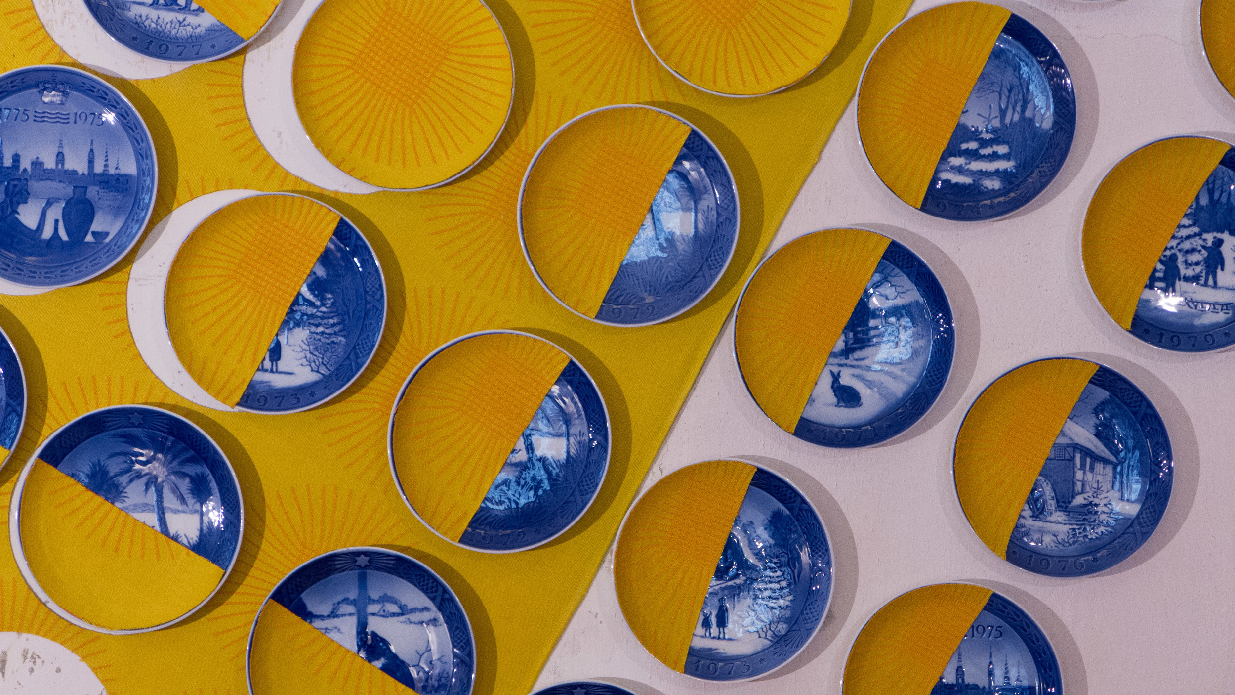
Georg Jensen Damask decided to re-issue the design and in 2014, to promote the table linen in three new colours, they asked people to return original tablecloths to the company to exchange for the new version but on the condition that they also provided the company with the story of how and when and why they or their family had originally bought that table linen. Well over 200 responded.

With such a strong response, they then came up with the idea of an installation to reuse these old tablecloths in an interesting way and chose the theme Together for togetherness. Mette Tonnesen, Marketing Manager at Georg Jensen Damask explained that their “ambition was to create a universe in a fun and informal way that retells stories from the Danish home.”

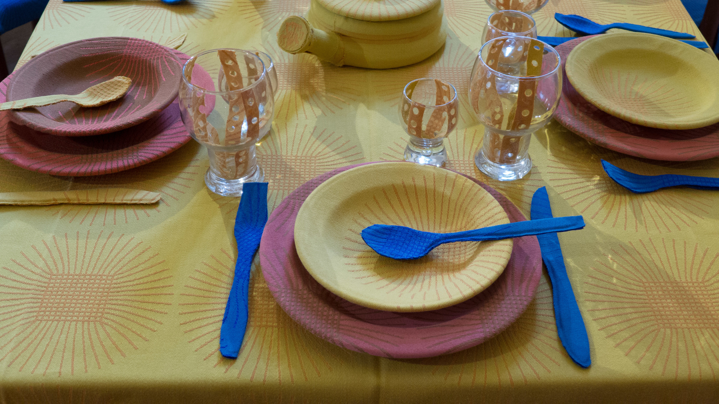
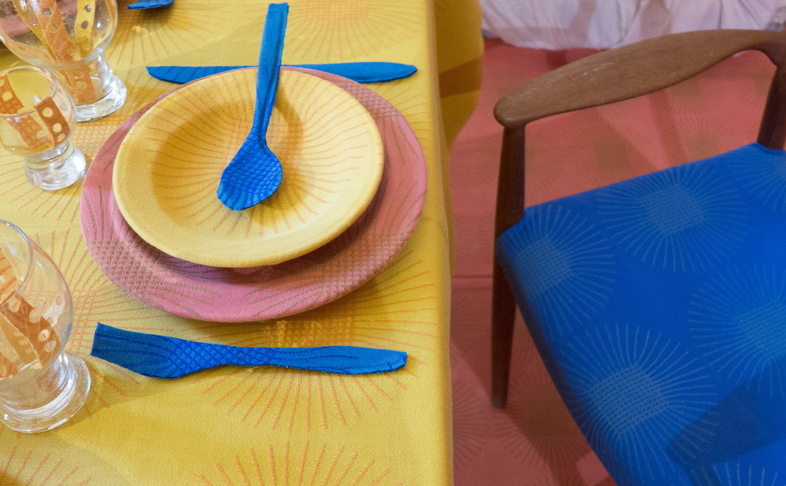
In the world created by Cecilie Rudolph, with a room set for an elaborate meal, the damask, in strong colours of deep blue, a salmon colour and deep yellow, has been reused for wall covering, upholstery, and flooring … in fact to cover nearly every surface including all the plates and cutlery of the table settings and even over an elaborate candle sconce on one wall … to create an incredibly bold and striking effect. 

Lengths of fabric have been cut with laser lettering repeating some of the histories and other stories are also on display. There have been other events at the exhibition to involve visitors and reinforce the theme of entertaining.


In some ways this installation is reminiscent of a project at 2nd Cycle in Helsinki for Artek. To mark the anniversary of the iconic Stool 60 … a design by Alvar Aalto that has been made by the company since the 1930s … 2nd Cycle took back stools that had been purchased over the years but again asked for personal family stories that explained why the stool had been important to them or why it had been repainted or who had covered the stool with fabric.

Both projects have identified that strong loyalty that customers can feel to both a company and a product but it also shows new customers that, when they invest in a well-made design, a design or product can become a cherished and important part of their own life story and possibly over a considerable period of their life.

Of course fine tablecloths from Georg Jensen reflect the important role of entertaining in Danish life and with it the tradition of setting a large table for a gathering of family and friends with good linen, china, glassware and cutlery.


Samværket continues at Anne Black Studio, Gammel Kongevej 103, Copenhagen until 16 October

Heidi Zilmer at northmodern


Heidi Zilmer, centre above, talking with potential customers?

She has a really strong display of her wallpapers at northmodern this year and today will be demonstrating the skills of hand painting, marbling, wood graining and how to use gold and silver leaf. She will be at the Danish™ stand this afternoon .... it normally takes me days if not weeks to write up posts so I thought for once I would try a "hot off the press" post before I head back to northmodern for the day.