Maud Jarnoux at Statens Værksteder for Kunst

the first stages of the project - assessing and recording the historic urban colour palette in the city
select any image to open all the photographs in sequence as slides


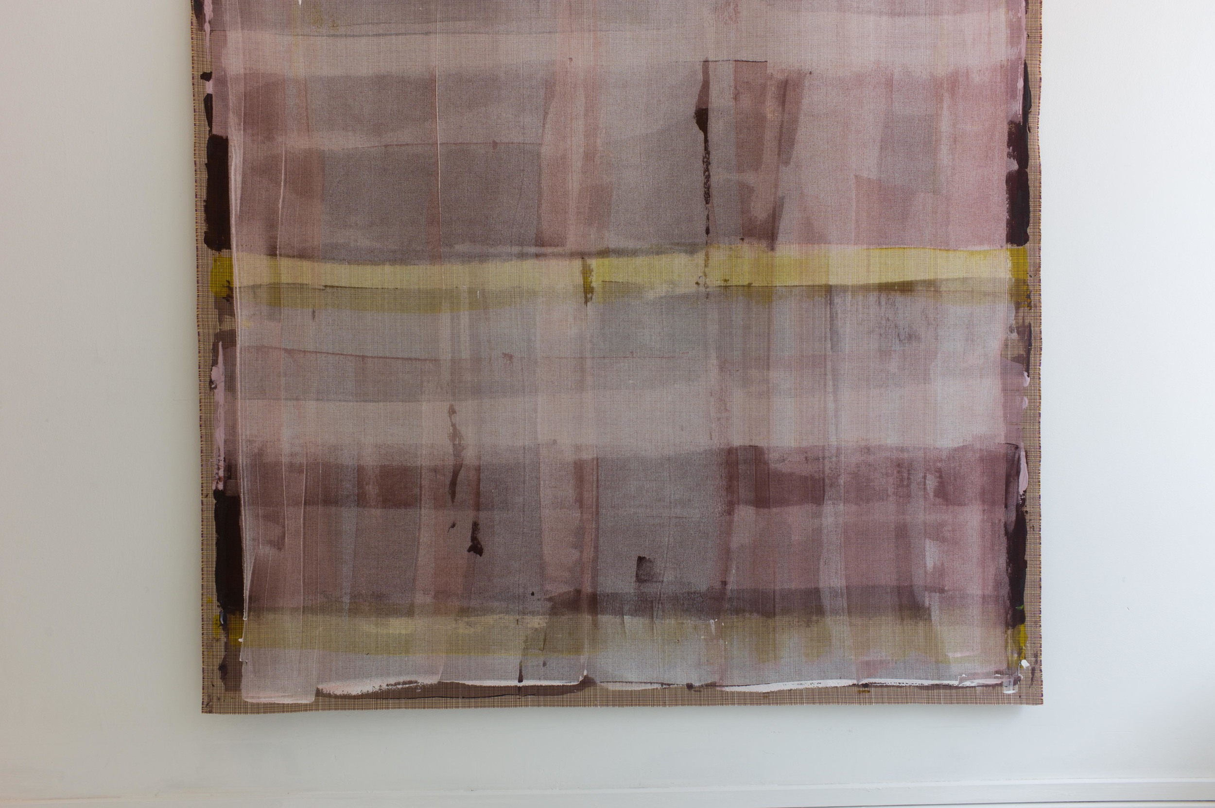
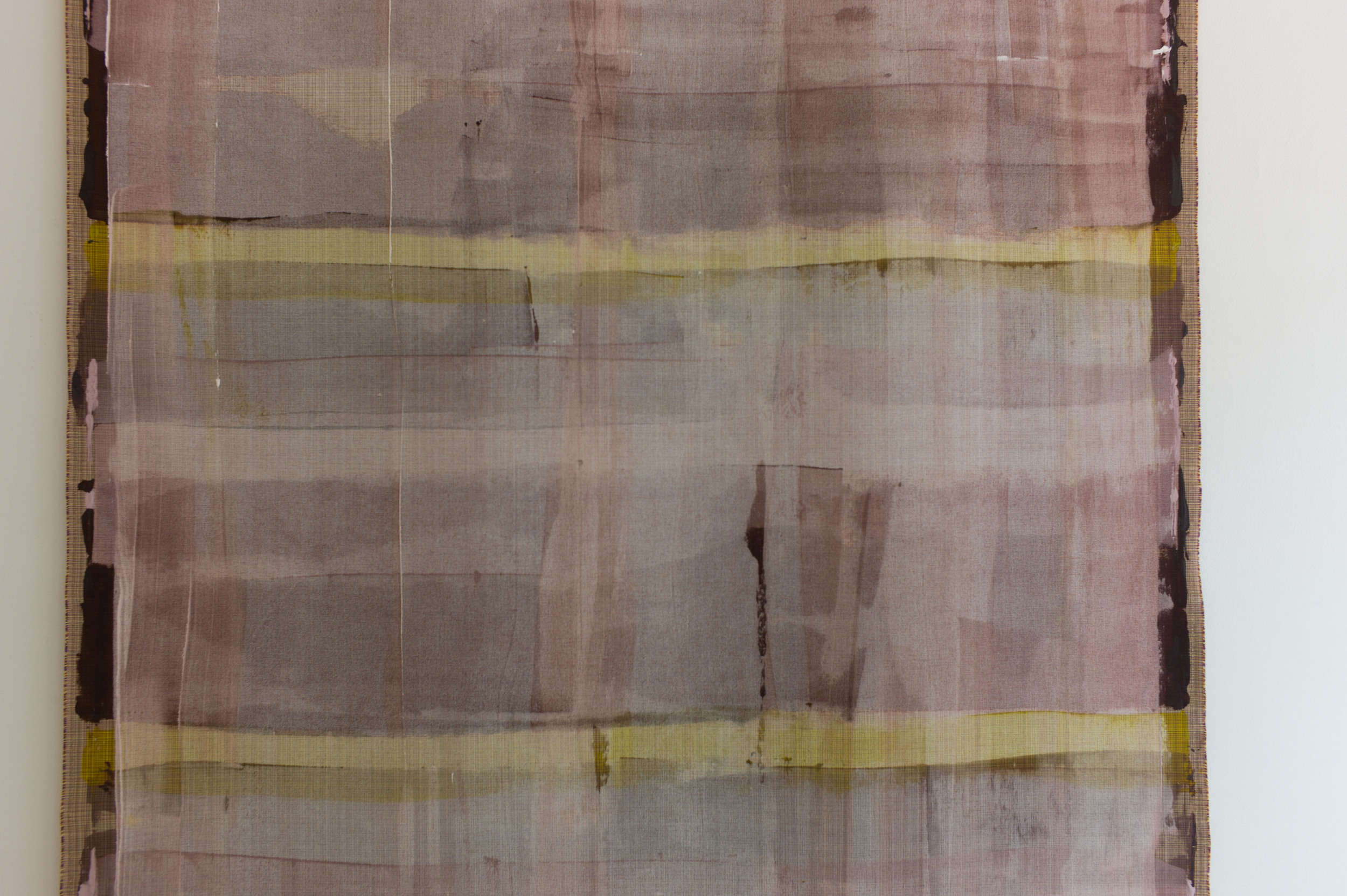
the colours on woven panels of thin ash veneer

Recently  I had the opportunity to meet the French designer and teacher Maud Jarnoux who was at Statens Værksteder for Kunst / the Danish Art Workshops on Strandgade where she has been working on a project inspired by the light and the colours of Copenhagen.

Walking around the city, she has sketched buildings and details of the architecture with annotations of the colours and matched those colours on site using pastels.

Back in the studio, those colours were matched in acrylic paint that was applied to sheets of thin card and again checked against small flakes of paint collected or checked against the notes and back out at the buildings.

Maud feels that the colours have not only changed over time - as fashions and paints change - but that colours also change from area to area and with the types of buildings and also with the light in different parts of the city that are reflected in subtle differences.

The next step, to me, seemed to be the amazing and incredibly creative and imaginative stage of the project.

Maud describes herself as a colour designer but she is also a textile designer. She cut the sheets of painted card into regular strips and these were then woven together in various combinations that were inspired by and reflect many of the colour combinations seen around the city on its buildings.

I have always been fascinated by the light in the city and in the colours of the plaster and the woodwork of the buildings and have got as far as appreciating that colour varies with the quality of the plaster or wood or stone. Uneven surfaces absorb or reflect light across a wall to cause distinct and often subtle changes in the density and quality of colours and - although Danes may take the work of Danish house painters for granted - the woodwork of doors and windows in the city, usually using linseed oil paints so with a matt finish, have a depth and a consistency and a quality of colour rarely matched in other cities …. but what this project by Maud Jarnoux did was open my eyes to strong and distinct combinations of colours in a single building: a deep warm pink on a wall combined with a gun-metal grey on woodwork or the range of deep green colours used for woodwork or stonework that is not actually a single consistent colour but a colour created by a range of often very different colours in distinct flecks or grain.

In a final stage, back in the workshop, colours were matched in linseed oil paint that was applied to split lengths of ash and these thin strips of coloured wood were woven together into large panels, using different weaving patterns and different combinations of colour, for what are, in essence, the weft and warp.

With woven fabrics it is the weave and the combination of different thicknesses of yarn and different colours that together create a texture and pattern and that controls how we perceive the overall colour and character of the textile. Here, that has been achieved with wood.

There is a link with the weaving of baskets and, in some cultures, the weaving of panels for walls and fences in willow or reed or split laths and other materials, with or without the bark stripped but this seems to me to be a truly remarkable and extremely imaginative project that makes us look again and reassess and appreciate anew the colours in the buildings around us.

 
_MG_4959.jpg
 

note:

I am extremely grateful to Maud for the time she spent to show me her work on this project, and to discuss what was done and why, particularly as it was at the very end of her stay in Copenhagen and she was having to pack away the work to return to Paris.

Above all I’m incredibly grateful that then she generously sent me her own photographs and allowed me to reproduce them here.

This is the only post in this blog that has used the photographs of another photographer throughout the piece but here the essence of the work is colour matching so it was important to use photographs that Maud herself feels reflect the work she has done. This is a remarkable and imaginative project to identify the colours that give a city and its light its distinct character.

These photographs should not be reproduced without permission.

This is another amazing example of the important role of the workshops for research and for facilitating creative projects in design and crafts in the city.
Statens Værksteder for Kunst

Samværket


On now at the Anne Black Studio on Gammel Kongevej in Copenhagen, just a few doors down from their shop, is an art show or installation with the title Samværket, which I think means Together. 

This is the result of an important and imaginative collaboration between Georg Jensen Damask, the Danish textile company, and Cecilie Elisabeth Rudolph, a young fashion and textile designer, who trained at Central Saint Martins in London.

The theme of the installation is a textile for Georg Jensen Damask called Mælkebøtte that was first produced by the company in 1972 from designs by John Kristian Becker, a Danish designer and weaver who trained first at the Gerda Henning Art Hand Weavers School and then at the Danish Weaving School in Geismar. His first work for Georg Jensen Damask called Calypso was designed in 1958 and he went on to produce over 30 designs for the company. 

Mælkebøtte, or Dandelion, is a strongly geometric and stylised design formed with a tight central square or grid of lines that extend out, curve and spread apart to form a circular representation of the seed head of the plant that are spaced across the fabric in a simple, tight and regular repeat.

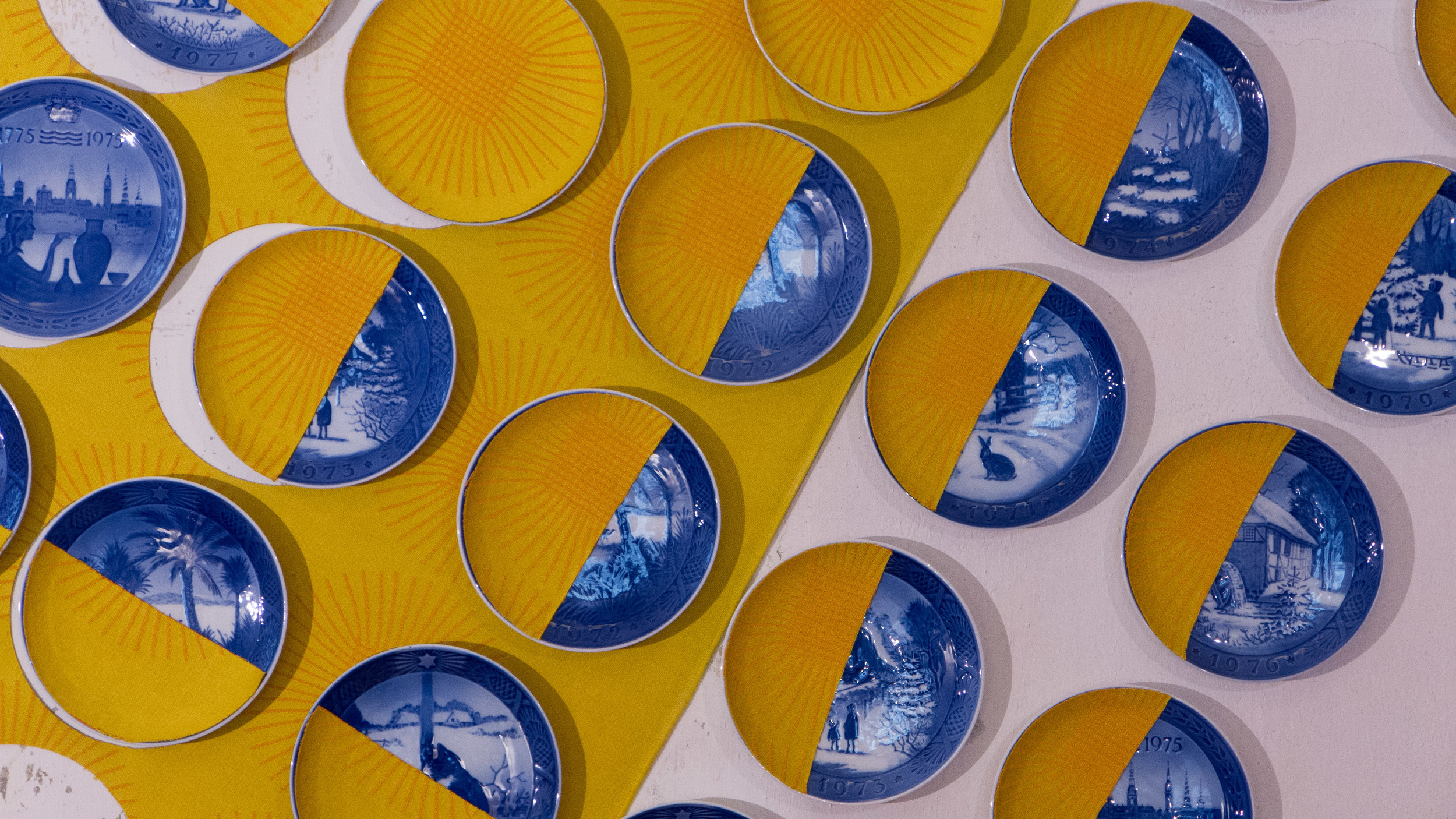
Georg Jensen Damask decided to re-issue the design and in 2014, to promote the table linen in three new colours, they asked people to return original tablecloths to the company to exchange for the new version but on the condition that they also provided the company with the story of how and when and why they or their family had originally bought that table linen. Well over 200 responded.

With such a strong response, they then came up with the idea of an installation to reuse these old tablecloths in an interesting way and chose the theme Together for togetherness. Mette Tonnesen, Marketing Manager at Georg Jensen Damask explained that their “ambition was to create a universe in a fun and informal way that retells stories from the Danish home.”

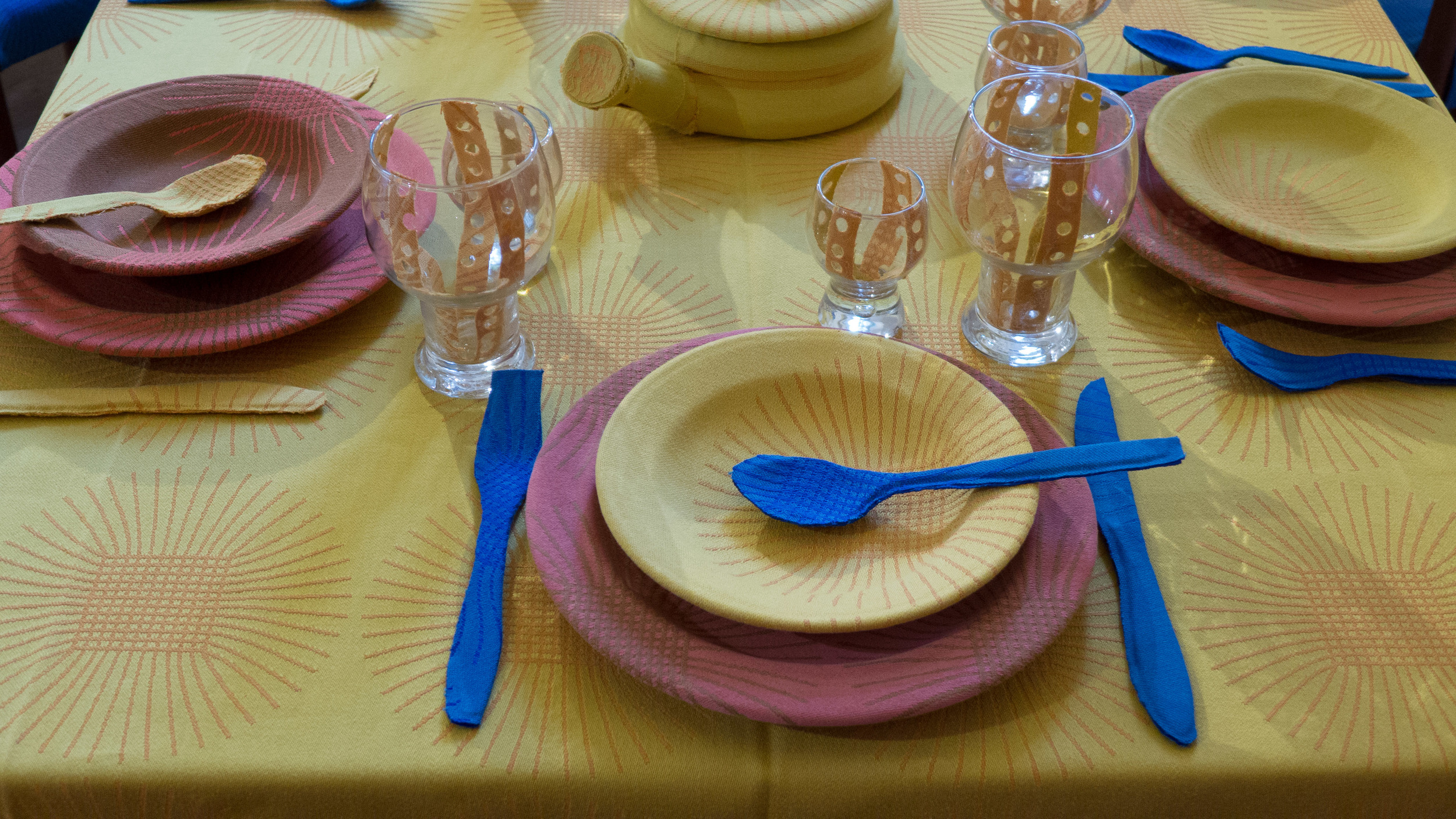
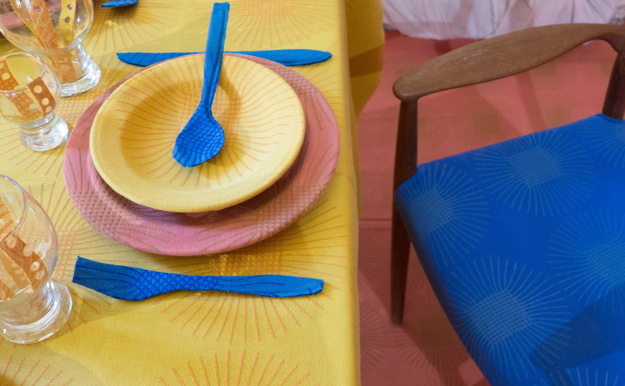
In the world created by Cecilie Rudolph, with a room set for an elaborate meal, the damask, in strong colours of deep blue, a salmon colour and deep yellow, has been reused for wall covering, upholstery, and flooring … in fact to cover nearly every surface including all the plates and cutlery of the table settings and even over an elaborate candle sconce on one wall … to create an incredibly bold and striking effect. 

Lengths of fabric have been cut with laser lettering repeating some of the histories and other stories are also on display. There have been other events at the exhibition to involve visitors and reinforce the theme of entertaining.


In some ways this installation is reminiscent of a project at 2nd Cycle in Helsinki for Artek. To mark the anniversary of the iconic Stool 60 … a design by Alvar Aalto that has been made by the company since the 1930s … 2nd Cycle took back stools that had been purchased over the years but again asked for personal family stories that explained why the stool had been important to them or why it had been repainted or who had covered the stool with fabric.

Both projects have identified that strong loyalty that customers can feel to both a company and a product but it also shows new customers that, when they invest in a well-made design, a design or product can become a cherished and important part of their own life story and possibly over a considerable period of their life.

Of course fine tablecloths from Georg Jensen reflect the important role of entertaining in Danish life and with it the tradition of setting a large table for a gathering of family and friends with good linen, china, glassware and cutlery.


Samværket continues at Anne Black Studio, Gammel Kongevej 103, Copenhagen until 16 October

Hjemlighed .... homeliness


Ten designers, architects and craftsmen have come together to exhibit their work in a private apartment in Lavendelstræde - a street in a tightly built up area of historic buildings just to the east of the city hall in the centre of Copenhagen.

It is an amazing apartment spread over two upper floors and the attic space of the tall, narrow 18th-century house with a striking mixture of original parts, including the roof structure, but with modern features such as an open metal staircase, a long wall of modern kitchen units and an area of glass floor between the attic bedroom and the kitchen and dining room on the level below.

The kitchen area opens onto a large roof terrace with views over the Copenhagen skyline looking towards the tower of Vor Frue Kirke. 


This is not just a chance to see a very striking apartment but, of course, to see the works displayed in a home, in the rooms of the apartment, along with books and furniture and kitchenware of a very real domestic setting.

Perhaps we have created false divisions between craftwork, such as tableware, that we can use in our homes, and the works of artists working in the crafts that we see as gallery pieces. These works, in this exhibition, were not, specifically, designed and made to be contained in an art gallery or museum - although many of these artists have their works in museum collections - but they can and should be seen and appreciated in a home. These pieces stimulate comment, attract admiration, stimulate discussion, stir people to decide if they love, like or even dislike the pieces. Owning and enjoying original art and craft pieces is not exclusively the prerogative of the public gallery or the private wealthy collector but original works of art or of craftsmanship really do have a place enhancing our lives in our homes.

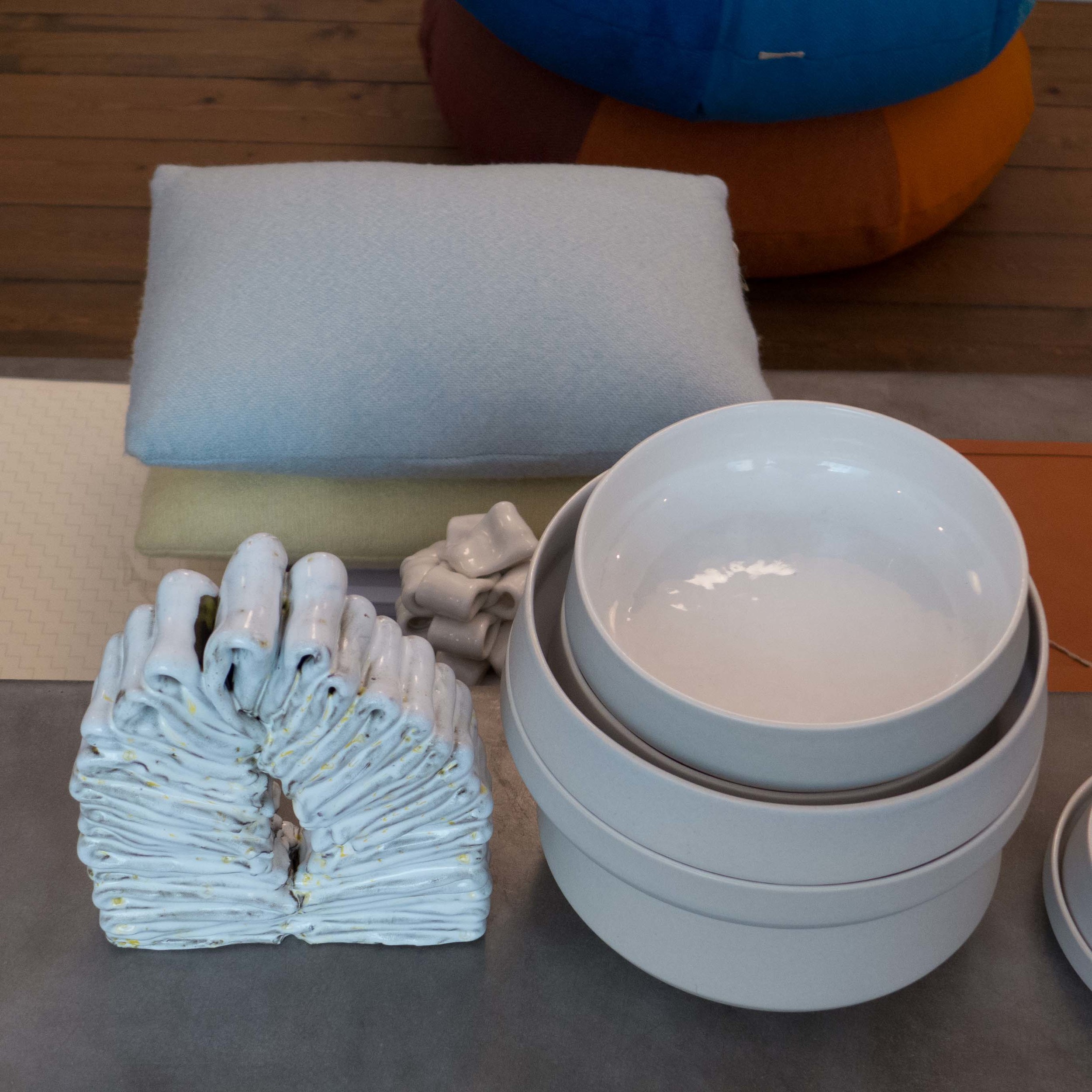
Works shown here range from ceramic multiples through printed cotton squares displayed on a clothes drier on the roof terrace, to a bench in smoked oak supported on upturned stoneware vessels and there are monumental architectural urns in stoneware. Porcelain lights over the main table are a homage to the iconic Danish PH lights and striking jewellery in braided or plaited white plastic beads, forming deep ruffs for the wrist or ankle but set in a framework of a house, reflect the title of the exhibition. The one odd work, and only odd because it was large and set diagonally it fills and dominates the space of the bathroom it is displayed in, is a long narrow glass case with an arrangement of single socks with no pair.

This piece, Finds by Morten Sørensen, illustrates really well one very important role of art which is to point out or isolate something that either we have not thought about or points out an absurdity or a universal experience that we rarely even think about. Other works show how artists experiment with materials and forms pushing boundaries that really should not be there and multiple works are a really good way of emphasising subtle differences or step changes or variations.

toPHøj in porcelain by Anne Tophøj

Indretning in stoneware by Marianne Nielsen and Kristine Tillge Lund

I tid og utid by Anne Tophøj and Theis Lorentzen

Base in oak, aluminium and stoneware by Anne Dorthe Vester and Maria Bruun


Architects, designers and artists taking part include:

Anne Fabricius MøllerAnne Tophøj, Anne Dorthe VesterMaria BruunJohan Carlsson

Katrine BorupKristine Tillge LundMarianne NielsenMartin SørensenTheis Lorentzen


Hjemlighed ... an exhibition at Lavendelstræde 8, 1462 København K continues until 15th September.

the Biennalen for a second time

At the weekend I went back for a second look at the Biennalen for Kunsthåndværk og Design out at the Carlsberg site. My first look at the exhibition was at the crowded opening so it was good this time to see the works with fewer people around but also I wanted to take some extra, specific, photographs of the pieces by Helene Vonsild to add to the profile of her work that I have posted here.

The exhibition continues at Bryggernes Plads until the 29th August.

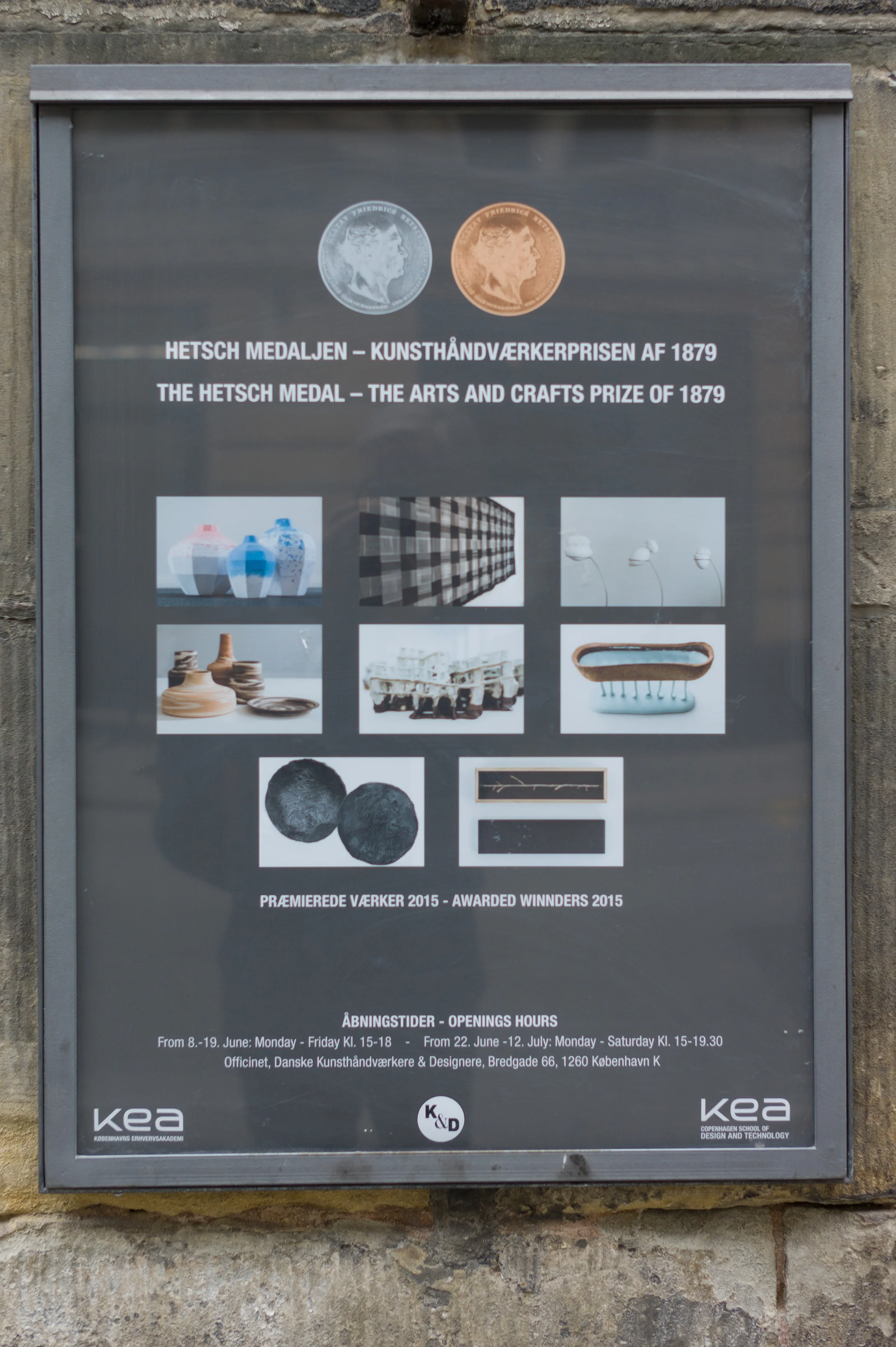
Vibeke Rohland awarded a Hetsch Medal

In April I posted about an exhibition in Copenhagen at the Superobjekt Gallery of work by the textile designer Vibeke Rohland. In May, at Copenhagen City Hall in the presence of Her Majesty Queen Margrethe, Vibeke was awarded the prestigious Hetsch medal - a major Arts and Crafts prize awarded first in 1879 and now hosted by kea - the Copenhagen School of Design and Technology. This year the award committee included the artist Björn Norgaard, the architect Kristin Urup, the museum director Bodil Busk Laursen and As Øland from Dansk Fashion and Textile.

Works by the winners of medals are now on display at Danske Kunsthåndværkere & Designere, Bredgade 66 and the exhibition continues until 12th July.

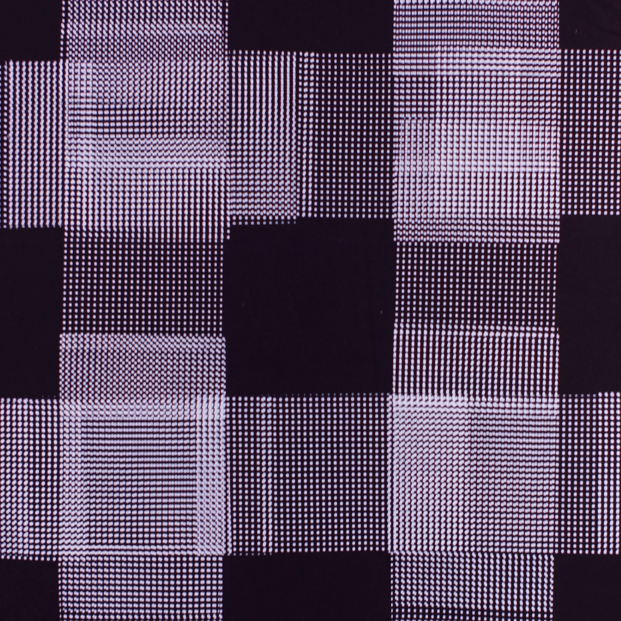
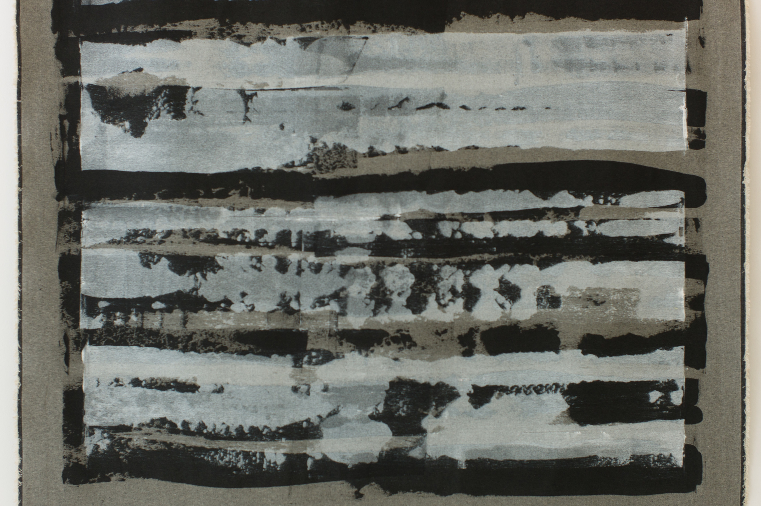
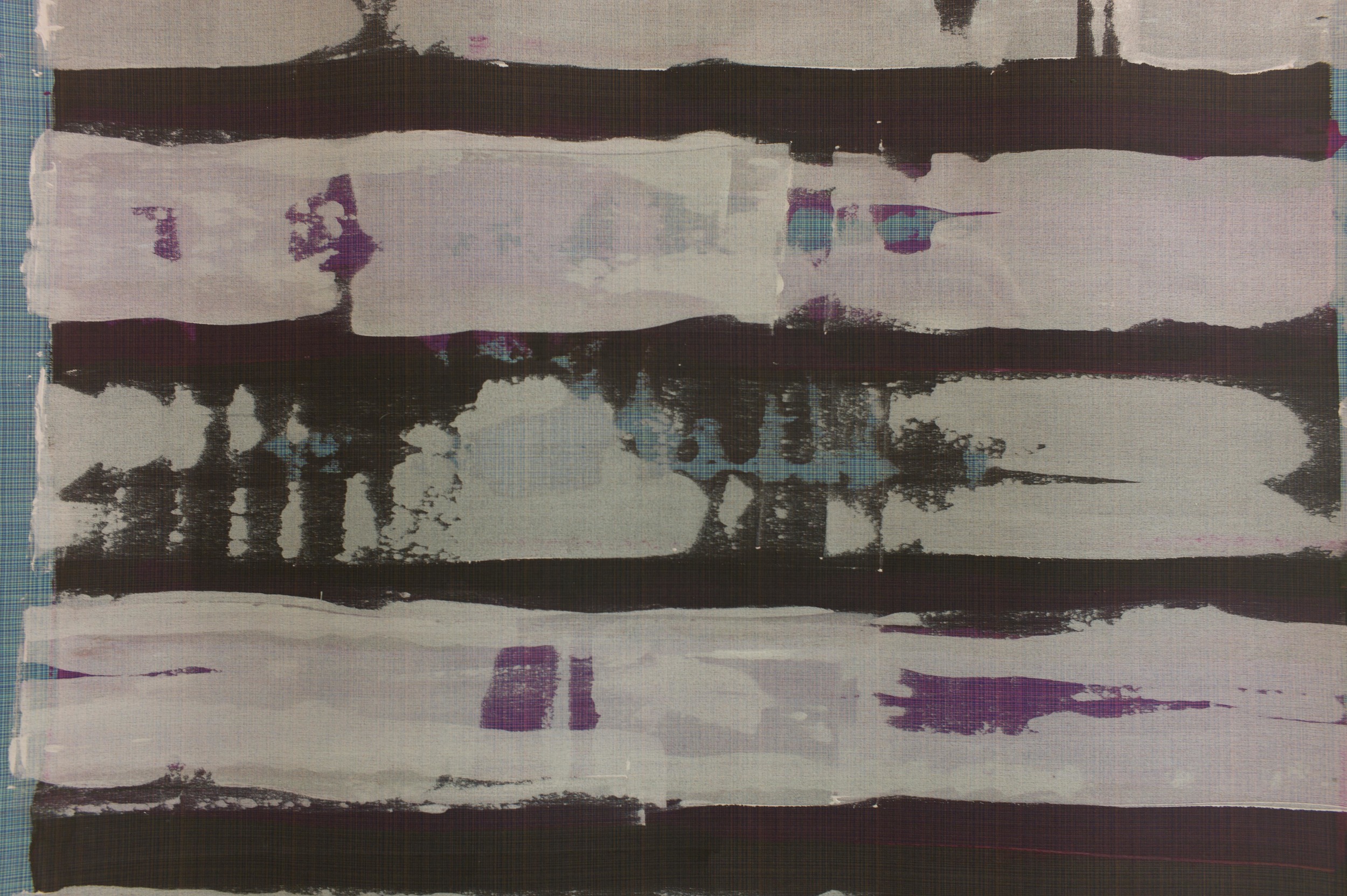
The striking and very impressive winning work by Vibeke, Crossroads’n Ginham, is a silk-screened piece in white on a rich black. The starting point for the piece was an exploration of the well-known gingham pattern which is a traditional woven textile with a tight regular pattern of small squares - often white on blue, white on red or white and pink. Gingham is woven in a light or medium-weight cotton; the finished textile is double sided and because it was light and strong as a fabric it was often used in the USA for clothes for children or for table clothes and curtains … think Dorothy in The Wizard of Oz and picnic baskets.

In contrast, the work by Vibeke is printed, single-sided and forms a substantial hanging with the weight of a tapestry with incredible visual strength and impact; gingham is a tight repeat of squares and this piece by Vibeke is actually a design without repeats although the pattern seems at first to be quite regular and where gingham has tight small squares, that together often form larger checks, close examination of this piece shows the design to be made up with small regular dots of thick, almost impasto, layers of white dye … so, as in other works by Vibeke, this is, if textiles can be subversive, subversive. It’s a very very clever exploration of tight texture with layers of pattern to give visual richness and layers of print built up to give a strong sense of depth … an exploration of a traditional textile technique to take it forward in a striking new form.

The works by the other silver medallists are on display and include pieces by the ceramist Charlotte Thorup, brooches by the goldsmith Janne K Hansen and an elegant and finely-made piece in wood by the cabinet maker Kristian Frandsen along with works by the winners of the bronze medal.

Kitub


The web site for the shop has the heading KITUB a small shop in Copenhagen … and it is small … but it is has a good and really interesting selection of hand-made ceramics, small ceramic sculptures, textiles, wall hangings and clothing. 

For me, what makes this shop particularly important is that it carefully occupies an interesting middle ground … many of the pieces sold here are by local craftsmen and are hand made but the aesthetic is very much the clean, straightforward lines and the appropriate use of colour and restrained pattern found in most classic Danish design but usually now associated with large-scale manufacturing.

As at Next Door, Mette Sørensen, the owner of Kitub, uses Instagram and Pinterest to keep customers updated. The Instagram site is really very good. Generally, I’m not a great fan of Instagram … I get annoyed by selfies and too many photos that should be headed “heh look what I’m doing now” … but the photos on the Kitub Instagram site are carefully produced and include good details of textiles and ceramics that are taken under natural light in the shop, and are all the better for that, but there are also some photographs of local scenes; photographs from visits to workshops and studios; photos of art in local galleries and so on that all help to explain the taste and the interests that lie behind the selection for the shop. 

What I think I can see here is that shops like Kitub are carefully curated … they cannot compete head on with big design retailers in terms of range or amount of stock but, like an art gallery, they can sell their expertise and sell a clear and specific understanding of their chosen areas of design. When I discussed this with Mette she looked slightly sceptical … I got the impression that maybe I was making it all seem too precious. 

As with the other independent shops in Copenhagen, described in these posts, there is a strong sense of being in and of the community. When you are in Kitub local people going by wave or stick their head round the door to say hello and chat. This close relationship extends to a strong bond with the makers and craftspeople whose work is sold here. On one visit I arrived for the tail end of a discussion between Mette and a potter about what was selling well and just why and, looking forward, what colours and glazes might be tried for local customers … a really good form of feed back.
 

Kitub, Classensgade 10 ST TV, 2100 Copenhagen Ø, Denmark

Kitub on Instagram

Clouds from Kvadrat

There is a new installation in the entrance hall of Designmuseum Danmark.

Clouds from Kvadrat is a set of fabric tiles linked with rubber bands and here hung from the ceiling. The system is by the French designers Ronan and Erwan Bouroullec and is commercially available in two fabrics and eleven colours.

Clouds

Ung Svensk Form - Malmö

POM - Piece of Me table - one of a series of three desks by Frida Erson and Martin Eckerberg

On the wall behind POPOP by Ida Pettersson

A new exhibition, Ung Svensk Form, opened at the Form Design Centre in Malmö on Friday. It is a show by young Swedish designers and includes textiles, ceramics and glass, furniture, jewellery and fashion. 
This is a competition and exhibition that has been staged ten times by Svensk Form since 1998 and many previous exhibitors are now well established either within the Swedish design professions or internationally. It is open to students and to young designers under 36. As well as the exhibition of their works which go on tour, designers are awarded scholarships, practical placements and workshops to gain more experience and an understanding of production processes.

The works included prototypes and concepts to show artistic experimentation.


Charlie Styrbjörn - Ladder produced by Gebrüder Thonet of Vienna and his Part Goat chair


Umami table and service - dining table in ash with powder coated steel legs and glasses and dinnerware which have rounded bases by Sofia Almqvist


Snow Shoe Chair by Hampus Penttinen


Jacquard-woven waffle binding by Matilda Dominique


A list of the designers and a copy of the exhibition catalogue are available on line.

The competition and exhibition are supported by IKEA and the Stockholm Furniture & Light Fair.

The exhibition continues at Form/Design Center in Malmö until 7 June


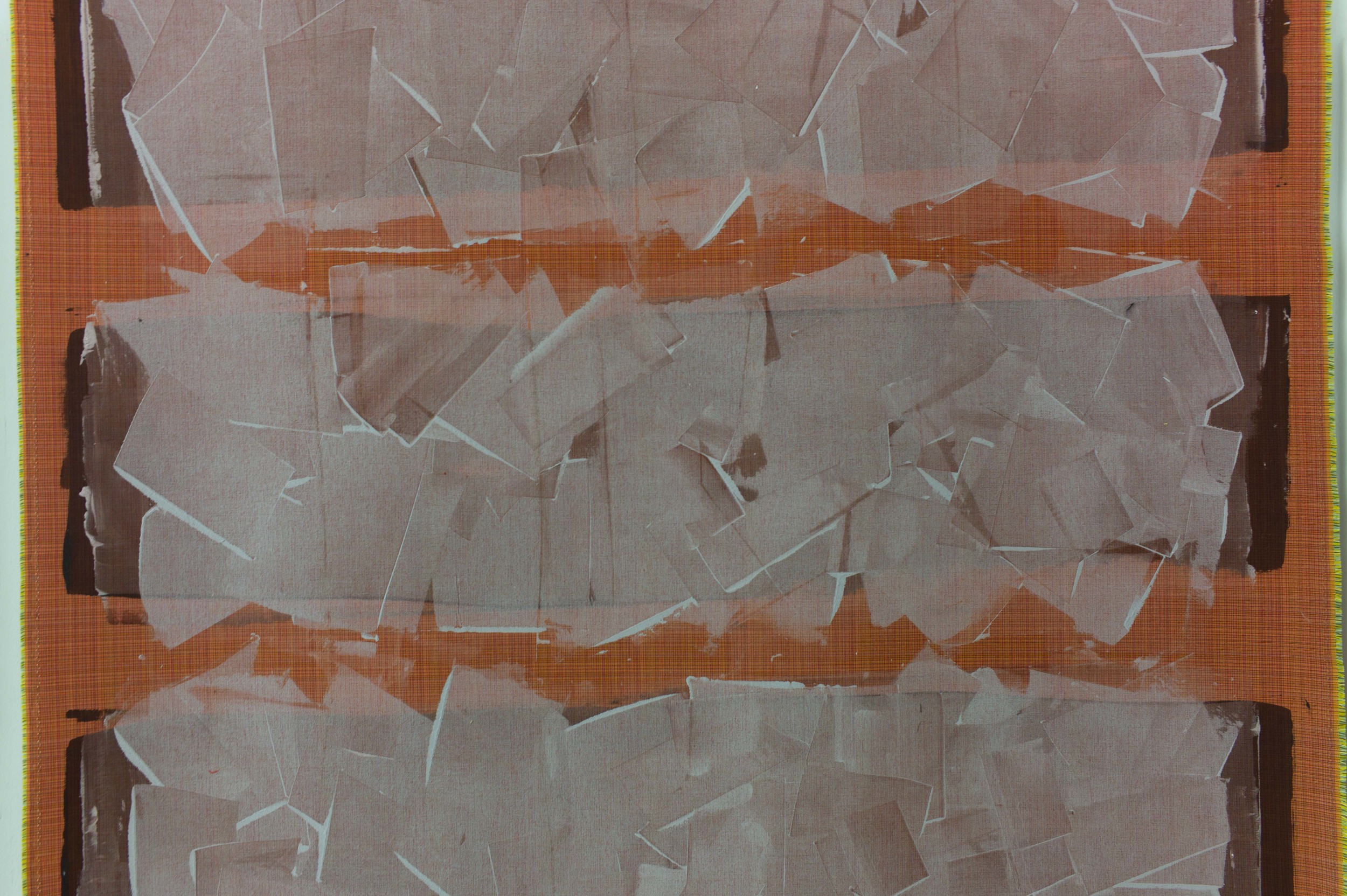
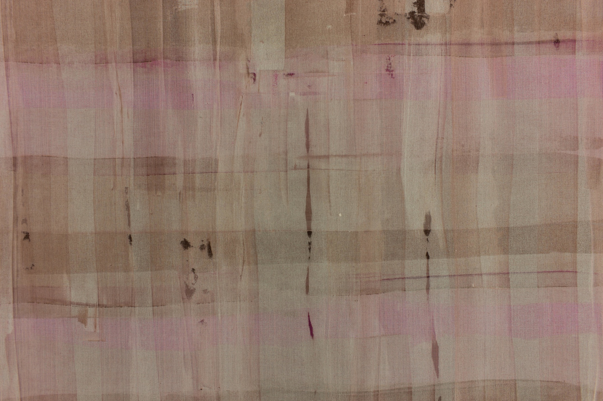
CrossRoads - an exhibition of the work of Vibeke Rohland

Superobjekt Gallery from Borgergade

Vibeke Rohland talking to a visiting art group on the day after the opening


An exhibition has opened at the Superobjekt gallery in Borgergade in Copenhagen showing recent works by the artist and designer Vibeke Rohland. 

Normally, I do not post about artists or about art gallery exhibitions on this site - trying to keep up with design and architecture is enough of a struggle for me without getting distracted, however pleasant or interesting that would be - but the meeting point of art, design and craftsmanship is incredibly important. And that is exactly what you can see in the Crossroads exhibition.

Marketing men and accountants, I am sure, see the different ‘disciplines’ in different boxes but one of the huge strengths for Nordic design in general and for Danish design in particular, is that the separation of roles in academic training and in professional practice is blurred. In Denmark many furniture designers have trained initially as architects, product designers come through a craft background as makers, designers appreciate that they have to understand the craft techniques as the starting point for commercial production and, through a long well-established tradition, many classic pieces of furniture have been produced by a close collaboration between the designer and cabinet makers. 

However, even in my own mind, it is difficult to define clear boundaries. At one end of the scale a unique piece, signed and often dated because it can be seen as part of a sequence in the development of an artist’s work over the years, is clearly ART and at the other end of the scale something produced in a distant factory and shipped back for sale is product design. Between though is the problem. A potter or glass maker might make a one-off piece for an exhibition; a set of matching pieces - a series of handmade pieces - for a client and then a related design for mass production by a well-known design brand. So one unique piece is a work of art, a set is crafts-made, and more than ten? more than twenty? several hundred? several thousand? becomes a product run? And how should artists, makers and designers interact? Surely they have to! Surely a designer needs to check back in to making something by hand every now and then and a craftsman could benefit from the occasional fee of a commercial run.

Vibeke Rohland very clearly and deliberately breaks through these boundaries. Here, at the Superobjekt gallery, many of the large and unique pieces are actually produced over commercial fabrics that Vibeke designed and that are made by Kvadrat. Even the techniques shown here are a beautiful subversion. Many of her pieces with a limited-run as well as the commercial designs have been produced by silk screen printing so always with slight variations because it is not, strictly, a mechanical process.* Here, for  the largest pieces in this show, the dye has been laid on and taken across the fabric using a squeegee but without the screen and its mask as the control or intermediary. Each area of colour therefore is and has to be a unique area of the overall work. There can, obviously, be no precise repeat pattern. The colour appears to be built up in layers and that is exactly what has happened.


A recurrent theme of Vibeke’s work is using what appear to be simple repeats of pattern but with complex overlays of colour using intensity of colour to create changes in the depth, light and space within the pattern. A series of grid or cross-hatched designs, some framed and included here, and experiments she has produced with large wheels or circles as the underlying form, created with broad cross spokes, uses the same approach ... being apparently very bold but actually creating a finished piece that is incredibly subtle in it’s use of colour and it is the variations in the intensity of colour or variation in the thickness of pigment which create the sense of depth. Another series uses strict repeats of large but simple shapes like crosses or dashes but on a huge scale to undermine the viewers judgement of distance from the work. The repeat becomes a texture but again not something mechanical because it is slight but deliberate changes or slight differences in the units over a surprisingly large repeat making up the pattern that bring the design to life.


Again, this same approach to colour and pattern can be seen in the commercial designs by Vibeke for Kvadrat. Her commercial woven and printed textiles use small points or fine lines of colour to build up pattern and form and shadow so it actually comes as a surprise when you see the large overall size of the repeat of the pattern. In the same way that the layers of colour on the pieces in this show build up to form a complex and large-scale work, the small points of colour and the very very careful combinations of colour in the furnishing fabrics are used to create depth and an effect of shadow to build up the final bold overall pattern.

The works on show here are amazing but it is also worth tracking down the commercial designs from Vibeke Rohland that have been produced by Georg Jensen Damask, Bodum, Hay and Royal Copenhagen. Spend time looking at the on-line site from Kvadrat to see the designs for fabric there - including Map, Satellite, Scott and Squares - with a wide range of colours in each design. The small sample at the start of the Kvadrat page reduces these textiles to a simple small area of dots or graph-paper grids but clicking through and moving out to the broader view these become complex patterns that are again both bold and subtle ... that same effect as you move close up to and then further back from the pieces in the gallery.

CrossRoads continues at Superobjekt Gallery Borgergade 15, København until 2 May 2015

Vibeke Rohland

Kvadrat


* And yes ... I know that screen printing can be incredibly precise when used as a commercial process. Many years ago I went to the Sanderson factory in west London and watched the hand printing of fabric that was 1.5 metres wide with a 900 mm repeat with men on either side of a screen printing alternate sections down a massive length, loading the dye by judgement and experience and taking the squeegee backwards and forwards between them and then returning down the length printing the gaps and it was impossible to see the joins ... but an important quality of screen printing on a textile that itself may have blemishes because it is organic rather than mechanical gives the finished textile its character and warmth. Perfection can be really dull.

lovewood

A huge strength of the northmodern furniture and design fair is that it gives the visitor a really good chance to compare the very different approaches taken by the different designers. Many of the companies exhibiting are small and many are recent start ups and many are producing similar things … chairs, tables, decorative objects in wood. That is not a criticism but in fact just the opposite because what you see is a phenomenal range of styles and different approaches to marketing, packaging and so on which shows clearly the strength and the depth and breadth of the Danish design and production industries.

There is a lively and varied approach to design in Denmark from the novel and experimental through to those companies that want deliberately to build on the traditions of good design and high levels of Danish craftsmanship in their own products.


Inside the boxes for The Donut from Lovewood it says that they have been “produced and designed in Denmark” … by “talented and dedicated furniture artisans with great respect for the Danish design tradition.”

From Hammershøj, about 50 kilometres drive north of Aarhus, Lovewood was launched in 2014. There were three initial products:

  • The Donut - a tea light or candle cup - in wood 
  • cushions that are covered in traditional horse blanket and
  • wall clocks with the face in wool fabric or leather and hung from a leather strap.


The Donut is a beautiful, simple piece but very very carefully designed. It fits neatly into the palm of the hand so is tactile - when was the last time you couldn’t resist picking up and cupping in your hands a candlestick? - and by just pushing one finger up through the hole in the centre you can push the tea light up to remove and replace it. There is a clever inner ridge that keeps the tea light centred and clear of the inner sides - a neat subtle touch to the design. Its soft shape shows the grain of the wood well but it also comes in a number of very carefully chosen and mixed colours … at DESIGNTRADE last August Martin Skov explained to me just how much time had been spent on getting the colours right. Similarly with the cushions it is clear that there is not only a love of a traditional Danish cloth but it is combined with real care taken over stitching and finishing.


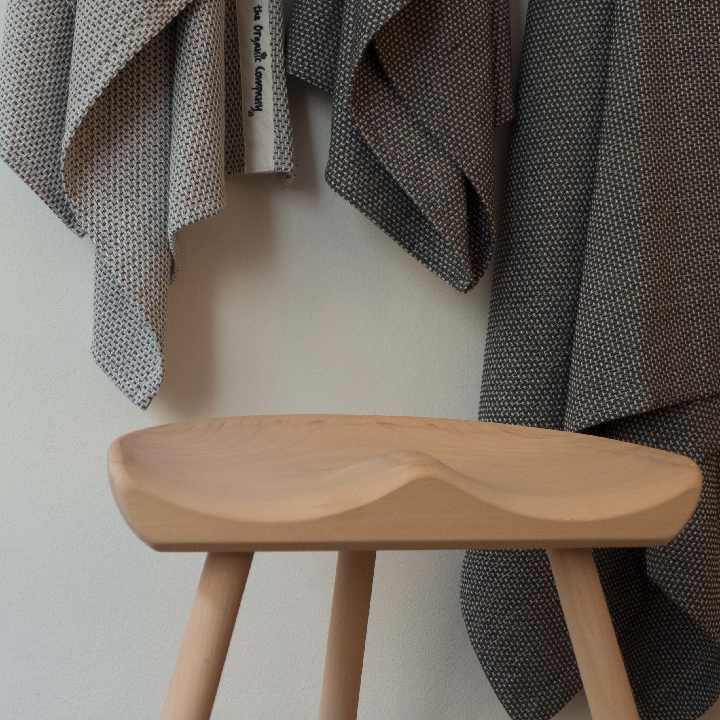
A major new addition for the northmodern show was a stool with three legs and cross rails in oak and a leather-covered seat in tan or black. As with their other products the stool has a remarkable level of care in both design and production … the seat is gently hollowed and well upholstered and the underside of the seat is also covered with leather … that makes it very pleasant to pick it up and move it … with many stools you look at the underside and you see and feel roughly finished mdf or ply. The mark of a good product is when even the parts that are not immediately obvious are as well finished as the rest of the piece. The legs are interlaced with leather cord … clearly not structural but here a nostalgic reference back to a piece of furniture fondly remembered from childhood where, as you move around the stool, you see an interlocking star that changes with your viewpoint. Many of these types of bar stool can feel too high and unstable and when in plastic very unforgiving on the backside … the stool from Lovewood could not be more comfortable and the tree legs make it inherently more stable if the floor is uneven and the T-shaped cross-bars form a foot rest at the front that is at exactly the right level.


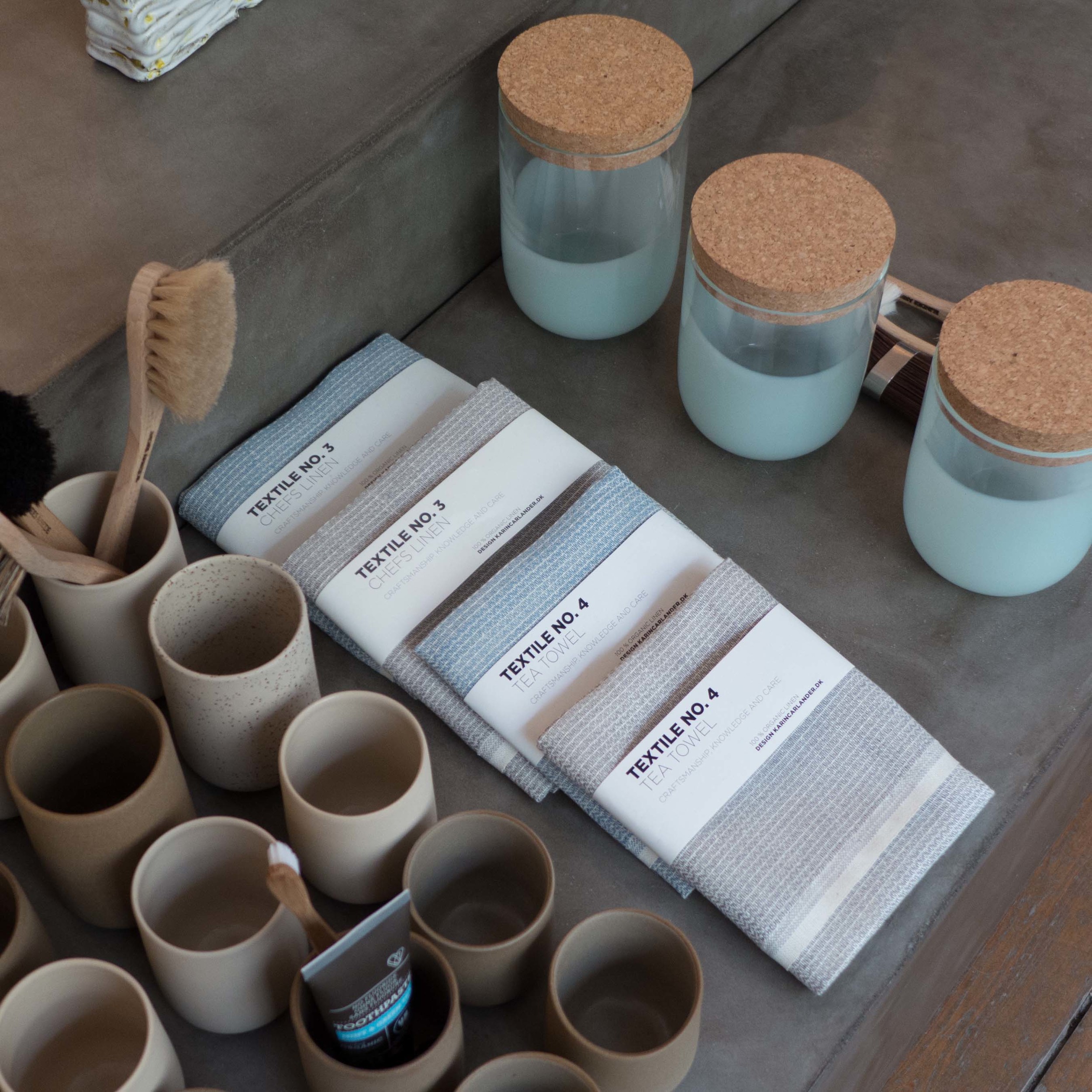
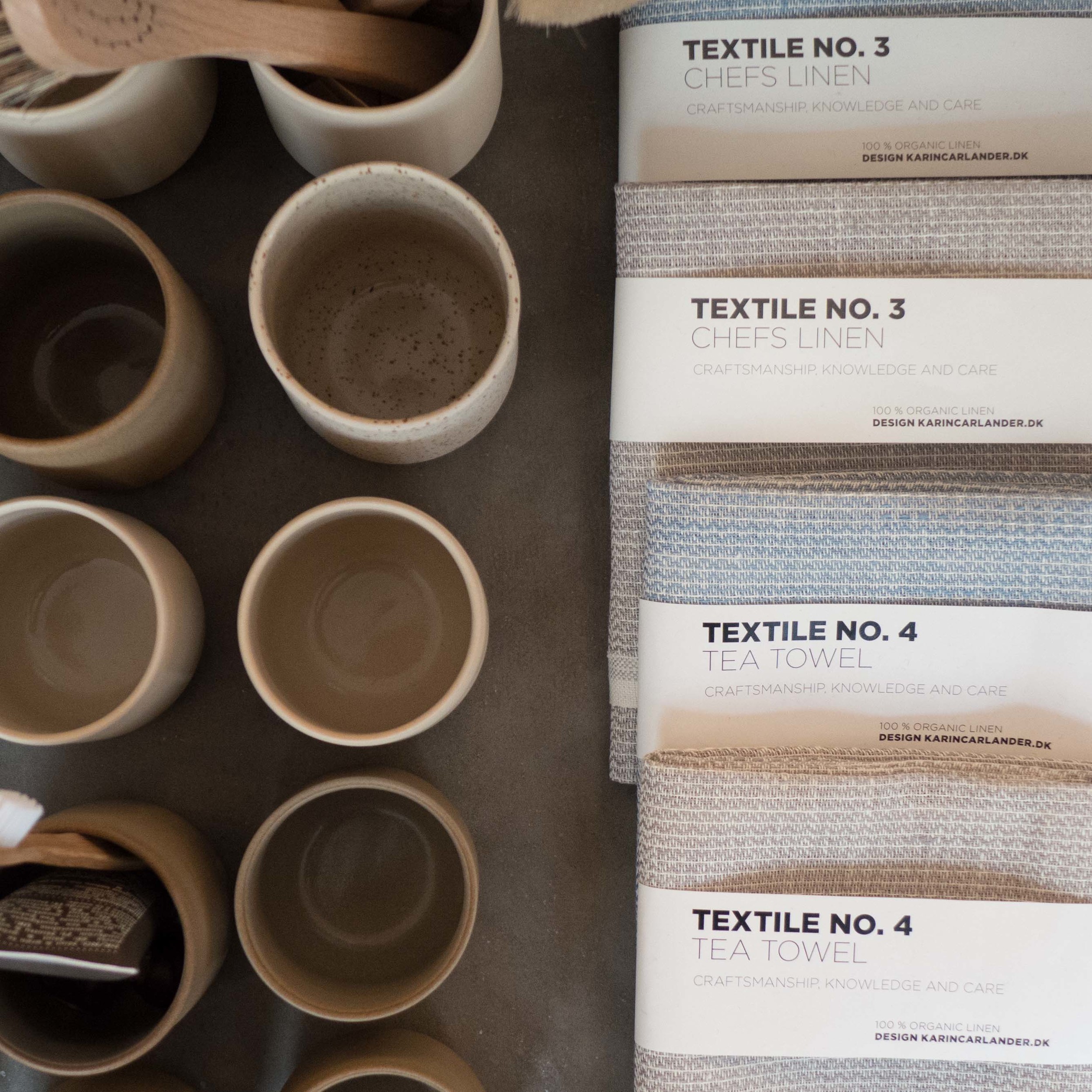
TEXTILE NO.

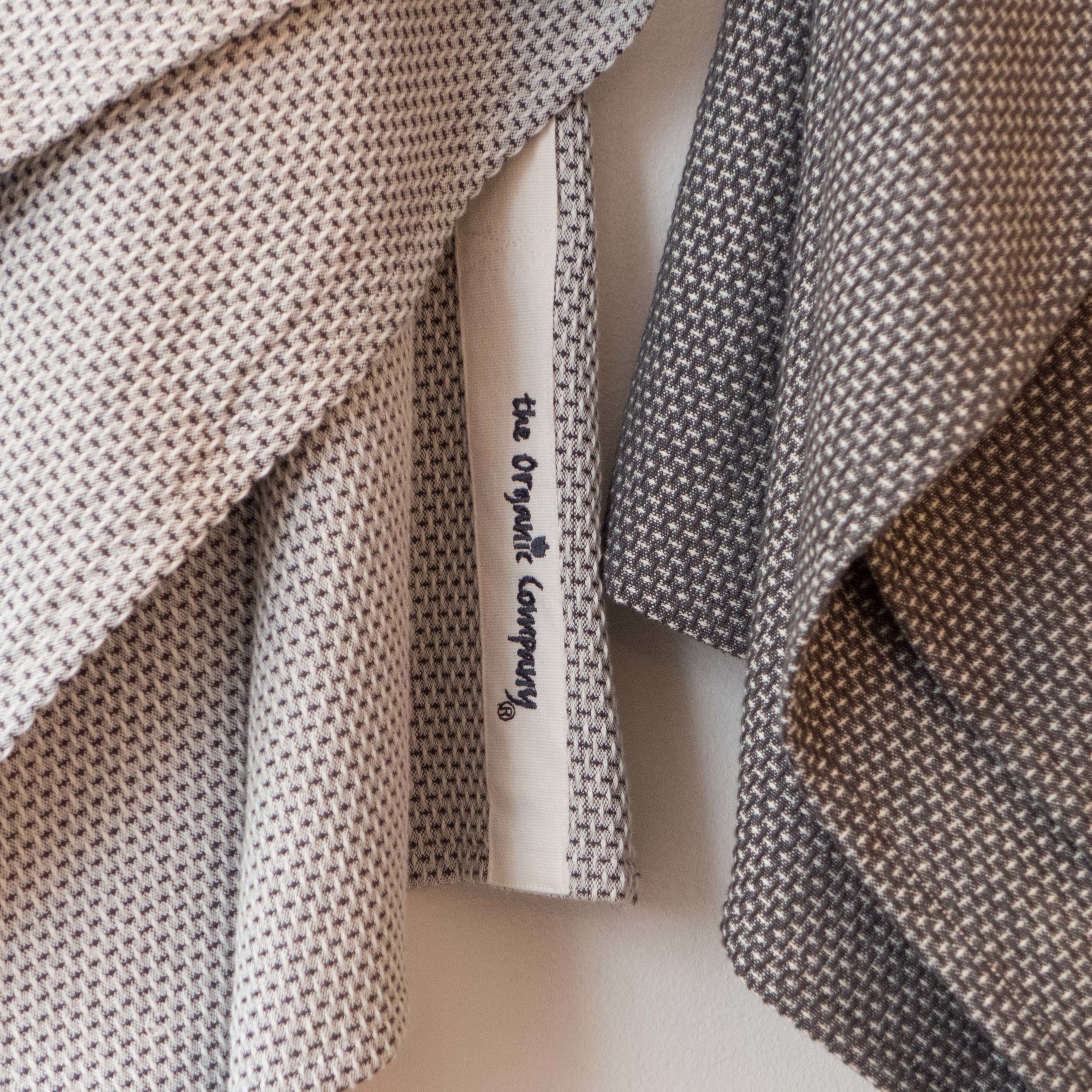
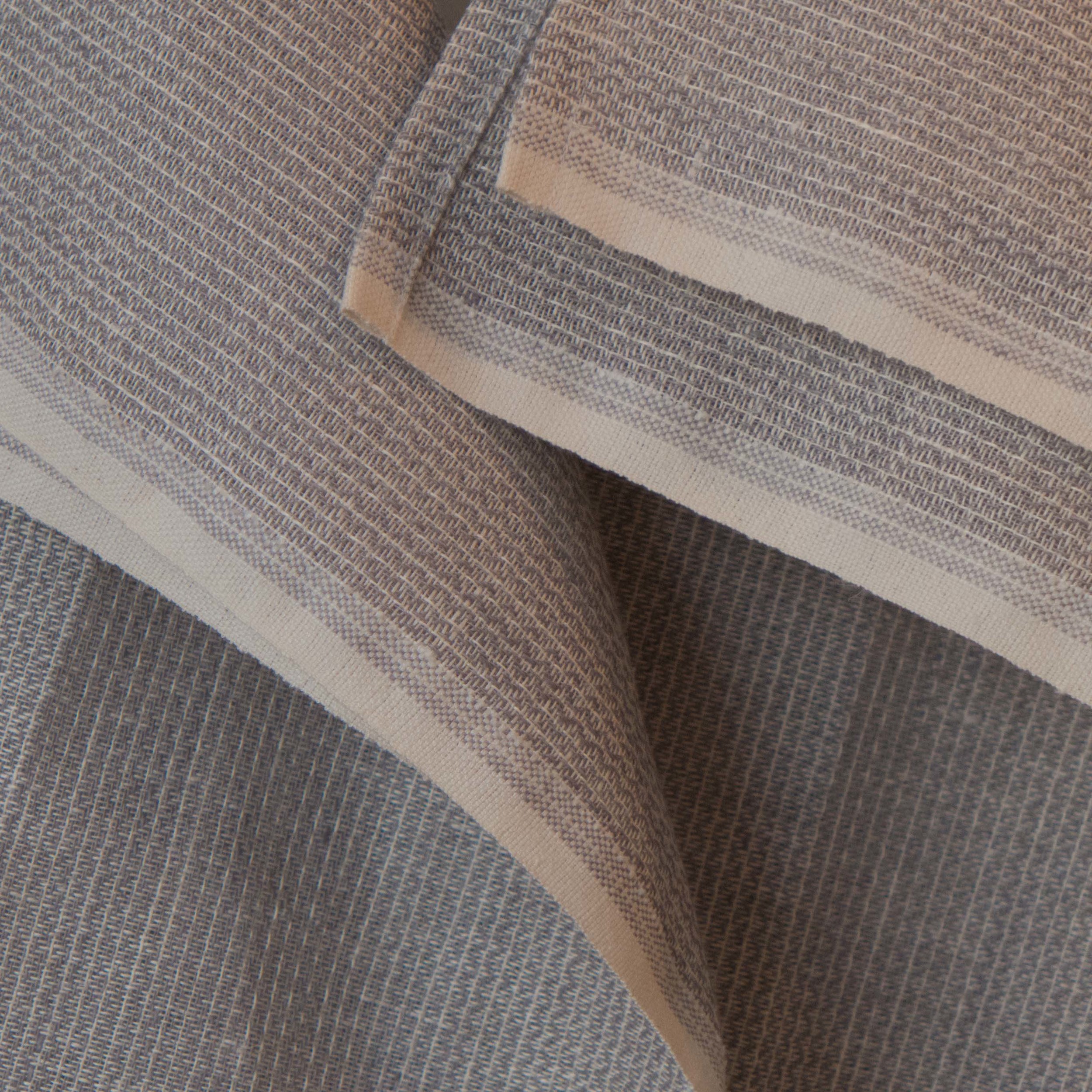
Karin Carlander graduated from the Royal Danish Academy of Fine Arts, School of Architecture, Design and Conservation, in 1987 with an MA in Textile Design. She started TEXTILE NO in 2013 and produces everyday woven textiles for the home in linen and cotton - for everyday read simple and beautiful. The pieces are made for her in India and include tea towels, bath towels, tablecloths, aprons, placemats and napkins.

TEXTILE NO exhibited at northmodern in January 2015 and her work is stocked by major outlets in Europe and the United States. Designmuseum Danemark and Kitub in Classensgade, in Copenhagen stock a selection of these pieces.

KARINCARLANDER

new fabrics from Marimekko for this season

Several new fabrics have been produced by Marimekko for this Season. Two in particular seem to reflect the style of textiles of the 1940s and 1950s with tight overall botanical designs but here given stronger and bolder scale ... or given a modern twist ... which is, I think, the way some design magazines would put it. 

Tomaattitarha, designed by Asao Kodama, has a white background with beautiful marked weave pattern in 45% linen and 55% cotton printed with a design of leaves and fruit in strong colours.

Kranssi, designed by Masaru Suzuki, is a heavy-weight cotton with a more stylised design of a flower vine or trailing stem in more subdued tones of grey, yellow and blue.

linen

Linen - the textile woven from the fibers of the flax plant - has been produced for thousands of years and over a vast area from India to Ireland. Fragments of fiber and seeds found in archaeological remains of lakeside settlements in what is now Switzerland have been dated to 8000 BC and dyed flax fibers found in Dzudzuana in Georgia are thought to be prehistoric and to date from 30,000 BC.

Flax or Linum usitatissimum - an annual plant that needs a relatively cool climate and steady precipitation - is now grown commercially over a wide area including Canada, Russia, India and China and not only for fiber but for fodder and for the seeds that produce oil. High-quality flax for textiles is still grown in northern France and Belgium although commercial production in Sweden ceased in the middle of the 20th century.

The plants grow to just over a metre high but fibers, taken from the stem of the plant, vary in length. They are stronger than cotton fibers but not as flexible which is one of the reasons that when the fabric is crushed it tends to crease rather than spring back to shape. Fibers vary in coarseness ... the finest can be used for the finest handkerchiefs (and bank notes) and the coarsest are used for twine and rope.

The crop is either cut, rather like mowing hay, or is pulled up by the root, to get the maximum length of fiber, and the stems are then dried and the seeds removed by threshing. The flax is then retted - either left on the ground for up to two months when alternating rain, that softens the cut stems, and wind, that dries the crop, causes the fibers to separate from the straw - or the flax can be soaked in tanks or ponds which is faster but reduces the quality of the fibers. After retting, the straw can be broken into small bits, while the long fibers survive intact, and can be separated by “scutching” and “heckling”.

Once these fibers are spun and then woven, linen fabric is durable, strong (one of the few textiles that is stronger wet than dry) and is cool to the touch, tactile, resistant to moths and does not shrink or pill like wool. The natural colours of linen - from ivory through stone colours to tan and grey - are beautiful but the fabric can also be dyed or printed, much as cotton is, and the weave can be anything from the finest lawn to heavy-weight fabrics for suiting. 

Linen can also be woven with cotton or cashmere to create blended fabrics with new qualities and Marimekko have been experimenting with washing their fabrics to produce much softer linens, or do I mean less crisp linens, for some products.

There is an extremely good film on Vimeo that follows the process through from growing the flax to producing textiles and although it is quite long, for a web film, it is worth watching as it shows just why linen is so amazing.

The film shows yet again that good design needs obsession, commitment, passion and above all expertise ... and maybe needs a consumer who understands what they are buying and why.