the danish chair - an international affair


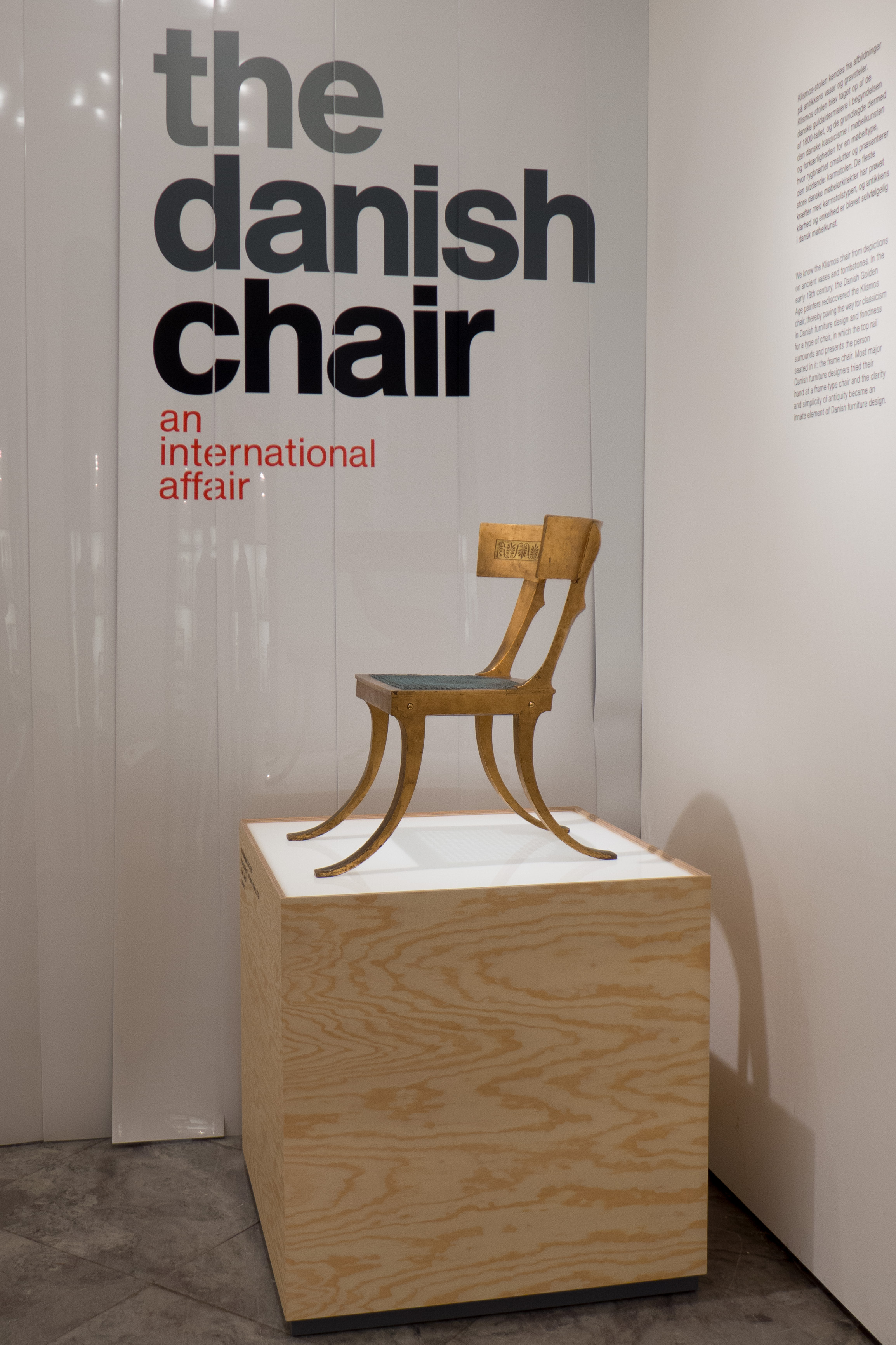
chairs in the collection of Designmuseum Danmark in the display that was designed by Boris Berlin and completed in 2016

Designmuseum Danmark have just published a book about chairs in the collection of the museum. Most of the chairs are from the 20th century and most are Danish although there are several chairs that were made in the 19th century -  an English Windsor Chair, an American Shaker Chair and Chinese chairs - that have been included because their forms of construction influenced Danish designs - and there are some modern international designs including chairs from England, Italy, Austria, Germany and the USA that help to set the Danish furniture in a wider context.

Essentially, the book takes the form of a catalogue with separate entries for nine stools and for 104 chairs with each on a double-page spread although for 31 of these the entries continue over to a second double-page that is used for historic photographs of the chair or for reproductions of working drawings.

Descriptions for each chair are succinct with most of the entries just over a hundred words although several are shorter and only two of the chairs have a text that goes into a second paragraph.

This certainly gives the book a clear and tight discipline.

Because this is not a continuous narrative text, it reads more like good museum labels and that is appropriate as the book accompanies a new gallery for the collection of chairs in the museum that was designed by Boris Berlin and completed in 2016.

With a relatively unusual format - the book is 150 mm wide and 270 mm high - the initial impression is that this is a handbook or even a pocket guide but at 32 mm thick and printed on heavy, good-quality paper this is a hefty book so would need a large pocket.

Although it is tall and narrow,  the double spread of facing pages gives a good and attractive square format. My only criticism of the book is that several interesting historic photographs and illustrations that have been placed across two pages are broken and distorted by a tight gutter.

Christian Holmsted Olesen, the author of the book, is a curator at the museum and wrote a seminal book on the work of the Danish furniture designer Hans Wegner - Wegner - just one good chair that was published as the main catalogue for an exhibition at Designmuseum Danmark in 2014. His introduction here is short but wide ranging and puts chair design in the much wider context of Danish design in the 20th century.

His aim is to show "how the so-called Golden Age of Danish furniture design was shaped by the study and refinement of historical furniture types," so the chairs in the book are not presented chronologically or by country but grouped by type … by form of construction. Types here are slightly different from the categorisation of form types in the museum gallery - presumably to be less specifically Danish and slightly more obvious for the foreign reader. The most straightforward change is that Shaker chairs, Chinese chairs and steam-bent chairs and the Klismos type of chair and Round Arm chairs - all types specified in the museum display - have been re-arranged in the book and those groups given new names. There is a new category for "Peasant chairs" - here including the influential Shaker chair from the collection and the well-known Church Chair by Kaare Klint and the People's Chair by Børge Mogensen - and the rest are divided between Bentwood chairs and Frame chairs.

In the book the categories for form or type are:

Folding stools and chairs
Low easy chairs
Peasant chairs
Bentwood chairs
Frame chairs
English chairs
Windsor chairs
Shell chairs
Cantilever chairs

Each section is prefaced by a list of the specific chairs of that type or of that form along with the useful outline sketches that were developed for information panels in the exhibition.

The book concludes with profiles of nine prominent and influential Danish designers …. Kaare Klint, Mogens Koch, Ole Wanscher, Børge Mogensen, Hans Wegner, Finn Juhl, Arne Jacobsen, Poul Kjærholm and Verner Panton.

Again, these are short accounts but authoritative - presumably for the general reader who wants more information for context - and finally there is a short but again useful list of recommended books for finding out more.

review of the museum chairs

The Danish Chair an international affair
by Christian Holmsted Olesen
Designmuseum Danmark with Strandberg Publishing 2018

layout and cover design: Rasmus Koch Studio


Designmuseum Danmark
Strandberg Publishing
Rasmus Koch Studio

Pictograms used in the introduction to the exhibition for a diagram of the types of chair and to represent the specific chairs in each type are used here as stylish end papers to the book and then as a quick-reference index at the start of the section on a type or form of chair … here Low easy chairs. Most chairs have a double page spread - so here the Windsor Chair by Ole Wanscher from 1942.

There are historic drawings for some chairs - here the Y or Wishbone Chair by Hans Wegner and historic photographs including the assembly hall of Kvinderegensen in Copenhagen - the university hall of residence for women with the chair designed by Rigmor Andersen in 1931.

The last section of the book has short accounts of the lives and the training and work of nine designers “who shaped their field.”


MONO - exhibition catalogue


The catalogue for the Cabinetmakers’ Autumn Exhibition in 2018 at Thorvaldsens Museum in Copenhagen has a general introduction to the exhibition by the selection board and then for each work there is a double-page layout with a full page black and white photograph for each of the works.

These monochrome images are dramatic and chime with the theme of the exhibition but also give a strong emphasis to the form of each work.

Some pieces have a descriptive or evocative name - so Calm or Look don’t touch and a cabinet for the display of special possessions has the title Ego - while other titles are more straightforward, with works described as Chair or Table and Chair.

Of course the catalogue sets out the name of the designer and the name of the cabinetmaker or the company who realised the work and each entry includes the materials and the dimensions of the piece.

There is also a short paragraph on each work to set out any thoughts that inspired the design or to talk about technical details - many of the pieces use material in an innovative way or the construction is much more complicated than is immediately apparent - and there is a translation in English.

Graphic design is by Studio Claus Due and the black and white photographs were taken by Torben Petersen.

Snedkernes Efterårsudstilling / The Cabinetmakers’ Autumn Exhibition 2018

Thorvaldsens Museum

Studio Claus Due


Karina Noyons

 Back in August, at the Kunsthåndværker Markedet - the craft market on Frue Plads in Copenhagen - one stall that immediately caught my attention was the work of the jewellery designer and goldsmith Karina Noyons. 

Her work is striking - simple but very clever and inventive - playing with strong geometric shapes but twisting them around so rings or bracelets are held out from the body. So for instance, by putting a square outside an inner circle of a ring. Here clearly is a designer's and a goldsmith’s skill that, to repeat something discussed regularly on this site, develops from experience and from working directly with a material, to understand what will and what will not achieve a desired result. What this jewellery also illustrates so well is that the simpler the piece then, as here, the more perfect the workmanship has to be … minimalism shows up any flaw and to misappropriate a much used phrase … less means more skill.

But above all, what I could see in the jewellery, is a fantastic and clearly justifiable self confidence that's combined with a really good sense of humour. That was obvious in the clever display that used illustrations by Rasmus Bregnhøi as a background for the jewellery with suggestions about how the more unusual or less conventional pieces could be worn.

read more

Karina Noyons

Rasmus Bregnhøi


3daysofdesign: graphics and publications

use of detailed graphics in the show room of Arper in Nordhavn


3daysofdesign was a major event that included many of the most well-established design companies in Denmark so, perhaps, it might seem odd to talk about the graphic design of publications and posters seen at the various venues … of course everyone expects well-designed graphics and beautiful catalogues from furniture companies … surely it goes without saying? … surely it would only be worth a comment if catalogues or lettering in the showroom or information leaflets were badly designed or badly printed?

Well no. Just because everyone assumes it will be good and just because the graphics were actually good throughout, it is even more important to make a few points about this aspect of the work of the furniture industry. 

In general, people outside the professional design world … so obviously the majority of customers … assume that graphics with high-quality photographs, eye-catching layout and high quality paper are all simply what should be expected. They take it for granted. After all, computers with a huge number of fonts and any template you could wish for for a layout, high definition images, even from a mobile phone, and high quality printing are all available from personal systems in most homes … what can possibly be so hard in producing a nice (free) catalogue? And of course we are all greedy - voracious - for images, gloss, entertainment, facts, information and commentary with little time spent on thinking about how much it has actually cost to produce in terms of professional skill, mental stress, time and money. And last years catalogue or last years campaign are not good enough. We want, need and expect something new.

What was clear across the board at 3daysofdesign is that companies do and do have to invest a huge amount of time, thought and money in the right style of advertising and the best possible publications with information about and for their products.

Catalogues, advertisements, information booklets, online sites and so on have to tell the story of the company; explain the development of the design; introduce the designer, if they are young or new to the company; explain the way the design evolved - everyone loves a good story - give information about the manufacturing process, promote green credentials, of course, and, often, give after-sales care advice as well. And good graphics, as everyone knows, can create a brand image and customer awareness of, recognition of and loyalty to a company or even to a specific design. Chair 7 by Arne Jacobsen, Stool 60 from Artek and the PH5 light are all the obvious examples of the ongoing commercial value of recognition and loyalty.

The Series 7 chair is actually a very good example. It will be the subject of a separate post but it is of relevance in this post just because it is still the best-selling piece in the Fritz Hansen catalogue but it has just reached a milestone anniversary - the chair was designed in 1955 - and Fritz Hansen are in the middle of a major campaign to ‘relaunch’ the chair in new colours to ensure that it remains a design that has a place in the homes of young and future generations of buyers. So publicity material, and advertising and the way the chair is shown in displays now, are crucial to its future success. The strap line of the present campaign is Colours in Perfect Shape.

With a completely new range or a novel design it may even be necessary to give advice about how the piece might best be set in the context of it’s new home. It is actually quite difficult to explain to a customer, who is dissatisfied because, maybe, their new purchase doesn’t look quite as good in their home as it did in the show room or in the catalogue, that in fact they have bought the wrong thing for their existing house and existing life style. The new piece itself is amazing … it’s just that really their room/your room should possibly/could maybe/definitely ought to be a different colour and much of the rest of the furniture should be replaced. But the shop can’t say that. Better to start a bit of gentle advice - sow the seeds of a few ideas and suggestions in the catalogue or in the display in the shop.

The good small catalogue for the event itself and the graphic material for Re-Framing Danish Design were well designed and distinct … presumably they were aware of the added problem of having to avoid any resemblance to the brand styles of any of the companies taking part. 

Arper and Muuto had elaborate graphics on the walls of their show rooms to explain or identify their designs and several companies including Fritz Hansen, OneCollection and Gubi include in their catalogues extensive articles on major designers from the classic period of Danish design to put designs, that might be 50 or more years old, into their wider historic context. The Gubi catalogue is called a design booklet and is, significantly, titled ‘Icons, Memories and Stories.’ It is necessary to explain to a new generation of buyers when and why the pieces were designed; state why they were important designs or why they were admired when they were first manufactured, and why they have relevance now and and why they should still be in production. Basically why a design was amazing then and why it is amazing now.

It is also necessary to explain to a new buyer why an old design might not be exactly like the earliest examples of a design that they have seen in a museum. Designs can evolve in terms of the materials used, for instance in upholstery, and manufacturing techniques change or some aspects of machine manufacturing have improved since the original pieces were made. Again managing expectations and nurturing customers who might have admired a design long ago but are, only now, getting around to buying it.

Innovations for new designs, particularly new materials or new methods of production, have to be explained to potential customers and can become what are called unique selling points to distinguish the designs from one company from the works from their rivals. Muuto have launched a new shell chair that is moulded from a recyclable material that includes wood fibre … deliberately described as ‘pinewood fibers.’ This material has a softer and matt look and a slight texture which has to be explained to the customer and work with the material has also led to interesting developments in producing an optional upholstered interior to the shell. New material often require changes to fixings and supports or an appropriate rethink and here, with Muuto, this means that the shell of this chair can have four different supports: thin, elegant, metal legs; a ’sled’ like metal frame; a wooden base with a frame below the seat and a metal swivel base. These distinguish the chair from rivals but the developments and the differences have to be pointed out to the customer and this has to be done through advertising and through catalogues and brochures … not least because this choice of base and choice of upholstery along with choices of colour, in the case of the new Muuto chair, gives 41 different permutations … a potential problem for the customer in making that choice and potential problems with manufacture and the supply system that can be made easier by appropriate publications for information. I believe this is called managing expectations.

Frama and Please Wait to be Seated both produced information that unfolded to poster size and several companies, including Frama, used reproductions of hand-drawn line work, rather than digital computer-generated drawings, to show something of the various early stages of the design process as designers play with a number of ideas and take a particular form forward.


Personally, I really like the small, folded and stapled A4, cloth-bound catalogue from Flos for their String Lights and IC Lights by Michael Anastassiades with quotes from the designer, talking about inspiration for the design, but with studio photographs combined with hand-drawn sketches to explain how that arrangement of the lights were set up along with a surprising amount of technical information. 

The small catalogue for Parentesit from Arper has an interesting look that somehow hints at the 1930s and Bauhaus style. Good graphic design can hint at sources of inspiration.

For its ‘case study’ series, Frama uses thick board that is coated on one side but unbleached on the back and with a single brass screw link at one corner - so playing a very clever game with period and style - hard-tech mechanics contrasted with soft-tech almost retro style that you see in their furniture as well with incredibly sharp, clean industrial-character designs presented in the elaborate and dramatic interior of their show room - formerly a chemist shop with amazing fittings that date back to about 1900.

Graphics from MA/U Studio were as thin and as elegant and as distinctive as their furniture with the clever use of simple outline human figures to give drawings of shelving easily-understood scale.


Cinnober


A small independent bookshop in the centre of the city on the north side of the Round Tower in Copenhagen. 

Here the focus is on graphic design, illustration, street art, fashion and industrial design along with limited-edition prints, illustrations and paper products such as boxes and binders.

The web site and the newsletter is beautiful with observations and reviews and comments about books and prints to show why they have been carefully selected for the shop. 


Cinnober, Landemærket 9, 1119 Copenhagen K, Denmark

Playtype


A Danish brand and design agency, e-Types was founded in 2010. They established a type foundry and also have an on-line store and a small shop on the west side of the city in Værnedamsvej where they sell lettering and type on posters, mugs, T-shirts, sweatshirts and stationery along with magazines and books about type. Theirs is probably the only shop sign I have seen that gives you a reference to the typeface.

If you think that all sounds rather specialised and esoteric then think again because, in many ways, if you are interested in design and trying to understand more - trying to work out what makes one thing good design and another bad design - when you would actually be hard pressed to describe the difference - then typefaces and fonts are a good place to begin. For a start graphic design and type are universal so it is easy to find good and bad examples. Just compare a good quality newspaper or magazine with confused and muddled and badly printed advertising that is pushed into your mail box. Or look at a book that is a pleasure to read - not just text as words and meaning but pages that look good and where you can find your way quickly and easily aroud the page and compare that with one that looks chaotic and is actually difficult to read or do the same with shop signs or road signs to decide which ones are well designed. 

Again there is a bench outside Playtype and people sit here to drink coffee from one of the nearby coffee places and local people from the neighbouring furniture shops and book shops and so on stop and chat. The staff or the partners, over from the main office, may well be there. That’s how I got talking to Rasmus Ibfelt, one of the directors of the company … happy to talk even though I was disturbing his coffee break.

What Playtype shows above all is that at every level and in every way, good design is about communicating … not least the idea of using good design to help communicate complex ideas or important information.


Playtype, Værnedamsvej 6, 1620 Copenhagen V, Denmark

NYTT ROM new scandinavian rooms


I had not come across this magazine until moving to Denmark. It is actually produced in Oslo and is well-established here coming out every two months and about to publish edition 46. The new scandinavian rooms part of the heading is not my translation but part of the full title of the magazine - although none of the articles are in English (and why should they be?) but some adverts from the larger companies are in English and presumably are a stock version to aim at an international audience.

Graphics are clean and fresh - which again is appropriate - and the magazine is well printed on good paper with high-quality images. Most pieces are short - some four or more to a page in some cases - but there are longer articles with three or four or more double-page spreads. These seem to be generally the longer assessments of particular homes. 

There are short book reviews and exhibition notices, reviews of cafes and restaurants that have distinct or well-designed interiors … so that means almost all of the new places are potential candidates. There are clear profiles of shops and shop owners which is building up into a really useful register and there are announcements or assessments for the launch of new products and new pieces of furniture.

Almost all the furniture and household items are current and new designs … generally the only classic designs are in the adverts of the more established manufacturers or if an unusual historic design is relaunched particularly if it comes back into production in new colour ways or with original colours or original features that have been changed over a long period of production.

What I really like is that apart from the photographs taken close up in a studio for the best lighting for the shot or to show details, most photographs are taken in real settings. OK rooms are tidied up or things moved around because the photographer needs to get things in view or get them out of the foreground where they can look terribly distorted by the viewpoint. It’s actually quite interesting to take photographs in your own home where it might look fantastic as you walk in and look good from certain view points but however much you step forward or back or twist slightly then at least one thing left in its usual place gets cut in half in the photo or appears to be weirdly triangular on tapered legs because the camera is looking down at an odd angle.

Here the real value for an English reader is that although many of these pieces of furniture and the household items are available in the UK it is actually the context in real homes that makes them look most Nordic. English readers might even be curious to see some of the rooms with clearly expensive furniture but hand-painted floors, and hand painting clearly done some years ago, electric wiring ducts surface mounted and light fittings with the flex stretched across to a hook and knotted up. Maybe this is one of the major differences between English and Scandinavian interiors. In the UK very expensive furniture usually reflects wealth and status and goes with equally expensive carpets and certainly with expensive bathrooms. Obviously it is always dangerous to generalise about national attitudes and priorities but in Scandinavia good quality furniture is appreciated not because it is expensive but because it is more generally what is expected and what is the priority. Then the room is simply the place for the furniture and in turn the house and the furniture are merely the setting for the family and the friends and what they do together there and that is what is important.

Nytt Rom also has a good web site and publishes a monthly on-line version of the printed magazine through issuu.

stylish shop front

Copenhagen is a city of independent shops and small independent design companies. That is the starting point and provides the strong base for much of the great design that comes out of the city. Everywhere you look there is a real sense of style ... the unwritten rule of the place seems to be that if it has to be done then do it well and do it in style. This a shop frontage in Gammel Kongevej ... a sign in iron for a clothes shop! Great typography and executed beautifully.

a logo for Rud. Rasmussen Snedkerier


Kaare Klint worked with Rud Rasmussen Snedkerier from 1926 onwards and their cabinetmakers produced nearly all of his furniture and many of the fittings for the new museum in the old hospital as work on the restoration progressed.

In May 1944 Rasmussen celebrated their 75th anniversary and Klint designed a commemorative wood plaque to mark the occasion. That design is still the logo for the company whose workshops are on Nørrebrogade in Copenhagen.


the magazine and exhibitor list

The magazine and exhibitor list for northmodern was great. Produced by Oak publishing; edited by Marie Graunbøl of the magazine - Oak The Nordic Journal - and published by CIFF, it contained all the information needed for locating stands and with colour-coded pages for lists of designers and manufacturers in each space and information on talks and so on - all pretty obvious stuff I know but clearly presented in a calm understated way - you don’t need graphics shouting at you when you have lots of other things to think about. It also had good profiles of several designers and pen-portraits of places to see or eat or drink in the city … and it was a sensible size.


DANISH™

DANISH™ is a new magazine published on line to promote Danish design and architecture. It has been launched by the Danish Design and Architecture Initiative, formed in 2012, and commissioned by the Ministry of Business and Growth, the Danish Ministry of Foreign Affairs and the Ministry of Culture.

Good straightforward typography and the restrained but stylish graphics with a good use of strong colour and horizontally scrolled bands of photographs all show that the site was designed from the start to be viewed on a tablet or touch screen … the side swipe for moving through the bands of images is the give away of course. However, there are still problems with reconfiguring sites to work on multiple platforms so actually the site does really still look best on a large screen that does justice to the high-quality images but also simply because on a larger and higher resolution screen text, images and columns of information and links appear in the relationships and sequence intended whereas seen on an iPad, normally held vertically in portrait format, some elements are rejigged and shunted to the bottom of the page.

This is really just carping and in any case is a general problem not specific to this site.

It is good to see the integration of short films including one from Carl Hansen about the Wishbone Chair and hopefully this suggests that, as the site builds, there will be more interviews, profiles and shorts about techniques and manufacturing methods and interviews with architects and designers. They presumably have the budget and the access to professional teams to commission filmed profiles of standing buildings and urban and rural landscape settings to take on-line reports on 3D design to a new level. 

Categories that drop down from the top navigation menu include architecture, art, craftsmanship, events. lifestyle, sustainability and urban development. 

There are separate profiles of Danish companies that already include the architectural practices of C F Møller, Schmidt Hammer Lassen and Norm, design companies including Kollision with entries for the furniture manufacturers Republic of Fritz Hansen, and Carl Hansen, and the lighting companies Louis Poulsen and Le Klint.

Each profile has a short pen portrait, supplied by the subject, with good photographs, the address of the company and links to their web sites. Clearly this will build up quickly to form an important access point to a directory of Danish designers, architects and manufacturers and retailers.

The site promises a monthly newsletter and from the outset the magazine seems to be fully integrated with postings to social media, including Facebook and Twitter links, which indicates that news and updates will be posted promptly.

DANISH™

a typeface for Sweden

When this story was first published on blogs and web sites at the beginning of the year, I managed to miss it but it has, for some reason, just appeared on Gizmodo and been reblogged on several other sites.

The design agency Söderhavet were commissioned to rebrand the official and national and international graphic face of Sweden and as part of that project Stefan Hattenbach designed a new typeface called Sweden Sans. Jesper Robinell, design director at Söderhavet, discussed the brief for the typeface on the company blog. It had to be distinct, “inspired by classic Swedish street signs, with blended mono-type and san-serif accents that clearly show a Scandinavian heritage.” Also the typeface had to “unambiguously convey the 50+ translations of “Sverige” into local languages.” What was also significant was that, in the words of Stefan Hattenbach, the typeface had to be “natively web friendly, so that readability on display screens is perfect.” People, brands, companies and now countries have to have a presence and an appropriate presence in digital space.


When the typeface was launched towards the end of 2013 there was clearly a mixed response … mixed in the sense that some praised it because they saw it as retro, others praised the minimalism and some thought it was stylish. All very and rightly positive although some compliments seemed rather more ambiguous as it was also described as too Swiss, and, most curious of all, “very IKEA.”

These days, the general public understand and follow re-branding exercises for large companies or for well-known products or even for cities if they are hosting a World Cup or the Olympics. Rebranding of the BBC or New York Time’s web site’s is scrutinised initially, particularly if some popular pages or services are more difficult to find or use because they are in a different place, but most people quickly adapt and quickly forget what the old design looked like.

The need to unify the official publications of a country is much more important: I am curious to know how the new brand identity for Sweden has been received over the year since its launch.

Typeface design and the appropriate and proper use of fonts and type require incredibly important professional skills but unfortunately designers rarely get the credit and recognition for that work that they deserve. There seem to be two obvious problems. Like much design work, when the designer gets everything absolutely right, no one notices but as soon as they get it wrong then everyone, or at least other designers, notice and have an opinion to offer. The second problem should be laid at the door of Microsoft and Apple. Generally, the public do not understand or appreciate either font design or graphics, unless again a designer or company gets it very wrong, and most people think typeface selection and layout is easy … surely you just select the template you want, type the text, highlight a block of words or a heading and go to the drop-down selection of fonts. Easy. If you are not a font designer then go to the Söderhavet blog and find out how complicated and how important the design of a typeface is.

lettering out on the street in Copenhagen

Walking around Copenhagen you can appreciate how well, generally, fonts and typography are used for shop and office signs. Of course there are a few international companies who continue to think that one font and one size fits all and fits everywhere but Copenhagen is, more than most places, a city of small, independent and in many cases local companies and this is reflected in the variety of signs, and the variety of colours, sizes and styles of lettering chosen.

Some of the signs and lettering have survived from the 19th century or earlier and some companies choose to use more traditional serif fonts to indicate how long they have been established - even if they haven’t - but many use more modern san-serif fonts because the general perception is that without serifs a font is simpler and crisper and, therefore, has a stronger impact from a distance.


A surprising number of businesses have lettering applied directly to the building with free-standing letters - without a back board or mount - either painted or cut out from metal. This is not a cheap quick option, even if it sounds like that, because it actually requires a sign writer or sign maker with real skill to get the scale and spacing of the lettering right.

Similarly, some lettering is painted directly onto the glass of windows and doors. These examples of lettering applied to the facade or the window are almost opposite each other on Dag Hammarskjölds Allé.


Some organisations, particularly galleries and museums, and large companies, use long narrow banners hung either from short brackets on the building itself or hung from purpose-made poles on the pavement. The banners do not generally face out from the building but are set out at 90 degrees to face up and down the street so that they can be seen some distance away along the pavement.

These photographs show the entrance to the Davids Samling with discreet, traditional lettering over the entrance arch and note the very careful placing of the house number but also there is a vertical name banner between windows on the first floor and larger banners dropped down from a post on the pavement.


This unusual sign is in the archway leading into the Passage of Sankt Annæ off Bredgade and acts as a sign as well as a sort of map/guide and a commemorative panel marking the restoration and conservation of the courtyard and its buildings.


The  Bikuben Kollegiet on the Amager campus of the university uses lettering for decoration with a series of inspiring words on the concrete pillars of the building’s entrance.


Most of the signs and lettering in the city are remarkable for their restrained or appropriate size - very few could be accused of ‘shouting’ at customers.

However, curiously, this oversized roof sign actually seems appropriate for what is certainly the smallest hotel in Copenhagen.


The variety and the quality of signs for shops and businesses in the city is amazing. They vary from the stripped-down minimalism of the sign over the Playtype door - advertising their own typeface naturally - to the slightly macabre sign with the man on a penny farthing bike with his intestines exposed - maven means stomach in Danish.

I have said before that one of my favourite signs in Copenhagen is for the Bøger & Curiosa bookshop - but I guess that says more about my odd sense of humour than about my appreciation of good typography.

By far the most common form of sign, with or without lettering, is the sign that sticks out from the building on a bracket and is usually set between the ground and first-floor windows … like pub signs in England but rather more stylish.


street name signs in Copenhagen

Having just moved to Copenhagen I am exploring the city as much as possible while the weather is still fine and the light good for taking photographs. So I guess, more than many people, I’m looking for road names. 

What is interesting is the variety of signs - from simple lettering painted directly on the plasterwork of buildings to elaborate carved stone on prominent facades. Where the front is in fine-cut stone and on more recent concrete facades, letters of the street name are sometimes cast or cut out from metal as a silhouette. The Havnegade sign is particularly distinguished as it is on the side of the National Bank.

The typefaces and fonts of the lettering are equally varied and well worth looking at although I’m worried I may become an accident statistic looking up and stepping back to take a photograph rather than watching for cyclists taking the corner at speed.

Cereal magazine on Helsinki

Cereal is a relatively new magazine about travel and lifestyle that it is produced in Bristol. It is published as a quarterly and the 5th edition is now available although they also have an active blog site under the url readcereal.

The latest issue opens with four pieces on Helsinki with a brief assessment of the work of Alvar Aalto; a review of the most important modern buildings in Helsinki; a short piece about the Finnish language and an interview and report on coffee drinking in the city. Through all four articles there are interesting comments and observations about the history of Finland and its culture. 

One clear theme of the magazines, and their online site as well, is the alternative city guide although they do not actually use the word alternative. So far they have covered Bristol, Bath, London, Paris, Copenhagen, Charleston, Manhattan, Vancouver, Los Angeles, Austin, Hong Kong and Seoul … an impressive list for a young team who have only been together - as a group of writers, photographers and editors - for just over a year. They promise to add 10 cities this year and presumably Helsinki will be one of the next. 

You have to subscribe for access to the city guides on line (I have) but don’t expect a definitive guide for the tourist in a hurry wanting to claim they have been there and done that … these guides, like the graphic style, are much gentler and much more subtle than that. These recommendations are for travellers who want to find quiet places to sit and watch and learn and want to find places away from the usual tourist circuit. In the Copenhagen guide they recommend a hotel that has just one room and among the sites they recommend is a church well away from the centre that no tourist would stumble across by accident but is an absolutely stunning building and there is nothing in England to match it. You will have to subscribe to the guides to find out which hotel and which church.

The layout online is a simple grid and basic information including background information, address and contact details drop down from clear prompts. Listed are one or two hotels, several pleasant restaurants, major but less obvious architectural sites and, of course, design stores. The graphics work well on an iPad but you would need a map as well but that is hardly a problem and, again, certainly not a criticism. A flag at the bottom of the guide now states that pdf versions are in preparation but I hope that, as they are using a subscription format, they will at least try to keep links and addresses and so on up to date.

Screen grab from the Copenhagen guide

Both the printed version of the magazine, on heavy matt stock, and the online site have a distinct graphic character with soft muted colours and images shading from sepia to grey. Again, that reads as a veiled criticism but it is not … I get tired of the brash and flash graphics of too many glossy magazines and the house style here is more grown up and subtle. One article on line is a series of photographs in soft greys and pine greens showing Bristol in fog but even for photo essays on Malta and LA they seek out soft evening light or a heat haze.