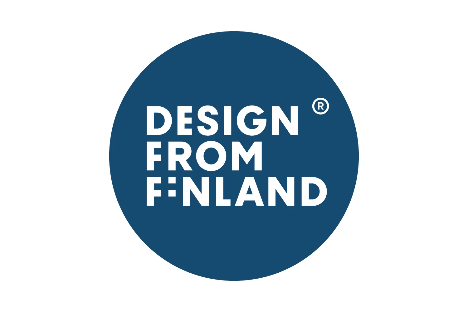
Design from Finland mark
/
Brand design agency Werklig, based in Helsinki, have produced a new mark for Finnish design. It was commissioned by the Association for Finnish Work who grant permission to use the official mark to companies who “invest in design and understand the value of it as part of their business strategy.”
The clean, strong blue of the background and the simple white graphics echo the Finnish flag and the containing circle, like that of the Iittala logo, works at various scales - either as part of a larger label or as a small, stand-alone stamp or tag on items like drinking glasses or tableware.
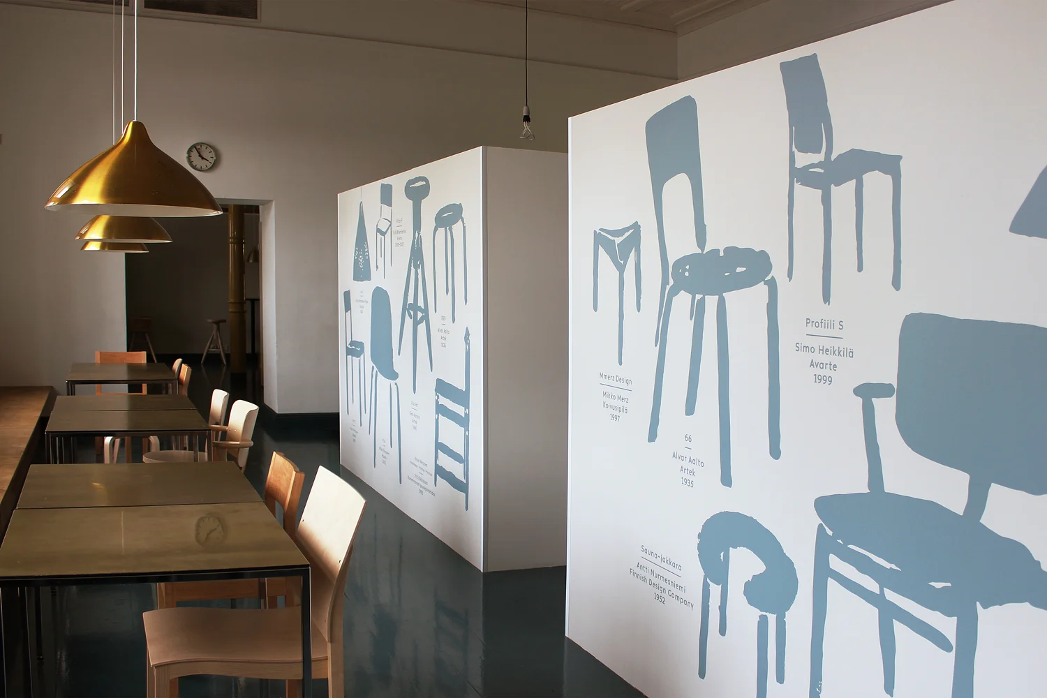
Looking at the Werklig site they have undertaken some interesting projects since they formed in 2008 including the design of a new font for Altai glassware; a travelling exhibition to showcase the work of Pekka and signs and information panels for the Design Museum in Helsinki.
When I saw that work in the museum I appreciated how the combination of strong plain colours and straightforward, stripped-down graphics works well with the architecture, including historic features such as architraves and cornices and so on, without competing or dominating. In fact the large information panels enhance the spaces and gives the architectural features a stronger rhythm. The architectural fittings of the interior merit retention because they are part of the original building but are actually rather plain: the building dates from 1895 and it was a school until taken over by the Association of Applied Arts so it is not surprising that the architecture is robust but not elaborate. The nearby building of the Museum of Finnish Architecture dated 1899 is much more sophisticated in terms of major fittings such as an elaborate staircase and in the treatment of the sequence of spaces.
The photographs of graphic work in the Museum of Design have been taken from the Werklig web site.