Two-seat sofa by Kaare Klint 1929


This sofa was designed for the Danish Pavilion at the Exposición Internacional de Barcelona that opened on 15 May 1929 and continued until 15 January 1930.

The frame is in Cuban Mahogany and the sofa is upholstered with goatskin leather covers for the loose cushions and with the frame itself covered with leather held along the bottom edge by closely-spaced, round-headed, brass fixing tacks used as a decorative feature.

In the l1920s and in the 1930s, Klint designed a number of sofas and most with legs between the different sections …. so the two-seat sofas have six legs and the three-seat sofas eight legs and most with cross bracing forming a cross below the seats. Here, in the two-seat sofa, there are stretchers set back from the front line of the front legs allowing people to tuck their feet back without touching the stretcher as they are sitting in the sofa or when they are standing up.

Stretchers are chamfered on the under edge partly to reduce the apparent thickness but also to strengthen the vulnerable edge which is more likely to splinter or dent if it is left as a sharp angle. The underside of lower frame are also shaped up inside the housing with the legs and the line of brass tacks follows and emphasises this line.

The sofa has thin upholstered end pieces as arm rests that ramp up at the back to the higher bank panel and thin loose cushions at each side mirror this shape. There are double cushions on the seat, the top cushions with down for comfort. There are also soft loose cushions for the back rest.

The pavilion itself was designed by Tyge Hvass and took as a starting point Danish vernacular architecture of the 17th or 18th century. The exterior was painted red and the simple building had a pitched roof covered with clay pantiles.

Lighting for the pavilion was from Louis Poulsen and was designed by Poul Henningsen.


two-seater sofa 1929
designed by Kaare Klint (1888-1954)
made by the cabinetmaker Rud. Rasmussen
identified in the catalogue of the Design Museum as sofa model 4035

Cuban mahogany with goatskin leather and round-headed brass fixing tacks.

height: 86 cm (34 inches)
width: 137 cm (54 inches)
depth: 74 cm (29 inches)


the Danish Pavilion at the Exposición Internacional de Barcelona in 1929

the German Pavilion in Barcelona designed by Mies van der Rohe

a three-seat sofa without loose cushions and with the cross bracing below
this is Model no. 4118 designed for the office of the Prime Minister Thorvald Stauning
Klint designed a two-seat version of this for the Ny Carlsberg Foundation in 1930 with the same shape of end but with leather upholstered cushions closely buttoned so
an interesting amalgamation of the 4118 and the Barcelona two-seat sofa

Snedkernes Efterårsudstilling / The Cabinetmakers' Autumn Exhibition 2019

Re-think / Re-use / Re-duce


The Cabinetmakers' Autumn Exhibition has just opened in the Golden Gallery at the Danish Architecture Center in Copenhagen.

photographs and basic information about the works.


the exhibition opened on 8 November 2019 and continues until 3 May 2020
Danish Architecture Center, Bryghuspladsen 10, 1473 Copenhagen
S.E. Snedkernes Efterårsudstilling 2019


Denmark's Next Classics


This is the last opportunity to see Denmark’s Next Classics at Designmuseum Danmark.

The exhibition shows the work of five designers who took part in a series on Danish television in the Spring that sought to find new designs that could become design classics in the coming years.

From each designer there is a dining chair, a dining table that can be extended, a pendant light, furniture for children, a sofa and a lænestol or arm chair.

With sketches and models for the designs and with audio-visual material - including clips and interviews from the programmes - Denmark’s Next Classics explores the process of design.

The designers are Janus Larsen, Isabel Ahm, Rasmus B Fex, Kasper Thorup and Rikke Frost.

Judges for the competition were Anne-Louise Sommer - professor of design and now director of Designmuseum Danmark - and the designer Kasper Salto.

Denmark’s Next Classics
at Designmuseum Danmark until 1 September 2019

the six programmes can still be viewed
on line through the DR site


Formgivning … from big bang to singularity

  • Connect by Bjarke Ingels and Simon Frommenwiler at entrance

  • BIG at BLOX

  • stairs up with the start of time line

  • PLAY - models of the buildings in LEGO

  • SHOW - Manhattan

  • HOST and LIFT

  • proposal by BIG for BIG in Nordhavn


BIG - the Bjarke Ingels Group - have taken over the Danish Architecture Centre in Copenhagen so this exhibition is not just in the two main galleries but flows up and down the staircases and even reaches out into the entrance area. About the only space not occupied by BIG is the half-in-half-out space of the lobby to the underground car park and they also missed an opportunity to take over the public square in front of the building.

Bjarke Ingels is one of the best communicator of ideas and theories about modern architecture - his talks on line are exceptional - so here, at several points in the exhibition, there are life-sized images of the man himself introducing his work and explaining his theories and their application to the phenomenal number of major projects with which BIG have been involved over the last fifteen years.

The main staircase, climbing up from the entrance level, has become a time-line of architectural and cultural history … “the history and future of how thinking, sensing, making, and moving have evolved and will continue to evolve.”

In the gallery at the first landing, PLAY has models of 25 BIG buildings but made by master model makers using plastic LEGO bricks.

Ingels designed LEGO House, in Billund, for the company - completed in 2017 - and here that partnership - between the company and Ingels - is reinforced. This makes a serious point that getting children to see architecture and design as fun from the start - from playing with building bricks or by building dens or play houses - then their approach to their built environment as adults will be more informed and more curious and possibly more adventurous - but the models in LEGO also make sense of these large and complicated buildings by BIG in the way that cartoons or sketches from a good artist can focus our attention on the essential elements of a complicated idea.

Up on the main exhibition area, the floor has been painted with swirls of strong colour that take you to colour-coded areas for this part of the exhibition with each area covering one of the series of main themes. It's a way to group complicated but apparently diverse commissions with sections including - among many others - LIFT, HOST, MARRY and GROW … caps courtesy of the exhibition designer and not mine.

Architectural drawings and rendered digital views - again all colour coded - hang from the high ceiling like banners so it feels like entering a huge medieval bazaar with a touch of Mad Max or Burning Man.

  • model for new apartment building on Dorotheavej in Copenhagen


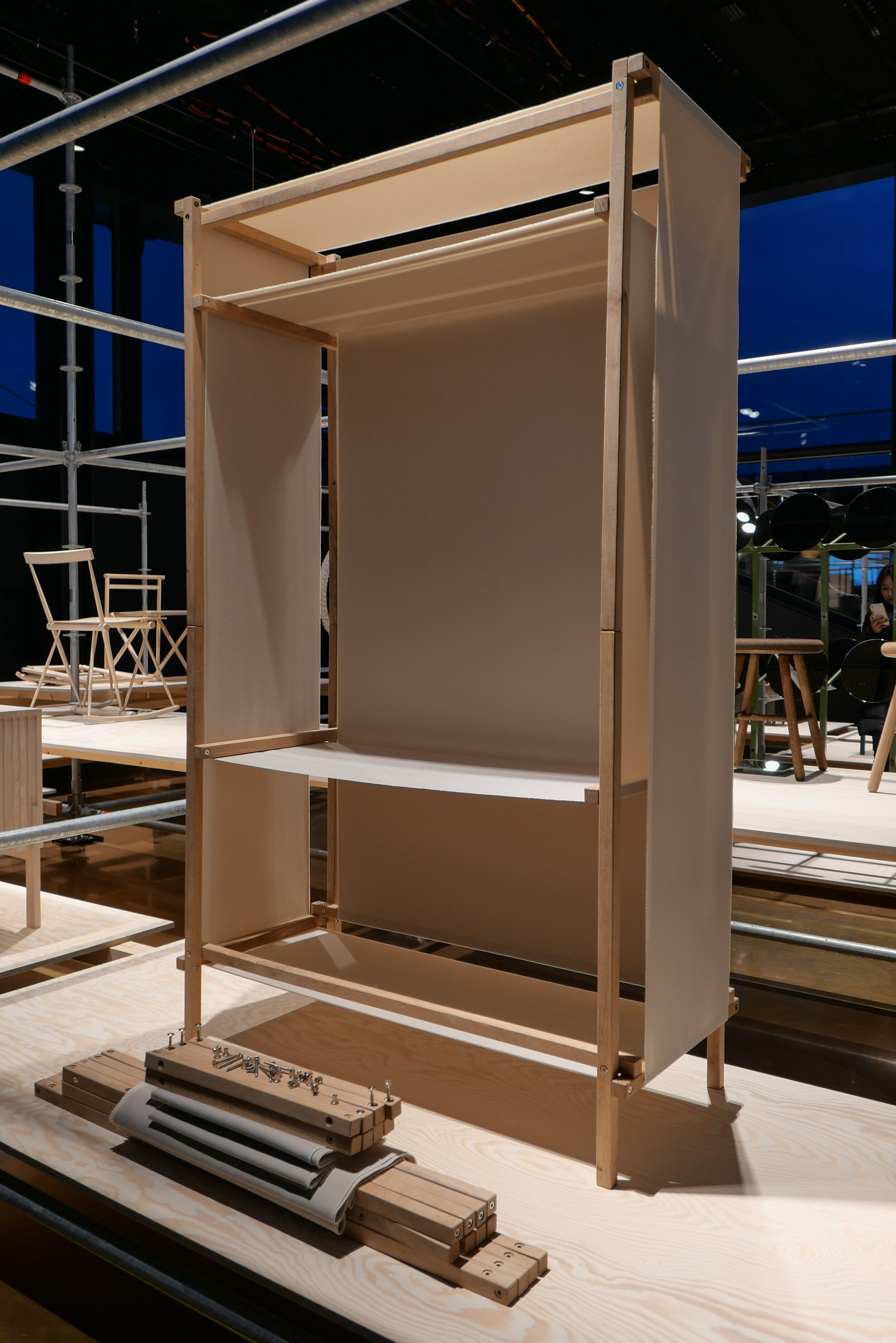
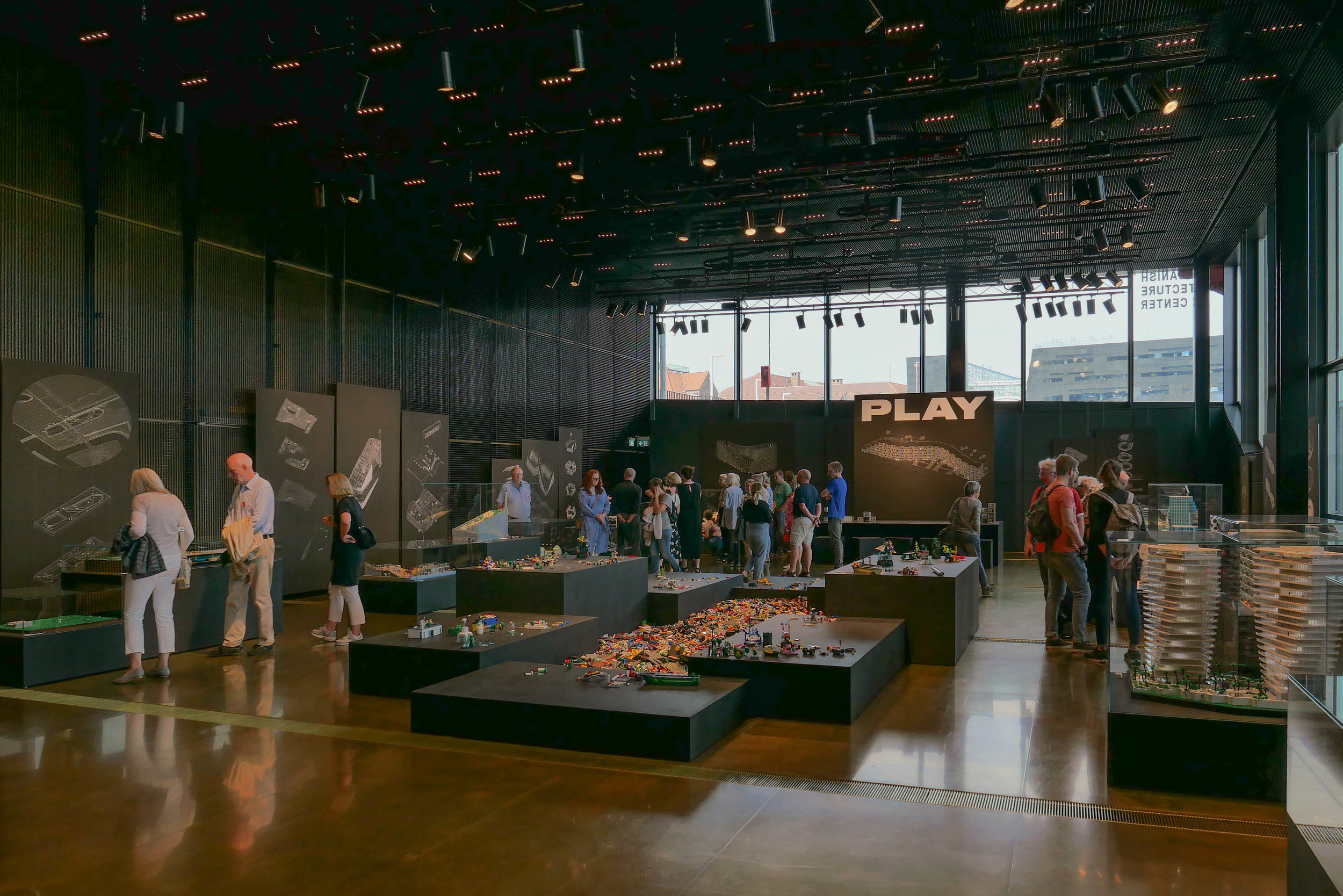
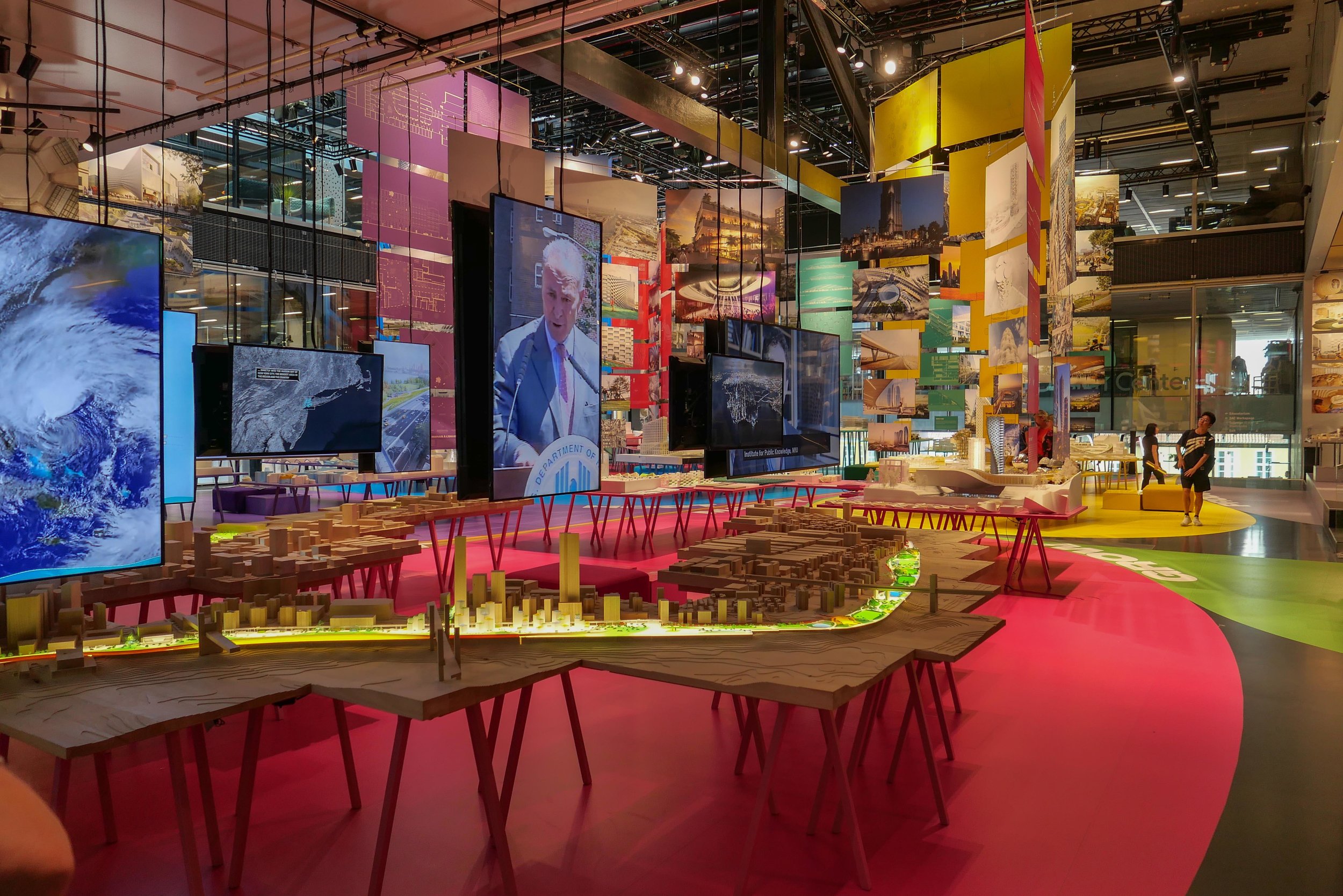
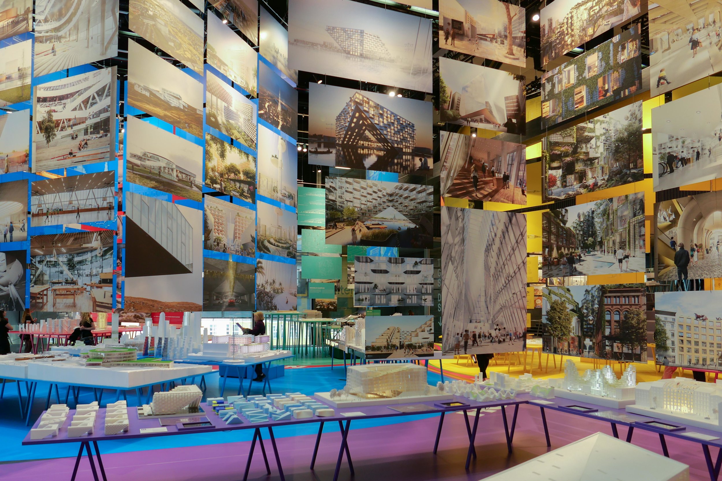
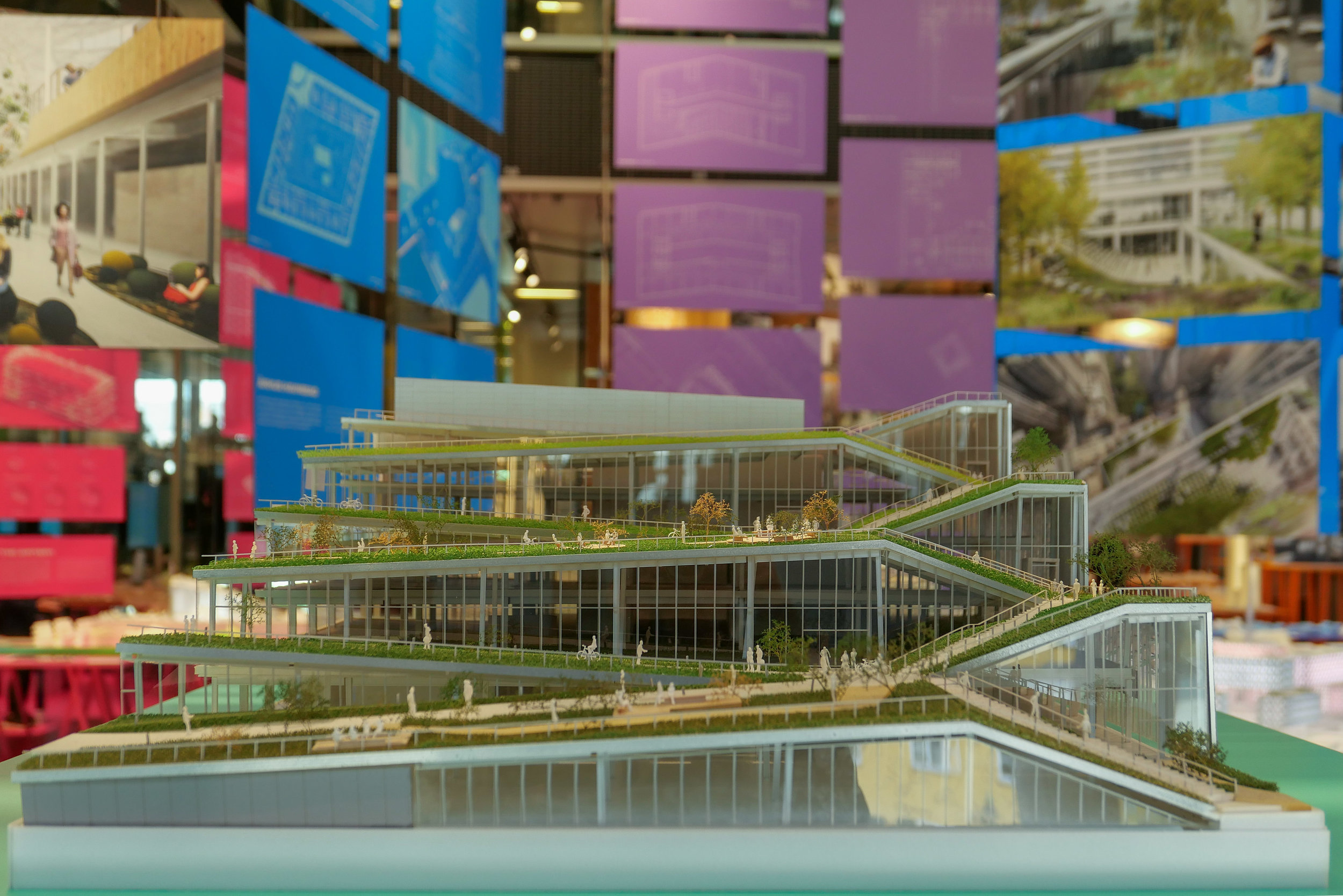
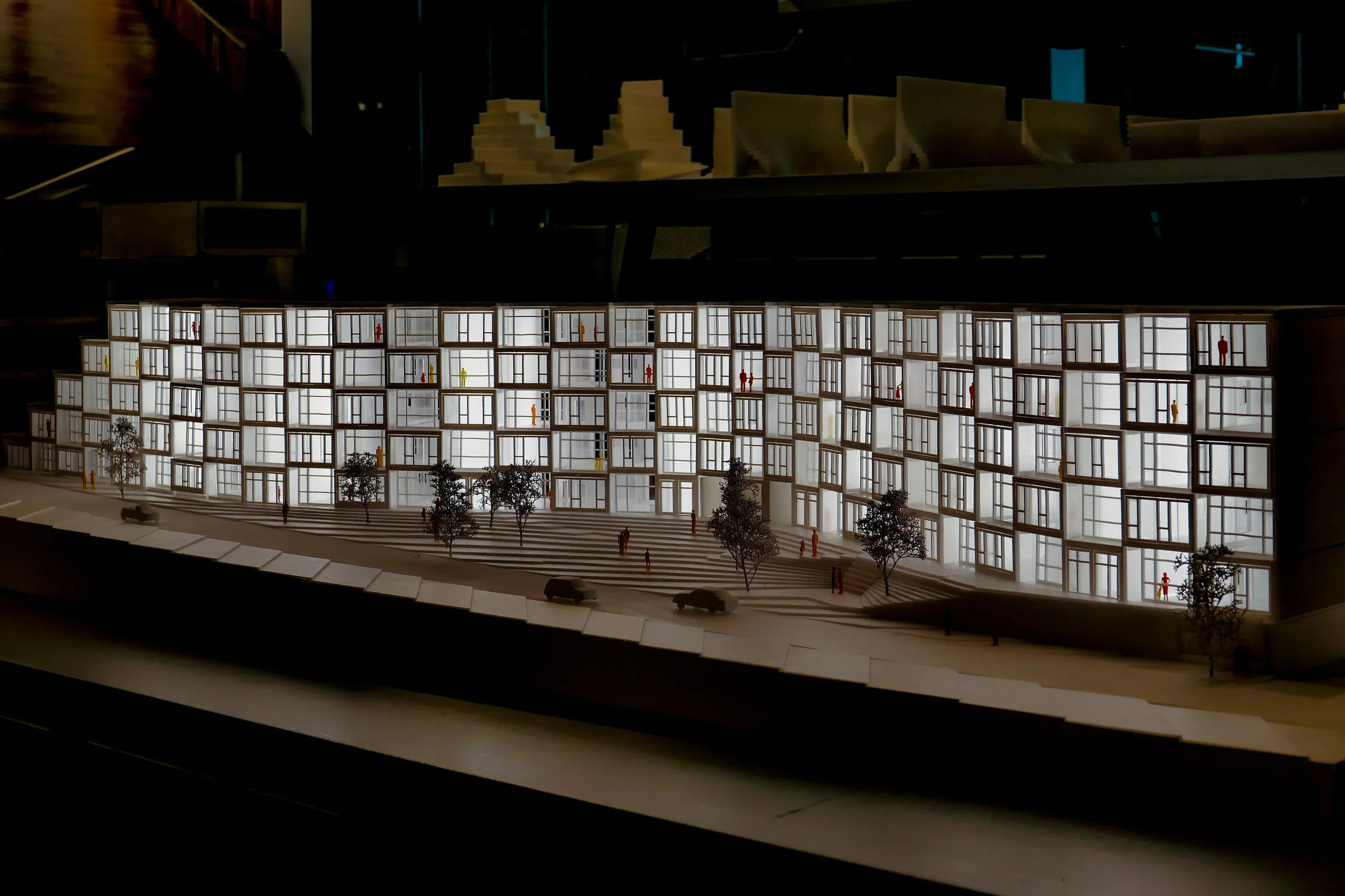
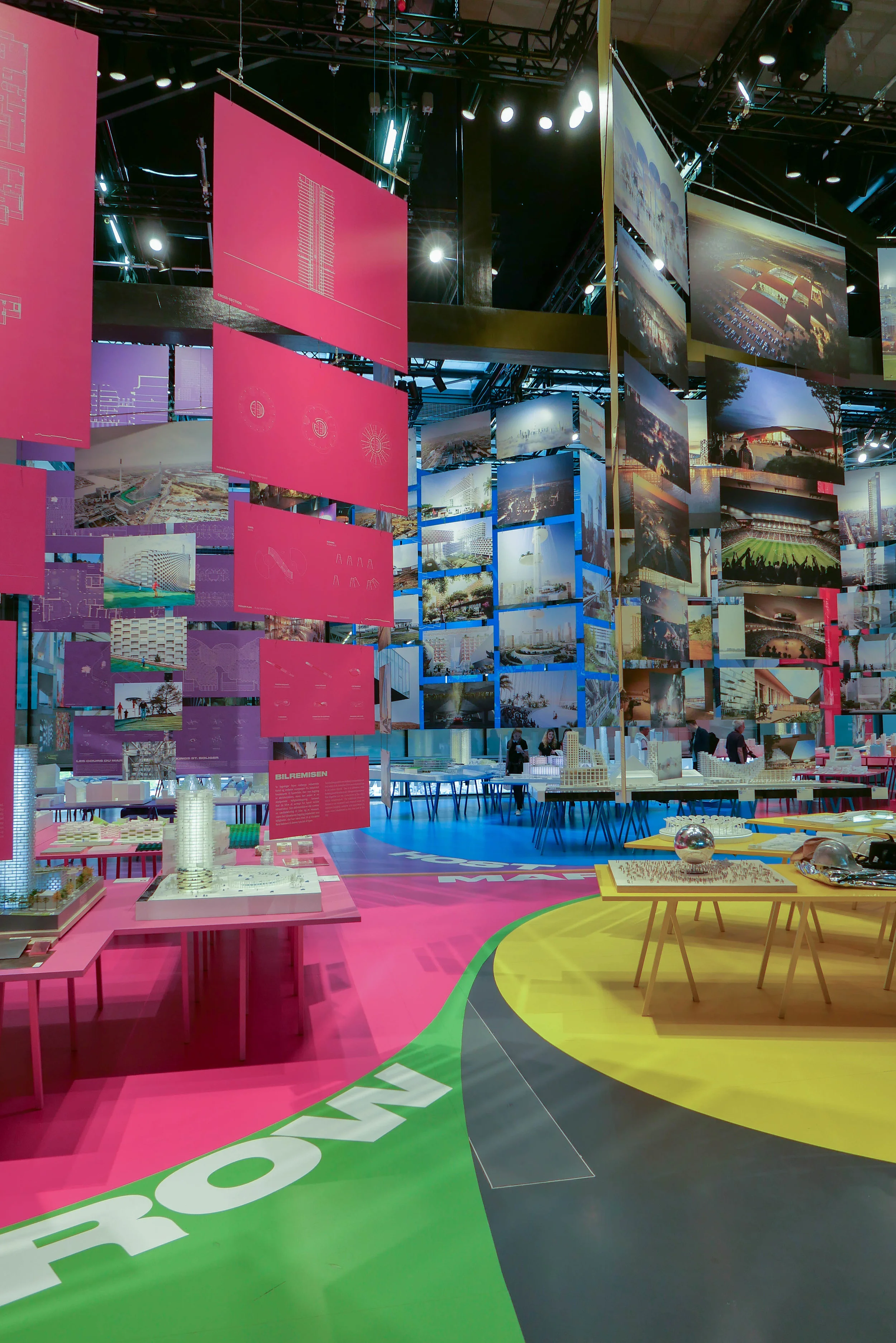
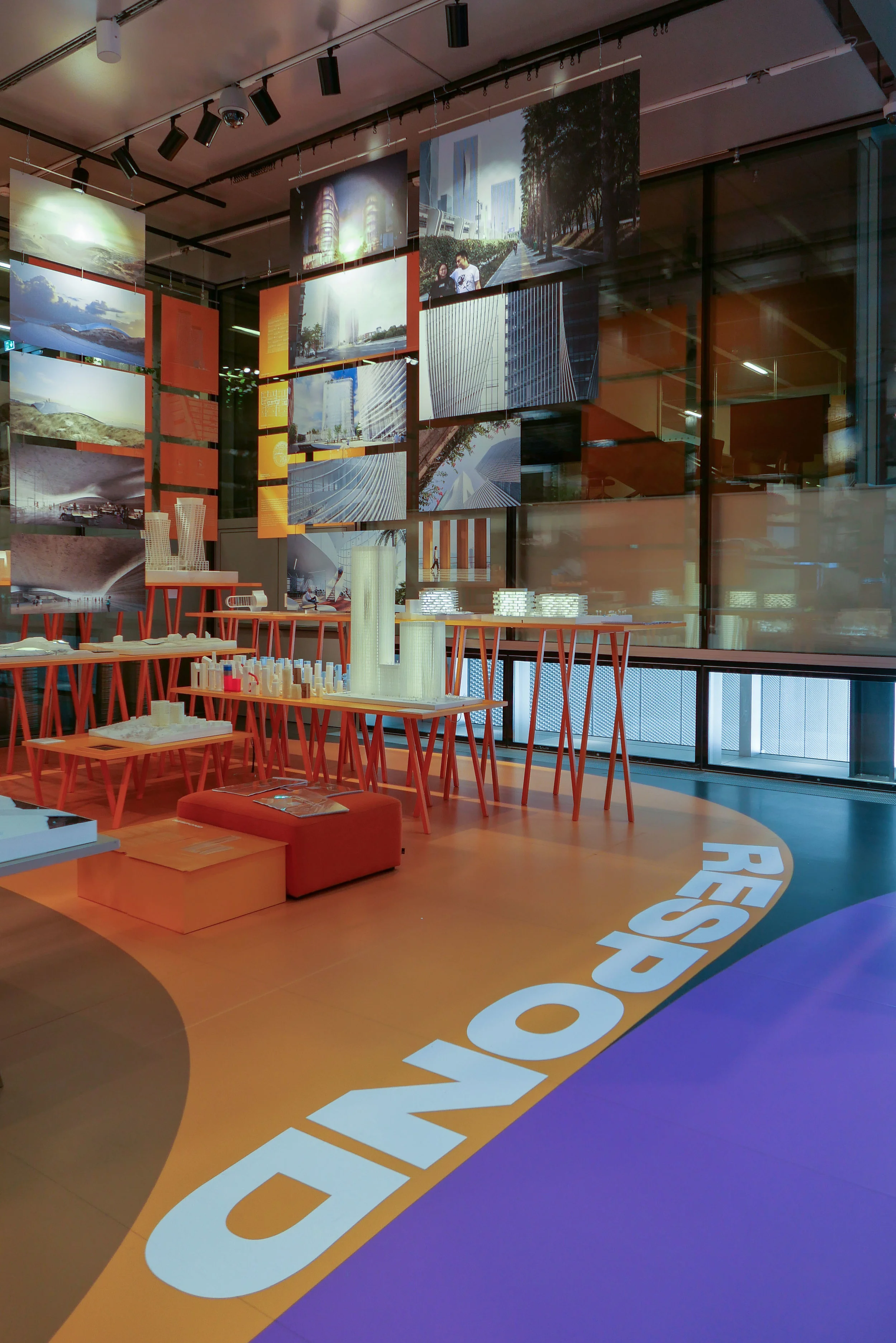
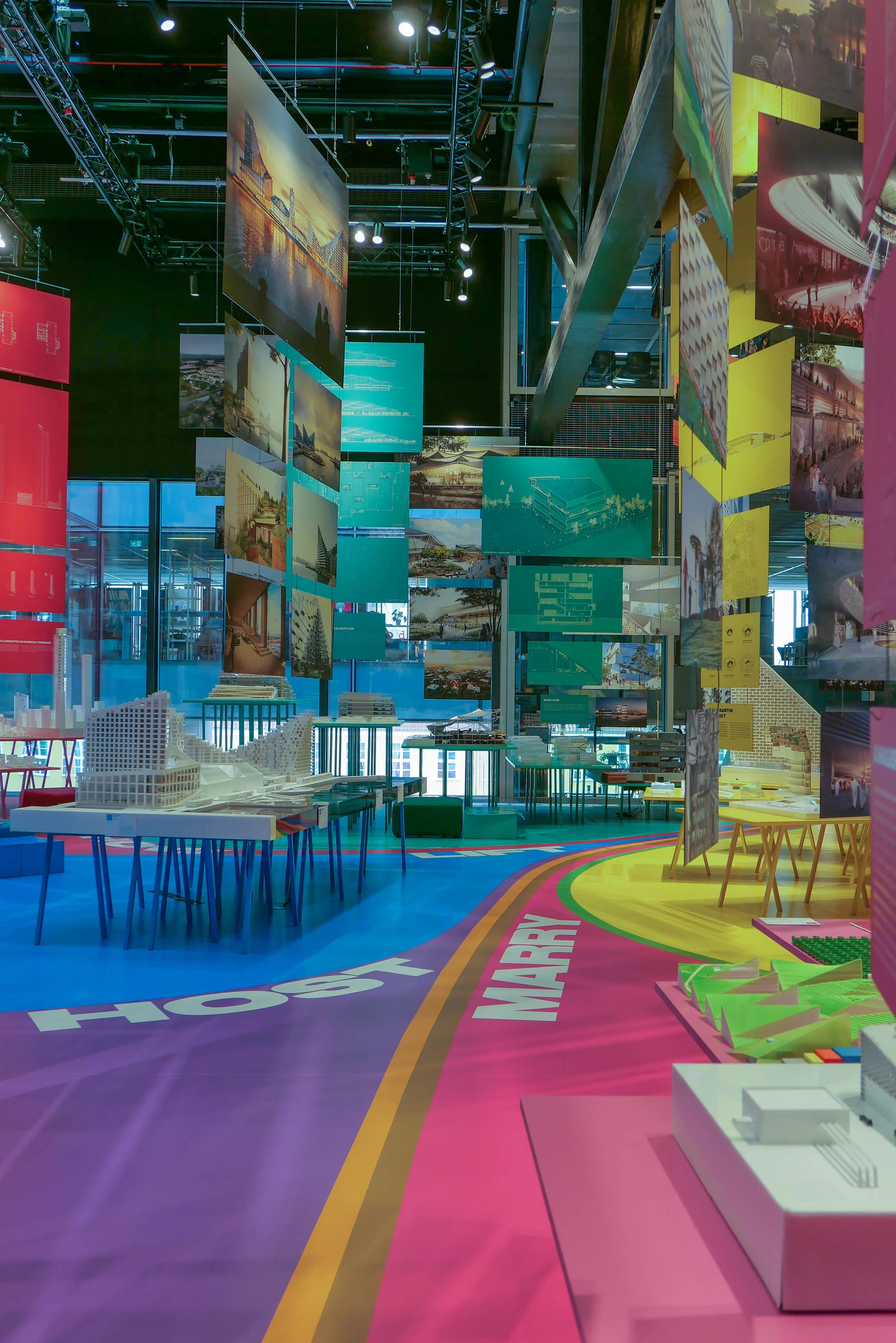
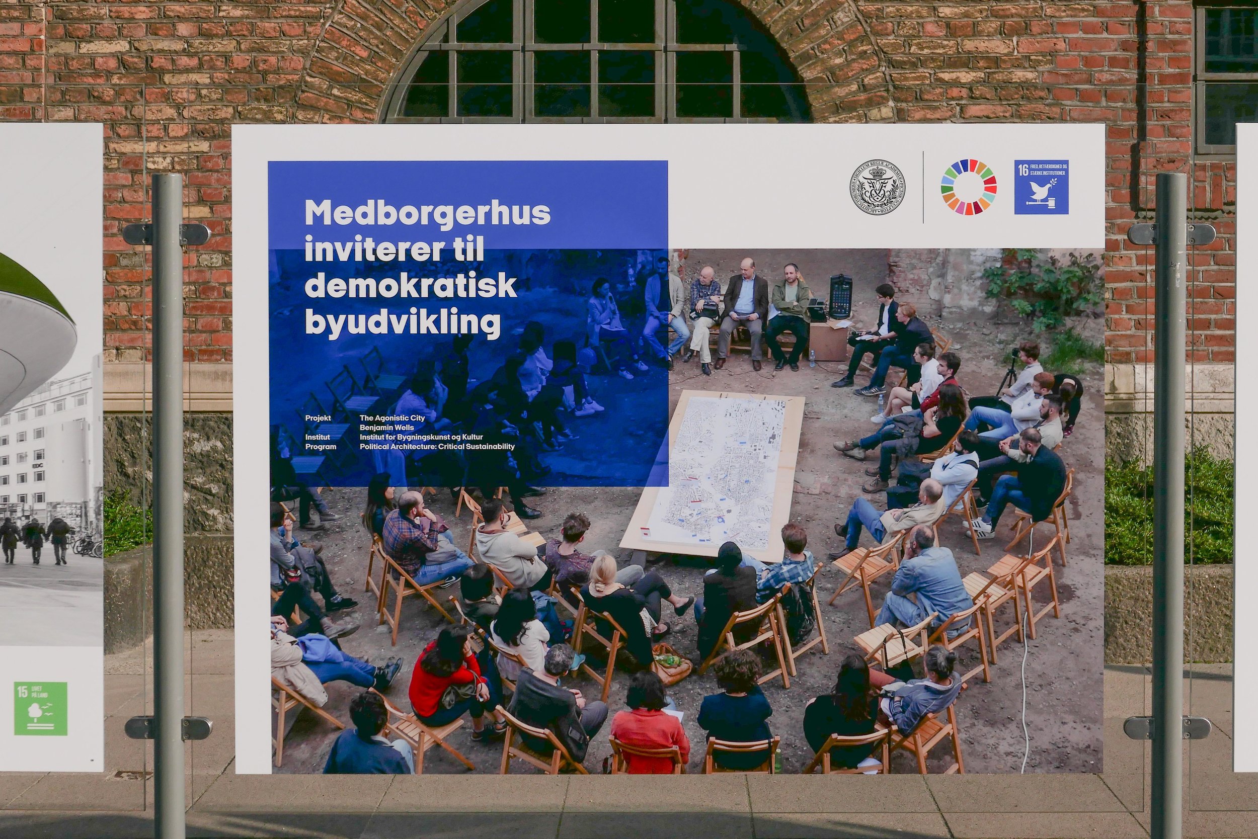
In each section, on trestles, there are architectural models.

Scale models for building projects are the traditional and the well-established tool of the architect and usually a final stage between concept and reality. Models can be the best way for the client and the planning officers to understand what the architect wants to do and models are particularly important if people distrust sketches or are not comfortable with reading and understanding plans and scale drawings.

Here, many of the models are internally lit - to add to the drama - and several use colour for the model that is not used in the final construction but emphasises the main volumes or large building blocks of the architectural composition and there are also some projects where a series of models show how a project evolved as different arrangements of volumes and primary building blocks were tried and ideas developed.

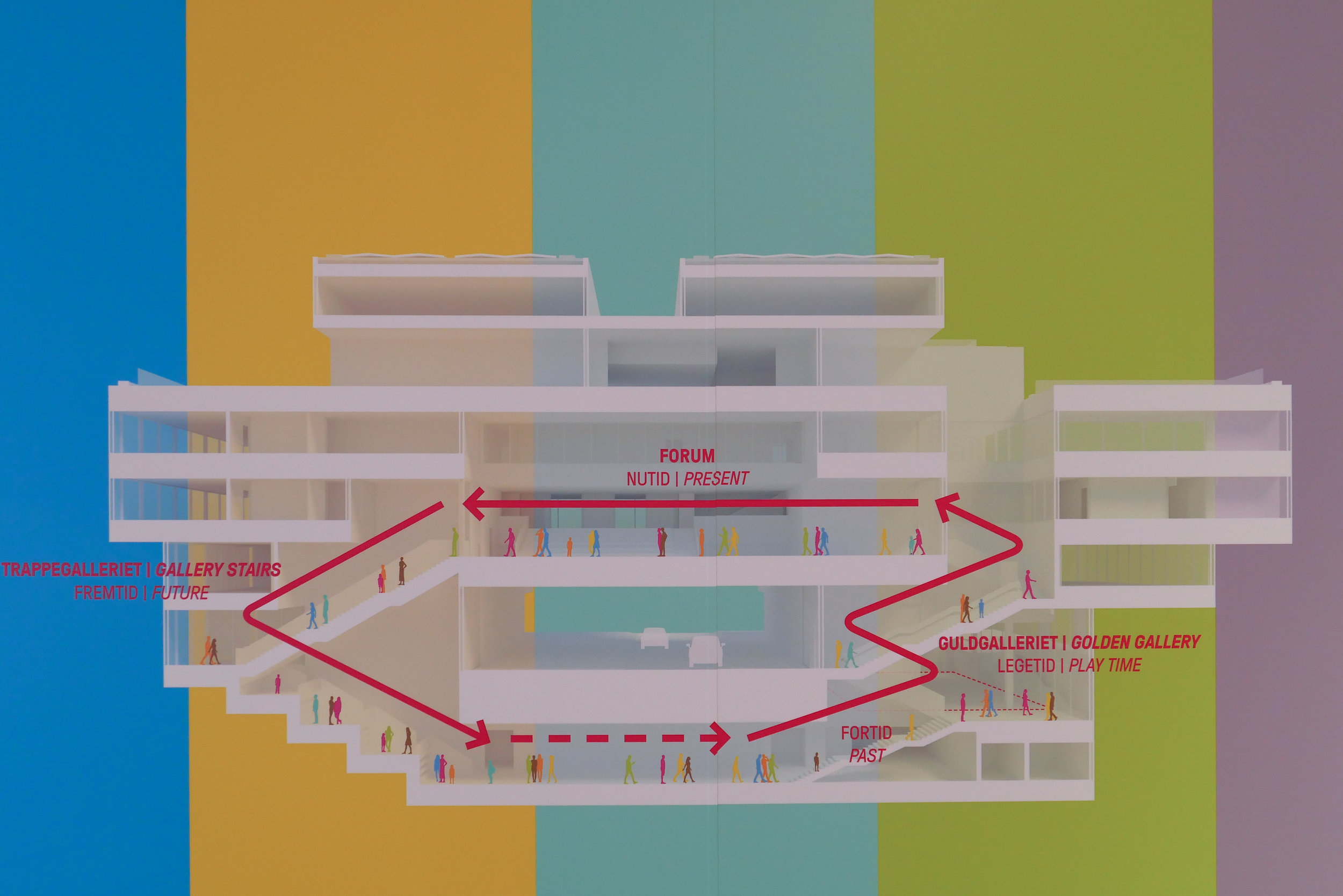
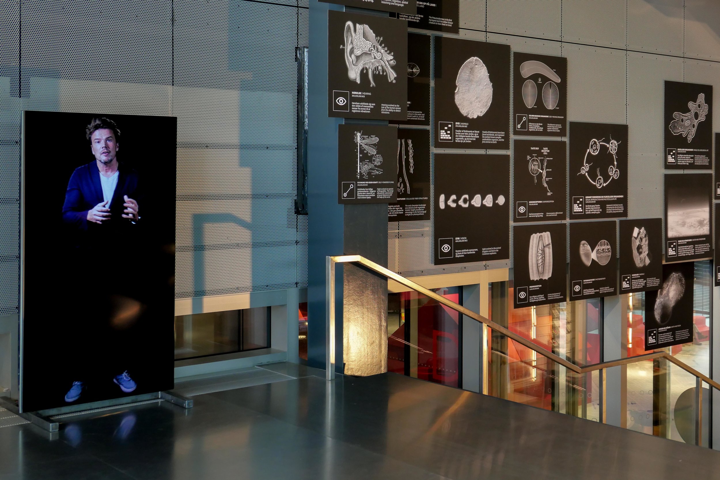
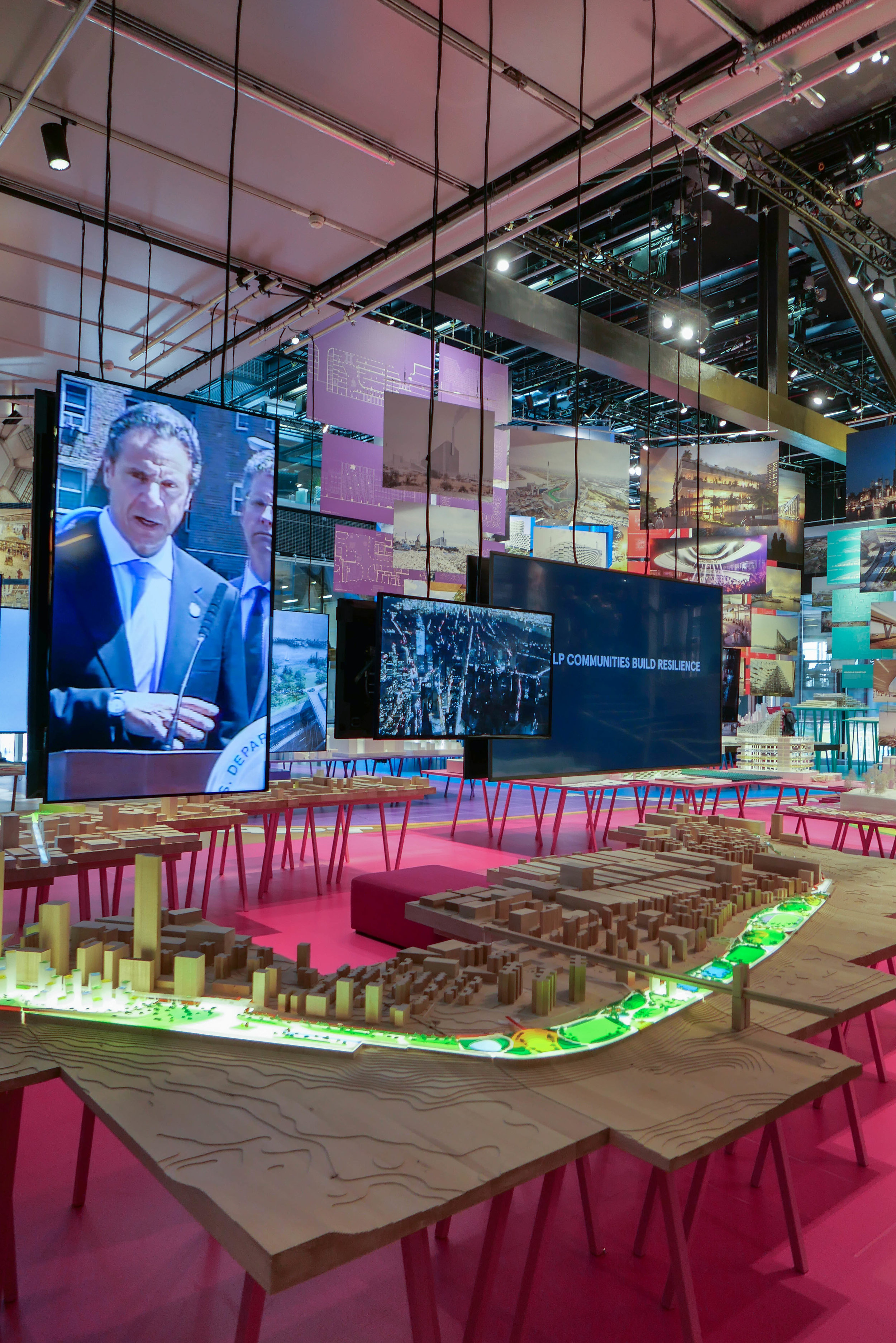
Down the stairs to leave and you find the BIG vision for the future - our future - including concept studies for people building on Mars. As you walk down the stairs, the sections are headed LEAP, THINK, SENSE, MAKE, MOVE.

As an exhibition, it is overwhelming and I will have to get into training and start overloading on energy bars before going back to think about a more carefully-considered review to add to this initial impression. Even if it sounds like it, I'm not carping or trying to be cynical. Seen together, these projects by BIG are impressive and the exhibition really is inspiring. So … the first impression is that it is overwhelming but inspiring.

Ingels is clearly driven - by enthusiasm and with passion - and revelations of theories underlying his ideas should, at the very least, initiate serious discussion about what we need from our buildings now and encourage people to think more about what we want in the future or, to quote, “rather than attempt to predict the future, we have the power to propose our future” although I’m still not sure if that we with the power is us or BIG.

It is appropriate that this exhibition follows on from the retrospective, here at DAC last year, that looked at the life and works of Ove Arup. Both men, although so different in character, can be seen as philosophers who, rather than write, build and make. Both set out to challenge the preconceptions of the staid or the cautious, to move architecture and engineering forward an alternative to simply making sequential improvements or recycling ideas.

If there is one omission, it is that Ingels fronts an atelier - a team of 600 professionals who are divided between offices in Copenhagen, London, Barcelona and New York - but from this first look at Formgivning there seems to be little sense of how responsibility is managed or delegated: an architectural practice on this scale and with this throughput of commissions is as much about management skills and, with growing fame, about the management of expectations as it is about inspiration.

And there is an aspect of modern architecture that the exhibition skirts around and that is the problems and the realities of the present. We tend to gloss over or ignore obvious mistakes of the past as now they are in the past and we want to be rushing on towards the buildings and the materials and the life style and the promises of an attractive and imminent future but in reality, and to be honest, architecture and building, particularly on the scale of many of these projects, is a protracted process where the present is the slowest part. The limbo of the present. Many of the designs here were commissioned five or more years ago and could take a decade to complete or might, even now, be shelved or abandoned as political or environmental pressure dictates a different course.

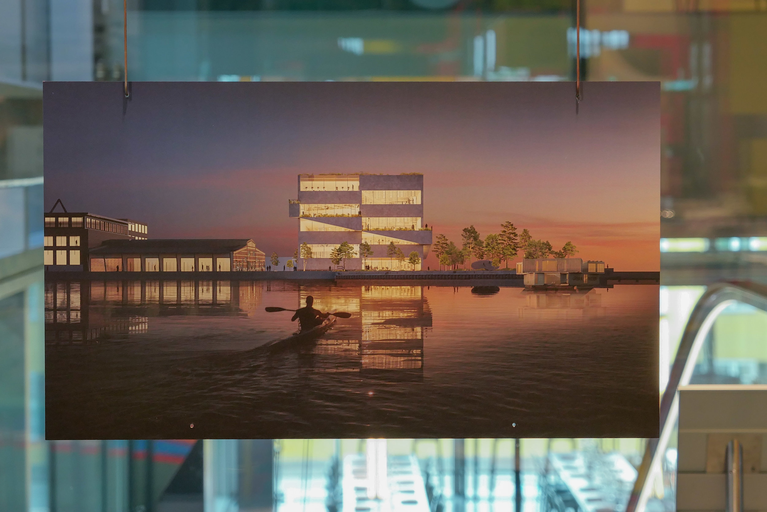
A case in point is shown in the exhibition with drawings and models for a new building in Nordhavn - the North Harbour - that has been designed by BIG for BIG.

It has been on hold for months because the proposals submitted were rejected in the planning process. A future on hold is frustrating but, sometimes, to take stock and to have to defend a design and to have to fight a corner or, even, when necessary, to accept and understand and take on board concerns should not thwart inspiration but could mean a better building but, in reality, it can be a slow and frustrating process.

BLOX, the new home of the Danish Architecture Centre by the architectural practice OMA, was commissioned in 2008 and completed in 2018. It has been heavily criticised but the rejoinder has been that if this building was commissioned today, it would not be this building that would be commissioned. Will that also be true for some of major projects from BIG that are shown here but are still to be realised?

If there has to be one single and simple contribution that the exhibition makes, it is that Ingels - in the very title of the exhibition - seems to challenge our use of the word design.

For at least the last decade, the word design has been kidnapped by marketing men so, for too many, design has become not so much a process but little more than an ingredient … a selling point to up the amount on the price tag.

Bjarke Ingels seems to have thrown in the towel and abandoned the word to go back to a Scandinavian notion of giving form so, the role of the architect is to have the idea and then to make that idea real … to have the idea and to give it form.


Formgivning / Formgiving
an architectural future history from Big Bang to Singularity
continues at Dansk Arkitektur Center / Danish Architecture Centre in Copenhagen
until 5 January 2020

Status:19 - Dansk Journalistforbund - Exhibition Bus Højbroplads

Part of the Copenhagen Photo Festival, this is an exhibition of 100 photographs by professional photographers shown as digital images on a mobile exhibition venue - the PIXLBOX or exhibition bus from PIXLART.

More than 2500 images were submitted by photographers who are members of DJ: Fotograferne … a section of Dansk Journalistforbund or the Danish Union of Journalists … and reflect a broad range of photographic work from commercial photography through portrait work, art photography and photo journalism.

The photographs were selected within an overall framework of five themes …

  • portrait

  • commercial

  • communication

  • art

  • journalism

 In the exhibition bus the images are digital, shown on a number of screens of different sizes and set portrait and landscape, and several images were shown cropped on more than one screen so there was an interesting opportunity to see how the message or story from an image changes with editing.

Shown on large, high-resolution screens the images have an intensity and depth that is rarely there on the printed page … just compare the images in the exhibition with those in the printed catalogue. That is not a criticism but simply the reality of keeping down the cost of printing the catalogue but then it becomes simply an aide memoir.

The large digital images showed strong vibrant colour where appropriate; the smallest detail in high resolution images and the nuances of soft light in the portrait by Søren Bidstrup of Lars Von Trier in a misty autumn landscape in a river valley.

The images scrolled through so there were often fascinating juxtapositions of images that established a momentary dialogue from the contrast. At one point an informal but still formal portrait by Niels Hougaard of HKH Prince Joachim, second son of the Danish monarch, in military uniform, was set, for a few seconds, next to an image by Rasmus Flindt Pedersen of a street in Mosul as people dealt with the bloody and grim reality of war.

It is a good exhibition space that is restricted but that actually means you focus on the image directly in front of you and the space is designed to have some seating to watch all the images on each screen scroll through and, above all, it is designed to bring art to streets and public spaces anywhere where people do not have easy or direct access to art. 

Many - on fact most - of the images are about context and back story - about why or what might or what probably happened next. Many capture just how weird life can be.


this exhibition was shown first through May in Viborg.
Status 19 in the exhibition bus is on Højbroplads
from 6 June to 11 June, 11 - 19


COPENHAGEN PHOTO FESTIVAL
DJ: Photographers - Status 19
PIXLART
PIXLBOX


Fang din by - forandring / Capture your city - change 2019


Fang din by - catch or capture your city - is an annual photographic competition at Dansk Arkitektur Centre - the Danish Architecture Centre or DAC - that demonstrates “that our cities are full of quirky details, historical corners, new urban spaces and fantastic architecture.”

This year the theme of the exhibition is transition in the city because our cities are changing every day and that change is fast. "We adapt to climate change, building height, the old is torn down creating new urban spaces." Information about the competition posed two questions ….

How does it look when old meets new? 
Is the transformation of our cities always good? 

Along with information about submission of images for the competition were also the recommendations that photographs should not only reflect the theme for this year but should also be an "exciting composition" and show the "interaction between urban space and people.

The competition was open to professional and amateur photographers and this year 3,000 people submitted images.

A final selection was made by a jury with Maja Dyrehauge Gregersen, Director of Copenhagen Photo Festival; the photo journalist Janus Engel Rasmussen, and Christian Juul Wendell, Head of Communications at the Institut for (X) and project manager at Bureau Detours.

The overall winner was announced at the opening with the second and third prize and there was a second and separate competition for schools and again the winner and second and third prizes were announced.

Fang din by was organised in collaboration with the Copenhagen Photo Festival and the opening coincided with the opening of the Festival.

the exhibition can be seen outside on
Bryghuspladsen in Copenhagen
- the public square in front of BLOX -
from 7 June through to 30 August

for the first time this year there will also be a separate but closely-related exhibition - showing a different selection of images - that will be moved between a number of venues around the city.

That exhibition can be seen at:

  • Nytorv - 7 June to 20 June

  • Israels Plads - 21 June to 4 July

  • Rådhuspladsen - 5 July to 18 July

  • Kultorvet - 19 July to 1 August

  • Den Røde Plads - 2 August to 15 August

  • Højbro Plads - 16 August to 30 August


Dansk Arkitektur Centre - Fang din by
Copenhagen Photo Festival
Bureau Detours
Institut for (X)

Fang din by on Bryghuspladsen


Fang din by on Nytorv

Is This Colour? … an exhibition by Kontempo at The Round Tower


Kontempo, an association of textile designers in the Nordic region, was founded in 2015. With a board of eight textile and furniture designers who meet once a month, they are "working to raise awareness about contemporary textile work and practices."  

Is This ….? …. is a series of exhibitions by Kontempo with Is This Colour? being the third following Is This Textile? in 2016 and Is This Knit? in 2017.

Here, twenty four works are shown that, using many different materials and styles, explore aspects of colour. The Gallery is in the Trinitas Church, the parish church for students, in an upper level that housed the university library, and access is via the brick spiral ramp in the tower. With windows on both sides - with views over the city - there is amazing natural light through the space and that is exploited in the exhibition so that what is clear, immediately, is that surface, texture and shadow all have a crucial role in how we perceive colours.

KONTEMPO
the exhibitions continues at Rundetaarn / The Round Tower until 23 June 2019

the framework
ide Blichfeld

NCS S 1080 Y20R
Kitt Dusnia

compleat
Charlotte Østergaard

colour lab
Louise Sass

duotone
Eva Fly

translucent faces
Henning Larsen

There I Belong at Statens Museum for Kunst


There I Belong is the first in a new series of exhibitions under the title SMK Plus where contemporary artists will explore the collections of the National Gallery.

For this exhibiion - Inspired by the works of the Danish painter Vilhelm Hammershøi who lived and worked in Copenhagen around 1900 - the artists Michael Elmgreen and Ingar Dragset have collaborated with Marianne Torp and Tone Bonnén, the museum's curators of contemporary art.

Spartan interiors by Hammershøi are restrained and calm but they are enigmatic - paintings that tread a fine line between being self contained or depictions of a life of painful isolation. The paintings resonate with a contemporary audience, reflecting aspects of modern taste and restrained Scandinavian interiors.

There may be windows in these rooms but the view out to a world beyond is usually obscured by thin, translucent curtains … the natural light entering the room is crucial but a sense of place not so because these are studies in light but never put people, objects or place under a harsh spot light. Figures in the paintings are detached, generally absorbed in what they are doing, inward looking, often with their back to the viewer and in many of the paintings we do not even know if they are reading or writing or simply sitting with head bowed in quiet contemplation. Open doors indicate that there are rooms beyond but barely hint at a lived life.

Interior with the Artist's Easel, takes this to an extreme because, when painting the picture, the artist himself should be at the easel. The only conclusion has to be that there is a second easel at the point where the viewer is standing so are we the artist? Perhaps we have been co-opted into this quiet and private world but this is the ultimate antidote to that modern scourge - the selfie - where the photographer shows themselves at the centre of the scene, always the subject of the view, inevitably relegating an event or scene beyond to a secondary role.

The second gallery - a large space - shows the work Powerless Structures (8 doors) by Elmgreen & Dragset from 2000-2002. These are the most simple, basic, standard white doors imaginable, with plain white door frames but each is a variation in a theme of a detachment from the real or the functional … one door has handles and hinges on both the left and the right side so it would be impossible to open - another has a handle that is not on the door but on the wall alongside so it might or might not open - one door is slightly open to reveal a locked door immediately behind - one door is folded and wrapped around the corner of the gallery - a pair of doors on adjoining walls at another corner are separate but linked by a security chain as if someone might be able to squeeze through from a room on one side to another room without being able to get into the gallery.

This work, or a version of this work, was shown at Statens Museum for Kunst in 2015 in Biography - an ambitious set of major installations by Elmgreen & Dragset. Then, the doors were part of a corridor and a series of rooms that were in what appeared to be a government or public office building. If not obviously dystopian then the corridor was completely anonymous and designed to smother any sense of self. On entering you had a choice to go one way or the other but with no signs or notices to say where you were or why you were there although you could get a ticket from a machine to wait for your number to be called but it never would be, of course, and if you proceeded past these doors you could only return to where you started.

By now placing these doors on the four walls of a large gallery, the work takes yet another step back and pays homage to Hammershøi but expands his space until it is monumental in scale.

The exhibition includes photographs, paintings, sculptures and video by other artists - all taking the theme of doorways and spartan anonymity - with works by Njideka Akunyili Crosby, Lilianna Maresca, Francesca Woodman, Robert Gober, Annika von Hausswolff, Ugo Rondinone and Thomas Ruff. Only the work by von Hausswolff is from the museum collection with the other works either courtesy of the artist or on loan from galleries and private owners.


the exhibition at Statens Museum for Kunst / The National Gallery in Copenhagen
continues until 1 September 2019

Interior with a young woman sweeping, 1899

Interior, No 30 Strandgade, 1906-1908

Interior with the Artist’s Easel, 1910

KADK graduates and UN Sustainable Development Goals


Shown in this outdoor exhibition are seventeen innovative study programmes or research projects by graduate students from the Royal Academy Schools of Architecture, Design and Conservation and each represent one of the 17 UN Sustainable Development Goals.

Rigsdagsgården - the courtyard immediately in front of the parliament building in Copenhagen - is an amazing public space that is easily accessible for everyone and has a regular series of open-air exhibitions but, more important, given the subject of this exhibition, it brings these problems - and the urgent need to find potential solutions - right to the doorstep of national politicians.

These are innovative and imaginative projects that show architectural, design-led or conservation solutions to major global problems but all are based on established design principles and the use of existing technology or of technology being developed now.

This is the best of Danish architecture and design that can and should be harnessed to tackle serious problems that have to be resolved now.

Solutions shown here are a response to huge range of serious questions including questions about:

  • how we can reclaim methane gas from melting permafrost as a source of green energy

  • how to use sustainable materials to design textiles and make them a preferred choice

  • how we create healthcare solutions for elderly citizens that involve people and maintain their dignity

  • that developing traditional handicrafts can be a starting point for women to start a local business

  • how novel solutions can ensure that people everywhere have access to clean water

  • design solutions can tackle the problem of over production of food or food waste and encourage people to share food resources to combat hunger

  • the design of lighting in the class room can be used to reduce noise levels and encourage calm and concentration in schools

  • research can find a way to use the waste from fish farms to fuel biogas energy

  • major architectural projects - changing the use of large but now redundant buildings - can reduce inequalities by enabling everyone in a community to participate

  • hemp can be an alternative to cotton because cultivation requires less water and less fertilisers

Each project is shown across two large panels for maximum impact but are repeated - two or more projects to a panel - on the side of the exhibition towards the pavement - where the text is in English.

There are important statements here from Jakob Brandtberg Knudsen, Director of the School of Architecture; Mathilde Aggebo, Director of the Design School; Rikke Bjarnhof, Director of the School of Conservation and Lene Dammand Lund, Rector of KADK. 


Det Kongelige Danske Kunstakademis Skoler for Arkitektur, Design og Konservering
The Royal Danish Academy Schools of Architecture, Design and Conservation

the exhibition of graduate projects from KADK in Rigsdagsgården
the courtyard in front of the parliament building in Copenhagen
continues until 30 June 2019


select any image to open in a slide show


Biennalen for Kunsthåndværk & Design / The Biennale for Craft & Design 2019


This evening, the prestigious Biennaleprisen from Danske Kunsthåndværkere & Designere - the Biennale Prize from the Danish Association of Craft and Design - was awarded to Katrine Borup, Pernille Mouritzen and Bess Kristoffersen for their work Revl og Krat / Wheat and Chaff … an installation that is a curated collection of natural objects - including soil, branches, bark moss and grass - with crafted objects, photographs and notes.

It is a collaborative project by artists who work in the woodland around Dyrehavehuset / Deer Park House - a historic timber-framed lodge that is close to Tystrup Lake - 70 kilometers south west of Copenhagen - and was part of the extensive estates of the historic house at Gunderslevholm.

In the catalogue, the artists acknowledge the influence on their work of the American academic, author and teacher Donna Haraway and cite her recent book Staying with the Trouble.

This is about connections and stories; about art, science and political activism and about trying to understand our environment and about showing respect for nature.

Dyrehavehuset, Rejnstrupvej 5, Fuglebjerg - has been restored and is now the studio of Bess Kristoffersen.

The web site for Deer Park House has a specific page to illustrate some of the workshop sessions and the works produced at the studio for Revl og Krat.  

bessktistoffersen.dk
pernillemouritzen.dk
katrineborup.dk
dyrehavehuset.dk


Naturen Vinder Biennaleprisen 2019

Prize Committee

Pernille Stockmarr, curator, Designmuseum Danmark
Peder Rasmussen, ceramicist
Christina Zetterlund, lecturer and curator Linnéuniversitet 

the exhibition with all eighteen works selected continues until 5 May 2019 at
Nordatlantens Brygge, Strandgade 91, København K

note:

I am curious about the translation of the title of the work.
In dictionaries revl is generally translated into English as batten or possibly lath (plausible as this is a woodland lodge) and krat as a thicket so presumably the saying implies something useful coming from something that might be dismissed or might be seen to be useless … in terms of potential materials, the tangled branches of a thicket are less useful than a carefully nurtured tree from managed woodland.  

This has been translated in the catalogue as Wheat and Chaff … where wheat is the grain or seed that you keep and use for food or for planting for the next crop while the chaff is the husks that are discarded after the crop is winnowed.

Is the implication therefore that if you appreciate the chaff then you can use teverything?

Fællesskab anno 2019 / Community anno 2019

Catalogue for Biennalen for Kunsthåndværk & Design / The Biennale for Craft & Design 2019

The forward for the catalogue has been written by  Hans Christian Asmussen - designer and lecturer in design and on the board of Danske Kunsthåndværkere & Designere / the Danish Association of Craft and Design.

He discusses the growing importance of our sense of community and the eighteen projects chosen for the Biennale consider, in one way or another, our "notion of community - some with a critical voice, some in a playful tone, some tenderly, but all striving to explore the value that community offers."

This is about how artists, through their work, explore complex ideas, express what they feel and give the viewer reasons to think and reconsider by emphasising or challenging a view point or simply by shining a light on aspects of our lives that possibly we need to reconsider.

There is a longer essay on Community by the design historian and design theorist Pernille Stockmarr. She makes the crucial observation that with the frequent use of terms such as 'sharing economy', 'co-creation', ‘co-design', 'crowdsourcing', and 'crowdfunding', the concepts of community and cooperation have a strong and important relevance.

Historically, the concept of community is strong in Denmark with a well-established welfare state; a strong sense of family and friendship; a strong and ongoing role for the co-operative movement in retailing for food and household design and a strong volunteer movement through various sports and hobby associations.

In part, political change outside Denmark and the growing pressure to resolve threats to our environment has lead many to question what motivates us and those uncertainties make us reconsider our priorities and help us decide how we can move forward as local or wider communities.

read more


the Biennale - Popsicle Index Workshop


A fascinating project by the textile and colour designer Margrethe Odgaard to explore links between our senses … so how taste or flavour, and presumably also smell, can form associations with certain colours.

In blind tastings of different foods in four different groups - Apricot, pomegranate and date in one trial and masala and marshmallows in another - people picked a colour from 520 different colour samples on the ice-lolly sticks and then put them into the slot in a wooden box to record which colours they associated with which flavours.

Colours selected for each specific group of flavours are shown in frames.

Obviously the mental and emotional process - linking a colour with a flavour or smell - is complex and surely has to be subjective. Some flavours will seem hot or cool or strong or subtle - we use many of the same words when we try to describe flavours and colours - and presumably that makes the choice of specific colours relatively straightforward but also people will also associate a specific smell or flavour with a particular memory of a specific event so that could well be the colour of the room they were in when they first tried a food or there might be a strong link between a person they knew and their favourite food and their favourite colour.

This experiment also, of course, throws a light on how designers, particularly product designers, have to consider options for colours that have to reflect fashion while allowing not only for personal taste but also conventions within a community or society for which colours are associated with a function … so designers have to consider colours that a wider community might associate with freshness or grief or passion or, that most curious of human concerns, about which colours reflect or might signal that you have good or bad taste. 

Biennalen for Kunsthåndværk & Design

margretheodgaard.com

the Biennale - no straw shortener

uden stråforkter / no straw shortener - are two works by the designer and visual artist Christina Christensen. One work is with rye from fields near Odder, and the other with reeds from Kysing Beach, and both with cotton, linen and brass.


connections:

Through their work, many of the artists who exhibited at the biennale communicate complex ideas or raise important issues about our lives … both in our immediate communities but also, more generally, about how we respond to and how we do or how we should appreciate and respect our broader natural environment.

These woven panels raise interesting issues about both how we see and use natural materials and about the impact on nature of human intervention.

Over recent decades research by plant breeders has lead to the development short-stemmed grain crops - to reduce damage from wind or rain, and to increases yields - but, as a consequence, secondary uses for the product from taller varieties are lost.

Until the second half of the 20th century, corn was not simply harvested for the nutritional value of the seed but the long stalks were a sustainable raw material.

Straw (and in many areas reed) was used for thatch where stone slates or fired clay tiles were not available locally or were too expensive for ordinary buildings.

Now, we worry about air miles or about the cost and effect of shipping food, fashion clothing and goods round the globe but I'm curious to know how many people think about where the materials for the construction of their home come from and the environmental impact of those materials at the source, at the factory, and from the transport of the materials.

Generally, in the past - so before the twentieth century - transport of building materials was difficult and expensive. If you were wealthy then you could buy a fashionable fireplace or elaborate panelling from the nearest city or import an exotic wood like mahogany for a staircase to be made by a local craftsman, but for ordinary people, building an ordinary house, materials, generally, came from the local area - often from no more than five miles away - unless you were by the coast or on a river, or, from the 19th century, by a canal or then a railway, when transport costs were less prohibitive.

So, it is fantastic to see the architect Dorte Mandrup using thatch for not only the roof but also for the external cladding of the walls for the new Wadden Sea interpretation centre at Ribe on the west coast of Jutland.

But straw and reed were not just used for building but were also used to make mats or to make furniture - in areas, where good timber was not available - and for making household goods and toys - but how many people now have things in their homes made from straw or reed?

I had a set of table mats that lasted for nearly 20 years before they finally disintegrated and I have a few traditional Dutch Christmas decorations - small birds and stars - that are woven in straw, and every year, for more than 30 years, they come out of the cupboard to be hung on the tree … good and sustainable examples of rural crafts that have much more meaning than tinsel and baubles.

For more than 20 years I measured and recorded and assessed historic buildings of all periods and a good number were thatched. My job was to measure, record and date the timber-work of the roof structure but I have to admit that I rarely thought about the thatch … more than just to note the material and any pattern on the ridge or eaves that reflected the traditions of that area.

Looking at the work by Christina Christensen, reminded me when I first thought about long straw. I had been asked by BBC radio to collaborate on a programme about a thatched building in Oxfordshire and was there to talk about the date of the roof timbers - the form and techniques of construction suggested it dated from the 14th century and that had been confirmed by dendrochronology - but the main contribution to the programme was from a plant archaeologist.

What was so important about that particular roof was that it had never been stripped back for the thatch to be replaced completely. For over 600 years it had simply been patched and repaired with new layers over the old core of straw thatch. Not just exposed roof timbers but also the underside of the thatch itself were blackened with soot from the original open hearth that had been at the centre of the house until the 16th century when a new fireplace with a closed-in chimney was built.

From within the roof space, huddled in cramped space above modern ceilings, with me and the radio interviewer, the archaeologist drew out straws that were not far off 2 metres long and some still had their seed heads. From these he was able to identify the specific types of corn grown in the area in the middle ages - types of corn that were often specific to a relatively small area and certainly no longer grown - and identifying them was important for understanding medieval farming but also important for studies on bio diversity.

the Biennale - to play and learn together


This work by Kristine Mandsberg has prominent labels that read "please touch".

Play and, through play, early learning is one of the first stages where a child not only begins to explore and understand the physical world but also begins to build bonds with parents, siblings and a growing circle of friends.

Copenhagen has remarkable playgrounds with a huge range of equipment to test agility, to stimulate the imagination of children and to encourage play and the production of toys and furniture for children has been important in the works of many designers.

Kristine Mandsberg trained as a textile designer in Kolding and once you know that then the structural form of Three of a Kind, with warp and weft, becomes intriguing.

She also describes herself as an illustrator and the bold simple shapes here and her use of strong, bold colours has to come from a graphic sensibility.

But it was not just children who spent time twisting and turning and resetting these pieces. It was interesting to watch adults set and re set the pieces … perhaps not to find the inner child but seemed to reflect, at least, the way humans are curious about complex and adaptable structures.

These works have an element of mechanics about them … reminiscent of old wood football rattles that are never seen at matches now.

Biennalen for Kunsthåndværk & Design

kristinemandsberg.com


Axel Salto Stentøjsmesteren / Axel Salto stoneware master


A major exhibition of work by the artist, designer and ceramicist Axel Salto (1889 - 1961) opened in February at Øregaard Museum in Hellerup - just along the coast to the north of the city.

Salto studied painting at the Royal Academy and graduated in 1914.

By 1916 he was living in Paris where he met Picasso and Henri Matisse and on returning to Denmark he produced, edited and wrote for a short-lived but influential journal Klingen / The Blade that was published between 1917 and 1919.

He was a member of the Grønningen group of artists and one of The Four with Svend Johansen, Vilhelm Lundstrom and Karl Larsen who exhibited together between 1920 and 1929.

In the 1920s he began to design ceramics and his stoneware pieces were produced in the workshops of Carl Haller at Saxbo keramik in Frederiksberg and he also produced designs for porcelain by Bing & Grondahl with his work shown at the Paris exhibition in 1925.

This exhibition shows a full range of his ceramic works from small stoneware bowls with incised decoration or bold moulding with Japanese-style glazes to large-scale works with scenes from Classical mythology or stylised nature.

Paintings and strong and very confident ink and line-work drawings, including designs for the ceramics, show clearly the style Salto developed from his training as a painter.

He also worked with the book binder August Sandgren and a selection of designs for end papers are shown in an upper gallery which have a distinct feel of the 1930s with deep colours and stylised and small repeat patterns.


the exhibition continues at Øregaard Museum until 23 June 2019