a design back catalogue .....


The recently restored building of the old postoffice in Købmagergade in Copenhagen has become a major design destination for the city. On Købmagergade itself, ARKET has been open for less than a month but if you head down the side of the building to the right, down Løvestræde, there is the entrance to the showrooms of the major furniture company Fredericia and to the left, down Valkendorfsgade, is the entrance to the show rooms and design store for Fritz Hansen.

ARKET and their collection of fashion and household design is literally brand new but both Fredericia and Fritz Hansen are well established companies with international reputations and both have catalogues that balance new commissions from major designers working now along with what are recognised to be Danish design classics that may have been designed fifty or sixty or more years ago.

Talk to young designers, just in the first years of their careers, and the conversation will inevitably come round to the ‘shadow’ in which they work. And that is not necessarily expressing a sense of awe but often a sense of frustration … if a company falls back on a well-established or safe design then where is the opportunity for the Arne Jacobsen or Nanna Ditzel of this generation to get their work into production? It is a problem. Major design by Hans Wegner or Børge Morgensen are not just popular but their furniture deserves to have a relevant and important place in contemporary interiors.

In some cases, the current production can even be better than the originals - with improvements in materials or changes in manufacturing methods - but how much should the back catalogue be updated or changed to give the designs a new relevance or a new appeal?

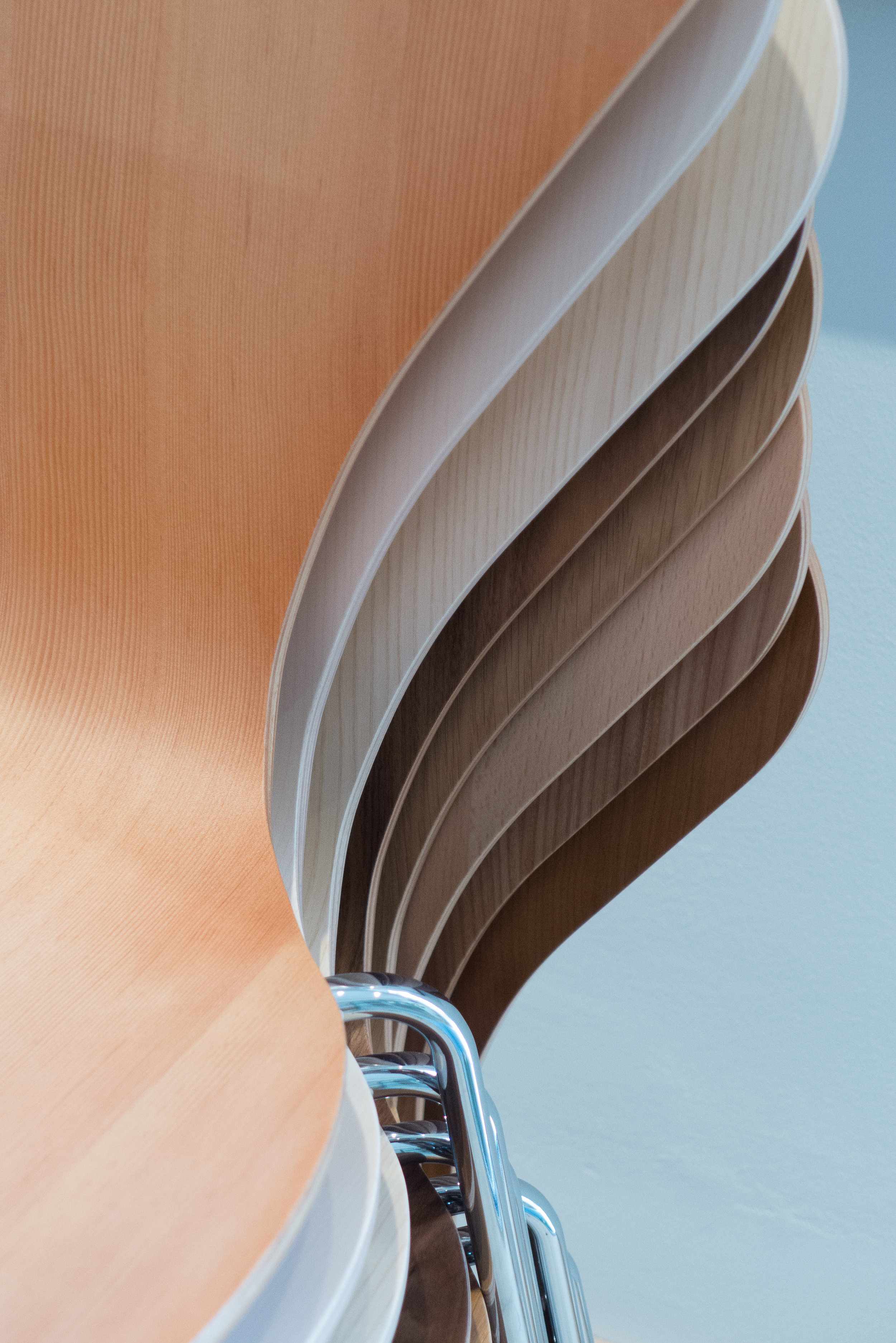
Series 7 was designed by Arne Jacobsen in 1955 but is still incredibly popular which is testament to the design itself. One current version has gold legs and when I saw the chair with fabric covers in a deep plush it was obvious that my inner puritan was a bit affronted … plywood is an amazing material and the original design exploited the flexibility of the steamed and shaped shell so that it was comfortable without padding.

But then I thought the display piece in the entrance to the Fritz Hansen store - with the shell set on a rough log - looks fantastic so my qualms were about taste and not for messing with the master. The Series 7 - on a linked frame rather than on legs - has been used in many lecture rooms ... a good recent example being at Museet for Søfart - the Maritime Museum - in Helsingør designed by Bjarke Ingels.

And the Series 7 is available in a good range of colours and wood veneers so maybe a great classic design can be and should be all things to all tastes. 

Fritz Hansen


Fredericia

Barbry Stool by Aurelien Barbry


The Danish furniture company Fredericia have moved from Frederiksborggade in Copenhagen to an extensive and impressive new space in Løvstræde where they are on the upper floors of the recently restored old post office building. There are large, well-lit spaces for displaying the furniture and, from the upper level, amazing views over the roof scape of the old city.

read more


new Normann

Tea Strainer by Böttcher Henssler Kayser, Nutcracker by Ding3000 and Peeler by Holmbäck-Nordentoft


With such a large number of people at the party last month for the relaunch of the Normann store in Copenhagen, it was a bit difficult to judge exactly how much had been changed. You could see the main alterations to the space but obviously it was difficult to see how and where furniture and so on would be displayed and impossible to get any sense if it would really feel like a different shop once the partygoers had left and it was all arranged for a more normal day.

So a trip back over to the store on a weekday was fascinating.


It has always been an unusual store because at one stage in its past the building was a cinema and that had been built immediately behind earlier shops on the street frontage. There is a relatively narrow and simple frontage from the street … simple in the sense that several shops along the street retain original or at least early fronts with heavy wood-framed windows and traditional display areas but Normann has large sheets of glass with minimal frames and a discrete name above. Inside there is a long and relatively narrow corridor running straight back into the building to get you to the main shop area in the old cinema. Until recently this corridor had a fair amount of display, in part to draw you into the store, but it is now much more dramatic with a solid and stark block of terrazzo forming a sale counter or reception just inside the doorway and some carefully-chosen items on display and then the corridor itself has been given a grey but glossy floor and the ceiling has ranks of neon strip lighting with the walls covered in large sheets of reflective metal. Along one side is a long long line of upholstered seating, rather like the Swell range from the company but squared off, less rounded, and, at the moment, along the side facing the seating is a long line of vases, the Nyhavn Vase, standing on the floor and all the same colour, so the effect is dramatic and sort of glamorous but glamour carefully restrained.


Just Chair from Iskos of Berlin with Slice Table by Hans Hornemann and the Onkel Sofa by Simon Legald

Ace Sofa by Hans Hornemann and Sumo Pouf by Simon Legald with Solid Table by  Lars Beller Fjetland


The large main shop space opens out at the end of the corridor and previously had a first part with a low ceiling, under an upper gallery that is an office and studio space, with steps and slopes down with parapet walls enclosing the area before the lower main display area and then at the far end there was a large raised area that was used in part for display and in part for meetings and exhibitions. The steps down are now the full width and in a dark terrazzo, so much more architectural, and the stage area has been removed completely to open up the space. Historic architectural features, including fairly grand and ornate arcading along each side, have been kept but given a sophisticated colour scheme in grey and white.

What was an open staircase in the centre to get down to a basement area has been in part covered over, again with the reflective metal sheet, and the stairs carpeted in pink. Clothes for men and women that were originally shown in that lower basement level have been moved up to the main floor and to glass wardrobe-like display/storage - that in part makes the items seem rather more special and even more carefully selected and in part these cabinets and other display features, taller and more solid than any previous display, divide up the area and enclose parts that suggest something much more like room settings for the furniture than was possible before.

Below, in the basement area, there is still some display but vaulted areas towards the back have been glazed in to create well-fitted meeting rooms and it is this that appears to be a key to the remodelling. It is just from observation rather than from talking to the team at the store but this all seems like a very careful move to take the whole brand up a level. For both the customer and the commercial buyers.


Nyhavn Vase designed by Simon Legald

Cap table lamp by the German design studio Kasch Kasch


The shop was always more a design store anyway rather than simply a main shop … most Normann furniture and design is sold through independent shops and department stores. So this means the Østerbrogade store is now the place to come for inspiration and not really the place to come to buy one more chair like the ones you bought last year although I’m sure they would be happy to sell it to you. 

Over the last five or ten years the main furniture and design companies in Denmark have ended up too much alike, too bunched together in the middle of the price band, trying to match each other in price and ending up matching each other in style too … the simple consequence of the consumer driven pressure for ‘value’. With the recent opening of a Fritz Hansen store in Copenhagen and the proposed merging of Hay with &Tradition and with Gubi still going very much it’s own way there seems to be a really healthy and new sense of divergence. 

At Normann, rather as with Muuto, what has always been interesting is that they have distinguished their designs by choosing very distinct ranges of colours. There really is a Normann style and although they would say, quite rightly, that their furniture appeals to a wide range of customers, this change to the store and the very character of the launch party itself would suggest that, at least here in Copenhagen, they are aiming for the 30 plus urban professional who has a real interest in fashion and design and this really does mark a move away from the pale wood and grey or muted colour palette normally associated with Scandinavian design and a move towards something still very sophisticated but maybe, as said, a bit more glamorous and a bit less clam. Minimal meets Art Deco revival … or is that me trying to be too clever?

normann Copenhagen, Østerbrogade 70, 2100 Copenhagen

Karina Noyons

 Back in August, at the Kunsthåndværker Markedet - the craft market on Frue Plads in Copenhagen - one stall that immediately caught my attention was the work of the jewellery designer and goldsmith Karina Noyons. 

Her work is striking - simple but very clever and inventive - playing with strong geometric shapes but twisting them around so rings or bracelets are held out from the body. So for instance, by putting a square outside an inner circle of a ring. Here clearly is a designer's and a goldsmith’s skill that, to repeat something discussed regularly on this site, develops from experience and from working directly with a material, to understand what will and what will not achieve a desired result. What this jewellery also illustrates so well is that the simpler the piece then, as here, the more perfect the workmanship has to be … minimalism shows up any flaw and to misappropriate a much used phrase … less means more skill.

But above all, what I could see in the jewellery, is a fantastic and clearly justifiable self confidence that's combined with a really good sense of humour. That was obvious in the clever display that used illustrations by Rasmus Bregnhøi as a background for the jewellery with suggestions about how the more unusual or less conventional pieces could be worn.

read more

Karina Noyons

Rasmus Bregnhøi


Roon & Rahn


Nicki van Roon and René Hansen are based in Aarhus and their designs were produced to solve a specific problem … they couldn’t find what they really wanted for their own apartment.

In fact, that seems to have become a key feature of their work … it’s problem led or do I mean solution driven? That’s a good starting point for any design … identify a problem - don’t just accept that something is and should be like that because it has always been like that and try to come at a problem from a different direction, a different viewpoint, to find a different solution.

Roon & Rahn also have a strong interest in graphics and they exploit engineering for the precision they want in manufacturing their designs.


Pieces in production include a bench and a round stool with three legs in wood; a rack for storing shoes; lighting and a wall hanging system called Moodboard and in development there is a very clever spice rack.

That might not sound like an extensive catalogue but Roon & Rahn are a young company and they are sensibly taking their time to add the right new designs. Moodboard took a year to develop, to come up with exactly what they wanted - the right design - and that is obvious in the quality of the finished product and in the clever way their system works. In fact, I liked the design so much that later in the Autumn, after seeing their work first at Northmodern, I tracked them down at Designer Space in Copenhagen to buy a Moodboard for my new apartment and then ended up buying a couple of their lights as well.


The pendant lights are interesting. They are simple with a large globe bulb hanging from a cable that runs through a brass stem but turned wood that drops over the bulb holder was made from timber salvaged from old recycled furniture. They use twisted flex in a natural linen colour that was chosen to give the lights a less clinical, less hard and less technical quality, as, over time, the brass will gain a patina.

R&R have a keen interest in the materials they use - the brass stems for the lights are made by them and we talked for quite a long time about sourcing good timber and about fuming or smoking oak. Again this is not about just designing at a drawing board but about working with materials and trying out ideas in the workshop to discover what a material can do or might do. The clear perspex used for the Moodboard is another good example because they had to experiment and had to work out how they could use laser cutting to get the precision and finish that they wanted. 

From talking to Nicki and René, it was clear that in Aarhus there are local craftsmen, workshops and designers who together provide a mutual support group … so if they don’t know exactly how to do something then they know someone who does. 

Packaging for their products is good. They use simple unbleached cardboard but again that disguises just how carefully thought out and stylish it all is … pictograms they designed for instructions for mounting the Moodboard on the wall are particularly good. These graphics are actually a step up from a pictogram but are still simple illustrations and are used instead of detailed written instructions … important when aiming for an international market. That same preference for good clear but sophisticated graphics can be seen in the design of their printed catalogue as well as the layout for their web site. 


In the catalogue they use white lettering on a warm grey background … all simple but stylish and all very carefully thought through, as you would expect. A non-standard ampersand and their logo with interlocked Rs is interesting, one R inverted, so together they look like a bolt or screw head. 

Roon & Rahn show yet again just why Danish design is so strong and why so many young designers and new companies are so successful … it’s not just about drive and ambition … they certainly have that … but about imaginative new solutions to old problems, with a clear sense of style, high standards for manufacturing with good, high-quality materials and the understanding that every detail really does matter.


ROON & RAHN

Moodboard by Roon & Rahn


The basic idea of the Moodboard is simple … a plain wood board that is mounted on the wall and has a series of holes in either a single line or in two parallel lines and with several different styles of wooden peg that can be arranged, as the buyer wants, to store and to display things like keys or glasses but the pegs are more than strong enough to take coats and even much heavier things … Nikki van Roon told me that he has a guitar and a snowboard hanging from Moodboards. 

There are different types of wooden peg of different lengths and a very neat key holder. With a choice of oiled oak or smoked oak for the board itself and, with the same options of light or smoked wood for the pegs, it means quite a few possible permutations, to give the buyer an interesting number of options.

More and more designers are trying to develop and extend options for customers to personalise what they buy. We discussed this at Northmodern and agreed that it’s difficult to get the balance right. Along with trying to give some of the background story for a company or for a product, personalisation can give the customer what is now, I think, called emotional ownership - an odd phrase that must have been thought up by a marketing man rather than a designer - but the idea itself is fine. However, it is necessary to limit options in order to manage expectations and prevent people from selecting a combination that does not work well or putting together a combination which they tire of quickly which obviously they would blame on the designer… that’s the down side of ‘consumer choice’ … the customer rarely chooses to accept the blame. And of course too many options can create problems for manufacturing and with packaging.

There is an engineered character to the design. Not just in the quality of finish but also the clean precision of the laser-cut Perspex and the fixing bolts are matt black, tightened with an allen key, and they project forward of the board to hold the perspex and it is that gap that supports the pegs and in a very simple way stops them from dropping out or being pulled downwards by the weight of whatever is hung from the peg.  

A bold chamfer undercutting the edge of the board itself makes it look thinner but also has the effect of making the board appear to stand slightly forward of the wall because of a line of shadow. Very clever.

Finally, perhaps the most important feature … a metal back plate to the board and small strong magnets in each peg hold them firmly in place and if you swap them around they are almost sucked back into their sockets in a very satisfying way and with a nice clunk sound as well. What’s not to like?

ROON & RAHN


Ole Palsby Design


Ole Palsby Design was at northmodern at the Bella Centre in August where they showed their ICHI range of cutlery and the recently-released thermos jug that is now being produced by the Coop in Denmark.

Mikkel Palsby, the son of Ole Palsby, also showed several historic pieces including the clear glass carafe that was designed for Georg Jensen.

Towards the end of one of the days, there was an opportunity to ask Mikkel a few questions about the way that his father worked when major designs were commissioned. In an earlier post on this site there are comments on the Eva Trio range of kitchenware and it was clear that Ole Palsby established a strong relationship with the manufacturer but Mikkel explained that what was crucial was work with production teams in the factory workshops who, working with his father, made the initial trial pieces. These were tested extensively, both at the factory and at home in the Palsby kitchen, to ensure that they functioned properly, making sure that each piece felt absolutely right in the hand, for weight, for balance or grip, and to be certain that the quality of the material was of the standard that Ole Palsby knew was necessary.

Mikkel Palsby has established a similar and close working relationship with the family of Kazonsuke Ohizumi, who own the workshops in Niigata in Japan where ICHI is made ... crucial in order to realise the designs for ICHI and to complete important final details that had not been resolved for the complete range of different pieces before Ole Palsby died in 2010.

With the new cutlery range this has been crucial because several of the pieces try new shapes or modified and clearly less-conventional shapes because Ole Palsby rarely accepted that something should be like that simply because it had always been like that. Obvious examples of this rethinking are the shape and angle of the bowls of soup spoons; the flexible but also sharp blades of knives for spreading and the longer centre tines of forks so they stick into and hold food before the main part of the fork breaks it open.

It was interesting to hear that changes might even be made to a design for technical reasons after an item had gone into full production so, clearly, Ole Palsby monitored his own work even after he had moved on to another project. For instance, Mikkel could remember one kettle where the base plate had not performed as well as expected and several months after the kettle was available, a revised version was designed where the thickness and composition of the bottom was changed to improve the transmission of even heat … a crucial feature for all cooking pans … and on another occasion one manufacturer had reduced the thickness of the metal used for a range of pans, some time after the launch, and Ole Palsby had insisted that the manufacturer went back to using the original gauge of steel. 

It seems astounding that he could keep such a tight control over the quality of the pieces coming off the factory production line but then Mikkel explained that when a design was completed, and after any modifications completed and agreed but before the piece went into production, one sample was sealed into a box that was then signed by both Ole Palsby and the factory. The contract stated that in the event of a dispute about changes, made subsequently by the factory, then the box would be opened for a direct comparison and the manufacturer was obliged, under the terms of the contract to revert to the agreed specification. Mikkel Palsby could not actually recall many disputes over ongoing production quality as presumably both Ole Palsby and the factory knew exactly what was in the box.

As a prolific designer, continually trying out new ideas, there are projects, drawings and trial pieces in the family archive that were not, for various reasons, produced commercially before Ole Palsby died and the long-term aim of the company is to go into partnership with appropriate manufacturers to see these realised and it is hoped that several designs that were popular in the 1970s or 80s will also go back into production.

the new FDB Møbler furniture store in Lyngby

Sofa J149 by Erik Ole Jørgensen from 1978 and table by Poul Volther designed in 1951


On the 1st September FDB Møbler opened a new furniture store in Lyngby - a quiet and prosperous suburb of Copenhagen some 12 kilometres north of the centre of the city. The opening seems to have been relatively modest - no great fanfares and little in the press - but this could mark a very important shift in the furniture market in Denmark and beyond.

FDB Møbler are part of the COOP and the company was important through the 1950s and into the 1960s for producing reasonably priced but well-made furniture that was designed by some of the most famous designers then working in Denmark including Poul Volther, Ejvind Johannsson, Erik Ole Jørgensen, Mogens Koch, Jørgen Bækmark, and Børge Mogensen.

More recently Johannes Foersom and Peter Hiort-Lorenzen and Thomas Alken have designed furniture for the company although until now it has been marketed under the parent brand of the Coop.

Many of the famous pieces from the 50s and 60s are being made again and under the banner Tradition of design at democratic prices

Relaunched in 2013, still under the Coop brand, the first pieces sold well … in fact it is said that they sold in a couple of months what the company had planned to sell in a year … and presumably that encouraged them to relaunch more designs and to open the store.

The quality of the products is high and the careful choice of new colours and finishes - natural wood with matt oil or strong pastels or deep colours, again with a matt finish - have been chosen to be more appropriate for contemporary taste.


J46 designed in 1956 by Poul Volther

J52 designed by Børge Mogensen in 1950

J149 and J146 by Erik Ole Jørgensen

J81 by Jørgen Baekmark

J48 designed in 1951 by Poul Volther

Mikado chair from 1996 by Johannes Foersom + Peter Hiort-Lorenzen

Household items by Ole Palsby and Grethe Meyer are being produced under the Enkel label of the Coop and are available in some of the supermarkets in the group but all are sold on line through the Coop site.

It will be interesting to see if and how this is all rationalised in terms of marketing and it will be fascinating to see if new designs are commissioned.

IKEA have clearly become very popular for their competitive/low prices and, in part because of their success, they seem to have split the market so some design companies have had to try and compete at or close to the IKEA price level and some major Danish furniture companies have moved, in part, to the premium end of the market so it will be very interesting to see if FDB can march into the gap and claim the middle ground. 

With my grasp of Danish being so shaky - to put it mildly - I’m struggling to sort out the history of FDB or Fællesforeningen for Danmarks Brugsforeninger … Association for Danish Consumer Associations.

Basically the association of cooperatives dates back to 1884 when the first cooperative was formed in Zealand and various co-operative groups have joined, changed names and then acquired or developed other businesses so the group now includes the Danish supermarket chains Super Brugsen, Fakta and Irma and since 2001 everything has come under a holding company called Coop Denmark although that larger holding has united with NKL in Norway and KF in Sweden as Coop Norden. 


FDB Møbler, Klampenborgvej 248, 2800 Kongens Lyngby

experts on the web

Dansk Møbelkunst, with showrooms in Copenhagen and Paris, deal in major examples of Danish furniture and decorative arts, of the highest quality and specifically from the period from 1920 through to 1970. 

They have produced a number of outstanding publications on Danish furniture design and monographs on a number of Danish designers including Jacobsen, Klint, Kjærholm and Wegner.

Their web site is a good source of information where they profile pieces of furniture that are currently in their show rooms but their blog also includes assessments of important historic buildings in Denmark where they are associated with major designers from the 20th century or have important schemes of decoration.


People who deal professionally with furniture or ceramics or glass build up a considerable expertise in part because they are actually handling and examining and assessing an amazing number of items. More and more, this expertise is published by them on web sites and blogs and can provide important and interesting insights for the general reader. There is now so much material out there, available on the web, that occasionally pointers or suggestions might be useful.

1934 are an English company who also deal in 20th century furniture. They have an accessible style of writing on their site and have good photographs of pieces that have not been scrubbed clean and lost their patina … the pieces they sell may seem more realistic if your budget does not stretch to museum quality works. They also write general pieces about the period … for instance a good article on the Frankfurt Kitchen.


OEN  imports into England and sells mainly Japanese ceramics and wood wares but also a selection of books and some glassware and some metalwork. Looking through the site reveals just how close Danish and Japanese design can be, in terms of aesthetics and in the way natural materials are appreciated and their characteristics and qualities exploited with such care by real craftsmen makers. The photographs, particularly the high-quality photographs of details of the works themselves, and the growing number of videos on the site of makers working are particularly informative and revealing. 

ceramics at the Frue Plads market

Ane-Katrine von Bülow, Møntergade 6, Copenhagen


The annual craft market on Frue Plads in Copenhagen provides an amazing opportunity to see a huge range of styles, forms and colours of ceramics of the highest quality. 

To start with the mundane … pottery is simply carefully selected earth that has been formed into a shape that is dried; possibly decorated - with incised, applied or painted decoration - and usually, but not always, covered with a glaze and then fired in a kiln at a greater or lesser temperature, depending on the nature and qualities of the clay and the effect planned, for the finished work to form a resilient and long-lasting piece. 

But then the reality, or at least the reality here is that the ceramics produced are personal and dynamic. For a start, the ceramics reflect the quality of the clay chosen - fine and regular and able to form a thin and precise shape and fired at a high temperature - or heavier or even with an inherent colour ranging from pale grey through to deep brown depending on minerals present in the clay. And texture varies from almost impossibly smooth to almost gritty clay used for robust and organic work and the forms that are possible range from almost impossibly delicate to strong and sculptural and the finish from precise regularity through to an almost-free irregularity. Colour for a glaze or for painted decoration applied to the surface can be anything from a thin wash, reminiscent of a water-colour painting, to a depth of colour that is almost so thick and so deep that it is almost tangible and designs can be anything from fine graphic lines to the boldest and strongest shapes and patterns.

Perhaps it is this almost infinite number of permutations for form, colour and texture that make ceramics so attractive not least because each piece reflects the taste and the interests of the individual ceramicist and works are often the product of a long period of experimentation with the careful development of a technique to create the form or pattern envisioned.


Anne Rolsted, Kagerupvej 22, Regstrup

Charlotte Nielsen, Reerslevvej 20a, Ruds Vedby

Karin Patricia Jensen, Anna Queens Stræde 5, Helsingør

Bente Brosböl Hansen, 1685 Klåverröd, Sweden

Finn Dam Rasmussen, Haredalen 4, Tisvildeleje

Jytte Strøm, Torupvejen 109, Hundested

Helle Vestergaard, Kigkuren 8d, Copenhagen

Nelly Gaskin, Gammeltotv 2a, Skælskør

Birgitte and Hans Börjeson, FulbyGl Skole, Dansbrovej 2, Sorø

Note there were over 130 stalls at the market so the selection here is simply of images that give an impression of the huge range of styles and forms of work shown at the market. Also the event was packed with visitors and there is an amazing crowd dynamic where, as soon as you find some space and an open view of a work, at least six people, thinking you must have spotted something good, step in front of the camera to get a closer view themselves of what must be really interesting … because someone is photographing. And of course it is not the most appropriate time to talk to a maker/designer when they have to focus on those people actually buying … but several names were noted down for visits to studios later in the year.

Names highlighted here in bold green type should give a direct link to the artists own site and details but the web site of Danske Kunsthåndværkere & Designere has an excellent gazetteer with links and images.

the first day of 3daysofdesign


3daysofdesign this May in Copenhagen has involved nearly 90 designers, studios, design stores and manufacturers around the city who open their doors for three days and, in what is really a festival atmosphere, give everyone a chance to see what is happening in the various parts of the design industry in the city. Some of the participating companies are open to the public normally but some not so this is a unique opportunity to meet designers and design professionals on their home territory. There were special displays, demonstrations and exhibitions set up for open house and many generously provide food and drink.  Several companies use the 3days to launch new designs or to officially open new or remodelled display spaces or studios.

read more

Montana at Pakhus 48

'lifestyle' at Finderskeepers


Actually, I’m not very keen on the word lifestyle when preceded by the word designer as it smacks too much of advertising and too little of design but then it is too easy to think of design for the home as just being about furniture or lighting and tableware. There are many other things that deserve to be and are carefully designed and well made. 

There were several companies at Finderskeepers that produce leather goods including Silleknotte with their bags, key hangers, loop handles and shelves hung from leather straps and Ham/Lerche of Aarhus produce a range of leather boxes and desk tidies. It was someone on the Ham/Lerche stand who said, as I was looking carefully at their designs, “Go on … you can look with your fingers” … maybe an odd phrase but an extremely important idea as so much good design, particularly in wood or leather, doesn’t just look good but is tactile.

As well as tables and desks, Christoffer Jørgensen of Manufakture, makes linen-covered pin boards with frames in oak, ash or Oregan pine; matching black boards or chalk boards and a range of linen-covered boxes for papers and documents in sizes from A5 up to A1.


FINDERSKEEPERS at TAP1


FINDERSKEEPERS has been promoted as “an indoor market where innovative design meets luxury secondhand clothing.” 

The clothes are a mixture of retro/antique or good second-hand (neither term derogatory) along with hand-made clothing or clothes from a small-run by an independent producer. That was mostly in the back half of the huge hall and across the front half were crafts and design of all types and between the two a lively and really good food area. What’s not to like for a Saturday afternoon.

The venue itself, TAP1, is a large industrial building on the Carlsberg site - where the brewery was, to the west of the centre in Copenhagen, before it was moved out of the city in 2008. 

It was all pretty amazing and pretty inspiring. It’s a sort of alternative Northmodern and I hope that is taken in the way it was meant - as being very very positive about both.

Design included leatherwork, textiles, ceramics, some surprisingly substantial items of furniture (including armchairs and tables) along with lighting and all from small and young independent companies and craftsmen.

Ceramics from Tina Marie Copenhagen Handmade

Here again I come up against this slight problem I have with the term craftsmen. Maybe it’s an English sensibility because I've seen too many poor-quality craft “fairs” in the UK. The word I keep coming back to is makers but I really don’t know if that translates into Danish.

Here, at FINDERSKEEPERS, the maker or, to use the Danish term, kunsthåndværker … art handworker is the clumsy literal translation into English … is also an entrepreneur and again that is used in the most positive way. Talking to people and looking at the stalls, it made me realise that everyone, with usually a very small team of people, has to design and make packaging, design and maintain a web site, deal with the finance and business side, cope with marketing and spend their whole weekend at an event like this, working hard, and that's all on top of designing and making their work.

Looking at the internet site for the venue, this event was organised through TALL GROUP and their “vision is to create sustainable companies that thrive on a global market, achieving this by encouraging pioneer thinking, guts and a clear path away from mainstream alternatives.”

Really the main point to make is that although most of the work here was 'hand made' rather than being from a large-scale factory manufacturer there was an all-pervading sense of professionalism, real commitment and self belief with a clear sense that each designer is working towards a carefully-considered and distinct style that carries across all their products, and there was, overall, great presentation, packaging, labelling and graphics. Having lived in Copenhagen for over a year now, none of this comes as a surprise to me … I am simply spelling it out for anyone who is not fortunate enough to get to the event.

What is also important is the crowd that was queuing at the door to get in. These were mostly couples and groups of friends in their 20s and early 30s. The event was packed and people were buying so obviously there is a very serious demand for high-quality design that is slightly different, more unusual than what can be seen in a store. Of course, many of the companies here sell through conventional outlets as well as their own on-line sites but people coming to the event certainly seemed to be looking for something that says a lot about the person who made it and probably, they hope, quite a bit about the taste and interests of the person buying. 


BLINKENBIKE ApS


Finderskeepers opened on 26th September 2015 and continues on the 27th

TAP1

FINDERSKEEPERS has photographs and links to the internet sites of the designers. Note that Finderskeepers hold comparable events in Aarhus and Odense so see their internet site for dates.