shell chairs in laminated wood by Arne Jacobsen

Ant Chair 1952,  The Tongue 1955,  chair model 3105 for Munkegård Elementary School 1955

Series 7 1955,  Side Chair 3103 from 1955,  Grand Prix 1957 ... all in the permanent collection of Designmuseum Danmark in Copenhagen


Looking through recent posts on this site about Danish chairs from the 20th century a major and obvious omission from the list are the shell chairs in laminated wood that were designed by Arne Jacobsen in the 1950s.

It was an amazing and productive decade for the architect when he was working on major buildings but still designing housing. Work on Munkegård Elementary School in Copenhagen started in 1951 and was completed in 1956;  the Town Hall in Rødovre was completed in 1956 and the Town Hall in Glostrup was completed in 1959. Jacobsen designed major commercial and industrial buildings in this period - including an office building for A Jespersen & Son in the centre of Copenhagen - where work started in 1952 and finished in 1955 - the Christensen factory in Aalborg and a pharmaceutical factories for Novo Industri A/S in Copenhagen and for a new site at Bagsværd to the north of the city centre and from 1955 through to 1960, Jacobsen was working on the SAS Royal Hotel in Copenhagen.

He designed several major housing schemes in that same period with both the Alléhusene housing complex and the  Jespersen row houses built in the area close to the railway station at Jægersborg - a growing suburb in the north part of Copenhagen where Jacobsen had designed housing in the 1940s - and there was a second phase of building on the coast  at Klampenborg - with the Søholm houses built just south of the Bellevue theatre and the Bellavista apartments that Jacobsen had designed in the 1930s.

For prestigious public buildings Jacobsen designed specific, custom-made, furniture but he also worked on more commercial designs with a growing demand for modern, well-designed furniture for the home. Jacobsen designed a series of shell chairs in laminated wood in collaboration with Fritz Hansen - the well-established Danish furniture manufacturer - that could be used in commercial and public buildings but were also increasingly popular for use in ordinary homes.

These chairs included model FH3100 known as the Ant Chair that was designed in 1952; model FH3102 or The Tongue - a small chair for children designed originally for Munkegård School in Copenhagen but later made in a larger version; from 1955 model FH3105 - another chair produced for Munkegård - and from that same year model FH3103 with a more pronounced curve between the seat and the back with a broader and deeper and squarer upper part to provide better support for the lower back and the shoulder blades.

The Series 7 - model FH3107 - the most famous of these laminated chairs - also dates from 1955 and is still the best-selling chair produced by Fritz Hansen.

Then, last in this series of shell chairs, the Grand Prix - model FH4130 - designed in 1957 and made in several versions.

The form of these chairs - with a moulded shell in laminated wood - divides them - visually and, in terms of construction and manufacture, into two distinct parts with a seat and back to the chair in one material - the shell in laminated and moulded wood - and a base or support that was made separately in another material.

This clear division of the production process could be exploited because it allowed the manufacturer to make different versions of a chair by providing options for distinctly different bases that changed not just the character of the chair but often also the way that the chair was used and where it was used …

  • most of the chairs could be purchased with thin metal legs that were bent under the shell and held in place on a fixing plate. These legs were compact and light in weight so the chairs could be used in a house or in a small apartment as a dining chair or a general chair
  • for several of the designs, there was an option for a support of legs in bentwood if a customer preffered a chair that looked more traditional
  • nearly all the chairs could be stacked and, although they were light, they were surprisingly robust, and came to be used in offices and canteens and meeting rooms
  • for several of the shaped and moulded chairs, there were options for a single vertical metal column that could be fixed in tiered rows for seating in a lecture theatre
  • most of the chairs had an option for a cross-shaped metal base, usually light-weight aluminium, that could be fitted with a swivel mechanism and/or castors for use at a desk so they could be used as an office chair
  • and - most unlikely of all - the simple and compact shell of the Tongue chair, designed initially as a chair for a child, was upholstered in leather and set on a high fixed metal column with a swivel mechanism for a bar stool at the SAS Royal Hotel.

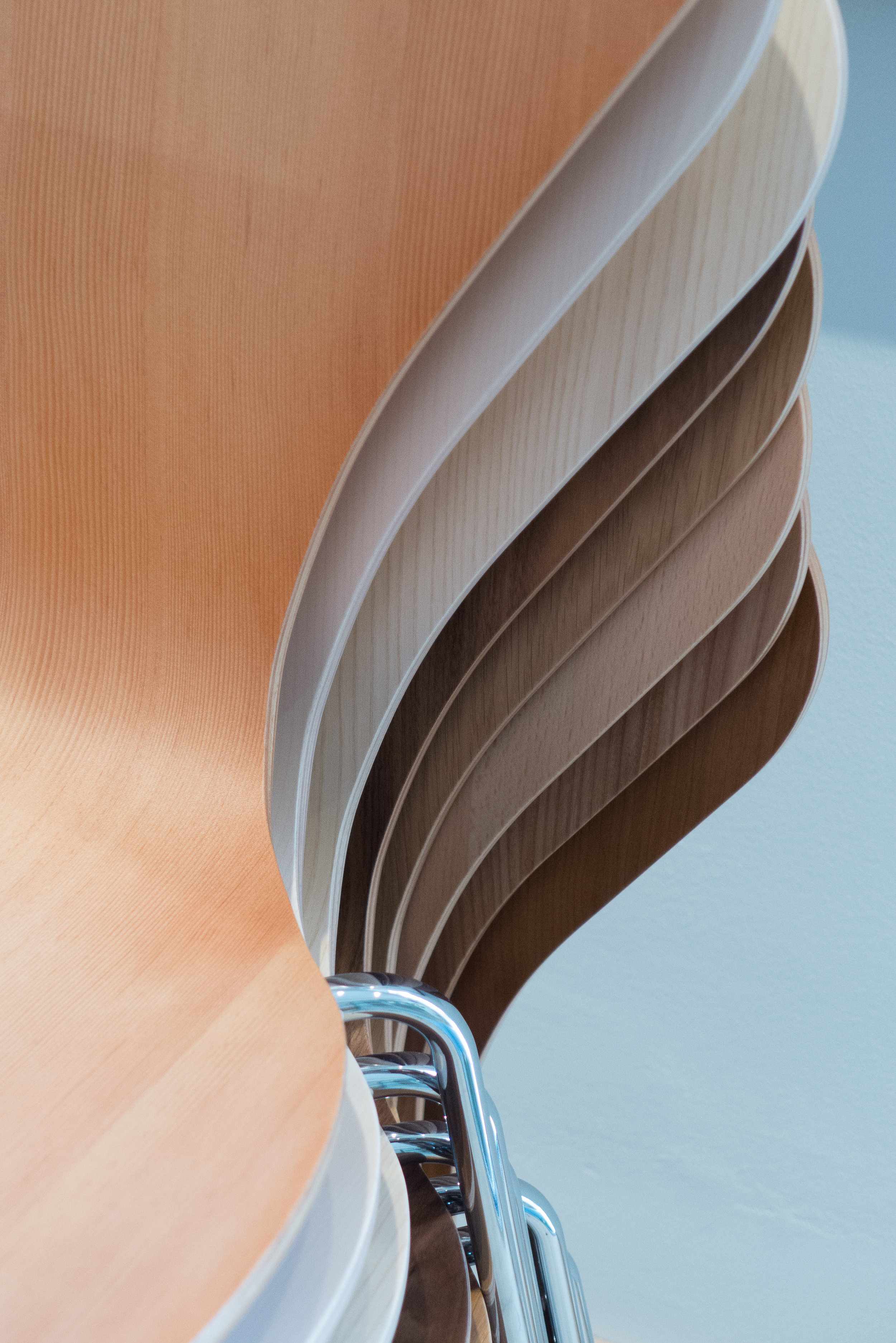
These chairs are deceptively simple but, in production, the moulding process presented challenges.

The chairs that were designed by Alvar Alto and manufactured in Finland from the 1930s were the first Nordic designs to exploit the properties of laminated and moulded wood in the commercial production of furniture. The layers of wood veneer were curved into different forms under pressure so the shape was 'remembered' when the wood was taken from the press but although those chairs by Alto had the seat and back from a single piece of laminated wood, the curve was in one plane so that it formed, in effect, a scroll.

Trying to mould the laminated wood into more complex curves, either hollow or convex and in both directions across the shell, Fritz Hansen put the material under considerably more stress.

The challenges might seem to be relatively simple …

  • to use the thinnest possible gauge of plywood to stop the piece from looking crude or being heavy
  • to source high quality, unblemished and even or consistent veneer … plywood for construction can have patches or uneven colour but for these chairs the shell was just sanded and finished to maintain the natural qualities of the timber so a good or an interesting grain pattern can also be important
  • to bend as sharp a curve as possible between the seat and the back without the facing layers of the finished shell delaminating - so folding on the inner face of a curve or splitting on the outer face
  • to create complex curves that were hollow or concave front to back - so it was not like sitting on a plank - but also curved across the width, so from side to side which, in effect, anticipates the curve under the weight of a person sitting down - to avoid that feeling of it sinking in like sitting down on, or rather, in a canvas chair
  • to create those complex curves without cutting into and overlapping sections of the shell
  • to develop ways of fixing the thin shell to any form of leg or support … you cannot fix a leg unit with screws through the leg and straight into the shell from below, because the shell is too thin, but if you fix screws or bolts from above, driven down into the leg or base, then those are exposed and you would be sitting on the screw or bolt heads

On that last point, the first version of the Grand Prix had four L-shaped and moulded leg pieces stuck to the underside of the shell with a glue developed for that purpose but, I presume, under stress, the glue delaminated the facing layer of the shell so in later versions the design was changed to a cross-shaped and self-supporting framework of legs that was fixed to a plywood plate at the centre of the underside of the seat in a similar way to the fixing of the metal legs.

For comfort, there must have been extensive trials to adjust the flexibility of the shell and the strength, weight and flexibility of the legs or base - particular where the chair has legs in thin bent tube metal. Too flexible and the chair would feel unstable but too rigid and it would be like plonking down on a park bench. The chairs also use rubber spacers or buffers set further out from the centre fixing plate to hold the legs free of the shell; provide some control to the flexibility of the shell and also stop the legs torqueing or twisting or shifting round.

L1170907.jpg

The view of the underside of a Series 7 Chair shows just how complex and how subtle the design of the shaping of the metal legs is with the cross pieces of the legs under the seat protruding beyond the edge of the seat - so that the chairs could be stacked - and with the metal curved downwards towards the centre to follow the shape of the moulded seat rather than sitting against it. The legs are also angled outwards - rather than being set vertical - which in part makes the chair appear lighter and more elegant - strictly vertical legs can look basic or stolid - but also provides extra stability for a light chair.

There is an interesting but more general point about the shell chairs designed by Jacobsen and made by Fritz Hansen. We are now so familiar with major Scandinavian design companies like Muuto or Normann producing chairs with a range of bases and a range of colours and covers along with options for plain shells or upholstered versions, that we no longer see that as unusual - or, actually, we take that for granted because we expect a number of options when choosing a design. Before these chairs were produced by Fritz Hansen in the 1950s, chairs were designed as a complete or self-contained entity with production in relatively small numbers but, if there were options or variations, it might be that a different material could be used for the frame - so asking for a chair to be made in mahogany rather than oak for instance - or would be limited to selecting leather rather than textile for an upholstered chair.

At most, the scale of a chair might be adapted for a later version so Rud Rasmussen produced the Red Chair designed by Kaare Klint in a smaller size as a dining chair where the original, was wider with more generous proportions, designed for the meeting room at the Design Museum. Chairs like the Thonet Chair from Austria, produced through the second half of the 19th century, was made in large numbers and was made to be transported in parts and assembled on delivery but that was unusual and there were different models or different styles but no options within each type of chair. Several of the chairs designed  at the Bauhaus were conceived as relatively cheap furniture of a high quality of design for a large market but politics and events overtook their wider marketing and Alto, through the company Artek, certainly understood the commercial potential of marketing and international sales but it was the American company Herman Miller, marketing the designs of Charles and Ray Eames, and Fritz Hansen marketing the designs of Arne Jacobsen who really established the potential for large-scale production of well-designed furniture in the years through the late 1940s and the 1950s.

Republic of Fritz Hansen

note:

Shell chairs for the SAS Royal Hotel in Copenhagen - including the Egg and the Swan - were designed in this same period - in the mid 1950s - but were made in foam and upholstered so presented different problems and resulted in a very different aesthetic so they will be the subject of a separate set of posts.

Chair 7 by Arne Jacobsen 1955

Designed by Arne Jacobsen in 1955, Chair 7 is perhaps the classic shell chair and is still in production. 

It is made in remarkably thin laminated wood with either a wood veneer or the shell is painted. There are also upholstered versions.

read more


a design back catalogue .....


The recently restored building of the old postoffice in Købmagergade in Copenhagen has become a major design destination for the city. On Købmagergade itself, ARKET has been open for less than a month but if you head down the side of the building to the right, down Løvestræde, there is the entrance to the showrooms of the major furniture company Fredericia and to the left, down Valkendorfsgade, is the entrance to the show rooms and design store for Fritz Hansen.

ARKET and their collection of fashion and household design is literally brand new but both Fredericia and Fritz Hansen are well established companies with international reputations and both have catalogues that balance new commissions from major designers working now along with what are recognised to be Danish design classics that may have been designed fifty or sixty or more years ago.

Talk to young designers, just in the first years of their careers, and the conversation will inevitably come round to the ‘shadow’ in which they work. And that is not necessarily expressing a sense of awe but often a sense of frustration … if a company falls back on a well-established or safe design then where is the opportunity for the Arne Jacobsen or Nanna Ditzel of this generation to get their work into production? It is a problem. Major design by Hans Wegner or Børge Morgensen are not just popular but their furniture deserves to have a relevant and important place in contemporary interiors.

In some cases, the current production can even be better than the originals - with improvements in materials or changes in manufacturing methods - but how much should the back catalogue be updated or changed to give the designs a new relevance or a new appeal?

Series 7 was designed by Arne Jacobsen in 1955 but is still incredibly popular which is testament to the design itself. One current version has gold legs and when I saw the chair with fabric covers in a deep plush it was obvious that my inner puritan was a bit affronted … plywood is an amazing material and the original design exploited the flexibility of the steamed and shaped shell so that it was comfortable without padding.

But then I thought the display piece in the entrance to the Fritz Hansen store - with the shell set on a rough log - looks fantastic so my qualms were about taste and not for messing with the master. The Series 7 - on a linked frame rather than on legs - has been used in many lecture rooms ... a good recent example being at Museet for Søfart - the Maritime Museum - in Helsingør designed by Bjarke Ingels.

And the Series 7 is available in a good range of colours and wood veneers so maybe a great classic design can be and should be all things to all tastes. 

Fritz Hansen


design classic: Series 7 Chair by Arne Jacobsen


The Series 7 Chair, was designed by Arne Jacobsen for Fritz Hansen and was first shown at an international exhibition in Helsingborg in 1955. It has a moulded plywood shell, in a single piece for seat and back, that is supported on a tubular steel base with four thin legs that are slightly splayed outwards and meet at the centre under the seat.

Not only is the Series 7 still in production, over 60 years later, and still the best-selling chair from Fritz Hansen, but it is said to be the most copied chair in the world. Does that make it the first truly universal chair … even the first egalitarian chair? In part that depends on its original and its current price and, I suppose, the number of countries where it is sold because, strictly, to be universal, it has to be available to a very broad demographic. 

Certainly it is a very interesting chair because it has had such a long period of popularity. In part this is because it was not only very much a product of its period but was also incredibly advanced … so, it must have felt very ‘modern’ to buy one in 1955. But actually you could suggest that the design is so simple … so stripped back to basics … that it is as far as is possible timeless. But can it be of it’s period and timeless?That raises the question about why some designs, over time, drift out of favour … become boring or old fashioned or politically inappropriate … a Corbusier chaise covered in zebra skin for instance … and others become icons.

Initially it was not so different that it meant that the customer was taking a risk but the design was also advanced enough that, to some extent, at least some might have seen its potential to remain popular although I’m not sure that even Jacobsen himself would have anticipated that the Series 7 would still be in production into the second and presumably the third decade of a new century. 

That in itself is interesting because in 1955 Jacobsen was a young architect trying to establish his career that was then associated primarily with designing houses but his reputation is now secure as one of the great architects and great designers of his generation. So, in that sense, the Series 7 could be claimed to be iconic and part of that odd current fascination with famous names. Is the chair ‘great design’ because it is by Arne Jacobsen or is Arne Jacobsen a great designer because he designed the Series 7 Chair?

read more


sixtieth anniversary of Series 7 chair from Fritz Hansen

BIG - photograph from fritz hansen

To mark the sixtieth anniversary of the design of the Series 7 chair by Arne Jacobsen, Fritz Hansen has commissioned a series of designs based on the form of the chair from seven architects. These architects or architectural partnerships included BIG, Zaha Hadid, Jean Nouvel, Carlos Ott & Carlos Ponce de Léon, Jun Igarashi Architects, Neri & Hu Design, and Snøhetta.

SNØHETTA


NERI & HU


Jean Nouvel Design


CARLOS OTT and CARLOS PONCE


ZAHA HADID


Republic of Fritz Hansen Series 7™


anniversary

Designed by Arne Jacobsen in 1955, the Series 7™ chairs reached a major anniversary this year. Republic of Fritz Hansen have a display in their showroom at Pakhus 48 in the dock development area of Nordhavn in Copenhagen where there are versions of the chairs in the style of different architects including Zaha Hadid, a love seat version by Neri & Hu, the striking black and white love seat from Jean Nouvel Design and a Series 7™ shell without legs and set in a miniature Nordic landscape from Snøhetta.


Two special versions of the chair will only be available this year with one in a deep pink and with gold legs and the other in a very very dark blue with the same colour for the framework of the legs.  


monochrome

This monochrome style, with the same colour for the moulded seat and the metal legs, is also promoted in a new series of four versions … the chair in a deep tan colour called Chevalier Orange, in a strong light blue, Trieste Blue, all in white or in black with black metal legs and I think a grey, a brown version and an aubergine coloured chair are to be added.


colour in perfect shape

Also, to mark the anniversary, a new range of nine colours for the Series 7™ have been produced in collaboration with the Copenhagen artist TAL R.

Here, the point emphasised by Fritz Hansen is that they prefer “artistic colours to industrial colours, diversity to uniformity, and the natural to the artificial … the result is furniture that will continue to live, surprise and inspire.”

This is in part the line from a skilled advertising or PR department but it would be glib to scoff because actually it is the quality of the colour surface, the way it reflects or absorbs light and the way the colours look different in different light or different settings that give the chair a sense of real style and real quality and real warmth.

The new colours are Opium, close to a Chinese red lacquer; Ai, a very, very deep blue; Chocolate Milk, for me an incredibly complex colour with touches of pink and very little yellow (and no I am, fortunately, not colour blind) Trieste - almost a cornflower blue but not; Hüzün, a striking mid green; Egyptian Yellow, a yellow toned down with lead; Altstadt Rose, a colour I can’t begin to describe; Evren Purple, again unusual and particular - somehow strong and sharp rather than pretty - and that's praise not criticism; Chevalier Orange, again surprisingly subtle, and finally Nine Grey, produced apparently by mixing all the other shades.

In a clever marketing move the colours are produced on a swatch with a lanyard as it will be important to choose these colours carefully in the final setting and to help to inspire people and get them to look at the chair in new ways and for new possibilities, for combining and playing with colour in a more adventurous way, room settings or grouping of these chairs, set around tables, are given plenty of space in the showroom and given carefully-chosen accessories such as appropriate flowers or tableware. The colour samples are reasonably large - 60x100mm - and interleaved with a short description of the inspiration for the colour.


The window display at Pakhus has a striking rainbow of colours showing off the other major feature of the design of the Series 7™ and that is that it was one of the earliest stacking chairs for the home to go into large-scale production.


3daysofdesign: graphics and publications

use of detailed graphics in the show room of Arper in Nordhavn


3daysofdesign was a major event that included many of the most well-established design companies in Denmark so, perhaps, it might seem odd to talk about the graphic design of publications and posters seen at the various venues … of course everyone expects well-designed graphics and beautiful catalogues from furniture companies … surely it goes without saying? … surely it would only be worth a comment if catalogues or lettering in the showroom or information leaflets were badly designed or badly printed?

Well no. Just because everyone assumes it will be good and just because the graphics were actually good throughout, it is even more important to make a few points about this aspect of the work of the furniture industry. 

In general, people outside the professional design world … so obviously the majority of customers … assume that graphics with high-quality photographs, eye-catching layout and high quality paper are all simply what should be expected. They take it for granted. After all, computers with a huge number of fonts and any template you could wish for for a layout, high definition images, even from a mobile phone, and high quality printing are all available from personal systems in most homes … what can possibly be so hard in producing a nice (free) catalogue? And of course we are all greedy - voracious - for images, gloss, entertainment, facts, information and commentary with little time spent on thinking about how much it has actually cost to produce in terms of professional skill, mental stress, time and money. And last years catalogue or last years campaign are not good enough. We want, need and expect something new.

What was clear across the board at 3daysofdesign is that companies do and do have to invest a huge amount of time, thought and money in the right style of advertising and the best possible publications with information about and for their products.

Catalogues, advertisements, information booklets, online sites and so on have to tell the story of the company; explain the development of the design; introduce the designer, if they are young or new to the company; explain the way the design evolved - everyone loves a good story - give information about the manufacturing process, promote green credentials, of course, and, often, give after-sales care advice as well. And good graphics, as everyone knows, can create a brand image and customer awareness of, recognition of and loyalty to a company or even to a specific design. Chair 7 by Arne Jacobsen, Stool 60 from Artek and the PH5 light are all the obvious examples of the ongoing commercial value of recognition and loyalty.

The Series 7 chair is actually a very good example. It will be the subject of a separate post but it is of relevance in this post just because it is still the best-selling piece in the Fritz Hansen catalogue but it has just reached a milestone anniversary - the chair was designed in 1955 - and Fritz Hansen are in the middle of a major campaign to ‘relaunch’ the chair in new colours to ensure that it remains a design that has a place in the homes of young and future generations of buyers. So publicity material, and advertising and the way the chair is shown in displays now, are crucial to its future success. The strap line of the present campaign is Colours in Perfect Shape.

With a completely new range or a novel design it may even be necessary to give advice about how the piece might best be set in the context of it’s new home. It is actually quite difficult to explain to a customer, who is dissatisfied because, maybe, their new purchase doesn’t look quite as good in their home as it did in the show room or in the catalogue, that in fact they have bought the wrong thing for their existing house and existing life style. The new piece itself is amazing … it’s just that really their room/your room should possibly/could maybe/definitely ought to be a different colour and much of the rest of the furniture should be replaced. But the shop can’t say that. Better to start a bit of gentle advice - sow the seeds of a few ideas and suggestions in the catalogue or in the display in the shop.

The good small catalogue for the event itself and the graphic material for Re-Framing Danish Design were well designed and distinct … presumably they were aware of the added problem of having to avoid any resemblance to the brand styles of any of the companies taking part. 

Arper and Muuto had elaborate graphics on the walls of their show rooms to explain or identify their designs and several companies including Fritz Hansen, OneCollection and Gubi include in their catalogues extensive articles on major designers from the classic period of Danish design to put designs, that might be 50 or more years old, into their wider historic context. The Gubi catalogue is called a design booklet and is, significantly, titled ‘Icons, Memories and Stories.’ It is necessary to explain to a new generation of buyers when and why the pieces were designed; state why they were important designs or why they were admired when they were first manufactured, and why they have relevance now and and why they should still be in production. Basically why a design was amazing then and why it is amazing now.

It is also necessary to explain to a new buyer why an old design might not be exactly like the earliest examples of a design that they have seen in a museum. Designs can evolve in terms of the materials used, for instance in upholstery, and manufacturing techniques change or some aspects of machine manufacturing have improved since the original pieces were made. Again managing expectations and nurturing customers who might have admired a design long ago but are, only now, getting around to buying it.

Innovations for new designs, particularly new materials or new methods of production, have to be explained to potential customers and can become what are called unique selling points to distinguish the designs from one company from the works from their rivals. Muuto have launched a new shell chair that is moulded from a recyclable material that includes wood fibre … deliberately described as ‘pinewood fibers.’ This material has a softer and matt look and a slight texture which has to be explained to the customer and work with the material has also led to interesting developments in producing an optional upholstered interior to the shell. New material often require changes to fixings and supports or an appropriate rethink and here, with Muuto, this means that the shell of this chair can have four different supports: thin, elegant, metal legs; a ’sled’ like metal frame; a wooden base with a frame below the seat and a metal swivel base. These distinguish the chair from rivals but the developments and the differences have to be pointed out to the customer and this has to be done through advertising and through catalogues and brochures … not least because this choice of base and choice of upholstery along with choices of colour, in the case of the new Muuto chair, gives 41 different permutations … a potential problem for the customer in making that choice and potential problems with manufacture and the supply system that can be made easier by appropriate publications for information. I believe this is called managing expectations.

Frama and Please Wait to be Seated both produced information that unfolded to poster size and several companies, including Frama, used reproductions of hand-drawn line work, rather than digital computer-generated drawings, to show something of the various early stages of the design process as designers play with a number of ideas and take a particular form forward.


Personally, I really like the small, folded and stapled A4, cloth-bound catalogue from Flos for their String Lights and IC Lights by Michael Anastassiades with quotes from the designer, talking about inspiration for the design, but with studio photographs combined with hand-drawn sketches to explain how that arrangement of the lights were set up along with a surprising amount of technical information. 

The small catalogue for Parentesit from Arper has an interesting look that somehow hints at the 1930s and Bauhaus style. Good graphic design can hint at sources of inspiration.

For its ‘case study’ series, Frama uses thick board that is coated on one side but unbleached on the back and with a single brass screw link at one corner - so playing a very clever game with period and style - hard-tech mechanics contrasted with soft-tech almost retro style that you see in their furniture as well with incredibly sharp, clean industrial-character designs presented in the elaborate and dramatic interior of their show room - formerly a chemist shop with amazing fittings that date back to about 1900.

Graphics from MA/U Studio were as thin and as elegant and as distinctive as their furniture with the clever use of simple outline human figures to give drawings of shelving easily-understood scale.