Anatomy of Colour


The Anatomy of Colour begins with types of paint - from distemper to lime wash to milk paint and more - and then Patrick Baty sets out the sources of pigment for those paints so through white paint, black paint and then on to each colour through the blues, the browns, greens, reds and yellows - so, generally, for each colour, he traces the development from natural pigments, from plants and minerals, to the by-products of emerging industries and then on to the first pigments by industrial chemists. 

Historic practices and techniques for house painters are discussed; there are fascinating reproductions of historic catalogues for the paint brushes and the tools of professional painters and the author looks at the early organisation of guilds and paint companies. However, for designers, the important contribution of the book comes from the extensive number of historic colour charts reproduced along with summaries of early colour theories and detailed discussions for each major period or each major style and fashion, that helps set historic design within the context of colour. He combines longer sections of text with carefully designed double-page spreads and uses longer captions effectively so you can sit and read the book cover to cover or you can use the book and its images as a reference encyclopaedia seeing where cross references take you.

We tend to describe styles and the relatively distinct periods of interior design in terms of the forms and types of furniture that were popular in a certain period and we also recognise distinct patterns that appear on furniture or are reproduced on textiles but certainly styles or periods can have distinct preferences for colours or, and more interesting, for the juxtaposition of certain colours. Even the choice of materials can be determined by what are fashionable or unfashionable colours so distinctly orange Oregon Pine was popular for a relatively short period and Formica was as much about having a wide selection of deep strong colours as it was about having a smooth clean surface for food preparation.

Reproductions from historic paint charts and books or articles about colour theories by contemporary artists and designers show how the presentation of colours and any general discussion about colour can influence our choice of colours for our homes. We may not even realise we are being influenced because, of course, although we feel now that there is almost infinite choice, what we see clearly here is that what designers select and what companies produce and make available and what they advertise all influence that choice.

It is absolutely right to describe this book as an anatomy of colour because, in a careful and scholarly way, the technical development of household paints and the theories of colour and the preference for certain colours in certain periods is dissected. It feels, in a good way, like sitting in an old-fashioned lecture theatre with high banks of seats to watch someone with skill take something apart, with care, to say now look at this … isn’t it fascinating … and this is how and why it works.


The Anatomy of Colour, The Story of Heritage Paints and Pigments, Patrick Baty, Thames & Hudson (2017)
Stangestolen / The Snake Chair by Poul Henningsen 1932

Having looked at and written about a number of Danish chairs that were designed in the 20th century, it seemed important to include this chair - The Snake Chair designed by Poul Henningsen - not because it is remotely representative - it is actually perversely unique - but because it is distinctly modern in the materials it used.

With a single coil of tubular steel to support the seat and back, it breaks with almost all conventions, but, curiously, it also appears to be 'of it's period'. 

read more


an everyday chair

These chairs were designed by the Copenhagen City Architect's Office, about 1930, for use in school offices.

They are not exactly what would have been found in a kitchen in Vesterbro or at a table in an apartment in Islands Brygge but they are pine and they are painted and the designs are straightforward with a simple arrangement of stretchers to strengthen the framework of the legs and simple plain wood back rests that are either fixed across or fixed between the uprights of the back.

Dining table and chairs in birch designed by Viggo Sten Møller and made by Adolf Jørgensen for the Cabinetmakers' Exhibition in 1929. The setting had a P.H. lamp over the table.


Over the last month or so, posts here have focused on a number of chairs from the 20th century that are design classics and all, in different ways, examples of new styles or examples of experiments with new forms and new manufacturing techniques. However, the problem is, this gives an impression that every Danish chair represents a point in time on a rapid, inevitable and ongoing progression of design innovations.

But if you look at photographs of homes from the 20th century or even photographs from the annual exhibition of the Cabinetmakers' Guild Furniture exhibitions that were held from 1927 through to 1966 - where craftsmen were actually competing to produce the latest and the best - you see a good number of strangely old-fashioned chairs and much of the best modern furniture was produced in small quantities or, in some cases, made only when commissioned and many of the designs would have been considered expensive, even at the time, so well beyond the budget of an ordinary working family.

Of course, for offices and schools and factories - let alone for ordinary families in ordinary homes in new apartments in the city in the 1920s and 1930s and 1940s - and then on through the period of so-called classic Danish furniture in the 1950s and 1960s - Denmark actually had to produce ordinary chairs or, at least, chairs that were designed and made to be robust and affordable rather than being primarily award winning, memorable or collectable.

So part of the story of the development of modern design in Denmark is the story of designers trying to produce ordinary chairs that were well designed and well made.

One reason - perhaps the main reason - for the annual exhibition of the work of cabinetmakers was so that these craftsmen could show they could compete with the emerging furniture factories, so proposals from cabinetmakers were  "submitted for both cheap and somewhat more expensive furniture" for the exhibition.

For the Cabinetmakers' Exhibition in 1929 Viggo Sten Møller and Hans Hansen designed furniture for a two-room apartment with a compact dining tables and chairs made by Adolf Jørgensen.

In 1932 Møller became the editor of the trade journal Nyt Tidsskrift for Kunstindustri and alongside technical articles he introduced pieces on colour schemes, lighting and textiles and from the architect Marinus Andersen he commissioned an article about furnishing a small apartment for a couple about to get married.

The cabinetmakers began to introduce a broader range of furniture so pieces specifically for children or in 1939 designs for a study for a student designed by Børge Mogensen and Aage Windeleff. In the exhibition in 1962 there was even a large kitchen designed Henning Jensen and Hanne and Torben Valeur that was made by Christensen & Larsen although it was clear that this would have been an exceptional and expensive project … so hardly a flat-pack job.

But it was not just cabinetmakers who were trying to improve the design of furniture that could be sold at a reasonable price. Around 1930, Magnus L Stephensen was asked to furnish two test apartments for a public housing scheme at Ryparken, designed by Povl Baumann, that was based on a budget that was realistic for a young working family but he found only one factory and one traditional workshop in the city who could provide furniture he considered good enough within that budget.

Dan-stol (left) from 1930 by Søren Hansen the grandson of the founder of Fritz Hansen

Bentwood chair model 234 (above) from Fritz Hansen by Magnus Stephensen (1903-1984)


Magnus Stephensen produced designs for the furniture makers Fritz Hansen.

Perhaps the first factory chair and, in some ways, one of the most popular everyday chair (in terms of the numbers produced) was the Café Chair in bent wood from the Viennese manufacturer Thonet that was designed in the middle of the 19th century. Methods of steam bending wood, rather like the development of plywood, had not been common in Denmark but from the 1920s Fritz Hansen realised the potential of both. The grandson of the founder of the Fritz Hansen designed a Dan-stole for the company in 1930 - a rationalisation and simplification of the Café Chair - and then Magnus Stephensen designed the chair Model 234 that combined a bent-wood frame with a more comfortable shaped and curved back rest in thin wood. DAN was a general term used for these chairs in steam-bent beech.

Co-op Denmark started to manufacture high quality but inexpensive furniture in 1940 with the architect and planner Steen Eiler Rasmussen providing advice as a consultant. He had curated an exhibition of applied art in 1932 to look at well-designed everyday objects. 


Chairs and a dining table designed by Børge Mogensen and made by the cabinetmaker Erhard Rasmussen in pear wood for the Cabinetmakers' Exhibition in 1944. Very simple square frame with upholstered pad for seat and simple curve of thin wood for back support presumably screwed to back uprights with plugs over the fixing in contrasting wood. But note that the back supports are curved in section so not actually that basic and because the legs are relatively thin in section then tere are stretchers to strengthen the frame but, rather unusual, to front and back but not to the sides between the front and back legs.


Børge Mogensen was appointed to be head of the design department at FDB Møbler (Fællesforeningen for Danmarks Brugsforeninger or Commonwealth of Danish Confederations of Users …  part of the Danish COOP) and in 1944 he furnished a test apartment in their store on Frederiksborggade in Copenhagen. In the sitting room there was a pine table, an Ercol style chair and a version of an English Windsor Chair at a desk that was a wall unit with a front flap that dropped down as a surface for writing at and on the floor their was simple rush matting.

Rasmussen published an article in the magazine Andelsbladet to explain the work of this better furniture campaign. The apartment in the store had "realistic rooms and floors, walls, ceilings, doors and windows - all with the dimensions that are found in ordinary little homes." … and it was described as a 'housing laboratory.'

"The new furniture is so ordinary and direct that one would almost believe it had made itself. But this is a virtue. It is not seductive and overwhelming like the pieces we see in advertisements, but then there is also hope that people will not grow tired of them in the long run."

Several well known or established designers in that classic period - through the 1950s and 1960s - produced chairs that were priced for an ordinary buyer … so Hans Wegner, Poul Volther, Mogens Koch, Jørgen Bækmark along with Børge Mogensen all designed chairs for FDB Møbler.


J39 / Folkestolen / People's Chair designed in 1947 for FDB by Børge Mogensen


Now all the major design and furniture companies have a range of basic or straightforward but well-made chairs and the launch of a new chair can be a major event and some companies produce major classics designed in the 1950s and 1960s where the price can be kept low by the rationalisation of manufacturing methods or simply by the scale of production and making it possible to have a choice from dozens and dozens of different well-designed chairs that are well made and reasonably priced.

J48 designed by Poul Volther for FDB Møbler and still made for the Danish Coop. This is a good everyday chair but is also a sort of cross-over design inspired by simple country furniture but given a real sense of modern style with a choice of strong colours.

chair made in Copenhagen by Søren Ulrich … the style is reminiscent of chairs from the 1930s and 1940s and would be a good choice for a kitchen table or small dining room and appropriate for one of the apartments in the city dating from the early 20th century


Dansk Møbelkunst gennem 40 År

40 years of Danish Furniture Design - The Copenhagen Cabinet-makers’ Guild Exhibitions

In four volumes: 1927-1936, 1937-1946, 1947-1956 and 1957-1966

Compiled and edited by Greta Jalk - first published in 1987 and republished by Lindhart og Ringhof in 2017


a living room and study with furniture by the cabinetmaker Andersen & Bohm that was shown at the exhibition in 1928

these volumes of Dansk Møbelkunst Gennem 40 År are so important because they record just how and how quickly the work of the cabinet makers changed through even the first years of the exhibitions

This is a major reference work - not just for the history of modern Danish furniture design and the design of homes but these volumes, compiled by Greta Jalk, are also a record of social history - recording much about how Danish families lived or wanted to live through that period of massive changes in the middle of the 20th century - and indicate much about Danish business and the way that Danish design, through this period, was marketed.

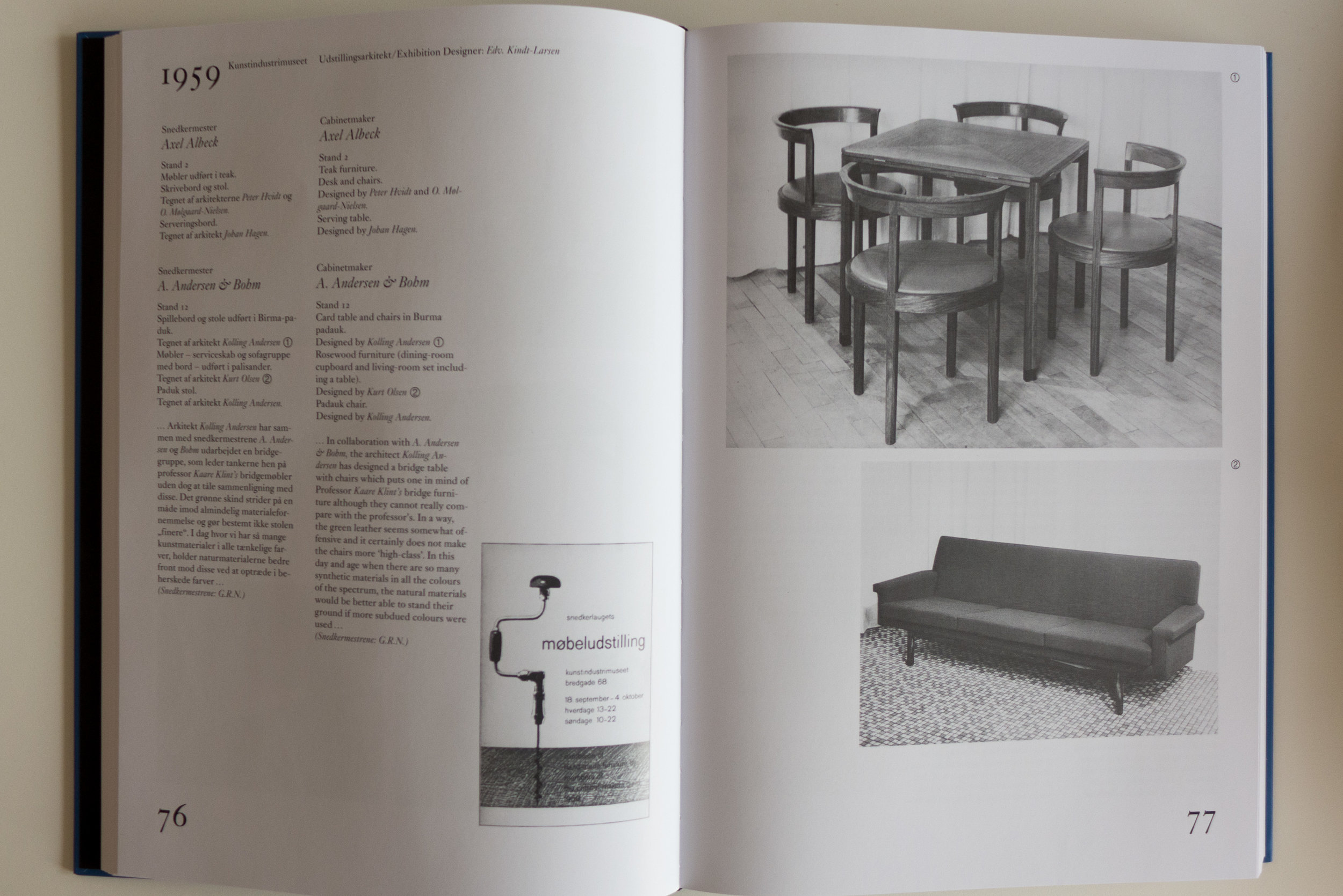
There is a forward and a general introduction but otherwise the volumes are set out year by year with contemporary photographs of the furniture shown at each exhibition, along with some technical drawings. There are images of the covers of the exhibition catalogues - themselves giving an insight into Danish typography and graphic design through this period - and quotations from contemporary reviews of the furniture.

By the 1920s a widespread economic Depression across Europe was having a marked effect on the independent furniture makers and on the furniture trade in Copenhagen and to compound the problem, there was a clear change in the way people were living, so a change in what furniture they needed, with a growing number of people living in smaller apartments in the large number of new apartment blocks that were being built around the city.


Trade and craft guilds from the medieval period onwards had been formed to oversee the training of apprentices and to protect craftsmen and their work in their own cities - guilds were based in cities and towns - and to monitor and where necessary restrict competition. Usually the guilds also provided support for widows and retired craftsmen. Through the 19th century, in major historic cities in Europe, these craft guilds began to loose their relevance as methods of production, of all sorts of goods from glassware to furniture, moved from small workshops that served a district or a town or a city to larger and larger factories. So it is ironic that Denmark, producing now some of the best and most highly regarded modern furniture, does so because it’s old craft guilds survived longer than elsewhere and fought back and in the process adapted and changed. 

So the first Cabinetmakers’ Exhibition in 1927 was organised as a way of demonstrating the skills of the furniture makers in the city and to bolster sales or, rather, to revive flagging sales.

From consecutive years an unusual idea … a square card table and chairs with sharply-curved backs set on an angle so when they were pushed in they form a scallop arrangement. The table and chairs shown in 1960 had been designed by Kaare Klint in 1935 and examples of the same design in mahogany were shown in 1946 and 1948. This version in rosewood was produced to commemorate the work of Klint who died in 1954. Svend Eriiksen wrote that “The tradition established by Klint is tenacious and durable. It will take vigorous effort to keep it alive” and the critic from Jyllands Posten wrote of this furniture that “they still stand out as some of the finest pieces to have been made in this country.”

Exhibitions were held in different venues but at an early stage room settings rather than simple display stands were built. Clearly, the aim was to show people, particularly young couples, how they might furnish a new home and they encouraged people to see furniture made by cabinetmakers as not just for the wealthy upper middle classes but as a sensible source for well-made furniture for a broad range of families.

In the second year, in 1928, there was a crucial change when cabinetmakers began to collaborate with architects and furniture was shown that had been designed by Viggo Sten Møller and Kay Gottlob and a sideboard was shown that was designed by Kaare Klint that was made by the cabinetmaker Otto Meyer. 

That set a pattern and - to use a pun deliberately - that set the bench mark for the next forty years. These partnerships established an important precedence where designs and styles evolved - not just through discussion amongst the cabinetmakers but year on year as a response to what the market wanted.

This room from 1944 included Chair NV44 designed by Finn Juhl and made by Niels Vodder. The side table is interesting with an integral hot plate to keep food warm. Reviews were critical - one pointed out that “The table was a new and interesting kind of extension table; but it seemed as if its design was not really related to that of the other furniture”  and another thought “the curved chairs are nice to look at and comfortable - but the cost of making it.”


Obviously, this furniture can not be completely representative of all furniture made through this period and nor was it all successful. Some cabinet makers were more adventurous than others … some produced amazing pieces of furniture that were not widely appreciated while other designs went on to achieve commercial success and some pieces are still produced and sold today.

The photographs and drawings in these volumes show how the way of life in the city for many changed through this period so, for instance, large cupboards for storing 12 or more place settings for formal dining disappear and tables and dining chairs become more compact. There were few beds shown - presumably for the simple reason that people don’t buy beds too often - but towards the later years there was quite a bit of furniture for the garden or balcony.

from 1962 bar stools in rosewood designed by Mary Beatrice Bloch and beds in teak designed by the Icelandic designer Gunnar Magnusson made by Christensen and Larsen. The sofa chairs and combined dinning table work table are also in teak, designed by Steffen Syrach-Larsen and made by the cabinetmaker Gustav Bertelsen & Co.


What you see, above all through these 40 years, is how the shapes and styles of chairs and tables and cupboards become simpler visually so superfluous decoration of any kind disappears. 

That is not to suggest that the furniture compromised quality by becoming more basic so cheaper to produce. Actually the opposite. As clear form and shape become more and more important then there is nowhere for shoddy workmanship to hide. If there was any extravagance or bravado it was through using more expensive imported timbers such as walnut or teak but there was always a focus on quality of workmanship to demonstrate mastery of woodworking techniques. 

Nor is that an implication that the cabinetmakers were defensive or protectionist or reactionary because many of the pieces shown at the exhibition involved new methods of construction that required new machines and jigs and new ways of working with wood - many of the most adventurous designs by Hans Wegner or Finn Juhl would have been impossible to make without new techniques for shaping, bending and joining wood. Furniture makers were moving from the workbench to the idea of the larger workshop or factory where larger numbers of each piece could be made so these exhibitions were less and less about the one-off commission, although those must have been welcome, but more and more about the establishment of an outward-looking and successful furniture industry. 

L1240373.jpg
 

Chair designed by Jørgen Høvelskov and made by the cabinetmaker J H Johansens was shown in 1966.

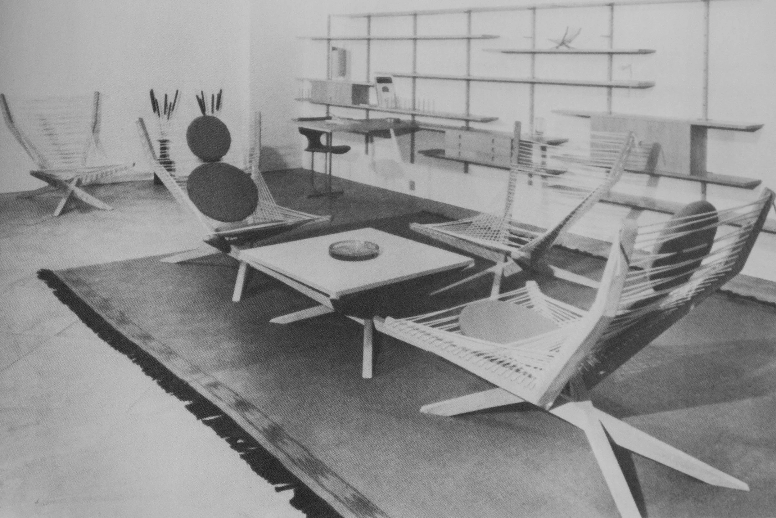
One critic wrote “…The purpose in exhibiting at the cabinetmakers’ furniture exhibition is either to show furniture of supreme quality or or to suggest future solutions by means of experiments. There are one or two examples of these experiments such as the chair designed by Jørgen Høvelskov and made by Henning Jensen. It is intended to be very simple with a frame threaded with heavy cord, but unfortunately the total impression is anything but simple. The chair seems confused and unfinished, and it is correspondingly uncomfortable.”


the origin of a modern Danish aesthetic?

In the Spring and through into the early summer, there was an important exhibition of the works of the Danish artist Vilhelm Hammershøi at the museum and gallery at Ordrupgaard which is just to the north of Copenhagen. With the title At Home with Hammershøi, the exhibition focused on an amazing series of paintings of interiors that he produced when he and his wife were living in an apartment that they rented in Strandgade in Christianshavn from 1898 through to 1910. 

The rooms have plain walls that were painted in soft greys or creams with all the woodwork simple colours - rather than picked out with any gilding - and furniture is relatively simple, set back against the walls, although they had a piano, at least one bookcase and with a few small paintings and simple pottery. This is in marked contrast to photographs and paintings that survive of what must have been more typical middle-class homes in the city with carpets, heavy curtains, upholstered furniture and banks of paintings on the walls.

Was Hammershøi reacting to the clutter of rooms in middle-class homes of the late-19th century? Was it simply that furniture was carefully rearranged for the painting? Was it a consequence of poverty or, at least, the relative poverty of an artist although he came from a middle-class family and while they lived in Strandgade, Hammershøi spent time in London and in Rome. These paintings are certainly not about ostentatious affluence. Whatever the reasons for their restrained good taste, they do seem to reflect a clear and recognisable Danish design aesthetic and these are interiors that we can appreciate as distinctly modern.

read more


Interior in Strandgade, Sunlight on the Floor painted in 1901 by Vilhelm Hammershøi (1864-1916) in the collection of Statens Museum for Kunst in Copenhagen


just how difficult can it be to design a staircase?

the recently remodelled staircases in the Illum store in Copenhagen


Well, actually, quite difficult.

A staircase is not just a major feature in any building but it can also be a particularly difficult part of the design to modify if other parts of the scheme are changed as the plan develops. It becomes a difficult game of consequences - change one part and another no longer works.

It might sound like stating the obvious but a staircase really does have to function well. A doorway can be slightly too narrow or a window sill too high and people grumble. If a staircase is too steep or too dark or the steps are irregular or too small then it is difficult to use easily and it might even be dangerous. 

A design for a staircase normally has to start with the dimensions for the height and depth of a step - the tread and the riser - fixed by the average foot size and the average stride pattern so a tread of at least 300mm and a step up or riser of between 150 and 200mm. These can vary slightly from one staircase to another but not by much and they have to be consistent and ideally consistent through the full height of that staircase. Just watch how many people stumble at the top and bottom of an escalator if it has stopped moving so after a number of abnormally high steps you get into a rhythm for the stride and then hit two or three very shallow steps at the end. It is interesting that even though people clearly understand the escalator has stopped many still stumble.


read more

Roon & Rahn


Nicki van Roon and René Hansen are based in Aarhus and their designs were produced to solve a specific problem … they couldn’t find what they really wanted for their own apartment.

In fact, that seems to have become a key feature of their work … it’s problem led or do I mean solution driven? That’s a good starting point for any design … identify a problem - don’t just accept that something is and should be like that because it has always been like that and try to come at a problem from a different direction, a different viewpoint, to find a different solution.

Roon & Rahn also have a strong interest in graphics and they exploit engineering for the precision they want in manufacturing their designs.


Pieces in production include a bench and a round stool with three legs in wood; a rack for storing shoes; lighting and a wall hanging system called Moodboard and in development there is a very clever spice rack.

That might not sound like an extensive catalogue but Roon & Rahn are a young company and they are sensibly taking their time to add the right new designs. Moodboard took a year to develop, to come up with exactly what they wanted - the right design - and that is obvious in the quality of the finished product and in the clever way their system works. In fact, I liked the design so much that later in the Autumn, after seeing their work first at Northmodern, I tracked them down at Designer Space in Copenhagen to buy a Moodboard for my new apartment and then ended up buying a couple of their lights as well.


The pendant lights are interesting. They are simple with a large globe bulb hanging from a cable that runs through a brass stem but turned wood that drops over the bulb holder was made from timber salvaged from old recycled furniture. They use twisted flex in a natural linen colour that was chosen to give the lights a less clinical, less hard and less technical quality, as, over time, the brass will gain a patina.

R&R have a keen interest in the materials they use - the brass stems for the lights are made by them and we talked for quite a long time about sourcing good timber and about fuming or smoking oak. Again this is not about just designing at a drawing board but about working with materials and trying out ideas in the workshop to discover what a material can do or might do. The clear perspex used for the Moodboard is another good example because they had to experiment and had to work out how they could use laser cutting to get the precision and finish that they wanted. 

From talking to Nicki and René, it was clear that in Aarhus there are local craftsmen, workshops and designers who together provide a mutual support group … so if they don’t know exactly how to do something then they know someone who does. 

Packaging for their products is good. They use simple unbleached cardboard but again that disguises just how carefully thought out and stylish it all is … pictograms they designed for instructions for mounting the Moodboard on the wall are particularly good. These graphics are actually a step up from a pictogram but are still simple illustrations and are used instead of detailed written instructions … important when aiming for an international market. That same preference for good clear but sophisticated graphics can be seen in the design of their printed catalogue as well as the layout for their web site. 


In the catalogue they use white lettering on a warm grey background … all simple but stylish and all very carefully thought through, as you would expect. A non-standard ampersand and their logo with interlocked Rs is interesting, one R inverted, so together they look like a bolt or screw head. 

Roon & Rahn show yet again just why Danish design is so strong and why so many young designers and new companies are so successful … it’s not just about drive and ambition … they certainly have that … but about imaginative new solutions to old problems, with a clear sense of style, high standards for manufacturing with good, high-quality materials and the understanding that every detail really does matter.


ROON & RAHN

Moodboard by Roon & Rahn


The basic idea of the Moodboard is simple … a plain wood board that is mounted on the wall and has a series of holes in either a single line or in two parallel lines and with several different styles of wooden peg that can be arranged, as the buyer wants, to store and to display things like keys or glasses but the pegs are more than strong enough to take coats and even much heavier things … Nikki van Roon told me that he has a guitar and a snowboard hanging from Moodboards. 

There are different types of wooden peg of different lengths and a very neat key holder. With a choice of oiled oak or smoked oak for the board itself and, with the same options of light or smoked wood for the pegs, it means quite a few possible permutations, to give the buyer an interesting number of options.

More and more designers are trying to develop and extend options for customers to personalise what they buy. We discussed this at Northmodern and agreed that it’s difficult to get the balance right. Along with trying to give some of the background story for a company or for a product, personalisation can give the customer what is now, I think, called emotional ownership - an odd phrase that must have been thought up by a marketing man rather than a designer - but the idea itself is fine. However, it is necessary to limit options in order to manage expectations and prevent people from selecting a combination that does not work well or putting together a combination which they tire of quickly which obviously they would blame on the designer… that’s the down side of ‘consumer choice’ … the customer rarely chooses to accept the blame. And of course too many options can create problems for manufacturing and with packaging.

There is an engineered character to the design. Not just in the quality of finish but also the clean precision of the laser-cut Perspex and the fixing bolts are matt black, tightened with an allen key, and they project forward of the board to hold the perspex and it is that gap that supports the pegs and in a very simple way stops them from dropping out or being pulled downwards by the weight of whatever is hung from the peg.  

A bold chamfer undercutting the edge of the board itself makes it look thinner but also has the effect of making the board appear to stand slightly forward of the wall because of a line of shadow. Very clever.

Finally, perhaps the most important feature … a metal back plate to the board and small strong magnets in each peg hold them firmly in place and if you swap them around they are almost sucked back into their sockets in a very satisfying way and with a nice clunk sound as well. What’s not to like?

ROON & RAHN


Fredericia at northmodern


With such a large number of designers and manufacturers showing their work at northmodern it is a place where you actually have to revise a few of those myths about Danish design. For a start Danish design is not all about white walls or, when colour is used, all safe, soft and muted.

Fredericia took the opportunity at northmodern to show their work with Uffe Buchard from Darling Creative Studio to create the ‘Double F Hotel’.

Shown in May in their city-centre store as part of 3daysofdesign, the spaces created represent a bar, a hotel lounge and a dining room. Publicity material from Fredericia talks about the ‘bright colours, unexpected textiles and … homey atmosphere, which today’s traveller demands … A home away from home.’

All the furniture is from the current Fredericia range but here shown against very strong colours and with dramatic use of lighting and plants and some furniture is shown with new textiles.

The concept is inspirational. 

Design hotels all over the world are a target market for any major design or furniture company, not just for the contract itself, but of course many travellers now seek inspiration from where they stay on holiday or business trips … a stay in a hotel is a chance to actually try out a new design or discover a new idea for fittings or decoration or use different and sometimes outrageous bathrooms … and then try to reproduce the look or track down the furniture for their own homes. 

Colours chosen by Uffe Buchard and the very confident juxtaposition of certain classic designs could certainly be copied in larger apartments in Copenhagen or Oslo or Sweden and particularly in older buildings with higher ceilings and large sash windows but would be equally theatrical in the new harbour-side apartments with their dramatic light reflected back up off the water. A large apartment only because in a small or cluttered space the use of such strong dark colours can be claustrophobic but maybe I'm still too cautious about using colour in this way ... maybe all that’s needed is inspiration … and maybe a little courage … or conviction.

Fredericia

the first day of 3daysofdesign


3daysofdesign this May in Copenhagen has involved nearly 90 designers, studios, design stores and manufacturers around the city who open their doors for three days and, in what is really a festival atmosphere, give everyone a chance to see what is happening in the various parts of the design industry in the city. Some of the participating companies are open to the public normally but some not so this is a unique opportunity to meet designers and design professionals on their home territory. There were special displays, demonstrations and exhibitions set up for open house and many generously provide food and drink.  Several companies use the 3days to launch new designs or to officially open new or remodelled display spaces or studios.

read more

Montana at Pakhus 48

an interior by Vilhelm Hammershøi

An interior in a house in Strandgade in Copenhagen with sunlight on the floor, painted by Vilhelm Hammershøi in 1901.

Painted in the apartment on Christianshavn, where the artist and his wife lived, the position of the door and the bright light shining through the window indicate that this room was on the south side of the building and looked into the courtyard. Although much of the mood of the painting depends on the sparseness of the furnishings - the catalogue of an exhibition of the artist’s work in London and Tokyo in 2008 described his paintings of interiors as “unsettlingly empty, silent and still” - photographs that survive of these rooms show that furniture, even if deliberately staged by the artist for his paintings, was furniture actually in the apartment and the rooms were certainly not cluttered. Can the paintings be seen as an example or, at least, as an interpretation of the taste and simple restraint to be found in the interiors of some middle-class houses in the city in the 19th century?


Vilhelm Hammershøi (1864-1916) was the son of a wealthy merchant. He studied first at the Royal Academy in Copenhagen and then with the artist Peder Severin Krøyer. His life-long friend and brother-in-law was the painter Peter Isted. This painting (KMS3696) is one of a series Hammershøi painted in the apartment in Strandgade and is now in the collection of the National Gallery in Copenhagen - Statens Museum for Kunst

Copenhagen in the snow

Houses in Kronprinsessegade from the King's Garden


This photograph of houses on Kronprinsessegade in Copenhagen was taken from the King’s Garden walking across to the National Gallery - to Statens Museum for Kunst - to see their major exhibition on the work of the Danish artist Christoffer Wilhelm Eckersberg on the last weekend before it closed.

Eckersberg was born in 1783 in Schleswig - then part of Denmark - and moved to Copenhagen in 1803 to study at the Royal Danish Academy of Fine Arts. He would certainly have known the King’s Garden and these houses. This large area of avenues and formal planting had been the private garden of the King’s house of Rosenborg, built in the early 17th century and just outside the city walls, but was opened to the public in the late 18th century and the iron railings and pavilions, between the gardens and the street, designed by Peter Meyn, date from about 1800 … so just before Eckersberg arrived in the city. 


the pavilions and railings between the garden and the street


Historiske Huse, a catalogue of historic houses in the city, that was published by the National Museum in 1972, indicates that these fine town houses date from the first decade of the 19th century and were part of the expansion of the city to the north in the late 18th century and early 19th century.

The National Gallery did not move to its present building until the 1890s and, through the 19th century, the royal collection of paintings, the core of the National Gallery collection, was housed in the Christiansborg Palace on the opposite side of the city but the Royal Academy, where Eckersberg studied, was in the Charlottenborg Palace on Kongens Nytorv just a few blocks from the gardens. The Academy had been established in the Palace in 1753 and is still in that building.

After a period at the Academy as a student, Eckersberg travelled first to Paris in 1812 to study under the artist Jacques-Louis David and then on to Rome where he remained until 1816. Back in Copenhagen he returned to the Academy and was appointed to a professorship in 1818.

As a product of the Royal Academy and as a teacher Eckersberg did produce grand paintings of historic and classical scenes but he is better known now for his portraits of wealthy middle-class families of Copenhagen society and for marine landscapes and for studies of his city and of his family. He lived in an age noted for rational investigation and he knew and associated with contemporary scientists - men like the physicist Hans Christian Ørested whose portrait he painted in 1822. Linked to scientific observation, an interesting areas of the exhibition at the National Gallery were the cloud studies by Eckersberg and his drawings and studies of perspective including a modern version of the viewing screen with gridded glass that he used for drawing in the landscape and a copy of notes and instructions on perspective for his students produced at the academy.

perspective study by Christoffer Eckersberg from the collection of Statens Museum for Kunst in Copenhagen

By comparing preparatory sketches and the paintings completed in the studio you could see that in the finished works he rationalised the view to create distinct planes, rather like theatre sets, so that more distant features could be pulled forward and given more emphasis. This might sound as if the works were therefore not strictly naturalistic but in fact he simulated well what the human eye does so well naturally … how often have people taken a landscape photograph and realised that a distant feature, quite clear to the human eye, looks more distant and much smaller in the photograph but then if a zoom lens is used, the distant feature looks more like what the eye can focus on but the width of view suddenly looks much narrower.

Eckersberg used the same rationalisation and the same sharp observation in his portraits and his drawings of interiors. In these works, you see some of the well-established and prosperous families of Copenhagen but remarkably little ostentation or show. Clearly, in part, that is because of the style in clothes at this period, with little expensive lace or ornate embroidery, but as with the uncluttered interiors you can see the expression of wealth in high-quality materials and well made clothing and furniture. 

detail of the painting of the Nathanson family from the collection of Statens Museum for Kunst in Copenhagen

The interiors themselves seem surprisingly but deliberately simple with shutters, rather than draped curtains, or at most blinds at the windows and stripped plain floors and unified and straight-forward colour schemes with all the panelling one flat and quite dark colour or at most one colour below the dado and a second colour for all the panelling and the cornice above the dado rail. There seem to be relatively few pieces of furniture in each room but that furniture is relatively restrained but clearly of good quality.

Similarly with the houses of this period, typical examples being those looking down into the King’s Garden, which are sober and elegant with carefully spaced windows and features such as doorways with columns that are based on classical precedents. Solid and respectable.

view of Sankt Annæ Plads, close to the Academy at Charlottenborg Palace


Does this sound familiar? I would not go so far as to suggest that what is called the classic period of Danish design from the 1950s and 1960s - the work of Arne Jacobsen, Hans Wegner or Finn Juhl - looked back to the first half of the 19th century in terms of style but at least you can see through the works of Christoffer Eckersberg an important stage in the development of middle-class Danish taste that can be seen echoing still in the best modern furniture and interiors in Denmark.


the daughters of the artist as they look out of a window in the Academy. Drawn by Eckersberg shortly before his death in 1853. From the collection of Statens Museum for Kunst and available through the Google Art Project

furniture at northmodern

northmodern shows clearly how strong and how diverse the furniture industry is in Denmark. Scale, approach, style of product and even preferred materials vary enormously from furniture company to furniture company but also what differs is the business model … particularly the difference between, at one extreme, companies that select design from a number of well-established manufacturers, almost like a curator might, and, at the other, companies that actually commission unique designs from independent furniture designers and work with a number of manufacturers to produce a collection that reflects what aims to be the unique style and the focus of the company.


Hornbak & Co

Hornbak have showrooms in Nordhavn in Copenhagen at Pakhus 48 and represent the Italian company Arper; the German designers and manufacturers Zeitraum; Offecct from Tibro in Sweden and Kasthall who are also Swedish. My assumption here is that they import primarily for the office and commercial market.

Hornbak & Co


FK 6720 and FK91 by Preben Fabricius and Jørgen Kastholm from Lange Production Copenhagen

Lange

Based in Hellerup on the northern edge of Copenhagen, Lange Production were established in 2006. They have a carefully curated catalogue of Danish furniture where they have acquired the licence to reintroduce and put into production mid-century classics from the design partnership of Preben Fabricus and Jorgen Kastholm and furniture by Greta Jalk.

Chair by Greta Jalk from Lange

        Chair and tables by Greta Jalk - Designmuseum Danmark, Bredegade, Copenhagen

Lange Production


Menu

Menu has been described in editorials as a design brand. Several companies like Menu have been established in Denmark over the last 30 or 40 years including Gubi, Normann, Muuto and Hay and there are similar companies in nearby countries including Design House Stockholm and most recently Hem in Germany. The companies vary in organisation so Menu does not have it’s own stores but markets only through selected retailers while Normann has a major store in Copenhagen as does Hay but both retail their products through a large number of furniture and interiors shops. What they all have in common is that they use a number of designers and independent manufacturers to create a distinct catalogue that tries to create a relatively clear brand style. 

All the companies produce a number of lights and decorative pieces so it is possible to furnish a Menu room or buy many of the major items of furniture needed to set up a new home. Menu is increasing the number of major pieces of furniture in its catalogue and at northmodern showed the Afternoon Chair by Hung-Ming Chen and Chen-Yen Wei inspired by bentwood chairs from Thonet from the early 20th century but using powder-coated tubular steel. 

The Menu web site lists 47 different designers or design studios that have worked with Menu on their products but there is a clear and deliberate Menu style so pieces work well together and in various combinations. One strong characteristic is the use of metal for furniture to create a spare and slightly industrial feel … a new range of three different sizes of table by the Stockholm-based designers Afteroom are said to have been inspired by Bauhaus furniture.

Bottle Grinder by Norm Architects

Corner Shelf and Corner Divider by Kyuhyung Cho

New starkly-simple seating called Godot with an arm chair and two sizes of sofa was designed by Iskos-Berlin and has just been launched and there is an elegant day bed by Anita Johansen, a young Danish designer who graduated in 2012.

Perhaps the strongest partnership for the company is with the Danish architectural practice Norm and new pieces by them shown at northmodern included new versions of the Bottle Grinder in polished or matt steel rather then the soft grey and stone colours of the original plastic versions.

Menu


Woud

Woud are the new company to add to the group and at northmodern they launched a new catalogue for 2016 with two new chairs. As with Menu they work with a number of designers - the catalogue lists 25 designers and studios - and again, as with the other ‘brand’ companies, they achieve a coherent style through their range of furniture, lighting and accessories.


Woud

1 | Virka Sideboard by Mark Wedel Pedersen & Rasmus Røpke

2| S A C Dining Chair by Naoya Matsuo

3| Bank by Nur

4| Lean Lounge Chair by Nur

Makers With Agendas at northmodern


The architect Julien de Smedt curated the area of northmodern for Belgian designers but also gave an important lecture on the work of his architectural practice and showed the work of his design and furniture company Makers With Agendas.

Simply from the name but certainly from the furniture itself you can see that the designs have a carefully thought-through philosophy or approach to the product. One really strong theme is the idea that the pieces should be resilient, sustainable and essentially timeless and well made so that there is no reason or excuse to replace them. 

One very interesting image shown in the lecture had all the contents for a room dismantled and stacked for the move to a new home. The forms and construction details are crisp and simple but therefore quite elegant: the furniture is stylish and timeless rather than having a clear style in the sense of being of a period. This is incredibly rational furniture for people with a pared back life and probably a life on the move … described by MWA as “Minimal Logistics”.


Julien De Smedt and Wouter Dons from MWA

Makers With Agendas

Heidi Zilmer at northmodern


Heidi Zilmer had a stand at northmodern to show her hand painted wallpaper. 

Her work may sound like a rather specialist or tightly specific area of design … one that depends on very high levels of craftsmanship to produce one off pieces … and that is true in part but what is important and interesting, in terms of general design theory and practice, is that her work is not about a designer trying to develop a recognisable or signature style. Just the opposite. What is astounding is the wide range of styles in the designs from those that take historic wallpapers as a starting point through to designs that are starkly and uncompromisingly modern and from designs that can be delicate and subtle, looking like shot silk, to designs that are strong powerful and uncompromising statements. 

A starting point can be a pattern found in nature; a pattern inspired by an ancient oriental or traditional Scandinavian motif, or from playing with a strong geometric pattern but all are seen with an amazing eye for colour but it is a wide-ranging imagination that is crucial and an open approach that sees an idea or a form for inspiration that is then developed into a unique design but with a keen awareness of what is appropriate for homes and interiors now. 

For this display a basic colour of deep blue was chosen to link the works but that was a starting point for ornate Japanese style motifs, Viking patterns or the starkest and sharpest geometric pattern of gilded crosses.