Is This Colour? … an exhibition by Kontempo at The Round Tower


Kontempo, an association of textile designers in the Nordic region, was founded in 2015. With a board of eight textile and furniture designers who meet once a month, they are "working to raise awareness about contemporary textile work and practices."  

Is This ….? …. is a series of exhibitions by Kontempo with Is This Colour? being the third following Is This Textile? in 2016 and Is This Knit? in 2017.

Here, twenty four works are shown that, using many different materials and styles, explore aspects of colour. The Gallery is in the Trinitas Church, the parish church for students, in an upper level that housed the university library, and access is via the brick spiral ramp in the tower. With windows on both sides - with views over the city - there is amazing natural light through the space and that is exploited in the exhibition so that what is clear, immediately, is that surface, texture and shadow all have a crucial role in how we perceive colours.

KONTEMPO
the exhibitions continues at Rundetaarn / The Round Tower until 23 June 2019

the framework
ide Blichfeld

NCS S 1080 Y20R
Kitt Dusnia

compleat
Charlotte Østergaard

colour lab
Louise Sass

duotone
Eva Fly

translucent faces
Henning Larsen

Biennalen for Kunsthåndværk & Design / The Biennale for Craft & Design 2019


This evening, the prestigious Biennaleprisen from Danske Kunsthåndværkere & Designere - the Biennale Prize from the Danish Association of Craft and Design - was awarded to Katrine Borup, Pernille Mouritzen and Bess Kristoffersen for their work Revl og Krat / Wheat and Chaff … an installation that is a curated collection of natural objects - including soil, branches, bark moss and grass - with crafted objects, photographs and notes.

It is a collaborative project by artists who work in the woodland around Dyrehavehuset / Deer Park House - a historic timber-framed lodge that is close to Tystrup Lake - 70 kilometers south west of Copenhagen - and was part of the extensive estates of the historic house at Gunderslevholm.

In the catalogue, the artists acknowledge the influence on their work of the American academic, author and teacher Donna Haraway and cite her recent book Staying with the Trouble.

This is about connections and stories; about art, science and political activism and about trying to understand our environment and about showing respect for nature.

Dyrehavehuset, Rejnstrupvej 5, Fuglebjerg - has been restored and is now the studio of Bess Kristoffersen.

The web site for Deer Park House has a specific page to illustrate some of the workshop sessions and the works produced at the studio for Revl og Krat.  

bessktistoffersen.dk
pernillemouritzen.dk
katrineborup.dk
dyrehavehuset.dk


Naturen Vinder Biennaleprisen 2019

Prize Committee

Pernille Stockmarr, curator, Designmuseum Danmark
Peder Rasmussen, ceramicist
Christina Zetterlund, lecturer and curator Linnéuniversitet 

the exhibition with all eighteen works selected continues until 5 May 2019 at
Nordatlantens Brygge, Strandgade 91, København K

note:

I am curious about the translation of the title of the work.
In dictionaries revl is generally translated into English as batten or possibly lath (plausible as this is a woodland lodge) and krat as a thicket so presumably the saying implies something useful coming from something that might be dismissed or might be seen to be useless … in terms of potential materials, the tangled branches of a thicket are less useful than a carefully nurtured tree from managed woodland.  

This has been translated in the catalogue as Wheat and Chaff … where wheat is the grain or seed that you keep and use for food or for planting for the next crop while the chaff is the husks that are discarded after the crop is winnowed.

Is the implication therefore that if you appreciate the chaff then you can use teverything?

Fællesskab anno 2019 / Community anno 2019

Catalogue for Biennalen for Kunsthåndværk & Design / The Biennale for Craft & Design 2019

The forward for the catalogue has been written by  Hans Christian Asmussen - designer and lecturer in design and on the board of Danske Kunsthåndværkere & Designere / the Danish Association of Craft and Design.

He discusses the growing importance of our sense of community and the eighteen projects chosen for the Biennale consider, in one way or another, our "notion of community - some with a critical voice, some in a playful tone, some tenderly, but all striving to explore the value that community offers."

This is about how artists, through their work, explore complex ideas, express what they feel and give the viewer reasons to think and reconsider by emphasising or challenging a view point or simply by shining a light on aspects of our lives that possibly we need to reconsider.

There is a longer essay on Community by the design historian and design theorist Pernille Stockmarr. She makes the crucial observation that with the frequent use of terms such as 'sharing economy', 'co-creation', ‘co-design', 'crowdsourcing', and 'crowdfunding', the concepts of community and cooperation have a strong and important relevance.

Historically, the concept of community is strong in Denmark with a well-established welfare state; a strong sense of family and friendship; a strong and ongoing role for the co-operative movement in retailing for food and household design and a strong volunteer movement through various sports and hobby associations.

In part, political change outside Denmark and the growing pressure to resolve threats to our environment has lead many to question what motivates us and those uncertainties make us reconsider our priorities and help us decide how we can move forward as local or wider communities.

read more


the Biennale - Popsicle Index Workshop


A fascinating project by the textile and colour designer Margrethe Odgaard to explore links between our senses … so how taste or flavour, and presumably also smell, can form associations with certain colours.

In blind tastings of different foods in four different groups - Apricot, pomegranate and date in one trial and masala and marshmallows in another - people picked a colour from 520 different colour samples on the ice-lolly sticks and then put them into the slot in a wooden box to record which colours they associated with which flavours.

Colours selected for each specific group of flavours are shown in frames.

Obviously the mental and emotional process - linking a colour with a flavour or smell - is complex and surely has to be subjective. Some flavours will seem hot or cool or strong or subtle - we use many of the same words when we try to describe flavours and colours - and presumably that makes the choice of specific colours relatively straightforward but also people will also associate a specific smell or flavour with a particular memory of a specific event so that could well be the colour of the room they were in when they first tried a food or there might be a strong link between a person they knew and their favourite food and their favourite colour.

This experiment also, of course, throws a light on how designers, particularly product designers, have to consider options for colours that have to reflect fashion while allowing not only for personal taste but also conventions within a community or society for which colours are associated with a function … so designers have to consider colours that a wider community might associate with freshness or grief or passion or, that most curious of human concerns, about which colours reflect or might signal that you have good or bad taste. 

Biennalen for Kunsthåndværk & Design

margretheodgaard.com

the Biennale - no straw shortener

uden stråforkter / no straw shortener - are two works by the designer and visual artist Christina Christensen. One work is with rye from fields near Odder, and the other with reeds from Kysing Beach, and both with cotton, linen and brass.


connections:

Through their work, many of the artists who exhibited at the biennale communicate complex ideas or raise important issues about our lives … both in our immediate communities but also, more generally, about how we respond to and how we do or how we should appreciate and respect our broader natural environment.

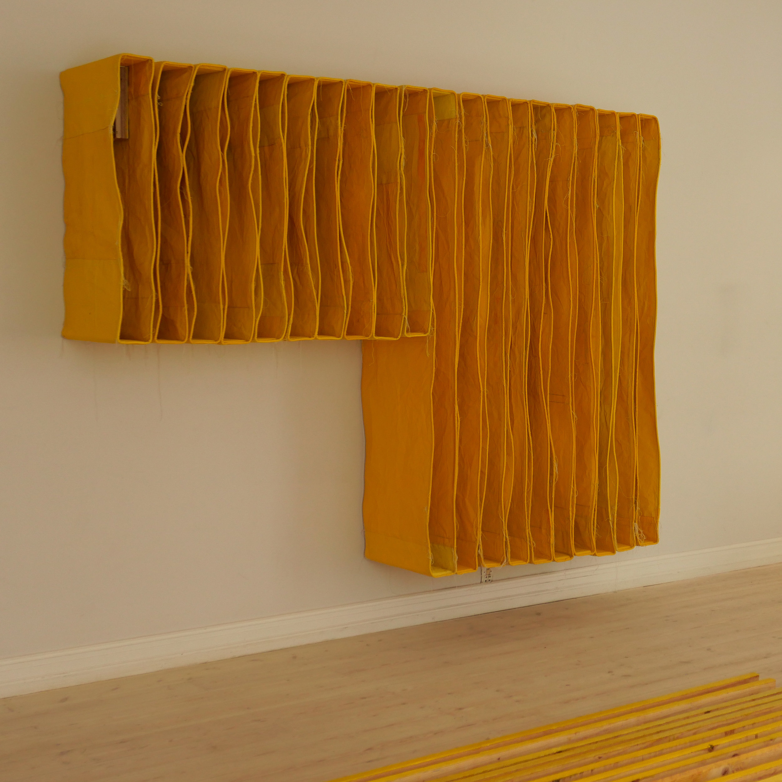
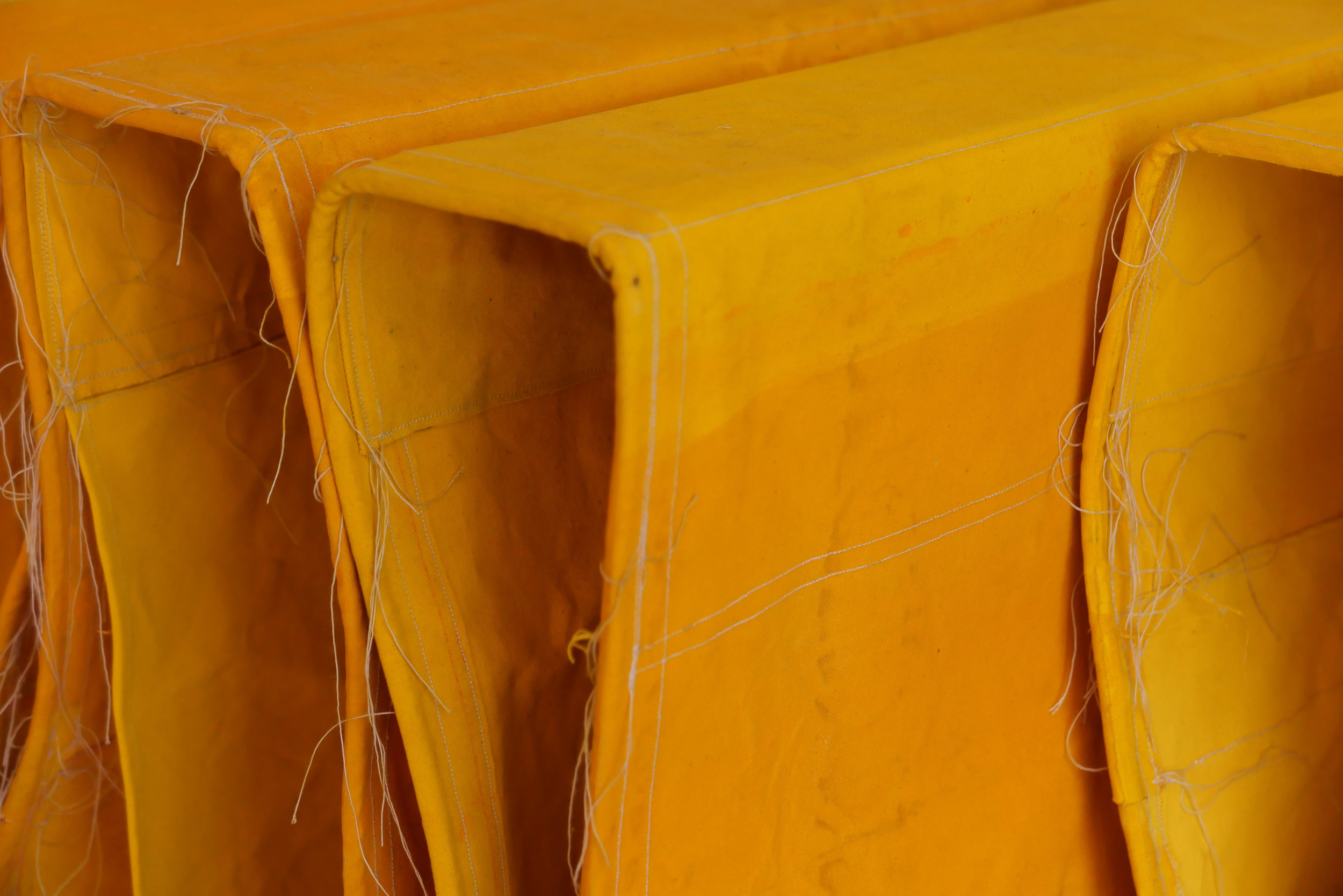
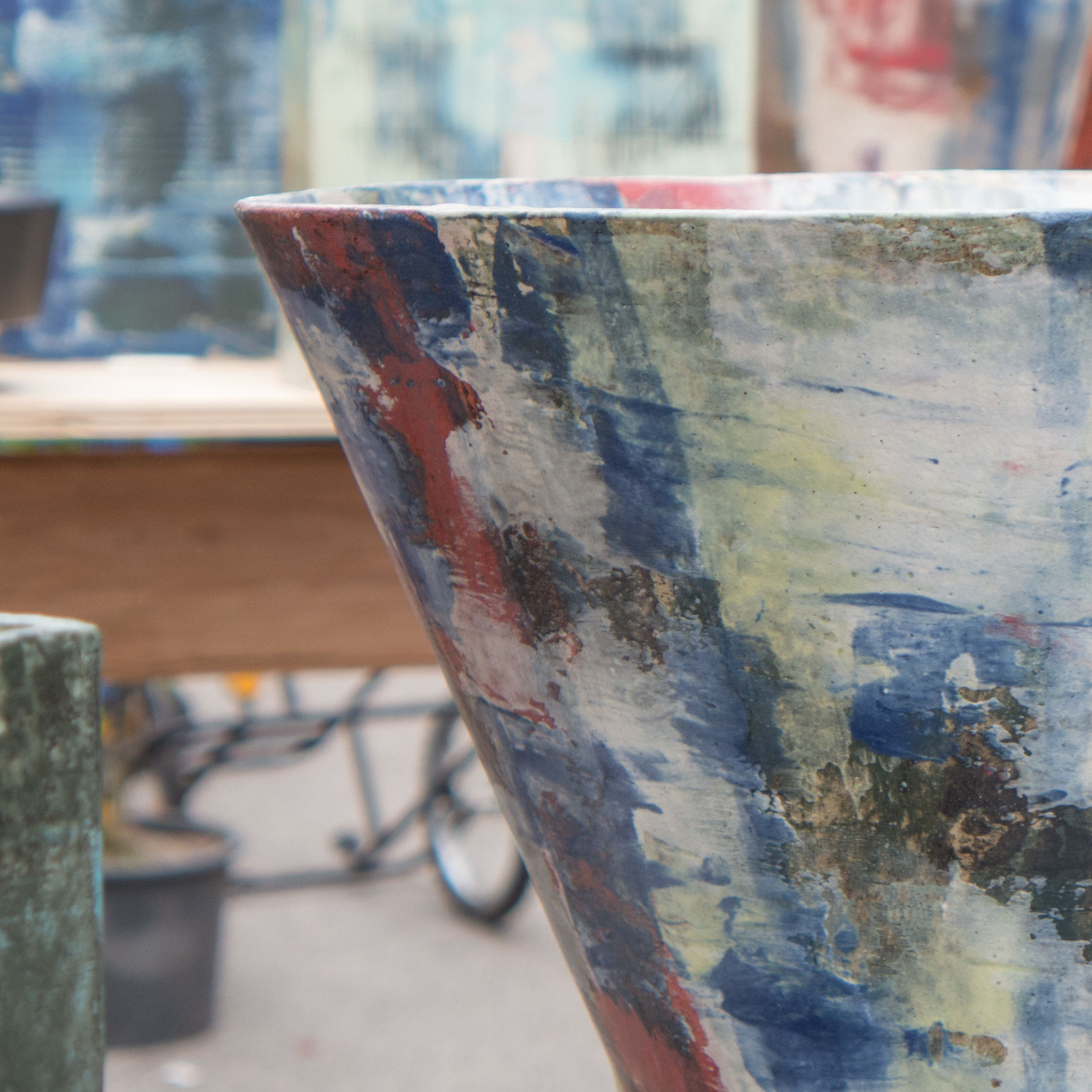
These woven panels raise interesting issues about both how we see and use natural materials and about the impact on nature of human intervention.

Over recent decades research by plant breeders has lead to the development short-stemmed grain crops - to reduce damage from wind or rain, and to increases yields - but, as a consequence, secondary uses for the product from taller varieties are lost.

Until the second half of the 20th century, corn was not simply harvested for the nutritional value of the seed but the long stalks were a sustainable raw material.

Straw (and in many areas reed) was used for thatch where stone slates or fired clay tiles were not available locally or were too expensive for ordinary buildings.

Now, we worry about air miles or about the cost and effect of shipping food, fashion clothing and goods round the globe but I'm curious to know how many people think about where the materials for the construction of their home come from and the environmental impact of those materials at the source, at the factory, and from the transport of the materials.

Generally, in the past - so before the twentieth century - transport of building materials was difficult and expensive. If you were wealthy then you could buy a fashionable fireplace or elaborate panelling from the nearest city or import an exotic wood like mahogany for a staircase to be made by a local craftsman, but for ordinary people, building an ordinary house, materials, generally, came from the local area - often from no more than five miles away - unless you were by the coast or on a river, or, from the 19th century, by a canal or then a railway, when transport costs were less prohibitive.

So, it is fantastic to see the architect Dorte Mandrup using thatch for not only the roof but also for the external cladding of the walls for the new Wadden Sea interpretation centre at Ribe on the west coast of Jutland.

But straw and reed were not just used for building but were also used to make mats or to make furniture - in areas, where good timber was not available - and for making household goods and toys - but how many people now have things in their homes made from straw or reed?

I had a set of table mats that lasted for nearly 20 years before they finally disintegrated and I have a few traditional Dutch Christmas decorations - small birds and stars - that are woven in straw, and every year, for more than 30 years, they come out of the cupboard to be hung on the tree … good and sustainable examples of rural crafts that have much more meaning than tinsel and baubles.

For more than 20 years I measured and recorded and assessed historic buildings of all periods and a good number were thatched. My job was to measure, record and date the timber-work of the roof structure but I have to admit that I rarely thought about the thatch … more than just to note the material and any pattern on the ridge or eaves that reflected the traditions of that area.

Looking at the work by Christina Christensen, reminded me when I first thought about long straw. I had been asked by BBC radio to collaborate on a programme about a thatched building in Oxfordshire and was there to talk about the date of the roof timbers - the form and techniques of construction suggested it dated from the 14th century and that had been confirmed by dendrochronology - but the main contribution to the programme was from a plant archaeologist.

What was so important about that particular roof was that it had never been stripped back for the thatch to be replaced completely. For over 600 years it had simply been patched and repaired with new layers over the old core of straw thatch. Not just exposed roof timbers but also the underside of the thatch itself were blackened with soot from the original open hearth that had been at the centre of the house until the 16th century when a new fireplace with a closed-in chimney was built.

From within the roof space, huddled in cramped space above modern ceilings, with me and the radio interviewer, the archaeologist drew out straws that were not far off 2 metres long and some still had their seed heads. From these he was able to identify the specific types of corn grown in the area in the middle ages - types of corn that were often specific to a relatively small area and certainly no longer grown - and identifying them was important for understanding medieval farming but also important for studies on bio diversity.

the Biennale - to play and learn together


This work by Kristine Mandsberg has prominent labels that read "please touch".

Play and, through play, early learning is one of the first stages where a child not only begins to explore and understand the physical world but also begins to build bonds with parents, siblings and a growing circle of friends.

Copenhagen has remarkable playgrounds with a huge range of equipment to test agility, to stimulate the imagination of children and to encourage play and the production of toys and furniture for children has been important in the works of many designers.

Kristine Mandsberg trained as a textile designer in Kolding and once you know that then the structural form of Three of a Kind, with warp and weft, becomes intriguing.

She also describes herself as an illustrator and the bold simple shapes here and her use of strong, bold colours has to come from a graphic sensibility.

But it was not just children who spent time twisting and turning and resetting these pieces. It was interesting to watch adults set and re set the pieces … perhaps not to find the inner child but seemed to reflect, at least, the way humans are curious about complex and adaptable structures.

These works have an element of mechanics about them … reminiscent of old wood football rattles that are never seen at matches now.

Biennalen for Kunsthåndværk & Design

kristinemandsberg.com


Axel Salto Stentøjsmesteren / Axel Salto stoneware master


A major exhibition of work by the artist, designer and ceramicist Axel Salto (1889 - 1961) opened in February at Øregaard Museum in Hellerup - just along the coast to the north of the city.

Salto studied painting at the Royal Academy and graduated in 1914.

By 1916 he was living in Paris where he met Picasso and Henri Matisse and on returning to Denmark he produced, edited and wrote for a short-lived but influential journal Klingen / The Blade that was published between 1917 and 1919.

He was a member of the Grønningen group of artists and one of The Four with Svend Johansen, Vilhelm Lundstrom and Karl Larsen who exhibited together between 1920 and 1929.

In the 1920s he began to design ceramics and his stoneware pieces were produced in the workshops of Carl Haller at Saxbo keramik in Frederiksberg and he also produced designs for porcelain by Bing & Grondahl with his work shown at the Paris exhibition in 1925.

This exhibition shows a full range of his ceramic works from small stoneware bowls with incised decoration or bold moulding with Japanese-style glazes to large-scale works with scenes from Classical mythology or stylised nature.

Paintings and strong and very confident ink and line-work drawings, including designs for the ceramics, show clearly the style Salto developed from his training as a painter.

He also worked with the book binder August Sandgren and a selection of designs for end papers are shown in an upper gallery which have a distinct feel of the 1930s with deep colours and stylised and small repeat patterns.


the exhibition continues at Øregaard Museum until 23 June 2019

Yellow at Officinet

An exhibition at Officinet - the gallery in Copenhagen of Danske Kunsthåndværkere & Designere - to show the works of the Danish artist Torgny Wilcke and the English artist Simon Callery.

Both artists have used the colour yellow for a common element and both use what are essentially functional every-day materials - for Callery heavy canvas and Torgny Wilcke timber and corrugated metal strip for roof covering.

Both work on a large scale with a strong presence in the space and both hint at potential practical uses for their works … the wall pieces by Simon Callery reference storage and the large floor pieces by Torgny Wilcke have been used for seating so they are challenging boundaries between art, craft and design.

Both use proportions to bring order and to assume control of the space in the gallery. 


the exhibition continues at Officinet until 24 March 2019
Bredgade 66, Copenhagen

Danske Kunsthåndværkere & Designere /
Danish Association of Craft and Design


Torgny Wilcke

Simon Callery


skud på stammen at Design Werck

Barndommens Land designed by Aske Foersom and made by Sara Ruff
En Gyngestol designed by Søren Nissen and made by Kasper Wium Kristiansen and Abia Manzanares
Bord designed by Tine Mouritsen and made by Gunver Lindeskov Søgaard

This week is the last opportunity to see the exhibition at Design Werck in Copenhagen of furniture made by students who are about to graduate as cabinetmakers. The students from next> in Copenhagen worked in partnership with designers and the furniture is made from lime wood from trees felled at the Rødovre City Hall when the main entrance courtyard was replanted.

SKUD PÅ STAMMEN continues at Design Werck until Sunday 10 March 2019
note: Design Werck does not open on Monday or Tuesday

Design Werck

Introvert position - chair designed by Andreas Lund


A compact and robust chair that has an unusual form of construction and proves, as always, that although a design may appear to be simple, the best simple - as here - takes a lot of work to get right.

It has a relatively thick seat in solid wood - so not with a frame - but the edge is undercut with a deep chamfer that disguises that thickness and also creates a sharp crisp line to the front edge when you see the chair in profile.

The seat also has a complex shape that is a semicircle for the back half but combined with an elongated half of a hexagon to the front.

The form of chair construction is also difficult to describe:

The seat is supported on an X with two cross pieces that are halved one over the other. These cross timbers are higher than they are wide and are cut away at the centre so that the solid seat drops down into the cross rather than sitting on top of it.

Each of these cross bars is housed directly into the turned legs … a shorter front leg at one end of the cross piece, with the mortice of the housing just below the top of the leg so that  it stands just proud of the horizontal cross piece, and a back leg at the other end with the housing for the cross bar at the centre of the leg.

That X - of the cross shape underneath the seat - is not regular with the crossing point closer to the back of the chair than to the front so, with unequal arms, the back legs are closer together than the front legs.

A kidney shaped back rest, in thin but solid wood, is gently curved and appears to be in two parts with the grain arranged symmetrically about a central horizontal axis. It is fixed an angle for comfort by cutting a flat face at the face of the upper part of the back legs.

The legs are set vertically, rather than being splayed outwards at the ground to make the chair more stable. Generally vertical legs indicate a simpler and more straightforward chair - a feature associated with country chairs made in a local workshop - and legs that are set an angle that require more precise and more complicated mortice and tenon joints are used to indicate that a chair is more sophisticated.

So one definition of a country chair is that it made in the workshop in a traditional way … barely needing thought and certainly not needing design but each slightly varying from the next as the carpenter responds to differences in each piece of wood. Although Introvert position might look like a simple country chair, it actually has carefully-determined and, of course, beautifully made with considerable precision.


Introvert position
MONO catalogue number 1
designed by:
Andreas Lund
produced by: Toke Overgaard

asketræ / ash
height: 77 
width: 38 
depth: 42 cm


more from MONO - 2Gether by Steen Dueholm Sehested


At Thorvaldsens Museum in Copenhagen, in November and early December this year, there was a major exhibition of furniture by cabinetmakers. This was MONO - the Snedkernes Efterårsudstilling or Cabinetmakers’ Autumn Exhibition.

Generally, these pieces are not in production and many were designed specifically for the exhibition as it is an opportunity to try out ideas or use materials in unconventional ways that might not be obvious for a commercial manufacturer and designers find ways to highlight the skills of the cabinetmakers.

There are photographs here of the forty-one works shown along with basic information about the materials and dimensions but many of the pieces deserve longer individual posts.

2Gether by Steen Dueholm Sehested - MONO catalogue 13

Stools with an X-shaped frame have a well-established place in Danish design - the display of chairs at Designmuseum Danmark has nine stools of this form.

Most of these stools are folding stools with two frames that are pivoted or hinged at the centre and open out or fold out to form an X shape that supports a seat that is often canvas but can be leather or slats of wood from side to side across the top.

Here, in the stool designed by Steen Dueholm Sehested, there are two pieces - each a complex C shape, with the wood not a constant thickness but thicker at the centre and tapered or thinner towards the top and bottom and curved in both planes with slots cut into them so that they can be slotted or linked together. The C shapes cross over, curve back and cross over again so the base and the top on each side are part of the same piece to create an elegant and sculptural form.

Such complex curves could not be formed from single planks but are made up with finely-cut and joined blocks with the grain forming a part of the design.

The side pieces do not sit square on the floor but the bottom edge is champfered and cut to a sharp curve so the stool has just four points of contact with the floor.


2Gether
MONO catalogue number 13
designed and made by:
Steen Dueholm Sehested

formspændt egetræ / moulded oak

height: 44
width: 38
depth: 26 cm

TRÆ, SAKS, PAPIR / Wood, paper, scissors

Karmstol, Stitched wood and a Skammel and Massive weaving


Knitted wood

Massive weaving and Folded wood

Knitted weaving and Folded wood

Knitted wood

An important exhibition of recent work by the furniture designer and architect Else-Rikke Bruun has just opened at the gallery of the Association of Danish Crafts and Designers in Bredgade .

There are several strong themes running through the works shown here but perhaps the most interesting and surprising idea is about not just defining space but also exploring shadow as a strong component as if it is itself a material element in the design.

Five screens in wood - the main works - define space but also occupy space and very considerable care was taken to set the lighting and to use the natural light of the gallery so strong shadows on the floor dissolve the sharp edge between the vertical of the screen and the horizontal surface of the floor and views through the screen and light coming through the screen from the other side change as you move round the space.

After completing her training as an architect Else-Rikke Bruun studied Arabian architecture for three years and here not just the fragmenting of light but also the use of precise geometric forms show the influence of Arabian architectural forms. Walking around the exhibition Else-Rikke explained that she is fascinated by patterns and the way we look for patterns and geometric pattern has a strong role in architecture of the Middle East, North Africa and southern Spain.

Influence from Japan is acknowledged both in the way the screens and the arrangement of faceted blocks of wood in the chair and in small panels reference the Japanese art of folding paper - two panels in wood are titled Origami panel - but also there is the sense of a Japanese aesthetic in the calm and measured division of space - a key feature of the way the pieces have been arranged in the gallery.

All the works shown are made with incredible precision so they also have the quality of fine engineering - particularly in the way separate pieces are linked or joined together or have different forms of hinge: all the screens can be articulated to adjust the angles of the parts or the alignment of the whole screen and Knitted wood folds back in on itself.

Another strong theme is inspiration from textile art and that is shown directly in the titles of three of the works … Stitched wood, Massive weaving and Knitted wood. This is not just about how elements interlock - Veneer has what are in fact giant warp and weft in cut plywood - but, as with woven textiles, the visual character from a distance is different from the complexity and subtlety that is revealed as you move closer.

Four of the works exploit the properties of laminated wood and develop different techniques for cutting to shape, bending, linking or interlocking plywood.

Use of colour is important but generally subtle … the screen titled Massive weaving uses spray paint so colour is strong on the cross-cut ends of the battens but fades out along the length. This work was developed with the colour artist Malene Bach. Generally subtle except that Knitted wood has a strong colour on one side that counterposes the shadow as you look through the interlocking curves.

The exhibition is the culmination of over a year of work specifically but actually develops and builds on themes that were first shown by Else-Rikke Bruun in the craft Biennials in 2015 and 2017.

Immediately  before the exhibition Else-Rikke Bruun had a residency at Statens Værksteder for Kunst / Danish Art Workshops in Copenhagen and in a longer review here both the development of the main ideas and themes of the exhibition and the role of the workshops in giving artists access to space and equipment to realise their work will be discussed.

Stools in Oregon pine were made by Anders Petersen Collection & Craft in Copenhagen.

Karmstol, the chair in the exhibition, took, as a starting point for its design, round-headed niches at each end of this gallery. It is not strictly site specific but does hint at just how carefully-considered this work is with strong references to the design of Classic Danish chairs while experimenting with both form and construction techniques. It is an important piece that blurs our artificial boundaries between art, craftsmanship and utility and will be the subject of a separate post.

A longer review of Træ, Saks, Papir will be posted here  

Danske Kunsthåndværkere og Designere

Else-Rikke Bruun


the exhibition continues until 20 December 2018 at
Officinet, Bredgade 66, Copenhagen

MONO - Snedkernes Efterårsudstilling / the Cabinetmakers’ Autumn Exhibition 2018

Piqué
designed by:
Hannes Stephensen
produced by: Snedkersind v/Kristian Frandsen

Sunrise
designed by:
Lise og Hans Isbrand
produced by: MoreWood Møbelsnedkeri ApS


The Cabinetmakers Autumn Exhibition for 2018 has just opened at Thorvaldsens Museum in Copenhagen.

SE - Snedkernes Efterårsudstilling - The Cabinetmakers’ Autumn Exhibition - is an association of 81 designers and manufacturers. Each year their board select a venue for their exhibition and set a theme along with any specific rules for a particular year - often to do with dimensions but this year also stipulating colour - so each work will be restricted to just one colour with the choice limited to either the natural colour of the material itself or to one of the strong and distinctive colours used in the original decorative schemes of rooms in Thorvaldsens Museum.

Each year, guest designers and guest manufacturers can apply to show their work. 

When setting the theme for this year, MONO was suggested to imply a range of associated ideas through monochrome, monolith, monopoly and monologue.

A subheading for the exhibition - furniture shaped by craftsmanship and insight - is important and significant: these pieces highlight the skills and the experience of the cabinetmakers who, in some pieces, take their chosen materials to new extremes and, in all the works, push their workshop techniques to the highest level of quality. So the exhibition is in part about the style and the form of each work but because, the cabinetmakers also represent a long and well-established craft tradition in Denmark, these pieces are about understanding the materials, to know what can be done and how, and to use incredible skills to shape, finish, join, refine or reduce the parts that make each work.

There are forty one works in the exhibition. Most were produced in a partnership between a designer and a cabinetmaker or furniture manufacturer - in many cases a  partnership that is now well-established over many years and over several projects shown at the Autumn Exhibition although several pieces were both designed and made by the same person.

The exhibition is also an opportunity to experiment or to produce designs that might otherwise not be commissioned … the aim is not only to challenge the skill of the maker but also to challenge the preconceptions of the visitor.


the Autumn Exhibition continues at Thorvaldsens Museum until 9 December 2018

Thorvaldsens Museum
SE - Snedkernes Efterårsudstilling

Cupola drejestol / Cupola swivel chair
designed by:
Niels Gammelgaard
produced by: Northern Layers

En stol / A chair
designed by:
Foersom & Hiort-Lorenzen
produced by: Kvist Industries A/S

Introvert position
designed by:
Andreas Lund
produced by: Toke Overgaard

Rum / Encircle
designed by:
Troels Grum-Schwensen
produced by: Malte Gormsen

2Gether
designed and made by:
Steen Dueholm Sehested

Bloom
designed by:
Hannes Stephensen
produced by: Egeværk

Beside
designed by:
Line Depping
produced by: Skagerak Denmark A/S

Guldlok / Goldilocks
designed by:
Monique Engelund
produced by: Sune Witt Skovhus


MONO - exhibition catalogue


The catalogue for the Cabinetmakers’ Autumn Exhibition in 2018 at Thorvaldsens Museum in Copenhagen has a general introduction to the exhibition by the selection board and then for each work there is a double-page layout with a full page black and white photograph for each of the works.

These monochrome images are dramatic and chime with the theme of the exhibition but also give a strong emphasis to the form of each work.

Some pieces have a descriptive or evocative name - so Calm or Look don’t touch and a cabinet for the display of special possessions has the title Ego - while other titles are more straightforward, with works described as Chair or Table and Chair.

Of course the catalogue sets out the name of the designer and the name of the cabinetmaker or the company who realised the work and each entry includes the materials and the dimensions of the piece.

There is also a short paragraph on each work to set out any thoughts that inspired the design or to talk about technical details - many of the pieces use material in an innovative way or the construction is much more complicated than is immediately apparent - and there is a translation in English.

Graphic design is by Studio Claus Due and the black and white photographs were taken by Torben Petersen.

Snedkernes Efterårsudstilling / The Cabinetmakers’ Autumn Exhibition 2018

Thorvaldsens Museum

Studio Claus Due


Kunsthåndværkermarkedet / The Craft Market on Frue Plads in Copenhagen


In the middle of August each year, there is a craft market on Frue Plads - the square next to the cathedral in Copenhagen.

Organised by Danske Kunsthåndværkere & Designere / The Danish Association of Craft Workers and Designers, this is an opportunity to see and to buy some of the very best ceramics, glass and textiles made in Denmark. These photographs of ceramics were taken this time last year and show the quality and the range of works sold here.

The current series of posts on this site is looking at aspects of how colour and texture are used in Danish design and Danish architecture and it seems curious that, on the whole, the current fashion for both buildings and for interiors in Denmark is for muted colours and, generally, very little or very restrained use of texture but in ceramics you find such strong forms or shapes and incredibly confident use of colour and texture in works that push both the material and the glazes used to new levels.


Kunsthåndværkermarkedet / The Craft Market 2018
Thursday 9 August 12 - 19
Friday 10 August 10 - 19
Saturday 11 August 10 - 16