PORCELAIN PLUS + Göransson + Manz + Nordli

The exhibition Porcelain Plus, at Officinet - the gallery of Danske Kunsthåndværkere og Designere - the Association of Craft and Design -in Bredgade - has been curated by Bettina Køppe of the gallery Køppe Contemporary Objects in Nexø on Bornholm.

Here are shown works by three major Scandinavian ceramic artists with all three working in porcelain and all three artists use slip pouring or casting.

All three show how their works have evolved as they explore specific ideas or a number of themes but also, through the development of their skills and their specific techniques, they explore the qualities of their chosen material to discover what is possible and what is not possible as they exploit what is essential about the qualities of porcelain.

But here, with the current works of the three artists, their pieces could hardly be more different.

Porcelain Plus at Officinet -
the gallery of Danske Kunsthåndværkere og Designere
in Bredgade in Copenhagen -
opened on 7 February 2020 and continues until 29 February.

Officinet, Danske Kunsthåndvækere & Designere
Køppe Contemporary Objects


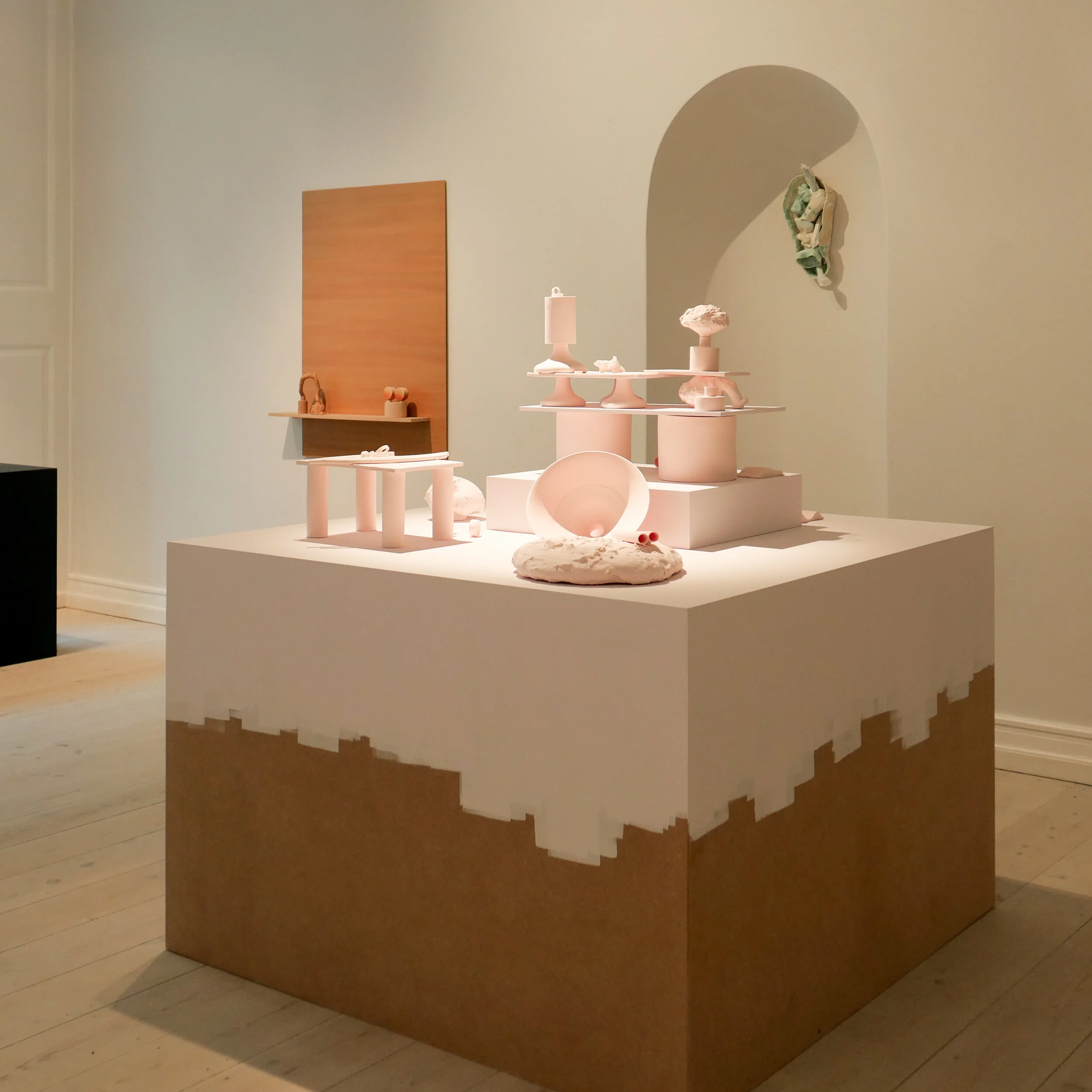
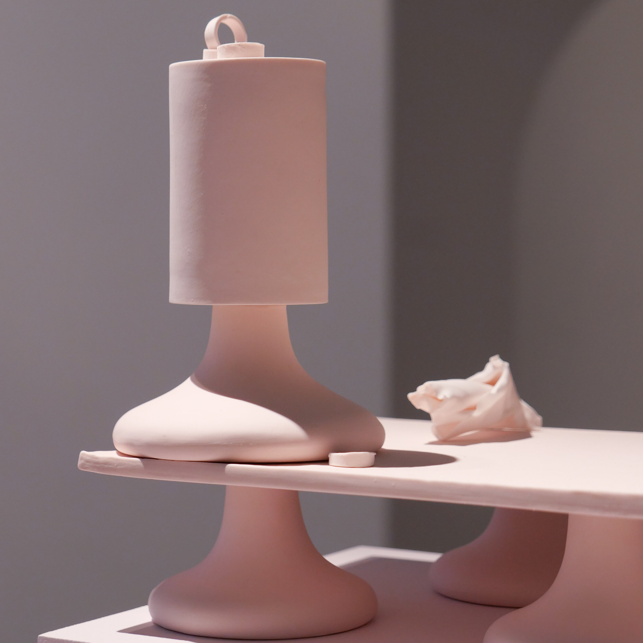
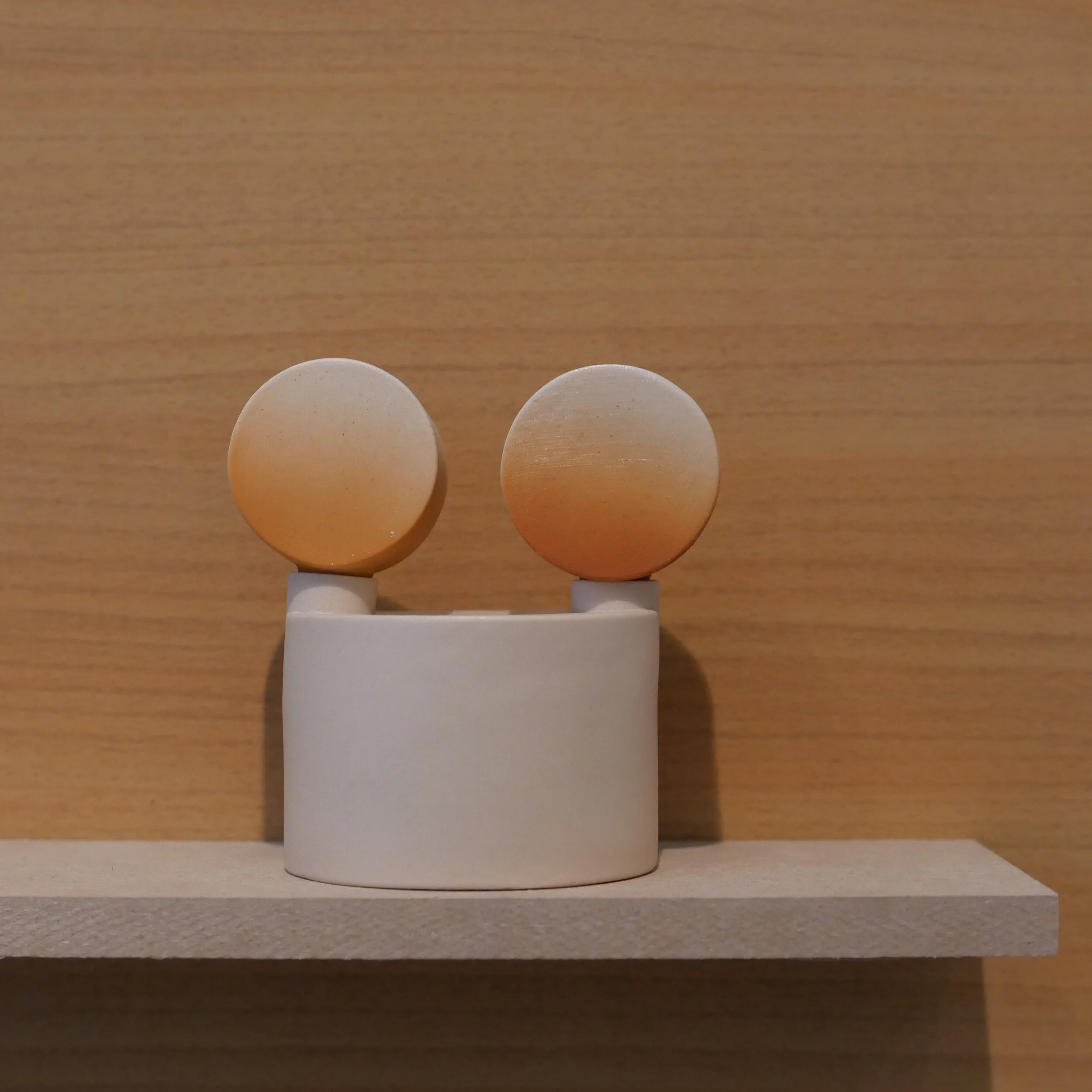
Mia Göransson, a ceramicist from Sweden, has produced what is, in effect, a wide catalogue of moulded shapes in porcelain that are then combined to produce a tableau - a still life on a plinth or on a shelf.

Generally, these shapes are simple so there is a strong sense of bold uncluttered forms but this is relieved by curls or rolls or twists of porcelain that exploit just how the clay can be taken down to a thinness that is almost impossibly delicate.

Primarily, the colour palette is strong pastels with a perfect matt finish but the works explore colour changes because some elements of the piece have surface texture or, simply, colour changes in the shadows or on different faces of the same piece.

In contrast, some works include a piece of what appears to be the almost raw clay as it is “knocked down” to remove air bubbles and then cut with a wire to ensure that the smooth fine texture is consistent through the material before working with it. Through this devise Mia Göransson gives the tableau a sense of time and an acknowledgement to the raw material and her method of working with the clay.


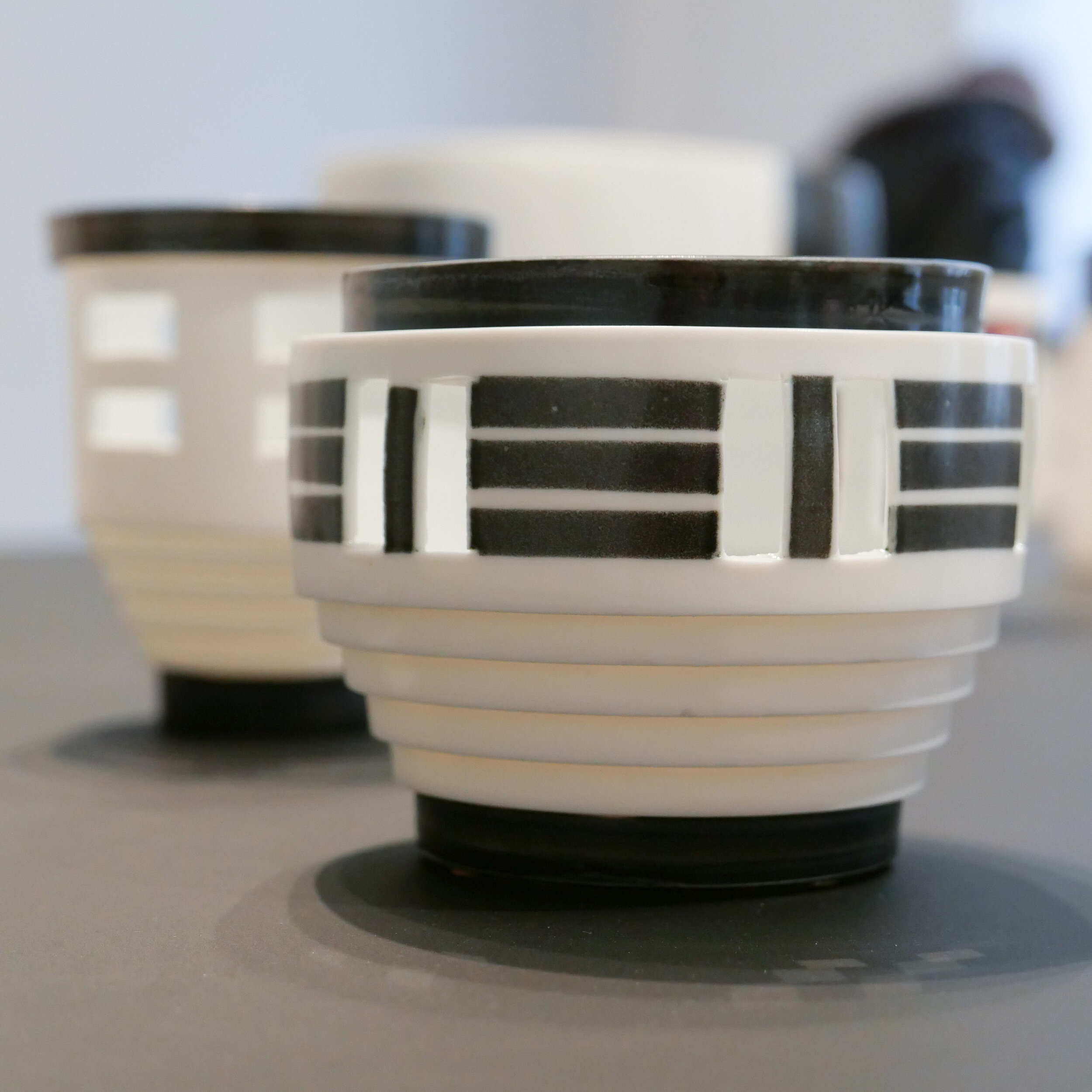
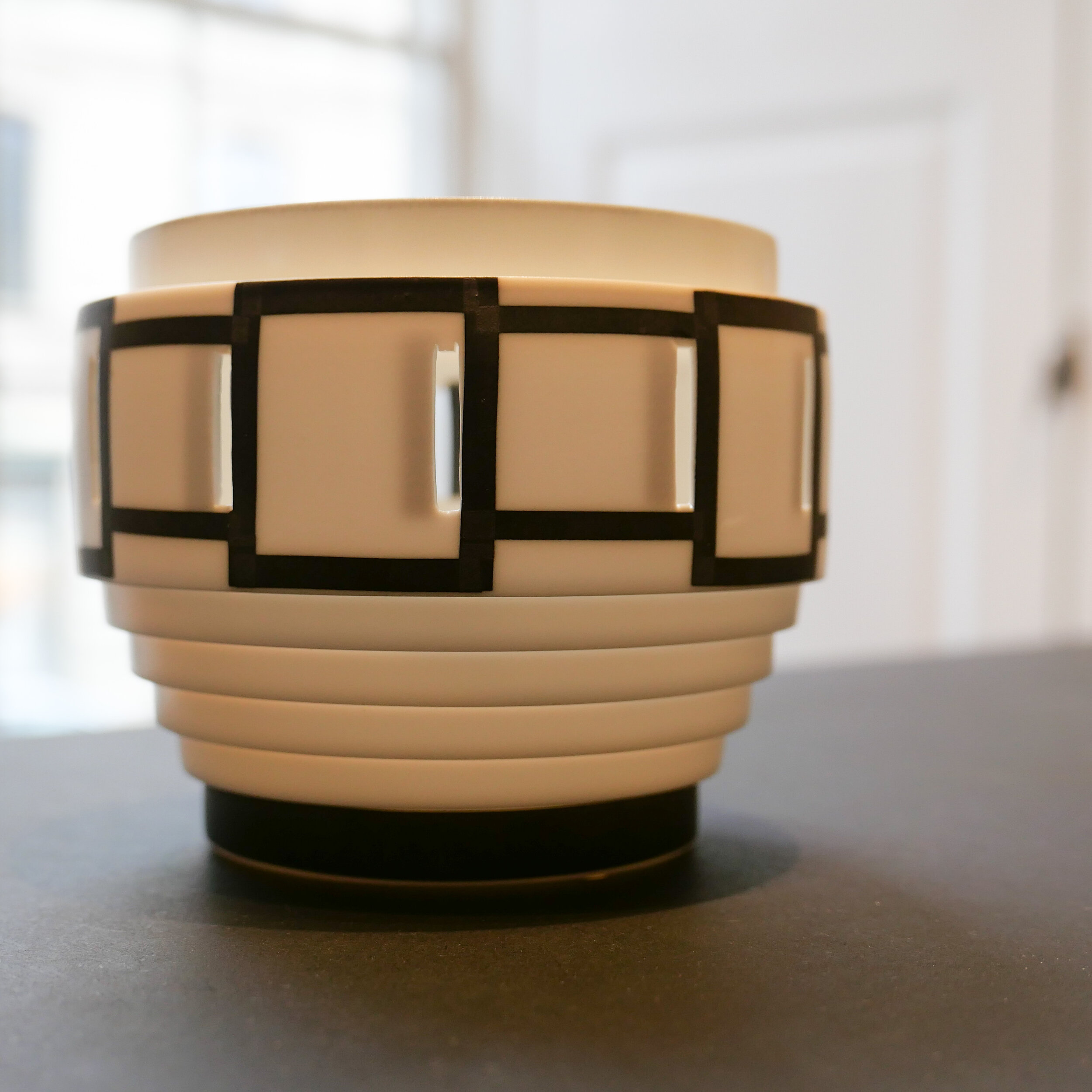
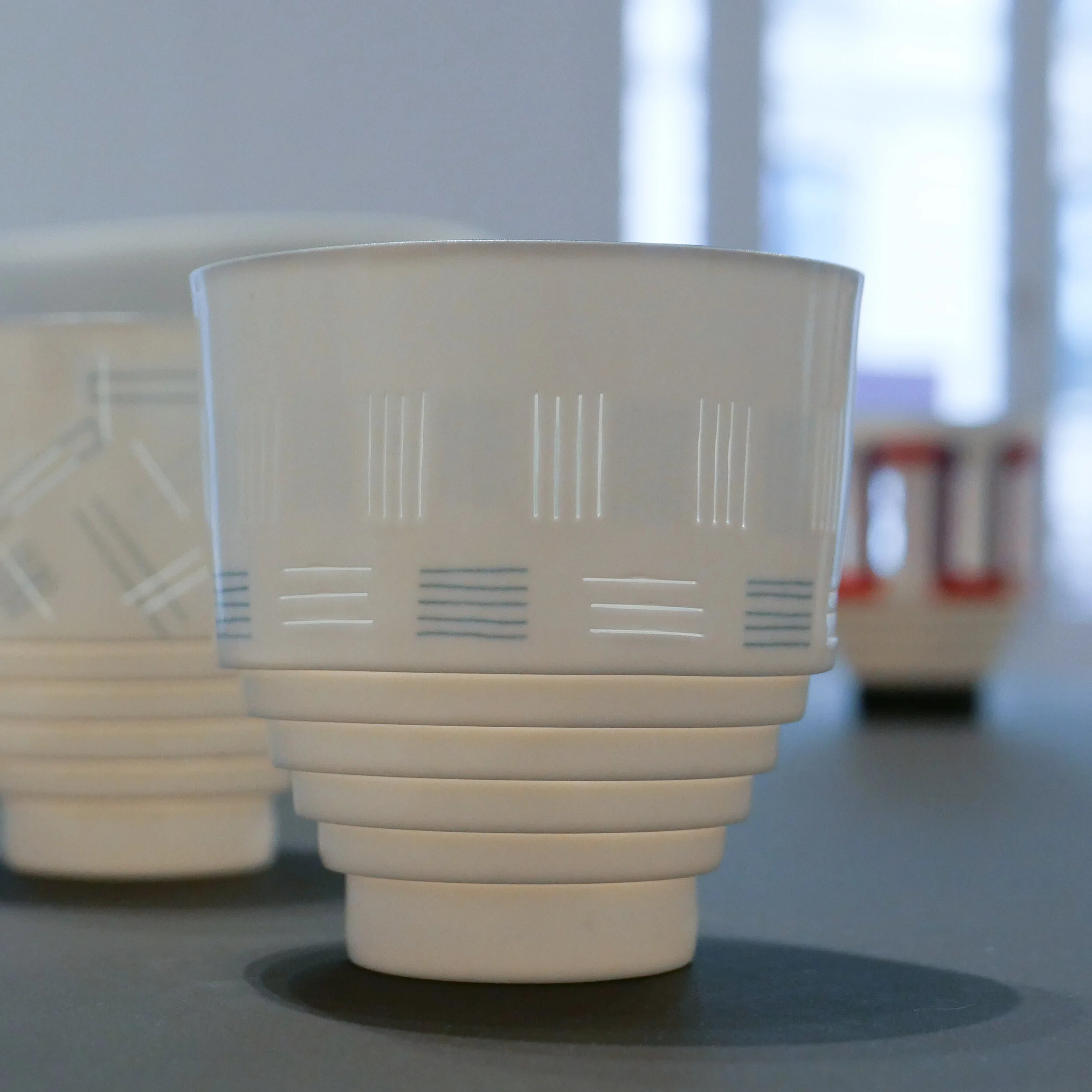
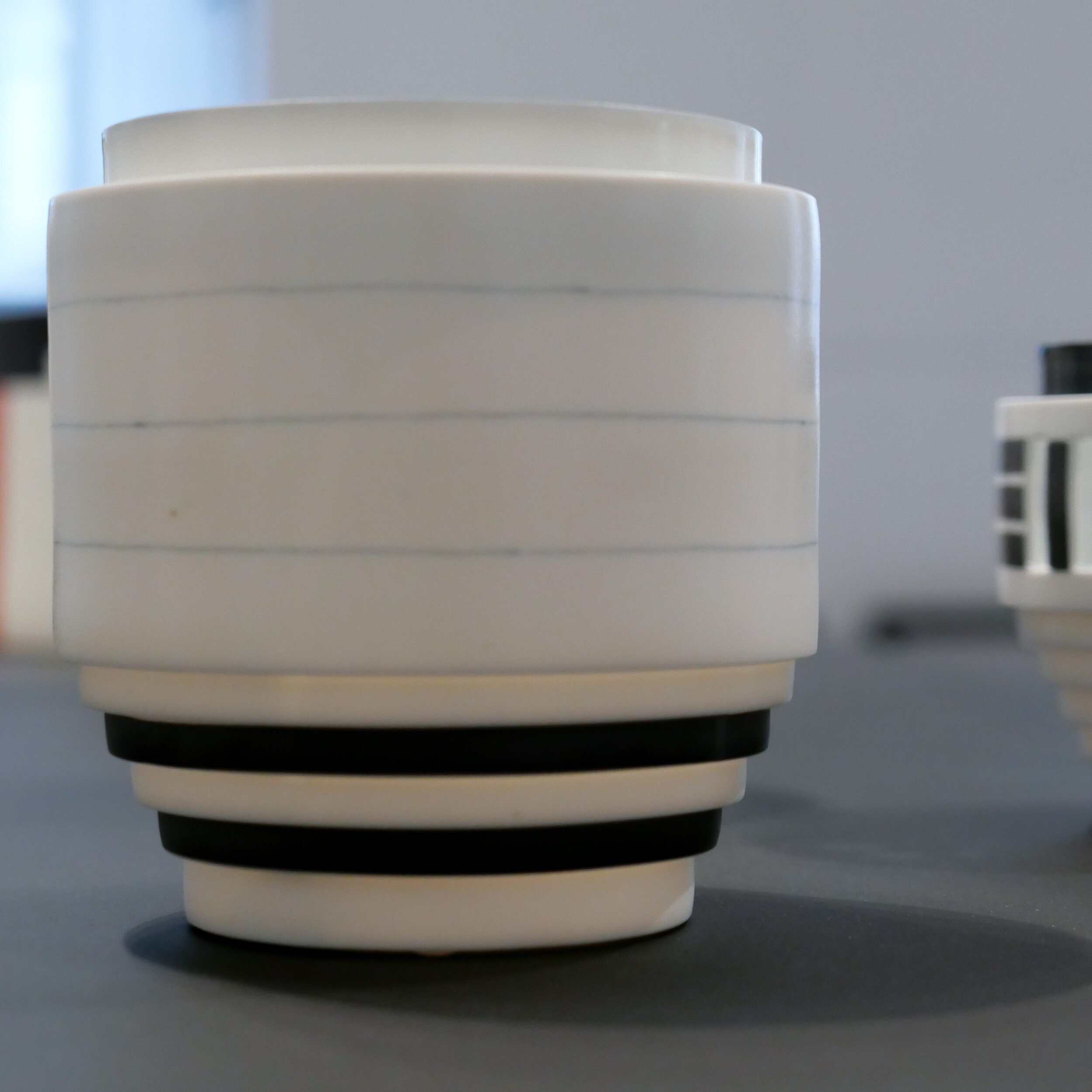
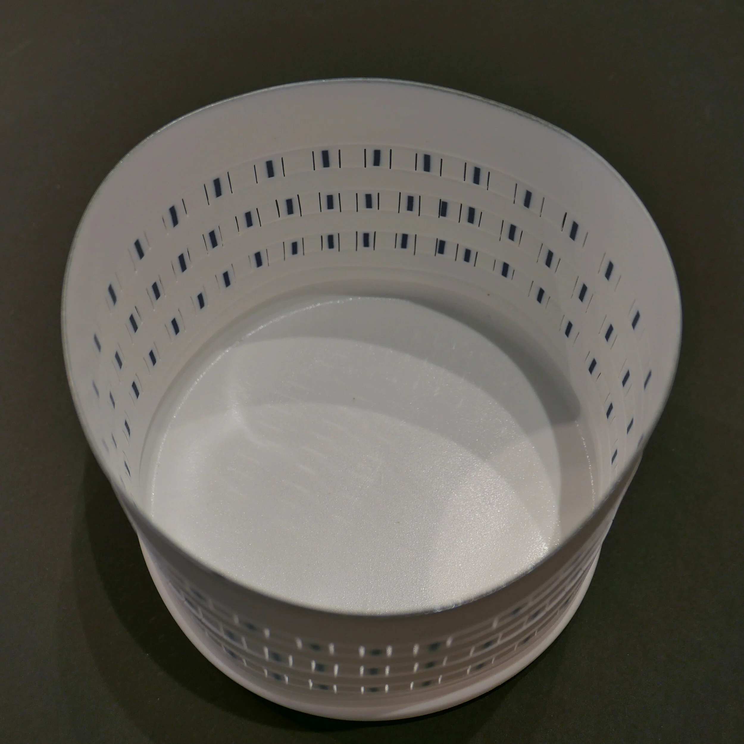
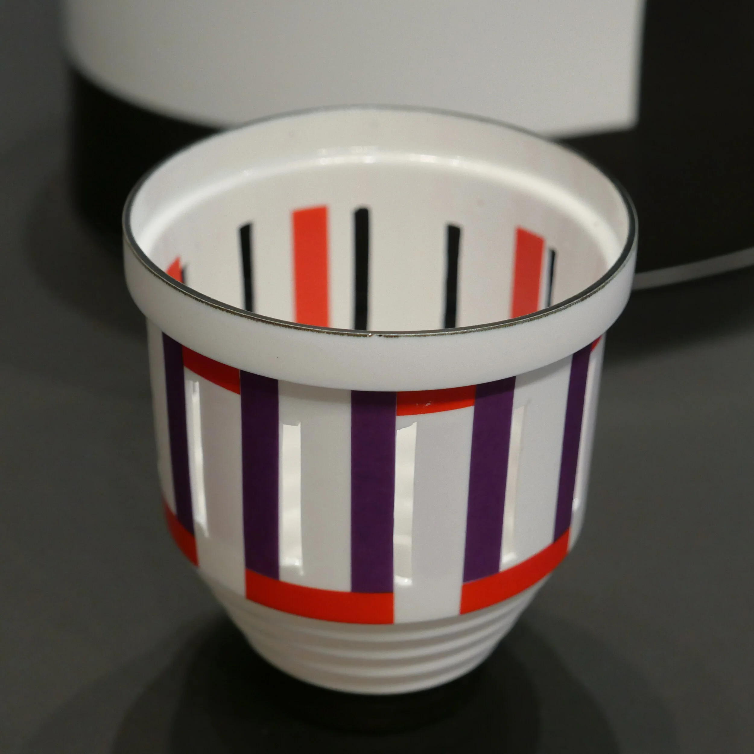
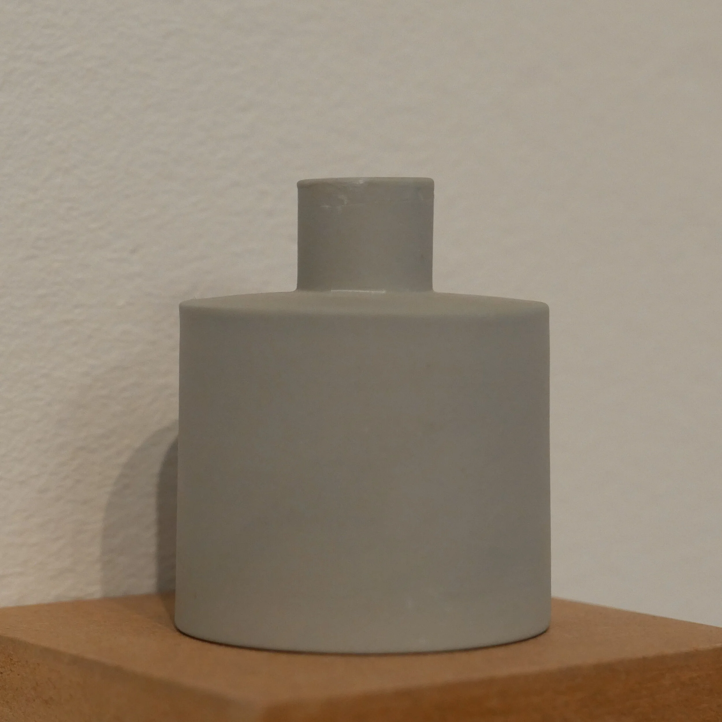
Works by Bodil Manz have a different starting point because they look to the sharply-defined and strong colours and geometric but primarily graphic patterns of modernist art and to the Bauhaus in design but combine that with the technical skills and the sensibility of Japanese porcelain.

Some of the forms have a simple elegance - a basic cylinder that relies on perfect proportions while others have a finely stepped base that exploits shadow to give the smaller pieces a sense of drama.

Many of the almost impossibly thin vessels are perforated and have fine linear patterns on the outer face and some have fine blocks of colour applied by transfer to the inside so that colour appears almost as shadows through the translucent body of the piece. Many have a thin line of dark colour around the rim and again this emphasises the three-dimensional volume and defines the boundary between inside and outside so each piece should be seen in profile to explore the silhouette and the proportions but also has to be seen from above and as you move around the work and see it from different angles.

The starting point might be a sense of the order of geometry but ultimately these works are not about the perfect shape or the perfect mechanical form but accept and explore how the thin clay can twist in the firing or the piece might have a slight irregularity and that gives these pieces a very humane sense of controlled fallibility.


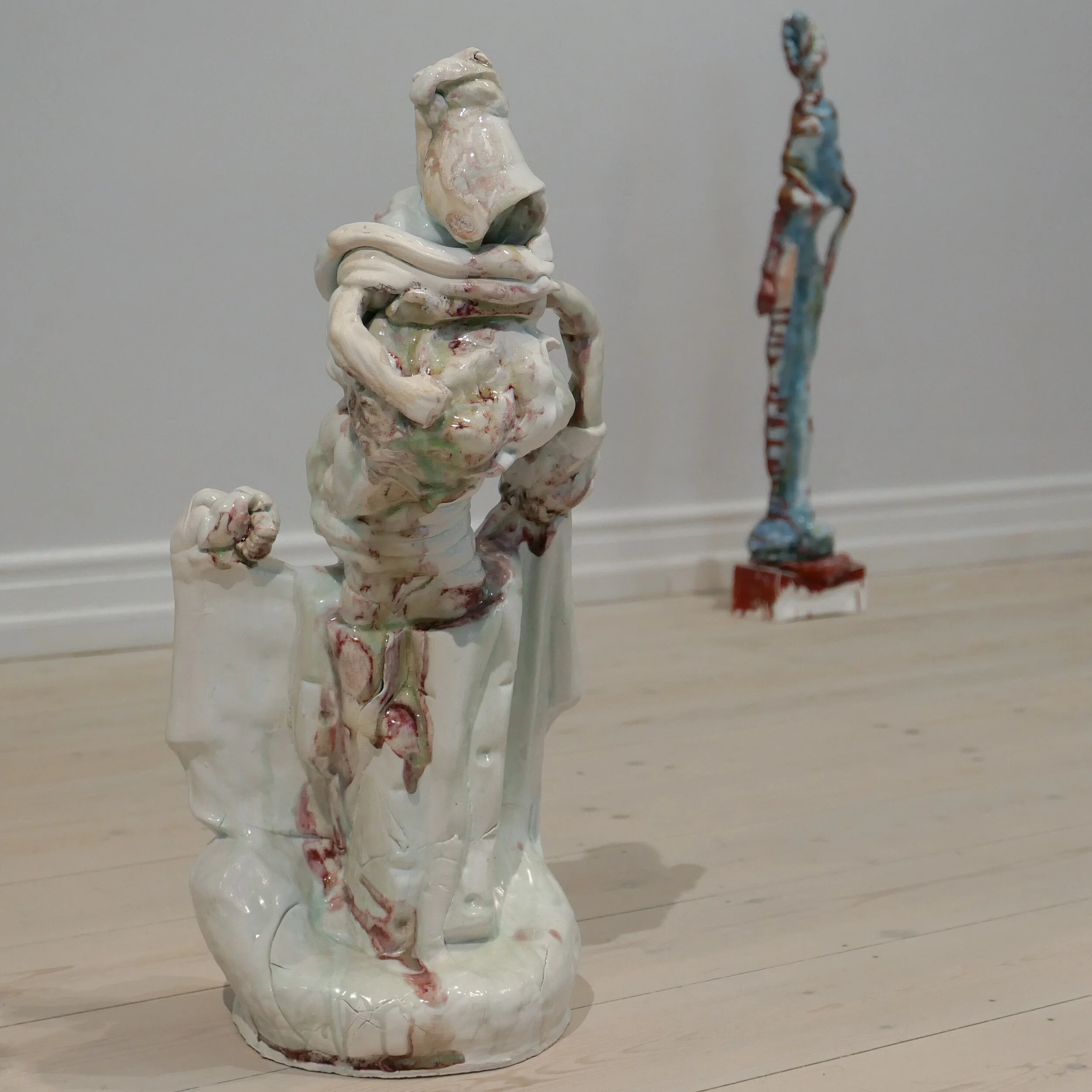
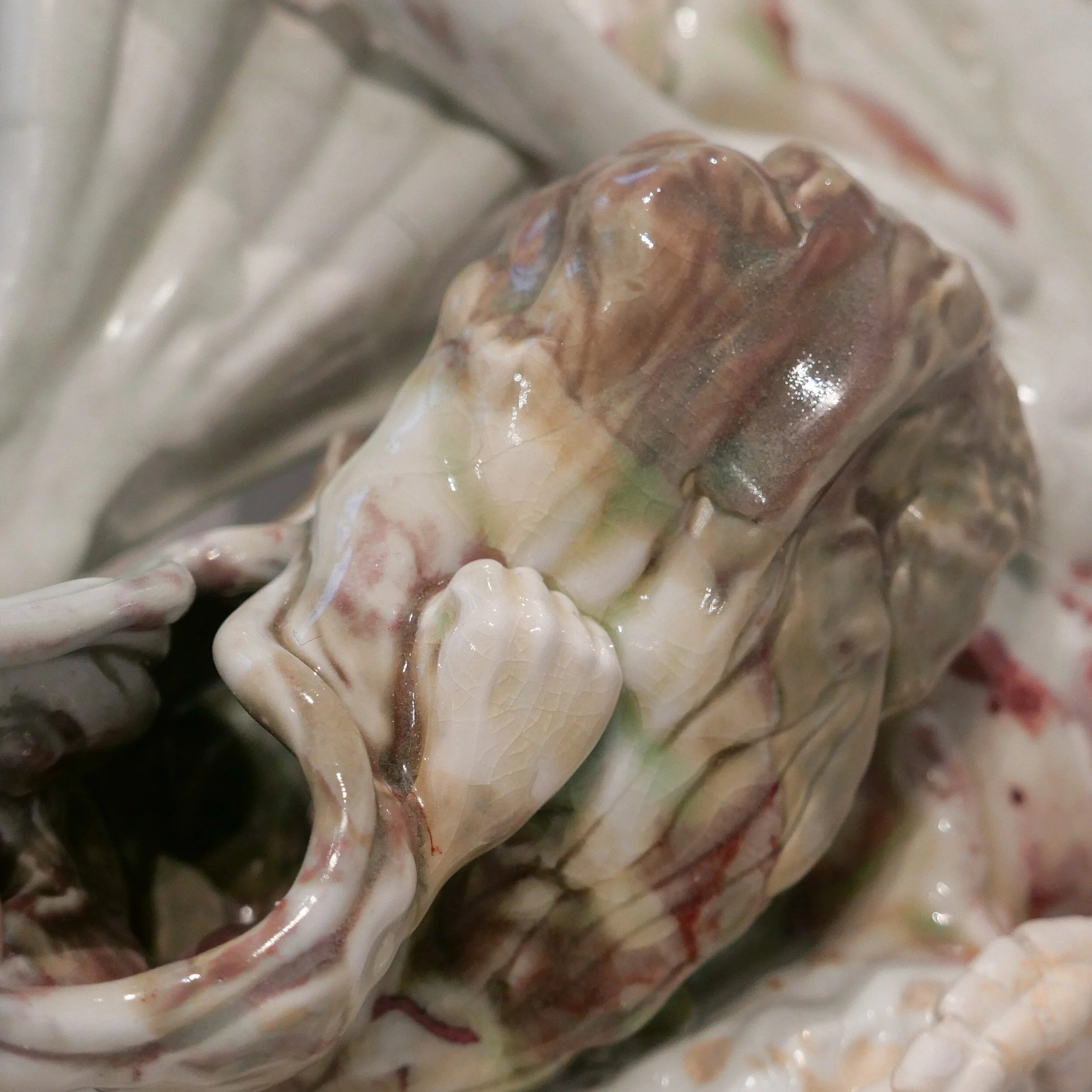
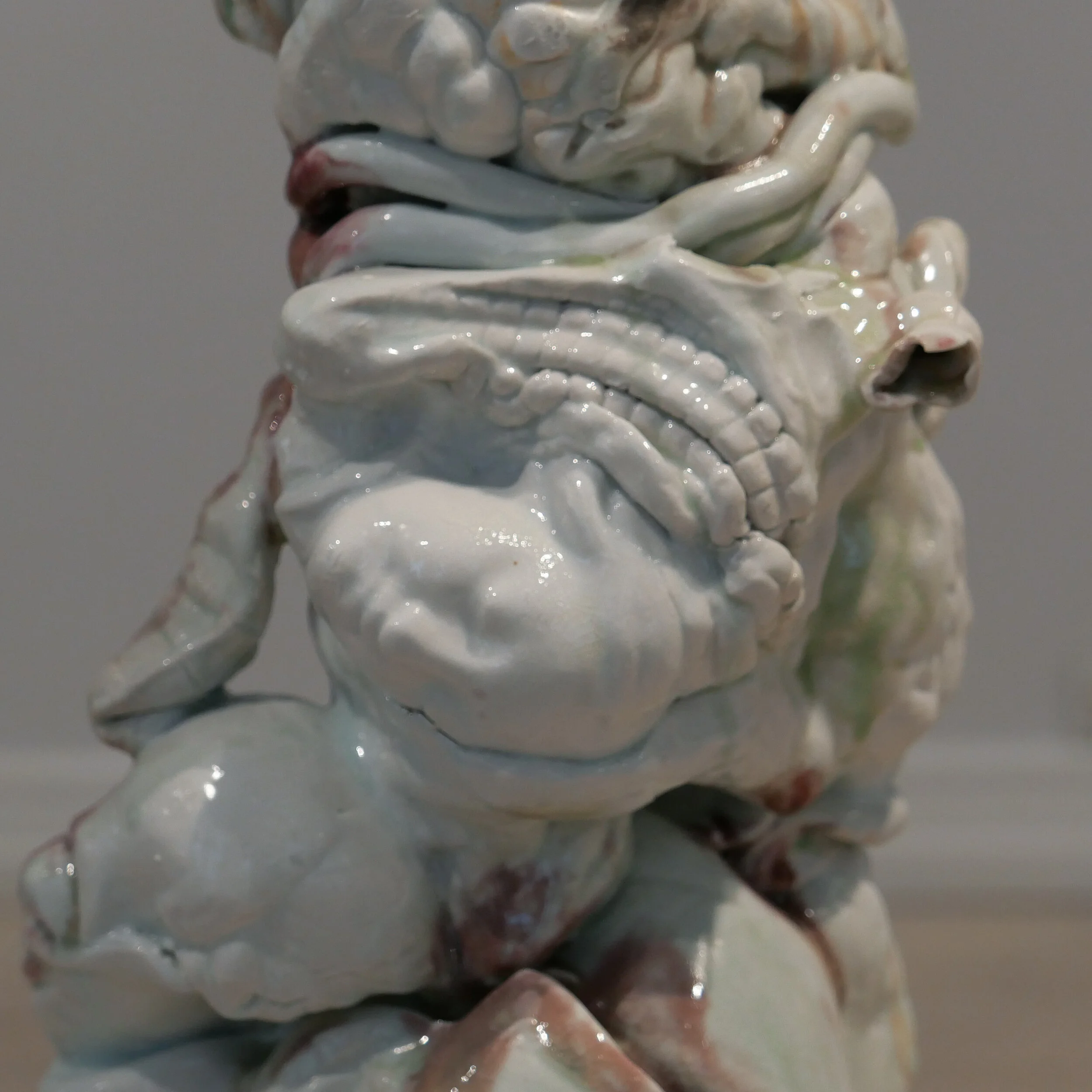
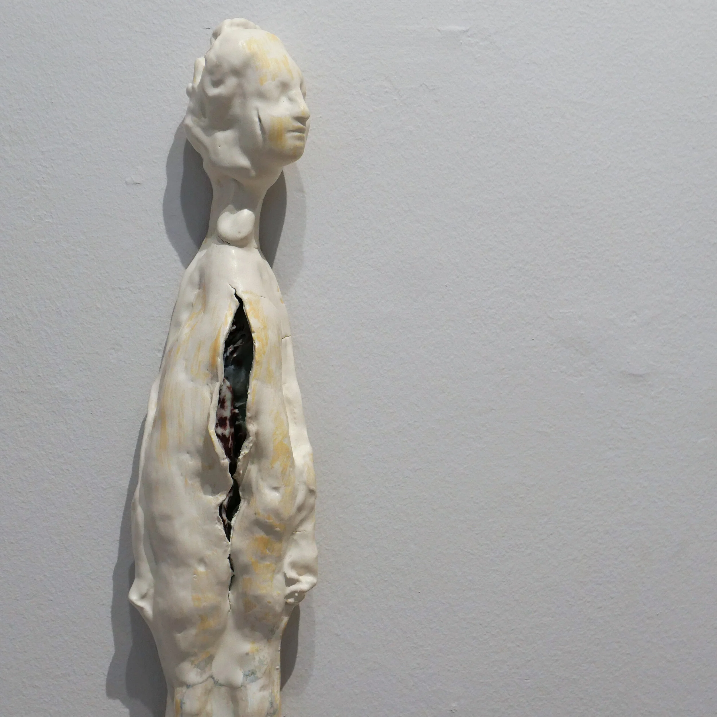
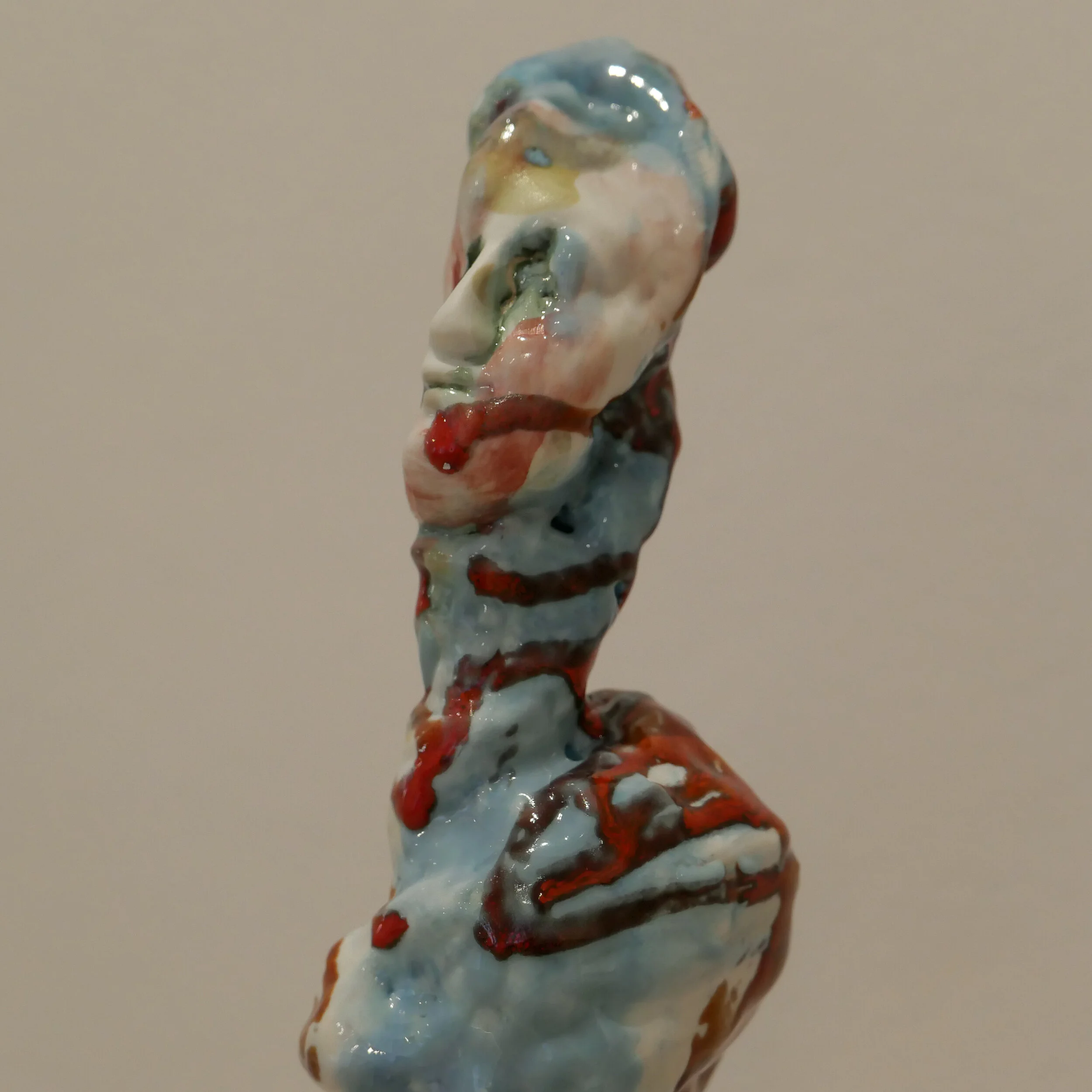
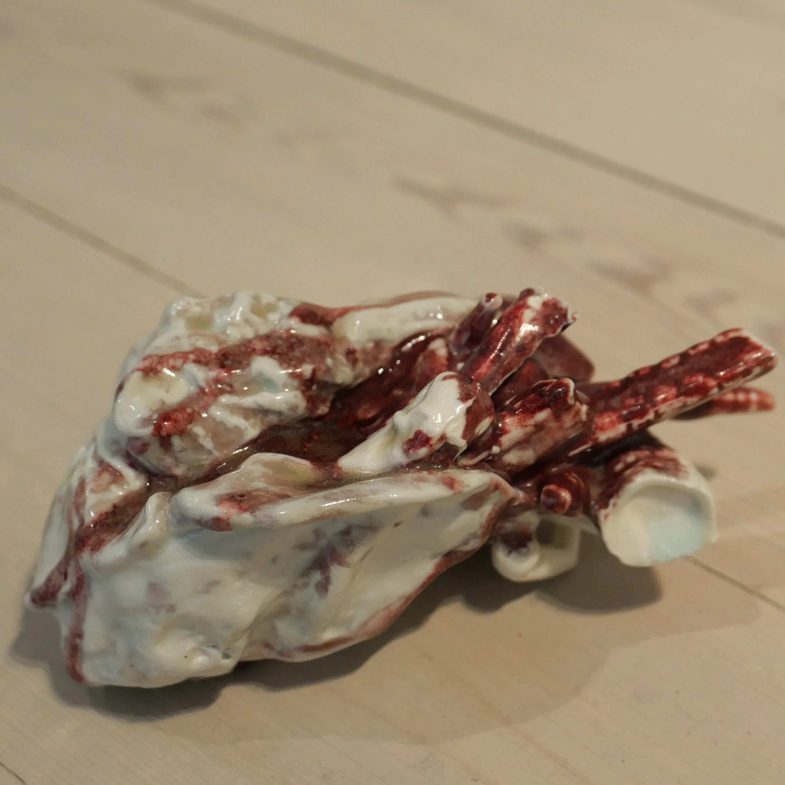
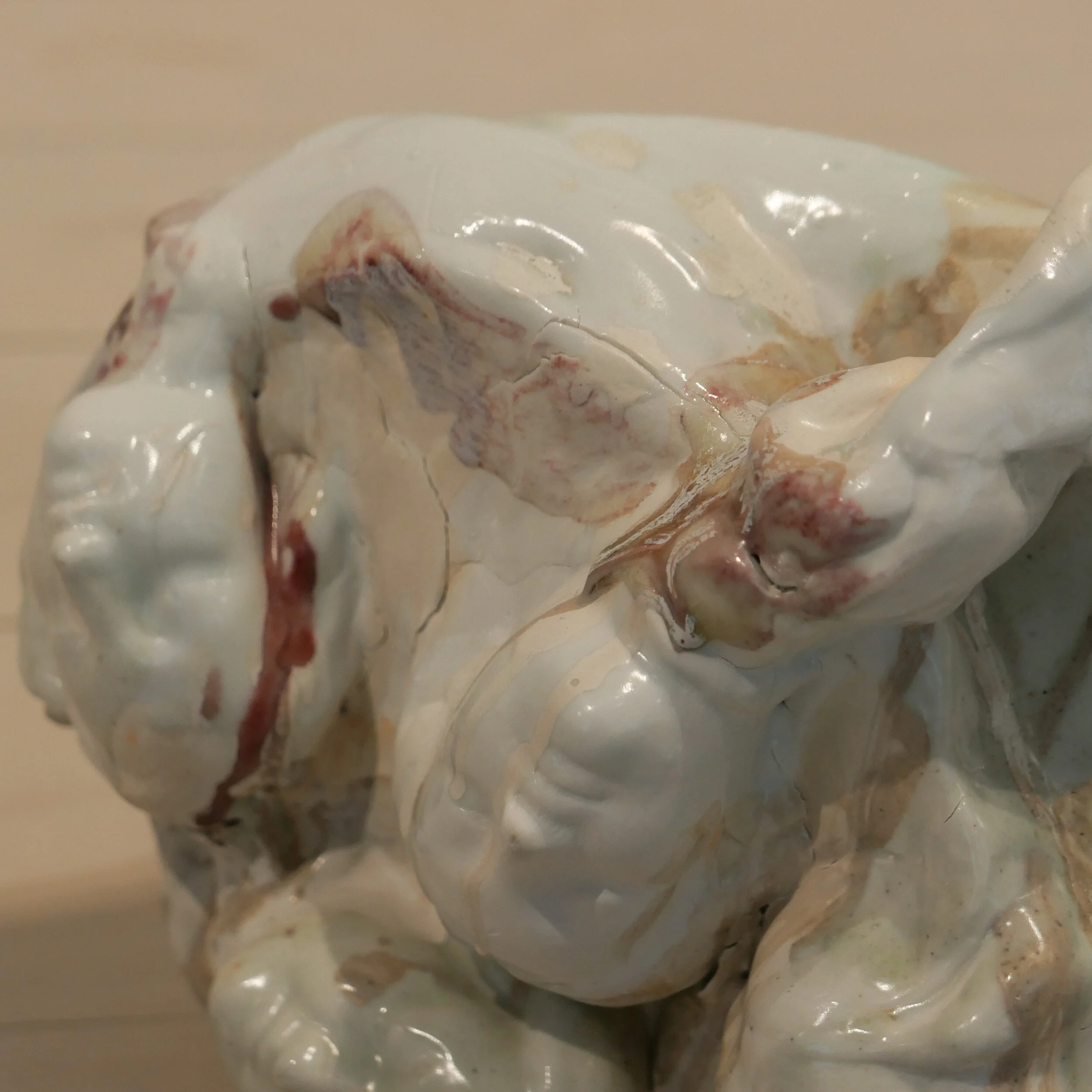
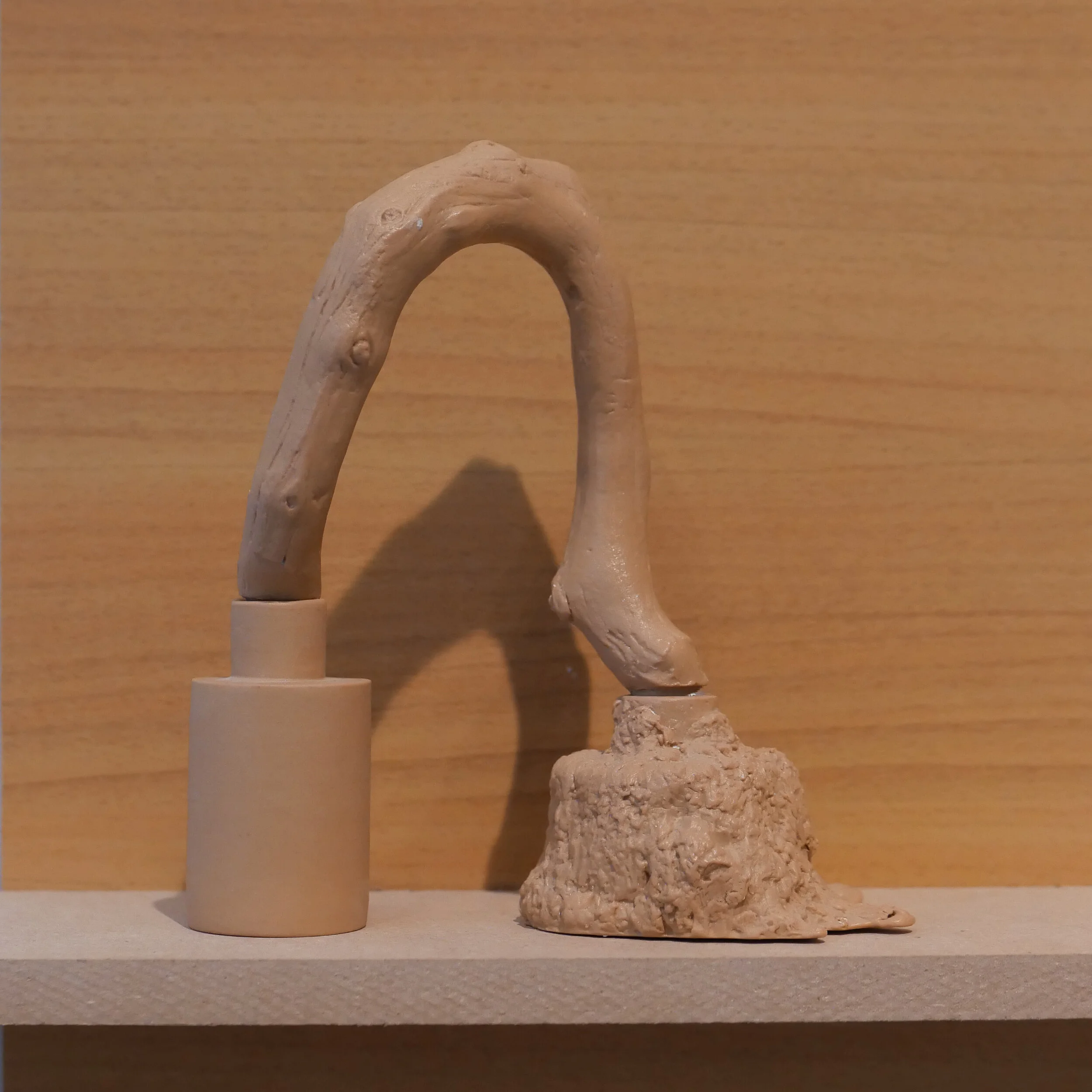
The Norwegian artist Irene Nordli produces porcelain sculptures that are dramatic and organic and with a Rococo sense of fantasy that echoes the forms of classic porcelain figurines of the 18th century but with a darker sense of fantasy. Three of the larger works are entitled Dissolved Figure and the title of another translates as Heart that is not Ethical.

In these works, it is the complexity of the pieces and control over the potential problems from the high firing temperature that marks the skill and the experience of the artist.

These works have a strong, thick glaze with thin washes or streaks of soft colour - from the Japanese, Korean and Chinese celadon tradition - and that contribute to the sense of mystery. In the 18th century, delicate porcelain figures were often supported by a tree stump or foliage - bocage - but here the bodies are fragmented and faces appear as if they are emerging from water with parts of bodies that twist and then the impression dissolves as you move around to look from another view point.


note:

Porcelain is made from a fine and consistent clay that can include kaolin. The work is fired at a very high temperature and through vitrification the process usually produces a hard and translucent body that is white or can have a distinct grey or blue tinge that is highly prized. After the first firing in the kiln, works in porcelain can then be glazed or painted with underglaze decoration and given a second or even a third firing at a lower temperature.


Mindcraft16 ... ceramics


Works by four ceramicists were selected to be included in the Mindcraft16 exhibition at Designmuseum Danmark.

They could hardly be more different showing four very different approaches to working with clay but all four makers are exploring what they can do with clay, testing boundaries and challenging preconceptions about ceramics.

None of the works are utilitarian pottery although Ole Jensen with his works called Primal Pottery Project  does produce vessels that might conceivably be used to store something. The clay used is a deep red, like the clay used for a refined plant pot, and fired to produce a relatively thin matt body but he uses a thick glaze inside the vessels that has a high gloss in a very deep orange/red colour.

The forms are squat and rotund or simple cylinders but several of the pieces have rounded stubby legs and one seems to have large ears. So this is anthropomorphic pottery - not quite the cartoon-like figures you find in the Moche Pottery of Peru but there are echoes of the shapes found in domestic wares in Ecuador or Costa Rica.


Heavy Stack (Extrude) by Anne Dorthe Vester and Maria Bruun is two separate pieces with rings in stoneware stacked over substantial oak frames. This work is about construction and about forming strong, almost monumental, sculptural works.

The larger piece has six rings and the lower work just a single ring but in both there is a centre upright - a beautiful slab of oak - with strong, sharply-cut oak bars or cross pieces as spacers or supports and also to form short legs on the larger piece. These oak frames seem to take their inspiration from Japanese architecture. It was difficult to see the pieces up close in the exhibition but I suspect that the frames are not pegged or glued but are held together with sharply-cut carpenters joints.

The rings are extruded and unglazed with a slight grit texture. Perhaps a simple but important element is the contrast between the oak - a natural and warm material, that has been given a sharp engineering precision - and the fired clay - ostensibly hard and mechanical because the very process of extrusion is to produce something consistent -  that has rounded, almost soft shapes that could be car tyre inner tubes. The size of these rings and there consistent and almost perfect forms is technically impressive.


Winter Series by Marianne Krumbach is a group of works that are also in stoneware but her pieces are glazed in dark, rich and deep colours. The delicate forms, inspired by plants and vegetation, seem to be close, in some ways, to porcelain figurines although about as far as you could imagine getting from pretty Meissen shepherdesses. Winter Series is certainly darker and more ominous like marsh or dark woodland plants.


Tension by Christina Schou Christensen is fascinating because here is presented a series of trials and experiments that most ceramicists have to undertake if they try a new glaze or a new clay base.

So there are different consistencies and thicknesses of glaze poured over or dripping from various shapes in clay that are more container than being the point of focus … normally a vessel or a sculpture in clay is the important base of the work that is then coloured or coated with glaze.

Of course the glaze is important in any ceramic piece but with Tension it is the thick, vanilla custard like glaze that is important and the clay shapes simple and in some cases quite crudely formed. What seems to be most important in the experiments with the glaze is it's consistency so it is pulled up into peaks or formed into globules. All these references to food seem appropriate … you could imagine a baker of fine biscuits or a chef icing cakes going through a similar set of experiments to achieve the effect they wanted. Kiln or oven? Clay or pastry? Glaze or icing? Tension really does reinforce those analogies between the core techniques of ceramics and methods of cooking.


Karina Noyons


Back in August, at the Kunsthåndværker Markedet - the craft market on Frue Plads in Copenhagen - one stall that immediately caught my attention was the work of the jewellery designer and goldsmith Karina Noyons. 

Her work is striking … simple but very clever and inventive … playing with quite stark geometric shapes but twisting them around so rings or wrist bracelets are held out from the body. Here clearly is a designer's and a goldsmith’s skill that, to repeat something discussed regularly on this site, develops from experience and from working directly with a material, to understand what will and what will not achieve a desired result. What this jewellery also illustrates so well is that the simpler the piece then, as here, the more perfect the workmanship has to be … minimalism shows up any flaw and to misappropriate a much used phrase … less means more skill.

But above all, what I could see in the jewellery, is a fantastic and clearly justifiable self confidence along with a real sense of humour. That was obvious in the display that used illustrations by Rasmus Bregnhøi as a background for the jewellery with suggestions about how the more unusual or less conventional pieces could be worn. 

Self confidence and humour together can have a significant impact in design, but are not often discussed. It's about not taking yourself too seriously because in fact you really do know what you can achieve - and that allows a designer to relax, try out new ideas and go off-piste … although maybe that's a bit odd ... to compare a designer with a downhill skier. How about the idea that experience and confidence allows a designer to play with ideas much as a really good jazz musician begins to play with themes and sounds because they understand music and their chosen instrument so well? Maybe that's a better metaphor.

Is that what is behind the gold needle shown here? The confidence and the sense of humour to play around with ideas?  The confidence to play with something so simple but in such a clever way? Street graffiti is an expression of self but then so too, in the past, was embroidery for women although obviously in a very different way. So why should self-expression be just for disaffected boys? But why a gold needle? Well because a gold needle is more valuable than a standard steel needle, so the task of sewing becomes something special - taken to a different level - and embroidering a unique design on your own clothes becomes an important but presumably transitory act of self expression. 

In a broader sense, the idea of a simple needle becomes an item of jewellery, because it is in a precious material, begins to explore wider questions about the effect and influence of good design … so why, for instance, does a beautifully-designed glass seem to make a good wine taste better or why does a special meal warrant getting out the best linen.

And maybe this simple piece of jewellery is also important because it introduces another interesting role for designers … that is good design should make you stop and think. The designer deliberately steps back and looks with a fresh eye at an old design or an old problem and comes up with a new idea … and that makes the rest of us also take a step back with them and take stock. It can take something mundane and utilitarian, something we just take for granted, presented in an unexpected way, that can challenge our preconceptions. Why do we need that and why are we prepared to pay extra for that? Is this the opposite of design that aims to produce something that is better … a rational but possibly boring step forward? Or are the two - the intellectual and the practical - not mutually exclusive. Perhaps that's what makes a beautiful gold needle clever and subversive.


Karina Noyons

Rasmus Bregnhøi


Kunsthåndværker Markedet … amazing art or beautiful utility?

A significant proportion of the ceramic works on show at the craft market were clearly decorative and that’s fine … the potter as ceramic artist or maker. Glass at this level of design and craftsmanship tends to be more practical so there were certainly wine glasses and jugs at the market but still plenty of presentation pieces. Many of the stalls had flowers or fruit in their vases or bowls but this was presumably to make the display as attractive as possible rather than suggest clear practical use. 

Believe me, this is not a criticism of the designers and artists but may simply reflect the practical approach of the Danes to buying table ware and glass and ceramics for their dining rooms and kitchens. There is probably a clear division in people’s minds between decorative work and practical table ware. I was just curious that although there were mugs and so on, which were clearly to be seen as something special … a gift or a treat to oneself … it would have been difficult to go around the market and buy enough tableware to set a table for a full dinner.

Perhaps this is not the right venue for that because the Kunsthåndværker Markedet does show the work of some of the best craft artists in the country but on the other hand it does deliberately call itself a craft market and not an art fair.

Again, I repeat, this really is not a criticism of the people showing their work here. It is more a reflection on the perceptions and expectations of the visitors to the market ... the customers. In the Renaissance, in Florence or Paris or Antwerp, the great silver smiths and glassmakers were seen as equals to the artists working as sculptors or painters and great presentation pieces would be the centre of any great table. It seems that now many buyers are still happier spending their money on a “work of art”, meaning a painting or a print, than a comparable amount on a ceramic or glass piece.

There are exceptions …there are serious collectors of art glass and of major ceramic works and pieces by Grayson Perry, for example, achieve astonishing prices.

So the makers inhabit a strange middle ground now … trying to command appropriate price levels to reflect their skill and expertise and the time taken to produce the works. 

Nor is this a comment about trying to return to a rose-tinted idea of an idyllic rural past where the local potter or local tin smith made everything the village needed for their tables … they didn’t … in the 17th, 18th and 19th centuries most families outside the towns bought a few special pieces on trips in to the local market. Much was local and, in the pre-industrial period, hand made although wealthy families could and did buy porcelain from the Copenhagen works or from further away in France and Germany, buying prestigious and fine tableware.

It’s just that I’m curious about how Danish families set their tables now. Is there just practical every-day white china from IKEA that goes into the dishwasher without having to think twice or maybe the old inherited service from Royal Copenhagen is used carefully and with respect for every important family meal or are young Danes in Copenhagen scouring the flea markets for china and glass from the 1950s and mixing and matching in an imaginative way?

And although Copenhagen now has a well-deserved reputation for the range and quality of its restaurants and many of those deliberately go to Danish companies or Danish designers for chairs and tables, do any set those tables with Danish craft ceramics or Danish craft glass? Is it simply a matter of price … even the most prestigious restaurant must set a budget for furniture and fittings … or is it that a small independent potter would simply struggle with the practical problems of suddenly having to produce 100 place settings. 

In the 1960s, in England, Cranks restaurant used pottery from John Leach’s workshop but then Cranks was exceptional … David Canter who established Cranks, in some ways an English equivalent of Claus Meyer, was not only a pioneer in selling healthy natural food but plans for Cranks were actually conceived when he was working in Carnaby Street on converting a building for the Craft Potters’ Association, of which he was a founding member, and a vacant bakery nearby came on the market and he took that opportunity to produce and sell the food he thought people should be eating on ceramics he appreciated. When we were at university, a school friend had a summer job serving table at Cranks and he told me that a phenomenal amount of china was stolen by customers so clearly it was a good choice … though perhaps not so good for the profit margins.

My budget doesn’t stretch to a grub crawl around the city in search of tables set with crafts-made pottery and glass but I’d be curious to hear about any Danish versions of Cranks.

I actually use pottery from John Leach every day and that is really the point of this post … not to boast about using pottery from Muchelney … but there is that odd phrase about things being “life enhancing” but actually it is true. Taking time to find the right ceramics and the right glass and investing in it but then actually using it every day is life enhancing. If you are half way through a cup of good coffee and you realise just how much you like the cup … that’s life enhancing; if the glass jar looks fantastic and perfect in the kitchen … as well as being practical and air tight and all those things … that’s life enhancing. I’ve used my Leach mugs and tea pots every day for nearly forty years and still enjoy using them … and after that length of time the price tag has been long-forgotten and is totally irrelevant.

glass storage jars by Marion Fortat