lettering out on the street in Copenhagen
/Walking around Copenhagen you can appreciate how well, generally, fonts and typography are used for shop and office signs. Of course there are a few international companies who continue to think that one font and one size fits all and fits everywhere but Copenhagen is, more than most places, a city of small, independent and in many cases local companies and this is reflected in the variety of signs, and the variety of colours, sizes and styles of lettering chosen.
Some of the signs and lettering have survived from the 19th century or earlier and some companies choose to use more traditional serif fonts to indicate how long they have been established - even if they haven’t - but many use more modern san-serif fonts because the general perception is that without serifs a font is simpler and crisper and, therefore, has a stronger impact from a distance.
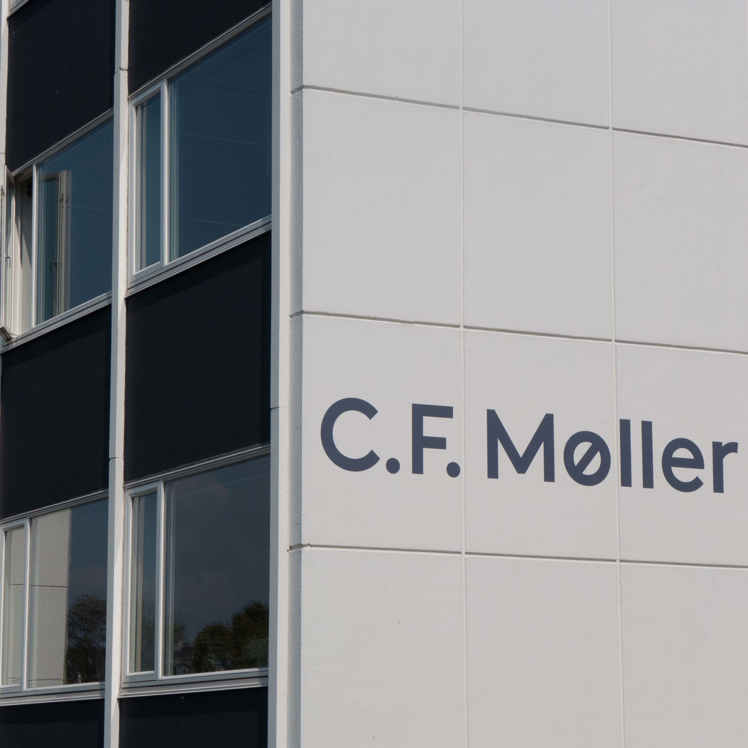
A surprising number of businesses have lettering applied directly to the building with free-standing letters - without a back board or mount - either painted or cut out from metal. This is not a cheap quick option, even if it sounds like that, because it actually requires a sign writer or sign maker with real skill to get the scale and spacing of the lettering right.
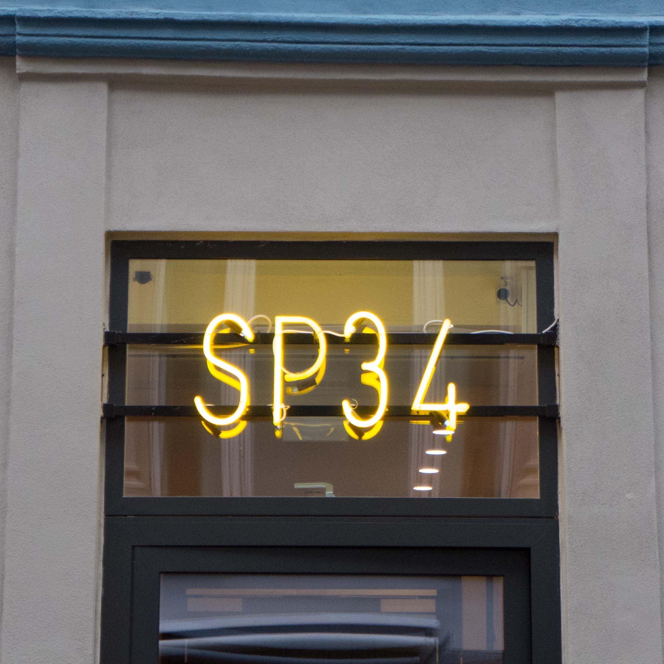
Similarly, some lettering is painted directly onto the glass of windows and doors. These examples of lettering applied to the facade or the window are almost opposite each other on Dag Hammarskjölds Allé.
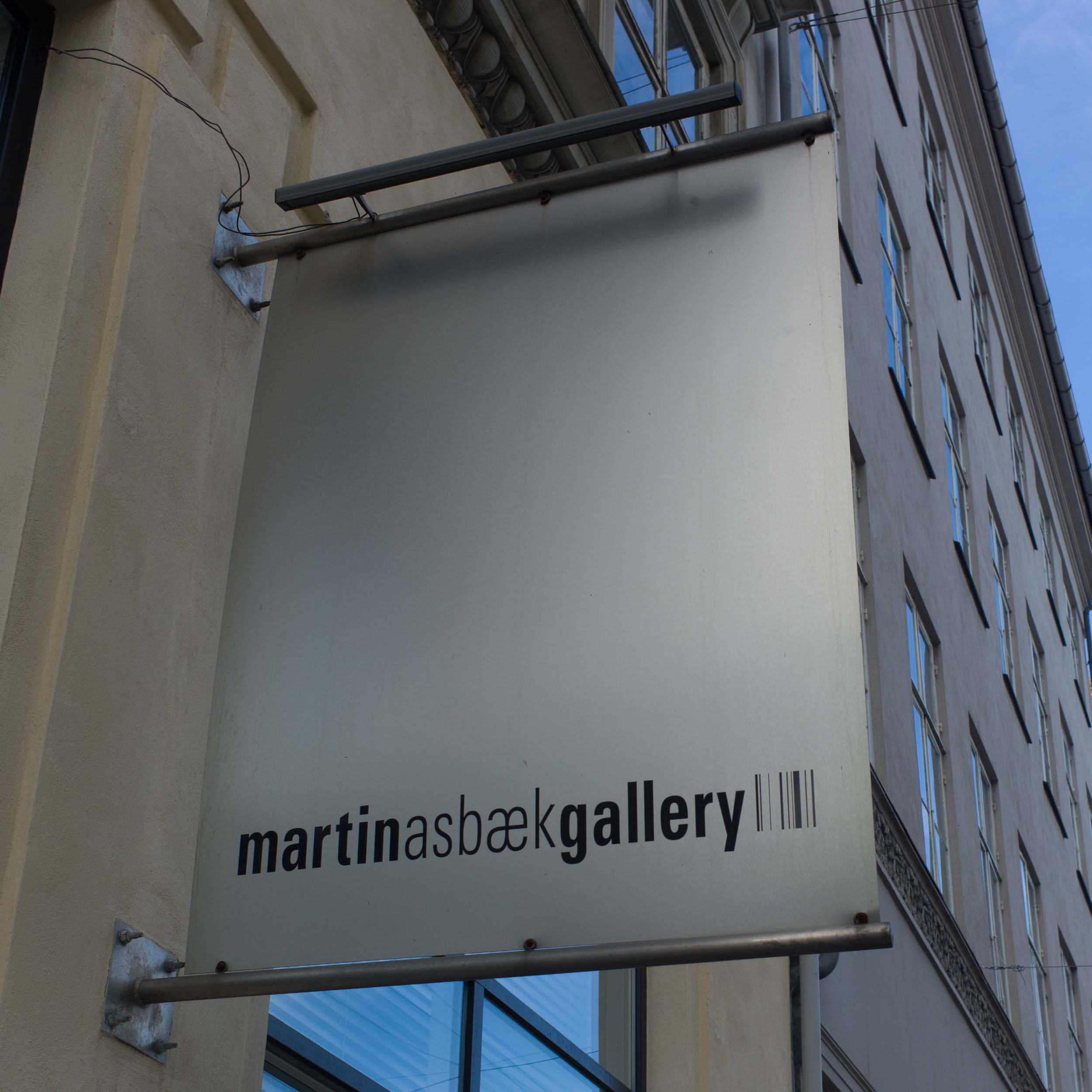
Some organisations, particularly galleries and museums, and large companies, use long narrow banners hung either from short brackets on the building itself or hung from purpose-made poles on the pavement. The banners do not generally face out from the building but are set out at 90 degrees to face up and down the street so that they can be seen some distance away along the pavement.
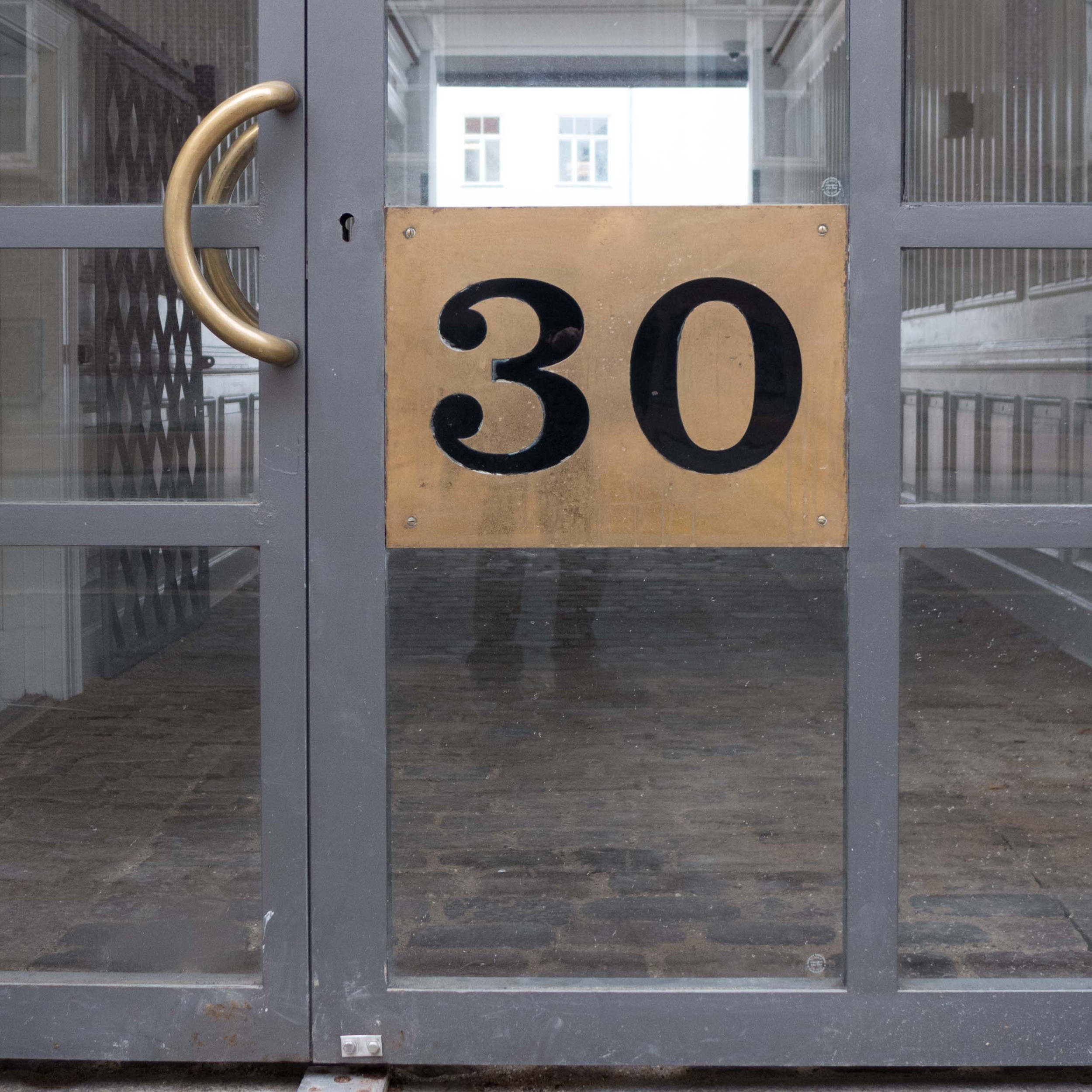
These photographs show the entrance to the Davids Samling with discreet, traditional lettering over the entrance arch and note the very careful placing of the house number but also there is a vertical name banner between windows on the first floor and larger banners dropped down from a post on the pavement.
This unusual sign is in the archway leading into the Passage of Sankt Annæ off Bredgade and acts as a sign as well as a sort of map/guide and a commemorative panel marking the restoration and conservation of the courtyard and its buildings.
The Bikuben Kollegiet on the Amager campus of the university uses lettering for decoration with a series of inspiring words on the concrete pillars of the building’s entrance.
Most of the signs and lettering in the city are remarkable for their restrained or appropriate size - very few could be accused of ‘shouting’ at customers.
However, curiously, this oversized roof sign actually seems appropriate for what is certainly the smallest hotel in Copenhagen.
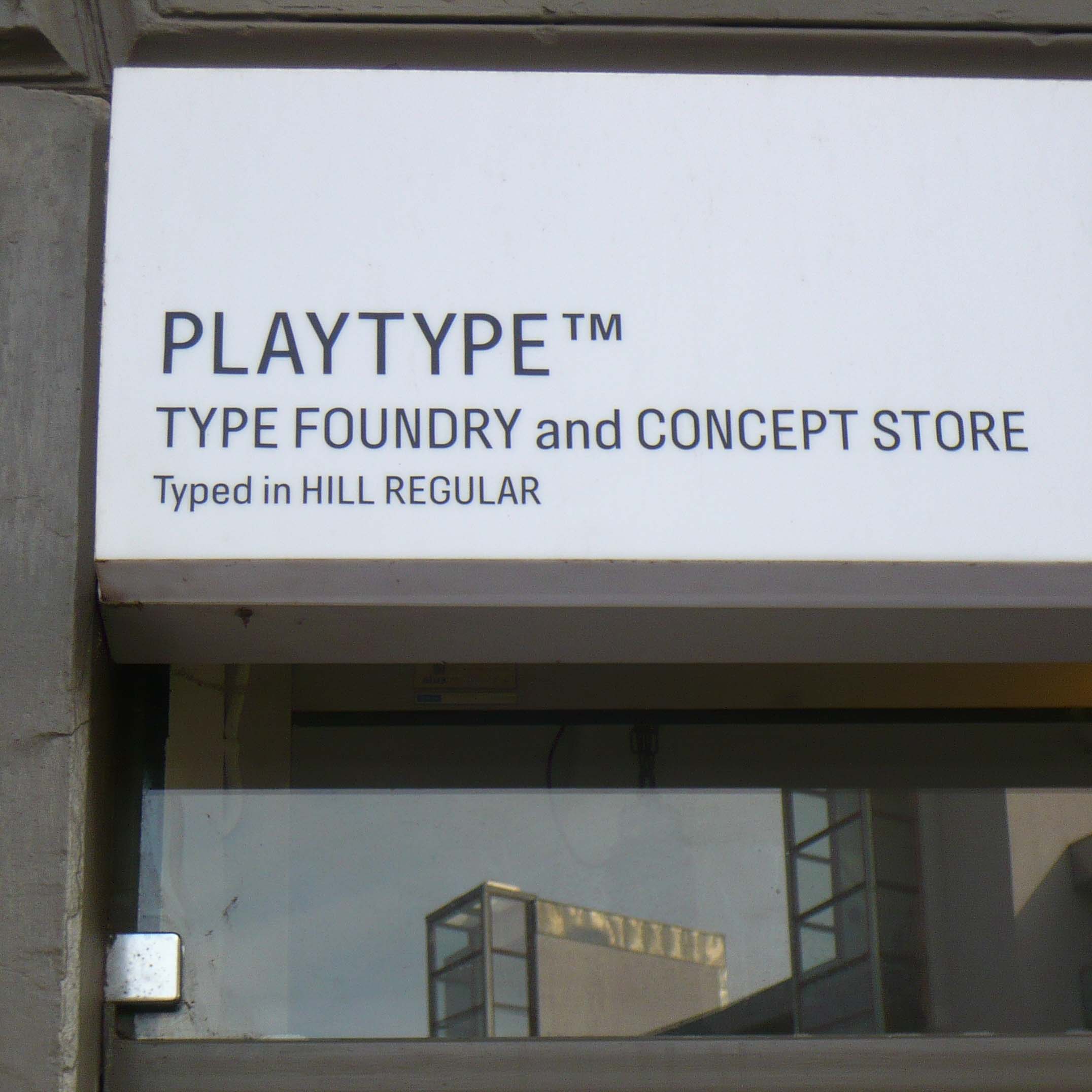
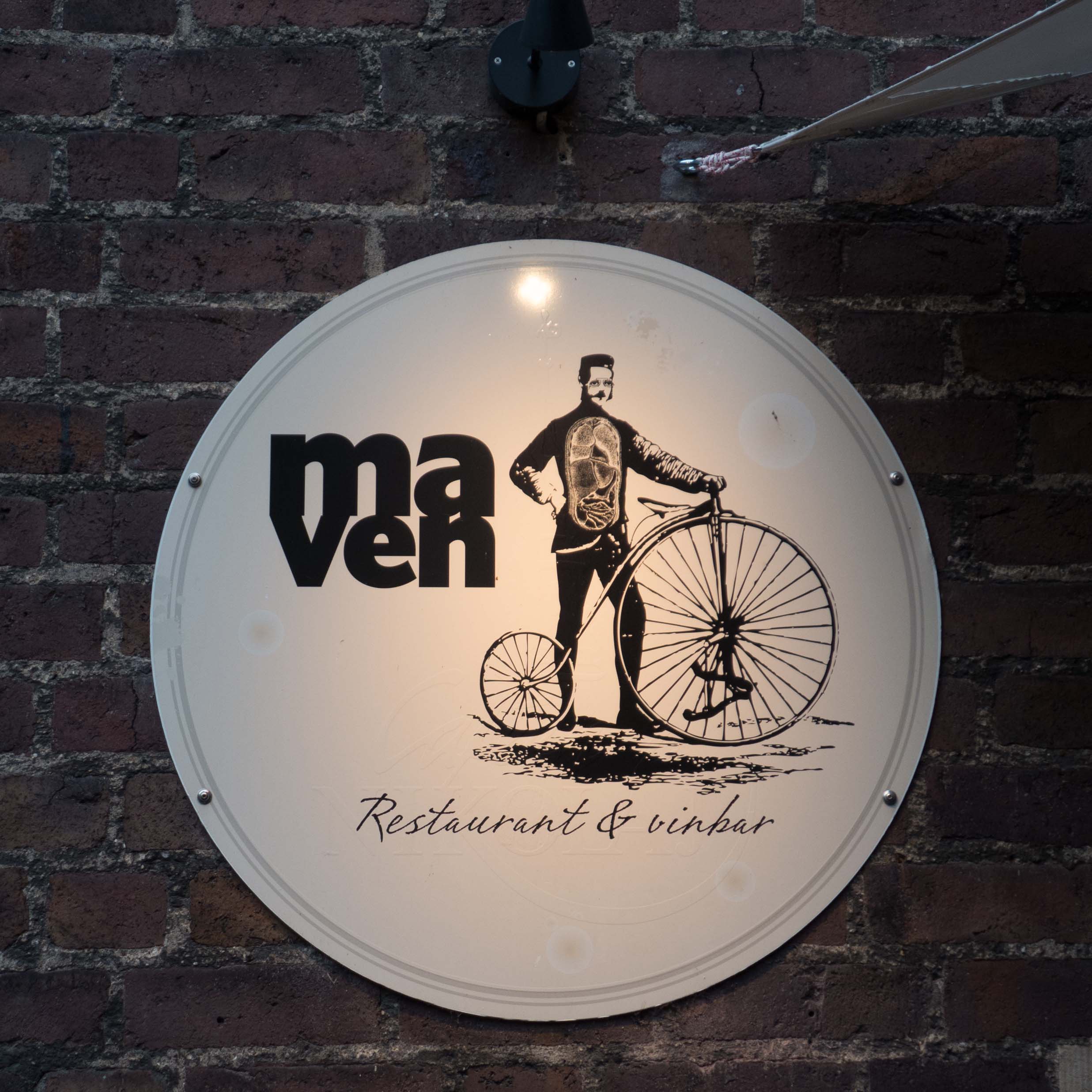
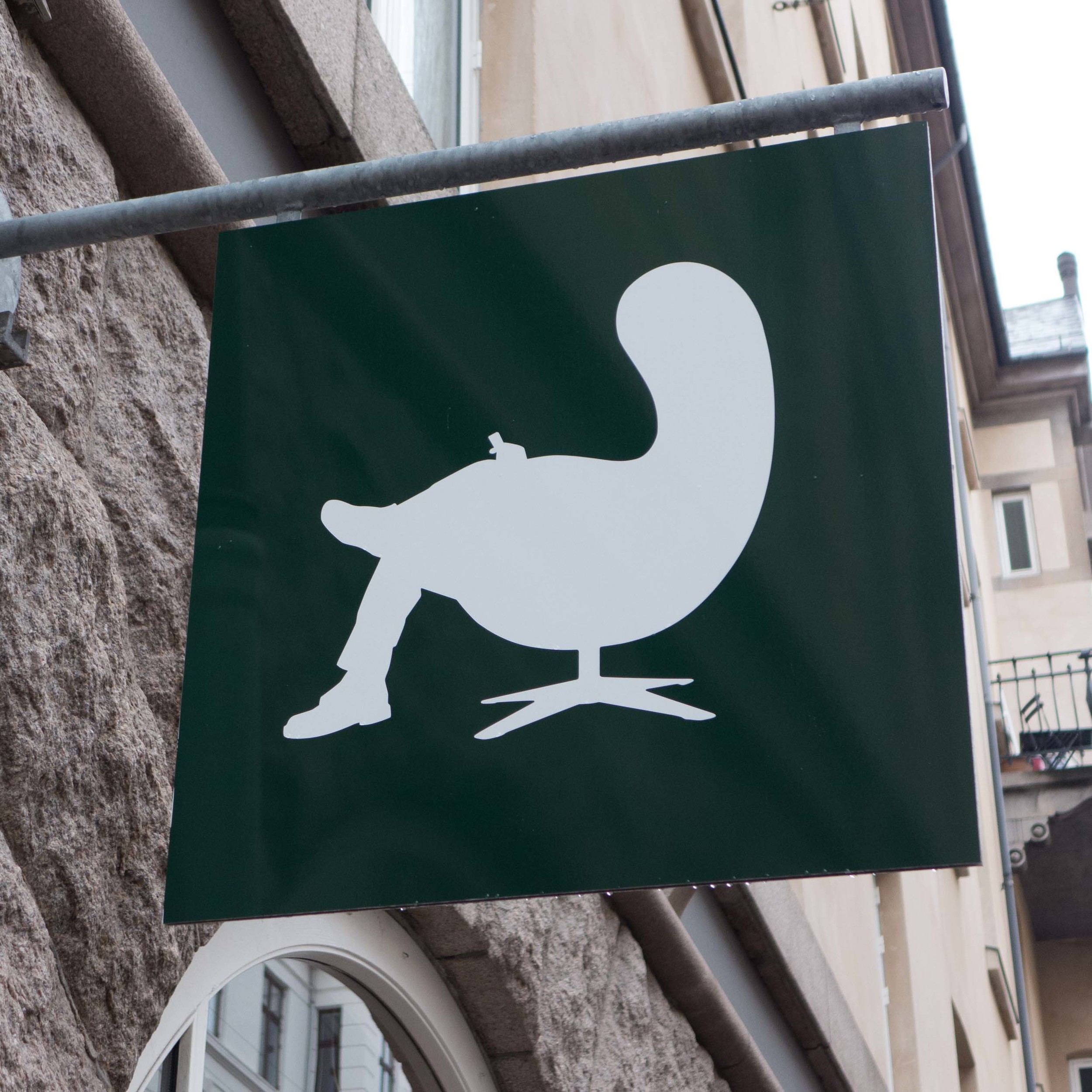
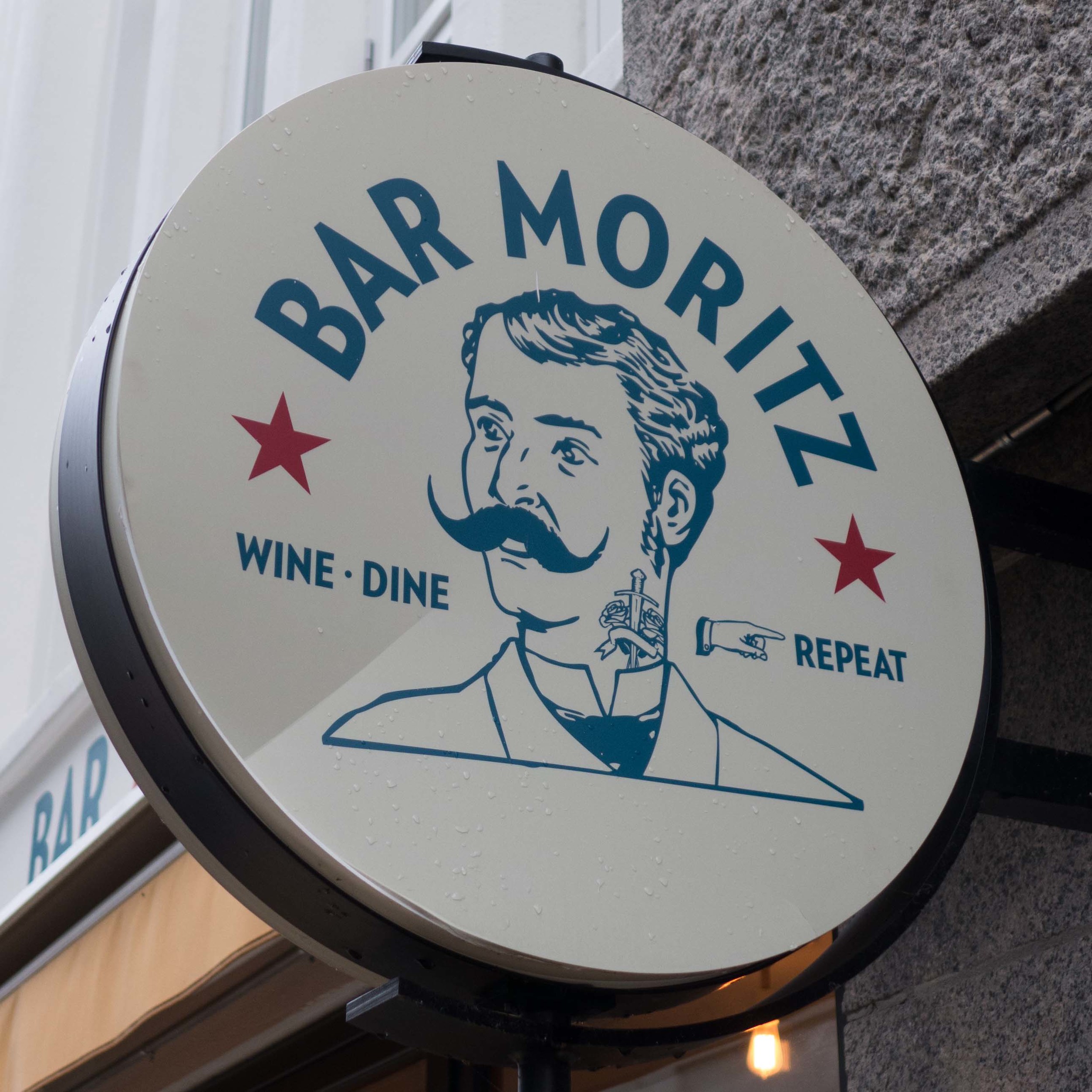
The variety and the quality of signs for shops and businesses in the city is amazing. They vary from the stripped-down minimalism of the sign over the Playtype door - advertising their own typeface naturally - to the slightly macabre sign with the man on a penny farthing bike with his intestines exposed - maven means stomach in Danish.
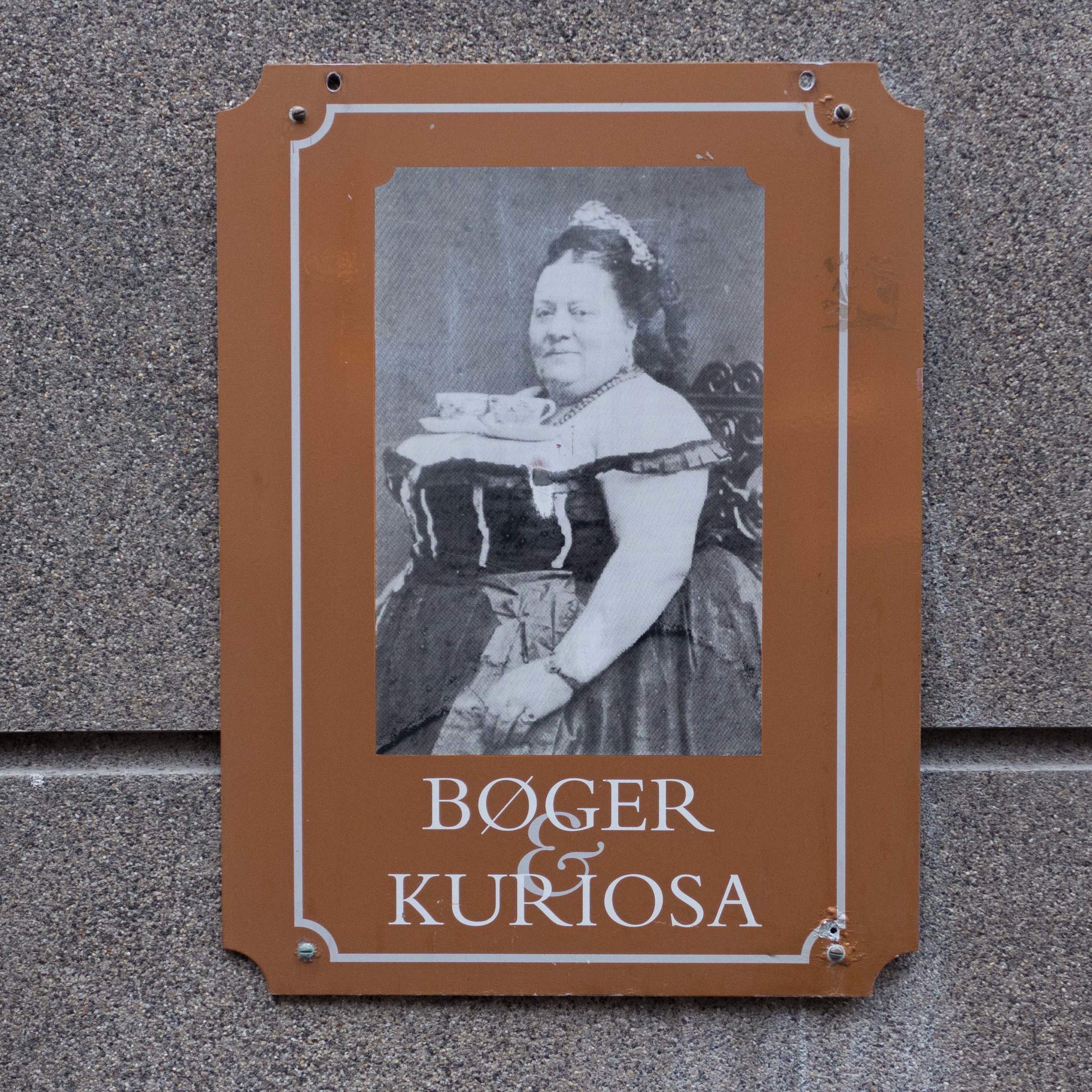
I have said before that one of my favourite signs in Copenhagen is for the Bøger & Curiosa bookshop - but I guess that says more about my odd sense of humour than about my appreciation of good typography.
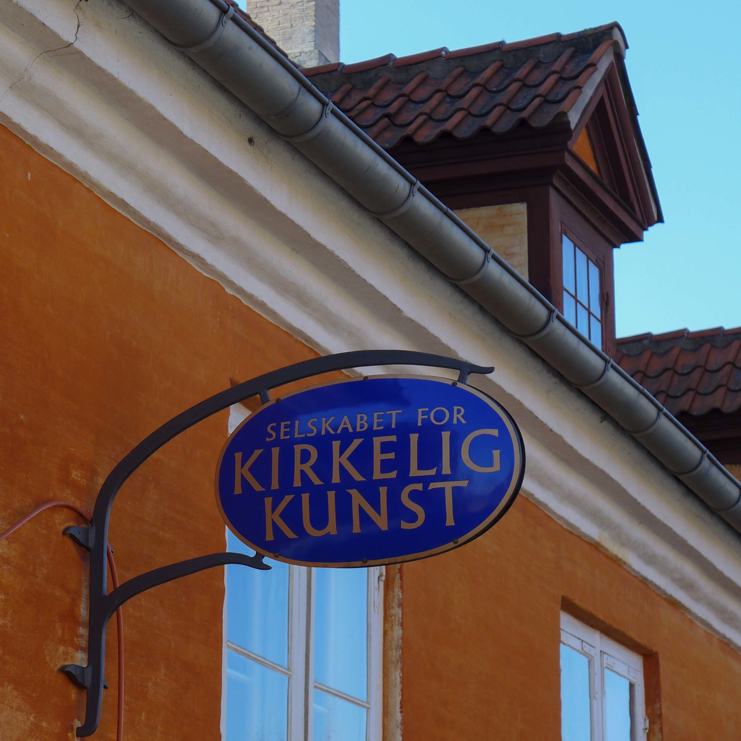
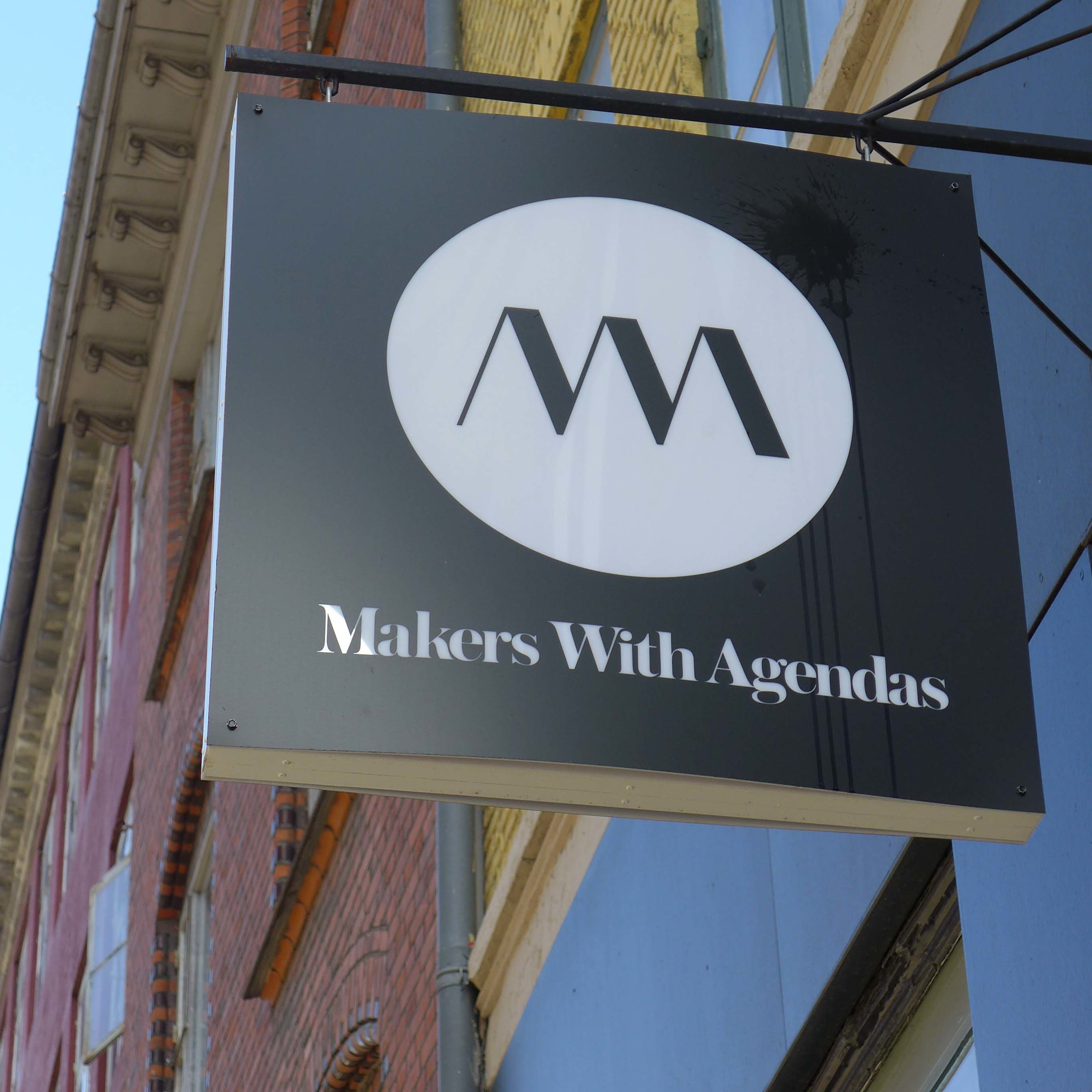
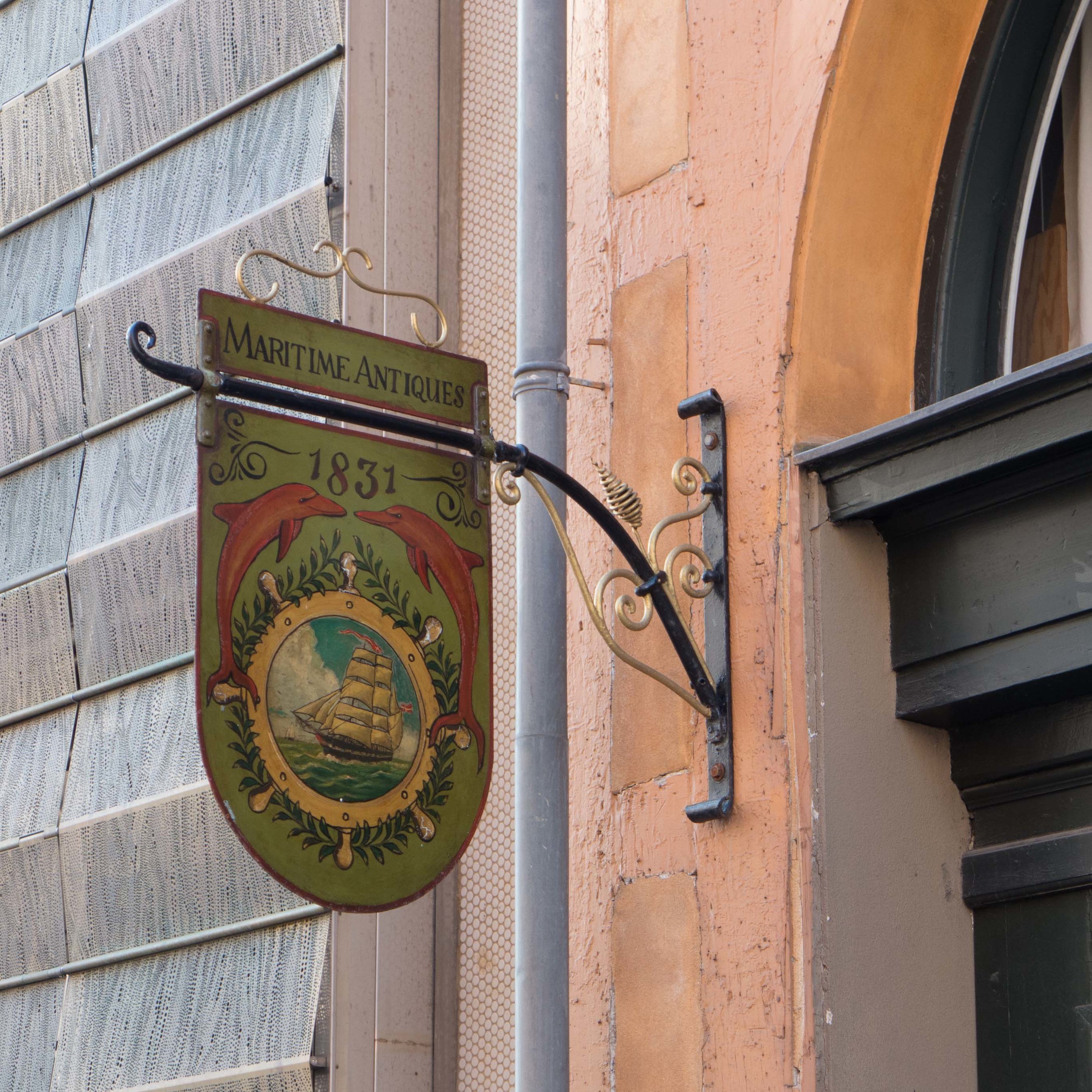
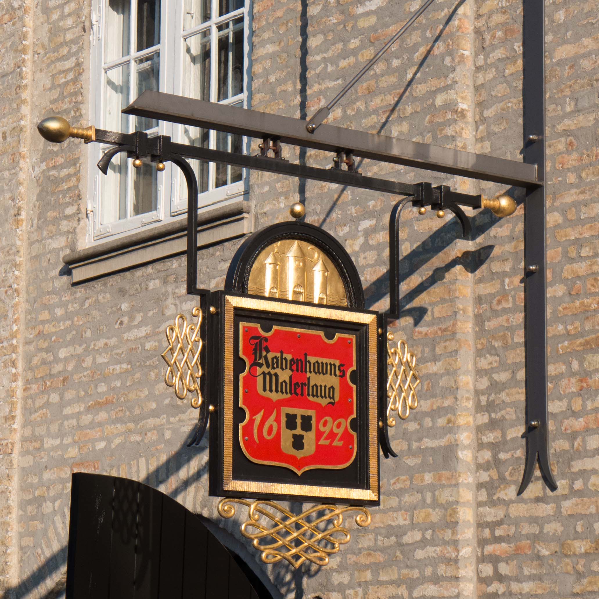
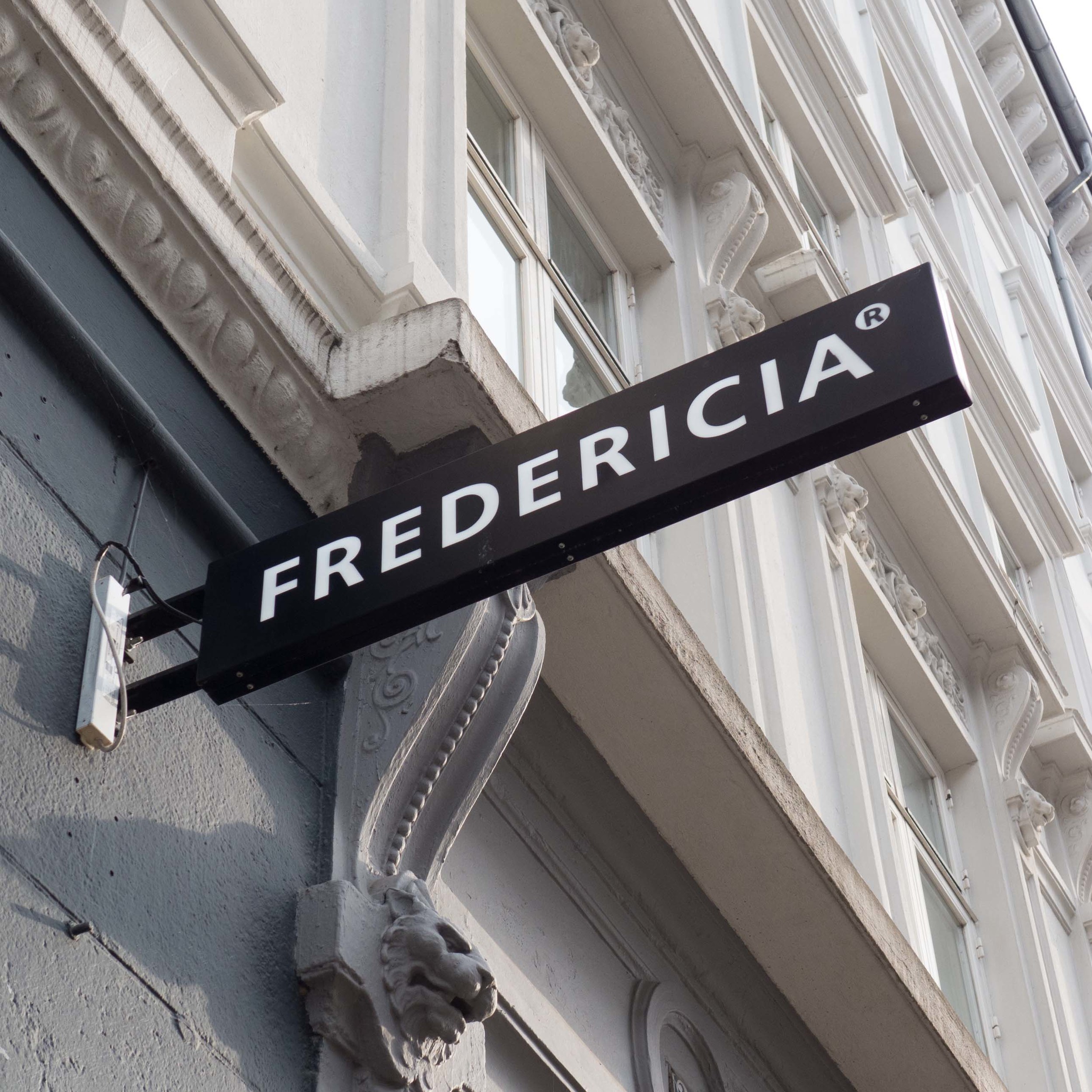
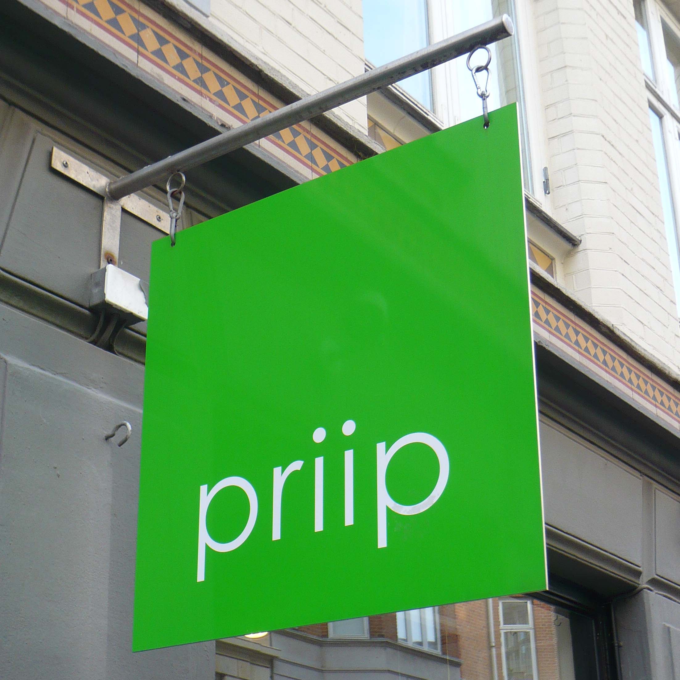
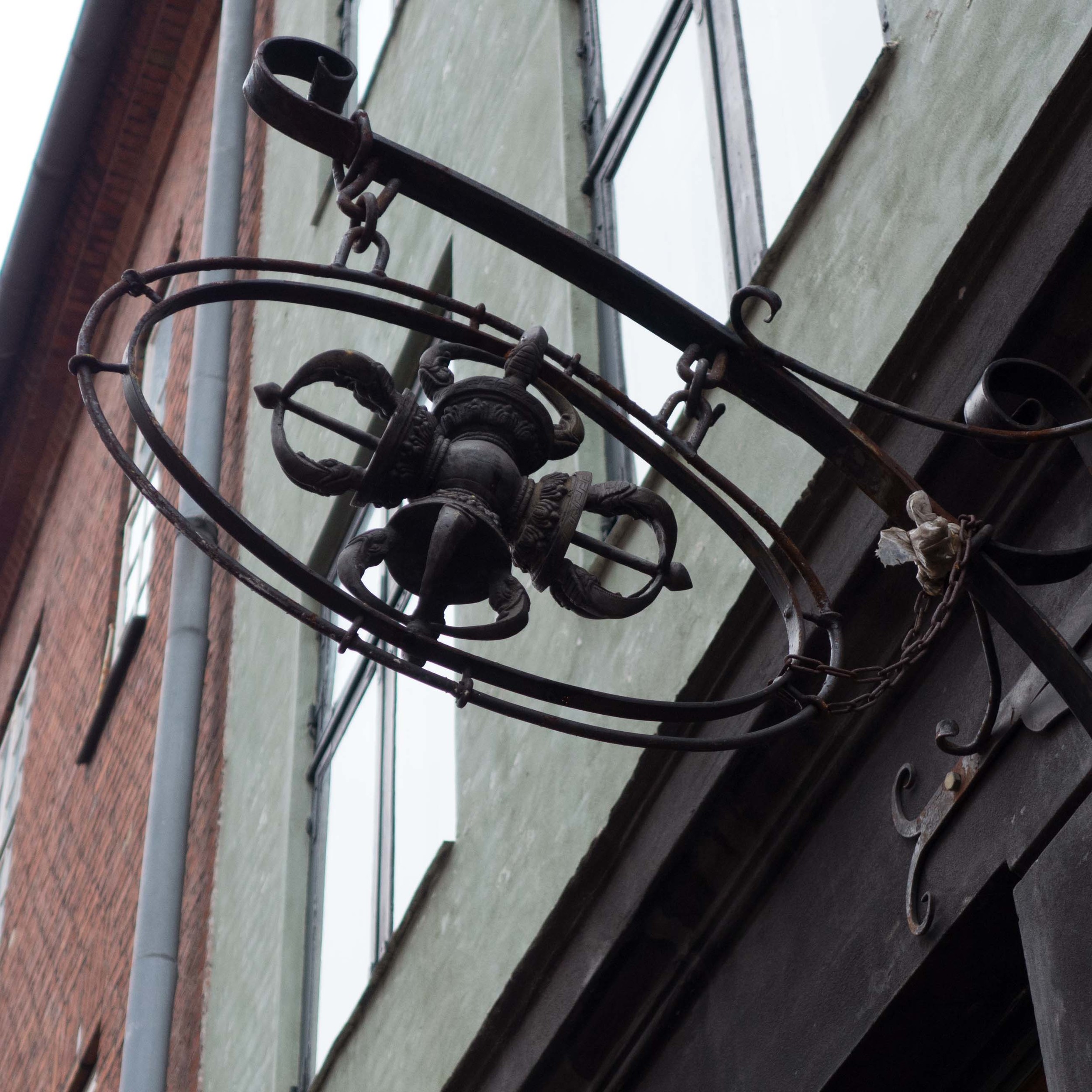
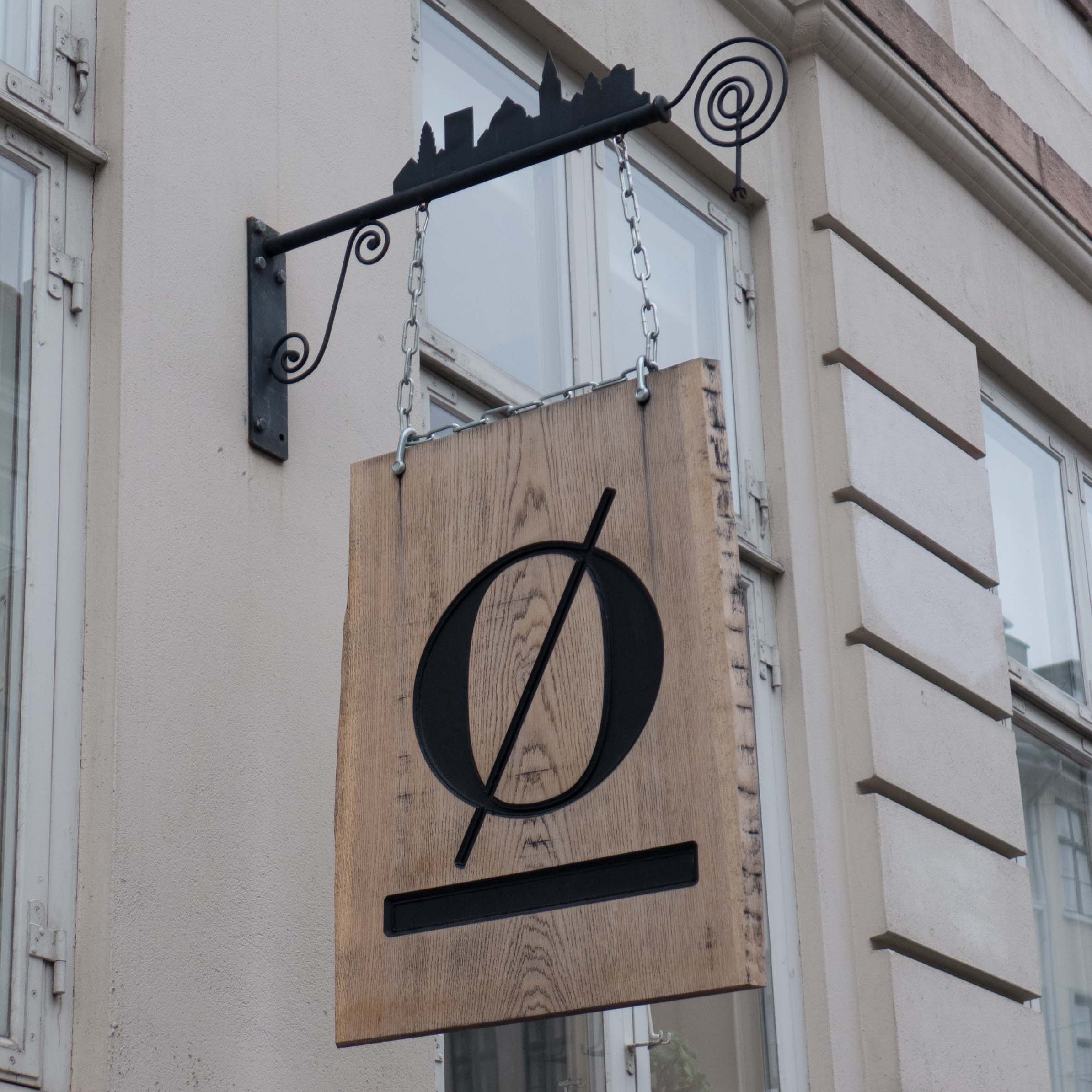
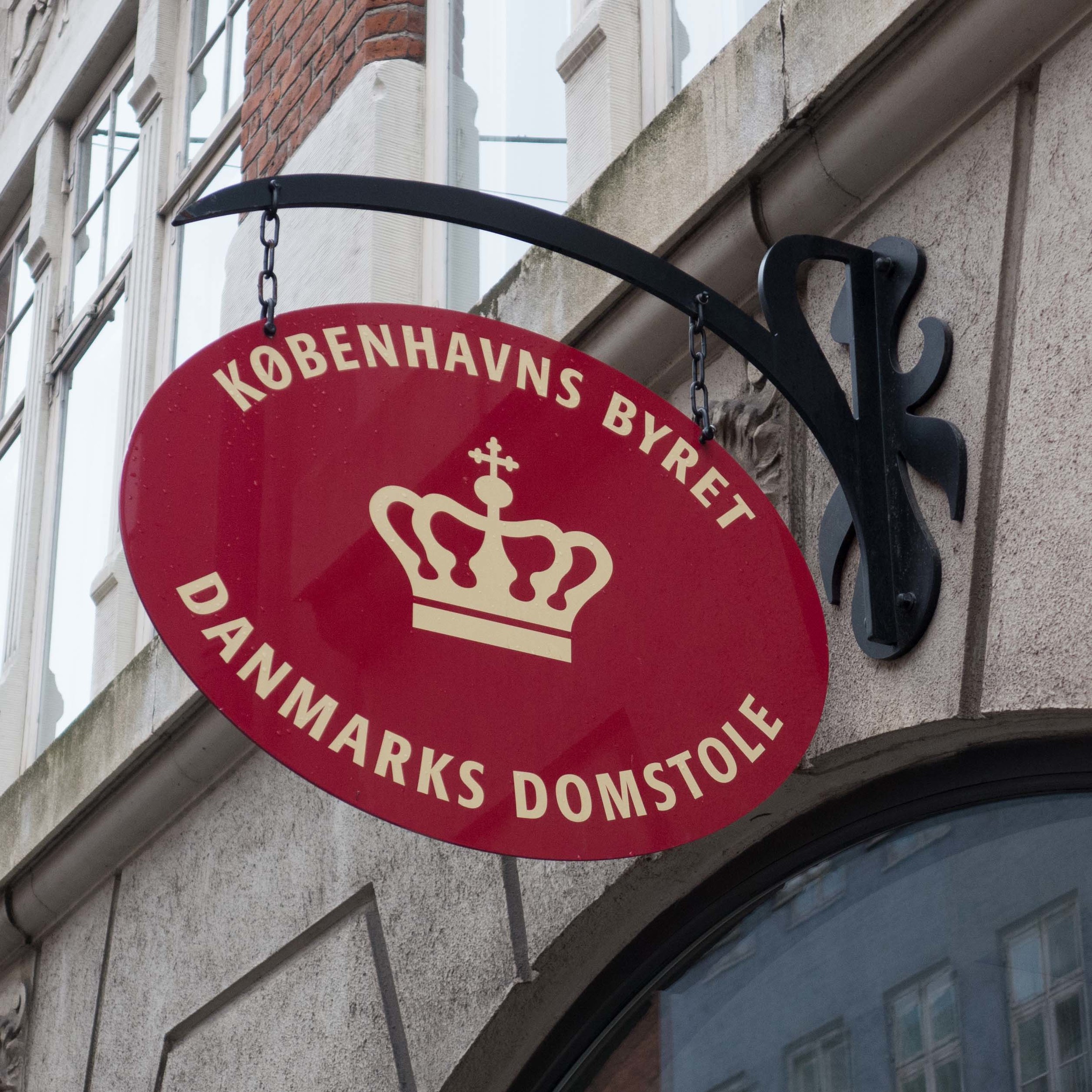
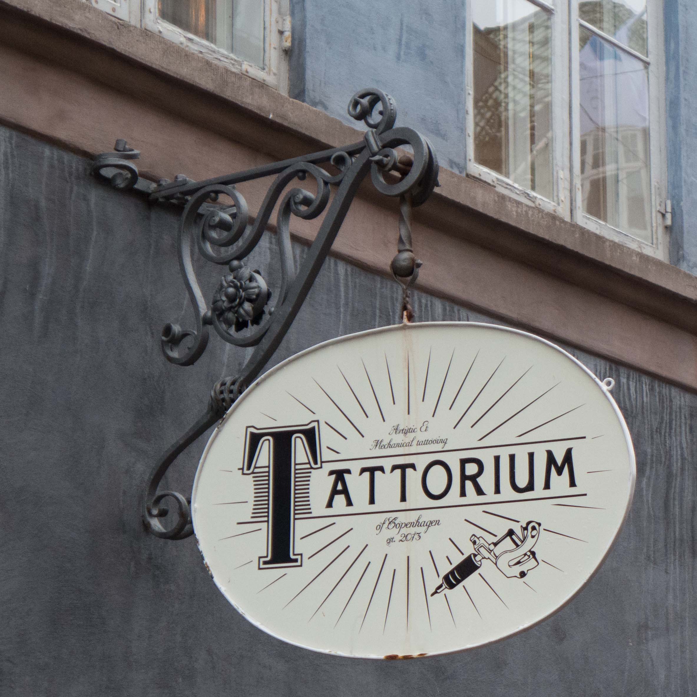
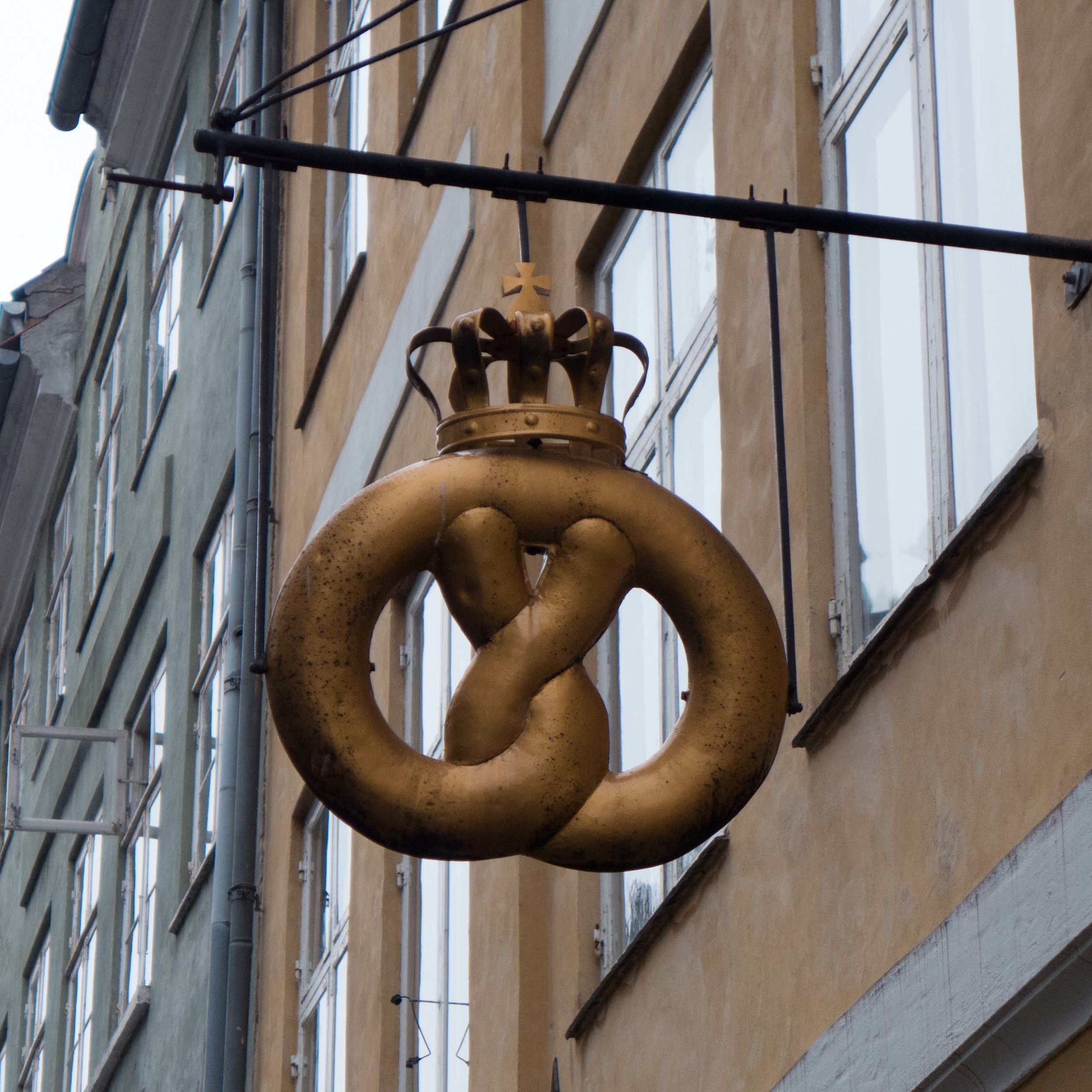
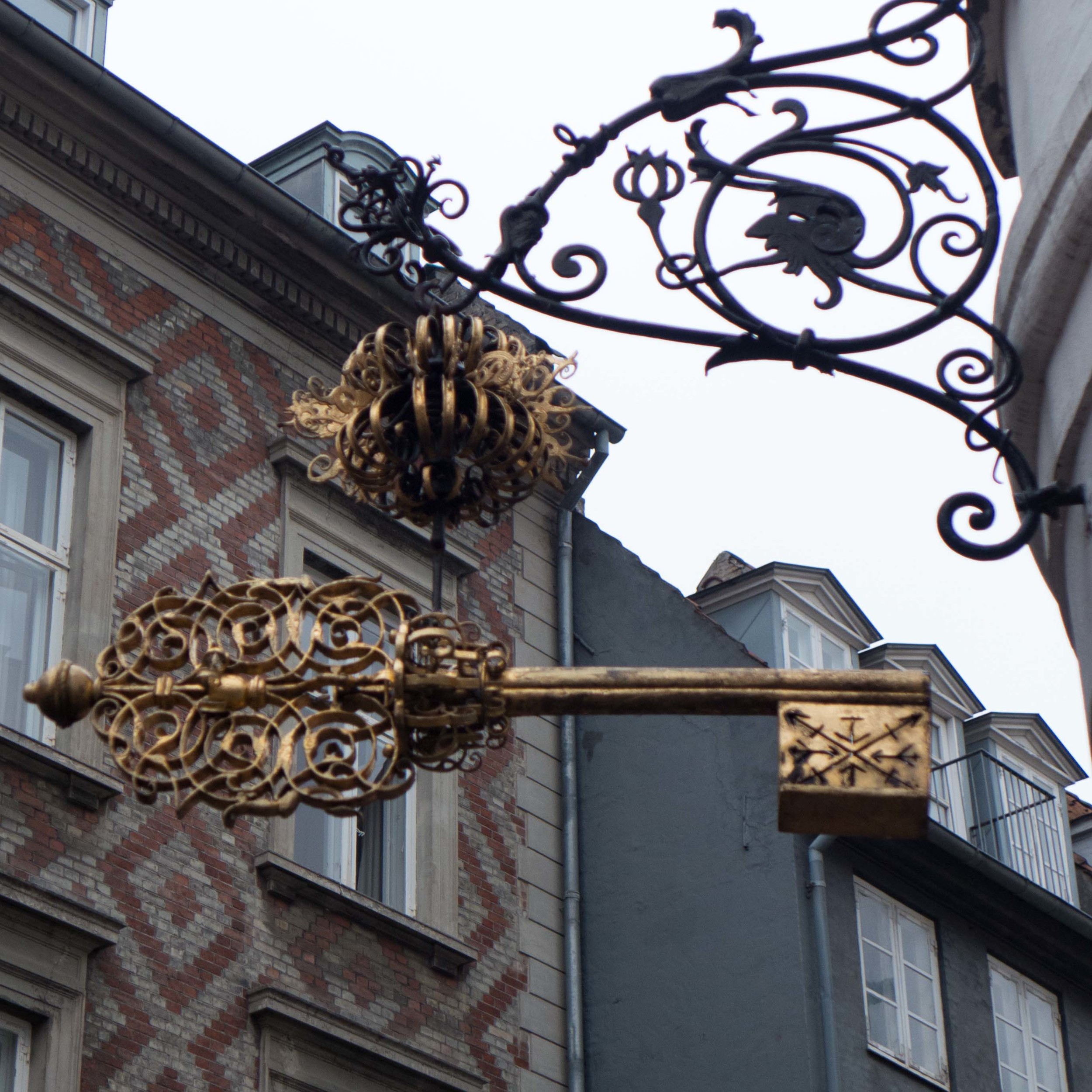
By far the most common form of sign, with or without lettering, is the sign that sticks out from the building on a bracket and is usually set between the ground and first-floor windows … like pub signs in England but rather more stylish.