


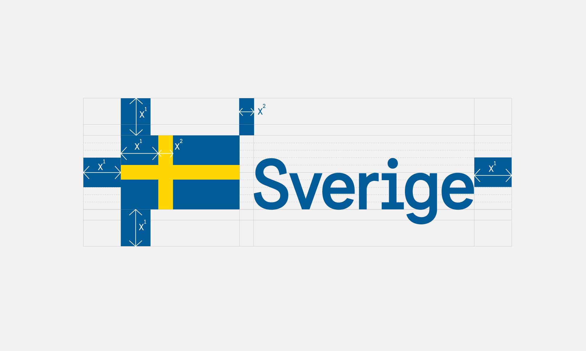
a typeface for Sweden
/
When this story was first published on blogs and web sites at the beginning of the year, I managed to miss it but it has, for some reason, just appeared on Gizmodo and been reblogged on several other sites.
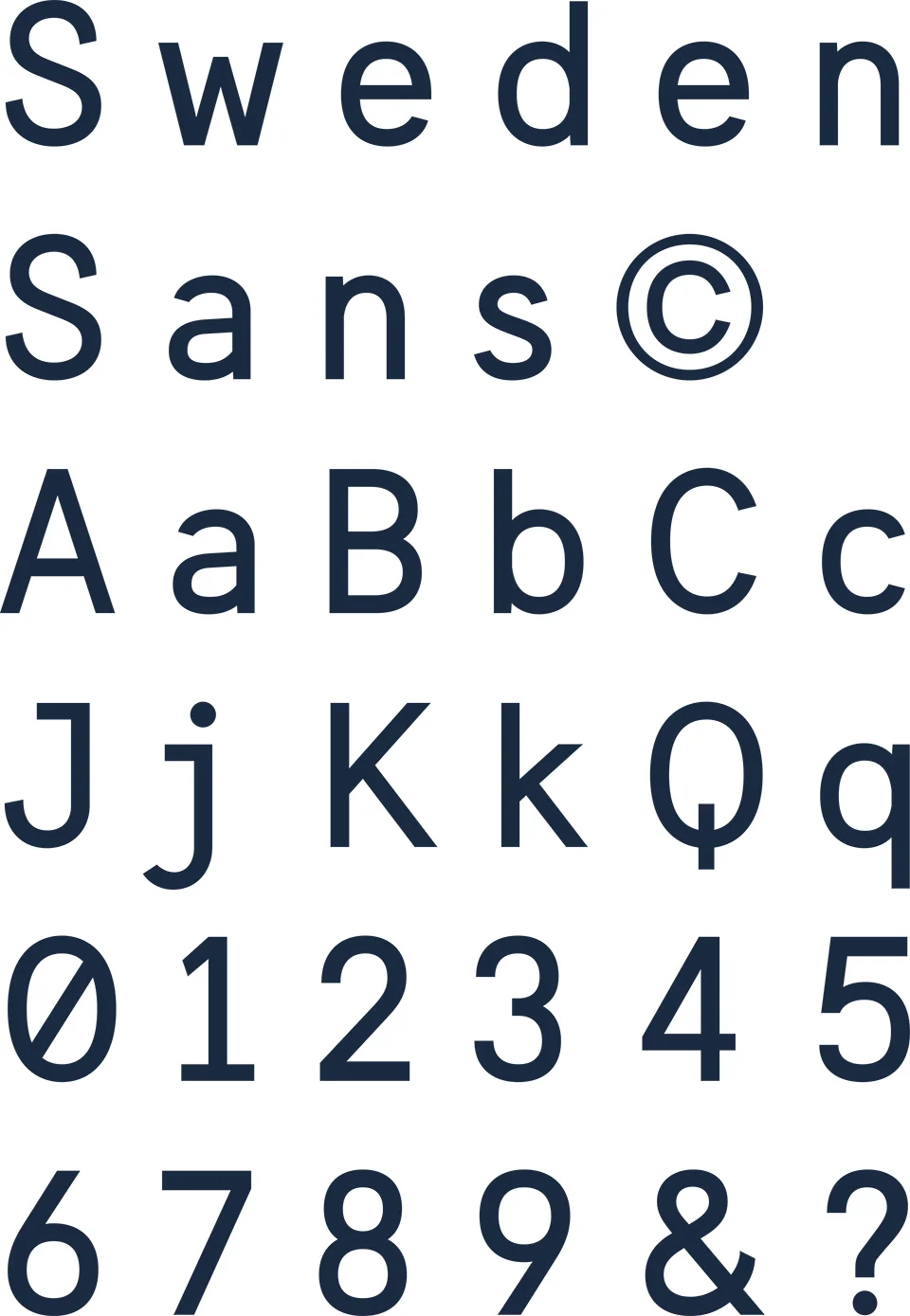
The design agency Söderhavet were commissioned to rebrand the official and national and international graphic face of Sweden and as part of that project Stefan Hattenbach designed a new typeface called Sweden Sans. Jesper Robinell, design director at Söderhavet, discussed the brief for the typeface on the company blog. It had to be distinct, “inspired by classic Swedish street signs, with blended mono-type and san-serif accents that clearly show a Scandinavian heritage.” Also the typeface had to “unambiguously convey the 50+ translations of “Sverige” into local languages.” What was also significant was that, in the words of Stefan Hattenbach, the typeface had to be “natively web friendly, so that readability on display screens is perfect.” People, brands, companies and now countries have to have a presence and an appropriate presence in digital space.
When the typeface was launched towards the end of 2013 there was clearly a mixed response … mixed in the sense that some praised it because they saw it as retro, others praised the minimalism and some thought it was stylish. All very and rightly positive although some compliments seemed rather more ambiguous as it was also described as too Swiss, and, most curious of all, “very IKEA.”
These days, the general public understand and follow re-branding exercises for large companies or for well-known products or even for cities if they are hosting a World Cup or the Olympics. Rebranding of the BBC or New York Time’s web site’s is scrutinised initially, particularly if some popular pages or services are more difficult to find or use because they are in a different place, but most people quickly adapt and quickly forget what the old design looked like.
The need to unify the official publications of a country is much more important: I am curious to know how the new brand identity for Sweden has been received over the year since its launch.
Typeface design and the appropriate and proper use of fonts and type require incredibly important professional skills but unfortunately designers rarely get the credit and recognition for that work that they deserve. There seem to be two obvious problems. Like much design work, when the designer gets everything absolutely right, no one notices but as soon as they get it wrong then everyone, or at least other designers, notice and have an opinion to offer. The second problem should be laid at the door of Microsoft and Apple. Generally, the public do not understand or appreciate either font design or graphics, unless again a designer or company gets it very wrong, and most people think typeface selection and layout is easy … surely you just select the template you want, type the text, highlight a block of words or a heading and go to the drop-down selection of fonts. Easy. If you are not a font designer then go to the Söderhavet blog and find out how complicated and how important the design of a typeface is.


