Mirror Chair by Peter Holm

Very different from the chairs featured in the most recent posts is the concept of a chair as the starting point for an art work or a sculpture.

The piece Mirror Chair by Peter Holm is in lacquered ash with squares of mirror and was part of the exhibition from SuperObjekt, in their Real Time collection, and shown in November at the annual exhibition The Time is Always Now by Banja Rathnov at her gallery Museumsbygningen in Copenhagen.

This chair, one in a series, is in the tradition of the conversation piece but also has aspects of a craftsman’s master work with it’s carefully and precisely-made frame and the delicate pierced seat with inset squares of mirror that together create interesting shadows across the floor. Several pieces at the Cabinetmakers Autumn exhibition at Øregaard were, in the same way, standing at a point of transition between utility and art. 

Realtime at superobjekt gallery


A new exhibition has just opened at superobjekt gallery in Borgergade in Copenhagen. 

Seven well known and well-established Danish designers were asked to produce objects or installations that reflected a theme of time… “to create a physical comment to what time means to them and by that revealing inspiration, thoughts, doubts and references normally hidden in their final work.”

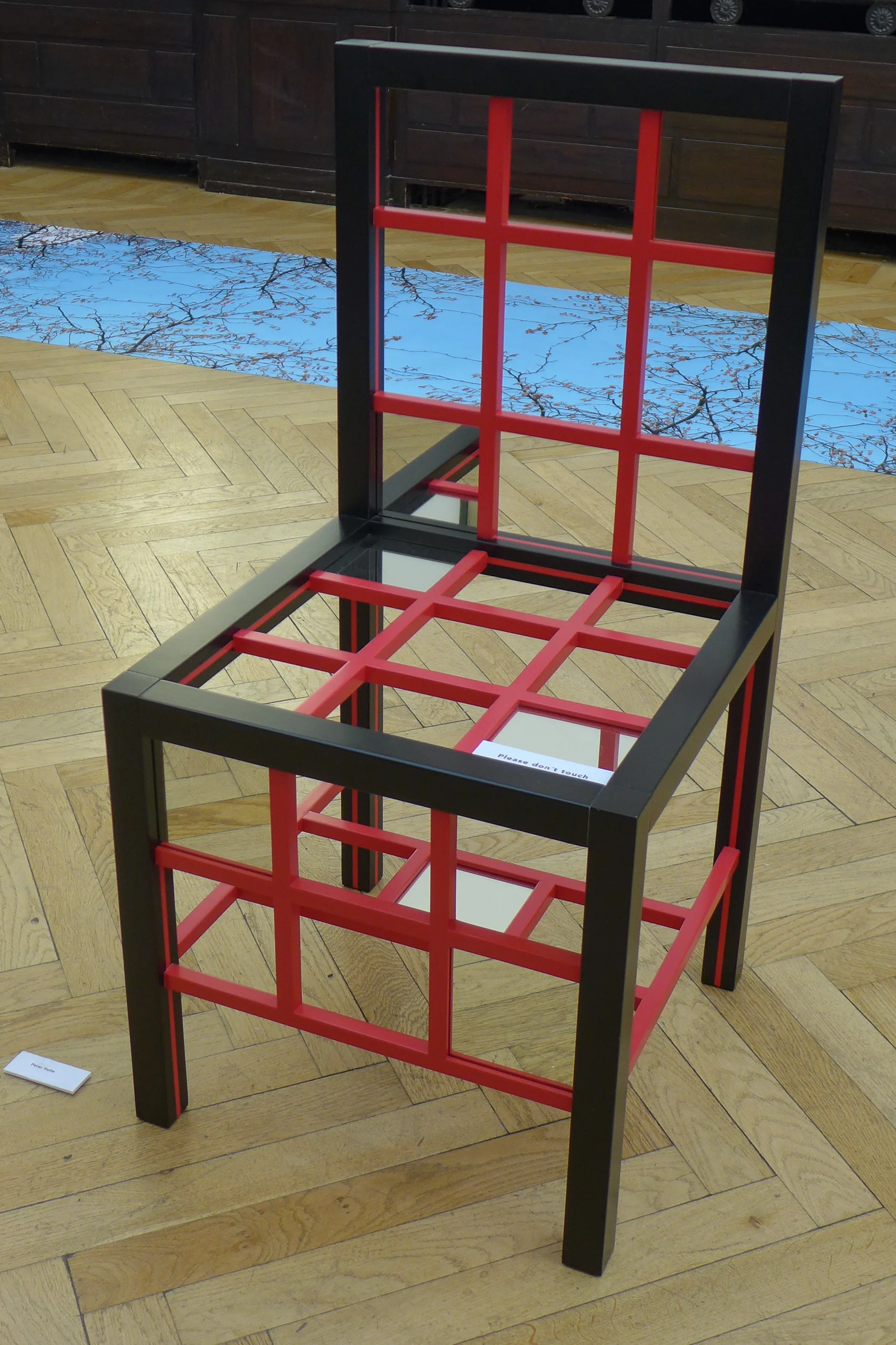
This is a fascinating concept. These designers, in their designs for a font or for dinnerware or for street furniture, invest a huge amount of their time on the commission - on the initial concept, the process of refining their design, the production period and so on - but the final work is clearly fixed in time … it is finished or as Tina Midtgaard, the owner of the gallery who commissioned the show,  points out, “no part will be changed, removed or added.”. Ironically, or do I mean very naturally, many designers hope that their works will continue in production and possibly even, become that iconic and rare accolade to be described by critics as “timeless”.  

One issue raised recently in posts here is that rarely does the public, the consumer, appreciate the role of the designer and the effort and time they have invested in a project. Some designers are complicit in that, modestly stepping back from their works. Somehow it seems better to imply that it was easy natural skill and talent rather than hard work that was required. Occasionally a retrospective or a new book will catalogue the range and extent of a designer's work and show all the intermediate stages and the development sequence that led to a well-known design but that is still relatively unusual.

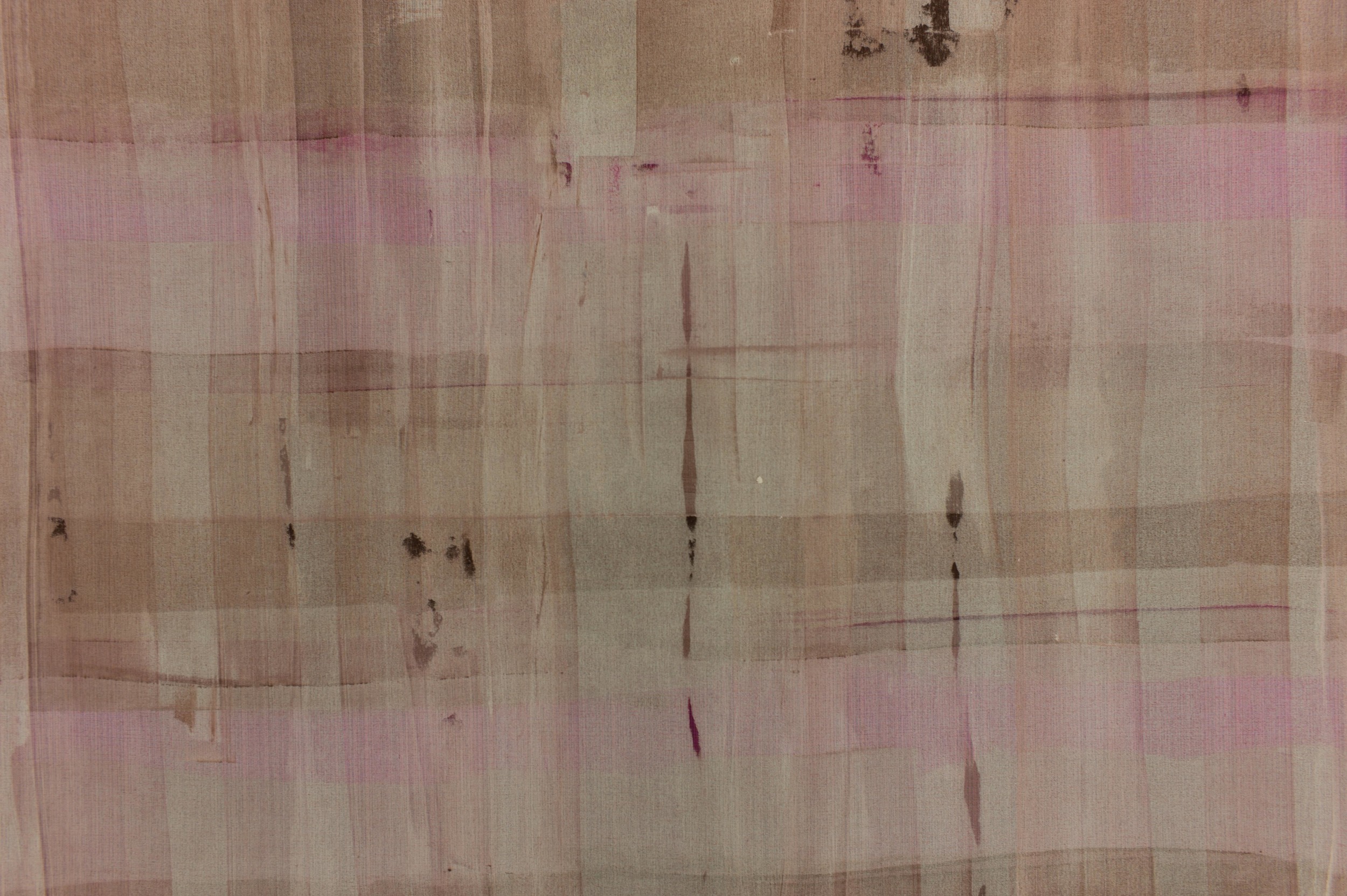
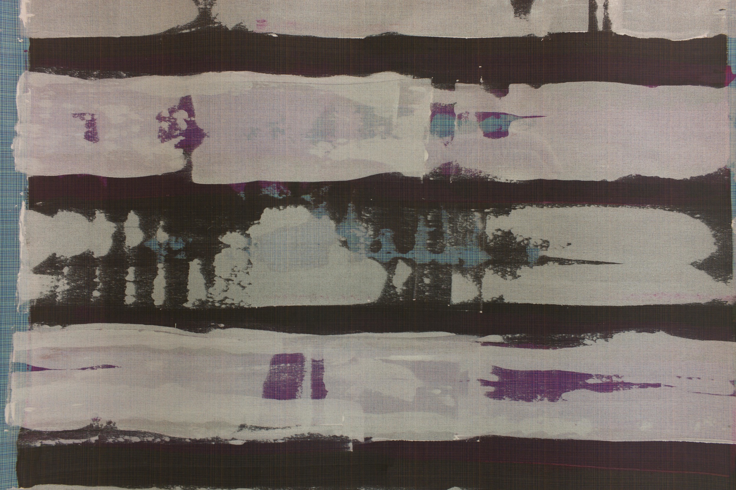
There is an opportunity here for the designers to produce a single piece, a single statement, and one that moves their work into the area more usually associated with artists … producing a single statement to convey a thought or an impression or a viewpoint on life to stimulate discussion, stop the viewer, make them think. It also gives those outside the design world an insight into the thought processes involved in the completion of a design project.

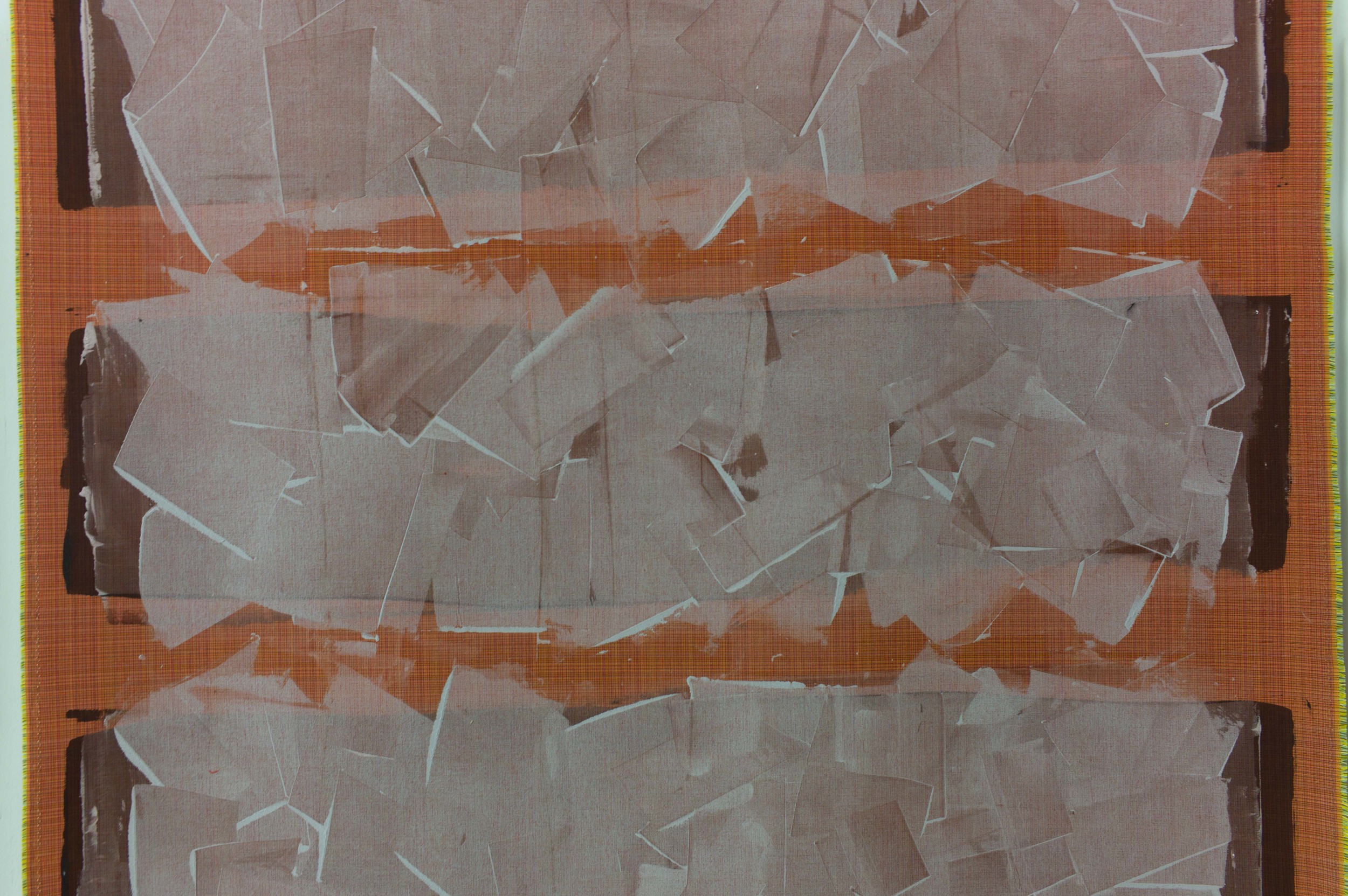
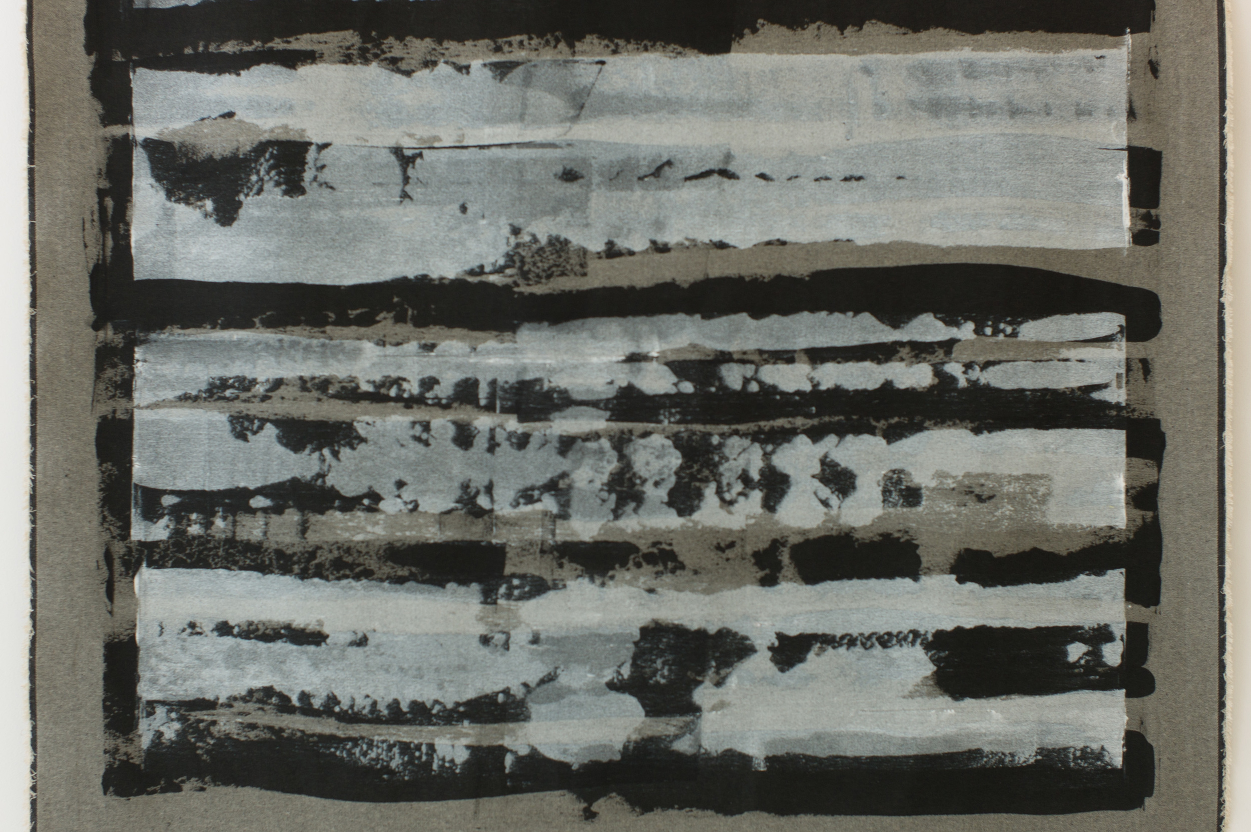
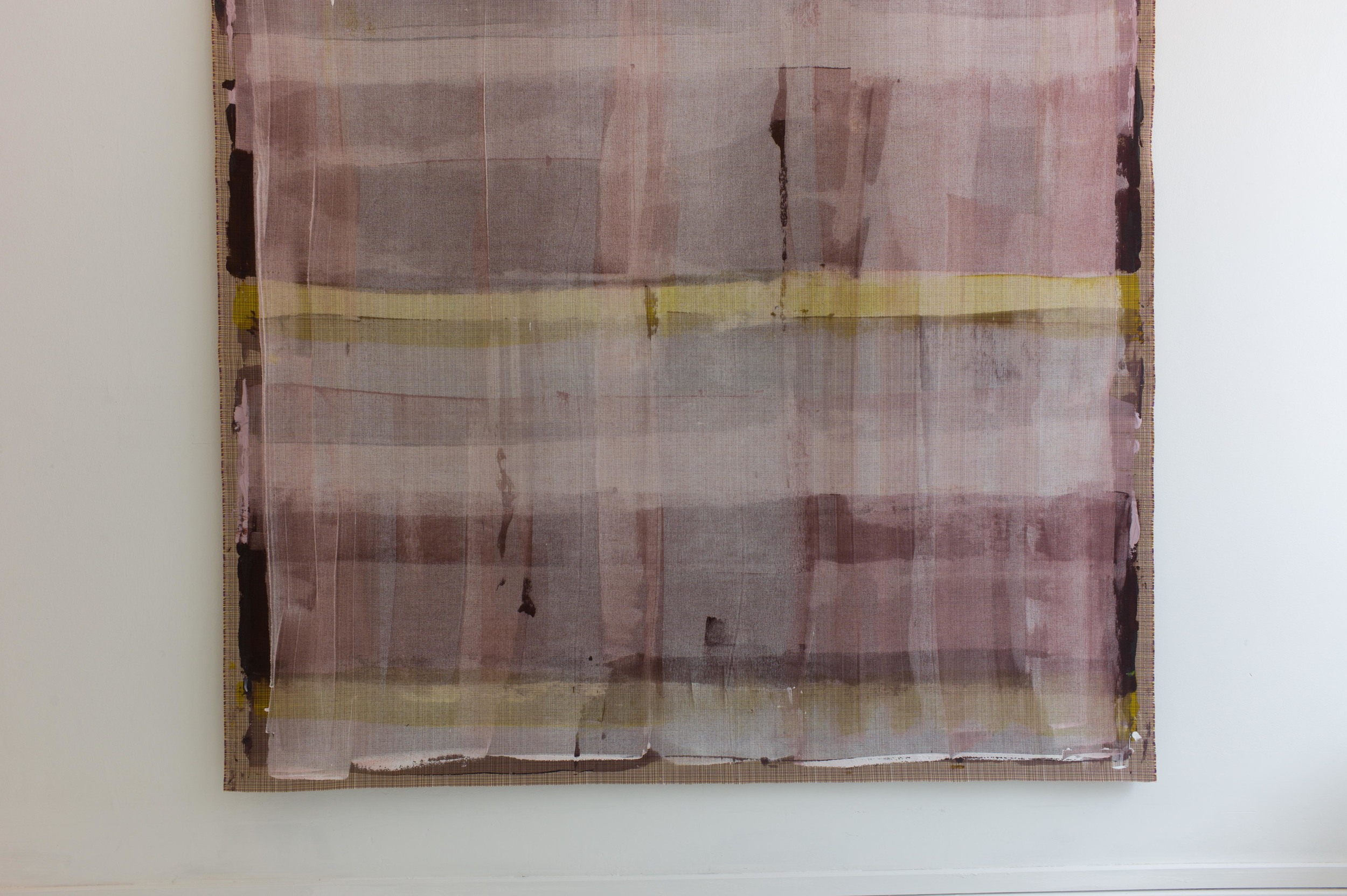
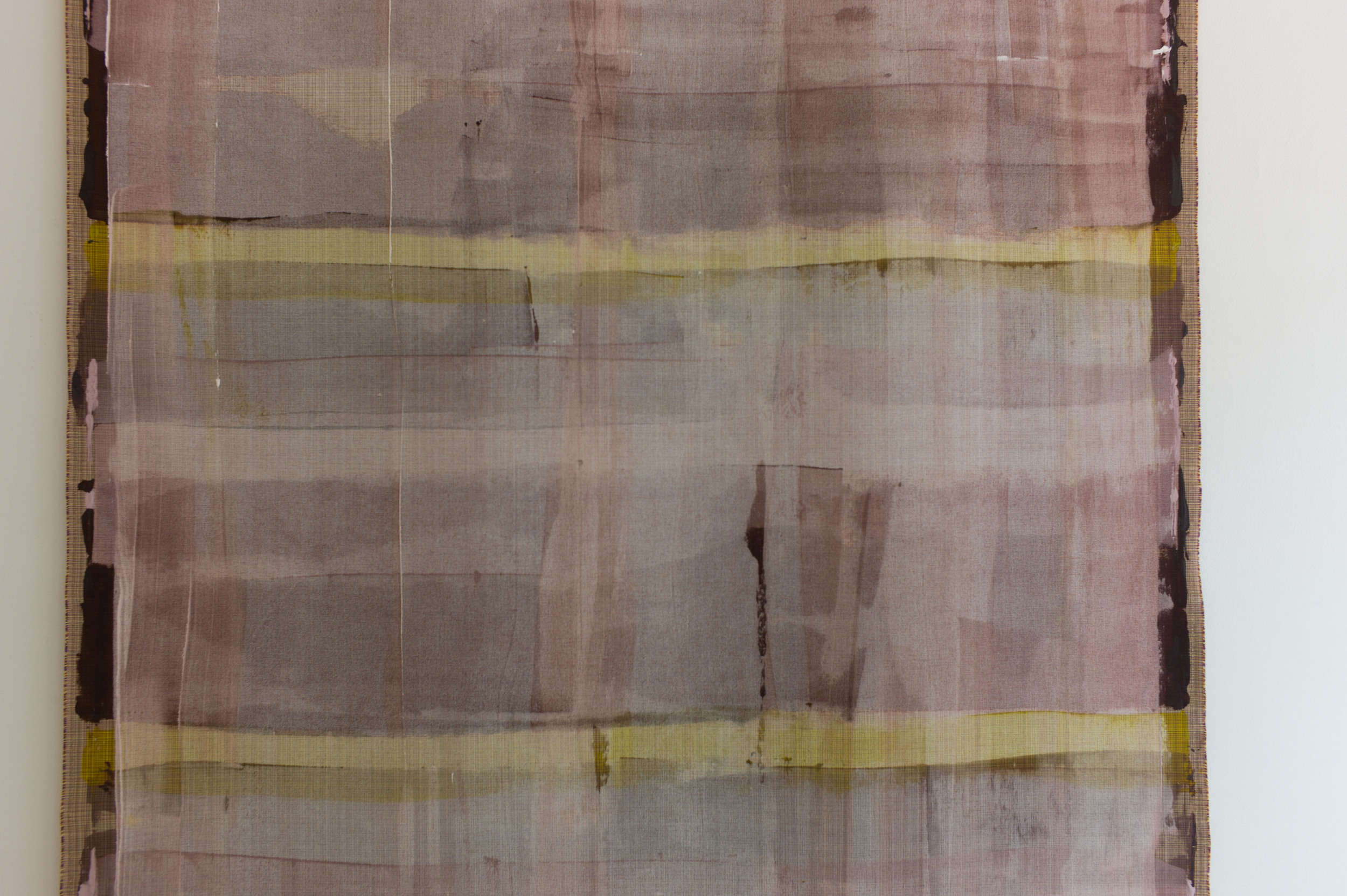
Here, in these pieces, ideas about time are piled up, layered or dissected. And most involve word play. Large posters of food and recipes by Susse Fischer are entitled måITID or mealTIME.


Wooden clock cases by Peter Bysted - Din tid, Min tid, Tik tak - do not have workings, they are simply the cases, so ironically cannot record or mark time, but one was made by Peter Bysted himself, so he invested his time and it is the piece where the wood is split and heavily grained, so has the strongest sense of age, while the other two were commissioned from a cabinet maker, his time in a sense was bought, but the wood is pale and more perfect and less clearly fixed in a style or specific time and, of course, the very design of the long case clock is now an anachronism, in an age of digital time, that respects and looks back to an older and now rare type of furniture where time was wound up and released.


In a similar way the stools and sundials by Christian Bjørn reflect time sharply and explicitly ... the stools in metal rust over time and the sundials with the gnomon in a sawn-through log mark off the passing of time each day but of course the rings of the tree, seen in the cross section of the trunk, record a precise passing of time, growing season by growing season, that ended when the tree was felled.


For me, and for specific personal reasons, two of the works had the greatest impact. Ursula Munch Petersen has laid down two lines of bricks, one pale yellow stock brick and one line of brick-red bricks, that are in progressive stages of being worn down by the sea and are laid in opposite directions perhaps to reflect the ebb and flow of the sea. As an architectural historian, all my work is about our buildings in time … fixed by the time and attitudes of the period in which they were built but also looking at how they are effected over time as people adapt and change their buildings. Here in Tidens Tand was human construction in a much longer time frame … the implication of the geological time taken to lay down the clay from which the bricks were made and the time, long after there is any link with an identifiable building, for the bricks to return to pebbles, grit, sand.

Curiously, it was the work by Ole Søndergaard that had most impact. Surprising only because this is a series of small pieces with icebergs shown in section with a polar bear on one and whales and dolphins on others but the style of the works is bold and graphically strong and in the Danish tradition of beautifully-made toys for children. 


It was actually after I left the exhibition and was thinking about the meaning of the various works that the impact of the Isbjergs motiver/tiden hit me. Many years ago I went to the Upsala Glacier in Argentina. There in a boat at the snout I have never felt so small and insignificant and curiously it was that that made me feel positive about the future. The ice rises over 100 metres above the water and runs down 900 metres below the surface to the bottom of the valley that the glacier has cut out so it is a wall of ice around a kilometre high and here the front of the glacier, stretching across the valley, is 4 kilometres wide and runs back over 110 kilometres to the source. My feeling then was that, for all our arrogance and bravado, man is pretty insignificant and the planet moves on regardless of what we do. There and then the most impressive and dramatic part of that visit was to see the glacier shedding huge blocks of ice. After a sharp explosive sound a block of ice, an iceberg, would drop and float away down the lake. This is called in English calving … giving birth. It was only some 25 years later that this exhibition in Borgergade made me realise, with a start, that the ‘birth’ of an iceberg from a glacier or ice sheet is perhaps one of the most potent signs of time that we have. It is the beginning of its ultimate end. Art is so often about symbols and meaning and representation and here in a simple line of child-like icebergs is an incredibly powerful statement about global warming. An iceberg records time passing but at a very different scale to a clock or a sundial. If the lifespan of an iceberg, from calving to melting away, gets shorter and shorter, the alarm, that wake-up call, is very loud and should not be ignored.


The designers taking part in the exhibition are Boris Berlin, Christian Bjørn, Peter Bysted, Susse Fischer, Knud Holscher, Ursula Munch Petersen and Ole Søndergaard.

Reatime continues until 26 September 

superobjekt gallery, Borgegade 15E, 1300 Copenhagen.

CrossRoads - an exhibition of the work of Vibeke Rohland

Superobjekt Gallery from Borgergade

Vibeke Rohland talking to a visiting art group on the day after the opening


An exhibition has opened at the Superobjekt gallery in Borgergade in Copenhagen showing recent works by the artist and designer Vibeke Rohland. 

Normally, I do not post about artists or about art gallery exhibitions on this site - trying to keep up with design and architecture is enough of a struggle for me without getting distracted, however pleasant or interesting that would be - but the meeting point of art, design and craftsmanship is incredibly important. And that is exactly what you can see in the Crossroads exhibition.

Marketing men and accountants, I am sure, see the different ‘disciplines’ in different boxes but one of the huge strengths for Nordic design in general and for Danish design in particular, is that the separation of roles in academic training and in professional practice is blurred. In Denmark many furniture designers have trained initially as architects, product designers come through a craft background as makers, designers appreciate that they have to understand the craft techniques as the starting point for commercial production and, through a long well-established tradition, many classic pieces of furniture have been produced by a close collaboration between the designer and cabinet makers. 

However, even in my own mind, it is difficult to define clear boundaries. At one end of the scale a unique piece, signed and often dated because it can be seen as part of a sequence in the development of an artist’s work over the years, is clearly ART and at the other end of the scale something produced in a distant factory and shipped back for sale is product design. Between though is the problem. A potter or glass maker might make a one-off piece for an exhibition; a set of matching pieces - a series of handmade pieces - for a client and then a related design for mass production by a well-known design brand. So one unique piece is a work of art, a set is crafts-made, and more than ten? more than twenty? several hundred? several thousand? becomes a product run? And how should artists, makers and designers interact? Surely they have to! Surely a designer needs to check back in to making something by hand every now and then and a craftsman could benefit from the occasional fee of a commercial run.

Vibeke Rohland very clearly and deliberately breaks through these boundaries. Here, at the Superobjekt gallery, many of the large and unique pieces are actually produced over commercial fabrics that Vibeke designed and that are made by Kvadrat. Even the techniques shown here are a beautiful subversion. Many of her pieces with a limited-run as well as the commercial designs have been produced by silk screen printing so always with slight variations because it is not, strictly, a mechanical process.* Here, for  the largest pieces in this show, the dye has been laid on and taken across the fabric using a squeegee but without the screen and its mask as the control or intermediary. Each area of colour therefore is and has to be a unique area of the overall work. There can, obviously, be no precise repeat pattern. The colour appears to be built up in layers and that is exactly what has happened.


A recurrent theme of Vibeke’s work is using what appear to be simple repeats of pattern but with complex overlays of colour using intensity of colour to create changes in the depth, light and space within the pattern. A series of grid or cross-hatched designs, some framed and included here, and experiments she has produced with large wheels or circles as the underlying form, created with broad cross spokes, uses the same approach ... being apparently very bold but actually creating a finished piece that is incredibly subtle in it’s use of colour and it is the variations in the intensity of colour or variation in the thickness of pigment which create the sense of depth. Another series uses strict repeats of large but simple shapes like crosses or dashes but on a huge scale to undermine the viewers judgement of distance from the work. The repeat becomes a texture but again not something mechanical because it is slight but deliberate changes or slight differences in the units over a surprisingly large repeat making up the pattern that bring the design to life.


Again, this same approach to colour and pattern can be seen in the commercial designs by Vibeke for Kvadrat. Her commercial woven and printed textiles use small points or fine lines of colour to build up pattern and form and shadow so it actually comes as a surprise when you see the large overall size of the repeat of the pattern. In the same way that the layers of colour on the pieces in this show build up to form a complex and large-scale work, the small points of colour and the very very careful combinations of colour in the furnishing fabrics are used to create depth and an effect of shadow to build up the final bold overall pattern.

The works on show here are amazing but it is also worth tracking down the commercial designs from Vibeke Rohland that have been produced by Georg Jensen Damask, Bodum, Hay and Royal Copenhagen. Spend time looking at the on-line site from Kvadrat to see the designs for fabric there - including Map, Satellite, Scott and Squares - with a wide range of colours in each design. The small sample at the start of the Kvadrat page reduces these textiles to a simple small area of dots or graph-paper grids but clicking through and moving out to the broader view these become complex patterns that are again both bold and subtle ... that same effect as you move close up to and then further back from the pieces in the gallery.

CrossRoads continues at Superobjekt Gallery Borgergade 15, København until 2 May 2015

Vibeke Rohland

Kvadrat


* And yes ... I know that screen printing can be incredibly precise when used as a commercial process. Many years ago I went to the Sanderson factory in west London and watched the hand printing of fabric that was 1.5 metres wide with a 900 mm repeat with men on either side of a screen printing alternate sections down a massive length, loading the dye by judgement and experience and taking the squeegee backwards and forwards between them and then returning down the length printing the gaps and it was impossible to see the joins ... but an important quality of screen printing on a textile that itself may have blemishes because it is organic rather than mechanical gives the finished textile its character and warmth. Perfection can be really dull.