


Copenhagen blue II
/Torvegade and Christians Kirke from Overgaden Over Vandet
Having said that for me blue is the colour in the urban landscape of Copenhagen that seems to be strong and reflect how I see the city, there are very few buildings that are actually painted blue.
There are several reasons for this and not least it’s that early blue pigments derived from lapis lazuli for ultramarine were incredibly expensive and the cheaper Prussian blues that were available from the early 18th century onwards were fugitive so they not only faded but could decompose in the air. Although Cobalt blue, an industrially produced blue pigment, was stable and lime proof, even that paint was considered to be too expensive for use across a facade.
Also, I have read somewhere that Danish architects and painters considered blue to be a very strong and dominant colour … ‘stronger’ than red … so to be used carefully.
Some historic buildings in the city are now painted blue in shades that vary from cornflower blue to blues that are much closer to purple and they certainly lift and brighten a line of buildings but there really should be a rule that one blue house in a street is fantastic but two is too much so once one owner has gone for blue that should be it.


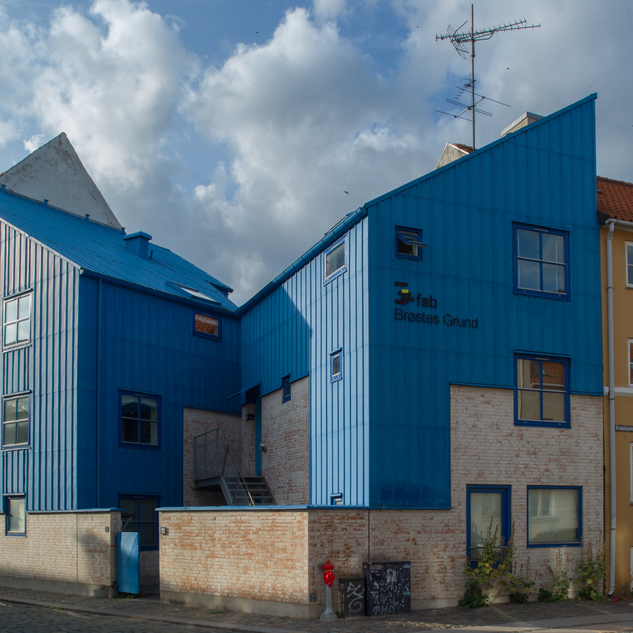
Det Blå Hjørne / The Blue Corner
The infill building in Christianshavn by the architectural studio Vandkunsten known as Det Blå Hjørne or The Blue Corner (bottom right) dates from 1989.
This is - as the name implies - a corner plot which can be difficult for both the plan of a building and for the design of the facades but here the corner is not even a right angle as Dronningsgade and the side road of Store Søndervoldstræde meet at an angle of about 120 degrees.
In addition, making the commission for a new apartment building here more difficult, this is a part of Christianshavn where relatively modest historic houses have survived so it gives an important impression of what domestic areas of the inner city must have been like in the 17th and 18th centuries before ordinary houses were replaced with grander or more commercial buildings. The building is at the quiet end of a beautiful and complex courtyard that retains more old courtyard buildings than in many blocks.
But Vandkunsten were bold, dividing the new apartments between two buildings to leave a narrow view into the courtyard at the corner and played with all the rules so the roofs are mono-pitch - the older buildings have pitched roofs with a ridge - and the choice for wall finish is metal sheet so it almost feels like a final parry with convention, that the cladding is deep blue. The total effect works well as it gives the building a semi-industrial feel and if there is any single aspect of the historic centre of the city that has been lost or changed with too little appreciation of the consequences it is that Copenhagen has lost far too many of the workshops and early industrial buildings that once filled many of the back streets and courtyards.


