restoration of wall paintings at Moltkes Palæ


At the end of last week Heidi Zilmer invited me to see her work on the restoration of wall paintings in the Gamle Seglsal - an antechamber to the Store Sal or first-floor great hall in Moltkes Palæ. The palace is now owned by Haandværkerforeningen, the association of craftsmen, and the room was decorated for them shortly after they bought the building in 1930.

Set on the corner of Bredgade and Dronningens Tværgade in Copenhagen, Moltkes Palæ dates back to the late 17th century when the first house on the site was built for Jørgen Henriksen Gosebruch, a Chief Customs and Excise Officer.

In 1696 the house and gardens were bought by Frederik Gyldenløve, half brother of the king and Governor-general of Norway. He rebuilt and extended the house and it remained a major town palace for a sequence of wealthy and aristocratic families through the 18th and 19th centuries. In 1852 the palace was purchased by Count Moltke, Prime Minister of Denmark, and his name is still used to identify the house.

In 1930 the property was bought by Haandværkerforeningen and they commissioned the architect Gotfred Tvede to alter the main entrance from Dronningens Tværgade and the main staircase, both on the south side of the palace, and to construct a new north range containing a new first-floor great hall for events and major dinners of the association and at the same time Tvede remodelled the courtyard side of the earlier street range to create this lobby or antechamber to the new hall.

Decoration in the room is painted directly onto the plaster and with time areas have been damaged or the paint has lifted slightly - hence the need for a programme of restoration works.

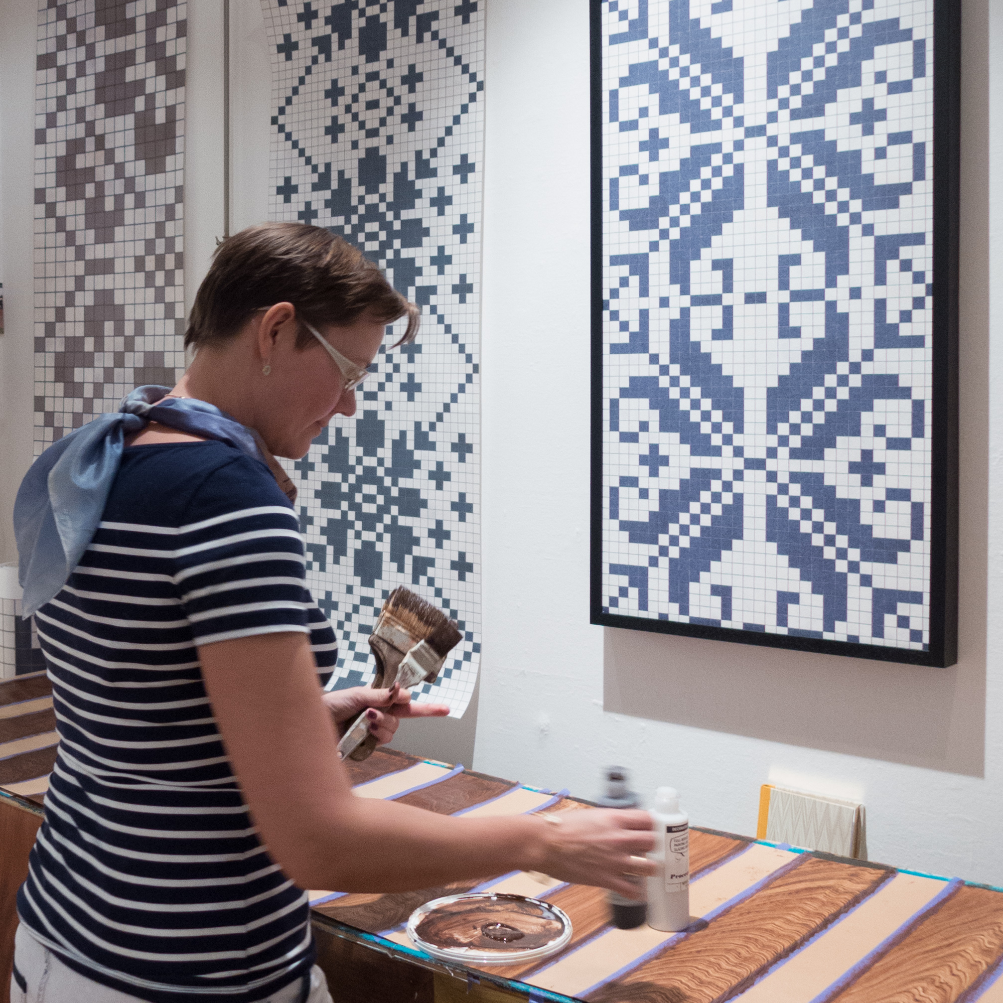
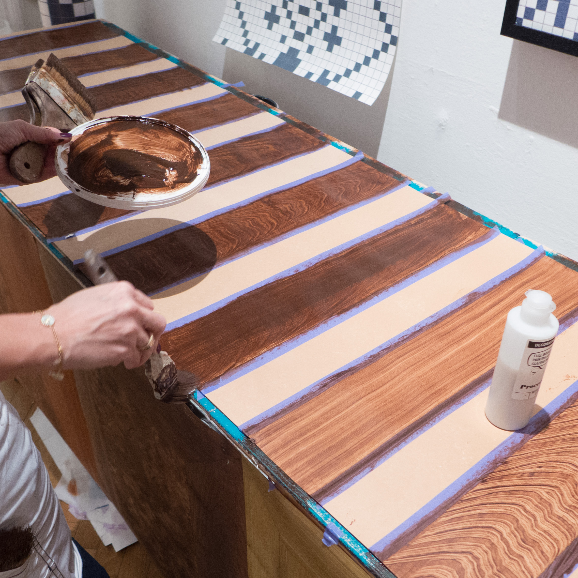
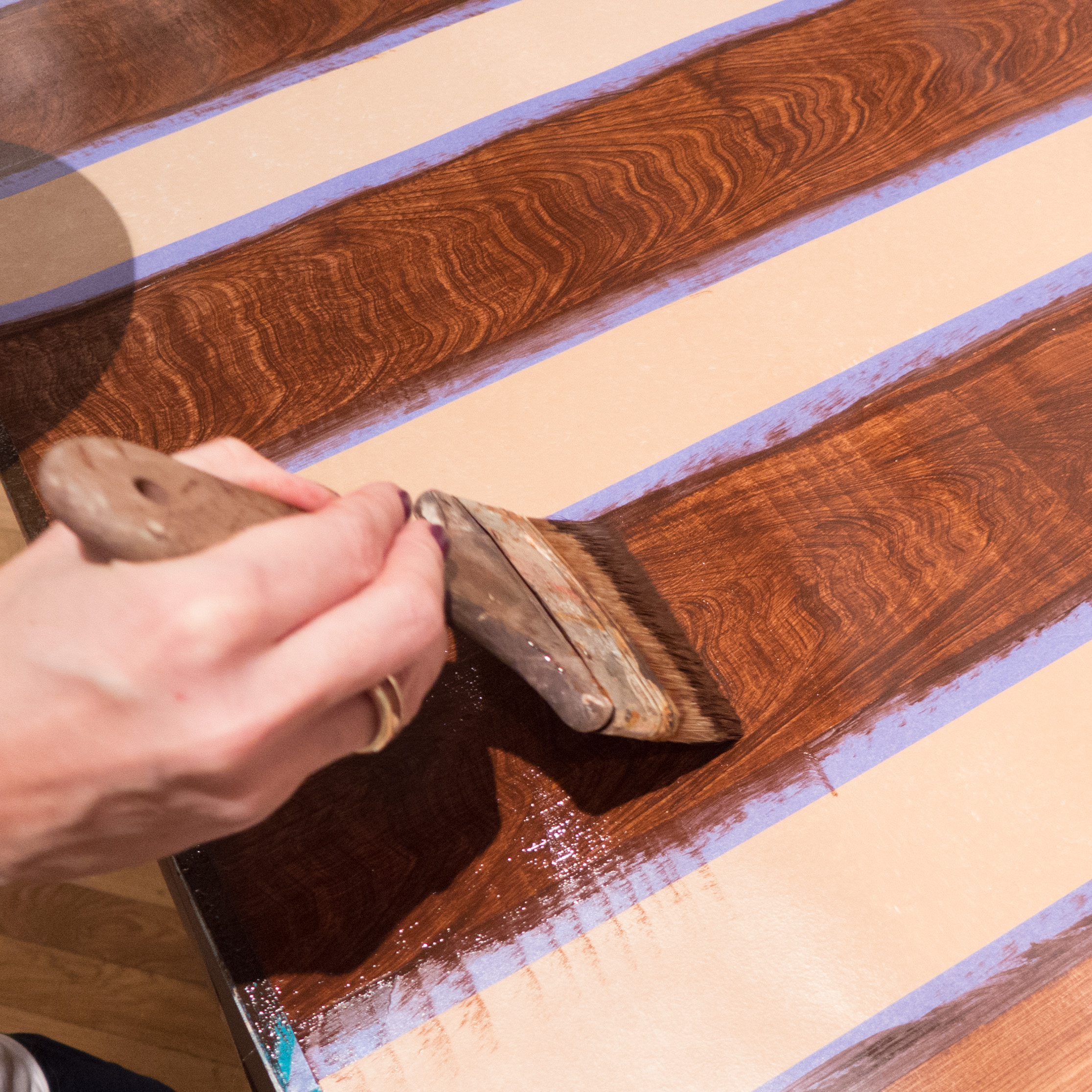
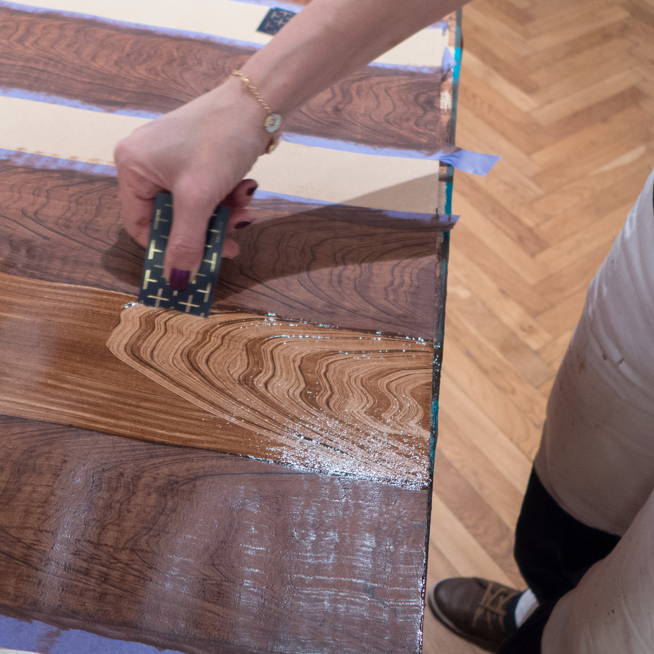
Heidi Zilmer is a very skilled restorer of historic hand-painted wallpaper as well as being a talented and prolific designer of new wallpapers. Here, in the Gamle Seglsal, the first stage was to consolidate loose paint and then fill and prepare areas of more extensive damage. After restoring the base colour, Heidi marked out the missing areas of the design … surviving areas of the pattern, to be reproduced over the damaged sections, were traced in pencil onto thin paper and then, the outline was pricked through with a line of closely spaced pin holes and graphite powder used to transfer the design to the wall - a technique known as pouncing. Original details of the artists brush strokes for line work and pronounced strong brush strokes in areas of blocked-in colour have been imitated exactly and pigment has been carefully and precisely matched to the surviving colours where they have faded or changed in different ways.


That evening I went out for supper with Heidi and her assistant to discuss their work.

As I have said elsewhere, I first met Heidi last Autumn at Museumsbyggningen when she showed her wallpaper designs and demonstrated historic painting techniques such as trompé l’oeil and imitating wood graining in an exhibition called The Time is Now. And I talked to Heidi again at Northmodern in January and saw her at the 3daysofdesign event called Re-framing Danish Design where her wallpaper was chosen by Danish™ for their exhibition.

As well as restoring historic wallpaper and historic decorative schemes in major buildings, I knew that Heidi also teaches design history and has designed an extensive range of modern wallpapers. I just assumed that she had studied at university in Kolding or here in Copenhagen.

It was only as we talked that I realised that in fact she had followed a traditional craft route and had completed a full painter’s apprenticeship. She is proud, justifiably proud, of that because it is those tangible skills that inspire all her designs and those skills and knowledge of her craft that has brought her international recognition - she was invited to participate in the annual meetings of the Salon of Decorative Painters exhibiting her work first at the Salon in Bergamo in 2009, in Versailles in 2010, in Tokyo and then this year at the Salon in Lecce.

colour for historic buildings in Copenhagen


Of course there are many really fine buildings in Copenhagen of great architectural significance but I also enjoy just walking around the inner city, looking at the colours of the brickwork, stonework, plasterwork and woodwork of the historic vernacular buildings.

Obviously the appearance of these houses, warehouses and apartment buildings is enhanced by the clear sharp light this far north in Europe and as the sun is often relatively low in the sky, through the autumn and through the Spring, or the light is reflected up off the water of the harbour or the canals, much of the effect, in townscape terms, depends on the texture of wall and street surfaces and shadows across architectural features.

Choice of colour is also crucial. An exact reproduction of historic colours is not always necessary but colours have to be chosen with some appreciation of historic architectural styles or with real panache to enhance, rather than flatten or distort, the underlying architecture of a facade. Choice of an inappropriate colour diminishes the appearance of a building and can actually compromise the appearance of the whole block or the group of buildings along a street or on a lane or square.


read more

3daysofdesign - more colour and stronger colour

Meeting room at the showroom of &Tradition in Copenhagen
 

A trend that has been building over the last couple of years but was very clear at 3daysofdesign is the use of much more colour - much deeper, stronger and richer colours.

This was perhaps most obvious at &Tradition, Gubi and at Frama and with the works of the wallpaper designer Heidi Zilmer and the works at File Under Pop. And along with the stronger colours was more pattern and stronger texture … the obvious example was with the work of Niek Pulles for the exhibition Re-Framing Danish Design but Gubi have been using boldly-patterned fabrics in strong colours for upholstery for years.

 
Re-Framing Danish Design ... work of the designer Niek Pulles
 
Gubi - the showroom at Pakhus in Nordhavn (above) with the Paradiset Sofa and an Eva Chair and
(below) a wall display at Gubi showing the range of colours for their Komplot Chairs and stools
 

Major furniture companies including Normann, Muuto and Fritz Hansen have produced new chairs or, in the case of Fritz Hansen, released chairs in new colours, where different colours in the range work together so dining chairs in several different colours or tones can be mixed around a table.

Distinct colours can mark and distinguish a company from the competitors and can go a long way towards forming a clear brand image. This is also a sensible business move … distinctive colour range for chairs can be part of a broader range of related products and colour is one area where on-line sales loose out against going to the showroom or design store.

White walls and pale wood are still the stock image conjured up to represent Scandinavian design but curiously this represents a relatively short period of classic design through from the 1950s but was never the whole story anyway - designers like Verner Panton used strong bright colours, Arne Jacobsen used pattern for textiles and wallpaper and upholstery has always been in offered in strong block colours.

Flügger, the Danish paint company, has a historic colour range and many of the dark greens, smokey blues and deep mauves appearing now can be found there produced from the careful examination of historic colour schemes.

The source of inspiration for these new colours being used by current designers can be tracked back to Danish vernacular furniture from the 16th, 17th and 18th centuries; the early 19th century where strong blocks of deep colour with vibrant pattern for wall and ceiling decoration were used - just look at the interiors of the Thorvaldsen Museum - and these dark colours continued to be used in Danish homes through the 19th and into the early 20th century.

 
Interior of a farmhouse at Frilandsmuseet - the open-air museum north of Copenhagen
 
Interiors of the Thorvaldsen Museum in Copenhagen


Bold use of strong colour in the interiors of the Glyptotek in Copenhagen

St Pauls Blue


The Frama showroom is in an amazing shop near the church of St Paul in Copenhagen. It was a chemists and ornate ceilings and elaborate woodwork from the 19th century have survived and creates a dramatic display space.

Smaller rooms have been decorated in strong colours to form a backdrop for the furniture and light fittings produced by the team. One of the smaller rooms is in a deep grey blue that was developed with the paint manufacturer Jotun and is used for the walls, the ceiling and the woodwork of doors, architraves and skirting boards with the only other colour and tone from the stripped boards of the floor.

Republic of Fritz Hansen Series 7™


anniversary

Designed by Arne Jacobsen in 1955, the Series 7™ chairs reached a major anniversary this year. Republic of Fritz Hansen have a display in their showroom at Pakhus 48 in the dock development area of Nordhavn in Copenhagen where there are versions of the chairs in the style of different architects including Zaha Hadid, a love seat version by Neri & Hu, the striking black and white love seat from Jean Nouvel Design and a Series 7™ shell without legs and set in a miniature Nordic landscape from Snøhetta.


Two special versions of the chair will only be available this year with one in a deep pink and with gold legs and the other in a very very dark blue with the same colour for the framework of the legs.  


monochrome

This monochrome style, with the same colour for the moulded seat and the metal legs, is also promoted in a new series of four versions … the chair in a deep tan colour called Chevalier Orange, in a strong light blue, Trieste Blue, all in white or in black with black metal legs and I think a grey, a brown version and an aubergine coloured chair are to be added.


colour in perfect shape

Also, to mark the anniversary, a new range of nine colours for the Series 7™ have been produced in collaboration with the Copenhagen artist TAL R.

Here, the point emphasised by Fritz Hansen is that they prefer “artistic colours to industrial colours, diversity to uniformity, and the natural to the artificial … the result is furniture that will continue to live, surprise and inspire.”

This is in part the line from a skilled advertising or PR department but it would be glib to scoff because actually it is the quality of the colour surface, the way it reflects or absorbs light and the way the colours look different in different light or different settings that give the chair a sense of real style and real quality and real warmth.

The new colours are Opium, close to a Chinese red lacquer; Ai, a very, very deep blue; Chocolate Milk, for me an incredibly complex colour with touches of pink and very little yellow (and no I am, fortunately, not colour blind) Trieste - almost a cornflower blue but not; Hüzün, a striking mid green; Egyptian Yellow, a yellow toned down with lead; Altstadt Rose, a colour I can’t begin to describe; Evren Purple, again unusual and particular - somehow strong and sharp rather than pretty - and that's praise not criticism; Chevalier Orange, again surprisingly subtle, and finally Nine Grey, produced apparently by mixing all the other shades.

In a clever marketing move the colours are produced on a swatch with a lanyard as it will be important to choose these colours carefully in the final setting and to help to inspire people and get them to look at the chair in new ways and for new possibilities, for combining and playing with colour in a more adventurous way, room settings or grouping of these chairs, set around tables, are given plenty of space in the showroom and given carefully-chosen accessories such as appropriate flowers or tableware. The colour samples are reasonably large - 60x100mm - and interleaved with a short description of the inspiration for the colour.


The window display at Pakhus has a striking rainbow of colours showing off the other major feature of the design of the Series 7™ and that is that it was one of the earliest stacking chairs for the home to go into large-scale production.


3daysofdesign: graphics and publications

use of detailed graphics in the show room of Arper in Nordhavn


3daysofdesign was a major event that included many of the most well-established design companies in Denmark so, perhaps, it might seem odd to talk about the graphic design of publications and posters seen at the various venues … of course everyone expects well-designed graphics and beautiful catalogues from furniture companies … surely it goes without saying? … surely it would only be worth a comment if catalogues or lettering in the showroom or information leaflets were badly designed or badly printed?

Well no. Just because everyone assumes it will be good and just because the graphics were actually good throughout, it is even more important to make a few points about this aspect of the work of the furniture industry. 

In general, people outside the professional design world … so obviously the majority of customers … assume that graphics with high-quality photographs, eye-catching layout and high quality paper are all simply what should be expected. They take it for granted. After all, computers with a huge number of fonts and any template you could wish for for a layout, high definition images, even from a mobile phone, and high quality printing are all available from personal systems in most homes … what can possibly be so hard in producing a nice (free) catalogue? And of course we are all greedy - voracious - for images, gloss, entertainment, facts, information and commentary with little time spent on thinking about how much it has actually cost to produce in terms of professional skill, mental stress, time and money. And last years catalogue or last years campaign are not good enough. We want, need and expect something new.

What was clear across the board at 3daysofdesign is that companies do and do have to invest a huge amount of time, thought and money in the right style of advertising and the best possible publications with information about and for their products.

Catalogues, advertisements, information booklets, online sites and so on have to tell the story of the company; explain the development of the design; introduce the designer, if they are young or new to the company; explain the way the design evolved - everyone loves a good story - give information about the manufacturing process, promote green credentials, of course, and, often, give after-sales care advice as well. And good graphics, as everyone knows, can create a brand image and customer awareness of, recognition of and loyalty to a company or even to a specific design. Chair 7 by Arne Jacobsen, Stool 60 from Artek and the PH5 light are all the obvious examples of the ongoing commercial value of recognition and loyalty.

The Series 7 chair is actually a very good example. It will be the subject of a separate post but it is of relevance in this post just because it is still the best-selling piece in the Fritz Hansen catalogue but it has just reached a milestone anniversary - the chair was designed in 1955 - and Fritz Hansen are in the middle of a major campaign to ‘relaunch’ the chair in new colours to ensure that it remains a design that has a place in the homes of young and future generations of buyers. So publicity material, and advertising and the way the chair is shown in displays now, are crucial to its future success. The strap line of the present campaign is Colours in Perfect Shape.

With a completely new range or a novel design it may even be necessary to give advice about how the piece might best be set in the context of it’s new home. It is actually quite difficult to explain to a customer, who is dissatisfied because, maybe, their new purchase doesn’t look quite as good in their home as it did in the show room or in the catalogue, that in fact they have bought the wrong thing for their existing house and existing life style. The new piece itself is amazing … it’s just that really their room/your room should possibly/could maybe/definitely ought to be a different colour and much of the rest of the furniture should be replaced. But the shop can’t say that. Better to start a bit of gentle advice - sow the seeds of a few ideas and suggestions in the catalogue or in the display in the shop.

The good small catalogue for the event itself and the graphic material for Re-Framing Danish Design were well designed and distinct … presumably they were aware of the added problem of having to avoid any resemblance to the brand styles of any of the companies taking part. 

Arper and Muuto had elaborate graphics on the walls of their show rooms to explain or identify their designs and several companies including Fritz Hansen, OneCollection and Gubi include in their catalogues extensive articles on major designers from the classic period of Danish design to put designs, that might be 50 or more years old, into their wider historic context. The Gubi catalogue is called a design booklet and is, significantly, titled ‘Icons, Memories and Stories.’ It is necessary to explain to a new generation of buyers when and why the pieces were designed; state why they were important designs or why they were admired when they were first manufactured, and why they have relevance now and and why they should still be in production. Basically why a design was amazing then and why it is amazing now.

It is also necessary to explain to a new buyer why an old design might not be exactly like the earliest examples of a design that they have seen in a museum. Designs can evolve in terms of the materials used, for instance in upholstery, and manufacturing techniques change or some aspects of machine manufacturing have improved since the original pieces were made. Again managing expectations and nurturing customers who might have admired a design long ago but are, only now, getting around to buying it.

Innovations for new designs, particularly new materials or new methods of production, have to be explained to potential customers and can become what are called unique selling points to distinguish the designs from one company from the works from their rivals. Muuto have launched a new shell chair that is moulded from a recyclable material that includes wood fibre … deliberately described as ‘pinewood fibers.’ This material has a softer and matt look and a slight texture which has to be explained to the customer and work with the material has also led to interesting developments in producing an optional upholstered interior to the shell. New material often require changes to fixings and supports or an appropriate rethink and here, with Muuto, this means that the shell of this chair can have four different supports: thin, elegant, metal legs; a ’sled’ like metal frame; a wooden base with a frame below the seat and a metal swivel base. These distinguish the chair from rivals but the developments and the differences have to be pointed out to the customer and this has to be done through advertising and through catalogues and brochures … not least because this choice of base and choice of upholstery along with choices of colour, in the case of the new Muuto chair, gives 41 different permutations … a potential problem for the customer in making that choice and potential problems with manufacture and the supply system that can be made easier by appropriate publications for information. I believe this is called managing expectations.

Frama and Please Wait to be Seated both produced information that unfolded to poster size and several companies, including Frama, used reproductions of hand-drawn line work, rather than digital computer-generated drawings, to show something of the various early stages of the design process as designers play with a number of ideas and take a particular form forward.


Personally, I really like the small, folded and stapled A4, cloth-bound catalogue from Flos for their String Lights and IC Lights by Michael Anastassiades with quotes from the designer, talking about inspiration for the design, but with studio photographs combined with hand-drawn sketches to explain how that arrangement of the lights were set up along with a surprising amount of technical information. 

The small catalogue for Parentesit from Arper has an interesting look that somehow hints at the 1930s and Bauhaus style. Good graphic design can hint at sources of inspiration.

For its ‘case study’ series, Frama uses thick board that is coated on one side but unbleached on the back and with a single brass screw link at one corner - so playing a very clever game with period and style - hard-tech mechanics contrasted with soft-tech almost retro style that you see in their furniture as well with incredibly sharp, clean industrial-character designs presented in the elaborate and dramatic interior of their show room - formerly a chemist shop with amazing fittings that date back to about 1900.

Graphics from MA/U Studio were as thin and as elegant and as distinctive as their furniture with the clever use of simple outline human figures to give drawings of shelving easily-understood scale.


Next Door


The full name of this shop in Østerbro is NEXT DOOR Recycle your rooms. Christine Løschenkohl Holm and Christine Heiberg sell furniture, ceramics, glassware and rugs and textiles mainly dating from the mid 20th century. The shop opened last summer but is already well established.

They have agents scouting for good pieces and they use an Instagram site and Squarepics and Iconosquare well as a very appropriate ways to show customers what has just arrived in the shop. The turn round of stock is rapid … I walk past here a couple of times a week to get to my local coffee shop or to look into Goods … and it is always beautifully arranged.

One really strong characteristic of Danish homes is the way that good design is mixed with skill to match Classic mid-century design with current pieces or to have starkly modern pieces of furniture in old rooms with panelling and ornate plasterwork or to use antique pieces in starkly modern glass and steel apartments.

What is unusual at Next Door is the striking and confident use of strong colour and strong pattern that has not been a part of typical Danish design for many years. Probably the style is closer to that found in Sweden in shops like Svenskt Tenn in Stockholm. The team at Next Door told me that one aim for the shop is to encourage people to use colour and pattern with more confidence. To help they also offer a design and advice service.


Next Door Dag Hammardkjölds Alle 33, 2100 Copenhagen Ø

the first cruise liner of the Summer


When I looked out from the apartment this morning this was the view. Over the trees of Kastellet what looked distinctly like a cruise ship at the Langelinie Quay. The first that I’ve seen this year. 

Wasn’t it Aristotle who said that one cruise ship does not a Summer make? … so I wandered over that way later in the day to find in fact two liners, all the cherry blossom out and swarms of tourists taking groupies at the Little Mermaid. Summer really must be here.


If you don’t know Copenhagen and are not sure where the statue of the Little Mermaid is then you can see all the crowds on the left of the view. The Little Mermaid is hidden by the column … someone told me that you can’t publish images of the statue without permission so I’m not taking any chances.

When I got to the quay I came across this slightly odd scene. One of the crew out with some white paint and a paint roller. Surely someone should have given him either a larger roller or a smaller ship to paint. I was a bit curious to know how he was going to do the other side but got bored waiting for him to get that far.


this was also posted on Copenhagen By Design

strong colour in Scandinavian design?

As I was taking the photograph of the cruise ship from the apartment I heard a fair bit of noise on the street below. Just excited talking and banter. Nothing to complain about. It was a large group of students in their late teens on some sort of trip. I carried on watching as they had to negotiate the traffic lights at the pedestrian crossing. They looked Danish and sure enough they all stopped and waited at the red man. 

Danes have a well-deserved reputation for being sociable and polite and open and friendly which I can certainly vouch for but all tourists should be given a warning notice as they arrive at the airport to say that all Danes are sociable, polite, open and friendly unless they are on a bike and have the green light in their favour and someone tries to walk across with the red man against them. Or even if they set off at a green man but they dawdled and the little red man lit up when they were half way across. The other part of the warning to tourists should point out that the little green man only stays green long enough for them to cross if they are actually at the road side when he appears and if they walk fast. In Copenhagen pedestrians are expected to walk fast.

The group this morning were concentrating more on chatting than walking and got stranded on the small middle island in the middle until the next time the little green man appeared.

Actually the problems of crossing the road in Copenhagen was not exactly the point of this post.

As I watched the group, squashed together on the island in the middle of the road, I could see that they were all in their late teens and all smartly and fashionably dressed … well as  far as I’m a judge … but, if anything, all the blokes were much more adventurous with their choice of hair cuts with a couple of man bun’s … well at least that’s what someone told me they are called … and quite a number of very dramatic quiffs over incredibly short buzz-cut sides. Then I realized that however fashionable the clothes and however expensive, they were all in black or grey with some dark navy blue. I can hardly talk as my own outfits are grey and black and blue though occasionally I do chance a pair of stone-coloured chinos. 

Then I realised that not a single person was wearing any patterns.

Curious that we seem to have become averse to colour and pattern … at least in clothing. 

Svenskt Tenn - Stockholm store display

In terms of interiors and furniture I have to admit - or do I mean confess? - that I have no pattern in the apartment at all except for one rug. I’m certainly much more likely to buy Norrman or Muuto than Svenskt Tenn. 

Then thinking back to the grey and black palette of the clothing I began to think about colour in Danish architecture and Danish interiors. If you ask any non Scandinavian about Scandinavian design then the first assertion, almost  certainly, will be that Scandinavian style is about pale wood and white walls. 

In fact, with the bright clear light here, very very strong colours can be used outside and strong dark colours are used for furnishing fabrics and by long tradition rich solid areas of colour can be used on walls for interiors. Restraint and careful choice of simple colour combinations should not be confused with either caution or conservatism or lack of colour.

I have just bought a copy of Norwegian Design 2014-15 from Young Rascal AB. I’ll review it here in the next week or so but, looking through that, the very last thing you could suggest is that the Norwegian use of colour is timid.

Just by coincidence today I was looking at the on-line site Remodelista and there is a very good post there on the home of the colour designer Caroline Gomez. Ok she is French but her home and office does show just how striking classic Scandinavian furniture looks against bold colours that are used confidently.


Household linen from H. Skjalm P. in Copenhagen

colour in Copenhagen

In theory these colours, with purple and yellow next to each other, really shouldn't work but actually, on these adjoining houses in Christianshavn, it seems to.

In part it works because of the deep tone of the colours - this is not a primrose yellow next to the bright mauve of a geranium - and, in part, it's the depth of colour and the texture of the surface with the colour a wash over old plaster. Maybe it's also that these appear to be traditional colours. Familiarity breeds content. 

window displays at Illums Bolighus

I find it hard to suspend belief and imagine that the carefully arranged and styled sets that are photographed for articles in magazines or for the adverts could possibly relate to me or the way I live … even when I try very hard to keep my apartment sorted there is still always something waiting to be washed up and when I look around, although individual pieces of furniture are fine and I have some quite nice pottery and china, the things in each room rarely set themselves out in that flat, one dimensional way, with everything facing forward, you see in the professional photos of interiors. 

It’s odd therefore that I’m a bit of a sucker for shop window displays. 

Illums Bolighus is the largest and most prominent furniture and interiors shop in the centre of Copenhagen and I find their window displays amazing. It’s partly the space they are given. The central entrance door is set well back into the facade so there is a very large square space for displays on each side with large front windows to the street, Amagertorv, but also large windows facing inwards on each side of this entrance lobby.

In some ways the team creating these displays have it easy … after all they have the whole of the store to raid … but they manage to create very very different themes or ideas or looks with each new display although the two windows are always treated as a closely related pair.

What I like is that not only do they use the windows to show new items but they also combine things in interesting ways or pick striking colours putting things together that I would not have thought about. 

Like the magazine adverts they are simply selling or they are trying to inspire the buyer, if you want to put it more kindly, but here the inspiration is actually more crucial. There can be no pretence that this is anything like my sitting room or bedroom or whatever. Even though I spend much of my time … ok much too much of my time  … thinking about architecture and design, I still tend to sort of glaze over when I go into a store like this when there is so much to choose from and I still find it difficult to see how these fantastic things might fit in my own home. The window curiously helps me, as I walk in, to focus on the task ahead.


A white, with pale wood and tan leather theme earlier in the year was particularly good and looked simple and fresh and actually quite easy to copy at home. Sharp green colours seem to be fashionable at the moment and appropriate for the Spring. These are the present windows at the store. 

It is good that they rarely have labels or prices or notices in the window ... this is pure theatrical ... particularly at Christmas.

Zilmer’s - Hand painted wallpaper

Heidi Zilmer produces hand-made wallpapers using traditional and well-established techniques including hand painting and stencilling. Her work has been used in the restoration of historic buildings to recreate lost or damaged decorative schemes from evidence where it survives or she has produced designs in an appropriate style using the right colours and the appropriate technique for the period. She lectures and demonstrates these techniques including marbling, imitating the appearance of stone but in paint, woodgraining, used in the past to decorate plain wood and paper - usually to imitate expensive and exotic timbers, and trompe-l’œil, the art of painting so well and so realistically that it deceives the eye.

Demonstrating the technique of woodgraining at Museumsbyngningen

Hand crafting means that designs but can be adapted or scaled in an appropriate way and there is a strong element of mischief … in one scheme with rows and rows of stencilled bowler hats in silhouette, just one might be left out or one, in the most appropriate place, twisted or ‘cocked’ or, in one commission I was shown, just one bowler hat in the room was replaced with a teddy bear.

Clearly modern elements have been introduced in the designs so one of the stencil patterns incorporates in silhouette Danish classics including a PH lamp and the distinct shape of a Jacobsen chair.

But what is so interesting and so important about the work of Zilmers, Heidi Zilmer’s company, is that they do not see these techniques as an end in themselves or as only being essential for high-quality and authentic restoration work: they are skills and methods that have a role in contemporary designs in modern updated adaptation of the technique but also, and much more important, they are techniques that can evolve and be developed further - they have not simply been mastered and brought forward to now but are dynamic and will change and move forward.

The carefully observed studies, painted in minute detail, can even be printed and with modern techniques of printing there is the potential to print onto almost any material including glass and plastic so the hand-painting skills become the first stage of the design and production processes.

The techniques of hand painted designs can also be scaled up to create striking new patterns so this is essentially what has been done with the Nordic Antique range of wallpapers based on traditional Scandinavian knitting patterns. Here, with these wall papers, the clever trick has been to retain strong traditional colours … the classic Scandinavian steel blue … with a cream background which works with the existing features of a historic building … many of the publicity photographs have the papers pasted above dado panelling or with cornices … but the designs also work with both antique and starkly modern furniture.

My thanks to Heidi for giving me so much of her time to discuss her work at the exhibition at Museumsbygningen ... I even came away with a strip of ornately-grained plank ... paper plank.

Zilmer's

hand-painted decoration in historic houses

16th-century painted panelling depicting a stag hunt now in the castle museum in Malmö

Hand-painted decoration of many types has been used in the interiors of buildings in the region for centuries. Extensive works from the late middle ages survive in churches but various combinations of painted scenes with figures, floral and foliage decoration, panelling and woodwork painted to imitate marble or paint used to transform pine to look like expensive exotic timbers are all found and at very different social levels from small farmhouses constructed in wood in Norway through to manor houses and the grandest of palaces in Copenhagen and Stockholm. 

The Blue Chamber in the Mayor's House now in Den Gamle By, Århus

Good, well-restored examples can be seen in the collections of saved and reconstructed vernacular buildings in the open-air museums at Den Gamle By in Århus, Frilandsmuseet, north of Copenhagen, in the Norsk Folkemuseum in Oslo, in Kulturen, the museum in Lund, and in Skansen, the open air museum in Stockholm. Many privately owned houses throughout Norway, Sweden and Denmark have surviving painted schemes but the open air museums give easy access and the chance to look at and compare designs and techniques from different periods and most of the museums have displays with information about the paint used, often with a base of linseed oil, and the pigments used for the colours which are often strong and often surprisingly deep and dark.

Scenes with figures can be incredibly naive or amazingly sophisticated but are invariably a rich resource for details of costume and life style.

Interior of a house from Rømo on the North Sea coast now in Frilandsmuseet
An 18th-century scheme of decoration now in Den Gamle By, Århus

Recommended books:

Kirsti Brekke, Det var en gang en hallingstue ... Fra folkestue til antikvitet, Bastion forlag (2012)

Lars Sjöberg, Classic Swedish Interiors, Frances Lincoln Limited (2010)

Copenhagen in the light of late Autumn


On Sunday afternoon the light over the harbour in Copenhagen was amazing. These photos were taken on a walk from Kastellet to Fisketorvet (and back) - the images can be enlarged.

Here you can see why Danish artists, architects and designers understand, appreciate and use the qualities of light and colour in so much of their work.

they also paint the gables in Malmö


Exploring more of the old town after spending a morning taking photographs in the West Harbour in Malmö, I came across this amazing painting on the gable of a building in a play area opening off Hospitalsgatan. Clearly the artist has a fascination with prehistoric animals. The colours seemed right for the season as well.