strong colour in Scandinavian design?
/As I was taking the photograph of the cruise ship from the apartment I heard a fair bit of noise on the street below. Just excited talking and banter. Nothing to complain about. It was a large group of students in their late teens on some sort of trip. I carried on watching as they had to negotiate the traffic lights at the pedestrian crossing. They looked Danish and sure enough they all stopped and waited at the red man.
Danes have a well-deserved reputation for being sociable and polite and open and friendly which I can certainly vouch for but all tourists should be given a warning notice as they arrive at the airport to say that all Danes are sociable, polite, open and friendly unless they are on a bike and have the green light in their favour and someone tries to walk across with the red man against them. Or even if they set off at a green man but they dawdled and the little red man lit up when they were half way across. The other part of the warning to tourists should point out that the little green man only stays green long enough for them to cross if they are actually at the road side when he appears and if they walk fast. In Copenhagen pedestrians are expected to walk fast.
The group this morning were concentrating more on chatting than walking and got stranded on the small middle island in the middle until the next time the little green man appeared.
Actually the problems of crossing the road in Copenhagen was not exactly the point of this post.
As I watched the group, squashed together on the island in the middle of the road, I could see that they were all in their late teens and all smartly and fashionably dressed … well as far as I’m a judge … but, if anything, all the blokes were much more adventurous with their choice of hair cuts with a couple of man bun’s … well at least that’s what someone told me they are called … and quite a number of very dramatic quiffs over incredibly short buzz-cut sides. Then I realized that however fashionable the clothes and however expensive, they were all in black or grey with some dark navy blue. I can hardly talk as my own outfits are grey and black and blue though occasionally I do chance a pair of stone-coloured chinos.
Then I realised that not a single person was wearing any patterns.
Curious that we seem to have become averse to colour and pattern … at least in clothing.
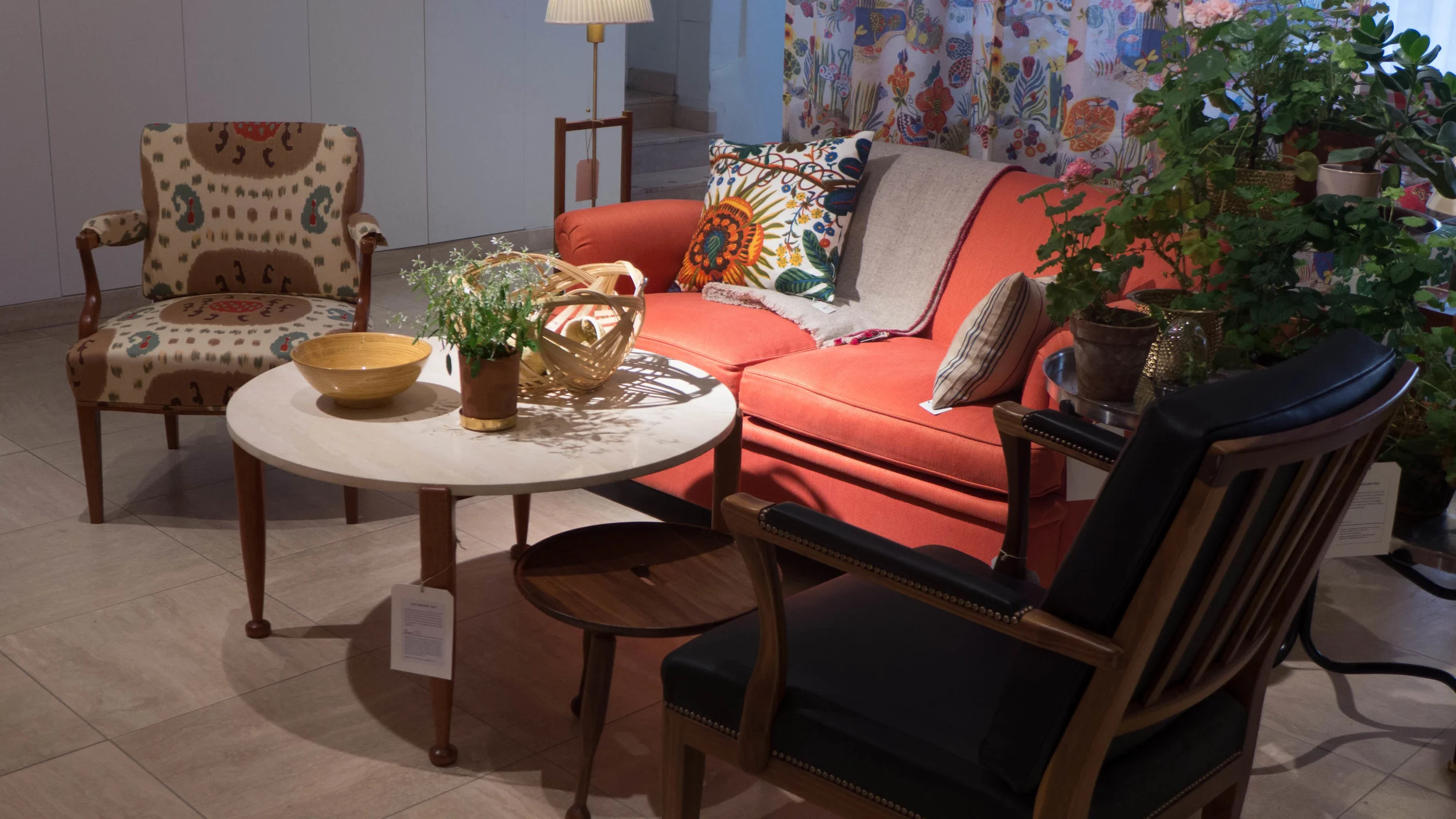
Svenskt Tenn - Stockholm store display
In terms of interiors and furniture I have to admit - or do I mean confess? - that I have no pattern in the apartment at all except for one rug. I’m certainly much more likely to buy Norrman or Muuto than Svenskt Tenn.
Then thinking back to the grey and black palette of the clothing I began to think about colour in Danish architecture and Danish interiors. If you ask any non Scandinavian about Scandinavian design then the first assertion, almost certainly, will be that Scandinavian style is about pale wood and white walls.
In fact, with the bright clear light here, very very strong colours can be used outside and strong dark colours are used for furnishing fabrics and by long tradition rich solid areas of colour can be used on walls for interiors. Restraint and careful choice of simple colour combinations should not be confused with either caution or conservatism or lack of colour.
I have just bought a copy of Norwegian Design 2014-15 from Young Rascal AB. I’ll review it here in the next week or so but, looking through that, the very last thing you could suggest is that the Norwegian use of colour is timid.
Just by coincidence today I was looking at the on-line site Remodelista and there is a very good post there on the home of the colour designer Caroline Gomez. Ok she is French but her home and office does show just how striking classic Scandinavian furniture looks against bold colours that are used confidently.
