a Guggenheim for Helsinki

In The New Yorker on the 12th May there was an astute article by Ian Volner about ongoing uncertainty with the plans for a new Guggenheim in Helsinki. He sets out the problems and quietly poses the questions although, quite rightly as an outsider, he does not and can not suggest a solution but what I found interesting was that his one firm conclusion was that “ … the Guggenheim, with its global reputation at stake, may need Finland more than Finland needs the Guggenheim.”

Is a mega museum, designed by a star foreign architect and showcasing international art, a long-term and sustainable benefit for the city? Is this simply a matter of having to be pragmatic … balancing an income from fickle tourists needing to be entertained before they pay out a dollar or a yuan against gaining what might be an important resource for Helsinki that can be used to inspire young Finnish artists and aspiring Finnish architects? Surely the Museum of Design and the Museum of Finnish Architecture in Helsinki already do a pretty good job of that.

Certainly it would be too high a price to pay if a new building dominated the harbour visually or changed irrevocably the balance of an urban plan that has evolved slowly in response to local and regional needs and pressures. And it would certainly be too high a price to pay if, after an initial enthusiasm, the paying audience moved on to something they thought was newer or more entertaining. Surely, in order to be sustainable in the long term, a new museum has to have at least some local relevance.

I first went to Helsinki in 1974 and returned for the first time forty years later so perhaps I should not make comments about a country I cannot claim to know well but I hope it is reasonable to make one observation: Finland in 1974 seemed cautious and reserved … an amazing and beautiful country and one with strong, distinct architecture based in part on natural and available building materials - in part on the countries own history - in part on the style and influences of it’s neighbours and, in part, in a strong belief in its own contemporary designers and architects. Finns may have seen themselves as isolated but, essentially, they were also self sufficient.

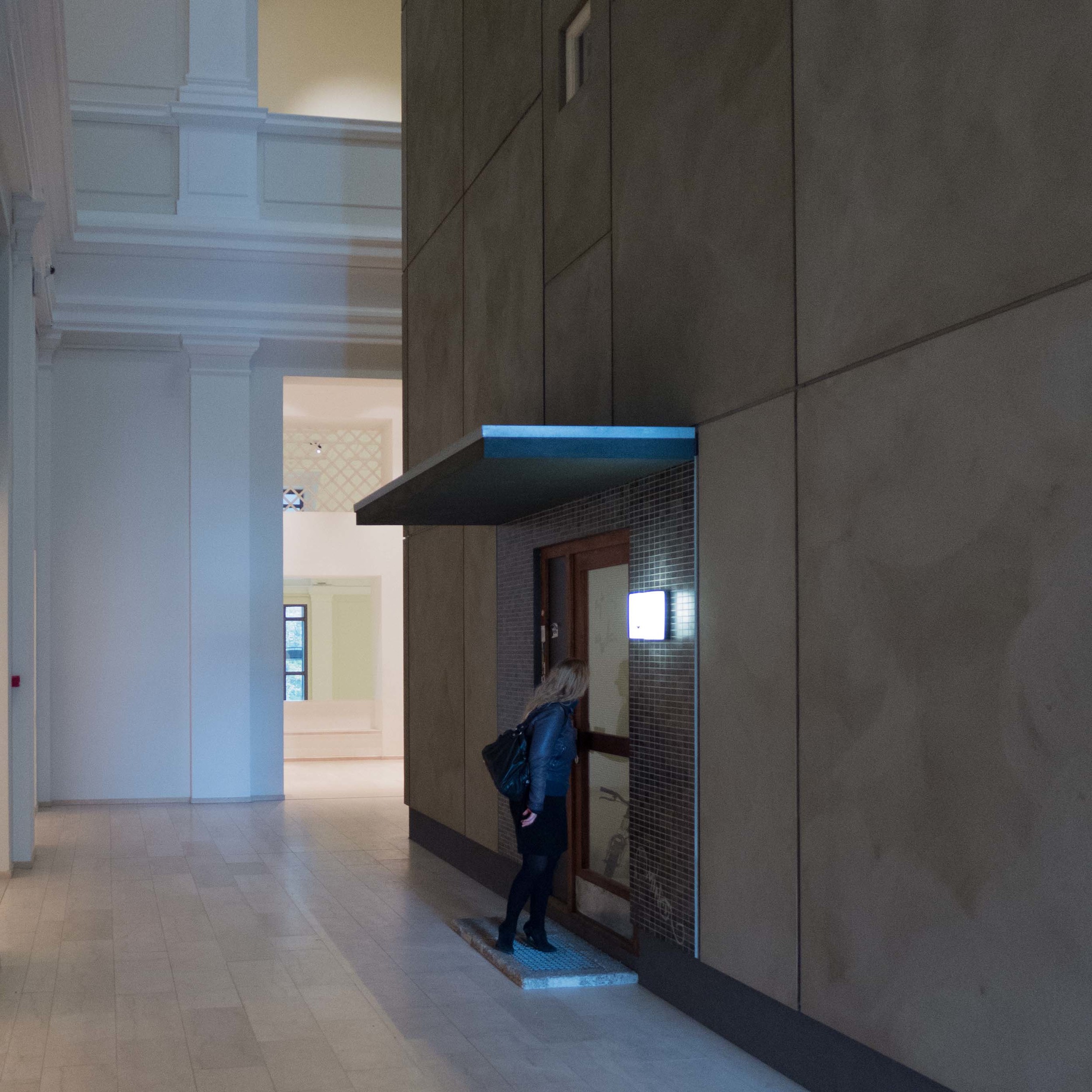
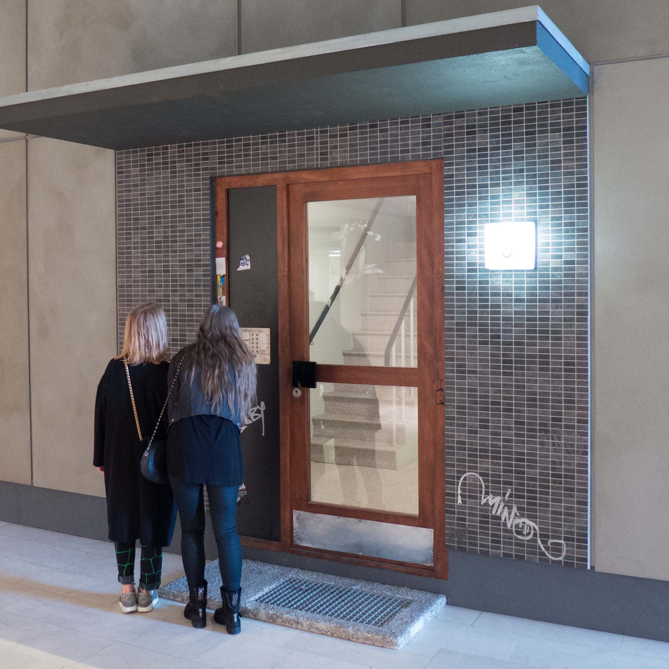
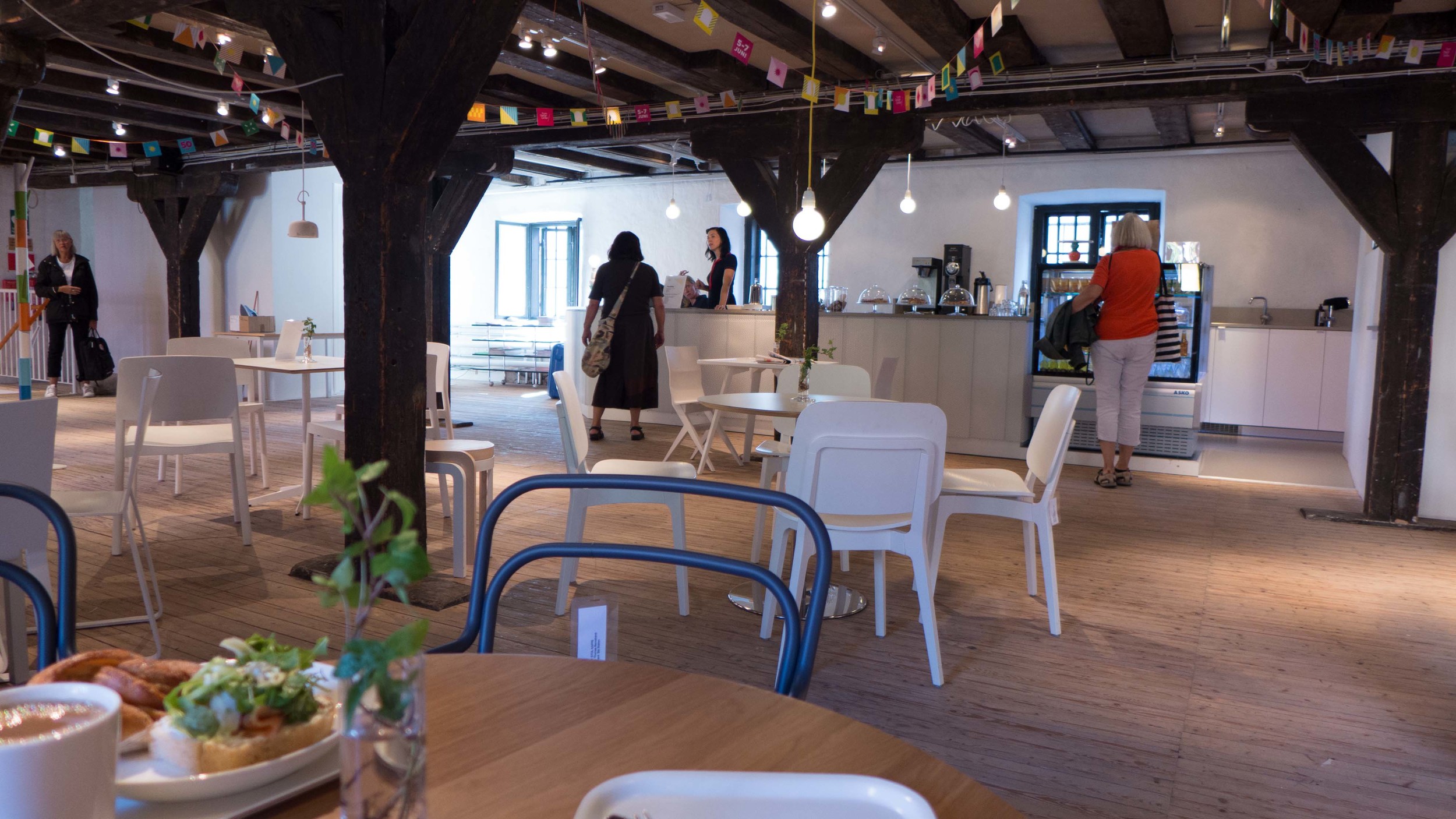
Wandering around the design quarter of Helsinki forty years later that was all still true but there seemed to be a new and clearly justifiable sense of self confidence along with a friendly openness and a willingness to both explain and to discuss what was being built or made but it was, quite rightly, with a strong hint that those designers and makers were proud of what they are doing. You are very welcome … I sensed I was being told … but if you don’t like it that is your problem and not ours. I repeat, it was something I sensed - not something anyone said but the team from the Guggenheim should be and probably by now are painfully aware of that.

Part of the problem is the proposed site. It is close to the city centre and is certainly prominent and handy for tourists arriving by cruise ship but it is a curious mixture of urban architecture and relatively small-scale maritime buildings on the quayside backed by trees and it is certainly not an abandoned industrial site where any solution would be better than nothing. A building or group of buildings that is grandly civic or something that is vernacular in scale would both be inappropriate for the setting but then also surely a pastiche of maritime buildings would hardly seem to be honest or appropriate as a home for international art and a magnet for tourists.

One building I visited in Helsinki that still seems physically like a slightly awkward visitor is Kiasma - the museum of contemporary art. As a facility a new Guggenheim must be relevant and useful for and used by the citizens … otherwise it simply has the role of a new Hilton or a new Marriott: something a local might or might not use but probably not and is essentially something that is there for the visitor who arrived yesterday and will be gone tomorrow. The new Guggenheim, as a structure, has to be firmly anchored in the design ethos and architectural traditions of Finland … if not it will be a bricks-and-mortar version of an ugly cruise liner in the harbour that everyone hopes will sail away.

Clouds from Kvadrat

There is a new installation in the entrance hall of Designmuseum Danmark.

Clouds from Kvadrat is a set of fabric tiles linked with rubber bands and here hung from the ceiling. The system is by the French designers Ronan and Erwan Bouroullec and is commercially available in two fabrics and eleven colours.

Clouds

Peter Doig at Louisiana

The exhibition of works by Peter Doig, at Louisiana Museum of Modern Art until 16th August, includes many large paintings and is displayed in the set of galleries that run under the main central lawn of the museum.

This is one of the Alice-Through-The-Looking-Glass areas of Louisiana where, after a series of rooms beyond the museum shop, you come to a wide and well-lit staircase that spirals down to a series of curved corridors and very large gallery spaces where there is little that gives you any sense of direction. At the end of the series of rooms is a matching spiral staircase, in grey marble, and ascending you find yourself on the other side of the garden, now outside the restaurant.

During the week, from Tuesday through to Friday, Louisiana is open until 10pm. The sculptures in the gardens around the gallery are amazing in the evening light and it is possible to have supper there and sit on the terrace looking out over the sound to the Swedish coast. A pretty civilised way to enjoy a long warm Danish Summer evening.

Peter Doig, Louisiana 

DAC on line


The on-line site of the Danish Architecture Centre is an amazing resource for information about modern architecture and landscape and urban planning.

There is, of course, the obvious information about the Architecture Centre itself, on Strandgade, with opening times and information about exhibitions but that is just the access point to a huge amount of data with three separate sections under the headings DAC&LIFE, DAC&BUILD and DAC&CITIES although, of course, opening and moving through and between the various sections is fluid.

Under the section DAC&Life is the Copenhagen X Gallery with descriptions, photographs and basic information about new buildings in Denmark including basic data about the architects, engineers, client, square metres and even cost that is often difficult to pull together from other sources.

Buildings can also be tagged and added to a personalised guide book with maps and then downloaded as a pdf or your personal list can be sent as an email to others so useful if you are planning to look at a number of buildings with a number of friends or colleagues.

There is information about new buildings in Copenhagen and its immediate area and about Aallborg, Aarhus and Odense and buildings are indexed by year, by architect, by location and so on and can also be found from maps.

There are even pre-recorded pod guides for running or walking. For at least four years DAC has organised an annual architecture run of 6 KM in which up to 1,000 people took part. Have to confess that my first reaction was only in Copenhagen could you find something like that.

Exhibitions at DAC can be tracked back to 2003 so again it is an amazing resource now and a very good starting point for research about contemporary Danish architecture and planning.

There are also other interesting pages like the book lists … for instance one compiled recently by Kim Herforth Nielsen of the major architectural practice 3XN.  Short comments about each book explain how the books have influenced the work of the practice.

News links cover not just DAC and Denmark but news about major projects and exhibitions and symposiums around the World with a strong focus on the development of cities ... not just completed buildings and work in progress but discussions about planning, the theories of what could or should be achieved through new architecture and what is or is not sustainable in our built environment.


Danish Architecture Centre, Strandgade 27B, DK 1401 Copenhagen K

how can we understand more about good design?

Just before Christmas I spent a good part of a day looking around Arbejdermuseet, the Workers’ Museum in Copenhagen, and, following the chronological sequence through the galleries and displays, I ended up at the basement level looking at reconstructed interiors of some fairly typical Danish homes from around 1960 including the workshop shown above. 

It started me thinking … ok it started me reminiscing and then it started me thinking. 

When I was a boy nearly every home or rather, I suppose to be more precise, nearly every father had either a garden shed or a garage and the garden shed or the garage had a work bench and at least a few tools. The end of our garage looked much like this but not quite as neat … my father got curiously animated when he came across men who had peg boards with hooks and each hook with the outline of a tool that it was supposed to be home to. To be honest, my father hated DIY and in our garage, although there were hooks and plenty of tools, it was a matter of rummaging in a box to find something and inevitably it was going rusty or it needed sharpening. But the point was that when shelves were needed we went to a timber merchant for wood and an ironmonger for brackets and screws and somehow the shelves got put up.

My grandfather was better organised and had an amazing garden shed that I loved as a kid. Generally, he was banished to the shed to smoke - mainly because my grandmother was trying desperately to not give in and start smoking again - and I’d go out there with him. He had amazing stocks of screws and bolts, mostly kept in old tobacco tins, and weird and wonderful things that had been saved or salvaged and a large basket under the work bench with scraps of wood. Having lived through two wars and the Depression, he never threw anything away if there was even an outside chance he could find a new use for it. While he had a cigarette and I sat up on a stool, he taught me, by showing me, what oak is like and what the different pines are like and how to sharpen a chisel and by the time I was six or seven he had shown me how to mark out and cut a mortice and tenon joint and a dovetail and taught me how to glue or pin or use dowels to fix bits of wood together. 

side table from GAD

the drawers have proper dovetails

When I went on to senior school, I went to a grammar school where the focus was ostensibly on academic work but never-the-less we had amazing workshops and all the boys had to do carpentry, metal work and technical drawing so I learnt how to use workshop tools like circular saws; was taught to hammer and shape copper; did enamelling and metal cutting and soldering.

A couple of days before I stood lost in thought in the basement of the Workers’ Museum and got all misty eyed about 3in1 there had been an article in the news about a major DIY chain in England shutting half their outlets. 

So does anyone have a work bench now and does it matter if people no longer put up shelves or know how to cut a butt joint? … and no that’s really not a euphemism.

Well - actually - yes it does matter.

And before I go any further I wasn’t going to say that men should do manly things because everyone should understand a little about materials and about how things are put together and how they work. How can we be discriminating buyers of design - how can we begin to see if something is good or bad design - if we don’t understand how and why it was put together in that way? You don’t have to be a brilliant cook to appreciate a meal in a great restaurant but understanding a little about food and flavours and the cooking process helps you to appreciate just how fantastic the meal is and the more you understand music, whatever style of music you are into, the more you can appreciate it. Mobile phones, music players, computers and cars are now way beyond the stage where DIY repairs or modification are possible but it still helps to understand a little when confronted with a line of options when you go to buy something. 

So understanding timber; knowing where mdf should or should not be used; being able to spot cheap chrome plating; understanding where or when or why wool or cotton or linen is most appropriate for upholstery or seeing immediately that a drawer is shoddy and badly made and will pull apart within weeks all makes us better consumers and makes us more likely to be able to see where something is well designed and well made or badly designed and badly made and a false economy.

I’m not suggesting that every one should have a work bench and not suggesting that everyone can or should want to put up a shelf but we should be worried that the internet and the quick-fix of purchasing something new as soon as something breaks have infantilised us and there are certain life skills children need along with being able to swipe an index finger across a screen to find the right app. Is there an app that tells you that the printed veneer on that fake walnut coffee table will mark and lift as soon as you put a hot coffee cup anywhere near it? If something breaks, will that fixing fix it? Which glue does which job? Will that shelf bend or split as soon as something is put on it?

If more buyers are to understand what makes a good design good and that in part something is expensive because it is well made in high-quality materials then designers and design shops have to point out, be it in a subtle and discrete way, why it is good and well made and maybe even why the cheaper version is cheap.

If my father thought a man had been emasculated if he had the outline of a fret saw around a peg on a board to show him what should be hanging there, I’m not sure what he would make of someone going into a tizzy and typing angrily on Twitter because there they thought that a grub screw was missing from their flat pack. And no that isn’t a euphemism either. Maybe it should be.

know your timber

Selection of timber samples on the FSC stand at northmodern

Several exhibitions I have been to recently have had a display or section about timber showing different types of wood.

At Northmodern in January, the FSC (Forestry Stewardship Council) display of student work had a simple set of samples of timbers. Identifying what the wood is has to be the first stage of determining if it is sustainable and also if some trees can no longer be felled then it is important to find other timber that might do a similar job.

Practice Makes Perfect, an exhibition at Designmuseum Danmark in Copenhagen about the furniture designs and teaching of Kaare Klint, has on show some of the samples of timber that Klint had in the teaching collection here. He knew that it was important for students to understand how different timbers not only looked different but had very different qualities and properties. Different timber was used for different parts of a piece of furniture or for different types of furniture.

samples of types of wood that Kaare Klint used for teaching

In the next gallery at the design museum is an exhibition about cupboards, cabinets and chests - Skuffer, skabe og skrin - and here there is a small but important section on timbers for furniture making with identified samples of many of the timbers found in the exhibition … each sample has half treated with a sealant or finish to show how the grain and colour changes from the appearance of the plain smooth and sanded wood. There is also a fantastic line of science-laboratory jars filled with wood shavings and when you lift the stoppers you get a good sense of how aromatic some of these timbers are and a hint of just how amazing it is to saw or sand or plane some wood.


samples of wood, shavings from aromatic wood and historic woodwork tools on display in the exhibition about cupboards, cabinets and chests at Designmuseum Danmark


Wood_stock

The shop at Designmuseum Danmark sells quite a few beautifully-designed and beautifully-made pieces in wood and I came across this carpenter’s folding rule there.

Different timbers are used for each section and on the back of each section the wood is identified with a drawing of the leaf and a short list of the most common uses for that timber: each timber has different qualities, different grains, different colours that make them suitable for some uses and not others.

I can’t think of many better or easier ways to start learning about types of tree and types of timber.

Designmuseum Danmark - the building


Frederik’s Hospital was built in the 1750s during the reign of Frederik V from designs by the court architect Nicolai Eigtved and, after his death in 1753, completed by Lauritz de Thurah. There were four main ranges set around a large enclosed courtyard, generally of a single storey but with two-storey pavilions at the centre of the fronts to Bredgade (at first called Norges Gade) and Amaliegade on the axis of Amalienborg. Those central pavilions on the street fronts had high, hipped roofs and pediments with ornate carved reliefs over the central doorways. Both fronts were set back from the street with forecourts, iron railings and gateways onto the street with ornate stone piers. On either side of the forecourts on both street fronts were tall service blocks of two full stories above basements and with high roofs with dormers. There were also yards with service buildings down each side that were screened off and divided up by high walls and gateways creating an extensive complex.

detail of a map of 1761 from the collection of Københavns Stadsarkiv

The design museum was established in 1890 by the Industriforeningen i København and the Ny Carlsberg Museumslegat and opened in 1894 in a new building by Vilhelm Klein on what is now H C Andersens Boulevard. From the start, what is implied is that there should be a connection between industry and business and an aim to collect examples of the applied or decorative arts as a study collection for teaching to improve the quality of design and production.

Frederik's Hospital closed in 1910, with no clear new use and there was a rumour it might be purchased by speculators. In 1919 Councillor of State Emil Glückstadt bought the buildings and gave them as a gift to establish a new home for the museum.

The Museum director was Emil Hannover (1864-1923) and a competition was held for “the Future Home of the Museum of decorative Arts.”

There was not an outright winner but the committee preferred the scheme proposed by Ivar Bentsen, Thorkild Henningsen and Kaare Klint. Henningsen withdrew from the project (because of an ongoing personal dispute with Hannover) and the contract was signed by Bentsen although in the end most of the design work was completed by Klint as the project architect … not just deciding on the major arrangement of the internal spaces but designing the main features such as the four new staircases, based on appropriate 18th-century models, determining the form of the display cases and designing library fittings, doorcases and doors and even handles and hinges.

However, the museum also commissioned work from other major designers of the period; G N Brandt produced the scheme for the courtyard - Grønnegården - with paved alleys and the planting with lime trees; lamps for the new museum were by Poul Henningsen based on a lighting system developed for the World Exhibition in Paris in 1925 and Mogens Koch and Ole Wanscher designed the display cases following a system of basic cube units devised by Klint. The cases were made by the master cabinet makers N C Jensen-Kjær and Rudolf Rasmussen, Otto Meyer and Jacob Petersen.

view of one of the galleries

drawings by Kaare Klint for door fittings

With the death of Hannover in 1923, Klint took over the responsibility for organising the display of the collection. He was clear that he did not want the museum collection shown in any form of room setting and his drawings for the main galleries show major items lined up formally along the spine walls opposite the widows to the courtyard. He saw the furniture as important works of art to have comparable validity to paintings and sculpture and to be displayed in a similar reverential way. He also designed shelving and storage systems for housing smaller items, drawings, photographs and other teaching collections such as the samples of different timbers. 

Klint established a studio in the attic of the museum, taught here using the collection and from 1932 had accommodation here where he lived until his death in 1954.

Amaliegade entrance to Designmuseum Danmark


This is the entrance hall leading from the forecourt on the Amaliegade side of the museum building and giving access to the main courtyard.

Presumably many visitors to the museum cross this space without taking that much notice but it shows clearly the taste and subtlety of the careful work directed by Kaare Klint when the buildings were converted from a hospital in the 1920s. 

The palette is a mixture of soft greys and cream or stone colours with a mixture of materials contributing not just colour but texture with marble floor tiles, wood blocks through the carriageway itself and natural lime-washed plaster. With the marble skirting and simple panelled doors the decorative scheme is restrained, practical and elegant.

Fur - An Issue of Life and Death


At one extreme you get people whose whole life revolves around design - names, companies, styles, the latest and the best - and at the other extreme people who insist that they know nothing about design - state categorically they are not interested in design - and normally finish by saying that they simply know what they like.  Curiously, it is often those very people, the non-designers - who are wearing the latest and the best training shoes and judge people they meet by the label on the jeans they are wearing. Fashion is the one discipline of the design World that people who do not work in the design World actually do often know about. 

Although I like buying good clothes and despite spending much of my time thinking about design, I’m not actually that interested in fashion - the reason why posts here about fashion are few and far between. I’ve never been to a fashion show and I can only recognise the most obvious designers if shown an outfit. For that reason, and also because I do have misgivings about fur used for fashion, I had not been to the current exhibition at the Nationalmuseet in Copenhagen - Fur - An Issue of Life and Death.

I was at the museum on Sunday in the shop trying to track down a book I wanted. Half way out of the door I thought that as I was there I might as well have a quick look at the exhibition and actually I was very glad that I did.


This is a beautifully presented and very clever and thought-provoking exhibition.

The two main displays face each other across the space with a curve of mannequins wearing traditional clothing from Greenland, North America, Siberia and Scandinavia facing an arc of figures wearing ‘fashionable’ clothing in fur.


At the centre - between fashion and tradition - are very informative displays about the raising of animals for pelts and about traditional methods of hunting and preparing the skins. The labels are completely unbiased, non-political, simply presenting the information and statistics without comments … for instance there is a straightforward map of Europe that shows which countries allow farming of animals for fur and those countries where it is banned.


Interactive displays around the edges are, in some ways, more interesting, encouraging people to decide. There are panels where you can feel samples of fur and have to guess if it is real or fake before lifting the flap to reveal the answer; there are interviews with people on the street asking them about what they think about fur for clothing and asking them why they are wearing natural fur or why they are wearing fake fur and there is one area where visitors can try on a range of fur coats and stand in front of a large projected image to take a selfie but by swiping a touch screen they can select different backgrounds for their photos from a grand interior - suggesting curiously that maybe fur was OK for grand people living in grand house? - to a fashion cat walk to an image that puts you in a fur coat standing in front of an anti fur protest.

The use of new technology here for information and for labels is superb - I particularly liked the use of a thermal imaging camera where you can hold in front of yourself or wear coats in different fabrics and in fur to see how much or how little body heat escapes - and fur does do a very good job of keeping you warm.

The traditional costumes are amazing both for their diversity and for the incredible craftsmanship. And there the ethics question is maybe easier because fur is a natural material and was all that was available. 

If you don’t want to confront your own political and ethical views about the use of fur for fashion clothing it is still well worth going to see the exhibition just look at those traditional clothes. 


The exhibition at Nationalmuseet continues until 22 February 2015

Statens Museum for Kunst, Copenhagen - a new forecourt


A major remodelling of the forecourt of Statens Museum for Kunst, the National Gallery in Copenhagen, has just been completed with the new landscape designed by the Dutch partnership of Sylvia Karres and Bart Brands, based in Hilversum, but also working with the Copenhagen architectural practice Polyform. 

Completed in 1896, the art gallery is set across the angle of its plot, at the intersection of Øster Voldgade and Sølvgade, so the forecourt is a large triangle. A formal arrangement of pathways radiating out from the entrance steps of the building has been removed completely with the aim to make the gallery much more part of the park behind. Dense planting at each end of the front has been removed and the pathways and open space now encourage visitors to move around the sides of the building to the lake and trees beyond. 

Now, the triangle of the forecourt has a number of elliptical areas of grass and planting and a very large area, with a raised stone edge, below the steps which in Summer will be filled with water but it can be drained to form a podium for outdoor gallery events. Presumably, in the Winter it has to be drained to prevent frost damage. 

Edging for the different areas, particularly the edge of the pond in dark grey smooth-cut stone, with eccentric inner and outer outlines creating an elegant thinning of the edge on one side, is of the highest quality and of course provision for bikes and for sign posts has all been very carefully thought through. 

The end elevation of the gallery towards Sølvgade has benefitted enormously from the new work - by taking away the established larger planting the junction between the original gallery and the addition by C F Møller, completed in 1998, now seems more dramatic particularly at dusk when lighting in the long cross hall - the full height top-lit space between the old and the new gallery spaces - is much more obvious. There is also a vista through, below the narrow end of the modern galleries, to the gallery of Den Hirschsprungske Samling, across the park.

The new pond at the front or really, as it is so large, the new lake is dramatic - as visitors leave the gallery and move down the steps the water picks up a reflection of the city sky line. People seem to have taken already to this more-open public space particularly when they are waiting to meet up with friends. It will be interesting to see how much the space will be used in the Summer … I suspect very well used. My only reservation is that the removal of relatively thick planting along the road edges has opened out and exposed the area so the traffic seems much more intrusive and, curiously, the road junction appears to be even wider and even more tarmac but presumably new planting will grow up to soften that.

What will be interesting over the next fews years is to see how this area of Copenhagen evolves as it has just been announced that work starts soon on linking the Geology Museum. opposite the art gallery, to the buildings at the north corner of the Botanic Gardens to form a new national museum of natural history. With the opening of new metro stations at Østerport and Nørreport in 2018 the dynamics of the area will change and the plan is for this area to be promoted as the museum quarter of the city … the vindication and completion of plans by the city dating back to the 1860s when the city defences were removed and the parks and the first new public buildings on the line of the embankments were created.


hand-painted decoration in historic houses

16th-century painted panelling depicting a stag hunt now in the castle museum in Malmö

Hand-painted decoration of many types has been used in the interiors of buildings in the region for centuries. Extensive works from the late middle ages survive in churches but various combinations of painted scenes with figures, floral and foliage decoration, panelling and woodwork painted to imitate marble or paint used to transform pine to look like expensive exotic timbers are all found and at very different social levels from small farmhouses constructed in wood in Norway through to manor houses and the grandest of palaces in Copenhagen and Stockholm. 

The Blue Chamber in the Mayor's House now in Den Gamle By, Århus

Good, well-restored examples can be seen in the collections of saved and reconstructed vernacular buildings in the open-air museums at Den Gamle By in Århus, Frilandsmuseet, north of Copenhagen, in the Norsk Folkemuseum in Oslo, in Kulturen, the museum in Lund, and in Skansen, the open air museum in Stockholm. Many privately owned houses throughout Norway, Sweden and Denmark have surviving painted schemes but the open air museums give easy access and the chance to look at and compare designs and techniques from different periods and most of the museums have displays with information about the paint used, often with a base of linseed oil, and the pigments used for the colours which are often strong and often surprisingly deep and dark.

Scenes with figures can be incredibly naive or amazingly sophisticated but are invariably a rich resource for details of costume and life style.

Interior of a house from Rømo on the North Sea coast now in Frilandsmuseet
An 18th-century scheme of decoration now in Den Gamle By, Århus

Recommended books:

Kirsti Brekke, Det var en gang en hallingstue ... Fra folkestue til antikvitet, Bastion forlag (2012)

Lars Sjöberg, Classic Swedish Interiors, Frances Lincoln Limited (2010)

Biography

Yesterday I went back to take another look at the installations by Elmgreen & Dragset at the National Gallery of Denmark in Copenhagen … I had been thinking about my first visit and wanted to look at the pieces again before the exhibition closes on the 4th January.

The three large-scale installations, under the general title Biography, feel initially very different in atmosphere and feel very different in the way the viewer looks at each one. The main work, The One & the Many, has been erected in the entrance hall of the gallery and is the representation of a stark, three-storey apartment building. There is an entrance door but it is locked so we are kept out and, as on any public street in any town or city, our view in is restricted to what we can see through windows. The rooms we can see into are completely realistic using appropriate furniture and curtains and personal possessions to make the viewer feel, almost too easily, that they can understand the ‘back story’ of what appears to be the sad, lonely and alienated lives of the tenants of the block. What is surreal is our position … we are outside and when we take our noses away from the window glass we are suddenly back in an art gallery.

The second gallery space is completely the other way round in that there is absolutely no sense of an exterior. There is a corridor and we have a choice of which way we turn but in the end we come back to same point anyway. There is a sense that this could be a characterless standard, scruffy and barely maintained government or town department with waiting rooms, ticket offices and even a toilet but there are no staff … no signs to tell us we have come to the right place. It is the extreme of de-personalised public space but everything is surreal. Everything is wrong and frustrating: one door has hinges and handles on both the left and the right side so could not open; another door opens to reveal another locked door immediately behind it; the basins in the toilet have the most weird plumbing and so it goes on. Again the sense is of alienation but this time ours on entering this parallel world.

The third gallery appears to be a continent away … Las Vegas, the ultimate city of escape and dreams ... a Las Vegas night … a fire escape with a bored teenager sitting there high up his legs dangling over the edge … a mobile home broken by a fallen sign … and … most disconcerting of all … the swimming pool of a motel beyond a chain-link fence … guarded by a snarling dog throwing itself at the fence … and with the body of a man floating face down. These are the images of a fractured and alien world … or at least alien to Copenhagen. I actually know Nevada fairly well and this violence and darkness is not so implausible there. For someone coming from western Europe then arriving in California, Nevada, the Mid West it can feel as alien and surreal as this. 

What has all this to do with a blog about design?

That’s why I went back. On my first visit I looked at the installations as I would many art exhibitions … as a fascinating insight into the view point of the artist and as an interesting comment on contemporary life … 

Then thinking about it I realised that much of the impact of the show and the way the artists get us to look and think is to view modern architecture, modern graphics, everyday furniture, popular taste and style, with the clinical, detached observation of a cartoonist or a satirist. Their view is not hard or unsympathetic - in fact just the opposite - but never-the-less they are detached and frighteningly analytical. Each room in The One & the Many has an inherent coherence that allows us to guess at the age, sex, character of the tenant. The wallpaper is right for the character they have created, the style of furniture or lack of furniture, the books and magazines or the lack of books and magazines, the pictures on the walls are all the things that character would have chosen … or rather … because the artists chose them we project onto the rooms our preconceptions about what a person like that would be like. That’s fine. We are above that out here in the real world outside the art gallery. We don’t judge a person on their clothes. We don’t judge people for their taste in carpets. Fine.

But actually look around you right now. Look at what you have bought recently.

In those rooms in The One & the Many even the food packaging, the typography of the books and magazines, the colours chosen were all consistent and are all so revealing. Do we really expose so much about who we are whenever we choose one product over another? Facebook and Google would like to think so.

Aldi or Irma, IKEA or Illums Bolighus, Berlingske or Politiken all judge us … and chose the typefaces, the colours, the sizes, the options and variations they choose to offer us … because they know us … or think they know us … or hope they know us … their core audience.

So successful design has to be about anticipation and manipulation? 

Is good design the design of an object that will end up in a museum collection? Or is good design the design that sells and allows the manufacturer to survive if not thrive? Is good design what we like or what a marketing man thinks we will like? Is good design the design of an object we see and decide we really must buy or is good design the object we buy because we have seen the ad that makes us realise we want it? Is good design the object that looks amazing or the object that works day after day in the background?

And finally - to flip it around - if we put up with bad design or, come to that, choose to buy something that we accept is badly designed ... what does that say about us? Generally I guess it is usually that we don't have the time, or the money or the energy to search out the alternative. In part, what Elmgreen and Dragset are saying is that as life becomes more difficult and people become more isolated then clearly good design or any choice between good or bad design becomes less and less relevant.

And on a lighter note I missed an amazing photo opportunity yesterday as I stood in the gallery looking up at the figure of the boy sitting high up on the fire escape wearing his hoodie and jeans and trainers. A teenager came into the gallery wearing a hoodie and jeans and trainers plus a baseball cap on backwards and he walked or rather scuffed along under the fire escape and peered through the wire fence at the body floating in the pool; shrugged; turned and scuffed out without looking up at the boy, or the representation of a boy the same age above him. I didn’t get the lens cap off my camera quickly enough to capture the moment. It was surreal. I felt old and tired ... alienated … an observer.


Biography, Michael Elmgreen and Ingar Dragset, Statens Museum for Kunst, Copenhagen

Continues until 4 January 2015

The One and the Many


If you visit Statens Museum for Kunst - the National Gallery in Copenhagen - the only way that you can avoid looking at The One and the Many is by not actually going inside the building as this colossal installation fills the entrance hall. 

That hall rises up through two storeys with a high domed ceiling and has galleries running around it and a modern staircase but this work from the partnership of Michael Elmgreen and Ingar Dragset dominates and fills the hall. It pushes visitors to the edges of the space.


It is a stark, dark, grey, concrete cube representing a four-storey apartment building or, to be more straightforward, what in England would be called a council block. There is an entrance door on one side with bells and name plates but you cannot get in because there is an answer phone and no one is in apart from a young man on a mattress on the floor in his room dead to the World or worse.

Some rooms are lit and let you look into the interior through the windows … not just at the ground floor but at the upper levels as well from the gallery. Each room, or cell, belongs to a different tenant … each room from its contents and furniture hints at a back story but above all shows you, the voyeur looking in, that the tenant is trapped. Not trapped in the room for only one room is actually occupied, but trapped in a life they are surviving or facing or coping with by dreaming or denying. There is the room of an old lady, or I presume an old lady, which is spotlessly clean with carefully washed net curtains and her knitting only just abandoned on the armchair; there is the sitting room of a man escaping by watching football on his TV with the coffee table covered in empty beer bottles and cigarette ends, a neighbour has a room set out with bland good taste but needing drama or whatever has the TV tuned to X-factor and, heart-wrenchingly sad, the kitchen of an immigrant from the far east with the poster of the woman they would like to be or want to look like and surrounded by everything that can be bought that is pink. Not pretty, soft pinks but harsh strong pinks. Like a Flemish or Dutch still life you have to keep looking further and further in to the image at the details.

If this all sounds grim it isn’t. If it sounds pretentious that’s my fault because of the way I’ve written about it. Everyone who lives in an apartment or is worried about ending up in a flat if they have to 'down size' or has aspirations to get away from mum and dad and get some independence should see this work. Anyone who tries to claim that they are not, above all, defined by what they own, should look carefully at this piece and then look around them when they get home.

At some stage it is also important to watch the film in a side gallery of an interview with the artists because there you begin to understand their observational skills and the way they use what is essentially the stripped-back but laser-sharp viewpoint of a cartoonist but with a very real sense of humanity to create the narrative for their tenants and in doing that make the viewer take stock. In the film at one point they admit that they feel as if they are outsiders and the whole point is that it takes an outsider to see what is happening in this way.

Visitors to the gallery eagerly look in through the windows or read the name plates on the entrance bells and laugh nervously about the piles of junk mail inside that no one has bothered to clear. One of the mail boxes has been forced open and left bent and un-lockable and that is in part what is brilliant about this work because just two years ago my mail box in the apartment where I was living then was broken into in just this way … it is that classic ‘shock of recognition’ that makes you feel that art has a message.

This is parody and there is real gentle, and mocking humour running through the ideas but what is haunting is that there is no hint of a future. That is what is grim. One window has no light but has a sign to show it is to let so new people will arrive. Is this The Hotel California? The style is hyper realism but stripped back and thin, almost hungry … or is that trying to read too much into it?

I spent a lot of time watching people’s reactions. Watching parents lift up children to look in through windows, trying to judge their reactions, but who was watching me?


The One and the Many was created in 2010 and before this was shown at the Astrup Fearnley Museum of Modern Art in Oslo. It will be at SMK until 4 January 2015 and is shown along with two other major installations by Elmgreen & Dragset under the title Biography.

Form Design Center Malmö

Form Design Center in Malmö opened in 1964 and is run by Svensk Form … the Swedish Association of Crafts and Design that was founded in 1845 and promotes Swedish design through their eleven regional associations. 

The Malmö gallery, shop and cafe are in an industrial building, a former grain store, in the centre of the city on the south side of Lilla torg.

Known as Hedman yard, timber-framed buildings on the square and on two sides of the courtyard date back, in parts, to the 16th century but the grain store, across the south side of the yard, was built in 1850. The cafe is on the ground floor of the grain store with a large exhibition space on the first floor with smaller areas for displays and information in the lobby. The extensive shop is on the second floor with offices and meeting rooms above.

There are some twenty exhibitions a year here as well as lectures and meetings and the shop sells a range of Swedish design and books on design. Their aim is to promote “a better life through good design” and to stimulate the development of design and “increase respect for the value of design.” It is important that their activities are directed equally at both design professionals and the general public.