Langebro - a new museum


Plans have been submitted to the department of Culture and Leisure for permission to create a new museum for Langebro with a new café in the substructure of the bridge on the Amager side.

There has been a bridge here since the 17th century but the present bridge designed by Kaj Gottlob was completed in 1954.

On the 17 January 2019 there will be a meeting about the bridge and the new museum at the nearby Kulturhuset down the harbour from the bridge and there is information about the bridge and about the proposed museum here.


update on the new bridge over the harbour

from the Christianshavn side of the harbour


On the Christianshavn side of the harbour, the paving and the cycle route with a bollard to separate out those coming from those going have all been laid out but the base for the new bridge has been covered temporarily with timber.

Round concrete piers for the bridge and the barriers to protect those piers are finished and on the far side - where the bridge lines up with the end of Vester Voldgade - next to BLOX - there are even traffic lights where cyclists will have to cross Christians Brygge - the main road with heavy traffic that runs along the quay. Again the base where the bridge lands on the city side has been covered for now with boarding. All it needs is the bridge … or rather all it needs is the remade bridge after the first version was dropped from a crane as it was being shipped from the manufacturer in the Netherlands.

There was a competition to name the new bridge and the most likely name seems to be Lille Langebro or Little Long Bridge as it crosses the harbour beside the main road bridge that was built in the 1950s.

Historic maps show that the new cycle bridge is on the line of an earlier Langebro so should it be the New Old Long Bridge? When the ditches of the city defences were filled in around 1870, a line of new apartment buildings were constructed along the line of bastions on the outer side of Vester Voldgade and H C Andersens Boulevard was laid out between those buildings and the Tivoli gardens. The map below from the 1860s shows, towards the top left corner, the old west gate to the walled city in the area of the large square in front of the town hall that was built around 1900.

Nytt Rom 67


The usual good mix of short book reviews, assessments of new products and so on with longer articles on a number of interiors including a review of the Hotel Sanders in Copenhagen.

This is called the Warm Modern Issue and looks at a distinct trend in Scandinavian interiors, identified as moving away from the simple uncluttered or even slightly spartan rooms - the white walls, undecorated furniture in bold shapes and bare wood floors usually associated with design from the region - to rooms that have more in them and reflect the individual. In the editor's phrase "confident personality and comfort, heavy curtains and big sofas, dark veneer panels, décor, colours and chairs not necessarily from a well-known designer."

Hotel Sanders, just off Kongens Nytorv in Copenhagen, certainly has a mixture of furniture of different styles and periods and a lot of books and ornaments and Det Blå Hus / The Blue House in Kongens Lyngby north of Copenhagen has an extraordinary room with books stacked high up into the roof space.

An older apartment in Oslo by the architects Grethe Løland and Harald Martin Gjøvåg has walls painted mainly in blue in various shades from mid blue to midnight that gives them a good background for a range of classic mid-century and modern furniture. Any heaviness in using such a strong palette of colours is offset by lighter woodwork - particularly dado panels - and by ornate white plaster ceilings.

There are plenty of simple and uncluttered interiors and even some interiors with plain wood boarding in this edition of the magazine if you are still not ready to move across to the idea of more dramatic and moody Scandinavian interiors.

Nytt Rom

Living Coral - Pantone colour of the year 2019

Pantone Color Institute has just announced their colour for 2019 and it is or, to be accurate, it will be Living Coral.

The Institute is a unit within Pantone that "highlights top seasonal runway colors, forecasts global color trends, and advises companies on color for product and brand visual identity."

This is where, I have to confess, I'm out of my depth. I understand fairly well the role of colour in architecture and furniture design and I admire and appreciate architects and designers who have an astute sense of colour and express that in their own work. I can see also that certain colours come into fashion and certain colours become associated with a designer or a period and some colours drop from wider favour.

But is that all too rational?

Can there really be a zeitgeist tone? Can there be a spontaneous decision by enough people to find a ubiquitous colour that works for most in most situations now but then next year doesn't?

Even Pantone suggest that they chose the colour of the year by looking at trends so maybe it's more about reaching peak Coral next year from a slow start but accelerating the build up of demand.

Or is choosing a colour of the year about giving fashion houses a nudge in one direction as they drown under colour swatches unable to decide exactly which of millions and millions of colours anyone and everyone will want to buy this Spring

To be cynical is it simply about trying to herd consumers towards a colour?

Or does a choice of colour still always come down to personal taste? … Though even using that word taste means stomping onto a minefield because it is loaded with the implication that if there is good taste then what is bad taste and who has bad taste and who is to arbitrate? Or is it better to talk about someone of limited or restricted taste?

And of course personal taste in colour or, rather, having singular and peculiar taste in colour is fine if you design and make and dye or paint for yourself but more difficult if you buy something when choice is limited to what is available.

Good taste or bad taste and how we react to colour is incredibly complex … our choices of colour for our clothes or for objects for our own homes can be because they remind us, in a good way, of events and people and things from our past while our reaction to colours we don't like are often because of their association with objects that have triggered an inexplicable prejudice. I really don't like lime green (except on a lime) and I'm not keen on scarlet but have no idea why.

It might be simply that I find it difficult to understand a colour chosen just for one year because I write about furniture makers and architects so about work with a longer time frame … few of us repaint and refurnish our homes completely every Spring … although, sometimes, I wish some architects would remember that people will be looking at their buildings for the next forty or fifty or more years because then they might not have chosen that colour.

Maybe it's just that I don't understand the fashion industry or at least the part that focuses on producing today what you will want tomorrow to replace what you wore yesterday.

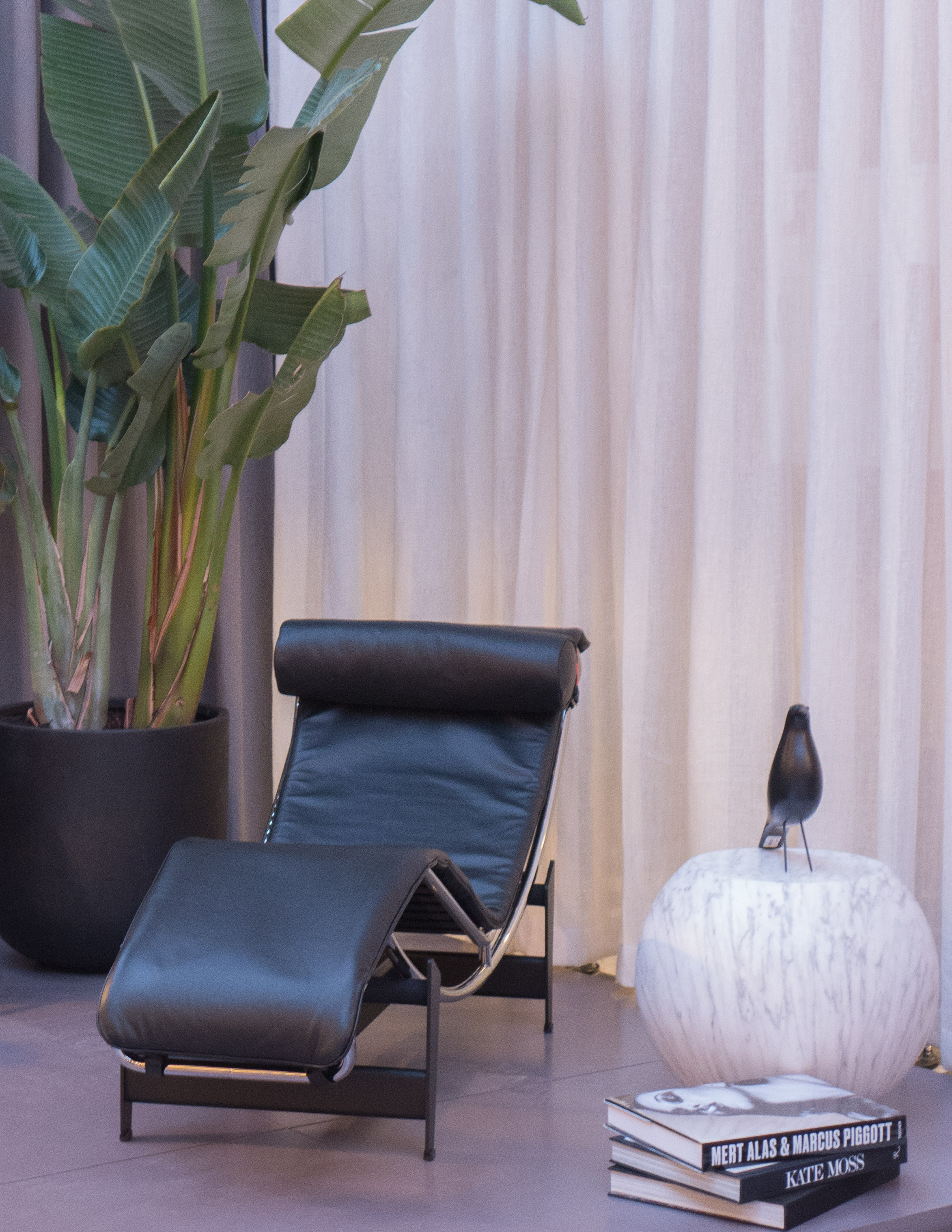
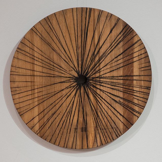
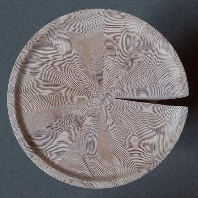
Maybe I can't get my head around the idea of a colour of the year because although I like well-made clothes and although I do know that certain shapes of shirt collar or width of trouser leg show everyone I've had some clothes too long, I suspect it's more to do with me being more interested in materials and textures and for furniture and clothes, that means natural materials like wool and linen and in natural colours … or at least colours pretending to be natural colours.

Yup I'm staid and boring but I will keep an eye open for anything that appears over the coming months in Living Coral but don't be surprised if I'm still only wearing black and grey as we hit 2020 and the next Pantone colour of the year.


Pantone

Living Coral.jpeg

colour of the year 2019 Living Coral

 
Pantone Ultra Violet 2018.jpeg

2018 Ultra Violet

Pantone Greenery 2017.jpeg

2017 Greenery

Pantone Rose Quartz 2016.jpeg

2016 Rose Quartz

Pantone Serenity 2016.jpeg

2016 Serenity


Over the last few years I've made a note of each Pantone colour and filed away a swatch and thought about writing a post but then changed my mind worried that it was getting into dangerous territory including having to think about taste and fashion. To be honest I actually quite like Living Coral … sort of warm and keeping the right side of brash … not that I can see me wearing it or sitting on it or eating off it.


V/ Strøget … Paustian are back in the city centre


Ole and Monika Paustian opened their first furniture store in Vesterbrogade in Copenhagen in 1964 but in 1987 Paustian moved out out of the city centre to Nordhavn - to the North Harbour - to a striking building that was designed for them by Jørn Utzon.

In December 2018, a Paustian store was opened on Lille Torv in Aarhus and at the beginning of this month, in December 2019, the company opened a second store in Copenhagen at Niels Hemmingsens Gade 24 - and that brings the company back right into the city centre.

Called V/Strøget, the new store is a block back from Strøget - the famous Walking Street. Head for Helligaandskirken - the large brick church that is at about the mid point of the Walking Street - and Niels Hemmingsens Gade runs back along the east or right-hand side of the churchyard with the new Paustian store one block back in a large and dramatic building on the corner and overlooking the church yard.

The building dates from the 1860s and was a bank but it had been empty since 2010. Restoration and the adaptation of the building has been by Årstiderne Arkitekter. Many of the fittings from the bank have been retained including high vaulted ceilings in the banking hall, supported on elegant fluted Corinthian columns, and hefty woodwork and panelled doors to offices that were around the banking hall but it is the huge steel doors of the bank vaults and blocks of safe deposit boxes that are a real talking point.

In some areas of the shop, walls are lined with marble and in a labyrinth of spaces and odd staircases you begin to wonder if the builders had somehow broken through a wall and into a Turkish bath house next door. Presumably the narrow staircases were the way that bank staff got down to the bank vaults from the behind the counters or from within the offices.

The Paustian store at Nordhavn is the epitome of Scandinavian mid-century cool - calm and rational with an excellent restaurant and with views out over the yacht marina. The new store could hardly be more different with walls in some areas painted deep blue and with amazing lighting and irrational spaces where you suddenly come across steep narrow staircases leading to catacomb-like rooms. This is about showing that Danish design can be much more dramatic … not design noir as such - to pair with the Scandi noir of film and TV - but certainly much more about the potential mood of an interior.

As out at Nordhavn, here Paustian have mixed the best of International furniture with the best of Danish design but there is also a clear plan to attract in general customers with selections of gifts and carefully-chosen books and cosmetics and so on. There is not a restaurant within the store but there is a bar from Mikkeller.

The Paustian store at Nordhavn has been, until now, rather out of the run of things. Other Danish design companies have moved out to Pakhus 48 although they are a hike away beyond almost impenetrable building works for an extension to the metro and for new apartment buildings although once the new metro line opens next year, it will make a trip out to Nordhavn quicker and easier.

But Paustian is not just back in the city after almost thirty years but, almost overnight, or at least that is how it feels, this large city block - until a couple of years ago the main central post office - has been transformed into the up-market hub for the very best of Danish furniture. The Republic of Fritz Hansen are in the adjoining building and Fredericia are at the top of one of the other buildings in the block so are also close neighbours.

The next and important stage of construction work, will come as the refurbishment of all these buildings is completed because developers, planners and the city have agreed that narrow streets on either side of the block - Løvestræde and Valkendorfsgade that run back from the main pedestrian street of Købmagergade - will be closed to through traffic and all spaces for parking cars will be removed to extend the pedestrian area.

Surely the consequence will be more people walking through - more footfall - and the smaller properties on the sides of these streets facing towards the post-office block have new opportunities to attract in these new customers for this new design quarter.

Årstiderne Arkitekter
Paustian


Spanish Chair by Børge Mogensen 1958

photograph taken at the showroom of Fredericia in Copenhagen


Børge Mogensen - the zebra skin and the wall hanging suggest that the photograph was taken in 1958 on the exhibition stand of the cabinetmaker Erhard Rasmussen at Kunstindustrimusset


designed by Børge Mogensen in 1958
shown by Erhard Rasmussen at the Cabinetmakers’ Guild Exhibition at Kunstindustrimuseet in Copenhagen in 1958

made by Fredericia

height: 67 cm
width: 82.5 cm
depth: 60 cm
height of seat: 33 cm

The Spanish Chair designed by Børge Mogensen was first shown in September and October 1958 at the Cabinetmakers’ Guild Exhibition at Kunstindutrimuseet in Copenhagen - now called Designmuseum Danmark. Produced by the Danish furniture company Fredericia - they are now celebrating its 60th anniversary.

The chair was shown in an interesting room setting along with a very large sofa upholstered in a giant check that was said to be large enough to sleep three and there was a zebra skin on the floor and models of yacht hulls across the wall … all with the title “furniture for a country house.”

They were described by the critic Johan Møller Nielsen as -

“the chair and couch for the consummate idler! It is hardly possible to make furniture more expensive than this. The whole interior is wonderful to look at and to to be in, and it would be well suited to be exhibited in one of the rooms of the ‘Louisiana’ museum of modern art as an example of the best furniture design of our age. But it is of no value whatsoever to the average citizen …”

Louisiana - just up the coast from the city - had only opened that August.

Even reading the criticism several times, and having typed it out, it’s not clear if this is praise or criticism.

Of course, it’s ironic that Børge Mogensen, is being damned here, apparently, for designing furniture that the average citizen could not afford, because he was and is best known not just as one of the great designers of his generation but through the 1940s as the head of design for FDB - the Danish Coop - when they produced well-designed modern furniture of a high quality and at the lowest price possible.

For the exhibition in 1958 the set of Spanish chairs were made by the cabinetmaker Erhard Rasmussen but the design was then produced by the Danish furniture company Fredericia who still make the chair.

To mark the anniversary of the Spanish Chair, Fredericia have relaunched the dining chairs, with and without arms, that were designed in 1964 that have the same form of set and back rest with leather stretched across the frame and held in place with large buckles.

Fredericia

TRÆ, SAKS, PAPIR / Wood, paper, scissors

Karmstol, Stitched wood and a Skammel and Massive weaving


An important exhibition of recent work by the furniture designer and architect Else-Rikke Bruun has just opened at the gallery of the Association of Danish Crafts and Designers in Bredgade .

review 

Danske Kunsthåndværkere og Designere

Else-Rikke Bruun


the exhibition continues until 20 December 2018
Officinet, Bredgade 66, Copenhagen

the new Louis Poulsen showroom - part II

the entrance side from the north and the building from the courtyard


Scaffolding on the new showroom and offices of Luis Poulsen has been taken down although some work is ongoing in the courtyard and on the neighbouring range that faces across to Paper Island.

This new home for Louis Poulsen provides them with design and office space but there are also areas for meetings with commercial customers and architects but, as with the old showrooms on Gammel  Strand, visitors can see the displays of lighting.

The high ground-floor space of this important 18th century warehouse was built to store supplies for the navy and has massive posts and beams. Apparently, it was a warehouse for salt beef so has the timber been painted white from the start? Certainly a coating with a wash of lime would have kept back mould.

In the showroom there are displays and information panels about the designers who have worked with Louis Poulsen including a small exhibition about the designer Poul Henningsen whose large Koglen or Artichoke Lamp was designed in 1958 for the pavilion on the Langelinie promenade so this year is its 60th anniversary.

Koglen / The Artichoke by Poul Henningsen 1958


Koglen / The Artichoke was designed in 1958 for the then newly rebuilt pavilion on the Langelinie promenade.

There are 72 leaves or petals to the light arranged in 12 lines of overlapping leaves or petals of graded size diminishing from top to bottom and angled out and down to control the light and obscure the light source to cut out glare.

With four sizes - of which the largest has a diameter of 840 mm and is 720 mm high with a weight close to 28 kilo - the lights have a dramatic impact - even in the largest space. The original lights had a copper finish although options now include versions painted white or with leaves in polished steel and, to mark the anniversary, there is a numbered edition in brushed brass.

Louis Poulsen

Langeliniepavillonen / The Langelinie Pavilion

approaching the pavilion on the path along the edge of the defences of Kastellet

Langeliniepavillonen from the south east


drawing for the pavilion designed by Jørn Utzon and a digital simulation of the pavilion for the exhibition Jørn Utzon - Horisont now at the Danish Architecture Center

 If you did a headcount - even if it would be for a rather odd census - then it's possible that the Pavilion on the Langelinie Promenade is seen but ignored by more tourists than any other prominent building in Copenhagen and simply because they are intent in their route march there and their route march back to see Den Lille Havfrue - the Little Mermaid - on the foreshore just beyond the pavilion.

However, the pavilion has an odd and complicated and fascinating history that should be better known … particularly as, but not just because, this year is the 60th anniversary year of the present building.

Langeliniepavillonen is on the site of a water gate on the outer defences of Kastellet … the 17th-century fortress that guarded the approach to the harbour from the sound from the north.

By the late 19th century, although there was still a garrison in Kastellet, the main defences had been established further out at Charlottenlund, some 6 kilometres to the north beyond Hellerup, and this thin strip of land between the sound and the outer water-filled defence of the fortress was used by the worthy citizens of Copenhagen as a promenade. The first pavilion here, built in 1885, was designed by Vilhelm Dahlerup for Dansk Forening for Lystsejlads (the Danish organisation for boating) but that was replaced in 1902 by a pavilion designed by Fritz Koch that included facilities for Kongelig Dansk Yachtklub (the royal Danish yacht club).

This was a popular destination for citizens just beyond gardens with sculptures and a walk could continue on to the long wide promenade along the sea side of the Langlelinie Kaj that had been built at the beginning of the 20th century as the outer quay of the new Free Port.

The pavilion was shelled and destroyed by the Germans in 1944 and it was not until 1954 that a competition was held to design a new pavilion. The chosen design was by Eva and Nils Koppel and the new pavilion was completed by 1958.

It is a slightly strange building … or at least it is strange for the location … starkly modern and of its period, so much closer in style and details of glazing and fittings to the contemporary design of the SAS Hotel by Arne Jacobsen than it was to the ornate pavilion it replaced that had polygonal end towers and ornate domes.

LP_SoMe_Historisk_18.jpg

There were large dining rooms in a huge low square box raised up and cantilevered out on all four sides over a lower floor containing the entrance and service rooms. A service road cuts under the sea side but with the room above connecting across to a terrace and the promenade walk. These public rooms had huge windows that look out over the sea or look across the outer water and banks of the defences of Kastellet.

A photograph of the dining room taken in 1959 shows the large lamps - the Koglen or Artichoke lamp designed for this building by Poul Henningsen.

The current exhibition at the Danish Architecture Centre on the work of Jørn Utzon has a model and a reconstruction of the design that Utzon submitted for the competition for a new pavilion. He proposed an amazing pagoda with outer walls of glass and the floors springing out from a central stem with staircases and lifts.

Surely his design has to be one of the most intriguing and spectacular buildings of unbuilt Copenhagen … those buildings for the city that did not get beyond the architects drawings.

Snedkernes Efterårsudstilling / Cabinetmakers' Autumn Exhibition 2018


This week will be the last chance to see the exhibition of the furniture by cabinetmakers shown in the amazing interiors of Thorvaldsens Museum in Copenhagen

the exhibition continues until 9 December 2018

Thorvaldsens Museum,
Bertel Thorvaldsens Plads 2, 1213 Copenhagen

the first afternoon of the Christmas market at Designmuseum Danmark


The Christmas market for design and crafts in the courtyard of Designmseum Danmark is organised as a collaboration between the museum and Danske Kunsthåndværkere & Designere - the Danish Association of Crafts and Designers. It is held on the first two weekends in December so on the 30th November and the 1st and 2nd December and on the 7th, 8th and 9th December 2018

Opening hours:
Friday: 12-17 
Saturday / Sunday: 10-17

The web site of Danske Kunsthåndværkere & Designere has a full list of the exhibitors.

Danske Kunsthåndværkere & Designere

Mød Vikingerne / Meet the Vikings


A redesign of the exhibition space at the National Museum in Copenhagen for the display of their collection of Viking artefacts was opened officially yesterday.

A first small square gallery has an introduction to this new display with images of three warriors and larger than life images of the king Harold Bluetooth and Tova his queen with the reconstruction of a throne. There are important items from the museum collection but displayed along with rubber portrait heads.

In the main gallery beyond, one long wall has further large figures of characters from the Viking period with a merchant, a housewife and so on and with each given a pen portrait or short back story.

My first reaction was that I wasn't sure if I was being introduced to Vikings warriors who were the first competitors from an early version of the Roskilde Festival naked run - but with fancy head gear - or to hipsters who have been living in Vesterbro since 875 AD and to kings and queens who were unbelievably attractive people who had just had a sauna and scrubbed up well before going to the equivalent of a casting session at HBO or Netflix but in the 9th century.

But actually, although I'm being sarcastic, I'm not about to launch into an attack although there has been some heated discussions in the press over the last couple of days about how authentic the costumes are or if some artefacts have been shown together when they are not contemporary and much about where on their bodies Viking men had tattoos … or not.

These costumes and setting for the reconstructions are by the Danish designer and author Jim Lyngvild although the museum has been quick to emphasise that these are based on current academic reassessments although much has to be speculative because, for instance, fragments' of rich silks brought back from the middle east have been recovered from excavations but few garments.

However, on balance, it is a good attempt to make us, the visitor, look again at our view of Viking life and Viking culture and particularly if that view is confined to stories of long ships and warriors wearing horned helmets who headed off on raids to plunder and pillage.

The story here draws attention to trade, culture and governance and looks at just how far Danish traders travelled and just how much was brought home from not just Baltic neighbours but through trade and conquest of Northern England; from settlements in Ireland and then south through areas of France and by the Viking traders travelling through the Mediterranean to trade with the Middle East to bring back valuable goods from as far away as Persia.

But the exhibition is also careful to point out that the vast majority of the population stayed at home with the wealthy taking care of large estates farmed by peasants and servants. The role of women was more nuanced than we might assume for with men away trading or fighting, aristocratic Viking women may have had a large degree of freedom and power. The exhibition also looks at recent ideas on the role of women in these expeditions abroad. Women would have travelled with the fighting ships to form new settlements and although some may consider the idea of shieldmaidens as a myth, some warrior graves have been identified as female graves.

I learnt a lot. For a start Viking men seem to have been fastidious about grooming and in one excavation of grave goods they even found silver ear spoons. I actually looked but IKEA seem to have dropped them from their catalogues sometime since the 10th century.

the new exhibition is at Nationalmuseet, Prinsens Palæ, Vestergade 10, Copenhagen

Nationalmuseet  / National Museum


Brooches that were part of a hoard from Hornelund near Varde. The fine filigree work and the form of decoration with vine leaves indicate that they are by Danish goldsmiths and date from the second half of the 10th century. 

Hoard from Terslev in Zealand with silver weighing nearly 7 kg including an astounding 1,751 coins. Buried in second half of the 10th century. A large bowl may have come from Persia showing the huge stretch of Viking maritime trade.

Sword from 800-900 AD found in Søndersø Lake in Northern Jutland. It has elaborate decoration with silver thread and fragments of the scabbard suggest it was not lost in battle but was possibly part of an offering of thanks.

Y-Stolen I nye jubilæumsfarver / The Wishbone in new anniversary colours


Carl Hansen & Son was founded 110 years ago and to mark their anniversary the company has released the Wishbone Chair by Hans Wegner in a range of eight new colours with Navy Blue, Russet Red, Deep Olive, Rosy Blush, Deep Burgundy, Oyster Gray, Forest Green, Midnight Blue and all with a semi-matt sheen finish.

This is one obvious way to give this classic design ongoing appeal and relevance for another generation of customers but it also shows just how important not just the colour but the exact tone or depth of colour, and the finish is in making a design look fashionable and appropriate for a modern interior.

As one single factor, colour seems to be more important than the form and the details of the piece and even, curiously, more significant than any perception we may have of the date of the piece or any gut feeling we may have of the style of a piece of furniture.

How do design teams select a very specific range of colours like this? Is there really a zeitgeist - colours that somehow we recognise as 'of this moment' or, being by inclination sceptical, is this marketing and advertising driven?

Some time ago I saw a photograph of a Wishbone Chair in matt black with the paper-cord seat in black and set against a wall painted with matt blackboard paint with a floor of wide and very pale unvarnished boards and I thought how incredibly elegant and how sophisticated it looked. I see a Wishbone Chair in a high-gloss, bright blue paint and my first reaction is that it might be good in a large kitchen but I'm not sure I like it even though it is exactly the same chair. How can our reactions be so strong and so instant and, apparently, based on colours alone?

The Wishbone Chairs in these new anniversary colours are available until 31 December 2018.


Carl Hansen & Son

paint from File Under Pop


The paint range from File Under Pop was photographed in the Stilleben shop on Fredeiksborggade in Copenhagen - close to the Israels Plads food halls.

There are 64 colours in different finishes of gloss from a matt with 1% gloss for walls through to oil paint for wooden floors with 5% or 40% gloss and an 80% gloss for interior woodwork. The paints are produced with Jotun - the paint company founded in Norway in the 1920s. The selection and range of colours is interesting as is the way they are presented as large swatches pinned up as if they are a mood board.

File Under Pop have their studio in Frederiksgade in Copenhagen - close to the Marble Church - and they specialise in tiles and wallpapers in strong colours. The tiles are made in Valencia and the wallpaper produced in Copenhagen.

File Under Pop
Jotun

Wulff & Konstali on Sankt Hans Torv


In the summer Wulff & Konstali opened their new food and coffee shop on the corner of Sankt Hans Torv in Copenhagen with design work by Studio David Thulstrup.

Although there are roads on three sides, the square itself is pedestrianised and has good landscaping with a large sculpture and water feature and is a very popular place for families and students to meet … particularly at weekends. There are several cafes and restaurants across the back of the square, the fourth side that does not have a road across in front of the buildings, and these have seats and tables outside on the pavement.

These buildings date from around 1900 and were and are stylish apartment buildings of that period … the square was quite an important intersection with a road running around parallel to the lakes - Blegdamsvej - and roads running out to parks and what were new suburbs that were laid out in the late 19th century. The area has seen a marked revival in the last couple of years with small galleries, a cultural centre - just beyond the café - and design companies moving to newly revamped buildings nearby.

The new food shop for Wulff & Konstali is at the right-hand corner of this back line of good 19th-century buildings, on the corner of the square and Nørre Alle, with the entrance on the corner itself under a distinctive turret of French style.

The interior is L-shaped and compact running left and right from the entrance with new pale blue tiles on the walls - but a strong blue rather than a pretty pretty baby blue - and with very pale wood for bent-wood chairs and for high stools as seating at the windows. This looks under stated and clean - crisp and stylish without looking stark or clinical.

Food displays at the counters are again as simple in form as possible - glass boxes without frames that drop down below the counter top - but again simple but well made with the tiling carefully set out to fit precisely as complete tiles at joins and angles and with steel beading at the edges that again is clean and sharp and stylish. This is a good example of good Danish design that is thought through in considerable detail but hides that effort so it looks just neat and simple. There are tiled niches for displaying bread and for coffee machines and so on.

There are also good details for the graphics used throughout with matt steel cut-out lettering for the main menu that shows the types of coffee sold and the blue colouring of the tiles is taken through labels and price information so all in all a clever branding exercise as much as the design of an interior.

A deep mauve tile for the floor is taken up one course to form a kickboard for the counters and the same colour is used for the wood work of the entrance door and architrave. Lighting is also distinctive with thin loops of neon tube regularly spaced across the seating area - rather than down the length that would emphasise the relative narrowness - but also there are recessed lights.

This is, without doubt, top end design … David Thulstrup worked for Jean Nouvel in Paris and then in America before setting up his own studio in Copenhagen in 2009. The studio works on residential design and product design but seem to specialise in retail and hospitality … so recent projects include interiors for the new NOMA restaurant.

Wulff & Konstali
Studio David Thulstrup

note:

Wulff and Konstali food shops all have a similar menu of their own really good cakes and distinctive bread and savoury food so there is a consistent menu of a high quality in all their shops but then, in a  clever way, each coffee shop is thought through to be appropriate to it's neighbourhood. My regular stop is W&K on the corner of Gunløgsgade and Isafjordsgade in Islands Brygge, that is small and comfortable and relaxed in a way appropriate for this area that is primarily residential whereas the food shop and kitchen on Lergravsvej in East Amager, south of the city centre, has their main kitchen so that it can be seen through windows from the seating area but this is a fast-developing area of very new apartment buildings close to the beach and among factories that are being converted so that café has a rather more industrial look and a lively buzz that seems appropriate. Clever. There is also a W&K shop in an up-market shopping centre in Hellerup, the area along the coast immediately to the north of the city. 

The Sympathy of Things


Perhaps it seems odd to recommend here a programme on BBC Radio about design when it was not specifically about architecture and design in Denmark but The Sympathy of Things that was first broadcast at the beginning of November raises what seems to me to be incredibly important general points.

The two programmes were presented by Amica Dall and Giles Smith of the architecture collective Assemble and they explored ideas about the designed and manufactured world and considered a wide range of problems about our relationship to the things that surround us everyday from "pavements and handrails to hairdryers and cereal bowls" and, along the way, asked the head of design why IKEA don't make toilets.

In our concerns about sustainability and in our growing uneasiness about global production, we may have reached a point of self doubt that is comparable to the conflict of feelings and soul searching about early factory-produced goods that, in the late 19th century, lead to the formation of the Arts and Crafts movement not only in England but also in Denmark and in other European countries.

We still seem to have an odd or at least an unresolved attitude to the relevant roles played by artists, craftsmen and designers and can be ambivalent about the benefits or not of mass production so now is certainly the time to consider and discuss this as we tackle issues like our use of natural resources, pollution from production and the growing impact of transporting goods from countries that have had low labour costs as the dominant economic model in a profit motivated society.

An important point made in the programme was that "there wouldn't be anything mass produced without the knowledge about how to do it by hand" but the problem is that as more and more is mass produced in remote countries, our skill base and, personally, our direct understanding of materials and how we use them is being lost.

Giles Smith suggested that “Learning to make things and to engage in richer more active relationships with materials can help you locate yourself in the world and witness your reliance on other people's skill and labour.” Is that indulgent … an attitude that is only possible in a wealthy country … or should it be a wakeup call for a World that seems increasingly disconnected?


The Sympathy of Things Part 1
The Sympathy of Things Part 2

Assemble

a load of balls


There is an ongoing threat of terrorist attacks in cities around the World and in Copenhagen public spaces and pedestrian streets have been protected with different forms of barrier to keep out unauthorised vehicles. Across the entrance front of Christiansborg, the palace and the Danish parliament buildings in the centre of Copenhagen, a barrier of large, roughly-cut blocks of stone was a short-term solution to stop vehicles driving across the large public square.

Now, work on a permanent solution is almost finished.

At Slotsplads or Castle Square the large apron of cobbles in front of the castle with its equestrian statue of Frederik VII has been re-laid with new granite setts. There are now electric security barriers at entry points that drop down into the pavement to give official vehicles access and in a curve around the edge of the public space there is a sweep of very large stone balls - spheres in light grey granite 110 centimetres in diameter that are set close together.

It is not quite finished but recently temporary wire fences around the work site and plastic sheeting, that protected the stone spheres as work on laying the paving was completed, have all been removed.

Walking home the other evening just as it got dark was probably not the right time to take the best photograph but it does show one slightly odd thing: possibly because the fences have only just been removed or possibly because the spheres are actually set so close together but, for whatever reason, pedestrians do not seem to have reclaimed the space. Nobody was taking the short cut across the front of the building. Everybody was keeping to the edge of the square and keeping to the pavement outside the stone balls.

Steps across the front of the building in concrete have been rebuilt in the same pale granite and there are other changes that, although not dramatic, are important. Ornate, historic lamp standards will be moved back to the square but now to form a line straight across the façade and trees on the square that were felled for the work are not to be replanted where they were before but there will now be a line of 12 new trees on the far side of the road that runs across the front of the space between the square and the canal. With trees on the far side of the canal, this will create a new avenue flanking not a road but here a waterway and this will create a formal but natural edge to the public area. Parking bays for buses and coaches have been moved away so they intrude less.

Design work here is by GHB Landskabsarkitekter and there are interesting and important aspects to the new scheme. The work was extensive and features like felling the trees seems right now to be drastic but as soon as work equipment is moved away and people start reusing the space, it's likely that few will actually remember the earlier arrangement. Replacing the cobbles has changed the character of the space particularly as the previous pattern that radiated out from the entrance has been replaced with a regular and consistent arrangement of the granite setts making it perhaps starker but also more discrete and less in competition with the building to make the space grander and the high quality of the materials and the quality of the new work are also important as this respects and reinforces the significance of this major public and national space.

GHB Landskabsarkitekter

Christmas market at Designmuseum Danmark

Recently received in a newsletter from Designmuseum Danmark … the dates for their Christmas market in the inner courtyard over two weekends.

Well worth putting in the diary or if you are thinking of visiting the city then a good time to be here.

Designmuseum Danmark


  • Friday 30 November 2018 – 12:00 to 17:00

  • Saturday 1 December 2018 – 10.00 to 17:00

  • Sunday 2 December 2018 – 10.00 to 17:00 

  • Friday 7 December 2018 – 12:00 to 17:00

  • Saturday 8 December 2018 – 10.00 to 17:00

  • Sunday 9 December 2018 – 10.00 to 17:00