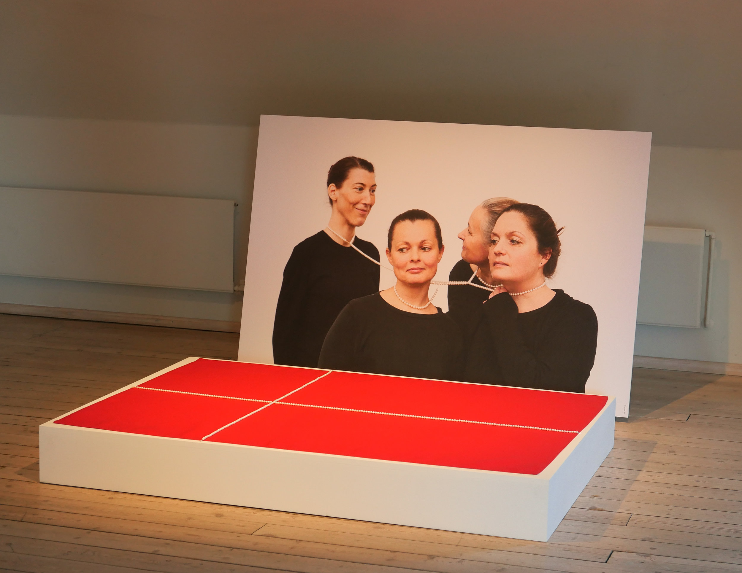
sum of the parts …


Too often, when writing about architecture, the focus is on famous or obvious buildings - on the latest or the biggest or the best or on the buildings by well-known architects - and it's too easy to forget or to ignore why everyday parts of our townscape are important.

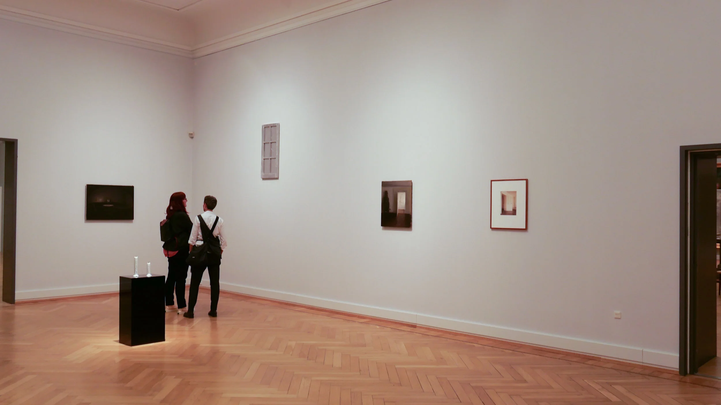
But, living in Copenhagen and walking around the city most days, I can see that it is the streetscape, the buildings together and the otherwise unremarkable but well-kept historic buildings that make the city such a pleasant and attractive and interesting place to live and to visit.

The architect and writer Jan Gehl has focused on how we respond to our urban environment and, over many years, he has looked at how people use the streets and public spaces of a city. Rather than seeing planning just in terms of the buildings themselves or, and worse, planning as simply the implementation of political dictate - the laws of urban administration - concerned simply with zoning or about how streets and squares are laid out in terms of traffic flow or parking bays - Jan Gehl writes about how people use their cities and what makes a city a good place to live.


It's rare for me to leave home here without a camera and I have been keen to look at and record not just buildings in the city but, because I'm a social historian, I look for evidence that shows how the city has evolved … evidence for not only when buildings were built, but why they were built in a specific way and how they were built and how they were used. And if we look at how and why and when buildings were altered or demolished or look at how and when the layout of the streets and squares changed, we can see evidence for how life has changed for people in the city …. and that change can be either rapid - so within a year or two - or buildings reflect change and adaptation over a time-span of decades or even centuries. 


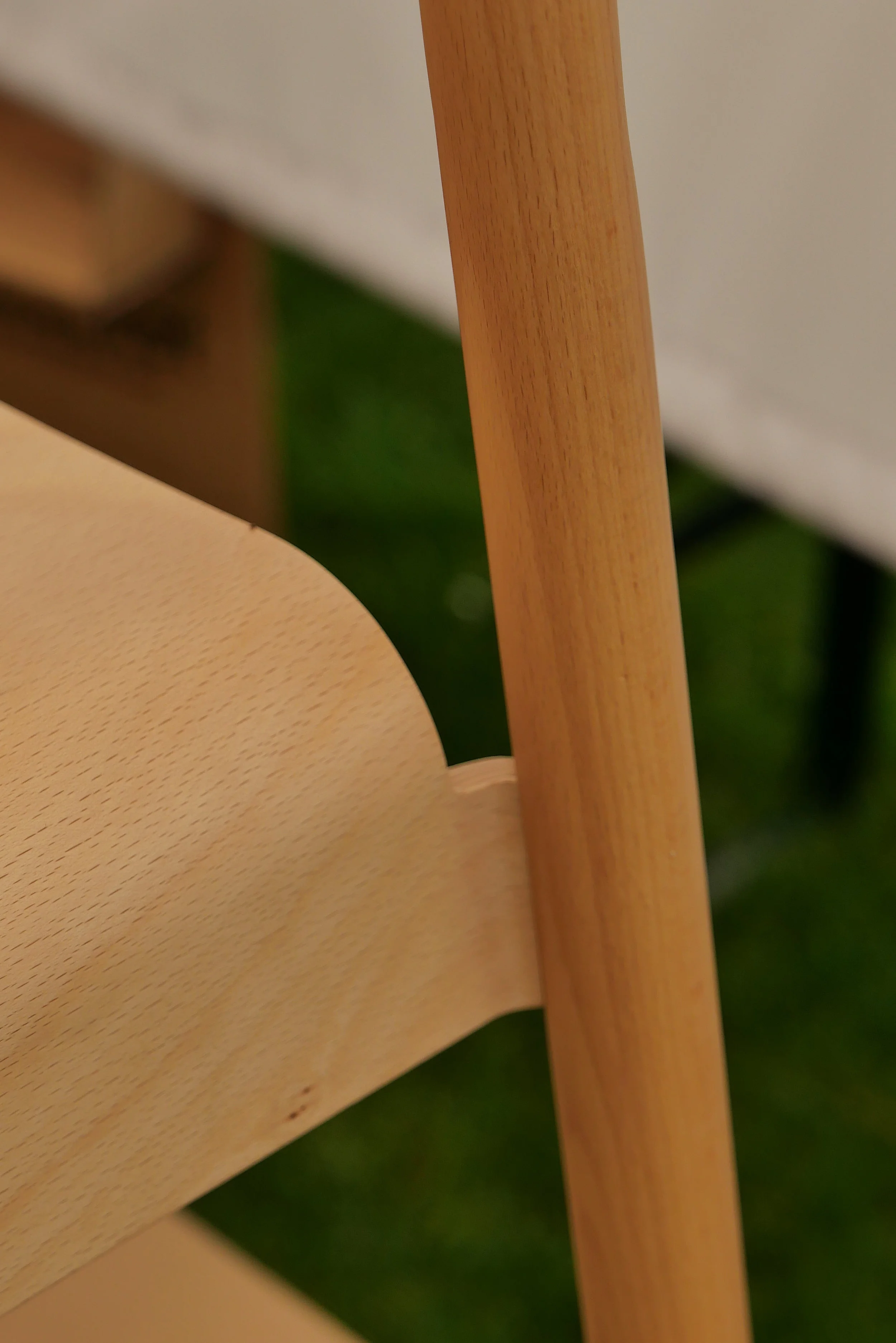
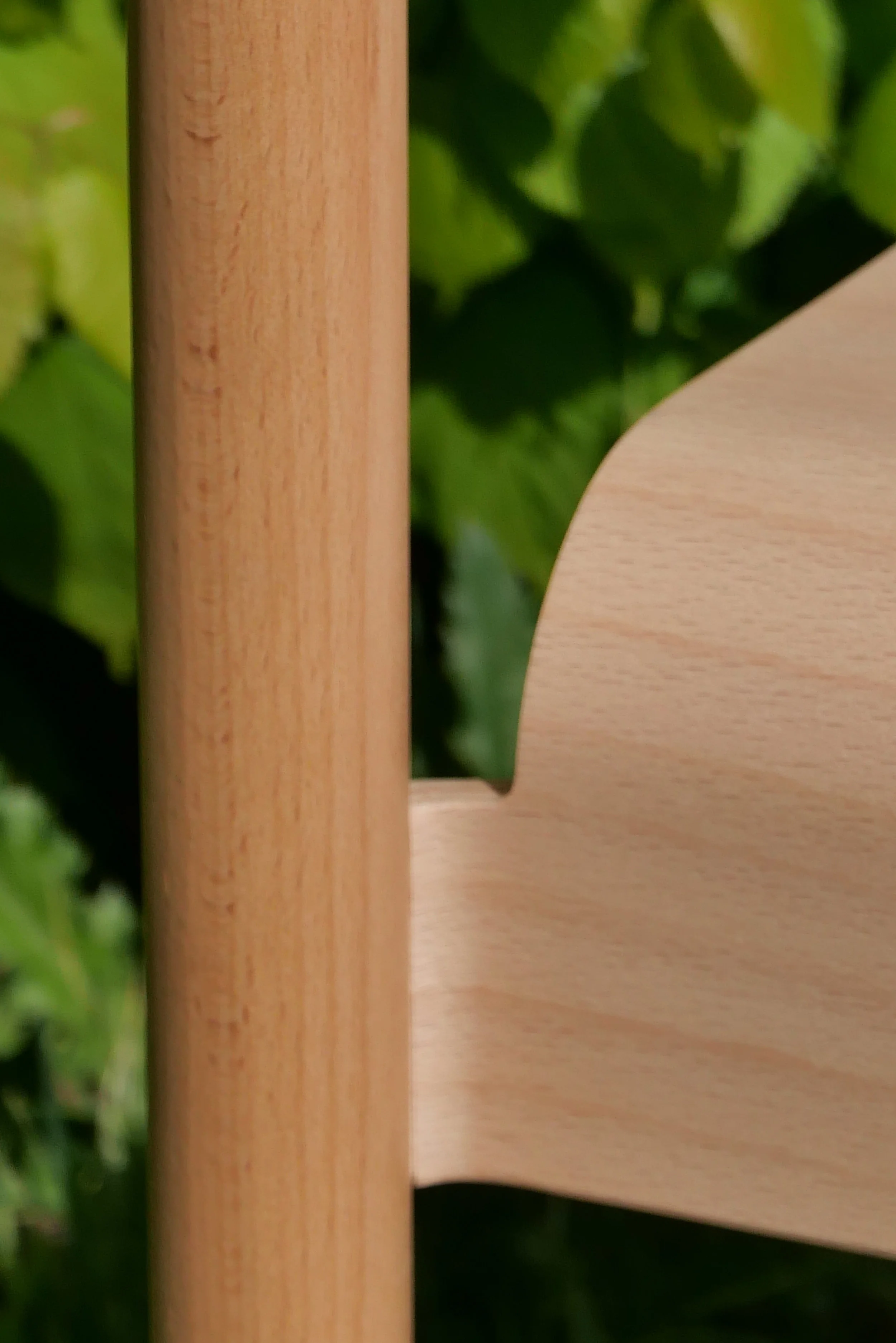
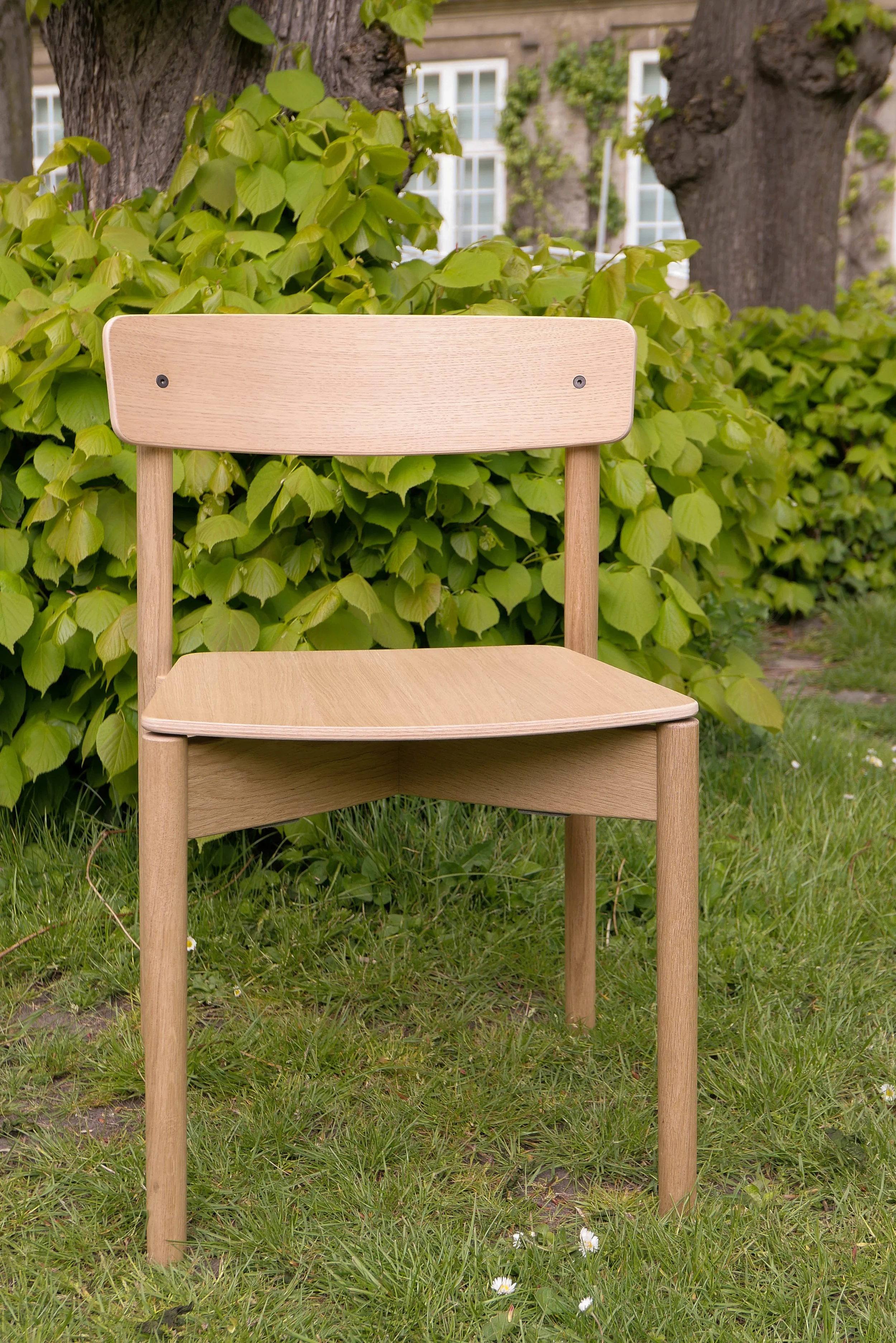
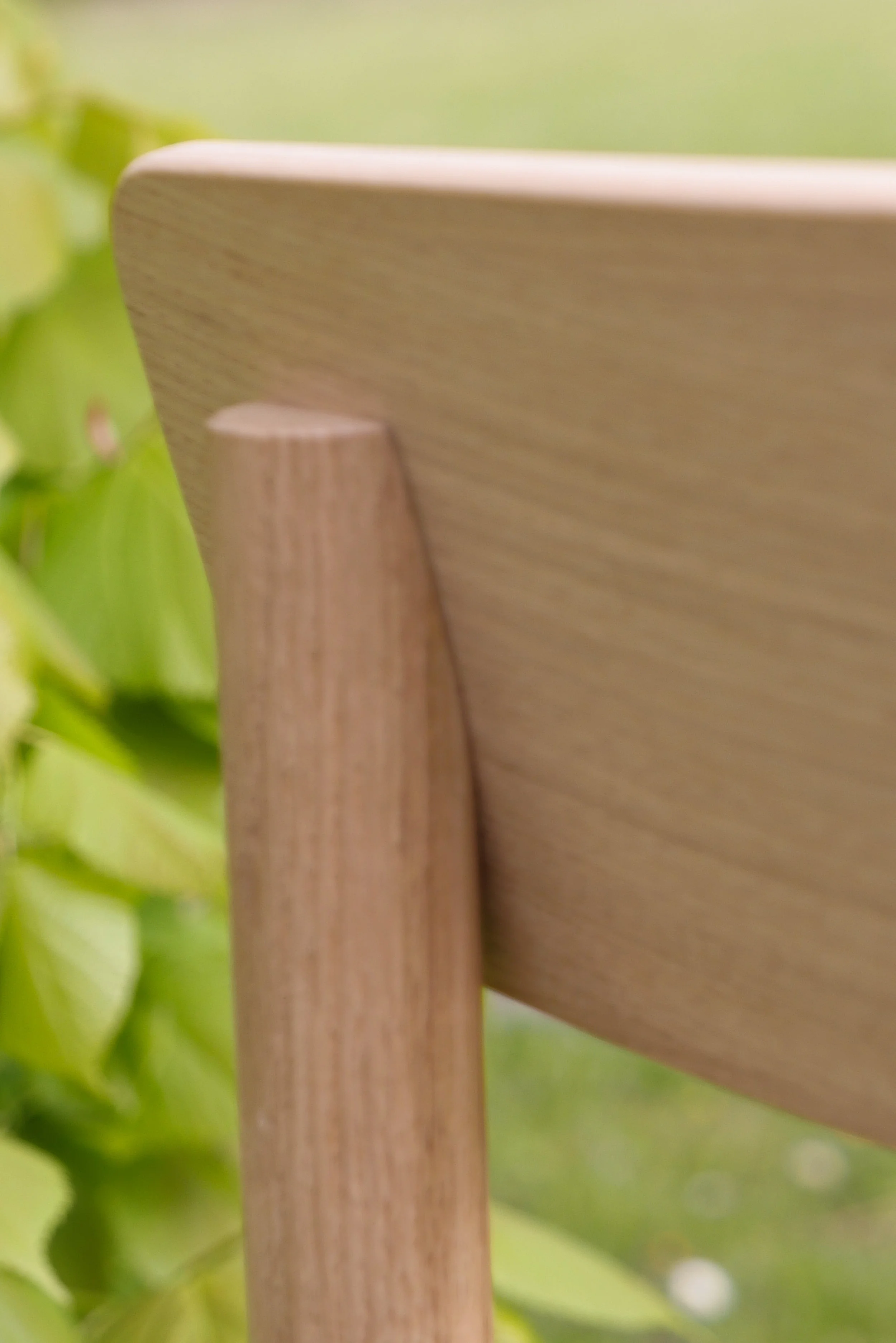
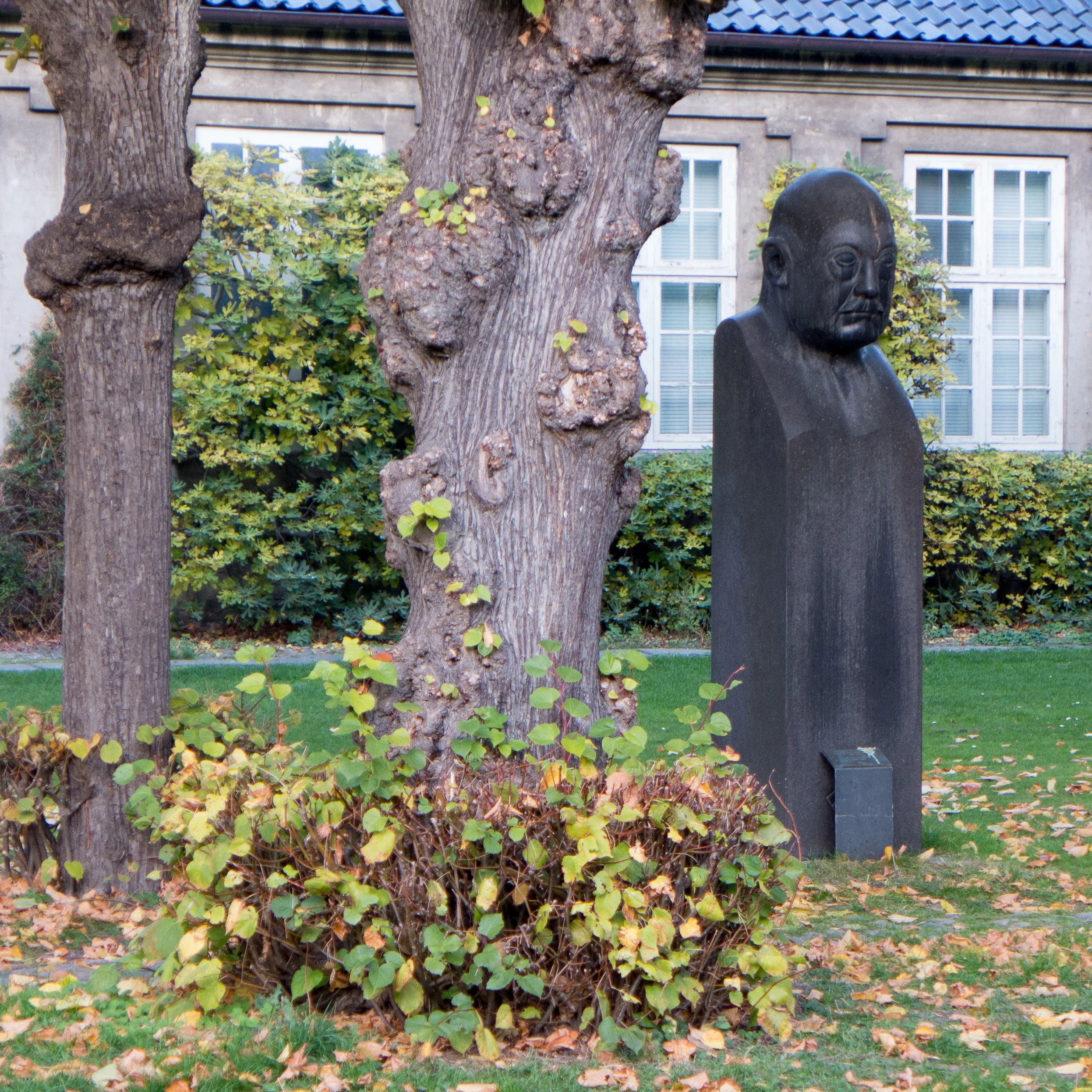
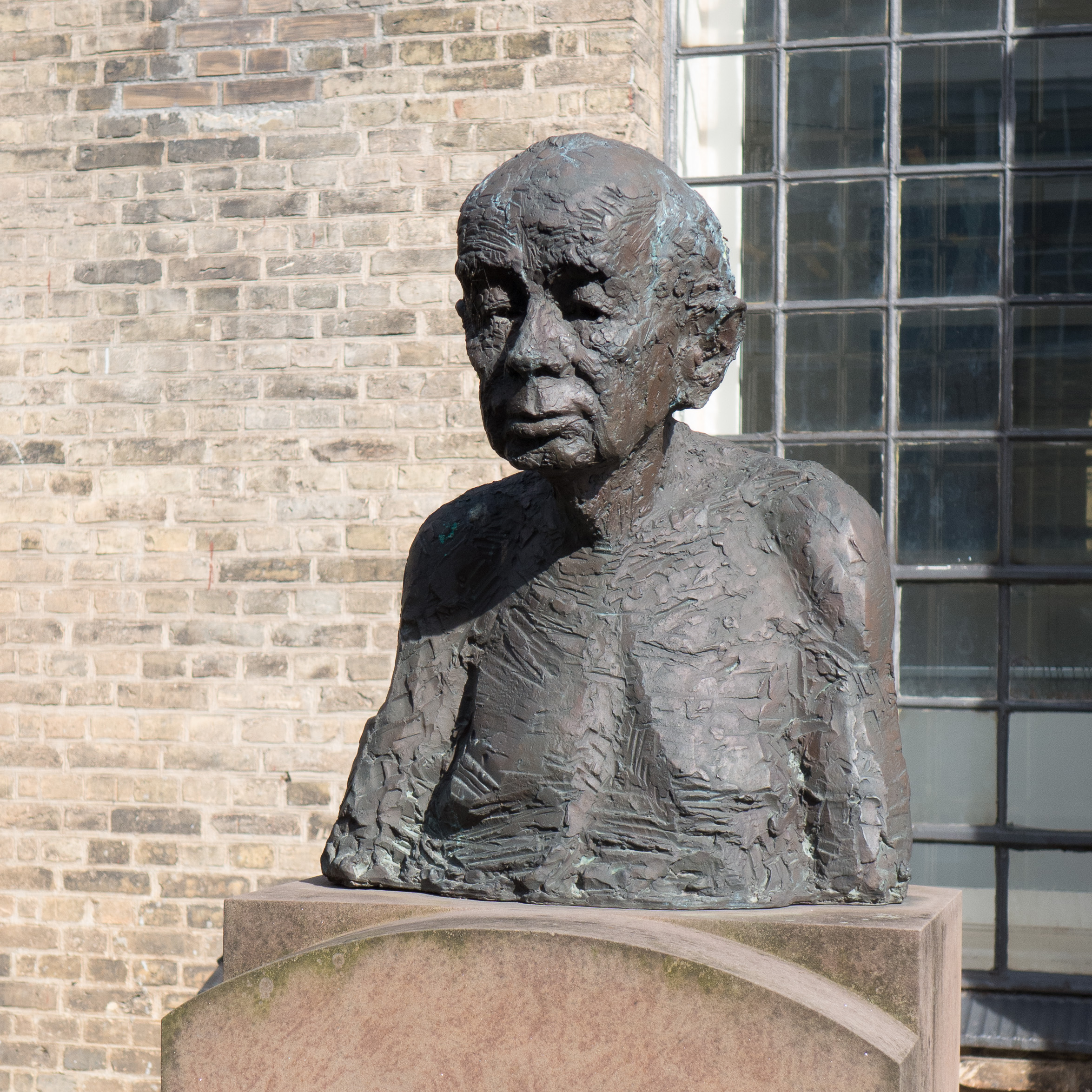
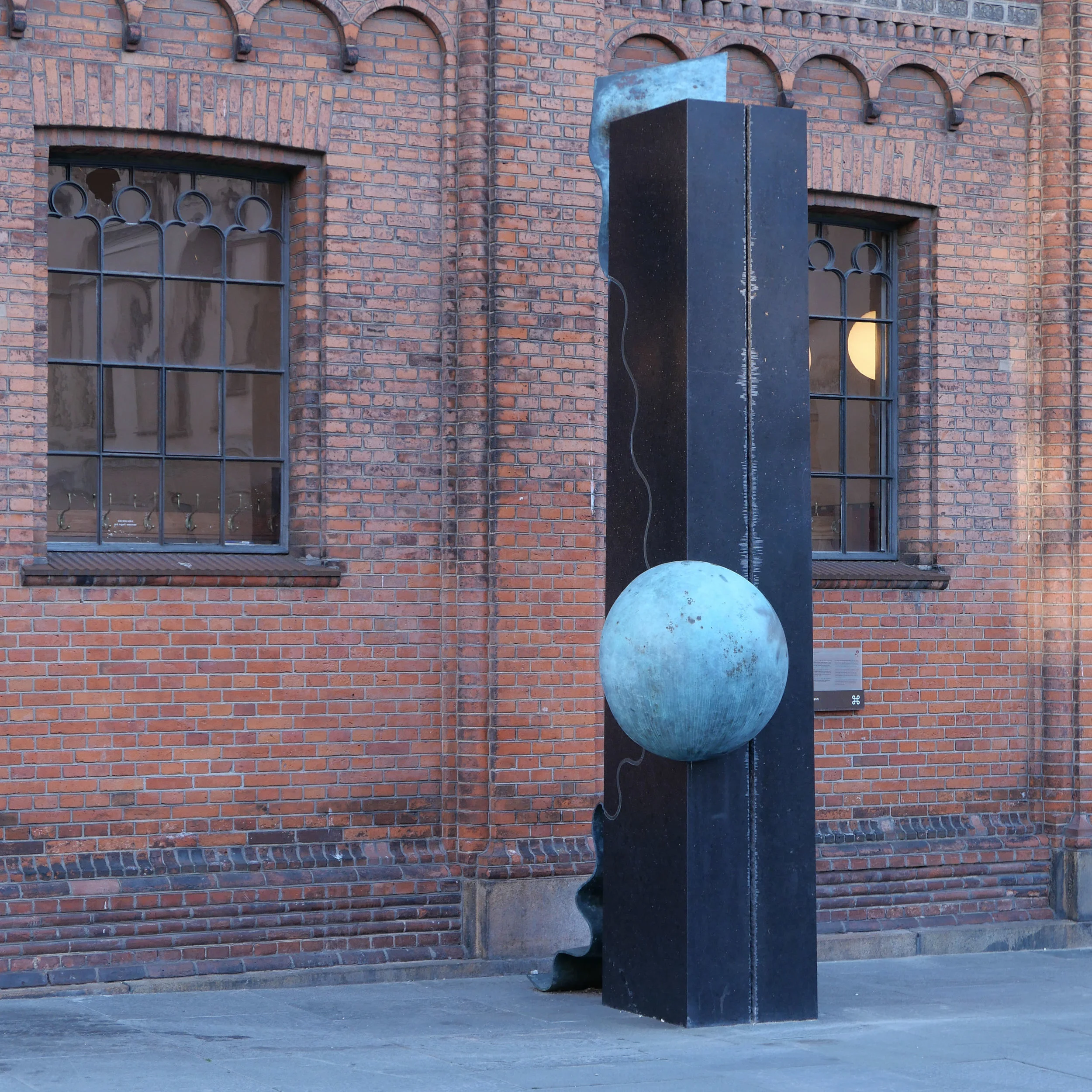
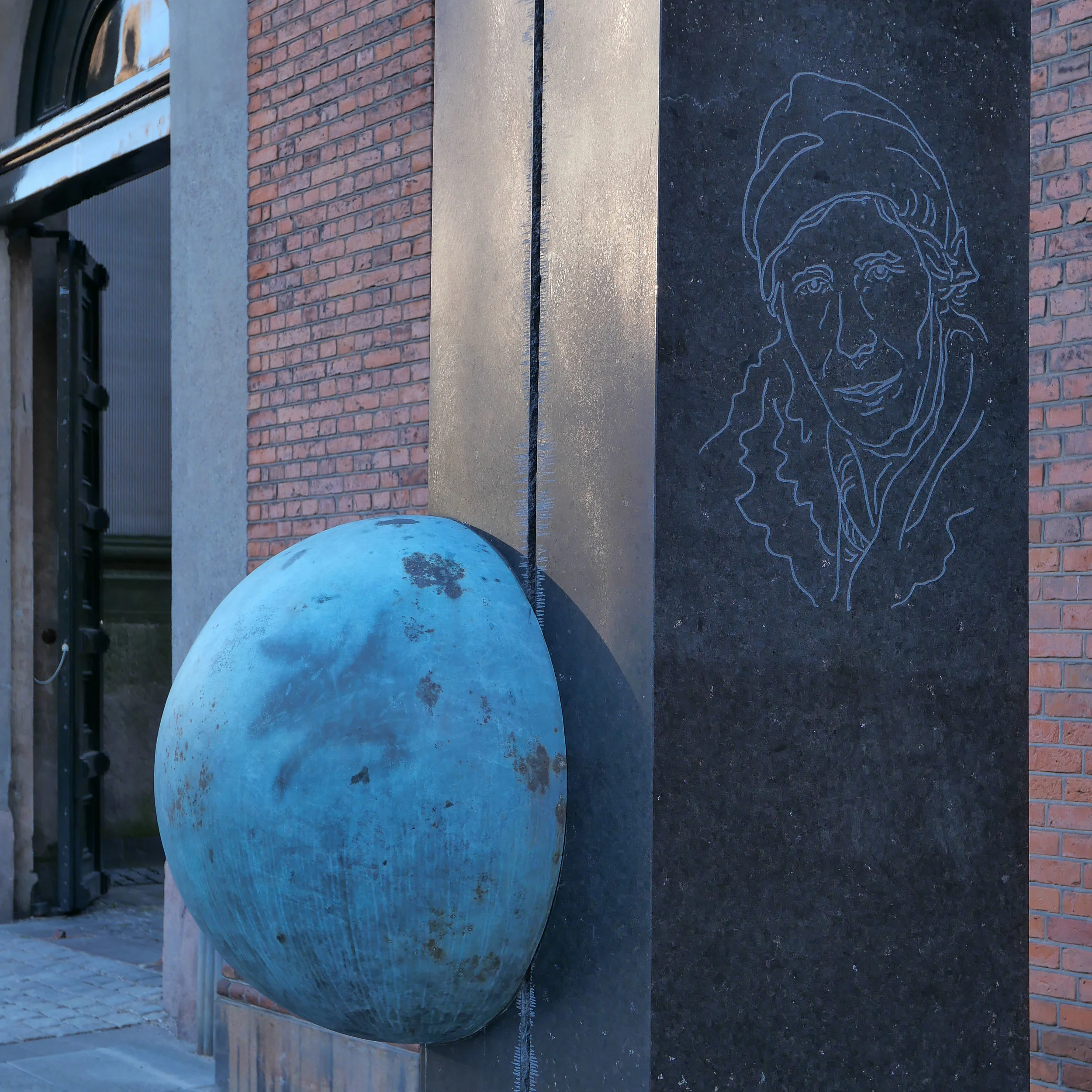
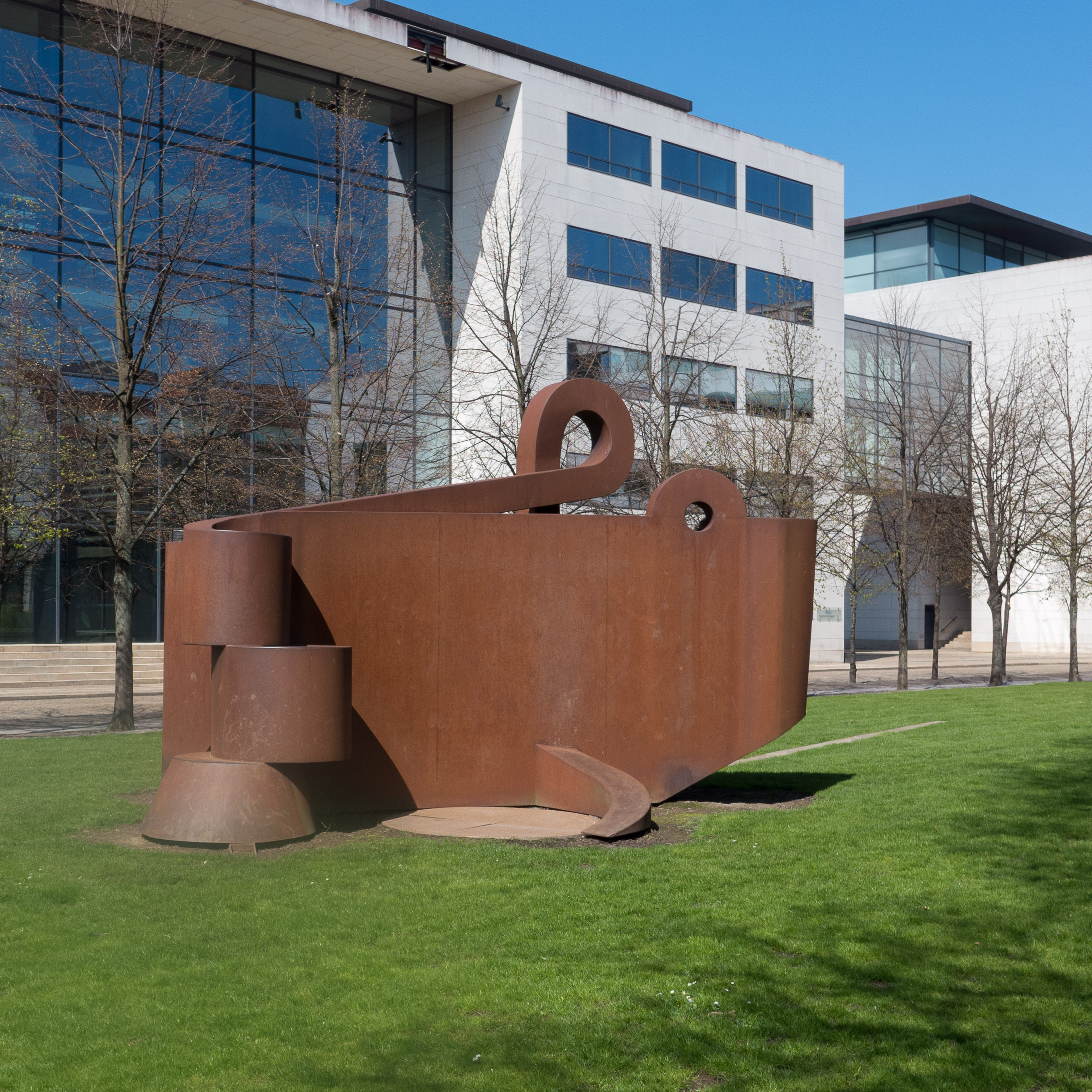
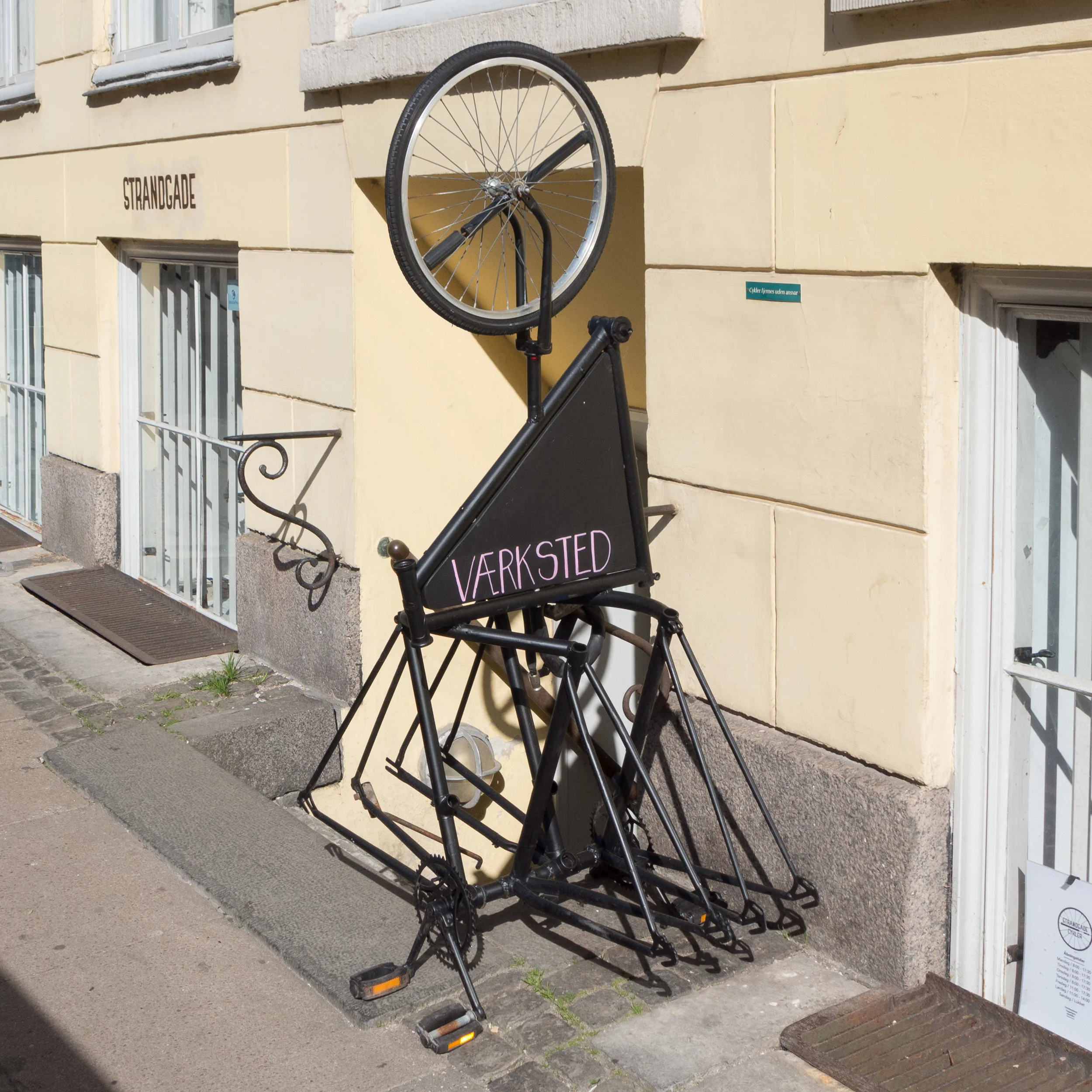
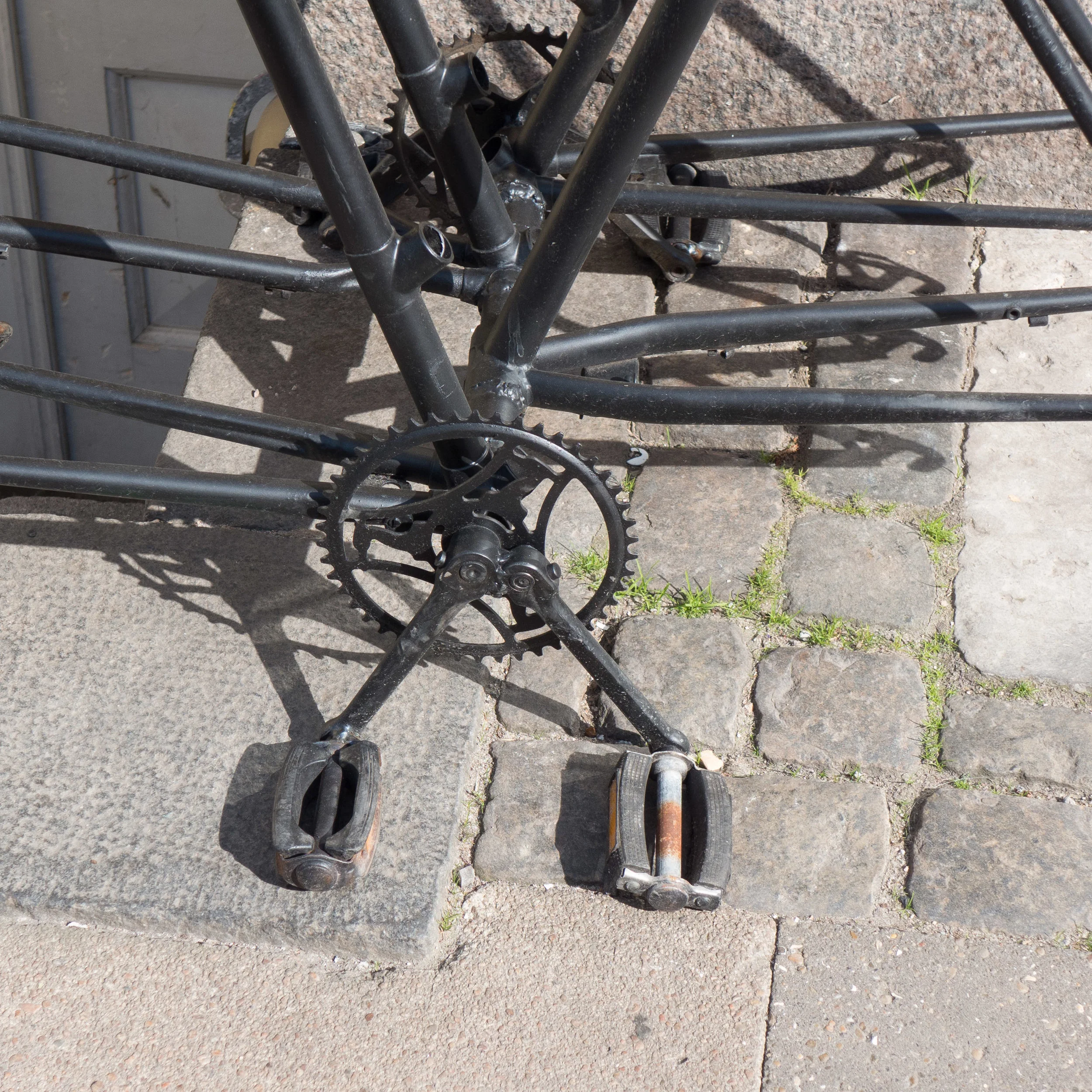
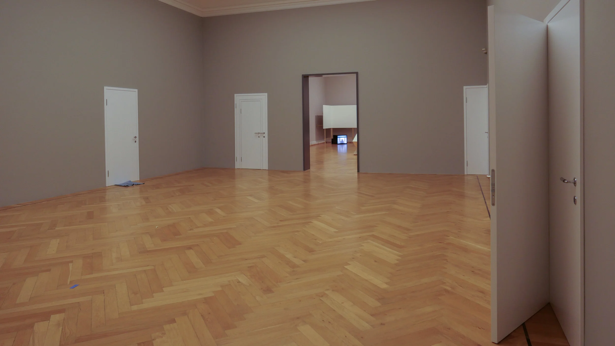
Certainly, in Copenhagen, there are important and amazing buildings but, more than in many cities around the world, it is the quality of the parts that make the whole … it is the public space of the streets and squares and courtyards - the areas framed or defined by the buildings and in the streets now it’s the planting and the hard landscaping and the care that is taken with the details and it’s the setting or context for the buildings that together are so important. 

But there’s the paradox … we rarely comment on these elements of our built environment - the context and setting of the buildings - when they are right but we can see something, or often, we just feel something, is wrong when something is done badly.

This is one part of what Jan Gehl talked about in the book New City Life where, with Lars Gemzøe, Sia Kirknæs and Britt Sternhagen Søndergaard, he set out what they called “12 key quality criteria” for good city spaces. 

These were divided between qualities of protection - so feeling safe against the traffic or protected against crime and violence - qualities of comfort - from opportunities to walk through a city to opportunities for play and exercise and then last are their key qualities - ten, eleven and twelve - that are grouped under what seems like a curious heading enjoyment … or perhaps not so much curious but a quality that is either ignored or simply not appreciated when journalists and academic authors write about architecture.

These key qualities of enjoyment are important so they are worth quoting in full.

They are:
scale - Buildings and spaces designed to human scale
opportunities to enjoy the positive aspects of climate Sun/shade Heat/coolness Shelter from wind/breeze
positive sensory experience Good design and detailing Good materials Fine views Trees, plants, water

… so what, in another book, Gehl called ‘Life Between Buildings.’ 

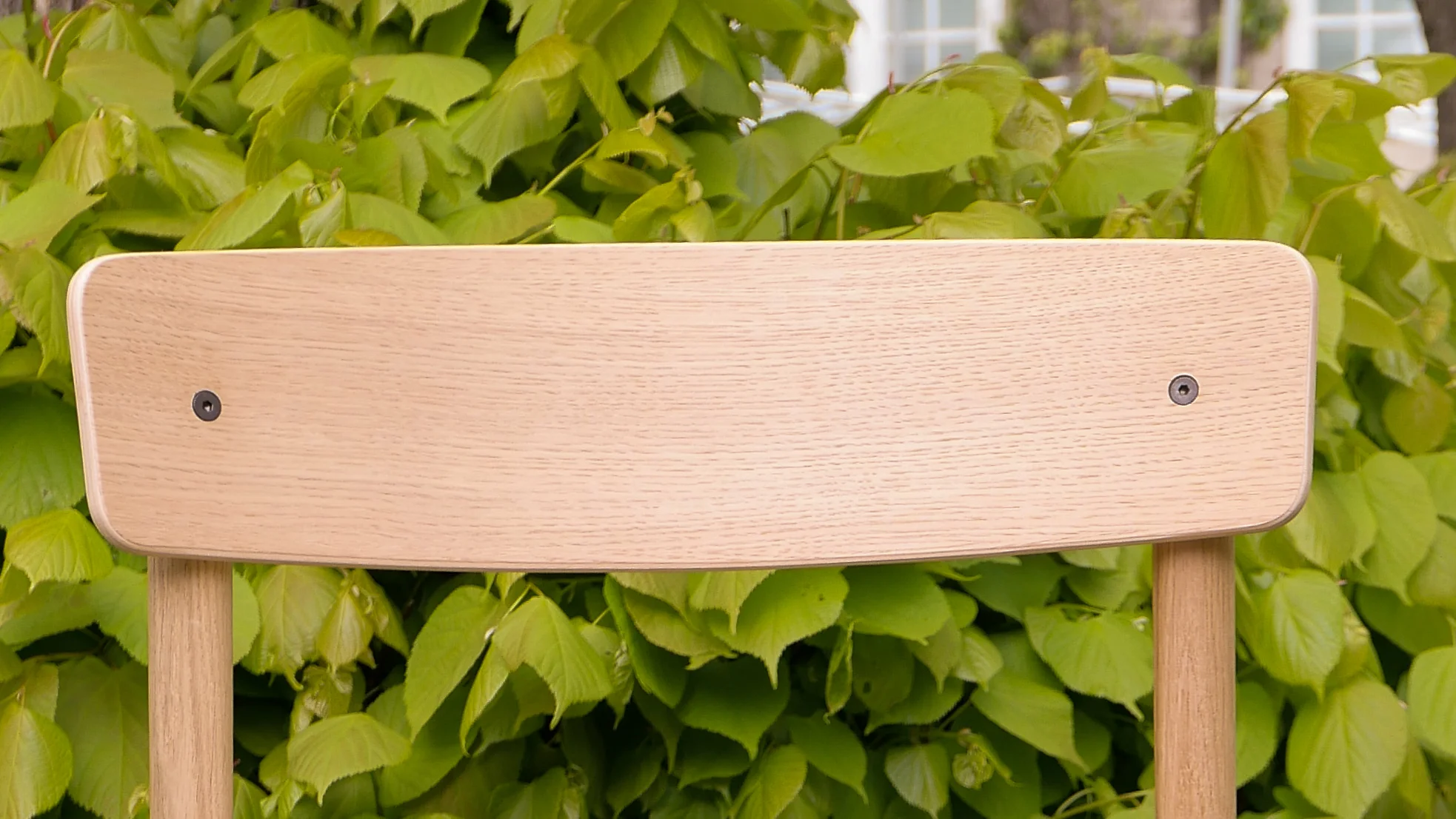
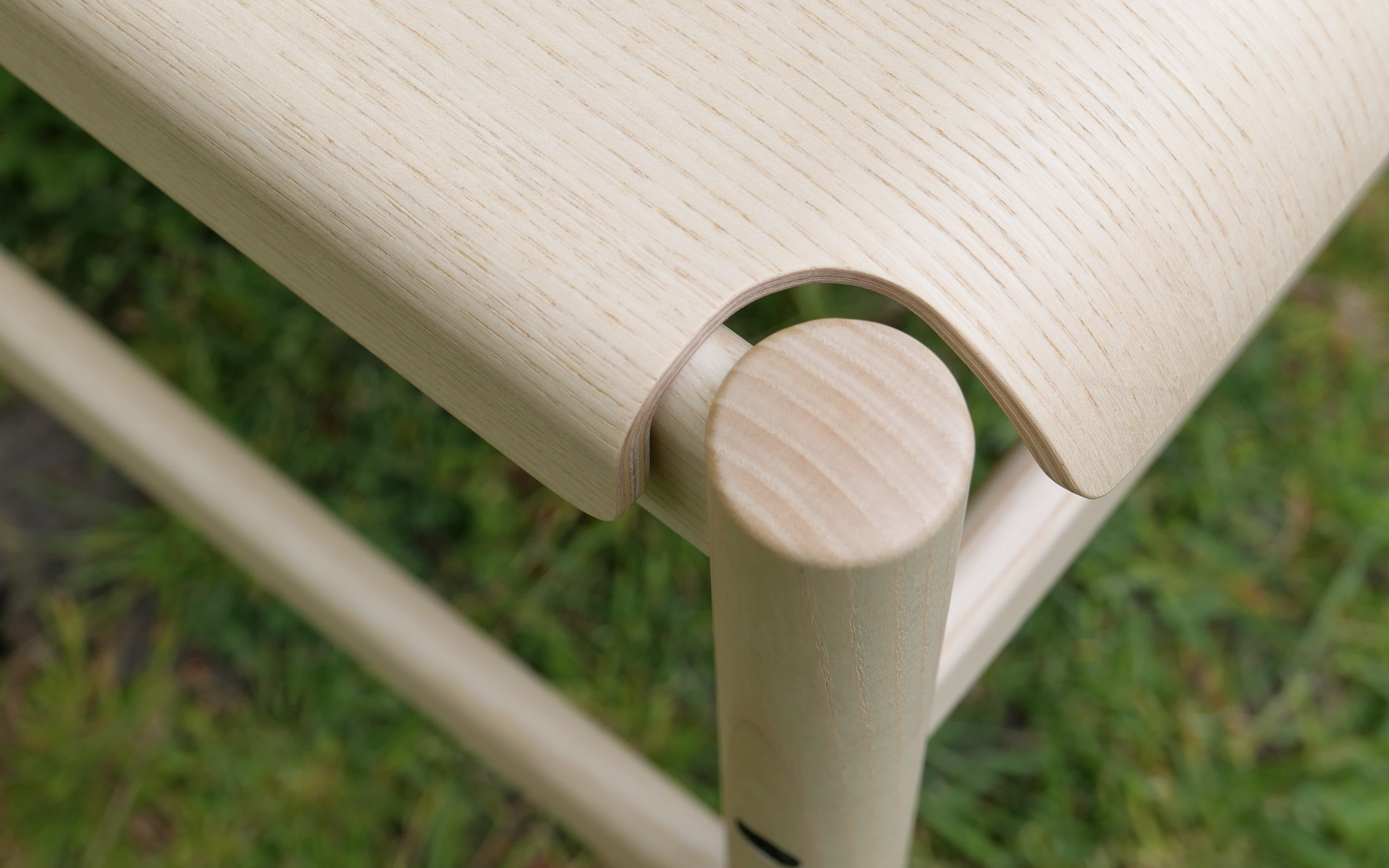
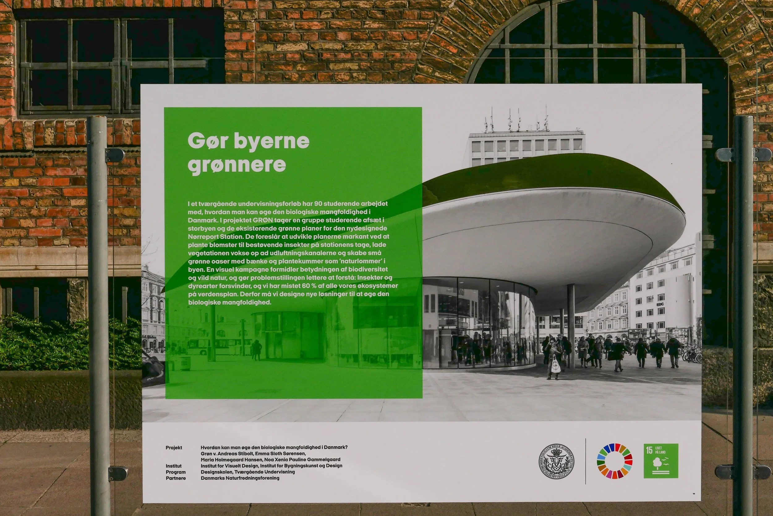
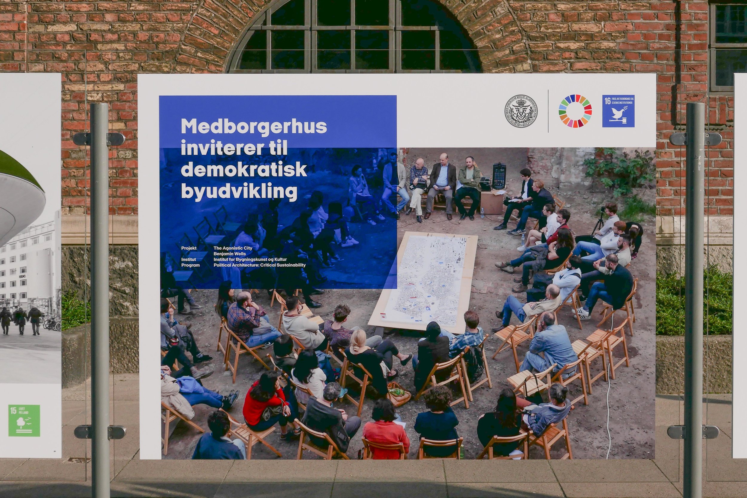
To consider some of these aspects of architecture design and planning, this new occasional series of posts, under the heading sum of the parts, will look at streetscape in Copenhagen; at the details and the outcome or the reality of planning policies, and at aspects of how people here use public and semi-public parts of the city and why well-thought-out architecture of a high quality with good landscaping and good street furniture, together make Copenhagen not just a pleasant but a visually stimulating place to live.

Good planning and good building is not necessarily about doing something that is perfect or even something that fits in - so something conventional or safe - because too often that becomes a matter of simply ticking boxes on a design pro forma but it should be about doing something that is appropriate for a specific place or for a distinct part of the city and is something that is thought through and done in a way that is resilient - which means often that it is something that has been done for the long term - and something that settles in and wears well and works well and, more often than not, that means it should work without shouting at the user.

In English architectural studies "polite" architecture is usually taken to mean the architecture of the rich although, and curiously, few books seem to talk about "rude" architecture.

So generally, in urban architecture and planning, the aim should be for architecture that is quiet and does what it is meant to do without being intrusive … so polite in that sense. That is what makes doing what is appropriate important and surprisingly difficult and, too often, when the appropriate is achieved then it is not appreciated enough.


New City Life by Jan Gehl Lars Gemzøe, Sia Kirknæs and Britt Sternhagen Søndergaard, The Danish Architectural Press (2006)

Life Between Buildings, Using Public Space, Jan Gehl, Island Press (sixth edition 2011)


*I've been told by several Danes that they can't understand why the English like puns so much … so I hope that I can get away with the general title of this series as less of a pun and more of a homophone although, of course, I like the idea that, when there are enough posts in this ongoing series, they will have to be indexed as some of the parts of sum of the parts.

the recent launch of three new chairs from TAKT


Design X Change at Designmuseum Danmark two weeks ago was my first chance to see the three new chairs that were launched a month before by a new Danish furniture company called TAKT.

Not only are the designs new but the marketing is innovative because, from the start, the company will market on-line direct to their customers. By keeping the cost of marketing as low as possible "in a transparent way" and by using sustainable materials, then they can "make quality goods more accessible."

With this approach and by working with a number of established designers, they clearly echo the principles of FDB in the 1940s and 1950s when they first marketed good-quality modern furniture designed by well-established designers to make good, well-made furniture of a high quality.

In this initial launch by TAKT there are three chairs. Design and development took 18 months and the chairs are made for them by the furniture maker Kvist - a well established Danish company.

The chairs are beautifully and precisely made and well finished. By focusing on perfectly-cut joinery with well-designed mortices or pegs or channels to hold the separate pieces together, then the parts of the chair can be thinner and therefore lighter in weight.

Each chair has a distinct character but you can see links between the designs … for a start they all make the best use of high-quality plywood for seats and back rests and the Tool Chair designed by Rasmus Palmgren is almost a text-book example of how to exploit all the best characteristics of plywood. The plywood of the seat is bent down on each side to give it strength and the front edge is simply held in a channel is a front frame in bent wood and the vertical sides are flared out at the back to form tabs that act like mortices to hold the seat into the bent-wood frame of the back.

Cross Chair by English designers has echoes of the classic stacking chair designed by Vilhelm Wohlert in the 1950s for the art museum at Louisiana. The TAKT chair has two h-shaped frames that cross over under the seat using interlocking slots at the intersection and giving the chair its name. The curved back rest, fixed across the uprights, is simple and elegant but what is impressive is the way it clicks into place as you assemble the chair because Cross Chair is delivered packed flat. That click is testament to the precision of the cutting of the joints give the chair a sense of precise engineering unusual with timber. Another very nice detail is that the ends of the cross rails are curved down - to drop the tenon down further where it is housed in a mortice at the top of the front legs but the top of the leg is also just slightly lower so does not press hard against the underside of the seat to give a more refined design and a slight emphasis to the line of the seat by having that space.

The third chair, Soft Chair by the Danish designer Thomas Bentzen, has a strong sense of Danish design from the late 1960s rather than the 1950s with distinct and marked verticals - so with echoes of the Ferry Chair by Wegner. The legs are a uniform thickness rather than being tapered and are vertical, rather than splaying out, and there are horizontal stretchers or cross rails between the legs. This framework supports an ingenious seat and backrest in plywood where both are curved sharply round at the edge to grasp the frame. It looks almost like leather draped across the frame but there are clever fixings holding both seat and back in place. Despite the apparent complexity of the design it has strong parts with simple fixings so again it is delivered flat.

Part of the team at TAKT is Nicholai de Gier who teaches at the Royal Academy. He wrote a seminal work on chair design - Chairs' Tectonics that was published by The Royal Academy of Fine Arts School of Architecture in 2009. In the book he classifies the form of construction for different types of chair and that same attention to detail and an understanding not only of style but techniques of construction is applied to the new collection from TAKT. It is important to emphasise that it is a strong part of the Danish design tradition to reference earlier designs but take them forward or experiment with alternative solutions to specific problems.

TAKT have a good on-line site - crucial for this form of marketing - that links to an 'image bank' with photographs of the chairs from all angles and with photographs of details.

Looking at the chairs as you walk around them you can see respected here a clear aim in classic Danish design to make furniture that is beautiful from any angle.

 TAKT


The display at Design X Change was in a marquee in the great central courtyard of the design museum. It is a very pleasant temporary venue for museum events but the light was oddly flat and not good for taking photographs. The team from TAKT were incredibly patient and let me take chairs outside to take photographs. Please note however that these chairs are not designed or made for garden use.


Tool Chair

Designed by Rasmus Palmgren from Finland
Beech
natural, black, grey, pale blue, mid blue
FSC-certified wood

delivered assembled


Cross Chair

by English designers Luke Pearson and Tom Lloyd of Pearson Lloyd
Oak and matt black
an option is with the seat upholstered in the eco-labelled wool Hallingdal from Kvadrat or with aniline leather
FSC-certified wood


Soft Chair

by the Danish designer Thomas Bentzen
Ash
FSC-certified wood


Is This Colour? … an exhibition by Kontempo at The Round Tower


Kontempo, an association of textile designers in the Nordic region, was founded in 2015. With a board of eight textile and furniture designers who meet once a month, they are "working to raise awareness about contemporary textile work and practices."  

Is This ….? …. is a series of exhibitions by Kontempo with Is This Colour? being the third following Is This Textile? in 2016 and Is This Knit? in 2017.

Here, twenty four works are shown that, using many different materials and styles, explore aspects of colour. The Gallery is in the Trinitas Church, the parish church for students, in an upper level that housed the university library, and access is via the brick spiral ramp in the tower. With windows on both sides - with views over the city - there is amazing natural light through the space and that is exploited in the exhibition so that what is clear, immediately, is that surface, texture and shadow all have a crucial role in how we perceive colours.

KONTEMPO
the exhibitions continues at Rundetaarn / The Round Tower until 23 June 2019

the framework
ide Blichfeld

NCS S 1080 Y20R
Kitt Dusnia

compleat
Charlotte Østergaard

colour lab
Louise Sass

duotone
Eva Fly

translucent faces
Henning Larsen

Kunst i Byudvikling / Art in Urban Development

Kunst Realdania cover.jpeg

Realdania have just published a report on sculpture and art in public space that is aimed at municipalities, development companies and other professionals to inspire them "to consider art as a value-creating asset in their own projects."

“Culture and temporary activities are often included in urban development to open up new urban areas and give them identity, involve local citizens, or attract investors and outsiders.”

Christine Buhl Andersen, director of the Glyptotek in Copenhagen, has written an introduction or overview and she emphasises the importance of art in public space …  "art is increasingly used strategically to make urban areas, urban spaces and buildings vibrant and attractive."

The report points out that art in public spaces has a clear role in helping to create a good urban environment but requires a partnership between politicians, architects, planners, developers, builders and artists.

Works of art can be used to decorate or to improve urban spaces and buildings but can do so much more … "art can give the individual building identity, create experiences and contribute to the well-being of the building's users."

established art in public space


sculpture of the Glyptotek in Copenhagen


Sculpture can be part of an outdoor exhibition space … the Glyptotek itself is a good and long-established example with sculpture on and around the building providing open access to art, with decorative portrait busts in niches across the entrance front, decorative panels and the heads of exotic animals, on the building itself; figures, many of workers, on the lawns on either side of the building, and across the back of the art gallery, on the opposite side to the entrance, there is a quiet, pleasant public garden that is also an outdoor gallery for a broad selection of statues.

Much of the sculpture in Copenhagen commemorates major figures - either from the city or national figures including, of course, monarchs, statesmen and major academics, scientists and literary figures.

These are busts or full length figures but there are also more complex representations of the lives of people … an interesting sculpture by Elisabeth Toubro has been added to the line of more traditional busts on plinths across the front of the old university buildings on Frue Plads that commemorates the life and work of the mathematician and seismologist Inge Lehmann.


commemorating and remembering through public art …
a statue of Hans Christian Andersen by Augustus Saabye in the King’s Garden: Gottlieb Bindesbøll by Kai Nielsen in the courtyard of Designmuseum Danmark: Steen Eiler Rasmussen by Knud Neilemose at the Royal Academy buildings on Holmen:
a traditional bust of the physicist Niels Bohr at the front of the university buildings on Frue Plads and the less-traditional monument close by to Inge Lehmann by Elisabeth Toubro

traditional art in public spaces


Litauens Plads - art, sculpture or street furniture?

 
L1260629.JPG

to mark the site of the important engineering works of Bumeister Wain there is a timeline set in the grass behind the sculpture

Now, many sculptures are designed to be sat on or climbed over and many have an important role in public spaces by encouraging people to sit in or use the space. Are the lines of low cylinders along the edge of the square at Litauens Plads street furniture? The red bird nesting boxes in the trees above suggest a complicated, diverse and subtle use of art works here.

Some artists can be reticent if they feel that their art is there simply to make the area more attractive or, worse, if it is there to increase the value of a development and politically it can be difficult if local people cannot relate to works; find them irrelevant or see the obvious cost as a waste of funds that might better be spent on supporting social projects.

The report looks at several major projects that have included public art in public spaces from the design stage with the examples of new sculpture incorporated into the new developments of Køge Kyst, south of Copenhagen, and Kanalbyen in Fredericia where there has been collaboration to integrate art from the start. 

An ambitious new scheme for public art is evolving at Arken, the major art gallery to the south of Copenhagen. There has been extensive re-landscaping immediately around the art gallery but, because many visitors and tourists come out from Copenhagen by train, Arkenwalk will link the railway station at Ishøj to the art gallery down on the beach - a walk of 2.2 kilometres - with the final design selected after a completion that was entered by 27 teams of artists and architects. The new "art axis" will be marked by very distinct red lamp posts.

new street art


The Wave - an interactive light installation by Frederik Svanholm, Mikkel Meyer and Jonas Fehr

the bike and foot bridge by Olafur Eliasson - public art or engineered city planning?

hoardings around the engineering works for the new metro station at Trianglen painted by Benjamin Noir


Superkilen in Nørrebro in Copenhagen

Public art is not restricted to sculpture - or at least not what would traditionally be seen as sculpture. Superkilen in Nørrebro has lines of stools and tables marked out with board games and the Circle Bridge by Olafur Eliasson, opposite the national library, with its lighting, blurs the boundary between engineering and public art. Paintings on the high fencing around the sites of the engineering works during the construction of a new Metro line has provided an opportunity for a major project in public art.

Many of these more recent projects, including newer forms of public art in light or with projected video art or sound, are about social engagement but public art can have an important role in attracting people through an area to make it feel used and safe rather than empty and abandoned or underused and under appreciated.

The report identifies a general change in the response to art in the streetscape. It suggests that there is a growing reaction against public art that is temporary or experience orientated or projects that are designed to attract tourists and a move towards "liveability", so art enhancing everyday life for local users of the space … a move towards appreciating art that brings joy, beauty, curiosity, a specific sense of a specific place so context and consideration - in the sense of thoughtfulness - back to enhance how we see and use and occupy public space.

It also includes more mundane but important and practical summaries about realising projects; about determining frameworks and about practical matters of planning for operation and maintenance and even a reminder about seeking information about rules covering Tax and VAT.

Above all the illustrations show just how diverse and just how imaginative public art in public space can be. 

Kunst i Byudvikling
Arkenwalk
Realdania

private art in public space?
a rack for bikes outside the bike shop on Strandgade in Copenhagen
pedals of the stand from a failed experiment to ride side saddle?


Christian IV


location map from the notice of consent granted by the city of Copenhagen

A new statue of the Danish king Christian IV has been unveiled by Queen Margrethe.

It stands at the corner of the forecourt and the ramp up to the main entrance of Børsen - the Royal Exchange - a building that was commissioned by Christian IV.

The statue of the king is in bronze and by the Faroese sculptor Hans Pauli Olsen. It is close in the pose and for the costume to a portrait of the king painted by Abraham Wuchters in 1638 or 1639 where Christian is wearing high riding boots that are loosely fitted with the tops folded down, has his left hand resting on his hip with the right hand outstretched and has a neat beard, heavy head of hair and the famous long, thin, plaited pigtail.

The statue is set on a high stone plinth from where Christian looks across the front of the palace of Christiansborg.

That plinth represents major buildings commissioned in the city by Christian IV with The Round Tower and the distinctive twisted spire of the Exchange and the spire of the tower of Christian's palace of Rosenborg but curiously the stone tower flanked by the spires in bronze are all upside-down … said by the sculptor to be the city that Christian built reflected in water.

The tower is set on a shallow mound in the cobbles that is slightly rustic and also slightly odd as if the whole thing is erupting from the ground.

The cost of the statue has been controversial as has the rather traditional style of the work. A new statue to Christian was first suggested in 2009 but in 2014 the design was rejected by Rådet for Visuel Kunst i Københavns Kommune - the Council of Visual Arts in the City of Copenhagen - on the grounds that "the sculpture does not reflect a contemporary art expression, and therefore lacks sufficient justification and relevance in the present."

The city finally gave consent for the statue by Olsen in January 2018.


background:

Christian was born in 1577 and he was only 11 when his father died. Initially the country was  governed by a regency council but Christian was deemed to have come of age when he was 19 and ruled Denmark from 1596 until his death in 1648.

Through his major building works Christian, more than any monarch, influenced both the plan and the appearance of the city. He remodelled the castle and made Copenhagen the centre of his administration and he commissioned major buildings that are still prominent features of the city including the Brewhouse and Arsenal to the south of the castle; Holmens Kirke - the church of the Royal Navy on the other side of the canal from Børsen - consecrated in 1619; Rosenborg - a private royal residence away from the castle - that was set in formal renaissance gardens on the edge of the city and completed around 1624; Børsen - The Royal Exchange - begun in 1624 and completed in 1640 and The Round Tower and its observatory and Trinitatis Church begun in 1637.

In 1626, Christian initiated work on the north defences of the city that was to become the Kastellet - completed after his death - and he began major engineering works to claim land from the sea - just off the shore and wharves of the old city - and where first Christianshavn was laid out, a planned new town, with defences around the south side and a new south gate to the city and then those defences were extended out to the north to enclose a vast area of sheltered and protected moorings for the naval fleet … an area of water that was subsequently filled with a number of large islands and canals that became the naval warehouses and dockyards of Holmen.


There I Belong at Statens Museum for Kunst


There I Belong is the first in a new series of exhibitions under the title SMK Plus where contemporary artists will explore the collections of the National Gallery.

For this exhibiion - Inspired by the works of the Danish painter Vilhelm Hammershøi who lived and worked in Copenhagen around 1900 - the artists Michael Elmgreen and Ingar Dragset have collaborated with Marianne Torp and Tone Bonnén, the museum's curators of contemporary art.

Spartan interiors by Hammershøi are restrained and calm but they are enigmatic - paintings that tread a fine line between being self contained or depictions of a life of painful isolation. The paintings resonate with a contemporary audience, reflecting aspects of modern taste and restrained Scandinavian interiors.

There may be windows in these rooms but the view out to a world beyond is usually obscured by thin, translucent curtains … the natural light entering the room is crucial but a sense of place not so because these are studies in light but never put people, objects or place under a harsh spot light. Figures in the paintings are detached, generally absorbed in what they are doing, inward looking, often with their back to the viewer and in many of the paintings we do not even know if they are reading or writing or simply sitting with head bowed in quiet contemplation. Open doors indicate that there are rooms beyond but barely hint at a lived life.

Interior with the Artist's Easel, takes this to an extreme because, when painting the picture, the artist himself should be at the easel. The only conclusion has to be that there is a second easel at the point where the viewer is standing so are we the artist? Perhaps we have been co-opted into this quiet and private world but this is the ultimate antidote to that modern scourge - the selfie - where the photographer shows themselves at the centre of the scene, always the subject of the view, inevitably relegating an event or scene beyond to a secondary role.

The second gallery - a large space - shows the work Powerless Structures (8 doors) by Elmgreen & Dragset from 2000-2002. These are the most simple, basic, standard white doors imaginable, with plain white door frames but each is a variation in a theme of a detachment from the real or the functional … one door has handles and hinges on both the left and the right side so it would be impossible to open - another has a handle that is not on the door but on the wall alongside so it might or might not open - one door is slightly open to reveal a locked door immediately behind - one door is folded and wrapped around the corner of the gallery - a pair of doors on adjoining walls at another corner are separate but linked by a security chain as if someone might be able to squeeze through from a room on one side to another room without being able to get into the gallery.

This work, or a version of this work, was shown at Statens Museum for Kunst in 2015 in Biography - an ambitious set of major installations by Elmgreen & Dragset. Then, the doors were part of a corridor and a series of rooms that were in what appeared to be a government or public office building. If not obviously dystopian then the corridor was completely anonymous and designed to smother any sense of self. On entering you had a choice to go one way or the other but with no signs or notices to say where you were or why you were there although you could get a ticket from a machine to wait for your number to be called but it never would be, of course, and if you proceeded past these doors you could only return to where you started.

By now placing these doors on the four walls of a large gallery, the work takes yet another step back and pays homage to Hammershøi but expands his space until it is monumental in scale.

The exhibition includes photographs, paintings, sculptures and video by other artists - all taking the theme of doorways and spartan anonymity - with works by Njideka Akunyili Crosby, Lilianna Maresca, Francesca Woodman, Robert Gober, Annika von Hausswolff, Ugo Rondinone and Thomas Ruff. Only the work by von Hausswolff is from the museum collection with the other works either courtesy of the artist or on loan from galleries and private owners.


the exhibition at Statens Museum for Kunst / The National Gallery in Copenhagen
continues until 1 September 2019

Interior with a young woman sweeping, 1899

Interior, No 30 Strandgade, 1906-1908

Interior with the Artist’s Easel, 1910

KADK graduates and UN Sustainable Development Goals


Shown in this outdoor exhibition are seventeen innovative study programmes or research projects by graduate students from the Royal Academy Schools of Architecture, Design and Conservation and each represent one of the 17 UN Sustainable Development Goals.

Rigsdagsgården - the courtyard immediately in front of the parliament building in Copenhagen - is an amazing public space that is easily accessible for everyone and has a regular series of open-air exhibitions but, more important, given the subject of this exhibition, it brings these problems - and the urgent need to find potential solutions - right to the doorstep of national politicians.

These are innovative and imaginative projects that show architectural, design-led or conservation solutions to major global problems but all are based on established design principles and the use of existing technology or of technology being developed now.

This is the best of Danish architecture and design that can and should be harnessed to tackle serious problems that have to be resolved now.

Solutions shown here are a response to huge range of serious questions including questions about:

  • how we can reclaim methane gas from melting permafrost as a source of green energy

  • how to use sustainable materials to design textiles and make them a preferred choice

  • how we create healthcare solutions for elderly citizens that involve people and maintain their dignity

  • that developing traditional handicrafts can be a starting point for women to start a local business

  • how novel solutions can ensure that people everywhere have access to clean water

  • design solutions can tackle the problem of over production of food or food waste and encourage people to share food resources to combat hunger

  • the design of lighting in the class room can be used to reduce noise levels and encourage calm and concentration in schools

  • research can find a way to use the waste from fish farms to fuel biogas energy

  • major architectural projects - changing the use of large but now redundant buildings - can reduce inequalities by enabling everyone in a community to participate

  • hemp can be an alternative to cotton because cultivation requires less water and less fertilisers

Each project is shown across two large panels for maximum impact but are repeated - two or more projects to a panel - on the side of the exhibition towards the pavement - where the text is in English.

There are important statements here from Jakob Brandtberg Knudsen, Director of the School of Architecture; Mathilde Aggebo, Director of the Design School; Rikke Bjarnhof, Director of the School of Conservation and Lene Dammand Lund, Rector of KADK. 


Det Kongelige Danske Kunstakademis Skoler for Arkitektur, Design og Konservering
The Royal Danish Academy Schools of Architecture, Design and Conservation

the exhibition of graduate projects from KADK in Rigsdagsgården
the courtyard in front of the parliament building in Copenhagen
continues until 30 June 2019


select any image to open in a slide show


Sustainable Chairs at Designmuseum Danmark

At the end of last year, the Nordic Council of Ministers held an open competition for the design of sustainable chairs with one winner chosen from each of the Nordic countries.

Judges considered the sourcing of materials; the energy required in production and distribution; consideration of disposal at the end of the life of the chair and general compliance with the United Nations 17 goals for sustainability.

At the beginning of December, winning designs were shown in the Nordic Pavilion at COP 24 - the United Nations Climate Change Conference in Katowice in Poland.

The overall winner was the Danish entry - The Coastal Chair by Nikolaj Thrane Carlsen.

This competition was organised in partnership with the Nordic national design associations - Danish Design Center, Svensk Form, DOGA in Norway, Ornamo in Finland and The Icelandic Design Centre.

the chairs will be shown in the entrance area of
the design museum in Copenhagen
until 26 May 2019

Designmuseum Danmark


Petite
David Ericsson
Sweden

beech
components reduced to use less materials and light - just 2.5 kilo


Tangform
Nikolaj Thrane Carlsen
Denmark

shell eelgrass and carrageenan extracted from red algae
frame recycled from bamboo floorboards


Håg Capisco
Peter Opsvik
Norway

recycled plastic from household waste
no glue or harmful chemicals
durable, easy to disassemble and repairable
manufactured by HÅG/Flokk


Kollhrif
Sölvi Kristjánsson
Iceland

cork and aluminium recycled from 14,400 tea lights
manufactured by Málmsteypan Hella and Portland


Clash 331
Samuli Naamanka
Finland

aspen and birch
thicker at the part of the seat where the legs are glued so subframe not necessary
durable
manufactured by naamanka

The Danish Design Center has posted photographs and information about the ten designs in the finals in each country:
Denmark, Finland, Iceland, Norway, Sweden

Fællesskab anno 2019 - Biennalen for Kunsthåndværk & Design /

Community anno 2019 - The Biennale for Craft & Design


The Biennale of Danske Kunsthåndværkere & Designere - the Association of Craft and Design - is a major exhibition for craft in Denmark with a prestigious prize.

Following an open call for ideas for works on a theme of Community, eighteen were chosen for the exhibition at Nordatlantens Brygge in Copenhagen - an impressive 18th-century, brick warehouse at the centre of the inner harbour. The Biennale is in a gallery space on the attic floor with good light from windows on both sides so low, strong natural light, forms shadows across the space, as the sun moves round the building, but that light emphasises the confident use of deep colour and strong element of texture in many of the works.

Some of these works are about family - about the gift of food at the table or about memories of lost loved ones - and there is a strong sense of exploring - exploring through play and exploring through senses not always associated with design - specifically taste as in flavour - as well as the obvious senses that mean we can appreciate carefully designed shapes or the choice of a colour in beautiful and well-made object.

These are exceptional and unique works, formed, in large part, from common and everyday materials but, primarily, they are works that express individual imagination so are about communicating ideas … in some cases complex ideas. Shape and form and colour, choice of material and even technique of crafting those materials are all used as a way to communicates and become as valid as language and spoken words …. what Pernille Stockmarr identifies in the catalogue as "archetypal forms that make up a common primeval source of inspiration."

Several of the projects were produced together with other artists and the biennale is clearly an opportunity to share experiences and increase debate and discussion …. more than appropriate given the theme for the exhibition of Community.


Jury of the Biennale exhibition in 2019

Anni Nørskov Morch, exhibition curator of Koldinghus 

Maria Foerlev, owner of design gallery Etage Projects 

Pernille Stockmarr, curator at Designmuseum Danmark


Prize Committee for the Biennale in 2019

Pernille Stockmarr, curator at Design Museum Denmark 

Christina Zetterlund, freelance curator and lecturer at Linnaeus University in Sweden 

Peder Rasmussen, ceramist


the Biennale - ties that bind us

Five of the projects in the Biennale use the theme of Community to explore what holds or binds a person - sometimes what quite literally ties a person - to a group or community.


AweAre by the visual artist Charlotte Østergaard in macrameé and braided lycra links together four people and that gives each an element of independence and freedom but clearly restricts how far they can move apart.

On the evening that the Biennale Prize was presented there was a performance by four dancers where, at points, they moved as a collective body and then pulled apart to the limit though curiously that was when, stretched taught, they could lean away, like leaning into the wind, at angles that no individual could achieve, but, when they came back together, it required delicate co-ordination to step round or through the group to tangle and untangle their connections.


Biennalen for Kunsthåndværk & Design

charlotteostergaardcopenhagen.dk


Hva' for et skab? What Kind of Ties by the art group RØRT with the jewellery artists Kristina Villadsen, Maja Røhl, Maria Tsoskunoglu, and Nanna Obel could hardly be more different but was still about four people linked by much more delicate ties but equally strong because those looped together in a single elegant necklace choose not to pull away and break the silk cord that holds the freshwater pearls together.

The work explores the strong and long-lasting bonds of friendship that can form within a group of women … bonds and ties that are so often difficult for an outsider, particularly a man, to understand.

When not worn then the necklace is laid across a deep red fabric and forms what is recognisable immediately as a Danish flag and that too is a symbol of a powerful and lifelong bond between the members of a community. 

Biennalen for Kunsthåndværk & Design


Mourning Period by the jewellery artist Sarah Winther is about stronger but even less tangible bonds than pearls strung on silk … here about our memories of family or friends after death.

Two strong ideas are explored. First that the memory of a specific smell can remind us of a person - here the distinct aftershave used by a step father - and, by well-established tradition, jewellery - here silver rings - can be a tangible reminder that honours and keeps the memory of a person with us.

Biennalen for Kunsthåndværk & Design

sarahwinther.com


Red Cabinet by the designer Mia Lagerman is a tall cabinet in red, lacquered wood, with rattan forming grills on both long sides but open ends and with shelves in mirror glass.

It looks back to a type of furniture that is less usual now … what was sometimes called a cabinet of curiosities.

People have always collected things - objects that are either intrinsically valuable - a collection of coins or medals - curious and unusual objects - particularly things collected on travels to other countries - or are objects that have personal importance so mementoes of a part of an earlier life or from family.

Displaying objects in a cabinet like this is about how a person sees themselves or wants the community to see them.


Biennalen for Kunsthåndværk & Design

mialagerman.com


CPH-PEK … en tur på konotoret / CPH-PEK … a trip to the office

by Helle Vibeke Jensen and Mette Saabye


Work in “stone, paper, string, gold, yarn, ink, mars. fabric, stamp mash, open sandwiches and copious amounts of 'goo' to keep it together”

This project began when the artists met for the first time in Beijing when they were travelling for the Danish Arts Foundation state jewellery collection. They discovered similar interests, in what they collected from the trip, and this work explores an amazing fantasy world, where they have created passports - the ultimate link between a person and their community in the broadest sense - unless you really can travel as a world citizen.

The starting point is the meeting of Chinese and Danish cultures and crafts so there is an invented alphabet of pictograms that were inspired by the stamps and seals of Chinese artists but has, for instance, a stylised propeller for the consonant P and, as in Danish teaching, is printed in black while the symbols for vowels are red.

The jewellery explores concepts of intrinsic value - so in gold - or invested value in found objects such as stones or bricks that are given value because they become important to us or because the artist reveals something beautiful within the material.

If this sounds stodgy or over-invested in meaning, the work is far far from that … it was difficult to take photographs as the tables were always surrounded by people in discussion with the artists. This is about fantasy and imagination but also about core design decisions about form and style; about materials and techniques used by the maker and about the discipline of stopping work on a piece at the right point.

 Biennalen for Kunsthåndværk & Design

Helle Vibeke Jensen

mettesaabye.com hebinu.com

the Biennale - the community of association

Danske Kunsthåndværkere & Designere - the Danish Association of Craft and Design is itself a community - not a trade guild in the medieval form but with many of the important functions of a traditional guild so supporting artists, encouraging communication and collaboration between artists and with a significant role in education and outreach.

Above all, through the Biennale and in the many exhibitions in the their gallery in Bredgade, the association gives artists an opportunity to show how their work is evolving and developing.

Much of the work shown in the Biennale is about that evolution and development and about continually experimenting and pushing the boundaries of materials and techniques in the crafts to achieve new forms and to express new ideas.

Three projects in the Biennale this year seem to exemplify the importance of developing and evolving skills …. 


In their work På sporet af det danske ler - et råstof / In search of Danish clay - a raw material the ceramicist Bodil Manz and the architect Jacob Manz show how they have explored beaches and cliffs, not just to find and to use local raw materials but also to look for inspiration from salvaged materials to inspire forms, colours and textures for new works … both new 'Functional Tiles' and 'Table Objects'.

Materials and trials shown here include clay, brick rubble from Danish beaches and cliffs and samples of glaze and slip.


Bigware by Sisse Lee are monumental in size but thin and elegant in execution … using white stoneware, volcanic sand from Iceland, transparent glaze, black stoneware and porcelain to produce vessels that echo fundamental and almost universal forms for essential containers.

Through human history, any settled family and every larger community had to store water or food and had to master local materials to make vessels.

sisselee.dk

Biennalen for Kunsthåndværk & Design


Torso, stoneware by the ceramicist Mariko Wada are presented as a group of three sculptures "expressing fragments of the shapes and structures of the human body" but are surely also about consummate skill in working with clay to produce ceramic art.

marikowada.com

Biennalen for Kunsthåndværk & Design


Biennalen for Kunsthåndværk & Design / The Biennale for Craft & Design 2019


This evening, the prestigious Biennaleprisen from Danske Kunsthåndværkere & Designere - the Biennale Prize from the Danish Association of Craft and Design - was awarded to Katrine Borup, Pernille Mouritzen and Bess Kristoffersen for their work Revl og Krat / Wheat and Chaff … an installation that is a curated collection of natural objects - including soil, branches, bark moss and grass - with crafted objects, photographs and notes.

It is a collaborative project by artists who work in the woodland around Dyrehavehuset / Deer Park House - a historic timber-framed lodge that is close to Tystrup Lake - 70 kilometers south west of Copenhagen - and was part of the extensive estates of the historic house at Gunderslevholm.

In the catalogue, the artists acknowledge the influence on their work of the American academic, author and teacher Donna Haraway and cite her recent book Staying with the Trouble.

This is about connections and stories; about art, science and political activism and about trying to understand our environment and about showing respect for nature.

Dyrehavehuset, Rejnstrupvej 5, Fuglebjerg - has been restored and is now the studio of Bess Kristoffersen.

The web site for Deer Park House has a specific page to illustrate some of the workshop sessions and the works produced at the studio for Revl og Krat.  

bessktistoffersen.dk
pernillemouritzen.dk
katrineborup.dk
dyrehavehuset.dk


Naturen Vinder Biennaleprisen 2019

Prize Committee

Pernille Stockmarr, curator, Designmuseum Danmark
Peder Rasmussen, ceramicist
Christina Zetterlund, lecturer and curator Linnéuniversitet 

the exhibition with all eighteen works selected continues until 5 May 2019 at
Nordatlantens Brygge, Strandgade 91, København K

note:

I am curious about the translation of the title of the work.
In dictionaries revl is generally translated into English as batten or possibly lath (plausible as this is a woodland lodge) and krat as a thicket so presumably the saying implies something useful coming from something that might be dismissed or might be seen to be useless … in terms of potential materials, the tangled branches of a thicket are less useful than a carefully nurtured tree from managed woodland.  

This has been translated in the catalogue as Wheat and Chaff … where wheat is the grain or seed that you keep and use for food or for planting for the next crop while the chaff is the husks that are discarded after the crop is winnowed.

Is the implication therefore that if you appreciate the chaff then you can use teverything?

Fællesskab anno 2019 / Community anno 2019

Catalogue for Biennalen for Kunsthåndværk & Design / The Biennale for Craft & Design 2019

The forward for the catalogue has been written by  Hans Christian Asmussen - designer and lecturer in design and on the board of Danske Kunsthåndværkere & Designere / the Danish Association of Craft and Design.

He discusses the growing importance of our sense of community and the eighteen projects chosen for the Biennale consider, in one way or another, our "notion of community - some with a critical voice, some in a playful tone, some tenderly, but all striving to explore the value that community offers."

This is about how artists, through their work, explore complex ideas, express what they feel and give the viewer reasons to think and reconsider by emphasising or challenging a view point or simply by shining a light on aspects of our lives that possibly we need to reconsider.

There is a longer essay on Community by the design historian and design theorist Pernille Stockmarr. She makes the crucial observation that with the frequent use of terms such as 'sharing economy', 'co-creation', ‘co-design', 'crowdsourcing', and 'crowdfunding', the concepts of community and cooperation have a strong and important relevance.

Historically, the concept of community is strong in Denmark with a well-established welfare state; a strong sense of family and friendship; a strong and ongoing role for the co-operative movement in retailing for food and household design and a strong volunteer movement through various sports and hobby associations.

In part, political change outside Denmark and the growing pressure to resolve threats to our environment has lead many to question what motivates us and those uncertainties make us reconsider our priorities and help us decide how we can move forward as local or wider communities.

read more


the Biennale - community through the ritual of the dining table


Providing food for family and friends at large gatherings for long meals is still a strong ritual in Danish life so it is hardly surprising that the table and the setting of the food and ceramics and glass vessels made for food are such a strong thread through Danish design and craft.

Grå hverdag / Grey Everyday by the ceramicist and designer Ole Jensen has, what appear to be, utilitarian bowls and jugs and plates that are set on a simple and robust table and all - the vessels and the table - are in a soft grey tone so the effect is haunting.

The work shows that colour can be a distraction and the pinched-clay technique of the works gives the forms of the vessels a softness and slight but important irregularity.


olejensendesign.com

Biennalen for Kunsthåndværk & Design


In their work Hverdagsceremoni / Ceremony of the everyday, the ceramicist Sarah Oakman and the glass designer Maj-Britt Zelmer Olsen explore the idea that as resources, including food, become scarce then the amount eaten might be restricted and then the ceremony of eating and the careful presentation of small quantities of food could become more significant in much the same way that, in the past, precious spices and even tea, when it was first imported, or cooking salt in poorer communities were kept in special containers and used with care and deference.

sarahhoakman.com

zelmerolsen.dk

Biennalen for Kunsthåndværk & Design


In Appearance Contemporary Centerpieces the ceramicist Signe Fensholt suggests that "A meal can be a stage for a social performance. A shared meal may indicate a relationship or mark the closing of a deal … In a shared meal, the basic need for food becomes a way to build a bond and a sense of community."

Here the centrepiece in stoneware is an exploration of organic forms and textures in clay.

signefensholt.com

Biennalen for Kunsthåndværk & Design


Mønster I Striber - fra bord til væg / Pattern in Stripes - from table to wall

by textile designer Bitten Hegelund


For setting a good table, fine linen is still used in Danish dining rooms and here the table cloth - and a variation of the pattern used for a vertical hanging - take on the formality of a tester and link these modern textiles back, at least in part, to the canopies and tapestries that wealthy households in mediaeval and 16th-century Denmark used to indicate their status when they were entertaining guests at formal meals.

The hanging system was designed by the architect Uffe Black


bittenhegelund.dk

Biennalen for Kunsthåndværk & Design


the Biennale - Popsicle Index Workshop


A fascinating project by the textile and colour designer Margrethe Odgaard to explore links between our senses … so how taste or flavour, and presumably also smell, can form associations with certain colours.

In blind tastings of different foods in four different groups - Apricot, pomegranate and date in one trial and masala and marshmallows in another - people picked a colour from 520 different colour samples on the ice-lolly sticks and then put them into the slot in a wooden box to record which colours they associated with which flavours.

Colours selected for each specific group of flavours are shown in frames.

Obviously the mental and emotional process - linking a colour with a flavour or smell - is complex and surely has to be subjective. Some flavours will seem hot or cool or strong or subtle - we use many of the same words when we try to describe flavours and colours - and presumably that makes the choice of specific colours relatively straightforward but also people will also associate a specific smell or flavour with a particular memory of a specific event so that could well be the colour of the room they were in when they first tried a food or there might be a strong link between a person they knew and their favourite food and their favourite colour.

This experiment also, of course, throws a light on how designers, particularly product designers, have to consider options for colours that have to reflect fashion while allowing not only for personal taste but also conventions within a community or society for which colours are associated with a function … so designers have to consider colours that a wider community might associate with freshness or grief or passion or, that most curious of human concerns, about which colours reflect or might signal that you have good or bad taste. 

Biennalen for Kunsthåndværk & Design

margretheodgaard.com