ICHI by Ole Palsby Design

At the time of his death in 2010, the Danish designer Ole Palsby was working on a range of cutlery with the Japanese master craftsman Kazonsuke Ohizumi whose workshop is in Niigata. Mikkel and Caroline Palsby discovered the working drawings by their father not only for that cutlery but also for other proposed designs along with trial pieces including a kitchen knife made by the Japanese workshop that had been used in the family home for over a decade but had not been put into production. 

The family decided to form a new design studio to continue both the work of their father and the well-established working relationship with the craftsmen in Japan. 

ICHI, the Japanese word for first, is the new cutlery range that is now in production and is available in two finishes - matte steel and a titanium finish. An initial trial piece had been given a polished finish for the handle but the Palsby’s, after some deliberation, felt that an overall matte finish would be more appropriate now. The dark grey-black finish of the titanium cutlery not only brings a new aesthetic to table settings but provides an important alternatives for people who have an allergic reaction to steel.

Ole Palsby came to design in his 30s after an early career in banking. He had friends and close contacts in the world of design and architecture, including Poul Kjærholm and Vilhelm Wolhert, and developed an interest in Japanese design and architecture. Initially, he opened a kitchenware store in Copenhagen and then moved on to design tableware and metal and glass cookware for companies including Eva Solo, Alfi and WMF. 

His approach to any design project was to go back to first principles not just to simplify a design - he talked about purity in design - but he analysed, as an engineer might, the human actions involved.

Working with the craftsmen in Japan the result is flatware that has features that, from a European viewpoint, looks novel or at least distinct. Bowls of spoons are wide and shallow, the angle of the relationship between the bowl and the stem has been rethought, and knife blades have a distinct deep bowed shape to cut sharply without crushing. The balance of kitchen knives also feels different … the result of rethinking not just the shape but also by working and reworking the details of each piece with the Japanese masters. This was not to produce Japanese cutlery but rather to rethink pieces that have a specific use in Denmark … so one knife is flexible and shaped for spreading but also has a sharp cutting edge to its blade so that when making a Danish open sandwich swapping knives is not necessary and on the forks the central two tines are just slightly longer so they make an initial break into the surface so the fork cuts into the food rather than crushing it - particularly useful for eating Danish cakes. The same tight focus on details can be seen in the kitchen knives ... the honed and sharpened edge returns back towards the handle at the base of the blade for deftly making a nick to initiate any cut.


Last May a new show room for Ole Palsby Design was opened in Copenhagen in Ravnsborg Tværgade, a street that runs back from the lakes, on the outer side of Sortedams Sø, close to Dronning Louises Bro.


Ravnsborg Tværgade 7, Copenhagen N


Here, along with the new cutlery, there is also on display earlier tableware and kitchenware designed by Palsby over his long and productive career. There are plans to put some of these designs back into production or to realise some of the ideas and preliminary designs from the archive. As with By Lassen in Copenhagen, Mikkel and Caroline Palsby have shown that it is possible for families to find a way of taking forward the legacy of a major designer’s work by making classic pieces a starting point for new designs.
 

the porcelain collection of Designmuseum Danmark


The display of porcelain at Designmuseum Danmark in Copenhagen, closed while the roof of the east range of the building was repaired, has just be re-opened.

The collection includes not just porcelain from the Royal Copenhagen factory that opened in 1775 but porcelain from the earlier works at Store Kongensgade in Copenhagen and at Kastrup on the island of Amager along with good examples from porcelain factories in the Netherlands and France as well as other countries around the Baltic including north Germany.

The quality of the pieces and the variety of tableware items, with so many different functions, reveals much about the life style of affluent middle-class families and aristocrats in Denmark in the 18th and 19th centuries. Ceramics, along with glass and flatware were early examples of high-quality design for large-scale production in a workshop or early form of factory.


food cover made in the Copenhagen factory in Store Kongensgade


tureen from the porcelain factory at Kastrup

but does the lid drop off?

I’m not sure why people get so engaged or so enraged by the suggestion that, in good design, form follows function. Maybe people assume it implies a hierarchy but it doesn’t actually mean that function is always more important than form. It is simply a reminder, particularly for industrial or product designers (or their bosses), that the starting point for any design is what the final product has to do or what you want it to do. Get that right and then start thinking about how it is to be made; the materials to use and what it should look like. 

It’s not even saying you need to fix all the function side first and you never need to return to that bit of the design process because obviously as a design is refined then it might present opportunities to add functions or simplify functions. It is also a reminder that because something has always functioned in that way and been designed like that, and everybody already has one anyway, it might still be worth just double-checking the function part again in case … before you decide that all you really need to worry about is some fancy new colours to make people buy yours rather than their’s. Everyone thought the best way to sell milk was by ladling it from pail to jug until someone came up with cheap strong bottles in glass and if designers thought that was as good as it could get and all you could play around with was the design of the lettering on the foil cap then the Rausing family might still be wondering what they should do to make a bit of money. 

Before designers send me emails asking why I am stating the obvious then remember I’m writing this blog for an interested reader who wants to find out more about design and might have heard the phrase or seen it in a magazine article but not stepped back to think about what it might actually mean.

Having said that of course it is worth pointing out that designers (or people working in design) can take opposing views. Some critics accuse Apple of placing appearance above everything but it is interesting that Steve Jobs is quoted as saying: 

“Some people think design means how it looks. But of course, if you dig deeper, it’s really how it works.”

But then very recently I came across an interesting quote from Sven Lundh of Källemo: 

‘If a piece of furniture is used day and night for two years without showing any sign of wear, but you cannot bear the site of it anymore, then it is bad quality …. good quality is visual quality.’

Another problem with talking about a design being functional is that often people leap to the assumption that you are talking about functionalism and then quickly move on to imagine designs that are starkly industrial and potentially brutal and certainly uncomfortable. But then tennis balls and knitted woollen hats get pretty close to being perfect designs for the job that they have to do.

Sometimes designers make their own lives difficult by trying to combine functions. One obvious example is the “spork” so either a broad shallow spoon shape but with tines or even more messy a single handle with a fork at one end and a spoon at the other.

Another combination piece is when a furniture designer combines a stool or a chair with a set of steps … for grand library steps for those with high enough ceilings and enough books to need them or more pedestrian kitchen steps for getting at something stored away in a top cupboard. Some combined functions in modern technology have surprised manufacturers and designers by the speed at which they have been adopted - so the camera in their mobile phone is for many people the only camera they use. 

45/90 by Salto & Sigsgaard and Møbelsnedkeri Kjeldtoft shown at the Cabinetmakers' Autumn Exhibition at Øregaard in 2015

With other everyday household items people are remarkably conservative so although square or rectangular plates are OK on a plane or train and plastic is OK for a picnic, most plates are still round and made from fired clay.

After graduating I spent a year on the museum diploma course in Manchester that was then directed by Alan Smith, who had worked at Liverpool Museum and with several other major gallery collections, and as a ceramicist he centred much of the practical work of the diploma course around what was then usually called the applied arts. In one lecture, and using a priceless 18th-century porcelain teapot to demonstrate, he pointed out that the way to decide if a teapot was well designed and well made was to pour out every last drop of tea. The spout should be set high enough up the pot so that tea leaves do not come out into the last cup but above all you should be able to tip the pot far enough over to drain it without the lid dropping off.

However beautiful the teapot do you really want to buy it if the lid drops off when you pour out the second or third cup? That’s about as simple as it gets to show that form should follow function. 


The tea pot above was made by the English potter Geoffrey Whiting (1919-1988). He trained as an architect at Birmingham school of architecture but then taught himself pottery and set up his first workshop at Avoncroft in Worcestershire where he was attached to the Adult Education College. He worked in stoneware broadly within a style established by Bernard Leach. He moved his workshop to Canterbury in 1972 and taught at the King’s School and at Medway College of Art and Design. 

He has been described as a potters’ potter and is also described, sometimes, as the master of the tea pot. This particular teapot only gets 9.5 out of 10 because the lid is just slightly too small so it’s a bit of a faff to get all the leaves out before you wash it.

design classic: Kartio by Kaj Franck 1958


Kaj Franck (1911-1989) trained as a furniture designer and interior designer in Helsinki and after graduating in 1932 he worked as an illustrator, textile designer and interior decorator. In 1945 he joined the ceramic company Arabia and became their chief designer but also worked in the late 1940s for Iittala and in 1951 he was appointed artistic director of the Nuttajärvi glass works so he is now more widely known for his glass and tableware designs.

In 1955 he was awarded the Lunning Prize and travelled first to the United States and then to Japan. 

The Kartio tumbler was designed in 1958 as one of several simple and practical pieces of table glass that were produced for both domestic use but also for commercial restaurant and cafe use and also for export. Kartio means cone and the shape could not be simpler … a truncated cone with a flat base and angled sides. It stacks easily and the smooth, slightly-rounded thickening of the base not only gives the tumbler a good balance when picked up but helps to prevent the stacked glasses being chipped and scratched.

One definition of good design is that there is a point reached in the design process where nothing can be added and nothing taken away without spoiling the form of the work and that is certainly true of the Kartio tumbler. The simple shape has beautiful clean lines and proportions and it is obvious that if, for instance, the angle of the side was made steeper and the top tighter then it would not be as easy to drink from or as easy to stack and if the top was taken outwards it might look more dramatic but would probably be less stable. The design has been refined to a point where visually and physically it has a strong sense of equilibrium.  

Another yardstick by which to judge good design is that it should express the best qualities of the material and its form and any decoration should reflect and make the best of the characteristics of the manufacturing process and, unless there are very good reasons, that form should take as the starting point its ultimate function. The Kartio tumbler certainly ticks all those boxes. Perhaps some people would argue that this makes the glass rather stark or even slightly boring and some might use words like functional or utilitarian pejoratively as an implied criticism but it is the simplicity of the design that makes it timeless. Some good design is good because it simply and quietly gets on with the job it was meant to do. The Kartio glass is coming up to its 60th birthday but my guess would be that anyone who is not a design historian would be hard pressed to guess its age.

Over the years Kartio has been made in coloured and clear glass and is still in production by Iittala who now control the Nuttajärvi works. The catalogue from the design museum in Helsinki, Kaj Franck Universal Forms published in 2011 has a short but interesting section on which colours were chosen and why and why and when over the years new colours were added and some colours stopped. Even the simplest design can be influenced by or set new fashions. 

too restrained?

If the there were too many greys and stone colour and too much subtle good taste in ‘just the right tone’ posted yesterday then Copenhagen also has an amazing selection of historic buildings decorated with ornate moulded brickwork or ceramic tiles. Through the second half of the 19th century there must have been workshops and small factories around the city and a highly-skilled workforce of craftsmen to produce work of this quality.


Mindcraft15

Umspiral by Henrik Vibskov


This is a stunning and magical and slightly odd exhibition.

To start with stunning and magical ….. the exhibition was first shown in Milan in the Spring and was designed and curated by the Danish-Italian partnership GamFratesi - Stine Gam and Enrico Fratesi. Fourteen works of craft by nineteen leading Danish designers and craftspeople were chosen including woven hangings, ceramics, furniture and interesting objects like an ‘umbrella’ but with a carpenter’s hand drill immediately above the traditional curved cane handle so that the piece can be rotated by the person carrying it. This is Umspiral by the fashion designer Henrik Vibskov and its covering, rather than being the conventional umbrella shape, has the form of a long spiral like an apple peeling or, probably more appropriate, it is reminiscent of one of the helicopter-like inventions drawn by Leonardo da Vinci. 

The exhibition aims to move into the realm of conceptual art … an area where, using imagination - the mind part of the title - GamFratesi challenges and blurs our view of what we might assume to be art and what we define as craft.

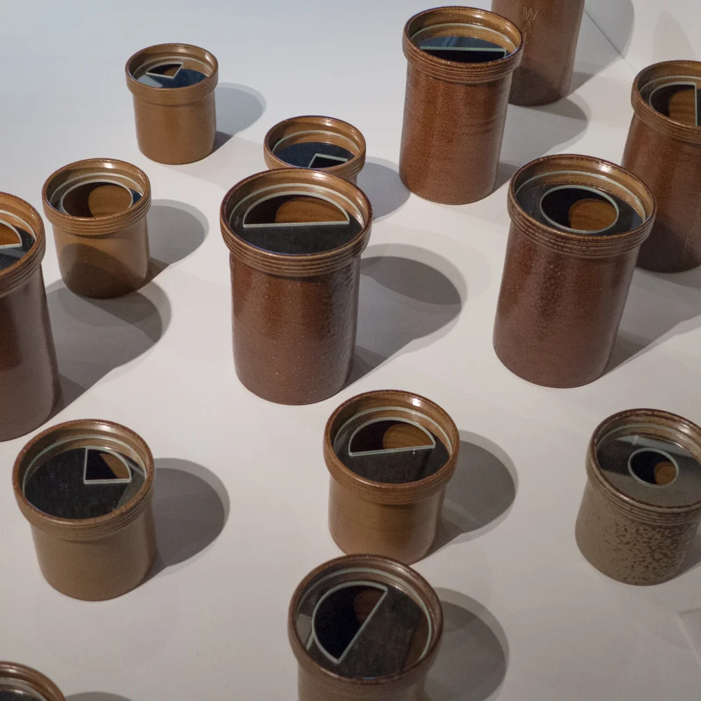
The works stand on mirrors that cover the whole floor of the gallery and are contained or protected or isolated by large frameworks that are in black and are round in plan but gently bell-shaped in profile. Each element is a quarter sphere so when two are placed together they enclose the work completely and reflections in the mirrors of the floor complete the cage to form a sphere. Set on their side the open cages create a complete circle with the reflection in the floor like a cave.

I can see the symbolism here. The metal-framed dome is reminiscent of garden features called gazebos, common in England in the 18th and 19th centuries, but deriving from Italian and French designs. These gazebos are a feature in the garden that you look at from a distance and are a destination for a ride or walk but once you get there, not only do you admire the architecture of the gazebo, but, usually set on a high point, you also gaze out over and admire the landscape. So here in Mindcraft you are looking at the framework of the exhibition, looking at items carefully isolated within each but also looking out and across to other works. 

The windows of the gallery are covered and as you enter you have to put on shoe covers to protect the mirror floor that you are walking on so … this is the odd part … it is a strangely detached World that you enter. Magical but odd. I spent a long time in the galleries waiting for people to leave so I could have the space to myself because that was when it seemed to be at it’s best. With other people in the gallery, the strange views of people reflected in the glass as you look down and their odd comments and so on were distracting. But, it was interesting to watch the reaction of the different visitors - some were absorbed, walking slowly and quietly as if in a church, and others gestured wildly and talked loudly breaking the atmosphere - admirable enthusiasm - but annoying.

Some of the works are not quite up to being isolated and being the focus of attention in this way but other pieces are brilliant. 

A general theme for the exhibition was ‘in between’ which worked well with the works that were multiples emphasising both a shape and the spaces.


Point of View by Jakob Wagner is a bench that is formed out of thin vertical slices that are kept apart by transparent spacers and are coloured red on one side and a deep blue on the other so the colour ripples and changes as you move around - heightened by the mirror reflection in the floor and by the way, at certain angles, individual pieces, reflecting the colour of the opposite side of the next segment, take on a luminous intermediate colour.

Point of View by Jakob Wagner

POINT OF VIEW BY JAKOB WAGNER


Fontanella, a simple white cone-shaped vessel in porcelain with a green angled stripe by Claydies, the partnership of Tine Broksø and Karen Kjældgaard-Larsen, was set as a multiple and the reflections created amazing shapes so the harder you looked the more the division between actual ceramic and mirror image of ceramic dissolved and it became more and more elusive, taking on the form of a decorative sculpture.

Fontanella by Claydies - Tine Broksø and Karen Kjældgaard-Larsen


In the same way, Open 1, 2 and 3 - large drawings by Louise Campbell in spidery and elegant red lines spaced along the wall seemed to dance with their reflections in the floor.

Open 1, 2 and 3 by Louise Campbell


Labels are kept to a minimum, with just simple titles in black lettering on the floor, but there is an initial gallery with extensive information panels so it really is worth spending time reading about the works or there is a good web site with profiles of the artists and their work.


The exhibition continues at Designmuseum Danmark in Copenhagen until 31 January 2016.


Basic Bar by Ole Jensen


Dish -Between Earth and Sky by Tora Urup and Selfie by Eske Rex


Terroir by Edvard-Steenfatt

ceramics at Finderskeepers


It was interesting, so soon after meeting several of the ceramicists behind Den Danske Keramikfabrik, to see the work of more from the group at Finderskeepers at TAP1 last weekend including Birgitte Ran Bennike Mayall and Tina Marie Bentsen. 

In fact, pottery and ceramics and ceramic sculpture were well represented at the event so it was possible to see just what a wide range of styles and forms and colours are possible in ceramics. 

Works included among others the crisp, white, faceted vases by Dorte Kjettrup and Susanne Holmvang of Piece of Denmark; the tightly folded works, almost like textiles but in porcelain, by Helene Søs Schjødts or the translucent vases decorated with fern fronds or leaf studies by the same artist; the tablewares of Birgitte Ran Bennike Mayall, Mette Duedahl and Kristina Vildersbøll or the studies in deep concentrated colour from Tina Marie Bentsen.

For many ceramicists, having a stall or display at a design fair for the public, rather than at a trade fair, is an important way to reach a much wider audience and possibly slightly different audience to the customers who might visit a studio or a gallery.


Birgitte Ran Bennike Mayall


Mette Duedahl


Kristina Vildersbøll


Tina Marie Bentsen


FINDERSKEEPERS at TAP1


FINDERSKEEPERS has been promoted as “an indoor market where innovative design meets luxury secondhand clothing.” 

The clothes are a mixture of retro/antique or good second-hand (neither term derogatory) along with hand-made clothing or clothes from a small-run by an independent producer. That was mostly in the back half of the huge hall and across the front half were crafts and design of all types and between the two a lively and really good food area. What’s not to like for a Saturday afternoon.

The venue itself, TAP1, is a large industrial building on the Carlsberg site - where the brewery was, to the west of the centre in Copenhagen, before it was moved out of the city in 2008. 

It was all pretty amazing and pretty inspiring. It’s a sort of alternative Northmodern and I hope that is taken in the way it was meant - as being very very positive about both.

Design included leatherwork, textiles, ceramics, some surprisingly substantial items of furniture (including armchairs and tables) along with lighting and all from small and young independent companies and craftsmen.

Ceramics from Tina Marie Copenhagen Handmade

Here again I come up against this slight problem I have with the term craftsmen. Maybe it’s an English sensibility because I've seen too many poor-quality craft “fairs” in the UK. The word I keep coming back to is makers but I really don’t know if that translates into Danish.

Here, at FINDERSKEEPERS, the maker or, to use the Danish term, kunsthåndværker … art handworker is the clumsy literal translation into English … is also an entrepreneur and again that is used in the most positive way. Talking to people and looking at the stalls, it made me realise that everyone, with usually a very small team of people, has to design and make packaging, design and maintain a web site, deal with the finance and business side, cope with marketing and spend their whole weekend at an event like this, working hard, and that's all on top of designing and making their work.

Looking at the internet site for the venue, this event was organised through TALL GROUP and their “vision is to create sustainable companies that thrive on a global market, achieving this by encouraging pioneer thinking, guts and a clear path away from mainstream alternatives.”

Really the main point to make is that although most of the work here was 'hand made' rather than being from a large-scale factory manufacturer there was an all-pervading sense of professionalism, real commitment and self belief with a clear sense that each designer is working towards a carefully-considered and distinct style that carries across all their products, and there was, overall, great presentation, packaging, labelling and graphics. Having lived in Copenhagen for over a year now, none of this comes as a surprise to me … I am simply spelling it out for anyone who is not fortunate enough to get to the event.

What is also important is the crowd that was queuing at the door to get in. These were mostly couples and groups of friends in their 20s and early 30s. The event was packed and people were buying so obviously there is a very serious demand for high-quality design that is slightly different, more unusual than what can be seen in a store. Of course, many of the companies here sell through conventional outlets as well as their own on-line sites but people coming to the event certainly seemed to be looking for something that says a lot about the person who made it and probably, they hope, quite a bit about the taste and interests of the person buying. 


BLINKENBIKE ApS


Finderskeepers opened on 26th September 2015 and continues on the 27th

TAP1

FINDERSKEEPERS has photographs and links to the internet sites of the designers. Note that Finderskeepers hold comparable events in Aarhus and Odense so see their internet site for dates.

Den Danske Keramikfabrik 2

PHOTOGRAPH PUBLISHED WITH THE PERMISSION OF TINA MARIE BENTSEN, DEN DANSKE KERAMIKFABRIK


Keen to find out more about Den Danske Keramikfabrik, I had coffee yesterday at the Design Museum with Alikka Garder Petersen and Tine Broksø, two of the ceramicists behind the new factory, and with Susanne Meyer who is working on their publicity.

The idea for the factory actually evolved from meetings of a ceramic club in Copenhagen. Many ceramicists work alone or share studios with one or two other artists and may take interns but contact and support from other professionals is important. In their studios, it is obvious that production has to be geared up to the kiln and the number of potters or ceramicists working there so, for very simple practical reasons, it can be difficult to respond if there is, for instance a large order for tableware or an idea to work on something that is much more ambitious or possibly more demanding technically.

Den Danske Keramikfabrik will provide those facilities and open up commercial possibilities for not just the initial group of 16 ceramicists but also other studios and other artists around the region … so already there has been a meeting in Malmö to involve studios and ceramicists in southern Sweden and the idea is to attract work from further afield including north Germany.

Bornholm is well placed geographically with ferries from Ystad and the flights from Copenhagen airport taking around 30 minutes. This was seen to be crucial if artists are to work closely with the production team in the factory. 

The factory site in Nexø was first seen in May 2014 and it is planned to open in the New Year so progress is fast. There will be an administrative board of five with three ceramicists and two business members.

From the start there has been a focus on conservation and sustainability, aware of their use of water, the need to recycle heat from the kilns and to use renewable energy where possible.

A factory mark has been designed for pieces produced by the factory and it is hoped that work will include that mark to identify the pieces as made in Denmark and made by hand although of course some artists and some design companies may opt to use just their own mark.

An initial range of pieces called Upside Down will be produced for an exhibition on Danish Design Now that opens at the Design Museum on the 13th November. That range will showcase what the factory can provide in terms of techniques, skills and expertise and will be produced as a limited and numbered collection for sale with 100 copies of each piece.

Den Danske Keramikfabrik


PHOTOGRAPH PUBLISHED WITH THE PERMISSION OF TINA MARIE BENTSEN, DEN DANSKE KERAMIKFABRIK

Den Danske Keramikfabrik

photograph published with the permission of Tina Marie Bentsen, Den Danske Keramikfabrik

Continuing with the theme of manufacturing and the production of design locally or at least regionally - see the post Den Nya Kartan about a project in Skåne in southern Sweden - I was recently contacted about a new ceramic factory that will open early next year on the Danish island of Bornholm. 

Den Danske Keramikfabrik will be owned by sixteen ceramicists, professional potters and designers who all have their own small businesses, and their goal is to produce high-quality ceramics at competitive prices not only for themselves but for other potters and designers and design companies. This means that the factory will develop products in close co-operation with skilled craftsmen to balance design, craft skills and technical skills.

There is a tradition of producing ceramics on the island and the new factory will be working in close co-operation with the Bornholm Kunstakademiets School of Design in Nexø. 

Initial publicity from the group has set out their aim …. “to create high-quality products based on professionalism, knowledge, curiosity and thorough knowledge of materials, techniques and craftsmanship. The diversity of products range from something unique, sculptural and experimental, to ceramics for everyday use in large and small series with a focus on form and function.”

“Our goal is to become a manufacturer who can sustain Denmark's reputation for good quality-conscious design and design that reflects the respect and knowledge of the material and especially mastery of the ceramic craft.”

They feel strongly that “for Denmark to maintain a leading position in ceramic design, it is essential that we have the knowledge, expertise and understanding of all stages of the design process. Including understanding materials and mastery of techniques.”

In part, this will be achieved by bringing to commercial production the workshop experience of craft potters to ensure “high quality and constant innovation of craft and production methods.”

There will be an emphasis on both reliability, as a manufacturer, quality control and flexibility in the factory so they will be able to produce different quantities of a design, from large runs of one design through smaller orders to unique pieces and with the ability to work on prototypes which need a close collaboration between the designer and the factory. This close working relationship, between designer and producer, and their understanding of the market combined with flexibility on the technical side should mean “rapid adaptability and the quick production of new designs that make it quicker to get to market.”

It will also be important to ensure that production is environmentally sound and ethical so they have already joined the Bright Green Island strategy where the aim is for Bornholm to be CO2 neutral by 2025.

Ethics extend to labelling and the group are already reminding people that actually "Made in Denmark” should not be used for products that are in part made abroad and “Handmade" should not be used by any company where the product has been made in part by machine. “Honesty and transparency of production methods gives final customers the opportunity to choose what products and brands they want to buy.”

Initial publicity talks rightly about a wider and more general need to respect the expertise and the designs of others - so here, from the start, is a strong statement against the growing problem where some factories simply copy the designs of others.


photograph published with the permission of Tina Marie Bentsen, Den Danske Keramikfabrik

Ceramics produced by the factory will be porcelain or stoneware and their expertise will cover technical drawing in the initial stage or 3D models, processes such as form work, plaster casting, slip casting, hand turning, throwing and dip glazing, spray glazing, double glazing, decoration with slip, painting and silk-screen printing with underglaze colours.

I will be meeting some of the ceramicists behind the project next week and I hope that I will be able to visit the site on Bornholm and report on progress at intervals as they produce their initial collection to demonstrate the range of designers, skills and technical expertise available.

Den Danske Keramikfabrik

Den Nya Kartan - Form Design Center Malmö


An initial report by Jenny Nordberg, begun in 2013 and completed through 2014, looked at how small-scale production of furniture, ‘gadgets’ and other design objects could be part of a sustainable community within Skåne, a clearly defined and relatively small region. The report considered ethical values in consumption and looked generally at production and at manufacturing skills surviving in southern Sweden. In part it seems to have followed a growing desire that more food should be produced locally. 

One aim of the consequent project is to reduce transport costs for both materials and for finished goods but also it was hoped that focusing design and production locally would also mean that there would be fewer intermediaries in the commercial chain. 

Early in 2015 twenty-four designers were selected along with twenty-four manufacturers to collaborate in the project. They were chosen in part for their curiosity about the project but also for their openness to trying new business partnerships.

Many of the designers had worked both locally and internationally and the manufacturers ranged in scale from craftsmen, who are generally geared up to small production runs, to companies organised for larger-scale production. Each partnership was given freedom to determine what they would produce and how and much came down to developing personal as well as working relationships.

This project has also been about testing the form of collaboration, between designer and manufacturer, and aimed to establish a more equitable financial arrangement that moved away from the normal pattern of royalties for rights to reproduce a design to agreements where the designers and manufacturers share the expenses incurred in development and initial production but then also share the revenue.

Items or objects produced through the project cover a wide range of materials and manufacturing techniques including blown glass, ceramics, metal work, leather work and textiles and a wide range of items from stacking boxes to storage jars to lighting to jewellery and a champagne table.

That last item emphasises one curious aspect of the works presented. It would appear from the introduction to the exhibition that the designers and manufacturers were given freedom to choose what they would produce. Jenny Nordberg, who also curated the exhibition, commented on this:

“As a curator, I imagined that most people would design and produce saleable inexpensive items to show that it actually does not need to be particularly expensive by local production. There, I thought wrong. It has instead been mostly projects where both designers and manufacturers wanted to challenge themselves and show the breadth of their skills. Many of the projects … are unique, conceptual, luxurious, on the verge of unfeasible and overall, just amazing.”


Biophillia - Stoft & Zol Art

Unisex-kimono-kofta - Liv Andersson & Biommiga Gredelina

Vaporware Fluid

Andréson & Leibel och Humi-Glas (samt JFKemi)

SpegelrörPetra Lilja & Wallåkra Stenkårlsfabrik

Spegelrör

Petra Lilja & Wallåkra Stenkårlsfabrik

Transformer

Milan Kosovic & Thomas Alexandrsson

Stilleben

Sophia Lithell & Herman Andersson Plåt

1L=

Patrik Bengtsson & Genarps Lådfabrik


It is not clear if this shows that designers or manufacturers were concerned primarily to showcase their skills but that seems unlikely given the well-established careers and reputations of most. Possibly they wanted to use the opportunity to produce things they would not normally be able to work on. It could be more of a problem, in terms of ongoing viability and the possibility of extending the project, if they all felt that reasonable financial returns would only be possible through producing more expensive items or if they thought that their potential market would not be interested in buying just basic items. Perhaps it is simply that, at this initial stage in this project, more basic designs - so everyday household items such as tableware - actually need a much larger production run to return a profit.


All the designs are available through the web site.

The exhibition continues at Form Design Center in Malmö until the 15th November and then transfers first to the National Museum in Stockholm and then in 2016 to Vandalorum in Värnamo.

Den Nya Kartan - The New Map

Hjemlighed .... homeliness


Ten designers, architects and craftsmen have come together to exhibit their work in a private apartment in Lavendelstræde - a street in a tightly built up area of historic buildings just to the east of the city hall in the centre of Copenhagen.

It is an amazing apartment spread over two upper floors and the attic space of the tall, narrow 18th-century house with a striking mixture of original parts, including the roof structure, but with modern features such as an open metal staircase, a long wall of modern kitchen units and an area of glass floor between the attic bedroom and the kitchen and dining room on the level below.

The kitchen area opens onto a large roof terrace with views over the Copenhagen skyline looking towards the tower of Vor Frue Kirke. 


This is not just a chance to see a very striking apartment but, of course, to see the works displayed in a home, in the rooms of the apartment, along with books and furniture and kitchenware of a very real domestic setting.

Perhaps we have created false divisions between craftwork, such as tableware, that we can use in our homes, and the works of artists working in the crafts that we see as gallery pieces. These works, in this exhibition, were not, specifically, designed and made to be contained in an art gallery or museum - although many of these artists have their works in museum collections - but they can and should be seen and appreciated in a home. These pieces stimulate comment, attract admiration, stimulate discussion, stir people to decide if they love, like or even dislike the pieces. Owning and enjoying original art and craft pieces is not exclusively the prerogative of the public gallery or the private wealthy collector but original works of art or of craftsmanship really do have a place enhancing our lives in our homes.

Works shown here range from ceramic multiples through printed cotton squares displayed on a clothes drier on the roof terrace, to a bench in smoked oak supported on upturned stoneware vessels and there are monumental architectural urns in stoneware. Porcelain lights over the main table are a homage to the iconic Danish PH lights and striking jewellery in braided or plaited white plastic beads, forming deep ruffs for the wrist or ankle but set in a framework of a house, reflect the title of the exhibition. The one odd work, and only odd because it was large and set diagonally it fills and dominates the space of the bathroom it is displayed in, is a long narrow glass case with an arrangement of single socks with no pair.

This piece, Finds by Morten Sørensen, illustrates really well one very important role of art which is to point out or isolate something that either we have not thought about or points out an absurdity or a universal experience that we rarely even think about. Other works show how artists experiment with materials and forms pushing boundaries that really should not be there and multiple works are a really good way of emphasising subtle differences or step changes or variations.

toPHøj in porcelain by Anne Tophøj

Indretning in stoneware by Marianne Nielsen and Kristine Tillge Lund

I tid og utid by Anne Tophøj and Theis Lorentzen

Base in oak, aluminium and stoneware by Anne Dorthe Vester and Maria Bruun


Architects, designers and artists taking part include:

Anne Fabricius MøllerAnne Tophøj, Anne Dorthe VesterMaria BruunJohan Carlsson

Katrine BorupKristine Tillge LundMarianne NielsenMartin SørensenTheis Lorentzen


Hjemlighed ... an exhibition at Lavendelstræde 8, 1462 København K continues until 15th September.

Kunsthåndværker Markedet, Frue Plads, Copenhagen


Concentrating on writing up my thoughts on northmodern, I have only just got around to posting a few photographs of the annual Kunsthåndværker Markedet - Craft Market - on Frue Plads in Copenhagen that was there from the 13th to the 15th August. With 124 stalls around the square, the market showed the works of makers from all over Denmark with jewellery, glass ware, ceramics and so on.

Although I’m not a great one for ornaments of any kind, I do admire the works of craftsmen-artists, but, generally, I’m more interested in the practical items of tableware or those pieces that fit in that interesting area between art and industrial design so hand-made glassware or table pottery.


As at last year's market, I was drawn to the work of Anne Mette Hjørnholm, the basket maker from Hjerm, and this year I took a business card from Rasmus Cold … his hand-made frames for glasses are amazing and will be considered when I need to change my reading glasses.


The black and white, tightly-patterned ceramic pieces by Ane-Katrine von Bülow are striking.


What was so impressive again this year was not just the range of crafts on display and not just the high quality of the works but actually the crowds of people who attended a fair spread over three days showing clearly how strong and how popular hand crafts are in Denmark.


Kunsthåndværker Markedet

Lotus by Arne Clausen

northmodern gives designer and companies an opportunity to launch new designs or new ranges and several companies had both a main stand to show the products from their main catalogues but also had separate areas in the entrance or in the main halls to spotlight a specific design.


Lucie Kass have reintroduced the ‘Lotus’ pattern by the Norwegian designer Arne Clausen who was born in 1923 and died in 1977. Lotus was commissioned by the Norwegian company Cathrineholm, initially for enamel wares, and first appeared in 1965 but the design was also used by the Danish pottery Lyngby Porcelain. The range of ceramics and porcelain tableware from Lucie Kass has been launched to mark the 50th anniversary of the design.


Lucie Kass

the Tomorrow Collective

ECCO CARRYING - Jingyi Zhang / TERRA urban root cellar - Ida Gudrunsdotter / YOYO BASKET - Nan Jiang


This is an exhibition by students from the Master’s Programme at the School of Industrial Design in Lund and is a collection of items, all well made, that question and challenge the assumption that any domestic chore must now be done by something plastic with a chip and a plug. And what is also clear here is that there is a sense of pride in the process of making ... so what is common to all the pieces is that they are made from natural materials using traditional craft skills.

It is a  brilliant and inspiring exhibition and even more important because it comes from industrial designers … or better still the next generation of industrial designers.

In part the designs take us back to the household items that you can see in the old town houses in the open-air museum in Lund or domestic items from the past that are displayed in the Danish open-air museums in Aarhus and at Frilandsmuseet north of Copenhagen but those items tend to be from old rural crafts and there is, in part, a sense there of people making do and making themselves what was not available to buy but all these items here in the exhibition could be produced commercially.

This is not nostalgia ... not a sort of romantic revivalist view of a cosy kitchen from our grandparents' past.

These designers have taken a very serious and realistic look at what we do and how and what we make and what we throw away. Sometimes it is useful and sometimes actually necessary to look at where we are, wonder if it is the right place and maybe go back down the road to a cross roads and explore if another road might be more interesting.


Basically they are saying take a step back and look at what you do and why and how and possibly, with ingenuity, sustainability can be very stylish and actually fun.

But they also make a very serious point …. “In a time when the single person is becoming more and more distanced from where things come from, how they are made, what they are made of and where they inevitably end up, it becomes increasingly harder to see the consequences of our lifestyles and choices. We depend on fossil fuel driven transportation systems, monocultural large-scale farming and non renewable, toxic energy sources. Our economies thrive on productivity and consumption and we live like there’s no tomorrow. The Tomorrow Collective is about exploring ways of enabling us to live a sustainable life in the future. Inspired by past knowledge of how to grow, make and be, the project presents concepts for modern tools and systems that can be used in a cyclic sense, within private homes or to share in smaller communities.”


M FOR MILK within one's reach - Judith Glaser


THE BURKS - Oskar Olsson


LITTLE THUMB save the crumbs - Elena Biondi


WOODEN IRON simple clothing care tool - Ausrine Augustinaite


FLAVOUR OF TIME preserve the unique feeling of daily food and seasonal flavour - Reo Letian Zhang


MICU smart choice for a healthy conscience - Andrea Müller


THE TOOTHPASTER nice and simple - Olof Janson


SHAVING KIT long lasting shaving tools inspired by the past & the present - Philip Andersson

Even now, electric gadgets with smart technology do not rule our homes completely … many people still have wooden spoons in the kitchen or one of those wooden lemon juicers and lots of cooks use a pestle and mortar to grind their own herbs but one of the points made here is that often a specific contraption for a specific task might be used once or twice and then confined to the back of a cupboard. Could there be a simpler way of doing some things? Is the purchase of a clever-clever time-saving devise our real priority? Whatever the cost in terms of the energy and the materials consumed? In that profit and loss account is a little time gained worth the loss from the satisfaction of doing something ourselves?

After looking at the exhibition I remembered that when I cleared my mother’s house, after she died a couple of years ago, I came across a butter knife that I had used at my grandparent’s house when I was a small child and some brushes my grandfather kept in his own drawer in the kitchen for when he came in from the garden and wanted to wash and they still smelt of the specific soap and and the tooth powder he always used … he was a late and reluctant convert to toothpaste. Memories suddenly came flooding back. If we chuck out and replace everything because it all has a short shelf life and the replacement is cheap, is it not just sustainability we should worry about but also the loss of our own sense of time and place?

There is a full catalogue of all the pieces on line with photographs and links to all the designers

THE TOMORROW COLLECTIVE

The exhibition continues at Form Design Center, Malmö until 30 August 2015