Amager incinerator


Taking the harbour ferry was a chance to take yet another photograph of the Amager Resource Centre designed by BIG - the Bjarke Ingels Group - and due to come into service next year. The stack - the one that will blow smoke rings - is finished and much of the exterior cladding appears to be in place and it's now easy to judge the angle of the ski slope that will run down from the top. Perhaps more important, if only from the design aspect, is that the grey colour helps drop the bulk of the building back into the cloudscape and tones down the impact of the building on the sky line.

schmidt/hammer/lassen

Krystallen, Nykredit Bank, Kalvebod Brygge, Copenhagen 2011 

Nykredit Headquaters, Kalvebod Brygge 2001


Just added to the list of architects that are in the menu that drops down from the top bar. These pages are not intended to be complete lists of buildings or a critical assessment but are for basic information, an introduction, and will be a place for links to exhibitions, reviews and information about new buildings.

Skagerak in October


I tend to associate the Danish company Skagerak with the summer and with garden furniture but of course they have an extensive range of furniture for inside the house - tables, chairs, bookcases and some really interesting solutions to storage problems - along with a range of household designs including ceramics. My trip to the shop was to look at their Vivlio shelf range - I’ve been buying quite a lot of books recently and started to trip over stacks around the desk so it’s time to look for a better place than the floor to keep them.

It was the first time I had been across to the Copenhagen showroom for quite a few months and was impressed by the changes. The building itself was part of the docks of the Free Port and dates from around 1900 with high ceilings, good architectural features and a really good staircase so it was a pleasant place but the remodelling is certainly very stylish in a sophisticated way.

The design agency All The Way To Paris - founded in Copenhagen in 2004 by Tanja Vibe and Petra Olsson Gendt - have designed several products for Skagerak but have now also restyled the interior of the showroom, the logo of the company and transformed the website and the printed catalogue.


Skagerak
All The Way To Paris


BLOX - a summer of building work

BLOX in February 2016

October 2016


Work on what initially was called the Bryghusprojektet in Copenhagen but is now known as BLOX seems to have moved forward rapidly through the summer. There are now fewer cranes, less obvious engineering work and with a more open site, where hoardings and builders cabins have been removed, it is now much easier to get a sense of how the finished building will appear. 

It still looks a bit like a stack of plastic lunch boxes but, as more of the large panels of pale green and opaque white have been put in place and the scaffolding and covers removed, it now seems to be at least some reference to the use of green and blue slate colours for many of the buildings in the city from the 20th century. It strongly adheres to danish ideals of rational and minimal style and is clearly aware of how buildings can and do use views of the harbour and the light reflected up off the water. 

It was obvious that the relationship with the dark, solid block of the Royal Library, the near neighbour along the quay, was always going to be a difficult one … dominate, compete or be subservient … but the decision to simply be different seems now to be the simplest one. There are still some odd issues with the way the new building will loom over low historic buildings around a courtyard on the side away from the harbour and it will undermine the impressive scale of the important 17th-century Brew House but that may well be resolved by the way the open space on the city side of the new building will be quite complex with changes of level with steps and sunken areas, that will form a transition from street level to the interior and then through to quay of the harbour.

That complex interlocking of levels is in part because a major road running along the quay is bridged by the new building but there will be links under the road as one important function of the building is to provide a route between what is now to be known as the Cultural District of the city and the water front.

Work is so far advanced that it was possible to allow the public access during the Night of Culture to see the progress for themselves. 

Determined clearly by necessary economic considerations, there will be a mix of uses for the building including car parking, a restaurant, a gym and luxury apartments across the upper levels but the primary function will be as the new home for the Danish Architecture Centre and for BLOXHUB - the Danish Design Council along with other associated bodies and companies working broadly on architecture to focus on the Built Environment … rather than the Natural Environment.


The architect for the project is Rem Koolhas and his studio in Rotterdam - OMA (Office for Metropolitan Architecture) - and the development is by Realdania who have an excellent web site for more information.


Light in Dark Places - the photographs of Jacob Riis


Art and photography are not usually reviewed on the site because the focus is on architecture and design but for several reasons this is an exceptional exhibition that resonates with themes discussed here on architecture and planning and is a very strong reminder of the importance of the political and social changes that are needed to resolve serious issues that emerge with large-scale migration and rapid urban growth.

Jacob Riis was a Dane who emigrated to New York with his parents in the late 19th century and worked first as a journalist and then as a photographer. He was one of the pioneers of photo journalism … using images rather than text to show people who had not realised or had not wanted to see the conditions in which huge numbers of people lived in the city tenements.

Why is the exhibition timely? Images on our television screens and in newspapers of crowded slum housing in South America or Asia or Africa seems alien and remote to most living in Europe or the USA but in reality it is only three or at most four generations ago that there were similar living conditions in not just New York but Chicago or San Francisco and in Europe in the ‘great’ cities like London or Manchester that had seen massive expansion in the numbers of migrant workers, either from abroad or escaping from severe economic deprivation in rural economies, and of course even in Scandinavia similar living conditions could be found in the crowded inner courtyards and cheaply built housing in Copenhagen and Stockholm.


the exhibition continues at
GL Strand, Gammel Strand 48, Copenhagen
until the 8th January 2017

Dorte Mandrup Arkitekter


Næstvedgade Day Care Centre, Copenhagen (2004)


Slowly but hopefully surely more architects and designers are being added to the menus that drop down from the bar at the top of the site. These pages are simply a broad introduction to the work of an individual or a studio ... a quick reference point for a reader wanting to find links to a person or a company that has been the subject of a post so links will be added to existing works, to provide a context, or for new work or to web sites, exhibition details, and references to catalogues and monographs.

The latest addition is a brief summary of the works of the Copenhagen architects Dorte Mandrup Arkitekter.

Havneholmen

looking across to Havneholmen from the east side of the harbour


On a walk down to the shopping centre at Fisketorvet on a clear sunny Autumn afternoon and happening to have a camera, it was a good opportunity to take photographs of the apartment buildings at Havneholmen.

There are two courtyard blocks here designed by the architectural firm of Lundgaard & Tranberg that were completed in 2008.

read more


from the street or entrance front looking through to the courtyard, to the boat moorings and to the main harbour beyond


changes to the blog


Some changes have been made to this site over the last month or so. Probably the most obvious is the change of name from Nordic Design Review to Danish Design Review.

There were two reasons for the change. When I moved to Copenhagen, just over two years ago, the site was up and running so, in effect, moved with me and somehow, coming from England to live here, I had a slightly optimistic plan that I would be zooming off to Oslo or Stockholm and even Helsinki … after all it only takes twenty minutes to get out to Kastrup and from there SAS and Norwegian Air can take me anywhere or everywhere.

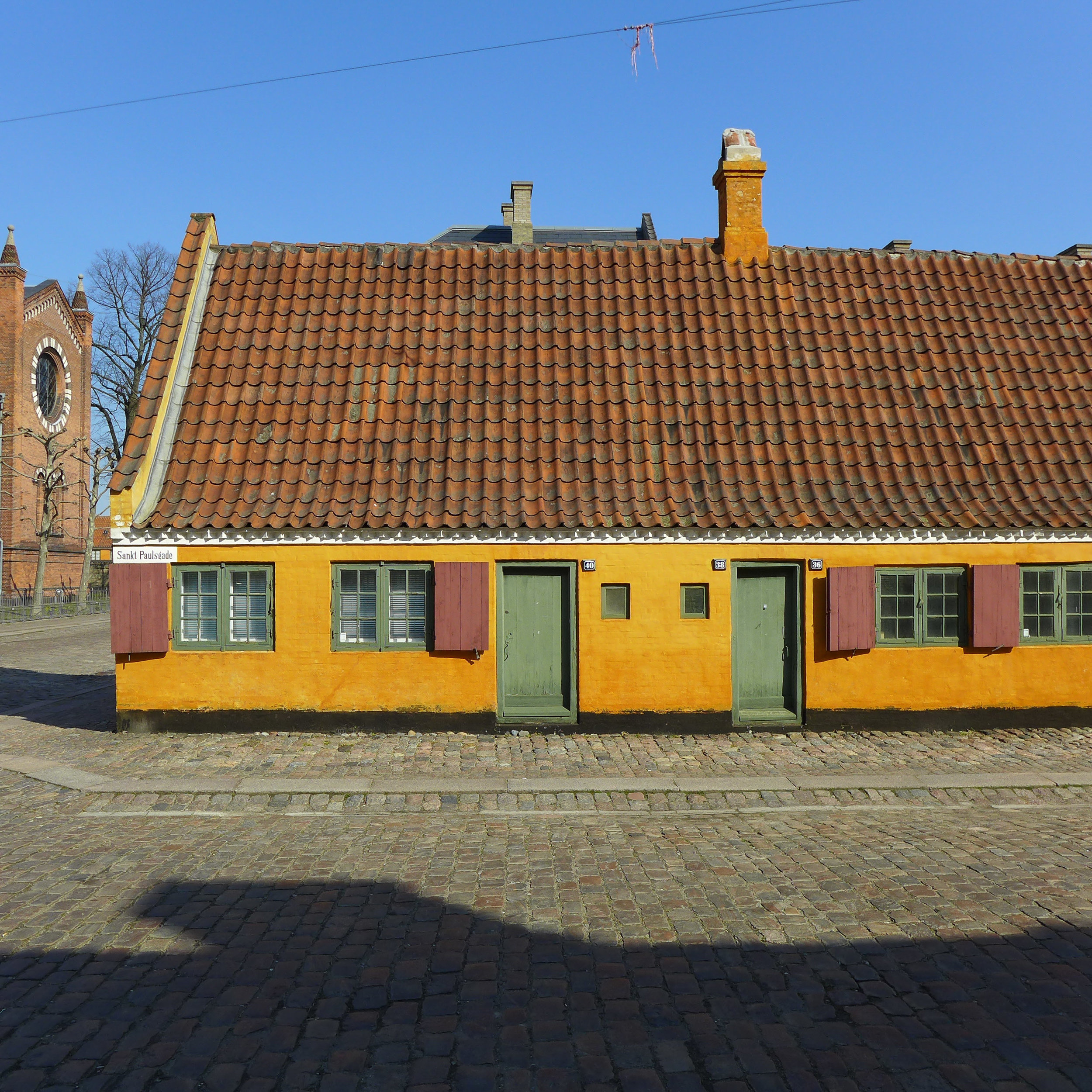
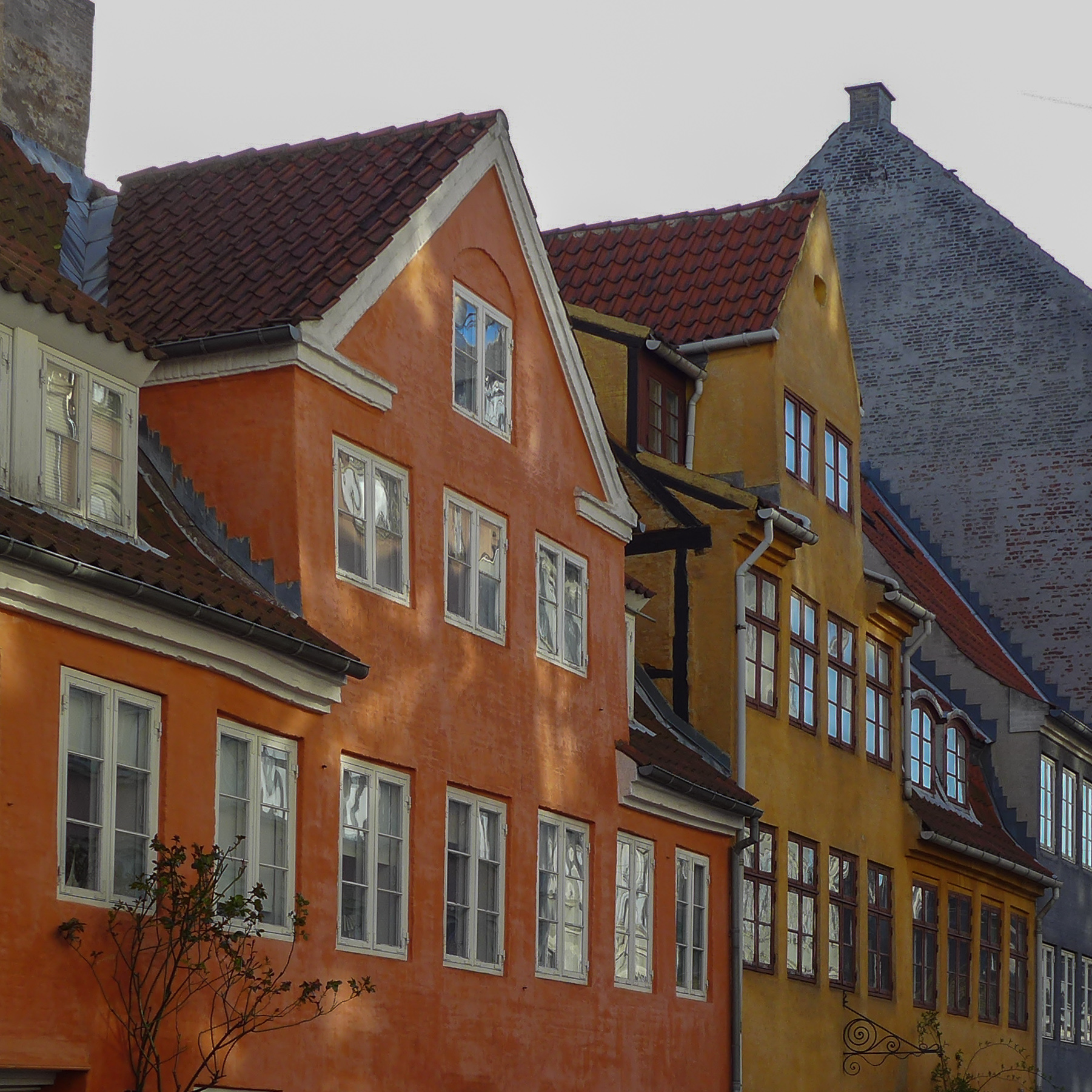
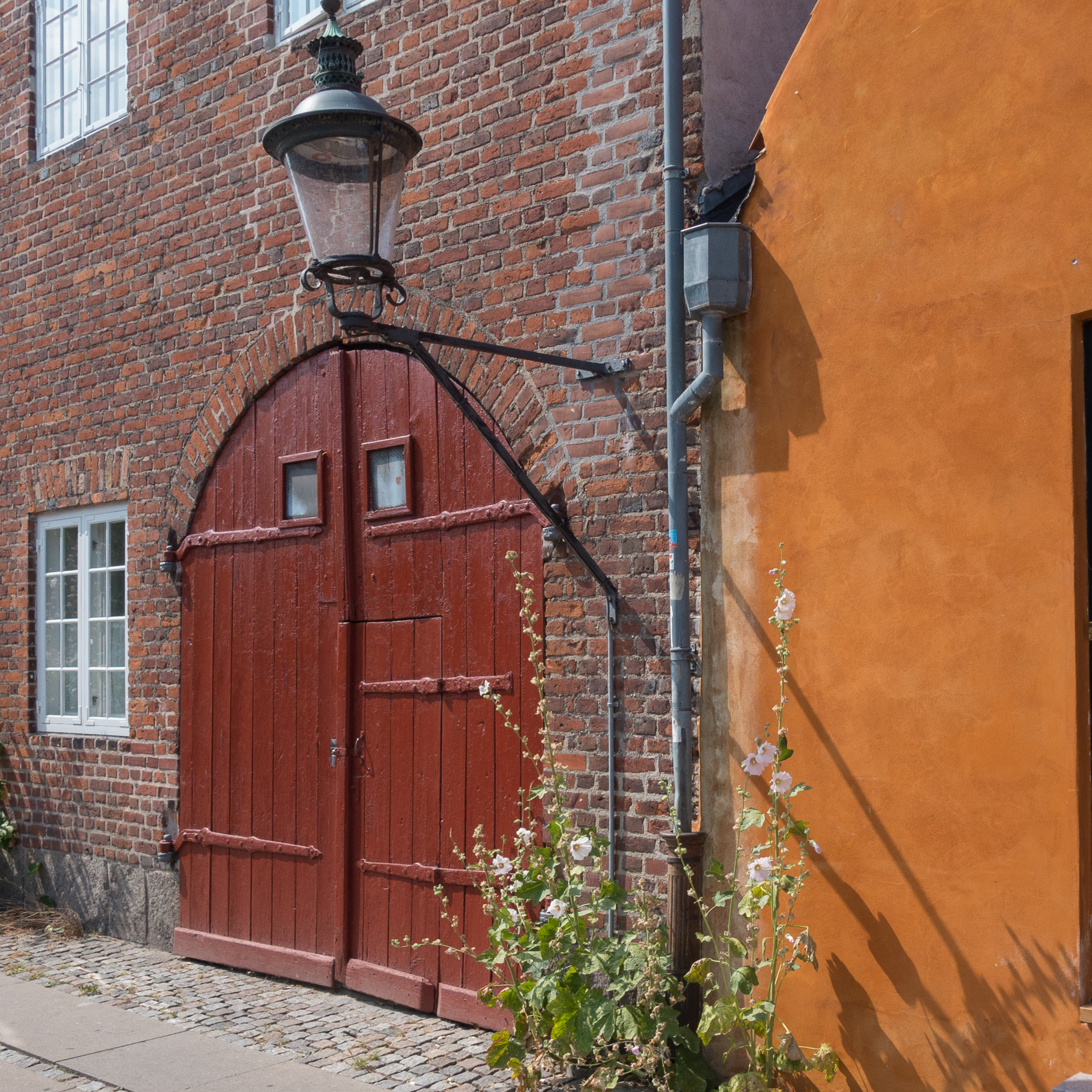
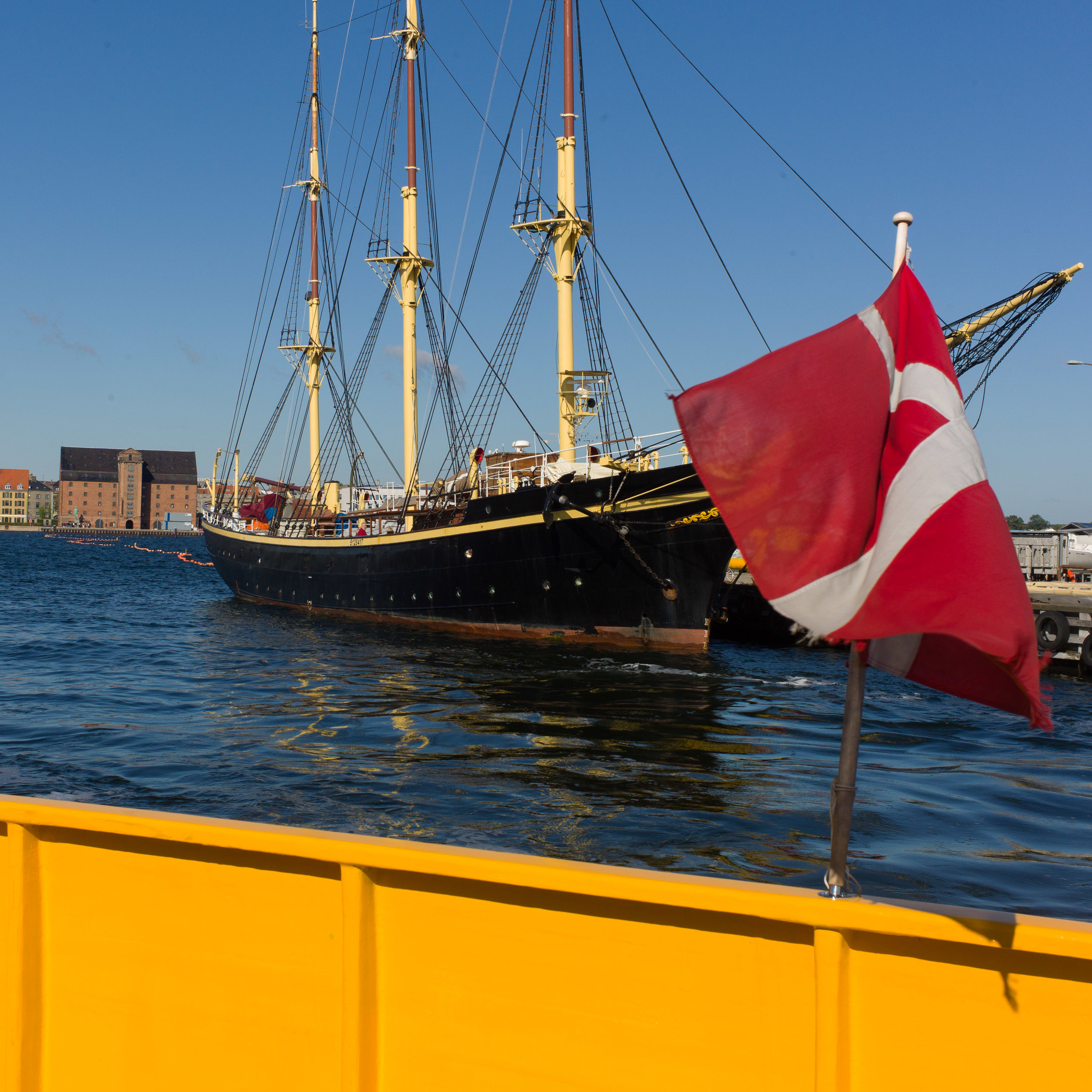
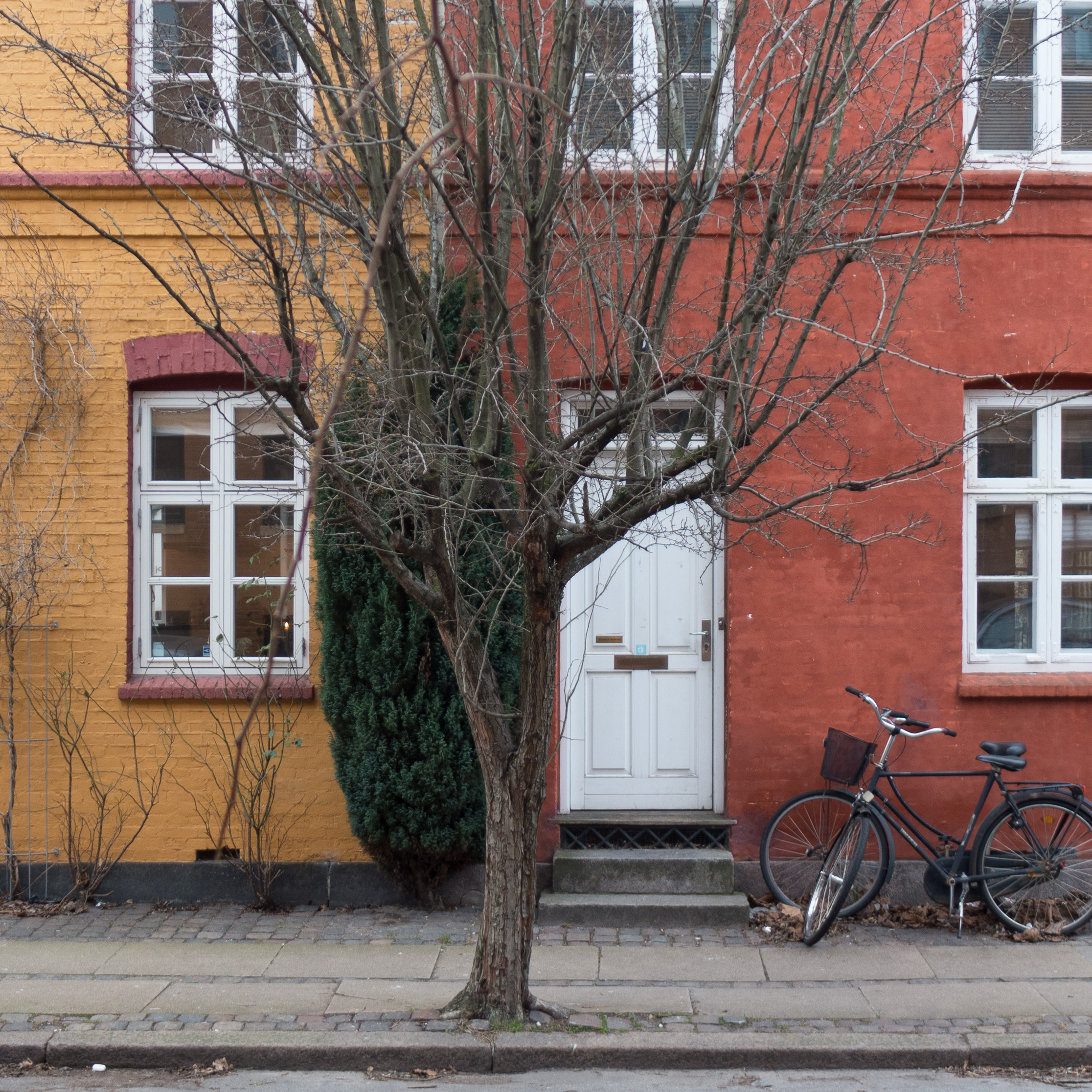
In reality, of course, I got sidetracked, exploring more and more here, trying to understand the architecture and trying to keep up with all the exhibitions and galleries and museums on this side of the Øresund.

So, even Malmö has been getting short shrift let alone anywhere further away. Now I’m trying to be more realistic. 

Another and more interesting conclusion was that although some design companies are taking on the idea of being Nordic, as part of their broader approach to marketing, it is still not a term that readers seem to use in searches when they go to the internet… neither readers here in this region nor readers from other countries.

If you ask people if they feel that they are Scandinavian they think for a moment, say perhaps so, but they are Norwegian or Swedish first and foremost but if I ask if they think of themselves as Nordic, the normal reaction is to look slightly perplexed, as if they have never been asked that before, and then say no, not Nordic, but Danish or no Finnish or whatever. So I’m not sure how often ‘Nordic’ is used as a search term that brings readers to the site.

When I moved here, web site analytics showed me that just over 1% of my readers were from Denmark. Reader figures have tripled over the two years but now up to 40% of readers each month are from Denmark so, I guess, in part the change of name also reflects that.

Site analytics are curious and often not what I expect. For instance, when the site started, by far the largest number of visitors came via their Apple computer and using Safari. I post to the site from a Mac Pro, using a large screen, and tend to design around what I see on my screen so I was already aware that that means I push the limits for anyone coming to the site on an iPad or phone but the number of readers using Chrome has increased steadily and although Squarespace - the company I use to host the site and whose templates I use - is good at scaling automatically, I need to do more to take into account a wider range of users on different platforms.

Note that review and Copenhagen notes are actually set out as self-contained blogs … clicking on the ‘logo’ or selecting REVIEW or COPENHAGEN NEWS on the top bar will take you to the most recent post in each chain of posts and the calendar below each ‘logo’ is one way to look at and select posts by title or date.

The major change here is the introduction of Copenhagen News for quick posts but also with site housekeeping like this, and notes will become a place for the type of posts normally found on a design blog - so more general thoughts and ideas and reminders about exhibitions or new design shops or new designers or design companies. The journal section has been renamed as review, simply to move closer to the original aim for the site as a place to write and publish reviews and longer pieces to try to discuss in detail the how and the why and the context for architecture and design now.

colours for this blog and its logos

With recent changes to this site there was a reason to look again at the typography and the layout of its pages and a chance to use some different colours. That meant thinking about which colours for me stand out in Copenhagen with a clearer appreciation of the city now I live here year round through all seasons.

Water around the city - the seascapes of the sound - and water in and through the city - the water of the harbour, the lakes and the fountains of Copenhagen - along with the strong clear light, means that clean, deep blues are a strong influence on design and architecture here along with the softer distinct slate green colours found in the work of Arne Jacobsen and in many of the more recent buildings in the city with opaque panels of blue or green or with acres of glass picking up the tones reflected up off the water. Cream and sand colours, of many of the historic buildings, are important and, of course, greys tending to purple of the cobbles and setts contribute a lot to the colour and tone of the townscape but in the end, to my surprise, I realised that it is the dark yellow and deeper colours, from ochre through to the deep oranges and darker reds of iron oxides, used for so many of the painted buildings, that had made a real impact.

Of course, these strong earth colours are not unique to Copenhagen but are found throughout Denmark and in Oslo and Bergen and from Malmö to Stockholm and beyond, so they are truly Scandinavian colours and part of a strong colour palette that designers and architects see around them every day.


Pitch Black - the Cabinetmakers’ Autumn Exhibition


Flexible Standard, Carlo Volf - Copenhagen Technical College


An astounding exhibition that highlights the huge skill and the boundless and seemingly immeasurable inventiveness of Danish furniture makers and designers. Except of course highlighting is not exactly the appropriate word here as the theme of the exhibition this year is the black line on paper - the draft - and the full title of the exhibition is Pitch Black - shadows and transparency.

Norm Architects have been responsible, as they were last year, for the overall design and arrangement of the exhibition, but have moved away from the mirror glass and complex reflected light of Øregård, last year’s venue, and created a dramatic setting of shadows and mystery: the works are shown over the two main floors of the 17th-century brewhouse building with windows covered to exclude all natural light and the massive posts and beams of the structure and the huge sculptures that are permanently here are sunk in gloom. The shadows appear palpable and become a significant part of the display. 

The forty-eight designs cover an amazing range of styles and explore the potential of many very different materials, from leather to Corian, but above all it is the form and shape of pieces and how they occupy space that is explored most strongly. Perhaps the only problem is that it is difficult to appreciate fully the quality of the craftsmanship and the novelty and imagination used in the diverse techniques of joining, overlapping, finishing and forming the pieces.

photographs of all the furniture


Black Hole, Örnduvald

Disguised as a chair, Nils-Ole-Zib

Syrsa, Mia Lagerman


the exhibition Pitch Black continues at the
Lapidarium of Kings, Christian IV’s Brewhouse, Copenhagen
until 30th October 2016


Ole Palsby Design - Ravnsborg Tværgade 7, Copenhagen


Recently, there have been several posts here about Ole Palsby Design so it might be useful to show the shop and display space that was opened in Copenhagen 18 months ago. This is in a new development - an infill or replacement building in a well-established street - with shops below and apartments above. The deliberately stark interior of the display space, with the use of exposed concrete, provides a foil for the designs that reinforces the strongly rational and functional starting point for these pieces.

Ravnsborg Tværgade is on the west side of the lakes, just over Dronning Louises Bro (Queen Louise's Bridge) so on the side of the lakes away from the centre of the city, and just one block away from the busy through fare of Nørrebrogade. For visitors new to Copenhagen or not familiar with this part of the city, the streets here, including Ravnborggade, Sankt Hans Gade leading up to the square and the blocks beyond the square are well worth exploring with established antique shops - several selling furniture and glass and ceramics and lighting from the mid 20th century - and a growing number of private galleries and design studios.

Before visiting Ole Palsby Design check with their own web site for the days and times for opening.

Ole Palsby Design


Let's Play

This is the last week to see Let's Play … an exhibition at the Danish Architecture Centre that looks at how important it is when physical activities - sport and exercise and play - can move out into the public space of streets, squares and parks and, in Copenhagen, to the harbour and the beaches.

This is not just about when or where people take part in organised sports or how and where they do any form of exercise but it's about how these aspects of life can be encouraged and how people can be encouraged to move these activities outside and, through careful and well-considered planning, how they can become an important and fully integrated part of life in the city.

And it's not just about those participating … it's also about seeing other people do these things and the way that contributes to the overall feeling that a city or town is relaxed and positive about life. And it's about how using public space makes living in a densely built up city pleasant, enjoyable and dynamic.

If you have ever wondered why Denmark seems to appear so often and rank so high in quality-of-life studies and polls you can begin to see some of the reasons in the panels and photographs and videos in Let's Play.


Let's Play,
Danish Architecture Centre,
Strandgade, Køebenhavn
continues until 30th September

Sted at the Danish Architecture Centre

From the middle of September through to early January the Danish Architecture Centre will have a series of individual exhibitions in the first-floor gallery space that will look at the work of three newly-established architectural firms in Denmark.  Sted is the first of the three and their exhibition opened on the 16th September.

Sted translates into English as place or location and the team - a group of young architects and landscape architects - have a strong interest in the established character of a location. In projects, they focus on the texture of existing hard landscape; colours and texture of existing buildings and the plants that may have become established naturally as a site or buildings have declined or are abandoned. It is the existing character of a specific place or neighbourhood rather than simply the potential of a cleared site that they take as their starting point.

Danish Architecture Centre

Sted

Silica Visions

FIXED//FLUID, Kitta Christiansen

Impossible Vessels, Thibault Varry


This weekend is the last opportunity to see Silica Visions at the Round Tower in Copenhagen … an exhibition of works by students who graduated this year from the Royal Danish Academy of Fine Arts School of Design on Bornholm.


Rundetaarn, Købmagergade, 1150 Copenhagen K

town hall Lyngby

The trip out to Lyngby to look at the new furniture store of FDB Møbler was also the chance to take some photographs of the town hall that was designed by Ib Martin Jensen and Hans Erling Langkilde, following a competition in 1937, and completed in 1941.

Built in reinforced concrete, the block has five main floors faced in Greenland marble and a penthouse inset from the main plane of the front and faced in copper. Set across one side of a large square the front forms a gentle arc and the design is uniform and regular apart from windows at the right-hand end that rise through two full floors and mark, externally, the position of the council chamber and the glazed entrance and porch which is not central but off set again to the right. The entrance hall leadsthrough the building to the main staircase that is in a block that projects to the back.

Door fittings and so on are of a very high quality and the main staircase is impressive rising the full height of the building with curved flights.

Lyngby town hall, Lyngby Torv, Lyngby


car-free Sunday


Yesterday was the Copenhagen half marathon and also “car free Sunday” so traffic was kept out of the city for much of the day.

It was a great opportunity to see many of the major buildings without the distraction of cars around them but it also emphasised just how much space, even in a historic city, is now taken up by tarmac … roads and squares look so wide and strangely bare without traffic. You also realised that it’s not just the space taken up by the traffic but that people are pushed to the margins of open space and in some places, without cars or, at least, with less traffic, there would be much more space for trees and, in some areas, space even for large-scale planting of large trees. 

On Sunday you could also see just how many lights and signs and road markings are required for the traffic. None of this should be a surprise, I suppose, but still, to see the centre of the city without traffic,  I realised just how much public space is dominated by cars.

There are illustrations from the 18th century showing people in all their finery strolling along broad streets inside the old city embankments … but did people then complain about the clatter of carriages and carts and the smell of the horses and the manure everywhere or did they just accept that as the price to be paid for living in a bustling prosperous place?

termokande by Ole Palsby

When the designer Ole Palsby died in 2010, his son Mikkel Palsby decided to take over the studio, and took on responsibility for his father's design legacy. A number of projects were on hold, still to be taken through to commercial production, including a thermos jug designed in 2007.

That jug, or termoskande, is now being manufactured for the Coop group in Denmark under their Enkel label and was shown by Ole Palsby Design at the design fair northmodern in August. The shape is simple and beautiful and the jugs have a soft matt finish for the outer surface and, for obvious practical reasons, a high gloss finish to the inner rim and pouring lip. If talking about a plastic jug as beautiful sounds slightly excessive - the exaggeration of a design obsessive - surely the proportions are almost perfect and the profile incredibly elegant.

As with all kitchen-ware designed by Ole Palsby, the jug fits perfectly in the hand; it is well balanced and there are carefully thought-through details like a slight depression for the thumb at the top of the handle which makes perfect sense in terms of ergonomics … the jug  can be held securely and can be tilted at the right angle to pour out the contents steadily and safely ... in other words it functions without the user actually having to think or analyse why or how.

Mikkel Palsby kindly agreed to be the 'hand model' for photographs to show how the jug pours perfectly.

coop - enkel

Ole Palsby Design


FDB Møbler in Lyngby

On the 1st September FDB Møbler, part of the Coop retail group of companies, opened a furniture store in Lyngby some 12 kilometres north of the centre of the city. The opening seems to have been relatively modest, with no fan fares and, as far as I can see, little in the press but this could mark a very important shift in the furniture market in Denmark and beyond as Coop Denmark is part of a wider Scandinavian commercial company with NKL Norway and KF in Sweden.

FDB Møbler were important through the 1950s and the 1960s for producing reasonably priced but well-made furniture designed for them by some of the most famous names then working in Denmark including Poul Volther, Ejvind Johannsson, Erik Ole Jørgensen, Mogens Koch, Jørgen Bækmark, and Børge Mogensen.

Many of the most famous pieces from the 50s and 60s are being made again and under the banner Tradition of design at democratic prices. Having visited the store, I can say that the finish and quality of the products is outstanding and the choice of colours and so on clever and appropriate for contemporary taste.

Household items by Ole Palsby and Grethe Meyer are being produced under the Enkel label of the Coop and are available in some of the supermarkets in the group and on line through the Coop site.

FDB Møbler, Klampenborgvej 248, 2800 Kongens Lyngby