Shell Chair by Grete Jalk 1963 

chair by Grete Jalk in Designmuseum Danmark in Copenhagen

Grete Jalk (1920-2005) studied under Kaare Klint and many of her designs are conventional with much of her furniture made by France & Son and by P Jeppesen. The plywood chair, designed in the early 1960s, is unique or almost unique for it is usually paired with side tables of a similar form that came in three sizes and marketed as a nest of tables.

It sounds like a simple concept to design a chair in shaped and folded laminated wood that has just two pieces - one for a slightly curved seat - with the ends bent under and down to support the seat - and the second piece gently curved to form an almost vertical back rest - with the ends tucked around behind and then bent down to the ground - and with the two pieces bolted together. In reality the folds are complex and the plywood shapes look more like something that could only be made from giant sheets of pasta left to dry. 

read more


8000 Series Chair by Thygesen and Sørensen 1981

chair in the collection of Designmuseum Danmark


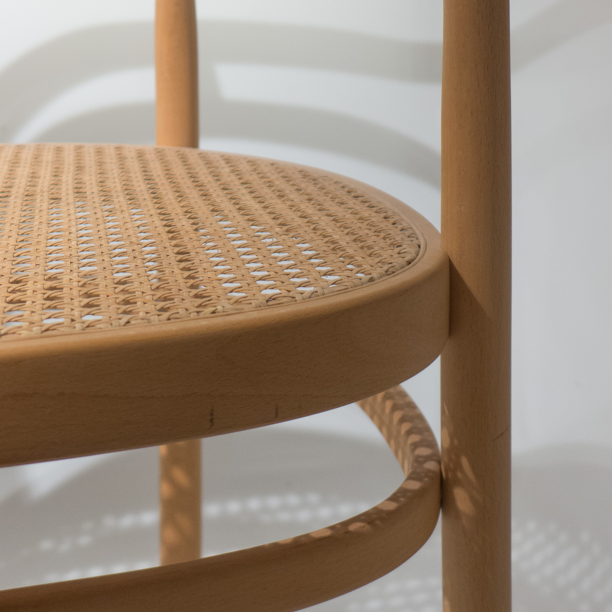
The 8000 Series Chair by Rud Thygesen (born 1932) and Johnny Sørensen (born 1944) was designed in 1980 for Café Victor in Copenhagen. It is said to be a reworking of the famous bentwood cafe chairs that were produced by Thonet in Austria in the late 19th century but it also looks to the rather different use of wood and rather different developments in wood technology from Finland in the 1930s in the work of Alvar Aalto and his experiments with laminated wood and plywood.

The light, compact chair by Thygesen and Sørensen has a round seat that is formed with an outer ring or frame in wood that is rebated to take circles of plywood in the top and bottom and both are slightly concave or dished and held apart by an internal spacing piece at the centre. Sinking the plywood into a rebate gives the edge of the seat a thin and clean profile.

read more


PK 15 Poul Kjærholm 1979

chair in the collection of Designmuseum Danmark


A chair in compressed beech that has a more traditional bentwood form and is interesting because it echoes and almost mimics the earlier chair in metal tube, the PK 12, that was designed by Kjærholm in 1962.

read more


PK25 by Poul Kjærholm 1951


Poul Kjærholm designed some of the most beautiful and most striking chairs of the modern period of Danish design.

At the age of 15 he was apprenticed to a cabinet maker in his home town of Hjørring in Jutland but moved to Copenhagen in 1948 where he continued his training at the Kunsthåndværkerskolen - the School of Arts and Crafts - that was then based at Kunstindustrimuseet - now Designmuseum Danmark. 

It was Hans Wegner who introduced him to the industrial design of Germany and introduced him to to Ejvind Kold Christensen, who was then establishing a company that would go on to manufacture pieces by both Wegner and then Kjærholm. 

read more

photographed at Designmuseum Danmark in Copenhagen


when we get to the future

In 1927, the architects Arne Jacobsen and Flemming Lassen - exact contemporaries and old school friends - won a competition to design a House of the Future which two years later was constructed for the Housing and Building Exhibition at the Forum in Copenhagen. 

The exhibition hall itself was then a new building that had been completed in 1926 with the design by the architect Oscar Gundlach-Pedersen. He was sixteen or seventeen years older than Jacobsen and Lassen but, although he had trained at the time when national romantic architecture was fashionable and his first works were in that general style, he was interested in new materials and new building techniques and as early as 1922 published an article where he talked about buildings that use these new materials “that are not encumbered with tradition.”

read more

Mindcraft16 ... Sølvgade Chair by Cecilie Manz


The Sølvgade Chair by Cecilie Manz - when seen alongside the other works in the Mindcraft16 exhibition - appears to be the most conventional piece because it is restrained, rather self-contained and certainly does not draw attention to itself. In contrast, many of the other pieces are deliberately flamboyant and deliberately controversial to push conventions and to challenge the visitor. 

However, the design of the chair goes in the other direction by taking the design of a chair back to basic principles it raises interesting and important questions about how designers and manufacturers should approach the production of a new chair. Why is that important? Well, a chair is perhaps the staple piece of furniture and usually has a major place or even an iconic place in the catalogues of the major Danish design companies. New chairs are launched at regular intervals and old designs are revived as a matter of pride in a well-known back catalogue. Most design buffs can reel off a list of classic chairs but would find it more difficult to name more than a couple of classic table designs or a couple of sofas.

read more

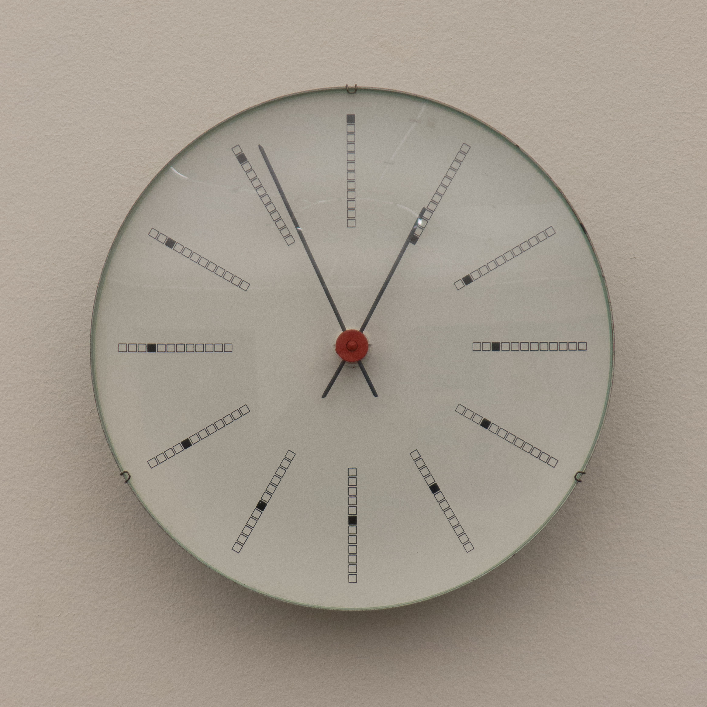
design classic: Bankers Clock by Arne Jacobsen

L1160634.jpg

Bankers Clock in the collection of Designmuseum Danmark


Designed in 1970 for for the National Bank of Denmark in Copenhagen and still in production - sold by Rosendahl. The hour marks around the face have a line of twelve small squares along the radial with the square nearest to the centre blacked out for number one, the second square blacked out for two and so on round to twelve at the top with just the outer square blacked out. The effect creates a fascinating spiral outwards through the twelve hours. Compared with the minimalism of the City Hall Clock, designed by Jacobsen in 1955, these little squares seem quirky or even superfluous, but then the intermediate marks for the minutes on the earlier clock face are not strictly necessary … minimal design is not necessarily about stripping back to the starkest and most basic point but about when you stop in that process of reduction.

Karina Noyons

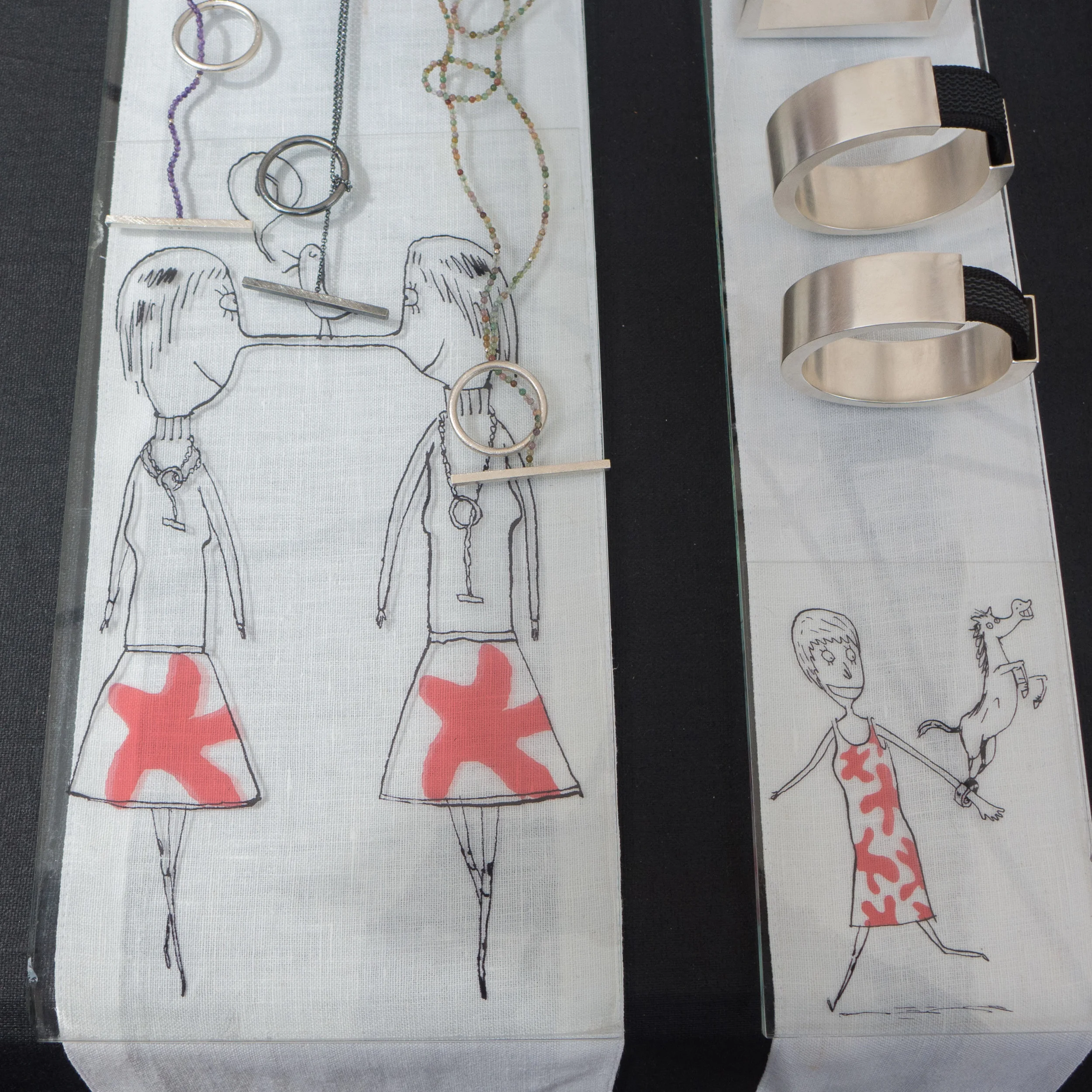
 Back in August, at the Kunsthåndværker Markedet - the craft market on Frue Plads in Copenhagen - one stall that immediately caught my attention was the work of the jewellery designer and goldsmith Karina Noyons. 

Her work is striking - simple but very clever and inventive - playing with strong geometric shapes but twisting them around so rings or bracelets are held out from the body. So for instance, by putting a square outside an inner circle of a ring. Here clearly is a designer's and a goldsmith’s skill that, to repeat something discussed regularly on this site, develops from experience and from working directly with a material, to understand what will and what will not achieve a desired result. What this jewellery also illustrates so well is that the simpler the piece then, as here, the more perfect the workmanship has to be … minimalism shows up any flaw and to misappropriate a much used phrase … less means more skill.

But above all, what I could see in the jewellery, is a fantastic and clearly justifiable self confidence that's combined with a really good sense of humour. That was obvious in the clever display that used illustrations by Rasmus Bregnhøi as a background for the jewellery with suggestions about how the more unusual or less conventional pieces could be worn.

read more

Karina Noyons

Rasmus Bregnhøi


Roon & Rahn


Nicki van Roon and René Hansen are based in Aarhus and their designs were produced to solve a specific problem … they couldn’t find what they really wanted for their own apartment.

In fact, that seems to have become a key feature of their work … it’s problem led or do I mean solution driven? That’s a good starting point for any design … identify a problem - don’t just accept that something is and should be like that because it has always been like that and try to come at a problem from a different direction, a different viewpoint, to find a different solution.

Roon & Rahn also have a strong interest in graphics and they exploit engineering for the precision they want in manufacturing their designs.


Pieces in production include a bench and a round stool with three legs in wood; a rack for storing shoes; lighting and a wall hanging system called Moodboard and in development there is a very clever spice rack.

That might not sound like an extensive catalogue but Roon & Rahn are a young company and they are sensibly taking their time to add the right new designs. Moodboard took a year to develop, to come up with exactly what they wanted - the right design - and that is obvious in the quality of the finished product and in the clever way their system works. In fact, I liked the design so much that later in the Autumn, after seeing their work first at Northmodern, I tracked them down at Designer Space in Copenhagen to buy a Moodboard for my new apartment and then ended up buying a couple of their lights as well.


The pendant lights are interesting. They are simple with a large globe bulb hanging from a cable that runs through a brass stem but turned wood that drops over the bulb holder was made from timber salvaged from old recycled furniture. They use twisted flex in a natural linen colour that was chosen to give the lights a less clinical, less hard and less technical quality, as, over time, the brass will gain a patina.

R&R have a keen interest in the materials they use - the brass stems for the lights are made by them and we talked for quite a long time about sourcing good timber and about fuming or smoking oak. Again this is not about just designing at a drawing board but about working with materials and trying out ideas in the workshop to discover what a material can do or might do. The clear perspex used for the Moodboard is another good example because they had to experiment and had to work out how they could use laser cutting to get the precision and finish that they wanted. 

From talking to Nicki and René, it was clear that in Aarhus there are local craftsmen, workshops and designers who together provide a mutual support group … so if they don’t know exactly how to do something then they know someone who does. 

Packaging for their products is good. They use simple unbleached cardboard but again that disguises just how carefully thought out and stylish it all is … pictograms they designed for instructions for mounting the Moodboard on the wall are particularly good. These graphics are actually a step up from a pictogram but are still simple illustrations and are used instead of detailed written instructions … important when aiming for an international market. That same preference for good clear but sophisticated graphics can be seen in the design of their printed catalogue as well as the layout for their web site. 


In the catalogue they use white lettering on a warm grey background … all simple but stylish and all very carefully thought through, as you would expect. A non-standard ampersand and their logo with interlocked Rs is interesting, one R inverted, so together they look like a bolt or screw head. 

Roon & Rahn show yet again just why Danish design is so strong and why so many young designers and new companies are so successful … it’s not just about drive and ambition … they certainly have that … but about imaginative new solutions to old problems, with a clear sense of style, high standards for manufacturing with good, high-quality materials and the understanding that every detail really does matter.


ROON & RAHN

Moodboard by Roon & Rahn


The basic idea of the Moodboard is simple … a plain wood board that is mounted on the wall and has a series of holes in either a single line or in two parallel lines and with several different styles of wooden peg that can be arranged, as the buyer wants, to store and to display things like keys or glasses but the pegs are more than strong enough to take coats and even much heavier things … Nikki van Roon told me that he has a guitar and a snowboard hanging from Moodboards. 

There are different types of wooden peg of different lengths and a very neat key holder. With a choice of oiled oak or smoked oak for the board itself and, with the same options of light or smoked wood for the pegs, it means quite a few possible permutations, to give the buyer an interesting number of options.

More and more designers are trying to develop and extend options for customers to personalise what they buy. We discussed this at Northmodern and agreed that it’s difficult to get the balance right. Along with trying to give some of the background story for a company or for a product, personalisation can give the customer what is now, I think, called emotional ownership - an odd phrase that must have been thought up by a marketing man rather than a designer - but the idea itself is fine. However, it is necessary to limit options in order to manage expectations and prevent people from selecting a combination that does not work well or putting together a combination which they tire of quickly which obviously they would blame on the designer… that’s the down side of ‘consumer choice’ … the customer rarely chooses to accept the blame. And of course too many options can create problems for manufacturing and with packaging.

There is an engineered character to the design. Not just in the quality of finish but also the clean precision of the laser-cut Perspex and the fixing bolts are matt black, tightened with an allen key, and they project forward of the board to hold the perspex and it is that gap that supports the pegs and in a very simple way stops them from dropping out or being pulled downwards by the weight of whatever is hung from the peg.  

A bold chamfer undercutting the edge of the board itself makes it look thinner but also has the effect of making the board appear to stand slightly forward of the wall because of a line of shadow. Very clever.

Finally, perhaps the most important feature … a metal back plate to the board and small strong magnets in each peg hold them firmly in place and if you swap them around they are almost sucked back into their sockets in a very satisfying way and with a nice clunk sound as well. What’s not to like?

ROON & RAHN


Ole Palsby Design


Ole Palsby Design was at northmodern at the Bella Centre in August where they showed their ICHI range of cutlery and the recently-released thermos jug that is now being produced by the Coop in Denmark.

Mikkel Palsby, the son of Ole Palsby, also showed several historic pieces including the clear glass carafe that was designed for Georg Jensen.

Towards the end of one of the days, there was an opportunity to ask Mikkel a few questions about the way that his father worked when major designs were commissioned. In an earlier post on this site there are comments on the Eva Trio range of kitchenware and it was clear that Ole Palsby established a strong relationship with the manufacturer but Mikkel explained that what was crucial was work with production teams in the factory workshops who, working with his father, made the initial trial pieces. These were tested extensively, both at the factory and at home in the Palsby kitchen, to ensure that they functioned properly, making sure that each piece felt absolutely right in the hand, for weight, for balance or grip, and to be certain that the quality of the material was of the standard that Ole Palsby knew was necessary.

Mikkel Palsby has established a similar and close working relationship with the family of Kazonsuke Ohizumi, who own the workshops in Niigata in Japan where ICHI is made ... crucial in order to realise the designs for ICHI and to complete important final details that had not been resolved for the complete range of different pieces before Ole Palsby died in 2010.

With the new cutlery range this has been crucial because several of the pieces try new shapes or modified and clearly less-conventional shapes because Ole Palsby rarely accepted that something should be like that simply because it had always been like that. Obvious examples of this rethinking are the shape and angle of the bowls of soup spoons; the flexible but also sharp blades of knives for spreading and the longer centre tines of forks so they stick into and hold food before the main part of the fork breaks it open.

It was interesting to hear that changes might even be made to a design for technical reasons after an item had gone into full production so, clearly, Ole Palsby monitored his own work even after he had moved on to another project. For instance, Mikkel could remember one kettle where the base plate had not performed as well as expected and several months after the kettle was available, a revised version was designed where the thickness and composition of the bottom was changed to improve the transmission of even heat … a crucial feature for all cooking pans … and on another occasion one manufacturer had reduced the thickness of the metal used for a range of pans, some time after the launch, and Ole Palsby had insisted that the manufacturer went back to using the original gauge of steel. 

It seems astounding that he could keep such a tight control over the quality of the pieces coming off the factory production line but then Mikkel explained that when a design was completed, and after any modifications completed and agreed but before the piece went into production, one sample was sealed into a box that was then signed by both Ole Palsby and the factory. The contract stated that in the event of a dispute about changes, made subsequently by the factory, then the box would be opened for a direct comparison and the manufacturer was obliged, under the terms of the contract to revert to the agreed specification. Mikkel Palsby could not actually recall many disputes over ongoing production quality as presumably both Ole Palsby and the factory knew exactly what was in the box.
As a prolific designer, continually trying out new ideas, there are projects, drawings and trial pieces in the family archive that were not, for various reasons, produced commercially before Ole Palsby died and the long-term aim of the company is to go into partnership with appropriate manufacturers to see these realised and it is hoped that several designs that were popular in the 1970s or 80s will also go back into production.
Else-Rikke Bruun at northmodern

It has been quite difficult to write about these complex and sophisticated pieces. For a start they are stunningly beautiful. Of course that shouldn't make it difficult to describe them or talk about this furniture but then the superlatives start to stack up and begin to slide into hyperbole and loose their impact.

Also the pieces occupy an interesting middle ground: this is furniture - or at least they are pieces designed to furnish a room, which is slightly different - but in some ways they are closer to being sculpture than most furniture because they explore so carefully ideas about volume and space and explore the role of light and shadow in defining both.

Harlekin in birch

Veneer in birch

A strong feature of the screens is their texture although it may seem slightly odd to describe something on this relatively large scale as texture. As well as through touch, of course, texture is usually revealed by light playing across a surface to highlight changes on the surface that show that it is not smooth - so the texture of rough concrete or, and more appropriate here, the texture of a woven fabric or the texture of the surface of a woven rush mat or of a basket.

Nor are conventional definitions of style particularly appropriate here. The screens are minimalist in that they have a relatively simple repeat pattern and are made in a material with a uniform tone and colour and there is no added decoration - any pattern is formed by the technique of construction and not applied - but rather than being minimal - which often now just implies simple or basic - these pieces are better described as being restrained or sober and controlled.

Certainly the gentle curves of the chairs, when seen in profile, are complex but there is a purity of line and that is what, in part, makes them so beautiful … and that is said with no apology for slipping into hyperbole.

Nor do the pieces really conform to a strict sense of period or location because although they are, in some ways, typically Scandinavian - pale wood and high-quality construction for a start - they can also be seen to relate to Japanese and Chinese techniques of carpentry where separate elements are held together by intersecting and locking the parts into place rather than being fixed together by using carpenters' joints or screws or glue.

Nor are these forms and shapes specifically related to timber, in its most natural form, because Else-Rikke Bruun exploits, in a very sophisticated way, the intrinsic qualities of the plywood that she uses and plywood is manufactured rather than being timber that has simply been felled and then sawn and planed smooth. But also the screens are reminiscent of origami and could be made in paper or card although, of course, then they would be of a different scale.

These pieces show Else-Rikke Bruun exploring and testing, in different ways, both a material and the different technique or ways of working with that material … here the shaping and bending of plywood so that it retains a complex shape. Plywood can be bent and then held under tension, as in the screens, or, with the construction of the chair, sheets of plywood can be shaped with heat and pressure so at normal temperatures the separate sections are flexible but retain the shape of the curve of a former or mould.

The screens and the chair are important because they illustrate another aspect of the design process. It is fascinating to see the work of a designer who knows instinctively that they have reached a point with a design when it is absolutely right. Many designers would have to think carefully before being able to explain to someone why one part of their design is not longer or not a sharper curve or a thicker dimension but by instinct and through experience they know or they feel when something is absolutely right for what they are trying to achieve. And that really is difficult to explain.


Veneer was shown at the Biennalen exhibition of Kunsthåndværk og Design - the Danish Craftwork and Design Association - at Carlsberg Byen in Copenhagen in August 2015

Else-Rikke Bruun

Bended by Else-Rikke Bruun


This chair was inspired by Arabic lettering and, when seen in profile, the curves of the separate parts certainly have the fluidity of ink lines drawn with a pen or a fine brush as in calligraphy.

It is formed from flat, two-dimensional, sheets of plywood that have been cut to shape and bent and moulded to follow complex curves but what is also important, particularly for the view from the side, are spacing and joining pieces that keep each of the four main parts of the chair separate so that they appear to run parallel for sections but then curve away without actually seeming to touch.

Back, seat, front support and the back support together form an elongated X in section when the chair is seen from the side but it is an X where there are not just two main lines simply intersecting but four curved parts that slide together with different amounts of overlap and changes of angle.

There is a strong contrast between the view of the chair from the front or back - which shows something very solid - because the elements are bold unbroken shapes - and the view from the side where the chair is thin, linear and very elegant. The proportions of the parts and balance or relationship between them is crucial and there is a dynamic between the lines and the solid planes in any view from an angle.

Else-Rikke Bruun


In terms of the broad history of chair design the structural form of Bended is fascinating.

Roman and medieval stools used either an x-shaped frame or intersecting and crossing pieces but generally the X shape was seen from the front, not the side, and the person using the chair was either sitting between the arms of the X or on a seat that rested across the top of the X. 

Some designers in the early modern period, such as Gerrit Rietveld, used flat sheets of plywood to form the seat and back of a chair and in the 1930s Alvar Aalto designed chairs with shaped seats or backs in plywood but this was only bent in one plane, basically forming a scroll, and these plywood seats were invariably supported on bentwood frames.

All these designs look inelegant when compared with the chair designed by Else-Rikke Bruun.


 Gerrit Rietveld (1888-1964) 

Red and Blue Chair 1917


Plywood is an industrial or manufactured product that was first made in the early 19th century and was seen as primarily utilitarian. It has layers of thin sheets of wood that are cut by turning a tree trunk against a long thin blade and often smaller or poor-quality tree trunks are used. These slices are glued together with a number of layers to form sheets of varying thickness. Plywood is strong, relatively light and relatively inexpensive so it can be used for boat building, covering industrial buildings, such as sheds or factories or farm buildings, or used for the backs of furniture such as wardrobes or over frames it is strong enough for the sides and fronts of cupboards - particularly for what was sometimes called utility furniture in the middle of the last century.

In the second half of the 20th century, several designers in Denmark produced chairs with a seat and back in plywood that had been curved or moulded into relatively complicated three-dimensional seats, perhaps most notably Arne Jacobsen, but generally these plywood shells were supported on a separate frame of wood or metal.

folding chair by Kaare Klint 1933

Chair PK25 by Poul Kjærholm 1951


The BENDED chair is low and in its form and in the position of the sitter it is reminiscent of two very distinct designs from the middle of the 20th century ... the deck chair by Kaare Klint from 1933 and the metal-framed chair PK25 by Poul Kjærholm designed in 1951 or his slightly later PK22 from 1955.

Several designers have, however, explored the possibilities of using plywood for the whole chair, both the seat and back and the support, and have moulded plywood into far more complicated shapes to create more complex pieces of furniture. 

Sori Yanagi (1915-2011) -  Butterfly Stool 1954. Deceptively simple with two very complex pieces that mirror each other.

Greta Jalke (1920-2006) chair in plywood from 1963. There are two main parts to the chair that are bent to particularly complex shapes - almost like strudel pastry or pasta.

Nanna Ditzel (1923-2005) a prototype chair in Oregon pine from 1962 for Poul Christiansen. The seat is a separate piece, supported by a cross piece between the front legs and housed into the back strut with a line of square mortise-and-tenon joints.


OneCollection at northmodern

At northmodern OneCollection showed the recently re-released France Chair that was designed by Finn Juhl and produced by France & Son from 1958.

Known originally as Chair FJ136, it was delivered as a flat pack which seems to have contributed to its popularity, particularly for the export market. 

More restrained than many of the designs by Juhl, the complex curves of the seat and back of the chair are a development of the 108 Chair of 1946 and the pronounced but gently-curved elbow rests on the arms are reminiscent of the arms of the Chieftain Chair from 1949.

OneCollection, France Chair


C W F France was an English businessman who from 1936 ran the Danish company Lama at Ørholm with the cabinet maker Eric Daverkosen, producing mattresses and furniture. After the War, the company expanded rapidly and at one stage, by the mid 50s, produced up to 60% of Danish furniture exports. The company changed its name to France & Son in 1957.  The working relationship between Juhl and France & Son was fascinating … Juhl was certainly not the most commercially focused designer of the post-war period.

It would be interesting to see production numbers for the chair because it was, possibly, the most overtly commercial of Juhl's designs. Clearly, this was not 'flat-pack' furniture as we think of it now but, unlike Mogensen and Wegner and most other major designers of the post-war period, Juhl did not produce furniture for the lower priced, more popular, sector of the market so he did not design for FDB - the Danish COOP.


A book on the France company - and their work with major Danish designers, including Finn Juhl, Grete Jalk, Ole Wanscher and Hvidt & Mølgaard - has recently been published: France & Søn – British Pioneer of Danish Furniture by James France from the publisher Forlaget Vita.

work in wood at the craft market

Monomade in Denmark


The craft market on Frue Plads is not an obvious venue for craft pieces in wood … the cabinet makers' guild hold regular exhibitions for major pieces and also general design shows and markets such as northmodern or the Finders Keepers market are a good place to find handmade one-off or small run pieces in wood made by craftsmen.

However there were two stalls at the Frue Plads market that had work in wood and both illustrated simple but important points about good design.

Monomade in Denmark was founded by the architects Kira Snowman and Uffe Topsøe-Jensen and is based in Copenhagen. Their beautifully simple - or, rather better to say, deceptively simple pieces - show how important it is to design with clean lines, careful use of appropriate proportions and using the very best timber to highlight and enhance the qualities of the material itself … the goal is to achieve a balanced partnership between the natural material and the skill of the maker.

The ceramicist Jenni Godtlebsen used shelves and a hanging rack by Vestwood with her amazing cups and plates to show how the the pieces do have a clear functional role in a kitchen as well as being beautiful ceramic works but the juxtaposition of fired and glazed pieces set against the natural wood emphasises that ceramics too are made from a natural material. As with timber, it is the variations and the slight irregularities in the finished and fired ceramics that give the works a warmth and vitality.

ceramics by Janni Godtliebsen with wood peg storage rail by Vest Wood