Mindcraft16 - ceramics

Works by four ceramicists were selected to be included in the Mindcraft16 exhibition at Designmuseum Danmark.

They could hardly be more different showing four very different approaches to working with clay but all four makers are exploring what they can do with clay, testing boundaries and challenging preconceptions about ceramics. 

read more

Mindcraft16 ... the cabinet of curiosity?

Three of the works in the Mindcraft16 exhibition seem to look back to the idea of a 'conversation piece' … a large, unusual and unique piece of furniture, usually made with considerable skill and often using rare or unusual materials, that was intended to attract admiration and wonder. Often, these pieces included shelves or drawers for particularly interesting collections of natural objects or fine silver or porcelain or even scientific specimens and were sometimes called 'cabinets of curiosities'. It was furniture for entertainment or for an expression of the owners status or learning with examples surviving from all periods from late medieval through to the 19th century.

These fine and often ostentatious pieces of furniture have little relationship to the humble clothes press or the later chest of drawers: furniture simply for storage.

For most people, drawers are a place to store things, often lots of small things or awkward things that are otherwise difficult to keep neatly or safely and often they are a place to store things that otherwise you do not know what to do with … the English phrase is to "shove something in a drawer and forget about it'.


The Office by benandsebastian has plenty of drawers and compartments, many of them labelled, but is described as "a bureau designed specifically for the Museum of Nothing." With writing flaps that drop down, it is "a place of work and also an incomplete system of thinking … its potential lies in what is projected into it: the promise of ideas that might fill its empty frames and vacant spaces."


Breathe by Akiko Kuwahata, is ostensibly more practical and certainly more obviously modern and Scandinavian in its stark simplicity. It is a metre wide and just over a metre high but only 275mm deep. But unlike most chest of drawers it is not designed to be set back against a wall but has to be free standing.

It is supported on a sharply precise and beautifully made base in maple with four round legs but the long sides are sheets of glass etched with a hatch of closely-spaced white lines set at a slight angle. There are three draws that pull out of each narrow end with a bottom, middle and lower draw, so six drawers in all, again in maple - simple boxes without runners - but the sides are grooved with narrow angled channels cut at the opposite slope to the lines on the glass so that as the drawers are pulled out there is not just a view through the cabinet revealed at the centre, between the drawers, but there is also an interference pattern set up as the angled grooves on the side of the drawer run past the angled lines on the glass … described as "flickering in and out of contact."


The Jaw Nuts by Henrik Vibskov is literally a conversation piece "a noisy crowd of blabbering wooden heads. Their broken language stimulates the constant flow of information and misinformation that threatens to drive us nuts."


just how difficult can it be to design a staircase?

the recently remodelled staircases in the Illum store in Copenhagen


Well, actually, quite difficult.

A staircase is not just a major feature in any building but it can also be a particularly difficult part of the design to modify if other parts of the scheme are changed as the plan develops. It becomes a difficult game of consequences - change one part and another no longer works.

It might sound like stating the obvious but a staircase really does have to function well. A doorway can be slightly too narrow or a window sill too high and people grumble. If a staircase is too steep or too dark or the steps are irregular or too small then it is difficult to use easily and it might even be dangerous. 

A design for a staircase normally has to start with the dimensions for the height and depth of a step - the tread and the riser - fixed by the average foot size and the average stride pattern so a tread of at least 300mm and a step up or riser of between 150 and 200mm. These can vary slightly from one staircase to another but not by much and they have to be consistent and ideally consistent through the full height of that staircase. Just watch how many people stumble at the top and bottom of an escalator if it has stopped moving so after a number of abnormally high steps you get into a rhythm for the stride and then hit two or three very shallow steps at the end. It is interesting that even though people clearly understand the escalator has stopped many still stumble.


read more

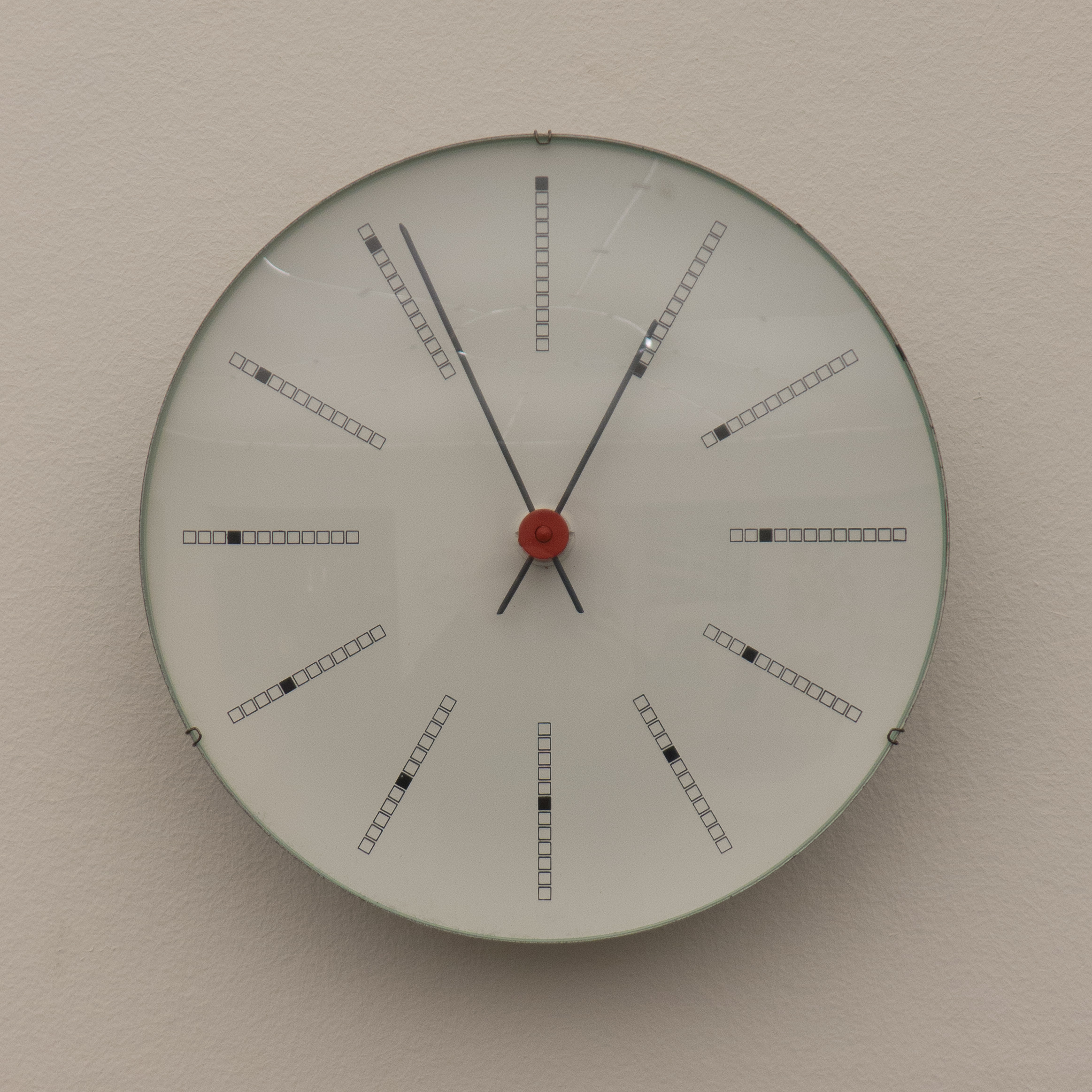
design classic: Bankers Clock by Arne Jacobsen

L1160634.jpg

Bankers Clock in the collection of Designmuseum Danmark


Designed in 1970 for for the National Bank of Denmark in Copenhagen and still in production - sold by Rosendahl. The hour marks around the face have a line of twelve small squares along the radial with the square nearest to the centre blacked out for number one, the second square blacked out for two and so on round to twelve at the top with just the outer square blacked out. The effect creates a fascinating spiral outwards through the twelve hours. Compared with the minimalism of the City Hall Clock, designed by Jacobsen in 1955, these little squares seem quirky or even superfluous, but then the intermediate marks for the minutes on the earlier clock face are not strictly necessary … minimal design is not necessarily about stripping back to the starkest and most basic point but about when you stop in that process of reduction.

writing about design on the internet gets more serious ….

This was posted by Em Fexeus under the dramatic heading I'm not dead


I don't mean serious as in grim and pessimistic but that writing about architecture and design on the internet can be much more grown up and more challenging - it should make us think and make us want to understand more - and could certainly be much more about the world we really live in.

Both design in general and our built environment in particular are too important to be limited to a finger swipe in a bored moment and certainly what's posted should be less about envy and aspirations that can't be realised - swish images that just make us, the readers, increasingly more discontented with our own life and encourage us to go out to buy something that will, we are told, make life easier or better or make us look more stylish or more fashionable.

Don't get me wrong, Instagram and Pinterest are good if people want to use those apps to create 'mood boards' for inspiration and as a starting point to find out more. But there should be more.

Good design should be about making things that work in a better way or to encourage design that uses materials in a better way, and certainly blogs about design should be much more about looking carefully at what makes good design good and bad design bad so we become more discerning about what we want and what we buy.

For most of us, urban settlements rather than the countryside are our normal everyday environment so the buildings we live in, work in or use for shopping or leisure and the streets and squares that form the settings for those buildings are definitely important. They need to function properly and if they look good and make our lives better or easier it really is a bonus.

Perhaps we all need to look more carefully at the buildings we use in order to understand more and question more about what is going on in our built environment so we can decide what is good and what is poor architecture and we should expect and demand more.

If we don't look at the underside of the table; if we don't plonk down in the sofa before we buy it; if we don't look at the label to see that the materials are genuine and sustainable; if we don't say no, that doesn't work; if we don't see that it's a cheap and nasty copy; if we don't look up from the shop window we are walking past to see if the street is a pleasant or an unpleasant place to be and if we don't start understanding more and questioning more then we end up with the architecture we are given and the design we swipe through on our phones when we have nothing better to do.

This was posted recently by Lotta Agaton on her design blog 

Norrøn - territory for dreaming


This is the second of a series of three exhibitions in the Dreyer’s Architecture Gallery at the Danish Architecture Centre with each exhibition running for about six weeks to profile the work of younger, more-recently established architectural practices from Copenhagen. The first was Sted; the work of Norrøn is the subject of this exhibition and the third, from early in December, will be the architectural partnership of Johansen Skovsted.

Perhaps the most important link between the three is that all, besides being young architects, have a strong sense of place in their work … not just a strong sense of nature and landscape but the specific character and qualities of a location that has to be the starting point for any architectural project. Maybe this seems obvious but the contrast with large and commercially-driven development is that the sense of place can often be relegated by the astute assessment of the plot and its potential ... at its worst, development reduced to a calculation of square metres against realisable value, that often results in a much less sensitive approach to context.


Given that awareness of place, and their clear sensitivity to specific places, it struck me as slightly curious that Norrøn chose to make the centrepiece of their exhibition a mythical island and a steeply mountainous and apparently tropical island with models of their projects placed around that landscape. It made for a dramatic use of the space but there was a disjunct simply because much of their work has been on coastal marshes and beaches … stunningly beautiful sites but very very very flat. 

Each model had a large postcard about the project and visitors could take a copy and collect together the full series of cards to form a catalogue … a simple idea that has been used and worked well in earlier exhibitions at the Centre.

The style of the cards - not just the soft line work of the graphics but also the muted tones of soft brown grey was striking and is reminiscent of the images collected together by the English architect John Pawson in A Visual Inventory but even paler to pick up the colours of the dried grasses and reeds on many of the marginal seascapes of these sites.


Many of the projects are for visitor centres or small hotels or lodges including the Blue Plateau beach park and designs for the Dune Hotel overlooking the north sea at Blåvand, a dark-sky observatory on the island of Møn, a viewing tower at the bird sanctuary of Lyttesholm, Lolland and visitor centres on the pilgrimage route on Møn, Camønoen, and for the castle ruins of Hammershus on the island of Bornholm.

There is a complex but significant approach that seems to link all these projects and that is to restore sites by removing intrusive or unsympathetic buildings, to put in place clear conservation plans to ensure the natural sites of sand dunes or coastal cliffs survive but also to build new and carefully-designed buildings to draw in new visitors, particularly where areas are suffering from economic decline or from a reduction in the population as people move from rural economies to the city.

The buildings generally, whatever their actual scale, have a simple monumentality and use natural materials but unselfconscious modern forms. This is perhaps the hallmark of the most successful Danish architectural conservation … to consolidate landscape or historic buildings but generally not resort to restoring by replicating or imitating the historic past.

This is particularly clear in the project by Norrøn to restore abandoned houses in the Danish countryside in Lolland, Guldborgsund and Vordingborg to create holiday homes to revitalise the local economy. The plans produced so far seem to have a respect for the vernacular traditions of the area but simplify the spaces and the interior finishes to give a practical and simple result that also fits clearly with that aspect of the Danish design aesthetic.

Norrøn

Norrøn - territory for dreaming continues at the Danish Architecture Centre until the end of November

Our Urban Living Room - Learning from Copenhagen

A major exhibition has opened at the Danish Architecture Centre which focuses on the work of the Danish studio of Cobe arkitekter but, in a much broader sense, the exhibitions also explores crucial aspects of urban planning … the current and the future role that planning has in the enhancement of our built environment and the way that architecture and planning together can and must encourage the use of public space in our cities and towns for a huge variety of activities.

What is shown here - with models, drawings, photographs and text - are specific projects completed by Cobe over the last decade or so - the remodelling of Israels Plads; the remodelling of the street space above Nørreport railway station; the building of new libraries and schools in the city and all with a very strong and positive planning agenda - but these are also clever and innovative projects that tell us much about the meeting point of public and private space; about the way that politicians and planners determine appropriate policies for how public space is used and shows how much citizens need and how much they appreciate public space and how they use that space in increasingly inventive ways.


a fascinating photograph that shows the street level above Nørreport station covered in snow where the patterns of footprints and bike tracks replicates the original study of routes across the space that determined the position of the bike racks and so on


previous posts on work from Cobe:

Israels Plads

Nørreport Station

Forfatterhuset Kindergarten

Our Urban Living Room at the Danish Architecture Centre, Strandgade 27B, Copenhagen continues until 8th January 2017

can cladding be good or bad or is it just cladding?


Some people get upset when they see an apostrophe in the wrong place on a shop sign and seem to spend half their life looking for examples in order to be offended. Some graphic designers can name a font from 100 metres away and tell you the date and the name of the foundry or the designer and for many it's Comic Sans that sets them off. Me? Well I get worked up about cladding.

OK that's a slight exaggeration but I've spent my working life looking at and taking photographs of and writing about buildings so it really is hard to switch off. Walking along a street, I’ll suddenly spot an interesting or curious feature and then I realise, although I was not conscious that I was doing it, I've been scanning and registering buildings as I'm walking. Perhaps that's why it's difficult sometimes for me to understand that, for lots of different reasons, other people don't even see the awful buildings all around them or, come to that, appreciate when a building has been designed with enormous care.

read more

cladding in Copenhagen … ….


the south end of the harbour in Copenhagen looking across to the Gemini  building by MVRDV and JJW Architects converted from silos to form 84 apartments in 2005


There are so many large new buildings in Copenhagen that the city could claim to have the International Reference Collection of Cladding

At the very least, if architectural students want to look at what is possible with different types of external wall for new concrete or steel-framed buildings then the city would be a good starting point.

I'm not saying that many of these examples are bad … no value judgements were intended … as they say … to avoid litigation. But some are curious in a bad way and many are curious in a good way … quirky or challenging or very revealing about what the architect or the planner or the client was trying to achieve.

Some are actually amazing and outstanding and tell us much about how and why architecture developed so rapidly in terms of both engineering and building technology through the 20th century and most might be worth looking at because they are interesting to think about … if it's not raining and you are not in a hurry.

images and comments

Frederiksberg Courthouse - 3XN

Frederiksberg Courthouse from the south west


The new Courthouse in Frederiksberg is part of the extensive development of the area to the west of the main shopping centre forming a series of squares and pedestrian areas with several new civic buildings. The old Courthouse, with two-storey ranges around three sides of a courtyard, designed by Hack Campmann and completed in 1921, has been retained but a substantial new brick building designed by 3XN has been constructed to the west as a separate block but with a glass link between the two parts at the first-floor level.

Tall, to reduce the footprint, the new range has a sloped roof towards the old buildings in part so that the front towards the historic buildings is a similar height but also so the slope of the roof throws less shadow over the courtyard in the afternoon.


Although the use of brick for the exterior is a nod to tradition the lighter colour of the new brickwork distinguishes the two phases. There are some interesting details so towards the north end of the building, on the east side and beyond the line of the courtyard, the tiles of the roof are swept back up to a vertical in a great curve that has a hint of Arts and Crafts architecture.

Brick is now used in many modern concrete or steel buildings with no structural function, often brought to the site as pre-formed panels, almost as a veneer, so with no need to follow traditional arrangements for coursing or bonding but this is the first building I have seen where several external doors have brick cladding. I’m curious to know how much these doors weigh and if there have to be special closers and door furniture to stop them slamming onto fingers. A line of severed digits on a threshold is not good.

3XN


The Silo


The Silo in May 2015 - work had been completed on the ground floor and the exhibition space was used for 3daysofdesign


The DLG Silo was a prominent and well-known landmark of the commercial docks to the north of the city … clearly visible to everyone coming into the city by train from the north and perhaps the most obvious sign that you were close to arrival for anyone coming into Copenhagen on the ferry from Oslo.

A massive and stark concrete block, the tower was built to store grain but with the decline of the dockyard it had been left in splendid and derelict isolation. With the redevelopment of the area immediately around the grain silo, mainly for housing, the decision was taken to retain the concrete tower but convert it into apartments with a public exhibition space below and the scheme that was proposed by the architects Cobe will now include a public restaurant on a new top level to be encased in glass and with views across the city and across the harbour to the sound. 

The interior spaces of the silo but new windows are being cut through the outer walls and in order to bring the building up to current standards for insulation - grain has to be kept cool and people prefer to be kept warm - insulation has been added to the outside and then a new outer skin added in galvanised steel - pierced sheet metal - that also forms the balconies of the new apartments. This outer metal skin is described by Cobe as "draping it with a new overcoat."

One balcony has been installed on the gable end of the warehouse of the Danish Architecture Centre as part of the current exhibition there on the work of the architects but the recent completion and the opening of a new multi-storey car park next to The Silo means that it was easy to photograph the new balconies on The Silo itself as the work progresses.

COBE

Our Urban Living Room, DAC, Copenhagen until 8th January 2017


photographs of the balconies that are now being fitted - taken from the roof of the P-Hus Lüders multi-storey car park designed by jaja architects and just completed to the east of the Silo


model for the remodelling of the tower and one balcony from The Silo installed on the gable end of the warehouse of the Danish Architecture Centre for the current exhibition on the work of Cobe

P-Hus Lüders - Parking House Lüders - Nordhavn Copenhagen

P-Hus Lüders from the east

looking down the north staircase with the harbour and the sound and in the distance the Swedish coast


Copenhagen is the city of bikes. There are said to be more bikes than people … five bikes for every four people … and the statistics are mind boggling. Each day people in the city cycle 1.27 million kilometres. I’m not sure how that was calculated but if it was organised as a relay race it would be the equivalent of team Copenhagen riding around the World 1,000 times EVERY DAY.

There are five times more bikes than cars in the city but of course that doesn’t mean that there are no cars in Copenhagen … you can pile all your shopping plus all the kids and an elderly relative onto a cargo bike without any problems but how else could you get that lot out to the summerhouse without a car?

So for maybe 20 years, with many of the new apartment buildings constructed along the harbour and around the city, a common solution is to excavate first and build underground parking below the block.

The other planning imperative in the city is for open space where children can play and adults exercise … despite all that cycling an amazing number in the city run and then insist on adding a few pull ups and squats. This means that many larger apartment buildings have a courtyard with play or exercise equipment or apartment buildings are set around a public square or open space with play and exercise equipment. This seems to resolve several problems. Apartments in Copenhagen are generally larger than in cities like London or New York or Hong Kong - many are over 100 square metres and some over 200 - but even with balconies that does not stop people getting stir crazy and needing open space but also, of course, attractive space, used in a practical way, means that public space is appreciated and well used public space is much less likely to be vandalised.

In the new development in Nordhavn a slightly different approach to the problem of parking cars and getting exercise is being tried. The density of housing that is being built on former dock yards is higher than that of many recent developments and presumably excavation of deep car parks, on what has only been solid land reclaimed from the sea about 100 years ago, would be a challenge so here at Helsinkigade the solution is to build a large well-equipped public square and then hoik it up into the air by 24 metres and slip a multi-storey car park underneath.

read more


model for the extensive new development around Århusgade in Nordhavn that is currently part of the exhibition at the Danish Architecture Centre on the work of the architectural studio of COBE. P-Hus Lüders is at the centre of the three buildings - on the far side of the canal - with the pronounced angle of the east end following the alignment of the canal. There are apartment buildings on either side and shows clearly the proximity of the Silo - just to the right - to the north - but set further back and there is the distinct shape of the two giant cylinders of the former concrete silo to the left - to the south - and set back slightly from the wharf of the Nordhavn basin. 


Bordings Independent School … Dorte Mandrup


In this series of posts about modern cladding, Bordings Independent School by the architectural studio of Dorte Mandrup might appear to be an odd building to include. Completed in 2008, the new addition to existing school buildings is a relatively conventional design using reclaimed brick for its long north and south walls and with glazed ends to bring light into what are ostensibly large open spaces on two main floors but also with a large basement space. 

Although the east end of the building, with a broad flight of steps down to the basement looks into the narrow courtyard of the school, the west end faces onto the pavement and traffic of Øster Søgade, with views across the road to trees and the lake of Sortedams Sø beyond. With what are actually glass walls at each end of the new block, and with undivided spaces, so no cross walls, there are views through from the north-facing courtyard to the trees and the lake to make the courtyard as open and as light as possible. 

The new building is against the north boundary of the plot and is set parallel to an earlier brick-built gymnasium to the south and the gap between the two is a main entrance into the school courtyard. Across the end of the range, and also forming school gates, is a steel structure covered in sheets of Corten pierced with tightly-spaced holes to create a screen. This provides privacy for pupils inside, so people walking by on the pavement see less clearly what is happening inside the building, but during the day, particularly in brighter sunlight, the screen is relatively transparent, and lets through light and allows a view out to the trees along the lake edge and the water of the lake. At night the visual effect reverses with the interior revealed by internal lighting. In effect, the structure is part screen, part verandah, part summerhouse grotto and part factory gate. 

read more

Lundgaard and Tranberg


For a city of its size, Copenhagen seems to have a disproportionate number of top architects. Some, like Bjarke Ingels, with his rise to international prominence, may now work as much on buildings in New York or London or Dubai or Shanghai as in Denmark but actually, over the last 20 years, there has been so much building work in the city - so much new and high quality architecture commissioned and completed - that one aspect of the city that might not be more widely appreciated, is that here you can see not just several but many buildings by each single practice or design studio and you can trace, within a tight and accessible geographic area, how their careers and how their ideas have evolved. 

read more

a double skin … rather than a thick skin


Wall systems with an inner and an outer face and a gap between the two is one type of facing or cladding system for more recent buildings that is not always obvious from the outside. In traditional systems, panels that form the outside wall - glass, metal, thin blocks of stone or whatever - usually have some form of insulation behind and sometimes integral systems for services such as wiring for power or even pipe work for fresh air or heating - although these services are more often set within a floor structure, hung from the ceilings or taken up through internal service ducts - and then there is an internal face of plaster or panels of wood or some form of composite but together these form a single integrated wall panel that is fitted between the floors or hung from the beams that form the roof. 

However, in some buildings, there is actually a substantial gap between the external face and an internal surface. Sometimes, this is because a façade was remodelled or upgraded and that space is necessary for a system that supports the outside wall and fixes it to the earlier building or the gap can be for an enhanced thermal barrier or a sound barrier or can be for an extensive system of beams or wires or ties whose structure allows thin internal and external walls, for instance in glass, but spanning a very wide opening or an opening rising up to a considerable height with little of what appears to be solid support.

more images