


Gentofte Library, Denmark
/
Gentofte Library in Hellerup, just north of Copenhagen, was designed by the architectural firm of Henning Larsen and was completed in 1985. Larsen had graduated from the Royal Danish Academy of Fine Arts in 1952 but for 10 months before he graduated he worked in the office of Arne Jacobsen at that point still in the basement of the architects own house in Bellvue, so just up the coast from Hellerup. The influence of Arne Jacobsen can be seen clearly in this building with it’s simple white facades but sophisticated plan, clever use of space and light and the high-quality fittings. There is a freedom of line at Gentofte that is rarely seen in the work of Jacobsen which is based much more on rectilinear forms with almost perfect proportions. What Larsen does at Gentofte is pay homage to Jacobsen by using some of the older architect's vocabulary … so the long proportion of the windows at Bellavista and the relationship of window to blank wall, the completely plain white columns without bases or caps and the recessed large circular ceiling light fittings of Jacobsen’s Rødovre city hall and the restaurant at the SAS Hotel.
Gentofte library is on a large, well-landscaped, plot at the north end of the main street of Hellerup, set back from the road on the west side, on a slope rising up slightly above the road and immediately south of the park and gallery at Øregaard.
There are entrances on either side of the library - on the south side from a car park area and on the north side from a pedestrian area and gardens between the library and the park. These entrances are not in line but form an angled route across the building on the east side of the main library area. The main south door has a flat canopy cut off at a sharp angle with a single column … probably a deliberate reference to the idea of a portico that might have been applied to give dignity to a municipal building in the 18th or 19th century.
The angled porch also makes the transition between the square block of the main building and the gradual stepping in through a number of bold angles to a narrower east end towards the town.
The north door is below the main level, down the slope of the site by half a floor, with a broad flight of steps down to the door and in this lower area is a well-lit cafe, within and open to the main space but set slightly below. To the east of the circulation area is a lecture theatre or meeting room with a large east facing window and there is also a large lobby area used for exhibitions so there is a sophisticated use of space, light and height to differentiate entrance and circulation areas and the areas for books and for study.
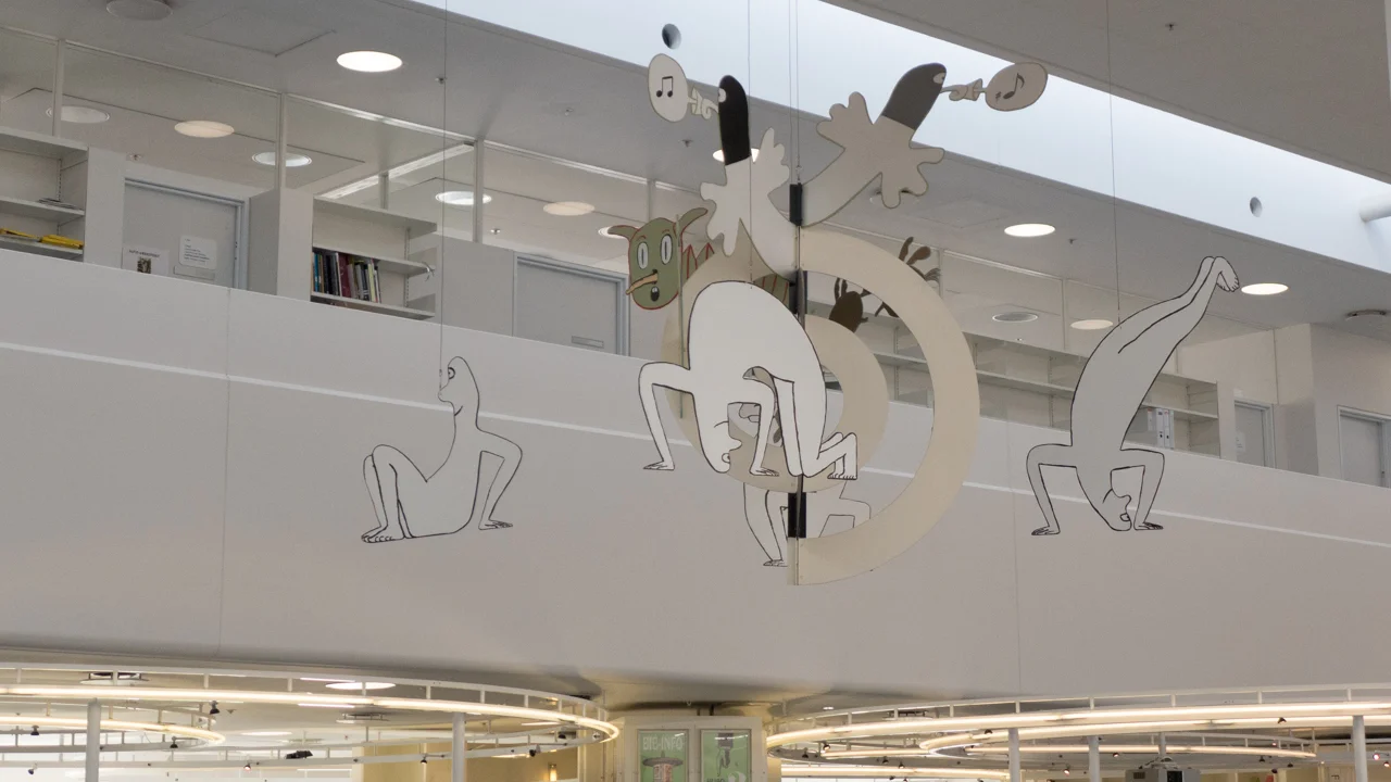
The main part of the building for books and reading, furthest from the main road, is a very large, square, top-lit area for the main reading room and information desk which is open through two storeys at the centre but with deep balconies around the edge with quieter study rooms, the local history collection and administrative office on the upper level and below, on the ground floor, although generally open to the main space, quiet, more enclosed reading and study areas beneath the balconies.
This demonstrates a clever and complicated manipulation of space and light to create views into, through and out of the building … so the initial impression as you enter the library is of light and of spaces which are very open and very welcoming. As you approach there are glass doors and windows so you can see clearly where to go and, after entering, see how each area is used and then, as you are drawn in, the spaces become lower, more enclosed and quieter although you can also sit and read where you can look up and look out to trees and grass.
Externally there are what read as conservatories or single-storey elements with sloping glazed roofs but internally these provide top lighting for some of these more domestic scale spaces. Also of note, in terms of how top light is used is that the centre of the main space has a lower roof and all the way round windows looking into the building, not providing direct light but light that is reflected down by a curved ceiling/wall just in from the windows.
Although the exterior is simple and the clean straightforward interior of white columns and white fittings is deceptively simple, the architectural features such as floors, bookcases and the staircases are of a high quality and very carefully considered. It has a timeless feel, that is difficult to date but it has certainly worn well and does not look thirty years old. Perhaps the major change since it was completed is that the original desk inside the south door, for bringing back and checking out books by staff, has been replaced by a sort of self-service system and staff have been moved into the centre of the reading room to an information desk. The library is well used and used with respect.
When I have been to the library it has been full of people and it is obviously a popular and well-used building. Even on a Sunday people are sitting reading magazines or books or using the computer terminals for various library services. Small children clearly love the toys and fittings of their area and there was a mother and toddler group there on one visit. I appreciate that this is a prosperous middle-class area but even so it is clear here that Danish children grow up with good design. It not that it is precious or special but that Danes actually expect this level of design. Nor should that imply good design is taken for granted but broadly there is an underlying sense that it is accepted and understood that if something is done then it should be done well … many Danes will only comment when something is done badly.
But equally this is absolutely not a pedantic or obsessive perfectionism. Buildings like the library are there to be used and enjoyed and seem to be even more appreciated as they gain a patina of age … one important proof that a design is good is that it gets good use.
Gentofte Library bottom left, immediately south of the villa and park of Øregård - from Google


