Roon & Rahn


Nicki van Roon and René Hansen are based in Aarhus and their designs were produced to solve a specific problem … they couldn’t find what they really wanted for their own apartment.

In fact, that seems to have become a key feature of their work … it’s problem led or do I mean solution driven? That’s a good starting point for any design … identify a problem - don’t just accept that something is and should be like that because it has always been like that and try to come at a problem from a different direction, a different viewpoint, to find a different solution.

Roon & Rahn also have a strong interest in graphics and they exploit engineering for the precision they want in manufacturing their designs.


Pieces in production include a bench and a round stool with three legs in wood; a rack for storing shoes; lighting and a wall hanging system called Moodboard and in development there is a very clever spice rack.

That might not sound like an extensive catalogue but Roon & Rahn are a young company and they are sensibly taking their time to add the right new designs. Moodboard took a year to develop, to come up with exactly what they wanted - the right design - and that is obvious in the quality of the finished product and in the clever way their system works. In fact, I liked the design so much that later in the Autumn, after seeing their work first at Northmodern, I tracked them down at Designer Space in Copenhagen to buy a Moodboard for my new apartment and then ended up buying a couple of their lights as well.


The pendant lights are interesting. They are simple with a large globe bulb hanging from a cable that runs through a brass stem but turned wood that drops over the bulb holder was made from timber salvaged from old recycled furniture. They use twisted flex in a natural linen colour that was chosen to give the lights a less clinical, less hard and less technical quality, as, over time, the brass will gain a patina.

R&R have a keen interest in the materials they use - the brass stems for the lights are made by them and we talked for quite a long time about sourcing good timber and about fuming or smoking oak. Again this is not about just designing at a drawing board but about working with materials and trying out ideas in the workshop to discover what a material can do or might do. The clear perspex used for the Moodboard is another good example because they had to experiment and had to work out how they could use laser cutting to get the precision and finish that they wanted. 

From talking to Nicki and René, it was clear that in Aarhus there are local craftsmen, workshops and designers who together provide a mutual support group … so if they don’t know exactly how to do something then they know someone who does. 

Packaging for their products is good. They use simple unbleached cardboard but again that disguises just how carefully thought out and stylish it all is … pictograms they designed for instructions for mounting the Moodboard on the wall are particularly good. These graphics are actually a step up from a pictogram but are still simple illustrations and are used instead of detailed written instructions … important when aiming for an international market. That same preference for good clear but sophisticated graphics can be seen in the design of their printed catalogue as well as the layout for their web site. 


In the catalogue they use white lettering on a warm grey background … all simple but stylish and all very carefully thought through, as you would expect. A non-standard ampersand and their logo with interlocked Rs is interesting, one R inverted, so together they look like a bolt or screw head. 

Roon & Rahn show yet again just why Danish design is so strong and why so many young designers and new companies are so successful … it’s not just about drive and ambition … they certainly have that … but about imaginative new solutions to old problems, with a clear sense of style, high standards for manufacturing with good, high-quality materials and the understanding that every detail really does matter.
 

ROON & RAHN

Moodboard by Roon & Rahn


The basic idea of the Moodboard is simple … a plain wood board that is mounted on the wall and has a series of holes in either a single line or in two parallel lines and with several different styles of wooden peg that can be arranged, as the buyer wants, to store and to display things like keys or glasses but the pegs are more than strong enough to take coats and even much heavier things … Nikki van Roon told me that he has a guitar and a snowboard hanging from Moodboards. 

There are different types of wooden peg of different lengths and a very neat key holder. With a choice of oiled oak or smoked oak for the board itself and, with the same options of light or smoked wood for the pegs, it means quite a few possible permutations, to give the buyer an interesting number of options.

More and more designers are trying to develop and extend options for customers to personalise what they buy. We discussed this at Northmodern and agreed that it’s difficult to get the balance right. Along with trying to give some of the background story for a company or for a product, personalisation can give the customer what is now, I think, called emotional ownership - an odd phrase that must have been thought up by a marketing man rather than a designer - but the idea itself is fine. However, it is necessary to limit options in order to manage expectations and prevent people from selecting a combination that does not work well or putting together a combination which they tire of quickly which obviously they would blame on the designer… that’s the down side of ‘consumer choice’ … the customer rarely chooses to accept the blame. And of course too many options can create problems for manufacturing and with packaging.

There is an engineered character to the design. Not just in the quality of finish but also the clean precision of the laser-cut Perspex and the fixing bolts are matt black, tightened with an allen key, and they project forward of the board to hold the perspex and it is that gap that supports the pegs and in a very simple way stops them from dropping out or being pulled downwards by the weight of whatever is hung from the peg.  

A bold chamfer undercutting the edge of the board itself makes it look thinner but also has the effect of making the board appear to stand slightly forward of the wall because of a line of shadow. Very clever.

Finally, perhaps the most important feature … a metal back plate to the board and small strong magnets in each peg hold them firmly in place and if you swap them around they are almost sucked back into their sockets in a very satisfying way and with a nice clunk sound as well. What’s not to like?

ROON & RAHN


Ole Palsby Design


Ole Palsby Design was at northmodern at the Bella Centre in August where they showed their ICHI range of cutlery and the recently-released thermos jug that is now being produced by the Coop in Denmark.

Mikkel Palsby, the son of Ole Palsby, also showed several historic pieces including the clear glass carafe that was designed for Georg Jensen.

Towards the end of one of the days, there was an opportunity to ask Mikkel a few questions about the way that his father worked when major designs were commissioned. In an earlier post on this site there are comments on the Eva Trio range of kitchenware and it was clear that Ole Palsby established a strong relationship with the manufacturer but Mikkel explained that what was crucial was work with production teams in the factory workshops who, working with his father, made the initial trial pieces. These were tested extensively, both at the factory and at home in the Palsby kitchen, to ensure that they functioned properly, making sure that each piece felt absolutely right in the hand, for weight, for balance or grip, and to be certain that the quality of the material was of the standard that Ole Palsby knew was necessary.

Mikkel Palsby has established a similar and close working relationship with the family of Kazonsuke Ohizumi, who own the workshops in Niigata in Japan where ICHI is made ... crucial in order to realise the designs for ICHI and to complete important final details that had not been resolved for the complete range of different pieces before Ole Palsby died in 2010.

With the new cutlery range this has been crucial because several of the pieces try new shapes or modified and clearly less-conventional shapes because Ole Palsby rarely accepted that something should be like that simply because it had always been like that. Obvious examples of this rethinking are the shape and angle of the bowls of soup spoons; the flexible but also sharp blades of knives for spreading and the longer centre tines of forks so they stick into and hold food before the main part of the fork breaks it open.

It was interesting to hear that changes might even be made to a design for technical reasons after an item had gone into full production so, clearly, Ole Palsby monitored his own work even after he had moved on to another project. For instance, Mikkel could remember one kettle where the base plate had not performed as well as expected and several months after the kettle was available, a revised version was designed where the thickness and composition of the bottom was changed to improve the transmission of even heat … a crucial feature for all cooking pans … and on another occasion one manufacturer had reduced the thickness of the metal used for a range of pans, some time after the launch, and Ole Palsby had insisted that the manufacturer went back to using the original gauge of steel. 

It seems astounding that he could keep such a tight control over the quality of the pieces coming off the factory production line but then Mikkel explained that when a design was completed, and after any modifications completed and agreed but before the piece went into production, one sample was sealed into a box that was then signed by both Ole Palsby and the factory. The contract stated that in the event of a dispute about changes, made subsequently by the factory, then the box would be opened for a direct comparison and the manufacturer was obliged, under the terms of the contract to revert to the agreed specification. Mikkel Palsby could not actually recall many disputes over ongoing production quality as presumably both Ole Palsby and the factory knew exactly what was in the box.

As a prolific designer, continually trying out new ideas, there are projects, drawings and trial pieces in the family archive that were not, for various reasons, produced commercially before Ole Palsby died and the long-term aim of the company is to go into partnership with appropriate manufacturers to see these realised and it is hoped that several designs that were popular in the 1970s or 80s will also go back into production.

Else-Rikke Bruun at northmodern

It has been quite difficult to write about these complex and sophisticated pieces. For a start they are stunningly beautiful. Of course that shouldn't make it difficult to describe them or talk about this furniture but then the superlatives start to stack up and begin to slide into hyperbole and loose their impact.

Also the pieces occupy an interesting middle ground: this is furniture - or at least they are pieces designed to furnish a room, which is slightly different - but in some ways they are closer to being sculpture than most furniture because they explore so carefully ideas about volume and space and explore the role of light and shadow in defining both.

Harlekin in birch

Veneer in birch

A strong feature of the screens is their texture although it may seem slightly odd to describe something on this relatively large scale as texture. As well as through touch, of course, texture is usually revealed by light playing across a surface to highlight changes on the surface that show that it is not smooth - so the texture of rough concrete or, and more appropriate here, the texture of a woven fabric or the texture of the surface of a woven rush mat or of a basket.

Nor are conventional definitions of style particularly appropriate here. The screens are minimalist in that they have a relatively simple repeat pattern and are made in a material with a uniform tone and colour and there is no added decoration - any pattern is formed by the technique of construction and not applied - but rather than being minimal - which often now just implies simple or basic - these pieces are better described as being restrained or sober and controlled.

Certainly the gentle curves of the chairs, when seen in profile, are complex but there is a purity of line and that is what, in part, makes them so beautiful … and that is said with no apology for slipping into hyperbole.

Nor do the pieces really conform to a strict sense of period or location because although they are, in some ways, typically Scandinavian - pale wood and high-quality construction for a start - they can also be seen to relate to Japanese and Chinese techniques of carpentry where separate elements are held together by intersecting and locking the parts into place rather than being fixed together by using carpenters' joints or screws or glue.

Nor are these forms and shapes specifically related to timber, in its most natural form, because Else-Rikke Bruun exploits, in a very sophisticated way, the intrinsic qualities of the plywood that she uses and plywood is manufactured rather than being timber that has simply been felled and then sawn and planed smooth. But also the screens are reminiscent of origami and could be made in paper or card although, of course, then they would be of a different scale.

These pieces show Else-Rikke Bruun exploring and testing, in different ways, both a material and the different technique or ways of working with that material … here the shaping and bending of plywood so that it retains a complex shape. Plywood can be bent and then held under tension, as in the screens, or, with the construction of the chair, sheets of plywood can be shaped with heat and pressure so at normal temperatures the separate sections are flexible but retain the shape of the curve of a former or mould.

The screens and the chair are important because they illustrate another aspect of the design process. It is fascinating to see the work of a designer who knows instinctively that they have reached a point with a design when it is absolutely right. Many designers would have to think carefully before being able to explain to someone why one part of their design is not longer or not a sharper curve or a thicker dimension but by instinct and through experience they know or they feel when something is absolutely right for what they are trying to achieve. And that really is difficult to explain.


Veneer was shown at the Biennalen exhibition of Kunsthåndværk og Design - the Danish Craftwork and Design Association - at Carlsberg Byen in Copenhagen in August 2015

Else-Rikke Bruun

Bended by Else-Rikke Bruun


This chair was inspired by Arabic lettering and, when seen in profile, the curves of the separate parts certainly have the fluidity of ink lines drawn with a pen or a fine brush as in calligraphy.

It is formed from flat, two-dimensional, sheets of plywood that have been cut to shape and bent and moulded to follow complex curves but what is also important, particularly for the view from the side, are spacing and joining pieces that keep each of the four main parts of the chair separate so that they appear to run parallel for sections but then curve away without actually seeming to touch.

Back, seat, front support and the back support together form an elongated X in section when the chair is seen from the side but it is an X where there are not just two main lines simply intersecting but four curved parts that slide together with different amounts of overlap and changes of angle.

There is a strong contrast between the view of the chair from the front or back - which shows something very solid - because the elements are bold unbroken shapes - and the view from the side where the chair is thin, linear and very elegant. The proportions of the parts and balance or relationship between them is crucial and there is a dynamic between the lines and the solid planes in any view from an angle.

Else-Rikke Bruun


In terms of the broad history of chair design the structural form of Bended is fascinating.

Roman and medieval stools used either an x-shaped frame or intersecting and crossing pieces but generally the X shape was seen from the front, not the side, and the person using the chair was either sitting between the arms of the X or on a seat that rested across the top of the X. 

Some designers in the early modern period, such as Gerrit Rietveld, used flat sheets of plywood to form the seat and back of a chair and in the 1930s Alvar Aalto designed chairs with shaped seats or backs in plywood but this was only bent in one plane, basically forming a scroll, and these plywood seats were invariably supported on bentwood frames.

All these designs look inelegant when compared with the chair designed by Else-Rikke Bruun.


 Gerrit Rietveld (1888-1964) 

Red and Blue Chair 1917


Plywood is an industrial or manufactured product that was first made in the early 19th century and was seen as primarily utilitarian. It has layers of thin sheets of wood that are cut by turning a tree trunk against a long thin blade and often smaller or poor-quality tree trunks are used. These slices are glued together with a number of layers to form sheets of varying thickness. Plywood is strong, relatively light and relatively inexpensive so it can be used for boat building, covering industrial buildings, such as sheds or factories or farm buildings, or used for the backs of furniture such as wardrobes or over frames it is strong enough for the sides and fronts of cupboards - particularly for what was sometimes called utility furniture in the middle of the last century.

In the second half of the 20th century, several designers in Denmark produced chairs with a seat and back in plywood that had been curved or moulded into relatively complicated three-dimensional seats, perhaps most notably Arne Jacobsen, but generally these plywood shells were supported on a separate frame of wood or metal.

folding chair by Kaare Klint 1933

Chair PK25 by Poul Kjærholm 1951


The BENDED chair is low and in its form and in the position of the sitter it is reminiscent of two very distinct designs from the middle of the 20th century ... the deck chair by Kaare Klint from 1933 and the metal-framed chair PK25 by Poul Kjærholm designed in 1951 or his slightly later PK22 from 1955.

Several designers have, however, explored the possibilities of using plywood for the whole chair, both the seat and back and the support, and have moulded plywood into far more complicated shapes to create more complex pieces of furniture. 

Sori Yanagi (1915-2011) -  Butterfly Stool 1954. Deceptively simple with two very complex pieces that mirror each other.

Greta Jalke (1920-2006) chair in plywood from 1963. There are two main parts to the chair that are bent to particularly complex shapes - almost like strudel pastry or pasta.

Nanna Ditzel (1923-2005) a prototype chair in Oregon pine from 1962 for Poul Christiansen. The seat is a separate piece, supported by a cross piece between the front legs and housed into the back strut with a line of square mortise-and-tenon joints.


OneCollection at northmodern

At northmodern OneCollection showed the recently re-released France Chair that was designed by Finn Juhl and produced by France & Son from 1958.

Known originally as Chair FJ136, it was delivered as a flat pack which seems to have contributed to its popularity, particularly for the export market. 

More restrained than many of the designs by Juhl, the complex curves of the seat and back of the chair are a development of the 108 Chair of 1946 and the pronounced but gently-curved elbow rests on the arms are reminiscent of the arms of the Chieftain Chair from 1949.

OneCollection, France Chair


C W F France was an English businessman who from 1936 ran the Danish company Lama at Ørholm with the cabinet maker Eric Daverkosen, producing mattresses and furniture. After the War, the company expanded rapidly and at one stage, by the mid 50s, produced up to 60% of Danish furniture exports. The company changed its name to France & Son in 1957.  The working relationship between Juhl and France & Son was fascinating … Juhl was certainly not the most commercially focused designer of the post-war period.

It would be interesting to see production numbers for the chair because it was, possibly, the most overtly commercial of Juhl's designs. Clearly, this was not 'flat-pack' furniture as we think of it now but, unlike Mogensen and Wegner and most other major designers of the post-war period, Juhl did not produce furniture for the lower priced, more popular, sector of the market so he did not design for FDB - the Danish COOP.


A book on the France company - and their work with major Danish designers, including Finn Juhl, Grete Jalk, Ole Wanscher and Hvidt & Mølgaard - has recently been published: France & Søn – British Pioneer of Danish Furniture by James France from the publisher Forlaget Vita.

work in wood at the craft market

Monomade in Denmark


The craft market on Frue Plads is not an obvious venue for craft pieces in wood … the cabinet makers' guild hold regular exhibitions for major pieces and also general design shows and markets such as northmodern or the Finders Keepers market are a good place to find handmade one-off or small run pieces in wood made by craftsmen.

However there were two stalls at the Frue Plads market that had work in wood and both illustrated simple but important points about good design.

Monomade in Denmark was founded by the architects Kira Snowman and Uffe Topsøe-Jensen and is based in Copenhagen. Their beautifully simple - or, rather better to say, deceptively simple pieces - show how important it is to design with clean lines, careful use of appropriate proportions and using the very best timber to highlight and enhance the qualities of the material itself … the goal is to achieve a balanced partnership between the natural material and the skill of the maker.

The ceramicist Jenni Godtlebsen used shelves and a hanging rack by Vestwood with her amazing cups and plates to show how the the pieces do have a clear functional role in a kitchen as well as being beautiful ceramic works but the juxtaposition of fired and glazed pieces set against the natural wood emphasises that ceramics too are made from a natural material. As with timber, it is the variations and the slight irregularities in the finished and fired ceramics that give the works a warmth and vitality.

ceramics by Janni Godtliebsen with wood peg storage rail by Vest Wood

Kunsthåndværker Markedet … amazing art or beautiful utility?


A significant proportion of the ceramic works on show at the craft market were clearly decorative and that’s fine … the potter as ceramic artist or maker. Glass at this level of design and craftsmanship tends to be more practical so there were certainly wine glasses and jugs at the market but still plenty of presentation pieces. Many of the stalls had flowers or fruit in their vases or bowls but this was presumably to make the display as attractive as possible rather than suggest clear practical use. 

Believe me, this is not a criticism of the designers and artists but may simply reflect the practical approach of the Danes to buying table ware and glass and ceramics for their dining rooms and kitchens. There is probably a clear division in people’s minds between decorative work and practical table ware. I was just curious that although there were mugs and so on, which were clearly to be seen as something special … a gift or a treat to oneself … it would have been difficult to go around the market and buy enough tableware to set a table for a full dinner.

Perhaps this is not the right venue for that … the Kunsthåndværker Markedet does show the work of some of the best craft artists in the country but on the other hand it does deliberately call itself a craft market and not an art fair.

read more


the first day of 3daysofdesign


3daysofdesign this May in Copenhagen has involved nearly 90 designers, studios, design stores and manufacturers around the city who open their doors for three days and, in what is really a festival atmosphere, give everyone a chance to see what is happening in the various parts of the design industry in the city. Some of the participating companies are open to the public normally but some not so this is a unique opportunity to meet designers and design professionals on their home territory. There were special displays, demonstrations and exhibitions set up for open house and many generously provide food and drink.  Several companies use the 3days to launch new designs or to officially open new or remodelled display spaces or studios.

read more

Montana at Pakhus 48

furniture at northmodern

northmodern shows clearly how strong and how diverse the furniture industry is in Denmark. Scale, approach, style of product and even preferred materials vary enormously from furniture company to furniture company but also what differs is the business model … particularly the difference between, at one extreme, companies that select design from a number of well-established manufacturers, almost like a curator might, and, at the other, companies that actually commission unique designs from independent furniture designers and work with a number of manufacturers to produce a collection that reflects what aims to be the unique style and the focus of the company.


Hornbak & Co

Hornbak have showrooms in Nordhavn in Copenhagen at Pakhus 48 and represent the Italian company Arper; the German designers and manufacturers Zeitraum; Offecct from Tibro in Sweden and Kasthall who are also Swedish. My assumption here is that they import primarily for the office and commercial market.

Hornbak & Co


FK 6720 and FK91 by Preben Fabricius and Jørgen Kastholm from Lange Production Copenhagen

Lange

Based in Hellerup on the northern edge of Copenhagen, Lange Production were established in 2006. They have a carefully curated catalogue of Danish furniture where they have acquired the licence to reintroduce and put into production mid-century classics from the design partnership of Preben Fabricus and Jorgen Kastholm and furniture by Greta Jalk.

Chair by Greta Jalk from Lange

        Chair and tables by Greta Jalk - Designmuseum Danmark, Bredegade, Copenhagen

Lange Production


Menu

Menu has been described in editorials as a design brand. Several companies like Menu have been established in Denmark over the last 30 or 40 years including Gubi, Normann, Muuto and Hay and there are similar companies in nearby countries including Design House Stockholm and most recently Hem in Germany. The companies vary in organisation so Menu does not have it’s own stores but markets only through selected retailers while Normann has a major store in Copenhagen as does Hay but both retail their products through a large number of furniture and interiors shops. What they all have in common is that they use a number of designers and independent manufacturers to create a distinct catalogue that tries to create a relatively clear brand style. 

All the companies produce a number of lights and decorative pieces so it is possible to furnish a Menu room or buy many of the major items of furniture needed to set up a new home. Menu is increasing the number of major pieces of furniture in its catalogue and at northmodern showed the Afternoon Chair by Hung-Ming Chen and Chen-Yen Wei inspired by bentwood chairs from Thonet from the early 20th century but using powder-coated tubular steel. 

The Menu web site lists 47 different designers or design studios that have worked with Menu on their products but there is a clear and deliberate Menu style so pieces work well together and in various combinations. One strong characteristic is the use of metal for furniture to create a spare and slightly industrial feel … a new range of three different sizes of table by the Stockholm-based designers Afteroom are said to have been inspired by Bauhaus furniture.

Bottle Grinder by Norm Architects

Corner Shelf and Corner Divider by Kyuhyung Cho

New starkly-simple seating called Godot with an arm chair and two sizes of sofa was designed by Iskos-Berlin and has just been launched and there is an elegant day bed by Anita Johansen, a young Danish designer who graduated in 2012.

Perhaps the strongest partnership for the company is with the Danish architectural practice Norm and new pieces by them shown at northmodern included new versions of the Bottle Grinder in polished or matt steel rather then the soft grey and stone colours of the original plastic versions.

Menu


Woud

Woud are the new company to add to the group and at northmodern they launched a new catalogue for 2016 with two new chairs. As with Menu they work with a number of designers - the catalogue lists 25 designers and studios - and again, as with the other ‘brand’ companies, they achieve a coherent style through their range of furniture, lighting and accessories.


Woud

1 | Virka Sideboard by Mark Wedel Pedersen & Rasmus Røpke

2| S A C Dining Chair by Naoya Matsuo

3| Bank by Nur

4| Lean Lounge Chair by Nur

Makers With Agendas at northmodern


The architect Julien de Smedt curated the area of northmodern for Belgian designers but also gave an important lecture on the work of his architectural practice and showed the work of his design and furniture company Makers With Agendas.

Simply from the name but certainly from the furniture itself you can see that the designs have a carefully thought-through philosophy or approach to the product. One really strong theme is the idea that the pieces should be resilient, sustainable and essentially timeless and well made so that there is no reason or excuse to replace them. 

One very interesting image shown in the lecture had all the contents for a room dismantled and stacked for the move to a new home. The forms and construction details are crisp and simple but therefore quite elegant: the furniture is stylish and timeless rather than having a clear style in the sense of being of a period. This is incredibly rational furniture for people with a pared back life and probably a life on the move … described by MWA as “Minimal Logistics”.


Julien De Smedt and Wouter Dons from MWA

Makers With Agendas

a Belgian viewpoint


At northmodern this year there were seven designers from Brussels chosen by the architect and designer Julien de Smedt who also designed the exhibition stand that was set in one of the large central halls.

The exhibition was promoted and co-ordinated through MAD Brussels - the Brussels Fashion and Design Centre - and Brussels Invest & Export.

Included were textiles from Sarah Kalman and the design studio nomore twist, furniture by Alain Berteau and by Alain Gilles, lighting by the designer Pierre Coddens, work by Pierre-Emmanuel Vandeputte (who also showed his work at northmodern last August) and work by Jonas Van Put. 

What seemed to distinguish three of the designers, in slightly different ways, was that their work was ideas led rather than initiated by a product brief. The reality of much design work is that a manufacturer or design company will approach an independent designer with a commission that has a fairly tight brief that essentially and inevitably means starting with preconceptions about the starting point and the end result. 

What should be more interesting but is possibly more of a risk (in terms of commercial returns) is to give a designer the time and space to approach the problem from a different direction or to consider a completely unconventional material or to simply think about and design something where the need or the use has not been identified.


Jonas Van Put

An interior architect and designer, Jonas Van Put actually doesn’t just want to have a different starting point himself but wants the user to have a different view point.

Observer was designed when Fritz Hansen provided a number of chairs in the Series 7 to the design school to encourage students to adapt and reinterpret the famous design by Arne Jacobsen to mark its anniversary. Jonas constructed a slim pyramid-shaped metal tower not to alter how we look at the chair but to alter what we see from the chair.

The catalogue to the Belgian section includes the fascinating information that by raising the chair up to take the eye level to 5.2 metres the distance you can see from the chair nearly doubles to 8 kilometres.

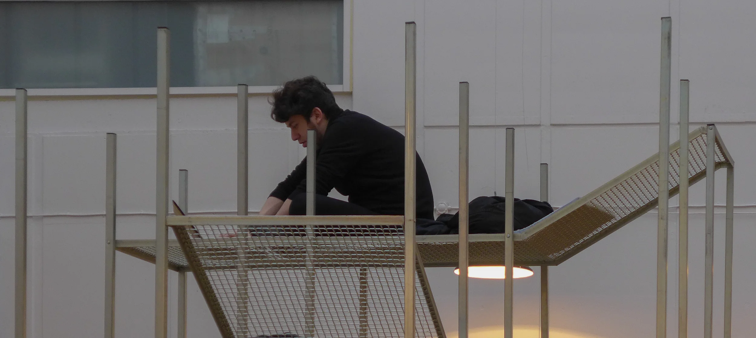
Pangea is described as a conversation piece with woven platforms or loungers at various levels on the steel frame. Jonas described how he had been inspired by looking at a jungle canopy and that the space between levels gets closer and more constricted at the lower levels. It was interesting to see who climbed up and how far up they went and as the loungers are set facing in different directions not only height but the view point changes as you work your way up the tower.


Both pieces and the works by Pierre-Emmanuel Vandeputte are one off and hand made. Talking to both designers it was clear that finding workshop space and materials was often a matter of trading off skills on a sort of designers barter system but this was seen by both as a very positive way to learn new manufacturing techniques and skills first hand and as an opportunity for exchanging ideas with other artists or skilled mechanics or craftsmen. Exploring and learning and adapting and manipulating ideas and materials was an essential part of the design process.

Jonas Van Put


Pierre-Emmanuel Vandeputte

Pierre-Emmanuel Vandeputte graduated from La Cambre in 2014 and showed some of his work at northmodern in August 2014 including the Cork Helmet … a way for the user to cut out from the noise and distractions around … and Belvedre … again a raised seat to encourage to user to take a different view point on the World. 

Ecco Freddo, shown this year, is a modular system in fired clay that addresses the problem of how we store and keep food … here using sand for root vegetables and double layers using the condensation of water to keep food cool and fresh without resorting to refrigeration. 

This approach … taking a step back and looking again at how we do day-to-day housekeeping tasks is reminiscent of the approach by the product design students from Lund who showed their project work at Form in Malmö last year in the exhibition The Tomorrow Collective.

It was interesting to listen to Pierre-Emmanuel describe how he worked with a potter to produce these pieces, adapting the design as he learnt more about the material and the techniques required … much like his approach to understanding how watching and learning from the methods of the glass blower meant he modified the design of his Wine Carafe.

Pierre-Emmanuel Vandeputte


Alain Gilles

Alain Gilles is an older and slightly more established designer although design is actually his second career as he changed to industrial design after studying Political Science and Marketing Management and after five years in banking.

At northmodern he exhibited three pieces … Grove, a group of low round tables, The Pure, a football table, and his leather and steel sofa called X-Ray. Visually, the three pieces are different in style but linked because they are all very much about how the user reacts with the piece.

The set of tables in different heights and with different finishes on the top are about how they are set in relation to each other. The football table is tactile and very much an adult play thing rather than a child’s toy. Brushed steel handles on the rods, the figures of the players, like steel skittles but with a look of spacemen, and the integral score boards set into each end are carefully refined.

It was the sofa that was really intriguing. It’s a good few steps away from traditional upholstery and seems to approach the design problems from an engineering perspective … what might be produced by an engineer if commissioned to design a sofa. 

The elements have been stripped back with a simple, exposed metal frame, a wooden top rail across the back, like a handrail on a staircase, to support the back cushions but swept round at each end to form arm rests and simple straight-sided leather cushions for the seat and back with smaller cushions at each end. Its success as a design is in the way it disguises just how much care has gone into the design of each of these parts so, for instance, the side cushions are upholstered around metal armatures that dropped down into slots in the base cushions so the leather had to be perfectly cut and sewn around these slots - an expensive and clever but hidden detail. 

Alain tried to convince me that the sofa is really comfortable by sliding down into the sort of slumped recline that most men adopt on most sofas to watch TV. But my problem with low upholstered chairs is that because I’m tall then seating designed for average-height people - particularly low upholstered seating like armchairs and sofas - makes my neck and back ache very quickly so I pushed the base of my spine right back into the seat and sat bolt upright. Alain presumably thought I was just being an uptight Englishman but actually I was testing the comfort and found that the carefully constructed and firm upholstery and the angles determined by the frame of the back and the frame under the seat cushions provide really comfortable support. Some designers and manufacturers seem to think that soft equals comfortable whereas in fact comfort comes from well-designed support … in the case of the back and neck, supporting the lower back well is actually what allows the upper body and neck to relax.

The sofa illustrates well another aspect of good design because, as so often, the Devil is in the detail and it’s a matter of knowing where a very carefully thought-out detail contributes to the whole - so here the rounded end of the legs rather than having them cut sharply square - repeats the termination of the wood back rail - and pulling the ends of the lower frame outwards to sit under the curve of the back rail creates the sense of the framework of a box containing the cushions. 

Red and dark blue used for the metal reinforce this idea of an outer box scaffold by consciously or sub-consciously picking up the way the artist Mondrian broke down and simplified his images to a strong frame and simple blocks. 


Heidi Zilmer at northmodern


Heidi Zilmer had a stand at northmodern to show her hand painted wallpaper. 

Her work may sound like a rather specialist or tightly specific area of design … one that depends on very high levels of craftsmanship to produce one off pieces … and that is true in part but what is important and interesting, in terms of general design theory and practice, is that her work is not about a designer trying to develop a recognisable or signature style. Just the opposite. What is astounding is the wide range of styles in the designs from those that take historic wallpapers as a starting point through to designs that are starkly and uncompromisingly modern and from designs that can be delicate and subtle, looking like shot silk, to designs that are strong powerful and uncompromising statements. 

A starting point can be a pattern found in nature; a pattern inspired by an ancient oriental or traditional Scandinavian motif, or from playing with a strong geometric pattern but all are seen with an amazing eye for colour but it is a wide-ranging imagination that is crucial and an open approach that sees an idea or a form for inspiration that is then developed into a unique design but with a keen awareness of what is appropriate for homes and interiors now. 

For this display a basic colour of deep blue was chosen to link the works but that was a starting point for ornate Japanese style motifs, Viking patterns or the starkest and sharpest geometric pattern of gilded crosses.


northmodern January 2016


Northmodern furniture and design show opened today at the Bella Center in Copenhagen and continues tomorrow, Thursday the 14th and Friday 15th January. 

Well-established Danish companies are here alongside young new designers and recently-established Danish design companies; young design talent from Belgium along with work by students and recent graduates from both the Royal Danish Academy (KADK) and Copenhagen Technical College (KTS) - shown in a large section called Schools and Talent - and there is an area for makers and crafts under the banner Handmade.

More detailed reviews and assessments to follow over the coming days.


ICHI by Ole Palsby Design

At the time of his death in 2010, the Danish designer Ole Palsby was working on a range of cutlery with the Japanese master craftsman Kazonsuke Ohizumi whose workshop is in Niigata. Mikkel and Caroline Palsby discovered the working drawings by their father not only for that cutlery but also for other proposed designs along with trial pieces including a kitchen knife made by the Japanese workshop that had been used in the family home for over a decade but had not been put into production. 

The family decided to form a new design studio to continue both the work of their father and the well-established working relationship with the craftsmen in Japan. 

ICHI, the Japanese word for first, is the new cutlery range that is now in production and is available in two finishes - matte steel and a titanium finish. An initial trial piece had been given a polished finish for the handle but the Palsby’s, after some deliberation, felt that an overall matte finish would be more appropriate now. The dark grey-black finish of the titanium cutlery not only brings a new aesthetic to table settings but provides an important alternatives for people who have an allergic reaction to steel.

Ole Palsby came to design in his 30s after an early career in banking. He had friends and close contacts in the world of design and architecture, including Poul Kjærholm and Vilhelm Wolhert, and developed an interest in Japanese design and architecture. Initially, he opened a kitchenware store in Copenhagen and then moved on to design tableware and metal and glass cookware for companies including Eva Solo, Alfi and WMF. 

His approach to any design project was to go back to first principles not just to simplify a design - he talked about purity in design - but he analysed, as an engineer might, the human actions involved.

Working with the craftsmen in Japan the result is flatware that has features that, from a European viewpoint, looks novel or at least distinct. Bowls of spoons are wide and shallow, the angle of the relationship between the bowl and the stem has been rethought, and knife blades have a distinct deep bowed shape to cut sharply without crushing. The balance of kitchen knives also feels different … the result of rethinking not just the shape but also by working and reworking the details of each piece with the Japanese masters. This was not to produce Japanese cutlery but rather to rethink pieces that have a specific use in Denmark … so one knife is flexible and shaped for spreading but also has a sharp cutting edge to its blade so that when making a Danish open sandwich swapping knives is not necessary and on the forks the central two tines are just slightly longer so they make an initial break into the surface so the fork cuts into the food rather than crushing it - particularly useful for eating Danish cakes. The same tight focus on details can be seen in the kitchen knives ... the honed and sharpened edge returns back towards the handle at the base of the blade for deftly making a nick to initiate any cut.


Last May a new show room for Ole Palsby Design was opened in Copenhagen in Ravnsborg Tværgade, a street that runs back from the lakes, on the outer side of Sortedams Sø, close to Dronning Louises Bro.


Ravnsborg Tværgade 7, Copenhagen N


Here, along with the new cutlery, there is also on display earlier tableware and kitchenware designed by Palsby over his long and productive career. There are plans to put some of these designs back into production or to realise some of the ideas and preliminary designs from the archive. As with By Lassen in Copenhagen, Mikkel and Caroline Palsby have shown that it is possible for families to find a way of taking forward the legacy of a major designer’s work by making classic pieces a starting point for new designs.