COBE on Frederiksberg Allé
/


select any image to open as sllde show
This new apartment building on Frederiksberg Allé - designed by COBE and built over a new metro station - sets a new standard for building in the city and deserves to win the Arne prize next year.
OK … it’s the slab and clad building method I rant about and rail against but that is when it is done badly with lazy or boring or cavalier design. This building shows exactly what can be done to produce an elegant and clever building by using the free tools any architect has of understanding and appreciating the use of proportion, logic, composition of masses, texture, colour tone and, with COBE, an astute knowledge of Copenhagen building traditions and an empathy with the city and its streetscapes.
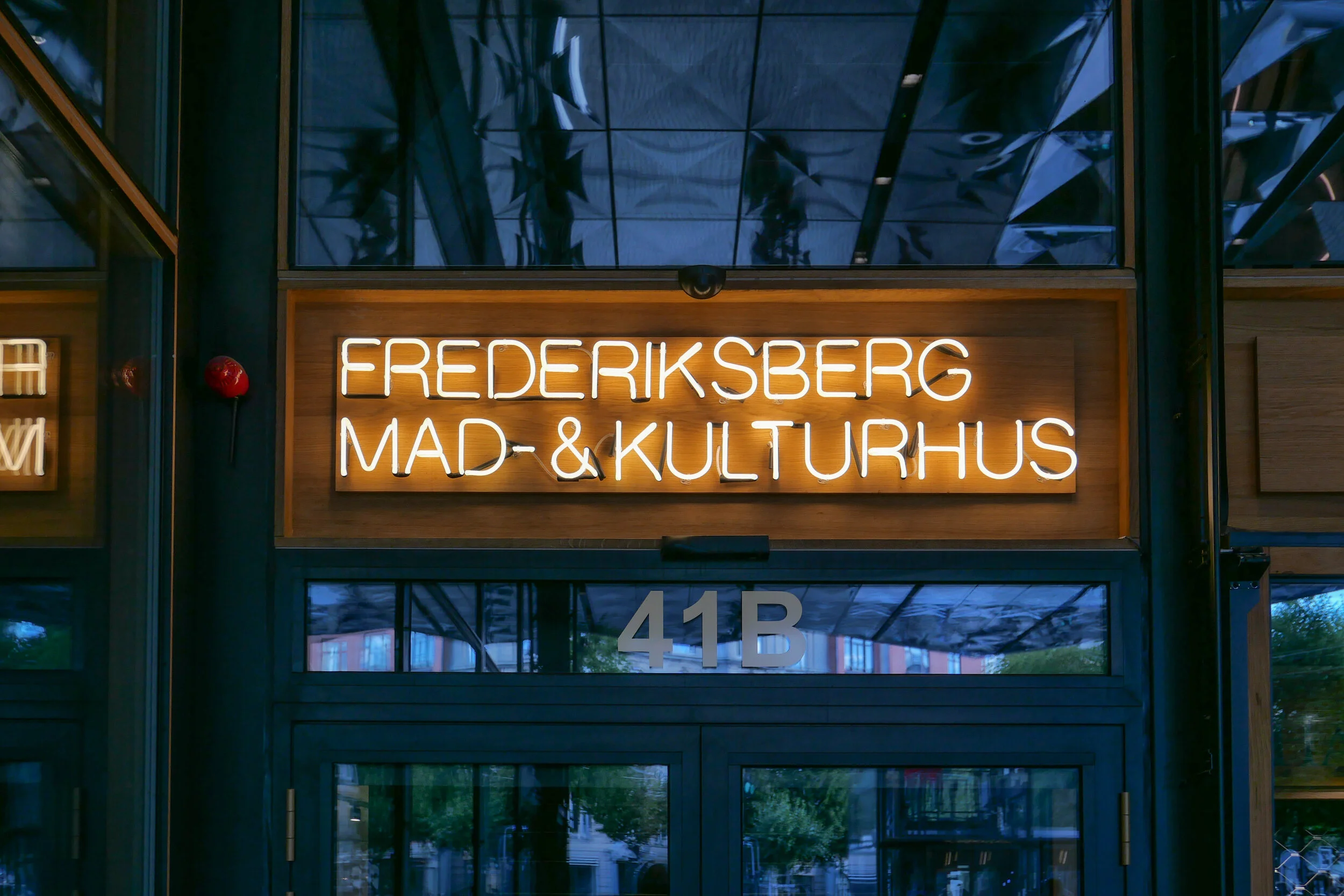
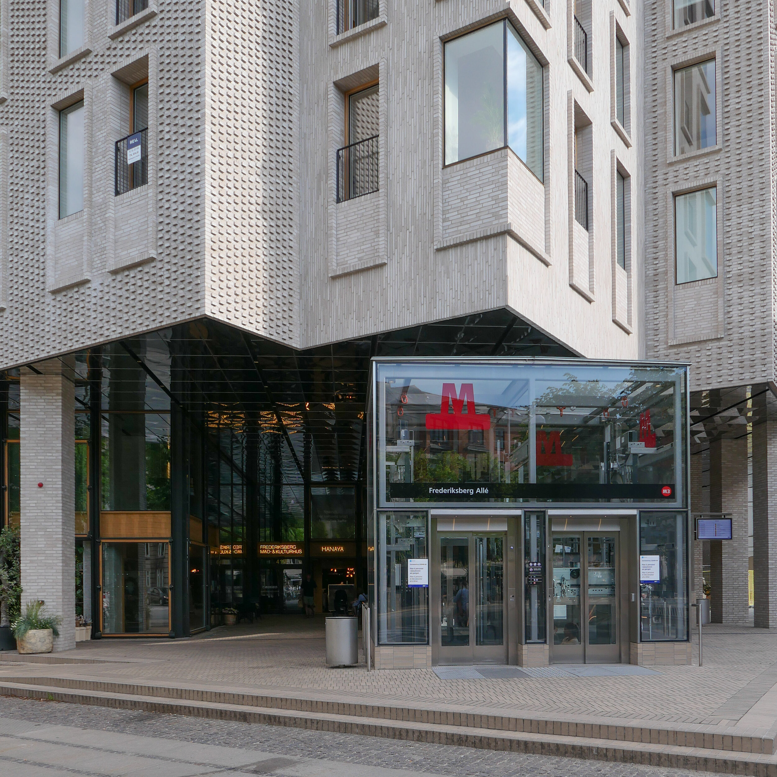
The site is a square plot approximately 35 metres wide and 35 metres deep that was cleared for construction work on the new metro line and for an important new metro station here at the centre of the Allé. There was a large villa here that broke or weakened the street line so this project has been an opportunity to establish a clear and well defined street frontage but also with a sense of a new space created at the cross roads by stepping back to the corner in stages along both Frederiksberg Allé and on Platanvej - the side street.
Metro trains now run under the cross roads at an angle and, as the general principal for the metro is that both platforms and the ticket halls and entrance stairs all work in line with the train tracks, that set the angle of the lift tower to the platforms and dictated that the main entrance to the metro should be across the corner and not from either the main street or the side road. Of course the lifts and staircases could have been buried into the building, disguising or ignoring that diagonal angle, but that would not have been a challenge and much of the very best architecture is good because it works with and overcomes the problems of a specific site.
It is also important that the architects of the new building understand the main vocabulary or language of the buildings along the street …. that is, substantial apartment buildings of a high quality with angle turrets at road intersections and the use of decoration to indicate individuality or difference and status. Here the architects from COBE have resisted any temptation to produce a pastiche with domes or flourishes but use strong composition by building up elements to a corner tower and by doing that well they actually get away with producing a building that is much taller and much more solid than anything that might otherwise have been rejected by the planning authority. Given the importance of this historic street and given the potential criticism that could have landed on the desks of politicians from the wealthy and articulate people who live in the expensive homes in this neighbourhood, it had to be right.
The panels of pale brick have either areas of raised header bricks or raised courses of bricks for texture and plain sunk panels on some areas show that actually it does not need much projection or recession to throw a little shadow across the facade for definition. Many of the new buildings in the city are too flat - with no use of recession or projection - even by a slight amount - to give the facade some life.
Here, bricks are set horizontally, in the conventional way on walls where headers are pulled forward, producing a darker surface with the same colour of brick but set vertically and with much longer bricks than is normal on the sections of wall on the corner tower to produce a much softer tone that gives the wall a sheen that is almost like a textile. The windows have a projecting frame or simple architrave of headers and window frames are thin and set back but produce what looks almost like a graphic line to define the openings. There is a clever use of blind panels within the brick frames of the windows above the metro entrance to disguise a high lost area or service mezzanine inside. All this, and the good proportions of the whole and the parts, is an aspect of the design that any good 18th-century architect would understand and respect.
I’m still not convinced that the lack of any definition below the brick but above the wide openings at the corner does not look slightly weak. Steel and concrete can span any space like this without obvious support on the material of the wall face - structural features such as lintels or arches - but without them a wall hanging above a void looks insubstantial - as if it could all slide down - but here it does work because looking at the building, from the angle, it is rather like a chest of drawers with the drawers half pulled out and the corner lifted up. And then the glass tower of the metro lift slides forward under the whole lot like an actress taking the applause, slipping under the curtain of the proscenium arch. Prose too florid? Ok but it does reflect the drama of the building but drama done with an almost minimalist restraint. If this does not win an award for being the best new building in the city it certainly deserves an award for being the classiest.
To simplify what is a complicated plan, essentially, there are three parts to the building with that rectangular block cutting in from the corner and containing the metro station. On either side is a high open space rising through two floors, basically triangular and filling out the space of the plot on either side of that metro rectangle. On the initial plans there were small units on either side to create a food court with tables around the escalators that drop down to the metro platforms but in the end there are two larger restaurants and what is now a florist. On a mezzanine level are two small halls and facilities - the kulturhus - that can be rented for local events.
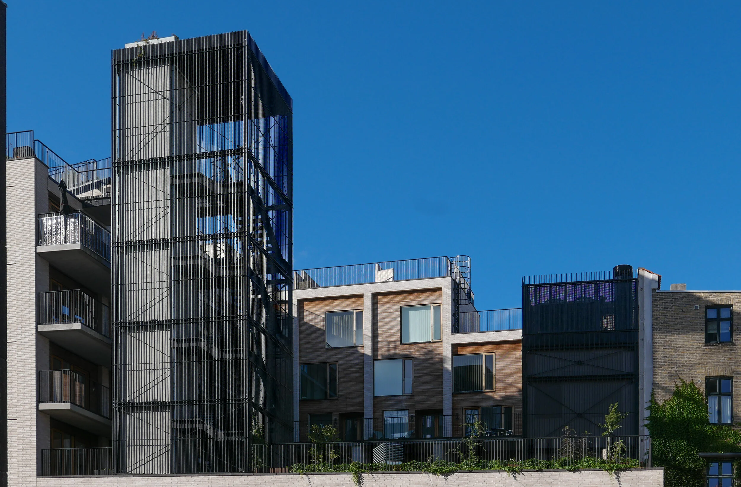
Above, and almost self contained, are 30 homes arranged in a squat L shape around an open courtyard that is a garden high above the street. From the courtyard itself there is access to six town houses each on two floors, with all but the corner house with dual aspects to the courtyard and to Frederiksberg Allé and then, piled on top, is another block pf six town houses above that and with roof terraces. On the west arm of the L there are relatively narrow studio flats, again with dual aspect but to the courtyard and to Platanvej - across the west side of the plot.
Upper levels of the housing are reached by open lift and stair towers with black metal framework and railings a little too much like cages. Lower apartments have entrance doors from the courtyard and the upper apartments from open external galleries … not the most common form of apartment building in the city where normally, in larger buildings, there will be a series of separate entrances along a front with separate staircases and lifts at each door and single apartments on either side at each level. Here, with the wide entrance to the metro across the corner and the commercial area on the ground floor, that was not an option.
On the courtyard side, the restrained style of the brickwork of the street frontages is abandoned for large panels of wood facing but with the grey brick used for a framing. Windows on the courtyard side are arranged with an unnecessary asymmetry and the staircases and balconies, with their black railings, begin to look a bit too much like an Escher drawing. What is good is that upper levels of the building not only step up to the corner so building up visually to the corner turret with its penthouse apartment, but they also step in or back at upper levels to disguise the height of the building when seen from street level and that also means that upper access galleries, from the lifts to the separate houses at the upper level, do not project but are on the roofs of deeper houses below and there are terraces or roof gardens on the set back so, for once, this is a major apartment block with no projecting balconies.