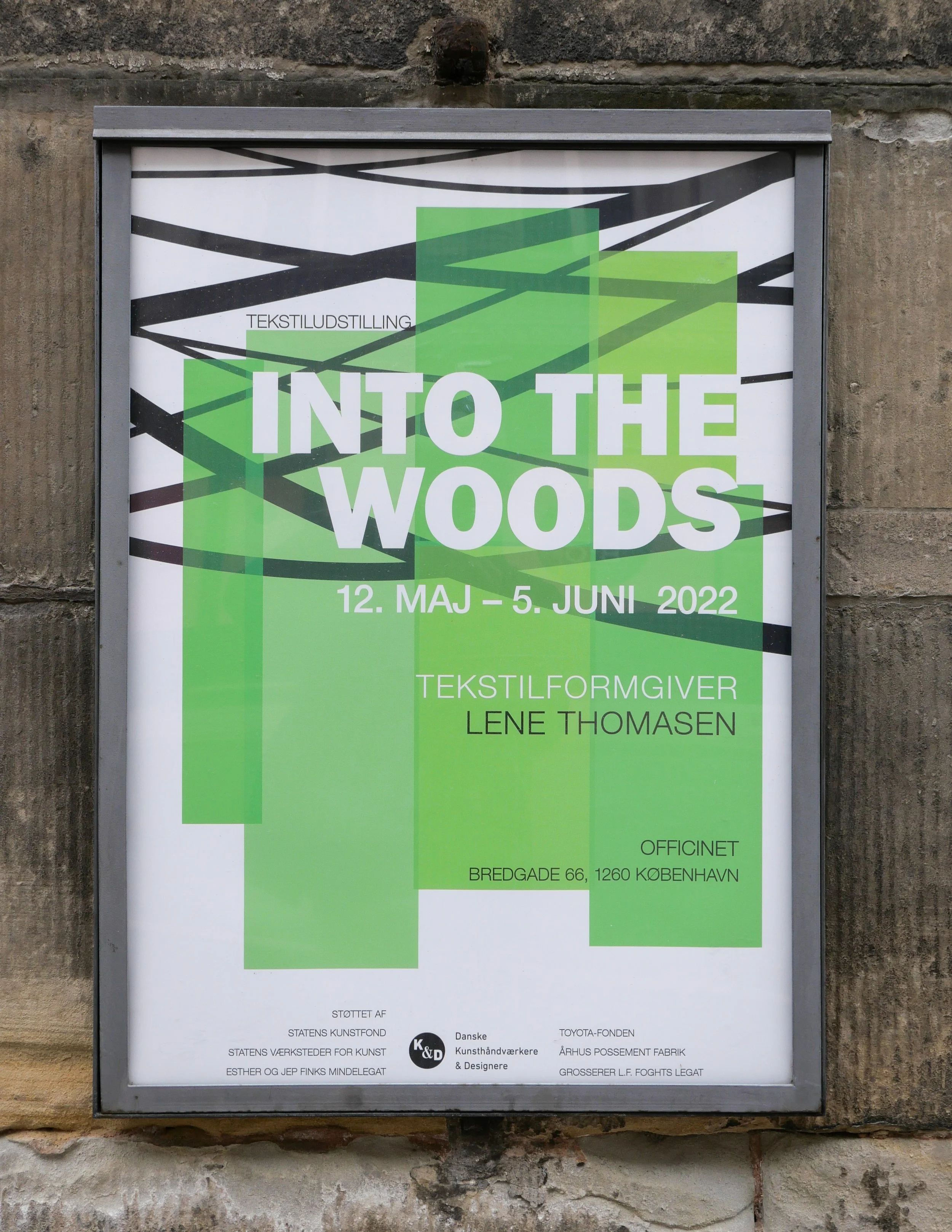
Into the Woods - an exhibition of work by Lene Thomsen

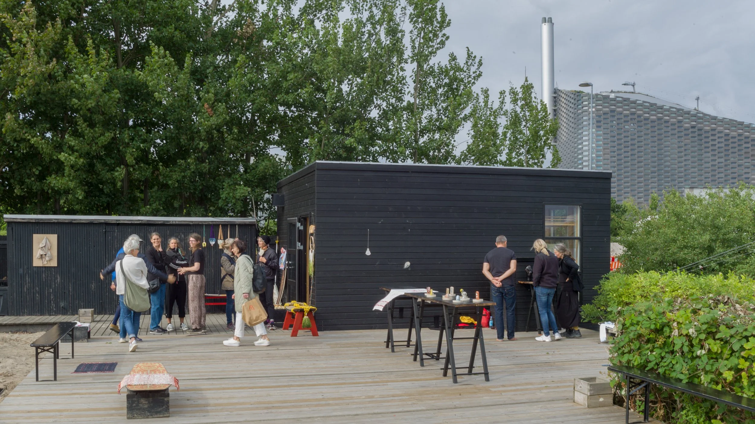
Into the Woods is an installation by the Danish textilformgiver (textile designer) Lene Thomsen at Officinet - the gallery of Danske Kunsthåndværkere & Designere - the Danish Association of Artisans and Designers.

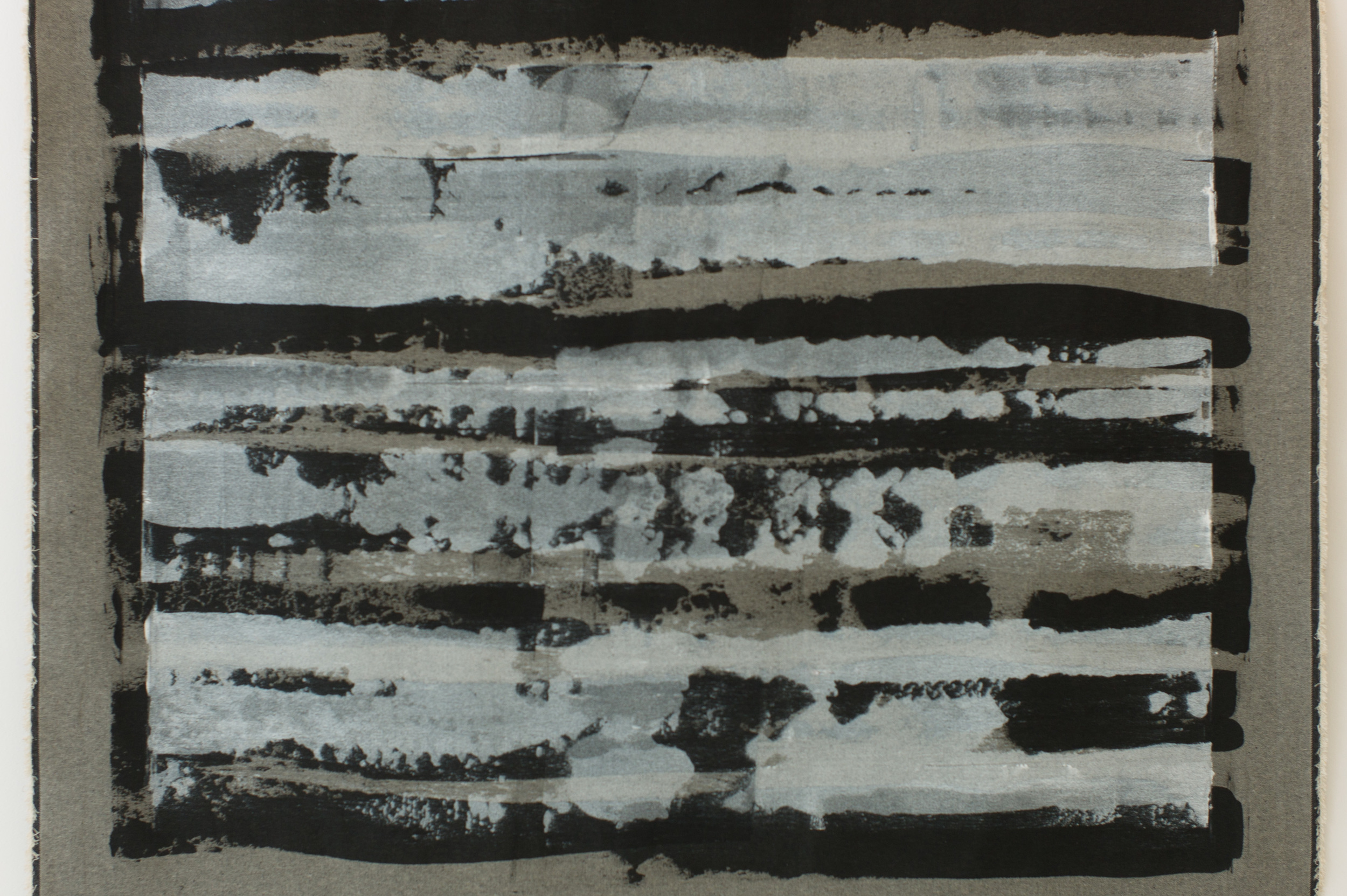
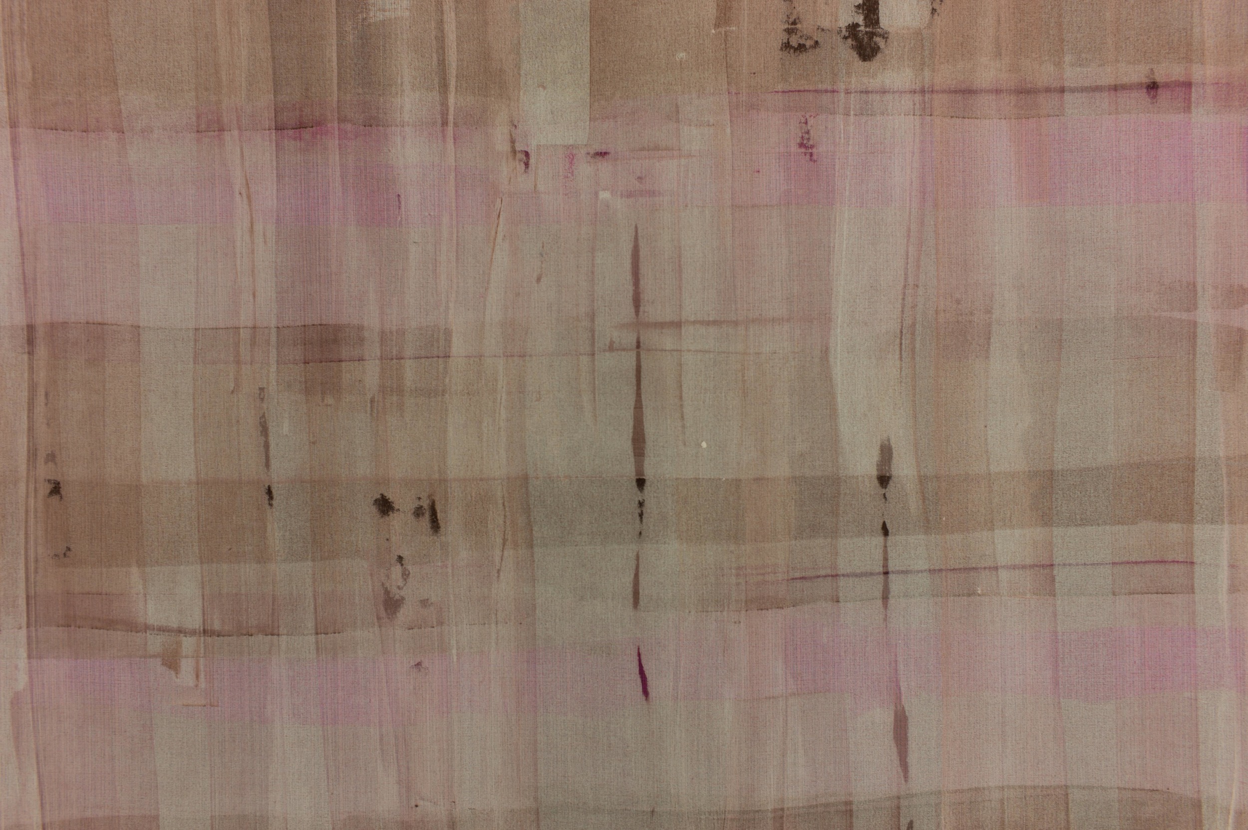
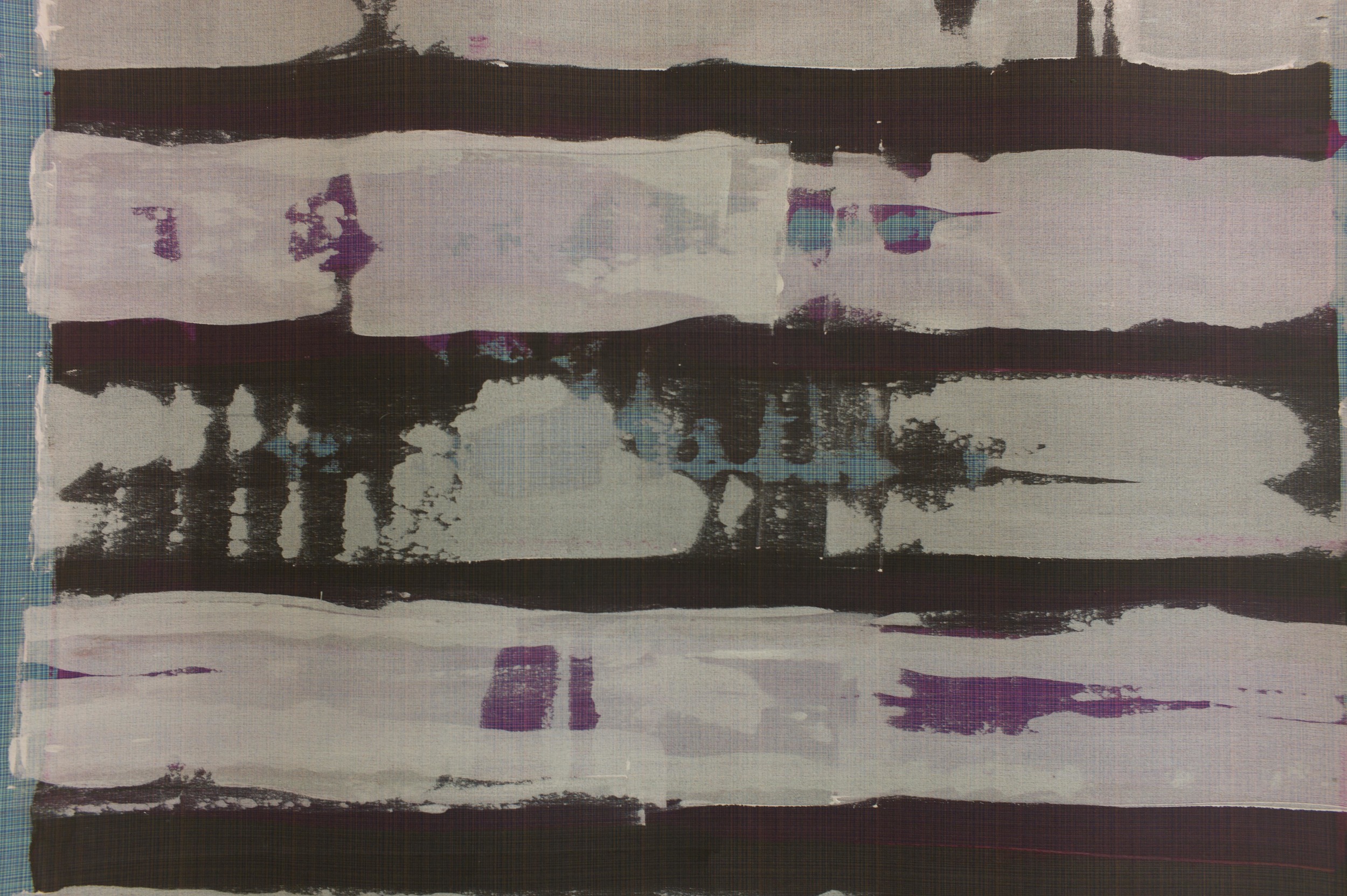
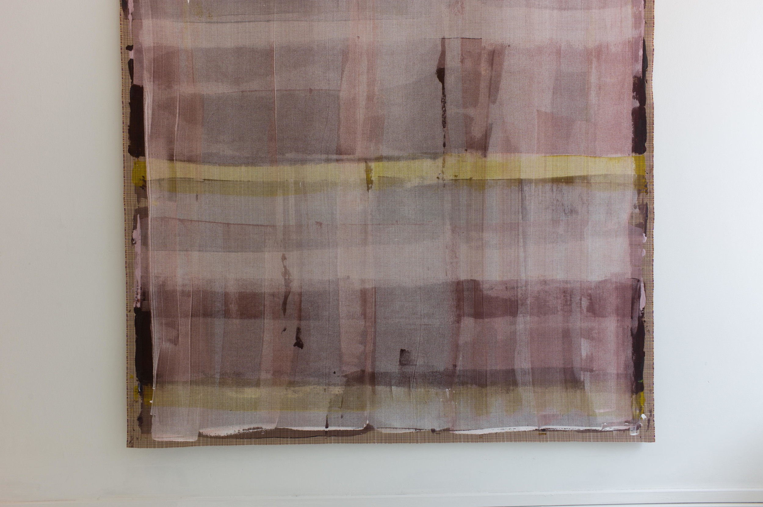
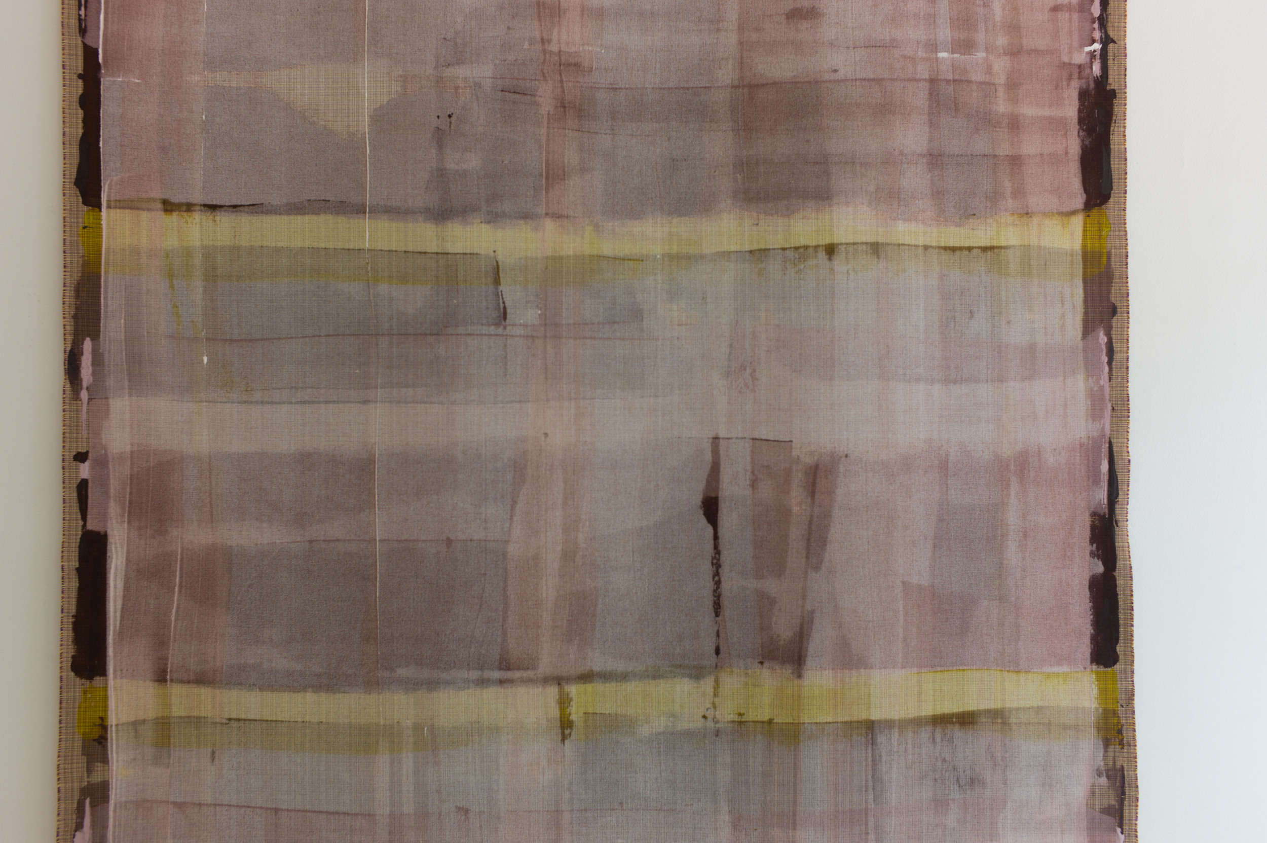
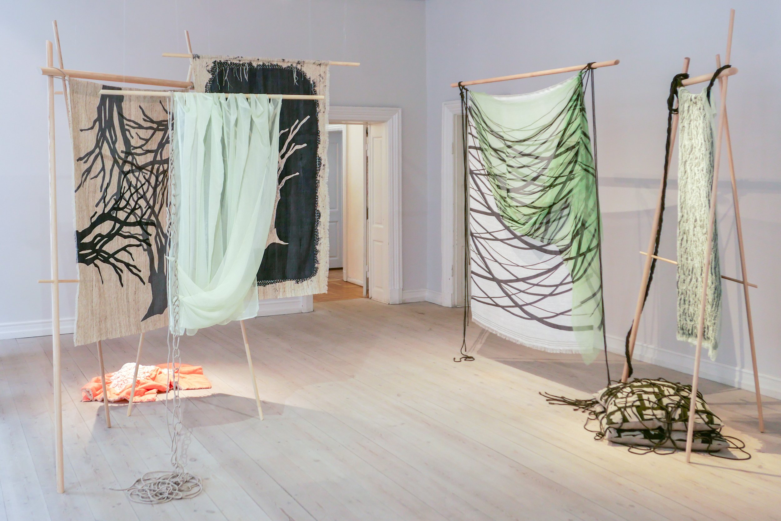
Created over the last year and created specifically for this exhibition, the works were inspired by trees, leaves, moss and, perhaps above all, the layering of light and form and colour found in the natural setting of woodland.

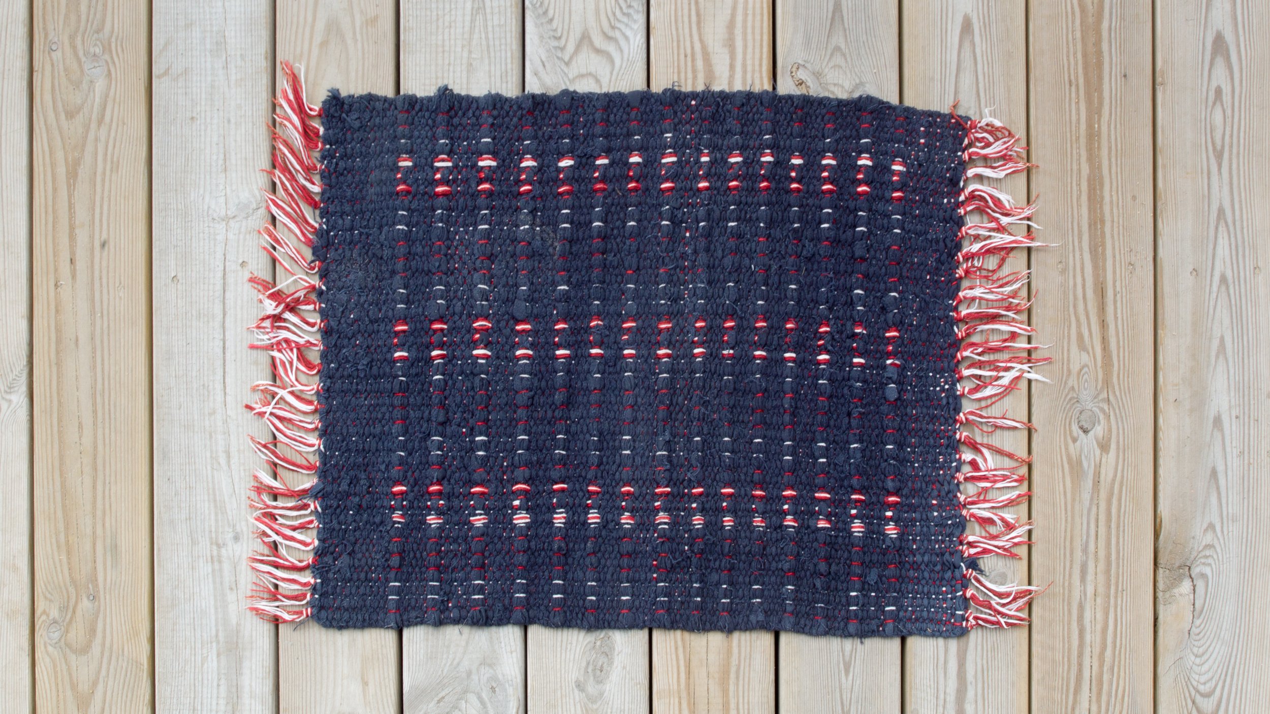
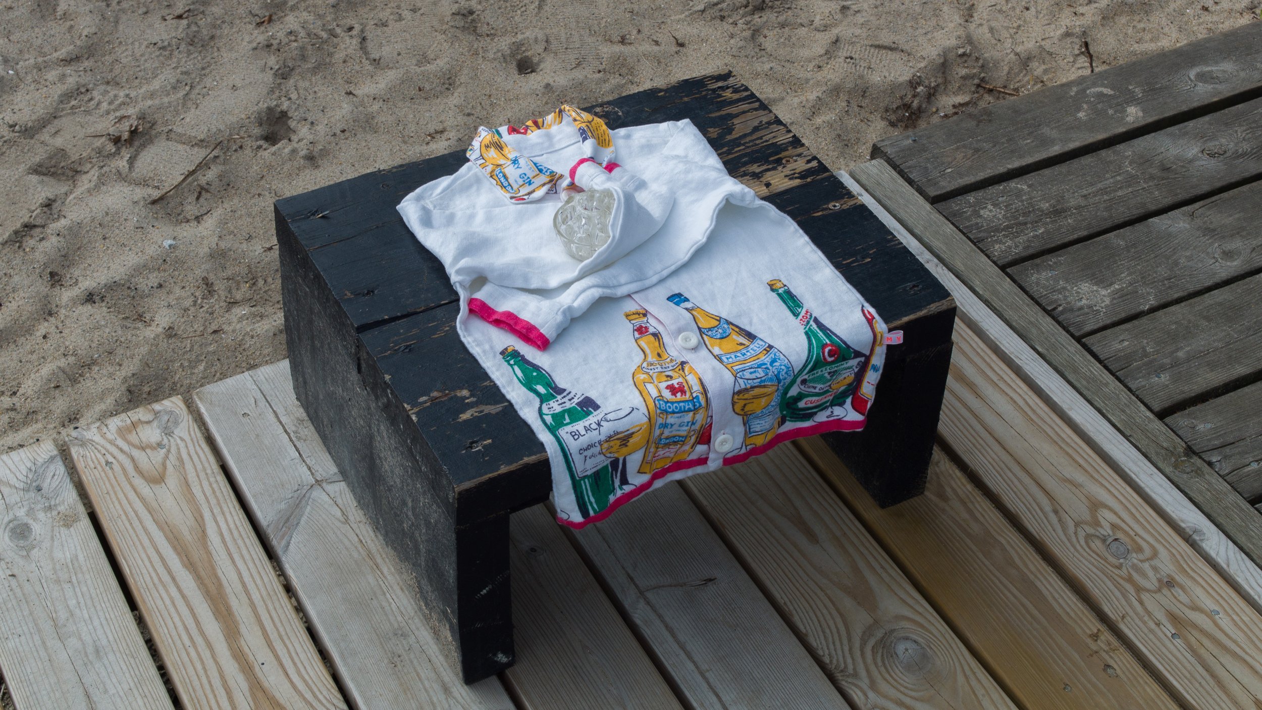
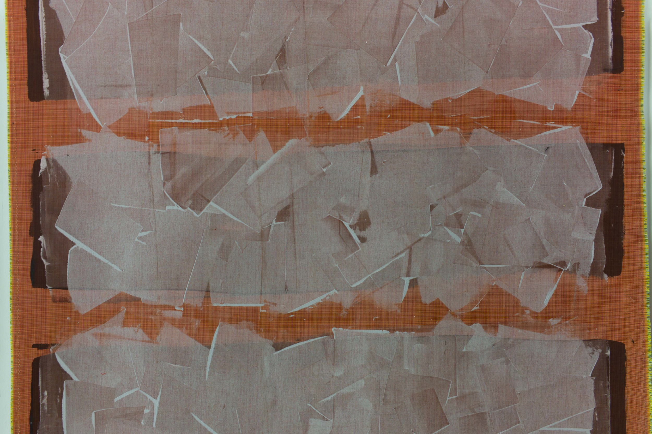
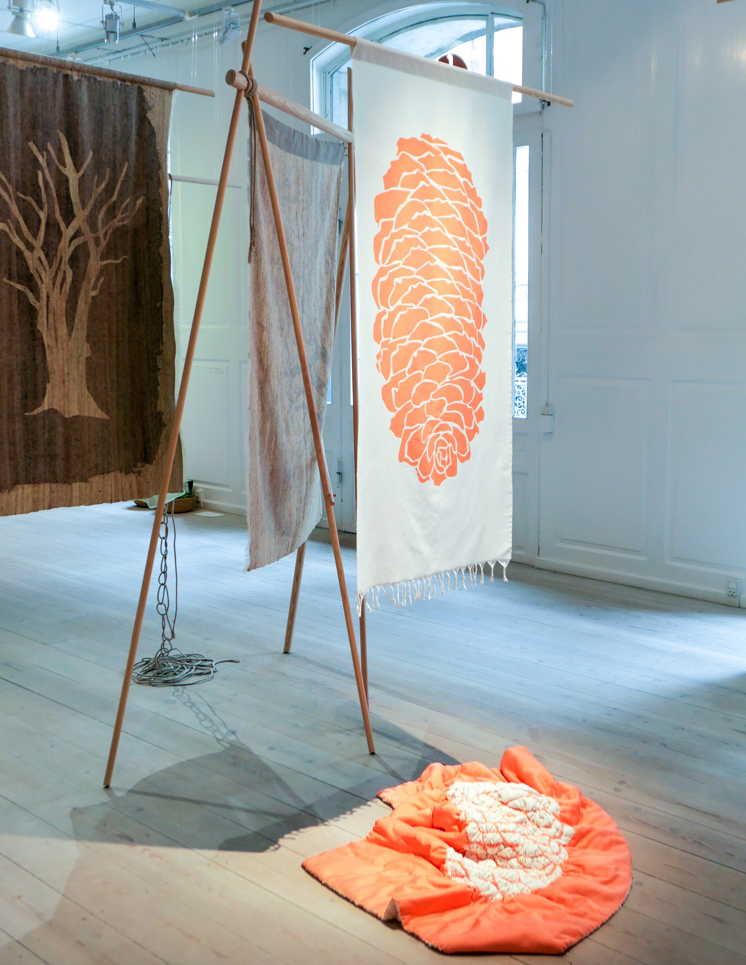
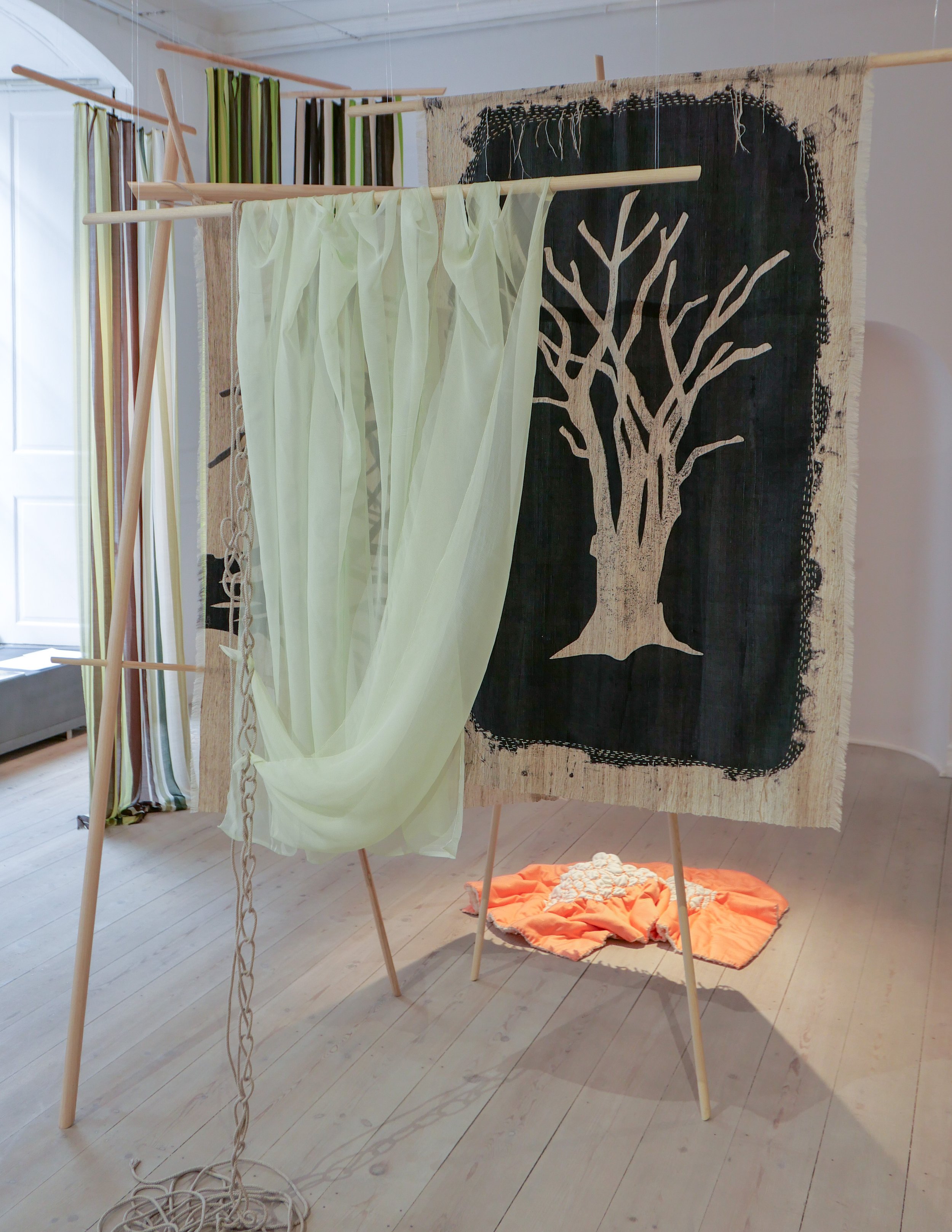
Lene Thomsen is a textile designer who trained at Kolding and now works primarily with screen printing. Works shown here are printed on silk, linen, or cotton and on very fine wool and she uses sheer fabrics and textiles that are layered and draped to create depth and a sense of space with weaving, sewing and gathering, where different materials are combined, for an intriguing and strong sense of volume.

In some works Lene Thomsen applies Shibori techniques that are Japanese - ways of forming patterns using folding, winding and embroidery before finally dyeing - and various Japanese reservation techniques are used traditionally and experimentally. These are also described as resist techniques - ways to block the dye reaching the fabric and often used to create texture - for instance by using a temporary coat of wax that is removed after the fabric has been dyed.

Patterns are overlaid or shifted or slightly offset and different intensity of dye are used, again to create a sense of depth, so, for example, to create an interpretation of the dappled light through layers of leaves and branches in the canopy in the woods.

Generally, there can be a temptation to see textile printing as simply a form of graphic design, so flat, but here, with the textiles displayed on wood frames, Lene Thomsen shows that textiles can have a strong presence in three dimensions as the works have to be explored from all angles as you walk around the gallery space.

Into the Woods continues at Officinet until 5 June 2022
Officinet, Danske Kunsthåndværkere & Designere, Bredgade 66, 1260 København K 

Lene Thomsen


note:
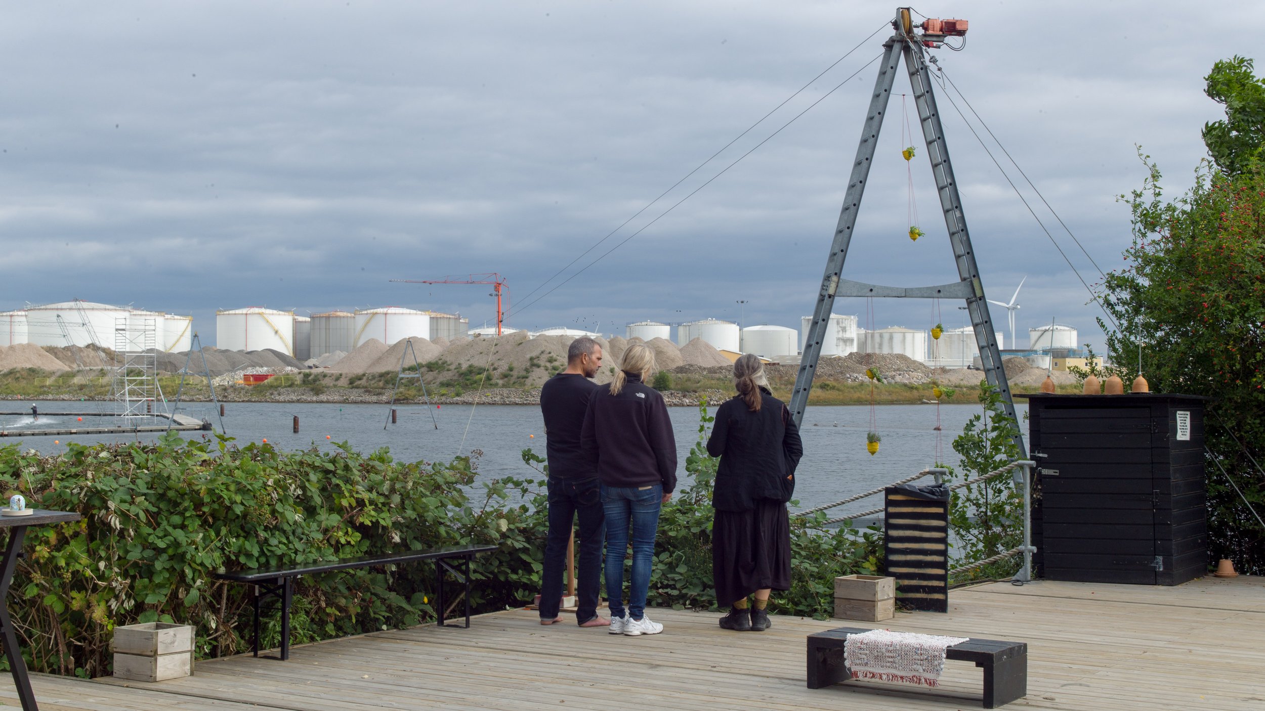
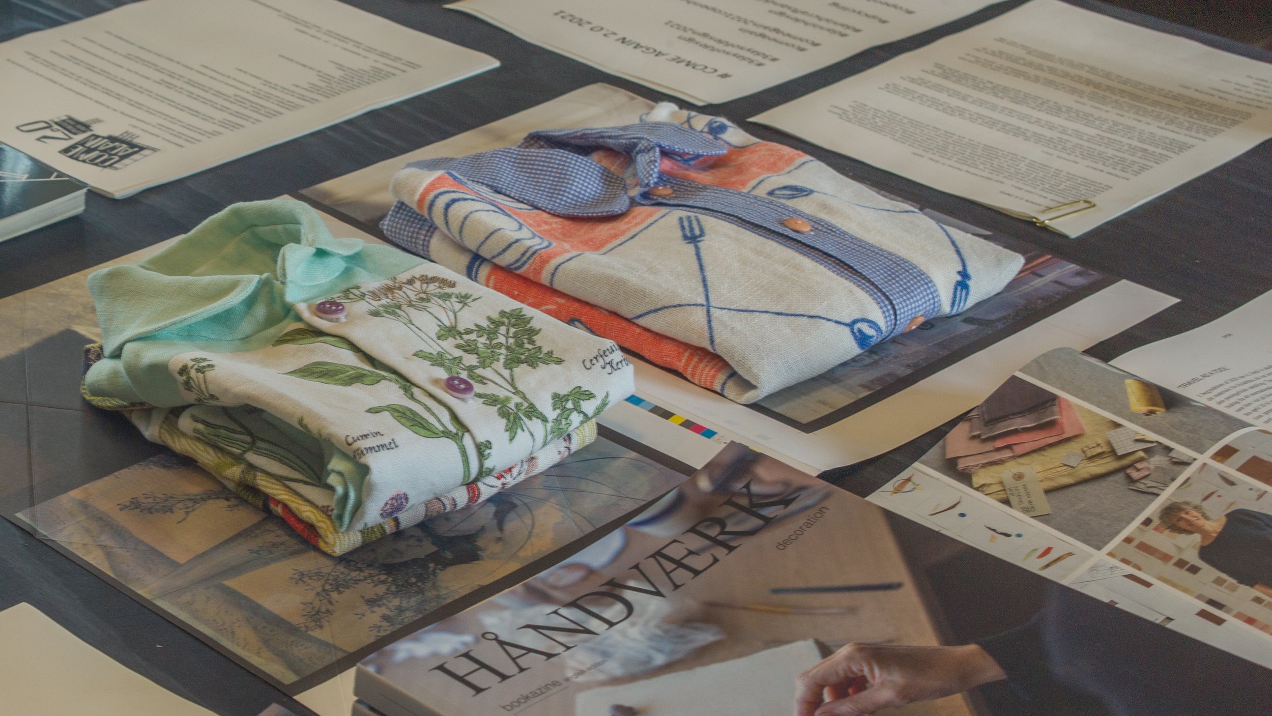
As for many of the artists and designers working towards a major exhibitions at Officinet, Lene Thomsen was able to spend several months at Statens Værksteder for Kunst in Copenhagen.

It is an amazing resource, in an old warehouse - Pakhus at Gammel Dok in the centre of the historic city - where designers and artists, with a scholarship or attachment, can use extensive facilities there that they may not have access to in their own studio or maybe not with the space to work at scale. The workshops also provide an environment for the intense focus and the long hours required for a complicated or demanding project.

The online site for the workshops has pen portraits of artists and projects that include photographs of their work in progress that gives, at least, an impression of the level of technical skill and the mastery of materials that is at the core of the work of formgivers and crucial to the development or evolution of their work.

Lene Thomsen at Statens Værksteder for Kunst
Statens Værksteder for Kunst

3daysofdesign - COME AGAIN 2.0

I didn’t get out to Cable Park until the very end of the third day of 3daysofdesign. That was not deliberate apart from the fact that I was trying to take a logical route from place to place to avoid doubling back or making long jumps across the city but there could not have been a better way of ending what was, by then, beginning to feel like a marathon run.

By a very long way, this was the most relaxed show of them all and - out on the edge of the sound - the light coming off the water was amazing.

The venue was the studio of the designer, illustrator and ‘paper poet’ Helle Vibeke Jensen and the works, by craftsmen and designers, were shown on the board walks and the hung on the walls of the wooden sheds and outbuildings of the water sports centre and were even shown wrapped around or draped over wakeboards.

Kids in wet suits were not phased and this showed an important aspect of Danish design …. here good design and an interest in art can be just a part of everyday life.

This is the second outing of COME AGAIN, and as with the exhibition at the Offcinet - the gallery of Danske Kunsthåndværker & Designere in Bredgade - this was curated by the jeweller Helen Clara Hemsley and Helle Vibeke Jensen.

Helle Vibeke Jensen
Helen Clara Hemsley

Copenhagen Cable Park
Kraftværksvej 24, 2300 København S


Exhibitors:
Helen Clara Hemsley, Janne K. Hansen and Mette Saabye with George William Bell, Katrine Borup, Rasmus Fenhann, Line Frank, Helle Vibeke Jensen, Lise Bjerre Schmidt, Lotte Myrthue, Martine Myrup, Anne Fabricius Møller, Annelie Grimwade Olofsson, Camilla Prasch and Tina Ratzer.

Tina Ratzer
Reeds

Helen Clara Helmsley
Looking back, to look forward 2

Lotte Myrthue
Strøtanker 3

Rasmus Fenhann
Air Bee n’ Bee


CHART Architecture

CHART Architecture is an annual competition to design pavilions that are erected in the two courtyards of Charlottenborg and they have a major role as they are the venues for drink and food served through the four days of the CHART Art Fair.

To give focus to the initial design process, there is a theme for each year and this year it was to explore the concept of Social Architecture where spaces and objects “sets a tone and a stage for social or private engagements.”

Forty-six proposals were submitted by graduate students or newly-graduated architects, designers and artists from 28 different countries.

In the Spring five finalists were selected by an international jury that included:

Bjarke Ingels, architect and founder of BIG
the architect Shohei Shigematsu, from OMA
David Zahle, architect and partner from BIG
Sabine Marcelis, award winning designer from Holland
Simon Lamunière, director of OPEN HOUSE
Danish artist Nina Beier

CHART 2021
CHART Architecture 2021

courtyard stage by the Swedish designer Fredrik Paulsen


Situated Exteriors
by Kathrine Birkbak, Anja Fange, and Joe Mckenzie

 The architecture of Charlottenborg is echoed in wire panels.


OM
by guilt.studio
Diana Claudia Mot, Marius Mihai Ardelean, Claudia Lavinia Cimpan, and Mihkel Pajuste

 A pavilion constructed with aluminium ventilation ducts.


Leverage
by Rumgehør
Rasmus R.B. Maabjerg, Nikolaj Noe, and Victor Tambo

Made from dunnage bags - light inflatable bags used generally to secure and protect freight.

Winner of CHART Architecture 2021


CURTAIN CALL
by Rosita Kær, Nina Højholdt, Thomas Christensen, Sam Collins, and Lauda Vargas

The textiles are reused to create “curtain walls” that define and divide the spaces.


FIELD
by Torsten Sherwood and Benedicte Brun

 The green canopy over a long communal table is fresh bean shoots.


Solutions at Royal Danish Academy

Architecture Design Conservation: graduate projects 2021

Shown here are 220 projects from the students in the schools of architecture, design and conservation who have graduated from the Royal Danish Academy in 2021.

This is an opportunity to see the work of the Academy schools, with their focus on the UN Sustainability goals, and these projects show clearly the ways in which teaching has taken onboard the challenge of climate change and the need to reassess our approach to materials for new developments and our approach to the increasing need to conserve or adapt existing buildings.

Here are the young architects and designers of the next generation whose designs for buildings and for furniture, industrial products, fashion and graphics will have to provide solutions to the new challenges.

As last year, the graduate projects can also be seen on line.

note:
after an initial opening in late June, the exhibition closed through July but then reopened on 2 August and can be seen daily from 10.00 to 17.00 through to 20 August 2021

Royal Danish Academy Architecture Design Conservation
Philip de Langes Allé 10
1435 Copenhagen K

Graduation 2021: SOLUTIONS
the exhibition on line


Absent Bodies at Designmuseum Danmark


Amina Saada

Ishara Jayathilake

A new exhibition has opened on the entrance courtyard of Designmuseum Danmark with works selected by Designers' Nest and Designmuseum Danmark.

The museum remains closed for extensive work to the building due to be completed in 2022 but there is access to the courtyard.

the works:

the love scene & the balancing act
Courtney Makins
sugarcoated cotton houndstooth, wool tartan and ripstop

the red bride
Amina Saada
polyester satin and foam

follow4follow
Oliver Opperman
recycled polyester and dead-stock neoprene

people go to work
Fredrik Stålhandske
cardboard and polyester

east meets west
Ishara Jayathilake
screen-printed cotton canvas


Fællesskab anno 2019 - Biennalen for Kunsthåndværk & Design /

Community anno 2019 - The Biennale for Craft & Design


The Biennale of Danske Kunsthåndværkere & Designere - the Association of Craft and Design - is a major exhibition for craft in Denmark with a prestigious prize.

Following an open call for ideas for works on a theme of Community, eighteen were chosen for the exhibition at Nordatlantens Brygge in Copenhagen - an impressive 18th-century, brick warehouse at the centre of the inner harbour. The Biennale is in a gallery space on the attic floor with good light from windows on both sides so low, strong natural light, forms shadows across the space, as the sun moves round the building, but that light emphasises the confident use of deep colour and strong element of texture in many of the works.

Some of these works are about family - about the gift of food at the table or about memories of lost loved ones - and there is a strong sense of exploring - exploring through play and exploring through senses not always associated with design - specifically taste as in flavour - as well as the obvious senses that mean we can appreciate carefully designed shapes or the choice of a colour in beautiful and well-made object.

These are exceptional and unique works, formed, in large part, from common and everyday materials but, primarily, they are works that express individual imagination so are about communicating ideas … in some cases complex ideas. Shape and form and colour, choice of material and even technique of crafting those materials are all used as a way to communicates and become as valid as language and spoken words …. what Pernille Stockmarr identifies in the catalogue as "archetypal forms that make up a common primeval source of inspiration."

Several of the projects were produced together with other artists and the biennale is clearly an opportunity to share experiences and increase debate and discussion …. more than appropriate given the theme for the exhibition of Community.


Jury of the Biennale exhibition in 2019

Anni Nørskov Morch, exhibition curator of Koldinghus 

Maria Foerlev, owner of design gallery Etage Projects 

Pernille Stockmarr, curator at Designmuseum Danmark


Prize Committee for the Biennale in 2019

Pernille Stockmarr, curator at Design Museum Denmark 

Christina Zetterlund, freelance curator and lecturer at Linnaeus University in Sweden 

Peder Rasmussen, ceramist


Oak Tree - an exhibition of work by Tina Astrup


 Tina Astrup graduated as a textile designer from the Danish Design School but also completed a post-graduate degree in furniture and spatial design.

Inspired by the timber and the colours seen in a local saw mill, where oak was stacked and seasoned, the work shown here is a project that has evolved over four years. She takes large disks of timber - sections of tree trunk - or substantial wedges of oak and baulks of wood and enhances both the pattern of the natural grain that mark the growth of the tree but her process seems also to echo mechanical cuts and saw marks that show how a tree is felled and the trunk cut into planks.

She uses vinegar poured over the timber that has been wound tightly with wire … a process that brings out tannins in the timber and creates slashes of dark colour in a way that echoes the effect when textiles are tie dyed.


This changes the character of the oak to make it darker both in terms of colour and in the sense of being much more dramatic.

We tend to see oak now only after it has been worked - so finely cut and planed and smoothed and pale - and see oak as the ideal wood for wide, hard-wearing floor boards or for strong finely-made furniture.

Along with beech and ash, pale or almost white oak is still a hall-mark if not the hall-mark wood for the modern Scandinavian interior. Through the classic period of modern furniture design, the English even talked about ‘light oak furniture’ to distinguish the look they wanted from the ‘dark’ oak of 19th-century and earlier furniture that was regarded as old fashioned or unfashionable.

But oak trees, in the wood or the forest, can be twisted and gnarled - powerful and impressive - and even disturbing.

The cuts and marks on these pieces by Tina Astrup reconnects us with what is, after all, the force - the almost aggressive force - of chopping down a large tree and cutting it into planks and should take us a step back from the product to the natural material and to the way we work with timber to see new possibilities in how designers could work with and use oak in very different ways.


Kunsthåndværkere & Designere
Tina Astrup

the exhibition continues until 28 October 2018
Officinet - the gallery of Danske Kunsthåndværkere & Designere
Bredgade 66, Copenhagen


Hjemlighed .... homeliness


Ten designers, architects and craftsmen have come together to exhibit their work in a private apartment in Lavendelstræde - a street in a tightly built up area of historic buildings just to the east of the city hall in the centre of Copenhagen.

It is an amazing apartment spread over two upper floors and the attic space of the tall, narrow 18th-century house with a striking mixture of original parts, including the roof structure, but with modern features such as an open metal staircase, a long wall of modern kitchen units and an area of glass floor between the attic bedroom and the kitchen and dining room on the level below.

The kitchen area opens onto a large roof terrace with views over the Copenhagen skyline looking towards the tower of Vor Frue Kirke. 


This is not just a chance to see a very striking apartment but, of course, to see the works displayed in a home, in the rooms of the apartment, along with books and furniture and kitchenware of a very real domestic setting.

Perhaps we have created false divisions between craftwork, such as tableware, that we can use in our homes, and the works of artists working in the crafts that we see as gallery pieces. These works, in this exhibition, were not, specifically, designed and made to be contained in an art gallery or museum - although many of these artists have their works in museum collections - but they can and should be seen and appreciated in a home. These pieces stimulate comment, attract admiration, stimulate discussion, stir people to decide if they love, like or even dislike the pieces. Owning and enjoying original art and craft pieces is not exclusively the prerogative of the public gallery or the private wealthy collector but original works of art or of craftsmanship really do have a place enhancing our lives in our homes.

Works shown here range from ceramic multiples through printed cotton squares displayed on a clothes drier on the roof terrace, to a bench in smoked oak supported on upturned stoneware vessels and there are monumental architectural urns in stoneware. Porcelain lights over the main table are a homage to the iconic Danish PH lights and striking jewellery in braided or plaited white plastic beads, forming deep ruffs for the wrist or ankle but set in a framework of a house, reflect the title of the exhibition. The one odd work, and only odd because it was large and set diagonally it fills and dominates the space of the bathroom it is displayed in, is a long narrow glass case with an arrangement of single socks with no pair.

This piece, Finds by Morten Sørensen, illustrates really well one very important role of art which is to point out or isolate something that either we have not thought about or points out an absurdity or a universal experience that we rarely even think about. Other works show how artists experiment with materials and forms pushing boundaries that really should not be there and multiple works are a really good way of emphasising subtle differences or step changes or variations.

toPHøj in porcelain by Anne Tophøj

Indretning in stoneware by Marianne Nielsen and Kristine Tillge Lund


I tid og utid by Anne Tophøj and Theis Lorentzen

Base in oak, aluminium and stoneware by Anne Dorthe Vester and Maria Bruun


Architects, designers and artists taking part include:

Anne Fabricius MøllerAnne Tophøj, Anne Dorthe VesterMaria BruunJohan Carlsson

Katrine BorupKristine Tillge LundMarianne NielsenMartin SørensenTheis Lorentzen


Hjemlighed ... an exhibition at
Lavendelstræde 8, 1462 København K
continues until 15th September.

Ung Svensk Form - Malmö

POM - Piece of Me table - one of a series of three desks by Frida Erson and Martin Eckerberg

On the wall behind POPOP by Ida Pettersson

A new exhibition, Ung Svensk Form, opened at the Form Design Centre in Malmö on Friday. It is a show by young Swedish designers and includes textiles, ceramics and glass, furniture, jewellery and fashion. 

This is a competition and exhibition that has been staged ten times by Svensk Form since 1998 and many previous exhibitors are now well established either within the Swedish design professions or internationally. It is open to students and to young designers under 36. As well as the exhibition of their works which go on tour, designers are awarded scholarships, practical placements and workshops to gain more experience and an understanding of production processes.

The works included prototypes and concepts to show artistic experimentation.


Charlie Styrbjörn - Ladder produced by Gebrüder Thonet of Vienna and his Part Goat chair


Umami table and service - dining table in ash with powder coated steel legs and glasses and dinnerware which have rounded bases by Sofia Almqvist


Snow Shoe Chair by Hampus Penttinen


Jacquard-woven waffle binding by Matilda Dominique


a list of the designers and a copy of the exhibition catalogue are both available on line.

the competition and exhibition are supported by IKEA and the Stockholm Furniture & Light Fair.

the exhibition continues at Form/Design Center in Malmö until 7 June


CrossRoads - an exhibition of the work of Vibeke Rohland

Superobjekt Gallery from Borgergade

Vibeke Rohland talking to a visiting art group on the day after the opening


An exhibition has opened at the Superobjekt gallery in Borgergade in Copenhagen showing recent works by the artist and designer Vibeke Rohland. 

Normally, I do not post about artists or about art gallery exhibitions on this site - trying to keep up with design and architecture is enough of a struggle for me without getting distracted, however pleasant or interesting that would be - but the meeting point of art, design and craftsmanship is incredibly important. And that is exactly what you can see in the Crossroads exhibition.

Marketing men and accountants, I am sure, see the different ‘disciplines’ in different boxes but one of the huge strengths for Nordic design in general and for Danish design in particular, is that the separation of roles in academic training and in professional practice is blurred. In Denmark many furniture designers have trained initially as architects, product designers come through a craft background as makers, designers appreciate that they have to understand the craft techniques as the starting point for commercial production and, through a long well-established tradition, many classic pieces of furniture have been produced by a close collaboration between the designer and cabinet makers. 

However, even in my own mind, it is difficult to define clear boundaries. At one end of the scale a unique piece, signed and often dated because it can be seen as part of a sequence in the development of an artist’s work over the years, is clearly ART and at the other end of the scale something produced in a distant factory and shipped back for sale is product design. Between though is the problem. A potter or glass maker might make a one-off piece for an exhibition; a set of matching pieces - a series of handmade pieces - for a client and then a related design for mass production by a well-known design brand. So one unique piece is a work of art, a set is crafts-made, and more than ten? more than twenty? several hundred? several thousand? becomes a product run? And how should artists, makers and designers interact? Surely they have to! Surely a designer needs to check back in to making something by hand every now and then and a craftsman could benefit from the occasional fee of a commercial run.

Vibeke Rohland very clearly and deliberately breaks through these boundaries. Here, at the Superobjekt gallery, many of the large and unique pieces are actually produced over commercial fabrics that Vibeke designed and that are made by Kvadrat. Even the techniques shown here are a beautiful subversion. Many of her pieces with a limited-run as well as the commercial designs have been produced by silk screen printing so always with slight variations because it is not, strictly, a mechanical process.* Here, for  the largest pieces in this show, the dye has been laid on and taken across the fabric using a squeegee but without the screen and its mask as the control or intermediary. Each area of colour therefore is and has to be a unique area of the overall work. There can, obviously, be no precise repeat pattern. The colour appears to be built up in layers and that is exactly what has happened.


A recurrent theme of Vibeke’s work is using what appear to be simple repeats of pattern but with complex overlays of colour using intensity of colour to create changes in the depth, light and space within the pattern. A series of grid or cross-hatched designs, some framed and included here, and experiments she has produced with large wheels or circles as the underlying form, created with broad cross spokes, uses the same approach ... being apparently very bold but actually creating a finished piece that is incredibly subtle in it’s use of colour and it is the variations in the intensity of colour or variation in the thickness of pigment which create the sense of depth. Another series uses strict repeats of large but simple shapes like crosses or dashes but on a huge scale to undermine the viewers judgement of distance from the work. The repeat becomes a texture but again not something mechanical because it is slight but deliberate changes or slight differences in the units over a surprisingly large repeat making up the pattern that bring the design to life.


Again, this same approach to colour and pattern can be seen in the commercial designs by Vibeke for Kvadrat. Her commercial woven and printed textiles use small points or fine lines of colour to build up pattern and form and shadow so it actually comes as a surprise when you see the large overall size of the repeat of the pattern. In the same way that the layers of colour on the pieces in this show build up to form a complex and large-scale work, the small points of colour and the very very careful combinations of colour in the furnishing fabrics are used to create depth and an effect of shadow to build up the final bold overall pattern.

The works on show here are amazing but it is also worth tracking down the commercial designs from Vibeke Rohland that have been produced by Georg Jensen Damask, Bodum, Hay and Royal Copenhagen. Spend time looking at the on-line site from Kvadrat to see the designs for fabric there - including Map, Satellite, Scott and Squares - with a wide range of colours in each design. The small sample at the start of the Kvadrat page reduces these textiles to a simple small area of dots or graph-paper grids but clicking through and moving out to the broader view these become complex patterns that are again both bold and subtle ... that same effect as you move close up to and then further back from the pieces in the gallery.

CrossRoads continues at Superobjekt Gallery
Borgergade 15, København until 2 May 2015

Vibeke Rohland

Kvadrat


* And yes ... I know that screen printing can be incredibly precise when used as a commercial process. Many years ago I went to the Sanderson factory in west London and watched the hand printing of fabric that was 1.5 metres wide with a 900 mm repeat with men on either side of a screen printing alternate sections down a massive length, loading the dye by judgement and experience and taking the squeegee backwards and forwards between them and then returning down the length printing the gaps and it was impossible to see the joins ... but an important quality of screen printing on a textile that itself may have blemishes because it is organic rather than mechanical gives the finished textile its character and warmth. Perfection can be really dull.