WORKS + WORDS

At KADK on Danneskiod-Sasøes Allé in Copenhagen … an exhibition to show a wide variety of recent experiments and research projects in architecture from architects and teachers from the Royal Academy itself and from the School of Architecture in Aarhus and the School of Architecture and Design in Oslo. 

This is about research into how we can design better buildings now and in the future: “the artistic experiment is … an important cornerstone of KADK's architectural and design education and is a central part of KADK's community commitment as an educational institution. “

this is the first in what will be a biennial event and continues
at KADK until 5 May 2017

KADK exhibition of graduate work 2016


The annual exhibition of the work of graduates from KADK …  Det Kongelige Danske Kunstakademis Skoler for Arkitektur, Design og Konservering… continues until the 21st August.

This is project work by 162 newly-qualified architects and 80 designers. Themes covered reflect current concerns about the environment, sustainability and, on the architecture side, adapting existing buildings to new uses or fitting new demands, in terms of evolving life style or new expectations, within an existing urban landscape. 

What is fascinating is to see that courses and projects set by academic staff clearly reflect major new concerns that the formal education and training system has to respond to now but the projects also show the personal concerns and interests of this, the next generation of architects and designers, as they grapple with and resolve these problems with huge amounts of energy and considerable imagination.

Student projects are divided into the separate teaching disciplines … so Building Design and Culture; Building Design Technology; Building and Landscape Design; Art and Design; Product Design and the work of the Institute of Visual Design … but there are recurring themes across the disciplines such as the exploration of the potential of new materials; to balance that, a focus on new ways to use traditional building materials and building techniques such as timber framing and a focus on using marginal land … both less hospitable topographies as climate change means the occupation of more extreme environments and the need to reuse difficult brown-field sites in densely built cities rather than encroaching further on agricultural land beyond a city boundary.

Over the next week or so more detailed assessments of some of the projects will be posted on this site. 


Afgangsudstilling Sommer 2016

KADK, Danneskiold-Samsøes Allé 51, 1435 Copenhagen K
continues until the 21 August 2016 - open every day from 11.00 to 18.00
admission free

Japanese art, design and influence


Learning from Japan is the major exhibition for this year at Designmuseum Danmark in Copenhagen.

It includes items added to the collection in the early years of the museum when it was first established in the late 19th century and then looks at how Japanese art inspired artists, designers and collectors in Denmark; how Danish craftsmen and artists first travelled to Japan to study there and also looks at how Danish design has been appreciated in Japan.

The exhibition includes prints, ceramics, textiles and furniture from the collections of the museum as well as jewellery and sword fittings.

In conjunction with the exhibition, a major book, Influences from Japan in Danish Art and Design by Mirjam Gelfer-Jørgensen, formerly Chief Librarian and Deputy Director of the museum, has been published by The Danish Architectural Press.


the exhibition continues at Designmuseum Danmark through to September 2017

The City of Jewellery


The space above the Trinitatis Church in Copenhagen, formerly the university library and a store for royal antiquities, is now used for exhibitions. Climbing the tower this evening I caught the last day of the exhibition called The City of Jewellery organised by the Copenhagen Guild of Goldsmiths in conjunction with open days, exhibitions and events at the work shops and show rooms of 38 workers in precious metals around the city.

Down the centre of the space was a time line tracing events associated with the Guild and its craftsmen from 1400 with some historic pieces including silver cups and the treasure chest of the guild. New works on display used a wide variety of materials to produce jewellery and vessels and other works of art in an amazing variety of styles.


Realtime at superobjekt gallery


A new exhibition has just opened at superobjekt gallery in Borgergade in Copenhagen. 

Seven well known and well-established Danish designers were asked to produce objects or installations that reflected a theme of time… “to create a physical comment to what time means to them and by that revealing inspiration, thoughts, doubts and references normally hidden in their final work.”

This is a fascinating concept. These designers, in their designs for a font or for dinnerware or for street furniture, invest a huge amount of their time on the commission - on the initial concept, the process of refining their design, the production period and so on - but the final work is clearly fixed in time … it is finished or as Tina Midtgaard, the owner of the gallery who commissioned the show,  points out, “no part will be changed, removed or added.”. Ironically, or do I mean very naturally, many designers hope that their works will continue in production and possibly even, become that iconic and rare accolade to be described by critics as “timeless”.  

One issue raised recently in posts here is that rarely does the public, the consumer, appreciate the role of the designer and the effort and time they have invested in a project. Some designers are complicit in that, modestly stepping back from their works. Somehow it seems better to imply that it was easy natural skill and talent rather than hard work that was required. Occasionally a retrospective or a new book will catalogue the range and extent of a designer's work and show all the intermediate stages and the development sequence that led to a well-known design but that is still relatively unusual.

There is an opportunity here for the designers to produce a single piece, a single statement, and one that moves their work into the area more usually associated with artists … producing a single statement to convey a thought or an impression or a viewpoint on life to stimulate discussion, stop the viewer, make them think. It also gives those outside the design world an insight into the thought processes involved in the completion of a design project.

Here, in these pieces, ideas about time are piled up, layered or dissected. And most involve word play. Large posters of food and recipes by Susse Fischer are entitled måITID or mealTIME.


Wooden clock cases by Peter Bysted - Din tid, Min tid, Tik tak - do not have workings, they are simply the cases, so ironically cannot record or mark time, but one was made by Peter Bysted himself, so he invested his time and it is the piece where the wood is split and heavily grained, so has the strongest sense of age, while the other two were commissioned from a cabinet maker, his time in a sense was bought, but the wood is pale and more perfect and less clearly fixed in a style or specific time and, of course, the very design of the long case clock is now an anachronism, in an age of digital time, that respects and looks back to an older and now rare type of furniture where time was wound up and released.


In a similar way the stools and sundials by Christian Bjørn reflect time sharply and explicitly ... the stools in metal rust over time and the sundials with the gnomon in a sawn-through log mark off the passing of time each day but of course the rings of the tree, seen in the cross section of the trunk, record a precise passing of time, growing season by growing season, that ended when the tree was felled.


For me, and for specific personal reasons, two of the works had the greatest impact. Ursula Munch Petersen has laid down two lines of bricks, one pale yellow stock brick and one line of brick-red bricks, that are in progressive stages of being worn down by the sea and are laid in opposite directions perhaps to reflect the ebb and flow of the sea. As an architectural historian, all my work is about our buildings in time … fixed by the time and attitudes of the period in which they were built but also looking at how they are effected over time as people adapt and change their buildings. Here in Tidens Tand was human construction in a much longer time frame … the implication of the geological time taken to lay down the clay from which the bricks were made and the time, long after there is any link with an identifiable building, for the bricks to return to pebbles, grit, sand.

Curiously, it was the work by Ole Søndergaard that had most impact. Surprising only because this is a series of small pieces with icebergs shown in section with a polar bear on one and whales and dolphins on others but the style of the works is bold and graphically strong and in the Danish tradition of beautifully-made toys for children. 


It was actually after I left the exhibition and was thinking about the meaning of the various works that the impact of the Isbjergs motiver/tiden hit me. Many years ago I went to the Upsala Glacier in Argentina. There in a boat at the snout I have never felt so small and insignificant and curiously it was that that made me feel positive about the future. The ice rises over 100 metres above the water and runs down 900 metres below the surface to the bottom of the valley that the glacier has cut out so it is a wall of ice around a kilometre high and here the front of the glacier, stretching across the valley, is 4 kilometres wide and runs back over 110 kilometres to the source. My feeling then was that, for all our arrogance and bravado, man is pretty insignificant and the planet moves on regardless of what we do. There and then the most impressive and dramatic part of that visit was to see the glacier shedding huge blocks of ice. After a sharp explosive sound a block of ice, an iceberg, would drop and float away down the lake. This is called in English calving … giving birth. It was only some 25 years later that this exhibition in Borgergade made me realise, with a start, that the ‘birth’ of an iceberg from a glacier or ice sheet is perhaps one of the most potent signs of time that we have. It is the beginning of its ultimate end. Art is so often about symbols and meaning and representation and here in a simple line of child-like icebergs is an incredibly powerful statement about global warming. An iceberg records time passing but at a very different scale to a clock or a sundial. If the lifespan of an iceberg, from calving to melting away, gets shorter and shorter, the alarm, that wake-up call, is very loud and should not be ignored.


The designers taking part in the exhibition are Boris Berlin, Christian Bjørn, Peter Bysted, Susse Fischer, Knud Holscher, Ursula Munch Petersen and Ole Søndergaard.

Reatime continues until 26 September
superobjekt gallery, Borgegade 15E, 1300 Copenhagen

Hjemlighed .... homeliness


Ten designers, architects and craftsmen have come together to exhibit their work in a private apartment in Lavendelstræde - a street in a tightly built up area of historic buildings just to the east of the city hall in the centre of Copenhagen.

It is an amazing apartment spread over two upper floors and the attic space of the tall, narrow 18th-century house with a striking mixture of original parts, including the roof structure, but with modern features such as an open metal staircase, a long wall of modern kitchen units and an area of glass floor between the attic bedroom and the kitchen and dining room on the level below.

The kitchen area opens onto a large roof terrace with views over the Copenhagen skyline looking towards the tower of Vor Frue Kirke. 


This is not just a chance to see a very striking apartment but, of course, to see the works displayed in a home, in the rooms of the apartment, along with books and furniture and kitchenware of a very real domestic setting.

Perhaps we have created false divisions between craftwork, such as tableware, that we can use in our homes, and the works of artists working in the crafts that we see as gallery pieces. These works, in this exhibition, were not, specifically, designed and made to be contained in an art gallery or museum - although many of these artists have their works in museum collections - but they can and should be seen and appreciated in a home. These pieces stimulate comment, attract admiration, stimulate discussion, stir people to decide if they love, like or even dislike the pieces. Owning and enjoying original art and craft pieces is not exclusively the prerogative of the public gallery or the private wealthy collector but original works of art or of craftsmanship really do have a place enhancing our lives in our homes.

Works shown here range from ceramic multiples through printed cotton squares displayed on a clothes drier on the roof terrace, to a bench in smoked oak supported on upturned stoneware vessels and there are monumental architectural urns in stoneware. Porcelain lights over the main table are a homage to the iconic Danish PH lights and striking jewellery in braided or plaited white plastic beads, forming deep ruffs for the wrist or ankle but set in a framework of a house, reflect the title of the exhibition. The one odd work, and only odd because it was large and set diagonally it fills and dominates the space of the bathroom it is displayed in, is a long narrow glass case with an arrangement of single socks with no pair.

This piece, Finds by Morten Sørensen, illustrates really well one very important role of art which is to point out or isolate something that either we have not thought about or points out an absurdity or a universal experience that we rarely even think about. Other works show how artists experiment with materials and forms pushing boundaries that really should not be there and multiple works are a really good way of emphasising subtle differences or step changes or variations.

toPHøj in porcelain by Anne Tophøj

Indretning in stoneware by Marianne Nielsen and Kristine Tillge Lund


I tid og utid by Anne Tophøj and Theis Lorentzen

Base in oak, aluminium and stoneware by Anne Dorthe Vester and Maria Bruun


Architects, designers and artists taking part include:

Anne Fabricius MøllerAnne Tophøj, Anne Dorthe VesterMaria BruunJohan Carlsson

Katrine BorupKristine Tillge LundMarianne NielsenMartin SørensenTheis Lorentzen


Hjemlighed ... an exhibition at
Lavendelstræde 8, 1462 København K
continues until 15th September.

KADK graduation diploma show


This exhibition of student work covers architecture, conservation, furniture design, product design, graphic and computer design and is the diploma show of the graduates this year from Det Kongelige Danske Kunstakademis Skoler for Arkitektur, Design og Konservering (the Royal Danish Academy or KADK for short).

It is worth spending time looking at the works to assess the current state of architecture and design in Denmark and to see the phenomenal talent of the students now coming through the education system here.

It is possible to identify a number of key themes - not so much in terms of the assigned project headings but more in the sense of the concerns that are now becoming a focus of attention for young architects and designers - so in architecture one strong theme that stands out was building on marginal land … particularly open or exposed or difficult rock landscape with little vegetation. Clearly, this is, in part, a response to changes in global climate where constructing settlements further and further north may become necessary as rising temperatures and lack of rain make living at latitudes closer to the Equator much more difficult but also of course young architects from Greenland and Iceland do come to Denmark for their training and the landscape that is familiar to them is very different from the green landscape and woodlands around the Baltic.

Other clear themes on the architecture side were the use of hefty timbers for framing, rather than steel, in the roofing tradition of the warehouses of Copenhagen, and an imaginative approach to using a diverse range of facing materials. 


The work of nearly 150 architecture students are on display through two large halls and the projects are grouped in sections including Spatial Design, Urbanism and Societal Change, Ecology and Tectonics and Political Architecture: Critical Sustainability.

Throughout all the work graphics are diverse in terms of style of presentation but of an incredible high standard, as I suppose you would expect at this level and with CAD and high-quality printing available to everyone, but it was also good to see the continued use of models, some of amazing detail and complexity, rather than students just relying on computer 3D graphic modelling and rendering.

To the other side of the entrance to the building is a third large hall with the design exhibition of the work of more than 80 design students and here the disciplines include furniture design, textile design, industrial and ceramic design, production design, fashion design, typography, a section defined as game art, design and development and the largest group of students whose projects came under the heading Visual Culture and Identity.


It was difficult not to smile at the number of projects around cycling … only in Copenhagen eh? … but there were some incredibly sophisticated furniture designs with some work on modular furniture but it was also interesting to see the number of pieces that build on and take forward Danish cabinet-making traditions.


The exhibition is in the old smithy building on Holmen at the heart of the design schools on the south side of the harbour in Copenhagen. For visitors who do not know this part of the city, it is well worth spending time walking around the area looking at the industrial and naval buildings that have been taken into new use as this area has been revitalised over the last decade or so with the transfer of the area from naval dockyards to academic and residential use.

For details of opening times and so on go to the current exhibition link in the right-hand column of this site or see the KADK site. The exhibition is closed until 26th July for the Danish holiday but then opens until the 16th August.

CrossRoads - an exhibition of the work of Vibeke Rohland

Superobjekt Gallery from Borgergade

Vibeke Rohland talking to a visiting art group on the day after the opening


An exhibition has opened at the Superobjekt gallery in Borgergade in Copenhagen showing recent works by the artist and designer Vibeke Rohland. 

Normally, I do not post about artists or about art gallery exhibitions on this site - trying to keep up with design and architecture is enough of a struggle for me without getting distracted, however pleasant or interesting that would be - but the meeting point of art, design and craftsmanship is incredibly important. And that is exactly what you can see in the Crossroads exhibition.

Marketing men and accountants, I am sure, see the different ‘disciplines’ in different boxes but one of the huge strengths for Nordic design in general and for Danish design in particular, is that the separation of roles in academic training and in professional practice is blurred. In Denmark many furniture designers have trained initially as architects, product designers come through a craft background as makers, designers appreciate that they have to understand the craft techniques as the starting point for commercial production and, through a long well-established tradition, many classic pieces of furniture have been produced by a close collaboration between the designer and cabinet makers. 

However, even in my own mind, it is difficult to define clear boundaries. At one end of the scale a unique piece, signed and often dated because it can be seen as part of a sequence in the development of an artist’s work over the years, is clearly ART and at the other end of the scale something produced in a distant factory and shipped back for sale is product design. Between though is the problem. A potter or glass maker might make a one-off piece for an exhibition; a set of matching pieces - a series of handmade pieces - for a client and then a related design for mass production by a well-known design brand. So one unique piece is a work of art, a set is crafts-made, and more than ten? more than twenty? several hundred? several thousand? becomes a product run? And how should artists, makers and designers interact? Surely they have to! Surely a designer needs to check back in to making something by hand every now and then and a craftsman could benefit from the occasional fee of a commercial run.

Vibeke Rohland very clearly and deliberately breaks through these boundaries. Here, at the Superobjekt gallery, many of the large and unique pieces are actually produced over commercial fabrics that Vibeke designed and that are made by Kvadrat. Even the techniques shown here are a beautiful subversion. Many of her pieces with a limited-run as well as the commercial designs have been produced by silk screen printing so always with slight variations because it is not, strictly, a mechanical process.* Here, for  the largest pieces in this show, the dye has been laid on and taken across the fabric using a squeegee but without the screen and its mask as the control or intermediary. Each area of colour therefore is and has to be a unique area of the overall work. There can, obviously, be no precise repeat pattern. The colour appears to be built up in layers and that is exactly what has happened.


A recurrent theme of Vibeke’s work is using what appear to be simple repeats of pattern but with complex overlays of colour using intensity of colour to create changes in the depth, light and space within the pattern. A series of grid or cross-hatched designs, some framed and included here, and experiments she has produced with large wheels or circles as the underlying form, created with broad cross spokes, uses the same approach ... being apparently very bold but actually creating a finished piece that is incredibly subtle in it’s use of colour and it is the variations in the intensity of colour or variation in the thickness of pigment which create the sense of depth. Another series uses strict repeats of large but simple shapes like crosses or dashes but on a huge scale to undermine the viewers judgement of distance from the work. The repeat becomes a texture but again not something mechanical because it is slight but deliberate changes or slight differences in the units over a surprisingly large repeat making up the pattern that bring the design to life.


Again, this same approach to colour and pattern can be seen in the commercial designs by Vibeke for Kvadrat. Her commercial woven and printed textiles use small points or fine lines of colour to build up pattern and form and shadow so it actually comes as a surprise when you see the large overall size of the repeat of the pattern. In the same way that the layers of colour on the pieces in this show build up to form a complex and large-scale work, the small points of colour and the very very careful combinations of colour in the furnishing fabrics are used to create depth and an effect of shadow to build up the final bold overall pattern.

The works on show here are amazing but it is also worth tracking down the commercial designs from Vibeke Rohland that have been produced by Georg Jensen Damask, Bodum, Hay and Royal Copenhagen. Spend time looking at the on-line site from Kvadrat to see the designs for fabric there - including Map, Satellite, Scott and Squares - with a wide range of colours in each design. The small sample at the start of the Kvadrat page reduces these textiles to a simple small area of dots or graph-paper grids but clicking through and moving out to the broader view these become complex patterns that are again both bold and subtle ... that same effect as you move close up to and then further back from the pieces in the gallery.

CrossRoads continues at Superobjekt Gallery
Borgergade 15, København until 2 May 2015

Vibeke Rohland

Kvadrat


* And yes ... I know that screen printing can be incredibly precise when used as a commercial process. Many years ago I went to the Sanderson factory in west London and watched the hand printing of fabric that was 1.5 metres wide with a 900 mm repeat with men on either side of a screen printing alternate sections down a massive length, loading the dye by judgement and experience and taking the squeegee backwards and forwards between them and then returning down the length printing the gaps and it was impossible to see the joins ... but an important quality of screen printing on a textile that itself may have blemishes because it is organic rather than mechanical gives the finished textile its character and warmth. Perfection can be really dull.

The One and the Many by Elmgreen & Dragset


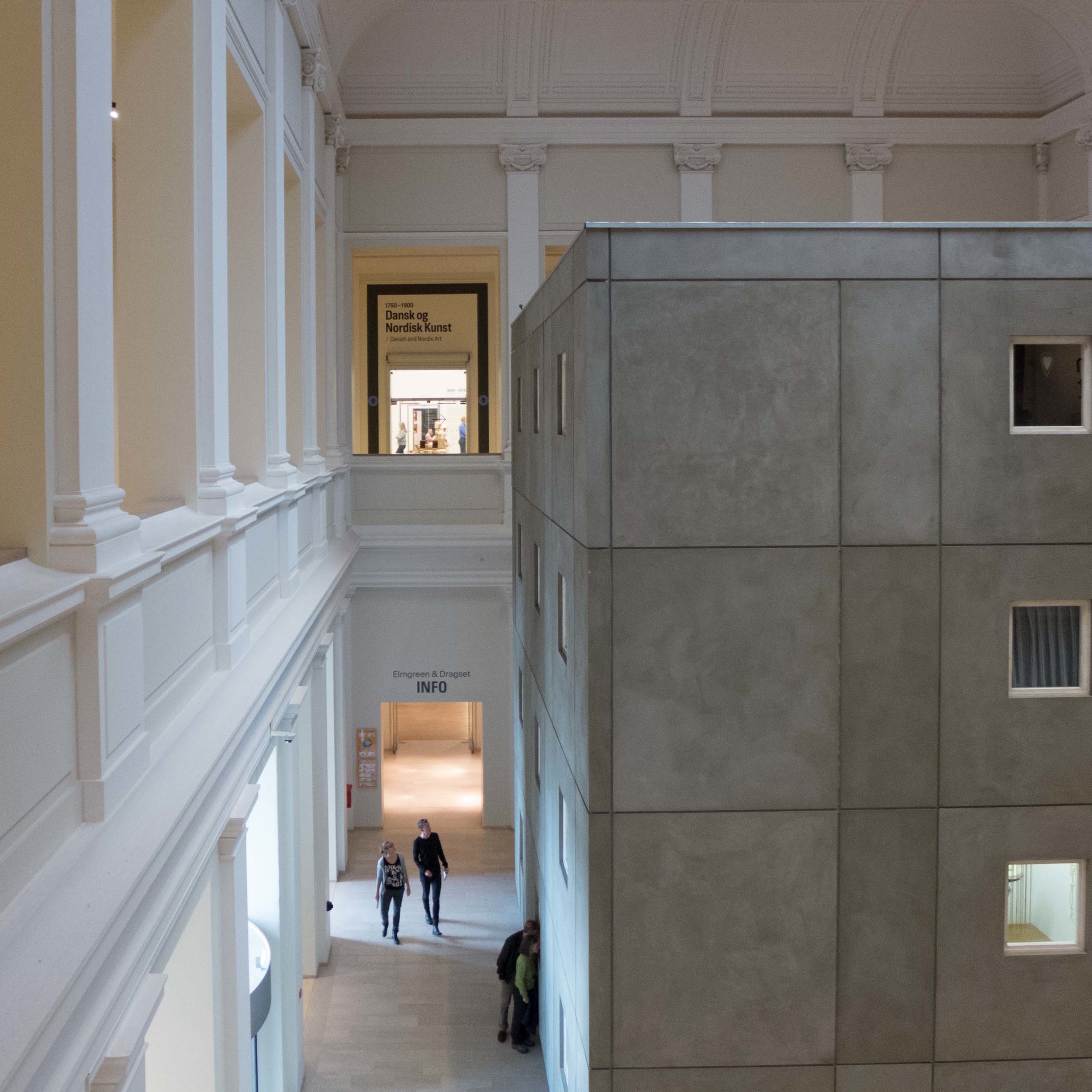
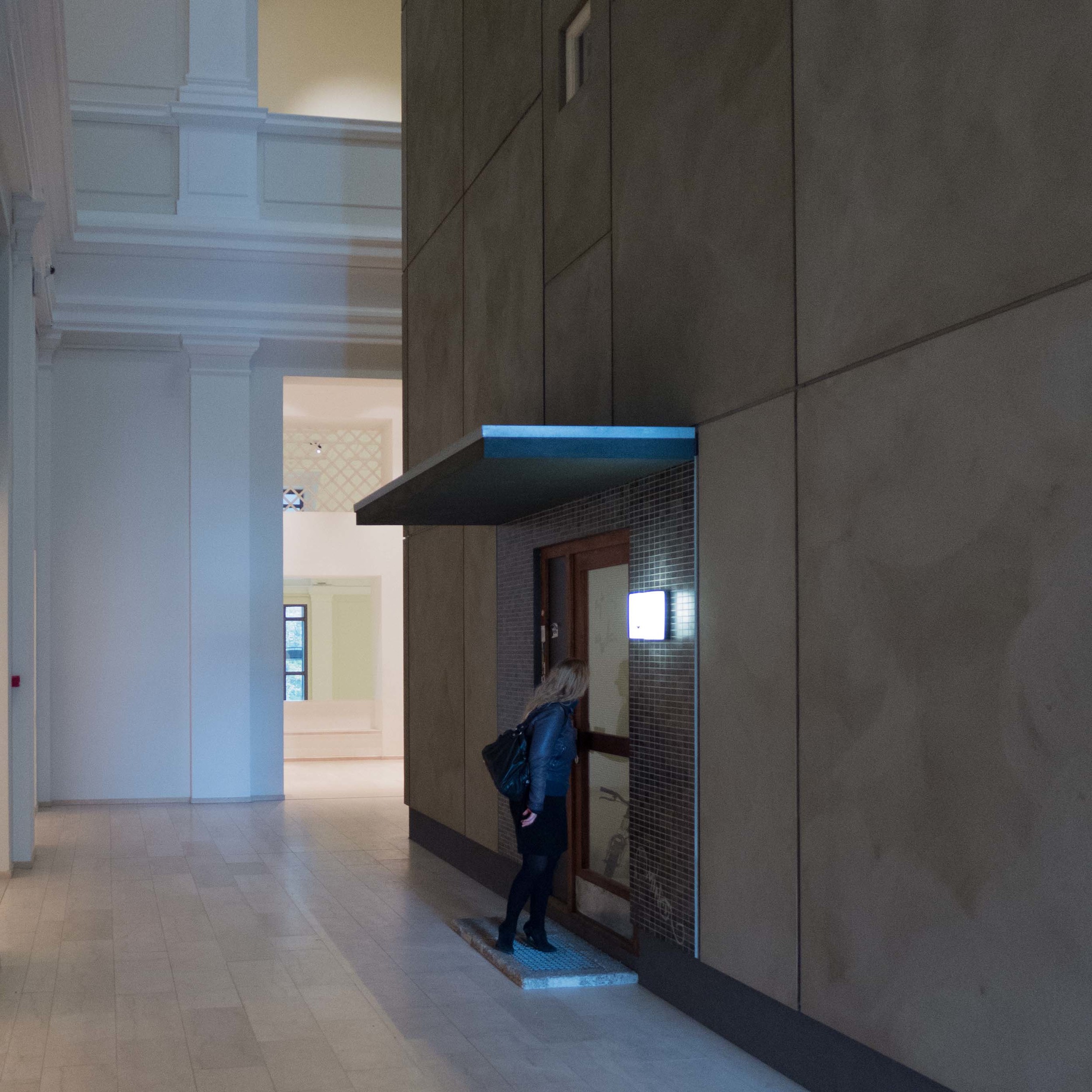
If you visit Statens Museum for Kunst - the National Gallery in Copenhagen - the only way that you can avoid looking at The One and the Many is by not actually going inside the building as this colossal installation fills the entrance hall. 

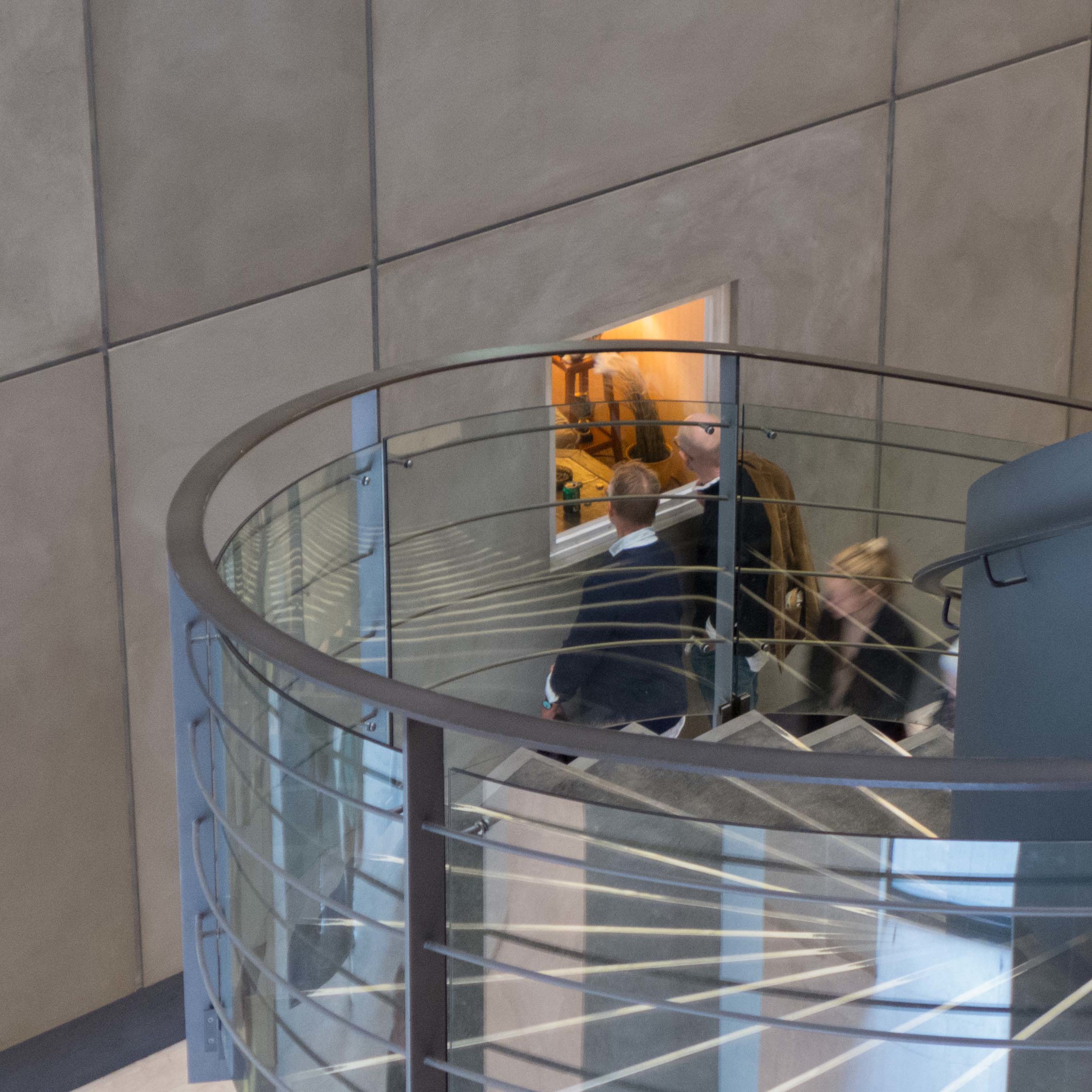
That hall rises up through two storeys with a high domed ceiling and substantial galleries running around it with a prominent modern staircase but this work, from the partnership of Michael Elmgreen and Ingar Dragset, dominates and fills the hall and pushes visitors to the edges of the space.

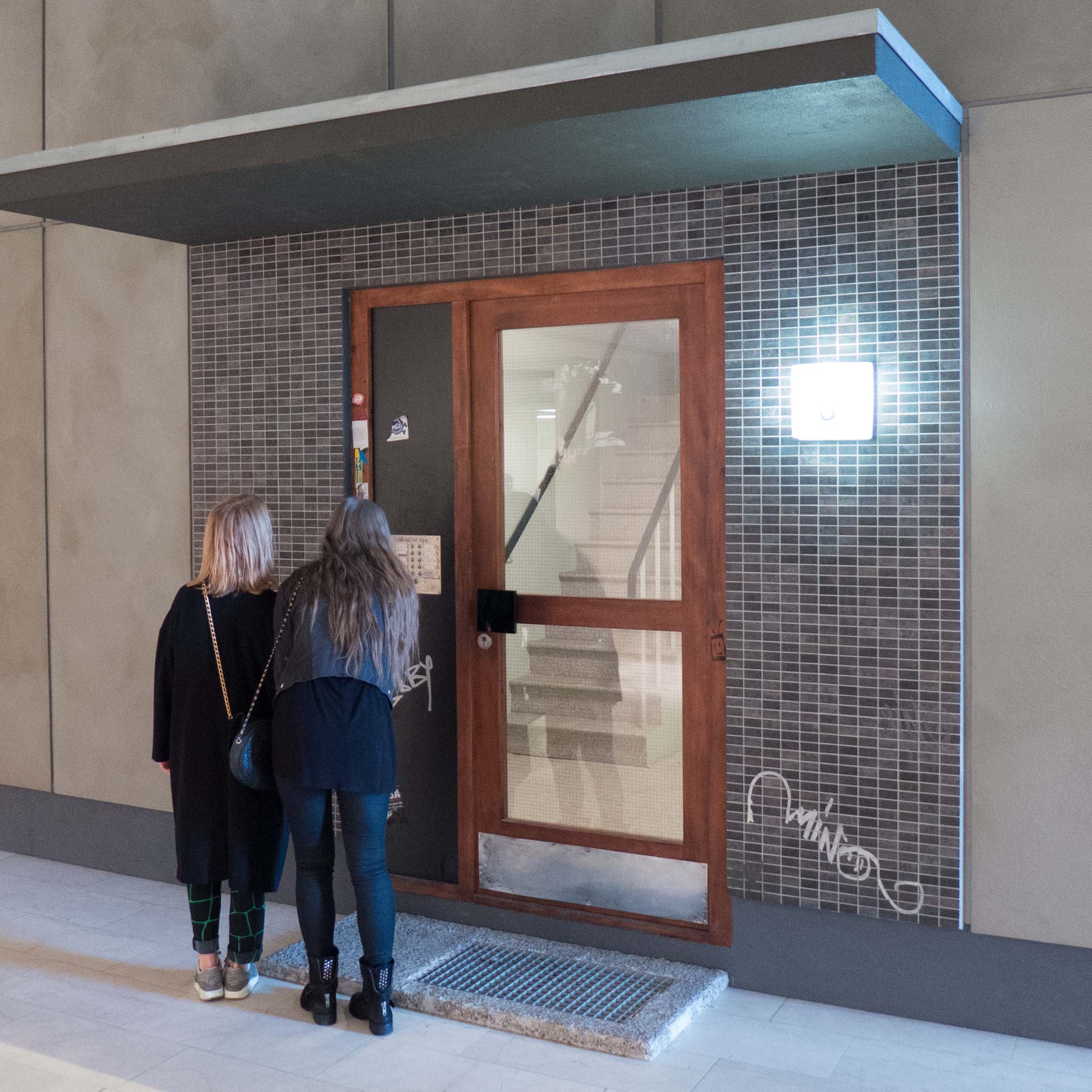
It is a stark, dark, grey, concrete cube representing a four-storey apartment building for social housing or, to be more straightforward, what in England would be called a council block. There is an entrance door on one side with bells and name plates but you cannot get in because there is an answer phone and no one is in apart from a young man on a mattress on the floor in his room dead to the World or worse.

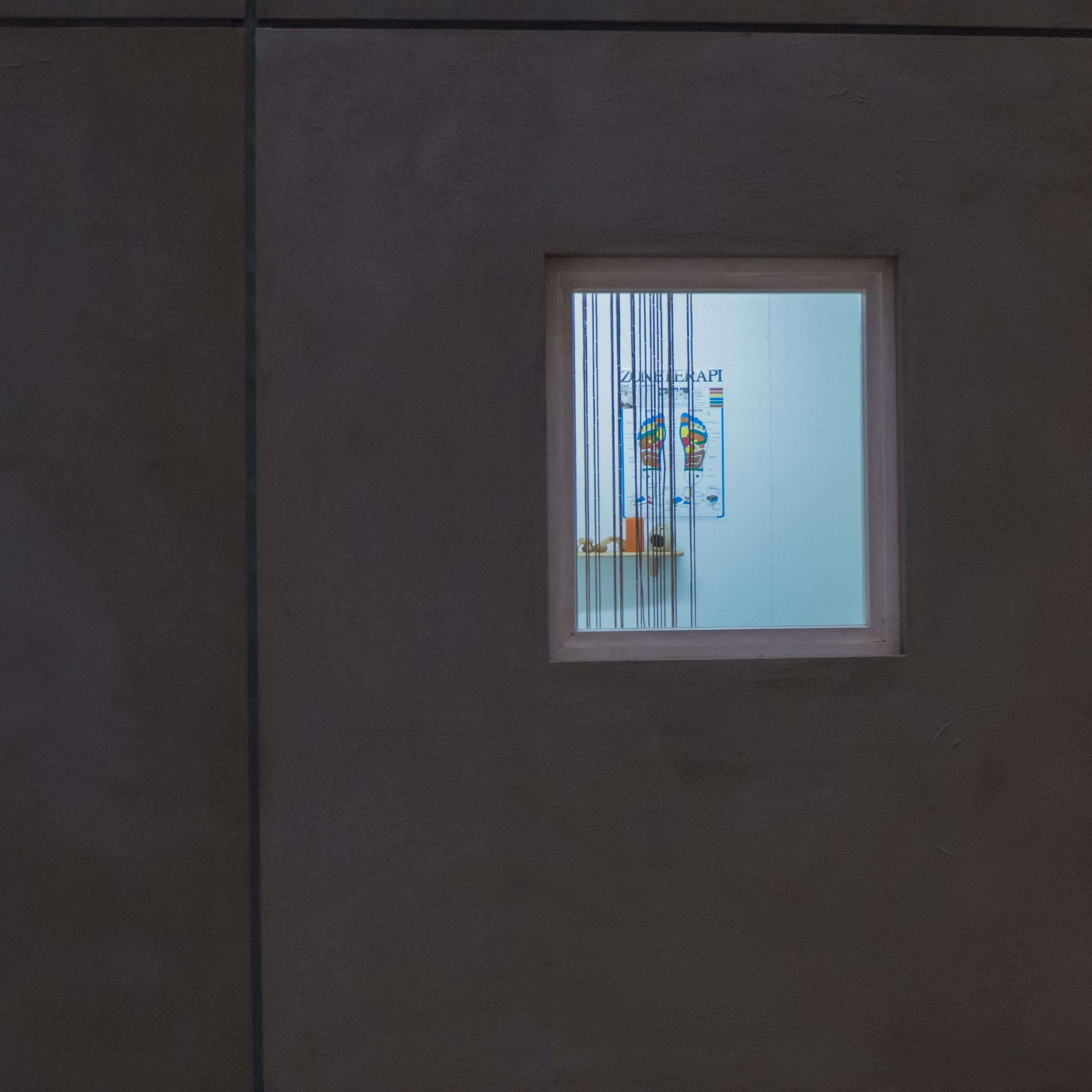
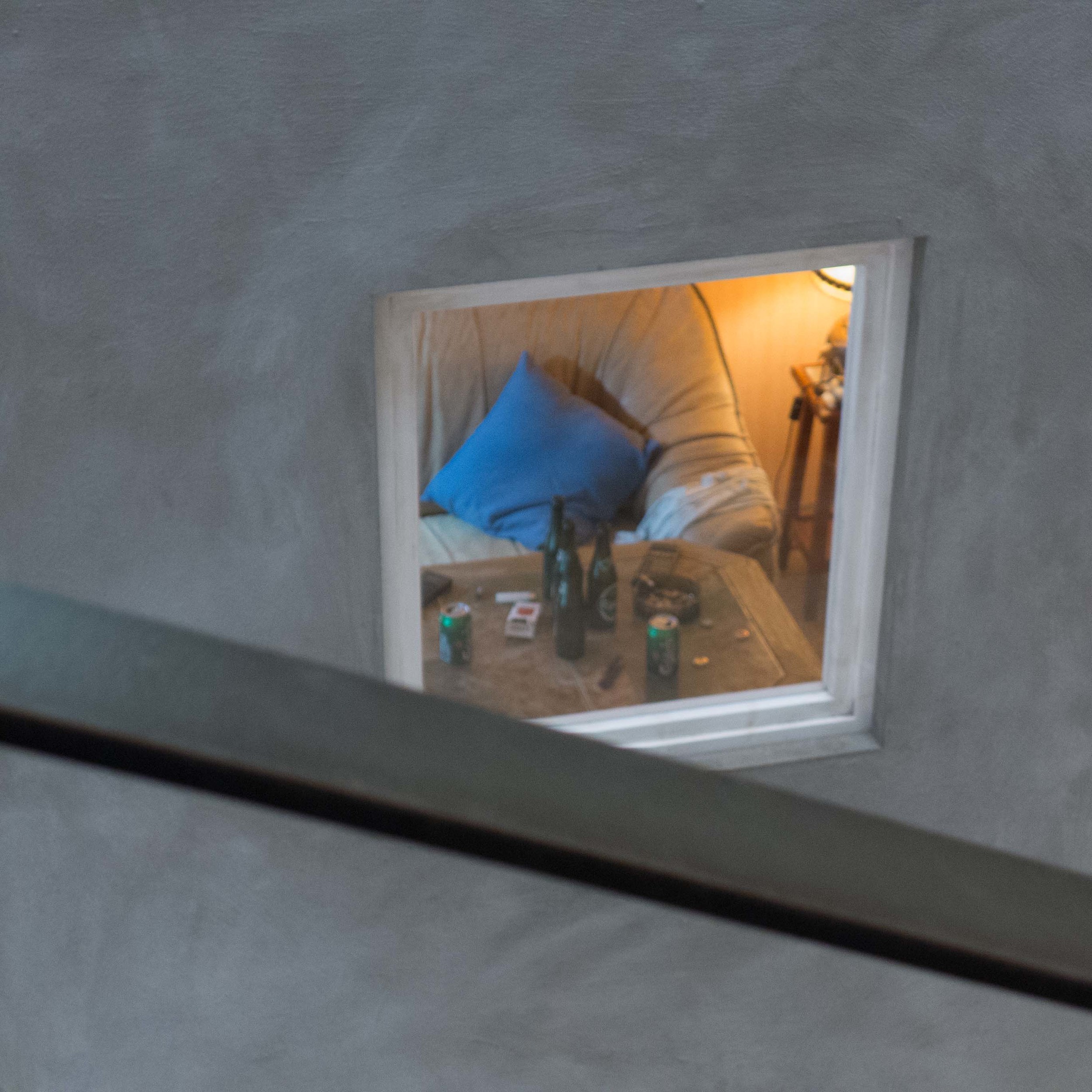
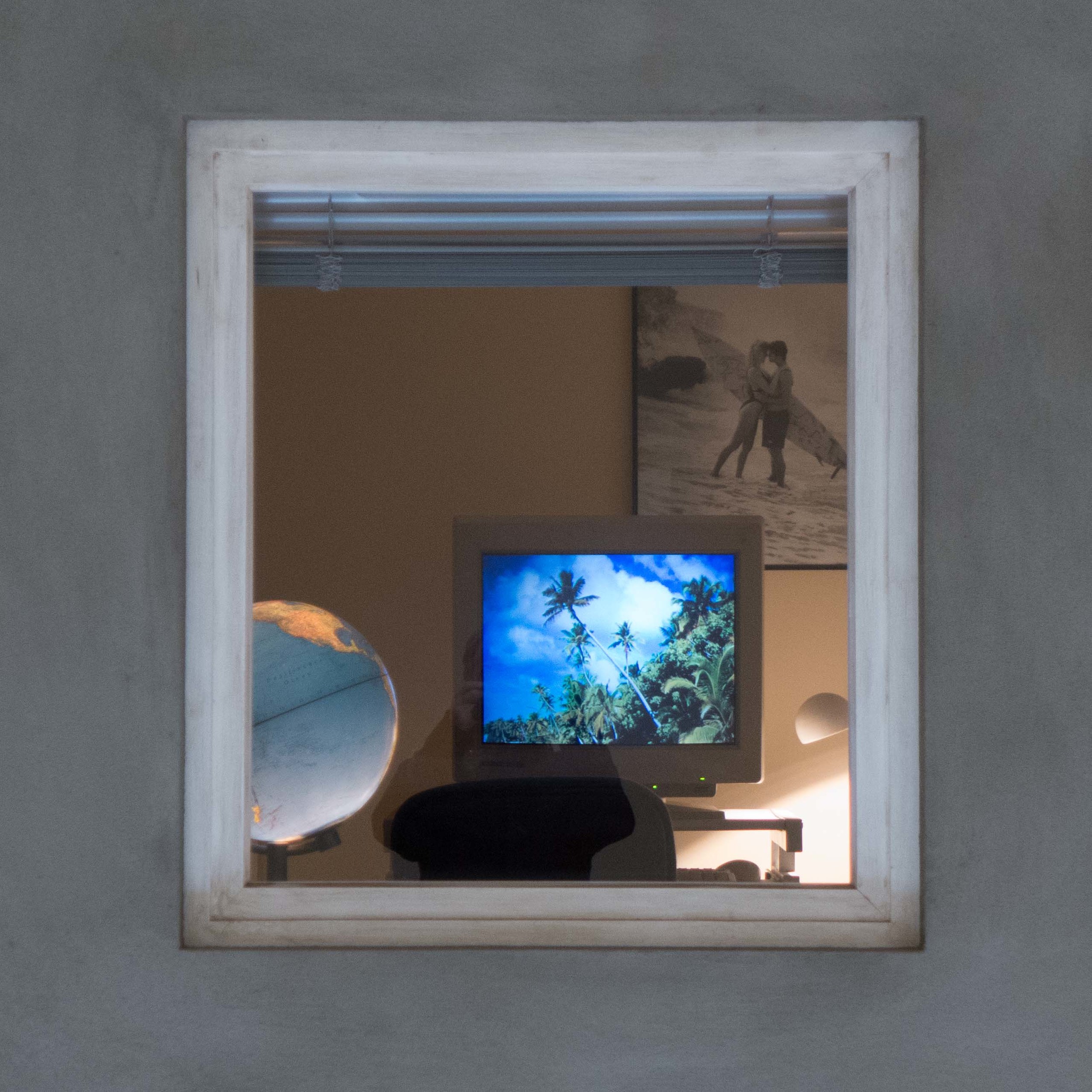
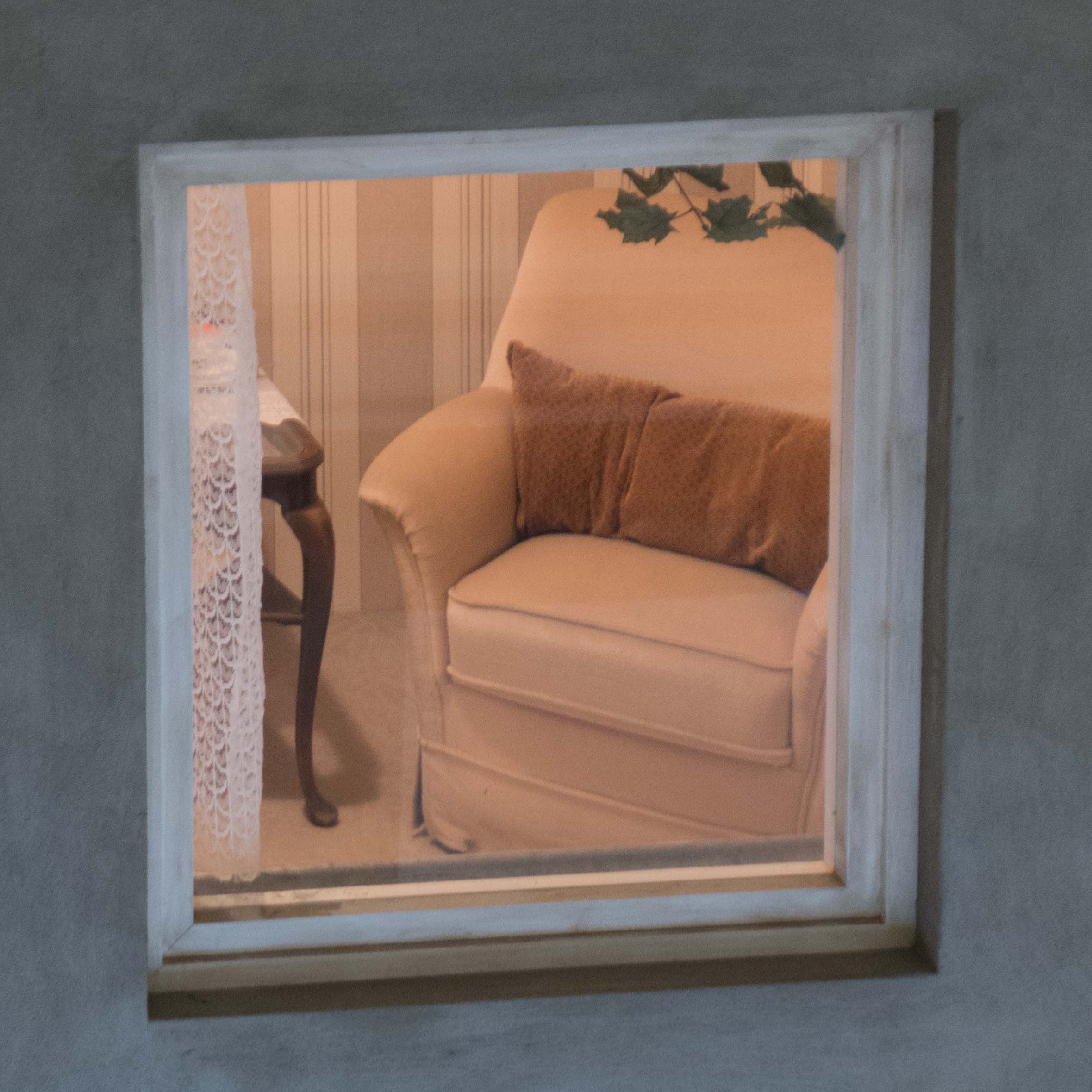
Some rooms are lit and let you look into the interior through the windows … not just at the ground floor but at the upper levels from the galleries. Each room, or cell, belongs to a different tenant and each room, from its contents and furniture, hints at a back story but above all show you, the voyeur looking in, that the tenant is trapped. Not trapped in the room for only one room is actually occupied, but trapped in a life they are surviving or facing or coping with by dreaming or denying.

There is the room of an old lady, or I presume an old lady, which is spotlessly clean with carefully-washed net curtains and her knitting only just abandoned on the armchair; there is the sitting room of a man escaping by watching football on his TV with the coffee table covered in empty beer bottles and cigarette ends; a neighbour has a room set out with bland good taste but, needing drama or whatever, has the TV tuned to X-factor and, heart-wrenchingly sad, the kitchen of an immigrant from the far east with the poster of the woman they would like to be or want to look like and surrounded by everything that can be bought that is pink. Not pretty, soft pinks but harsh strong pinks.

Like a Flemish or Dutch still life, you are drawn further and further in to the scene to look at the details.

If this sounds grim it isn’t. If it sounds pretentious that’s my fault because of the way I’ve written about it. Everyone who lives in an apartment or is worried about ending up in a flat if they have to 'down size' or has aspirations to get away from mum and dad and get some independence should see this work. Anyone who tries to claim that they are not, above all, defined by what they own, should look carefully at this piece and then look around when they get home.

At some stage it is also important to watch the film in a side gallery for an interview with the artists because there you begin to understand their observational skills and the way they use what is, essentially, the stripped-back but laser-sharp viewpoint of a cartoonist but with a very real sense of humanity to create the narrative for their tenants. In doing that the artists make the viewer take stock. At one point in the film they admit that they feel as if they are outsiders but surely it takes an outsider to see what is happening in this way?

Visitors to the gallery eagerly look in through the windows or read the name plates on the entrance bells and laugh nervously about the piles of junk mail inside that no one has bothered to clear. One of the mail boxes has been forced open and left bent and un-lockable and that is in part what is brilliant about this work because just two years ago my mail box in the apartment where I was living then was broken into in just this way … it is that classic ‘shock of recognition’ that makes you feel that art has a strong message.


This is parody and there is real gentle, and mocking humour running through the ideas but what is haunting is that there is no hint of a future. That is what is grim. One window has no light but has a sign to show it is to let so new people will arrive. Is this The Hotel California? The style is hyper realism but stripped back and thin, lean and almost hungry … or is that trying to read too much into it?

I spent a lot of time watching people’s reactions. Watching parents lift up children to look in through windows, trying to judge their reactions, but who was watching me?


The One and the Many was created in 2010 and was shown at the Astrup Fearnley Museum of Modern Art in Oslo.
It will be at SMK until 4 January 2015 and is shown with two other major installations by Elmgreen & Dragset under the title Biography.


The Heart of the Stone


Created by the writer Tor Nørretranders, this exhibition at the Danish Architecture Centre is the third in a series under the title Close up and looks at the work of the Copenhagen architectural firm of Lundgaard & Tranberg Arkitekter. Formed in 1983 by Boje Lundgaard and Lene Tranberg they have been responsible for a number of important and prominent buildings in the city. 

This is not a conventional architecture exhibition for there are no architectural drawings, few comments about or detailed analysis of specific buildings and few photographs of works by the partnership. Rather, it uses a number of statements and images to make visitors re-assess their own preconceptions about how architecture, particularly the architecture of public buildings and public spaces, should be seen … over a sink being filled with running water one statement points out that familiarity means we see pipes as pipes and not for the water they carry … so buildings should not be considered primarily as blocks or facades but as containing or defining spaces where light, air and, most important of all, people move to act and live out their lives. One panel towards the end of the exhibition has the declaration “Architecture is about creating good lives. Not about creating fine buildings. Good architecture makes life flow through the world.”

However, major elements in the exhibition do make visitors stop and look in a different and thought-provoking way at three large and prominent buildings in the city that they probably know and may already take for granted. 


A time-lapse film projected onto a large screen shows the movement of traffic and people around the SEB Bank buildings completed by Lundgaard and Tranberg in 2010. These are two large blocks with irregular undulating walls flowing around a large open space planted with trees and in particular the effect of light on the buildings, changing as clouds move across the sky, is striking in the film. Presumably the message is that our reaction to a building can be fixed by the specific time of day when we first saw it and the response can be influenced if we perceive it to be uncomfortably crowded with people or deserted in a disconcerting way.


A set of strategically placed mirrors brings views of the Skuespil Huset - The Royal Danish Playhouse - right into the gallery space. The substantial block of the theatre, completed in 2008, is on the opposite side of the harbour and quite some distance away from the Architecture Centre so it is slightly disconcerting and slightly disorientating to see it somehow so close and even, in one mirror, in mirror image. Presumably that was the point … to take a familiar building and quite literally see it from a completely different point of view.

The Playhouse does also illustrate well one major aim of the exhibition and that is to examine how people use and move through and around a building which can determine its success or, in the case of other buildings, explain its failure. The terrace walk around the Playhouse, described by the architects as a promenade, and the terrace cafe with chairs that can be moved to follow the sun around the building has made the space very popular and this is likely to become more significant as the former ferry terminal immediately to the north is made into important new public space and the new foot bridge taking pedestrian and cyclists over the harbour immediately to the south of the Playhouse is completed. The new river walk and new terrace of the Playhouse shows that a building may well be judged by the public not in terms of facades or style or quality or even by how well it fulfils its intended purpose but in terms of how it fits into and facilitates what they want to do and how they want to use the space.

The third building given prominence in the exhibition is the Tietgenkollegiat in Ørestad - student housing that was completed in 2002. The building is circular in outline and around a circular courtyard with kitchens for the students and communal rooms arranged to look inwards and the private spaces of bedroom/study rooms looking out. The rooms are formed as a series of boxes stacked to project or recede from the barely defined facade line. This emphasises the individual but also gives them a perspective on their place within the student community but also a wider relationship to the world beyond. The fragmentation of the facades, described as a crystalline structure, in a clever and successful way, creates offsets for balconies, restricts or opens out view lines and, crucially, makes light and shadow, as the day progresses, key elements of the design.


For the exhibition there is a 1/20 model with the front of each room created with a photograph showing in some cases students standing at the windows looking out, in one area students with rock-climbing equipment and helmets scaling the outside and in others students eating or sitting on the terrace balconies. The photographs also change in the time of day shown as you move around the model from morning to afternoon to evening to night so there is also a sense of not just the change of light but the way activities change … in the areas photographed in the late evening or early morning curtains or shutters are closed ... and it shows clearly how the activities in the building and the role of the building are different at different times of the day. It shows that the ways in which a major building is used is rarely static.


the exhibition continues until the 21st September
Follow the link to the DAC site for opening times.

Lundgaard & Tranberg Arkitekter