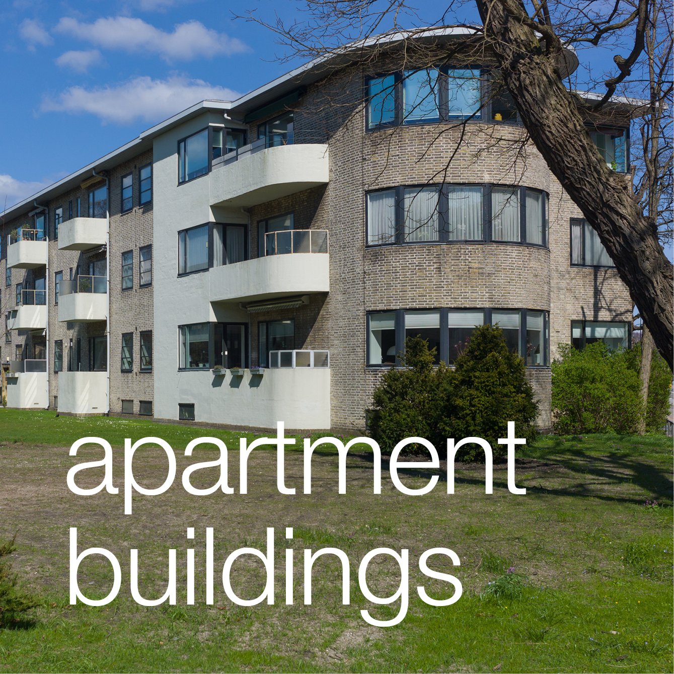
Dorotheavej apartments by BIG


This new apartment building on Dorotheavej - affordable housing designed by Bjarke Ingels Group - has just been nominated for the Bygningspræmiering - the annual city architectural award.

Out to the north-west of the city centre, just over 4 kilometres from city hall, this is an interesting area just below Bispebjerg and Nordvest cemetery, with a mixture of older apartment buildings and new apartment developments but also older industrial buildings on either side of a main road and, to the west, just beyond this site, low suburban housing.

The main road, Frederiksborgvej runs north - climbing up the long slope up to Bispebjerg - and Dorotheavej is on the west side, itself rising up a slope across the hill, with the new apartment building just in from the main road and on a very wide site with a long frontage to the street that faces south.

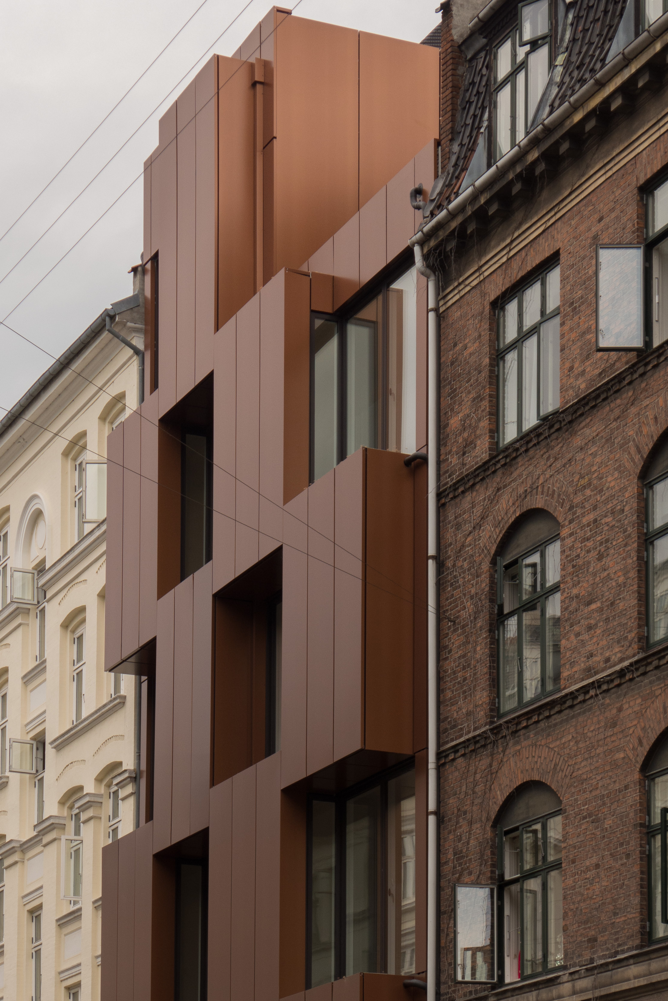
The form of the block is a long, gentle and sinuous curve back away from the street towards the centre but hard against the pavement at each end with the area in front planted with grass and trees. There is a high and wide archway through to the back of the building at the point where that curve is furthest back from the street.

The apartments have the typical through form - typical for Copenhagen - so here with a series of seven separate entrances along the façade and each giving access to a staircase with an apartment on each side at each level those apartments are relatively narrow but deep and run through from front to back of the block.*

There are 66 apartments on five floors although at the west end, furthest from the main road, the block steps rapidly down to a single storey to form a transition to the smaller scale of buildings in the next part of the street.

The design of the street frontage has a clear and neat articulation with wood on the façade creating the impression of a regular set of large wooden boxes stacked up corner to corner with the spaces between glazed but set back to form balconies. Unlike the 8-House in Ørestad - also by Ingels - this gives vertical and horizontal lines across the front a rational coherence … my main criticism of the earlier apartment building in Ørestad is that with the underlying arrangement of apartments along, in effect, a ramp that spirals up the building, then vertical and horizontal lines get chopped up and broken … it's not by a huge amount but enough to make the façade there look and feel restless or uneasy.


At Dorotheavej, the back of the building has windows that look across a large open area of grass and services, including car parking and the square division of the front elevation is repeated but more simply expressed with very shallow stepping backwards and forwards of the elements making it look more like a checkerboard in shallow relief. That might sound like damning with feint praise but actually it makes the façade look honest and straightforward but still expresses the internal arrangement and internal divisions but avoids the grimly stark, cliff-like backs of most modern blocks. In too many buildings you find that money and thought has been spent on the front but both run out by the time you get to the back but here, at Dorotheavej, it is actually a pleasant and elegant elevation and the gentle curve, determined by the footprint, even more than on the front, reduces and softens the impact of what is a very large block.

This complex curve also means an interesting dilemma or an interesting challenge for the inside.

If the front looks like a set of regular boxes repeated along the building, the curves means that cross walls are set at angles and there is a huge variety of arrangements in the individual, wedge-shaped apartments. There was a prospectus on line - issued for potential tenants - and the choice of internal arrangements of the apartments was bewildering - so rather like the different plans within the VM Houses by Ingels and JDS from 2005. 

At Dortheavej there are generous ceiling heights and, as an interesting consequence of the staggered-box design, there is a difference of floor level between the main box and the recess on either side so there can be interesting steps within each apartment and several of the apartments have an internal staircase with bedrooms on a separate level. Sizes of apartment vary from 65 square metres through to 115 square metres with most having one or two bedrooms although there are studio apartments and some of the larger apartments have a small study that could be used as a third bedroom. A standard trick here is to use interlocking L- shapes for adjoining apartments reached from different staircases so both have a large room running across the full width and then one has a front-facing room and the other a back facing room with internal bathrooms in the area between.

This interlocking of L shapes is found in the plans of apartment buildings in the city from the 1920s and 1930s and the large central archway is, of course, an echo of the archway through at Hostrups Have from 1936. That's not saying that Ingels here is being derivative … he is simply showing how well he knows and how well he understands the history and the conventions of housing in the city and is playing games with successful forms and styles for the building type to come up with clever and good variations on a theme. The building would certainly more than justify that Award if they do win.


note:

 * this arrangement means that apartments run back the full depth of the block with windows to the front and to the back and there is no connection between one vertical set of apartments and the next except outside at street level. An alternative arrangement is to have a main entrance and then access from a central corridor or to have external galleries or long public balconies at each level with the front doors accessed from there but both alternatives usually mean a compromise with some apartments with windows on just one side of the building or, with gallery access, some compromise in privacy as people walk past to get to their own door.


Nansensgade 57


This plot on Nansensgade - a street a few blocks out from Nørreport - has been empty since the late 1980s … simply a gap in the street frontage with a garden behind a fence.

The new building here was designed by Christensen & Co and completed last summer.

Built by the city social services, the apartments are for vulnerable young people and are used as a staging post to give them help and support before they move on to more independent lives.

It is a narrow plot, so the entrance door is set off to one side - leaving space for one shop on the ground floor and the staircase is at the back, turned to run up across the garden side. On the floors above, the apartments are arranged to follow the well-established Copenhagen form with two apartments at each level, one to the right and one to the left, with the pattern broken at the top floor where there is a ninth apartments on one side and a roof terrace to the other.

To the street the façade has a checkerboard pattern of plain copper panels that step forward boldly to give privacy to the balconies of each apartment and narrow windows in the sides give views up and down this lively street.

My career has been spent working on historic architecture and conservation but that does mean that I can't appreciate good modern architecture even if, as here in a good street of good buildings with a distinct character, it seems to break many of the conventions.

Breaking rules or breaking conventions or, as here, breaking forward of the regular line of the facades along the street, is fine if it's done knowingly. Rules and conventions should not be broken just for the sake of it but here it clearly adds a dynamic to the street frontage and the choice of material and the colour is spot on.

Christensen & Co


Functionalism - apartment buildings in Copenhagen in the 1930s

Grønne Funkishus Nordre Fasanvej 78-82


In Copenhagen, there is a clear change from the apartments buildings that were constructed in the late 19th century and early 20th century and the apartment buildings from the 1920s and 1930s. 

In the 19th century each building was different from the next, often with relatively ornate doorways, carvings and complex mouldings for the street frontage and inside the arrangement of the apartments was often dictated by a narrow plot with existing buildings on either side that determined where and how windows to the back could be arranged. Even within a building, there were often differences between one floor and the next in both ceiling heights and in the quality of fittings. 

By the 1920s, plans of individual apartments became simpler and they were generally more compact and certainly more rational in their arrangement of the rooms and staircases. Because many of these new buildings were on new sites outside the old city, or if they were within the city a whole block could be cleared of old buildings, so there is generally a greater sense of uniformity within larger and larger buildings. 

In part, this was because, in this period immediately after the First World War, there was a severe housing shortage and, to a considerable extent, the functionalism and the adoption of new building techniques was driven by a need to build as many apartments as possible and as quickly as possible.

Externally ornate decoration, such as pilasters or pediments or heavy stone or plaster window surrounds were omitted completely and the design, or rather, the articulation of the facade, depended on windows or balconies repeated regularly across the full width of the front. 

By 1930 there might be some apartments with one bedroom and some with two and occasionally some apartments with three or more bedrooms - even within a single building - but usually fittings in every apartment and the style and arrangement of common areas within one building were the same. 

Perhaps the most obvious change, between the buildings of the 1930s and developments constructed now is that, in apartments then, kitchens were relatively narrow and usually were to the rear of an apartment whereas now, in many modern apartments, the kitchen area is within the main sitting room or is even open to the sitting room or a sitting room, dining area and kitchen are a single open space. 

In the last decade or so, some architects have tried to re-introduce more diversity in planning, to create more individual apartments within the same building - the most extreme example being the VM building by Plot where there are 40 different plans for apartments in the V building and 36 different plans in the M building - and there has been a return to having more prestigious apartments (so more expensive apartments) on one level. In the 19th century the best apartments were usually on the first or second floor - above the noise of the street but not up too many stairs. In the 1930s, if apartments were different in any way, it was probably only on the ground floor where they could be smaller as some of the area was taken up by the entrance lobby and lobbies and doorways to the courtyard. Now, of course, the best apartments are usually on the top floor if the building has a penthouse.

Changes in the way that people lived, at different social levels, can be seen clearly in the changes between 1870 and 1920. Of course there have been changes between 1920 and 2017 but many of those changes are architectural so structural or technical and to do with new materials but with little effect on the plan of the apartments or the changes are perhaps better described as improvements … so faster lifts, triple glazing, micro-wave ovens, dish washers and underfloor heating that all make life easier or more comfortable but do not in themselves actually indicate radical changes in the way people live … simply rising levels of prosperity. 

Equally, major changes in people’s lives, so the ever increasing number of people living alone or the number of men staying at home to bring up children or even the rise and rise of computer technology in the home that would hardly be comprehensible to someone living in Copenhagen in 1930 have barely required any changes to the apartments people live in or the furniture they need and buy today.

Really, this is a long way of saying that we tend to see ourselves as living a very modern life - specifically a contemporary life by definition - but if people look for a starting point - a point of change in the way that most of us live - then the first truly modern housing and modern furniture - although many Danes would see the Classic period of modern design in the 1960s as the crucial point of change, in fact, the real context for what we call modern housing and for what we would recognise as modern design is back in the 1920s.

Through the late 1920s and the 1930s it was the technical methods of construction and the style of the buildings and, of course, some of the architectural features that changed. So there was the more and more frequent use of concrete for floor structures so, in many buildings, the outer walls were no longer load bearing. As a consequence, a distinct feature of this period is long horizontal runs of windows because long windows, with few or no intermediate vertical supports, are only possible when the outer wall is no longer important in taking the weight of the building above. By the 30s, many buildings have square bay windows for the living room or large balconies off the main living space - again partly to do with style or fashion but, for more rational reasons, again it was a fashion that was only possible because of those changes in the way that the building was constructed.

By 1930, decorative elements had been reduced or even omitted so there was relatively little or no decoration on either the exterior of apartment buildings or inside - so plain doors and simple door architraves became common - so that is doors and architraves without ornate mouldings. Most fittings were industrially produced so apartments had factory-made window frames that were often metal rather than wood and iron radiators and fittings in the kitchen that had been made away from the site. So this period also marked a clear change in the way that builders and artisans were employed with less on-site skilled labour. Carpenters were needed for the construction of the roof and floors, if they were not concrete, and of course brick layers had to work on the site but there were fewer joiners and, because ceilings were plain, there was no longer a need for highly-skilled plasterers who could run a moulded cornice or form decorative feature.

Staircases in the 30s were generally plain or restrained - so no great sweeps or curves of moulded handrails with shaped or turned balusters - but actually some architects did use quite expensive new materials like bakelite or chrome or brass - and the staircases often provided an opportunity to show off new engineering skills with cantilevered flights or thinly elegant landings and large walls of window that in some buildings rise up through several levels. 

The standard arrangement in most apartment buildings was to have a main staircase reached by a lobby from the street with just two apartments at each level - one each side of each landing - but with secondary or back staircases that were usually reached by a door in the kitchen and gave access to the basement if there were service rooms like washing or drying rooms there and access to the courtyard for rubbish and so on.   

In Copenhagen, the plan of the apartments - the way that rooms and staircases were arranged - developed through the first decades of the 20th century. 

By the 1920s, there was usually one sitting room, a small kitchen and one or two bedrooms, in part depending on the size of the apartment, but even in Copenhagen now, many surprisingly-large apartments have just one bedroom.

In some buildings a distinct feature found in some apartments was to have wide door openings with double doors between the living room and the main bedroom, with the doorway in the centre of the wall rather than in the corner of the room. If there was a second bedroom it was smaller and often alongside the kitchen which meant that the way the rooms could be arranged was flexible. 

Some contemporary plans show furniture so that it is obvious that in one flat the room adjoining the main sitting room was used as an extension of the living space but in another apartment, with the same overall plan and even though the two rooms were linked by wide double doors, the room was used as the main bedroom.

By the late 1920s perhaps the most important change was that many if not most apartments had a small private toilet or bathroom within the apartment - although some toilets had internal windows onto a staircase for ventilation. Earlier apartment buildings, particularly for working families, might have had toilets on stair landings that were shared between two families or more or the toilets were down in the courtyard and all families used a nearby public bath house.


The following apartment buildings are not necessarily the best or even the most typical from the period but they illustrate interesting points and two - the Grønne Funkishus apartments and Hostrup Have - are important buildings that are out from the centre of Copenhagen so, for visitors not familiar with the city, they are less known and less likely to be just discovered on walking around.


Vodruffsvej 

The apartment building on Vodruffsvej was designed by Kay Fisker (1893-1965) and C F Møller (1898-1988) and was completed in 1929. It is at the south end of the lakes on a triangular plot on the south-west corner of Sankt Jørgens Sø and the narrow and restricted site of the building, with the lake to its east and with the shortest elevation to the south, explains the importance of the balconies and the long runs of window. 

It has the typical feature of many Functional buildings - bay windows, long runs of windows, flat roof, plain undecorated exterior - but rather than being arranged around a courtyard, it has, almost literally, an A-typical plan because of the long and narrow triangular site between a road and a lake.

The plan, like a capital A, has service rooms and secondary staircases moved into the centre to place the maximum number of good rooms looking outwards. 

Broad alternating bands of yellow and red brick and the projection of window bays with the cutting back of corners creates a complex design of layers and planes that are particularly interesting at the south end where you can see that the apartments on the lake side are set up half a level from those onto the street because the lake and the lakeside path on a man-made bank or dam are at a higher level than the road.


Grønne Funkishus Nordre Fasanvej 78-82 and Guldborgvej 25-27 

Designed by Hans Dahlerup Berthelsen (1888-1939) and completed in 1932

Again, this is a relatively unusual site that is between two existing roads, with a separate block fronting onto each road and with a narrow courtyard between the two blocks. It is a wide plot - but not particularly deep - and with the main frontage of the main building set back from the pavement with front gardens - to respect the building line of earlier apartments to the south - and there is also a shorter frontage to the secondary road so the ranges are also of different lengths. They are relatively shallow blocks from front to back, with no projections to the rear, and, even so, there is only space for a narrow courtyard between the two ranges that is reached through a wide opening at the centre of the Guldborgvej block.

The buildings have load-bearing steel frames and it has been suggested that this was important because it allowed for thinner outer walls … again to keep the buildings as shallow as possible from front to back.

However, the apartments themselves are wide - unusually wide - and vary in size from 89 to 168 square metres 

There are three entrance doors across the main frontage with each door leading into a stair hall with apartments on each side - so six apartments on each floor in the main block - but there are also secondary staircases for every apartment - the second staircase out to the side rather than out to the back - again dictated by the relatively shallow plot. 

The apartments are rationally laid out and well proportioned with the windows of the main rooms to the street rather than to the courtyard. From the main staircase there is a lobby, with a window to the courtyard, and then from there a door into a series of three good rooms along the street frontage that are interlinked by wide doorways on the central axis and the set of rooms culminates in a main bedroom. From the entrance lobby there is also a door into a small second bedroom with its window looking into the courtyard. The kitchen and bathroom are not reached from this entrance lobby but from the centre room of the three on the street side.

The two ranges have pitched roofs with clay tiles and there are no balconies - again possibly the consequence of having to build ranges with a restricted depth - but there were drying balconies in the attic on the slope towards the courtyard.

Nordre Fasanvej 78-82

the parallel building - Guldborgvej 25-27 

the courtyard with the windows for the service or second stairs at intermediate levels 


Hostrups Have, Falkoner Allé  

This very large housing scheme in red brick was designed by Hans Dahlerup Berthelsen and completed in 1936. There were 680 apartments, that vary in size from 60 to 205 square metres, and also 30 commercial leases for shops and businesses ... so extensive that it should perhaps be seen as town planning. 

It was on the site of Rubens Clothing Factory that had been established here in 1857 but was closed and demolished in 1927. One large factory chimney was retained, for the heating system of the new apartments, but that too has now gone, demolished in 2013.

A ceremony was held in 1935 for laying a foundation stone of the buildings and that ceremony was attended by the prime minister Thorvald Stauning and Marius Godskesen, mayor of the city. The builder was Harald Simonsen.

looking through the arch to the square from Rolighedsvej


from above the apartment buildings of Hostrups Have could not be easier to pick out ... they are the buildings with red clay-tile roofs. Air view from Google

the square from the south

Large housing schemes at this time might take up a whole block or one side of a block with a large internal courtyard but the apartments of Hostrup Have reverse this with the main blocks looking inwards into a large public square with gardens with a service or access road round the square between the apartments and the garden. The square is 70 metres across from east to west and 150 metres long from north to south. There is a main entrance range, across the north side of the gardens, that also has an important front to Roliighedsvej that is 125 metres long and there is a wide opening through the building at the centre of this north range to connect the street with the square.

At the centre of the west side of the square, there are additional apartments on both sides of a relatively short street running out to Falkoner Allé, one of the main streets in this area, the south range shorter, continuing for about half the length of the street but the north range for the full length of the street of 70 metres and with apartments in a range returning along Falkoner Allé.

There is a second street out of the square at the south-east corner that is 115 metres long with ranges of apartments on each side running down to Sankt Nikolay Vej and again those apartments return with frontages to Sankt Nikolaj Vej, and that to the east longer, continuing to an angled corner and a short block returning north along the side street to the east of the square called Dr Abildgaards Allé.

There are service yards to the south west and north west and a very long service yard across the east side of the long east range.

Hostrup Have seems to inspire considerable loyalty among residents as people advertise to move within the scheme, to move to a larger or smaller apartment, but want to stay within the square. Over the years there have been famous residents including actors, authors, and the designer Børge Mogensen.


inscription above the way through from the square to Rolighedsvej and the clock on the parapet above the inscription


the south-east corner of the square with the road leading down to Sankt Nikolaj Vej


Sankt Nikolaj Vej (above) with the apartment buildings on either side of the road leading up to the square and (below) the range set at an angle at the corner of Sankt Nikolaj Vej and Dr Abildgaards Allé


the north-east corner of the square with the passageway through to the east service yard. Note the two different forms of balcony and the change of angle at the corner as Rolighedsvej to the north and Dr Abildgaards Allé do not meet at a right angle


views of the west service yard (above) and the staircase at the south end of the east service yard (below)


staircase at the north end of the east service yard


Vestersøhus 

Built between 1935 and 1939, the Vestersøhus apartments were also designed by Kay Fisker and C F Møller. This building is also unusual for the period in that despite being a very large housing scheme it is not built around a courtyard but has a single long range although there is a short return of apartments at the north end and a long narrow service area to the back. That main range faces onto Sankt Jørgens Sø, and is just under 300 metres long and occupies almost all of the west side of a long narrow block between Vester Søgade and Nyropsgade.

There were 242 apartments in the block with ten shops and, more unusual, a hotel that had 43 rooms.

The most striking feature of the front to the lake are the lines of white balconies that, from a distance, give the facade what looks almost like the texture of a woven basket. The apartments have two rooms to the front - with a large living room and a smaller room that is set back behind the balcony - so although the balcony projects it is also set half back into the building - and that allows for a corner window in the sitting room that looks out to the lake and into the balcony and makes maximum use of south-west light through the afternoon and evening.

Vestersøhus from the west - from the far side of the lake


Although the facade is strictly regular in its arrangement of doorways, window bays and balconies, in fact the apartments alternate, larger and smaller, down the length because the main staircases are not set between apartments, taking an equal amount of space from each side, but are to one side, taking up part of the space from one apartment, reducing its size. The main staircases also project slightly to the back giving a bay rhythm to the courtyard side that is otherwise rather stark and severe. 

Following the well-established plan form, there are second or back staircases for each apartment with access from the kitchens. 

There are service rooms in the raised or half basement so, although front doors are at street level, there are steps up inside the front door to the first apartments on what is a raised ground floor. This has several advantages as the basement rooms have ventilation and light from openings with their sills at pavement level but, more important, the ground-floor windows of the rooms to the front have some privacy as those sills are well above the head height of people walking along the pavement so they cannot look directly into the apartments.

Plans show rooms with grand or baby-grand pianos so clearly these apartments, with relatively large rooms and views over the lake, were a prestigious place to live.


Sortedams Dossering 101-03 / Østerbrogade 19

Two examples of buildings designed by Ib Lunding (1895-1983) have been included here to show that Functionalist architecture does not have to be severe or stark.  

Lunding graduated as an architect from the School of Architecture in 1925 and worked in the Department of the City Architect but also had a private practice. Although his apartment buildings have many of the hallmarks or use the elements and architectural vocabulary of Functionalism his buildings also have a distinct sense of quirkiness.

It is the lively arrangement of small balconies across the front of the apartments at Sortedams Dossering that is striking, with windows projecting out at an angle to make the most of views down the lake, and in vertical lines are Lunding’s signature feature of round windows.


Grønningen about 1910 looking north. The apartment buildings at each end of the street were completed first but the plots in the middle remained vacant for many years. The building by Ib Lunding was in the space on this side of the narrow road, now called Hammerensgade, that is shown as already surfaced between two plots of land. The trees to the right are Kastellet

7-9 Grønningen 

Round windows are also used at the apartment building at 7-9 Grønningen in Copenhagen in a line rising above the entrance door and light the staircase. These round windows are of different sizes, rather like a stream of bubbles, and the building is called fondly the Champagne Building. The entrance doorways are different and with arched heads are certainly not functional but are late echoes of romantic historicism but perhaps the most striking feature is the large windows at the corner of the two ranges where there is almost a bravado design to show that there is no corner support and the large windows are set out from the facade with relatively deep window sills. These windows look out across the street to the 17th-century earthworks of the Kastellet. The apartments were completed in 1936.


For other examples of apartment buildings in Copenhagen and for a broader context for the period there is a time line for apartment buildings on the architectural site copenhagen by design