a new library for Nørrebro


At the beginning of August a new public library opened in the old tram sheds in Nørrebro.

The building is set back from Nørrebrogade with a large square at the front where trams originally turned into the sheds and the original high and narrow openings towards the road have been retained but with new doors that have stylised versions of giant book cases.

Inside, the single huge space of the shed has been retained with arched openings in the brickwork along the east side towards Bragesgade kept as a strong architectural feature and to flood the space with light. The industrial roof has been kept and is now painted black.

Fittings are in pale plywood and divide up the space and there are integral breaks in the shelving with desk spaces and benches that create quiet places to work but also form views through the space.

Across the west side of the library are smaller spaces on two levels with meeting rooms above for meetings and teaching that the community can use and, like all libraries in the city, there is a play area for children to encourage even the youngest to see the library as a fun place to visit.

Further back from the road is a second huge tram shed and that was converted some years ago to a sports hall - Nørrebrohallen - and there is now a large entrance area and large cafe between the two - between the library and the sports halls - as a place where people can meet.

Running back from the road and along the west side of the buildings is the famous city park - Superkilen - with its outdoor play and sports so this area is now a major hub for the community around. It is anticipated that visitor numbers to the library could soon exceed 1,000 a day.


select any image to open the photographs as a slide show

sport and space consultancy KEINGART
have published a pdf file on line with
plans of the library and cafe area


Kids' City Christianshavn


the front of the school to Prinsessegade - the yellow box-girder structure is courts for sports over the main entrance and the glass roof structure is a greenhouse over the restaurant


the Town Hall of Kids' City from the far side of the canal

The first stages of Kids’ City - buildings along Princessegade in Christianshavn in Copenhagen - have opened although there is still construction work on part of the site and work on hard landscaping and planting is ongoing but already it is clear that the design of this new school will be innovative and inspiring.  

When finished there will be up to 750 children here, ranging in age from babies in the pre-school area through to young adults of 17 or 18 in their last years of schooling so Kids’ City will be the largest ‘pre school and youth club’ in Denmark. 

That presented COBE, the architects, with distinct challenges. On a relatively tight plot of around 11,000 square metres, the buildings have to be extensive but have to allow for as much space as possible outside for sport and play and other activities. As a single, unified block it could have been over bearing and daunting for small children but this school also has to provide an appropriate setting and the right facilities for such a broad range of age groups that it could never be a place where a one-class-room-fits-all approach was possible.

The solution has been to link together a number of simple blocks - most of two stories and some with gabled roofs and some set at angles - to create groups and small courtyards and to treat the site as a small city with different neighbourhoods and public spaces. The separate parts are even described as if they are the distinct and recognisable elements of a diverse but well-established community so rather than an assembly hall or school hall there is a Town Hall; rather than a dining hall or canteen there is a restaurant, and there will be a stadium and a library and a museum and even a fire station and a factory.

Play and fun are an incredibly important part of the whole scheme so there will be a beach along a canal where there will be canoes and places to have a bonfire "to roast marsh-mallows." 


Conservatives will harrumph that this is liberalism gone berserk - school desks in rows and every class room the same never did them any harm - but surely rigid uniformity in the unrealistic and almost surreal form of standard and old-fashioned class rooms infantilises children. That sounds like tautology but actually formal classrooms separate out and segregate children from the realities of the world just outside the school fence and there is harm to be done by compartmentalising education so it is seen as an isolated stage and one that is somehow separate and very different to future life as an adult.

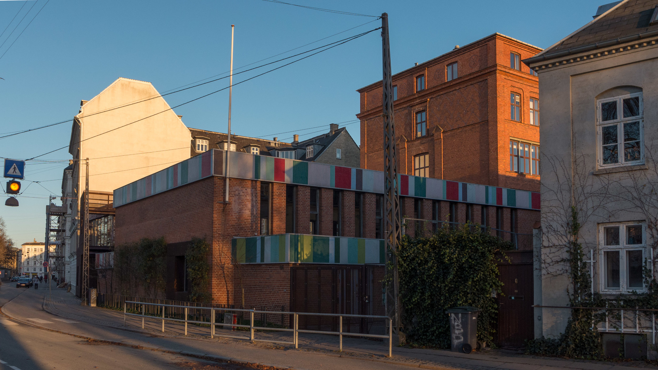
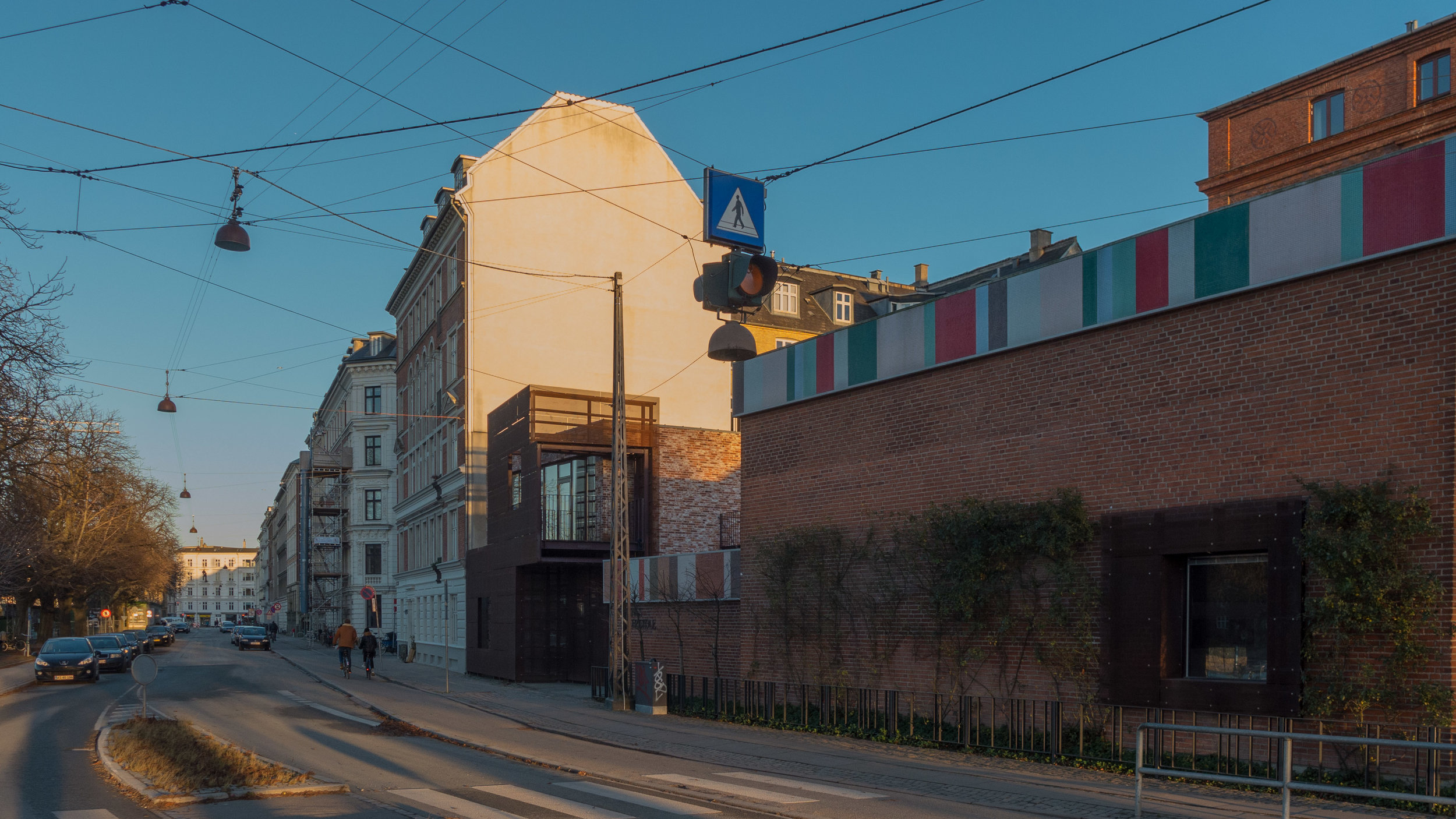
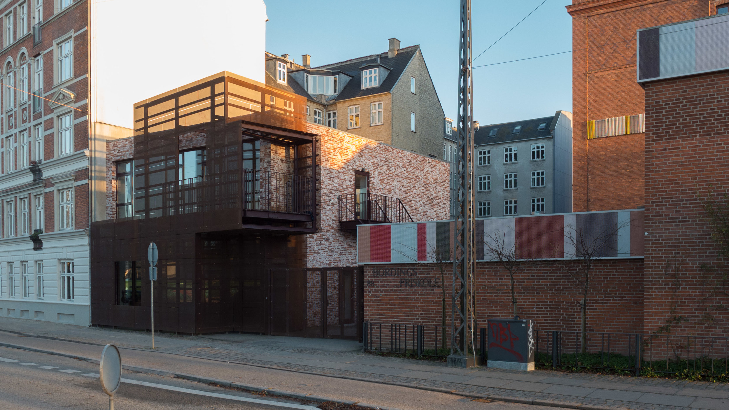
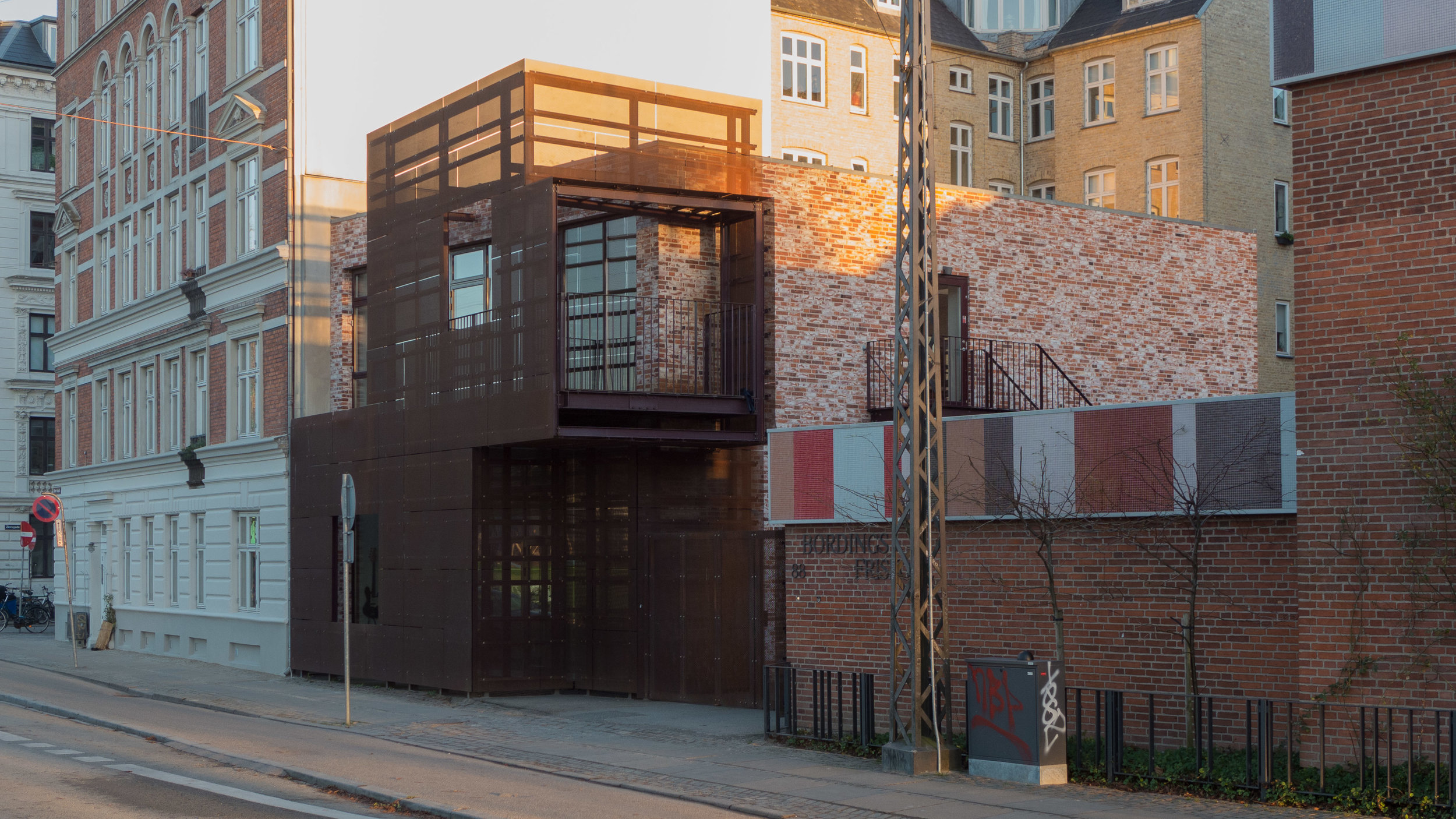
Kid's City has been designed to reflect the social and architectural diversity of the larger city around the school.

In a safe and sensible way it will introduce children to how the community around them actually works - or perhaps doesn't work - and it introduces children to good architecture by helping them to understand its importance in their wider urban environment, outside the school gate. Cities are made up of separate buildings that have their own functions and traditions and identity and buildings in the wider built environment have a vocabulary and a grammar so it helps if people know how to read and understand buildings and the settlements in which they exist.

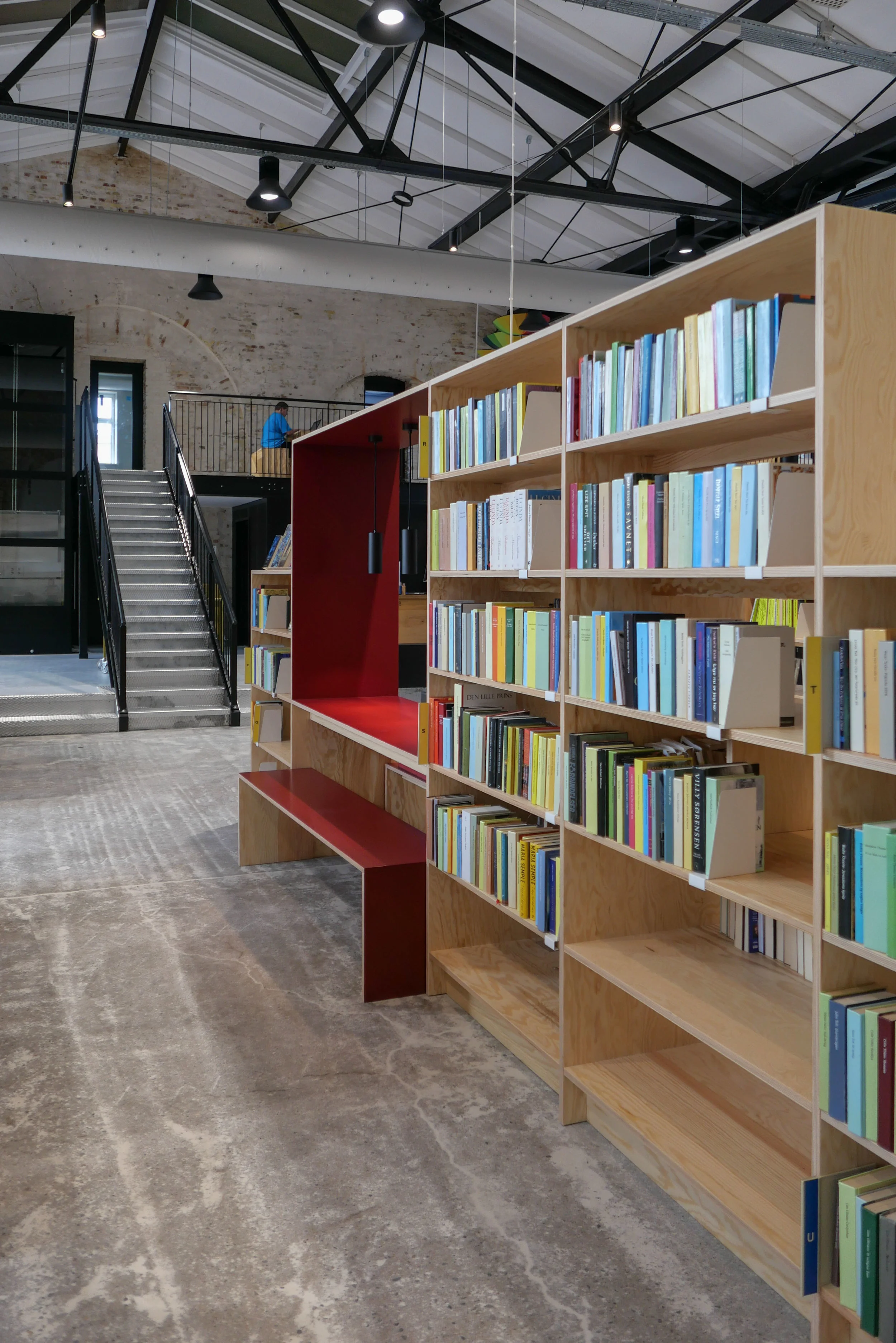
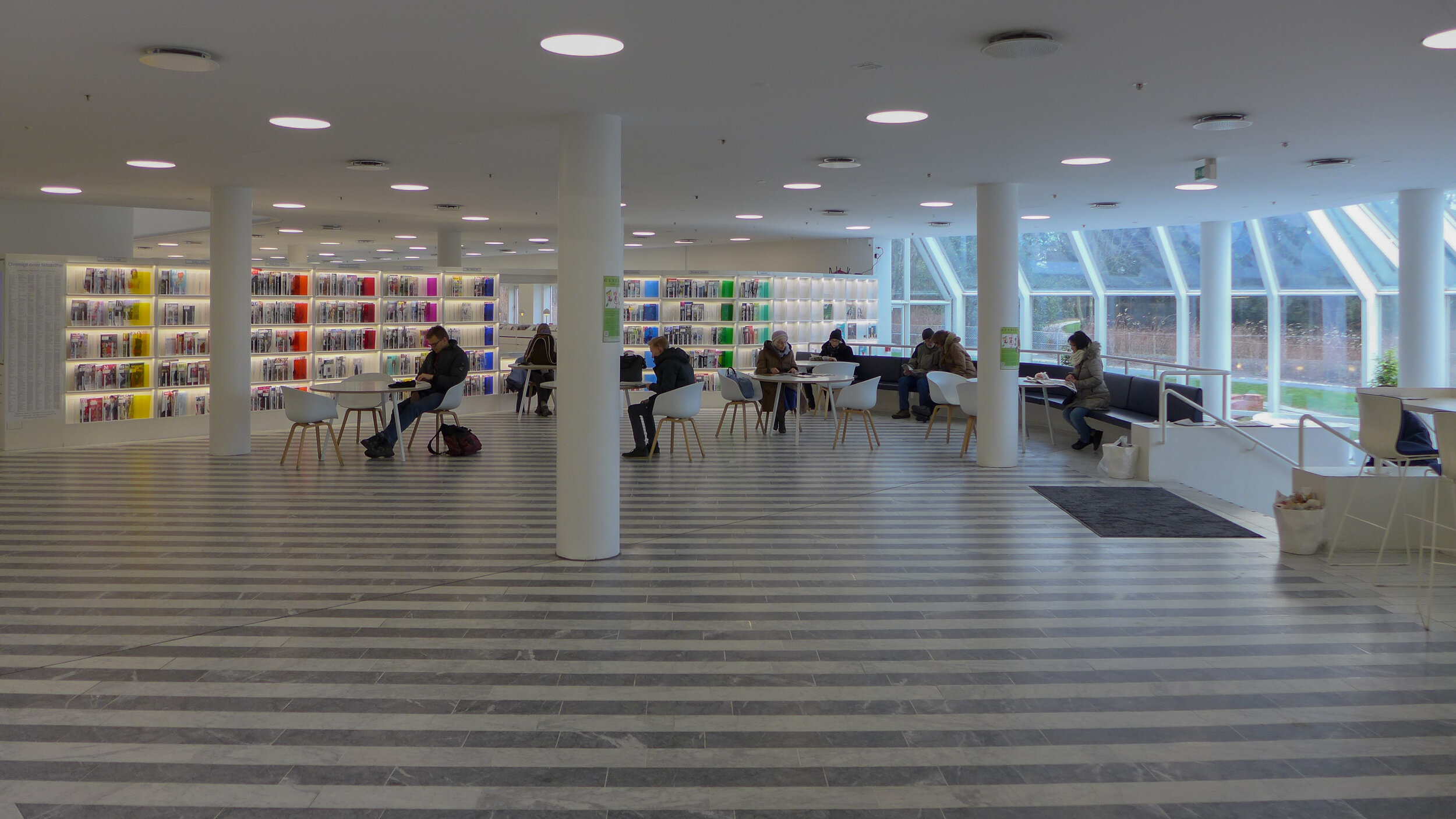
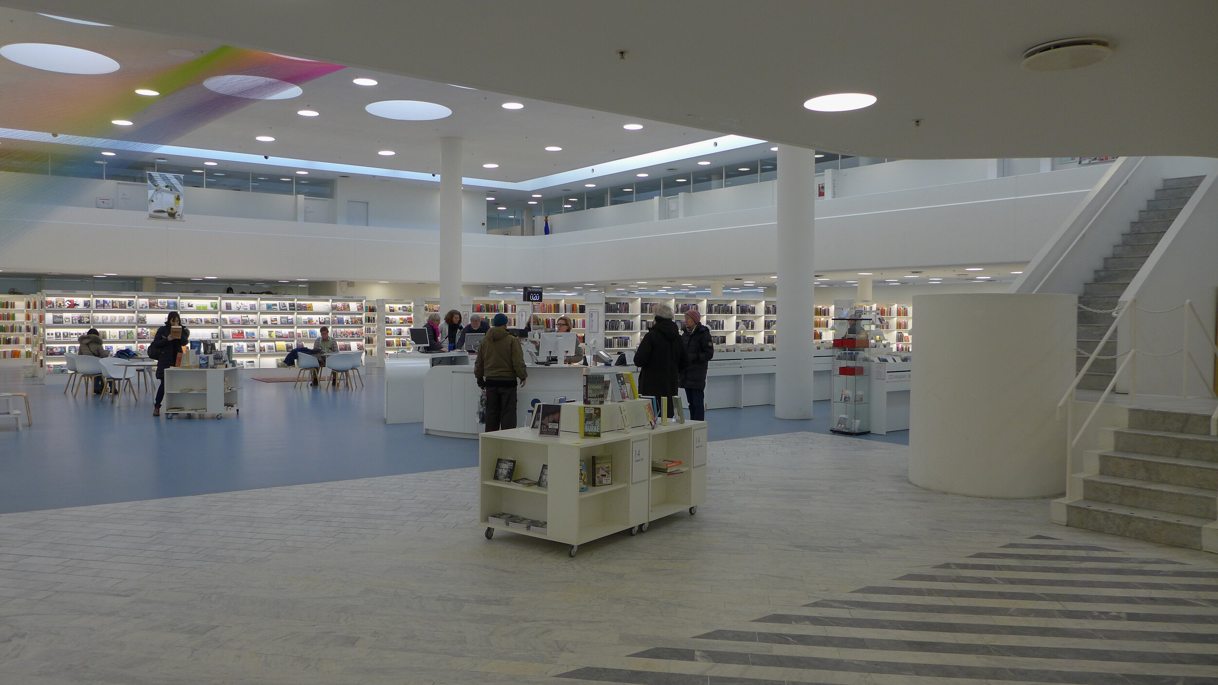
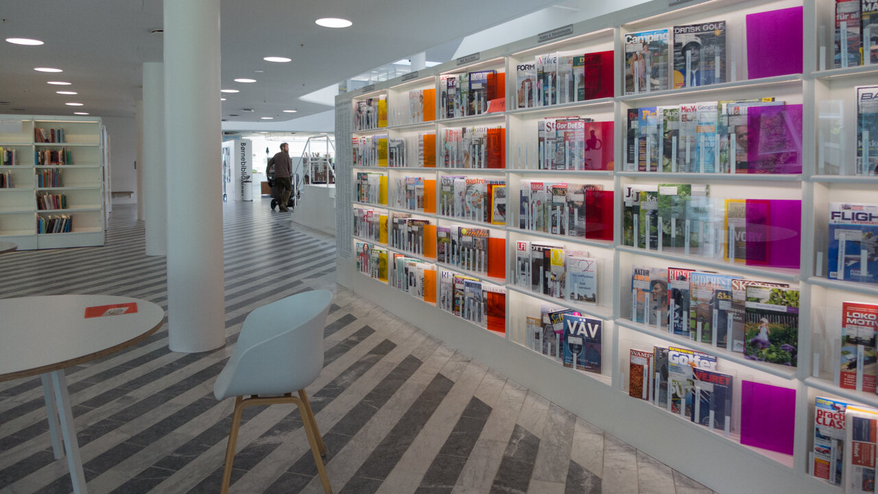
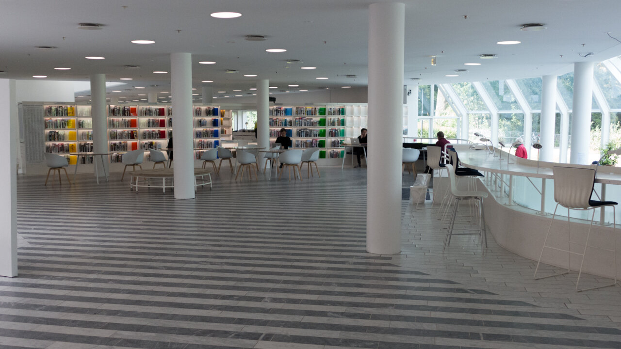
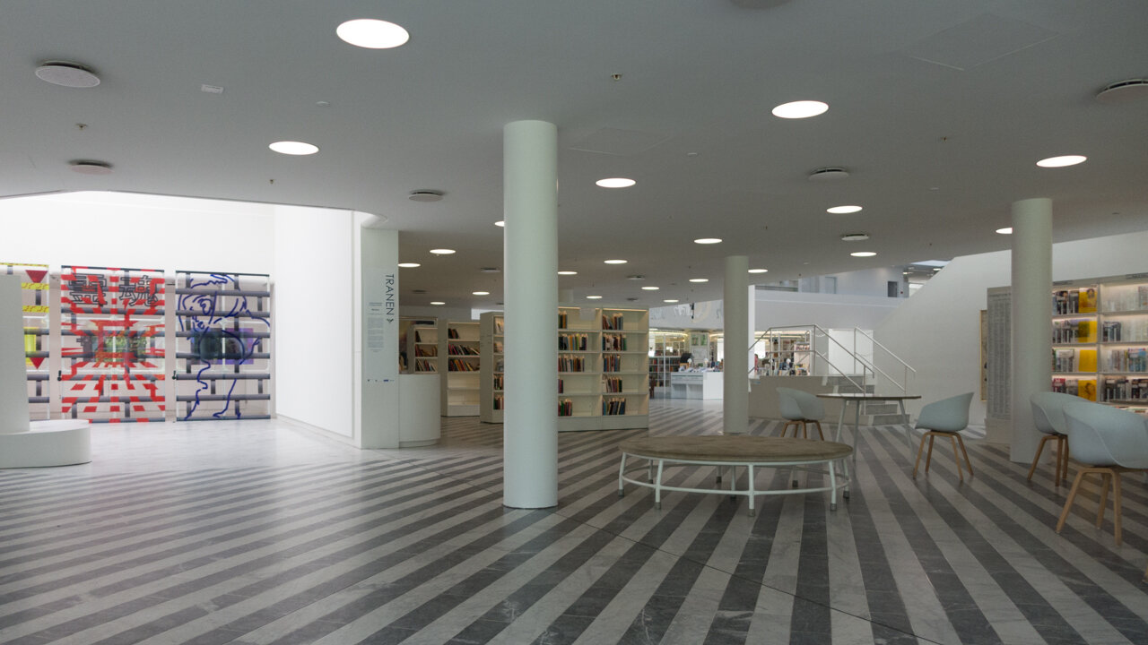
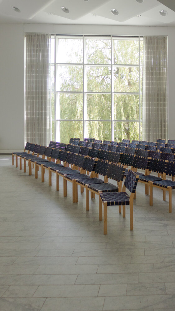
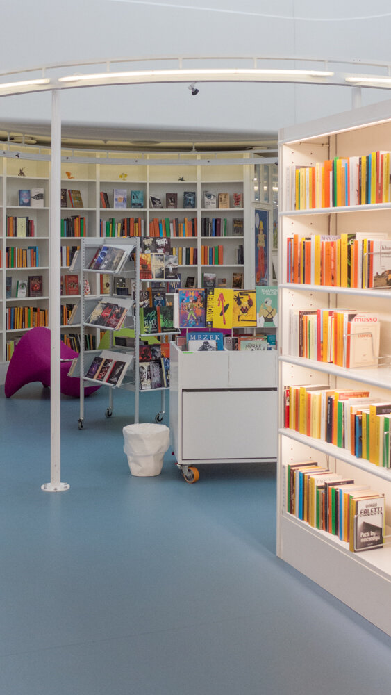
As with other schools and the public libraries that I have seen in the city, there is here a consistent use of thought-through design with good furniture and fittings and good, carefully-considered, architecture that helps kids appreciate good design. That is appreciate in both senses … to understand and to like. They become architecturally literate, almost by osmosis, because good design is all around them, and they see it realistically - not as precious or special but just part of their everyday life - so the good and, I suppose, the bad thing is that they can but they should take good design for granted.

I have told this story on this site before but it is worth repeating here. A year or so ago I was talking to someone from Paustian design store and he confessed that when he first left Munkegårds School in Copenhagen and met people from other places, who had gone to other schools, he was taken aback - even slightly shocked - as he had always just assumed that everybody went to a school with furniture designed by Arne Jacobsen.

Munkegårds and Kids' City could hardly be more different in plan - after all they are separated by 60 years - but, in both schools, new buildings were commissioned that are the best designs available and see that as one part but an essential part of the education that is being provided.

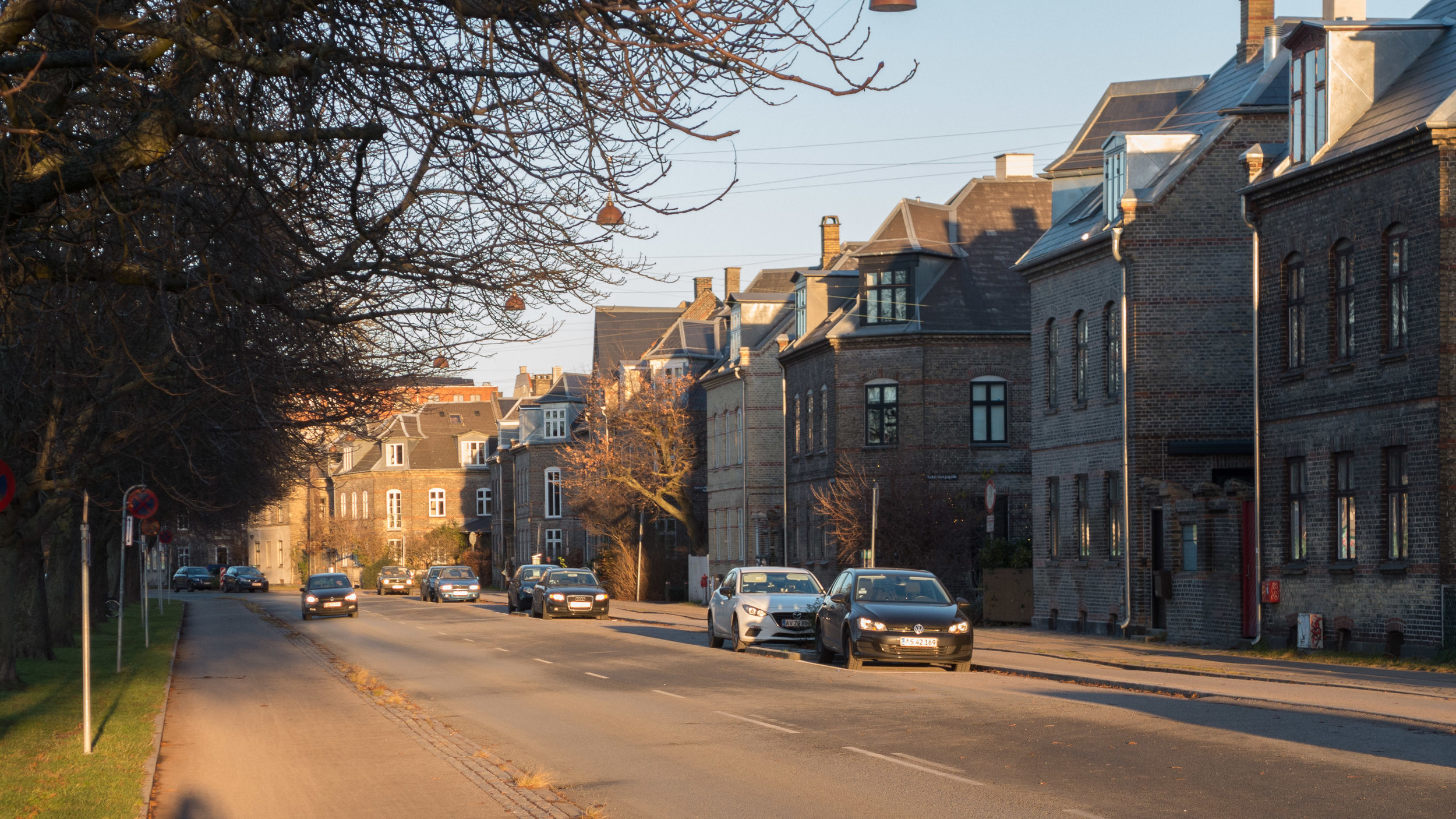
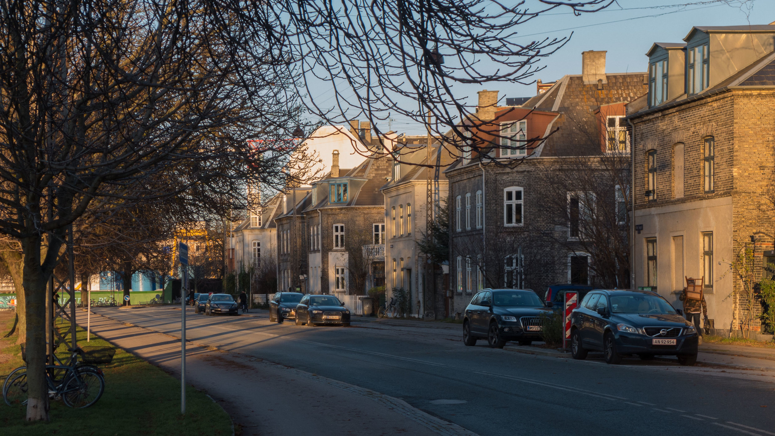
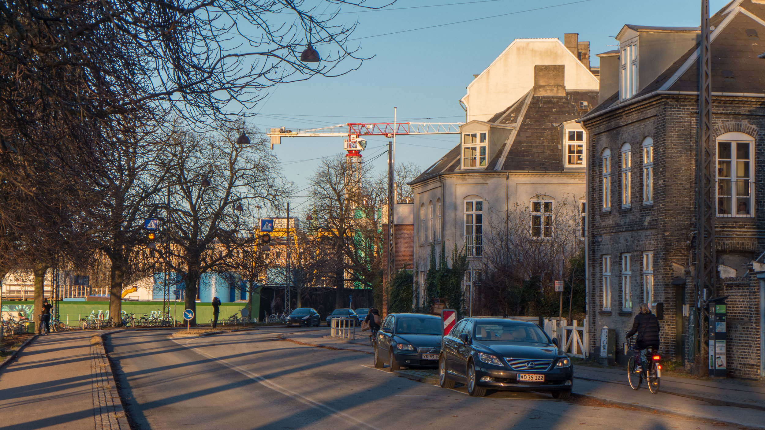
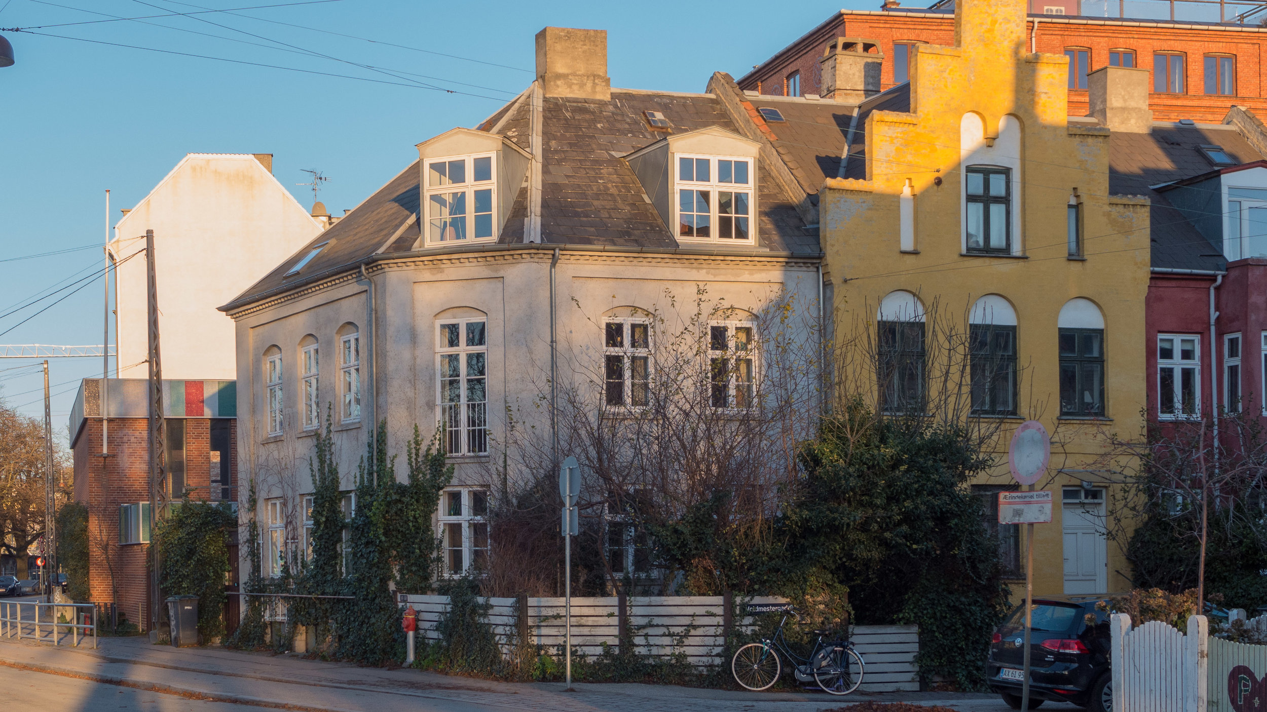
The location of Kids' City is crucial to the character and form of the final scheme. Across the front of the plot is a relatively busy road - Prinsessegade - with large older apartment buildings opposite. These are typical of working-class housing in the city and are an important part of the history of Christanshavn - an area on the other side of the harbour to the historic and posh core of the city - the city of merchants and royalty and politicians - and the school is close to the historic buildings of the former docks and naval shipyards. Until the late 20th century the naval yards and docks were the main place for employment for the people who lived in this district.

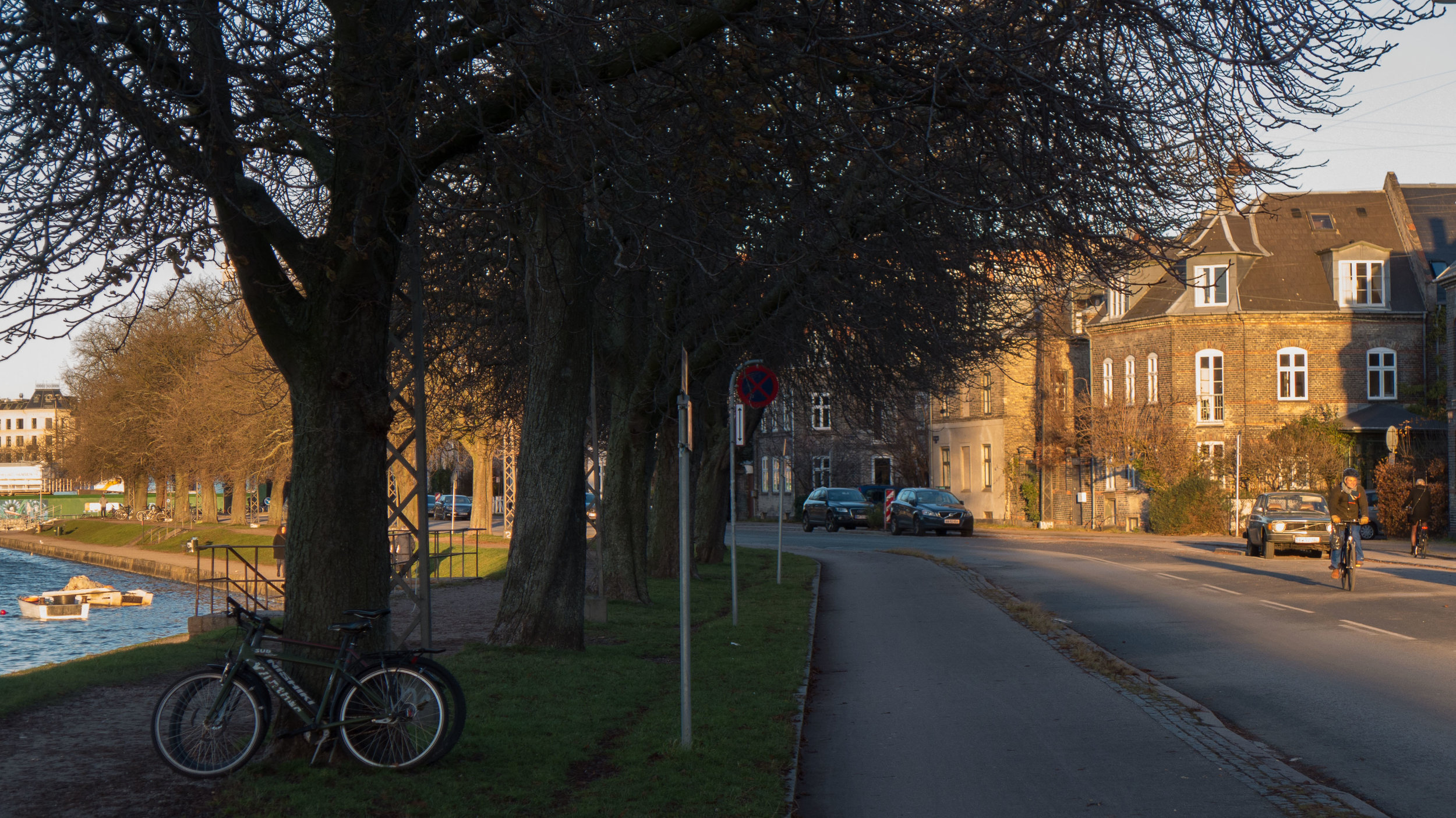
Along the side of the school is Refshalevej - a quieter street that runs down away from Princessegade and then turns north as a lane along the old outer defences of the city where there is a series of bastions and redoubts built in the 17th century that originally looked across water towards what was then the distinct flat farmland and grassland for grazing on the island of Amager. 

On the opposite side of the street from Kids' City is the north part of the world-famous free community of Christiania and again the new school reflects that because, presumably, some of the children inthe school will be drawn from there and they will have a strong sense of identity and, I guess, less empathy for unnecessary formality or restrictions.


There are brilliant features of the scheme that can only have been achieved through a close co-ordination between the architects and the educational team for the school so, for instance, the 'restaurant' takes the form of a large conservatory or green house and that is because that is exactly what it is. The children will grow food in a glass house immediately above the restaurant so they have a direct and hands-on understanding of where their food comes from. There will be a wall outside where kids can write the names of their first 'loves' although I had to smile because even the Danes end up by using sexist stereotypes … as it has been described as a wall where girls can write up the names of their first boyfriends. Don’t boys write up names?

Our Urban Living Room - the catalogue of the exhibition of the work of COBE that is on now at the Danish Architecture Centre - explains that the layout of the school site is, in part, inspired by the Tivoli Gardens because that is "a place where all kids want to go." But actually that source of inspiration could not be more appropriate … however much those conservatives might harrumph again.

Education succeeds when it engages and intrigues and inspires but then that is exactly what Tivoli was always meant to do. Since the middle of the 19th century, it has been a place where the citizens of Copenhagen have gone to relax and be entertained but it also has a world-class concert hall - I have been to the fairground to hear the Berlin Philharmonic play there - and the first building of the Danish Design Museum was on the corner of the Tivoli Garden - so ordinary people then could see art and design from Japan, recently added to the collection, or admire the craftsmanship of the best Danish furniture - and the trade hall - where the latest tractors or engines produced in Denmark could be admired by anyone or everyone - was across the north side of Tivoli and that is still the site of DI - the association of Danish industry. Absolutely nothing wrong with a bit of fun and awe and learning going hand in hand.


The plot for Kid's City is not square but a large triangle as the back boundary is formed by a canal cutting across. On the other side of that canal is an important open area of ground used for sports and a recently-completed sports hall - Hal C designed by Christensen & Co.

The canal is an important feature of this area for two rather different reasons. First, it is evidence for the topographical development of this part of the city over four centuries. A large area of open sea - between the old city and the island of Amager - was enclosed by the construction of the outer defences that provided sheltered and defended moorings for the fleet but then slowly the inner area, the water inside the defences, was back filled to provide new ground for more and more naval buildings and for housing and so on although large areas of moorings were left open and lengths of canal, like the section here, were left to be used for moving around goods and presumably the canals also formed good and secure barriers between different areas on separate islands. Surely it is important for kids to understand this as part of their local heritage.

Also interesting, but in terms of modern life in the city, is that, just as with good design, children in Copenhagen take for granted the water and swimming and being on the water in boats or canoes so schools do have a role to encourage this but do it safely. That's not by fencing off water or putting up warning signs but by making sure kids are confident and happy around and on the water.

The triangular area is divided into three parts where buildings and spaces vary in scale and are arranged in different ways that are appropriate for each of the main groups of kids in that wide range of ages taught here. Babies and younger children through to six-years old are in the group of buildings at the angle of the roads with a separate area of the school for children from 7 to 13 at the south-east or back angle of the site and an area for older kids from 14 to 18 to the left of the main gate with access to separate bike sheds, as they are more likely to come to school independently. This part of the school is next to the steps up to a large sports deck above the gateway.

As the children move up through the school there should be less stress about each change as the idea is that, with the single site, there will be a well-developed sense of familiarity and above all a strong sense of community in the school as a whole. Perhaps not so much a city as the scale and community of a village - safe rather than daunting - and with a very strong sense of locality.

Or is that comparison with a village too rural - too simple?

For Copenhagen I guess it really has to be a city within the city.

COBE

the part of the school for the older kids to the north of the gate

sliding metal shutters can be used to provide privacy or opened to give views right through the block


view out from within the school with the staircase up to the sports area over the gate and the 'town hall' just visible to the right. Many schools, as here, have miniature road layouts with signs and road markings where children are taught how to use public roads safely.


the central activity area with the red drum of the fire station ... landscape work to be completed

the restaurant set back from the pavement to create an area where parents can meet and talk while they wait to collect kids. Note the timber cladding of the building on the right is continued up to enclose and screen a roof area ... with a relatively tight plot open space on the ground, lost under a building, can be reclaimed on a flat roof above.

the mixture of flat and pitched roofs above what appear to be small, self-contained volumes gives visual interest but also establish a human scale that would be lost if the same overall accommodation was in a single block covered by a single roof

the simple blocks that are linked together to form the different parts of the school have different cladding and different colours ... here the vertical timber cladding and the treatment of the window is reminiscent of the design of Forfatterhuset - also by COBE - but here vertical strips of timber rather than ceramic


The model of the school that was shown as part of the exhibition at the Danish Architecture Centre reveals some parts of the design of the buildings that is not easy to appreciate at ground level. Each of the three areas - the separate areas for the different age groups - has one key central part that is set at an angle to the other blocks in the group ... so for the part of the school for the youngest children that is the restaurant and the glass house above. This creates some interesting wedge-shaped spaces that, for instance on the south side of the restaurant is an internal corridor.


Looking down on the model you can see that what appear from street level in the real building to be relatively tall simple blocks are in fact a single-storey room with the outer walls continued up to form a high parapet around an open play or teaching area on the first floor. In some blocks where the facade is vertical timbers then these continue up as open fencing to the roof area so the upper space is more obvious.

From above it is also clear that what appear to be two separate adjoining blocks with different wall treatment to the outside are actually a single rectangular space internally with no structural cross wall between the two parts ... so not strictly 'honest' with detail expressing form ... but perfectly understandable in trying to simplify an extremely complicated arrangement inside with what has to be a rational overall scheme for the exterior. Roof drainage must have been a design challenge.

The large block with a black roof, set at an angle at the centre, is the City Hall. It is interesting to see this has a glazed or visually open ground floor. We tend to associate town halls or city halls now with administration and lots of offices but many were traditionally simple meeting halls ... hence the generic name ... and in some, like the old City Hall in Copenhagen, in Gammeltorv, the hall was set above an open arcade that was used for events and markets.


the buildings for the middle age group where building work has just started

the part of the school for older kids has the raised courts for sport (bottom left) and the City Hall to the right


If there is a criticism, or perhaps better simply a concern, it is that the realities of the economy means that possibly the construction work is not as robust as in new school buildings of ten or twenty years ago so there is a short-term feel to some of the facing material and the buildings are not so much solid construction as wood frames plus the most recent in the development of insulation.


Bordings Independent School … Dorte Mandrup


The gate lodge. The gate is set back to create more space on a narrow pavement and the verandah above with views down onto the gate but also with views to the lake gives this the feeling of a gazebo or garden building in the park of a great house.


In this series of posts about modern cladding, Bordings Independent School by the architectural studio of Dorte Mandrup might appear to be an odd building to include. Completed in 2008, the new addition to existing school buildings is a relatively conventional design using reclaimed brick for its long north and south walls and with glazed ends to bring light into what are ostensibly large open spaces on two main floors but also with a large basement space. 

Although the east end of the building, with a broad flight of steps down to the basement looks into the narrow courtyard of the school, the west end faces onto the pavement and traffic of Øster Søgade, with views across the road to trees and the lake of Sortedams Sø beyond. With what are actually glass walls at each end of the new block, and with undivided spaces, so no cross walls, there are views through from the north-facing courtyard to the trees and the lake to make the courtyard as open and as light as possible.

The new building is against the north boundary of the plot and is set parallel to an earlier brick-built gymnasium to the south and the gap between the two is a main entrance into the school courtyard. Across the end of the range, and also forming school gates, is a steel structure covered in sheets of Corten pierced with tightly-spaced holes to create a screen. This provides privacy for pupils inside, so people walking by on the pavement see less clearly what is happening inside the building, but during the day, particularly in brighter sunlight, the screen is relatively transparent, and lets through light and allows a view out to the trees along the lake edge and the water of the lake. At night the visual effect reverses with the interior revealed by internal lighting. In effect, the structure is part screen, part verandah, part summerhouse grotto and part factory gate. 


Corten steel is now quite widely used in buildings and garden designs. With its deep rust colour, it is generally a good foil for green planting but also has a curious ambiguity that makes it both hard and industrial, so starkly modern, but at the same time somehow natural and less mechanical than plastics or fibre glass or even coloured glass. Pierced metal sheets have been used in several buildings in the city to disguise car parking … the most obvious examples being the metal sheeting, laser cut with holes to depict a landscape of mountains, that covers car parking below apartments in Ørestad, The Mountain by BIG and JDS from 2008, and, most recently, pierced metal sheet has been used for the outer facing of Parking House Lüders by jaja architects, a multi-storey car park in Nordhaven. There, the design on the metal sheet includes figures from the history of the docks. At both The Mountain and Parking House, the holes cut through the metal are more widely or more closely spaced to create the impression of lines and areas of tone or shadow like pixels on a traditional print image in a newspaper.

Architects in the city have also used pierced metal sheet for blinds or shutters to provide privacy … perhaps most notably for the remodelling of the offices at Toldbodgade 13 by BBP Arkitekter.

But curiously, at Bordings School, the use of Corten, particular in such stark bold block shapes seems almost aggressive … almost too industrial for school children. That is not actually a criticism because this is one of the most stimulating and interesting modern buildings in the city … and for a city of outstanding modern architecture that is quite something. 

The symbolism implied here is complicated. For a start, what is a school if not a sort of factory so why not factory gates and the severity does suggest security or protection. Corten steel has been used in the entrance gateway of the new UN building in Nordhavn for similar reasons. The design of Bordings School is challenging - it is curious and unique architecture - so one good way to get children talking about and thinking about design. 

Also the building, or rather the frontage to the street, had to be bold to compete with the much more substantial flanking buildings against which it has a relatively small scale. It must have been a challenging brief and certainly in terms of its role in the townscape it would form an interesting example for planning students to discuss if they were asked to assess how it fits into the complex site and a sensitive and demanding streetscape. 

For a start there are clever ideas like setting the gates back from the pavement to create an area for vehicles turning in off the road if the gates are shut and as an area where parents and children can congregate to wait or to talk … a sort of interim space between public street and private school.

Junction of the apartment building to the north and the Corten screen

View of the steel structure in the space between the screen and the glass windows of the music room


Bordings Independent School was founded in 1945 and moved to its present site in the early 70s - when they moved into the buildings of an earlier school. That earlier building is the large block running east west almost at the centre of the air view with the school yard in shadow to its north. A large sports hall was added to the west, running between the main school building and the road. Air view from Google


The school is at a hinge point, a change of angle in the road and the lake, but there is a also a distinct change at this point in the architecture of Øster Sogade with traditional Copenhagen apartment buildings immediately to the north, continuing all the way to Østerbrogade - here, immediately next to the school, with a classically inspired frontage of five storeys but with a high blank gable end towards the school - and to the south, after the gable end of the earlier flat-roofed gymnasium, there are the gable ends of the houses of the series of roads that run back from the lake … the important and famous Potato Rows or Building Society Row Houses dating from the 1870s and 1880s.


Approaching the school from the south along Øster Søgade with the Potato Houses to the right and the lake to the left. The earlier tall brick main school building can be seen first above the houses and then the sports hall added to the left with the first glimpse of the new building. Finally the building by Dorte Mandrup can be seen against the high gable of the apartment building immediately to its north.


This is also where the screen of iron standing forward of the building has a significant function … the block of the new building runs along the north boundary of the plot with square-set end walls - in terms of construction the cheapest and easiest solution - but that leaves an odd triangle of space against the pavement so the iron structure disguises that change of alignment. 

This site also illustrates well a more general problem in Copenhagen … and in fact a problem for any new development in densely built cities particularly where there is a mixture of buildings of different sizes and different ages. If you punch a hole or have a break in the streetscape then the sight lines through the site and the backdrop of new buildings are much more difficult to control and you expose the backs of buildings that were not built to be seen. Here the wide gap in the Øster Søgade frontage opens up views to the back and into the courtyard of the apartments to the north and east. The new building for the school would have to be much taller to screen the courtyard but then would have created shade in the courtyard in the afternoon. 

The arrangement of the sheets of Corten creates a series of simple box shapes with no clear vertical or horizontal articulation though possibly here at this point in the street just slightly more height and more vertical emphasis could have created a stronger mark on the street scape although again this raises the interesting problem of the changing dynamics of the building visually which is very different for the person walking along the pavement hard against the building to the view for people walking along the side of the lake and the impact of the building is very different if you are walking from south to north when the gates and the verandah above have greatest impact, because they face you, which is very different to seeing the building as you walk from the north when the front is angled back and not visible until you are standing beside it.


Dorte Mandrup


A window into the sports hall has been given a frame of Corten to form a visual link between the two blocks.


Rødovre Library by Arne Jacobsen


the entrance to the Library ... the higher roof is the main hall and the windows beyond are an apartment building that was also designed by Jacobsen


Rødovre is a suburb to the west of Copenhagen and was established as an independent municipality in 1901 but it was in the 1950s that a new civic centre was created with a new City Hall designed by Arne Jacobsen on the west side of a new square and completed in 1956. The first plan was to build a library and a new technical school on the east side of the square, facing the city hall, but only the library was built … a larger building than shown on the initial scheme and set slightly further north on the east side of the square with its entrance door immediately opposite the entrance into the City Hall, to form a cross axis to the square.

Not completed until 1969, Jacobsen’s library is a large, flat-roofed, single-storey building, that is clad in dark green/grey stone. In fact, the walls are built in brick and the panels of stone are supported proud of the structural wall with small steel anchors. 


the stone facing of the outer walls is in large blocks that are 43" (110 cm) by 21" high (53 cm) - so almost a double square - and are laid precisely with a half overlap (like courses in standard brick work). The stone wall is not structural - there is a brick wall behind with a gap between the two - and the thin stones, more like tiles than ashlar blocks, are not set with mortar but have steel spacing pins in the edge to keep them a precise distance apart.

There are no windows breaking through the outer wall - just doorways on the west entrance front (facing the City Hall) and on the east side of the building, immediately opposite the public entrance, as access for staff and services.

There are five open courtyards that are glazed on all four sides to bring natural light into the reading rooms and offices and meeting rooms set around the courtyards.

It is as if the aim was to create an inward-looking building to avoid the distraction of views to the World outside.


the south-west courtyard looking north towards the main hall


From the low and relatively dark entrance hall the public move through a sequence of spaces ahead and to either side that are different in size and vary in the amount of natural light. At the centre, beyond the entrance and the library desk, is a main hall for meetings or lectures that has a higher roof supported on columns that are inset from each corner of the space and there is a high clerestory with large sheets of glass and narrow, minimal frames for maximum light as the sun moves around the building during the day. The central area is a step down and the space seems to have the form of a covered atrium.  


the main hall at the centre of the library


A complicated use of geometry and proportions determines the position and the dimensions of all the main features through the building with a geometric grid that includes the courtyards, the main hall, the position and the size of enclosed offices, and the arrangement of doorways and windows and even the position and the dimension of the shelves for books. This geometric framework is used not just for the plan but also to determine the height of the main structure and, it would seem, the dimensions of architectural fittings. 

For instance the height from the basement floor to the underside of the ceiling of the main hall appears to be half the distance between the two cross walls. Although this was calculated using a relatively small reproduction of the drawing of the long section of the building, so complete accuracy cannot be verified, but it suggests that even those dimensions that are not obvious, when standing in the building, are determined by the grid and its underlying geometry.

Large stores in the basement are reached from the reading rooms by circular staircases with curved glass rather than railings so they are reminiscent of the secondary staircase in the Jespersen Building in Copenhagen that goes from the basement there to the first floor.


one of the circular staircases for access to the basement


The Children’s Reading Room is to the north of the Main Hall and the larger Main Reading Room is to the south although that area was sbsequently altered with the removal of original divisions at the south end to create what is now a T-shaped room.

Original fittings and furniture by Jacobsen remain and the original colour scheme for the building can be seen with the framework of the windows into the courtyards in dark olive green; the main concrete piers painted deep blue and the acoustic panels of the ceiling, in drilled/pierced-aluminium sheets, is an ochre brown. The chairs were originally oak veneer but have subsequently been painted.


the main reading room


geometry underlying the design of the building


Ariel view of the main buildings from Google Maps.

The long narrow building is the offices of Rødovre City Hall. To its west, and linked by a single-storey corridor, is the council chamber. That block is rectangular with dimensions that form a Golden Rectangle and the distance between the main City Hall and the chamber is equal to the short side of that Golden Rectangle. The library to the East of the City Hall is a single-storey, flat-roofed building that again is set out with the proportions of a Golden Rectangle and again the distance from the City Hall to the front entrance to the Library is equal to the width of the Library … the short side of the Golden Rectangle.


There is a transverse or cross axis through the library from the centre of the west entrance door to the centre of the east service door. Substantial cross walls, to the north and south of the entrance, are positioned symmetrically, equal distances to the south and north of the axis, to fit within a framework that was determined by geometry. The main hall at the centre has a higher roof raised on columns and the distance from inside the front wall to the centre line of the western columns is equal to the distance between the cross walls so defining a square. In the same way, the east columns are inset from the east or back wall of the library by the distance between the cross walls and the space between the two squares, between the east and west columns but across the full width of the space is a Golden Rectangle with the long dimension north south. The west square and the central Golden Rectangle together form a larger Golden Rectangle that overlaps with a Golden Rectangle formed by the east square and the central rectangle added together.

This sounds more complicated than it is but where the whole underlying system of construction lines becomes interesting is that the space between the north cross wall and the north wall of the library is the same width as the width between the cross walls and both sections are within a large Golden Rectangle defined by the outer walls of the library. Essentially that implies that the position of the entrance doorway was determined by the need to position two internal cross walls within a geometric grid rather than by any relationship to the site or to any demands for the practical arrangement of internal spaces.


There are also two separate grids that determine the position and dimensions of internal features. One determines the position of the piers that support the ceiling and, above that, the main flat roof. The bay system created by the grid has five equally spaced lines of piers running north south - so five lines of piers set from the entrance on the west side back to the east or back of the building forming 6 aisles. These are lined up in 17 rows of piers but with the bay system inset by half a bay from the north and south walls so a half bay with 16 full bays and then a final half bay. These half bays determine the width of a corridor or circulation space across inside of the north and south walls.

The position and dimensions of all main features, including the courtyards, the walls forming enclosed offices and even, initially, the position of the book shelves, were determined by that grid.

That main grid is only broken in the area of the main hall where the roof is raised and supported on columns rather than the rectangular section piers. Here, a secondary grid has different proportions with the long dimension of the rectangle of the grid set north south with six rectangles in line from east to west by five rectangles north south. Only the positions of the four columns, inset from the corners of the hall, and the position of a screen wall behind the entrance desk are determined by this secondary grid.


Dimensions of a Golden Section or Golden Rectangle can be drawn by starting with a square. The diagonal of half the square, when an arc is dropped down from the corner of the square to the base line, forms a Golden Rectangle. The addition to the square is itself another Golden Rectangle. 

The proportions of a Golden Rectangle or a Golden Section can also be calculated because the length of the larger section … here A … divided by the small section B is equal to the whole … A+B divided by the larger section A.

The spacing of the piers through the library is determined by a grid based on equilateral triangles where the diagonal distance between the centres of two piers is equal to the distance between three piers in line north south …. or put another way the distance from the centre of one pier to the centre of the pier to its north or to its south is X divided by two and the distance to the centre of the pier to the east or west is the square root of X. 


Gentofte Library, Denmark


Gentofte Library in Hellerup, north of Copenhagen, was designed by the architectural office of Henning Larsen and was completed in 1985.

Larsen had graduated from the Royal Danish Academy of Fine Arts in 1952 but for 10 months before he graduated he worked in the office of Arne Jacobsen - at that point still in the basement of the architects own house in Bellvue, just up the coast from Hellerup. The influence of Arne Jacobsen can be seen clearly in this building with it’s simple white facades but sophisticated plan, clever use of space and light and the high-quality fittings. There is a freedom of line at Gentofte that is rarely seen in the work of Jacobsen who based the design of larger buildings on more strictly rectilinear forms with almost perfect proportions. What Larsen does at Gentofte is pay homage to Jacobsen by using some of the older architect's vocabulary … so the long proportion of the windows at Bellavista and the relationship of window to blank wall; the completely plain white columns without bases or caps and the large, circular, recessed ceiling light fittings of Jacobsen’s Rødovre city hall and the restaurant at the SAS Hotel.

Gentofte Library bottom left, immediately south of the villa and park of Øregård -
from Google Maps

Gentofte library is on a large, well-landscaped, plot at the north end of the main street of Hellerup, set back from the road on the west side, on a slope rising up slightly above the road and immediately south of the park and gallery at Øregaard.

There are entrances on either side of the library - on the south side from a car park area and on the north side from a pedestrian area and gardens between the library and the park. These entrances are not in line but form an angled route across the building on the east side of the main library area. The main south door has a flat canopy cut off at a sharp angle with a single column … probably a deliberate reference to the idea of a portico that might have been applied to give dignity to a municipal building in the 18th or 19th century.

The angled porch also makes the transition between the square block of the main building and the gradual stepping in through a number of bold angles to a narrower east end towards the town.

The north door is below the main level, down the slope of the site by half a floor, with a broad flight of steps down to the door and in this lower area is a well-lit cafe, within and open to the main space but set slightly below. To the east of the circulation area is a lecture theatre or meeting room with a large east facing window and there is also a large lobby area used for exhibitions so there is a sophisticated use of space, light and height to differentiate entrance and circulation areas and the areas for books and for study. 


The main part of the building, furthest from the main road, is a very large, square and top-lit area for the main reading room and information desk which is open through two storeys at the centre but with deep balconies around the edge with quieter study rooms; the local history collection and administrative office on the upper level and below, on the ground floor under the balconies, although generally open to the main space, quiet, more enclosed reading and study areas.

This demonstrates a clever and complicated manipulation of space and light to create views into, through and out of the building … so the initial impression as you enter the library is of light and of spaces which are very open but very welcoming. As you approach there are glass doors and windows so you can see clearly where to go and, after entering, see how each area is used and then, as you are drawn into the building, spaces become lower, more enclosed and quieter although you can also sit and read where you can look up and look out to trees and grass.

Externally there are what read as conservatories or single-storey elements with sloping glazed roofs but internally these provide top lighting for some of these spaces with more domestic scale. Also of note, in terms of how top light is used is that the centre of the main space has a lower roof and all the way round windows looking into the building, not providing direct light but light that is reflected down by a curved ceiling/wall just in from the windows.

Although the exterior is simple and the clean straightforward interior of white columns and white fittings is deceptively simple, the architectural features such as floors, bookcases and the staircases are of a high quality and very carefully considered.  It has a timeless feel, that is difficult to date but it has worn well and certainly does not look thirty-years old. Perhaps the major change since it was completed is that the original desk, where readers returned books to the staff or checked out books, that was inside the south door has been replaced by a self-service system and staff have been moved into the centre of the reading room to an information desk.

The library is well used and used with respect. When I have been to the library it has been full of people and is obviously being well appreciated. Even on a Sunday people are sitting reading magazines or books or using the computer terminals for various library services. Small children clearly love the toys and fittings of their area and there was a mother and toddler group there on one visit. This is a prosperous middle-class area but even so it is clear here and elsewhere in the design of libraries and schools that Danish children grow up with good design. It not that it is precious or special but that Danes actually expect this level of design. Nor should that imply it is taken for granted but there is certainly an underlying sense that it is accepted and understood that if something is done it should be done well … many Danes will only comment when something is done badly. This is absolutely not a pedantic perfectionism because buildings like the library in Gentofte are there to be used and enjoyed and seem to be even more appreciated as they gain a patina of age … the proof that it is good design is that it gets good use.


Forfatterhuset Kindergarten, Copenhagen


Forfatterhuset Kindergarten (The Writers’ House) opened in 2014 although work continues on the landscape of the street immediately around the school. It was designed by the architectural practice COBE and is on the north side of De Gamles By (City of the Old). The new buildings are in a square that is open on the north-east side to Sjællandsgade. Buildings around the school date mainly from about 1900 and were originally built for a hospital for the elderly.

The new nursery school is in a striking and novel form but picks up the deep red brick colour of the earlier buildings. The square-section vertical bars or slats are continued as a band that forms a high fence for the large play area at the south west end of the site. Windows and doors have a metal square-section architrave in deep red that projects forward of the system of the wall face. 

The plan is a series of interlinked pavilions with rounded corners and with flat roofs but with roof gardens to make best use of the site. Buildings and fencing wrap around mature trees and the building has the character of a large tree house.


Inside, white railings continue the theme of vertical lines, looking rather like bamboo, running the full height of hallways and enclosing the staircases and landings - presumably for safety. The main building actually has three floors around a full height atrium and staircase and the main entrance is into that taller block with a narrow entrance court that almost feels as if it has been created by someone pushing hard at the fence to move it inwards.


COBE