Flexibility

A small exhibition - described as a pop-up exhibition - has just opened at Designmuseum Danmark.

With the subtitle The Missing Link in Danish Typography History, it spotlights the new font called Flexibility that was introduced last year as part of an updating of the typography and graphics used for the museum and is to be used across all aspects of their graphic design from posters to signage and display graphics, as the font for the museum's website and for in-house leaflets for publicity. This work was undertaken by the Copenhagen studio Urgent. Agency.

As part of the commission they searched through the archives of the museum and found initial sketches for this font that dated from the beginning of the 1960s and were by Naur Klint - the architect and designer who was the son of Kaare Klint. The designs were digitized and this was the starting point to produce a font appropriate for the museum.

With the exhibition there is a handout newspaper that sets out a good brief history of the design museum and also sets out the iterations of the typeface with various weights and an italic and an outline version.

5 October 2018 to 6 January 2019

Designmuseum Danmark
Urgent.Agency

Fortællinger om et sted / Stories of a place


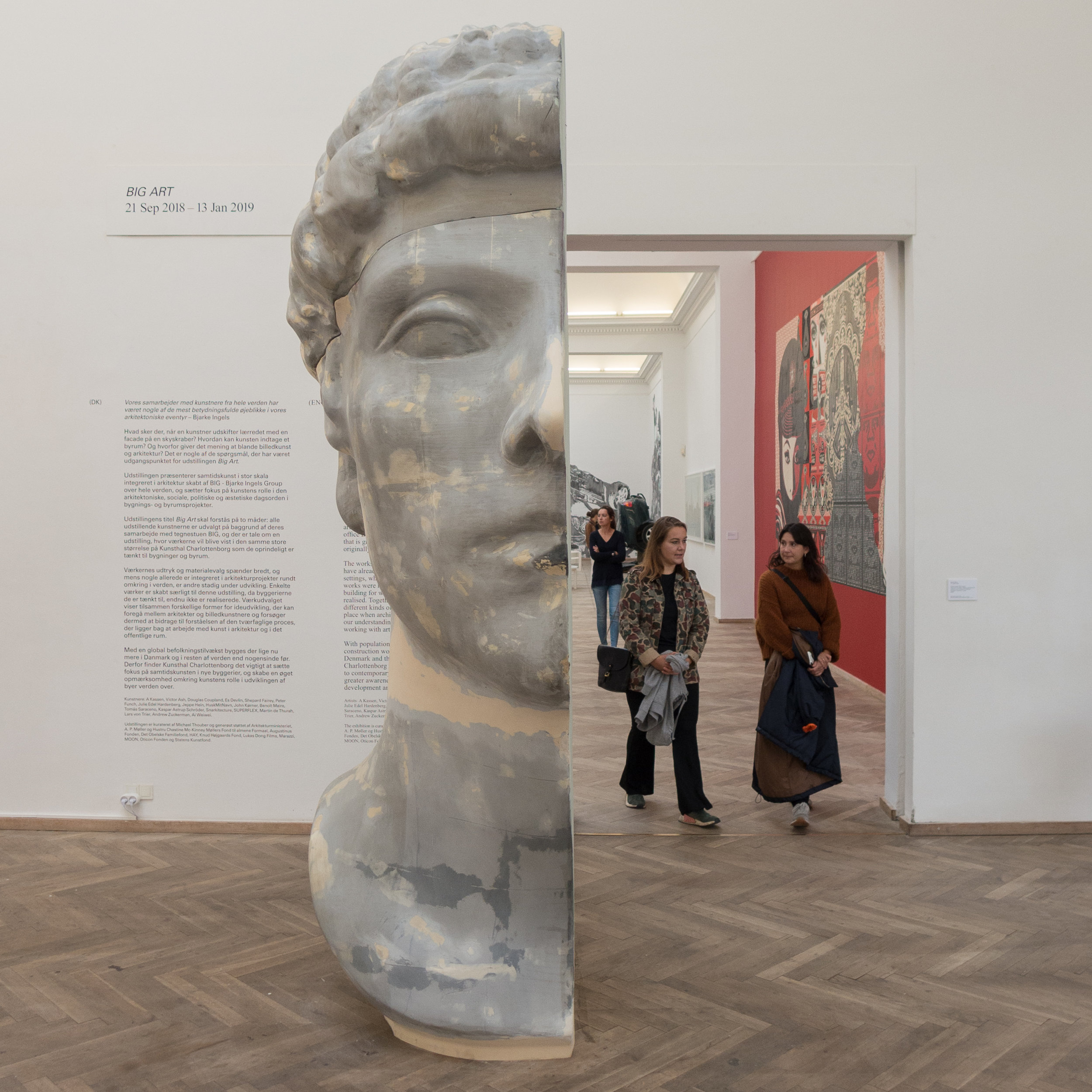
Arkitektens fotokonkurrence 2018 / The Architect's Photo Contest 2018

Following a competition by the Association of architects, these are the five winning portfolios, each with five photographs to present a building or a single architectural project.

In a World that seems to be dominated by rather superficial Instagram images this is an important exhibition because instead of a quick glance and a swipe right the photographs are presented for careful consideration … it really is difficult to capture for the record the qualities and the character of a building in a few images and one function of these photographs is to slow down that process of looking. 

These photographs are about trying to record what is essential about the style and the form and the materials and the setting of an individual building.

It was interesting to see that three of the photographers chose to use the traditional format of black and white images for recording buildings.  

On graduating, I worked for what was then probably the most established academic architectural photo library in the World and by far the majority of images then were black and white - in part for archive reasons as colour prints were assumed to be fugitive - in fact the black and white negative and not the print was considered to be the archive - but also because black and white images seem to take out some of the distractions and give the images a stronger emphasis for texture and line and form. 

One major exception was a collection of colour images of buildings from the archives of the magazine Country Life and as colour became more reliable then it was used for recording museum and gallery pieces. Then colour moved on from what was for me the rather odd distortion of Kodachrome and colour printing became cheaper, sharper and more reliable and colour photographs moved from being the luxury of a single front plate to what everyone expected for everything.

Shadows in black and white images tend to be darker and deeper and pick out and define edges of buildings and sculpture but in colour images, as a gross generalisation, shadows soften and obscure. Road signs, people and planting are less obvious in black and white but perhaps, for that very reason, can seem less realistic and curiously that detachment can make the images less obviously identifiable or less immediately recognisable.

Photographs here of a crematorium were given a strong sense of form and drama by using dark shadow in the black and white images that suggest the gloom and the power of the building even if that obscures the actual form and extent of the buildings and their setting.

On the other hand, here, in the exhibition, it was interesting to see that colour photographs for one project, with a swimming pool, was used to introduce a stronger emphasis on social element - including people - and with a clever sense of narrative by including the splash but not the person who had caused the splash fractions of a second earlier by jumping or diving from a diving board or the side of the pool. 

The other project that used colour used a softened and dulled colour (rather than sharp bright colour in sunlight) to suggest mood and emphasise the importance and the character of the natural landscape setting.

It was also interesting to see different approaches to presentation so, although the overall size was stipulated in the competition rules, one set of prints was taken to the edge - bled off - as we now expect in most books and for larger images in magazines - but another set was presented with a small white border - as they came from the inkjet printer - and another group of five was presented as smaller images carefully set within larger areas of blank space as they would appear in a high-quality art book.

Certainly worth a visit if you want to think about and improve the photographs that you take of buildings.

the exhibition was open as part of the Day of Architecture on 1 October
but continues through to the 12 October

Arkitektforeningen
Åbenrå 34
1124 Copenhagen K


winners of the competition:

all the images and information about the five projects and the five architects have been published by the on-line magazine ARKITEKTEN.DK

Links below each of the images will take you to the appropriate page on that site


Boliger til Folket / Housing for the people


Immediately after the War there was clearly a shortage of housing but also cities realised that poorly-built housing - particularly the dark and tightly-packed housing that had been built in courtyards - had to be demolished and replaced with appropriate homes of a much higher standard

The exhibitions at Arkitektforeningen for the Day of Architecture is an opportunity to see here again the exhibition Boliger til Folket / Housing for the people about social housing in Denmark after the Second World War, so through the1940s and 1950s.

This was shown first in Copenhagen in the central library in March 2017 and was reviewed here

This is a second chance if you missed the exhibition the first time round but it is well worth a second look with profiles of several major housing schemes and includes comments by residents from interviews some remembering what the apartments were like when they were new. 

One aim of the exhibition was to re-establish the merits of these apartment blocks by focusing on the quality of the design and the high quality of the initial building work but it also emphasises the reasons for good and sympathetic restoration work to ensure that these buildings not only survive but that they have an ongoing role as good and desirable housing.

BIG Art at Kunsthal Charlottenborg


An impressive and entertaining exhibition at Kunsthal Charlottenborg with large-scale works created by artists working with the architectural studio of BIG and primarily for major new buildings or for public spaces.

Each work has a video presentation by Bjarke Ingels and this confirms that he is one of the most articulate proponents of modern architecture and planning.

the exhibition continues until 13 January 2019

Kunsthal Charlottenborg

Out of Ousia - Alicja Kwade


Through six large gallery spaces at Kunsthal Charlottenborg in Copenhagen, this is the first solo exhibition in Denmark to show the work of Alicja Kwade. ‘Ousia’ is Greek and means being or essence.

One large-scale work in the first gallery, DrehMoment, with large stone spheres balanced on a frame was created in 2018 specifically for Charlottenborg.

the exhibition continues until 17 February 2019
Kunsthal Charlottenborg

farve form stof / colour form texture

detail of 1025 Farben by Gerhard Richter 1974
Parrhesia, sculpture in papier mâché by Franz West 2012
and, in the background Para 1 by Morris Louis 1959


Works in this exhibition are drawn from the collection and they mark major themes in art since the Second World War looking at the use of vibrant colour that has an immediate impact and at the exploration of texture and of forms for sculpture that step well beyond realism or, rather, look beyond the realistic depiction of colours and shapes and forms from the natural world.

The exhibition in the lower galleries looks at two other major themes from art from the middle of the 20th century onwards … men and masculinity and war and conflict.


the exhibition farve form stof continues until 21 October 2018
at Louisiana Museum of Modern Art
Gammel Strandvej 13, 3050 Humlebæk


Månen / The Moon - From Inner Worlds to Outer Space


With more than 200 works including paintings, film, music, literature, photographs, maps and scientific instruments, this major exhibition looks at myths about the Moon; at the way the Moon has been shown in art and in scientific observations and study over centuries and leading to man landing on the Moon fifty years ago.

the exhibition Månen / The Moon continues until 20 January 2019

Louisiana Museum of Modern Art,
Gammel Strandvej 13, Humlebæk


LETH & GORI - The Art of Building


One of the series of exhibitions of the Dreyers Arkitektur Galleri to show the work of new or young architects, architectural practices and studios.

For this exhibition the architects have produced a timber-framed structure that steps down three levels of the gallery and creates distinct partly- enclosed spaces where models and photographs of their buildings are displayed.

Dreyers Arkitektur Galleri at DAC

Leth & Gori


the exhibition continues at the Danish Architecture Centre until 5 October 2018


Din ting - vores historie / Your thing - our history


Thirty objects have been chosen to show trends or mark events that have had an impact and that, in some ways, might represent life in Denmark over the 17 years since the beginning of this century. 

Fifteen objects are from the collection of the museum - important because it makes the point that this is a national museum that is not just about a distant or remote past but is relevant now and looks at the full social and political history of the country through the artefacts it collects because history can be as close as yesterday.

Fifteen objects were selected by a committee from objects suggested by the public. Again this is important because academic staff might feel that they are ‘across’ the major trends of contemporary life and culture but it always helps to get a broad viewpoint. After all, the idea of diversity or at least open discussion about diversity is itself an aspect of life in most modern democracies.

Very few of the objects are what would be defined as design pieces - if your definition of design follows what is seen in design museums or design magazines - but again this exhibition reinforces the most general principle that all man-made objects are designed. They have to be, even if the design is kept in the mind as work starts, and any commercial object that is industrially produced has to be designed - has to be contrived. A manufactured object might not be beautiful or it might not be good design but designed it is.

What is interesting, with these thirty objects, is that many are utilitarian so make life easier and can be game changing or life changing. Included would be the single-cup coffee maker that uses capsules of fresh coffee - OK not exactly life saving but pretty important to some of us - along with an NEM ID card for online security; a pair of trainers, and a trailer used to take rubbish to the recycling centre at weekends. 

The trailer is evidence of distinct social change but also change that is overtly political as people try, as individuals, to tackle the threat of climate change by sorting their rubbish.

There is also an iPhone from Apple - not to show the achievements of recent advances in technology but it is an ‘old’ model from 2011, cracked and, despite it’s initial cost, just given away to a charity shop. Nearby is a purse that is not here to represent money but here because its owner thought it is now redundant with the rapid movement towards a cashless society.

In fact, a surprising number of the objects reflect what has been dramatic and, in some instances, traumatic political and social change in Denmark through the first years of this century. 

  • there is a cobble or stone sett thrown in street fighting in 2007 when police cleared protestors from Ungdomshuset, the Youth House, in Jagtvej in Nørrebro when the building was demolished  

  • a full-length red evening dress worn to get into a formal dinner for the UN Climate Change Conference in 2009 so a banner could be unfurled as a protest

  • sweets and packaging from Malaco because when the confectionary factory in Scalgelse was closed, when production was moved to Slovakia, it had a huge impact on the community

  • a school assessment form included to show how much pressure there is now on children to achieve top grades and also, and in some ways related, capsules for anti depressants and a roughly made market stall with the sign ‘Ryg med hjem’ or ‘Hash to Go’ from Pusher Street in Christiania

  • glass from Krudttønden - the community centre in Serridslevvej - that was shattered by a bullet when a meeting about Freedom of Speech was attacked before the perpetrator went on to attack the synagogue in the centre of the city

  • a fake road sign that was set up in Thisted in 2016 to show the direction for migrants and asylum seekers to go to get home

Some objects are intensely personal but reflect much wider social issues so there is a wig worn by a patient undergoing treatment for cancer.

Some of the objects were chosen to represent more vague concepts or ideas that are actually important to people … so there was a small Danish flag - the Dannebrog seen at so many events and in so many homes - and a book about hygge along with  the suit worn by the first Danish astronaut and a football shirt worn by Nadia Nadim with pictures of the successful Danish Women's European Championship team …. so all about a quiet, generally undemonstrative, pride that Danes feel for their country.

There are comments by people about each object - far from all being positive - and around the exhibition are bound booklets with these comments and details of the exhibition in English. Well worth reading. 

If you want to try to begin to understand what it is to be Danish in the 21st century then a good starting point is this brilliant exhibition.


the exhibition continues at Nationalmuseet / National Museum of Denmark
Prinsens Palæ, Ny Vestergade 10, 1471 Copenhagen K


Bagsider / Flip Sides


For the Golden Days Festival this year the theme was The B-sides of History so, for this exhibition, the curators at Statens Museum for Kunst took that literally and present the backs of paintings and drawings in their collection.

And it is fascinating.

The exhibition is relatively small and shown in an almost-square gallery space just off the Sculpture Street with views out over the park so there is pleasant natural light and it is well worth spending time here to look at the works and read the well-written and thought-provoking labels and information panels. 

A number of paintings and drawings are shown in double-sided display cases - so that you can examine both sides - but most are turned face to the wall and they are grouped under four themes:

  • process, technique and conservation

  • recycling

  • back or front?

  • traces and signs

The first group looks at materials used to make a work of art and it is fascinating to see how considerable craftsmanship went into producing the ground for the painting or drawing particularly for paintings here on panels or on planks of wood but there are also examples of important studio techniques like pricking holes in an initial drawing so that pounce or black powder could be used to either transfer the outline or to reverse the image.

Several works show how a drawing or painting could be abandoned and the other side used for a different work.

In a few examples the view of the back shows that both sides of a work were in fact to be seen - particularly for doors that covered an altarpiece that would have an image to be seen when the door was closed and a second image that was revealed when the door was open and it flanked the main central panel. However several works play clever games with that idea so a work by Cornelis Gijsbrecht is the solid door of a cabinet but painted as if it was glazed and with the contents of the cupboard as an image and with some items painted as if they were stuck to the inside of the glass. The back of the door has a painting of the back of what was stuck to the glass. One work, also by Gijsbrecht, shows what appears to be the back of a unpainted wooden frame held with wooden pegs and with nails and the back of the canvas but the whole thing is painted.

For the social historian or simply for anyone curious about how paintings can be dated and their attribution confirmed, then the back of a painting can reveal huge amounts of evidence from plausible to incongruous techniques that do or don’t tally with what the painting on the front is telling us to makers labels for the panels or canvases the artists bought ready made to the labels from auctions or the labels and notes pasted on the back by collectors or by galleries.  

the exhibition continues at Statens Museum for Kunst until 10 March 2019


The reverse of a Dutch painting - a half-length portrait of an old man painted in the late 17th century on two planks of oak. The planks include sapwood, which is unusual and the curators conclude this suggests the at the panel was not of the highest quality. Note how the edges are bevelled to hold the panel in slots on the inner edge of the frame.

If a work is to go to an exhibition with several venues so might need a more controlled environment, then the gallery produces special frames where the work is sealed in a ‘micro climate’.

A painting of Board Game Players by Pieter SymonszPotter (1597/1600-1652). On the back is a drawing of a castle or manor house and the seal of Schleswig-Holstein-Gottorf with the name of the artist.

Labels on the back record that the painting by Carpeaux was shown in exhibitions at the Petit Palais in Paris and the Musees de Nice.

The label on the back shows that A View from the Temple of Athena on the Acropolis from 1844 was painted by Rørbye on millboard from Robert Davy, a London frame maker and restorer, but as Rørbye is not known to have visited London then the board may have been bought from a foreign dealer and possibly while he was travelling.

A trompe l’oeil by the Flemish painter Cornelis Gijsbrecht with what appears to be a canvas in a frame but all painted.

Painting of working horses cut down and used for a new work.

Untitled work from 1945 by Asger Jorn (1914-1973) The artist had returned from Paris and his style of work was going through a period of transition so, in effect, abandoning a work to paint a new work on the back might be seen to reflect this. The photograph on the left shows the painting on the front.