ELEMENTAL at Louisiana


A dramatic exhibition and one of a series at Louisiana under an overall title Arkitekturens Værksteder / Architecture Workshops - ELEMENTAL profiles the work and the approach to architecture of the office in Santiago of Alejandro Aravena.

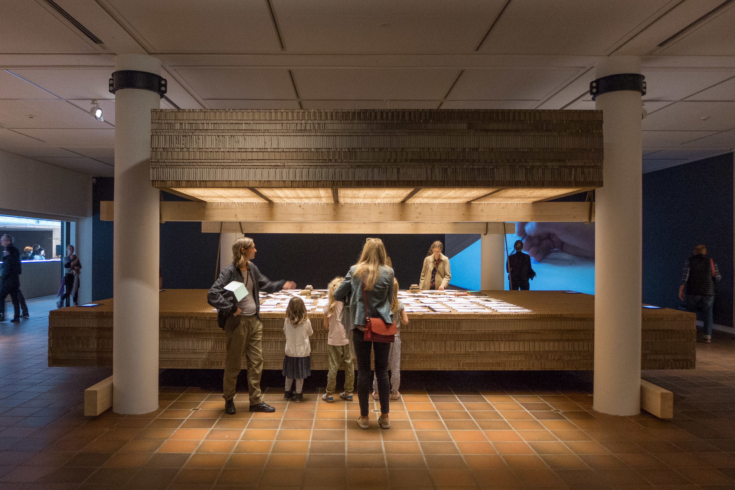
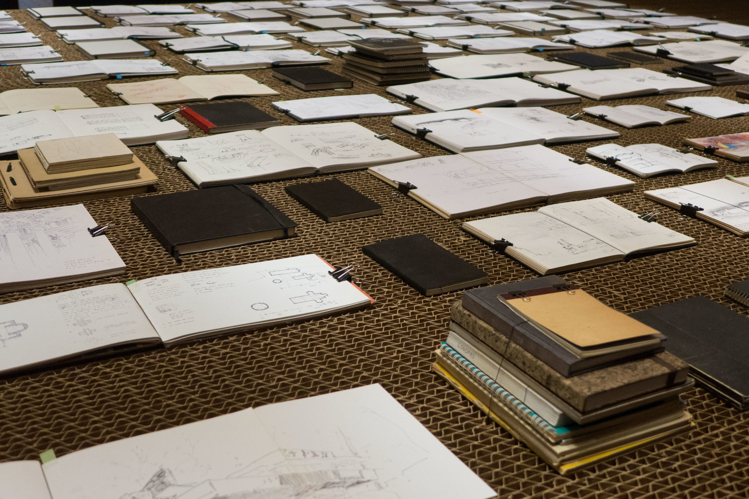
The process of design is here a main focus of the exhibition that begins with a display of sketch books - a primary stage in their design process. With excellent visuals, on small screens around the edge of the display, you can select a sketch book and explore the contents by swiping through the pages that include both notes and detailed drawings.

In conjunction with this are films running across three large images on a nearby wall that turn through sketchbooks page by page. 

The design process for this exhibition space - from initial ideas through to the construction of the final display - was treated like a specific design project by ELEMENTAL to explain their work process and philosophy. A series of large panels on a lower level of the galleries trace through the whole development of the exhibition from the first letter from Louisiana proposing the exhibition through to the construction in the space. It is rare, as a visitor to an exhibition, to be able to track in such detail the work involved in producing an exhibition on this scale and of this complexity.

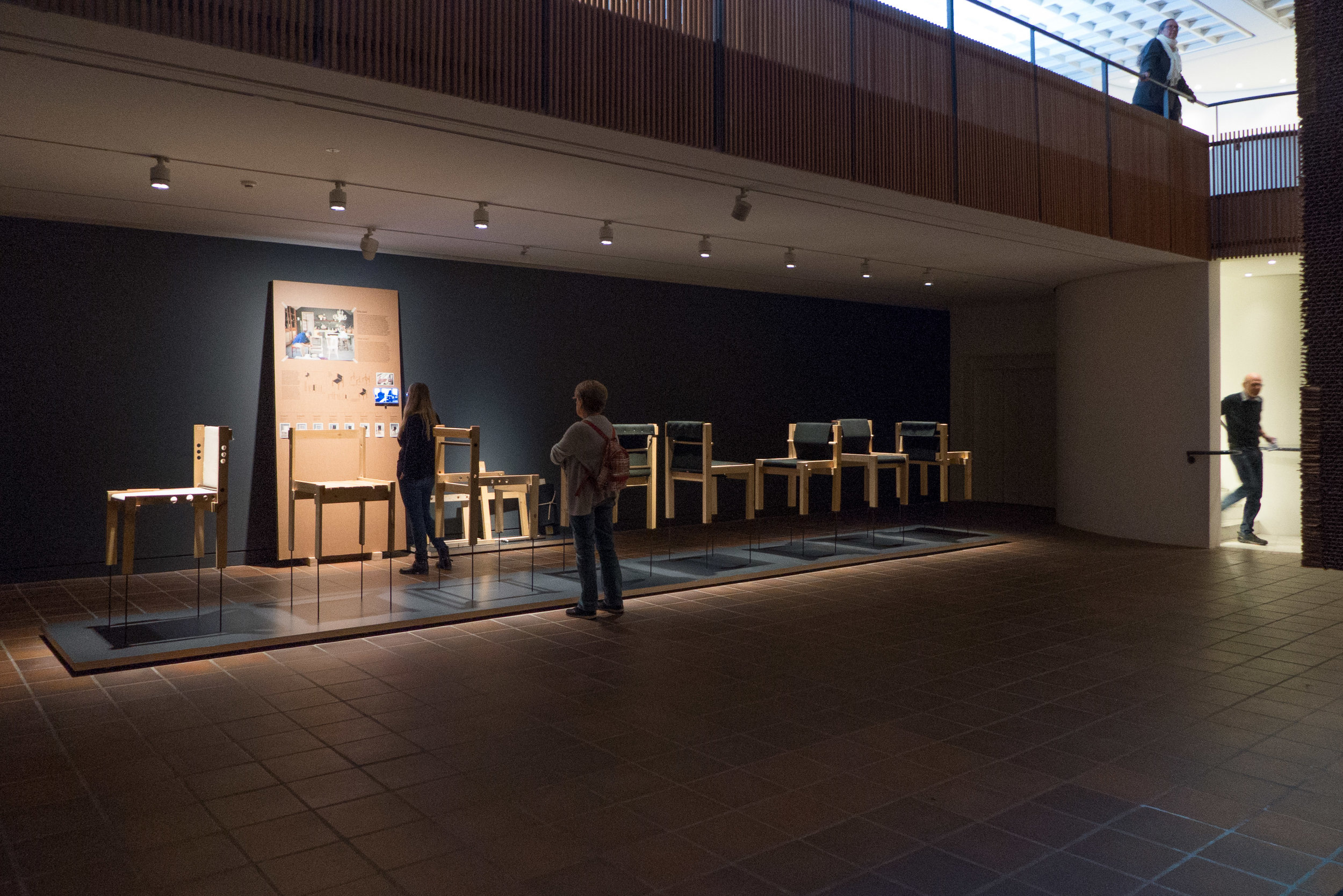
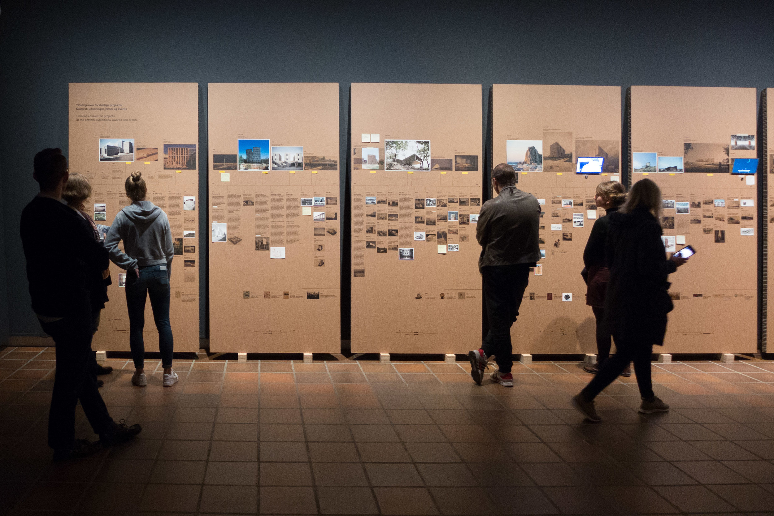
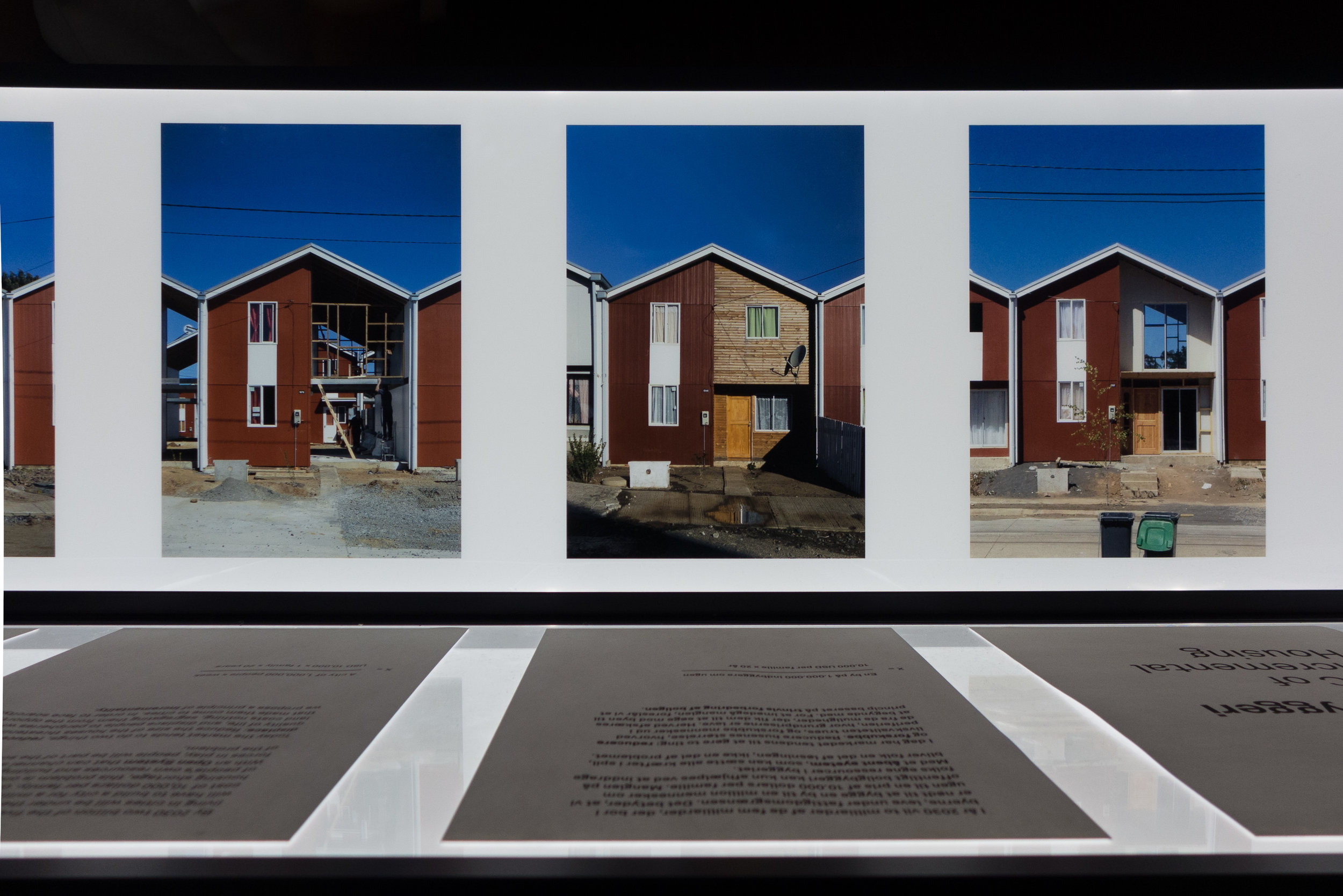
There are separate areas with photographs forming a time line for projects and models showing the primary volumes and forms of major buildings. There is a sequence of photographs and drawings of the now famous social housing - half fitted out in the initial construction and half to be completed by the families at a later stage and a sequence of prototypes showing the development of the design of Silla Chair - an open source design. Under a huge suspended box, there is a film of the projects from a drone.


ELEMENTAL 11 October 2018 - 28 February 2019
Louisiana Museum of Modern Art

OUT at Statens Museum for Kunst


An exhibition of work by the German artist Judith Hopf who is based in Berlin.

In part this work is about how we perceive space - how an artist can organise and manipulate space - and how we respond to space.

And it is also about materials and scale.

The main work, that you see as you enter the gallery, is a diagonal line of three Pears in brick and on a monumental scale - the largest is just under a metre high. That line is reinforced by a low brick wall cutting across the gallery at an angle. 

Untitled (Laptop Men) in polished sheet metal are identifiable as figures holding a laptop and leaning back against the gallery wall but are also like a pictogram but on a life-sized scale.

Suspended around a large video display are curtains hung from the ceiling but stopping short of the floor so you have to duck under the curtain to enter the space to see the video but your legs, from the knee down, seem to become part of the work.

OUT - the video that gives the exhibition its name - shows a high narrow block in front of the open courtyard of an apartment building with distinct features including sun shades over the balconies but, as you watch, the tall block is raised up revealing legs, again from the knees down, showing it is in fact a costume worn by a person and it is our preconceptions and clever perspective and manipulation of perspective that deceives us into seeing it as a building.

As the scene develops there is a short length of hedge on wheels and a young boy playing a full set of drums in what looks like the courtyard of an apartment building.


the exhibition continues until 30 December 2018
in X-rummet / the X room at Statens Museum for Kunst

Oak Tree - an exhibition of work by Tina Astrup


 Tina Astrup graduated as a textile designer from the Danish Design School but also completed a post-graduate degree in furniture and spatial design.

Inspired by the timber and the colours seen in a local saw mill, where oak was stacked and seasoned, the work shown here is a project that has evolved over four years. She takes large disks of timber - sections of tree trunk - or substantial wedges of oak and baulks of wood and enhances both the pattern of the natural grain that mark the growth of the tree but her process seems also to echo mechanical cuts and saw marks that show how a tree is felled and the trunk cut into planks.

She uses vinegar poured over the timber that has been wound tightly with wire … a process that brings out tannins in the timber and creates slashes of dark colour in a way that echoes the effect when textiles are tie dyed.


This changes the character of the oak to make it darker both in terms of colour and in the sense of being much more dramatic.

We tend to see oak now only after it has been worked - so finely cut and planed and smoothed and pale - and see oak as the ideal wood for wide, hard-wearing floor boards or for strong finely-made furniture.

Along with beech and ash, pale or almost white oak is still a hall-mark if not the hall-mark wood for the modern Scandinavian interior. Through the classic period of modern furniture design, the English even talked about ‘light oak furniture’ to distinguish the look they wanted from the ‘dark’ oak of 19th-century and earlier furniture that was regarded as old fashioned or unfashionable.

But oak trees, in the wood or the forest, can be twisted and gnarled - powerful and impressive - and even disturbing.

The cuts and marks on these pieces by Tina Astrup reconnects us with what is, after all, the force - the almost aggressive force - of chopping down a large tree and cutting it into planks and should take us a step back from the product to the natural material and to the way we work with timber to see new possibilities in how designers could work with and use oak in very different ways.


Kunsthåndværkere & Designere
Tina Astrup

the exhibition continues until 28 October 2018
Officinet - the gallery of Danske Kunsthåndværkere & Designere
Bredgade 66, Copenhagen


Flexibility

A small exhibition - described as a pop-up exhibition - has just opened at Designmuseum Danmark.

With the subtitle The Missing Link in Danish Typography History, it spotlights the new font called Flexibility that was introduced last year as part of an updating of the typography and graphics used for the museum and is to be used across all aspects of their graphic design from posters to signage and display graphics, as the font for the museum's website and for in-house leaflets for publicity. This work was undertaken by the Copenhagen studio Urgent. Agency.

As part of the commission they searched through the archives of the museum and found initial sketches for this font that dated from the beginning of the 1960s and were by Naur Klint - the architect and designer who was the son of Kaare Klint. The designs were digitized and this was the starting point to produce a font appropriate for the museum.

With the exhibition there is a handout newspaper that sets out a good brief history of the design museum and also sets out the iterations of the typeface with various weights and an italic and an outline version.

5 October 2018 to 6 January 2019

Designmuseum Danmark
Urgent.Agency

Fortællinger om et sted / Stories of a place


Arkitektens fotokonkurrence 2018 / The Architect's Photo Contest 2018

Following a competition by the Association of architects, these are the five winning portfolios, each with five photographs to present a building or a single architectural project.

In a World that seems to be dominated by rather superficial Instagram images this is an important exhibition because instead of a quick glance and a swipe right the photographs are presented for careful consideration … it really is difficult to capture for the record the qualities and the character of a building in a few images and one function of these photographs is to slow down that process of looking. 

These photographs are about trying to record what is essential about the style and the form and the materials and the setting of an individual building.

It was interesting to see that three of the photographers chose to use the traditional format of black and white images for recording buildings.  

On graduating, I worked for what was then probably the most established academic architectural photo library in the World and by far the majority of images then were black and white - in part for archive reasons as colour prints were assumed to be fugitive - in fact the black and white negative and not the print was considered to be the archive - but also because black and white images seem to take out some of the distractions and give the images a stronger emphasis for texture and line and form. 

One major exception was a collection of colour images of buildings from the archives of the magazine Country Life and as colour became more reliable then it was used for recording museum and gallery pieces. Then colour moved on from what was for me the rather odd distortion of Kodachrome and colour printing became cheaper, sharper and more reliable and colour photographs moved from being the luxury of a single front plate to what everyone expected for everything.

Shadows in black and white images tend to be darker and deeper and pick out and define edges of buildings and sculpture but in colour images, as a gross generalisation, shadows soften and obscure. Road signs, people and planting are less obvious in black and white but perhaps, for that very reason, can seem less realistic and curiously that detachment can make the images less obviously identifiable or less immediately recognisable.

Photographs here of a crematorium were given a strong sense of form and drama by using dark shadow in the black and white images that suggest the gloom and the power of the building even if that obscures the actual form and extent of the buildings and their setting.

On the other hand, here, in the exhibition, it was interesting to see that colour photographs for one project, with a swimming pool, was used to introduce a stronger emphasis on social element - including people - and with a clever sense of narrative by including the splash but not the person who had caused the splash fractions of a second earlier by jumping or diving from a diving board or the side of the pool. 

The other project that used colour used a softened and dulled colour (rather than sharp bright colour in sunlight) to suggest mood and emphasise the importance and the character of the natural landscape setting.

It was also interesting to see different approaches to presentation so, although the overall size was stipulated in the competition rules, one set of prints was taken to the edge - bled off - as we now expect in most books and for larger images in magazines - but another set was presented with a small white border - as they came from the inkjet printer - and another group of five was presented as smaller images carefully set within larger areas of blank space as they would appear in a high-quality art book.

Certainly worth a visit if you want to think about and improve the photographs that you take of buildings.

the exhibition was open as part of the Day of Architecture on 1 October
but continues through to the 12 October

Arkitektforeningen
Åbenrå 34
1124 Copenhagen K


winners of the competition:

all the images and information about the five projects and the five architects have been published by the on-line magazine ARKITEKTEN.DK

Links below each of the images will take you to the appropriate page on that site


Boliger til Folket / Housing for the people


Immediately after the War there was clearly a shortage of housing but also cities realised that poorly-built housing - particularly the dark and tightly-packed housing that had been built in courtyards - had to be demolished and replaced with appropriate homes of a much higher standard

The exhibitions at Arkitektforeningen for the Day of Architecture is an opportunity to see here again the exhibition Boliger til Folket / Housing for the people about social housing in Denmark after the Second World War, so through the1940s and 1950s.

This was shown first in Copenhagen in the central library in March 2017 and was reviewed here

This is a second chance if you missed the exhibition the first time round but it is well worth a second look with profiles of several major housing schemes and includes comments by residents from interviews some remembering what the apartments were like when they were new. 

One aim of the exhibition was to re-establish the merits of these apartment blocks by focusing on the quality of the design and the high quality of the initial building work but it also emphasises the reasons for good and sympathetic restoration work to ensure that these buildings not only survive but that they have an ongoing role as good and desirable housing.

BIG Art at Kunsthal Charlottenborg


An impressive and entertaining exhibition at Kunsthal Charlottenborg with large-scale works created by artists working with the architectural studio of BIG and primarily for major new buildings or for public spaces.

Each work has a video presentation by Bjarke Ingels and this confirms that he is one of the most articulate proponents of modern architecture and planning.

the exhibition continues until 13 January 2019

Kunsthal Charlottenborg

Out of Ousia - Alicja Kwade


Through six large gallery spaces at Kunsthal Charlottenborg in Copenhagen, this is the first solo exhibition in Denmark to show the work of Alicja Kwade. ‘Ousia’ is Greek and means being or essence.

One large-scale work in the first gallery, DrehMoment, with large stone spheres balanced on a frame was created in 2018 specifically for Charlottenborg.

the exhibition continues until 17 February 2019
Kunsthal Charlottenborg

farve form stof / colour form texture

detail of 1025 Farben by Gerhard Richter 1974
Parrhesia, sculpture in papier mâché by Franz West 2012
and, in the background Para 1 by Morris Louis 1959


Works in this exhibition are drawn from the collection and they mark major themes in art since the Second World War looking at the use of vibrant colour that has an immediate impact and at the exploration of texture and of forms for sculpture that step well beyond realism or, rather, look beyond the realistic depiction of colours and shapes and forms from the natural world.

The exhibition in the lower galleries looks at two other major themes from art from the middle of the 20th century onwards … men and masculinity and war and conflict.


the exhibition farve form stof continues until 21 October 2018
at Louisiana Museum of Modern Art
Gammel Strandvej 13, 3050 Humlebæk


Månen / The Moon - From Inner Worlds to Outer Space


With more than 200 works including paintings, film, music, literature, photographs, maps and scientific instruments, this major exhibition looks at myths about the Moon; at the way the Moon has been shown in art and in scientific observations and study over centuries and leading to man landing on the Moon fifty years ago.

the exhibition Månen / The Moon continues until 20 January 2019

Louisiana Museum of Modern Art,
Gammel Strandvej 13, Humlebæk