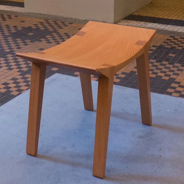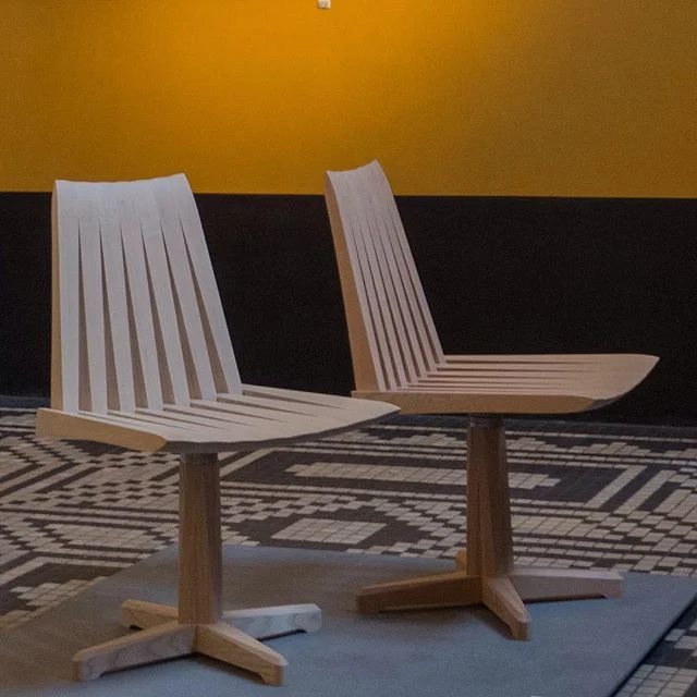
shop interior by Kaare Klint for FA Thiele
/background / history
Købmagergade is one of the two main shopping streets in Copenhagen and number 3, close to the intersection of those two streets, is a wide building with two separate shops running back into the property and a central doorway for access to the staircase and to the floors above the shops.
The building appears to have just escaped the catastrophic fire in the city of 1728 and may date back to the first half of the 17th century - the adjoining building was damaged and had to be rebuilt. Number 3 was rebuilt between 1816 and 1834, when it was owned by a restaurateur - Jean Pierre Casadaban - and in 1847, an extra floor was added with, presumably, a new roof and at that point the street frontage took on its present appearance.
The shops have very high ceiling heights because - as in so many of the older buildings in the centre of the city - the floors of the main level, originally six or seven steps up from street level were brought down to pavement level, cutting into the space of basement rooms that were originally half below ground and half above ground - a form of plan described as a half basement or semi basement.
In the middle of the last century, the shop in the left or south half of the building at number 3 Købmagergade was occupied by the opticians F A Thiele. They are now in a shop further north along the same street - but in 1944 they commissioned the architect Kaare Klint to design a new shop font and new interior fittings here.
Work was delayed and did not start until 1951 when Klint was assisted by the young architect Vilhelm Wohlert, who had studied under Klint, and the shop was actually completed in 1956, some two years after Klint died.
It is a complicated space with the front part of the shop just two steps up from the pavement but the space then narrows and towards the back runs through into a back building at a higher level, eight steps up from the floor of the front space, although the ceiling level is constant.
Klint and Wohlert designed a reception and waiting area at the front and, back down the shop, there were 18 tables or desks with chairs, where patients were seen by the opticians, including tables set along a narrow balcony that returned back towards the shop front from the raised area at the back. At the very back there was a small office but with a glazed front wall.
Unlike the present arrangement, the back part of Thiele's had windows looking into a narrow back courtyard so there was natural light.
Distinctive fittings included high and narrow units of small drawers - next to the staircase in the middle of the shop - for storing the glasses but the interior also made striking use of large flush panels veneered in wood and areas of vertical and closely-spaced narrow strips of wood that picked up the tight linear pattern of the ceiling, that had narrow strips running front to back, and the bolder lines of the closely-spaced rafters of the underside of the balcony.
The drawer units were along the side wall but also returned across the shop beside the staircase and taken up higher than the floor level of the space beyond and seem to have included a flower planter across the top and formed the barrier or parapet of the upper level.
These steps up to the back had open treads and the handrail had closely-spaced vertical battens so again a strong linear design. Note how the wide handrail curves at the top and bottom to level off to horizontal so it was at the right level for your hand as you approached and as you reached the last of the steps.
The interior is about clean simple lines but the planes of walls and fittings define a clever interrelationship of spaces and volumes marking not just changes in the underlying building - that the architects were given - but define different areas of the shop ... so a progression from pavement through the display space of the shop window to a counter and reception area, a waiting area and pay desk, stations for consultations, storage of stock and an office at the far end, above everything but with its glass wall, a place from which to supervise all. Perhaps one of the most elegant essays in functional architecture in the city.
The front window was again a deceptively simple but again an exceptionally sophisticated design with a wide lintel across the door to divide the very high shop window across the centre. This was deep enough to carry lighting with a series of spot lights over the window displays and narrow opaque panels for the lights over the entrance. The glass on either side was set at the front edge for the areas of window display but the entrance door was set on the back edge of this horizontal feature with narrow windows on each side to form a covered entrance lobby. At the front or outer corners the sheets of glass forming the sides of this lobby are butted up to the large plate-glass windows of the shop front without vertical frames - something we now just take for granted but then, presumably, both novel and daring.
Plain boards below the windows set the height of a solid panel in the bottom of the otherwise glazed door and the windows were large undivided sheets of glass so there is an apparent simplicity to the design but in reality a complicated and clever game with planes and lines and spaces.
The demolition of this interior has to be seen as a major loss.