the colours of Thorvaldsens Museum
/

The sculptor Bertel Thorvaldsen (1770-1844) studied at the Royal Danish Academy of Art and then, in 1797, travelled to Rome where he established a successful studio.
When he returned home to Copenhagen in 1838, he was was welcomed as a hero.
He donated his collection to the nation, on the condition that a specific and dedicated building should be constructed to house his sculptures and his studies, and a site adjoining the royal palace, the Royal Coach House, was granted by the king. A new building was commissioned that was designed by Michael Gottlieb Bindesbøll (1800-1856).
Completed by 1848, it was the first public art museum in Denmark.


Frescoes around the exterior depict the triumphal arrival of Thorvaldsen in the city with his sculptures carried in triumph from the ship and watched by local people.
The painter was Jørgen Sonnes (1801-1890) but his colours were lime based but over a cement mortar and changed over time so had to be repaired in the 1860s and then recreated by the renowned Danish painter and ceramic designer Axel Salto in 1951.
The colour scheme is a combination of rich, deep-ochre tones with the background in a blue/grey base with figures in outline and fabric of costumes picked out in a limited range of colours with solid ochre, iron red and stone which gives the frieze a strong unity.
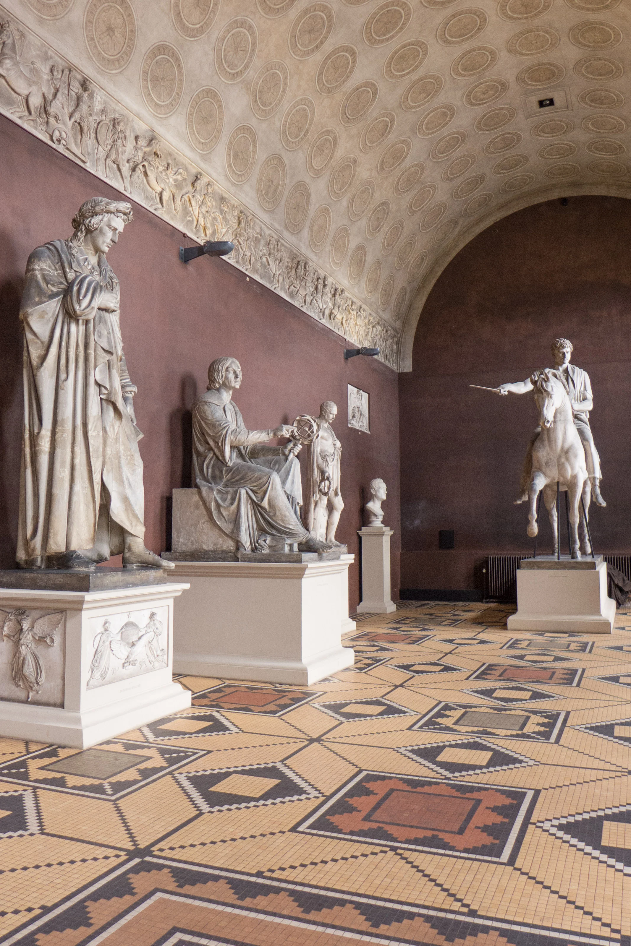
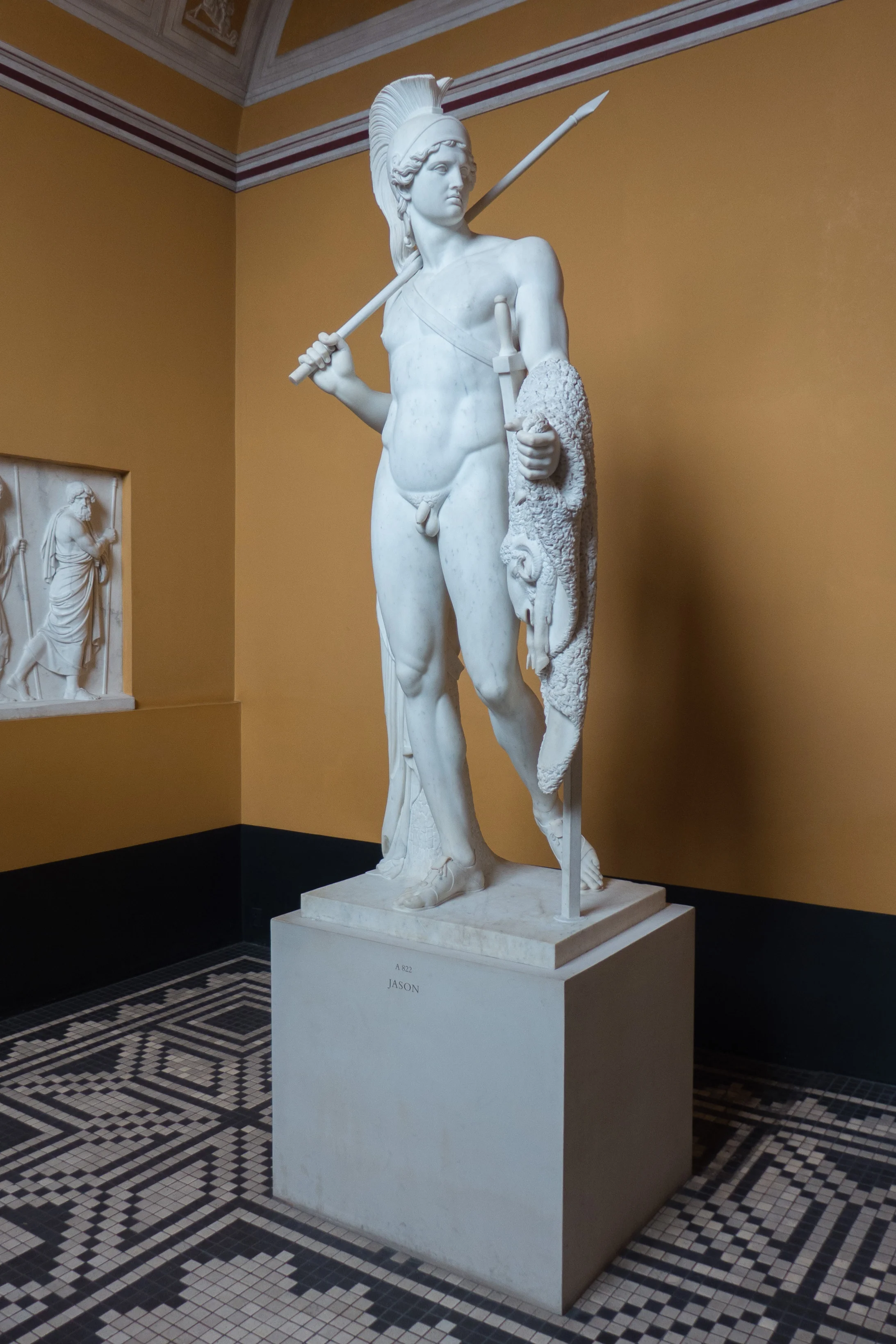
Colours of the interior of the building are richer and darker, based in part on studies of classical Pompeian art, with strong solid wall colours as a foil to the marble statues and plaster casts.
Documents survive to show that, from the start, the architect considered the role and the control of natural light in the galleries as crucial … in part, it is said, to copy the form of controlled lighting in Thorvaldsen's studio in Rome. Light was to fall from above with the brightest light on the heads of the statues with a more suffused light across the floor. On the upper floor is what was called "the sunshine corridor" where natural light was reflected to illuminate the works. Etched glass was used in the large windows on the ground-floor that look into the courtyard and this modifies the natural light in these inward-looking spaces.
The colour scheme of the large courtyard is different from the exterior and has strong, deep, slate green and a dull blue that are used to emphasise architectural features. This is not just a museum but was conceived as a mausoleum and the grave of Thorvaldsen is at the centre of the courtyard so plants etched in the window glass and palms in the design of the frescoes are an allusion to the Garden of Paradise.
When completed, the whole composition must have seemed astounding to citizens, at a time when the city had been dominated for half a century by subtle and subdued classical taste, with most new buildings painted in tones of cream, grey and stone. Here, at Thorvaldsens Museum, was a return to the strong colours of 17th-century Danish buildings and interiors and the building marks a key point in the development of Danish historicism with a new interest in the idea of a national style based on historical precedence.