balcony blight has spread to Jægersborggade *

With Coronavirus lockdown restrictions, it has been many months since I have been up to Jægersborggade but Saturday was sunny, and I needed some exercise, so I walked up to the lakes and then on along Nørrebrogade and through Assistens Kirkegård.

As soon as I got into Jægersborggade, opposite the north gate of the cemetery, I could see that construction work had started to add balconies to the front of several of the west-facing buildings.

This whole business of retrofitting older apartment buildings with new balconies has become a serious problem in the city.

Copenhagen has a phenomenal number of good apartment blocks that date from the 19th and the early 20th century ... apartments that were built on new squares and new streets as the city expanded rapidly with large new districts built over the fields and gardens beyond the old city gates.

Most of these apartments still form an important part of the housing stock in Copenhagen and most, even if the original arrangement of rooms was restricted or not completely appropriate for the way we live now, they can be easily adapted .... so heating and bathrooms and so on can all be upgraded. Even replacement doors and windows that comply with modern building standards for sound and heat insulation can be found in an appropriate style and colour that either replicate or compliment the original fittings.

But few of these buildings had balconies.

Of course, I can see why people want a balcony and particularly a balcony that faces the sun or looks across an attractive street or square. A balcony can bring extra light into a room; can be a space to grow herbs or plants; and, if large enough, can be a place to sit and sunbathe or even provide space outside to have a table and chairs for a meal.

Balconies are fine when they form part of the original design and are part of the original construction on apartment buildings from the 1930s or on modern buildings but inserted on the street frontage, they inevitably slam through the original architectural features of the facade, compromise any architectural style the building may have; add what are often little more than stark metal boxes across the front and usually throw shadow across the windows of the apartment below.

With many of these older apartment buildings, the street frontage and a main staircase, are the only parts with any architectural coherence. In most, the back of the building is far less distinguished or, worse, a muddle of toilets and back or kitchen staircases but rooms on the back of the apartment can look down into gardens or attractive courtyards  so balconies added to the rear of building are rarely an issue.

* blight covers green leaves on a plant or tree with ugly and disfiguring areas

shopping in Jægersborggade - December 2018
Jægersborggade - May 2021
retrofitting balconies is a problem - January 2020 


new balconies from a walk down through Østerbro and on to Dronning Louises Bro

By coincidence, just two days before walking over to Jægersborggade, I had been up to Østerbro and walked back through Østerbro and through the streets on the outer side of the lakes.

Most of the apartment buildings on these streets date from the 1880s and 1890s or from the first decade of the 20th century and, again, it was possibly a year or more since I had been to this part of the city.

Yet again, I was amazed and depressed by seeing just how many of these good buildings had been altered with the addition of new balconies on the street fronts.

The city planning system really has to control this.

Even if permission is still given for new balconies to be added to the garden or courtyard side of a building, the presumption has to be that new balconies cannot be added to a street front unless there are exceptional reasons or an exceptional design and certainly not when it means cutting through original architectural features.

Can anyone in the city planning department defend the decision to give permision for the addition of any of these balconies or convince me that they contribute in any way to the street scape?


select any image to open as a slideshow


retrofitting balconies is a problem

If you live in an apartment in Copenhagen, a balcony can be a real asset.

If the balcony is small but faces in the right direction then it’s a place to grow a few flowers or herbs or if it’s large enough for a chair or two and a table, it can even be a useful extra room - at least on sunny days.

Through the 18th and 19th centuries in Copenhagen, a balcony was usually a grand architectural statement … a feature of bigger and better houses and these balconies were usually on the street frontage and on the most important floor level, so, more often than not, on the first floor and, more often than not, the balcony was defined or marked by a display of impressive or pretentious architectural details … so under a pediment or flanked by columns and with an elaborate iron railing or a stone balustrade and was there to impress … more a place from which to make a speech to the crowd than a place to lounge in the sun.

But by the 1920s, people living in the city had discovered sun and fresh air and, generally, as apartments became smaller and as purpose-built apartment buildings tended to get larger, balconies became more common.

They meant the apartment had a private outdoor space, so people did not have to go down to the courtyard to be outside, and, if the balcony was on the front of a building, then there could be a view out over the street or, in well-located apartment buildings, the view could be over a square or over the lakes or even over the sound. 

With the use of concrete and steel in the construction of more and more new buildings, it became possible to cantilever out ever larger balconies and by the 1930s apartment buildings became common where every apartment had a balcony and with those balconies often forming the dominant feature across the facade. In some buildings, it was almost as if the balconies had been designed first and everything else made to fit behind.

Glazed doors to get out on to the balcony bring more light into the room and on, hot days, the doors can be left open to improve the circulation of air …. so what’s not to like.

But there is a growing problem with retrofitting balconies on buildings that did not have them originally.

Not too much of a problem, in terms of the look of a building, if they are on the courtyard side and even acceptable on the street frontage if secondary balconies are placed carefully and try to show at least some respect for the style and architectural articulation of the building. 

But, too often, these secondary balconies are simply metal boxes clamped across the front and, if nothing else, they increase the visual clutter of the street - diminish the streetscape - and, if not all the owners or tenants want the disruption or the expense of knocking out walls below windows for doorways and for constructing the required supports for the balconies - they can be spread randomly across an otherwise regular frontage.

Worse, when placed across the sunny side of the building, new balconies can throw deep shadows across windows below so actually they mean less light for those lower rooms and, in some cases, balconies above will take away an unimpeded view of the sky when someone is in the room below.

It’s difficult. Obviously people like and want a balcony and who is a mere planner to say they can’t have one?

But now they really do have to be reigned back and controlled.

Copenhagen has a phenomenal stock of well-built apartments that date from across the last three centuries and with modern materials for glazing and with modern and efficient heating systems and insulation we can give these older buildings an important extended life and, without doubt, buildings only survive if they can be adapted for changes in the way we want to live. But too many good buildings are being devalued by poorly thought out balconies and too often these end up simply as extra space to store kids toys or the best bike that cannot be left in the courtyard or a barbecue that once seemed like a nice idea but somehow now is rarely used.


An apartment building on the corner of Sønder Boulevard and Sommerstedgade (left) and an apartment building on Broagergade are two examples where it could be argued that balconies add interest to otherwise stark or plain facades but both show clearly the problem with balconies throwing deep shadows across windows below

Skydebanegade (below left) and Nordre Fasanvej in Frederiksberg are examples where courtyards have been cleared of buildings and new balconies added to rooms at the back of the apartments that look down to the courtyard.


Overgaden Oven Vandet - expensive balconies added to an apartment building from the late 19th century
pairs of window were lowered for access to a long balcony but this meant the removal of aprons or panels below the windows and distinct features like key stones above windows were partly covered so changing the careful articulation of the original design


Tavsensgade housing scheme on the west side of Assistens Kirkegaard was designed by Povl Baumann and completed in 1920

the architecture of the brick blocks is severe but this is a major and influential group of buildings of considerable historic importance.

balconies have been added in a random pattern across the street frontages


Tåsingegade … a scheme to upgrade these apartments in Nørrebro has more justification …
balconies were added across the front of all the apartments to look down on new climate-change improvements on the square and this gives people a stronger sense of community and a stronger sense of ownership and participation in the improvements to their street


Rejsbygade - an apartment close to Enghave Parken - and a building on Sønder Boulevard have new balconies on what were blank gable walls … both seem to be associated with small areas of garden where adjoining buildings have been demolished

L1066646.JPG
 

Ørkenfortet / Desert Fort, Christianshavn

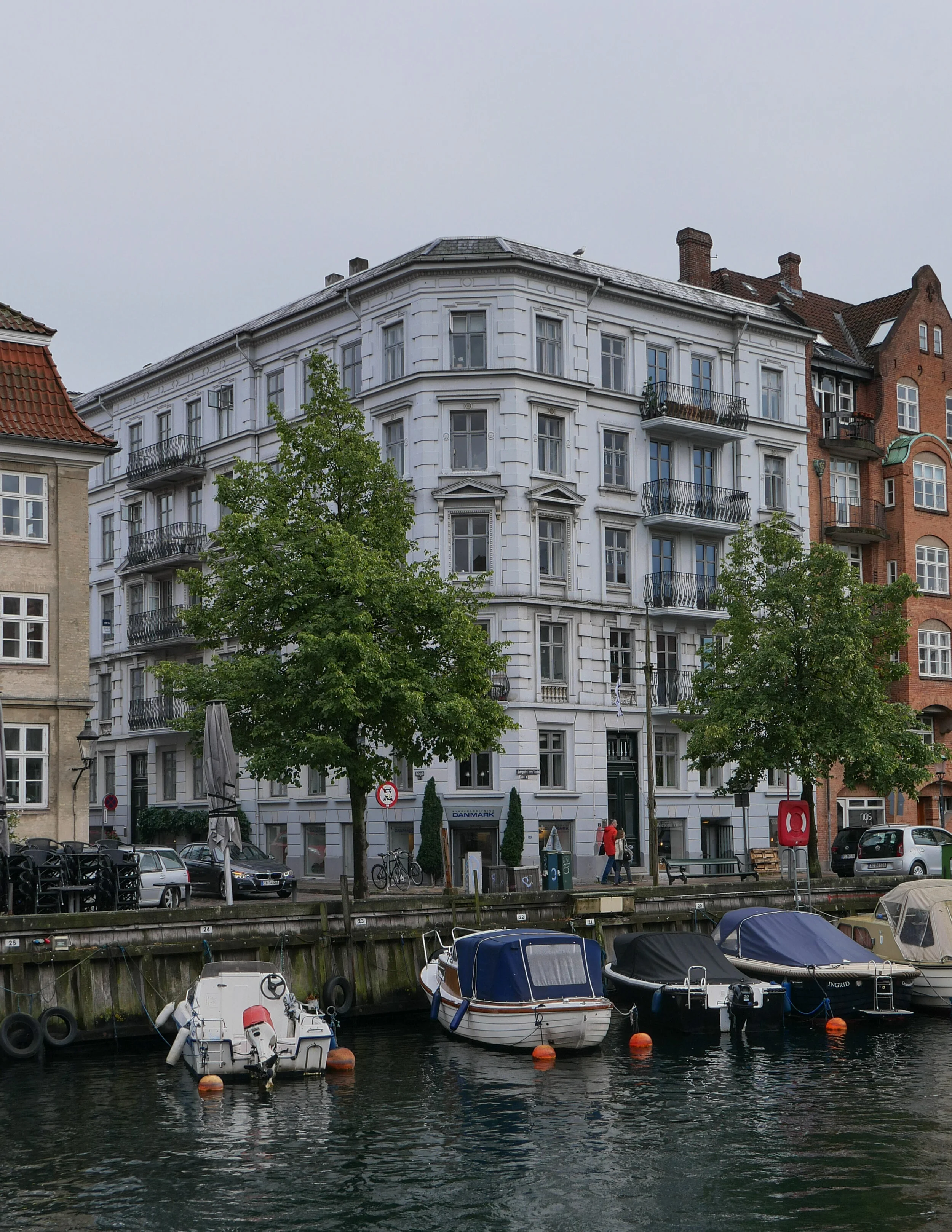
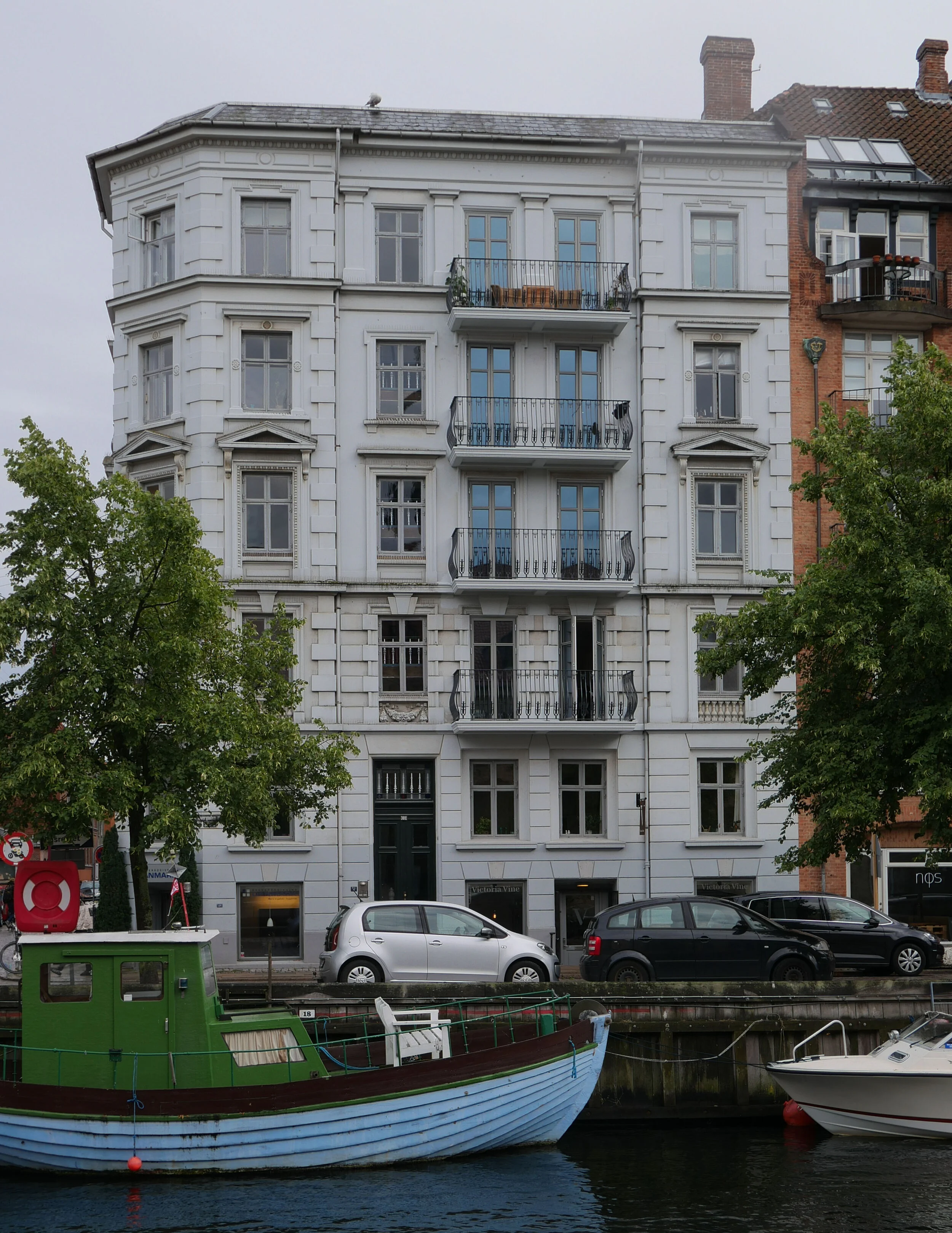
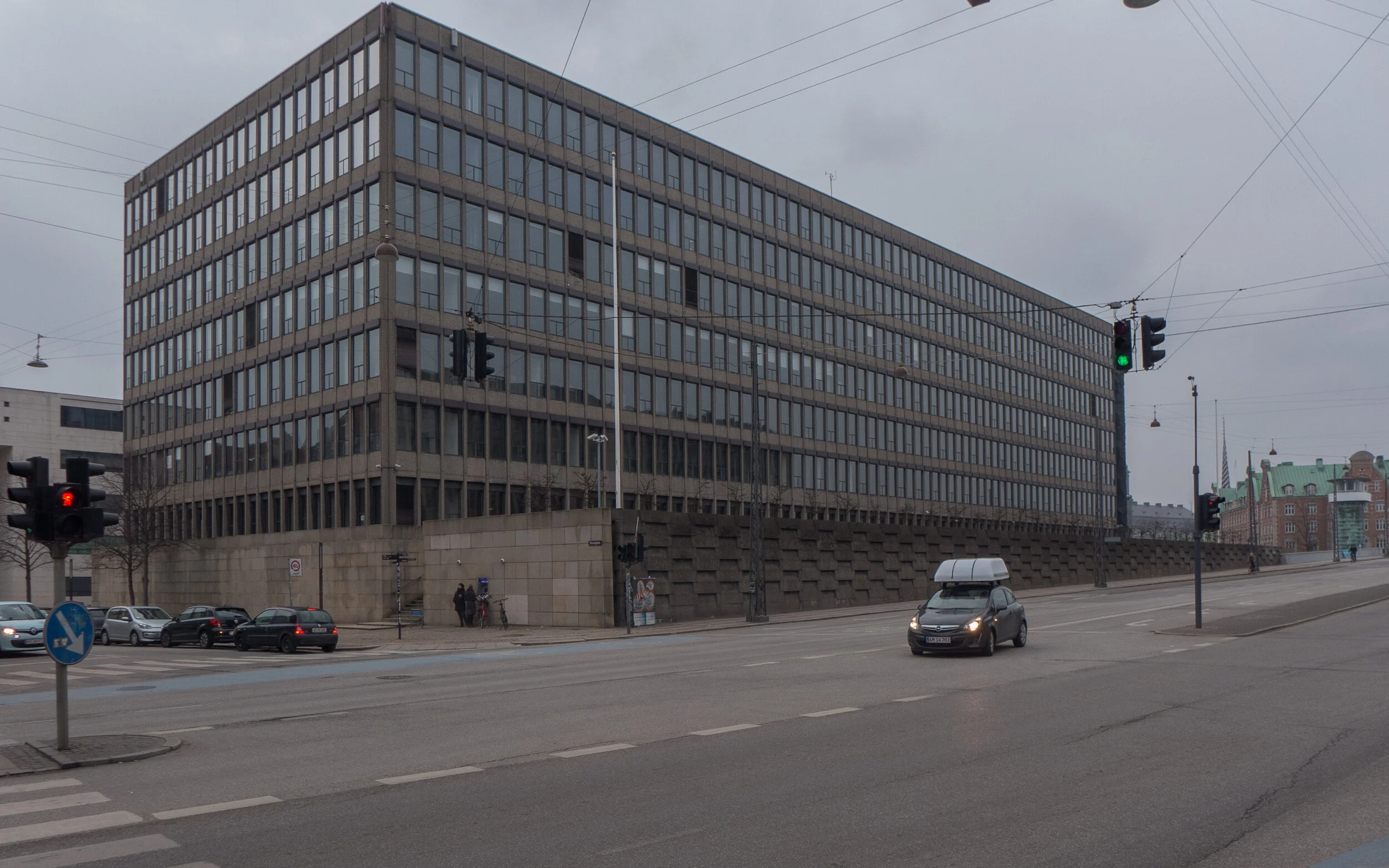
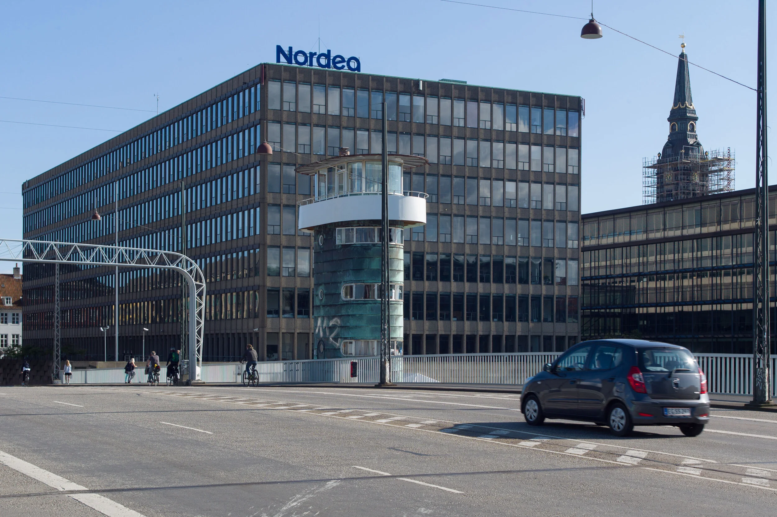
Work is moving forward fast on Ørkenfortet, the Desert Fort - the large office building that is at the centre of the harbour at the Christianshavn end of Knipplesbro - the central bridge that crosses the harbour between the centre of the city and Christianshavn.

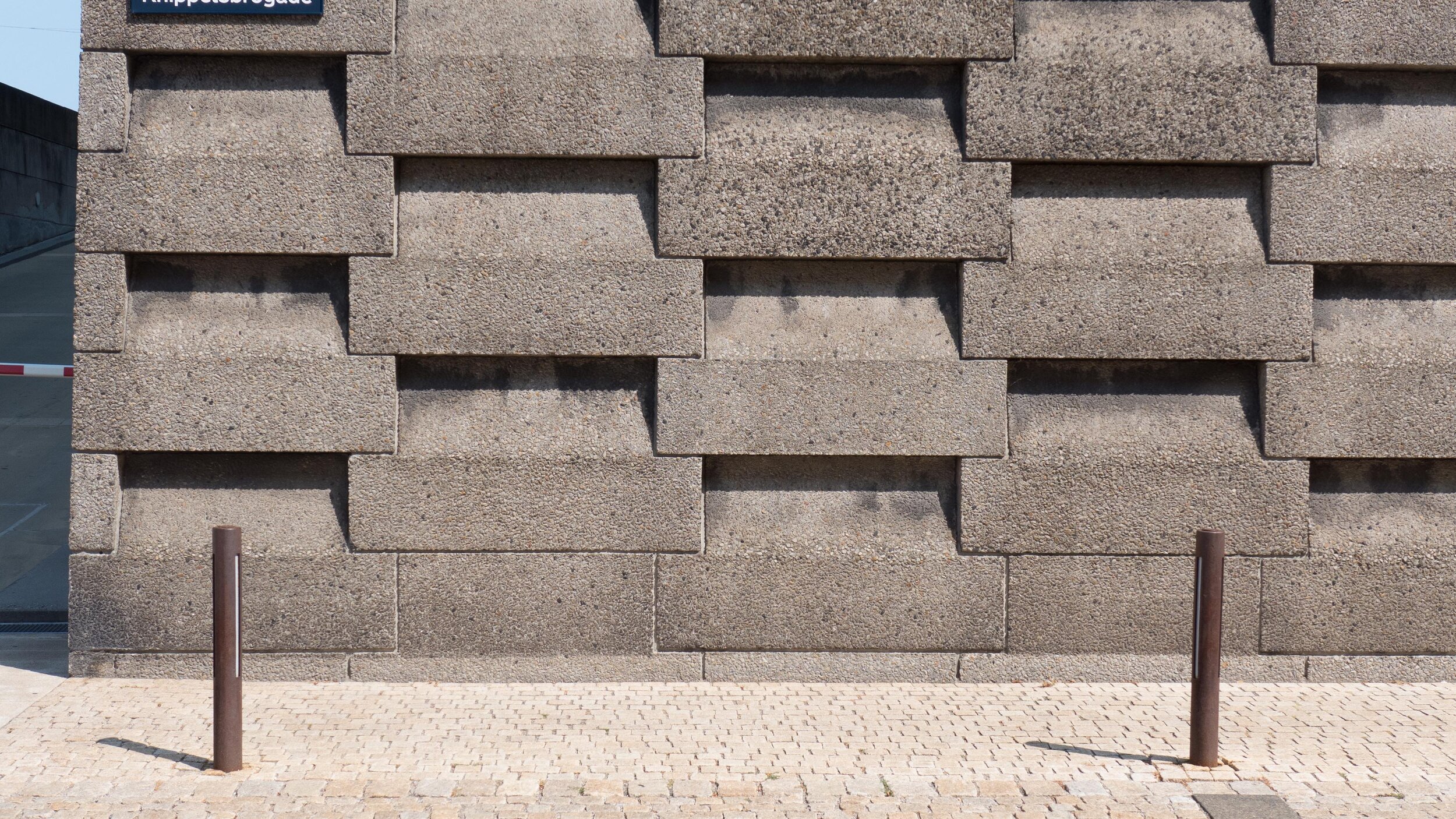
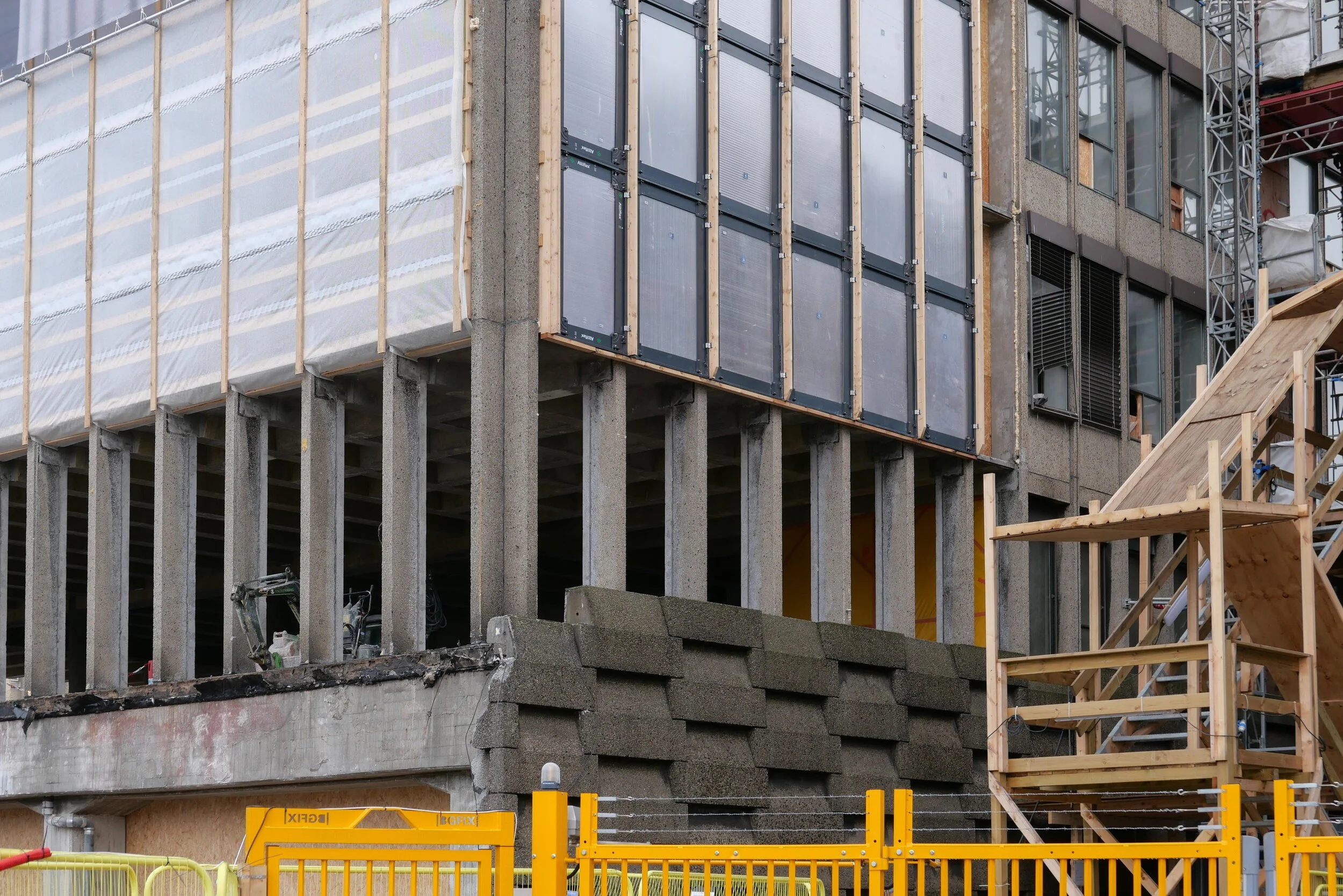
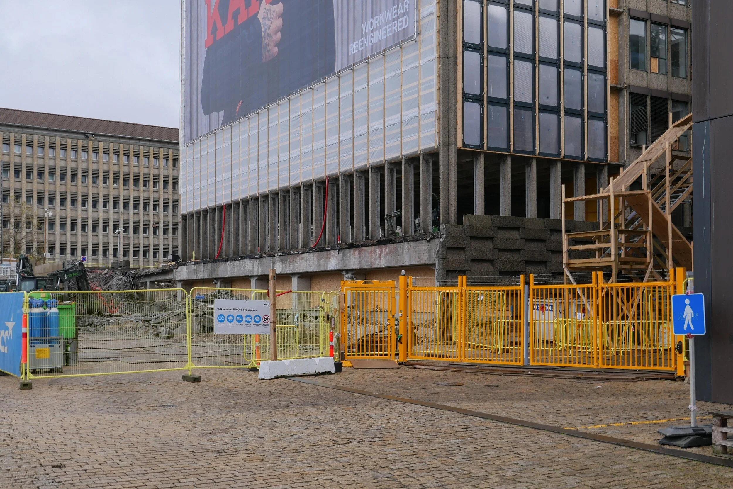
The interior at all levels has been gutted and all original windows and all external cladding have been removed. Work has started on cutting down new internal courtyards or light wells within the concrete structure of the block and on removing hefty concrete retaining walls along both the street frontage towards Torvegade and at the level of the quay on the end of the building towards the harbour that formed a base for the building.

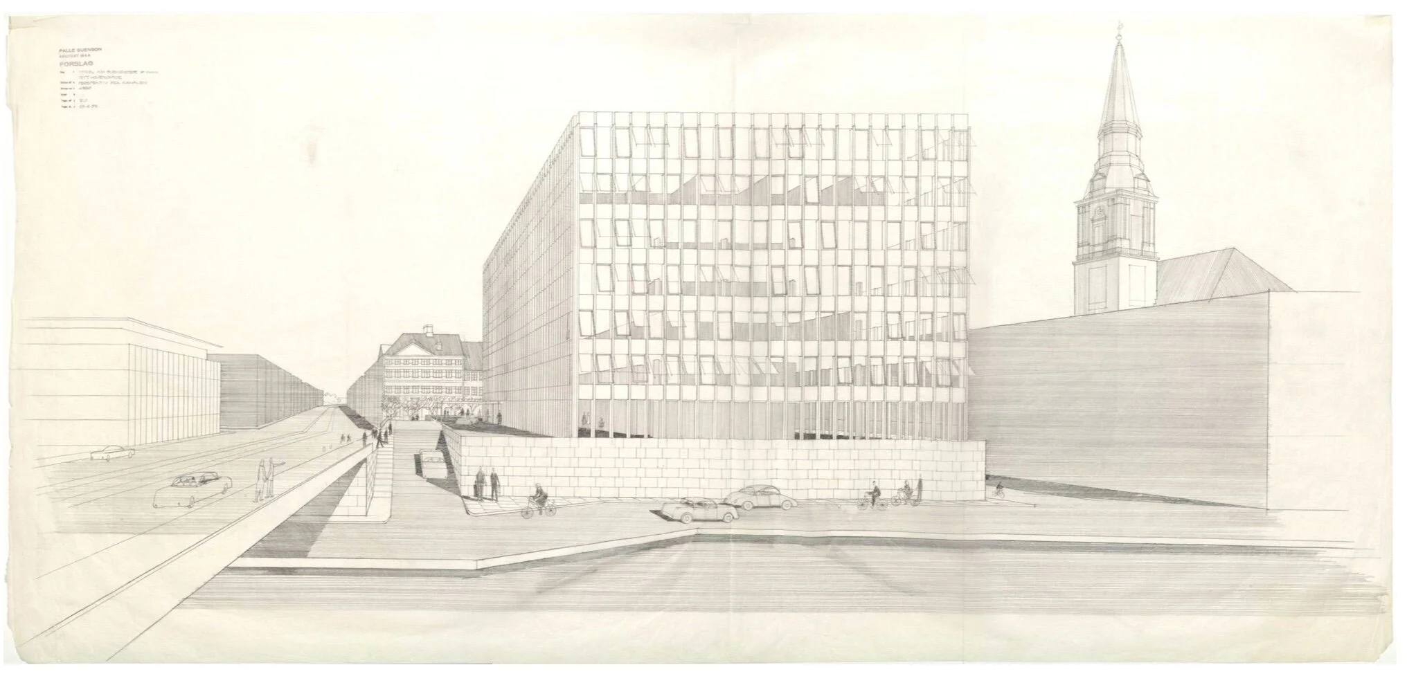
Ørkenfortet was designed by Palle Suenson (1904-1987) and was completed in 1962 as offices for Burmeister & Wain who were a well-established and major engineering and ship-building company in the city.

They had been established under that name in 1865 and, by the middle of the last century, their main ship yards were at Reshaleøen - at the north end of the harbour - where the main dry dock survives along with the some of the huge sheds and buildings of the yards but the engine works were here at the south end of Christianshavn, immediately south of this office building.

These extensive engineering yards on Christianshavn shut in 1993. Although some of the earlier buildings - including former drawing offices and the works' gates - survive, most of the buildings along the quay towards the harbour were demolished and wharves and docks were filled in for the site to be redeveloped with large new apartment buildings and extensive office buildings that were designed by the architects Henning Larsen.

Several of these office buildings along the harbour were occupied by the Danish headquarters of Nordea Bank including the office building by Suenson but in 2017, the bank moved their offices to a new site, close to the metro station at DR Byen, and the main office building from the 1960s became available for redevelopment.

This is all fairly straightforward history - the recent history of the site and of the building - but what I don't understand is the planning decisions then made for this key site at the very centre of the harbour.

Of course, I can see the logic and the reasons for planning decisions made in the 1950s. As Denmark emerged from the war, the priorities were for economic recovery. These ship-building and engineering works were not only a major employer in the city but these were highly skilled and, presumably, relatively well-paid jobs. The company was well established and, if nothing else, emerging from the widespread destruction of the war, there was an obvious market for new engines and new ships to replace what had been lost. Perhaps, and even more significant at that stage, although the harbour was, in terms of topography, at the heart of the historic city, attitudes to the harbour then were very different.

Then , north of Knippelsbro, were the working naval docks, with all that meant, and with the only road access through Christianshavn. Through the centre of the harbour and below or south of Knippelsbro was a working port with all that meant. Polite, middle-class society in the city would have seen the harbour as a major resource but that was as a major financial resource, so a massive new office building for Burmeister & Wain would not have been seen as an eye sore … even though its within sight of the 17th-century buildings of the exchange, on the other side of the harbour, and close to the magnificent warehouses from the 18th century, of the Asiatic Quay and Gammel Dok, on the other side of the road … but it would have been seen as an astute and positive show of confidence in the industries of the city and in their future.

It has only been with the decline of the dockyard and the working port and those industries that the harbour had to look for and has certainly found a new purpose at the heart of the city but I'm not sure how this massive hotel development actually makes a positive contribution.

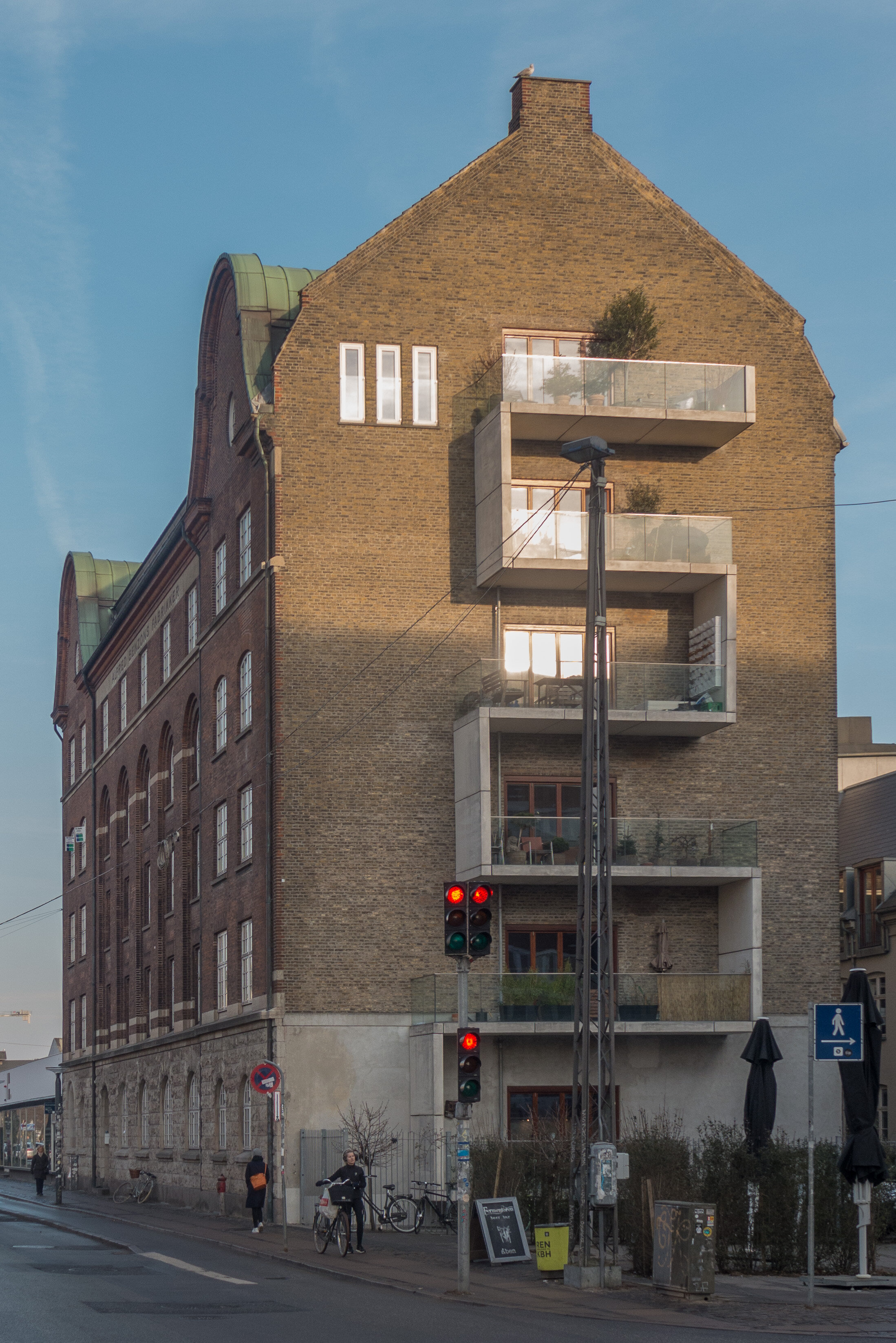
On the side away from the harbour, the existing building looms over Strandgade - an exceptionally important street of historic buildings with many that date back to the early 17th century - and it overshadows the stunning Christians Church by Nicolai Eigtved that was built in the 1750s.

The block of the existing building is massive - one of the largest and certainly one of the most prominent at the centre of the harbour. It's 90 metres long by 31 metres deep and about 30 metres high. It's not a bad building as such but simply a product of its period and certainly not the best building for this location.

In terms of planning, the retention of the building and its conversion to a hotel by the Hilton Group, raises lots of issues.

It will have about 400 rooms so how will Christianshavn cope with the amount of traffic a hotel of this size generates with visitors coming and going, staff arriving and leaving and delivery lorries coming and going?

And why, when it is such a large building anyway, has permission been given to add a whole extra floor on the top that will increase the visual impact of the building and ensure that it overlooks even more properties. I can see that a roof-top dining room and roof terraces are a huge bonus for the hotel but I cannot see what they contribute to the harbour or to the neighbourhood.

Consent has been given to remove the hefty concrete retaining wall along the lowest level towards the quay but this means that the hotel can colonise and make use of the quayside as an asset for the hotel although citizens gain little from this apart from some new steps up from the quay to the bridge on this side. Note there are already steps up to the bridge on the other side of Torvegade and steps on both sides of the bridge on the city side so access from the bridge to the quay is actually adequate.

Almost-certainly, the city would not have given permission for a building of this size and prominence if the site had been empty land or there had been much lower buildings here.

Surely, it would have been better for the city and for the harbour if the building from the 1960s had been demolished and replaced with buildings that were lower and more compact, and with new buildings that reinstated or created a reasonable street frontage to the road up to the bridge and a more appropriate and more respectful frontage towards Strandgade.

Planning Statement - appendix to the Local Plan

notes:

In Danmarks Kunstbilbliotek / the Danish Art Library in Copenhagen there is a drawing of the building by Palle Suenson Inv. nr. 53296 - a perspective from Knippelsbro

While tracking down information on the building I came across a web site that revealed that the building was given a nickname by locals who called it Røven or The Arse. Initially, I assumed that was because the building was thought to be butt ugly but actually it was because at lunchtime workers in the office came out onto the forecourt and sat along the parapet of the wall along Torvegade and, for people walking along the pavement below, the only thing that could be seen from the street was a line of backsides.


photograph from 1965 showing Knippelsbro and Torvegade with the office building designed by Palle Suenson in the foreground and the engineering works of Burmeister & Wain beyond - along the harbour as far as the canal and around the south and east side of Christians Church


a new library for Nørrebro

At the beginning of August a new public library opened in the old tram sheds in Nørrebro.

The building is set back from Nørrebrogade with a large square at the front where trams originally turned into the sheds and the original high and narrow openings towards the road have been retained but with new doors that have stylised versions of giant book cases.

Inside, the single huge space of the shed has been retained with arched openings in the brickwork along the east side towards Bragesgade kept as a strong architectural feature and to flood the space with light. The industrial roof has been kept and is now painted black.

Fittings are in pale plywood and divide up the space and there are integral breaks in the shelving with desk spaces and benches that create quiet places to work but also form views through the space.

Across the west side of the library are smaller spaces on two levels with meeting rooms above for meetings and teaching that the community can use and, like all libraries in the city, there is a play area for children to encourage even the youngest to see the library as a fun place to visit.

Further back from the road is a second huge tram shed and that was converted some years ago to a sports hall - Nørrebrohallen - and there is now a large entrance area and large cafe between the two - between the library and the sports halls - as a place where people can meet.

Running back from the road and along the west side of the buildings is the famous city park - Superkilen - with its outdoor play and sports so this area is now a major hub for the community around. It is anticipated that visitor numbers to the library could soon exceed 1,000 a day.


select any image to open the set of photographs as a slide show

sport and space consultancy KEINGART have published a pdf file on line with plans of the library and cafe area


the forecourt of the design museum


Work continues at Designmuseum Danmark where the entrance gates, railings and stone piers along the street are being rebuilt and the setts of the forecourt relaid to form a new ramp to replace the steps up to the front entrance door and to install lighting and so on for new outdoor exhibition cases. 

The project - designed by the architectural practice COBE - includes a new ticket area, book shop and new cafe in the lower part of the old pharmacy … that’s the pavilion to the right of the forecourt.


As new blocks of stone have been brought to the site and set up, the work is an opportunity to see some of the details of 18th-century stone masons’ techniques that have been replicated … so it is possible to see the way bold mouldings are cut across large blocks to form plinths and caps to the piers.

The large ashlar blocks of the stone piers and the blocks that form the moulded bases and caps are dressed back with strong vertical tooling which contributes a distinct surface texture and gives a darker tone to the architectural details. Note how at each end of the ironwork screen the outer piers are not butted against the brickwork of the pavilions but are set into them which would suggest that the brickwork and stonework were built up at the same time … not one built against the other.

top left - the door into the former pharmacy of the hospital which will be the access to a new arrival space with ticket desk, book shop and new cafe. Note the silhouette in the brickwork of the ball finial and moulded cap of the stone pier that has been dismantled.

top centre - an iron pintel, set into the stonework of the pier, that will hold the strap of the lower hinge of the gate


Heavy spiked or barbed railings and the ornate iron gates are held in sockets cut into the blocks.

At this stage the gates are back on site but are on pallets so it is possible to see the robust quality of the iron work and to see how the straps of the gate hinges form a loop that will be dropped over hefty iron ‘pintels’ set into the stonework. 

This major project has also been an opportunity to repair some of the stonework on the entrance front of the main building and it is interesting to see around the doorway that although the stone frame or architrave of the door looks hefty or robust, it is, in fact, made up with relatively thin slips of stone with pieces forming the moulded front and separate pieces forming the reveal or jamb running back to the door frame and the brickwork behind is surprisingly crude.


can cladding be good or bad or is it all just cladding and you can’t expect anything better?

Some people get upset when they see an apostrophe in the wrong place on a shop sign and seem to spend half their life looking for examples in order to be offended. Some graphic designers can name a font from 100 metres away and tell you the date and the name of the foundry or the designer and for many it's Comic Sans that sets them off. Me? Well I get worked up about cladding.

OK that's a slight exaggeration but I've spent my working life looking at and taking photographs of and writing about buildings so it really is hard to switch off. Walking along a street, I’ll suddenly spot an interesting or curious feature and then I realise, although I was not conscious that I was doing it, I've been scanning and registering buildings as I'm walking. Perhaps that's why it's difficult sometimes for me to understand that, for lots of different reasons, other people don't even see the awful buildings all around them or, come to that, appreciate when a building has been designed with enormous care.

If I mention cladding then you'll probably look slightly blank … then possibly recall that it's a word for the planks that people nail on the outside of garden sheds. But even architects can be a bit vague when talking about cladding and some manufacturers use the term façade panel and many use the word generically for the exterior skin of a modern building and some only where it is a curtain wall.

Using that tighter definition of curtain wall construction is probably a good starting point because that's where the different levels of a structure are built in concrete or in steel and are supported by pillars or piers in reinforced concrete or steel so that the external walls do not actually carry any load. So, when it comes to the facades, then anything goes … anything that keeps out the rain and keeps out or keeps in heat and keeps out … or keeps in … noise.

One benefit/problem with concrete or steel-framed buildings now is that there is a general sense of freedom … a sense of freedom or possibly the misconception that the outer face of the building, its cladding, does not have to be related to the interior spaces or to the functions of the building in any direct way.

For many architects that has released them from conventional restraints - anything is possible and anything should be possible. Recently I read an article by one of the team who worked with Zaha Hadid who said that many of her ideas could not be realised until computer drafting in 3D was developed to deal with the complex shapes of the cladding that those buildings demand. 

Also, of course, materials can now be shipped in from any manufacturer anywhere in the World so, even if that seems exciting or adventurous or exotic, it begins to undermine the specific character and continuity of place. And those materials cover an enormous range of colours and textures, including shaped and tinted glass, plastics of various forms, artificial stones and coloured and preformed panels of concrete and sheets of metal that will have no relationship to traditional local building materials. 

So some of the new buildings along the harbour in Copenhagen could be anywhere in the World and are ambiguous in terms of a possible date - they could have been constructed at any stage in the last 40 years - and, with several of those buildings, it is unclear from the outside if they are apartments or offices and, when it is an office building, it's not obvious if they have a civic function or are let to a fast turnaround of small companies or are the global headquarters of a vastly profitable organisation.

Quite often an ambiguous or bland exterior can be used deliberately to conceal what is happening inside … although of course the opposite is interesting where a flash and brash exterior to a building is used to exaggerate the importance of what is actually going on inside and is much more mundane than the front suggests. 

Cladding does not have to be novel or exotic - many building have brick or tile on the front but when you look carefully at the joins you can see they were applied as large, pre-formed panels - rather like a veneer - and that is completely unrelated to the traditional way those materials have been used in the past. This might seem proscriptive or even puritanical but one of the key principles of good design is that good design is honest about the materials and honest about the method of manufacture or construction.

Perhaps the easiest way to explain that is to look back to an early use of moulded plastic. Early household pieces in plastic would imitate glass … often ornate and highly coloured glass or might even imitate cut glass - basically to produce a cheap version - but the products looked wrong and certainly felt wrong because when you picked them up they were much lighter than you expected. Plastic is a fantastic material but only when it is used in ways that exploit it's own qualities. Plastic is a perfectly acceptable material for cladding as long as it looks like plastic and not, for instance, when it is given a colour and fake grain to pretend that it is timber.

If buildings work in the way planned and don't actually look horrendous - simply boring or nondescript - does the cladding matter? And doesn't it make the street or the square more interesting if architects and builders make their buildings look a bit more … well … exciting. Who needs drab in a drab life? 

But I'm not saying that buildings should be boring and deferential. I admire clever architect who are pushing the boundaries but I'm worried if a developer or their architect is simply being lazy; being bolshie or testing the limits just to be controversial or they are in a hurry or simply didn't give themselves the time to think or because it was the cheapest option or because they think it is fashionable in the sense of being trendy or edgy. Today's edgy rapidly becomes tomorrows tiring and boring.

I'm not sure I will convince anyone that cladding spotting is interesting or fun but maybe you can agree that inappropriate use of inappropriate cladding diminishes the quality of the urban setting of all our lives.


cladding in Copenhagen


the south end of the harbour in Copenhagen looking across to the Gemini  building by MVRDV and JJW Architects converted from silos to form 84 apartments in 2005


There are so many large new buildings in Copenhagen that the city could claim to have the International Reference Collection of Cladding. 

At the very least, if architectural students want to look at what is possible with different types of external wall for new concrete or steel-framed buildings then the city would be a good starting point.

I'm not saying that many of these examples are bad … no value judgements were intended … as they say … to avoid litigation. But some are curious in a bad way and many are curious in a good way … quirky or challenging or very revealing about what the architect or the planner or the client was trying to achieve.

Some are actually amazing and outstanding and tell us much about how and why architecture developed so rapidly in terms of both engineering and building technology through the 20th century and most might be worth looking at because they are interesting to think about … if it's not raining and you are not in a hurry.


early buildings with facing or cladding on a concrete or steel construction:


Copenhagen Teknisk Skole, Julius Thomsens Gade from 1938 by S C Larsen and Aage Rafn. The building is faced in brick rather than constructed in brick. Bricks over the windows in a conventional construction would have to have a lintel or a flat arch to support the weight of the wall above and stop the bricks dropping down. Here the facing bricks must be set against either a steel girder or the concrete floor


Vesterport commercial building Vesterbrogade 1932 by Ole Falkenthorp and Povl Baumann - an early and large steel-framed building with reinforced concrete floors with the exterior faced with copper


Arne Jacobsen - 

Arne Jacobsen (1902-1971) was one of the most important architects of the mid 20th century. He was one of the first Danish architects to establish an International reputation but the majority of the buildings he designed are in and around his home city of Copenhagen. He established a style that was intrinsically restrained, simple by the standards of many contemporary buildings yet explored and pushed forward engineering solutions for building types that we now take for granted ... so he refined the planning of complicated arrangements of civic offices, designed factories and petrol stations and new forms of housing. In these buildings he also explored new construction methods and, inevitably, experimented with cladding materials for buildings that were constructed with a framework of concrete and steel. Working on both innovative and important commissions, many of the materials he used were of the highest quality.


Arne Jacobsen faced several buildings with tiles - here in 1937 for the building for A Stelling at Gammel Torv 6 in Copenhagen


The Texaco Service Station on Strandvejen from 1937. Technically amazing for the date with the great concrete canopy above the petrol pumps on a single support but the kiosk and the adjoining car wash are clad in white tiles. Note how the markers of the clock face fit rationally with the lines of grout between the tiles and the glass blocks in the wall of the car wash fit precisely into the coursing of the tiles with two special tiles, with part cut out and with rounded edges, were made to fit precisely. Some would argue this is obsessive but it would stand out and be intrusive if it was badly done.


Søllerød town hall by Arne Jacobsen from 1942. A reinforced- concrete frame faced in marble from Porsgrund with copper clad roof. The success of the facade depends on the proportions of the design and the quality of the stonework as it has been stripped deliberately of architectural articulation with no plinths, no cornice and no architraves to the window openings. Somehow, though, this is not a stark minimalism ... rather it is architectural rationalism.


Jespersen & Son Nyropsgade Copenhagen by Arne Jacobsen 1955. Here again it is the precision of the design and the proportions of the panels and their relationships that makes the front so elegant


Housing in Rødovre by Jacobsen from the 1950s. This type of facade has not proved popular for domestic buildings


Rødovre town hall

completed in 1956 - marble cladding on a concrete structure


The National Bank in Copenhagen by Jacobsen that was completed in 1971.
It is perhaps his most sophisticated game with design and cladding in the city -creating panels and layers above the monumental blocks of stone that face the ground-floor level


Facing or cladding materials:


Den Danske Scenekunstskole, Per Knutzons Vej - a modern building on Holmen with timber cladding


Radiohuset, Frederiksberg by Vilhelm Lauritzen and completed in 1956
the cladding here is ceramic tiles


Fyrtårnet, Amerika Plads. Apartment buildings by Lundgaard and Tranberg 2007 an unusual use of slate hanging particularly for a high tower. Note the bent pins holding the overlapping slates in place.


CPH Conference Tietgensgade from 2009 by PLH Arkitekter and Schmidt Hammer and Lassen - glass curtain wall at its best?

the glass reflects but also takes on colours from nearby buildings and in sunlight the shadows on and inside the building add to the complexity


the huge area of glass and its support system of wires at the centre of the harbour front of the Royal Library - the Black Diamond - by Schmidt Hammer Lassen completed in 1999


Architects House,

Strandgade by 3XN from 1996. These details of the back of the building - towards the harbour - show an intricate design grid that links together the panels of a glass-roofed box and facing blocks on the archway. Horizontal lines continue into the building where there is a skeletal or grid-like staircase set just back from the window wall. This is a sophisticated game with lines and planes to create a building that is like complex three-dimensional graph paper


concrete balcony and facing blocks on one of the apartment towers at Bellahøjhusene housing scheme from 1951-1956


the headquarters of Mærsk in Copenhagen by Ole Hagen completed in 1978
initially, the impression of the building, particularly of the side towards the harbour, is that it is brutal and dominates this part of the city but the facades of concrete have good proportions with the glass of the windows set back with bold chamfers to the sides and the sill that creates a honeycomb pattern that is enlivened by shadows, light and reflections


Knippelsbro with copper cladding - originally known as Store Amager Bro or Langebro - this bridge was designed by Kaj Gottlob and opened in 1937


Blue Planet by 3XN competed in 2013 with a steel frame clad in aluminium


copper cladding and rounded corners of the tower at Amerika Plads by Arkitema from 2004


The Mountain - an apartment building from 2008 by BIG and JDS. There are three distinct types of cladding with timber on the south-east side, on the terraces of apartments, but to the east, north and west the lower level has panels of aluminium pierced with holes that create an image of a mountain range and above, for the apartments themselves, plain metal sheet in regular courses and blocks suggesting ashlar 


Toldbodgade 13 by BBP Arkitekter 2012 with perforated metal for the front and for horizontal shutters


Zinkhuset Amerika Plads with 60 apartments around a courtyard. Designed by Holsøe Arkitekter and completed in 2008. The strips of zinc vary in width but are consistent for the full height and carefully respect the edge of the openings or fenestration to give the building an interesting vertical emphasis. The colour is a dull grey green known in 17th-century England as 'drab'


Krøyers Plads by Vilhelm Lauritzen and COBE 2016.
Brickwork on large modern buildings is regularly used to give a more traditional look. Applied as a thin face, rather than used structurally, the brickwork does not have to have conventional courses or bonding patterns. Here the effect is slightly curious as the 'frogs' - the hollow normally in the top of the brick to take more mortar, and therefore normally hidden - is turned outwards and the bricks in each course are only slightly staggered with very narrow 'bats' at the end of every other course to fill the gap. The effect, with the thick mortar against the sharp precision of the window frames, is, if anything slightly crude, but then I guess my taste is boringly staid


Horten 3XN 2009. The distinct faceted face to the building has a new type of panel developed for this building with layers of fibreglass sandwiching high-insulating foam


The shaped glass panels of the Saxo Bank building by 3XN from 2008 against one of the three towers of Punkthusene by Vilhelm Lauritzen from 2009

Both Horten and these buildings are part of the redevelopment of Tuborg Havn in Hellerup immediately north of Copenhagen


Forfatterhuset

- a school designed by COBE and completed in 2014. The very unusual facing material is brick slats described as ceramic lamella. The detail of the fixing, hidden on the building, was photographed at the exhibition at the Danish Architecture Centre in the Autumn 2016 on the work of COBE - Our Urban Living Room


some odd problems with cladding?


This building has cladding that tries to imitate the coursing of ashlar blocks but has problems at the corners so curiously it ends up looking more like paving slabs applied to the building


Ordrupgaard Museum - north of Copenhagen. The addition by Zaha Hadid was completed in 2005.  A curiously inappropriate shape that dominates an historic house and good gardens. There are certainly odd problems resolving how the building sits on the ground - the external finish is described as black lava concrete


Tower at Ørestads Boulevard 106 with a dramatic north wall that bows inwards towards the base but there are problems reconciling the glazing with the shape of the silhouette and there is a curious effect with the heavy dark frames of windows forming a vertical line of squares above the entrance


8House by BIG. Apartments over shops and offices completed in 2010.
The plan is complex around two courtyards with access from a sloping walkway so adjoining apartments are at different levels and the courtyard facades are made more complex by upper floors over sailing and angled balconies that are in part enclosed to provide some privacy.
The result is an incredibly complex patchwork of cladding ... visually irrational and possibly with problems with joins. Every piece of cladding is a different shape creating a feeling of restlessness and at the upper level the top lines of windows appear to be sliding apart horizontally. The concept is brilliant and I am sure that Bjarke Ingels would argue, and probably be right to argue that, with constraints on budgets and with the pressure of time, it is better to build first and worry about drain pipes and cladding later.


Bohrs Tårn and the buildings immediately north of the new Carlsberg suburban railway station by Vilhelm Lauritzen.
A curious mixture of cladding types and odd junctions of different facades that somehow makes the cladding look like wallpaper. Is this architecture where facades have been reduced to surfaces or is it no longer necessary to relate cladding to the structure, plan, function and engineering of the building?

P-Hus Lüders - Parking House Lüders - Nordhavn Copenhagen


Copenhagen is the city of bikes. There are said to be more bikes than people … five bikes for every four people … and the statistics are mind boggling. Each day people in the city cycle 1.27 million kilometres. I’m not sure how that was calculated but if it was organised as a relay race it would be the equivalent of team Copenhagen riding around the World 1,000 times EVERY DAY.

There are five times more bikes than cars in the city but of course that doesn’t mean that there are no cars in Copenhagen … you can pile all your shopping plus all the kids and an elderly relative onto a cargo bike without any problems but how else could you get that lot out to the summerhouse without a car?

So for maybe 20 years, with many of the new apartment buildings constructed along the harbour and around the city, a common solution is to excavate first and build underground parking below the block.

The other planning imperative in the city is for open space where children can play and adults exercise … despite all that cycling an amazing number in the city run and then insist on adding a few pull ups and squats. This means that many larger apartment buildings have a courtyard with play or exercise equipment or apartment buildings are set around a public square or open space with play and exercise equipment. This seems to resolve several problems. Apartments in Copenhagen are generally larger than in cities like London or New York or Hong Kong - many are over 100 square metres and some over 200 - but even with balconies that does not stop people getting stir crazy and needing open space but also, of course, attractive space, used in a practical way, means that public space is appreciated and well used public space is much less likely to be vandalised.

In the new development in Nordhavn a slightly different approach to the problem of parking cars and getting exercise is being tried. The density of housing that is being built on former dock yards is higher than that of many recent developments and presumably excavation of deep car parks, on what has only been solid land reclaimed from the sea about 100 years ago, would be a challenge so here at Helsinkigade the solution is to build a large well-equipped public square and then hoik it up into the air by 24 metres and slip a multi-storey car park underneath.


model for the extensive new development around Århusgade in Nordhavn that is currently part of the exhibition at the Danish Architecture Centre on the work of the architectural studio of COBE. P-Hus Lüders is at the centre of the three buildings - on the far side of the canal - with the pronounced angle of the east end following the alignment of the canal. There are apartment buildings on either side and shows clearly the proximity of the Silo - just to the right - to the north - but set further back and there is the distinct shape of the two giant cylinders of the former concrete silo to the left - to the south - and set back slightly from the wharf of the Nordhavn basin. 


A competition in 2013 for a design was won by jaja architects and the work was completed and opened in the Autumn of 2016.

It is a substantial building, roughly rectangular although the east end is set at an angle determined by a canal between the main area and an oddly angled island beyond to the east. Parking is accessed from the ground level with seven floors or decks of parking above. There is a massive circular ramp for cars is at the east end and rather than having separate ramps, for going up and coming down, this has two lanes together so like a road spiralling to the top. Space around the ramp is dramatic, open through the full height. There are places for bikes to be left here and there will be lockers where people can leave possessions while they exercise on the roof … yup this is for serious exercise.

Access to the roof is by long straight flights of steps with one staircase up the south side rising to a landing at the east end of the south side but with intermediate landings at each level. The north staircase actually starts on the east side of the building, by the entrance to the bike store, and then turns the north-east corner to continue up the north side and again with intermediate landings at each level and each landing with a door into a parking level.


the full run of the staircase that rises up the south side of the building to the north-east corner of the building ... one of two staircases that give access to the car decks and the roof

the east end of the south side of the car park (above) and the staircase with pierced panels of Corten steel and planters (below)

portrait of Ferdinand Lüders at the landing of the north staircase at the north-east corner of the building

detail of pierced holes in the sheets of Corten steel that face the building - there are doorways at each landing of the external staircases for access to the car decks


The most striking feature of the building itself is the metal cladding. For adequate ventilation much of the metal sheet is an open-weave grill but on the staircases there are large sheets of Corten steel 3mm thick pierced with 20mm holes - like pixels on a screened newspaper image - to form a montage of scenes and characters from the historic docks in a bold design by Rama Studios. Their web site has drawings of the whole design and good photographs of the Corten panels as they were fixed into position as work on the building progressed.

The steel has the normal deep rust-red colour of Corten and this is picked up not just by the red metalwork of the exercise and gym equipment and the handrail of the staircases but also in red concrete for the steps of the staircases and large red planters on the side of the building at various levels that presumably will hold trailing plants.

The building is named after Ferdinand Lüders who came from from Odense and was a naval officer who trained as a mechanical engineer. He was an inspector of naval dockyards before being employed in Copenhagen from 1860 to build docks and wharves and was promoted to “harbour captain” or master of the port. The road was called Lüdersvej until 2013 when it was renamed Helsinkigade.


On the roof there is fixed equipment for a cross training gym and a sprint course as well as areas for ball games although the fencing is relatively low so if play gets a bit over enthusiastic then it’s a long way down and back to retrieve a ball.

For children there are swings and trampolines, climbing ropes and at the centre an amazing spiral rope walk. The surface is soft and in shades of red with red painted metalwork for all the equipment and the red is taken down the building as the colour for the handrails of the staircases.

From the roof there are incredible views across the city to the south and west, to the northern area of Nordhavn and the terminal for cruise ships and across the harbour and the sound to the east.


Konditaget Lüders
jaja architects
Rama Studio


above: view from the roof of the car park across the harbour to Refshaleøen and the new incinerator on Amager
below: the view east towards the triangular fort that guarded the entrance to the harbour and beyond the sound and the Swedish coast


to the north of the car park some parts of the container port are still in operation. Beyond the crane is the large area of land where there is to be major development and just to the right of the crane are the distinct roofs of the buildings of the cruise ship terminal


when the lights come on ......


Nordea Bank, Strandgade 3, Copenhagen -
a series of office buildings designed by Henning Larsen Architects and completed about 2000 and part of a major redevelopment on the site of ship yards. Taking a pattern from warehouses along the harbour, they are relatively narrow but high blocks with their narrow ends towards the water but with flat rather than pitched and tiled roofs. They look quite elegant but slightly severe during the day but that is softened by excellent landscaping and in the late afternoon and evening, with the offices lit, their real elegance and sophistication are revealed. It is then that you can appreciate how the blocks fan out slightly creating slightly different angles of view as you walk along the quay.


A gross generalisation I know, but historic buildings in traditional materials are usually best seen during the day because that is when you can appreciate ornate decoration or amazing stone work or complicated brickwork or a beautiful landscape setting of trees and planting.

At night those same buildings become much simpler solids and details are flattened and, particularly if they are large buildings, they can be dark and ominous. Walk past a fantastic medieval church or an 18th-century house at night and what might impress is the glow of light and the sense of an internal life from the bright windows but the design of the building - its massing and the design of it's facades and the quality of the external architecture - become softened or lost completely in shadow.

Everything changed in the 20th century in towns and cities with relatively bright and relatively cheap artificial light for inside and outside … so some shopping streets can have so many bright lights now that you can read outside - well almost - but that rarely does much for the buildings unless it's a son et lumiére or Tivoli and then, in many ways, the point of the whole business is to disguise or transform.

Very bright artificial light also has down sides because it will also flatten or bleach out textures and pattern.

But curiously some modern steel and concrete buildings come alive at night and often it is only at night, when they are lit from within, that you can see the internal structure of the building and begin to appreciate how they function and how they are arranged for people coming and going. 

Ironically, it is glass as a facing material that is transformed most by night and artificial light. A wall of glass during the day, if it is tinted or it's reflective glass, actually reveals very little from the outside and can distort or dull the view from the inside … it can be a uniform skin that hides a complex internal arrangement or can be like someone wearing sunglasses, just reflecting the outside world back at the viewer.


Denmark’s National Bank, Havnegade 5, Copenhagen
by ArneJacobsen from 1965 onwards and completed by Dissing + Weitling. An incredibly sophisticated composition by the greatest Danish architect of the modern period. On the shorter ends narrow panels of stone are separated by very thin vertical openings of glass but on the long sides to the north and south the bay system has the same proportions but with vertical panels of glass. During the day the windows reflect back the sky and the street scape - inscrutable - but at night the individual offices in use are lit so the pattern across the facades is like the display of a graphic equaliser on an audio system … a satisfying image of working into the night to balance the books … or is that taking it all a step too far?


The Royal Library, Sørens Kierkegaards Plads, Copenhagen
by Schmidt Hammer and Lassens completed in 1999. It is at night that the structural complexity of the building is revealed with the ground floor glazed and the whole weight of the building appearing to float above. The central stairhall providing access to the reading rooms on either side becomes a great canyon of light and at night there is a random pattern of narrow horizontal slits of light in the massive blocks on either side where some people are working late in their offices and some rooms are empty and dark.


Industriens Hus, H C Andersens Boulevard 18, Copennhagen
for Dansk Industri by Transform completed 2014. Actually a remodelling of a large brick-faced building that survives in part beneath the glass box. During the day the new building seems too high and somehow out of kilter with the 19th-century City Hall but at night with its advertising it takes a much more exciting part in the square and with the adjoining streets and with the lights of the Tivoli gardens so the area becomes an important hub for people heading home or for people heading into the city in the evening and this will become even more important as part of one of the main transport hubs when a new Metro station opens on the square in 2018.


N Zahles Gymnasieskole, Nørre Voldgade 5-7, Copenhagen
by Rørbæk og Møller Arkitekter 2012. This is an extension to the late 19th-century buildings of a well-established and famous school in the city. On a tightly restricted site, the only way was up but the buildings front onto an important street that already has a visually busy street scape. Extensive new facilities are set behind a filigree of blue-grey metal work that acts as a sort of visual baffle … almost like camouflage … but at night with the rooms lit up, the effect is actually more open and more exciting.