Fællesskab anno 2019 / Community anno 2019
/Catalogue for the Biennalen for Kunsthåndværk & Design / Biennale for Craft & Design 2019
The forward for the catalogue has been written by Hans Christian Asmussen - designer and lecturer in design and on the board of Danske Kunsthåndværkere & Designere / the Danish Association of Craft and Design.
He discusses the growing importance of our sense of community and the eighteen projects chosen for the Biennale consider, in one way or another, our "notion of community - some with a critical voice, some in a playful tone, some tenderly, but all striving to explore the value that community offers."
This is about how artists, through their work, explore complex ideas, express what they feel and give the viewer reasons to think and reconsider by emphasising or challenging a view point or simply by shining a light on aspects of our lives that possibly we need to reconsider.
The catalogue has a longer essay on Community by the design historian and design theorist Pernille Stockmarr. She makes the crucial observation that with the frequent use of terms such as 'sharing economy', 'co-creation', ‘co-design', 'crowdsourcing', and 'crowdfunding', the concepts of community and cooperation have a strong and important relevance.
Historically, the concept of community is strong in Denmark with a well-established welfare state; a strong sense of family and friendship; a strong and ongoing role for the co-operative movement in retailing for food and household design and a strong volunteer movement through various sports and hobby associations.
In part, political change outside Denmark and the growing pressure to resolve threats to our environment has lead many to question what motivates us and those uncertainties make us reconsider our priorities and help us decide how we can move forward as local or wider communities.
How do artists and crafts people and designers respond to these changes as individuals and collectively? How can the concerns and thoughts of the maker or the designer stimulate a wider debate? Perhaps the greatest achievement of any work of art is that it can make us pause - hold our attention and encourage us, the viewer, to take stock, question preconceptions and encourage us to reconsider and inspire us to change.
Pernille Stockmarr describes this as works that are open to the viewer's own interpretation.
How do we balance a sense of self as an individual and our sense of our community and the ability now, through recent technology, to build communities that are global rather than just local?
"The message that is being delivered by the makers at this biennale spells out a clear position on the issue of where community should be found and cultivated."
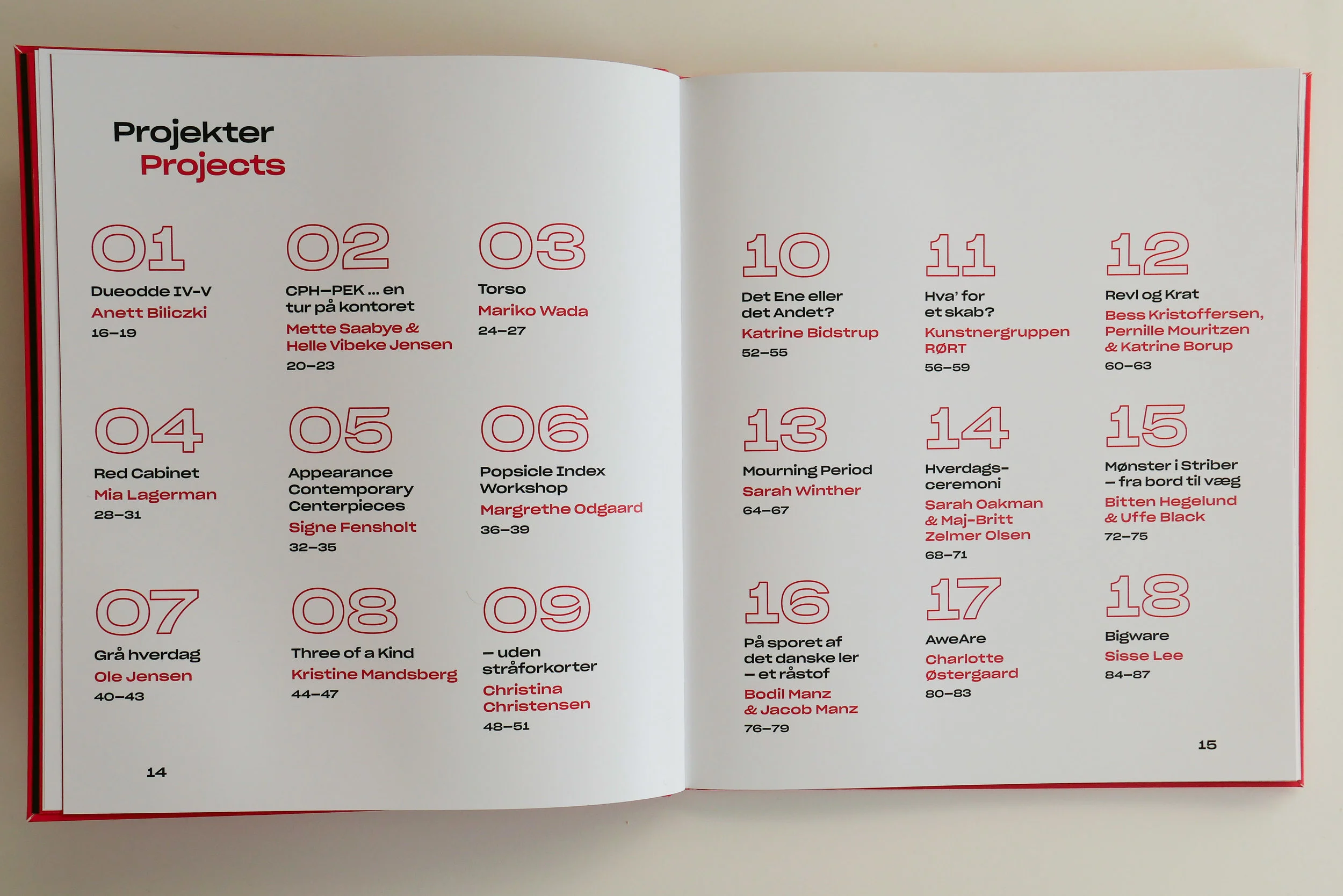
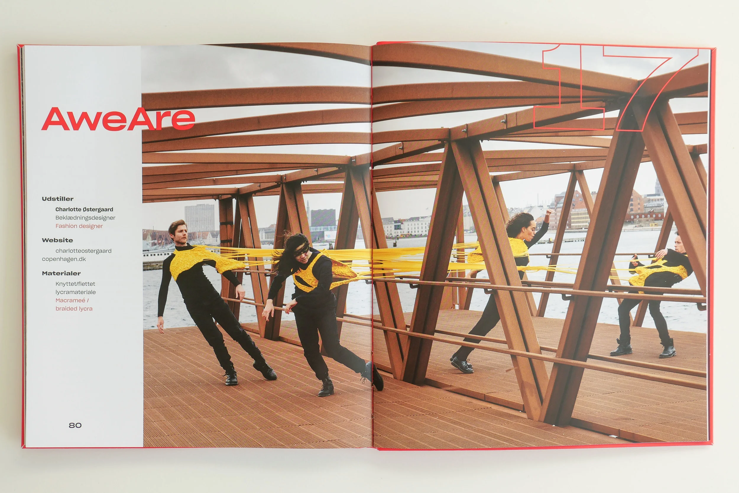
All eighteen projects in the biennale have a separate entry in the catalogue with photographs by Dorte Krogh.
Graphic design for the catalogue is by Rasmus Hetoft Hansen and the design is carried through into the graphics of posters and information panels in the exhibition with the use of bold red and the good use of colour to make reading the bilingual catalogue easier … so the reader quickly understands that they follow either the white or the black text on red or the red or the black text on white … not both.
The catalogue includes links to the web sites of the artists with information about materials; information about sponsorship and support for certain projects and a short synopsis for each project.
The Biennale exhibition for Kunsthåndværk & Design 2019 was shown at Nordatlantens Brygge, Strandgade 91, København K from 18 April through to the 5 May 2019


