Fællesskab anno 2019 / Community anno 2019

Catalogue for the Biennalen for Kunsthåndværk & Design / Biennale for Craft & Design 2019


The forward for the catalogue has been written by  Hans Christian Asmussen - designer and lecturer in design and on the board of Danske Kunsthåndværkere & Designere / the Danish Association of Craft and Design.

He discusses the growing importance of our sense of community and the eighteen projects chosen for the Biennale consider, in one way or another, our "notion of community - some with a critical voice, some in a playful tone, some tenderly, but all striving to explore the value that community offers."

This is about how artists, through their work, explore complex ideas, express what they feel and give the viewer reasons to think and reconsider by emphasising or challenging a view point or simply by shining a light on aspects of our lives that possibly we need to reconsider.


The catalogue has a longer essay on Community by the design historian and design theorist Pernille Stockmarr. She makes the crucial observation that with the frequent use of terms such as 'sharing economy', 'co-creation', ‘co-design', 'crowdsourcing', and 'crowdfunding', the concepts of community and cooperation have a strong and important relevance.

Historically, the concept of community is strong in Denmark with a well-established welfare state; a strong sense of family and friendship; a strong and ongoing role for the co-operative movement in retailing for food and household design and a strong volunteer movement through various sports and hobby associations.

In part, political change outside Denmark and the growing pressure to resolve threats to our environment has lead many to question what motivates us and those uncertainties make us reconsider our priorities and help us decide how we can move forward as local or wider communities.

How do artists and crafts people and designers respond to these changes as individuals and collectively? How can the concerns and thoughts of the maker or the designer stimulate a wider debate? Perhaps the greatest achievement of any work of art is that it can make us pause - hold our attention and encourage us, the viewer, to take stock,  question preconceptions and encourage us to reconsider and inspire us to change.

Pernille Stockmarr describes this as works that are open to the viewer's own interpretation.

How do we balance a sense of self as an individual and our sense of our community and the ability now, through recent technology, to build communities that are global rather than just local?

"The message that is being delivered by the makers at this biennale spells out a clear position on the issue of where community should be found and cultivated."

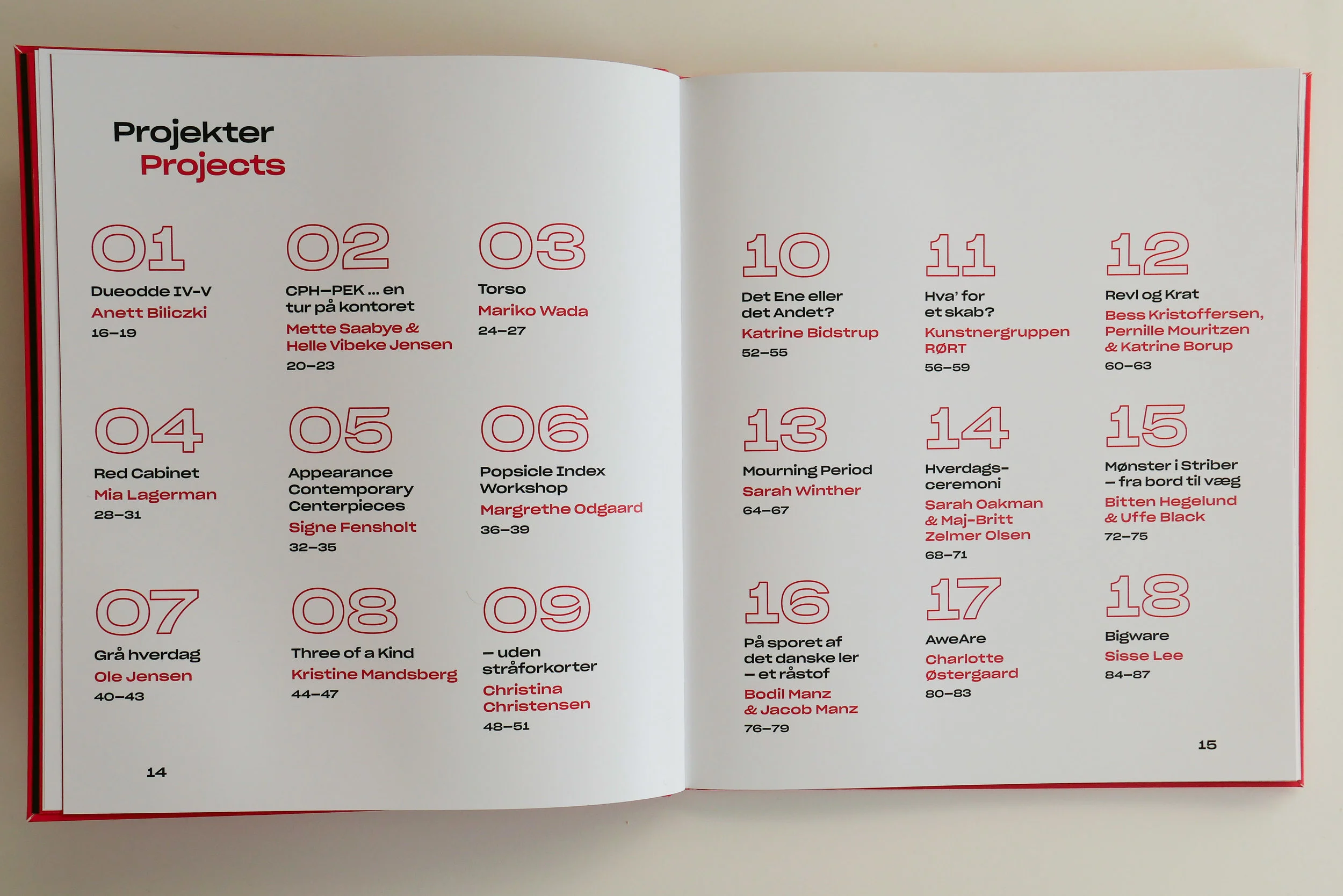
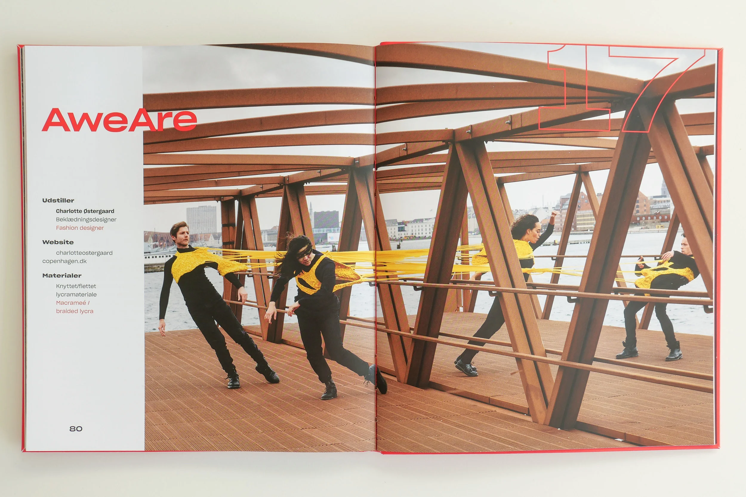
All eighteen projects in the biennale have a separate entry in the catalogue with photographs by Dorte Krogh.

Graphic design for the catalogue is by Rasmus Hetoft Hansen and the design is carried through into the graphics of posters and information panels in the exhibition with the use of bold red and the good use of colour to make reading the bilingual catalogue easier … so the reader quickly understands that they follow either the white or the black text on red or the red or the black text on white … not both.

The catalogue includes links to the web sites of the artists with information about materials; information about sponsorship and support for certain projects and a short synopsis for each project.


The Biennale exhibition for Kunsthåndværk & Design 2019 was shown at Nordatlantens Brygge, Strandgade 91, København K from 18 April through to the 5 May 2019


Anatomy of Colour


The Anatomy of Colour, The Story of Heritage Paints and Pigments,
Patrick Baty, Thames & Hudson (2017)

The Anatomy of Colour begins with types of paint - from distemper to lime wash to milk paint and more - and then Patrick Baty sets out the sources of pigment for those paints so through white paint, black paint and then on to each colour through the blues, the browns, greens, reds and yellows - so, generally, for each colour, he traces the development from natural pigments, from plants and minerals, to the by-products of emerging industries and then on to the first pigments by industrial chemists. 

Historic practices and techniques for house painters are discussed; there are fascinating reproductions of historic catalogues for the paint brushes and the tools of professional painters and the author looks at the early organisation of guilds and paint companies. However, for designers, the important contribution of the book comes from the extensive number of historic colour charts reproduced along with summaries of early colour theories and detailed discussions for each major period or each major style and fashion, that helps set historic design within the context of colour. He combines longer sections of text with carefully designed double-page spreads and uses longer captions effectively so you can sit and read the book cover to cover or you can use the book and its images as a reference encyclopaedia seeing where cross references take you.

We tend to describe styles and the relatively distinct periods of interior design in terms of the forms and types of furniture that were popular in a certain period and we also recognise distinct patterns that appear on furniture or are reproduced on textiles but certainly styles or periods can have distinct preferences for colours or, and more interesting, for the juxtaposition of certain colours. Even the choice of materials can be determined by what are fashionable or unfashionable colours so distinctly orange Oregon Pine was popular for a relatively short period and Formica was as much about having a wide selection of deep strong colours as it was about having a smooth clean surface for food preparation.

Reproductions from historic paint charts and books or articles about colour theories by contemporary artists and designers show how the presentation of colours and any general discussion about colour can influence our choice of colours for our homes. We may not even realise we are being influenced because, of course, although we feel now that there is almost infinite choice, what we see clearly here is that what designers select and what companies produce and make available and what they advertise all influence that choice.

It is absolutely right to describe this book as an anatomy of colour because, in a careful and scholarly way, the technical development of household paints and the theories of colour and the preference for certain colours in certain periods is dissected. It feels, in a good way, like sitting in an old-fashioned lecture theatre with high banks of seats to watch someone with skill take something apart, with care, to say now look at this … isn’t it fascinating … and this is how and why it works.


The Colours of Copenhagen


The Colours of Copenhagen
Bente Lange
The Royal Danish Academy of Fine Arts School of Architecture 1997 

The Colours of Copenhagen was published by the Royal Danish Academy of Fine Arts in conjunction with the School of Architecture in 1997. Generally, I only review books here that are recently published or at least still available but this is a very important work that really deserves to be reprinted. 

It sets out the history of architectural colour in the city, primarily through the 18th and the 19th centuries, and explains why the city looks as it does. There are a large number of illustrations with photographs of existing buildings as well as drawings produced for the book with colour wash showing their original appearance and a large number of historic drawings - views of buildings that have gone or buildings that have been altered. These illustrations show clearly how the look of the streets and squares has changed with changes of legislation and building regulations after a number of major fires in the city and also shows how both fashion and growing prosperity influenced the appearance of buildings in Copenhagen.

Some of the evidence for these changes comes from the detailed analysis of samples of historic paint taken from the facades and the book includes chapters on sampling and sections on pigment and binders and some technical information about cleaning or restoring the facades of historic buildings.

This was not the first book written on the subject of colour for historic architecture - John Prizeman wrote a book on English facades, Your House the Outside View, that was published in 1975 and there are several publications from the States including Paint in America, the colours of historic buildings, by Roger Moss published in 1994 by the National Trust for Historic Preservation in Washington and both cover similar ground in their respective countries - but the colour of the historic buildings is such an important part of the character and the quality of the street scape in Copenhagen that the work by Lange is of crucial significance.

The book puts the appearance of historic buildings in the city into a wider context of social history and explains why original colours are not just of academic interest but are relevant to the appearance of the buildings now and provides well thought through arguments and reasons for their preservation in the most appropriate and sympathetic way.