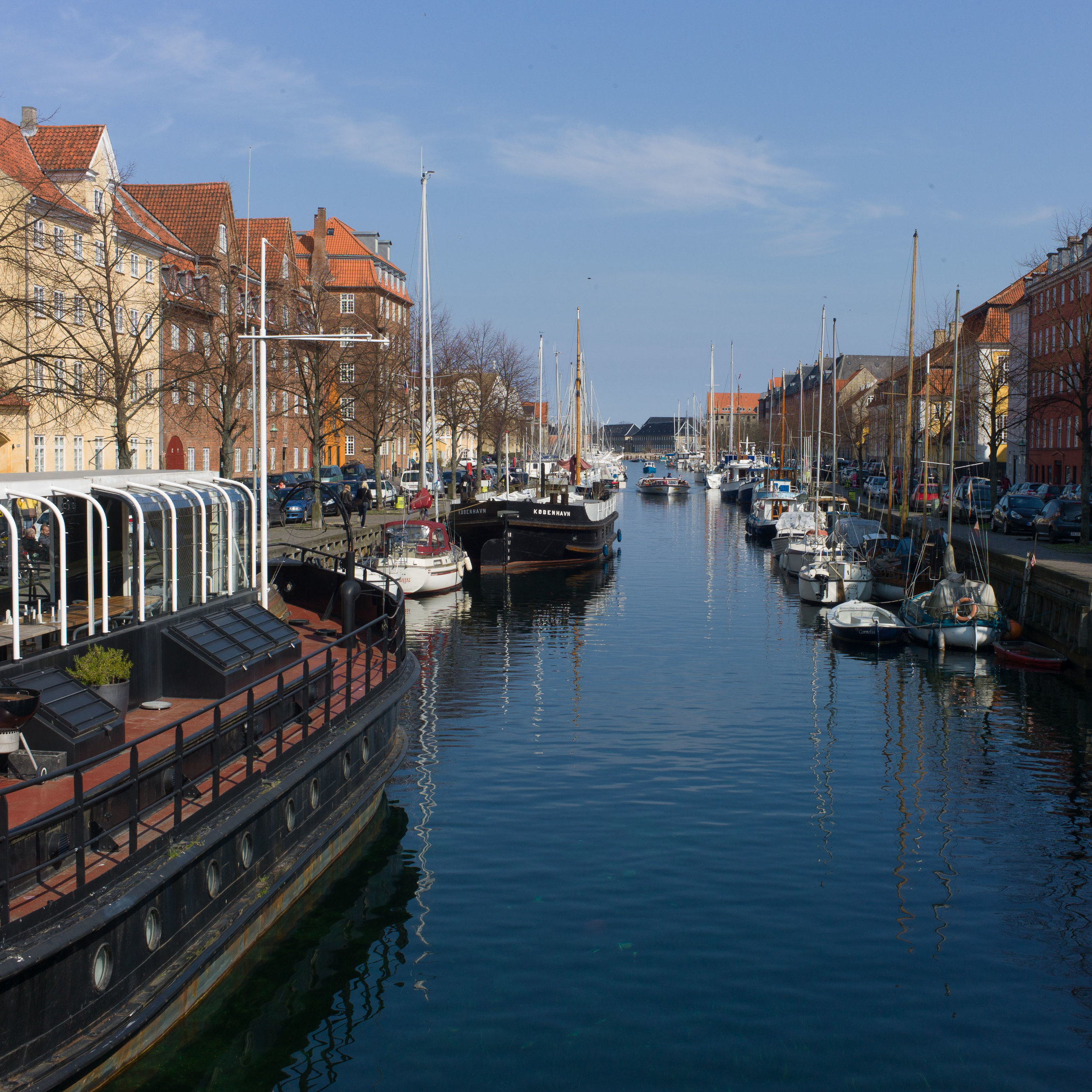
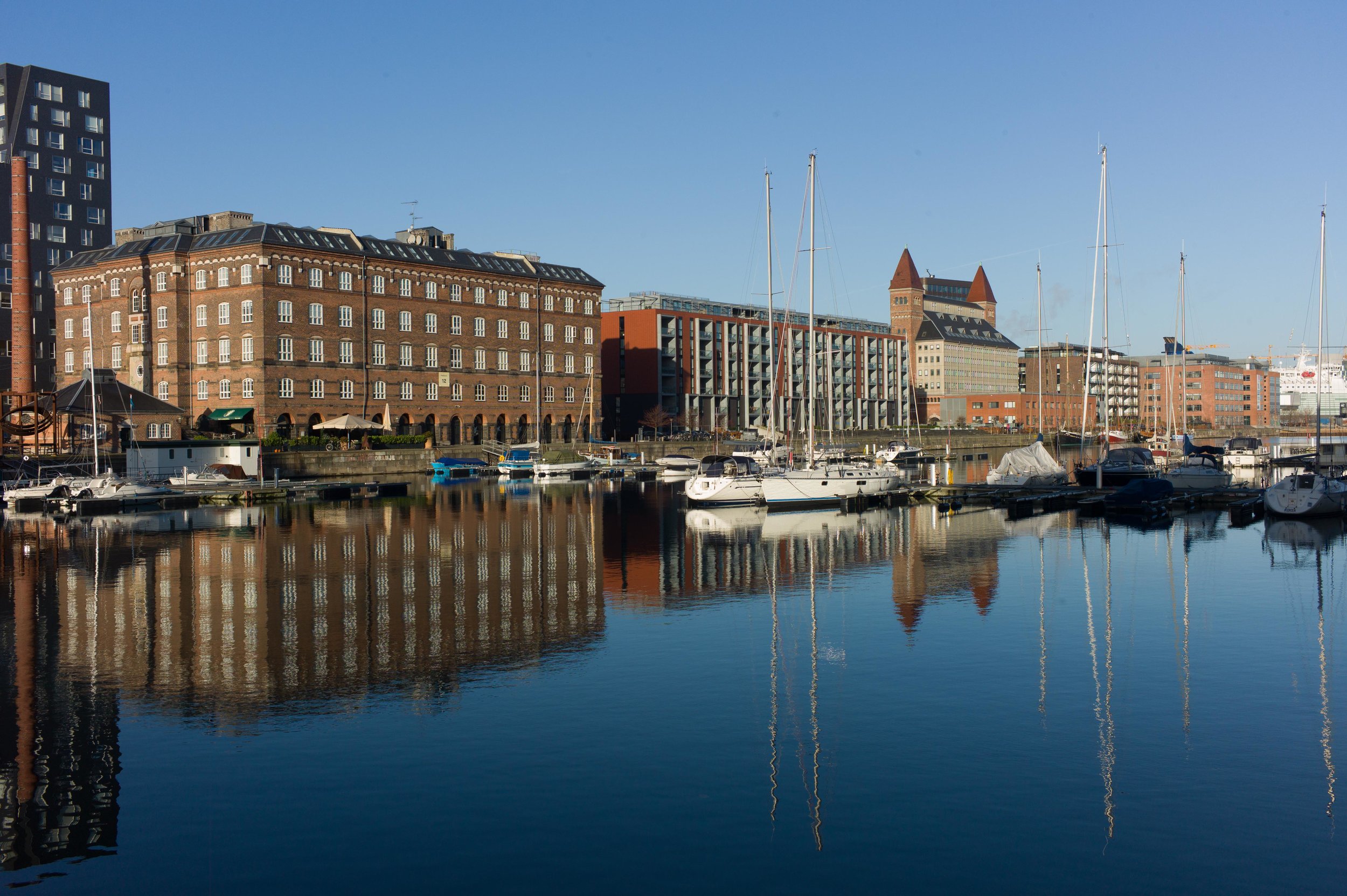
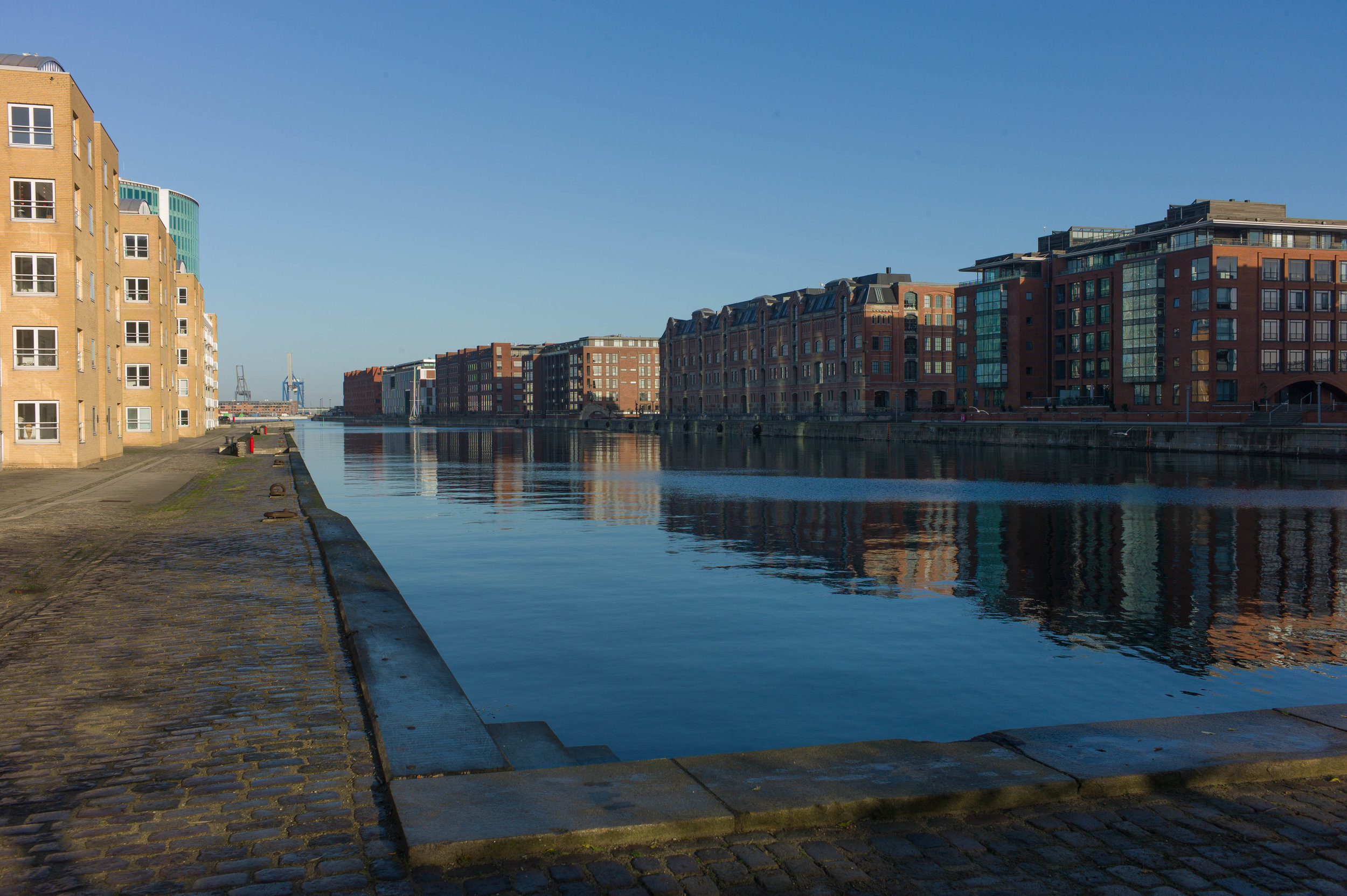
Recently I had the opportunity to meet the French designer and teacher Maud Jarnoux who was at Statens Værksteder for Kunst / the Danish Art Workshops on Strandgade where she has been working on a project inspired by the light and the colours of Copenhagen.
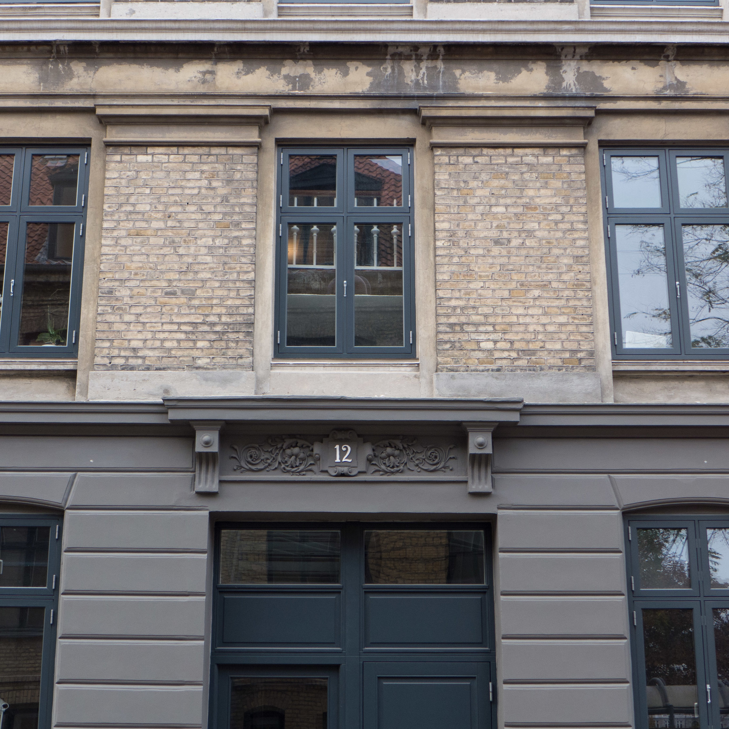
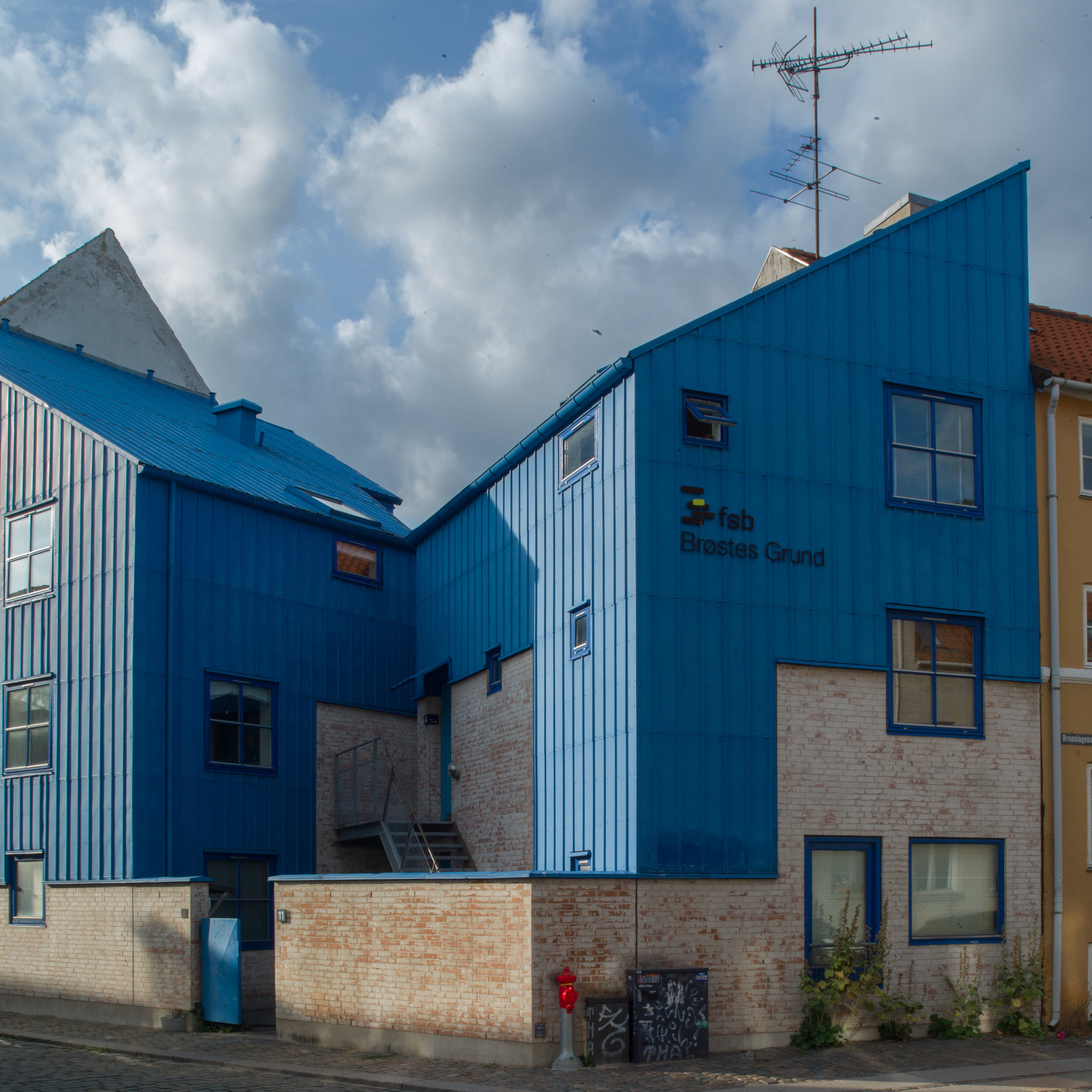
Walking around the city, she has sketched buildings and details of the architecture with annotations of the colours and matched those colours on site using pastels.
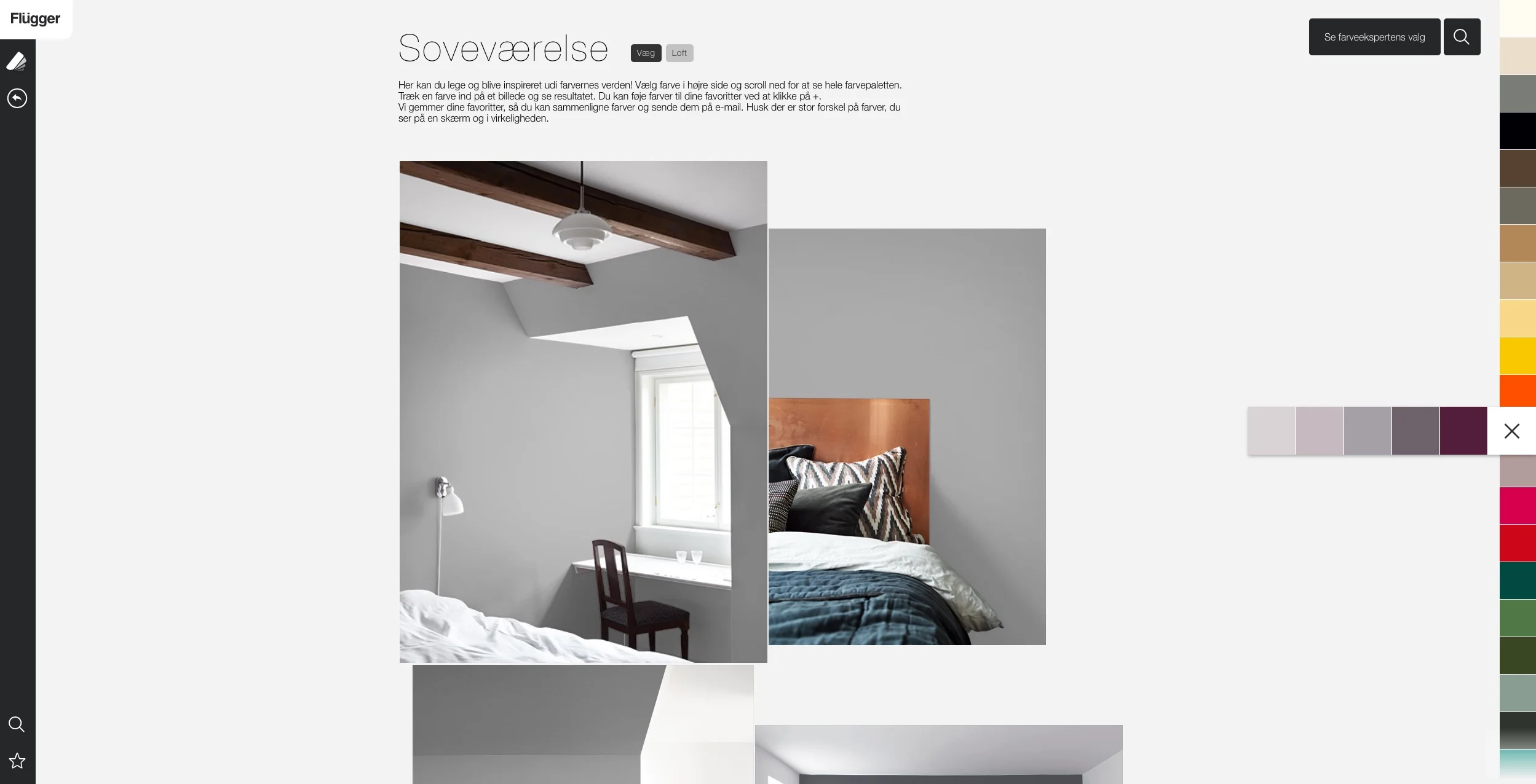
Back in the studio, those colours were matched in acrylic paint that was applied to sheets of thin card and again checked against small flakes of paint collected or checked against the notes and back out at the buildings.
Maud feels that the colours have not only changed over time - as fashions and paints change - but that colours also change from area to area and with the types of buildings and also with the light in different parts of the city that are reflected in subtle differences.
The next step, to me, seemed to be the amazing and incredibly creative and imaginative stage of the project.
Maud describes herself as a colour designer but she is also a textile designer. She cut the sheets of painted card into regular strips and these were then woven together in various combinations that were inspired by and reflect many of the colour combinations seen around the city on its buildings.
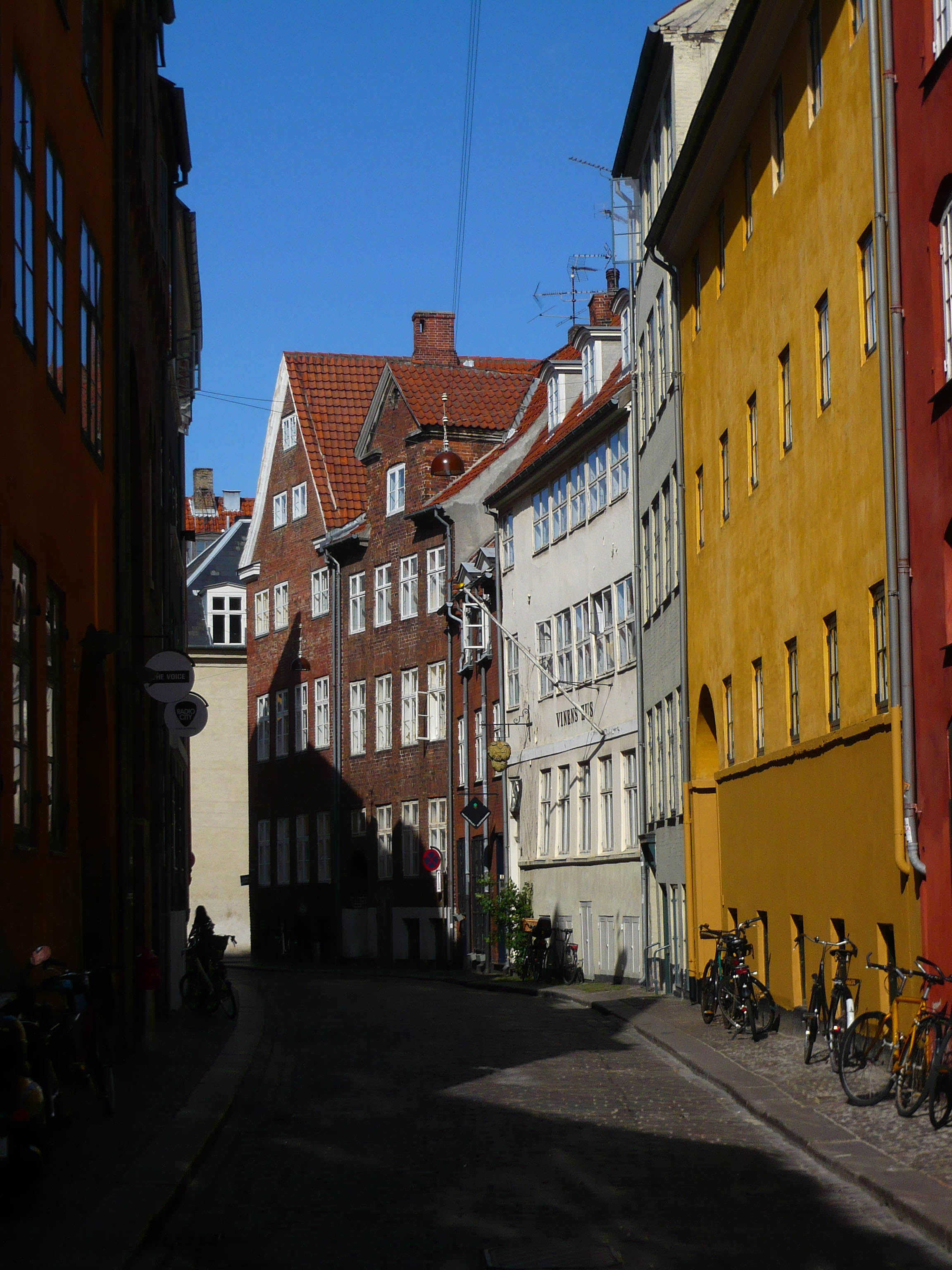
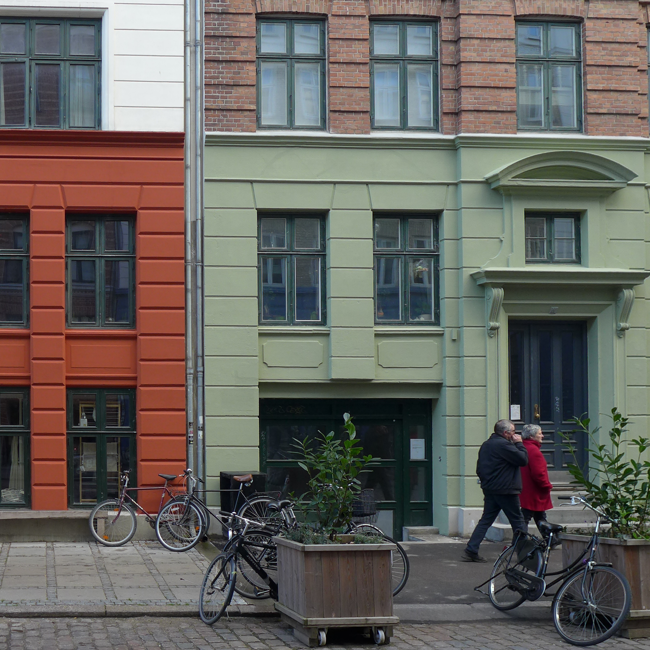
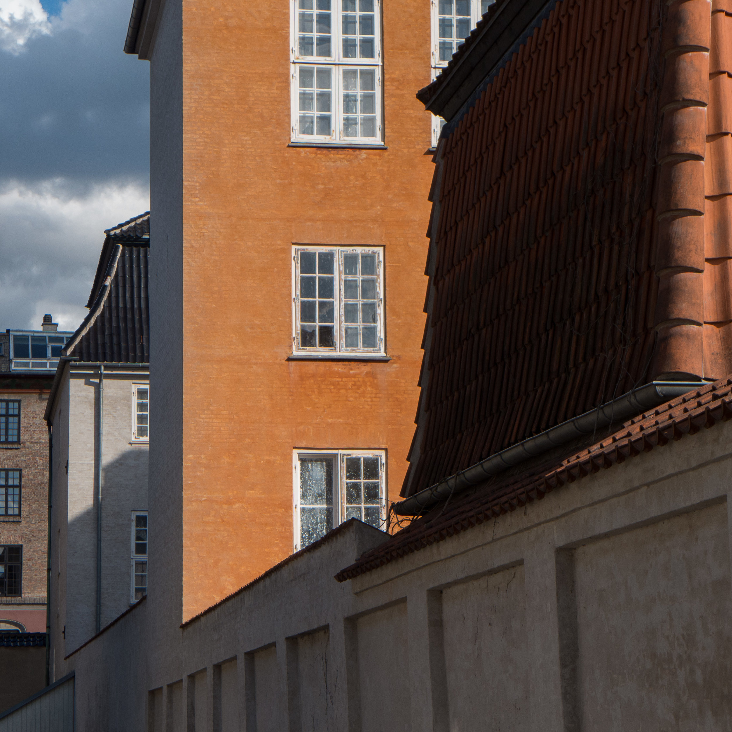
I have always been fascinated by the light in the city and in the colours of the plaster and the woodwork of the buildings and have got as far as appreciating that colour varies with the quality of the plaster or wood or stone. Uneven surfaces absorb or reflect light across a wall to cause distinct and often subtle changes in the density and quality of colours and - although Danes may take the work of Danish house painters for granted - the woodwork of doors and windows in the city, usually using linseed oil paints so with a matt finish, have a depth and a consistency and a quality of colour rarely matched in other cities …. but what this project by Maud Jarnoux did was open my eyes to strong and distinct combinations of colours in a single building: a deep warm pink on a wall combined with a gun-metal grey on woodwork or the range of deep green colours used for woodwork or stonework that is not actually a single consistent colour but a colour created by a range of often very different colours in distinct flecks or grain.
In a final stage, back in the workshop, colours were matched in linseed oil paint that was applied to split lengths of ash and these thin strips of coloured wood were woven together into large panels, using different weaving patterns and different combinations of colour, for what are, in essence, the weft and warp.
With woven fabrics it is the weave and the combination of different thicknesses of yarn and different colours that together create a texture and pattern and that controls how we perceive the overall colour and character of the textile. Here, that has been achieved with wood.
There is a link with the weaving of baskets and, in some cultures, the weaving of panels for walls and fences in willow or reed or split laths and other materials, with or without the bark stripped but this seems to me to be a truly remarkable and extremely imaginative project that makes us look again and reassess and appreciate anew the colours in the buildings around us.