Copenhagen warm


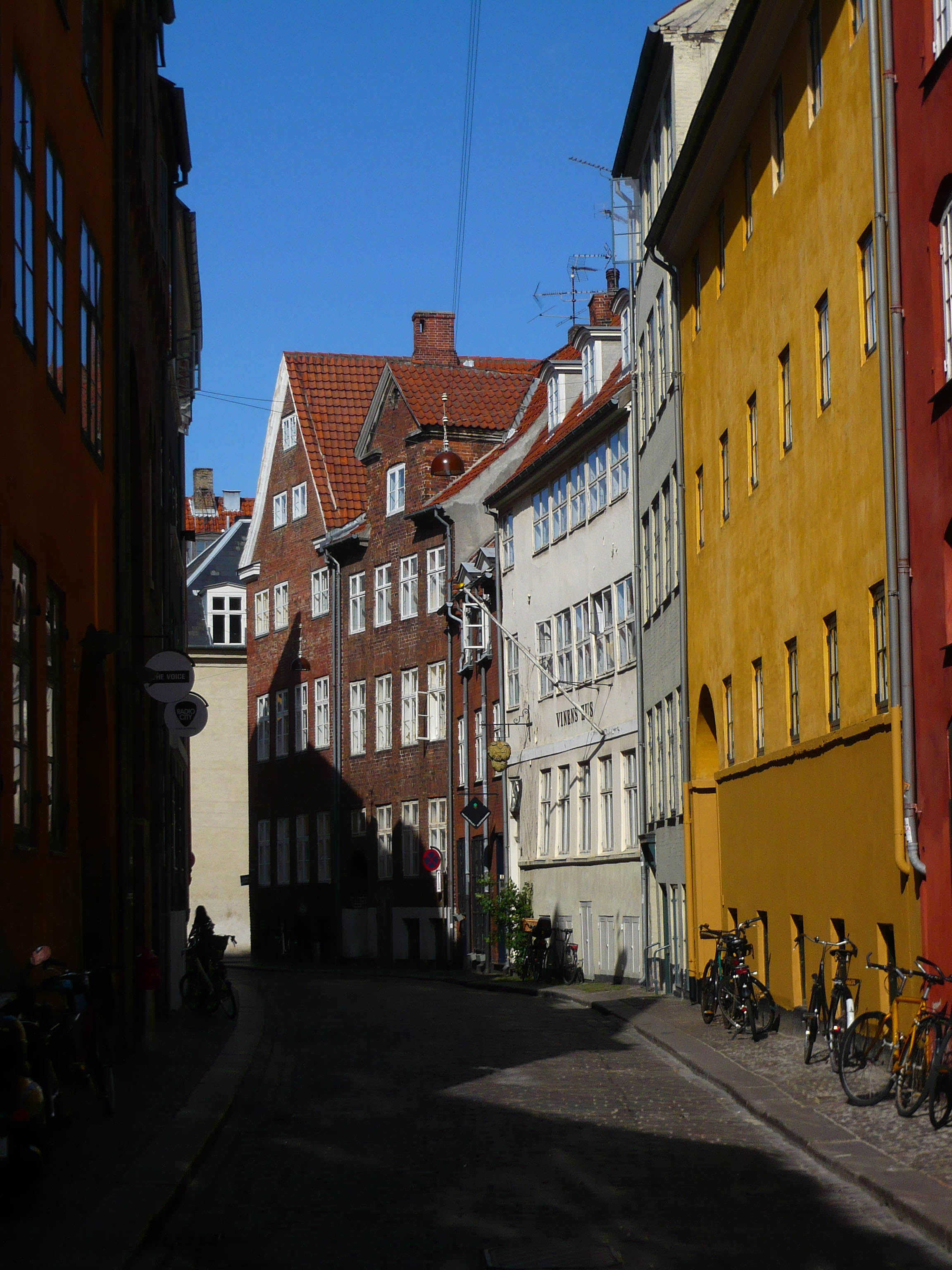
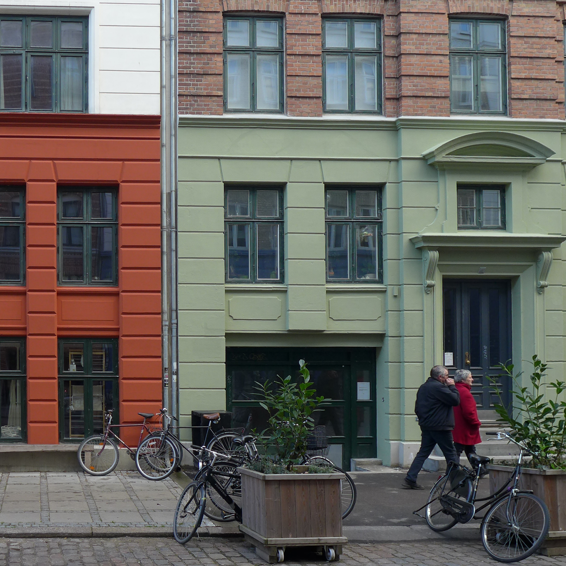
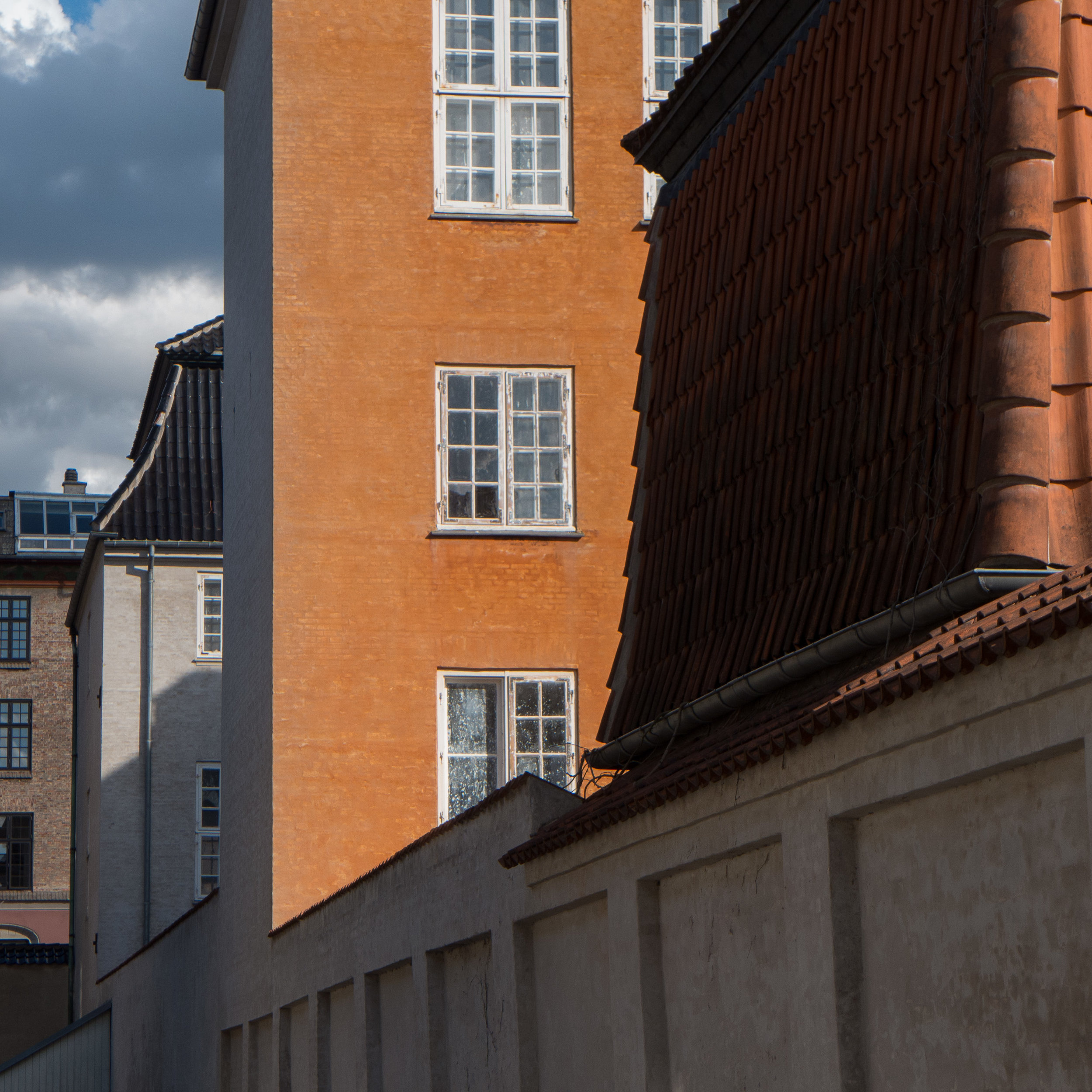
In the older buildings in the city, the palette of colours is warmer and richer … with stronger earth colours and more texture and more irregular surfaces because colour is laid over heavy plaster that is often repaired. The colour is not flat but less consistent less mechanical, richer and deeper. 


a zing of yellow in the city


In the city, the buses and the ferries are a very deep yellow and these provide a real zing of colour that moves across the urban landscape against the buildings or against the blue of the water along the harbour.

It's the depth of the yellow colour that is so striking. Is this egg yolk yellow? Certainly very little white so it's not a pretty yellow like a flower … darker and deeper than a daffodil but not as sharp and painful on the eyes as the yellow of oil seed rape flowers so the bus and ferry yellow is not a botanical colour so better described as mechanical … a chemical or mineral yellow.


subtle colour and soft tones in the city

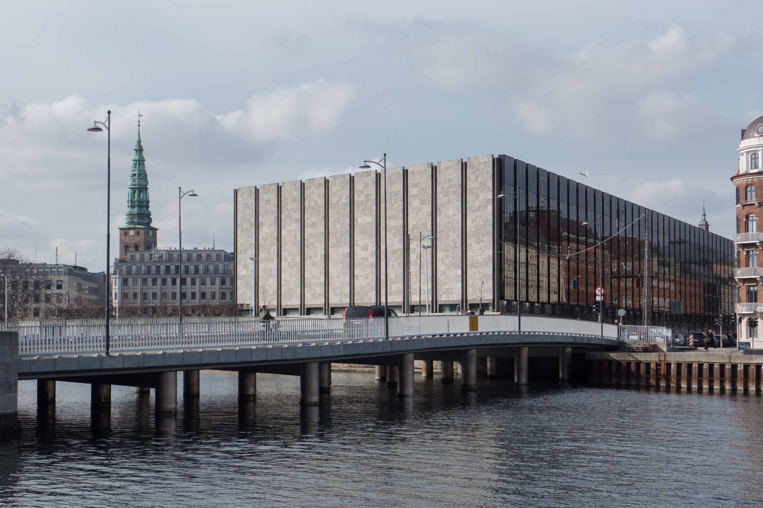
the entrance to the National Bank designed by Arne Jacobsen


Many of the buildings in the city use pale stone or pale marble or are painted and in subtle or subdued colours with tones of cream and stone and soft grey. 

Or maybe subtle is the wrong word - because the ochre of the Nyboder houses could hardly be described as subtle - but these colours provide a solid and a calm background to the life passing by and passing through these buildings. 

There are few sharp pastels, few day-glow colours, few sharp or acidic colours but toning down colour is not boring and nor is it a safe or an easy design option … it is possible to get it wrong, particularly when colours on neighbouring buildings do not work together … so going for a stone or grey or off white colour it's not a lack of design … very much the opposite because reducing the palette range means that the juxtaposition of tones becomes more important with darker or lighter tones defining architectural features by making some parts set back and some break forward in order to emphasise planes or emphasise details or pick out a pattern or carving or texture or moulding.


The east lobby of the Design Museum is a fantastic space that some people might, initially, find boring but it is like a quiet and carefully-constructed poem in tone and texture with subtle contrasts so juxtaposing smooth dark grey marble with the warmer, softer and broken textures of the grain of the wood blocks of the floor and contrasting those surfaces with the deep, matt wash of grey across the walls. This did not happen by accident but is the consequence of considerable thought and careful choice.

Even within the museum there are different sets of these tones. On the staircases flanking the entrance there are much greener tones in the soft sage colours of the stone flooring and painted handrail and dado of the woodwork of the staircase.  


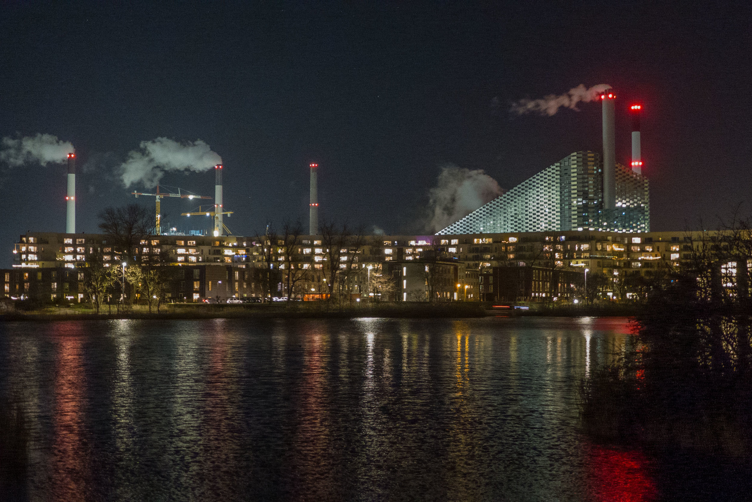
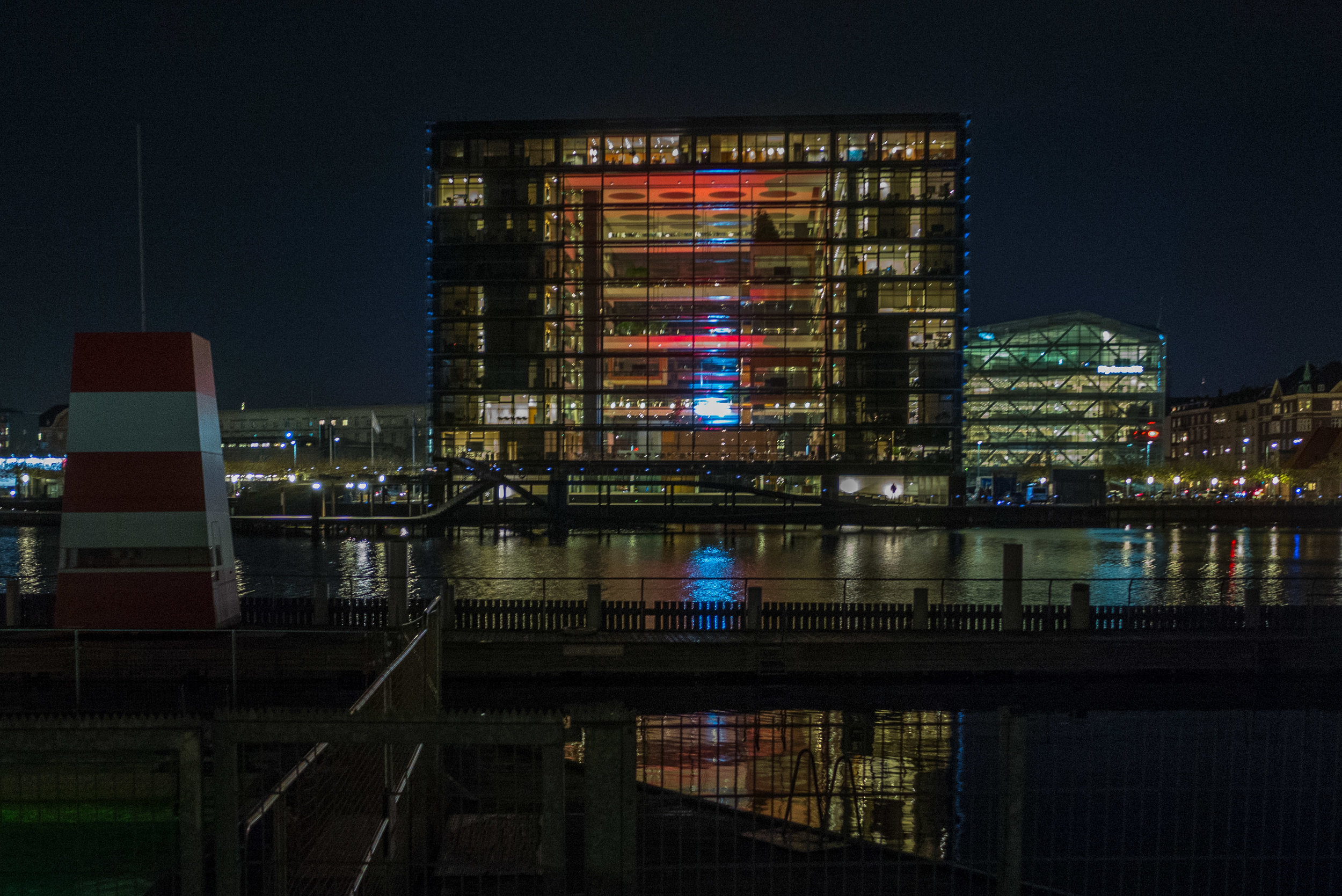
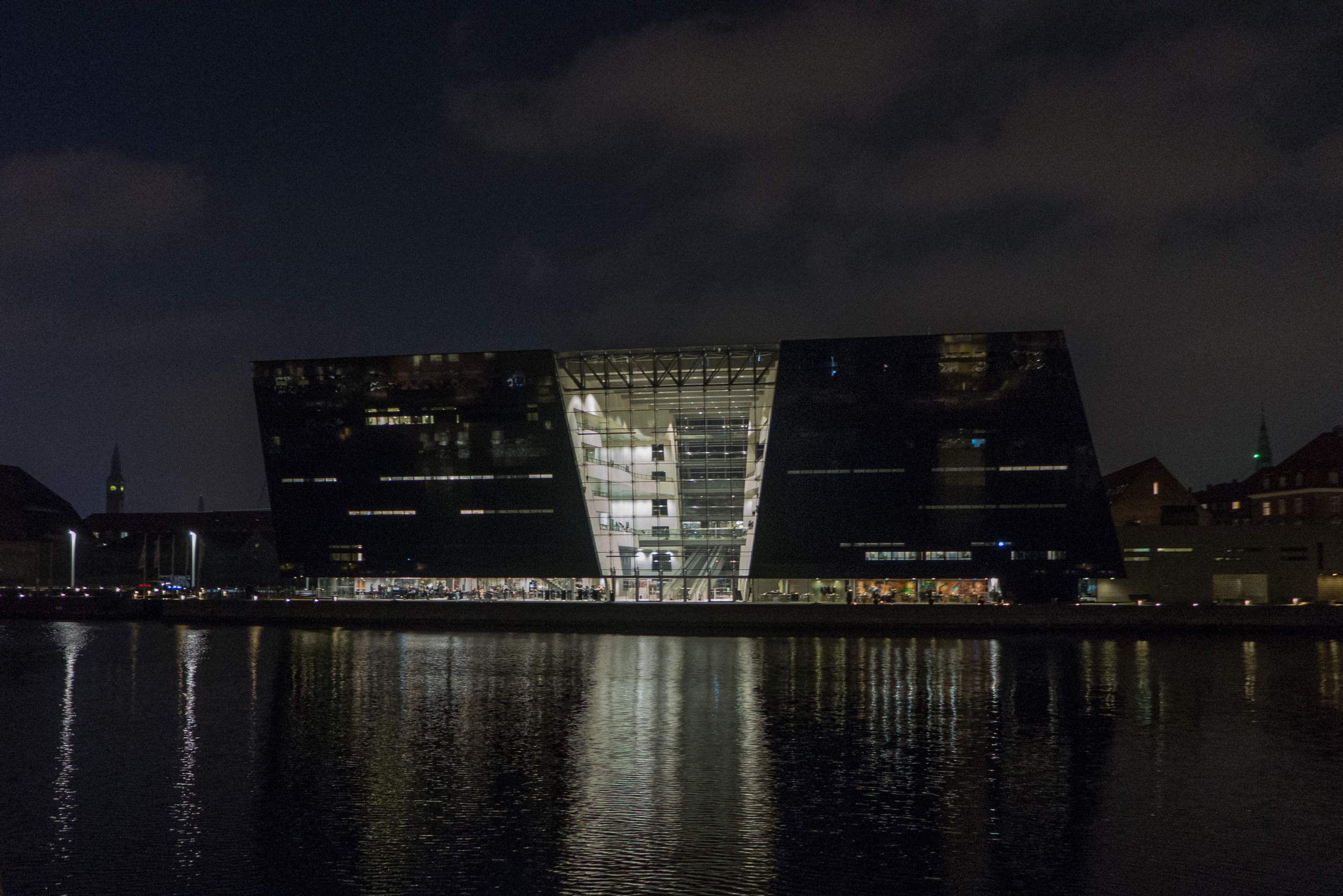
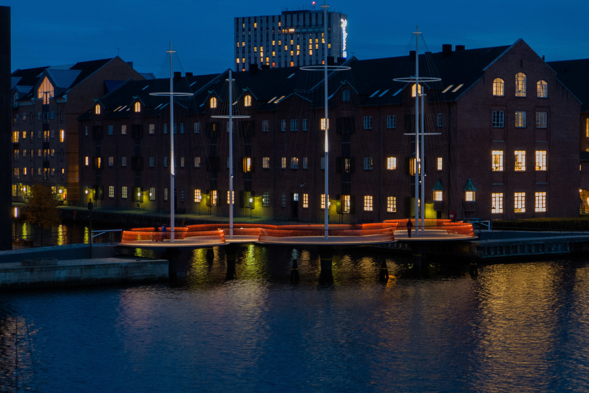
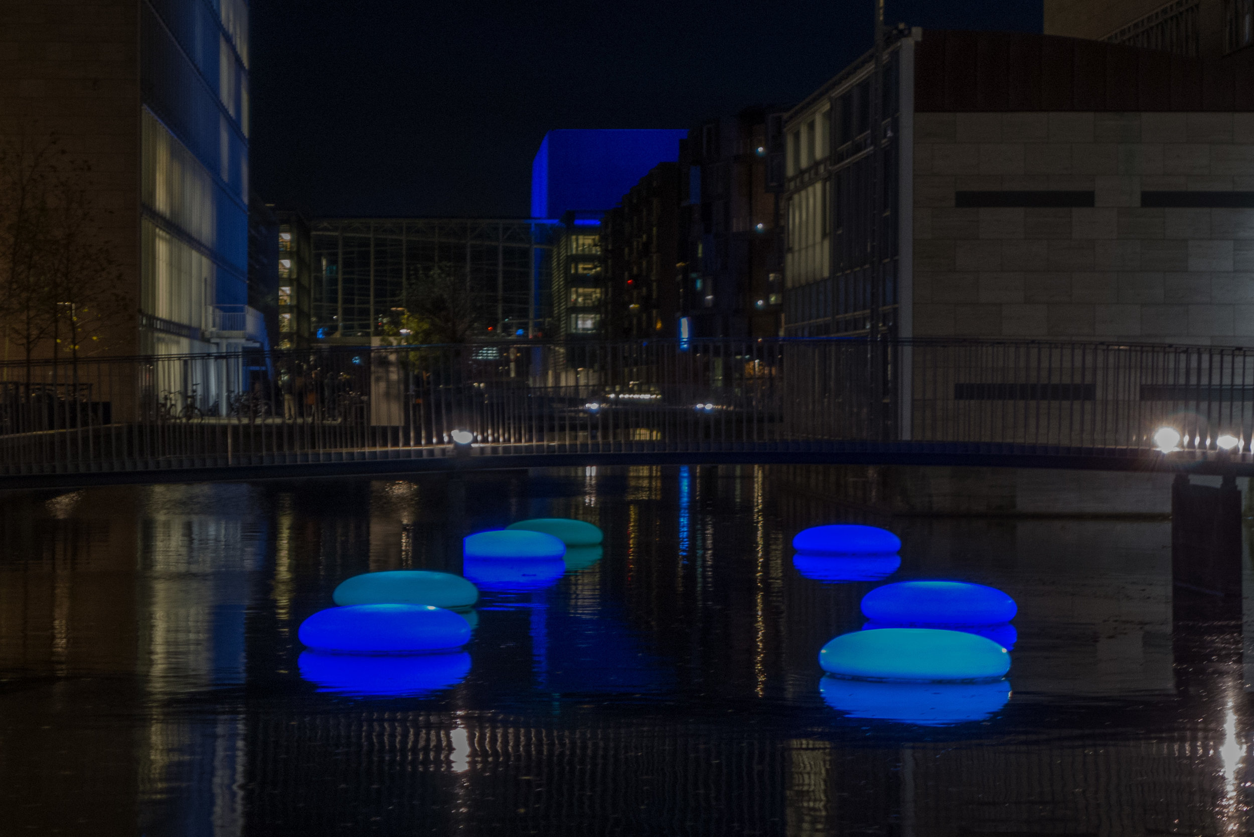
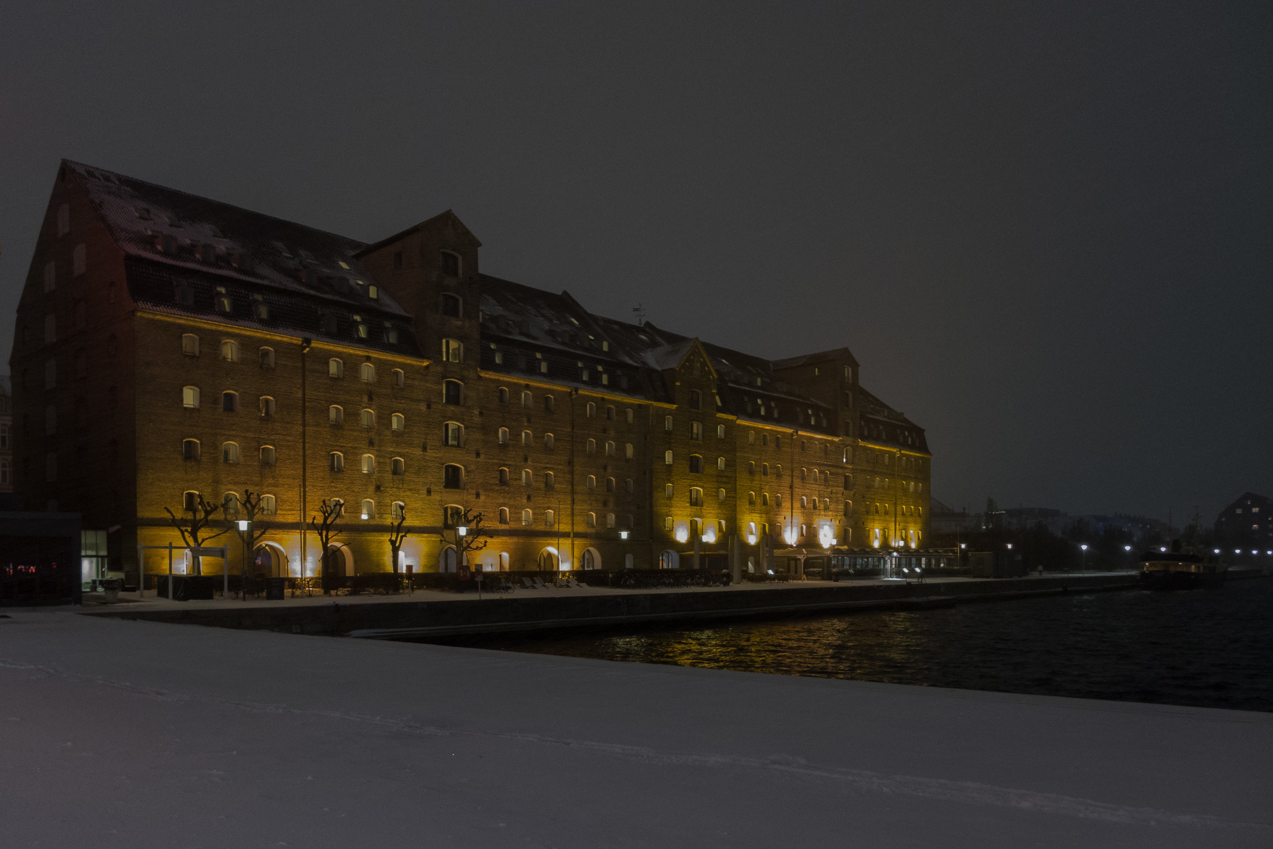
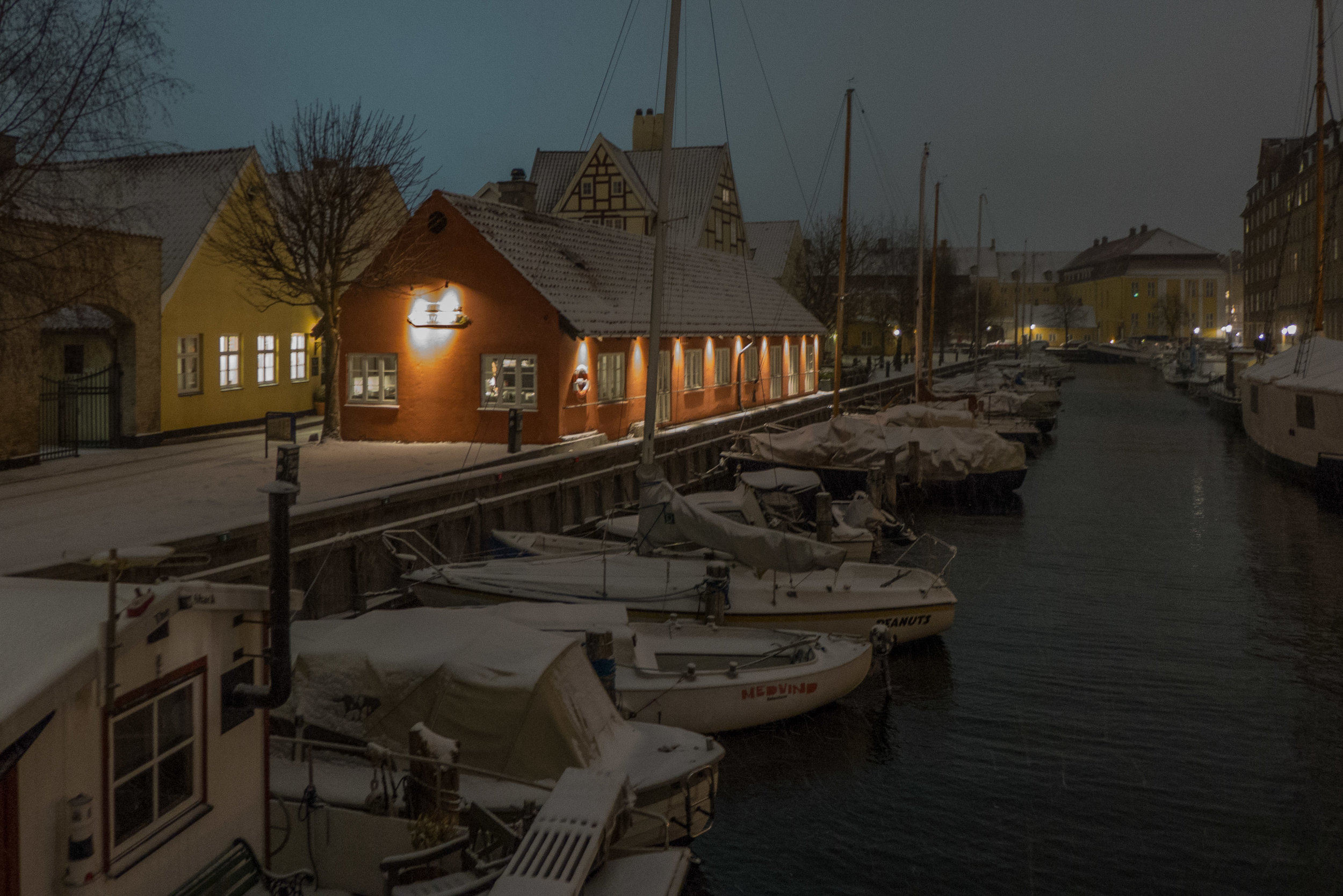
Copenhagen colour at night


Away from the main shopping streets, electric lighting in the city is kept low … that's both the level of light is surprisingly low and, generally, the height of street lights is low … a lot of lights are fixed to buildings at about first-floor level although in some streets some fittings for more general lighting are suspended from wires strung across the street but there are also various forms of low-level lights along footpaths and custom lighting on slopes and steps at ground level so light rakes across the footpath. On some paths and steps, there are even lights along or under handrails.

As the sun gets lower, the sky goes through violet and mauve colours that deepen to navy and then, as artificial lighting takes over, there are washes of colour - the colours of the bricks or the stone or the render - tailing off into shadows that mark or define many facades and for modern, glass-clad buildings, it is often at night that the interior arrangement of offices and staircases and walkways is revealed.

For a city where commerce is so important, there is surprisingly little advertising with neon lighting … so around the town hall square and along the street towards the train station, where it seems appropriate, and otherwise on a few major apartment buildings like those on the Islands Brygge side of Langebro or along the lakes where you can find the famous Irma hen laying eggs. 

Shop fronts are illuminated but signs are often painted and might or might not be spot lit for night time rather than being back lit.

So, for a large and densely-populated city, light pollution is relatively well controlled.

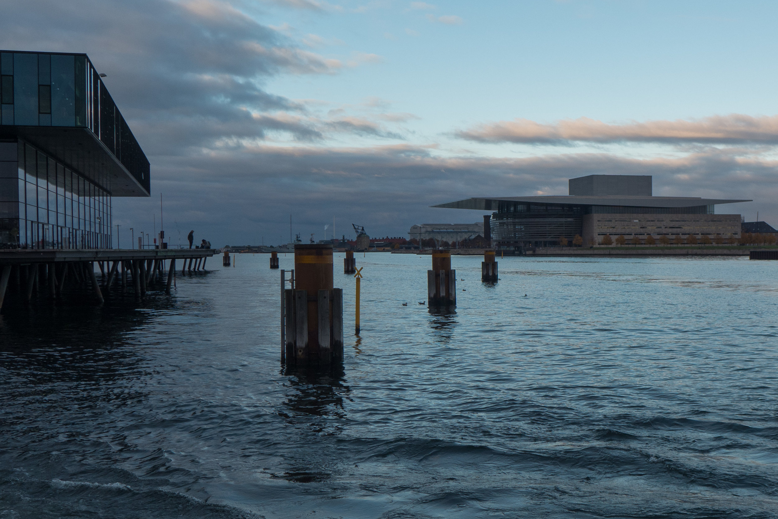
It is still possible to walk around the central harbour and see lights reflect up off the water sparkling with light from cars and from buildings and with the light from boats.

Another interesting Copenhagen experience is to walk through the residential areas and witness the Copenhagen 'no-curtains' habit. Talking to someone working in the design industry but who lived over the bridge in Malmö, she said one guilty pleasure she had was to walk around the city in the evening to look in through windows to see how people in the city live and how they furnish their homes.  


tripartite Shell Chair by Hans Wegner 1949

the Tripartite Chair now in the collection of Designmuseum Danmark


More often than not, when someone describes a chair as unique then it is either hyperbole or they are writing for an advert or a sponsored post ……

…. but the tripartite shell chair - designed by Hans Wegner and shown to the public at the Cabinetmakers' Exhibition in 1949 - really is unique because just one chair was made by the cabinetmaker Johannes Hansen and after the exhibition it was not sold but taken by Wegner to use in his own home - the design was never put into production.

Wegner had previously designed furniture with shaped and curved laminated wood for Fritz Hansen - Chair FH1936 and a bench or sofa version FH1937 and the tripartite chair was not the only chair in plywood in the 1949 exhibition because Børge Mogensen, Wegner's colleague and friend, also showed a shell chair.

Although the form of the tripartite chair seems simple - a wooden frame with three separate pieces of laminated wood that are shaped and curved for a seat, back rest and head rest - it is difficult to describe the shape of the chair and almost impossible to describe the frame that supports that seat, back rest and head rest.

read more

Ax chair by Peter Hvidt and Orla Mølgaard-Nielsen 1947

Ax Chair in the permanent collection of Designmuseum Danmark in Copenhagen


This is an interesting chair because rather than forming a plywood shell, it uses laminated and moulded wood for the chair seat and the back rest that are supported between frames of laminated and bent beech in a form but not a style reminiscent of the chairs by the Finnish architect Alvar Aalto from the 1930s.

The Ax series that included a number of chairs and tables was some of the first Danish furniture to be made after the War that was aimed specifically at the export market. Many of the pieces were designed so that they could be packed as parts and then assembled at the destination and in the 1950s furniture made in Denmark in more expensive woods such as teak or mahogany tended to be exported rather than sold to the home market.

Two chairs were made in this form - one narrower, the height and width for a traditional dining chair, and this design wider and lower as an easy chair.

read more


Trinidad Chair by Nanna Ditzel 1993

Trinidad Chair in the permanent collection of Designmuseum Danmark in Copenhagen


The Trinidad Chair is one of the most distinct and most unusual of modern Danish chairs made in plywood. It was designed by Nanna Ditzel and was given that name because the fretwork of facades in Trinidad, seen by her on trips to the island, had been the initial inspiration for the design.

read more

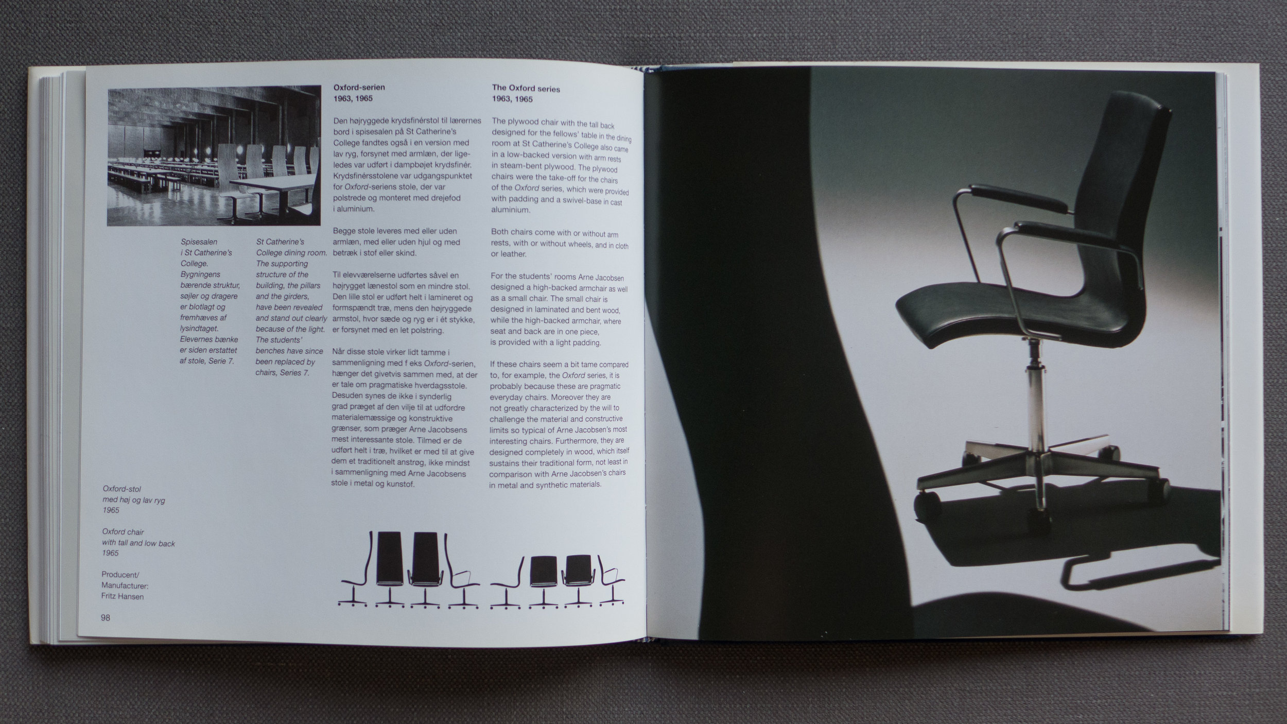
Arne Jacobsen Arkitekt & Designer


Arne Jacobsen Architect & Designer, Poul Erik Tøjner and Kjeld Vindum, Dansk Design Center 1999.

Normally reviews here are for books that are still in print but this is a really good general introduction to the buildings and the furniture and fittings that were designed by Arne Jacobsen and it can still be found second hand.

It was published by the Danish Design Center to coincide with a retrospective exhibition.

The format is interesting with the pages 240mm wide by 229mm, when bound and trimmed, so a double-page spread is almost a double square.

Those double-page spreads are used well with most covering a single building or single theme and with the use of whole page images and the use of bleed off to good effect.

There is a good use of black and white photographs including historic images. Of course black and white photographs were more prolific in book production to control print costs but black and white images can also have distinct qualities in high lighting shape and form where sometimes colour can be a distraction and for many buildings black and white images heighten the drama of a space … often by bringing stronger emphasis to lines and edges.

All text and captions are in both Danish and English but used cleverly in columns with captions either stacked in a singe narrow column or actually divided to the margins of facing pages if appropriate so this is fairly subtle and you rarely have the impression that you are reading half a book.

There are a number of interviews that are spread through the book but distinguished by being printed on a pale grey paper. These provide a real insight into the working practice of Jacobsen from people who worked with the architect and many who worked with him over many years and on many projects.

These include Erik Olsen and Ove Hansen - who had worked with Jacobsen on the lighting produced by Louis Poulsen - Hansen was the chief engineer for Louis Poulsen - Verner Panton who worked in the Jacobsen design office - M Folmer Anersen who was the engineering consultant on several projects and Henning Simony who worked for Novo and collaborated with Jacobsen on the buildings he designed for the company.

Sandor Perjesi was a sculptor who worked with Jacobsen on the full-sized plaster models for the chairs for the SAS Royal Hotel and Peter Lassen worked on project development with Fritz Hansen and there are interviews with the men who worked with Jacobsen on the design and construction of St. Catherine's College in Oxford including Lord Bullock and Jack Lankester from the university and Knud Holscher who managed the project on site in Oxford.

There are some fascinating revelations that focus on Jacobsen's approach to design and work methods so for instance building projects were presented to clients with beautiful water colour drawings - several books of Jacobsen's water color paintings and studies from nature have been published - but furniture designs started with a small and often very rough sketch and then evolved through a series of models from the workshops of the companies that were then edited by Jacobsen and sent back for revisions … often many and many small revisions.

Niels Jørgen Haugesen, worked with Jacobsen on a chair design using plaster models in the same way that Jacobsen worked when he was designing The Egg and The Swan. He makes the brilliant point that Jacobsen taught him "about form; about the link between eye and hand - about seeing a piece of furniture both as sculpture and a functional object." (see page 108)

In several interviews it is stated that Jacobsen could be very critical and was very certain about what he wanted but was usually right and several designers make the point that few of his designs were unique or revolutionary in their initial conception but that he was very clear about how a form or a technique could be developed and how in that process he imposed his specific and personal aesthetic. It is also clear that, although many might assume that he completely controlled projects from his design office, that was not done by doing everything himself or by not letting things go but by either inspiring or demanding loyalty. Perhaps on major projects like the SAS Royal Hotel or the National Bank in Copenhagen, that was the only way that so much could be achieved in a relatively short time … was Jacobsen like Leonard Bernstein … a composer but also a great if difficult conductor?

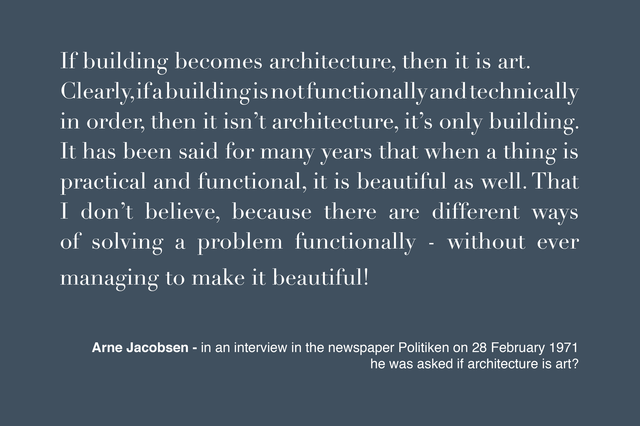
The book ends with an interesting text from an interview with Arne Jacobsen that was published in the newspaper Politiken in February 1971 … interesting because Jacobsen rarely talked at length about his work and rarely talked about theory or aesthetics and this was published just a month before his death.

There is also a short bibliography and a useful chronological list of works that incorporates basic biographical information.
shell chairs in laminated wood by Arne Jacobsen

Ant Chair 1952,  The Tongue 1955,  chair model 3105 for Munkegård Elementary School 1955

Series 7 1955,  Side Chair 3103 from 1955,  Grand Prix 1957 ... all in the permanent collection of Designmuseum Danmark in Copenhagen


Looking through recent posts on this site about Danish chairs from the 20th century a major and obvious omission from the list are the shell chairs in laminated wood that were designed by Arne Jacobsen in the 1950s.

It was an amazing and productive decade for the architect when he was working on major buildings but still designing housing. Work on Munkegård Elementary School in Copenhagen started in 1951 and was completed in 1956;  the Town Hall in Rødovre was completed in 1956 and the Town Hall in Glostrup was completed in 1959. Jacobsen designed major commercial and industrial buildings in this period - including an office building for A Jespersen & Son in the centre of Copenhagen - where work started in 1952 and finished in 1955 - the Christensen factory in Aalborg and a pharmaceutical factories for Novo Industri A/S in Copenhagen and for a new site at Bagsværd to the north of the city centre and from 1955 through to 1960, Jacobsen was working on the SAS Royal Hotel in Copenhagen.

He designed several major housing schemes in that same period with both the Alléhusene housing complex and the  Jespersen row houses built in the area close to the railway station at Jægersborg - a growing suburb in the north part of Copenhagen where Jacobsen had designed housing in the 1940s - and there was a second phase of building on the coast  at Klampenborg - with the Søholm houses built just south of the Bellevue theatre and the Bellavista apartments that Jacobsen had designed in the 1930s.

For prestigious public buildings Jacobsen designed specific, custom-made, furniture but he also worked on more commercial designs with a growing demand for modern, well-designed furniture for the home. Jacobsen designed a series of shell chairs in laminated wood in collaboration with Fritz Hansen - the well-established Danish furniture manufacturer - that could be used in commercial and public buildings but were also increasingly popular for use in ordinary homes.

These chairs included model FH3100 known as the Ant Chair that was designed in 1952; model FH3102 or The Tongue - a small chair for children designed originally for Munkegård School in Copenhagen but later made in a larger version; from 1955 model FH3105 - another chair produced for Munkegård - and from that same year model FH3103 with a more pronounced curve between the seat and the back with a broader and deeper and squarer upper part to provide better support for the lower back and the shoulder blades.

The Series 7 - model FH3107 - the most famous of these laminated chairs - also dates from 1955 and is still the best-selling chair produced by Fritz Hansen.

Then, last in this series of shell chairs, the Grand Prix - model FH4130 - designed in 1957 and made in several versions.

The form of these chairs - with a moulded shell in laminated wood - divides them - visually and, in terms of construction and manufacture, into two distinct parts with a seat and back to the chair in one material - the shell in laminated and moulded wood - and a base or support that was made separately in another material.

This clear division of the production process could be exploited because it allowed the manufacturer to make different versions of a chair by providing options for distinctly different bases that changed not just the character of the chair but often also the way that the chair was used and where it was used …

  • most of the chairs could be purchased with thin metal legs that were bent under the shell and held in place on a fixing plate. These legs were compact and light in weight so the chairs could be used in a house or in a small apartment as a dining chair or a general chair
  • for several of the designs, there was an option for a support of legs in bentwood if a customer preffered a chair that looked more traditional
  • nearly all the chairs could be stacked and, although they were light, they were surprisingly robust, and came to be used in offices and canteens and meeting rooms
  • for several of the shaped and moulded chairs, there were options for a single vertical metal column that could be fixed in tiered rows for seating in a lecture theatre
  • most of the chairs had an option for a cross-shaped metal base, usually light-weight aluminium, that could be fitted with a swivel mechanism and/or castors for use at a desk so they could be used as an office chair
  • and - most unlikely of all - the simple and compact shell of the Tongue chair, designed initially as a chair for a child, was upholstered in leather and set on a high fixed metal column with a swivel mechanism for a bar stool at the SAS Royal Hotel.

These chairs are deceptively simple but, in production, the moulding process presented challenges.

The chairs that were designed by Alvar Alto and manufactured in Finland from the 1930s were the first Nordic designs to exploit the properties of laminated and moulded wood in the commercial production of furniture. The layers of wood veneer were curved into different forms under pressure so the shape was 'remembered' when the wood was taken from the press but although those chairs by Alto had the seat and back from a single piece of laminated wood, the curve was in one plane so that it formed, in effect, a scroll.

Trying to mould the laminated wood into more complex curves, either hollow or convex and in both directions across the shell, Fritz Hansen put the material under considerably more stress.

The challenges might seem to be relatively simple …

  • to use the thinnest possible gauge of plywood to stop the piece from looking crude or being heavy
  • to source high quality, unblemished and even or consistent veneer … plywood for construction can have patches or uneven colour but for these chairs the shell was just sanded and finished to maintain the natural qualities of the timber so a good or an interesting grain pattern can also be important
  • to bend as sharp a curve as possible between the seat and the back without the facing layers of the finished shell delaminating - so folding on the inner face of a curve or splitting on the outer face
  • to create complex curves that were hollow or concave front to back - so it was not like sitting on a plank - but also curved across the width, so from side to side which, in effect, anticipates the curve under the weight of a person sitting down - to avoid that feeling of it sinking in like sitting down on, or rather, in a canvas chair
  • to create those complex curves without cutting into and overlapping sections of the shell
  • to develop ways of fixing the thin shell to any form of leg or support … you cannot fix a leg unit with screws through the leg and straight into the shell from below, because the shell is too thin, but if you fix screws or bolts from above, driven down into the leg or base, then those are exposed and you would be sitting on the screw or bolt heads

On that last point, the first version of the Grand Prix had four L-shaped and moulded leg pieces stuck to the underside of the shell with a glue developed for that purpose but, I presume, under stress, the glue delaminated the facing layer of the shell so in later versions the design was changed to a cross-shaped and self-supporting framework of legs that was fixed to a plywood plate at the centre of the underside of the seat in a similar way to the fixing of the metal legs.

For comfort, there must have been extensive trials to adjust the flexibility of the shell and the strength, weight and flexibility of the legs or base - particular where the chair has legs in thin bent tube metal. Too flexible and the chair would feel unstable but too rigid and it would be like plonking down on a park bench. The chairs also use rubber spacers or buffers set further out from the centre fixing plate to hold the legs free of the shell; provide some control to the flexibility of the shell and also stop the legs torqueing or twisting or shifting round.

L1170907.jpg

The view of the underside of a Series 7 Chair shows just how complex and how subtle the design of the shaping of the metal legs is with the cross pieces of the legs under the seat protruding beyond the edge of the seat - so that the chairs could be stacked - and with the metal curved downwards towards the centre to follow the shape of the moulded seat rather than sitting against it. The legs are also angled outwards - rather than being set vertical - which in part makes the chair appear lighter and more elegant - strictly vertical legs can look basic or stolid - but also provides extra stability for a light chair.

There is an interesting but more general point about the shell chairs designed by Jacobsen and made by Fritz Hansen. We are now so familiar with major Scandinavian design companies like Muuto or Normann producing chairs with a range of bases and a range of colours and covers along with options for plain shells or upholstered versions, that we no longer see that as unusual - or, actually, we take that for granted because we expect a number of options when choosing a design. Before these chairs were produced by Fritz Hansen in the 1950s, chairs were designed as a complete or self-contained entity with production in relatively small numbers but, if there were options or variations, it might be that a different material could be used for the frame - so asking for a chair to be made in mahogany rather than oak for instance - or would be limited to selecting leather rather than textile for an upholstered chair.

At most, the scale of a chair might be adapted for a later version so Rud Rasmussen produced the Red Chair designed by Kaare Klint in a smaller size as a dining chair where the original, was wider with more generous proportions, designed for the meeting room at the Design Museum. Chairs like the Thonet Chair from Austria, produced through the second half of the 19th century, was made in large numbers and was made to be transported in parts and assembled on delivery but that was unusual and there were different models or different styles but no options within each type of chair. Several of the chairs designed  at the Bauhaus were conceived as relatively cheap furniture of a high quality of design for a large market but politics and events overtook their wider marketing and Alto, through the company Artek, certainly understood the commercial potential of marketing and international sales but it was the American company Herman Miller, marketing the designs of Charles and Ray Eames, and Fritz Hansen marketing the designs of Arne Jacobsen who really established the potential for large-scale production of well-designed furniture in the years through the late 1940s and the 1950s.

Republic of Fritz Hansen

note:

Shell chairs for the SAS Royal Hotel in Copenhagen - including the Egg and the Swan - were designed in this same period - in the mid 1950s - but were made in foam and upholstered so presented different problems and resulted in a very different aesthetic so they will be the subject of a separate set of posts.

FH3100 / Myren / The Ant Chair by Arne Jacobsen 1952

Ant Chair in the permanent collection of Designmuseum Danmark in Copenhagen


The Ant Chair was designed for the canteen of Novo Industry - the pharmaceutical company - or rather - the story is that Arne Jacobsen had designed the chair but Fritz Hansen were not convinced that it was viable commercially. When a director from Novo visited the drawing office to discuss work on the design of new buildings for Novo and admired the chair, he asked Jacobsen about the design. Jacobsen told him it was for the canteen at the new factory and so secured an order for 200 that convinced Fritz Hansen that the design should go into production.

This was not an industrial design, as such, but the design for an industrially manufactured chair for everyday use.

read more

Chair 3105 - the Munkegård chair by Arne Jacobsen 1955

A small and elegant chair designed by Arne Jacobsen for Munkegård School in Copenhagen. It is sometimes referred to as The Mosquito.

Versions were produced by Fritz Hansen in beech, teak and stained black. The chair has been in production several times but is not currently available.

read more


Chair 3103 by Arne Jacobsen 1955


This chair was designed by Arne Jacobsen in collaboration with Dr E Snorrason who gave advice on how to improve the lumbar support provided by the back of the chair. There is a sharper and more pronounced curve at the base of the back and the top of the back has a more generous width to support the shoulder blades.

The initial version made by Fritz Hansen was produced using a plywood faced with teak ... then popular and normally implying a more expensive piece of furniture. 

read more


FH4130 / Grand Prix by Arne Jacobsen 1957

Grand Prix in the permanent collection of Designmuseum Danmark in Copenhagen


The chair was shown at the XI Triennial in Milan in 1957 - where the design was awarded the Grand Prix from which it takes its name - and then shown at Charlottenborg, in Copenhagen, later in the same year.

In the original version the shell was made with a teak or beech finish or the chair could be upholstered.

read more